When embarking on the journey of transforming a home or space, the power of color becomes unequivocally apparent. It is an essential element of design that can significantly affect the mood and aesthetic of any interior. Among the vast spectrum of hues available, there is one that stands out for its versatility and depth – Basic Blue CC-968.
This article delves into the character of Basic Blue CC-968, dissecting its temperature, undertones, how it interacts with light, and its Light Reflectance Value (LRV). We will also explore its coordinating colors, suitable trim options, and similar shades that complement it.
Understanding these aspects of Basic Blue CC-968 will illuminate the reasons behind its ability to create a dynamic yet harmonious space.

What Color Is Basic Blue CC-968?
Basic Blue CC-968 is a color that carries the depth of the ocean at dusk—serene yet full of mystery. It’s a hue that is both grounding and ethereal, capable of anchoring a room while also giving it a breath of fresh air. As a color, it’s versatile enough to suit a variety of interior styles; from a crisp and contemporary look to a traditional setting, it’s a color that adapts to its environment.
In modern minimalist interiors, Basic Blue CC-968 creates a striking contrast against clean lines and simple forms. It pairs well with natural materials such as light wood, stone, and metal, bringing out their inherent textures.
In more eclectic spaces, it can act as a backdrop for a mix of patterns and colors. The depth of Basic Blue CC-968 provides a rich canvas for fabrics like velvet or silk, highlighting their luxurious feel.

Ever wished paint sampling was as easy as sticking a sticker? Guess what? Now it is! Discover Samplize's unique Peel & Stick samples.
Get paint samples

Is It a Warm Or Cool Color?
Basic Blue CC-968 firmly sits on the cooler side of the color wheel. This coolness lends the color a calming and refreshing quality, much like a gentle breeze in the heat of summer. The cool nature of Basic Blue CC-968 means that it brings a soothing presence into homes, often making spaces feel more open and serene.
The coolness of this blue affects its functionality within homes. It is a color that can make small rooms feel larger and ceilings higher. Basic Blue CC-968, being cool, is particularly adept at creating a retreat-like atmosphere, offering a tranquil escape from the outside world.
Undertones of Basic Blue CC-968
The undertones of a color are subtle hues that lie beneath the surface, influencing its overall appearance. Basic Blue CC-968 has a complex set of undertones that can lean towards subtle grays, giving it a muted sophistication. These undertones are what provide the color with such adaptability, allowing it to complement a wide range of décor styles.
In the world of interior paint, undertones are crucial; they affect how we perceive the main hue in different lighting conditions and against other colors. The gray undertones in Basic Blue CC-968 ensure that it remains a sophisticated and muted blue rather than veering into a more juvenile, primary blue.
This makes it a favored choice for creating an elegant and mature atmosphere on interior walls.

Coordinating Colors of Basic Blue CC-968
Coordinating colors are those that work harmoniously with the primary color to create a cohesive and pleasing look. For Basic Blue CC-968, certain shades act as perfect companions, enhancing its beauty without overpowering it.
Colors like CC-30 Oxford White , with its clean and crisp character, and OC -149 Decorator’s White , a softer shade with a hint of warmth, are classic pairings. OC-49 Titanium offers a neutral backdrop that allows Basic Blue CC-968 to truly stand out, while CC-820 Airway provides a lighter, airier complement to the depth of Basic Blue.
Oxford White is a bright and pure white, perfect for trim and ceilings. Decorator’s White has a slight hint of gray, offering a sophisticated blend. Titanium is a muted beige with warm undertones, grounding and balancing. Airway is a pale, airy blue that echoes the lightest tones within Basic Blue CC-968.
Adding to these, shades like OC-130 Cloud White , CC-50 White Down , and OC-65 Chantilly Lace could be excellent additions. Each provides a slightly different take on white that can either cool down or warm up the overall ambiance when used with Basic Blue CC-968.

How Does Lighting Affect Basic Blue CC-968?
Lighting plays a pivotal role in the perception of color within a space. Basic Blue CC-968 can exhibit a range of personalities depending on whether it is bathed in the warm glow of artificial light or the clear radiance of natural daylight.
Under artificial lighting, this blue can appear richer and more profound, especially in the evenings, offering a cozy and enveloping feel. In natural light, however, the color’s full spectrum is revealed—it can shift from a bright, energetic blue in the morning light to a more muted, serene hue in the soft light of dusk.
The orientation of the room further influences this interplay of light and color. In north-facing rooms, Basic Blue CC-968 may appear cooler and more shadowed, whereas, in south-facing rooms, it could reveal a brighter, more vibrant side. East-facing rooms capture the warmth of the morning light, making the blue feel crisper, while west-facing rooms might imbue it with a softer glow as the day progresses.

LRV of Basic Blue CC-968
The Light Reflectance Value (LRV) of a color measures the percentage of light it reflects. Basic Blue CC-968 has an LRV of 8, placing it on the lower end of the scale, which means it absorbs more light than it reflects. This low LRV results in a color that is inherently rich and deep, capable of making a strong statement in a room.
With an LRV of 8, Basic Blue CC-968 has the potential to shrink a space if used excessively, but when balanced correctly with lighter colors and adequate lighting, it can create a dynamic and intimate atmosphere. The low LRV makes it ideal for a feature wall or an accent space, where its depth can be appreciated without overwhelming the senses.

LRV – what does it mean? Read This Before Finding Your Perfect Paint Color
Trim Colors of Basic Blue CC-968
Trim colors, the accents on the moldings, door frames, and baseboards, are integral to the overall design scheme. They frame and define the space, creating clean lines that can either subtly blend in or make a contrasting statement. For Basic Blue CC-968, shades of white make for the ideal trim colors.
White trims like CC-30 Oxford White , OC-117 Simply White , and OC-65 Chantilly Lace from the same brand are excellent choices. Oxford White brings a stark contrast that sharpens the edges and outlines of the space.
Simply White, with its slightly warm undertone, softens the transition between wall and trim, while Chantilly Lace, known for its neutrality, provides a clean, unobtrusive boundary.

Colors Similar to Basic Blue CC-968
In the design process, having a palette of similar colors can provide alternatives that might cater better to the lighting, size, or style of a room. For hues akin to Basic Blue CC-968, Benjamin Moore offers shades like 2066-20 Evening Blue , 2065-20 Dark Royal Blue , 812 Blueberry Hill , and 819 Southern Belle .
Evening Blue is a vibrant, deep blue that brings a night-sky elegance to the space. Dark Royal Blue has a regal presence, with just enough saturation to feel luxurious without being overpowering. Blueberry Hill has a playful, perky personality, providing a lighter alternative to Basic Blue. Southern Belle presents a slightly more purple-tinged blue, offering a hint of whimsy and romance.

Colors That Go With Basic Blue CC-968
The harmony within a room can be significantly affected by the color relationships established. For a color like Basic Blue CC-968, finding complementing colors ensures a balanced and aesthetically pleasing environment.
Benjamin Moore offers a spectrum of colors that pair well with this blue, such as HC-172 Revere Pewter , a warm gray that provides a soft counterbalance; AF-690 Metropolitan , a sophisticated neutral; HC-154 Hale Navy , a deeper blue that can enhance the richness of Basic Blue CC-968; OC-52 Gray Owl , which introduces a lighter, airier feel; and BM 2121-60 White Diamond , a near-transparent blue that adds a touch of ethereal lightness.
Each of these colors brings a unique element to the palette, from grounding grays to complementing blues and lifting lights, ensuring that Basic Blue CC-968 can be the star of the show while still being part of a cohesive design story.
By understanding the characteristics of Basic Blue CC-968, from its cool nature and sophisticated undertones to its behavior under different lighting conditions and its coordinating colors, we can harness its full potential in interior design.
This deep, adaptable blue can anchor a space, provide tranquility, and act as a backdrop for a myriad of design possibilities, making it a timeless choice for any home.

How to Use Basic Blue CC-968 In Your Home?
Basic Blue CC-968 is a versatile hue suitable for several rooms and interior design styles. In a study or home office, it can foster concentration and calmness, while in a dining room, it adds a touch of sophistication. For a welcoming and serene bedroom, it’s perfect for creating a retreat-like atmosphere.
Its timeless quality fits seamlessly within a traditional décor scheme, yet it’s bold enough for modern and contemporary spaces. Coastal and nautical themes are elevated by its oceanic tones, and when aiming for a Scandinavian look, it can be balanced with light woods and cozy textiles.
Regardless of the room, Basic Blue CC-968 brings depth and character to any space it inhabits.
How to Use Basic Blue CC-968 in the Bedroom?
In the bedroom, Basic Blue CC-968 is ideal for creating a tranquil sanctuary. Its soothing quality can be used on an accent wall behind the bed to introduce a focal point while enveloping the room in calmness. Pair it with light, neutral bedding and curtains to keep the room feeling airy and balanced.
Silver or mirrored accents can add a touch of elegance, while rich wooden tones introduce warmth. For a cohesive look, incorporate the color in accessories like throw pillows or rugs. The result is a restful and chic bedroom environment where the worries of the day can gently drift away.

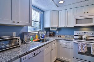
How to Use Basic Blue CC-968 in the Bathroom?
Transform your bathroom into a spa-like haven with Basic Blue CC-968. Cover all walls to create an immersive experience, or use it for cabinetry against a backdrop of white subway tiles for a classic look with a twist. Complement with marble or quartz countertops and chrome fixtures for a modern, sleek appearance.
For a more vintage or country-style bathroom, pair it with warm woods and antique brass fixtures. In smaller bathrooms, use Basic Blue sparingly to avoid the space feeling cramped. When applied thoughtfully, this color can lend a serene, clean feel to your bathroom retreat.

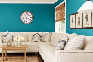
How to Use Basic Blue CC-968 in the Living Room?
In the living room, Basic Blue CC-968 can be a stunning statement when used on a feature wall, possibly the one housing a fireplace or a gallery of artwork. For an elegant vibe, combine it with plush textiles in neutral shades and a mix of metals like gold or bronze for a touch of glamour. In a more casual setting, balance it with natural materials like rattan or jute.
Soft lighting can highlight the color’s depth in the evenings, while ample natural light will keep the space feeling vibrant during the day. This color’s versatility makes it an excellent choice for a living room that’s both stylish and inviting.

How to Use Basic Blue CC-968 for an Exterior?
Using Basic Blue CC-968 on the exterior can give your home a stately yet inviting appearance. It’s a bold choice for front doors, shutters, or trim, providing a beautiful contrast against brick or stone facades. When paired with crisp white trim and accents, it can give your home a fresh, nautical appeal.
For a more subtle effect, it can be used on garden sheds or outdoor furniture to add pops of color. Remember to consider the amount of sunlight your home receives, as this color can appear quite different in direct sunlight versus the shade.

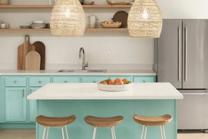
How to Use Basic Blue CC-968 in the Kitchen?
The kitchen, the heart of the home, can be invigorated by the cool tones of Basic Blue CC-968. Utilize it on a feature wall or as a bold backsplash behind open shelving or white cabinetry for a refreshing pop. Balance it with countertops in light granite or butcher block for a natural feel.
This color also pairs well with stainless steel appliances, creating a modern, sleek kitchen aesthetic. For a farmhouse style kitchen, incorporate it with creamy whites and rustic elements. Basic Blue CC-968 can energize morning routines and bring a sense of joy to meal preparations.

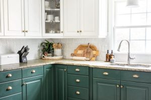
How to Use Basic Blue CC-968 on the Kitchen Cabinets?
For a daring yet sophisticated kitchen cabinet transformation, Basic Blue CC-968 can be the star of the show. This deep blue can either cover all cabinetry for a dramatic look or be used on an island or lower cabinets for a grounded effect. Offset the depth of the color with a light backsplash and countertop materials like marble or light quartz to keep the space from feeling too dark.
Satin brass or brushed nickel hardware can add a refined touch to the cabinets. In a well-lit kitchen, this shade creates a chic and dynamic space that’s both inviting and functional.

Comparing Basic Blue CC-968 With Other Colors
Comparing different colors is essential in interior design to understand how they will interact within a space and influence its ambience. Colors can change perception of size and shape, and affect emotions and mood. Basic Blue CC-968 has a specific character that may vary when placed alongside other hues.
This comparison helps in making informed decisions about color schemes and ensuring that the chosen colors align with the desired atmosphere and design intentions of a room. Through comparison, designers can create a cohesive palette that either soothes or energizes, based on the relationship between the colors used.
Basic Blue CC-968 vs. BM 1424 Blue Viola
While Basic Blue CC-968 is a deep, almost nautical blue, BM 1424 Blue Viola leans towards a soft, airy lilac. Blue Viola’s lighter, greyish tone provides a more delicate touch compared to the strong and grounded presence of Basic Blue. In a space, Blue Viola could brighten and enlarge the room, whereas Basic Blue would create a more profound and focused energy.
When paired, Blue Viola would act as a breath of fresh air against the intensity of Basic Blue, offering a striking balance between depth and lightness, ideal for a contemporary space that wants to marry boldness with subtlety.

Basic Blue CC-968 vs. BM 1430 Spring Flowers
BM 1430 Spring Flowers is a muted, pastel lavender, emitting a soft, floral ambiance that contrasts with the saturated depth of Basic Blue CC-968. Spring Flowers might bring a sense of springtime freshness to a room, making it feel open and serene, while Basic Blue could serve as an anchor, giving a space weight and sophistication.
In juxtaposition, Basic Blue provides a backdrop that can make Spring Flowers pop, serving as a gentle reminder of bloom amidst the seriousness of the deep blue, perfect for a balance of playfulness and gravitas.

Basic Blue CC-968 vs. BM 1419 Persian Violet
BM 1419 Persian Violet offers a unique blend of blue and purple tones, providing an exotic flair that is softer compared to the robust Basic Blue CC-968. Persian Violet could lend a mystical, imaginative quality to an interior, whereas Basic Blue stands out as more traditional and steadfast.
Together, these colors could create an enchanting palette, with Persian Violet adding a touch of whimsy to the authoritative stability of Basic Blue, suitable for a space aiming for both creativity and order.

Basic Blue CC-968 vs. BM 818 Watertown
BM 818 Watertown is a pale, calming aqua that contrasts sharply with the deep and concentrated hue of Basic Blue CC-968. Watertown would impart a gentle, soothing energy to a space, reminiscent of a tranquil beachside, while Basic Blue can infuse a room with a sense of strength and confidence. When used together, they can evoke the feel of a seaside escape, with Basic Blue’s solidity supporting Watertown’s restful quality, an ideal combination for a restful, yet sophisticated coastal theme.

Basic Blue CC-968 vs. BM 1426 Queen’s Wreath
Queen’s Wreath is a vibrant, medium-toned periwinkle blue that stands out for its vivacity when compared to the more subdued Basic Blue CC-968. While Queen’s Wreath can enliven a space with its cheerful energy, Basic Blue brings a more reserved, contemplative vibe. The two could work together to balance exuberance with depth, offering a dynamic that is both uplifting and grounded, suitable for an energetic, yet refined living space.

Basic Blue CC-968 vs. BM 1441 Amethyst Shadow
BM 1441 Amethyst Shadow is a muted plum shade that provides a sophisticated yet understated alternative to the more prominent Basic Blue CC-968. Amethyst Shadow is warmer and less intense, which can create a cozy, enveloping feel in contrast to Basic Blue’s cooler, bolder statement.
When paired, they would offer a rich, luxurious combination, ideal for creating a space with a regal and cozy ambiance, perfect for personal retreats or formal settings.

Conclusion
Choosing the right colors for a space goes beyond aesthetic appeal; it’s about crafting an environment that reflects the desired mood and functionality. Basic Blue CC-968 offers depth and versatility, serving as a strong foundation for various color combinations.
Whether complemented by lighter, softer tones like Blue Viola and Spring Flowers, or paired with richer, more vibrant hues like Queen’s Wreath and Amethyst Shadow, Basic Blue can adapt to diverse design needs.
By comparing and contrasting it with a range of colors, we can appreciate its unique qualities and understand how it can be incorporated into a palette to achieve a harmonious and well-designed space. The ability to pair it effectively with other colors ensures that Basic Blue CC-968 can find its place in any home, bringing with it a sense of elegance, stability, and timeless style.