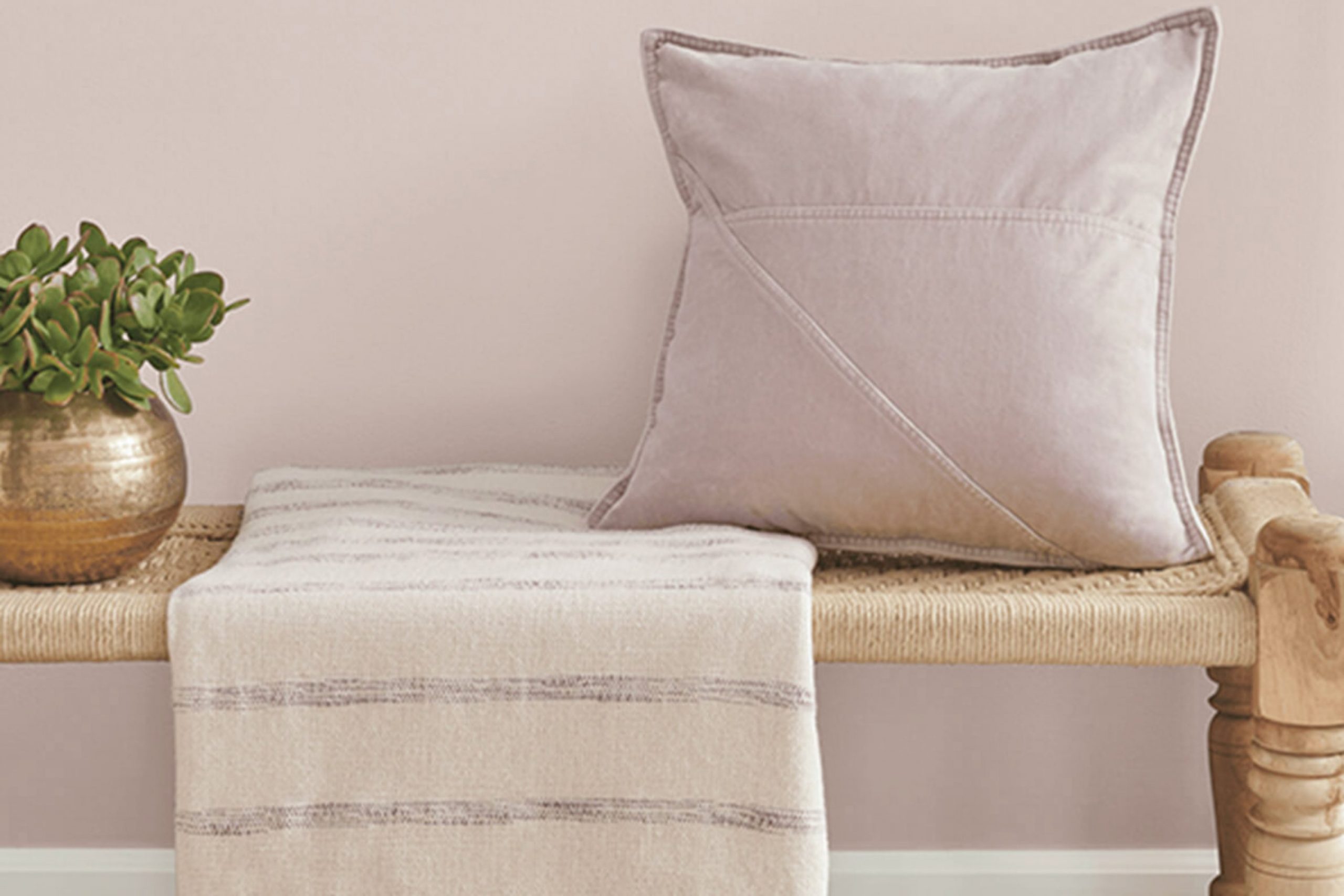
If you’re thinking about refreshing your room with a new coat of paint, you might want to consider SW 6029 White Truffle by Sherwin Williams. I recently chose this color for my own home, and I was looking for something flexible with an elegant touch. White Truffle is a soft, warm beige that has a subtle depth, making it more inviting than stark whites or overly creamy beiges.
The beauty of White Truffle lies in its ability to work well with different decor styles and lighting conditions. In my home, it contrasts nicely with bold colors, providing a calm background that allows other elements to stand out. It’s also just as effective at enhancing a minimalist style, supporting a clean and airy feel without feeling cold. This balance makes it perfect for common areas like living rooms and kitchens, where you want a color that’s easy to live with and complements different styles and textures.
For anyone redoing their home or just touching up a few areas, White Truffle provides that delicate balance between a neutral foundation and having enough character to quietly make a statement.
Whether you’re leaning toward a modern look or sticking with classic vibes, this color might be the flexible option you’re looking for.
What Color Is White Truffle SW 6029 by Sherwin Williams?
White Truffle by Sherwin Williams is a warm and welcoming neutral tone with a slight hint of gray. This color is soft and subtle, making it a flexible choice for various interior styles. It shines particularly well in rooms designed for rest and calm, such as living rooms, bedrooms, and bathrooms.
The gentle nature of White Truffle pairs beautifully with natural materials like wood and stone. It enhances the rich textures of leather and linen, creating a cohesive and inviting room. This shade works exceptionally well with polished wood floors or wooden furniture, bringing out their natural beauty and creating a soft contrast. For a more layered look, combining it with cotton throws or wool rugs can add depth and interest to any room.
In terms of interior styles, White Truffle fits perfectly into modern farmhouse, Scandinavian, and minimalist decor. Its understated quality supports the light and airy feel typical of Scandinavian interiors, while in modern farmhouse settings, it complements the rustic elements without overpowering them.
This color is also ideal for those who love a classic look, as it can blend easily with a variety of textures and materials, helping the design stay fresh and stylish year after year. Whether used as a main color or an accent, White Truffle is a reliable choice for creating warm and inviting interiors.
Is White Truffle SW 6029 by Sherwin Williams Warm or Cool color?
White Truffle by Sherwin Williams is a unique paint color that brings a warm and cozy feel to any room. Its soft beige tone has just the right hint of gray, making it ideal for rooms where you want to create a comfortable and inviting atmosphere. This flexible color works well in living rooms, bedrooms, and kitchens because it pairs beautifully with a wide range of furniture and decor styles, from modern to rustic.
Using White Truffle in your home can help brighten up darker rooms or give small rooms a more open feel. It reflects light gently, helping to make rooms feel airy without being too stark or cold, which is often a challenge with pure white paints.
Whether you’re looking to refresh your walls, cabinets, or even ceilings, this color can easily be incorporated into your home to achieve a fresh and tidy look. It’s particularly effective in creating a neutral backdrop that allows other design elements to stand out.
Undertones of White Truffle SW 6029 by Sherwin Williams
White Truffle is a unique paint color that blends subtle undertones, enhancing its flexibility and appeal in various settings. Like other colors, the perception of White Truffle can shift based on its undertones. These undertones are gentle colors that sit beneath the primary shade, influencing how it appears under different lighting conditions or when paired with other colors.
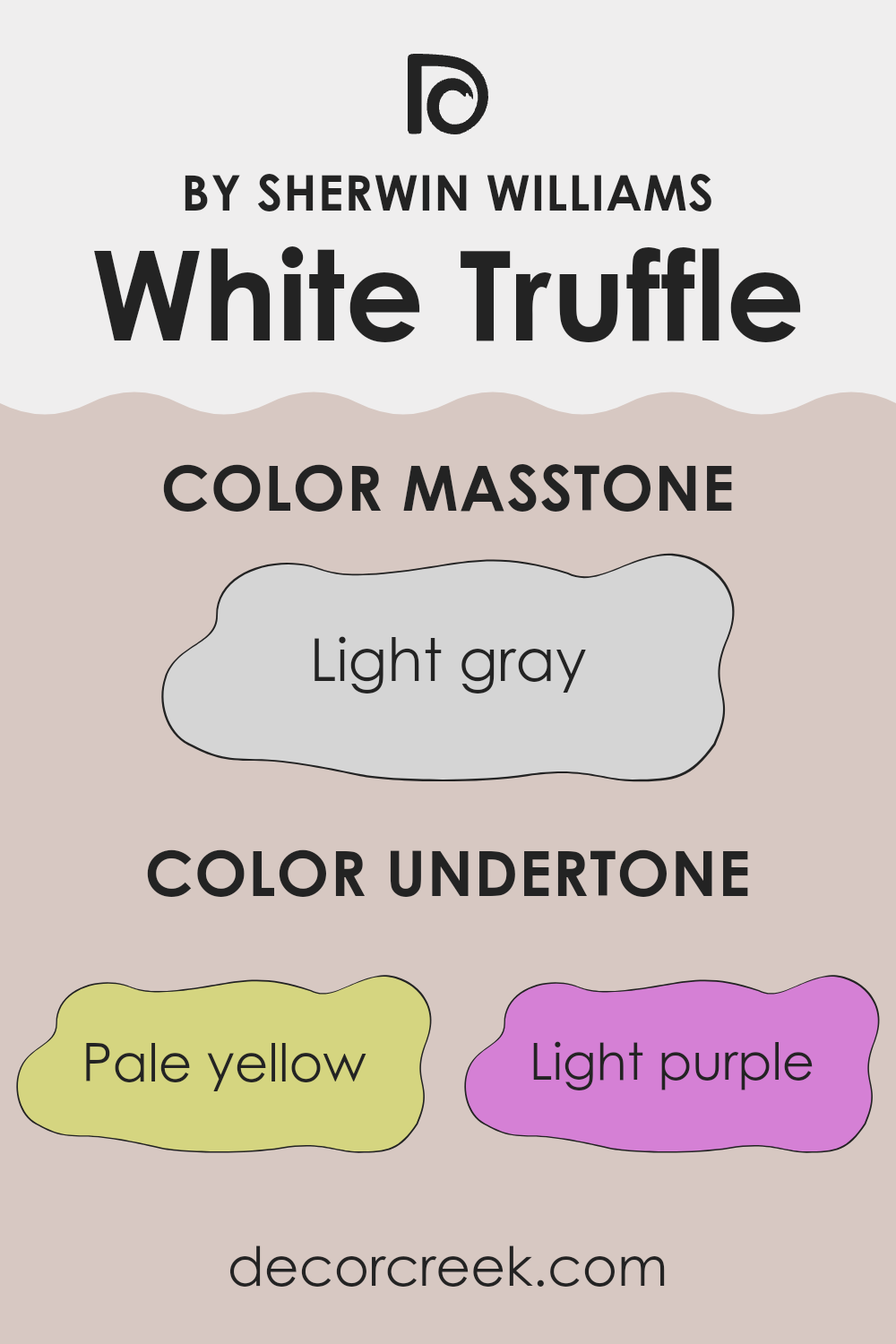
For White Truffle, the undertones include pale yellow, light purple, light blue, pale pink, mint, lilac, and grey. Each undertone contributes to the overall look in distinct ways. Pale yellow and pale pink add a soft warmth, making the room feel welcoming. Light blue and mint introduce a refreshing, slightly cool touch, ideal for creating a calm atmosphere. Light purple and lilac add a refined hint of depth without feeling too strong, perfect for adding character. Grey helps ground the color, ensuring it doesn’t lean too far in any direction and stays neutral.
When used on interior walls, White Truffle adjusts easily to different styles and rooms because of these undertones. In bright, natural light, the cooler undertones like light blue may become more noticeable, giving the room a crisper look. In artificial or dim lighting, the warmer tones like pale yellow can make the room appear cozier. This adaptability makes White Truffle a practical choice for many rooms, supporting both natural and artificial light to create the desired mood.
decorcreek.com
What is the Masstone of the White Truffle SW 6029 by Sherwin Williams?
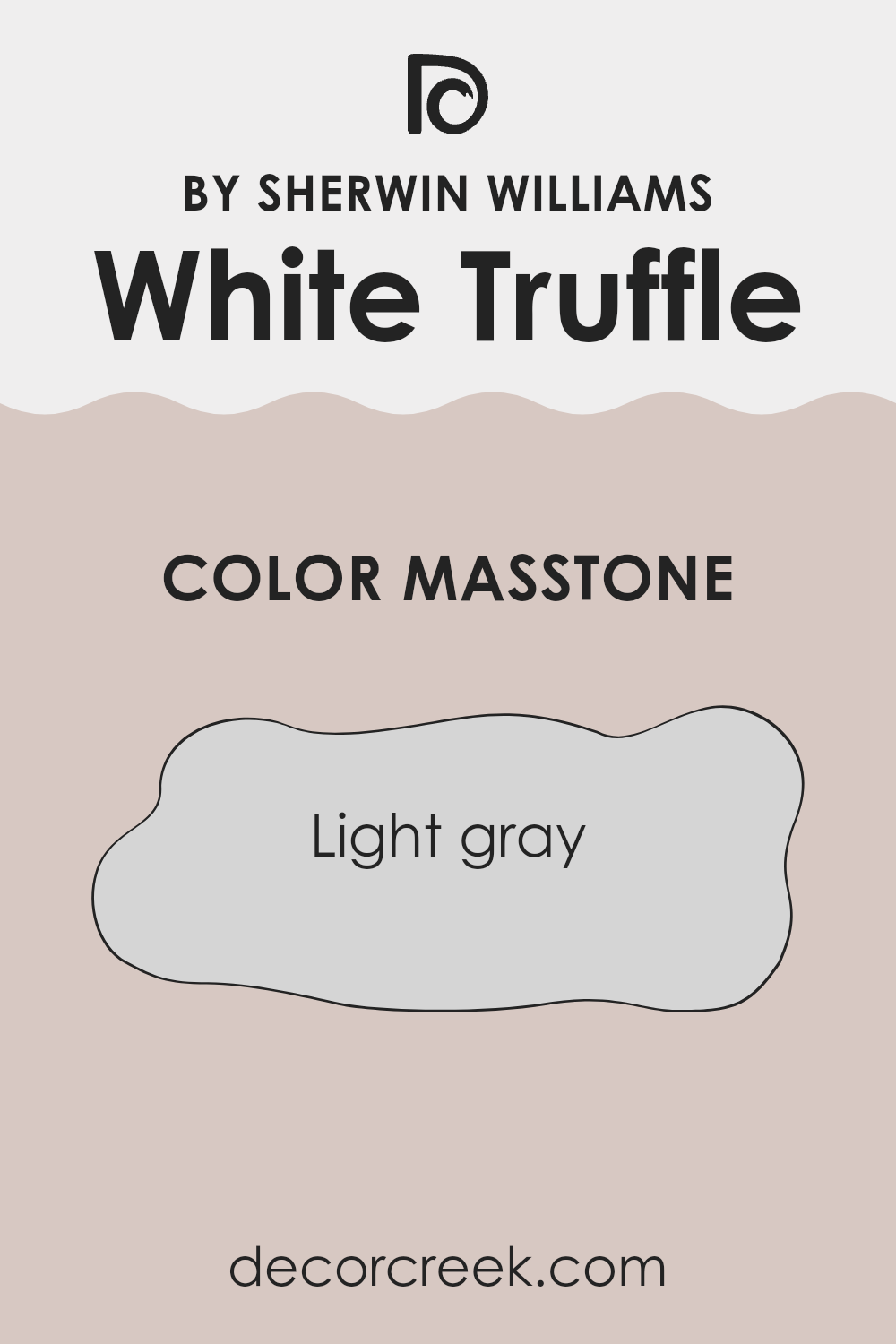
White Truffle SW 6029 by Sherwin Williams has a masstone of light gray, appearing as a gentle and soft hue. This color is great for homes because it is very neutral, making it easy to pair with different styles and room functions.
It can blend well in rooms that receive both plenty of light and those that are a bit darker, maintaining its true color without turning dull. This shade can help smaller rooms appear larger and more open, as light colors generally make rooms feel more expansive.
Moreover, its calming effect is perfect for areas like bedrooms and living areas where a relaxed atmosphere is often desired. The flexibility of White Truffle allows for easy decor changes, letting homeowners swap accent colors or furniture without clashing with the walls. It’s a practical and visually pleasing option for anyone looking to refresh their living room or home.
How Does Lighting Affect White Truffle SW 6029 by Sherwin Williams?
Lighting plays a crucial role in how we perceive colors. The type of light and its intensity can dramatically affect the appearance of a color in a room. Generally, under artificial lighting, colors can appear warmer or cooler depending on the light’s temperature. For instance, warm lights can make colors look more vibrant, while cool lights can give them a muted tone.
Taking the color White Truffle as an example, this is a shade that will vary in different lighting conditions. Under artificial light, such as LED or fluorescent lights, White Truffle tends to look slightly cooler, bringing out subtle gray undertones. This can make rooms feel calm and understated, especially in the evenings.
In natural light, the time of day and the direction of the window play a significant role in how White Truffle appears. In a room facing north, which receives less direct sunlight, it can appear more like a true soft beige, providing a light and airy feel while still maintaining warmth. This makes it ideal for living areas where a gentle and inviting atmosphere is desired.
In south-facing rooms, where sunlight is abundant throughout the day, White Truffle can take on a brighter, warmer appearance, enhancing the cozy and welcoming vibe of the room. The color becomes more dynamic and can make the room feel more alive.
For rooms facing east, the morning light can make White Truffle appear soft and slightly warm, perfect for bedrooms or breakfast nooks where a gentle start to the day is preferred. As the sun shifts, the color maintains a balanced neutral tone throughout the day.
In west-facing rooms, White Truffle goes through the most noticeable change, starting cooler in the morning and shifting to a warmer tone by sunset. This gradual shift can add visual interest to rooms used more in the afternoon and evening, such as dining rooms or living areas. Overall, the color White Truffle is flexible and adjusts well to different lighting conditions, making it a practical choice for many settings and room orientations.

decorcreek.com
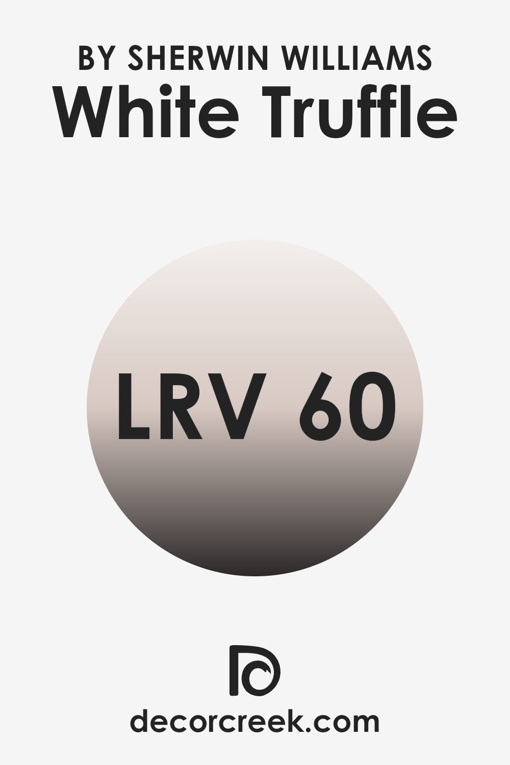
What is the LRV of White Truffle SW 6029 by Sherwin Williams?
LRV, or Light Reflectance Value, is a measurement used to indicate how much light a color reflects or absorbs. This value is rated on a scale where lower numbers mean the color absorbs more light, making it appear darker, and higher numbers mean it reflects more light, appearing lighter. This scale does not reach all the way up to 100, showing that no paint color can reflect all light.
This concept is important when choosing paint colors because it helps predict how a color will look under different lighting conditions. For instance, a room with less natural light might benefit from a paint color with a higher LRV to make the area feel brighter.
The LRV for the color White Truffle by Sherwin Williams is 59.514, which is a mid-range value. This means it neither reflects light very strongly nor absorbs it heavily. As a result, this particular shade will have a balanced appearance under most lighting conditions. It won’t dramatically brighten a room like a higher reflective value might, but it also won’t make a room feel overly dark. This level of LRV is flexible and can be a good choice for various room sizes and lighting situations, helping maintain a neutral and pleasant ambiance.
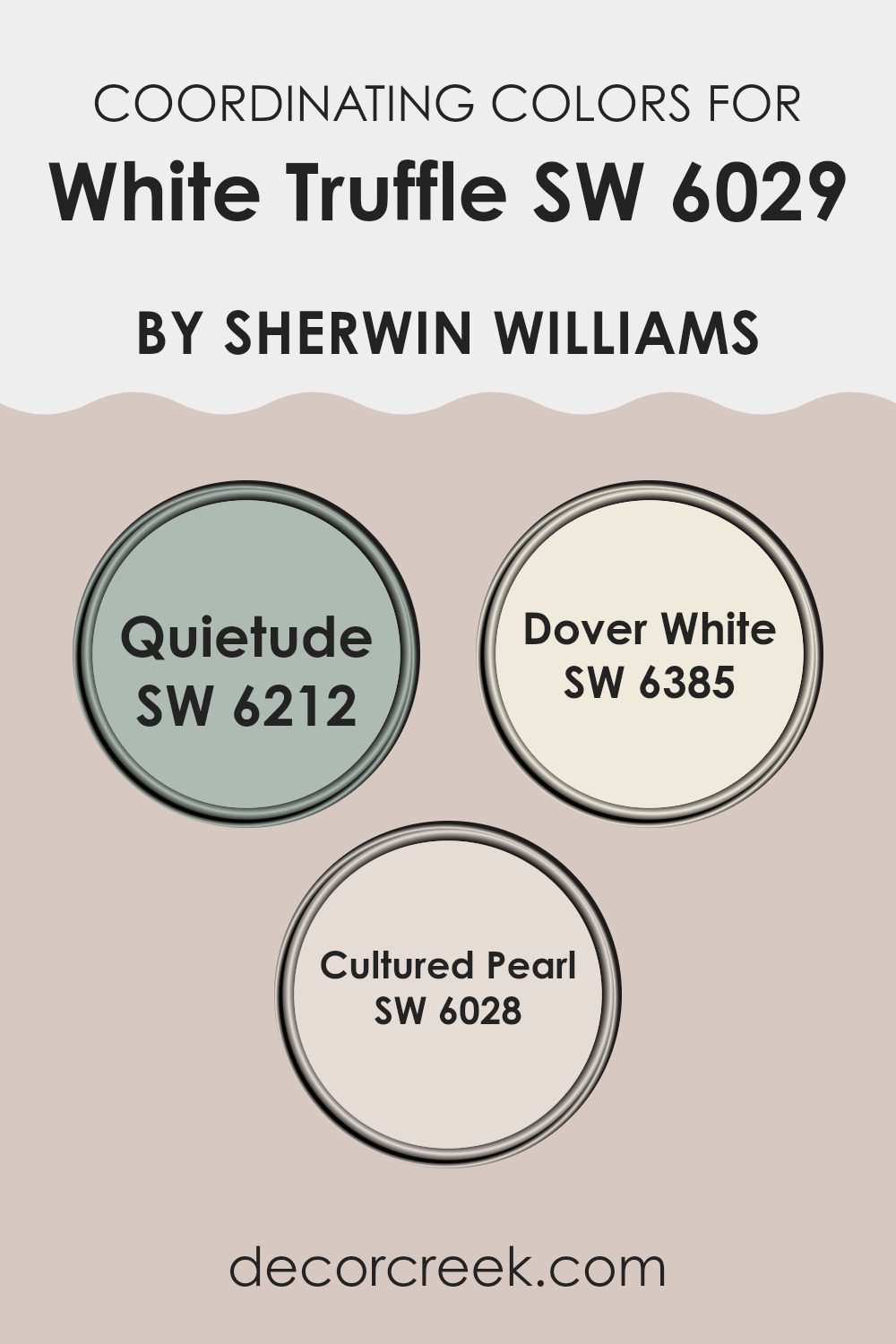
Coordinating Colors of White Truffle SW 6029 by Sherwin Williams
Coordinating colors are selected to create a harmonious color scheme when used alongside a primary color, such as White Truffle. These chosen shades complement or enhance the primary color, ensuring that the overall look feels balanced and pleasing to the eye. Coordinating colors can range from contrasting tones that create a vibrant look to similar hues that add subtle refinement to a room.
One coordinating color is Quietude, a soft and gentle blue-green that brings a calm and refreshing energy into any room. It pairs beautifully with the warm tone of White Truffle, offering a soothing contrast. Dover White is another coordinating color, which is a creamy, almost white shade that adds a clean and bright touch to interiors.
It works well to lighten rooms without overpowering the subtle nature of White Truffle. Lastly, Cultured Pearl is a refined gray with a hint of lavender, adding a touch of modern polish. This color complements White Truffle by providing a neutral background that highlights the primary shade’s warmth. The use of these coordinating colors can strongly influence the mood and style of a room, allowing for a personal touch that reflects individual tastes and preferences.
You can see recommended paint colors below:
- SW 6212 Quietude
- SW 6385 Dover White
- SW 6028 Cultured Pearl
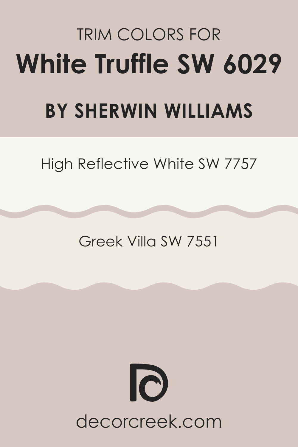
What are the Trim colors of White Truffle SW 6029 by Sherwin Williams?
Trim colors, such as SW 7757 – High Reflective White and SW 7551 – Greek Villa, play a crucial role in the overall look of a room when used alongside a main wall color like White Truffle by Sherwin Williams.
These colors are used on elements such as door frames, moldings, skirtings, and window trims, helping to define and accentuate the boundaries of the room. The contrast between the trim and the wall color can either subtly complement the primary hue or create a striking border that adds depth and character to the color scheme.
High Reflective White is a very bright and clean white, almost akin to pure white. This makes it an excellent choice for trims, adding a crisp edge to the soft tones of White Truffle and enhancing the light in any room. Greek Villa, on the other hand, offers a slightly warmer and creamier shade of white. It provides a soft, gentle contrast with White Truffle, promoting a cohesive and inviting atmosphere without overpowering the main color.
You can see recommended paint colors below:
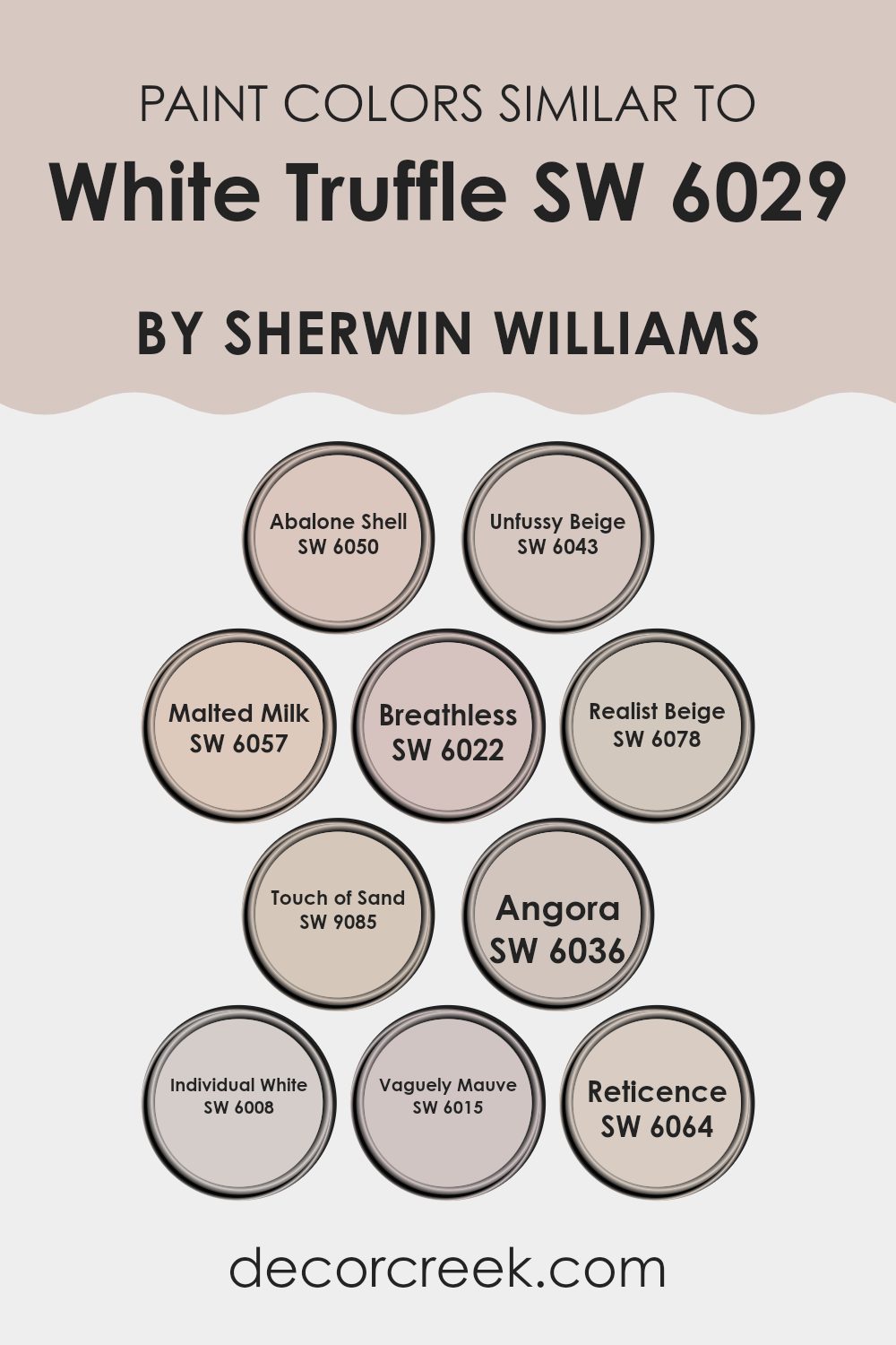
Colors Similar to White Truffle SW 6029 by Sherwin Williams
Choosing similar colors when decorating or painting can create a harmonious and seamless visual experience. Colors such as Abalone Shell, which has subtle neutral tones and leans slightly into gray, are perfect for blending rooms together without harsh contrast.
Unfussy Beige is a warm companion, providing a gentle wash of color that complements areas seeking a touch of softness without feeling too bright. Alongside these, Malted Milk introduces a slightly richer hue, tying rooms together with its comforting beige feel, ideal for creating cozy environments.
Breathless offers a lighter approach, almost whispering in pale tones to create a soft but noticeable presence in smaller or well-lit rooms. On the other end of the spectrum, Realist Beige stands firm with a more pronounced beige character, holding its own in areas that see a lot of daily activity.
Touch of Sand is another neutral that works steadily to establish unity with its slightly sandy tone, making it a flexible choice for many rooms. Then comes Angora, a deeper tone that adds depth without taking over the palette. Individual White brings a clean simplicity, which works well to gently break up repetition.
Vaguely Mauve adds a hint of color, soft and nearly neutral, with a blush that suggests warmth. Finally, Reticence finishes with its muted gray, a strong yet quiet anchor in any color scheme, providing a final touch that pulls all similar hues together. These colors, though distinct, share an underlying connection that helps create smooth and visually pleasing interiors.
You can see recommended paint colors below:
- SW 6050 Abalone Shell
- SW 6043 Unfussy Beige
- SW 6057 Malted Milk
- SW 6022 Breathless
- SW 6078 Realist Beige
- SW 9085 Touch of Sand
- SW 6036 Angora
- SW 6008 Individual White
- SW 6015 Vaguely Mauve
- SW 6064 Reticence
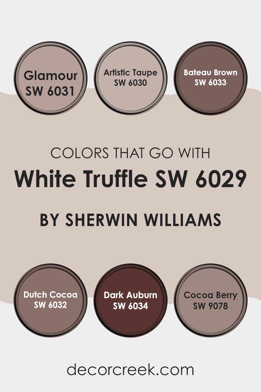
Colors that Go With White Truffle SW 6029 by Sherwin Williams
Choosing the right colors to complement White Truffle SW 6029 by Sherwin Williams is important because it helps create a harmonious and visually pleasing room. White Truffle itself is a flexible color that works as an ideal backdrop for a wide range of palettes, allowing it to blend smoothly into a room’s decor or act as a neutral base that lets other colors stand out.
Pairing White Truffle with colors like Glamour SW 6031, a soft pink hue, adds gentle warmth to a room, creating a welcoming and cozy feel. Artistic Taupe SW 6030 is a richer, deeper shade that brings balance against the lighter tones of White Truffle, adding depth and contrast without feeling too strong.
Bateau Brown SW 6033 is a bold dark brown that brings a grounded, earthy feel to a room, pairing beautifully with lighter tones for a stable, balanced look. Another excellent match is Dutch Cocoa SW 6032, which introduces a creamy chocolate tone, filling the room with a rich and cozy mood.
Dark Auburn SW 6034 adds a deep reddish-brown note that brings drama and refined character to an otherwise neutral scheme. Lastly, Cocoa Berry SW 9078 offers a unique reddish-purple accent that adds a modern and unexpected touch, making the room feel lively and fresh. Each of these colors can complement and contrast with White Truffle in ways that enhance the overall mood and visual appeal of a room.
You can see recommended paint colors below:
- SW 6031 Glamour
- SW 6030 Artistic Taupe
- SW 6033 Bateau Brown
- SW 6032 Dutch Cocoa
- SW 6034 Dark Auburn
- SW 9078 Cocoa Berry
How to Use White Truffle SW 6029 by Sherwin Williams In Your Home?
White Truffle SW 6029 by Sherwin Williams is a warm and inviting paint color that can bring a cozy feel to any room in a home. Its creamy tone makes it perfect for creating a welcoming atmosphere, whether in a living room, bedroom, or kitchen. This shade pairs beautifully with darker colors like navy or charcoal for a striking contrast, or it can be used with softer hues like light blues and pinks for a more gentle and harmonious look.
For those looking to refresh their home, White Truffle is a great choice for walls, as it provides a subtle warmth without overpowering the room. It works especially well in rooms that receive a lot of natural light, enhancing the light and airy feel.
Additionally, this color is flexible enough to be used on trim or cabinets, offering a soft but noticeable change from stark white. Using White Truffle can help make your home feel more welcoming and cozy, making it a delightful choice for anyone looking to update their interior.
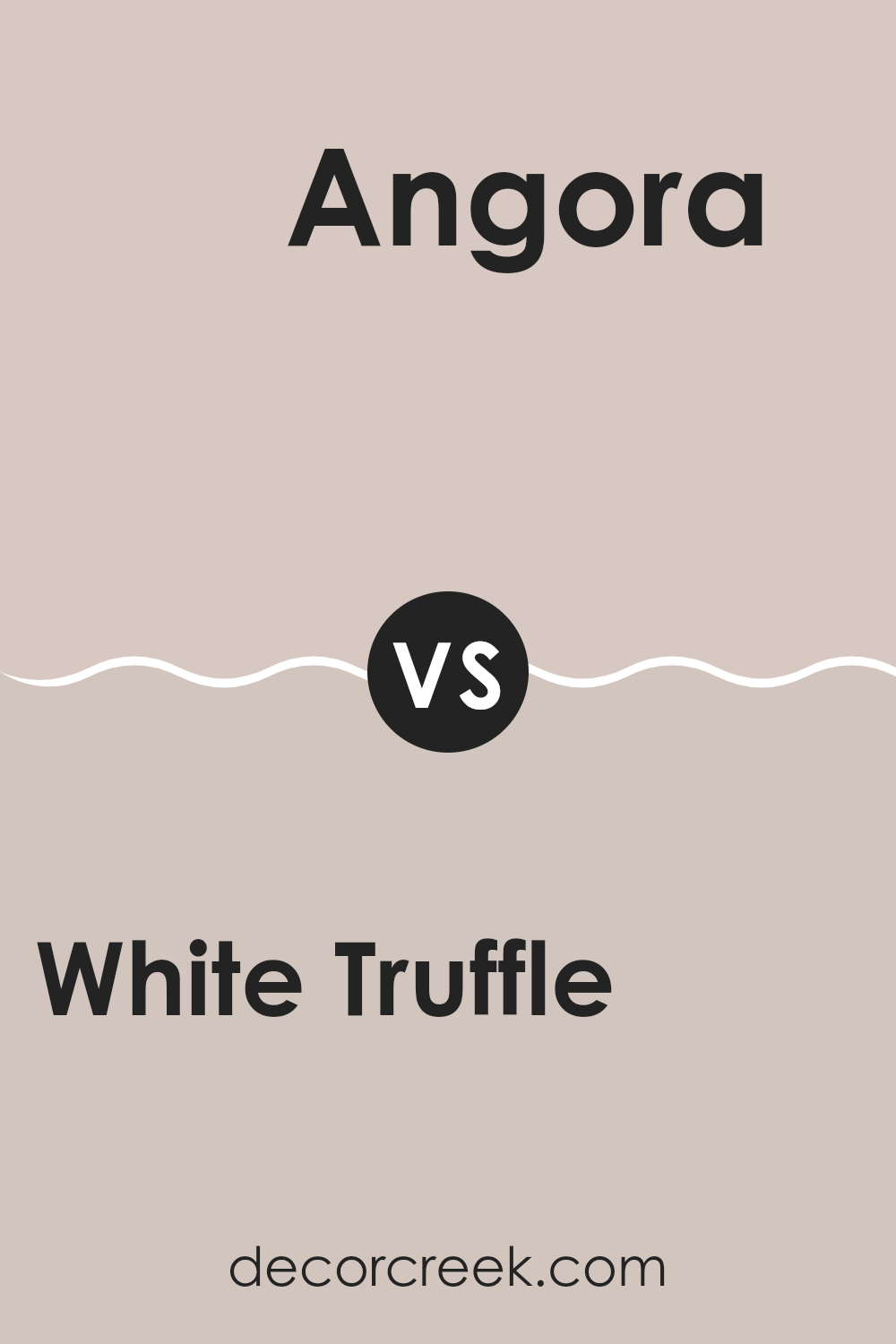
White Truffle SW 6029 by Sherwin Williams vs Angora SW 6036 by Sherwin Williams
White Truffle and Angora, both by Sherwin Williams, are neutral shades with subtle differences. White Truffle has a creamy, off-white tone that creates a warm and inviting atmosphere. It’s a flexible color that pairs well with a variety of décor styles, adding a gentle brightness to rooms without feeling too strong.
On the other hand, Angora takes a slightly different approach. It leans toward a soft, light gray with hints of beige, making it cooler in tone compared to White Truffle. This color is excellent for those who prefer a neutral palette but want a touch more richness and depth, without moving too far away from a light, airy feel.
Both colors are perfect for creating a calm and cozy environment, with White Truffle offering more warmth and Angora providing a more refined, understated look. They work well in rooms that get plenty of natural light, enhancing the openness and lightness of the area.
You can see recommended paint color below:
- SW 6036 Angora
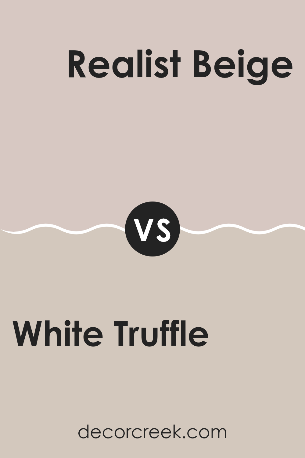
White Truffle SW 6029 by Sherwin Williams vs Realist Beige SW 6078 by Sherwin Williams
White Truffle and Realist Beige are two different neutral shades from Sherwin Williams. White Truffle has a lighter, more muted cream tone that gives a soft, clean look to any room. It’s quite flexible and can help rooms appear brighter and more open.
On the other hand, Realist Beige is a warmer color with a deeper beige hue. It offers a cozy feel, making it ideal for areas where you want to create a welcoming and comfortable atmosphere, such as living rooms or bedrooms.
Both colors are subtle and work well with a variety of decor styles, but White Truffle leans toward a more modern and fresh aesthetic, whereas Realist Beige lends itself to a more traditional and warm vibe.
You can see recommended paint color below:
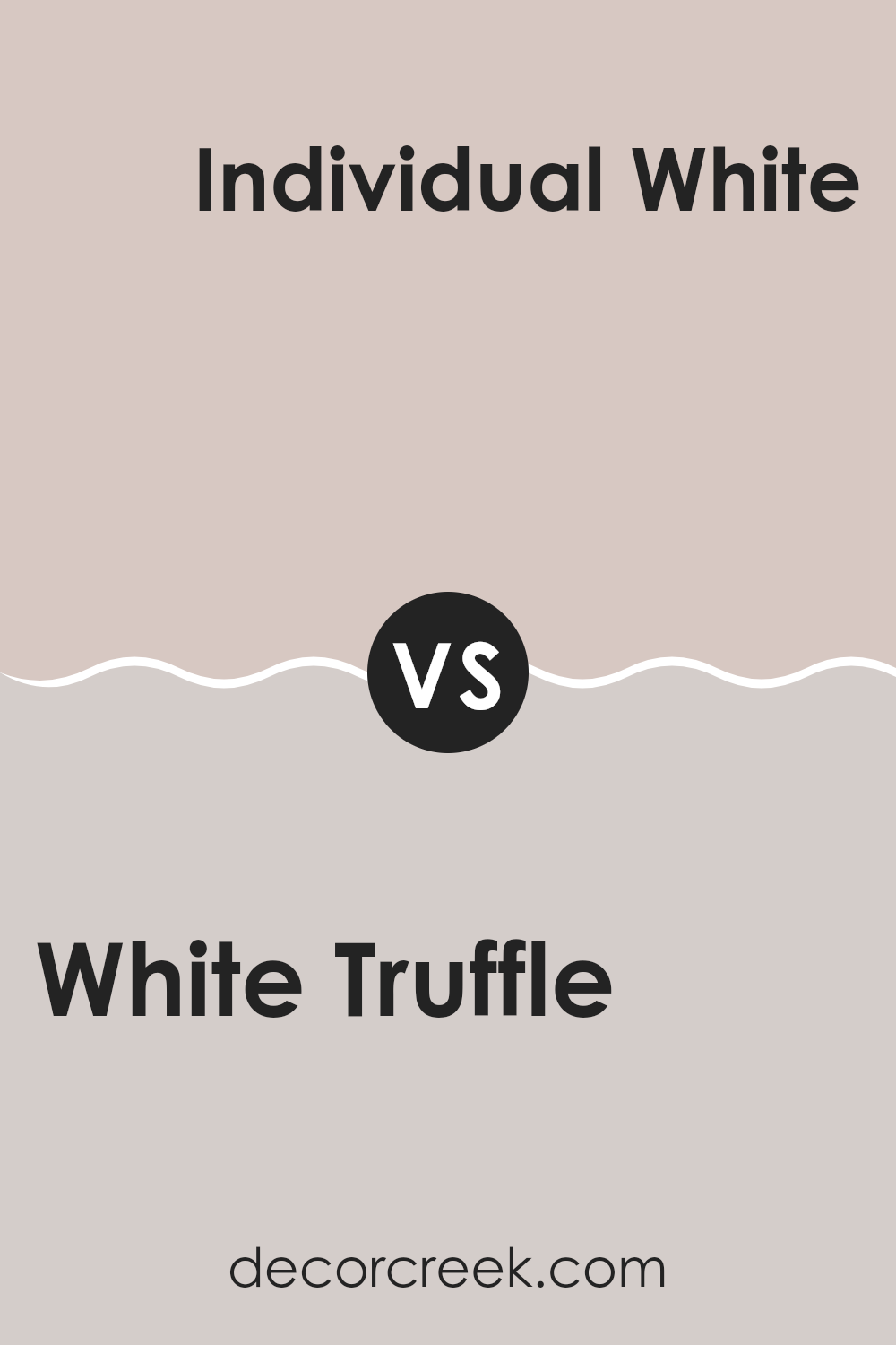
White Truffle SW 6029 by Sherwin Williams vs Individual White SW 6008 by Sherwin Williams
White Truffle is a warm neutral that leans slightly toward a soft beige. This color offers a cozy and comforting vibe, making it a great choice for areas where you want to create a relaxed and welcoming atmosphere, like living rooms or bedrooms.
On the other hand, Individual White is a cooler tone, lighter than White Truffle. It presents a clean and crisp appearance, making it ideal for rooms that aim for a more modern and minimalist feel. It can help make small rooms appear larger and brighter.
Both colors are flexible, but their different undertones mean they set distinct moods in a room. White Truffle, with its beige hints, provides warmth, while Individual White offers a clearer, more neutral backdrop that pairs well with bold colors and designs. Depending on the room’s function and desired feel, one might suit better than the other.
You can see recommended paint color below:
- SW 6008 Individual White
White Truffle SW 6029 by Sherwin Williams vs Breathless SW 6022 by Sherwin Williams
The color “White Truffle” by Sherwin Williams is a warm neutral with a soft beige tone that can give rooms a cozy and welcoming vibe. It’s perfect for rooms where you want a gentle splash of color without feeling too strong.
On the other hand, “Breathless” is also a neutral but leans more toward a pale gray, offering a cooler and crisper look. This shade is ideal for creating a more modern and clean aesthetic in a room.
While “White Truffle” adds a hint of warmth that makes rooms feel snug, “Breathless” provides a lighter, airier feel, which can make small rooms appear larger and more open. Both colors are flexible, but the choice between them depends on the mood and style you want to create in your room.
You can see recommended paint color below:
White Truffle SW 6029 by Sherwin Williams vs Touch of Sand SW 9085 by Sherwin Williams
White Truffle and Touch of Sand by Sherwin Williams are both neutral shades that can create a calm and welcoming mood in any room, though they differ subtly in hue and warmth. White Truffle is a soft beige that leans slightly toward taupe, making it a flexible choice that pairs well with both warm and cool tones. This color can make small rooms appear bigger and provide a cozy backdrop for varied decor styles.
Touch of Sand, on the other hand, is lighter compared to White Truffle and offers a hint more yellow, giving it a warmer feel. This shade is ideal for those looking to brighten up a room while still keeping the overall color scheme subtle and grounded.
Both colors offer a clean, minimal look, but Touch of Sand, being lighter, may be preferable for those wanting to add a bit more brightness to their rooms, while White Truffle is better suited for a more neutral, balanced aesthetic.
You can see recommended paint color below:
White Truffle SW 6029 by Sherwin Williams vs Vaguely Mauve SW 6015 by Sherwin Williams
White Truffle and Vaguely Mauve are two distinctive paint colors from Sherwin Williams. White Truffle is a subtle, warm grey shade that has a soft, welcoming feel. It’s very flexible and can work well in many different rooms, providing a cozy backdrop that isn’t too stark. This color pairs well with bolder hues, adding a balanced touch to any room.
On the other hand, Vaguely Mauve is a gentle purple with grey undertones, offering a more distinct but equally soothing appearance. It’s a unique shade that adds a hint of color while maintaining a soft, muted quality. This makes it ideal for rooms where you want to introduce color without feeling too intense.
Both shades offer a muted palette that is easy on the eyes but in different ways. While White Truffle leans toward a neutral warmth, Vaguely Mauve brings a subtle touch of color, making it perfect for those looking to add a slight vibrancy to their room.
You can see recommended paint color below:
- SW 6015 Vaguely Mauve
White Truffle SW 6029 by Sherwin Williams vs Unfussy Beige SW 6043 by Sherwin Williams
White Truffle and Unfussy Beige, both from Sherwin Williams, offer subtly different tones that can influence the atmosphere of a room. White Truffle is a soft, warm gray with a hint of beige. It’s a flexible hue that can make small rooms feel larger and airy, fitting well in almost any room, whether it’s a kitchen, living room, or bedroom.
Unfussy Beige is slightly darker and warmer compared to White Truffle. It has a cozy, welcoming feel that works especially well in living areas or bedrooms where a soothing backdrop is desired. It pairs beautifully with a range of other colors, supporting designs that include wood elements and natural textiles.
Both colors can create a relaxed and inviting vibe, but the choice between them depends on how much warmth and depth you want in the color of the room. White Truffle keeps things lighter and more open, while Unfussy Beige offers a deeper, cozier tone.
You can see recommended paint color below:
White Truffle SW 6029 by Sherwin Williams vs Reticence SW 6064 by Sherwin Williams
White Truffle and Reticence by Sherwin Williams are two unique paint colors that offer distinct vibes for any room. White Truffle is a soft, warm beige that gives a cozy, inviting feel to interiors. It’s a flexible color that works well in living areas, bedrooms, or any room where you want a touch of warmth without excessive brightness.
On the other hand, Reticence is a cooler gray shade that brings a subtle, calm look. It pairs beautifully with modern and minimalist decor, providing a neutral backdrop that complements bold accents and furniture. This color is ideal for rooms where you want to create a calm, grounded atmosphere.
White Truffle suits various decor styles thanks to its warmth, while Reticence offers a more neutral, understated look that feels just right for contemporary settings. Each color has its own charm, whether adding comfort with White Truffle or leaning toward a sleek, polished feel with Reticence.
You can see recommended paint color below:
- SW 6064 Reticence
White Truffle SW 6029 by Sherwin Williams vs Abalone Shell SW 6050 by Sherwin Williams
White Truffle and Abalone Shell, both by Sherwin Williams, are subtle yet different hues that can influence the mood of any room. White Truffle is a soft beige with a warm base that makes it flexible for rooms that need a cozy and gentle feel. It pairs well with bolder colors or serves as a standalone neutral for a calming atmosphere.
On the other hand, Abalone Shell steps slightly toward the cooler side with its grey undertones while maintaining a touch of warmth to stay within the inviting spectrum. This color is excellent for those who prefer a hint more of neutrality without leaning too cold, making it ideal for contemporary rooms that aim to keep a balanced, welcoming vibe.
Together, these colors offer a delightful palette for blending or contrasting elements in a room, providing a subtle, yet effective, option to design a room that feels both refined and accessible.
You can see recommended paint color below:
White Truffle SW 6029 by Sherwin Williams vs Malted Milk SW 6057 by Sherwin Williams
White Truffle and Malted Milk are both neutral colors from Sherwin Williams, but they have distinct tones that set them apart. White Truffle is a soft, creamy beige that provides a warm and welcoming vibe to any room. It’s a flexible color that pairs well with a variety of decor styles, making it a great choice for living areas and bedrooms where a cozy atmosphere is desired.
On the other hand, Malted Milk has a lighter, almost sandy beige tone, which can make a room feel more open and light. This color is excellent for smaller rooms or areas with limited natural light, as it helps reflect light and make the room appear larger.
Both colors are subtle and can work beautifully as main hues or complementary backgrounds. They pair well with bolder colors and natural materials, offering flexibility in design choices. Whether you’re looking for warmth with White Truffle or a feeling of openness with Malted Milk, both provide a beautiful, understated canvas for your home.
You can see recommended paint color below:
In wrapping up, SW 6029 White Truffle by Sherwin Williams is really like a magic paint color. It’s quite special because it can make any room look friendly and welcoming. Imagine having a paint color that works well in your living room, your kitchen, and even your bedroom without making the rooms look too alike — that’s White Truffle for you. It’s light enough to make small rooms appear bigger, but also has enough color to add a warm feel to larger areas.
This type of paint is perfect for those who like clean and neat-looking rooms without using plain white. White Truffle can go nicely with lots of different colors, which means you can use it with other shades you love to make your room feel just right for you. Whether your furniture is bright or dark, modern or old-fashioned, this paint can support the look you’re going for.
So, if someone asked me about choosing a new paint color for their walls, I would confidently recommend SW 6029 White Truffle by Sherwin Williams. It’s quite the all-rounder and does its job very well in making sure rooms look their best. It’s a safe choice that also brings a lot of warmth and charm to any area. Using this paint could simply help anyone make their home feel even more special.

Ever wished paint sampling was as easy as sticking a sticker? Guess what? Now it is! Discover Samplize's unique Peel & Stick samples.
Get paint samples

