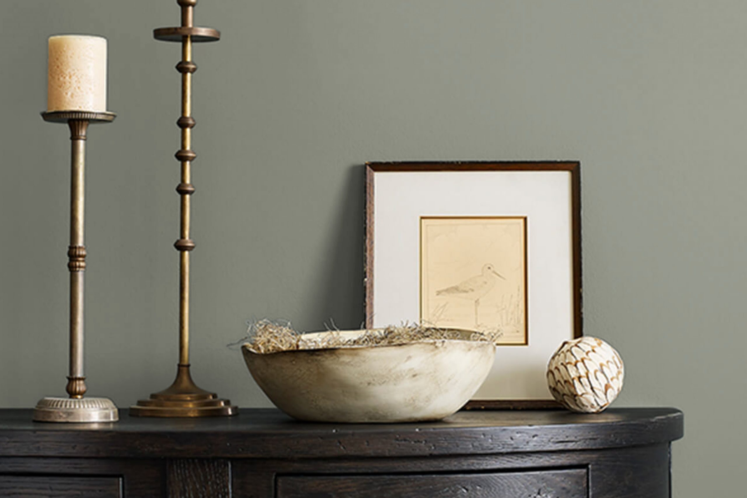
If you’re thinking about refreshing your space with a new paint color, SW 9649 Willowleaf by Sherwin Williams might just be the shade you’re looking for. It’s a unique green that brings a sense of calm and renewal to any room without being overwhelming. You’ll find that Willowleaf stands out because of its ability to blend seamlessly with different styles and settings, whether you’re looking to add a touch of nature-inspired serenity to a modern living room or create a cozy, inviting ambiance in a bedroom.
As someone who appreciates the subtle impact of color in home decor, I’ve always leaned towards hues that offer both versatility and a soothing presence. Willowleaf does just that.
It strikes a beautiful balance between being vibrant enough to make a statement and subdued enough to serve as a neutral backdrop. What really sets it apart is how it changes with the lighting, appearing more muted on cloudy days and brighter when the sun is shining.
Whether you are updating a single room or planning a larger renovation, Willowleaf provides a refreshing twist to your home’s palette.
What Color Is Willowleaf SW 9649 by Sherwin Williams?
The color Willowleaf by Sherwin Williams is a soft, muted green with a slightly gray undertone. This nature-inspired hue brings a sense of calm and freshness to any space, much like the gentle shade of early spring leaves. Its mild tone makes it incredibly versatile, suitable for various interior styles, particularly rustic, modern, and coastal themes. In a rustic setting, Willowleaf works beautifully with natural materials like wood and stone, enhancing their organic feel without overpowering them.
The color complements rich wooden textures, from pine to oak, adding a touch of lightness to the often-heavy rustic decor. In modern interiors, it pairs seamlessly with sleek materials such as polished metal, glass, and modern synthetic textiles, providing a soft contrast to clean lines and minimalist furnishings.
For a coastal look, Willowleaf is a natural fit. It mirrors the calmness of seaside hues and pairs wonderfully with light, airy fabrics like linen and cotton, as well as with more textured materials such as wicker and rattan. This color helps to create a breezy, light-filled environment that resonates with the ease of beachside living.
Overall, Willowleaf is a flexible choice that works nicely across various materials and textures, helping to create a cohesive yet distinct decorative feel in any home. Whether used as a main wall color or as an accent, it offers a refreshing touch that is both inviting and comforting.
Is Willowleaf SW 9649 by Sherwin Williams Warm or Cool color?
Willowleaf by Sherwin Williams is a vibrant green color that brings freshness and energy into any room. This shade mimics the lively color of spring leaves, perfect for homeowners looking to add a burst of nature to their interiors. It’s a fantastic choice for kitchen spaces or sunrooms where natural light can enhance its brightness and lively character.
Because of its vivid nature, Willowleaf works exceptionally well in rooms that need a touch of cheerfulness. In larger spaces, it can be used on an accent wall to create a focal point without overwhelming the entire area with a bold color. For smaller spaces, using it in accessories like cushions or small decorations can introduce a pop of color without making the room feel cramped.
Additionally, this color pairs beautifully with more neutral shades, allowing for a balanced look. When matched with whites or light grays, Willowleaf provides a striking contrast, keeping the space lively yet grounded. Its adaptability and vibrant energy make it a popular choice for homes looking to have a naturally inviting atmosphere.
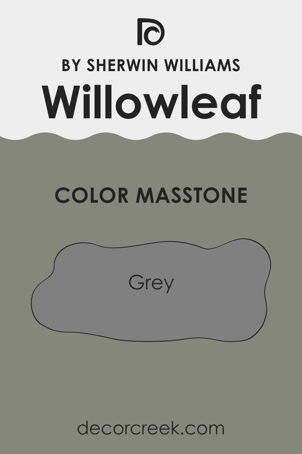
What is the Masstone of the Willowleaf SW 9649 by Sherwin Williams?
The masstone of WillowleafSW 9649 by Sherwin Williams is gray, specifically #808080. This particular shade has a neutral, balanced appearance that makes it versatile in various home settings. Being a mid-tone gray, it serves as an excellent backdrop because it does not overpower room elements, allowing furniture and artwork to stand out.
Its neutrality also means that it pairs well with a wide range of other colors, from bold hues to softer pastels, providing flexibility in decorating. This gray can make small rooms feel larger and more open because it reflects light better than darker colors.
Additionally, it’s effective in hiding imperfections on walls due to its medium depth. This color can work equally well in living spaces, bedrooms, and offices, maintaining a fresh and clean look without being too stark or cold. Overall, its practicality and aesthetic appeal make it a reliable choice for homeowners looking to create a modern and welcoming environment.
How Does Lighting Affect Willowleaf SW 9649 by Sherwin Williams?
Lighting plays a crucial role in how we perceive colors in an environment. The way a paint color appears can vary significantly under different lighting conditions, affecting the mood and ambiance of a room.
Take, for example, the color Willowleaf by Sherwin Williams—a soft and subtle hue. This color tends to change its appearance based on the light exposure it receives, which can make it versatile or tricky to work with, depending on the room’s orientation and the type of light fixtures used.
Natural Light: In naturally-lit environments, Willowleaf appears more true to its swatch. Under the pure and broad spectrum of sunlight, this color will reflect a clean and gentle green, enhancing the freshness of the space.
Artificial Light: Under incandescent lighting, Willowleaf tends to look warmer and richer, as these lights bring out yellow and red tones. On the other hand, fluorescent lights, which lean towards the blue end of the spectrum, might make it appear slightly cooler and more muted.
Room Orientation:
– North-Faced Rooms: These rooms get less direct sunlight, which can make them cooler in tone. Here, Willowleaf might appear more muted and subtly sophisticated, possibly requiring additional warm lighting to prevent it from looking too shadowed or dull.
– South-Faced Rooms: These rooms are flooded with more vibrant, direct sunlight throughout the day, which can make Willowleaf look brighter and more lively. It can bring out the cheerful aspects of the color, making the room feel more inviting.
– East-Faced Rooms: Morning light in east-facing rooms is warmer, making Willowleaf appear soft and gently illuminated. As the sun shifts, the color may lose some of its warmth and appear more neutral or cool.
– West-Faced Rooms: In the evening, when sunlight in west-facing rooms is at its warmest, Willowleaf will appear very cozy and welcoming, harmonizing beautifully with the orange and red hues of the sunset.
Understanding how different types of light affect this particular shade can help in deciding if it’s the right choice for a specific room, depending on the atmosphere you’re aiming to achieve. Whether you opt for natural or artificial light, consider the room’s orientation and how these factors will make the color interact with the room throughout the day.
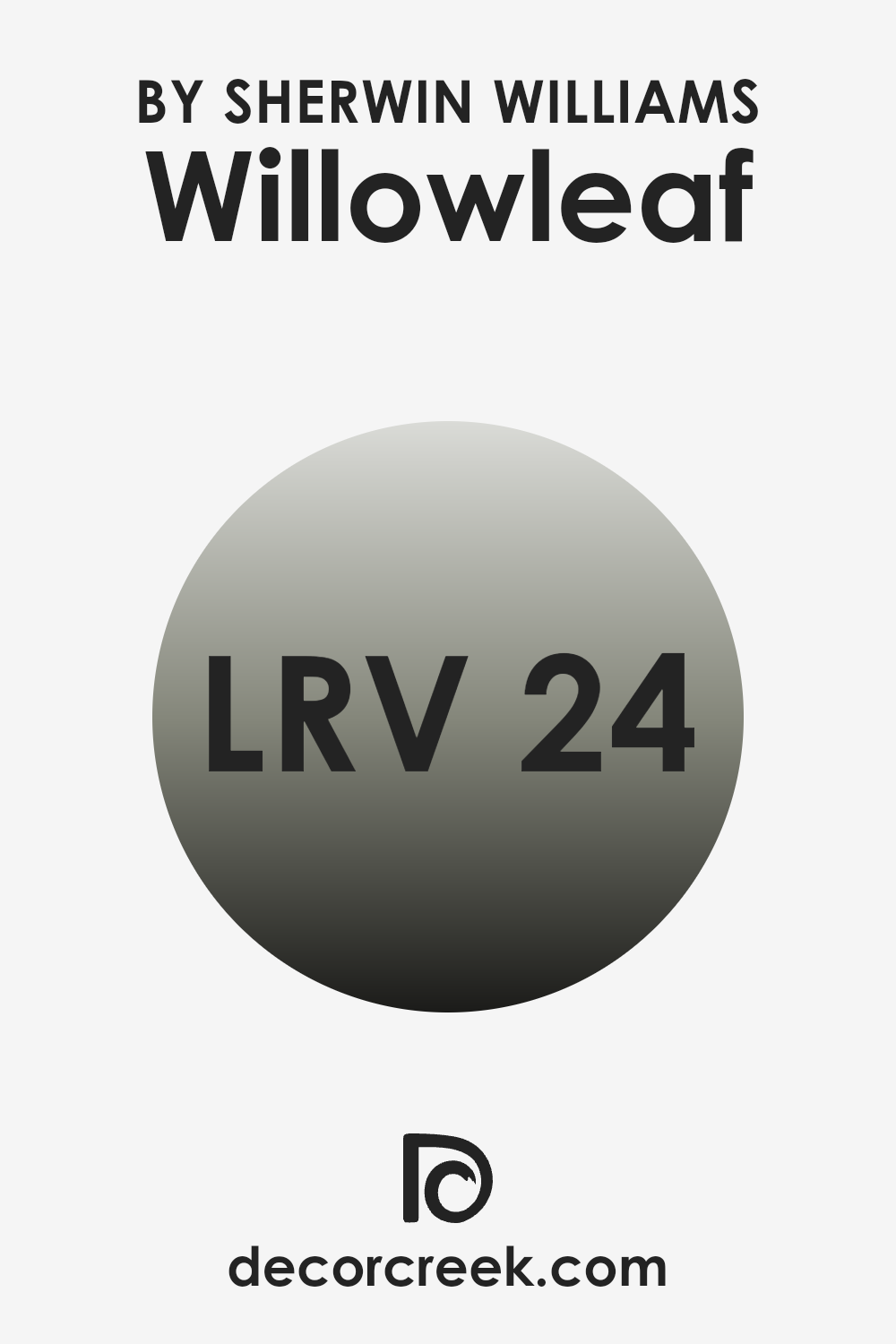
What is the LRV of Willowleaf SW 9649 by Sherwin Williams?
LRV stands for Light Reflectance Value, which is a measure on a scale that tells us how much light a color reflects and how much it absorbs. When a color has a high LRV, it means it reflects more light back into the room, making the space appear brighter and larger. Conversely, a color with a low LRV absorbs more light, which can make a room look cozier but smaller and darker.
This measurement is particularly useful when choosing paint shades for your interior, as it helps predict how light or dark a color will look on your walls depending on the natural and artificial lighting available in the space.
The LRV of Willowleaf, which is 23.668, indicates that it is on the darker side of the scale. This means that it doesn’t reflect as much light as lighter colors would. When used on walls, Willowleaf creates a more intimate and enclosed atmosphere owing to its ability to absorb most of the light. This can make smaller rooms feel snug and cozy, but it might also make them seem a bit darker, especially if there is limited natural or artificial light. In larger spaces or rooms with ample lighting, however, this color can add depth and warmth, enhancing the room’s overall aesthetic without making it feel cramped.
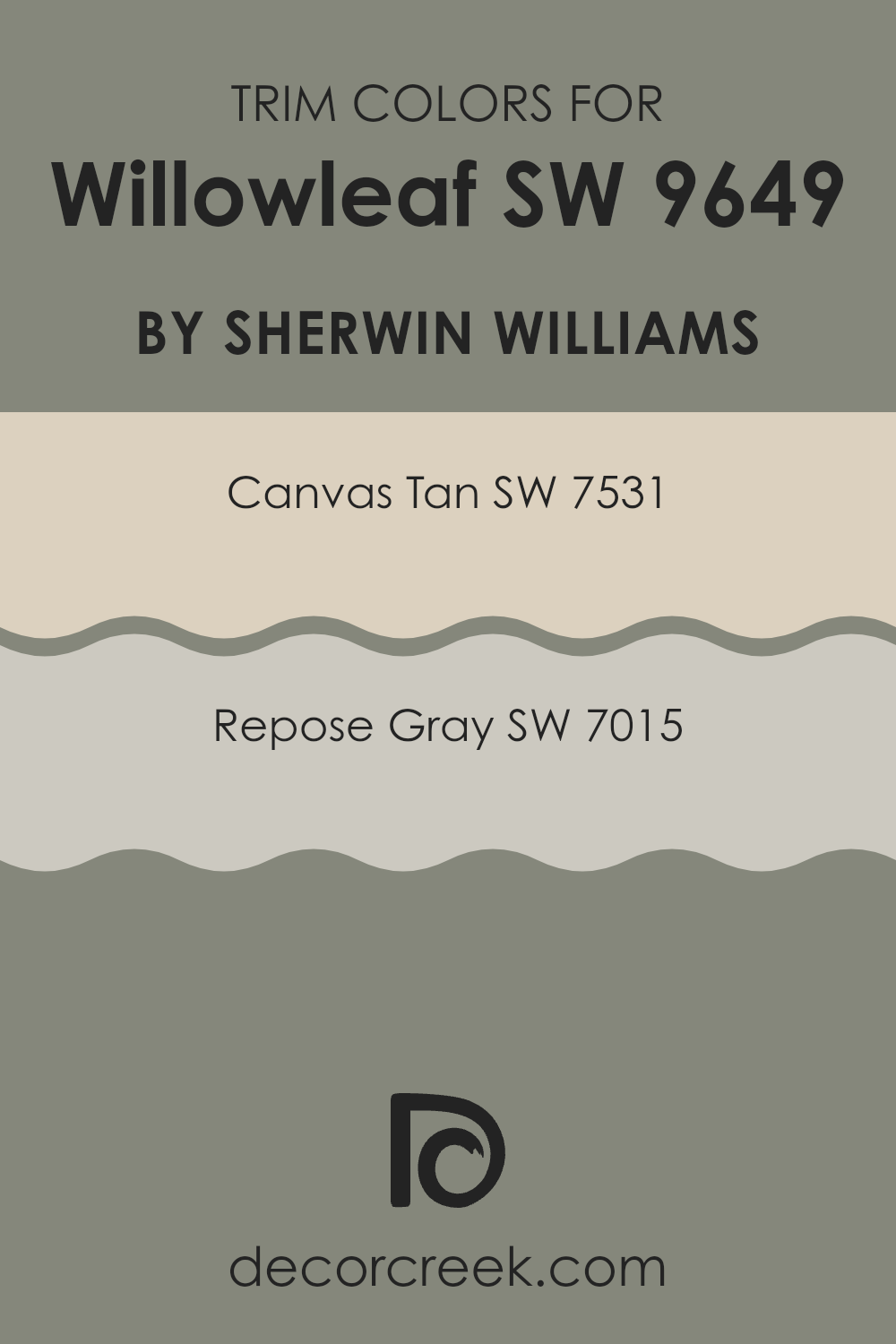
What are the Trim colors of Willowleaf SW 9649 by Sherwin Williams?
Trim colors play a crucial role in interior and exterior design, acting as accents that define and highlight the architectural features of a space. When used effectively, trim colors can create a subtle but distinct boundary that enhances the overall appearance of a room. For instance, using shades like SW 7531 – Canvas Tan and SW 7015 – Repose Gray as trim colors can complement a neutral color like Willowleaf by Sherwin Williams, adding depth and definition to the walls. Choosing the right trim color can make the difference between a space that looks finished and one that feels incomplete.
SW 7531 – Canvas Tan is a warm, earthy hue that offers a soft contrast against more subdued wall colors, providing a cozy and inviting feel to any room. It pairs well with natural materials such as wood and stone, making it a versatile choice for many home styles.
On the other hand, SW 7015 – Repose Gray is a neutral gray that provides a clean and modern edge, making it ideal for contemporary spaces. This color can help in creating a crisp transition between different areas, enhancing the architectural details without overpowering the primary wall color.
You can see recommended paint colors below:
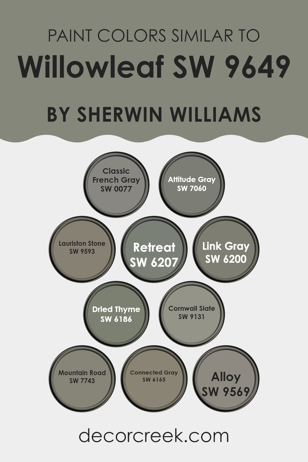
Colors Similar to Willowleaf SW 9649 by Sherwin Williams
Similar colors work well together because they allow for a harmonious look without contrasting sharply. By using colors near each other on the color wheel, you can create a space that feels cohesive and calm. For example, colors similar to Willowleaf by Sherwin Williams play an essential role in achieving a subtle yet effective aesthetic.
Classic French Gray (SW 0077) is considered a timeless neutral with a gentle gray tone; it gently complements spaces seeking understated elegance. On the darker side, Attitude Gray (SW 7060) offers a deeper gray with a hint of warmth, perfect for adding a sense of grounding to any room.
Lauriston Stone (SW 9593) presents an earthy, subdued green that pairs beautifully with more naturalistic themes. Retreat (SW 6207) is a deeper, soothing green that can create a cozy, enclosed feel in an area. Link Gray (SW 6200) is another neutral option but comes with a slightly ashy undertone, providing a subtle contrast within neutral color schemes.
Dried Thyme (SW 6186) serves as a muted green, offering a touch of nature and freshness. Cornwall Slate (SW 9131) introduces a more profound, stony gray that works well in modern and minimalist designs. Mountain Road (SW 7743) is a versatile gray-green that adapts well to both rustic and contemporary environments.
Connected Gray (SW 6165) bridges the coolness of gray with the warmth of beige, making it excellent for transitional spaces. Lastly, Alloy (SW 9569) is a unique gray that carries a metallic undertone, perfect for creating a subtly dynamic space.
You can see recommended paint colors below:
- SW 0077 Classic French Gray
- SW 7060 Attitude Gray
- SW 9593 Lauriston Stone
- SW 6207 Retreat
- SW 6200 Link Gray
- SW 6186 Dried Thyme
- SW 9131 Cornwall Slate
- SW 7743 Mountain Road
- SW 6165 Connected Gray
- SW 9569 Alloy
How to Use Willowleaf SW 9649 by Sherwin Williams In Your Home?
Willowleaf SW 9649 by Sherwin Williams is a beautiful paint color that brings a fresh and peaceful feel to any room. Its subtle green shade has a hint of gray, making it versatile for various spaces whether you are updating an entire room or just an accent wall. This color works particularly well in places where you want to create a calm and relaxing atmosphere, like bedrooms or bathrooms.
Willowleaf is also a great choice for the living room, paired with natural materials such as wood or linen, to craft a cozy and welcoming environment. In the kitchen, this color can be used on cabinets or walls to add a touch of softness. It is light enough to make small spaces appear bigger, making it ideal for apartments or smaller homes.
For those who like outdoor elements indoors, Willowleaf can complement houseplants or botanical themes, achieving a harmonious connection between nature and your living space. Using Willowleaf, you can give your home a refreshing update that feels peaceful.
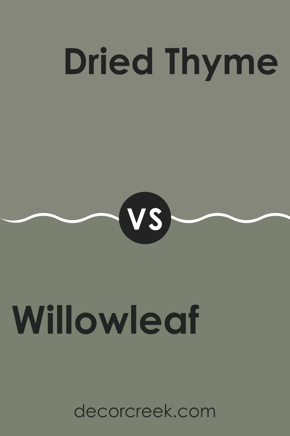
Willowleaf SW 9649 by Sherwin Williams vs Dried Thyme SW 6186 by Sherwin Williams
Willowleaf by Sherwin Williams is a fresh and light green color that brings in a feel of subtle spring energy to any space. It’s airy and has a gentle vibe, making it quite adaptable, especially to areas that need a touch of brightness but not overwhelming color.
Dried Thyme by Sherwin Williams, on the other hand, is a darker, more muted green. It leans towards an earthy tone that can be seen as comforting and grounding for interiors. This color is great for those wanting to add a bit of nature-like calmness to their rooms without going too bold.
Both colors bring their unique green shades to play, but where Willowleaf is lighter and suits spaces seeking clarity and light, Dried Thyme offers a cozy and protected feeling, better for spaces needing a collected and subdued atmosphere. Together, they cover a broad spectrum of moods and tastes, from the easy-going to the reserved.
You can see recommended paint color below:
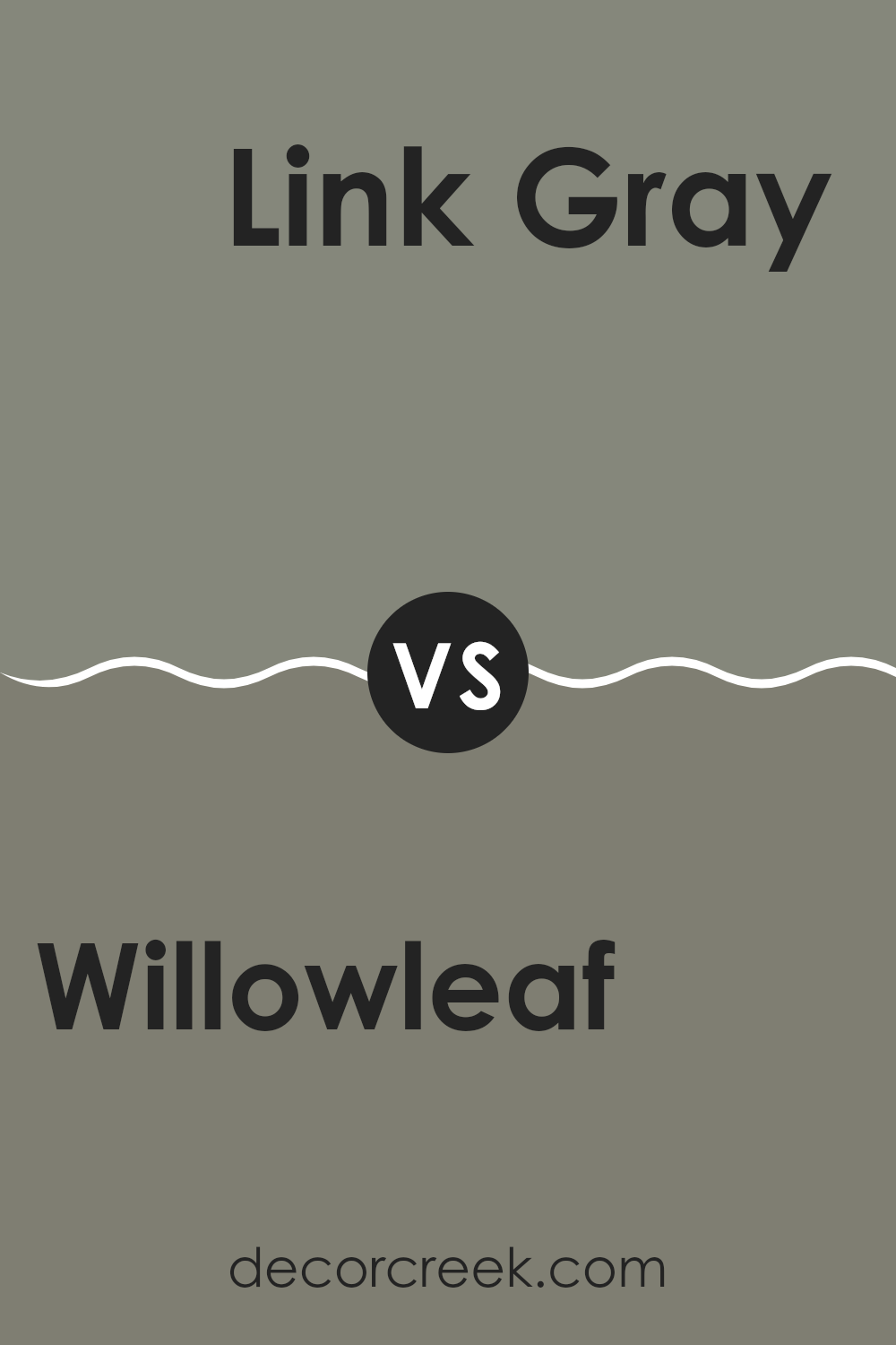
Willowleaf SW 9649 by Sherwin Williams vs Link Gray SW 6200 by Sherwin Williams
Willowleaf SW 9649 by Sherwin Williams is a soft and gentle green hue that adds a subtle touch of nature to any space. It evokes the feeling of fresh leaves or a calm, grassy field. The lightness of Willowleaf makes it excellent for creating a relaxed and airy atmosphere in rooms, suggesting an environment that is easy and welcoming.
On the other hand, Link Gray SW 6200, also by Sherwin Williams, is a deeper gray shade that offers a strong but neutral background. This color is versatile and practical, making it perfect for both modern and traditional spaces. It has the capability to stand as a firm backdrop that allows other colors to pop or blend smoothly depending on the room’s accents and furnishings.
Together, these colors could complement each other well in a decor scheme, with Willowleaf providing a refreshing contrast against the steadiness of Link Gray.
You can see recommended paint color below:
- SW 6200 Link Gray
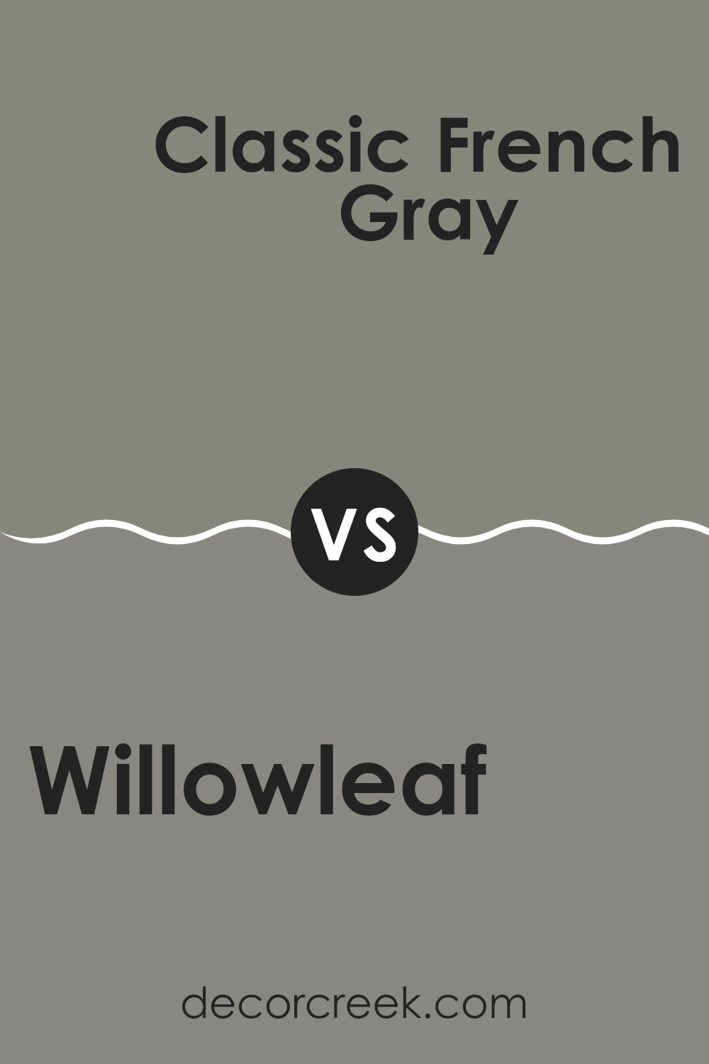
Willowleaf SW 9649 by Sherwin Williams vs Classic French Gray SW 0077 by Sherwin Williams
The two paints, Willowleaf and Classic French Gray, offer distinct shades perfect for different vibes in a room. Willowleaf is a soft, muted green, giving a calm and refreshing feel without overpowering the space. It mimics the gentle tones of nature, making it a solid choice for creating a peaceful setting. Great for bedrooms or living areas, its subtle hue works well with light woods and neutral decor.
On the other hand, Classic French Gray is a timeless, medium-dark gray that has a solid presence. It offers an elegant backdrop that can make art pieces or furniture in lighter colors stand out. This color is versatile enough for offices or modern kitchens where you want a touch of formality without going too dark.
Both colors are from Sherwin Williams and are ideal for those looking to update their walls with a modern yet understated tone. Whether you prefer the earthy whisper of Willowleaf or the grounded strength of Classic French Gray, each provides a unique atmosphere.
You can see recommended paint color below:
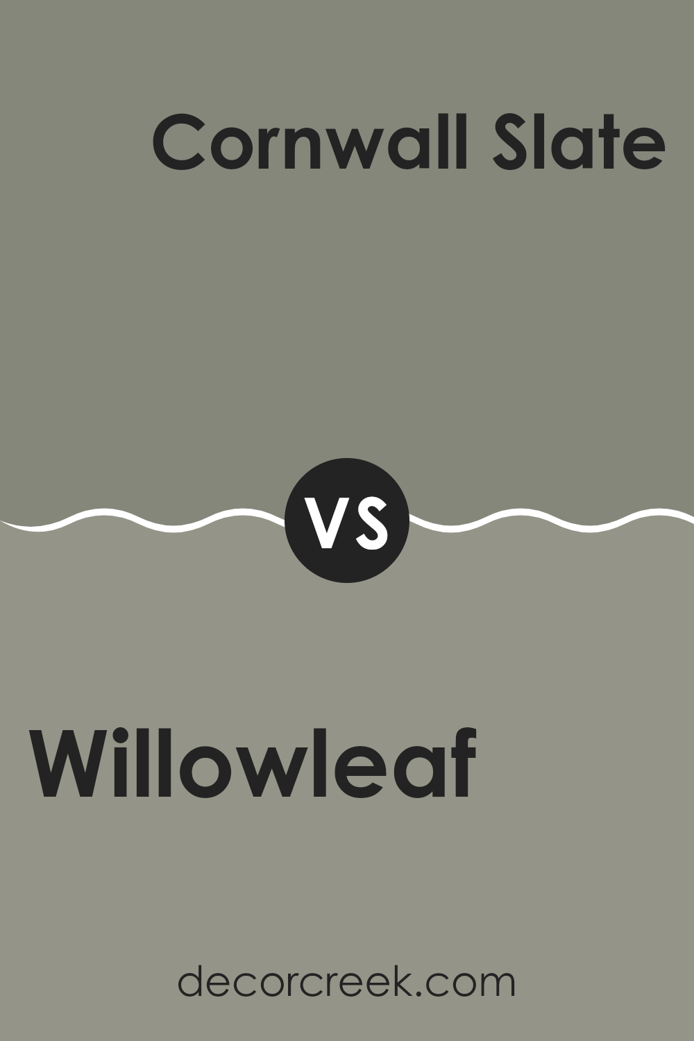
Willowleaf SW 9649 by Sherwin Williams vs Cornwall Slate SW 9131 by Sherwin Williams
Willowleaf and Cornwall Slate, both by Sherwin Williams, present unique yet contrasting tones suitable for various decorating themes. Willowleaf is a gentle green shade with a soft, subtle presence. This color is reminiscent of natural foliage, bringing a fresh and calming feel to any space. It works well in areas where a touch of nature and a peaceful atmosphere are desired.
On the other hand, Cornwall Slate offers a deeper, grayish-blue hue that carries a hint of sophistication and strength. This color provides a grounding effect, making it excellent for spaces that benefit from a more stable, anchored look. It pairs well with both bright accents and neutral palettes, offering versatility in design choices.
When deciding between the two, consider the mood and functionality of the room. Willowleaf’s light and airy quality suits relaxing spaces like bedrooms or quiet sitting areas, while Cornwall Slate’s richness is great for creating a focal point or adding depth to a living room or office.
You can see recommended paint color below:
- SW 9131 Cornwall Slate
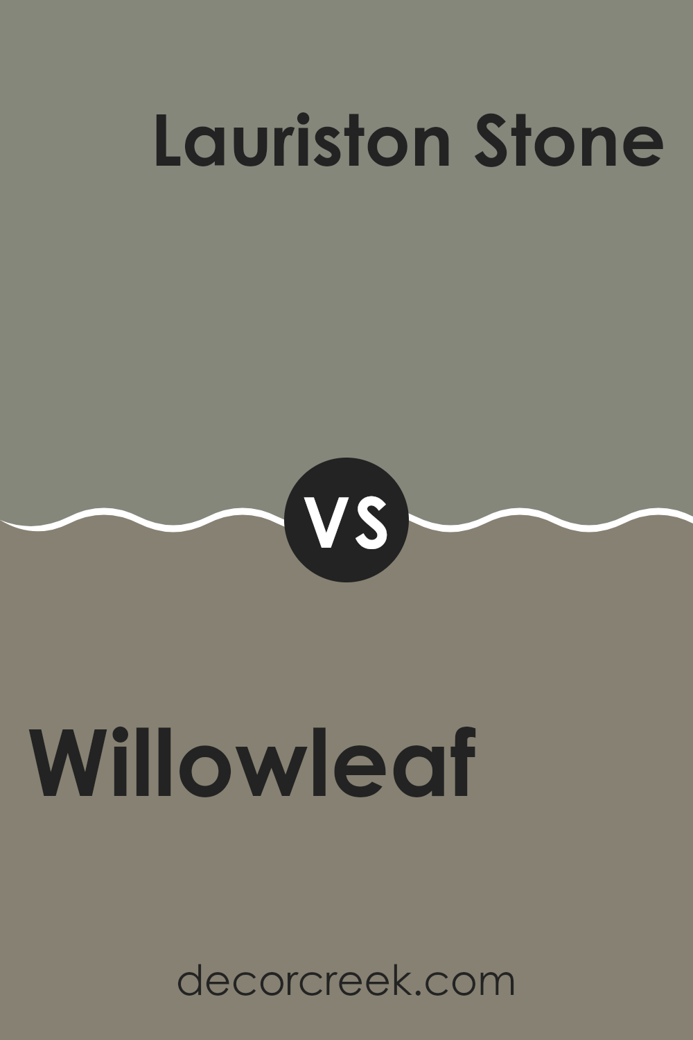
Willowleaf SW 9649 by Sherwin Williams vs Lauriston Stone SW 9593 by Sherwin Williams
Willowleaf and Lauriston Stone, both by Sherwin Williams, offer distinct shades that can significantly affect the mood and style of a space. Willowleaf is a fresh, vibrant green that brings a lively and natural feel to a room. This color can brighten up spaces and works well in areas that get lots of light, complementing houseplants excellently.
On the other hand, Lauriston Stone is a subtle, muted beige with warm undertones. It provides a calm and neutral background, making it easy to pair with various decor styles and color schemes. Lauriston Stone is ideal for those looking for a gentle, unobtrusive backdrop that still offers warmth and coziness to the environment.
Both colors have their unique appeal, with Willowleaf adding energy and a touch of nature, while Lauriston Stone offers a soothing and understated canvas suitable for any room.
You can see recommended paint color below:
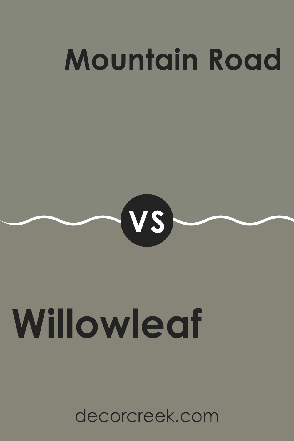
Willowleaf SW 9649 by Sherwin Williams vs Mountain Road SW 7743 by Sherwin Williams
Willowleaf and Mountain Road, both by Sherwin Williams, offer distinct hues that can significantly influence the atmosphere of a room. Willowleaf is a gentle green with a soft, muted quality that suggests calmness and a touch of nature. It’s light enough to make small spaces feel larger and airy, yet has enough color to add character.
On the other hand, Mountain Road is a darker, more olive-toned green. This color gives a stronger sense of earthiness and grounding compared to Willowleaf. It’s perfect for creating a cozy, more enclosed feel, making it ideal for larger spaces or accent walls where you want to add depth and focus.
Both colors are versatile and can work beautifully in various settings, whether you aim for a light and fresh look with Willowleaf or a more rooted, sheltered feel with Mountain Road. They pair well with natural materials like wood and stone, enhancing the inherent qualities of each shade.
You can see recommended paint color below:
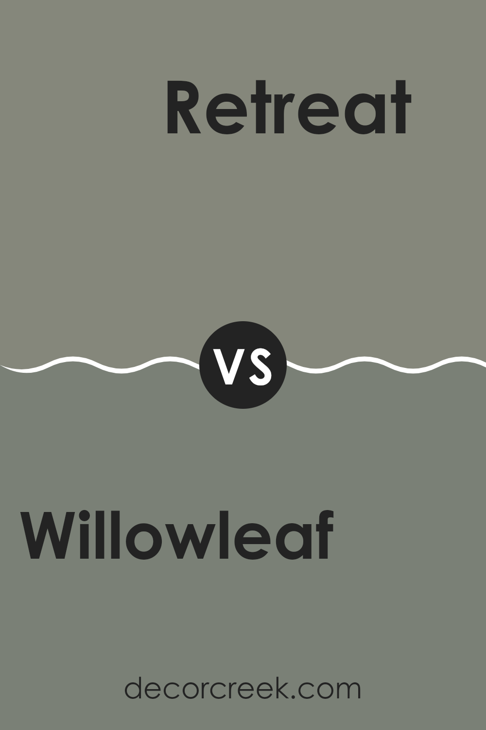
Willowleaf SW 9649 by Sherwin Williams vs Retreat SW 6207 by Sherwin Williams
Willowleaf SW 9649 and Retreat SW 6207 are both paint colors from Sherwin Williams, each offering a distinct mood for room decor. Willowleaf is a light, airy green that feels fresh and clean. This color can brighten up a room while maintaining a gentle and inviting atmosphere. It’s a great choice for spaces that aim to have a rejuvenating and light feel, such as bathrooms or kitchens.
On the other hand, Retreat is a deeper, gray-green shade that brings a rich and cozy vibe to any space. It’s more grounded and can generate a calm, relaxing setting. This makes it ideal for areas where you want to relax, such as bedrooms or living rooms.
Though both colors are from the green family, Retreat’s dusky undertones create a stark contrast to the vibrant and light-hearted nature of Willowleaf. Consequently, while Willowleaf works well in energizing a space, Retreat is better suited for crafting a cozy retreat.
You can see recommended paint color below:
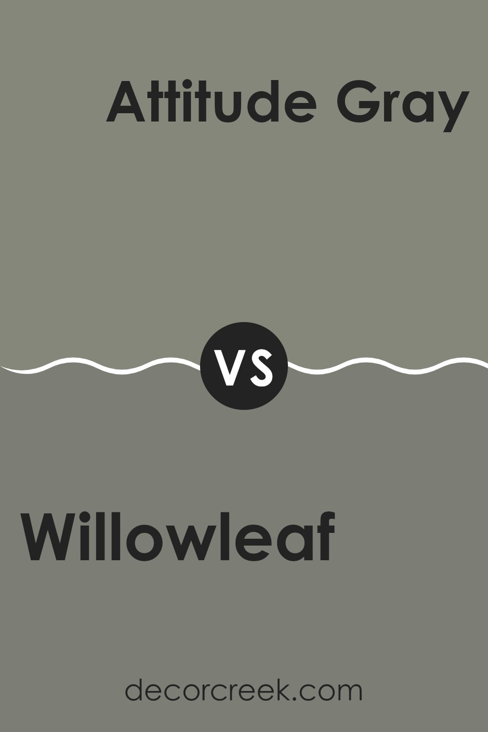
Willowleaf SW 9649 by Sherwin Williams vs Attitude Gray SW 7060 by Sherwin Williams
Willowleaf and Attitude Gray, both from Sherwin Williams, offer distinct tones that can influence the mood and style of a space. Willowleaf is a gentle green shade with a calming, natural vibe that can make interiors feel fresh and inviting. This color works well in spaces where you want to introduce a touch of nature and a subtle dash of color without overwhelming the room.
In contrast, Attitude Gray is a bold, deep gray that brings about a strong presence and depth to any room. It’s great for creating a dramatic backdrop, as it highlights artworks, furniture, and other decor elements effectively. Being a neutral shade, it pairs well with a wide range of colors.
Both colors are versatile in their own ways. Willowleaf suits spaces like kitchens and living rooms where a light, airy feel is desired, while Attitude Gray is perfect for a more formal or cozier setting such as a dining room or bedroom. Together, these colors could also complement each other in a single home, providing a balanced palette.
You can see recommended paint color below:
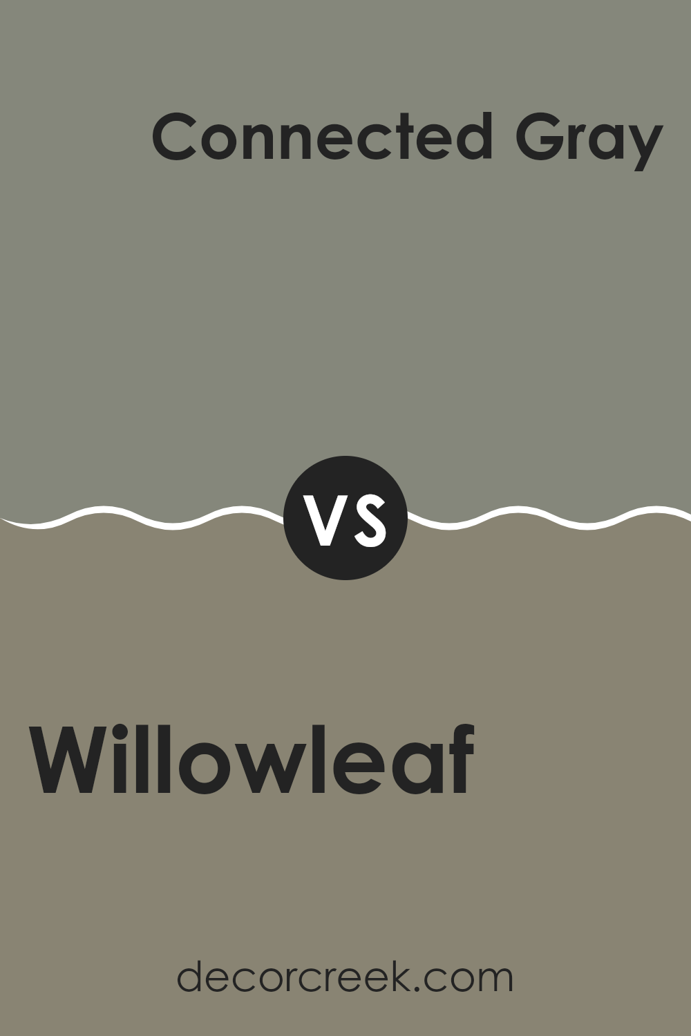
Willowleaf SW 9649 by Sherwin Williams vs Connected Gray SW 6165 by Sherwin Williams
Willowleaf and Connected Gray are two distinct colors from Sherwin Williams, each offering a unique vibe for interior spaces. Willowleaf is a fresh, soft green shade that brings a hint of nature indoors. It’s light and airy, providing a subtle touch of color that’s easy on the eyes and pairs well with natural wood and light fabrics.
On the other hand, Connected Gray is a deeper, neutral gray that offers a sturdy, grounding effect. It’s a versatile color that can work well in various settings, whether you’re looking to complement bold accents or keep a muted, consistent color scheme throughout a room.
While Willowleaf adds a splash of gentle color, Connected Gray works as a strong backdrop, enabling other hues to stand out. Choosing between them depends on the atmosphere you want to create—Willowleaf is ideal for a light, refreshing feel, while Connected Gray is excellent for a more anchored, subtle environment.
You can see recommended paint color below:
- SW 6165 Connected Gray
Willowleaf SW 9649 by Sherwin Williams vs Alloy SW 9569 by Sherwin Williams
The main color, Willowleaf, is a soft, light green with a hint of grey, giving it a muted, natural feel. It’s a color that looks like it’s inspired by the subtle tones of nature, resembling the gentle hues of young leaves in spring. This color can brighten up a room while still feeling calm and understated.
On the other hand, Alloy is much darker and cooler. It’s a deep grey with blue undertones, which makes it look sleek and modern. Alloy provides a strong contrast to the lighter Willowleaf, especially in spaces aiming for a contemporary look with a bold statement.
When comparing these two, Willowleaf works well in spaces where you want a light, airy feel, or where you’re looking to add a touch of nature without overwhelming the senses. Alloy, however, is better for creating depth or as an accent in a minimalist or modern setting. Together, they could complement each other in a room, especially if you’re looking to combine natural softness with modern boldness.
You can see recommended paint color below:
Conclusion
After researching and thinking a lot about SW 9649 Willowleaf by Sherwin Williams, I’ve learned that this paint color is pretty awesome for making any room feel fresh and lively. It’s like when spring comes, and all the leaves on the trees are bright and full of life—that’s what Willowleaf feels like. It’s mostly a green color but has a hint of blue that makes it cooler and very pleasant to look at.
This color can be really great in places like the living room or a bedroom because it makes the room look clean and full of energy. It’s also calm enough that it won’t make spaces feel too busy or bright, which is great because it means it won’t be too tiring to look at every day.
People who have used it seem to really like it because it can make small places look bigger and more inviting.To sum it up, SW 9649 Willowleaf by Sherwin Williams is a fantastic choice if you want to refresh a room in your house. It brings a nice, cheerful vibe without being too loud, and it can make any room feel more open and welcome.
Whether you are getting ready to refresh your home or just want a little change, Willowleaf is a color that might just do the trick!
Ever wished paint sampling was as easy as sticking a sticker? Guess what? Now it is! Discover Samplize's unique Peel & Stick samples.
Get paint samples

