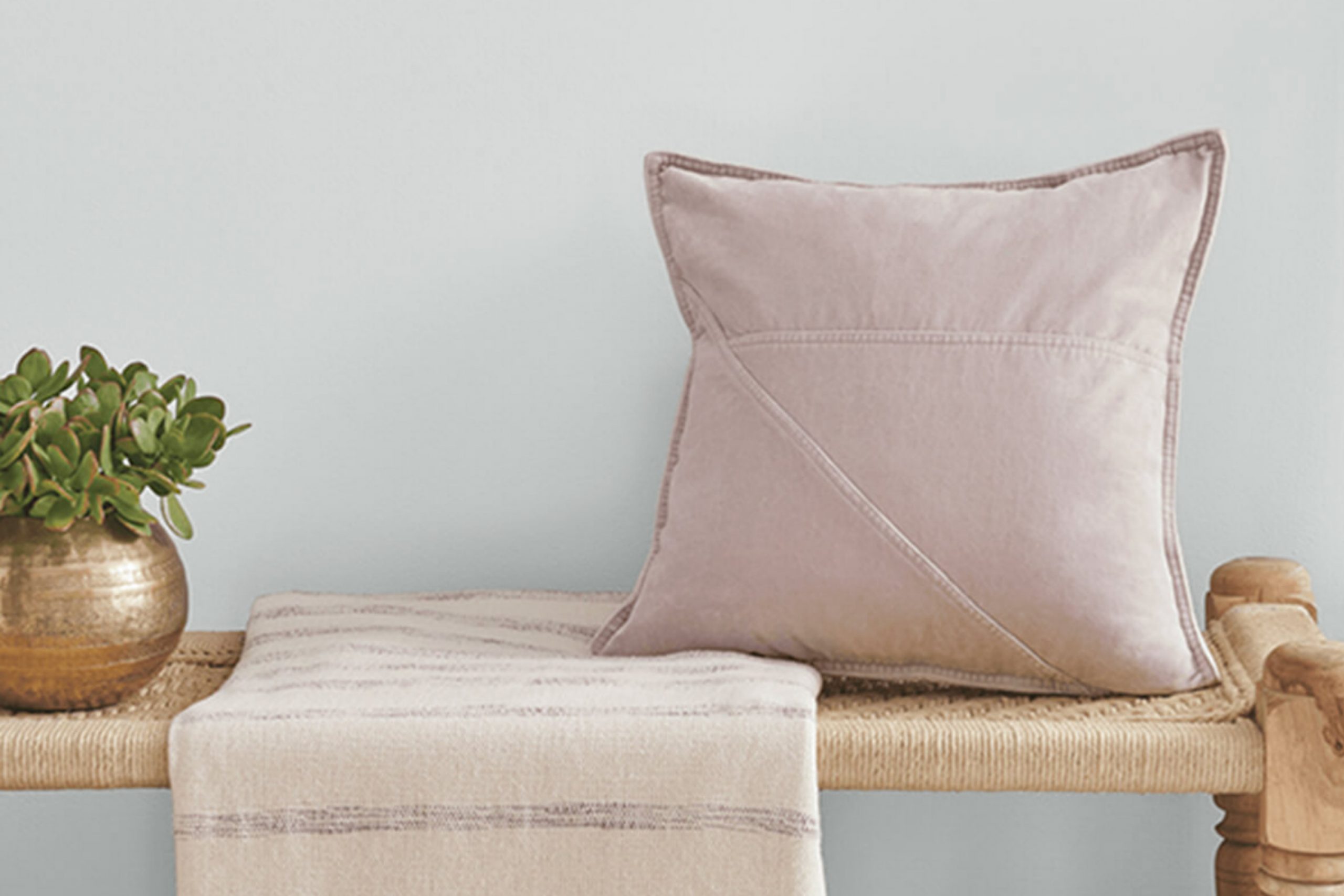
When you choose a color for your home, you want something that not only looks great but also sets the right mood. SW 9636 Windchill by Sherwin Williams does just that. It’s a color that breathes ease and lightness into any space. Imagine a shade of paint that brings the crisp freshness of a cool breeze indoors. Windchill, with its soft and subtle hue, offers a gentle atmosphere perfect for any room.
The beauty of Windchill lies in its versatility. It has a way of making spaces feel open and refreshed, like you’ve opened all the windows on a lovely day. Whether you’re painting a living room, a bedroom, or even a small nook, this shade adapts beautifully. Its light tone works well with both modern and traditional decors, providing you with a reliable backdrop for everyday living.
Pair Windchill with deeper blues or grays for a striking contrast, or keep it simple with whites and pastels for an airy feel. Whatever your style, Windchill has the ability to unify your space, making it feel cohesive and inviting.
You’ll find this color makes your home not just a place to live, but a more relaxed and enjoyable environment.
What Color Is Windchill SW 9636 by Sherwin Williams?
Windchill SW 9636 by Sherwin-Williams is a soft and calming shade of blue-gray that works wonderfully in various interior design styles. Its gentle hue has a soothing effect, making it a great choice for spaces where relaxation is key, such as bedrooms or living rooms. The subtle hint of blue adds a touch of calmness, while the gray undertone keeps it neutral and versatile.
This color fits well in coastal-themed interiors, where it pairs beautifully with natural elements like light wood and rattan. In modern or minimalist spaces, Windchill can serve as a peaceful backdrop that allows furnishings and decor to stand out. When used in Scandinavian interiors, it complements the clean lines and cozy textures typical of this style, especially when combined with white or off-white tones.
Windchill also pairs effectively with materials like marble, linen, and cotton. These materials enhance the room’s light and airy feel, creating a welcoming atmosphere. Additionally, metals like brushed nickel or stainless steel can add a contemporary edge, providing a nice contrast with the softness of the color. Overall, Windchill SW 9636 is a versatile color that brings a sense of calm to any room it graces.

Is Windchill SW 9636 by Sherwin Williams Warm or Cool color?
Windchill SW 9636 by Sherwin Williams is a soft, muted gray color that can bring a refreshing and balanced feel to any home. Its gentle, understated tone makes it a versatile choice for various spaces, fitting well in both modern and traditional settings.
The color’s lightness can help make small rooms appear larger and brighter, reflecting light effectively to create an open and airy vibe. It pairs well with whites and other neutrals, allowing for easy coordination with furniture and decor.
In living rooms, Windchill SW 9636 can provide a calm backdrop, letting colorful accessories stand out. In bedrooms, it offers a soothing atmosphere that promotes relaxation. Kitchens and bathrooms can benefit from its clean and fresh look, complementing stainless steel or white fixtures. Overall, this color adds a subtle touch of elegance without overpowering other design elements, making it a popular choice for homeowners looking for a neutral but stylish paint option.
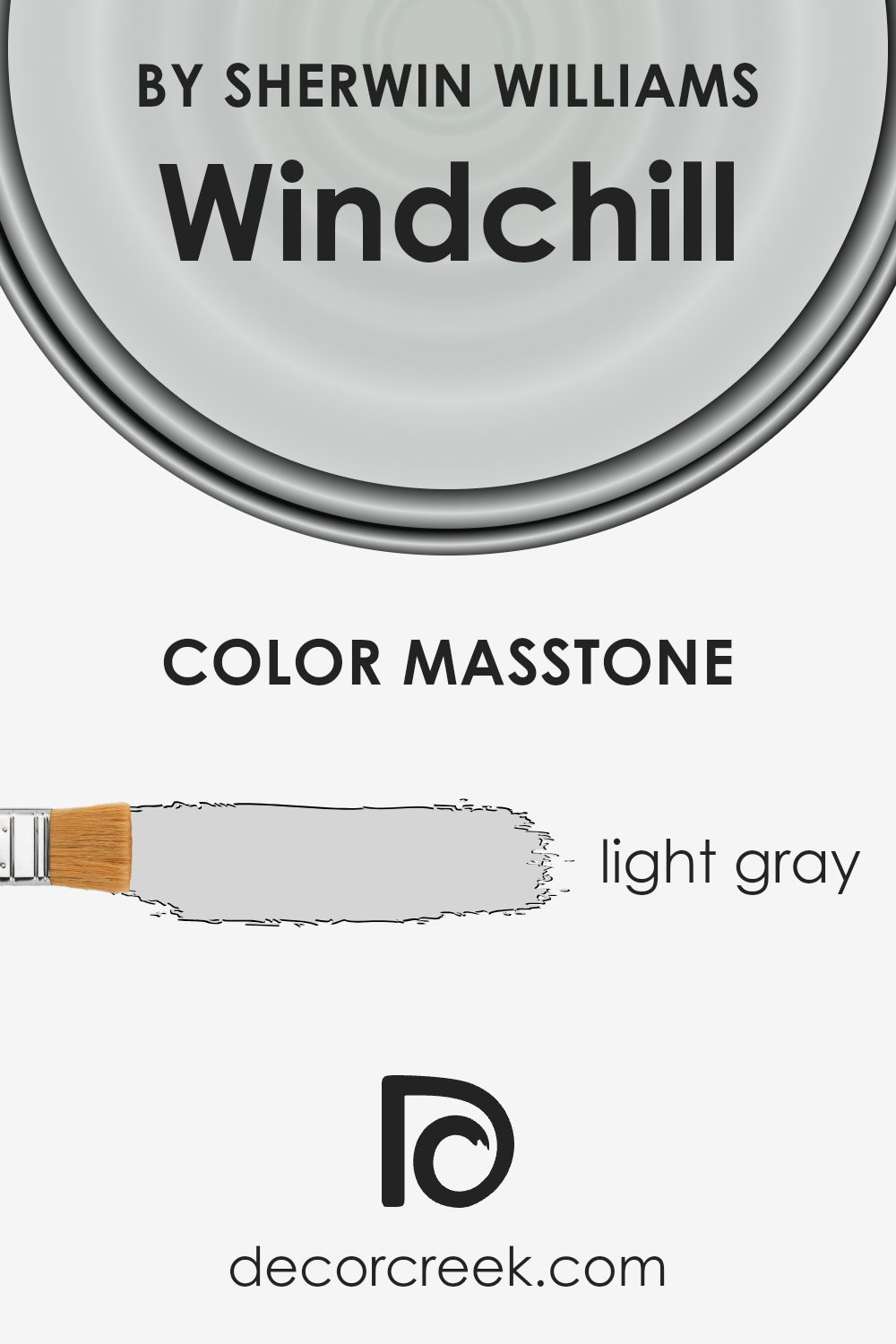
What is the Masstone of the Windchill SW 9636 by Sherwin Williams?
Windchill SW 9636 by Sherwin Williams is a light gray color with a masstone of #D5D5D5. This soft shade of gray is versatile and works well in various home settings. Its light tone reflects natural light, making spaces feel open and airy.
In living rooms, Windchill provides a neutral backdrop that complements a variety of furnishings and decor styles, from modern to traditional. In kitchens and bathrooms, it pairs well with both stainless steel and wood finishes, creating a clean and fresh look. This color also works well in bedrooms, where it promotes a calm and relaxing atmosphere, perfect for unwinding.
Additionally, because it’s a neutral color, it’s easy to accent with bolder colors for a lively touch, or with soft pastels for a gentle appeal. Whether used on all walls or as an accent, Windchill SW 9636’s lightness enhances the overall brightness and comfort of a space.
How Does Lighting Affect Windchill SW 9636 by Sherwin Williams?
Lighting has a big impact on how we perceive colors. The color Windchill by Sherwin Williams, identified as SW 9636, can provide an illustrative example. The color itself is a light, cool-toned hue, almost off-white with a hint of blue. How it appears can vary greatly depending on the lighting conditions.
In natural light, this color tends to look fresh and crisp. However, the exact appearance depends on which direction the room faces. In a north-facing room, natural light is often cooler and softer. As a result, Windchill might appear slightly more muted or even grayer than it does on a paint swatch. The inherent cool tones of the paint can be enhanced by the cool northern light.
In a south-facing room, there is generally more consistent and warmer sunlight throughout the day. Therefore, Windchill may seem brighter and have its coolness dialed down a bit, allowing it to feel slightly warmer in this lighting.
East-facing rooms receive warm, direct sunlight in the morning and cooler light later in the day. So, in the morning, Windchill might look a bit warmer and more glowing. In the afternoon, as the sun moves westward, the cooler tones might become more apparent again.
West-facing rooms have the opposite effect, where the morning light is cooler, enhancing the bluish undertones of Windchill. As the sun sets, the warmer light can make the color appear softer and more inviting.
When it comes to artificial lighting, such as LED or incandescent bulbs, the mood and tone of Windchill can change as well. Warm light bulbs can bring out any inherent warmth, reducing the coolness, whereas cool white LEDs might enhance its crispness. In any setting, understanding how lighting affects a paint color like Windchill can help decide where it will work best in a home.

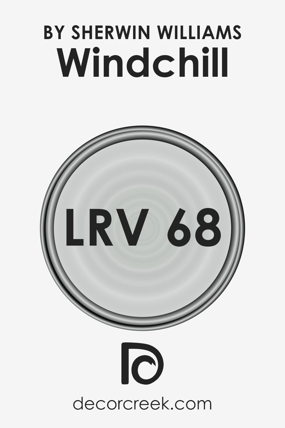
What is the LRV of Windchill SW 9636 by Sherwin Williams?
Light Reflectance Value, or LRV, is a measurement that tells us how much light a color reflects back into space. It’s a percentage, with 0 meaning the color absorbs all light (like black) and 100 meaning the color reflects all light (like white). The higher the LRV, the more light the color reflects. This can impact how a room feels when painted with that color.
For example, a color with a high LRV can make a space feel brighter and larger because it bounces more light around. On the other hand, colors with a low LRV absorb more light, making a room feel smaller or cozier.
Windchill by Sherwin-Williams has an LRV of 68.011, which means it reflects a good amount of light. This makes it a relatively bright and airy color, helping rooms appear more open and light-filled. The way the color interacts with light can make it change throughout the day, appearing slightly different in bright sunlight compared to artificial lighting.
If you use this color on your walls, expect it to enhance the brightness of the room, adding a sense of spaciousness and cheerfulness, especially in areas that might not get a lot of natural light.
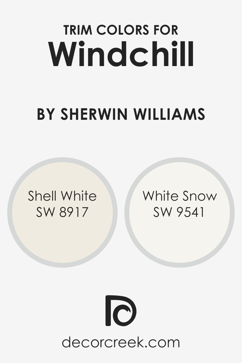
What are the Trim colors of Windchill SW 9636 by Sherwin Williams?
Trim colors are the shades used to highlight the moldings, window frames, and other architectural details within a space, creating contrast and definition against the main wall color. In the case of Windchill SW 9636 by Sherwin Williams, choosing the right trim colors is crucial because they can enhance the overall appearance and feel of a room.
Windchill is a soft and soothing blue that feels refreshing and light. Using the right trim colors alongside it can complement its gentle tones and bring out its subtlety in a room’s decor.
SW 8917 – Shell White and SW 9541 – White Snow serve as excellent trim colors when paired with Windchill. Shell White is a warm, creamy white that offers a soft contrast, adding warmth and depth to the cooler tones of Windchill.
On the other hand, White Snow is a crisp, clean white that provides a bright, fresh look, highlighting details and creating a sharp, polished finish. Together, these trim colors can create distinct visual appeal, helping to define spaces beautifully and make the calming presence of Windchill even more welcoming.
You can see recommended paint colors below:
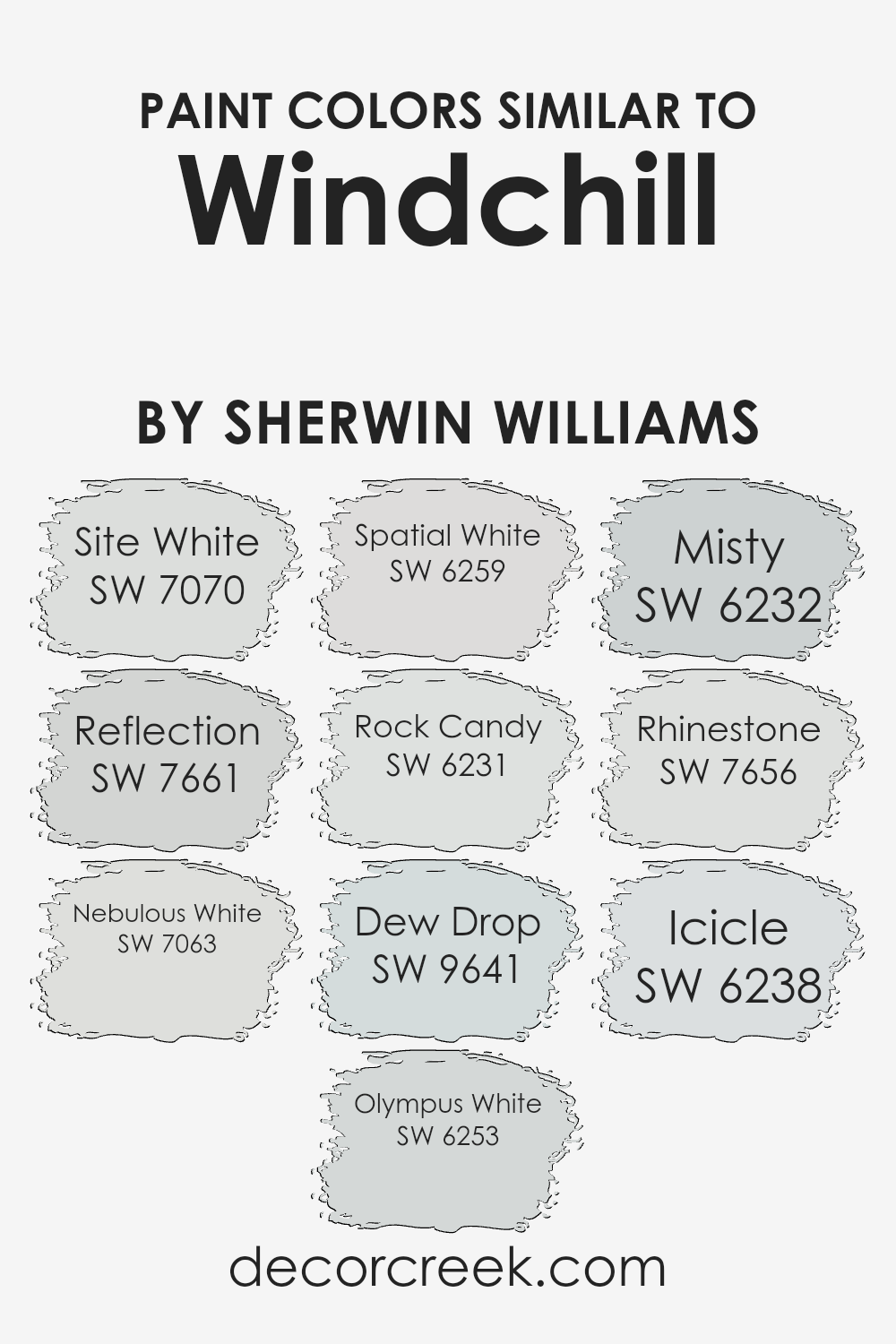
Colors Similar to Windchill SW 9636 by Sherwin Williams
Similar colors play a crucial role in interior design and home decoration by creating a harmonious and visually appealing atmosphere. The colors similar to Sherwin Williams’ Windchill include options like Site White (SW 7070), Reflection (SW 7661), and Nebulous White (SW 7063), which work together to create a soothing and cohesive look.
Site White is a soft, subtle hue like a gentle canvas, ideal for making other colors pop. Reflection offers a reflective quality with a hint of coolness, adding depth and light to any space. Nebulous White provides an airy, cloudy vibe, making rooms feel open and inviting. These colors blend seamlessly, creating a unified flow throughout the home.
In addition, colors like Olympus White (SW 6253) and Spatial White (SW 6259) offer a clean, crisp essence, brightening spaces without overwhelming them. Rock Candy (SW 6231) presents a whisper of blue, perfect for adding a slight hint of color that feels fresh.
Dew Drop (SW 9641) mimics early morning dew with its calm yet vibrant touch, while Misty (SW 6232) gives off a delicate, foggy mood. Rhinestone (SW 7656) sparkles subtly, while Icicle (SW 6238) provides a cool, icy whisper. Together, these similar colors help maintain a peaceful and coordinated environment, perfect for any home.
You can see recommended paint colors below:
- SW 7070 Site White
- SW 7661 Reflection
- SW 7063 Nebulous White
- SW 6253 Olympus White
- SW 6259 Spatial White
- SW 6231 Rock Candy
- SW 9641 Dew Drop
- SW 6232 Misty
- SW 7656 Rhinestone
- SW 6238 Icicle
How to Use Windchill SW 9636 by Sherwin Williams In Your Home?
Windchill SW 9636 by Sherwin Williams is a soft, light gray paint color that can bring a fresh and airy feel to any room in your home. Its subtle hue makes it versatile, allowing it to work well in various spaces like living rooms, bedrooms, or even bathrooms.
It reflects light beautifully, which can help make smaller rooms feel larger and more open. You can use Windchill on all walls for a uniform look or pair it with white trim to create a clean, crisp contrast. This color serves as a great backdrop for both modern and traditional decor, complementing neutral palettes and allowing bolder colors to stand out.
Whether you want to refresh your home’s overall look or simply add a touch of softness and warmth to a particular room, Windchill SW 9636 is a great choice for creating a welcoming and comfortable environment.
Windchill SW 9636 by Sherwin Williams vs Reflection SW 7661 by Sherwin Williams
Windchill SW 9636 is a soft, cool color with a hint of green that gives it an airy and light feel. It’s part of the Sherwin Williams line and often feels fresh and gentle, making spaces appear open and welcoming.
On the other hand, Reflection SW 7661 is a light gray that has a calm and neutral quality to it. Reflection adds a sophisticated touch without being overpowering and tends to give rooms a modern and sleek appearance. Both colors have a cool undertone, but Windchill has that slight green tint, whereas Reflection is purely gray.
Windchill suits spaces that aim for an invigorating yet understated atmosphere, while Reflection fits settings that seek a clean, minimalist look. When deciding between the two, consider whether you prefer the subtle green of Windchill or the straightforward neutrality of Reflection. Both colors can create a peaceful and inviting home environment.
You can see recommended paint color below:
- SW 7661 Reflection

Windchill SW 9636 by Sherwin Williams vs Olympus White SW 6253 by Sherwin Williams
Windchill SW 9636 and Olympus White SW 6253 by Sherwin Williams are both soft, versatile colors, but they have distinct characteristics. Windchill is a light, cool minty green that brings a fresh and airy feel to a space. It works well in rooms where you want a hint of color without being overpowering, adding a touch of nature-inspired calmness.
On the other hand, Olympus White is a soft, cool gray with a slight blue undertone. It’s more neutral compared to Windchill, making it a great backdrop that pairs nicely with both warm and cool tones.
While Windchill adds a refreshing vibe, Olympus White offers a more subtle, modern look. Both colors are excellent choices for creating a light and open feel, but Windchill offers a bit more color, while Olympus White provides a more subdued and contemporary appearance.
You can see recommended paint color below:

Windchill SW 9636 by Sherwin Williams vs Site White SW 7070 by Sherwin Williams
Windchill SW 9636 is a gentle, soft green that brings a hint of minty freshness to a space. It’s light and airy, ideal for creating a calm and refreshing atmosphere. The subtle green undertone is perfect for those who want to add a touch of color without overwhelming a room.
On the other hand, Site White SW 7070 is a cool, crisp white. With its slight gray undertone, it provides a clean and modern look, making it versatile enough to pair with almost any color scheme. It’s excellent for brightening a room and giving it a spacious feel.
Together, Windchill and Site White can create a balanced and harmonious look. Windchill adds a soft touch of color that contrasts nicely with the purity of Site White, resulting in a fresh and inviting environment. Whether used alone or together, both colors offer simple elegance and versatility for any home.
You can see recommended paint color below:

Windchill SW 9636 by Sherwin Williams vs Rhinestone SW 7656 by Sherwin Williams
Windchill SW 9636 and Rhinestone SW 7656 by Sherwin Williams are both light, neutral shades. Windchill is a soft, pale blue with a hint of grey, giving it a cool and refreshing feel. It works well in spaces where you want a relaxed and airy atmosphere. Rhinestone, on the other hand, is more of a light grey with subtle blue undertones, making it slightly more neutral while still maintaining a crisp, clean look.
Both colors are versatile and can be paired with a variety of other shades. However, Windchill’s slight blue tint can make it feel more lively compared to the understated and calming tone of Rhinestone.
If you’re looking for a color that subtly suggests more color without being overwhelming, Windchill may be the better choice, while Rhinestone offers a classic, neutral backdrop. Both are excellent for adding lightness to a room, though they create slightly different moods.
You can see recommended paint color below:

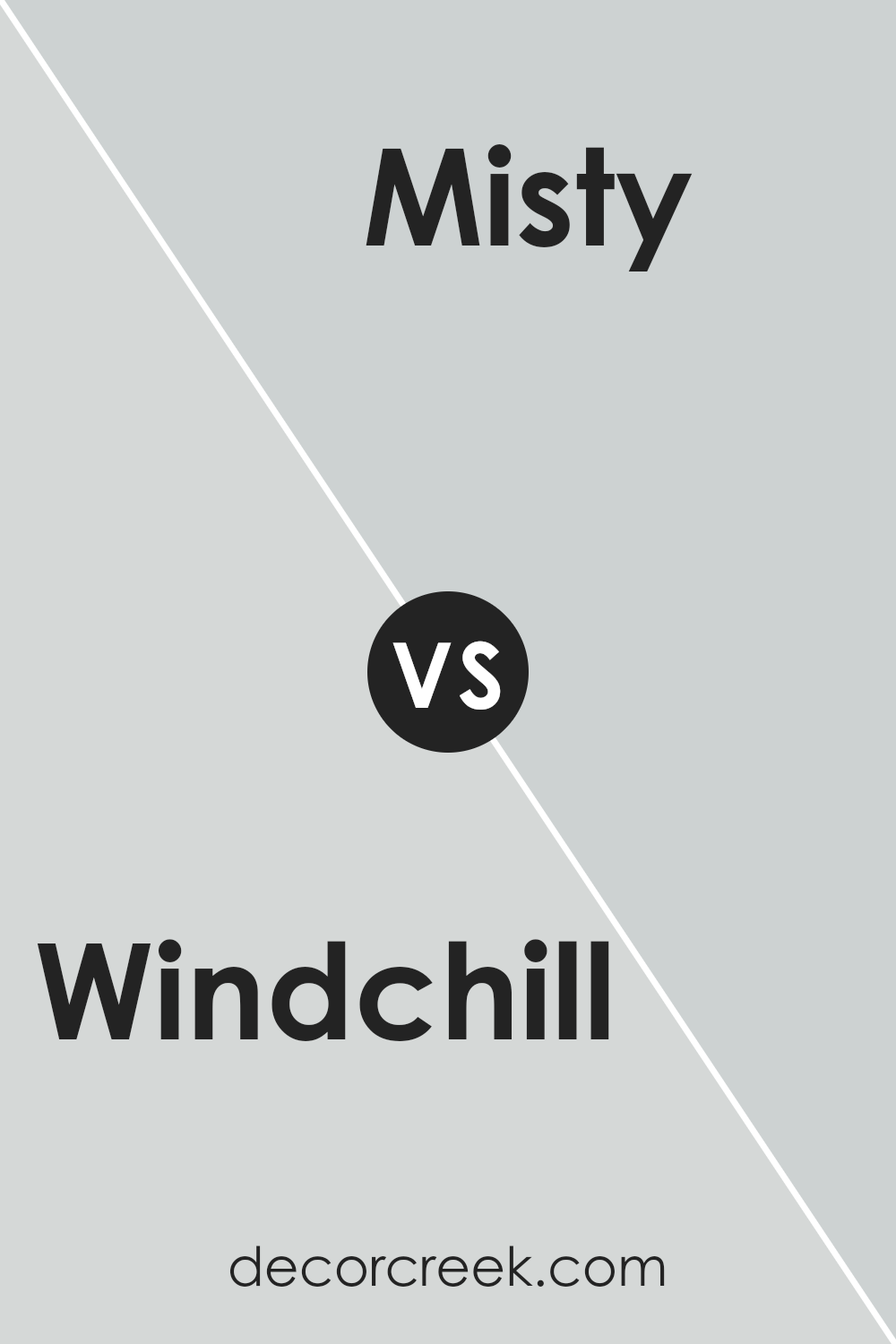
Windchill SW 9636 by Sherwin Williams vs Misty SW 6232 by Sherwin Williams
Windchill (SW 9636) and Misty (SW 6232) by Sherwin Williams are both soft, cool colors, but they offer different vibes. Windchill is a pale, icy blue with a hint of gray, creating a fresh and airy feel. It’s perfect for spaces where you want a light and breezy atmosphere, like bathrooms or laundry rooms.
On the other hand, Misty is a light gray with blue undertones. It’s slightly darker than Windchill and feels a bit more grounded and cozy. Misty works well in living rooms or bedrooms, offering a subtle warmth while still keeping things calm.
Both colors complement each other well and can be used together for a cohesive look, with Windchill as an accent against Misty’s backdrop. These shades let you play with light and mood without being too bold or overwhelming.
You can see recommended paint color below:
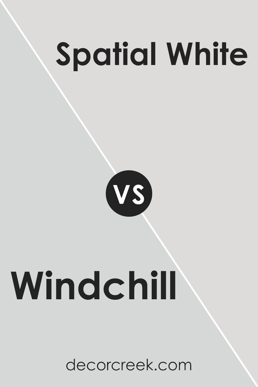
Windchill SW 9636 by Sherwin Williams vs Spatial White SW 6259 by Sherwin Williams
Windchill SW 9636 and Spatial White SW 6259 from Sherwin Williams are both light and neutral colors but have distinct tones. Windchill is a cool, soft greenish-gray that can create a fresh and airy atmosphere in a room. It has subtle green undertones that can be soothing and work well in spaces needing a calming and refreshing vibe. This color is versatile, pairing nicely with other cool-toned shades like blues and grays.
Spatial White, on the other hand, is a warm, off-white with subtle beige undertones. It offers a gentle warmth, making spaces feel cozy and inviting. It is an excellent choice for creating a more traditional, homely environment and pairs well with both warm and cool accents.
Overall, while Windchill offers a cooler, more refreshing touch, Spatial White provides a comforting warmth, making them suitable for different moods and settings in home decor.
You can see recommended paint color below:
- SW 6259 Spatial White
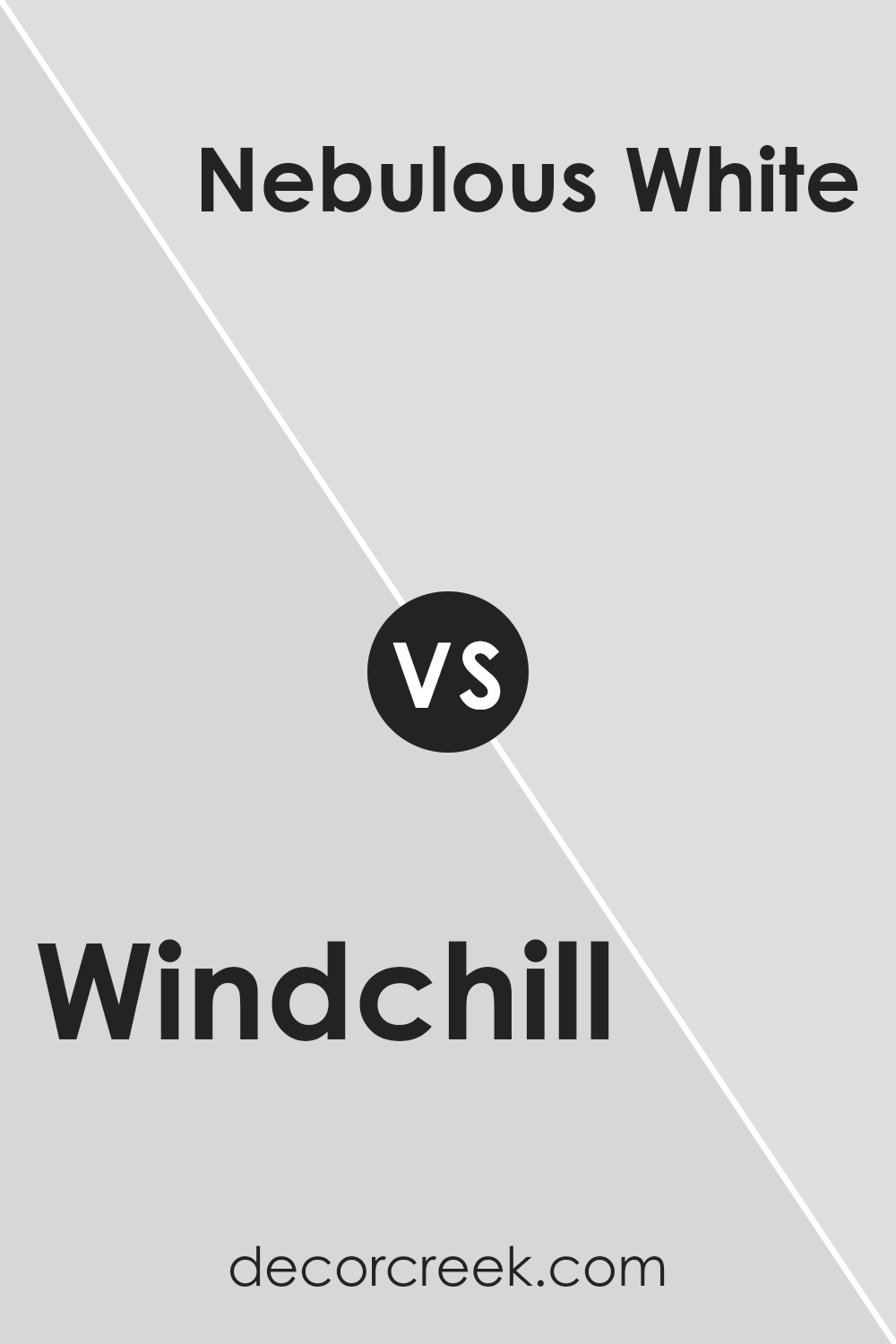
Windchill SW 9636 by Sherwin Williams vs Nebulous White SW 7063 by Sherwin Williams
Windchill SW 9636 by Sherwin Williams is a cool, light blue-green that feels refreshing and airy. It’s a great choice for creating a calm and soothing space. It can bring a touch of nature indoors, reminiscent of a gentle breeze. On the other hand, Nebulous White SW 7063 is more of a soft gray with subtle warm undertones. This color is versatile and neutral, making it perfect for backgrounds or spaces where a clean, minimal look is desired.
While both colors are on the lighter side, Windchill adds a bit more color and a refreshing vibe, whereas Nebulous White keeps things more understated and simple.
If you want a room to feel a bit cooler and lively, Windchill might be the way to go. If you prefer a backdrop that’s easy to pair with other colors and furnishings, Nebulous White might suit your needs. Both create a light, airy atmosphere but in different ways.
You can see recommended paint color below:
Windchill SW 9636 by Sherwin Williams vs Rock Candy SW 6231 by Sherwin Williams
Windchill SW 9636 and Rock Candy SW 6231, both from Sherwin Williams, are very light and soft colors, yet they offer distinct vibes. Windchill SW 9636 is a gentle, cool-toned color with a hint of minty freshness. It’s perfect for spaces where you want to feel refreshed and lively. It pairs well with other cool colors and works beautifully in areas that need a touch of brightness.
On the other hand, Rock Candy SW 6231 is a bit more subdued with a light blue-gray tint. It’s soothing and calming, making it a great choice for spaces where relaxation is key, like bedrooms or bathrooms.
While both colors are on the cooler side of the spectrum, Windchill has that slightly livelier twist, whereas Rock Candy leans more towards a tranquil and muted feel. Both can complement each other or stand alone as clean and airy choices.
You can see recommended paint color below:

Windchill SW 9636 by Sherwin Williams vs Icicle SW 6238 by Sherwin Williams
Windchill SW 9636 and Icicle SW 6238 by Sherwin Williams are both cool-toned colors but with distinct characteristics. Windchill is a soft, light minty green, which brings a fresh and airy vibe to spaces.
Its gentle hue can brighten a room without overwhelming it, creating a clean and refreshing environment. On the other hand, Icicle is a pale blue-gray color that exudes a calm, airy feel. It leans more toward a neutral palette, making it versatile for various rooms. While Windchill adds a touch of subtle color, Icicle offers a more muted, sophisticated look.
Both colors are ideal for creating a light and open atmosphere in any space, but Windchill adds a bit more liveliness with its hint of green, whereas Icicle provides a more understated, relaxing backdrop.
You can see recommended paint color below:

Windchill SW 9636 by Sherwin Williams vs Dew Drop SW 9641 by Sherwin Williams
Windchill (SW 9636) and Dew Drop (SW 9641), both by Sherwin Williams, are light, refreshing colors that can brighten up any space. Windchill is a soft, cool-toned pale blue with a hint of gray. It feels crisp, clean, and airy, making it a great choice for those wanting a subtle touch of color while maintaining a neutral look.
On the other hand, Dew Drop is also a light blue, but it leans more towards a gentle green tone. This gives it a slightly warmer and more inviting feel compared to Windchill. Dew Drop can bring a natural, calming vibe to a room.
Both colors are versatile and can work well in various spaces, such as bedrooms, bathrooms, or living areas. Windchill offers a more traditional cool blue-gray appearance, while Dew Drop adds a soft, natural touch with its green undertone.
You can see recommended paint color below:

Conclusion
After reading about SW 9636 Windchill by Sherwin Williams, I feel excited to share my thoughts. Windchill is a color that feels fresh and calming. It’s like a gentle breeze on a sunny day. This shade of blue feels cool and neat, kind of like a clear sky or the ocean on a peaceful afternoon.
I think Windchill would make any room look brighter and more peaceful. It’s not too dark or too light, which makes it a great choice for many kinds of rooms. Whether it’s a bedroom, a living room, or even a kitchen, this color makes a room feel cozy and nice. It helps to lighten up the place, making everything look more open.
Using Windchill feels like a friendly invitation to relax and enjoy the room. It pairs well with lots of other colors too, like whites, grays, or even some gentle greens. This means you can mix and match easily if you like different colors.
Overall, Windchill is a wonderful color to consider if you want a room to feel inviting and calm. It’s a simple way to change the way a room feels without making it seem too busy. I think anyone looking to freshen up their home would love it!

Ever wished paint sampling was as easy as sticking a sticker? Guess what? Now it is! Discover Samplize's unique Peel & Stick samples.
Get paint samples

