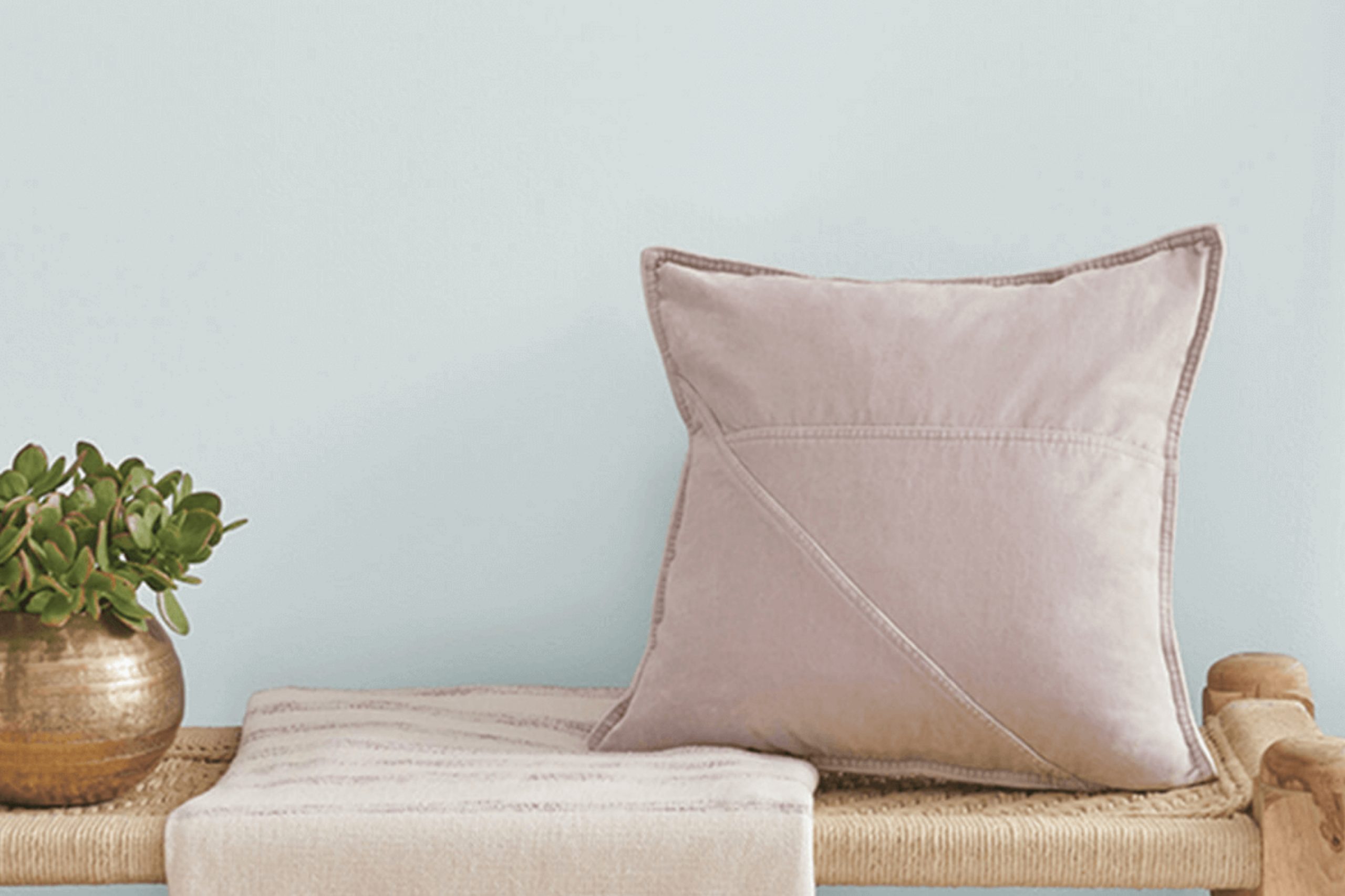
This soft, muted shade of green immediately brought a sense of calm and freshness to my mind. It reminded me of early morning walks in a garden, where everything is quiet and the air feels clean and renewed. Dew Drop has this unique ability to add a gentle touch to any space, making it feel more inviting and soothing.
Choosing a paint color can feel overwhelming, but Dew Drop makes the choice simpler. It has a subtle charm that works well in various settings.
Whether you are thinking about repainting a bedroom to create a peaceful retreat or want to bring a touch of nature into your living room, Dew Drop can be a great option. It pairs well with both neutral tones and bolder accents, giving you the flexibility to express your personal style without much fuss.
The name “Dew Drop” captures the essence of this shade perfectly. It feels fresh and light, like the first breath of spring. Applying it to your walls can transform your space into a serene oasis, away from the hustle and bustle of everyday life.
With Dew Drop, you can create an environment where you can truly relax and find peace.
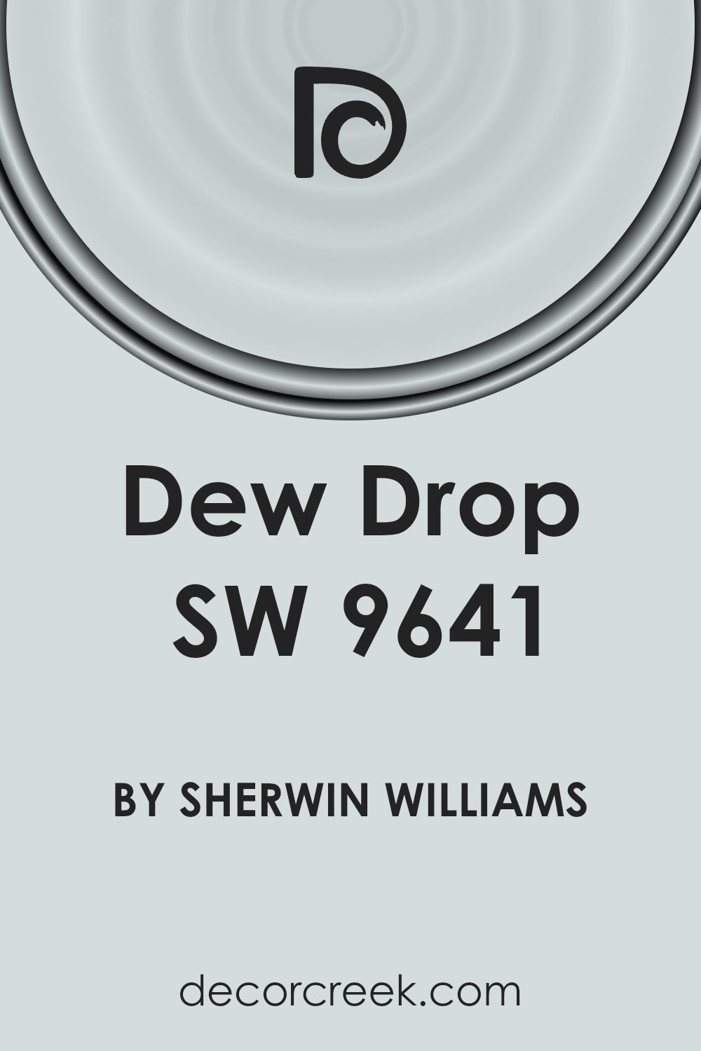
What Color Is Dew Drop SW 9641 by Sherwin Williams?
Dew Drop SW 9641 by Sherwin Williams is a soft, muted green with a hint of blue, giving it a calm and refreshing feel. It’s a versatile color that brings a subtle touch of nature into a room, reminiscent of a gentle morning dew.
This shade works beautifully in coastal or cottage-style interiors, where it can complement other light and airy colors. It also fits well in modern and minimalist settings, offering a refreshing pop of color without being overwhelming.
Pair Dew Drop with natural materials like light wood, wicker, or rattan to enhance its organic vibe. It looks great alongside creamy whites and soft grays, which help to balance its cool tones. Textures such as linen or cotton in curtains or upholstery add a comfortable and welcoming touch.
For a bit of contrast, include metallic accents in silver or brushed nickel, which offer a sleek counterpoint to the softness of the color.
In kitchens and bathrooms, Dew Drop can brighten up small spaces, especially when used on cabinetry or walls. Overall, its gentle hue is perfect for creating a relaxing and inviting atmosphere, making it ideal for bedrooms or living areas where comfort is key.
Is Dew Drop SW 9641 by Sherwin Williams Warm or Cool color?
Dew Drop by Sherwin Williams is a soft, light green paint color that brings a fresh, natural feel to any room. It’s known for its gentle and calming effect, making it an excellent choice for spaces where you want to relax, like bedrooms or living rooms.
The light green shade is versatile, pairing well with both neutral and bold colors, allowing you to create a balanced and harmonious look in your home.
This color works well in rooms with plenty of natural light, as it reflects and amplifies the brightness, giving the room an airy and open feel. However, even in darker spaces, Dew Drop can add a touch of brightness and warmth. It’s an ideal choice for those looking to add a hint of nature indoors, providing a subtle backdrop that doesn’t overpower the room’s existing decorations and furniture. Its calming presence makes any space feel inviting and comfortable.
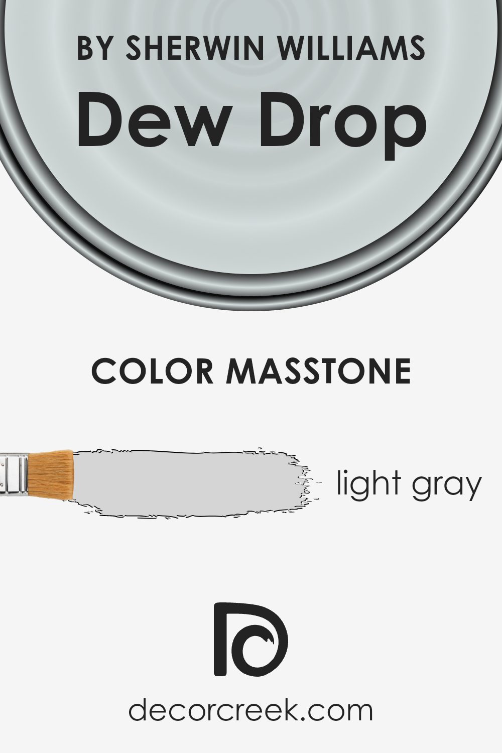
What is the Masstone of the Dew Drop SW 9641 by Sherwin Williams?
Dew Drop, a light gray color identified as SW 9641 by Sherwin Williams, brings a subtle and calming atmosphere to home interiors. Its soft, neutral tone makes it versatile, effortlessly blending with various design styles. The light gray hue acts as an excellent backdrop, allowing furniture and decor to stand out.
In living rooms, Dew Drop creates a relaxing environment, making it comfortable for social gatherings or quiet evenings at home. In bedrooms, its gentle color helps foster a restful and peaceful sleep space, encouraging relaxation.
Kitchens painted in Dew Drop feel fresh and clean, providing a bright, inviting area to cook and dine. The color’s understated nature means it pairs well with both bold and subtle accents, providing flexibility in decorating. Additionally, Dew Drop’s lightness can make small rooms feel more open and airy, enhancing the sense of space without overwhelming the senses. This makes it a practical choice for any home.
How Does Lighting Affect Dew Drop SW 9641 by Sherwin Williams?
Lighting plays a big role in how we perceive colors. The same paint color can look different depending on the light source. Natural light changes throughout the day and varies based on the room’s direction. Artificial light, such as LEDs or incandescent bulbs, also affects color.
The paint color Dew Drop SW 9641 by Sherwin Williams is a light, soft green with warm undertones. When exposed to different lighting conditions, this color can appear to shift slightly, which makes it versatile yet sometimes unpredictable.
In north-facing rooms, the light tends to be cooler and more constant throughout the day. Colors in these rooms can appear more muted. For Dew Drop, it might look a bit more subdued or gray, which can be calming but less vibrant.
South-facing rooms receive the most consistent bright light throughout the day. In this setting, Dew Drop can appear warm and more vibrant. The natural sunlight can enhance its green tones, bringing out the warmth and making it feel cozy and inviting.
East-facing rooms get bright, warm light in the morning but become cooler later in the day. Dew Drop will look warmer and more lively in the morning light, with the green tones becoming more pronounced. In the afternoon and evening, the color may look more muted and cooler.
West-facing rooms have cooler light in the morning and warmer light in the afternoon. Dew Drop will appear softer and more neutral in the morning, turning richer and warmer as the sun sets, enhancing its green hue during late afternoons and early evenings.
Artificial lighting adds another layer of complexity. Warm bulbs can make Dew Drop appear more yellow, while cool bulbs might enhance the gray undertones. It’s important to test paint samples under different lighting conditions to see how the color shifts throughout the day.

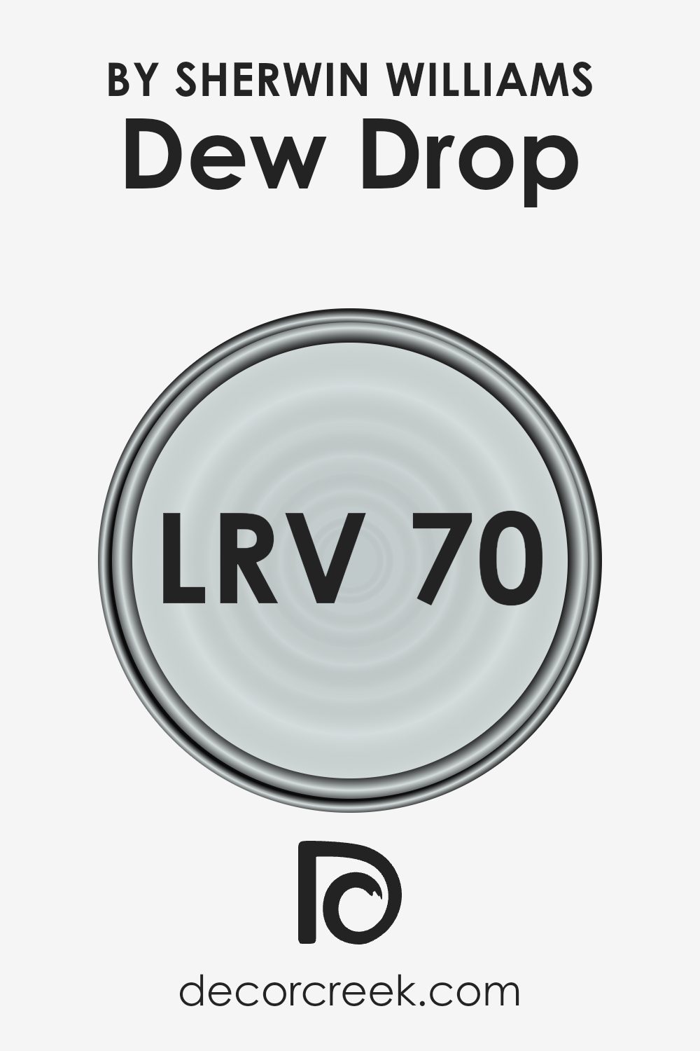
What is the LRV of Dew Drop SW 9641 by Sherwin Williams?
LRV, or Light Reflectance Value, is a measurement that tells you how much light a paint color will reflect when it’s on a wall. It is measured on a scale from 0 to 100, where 0 means the paint absorbs all the light and is completely black, and 100 means it reflects all the light and is completely white.
When choosing paint, the LRV is important because it affects how light or dark a color will appear in a space. A higher LRV means the paint color reflects more light and can make a room feel brighter and larger, while a lower LRV absorbs more light, making the space feel cozier and smaller.
For a color with an LRV of 70.431, it means the paint reflects a good amount of light. This makes it a great choice for rooms where you want to create a bright and airy atmosphere. Such a color can help make a room feel more open and inviting, especially in spaces that don’t get much natural light.
It won’t appear too stark or overly bright like a white might, but it will still bounce light around the room, enhancing the overall lightness of the space. This is beneficial for maintaining a light and fresh feel without overwhelming the room with brightness.
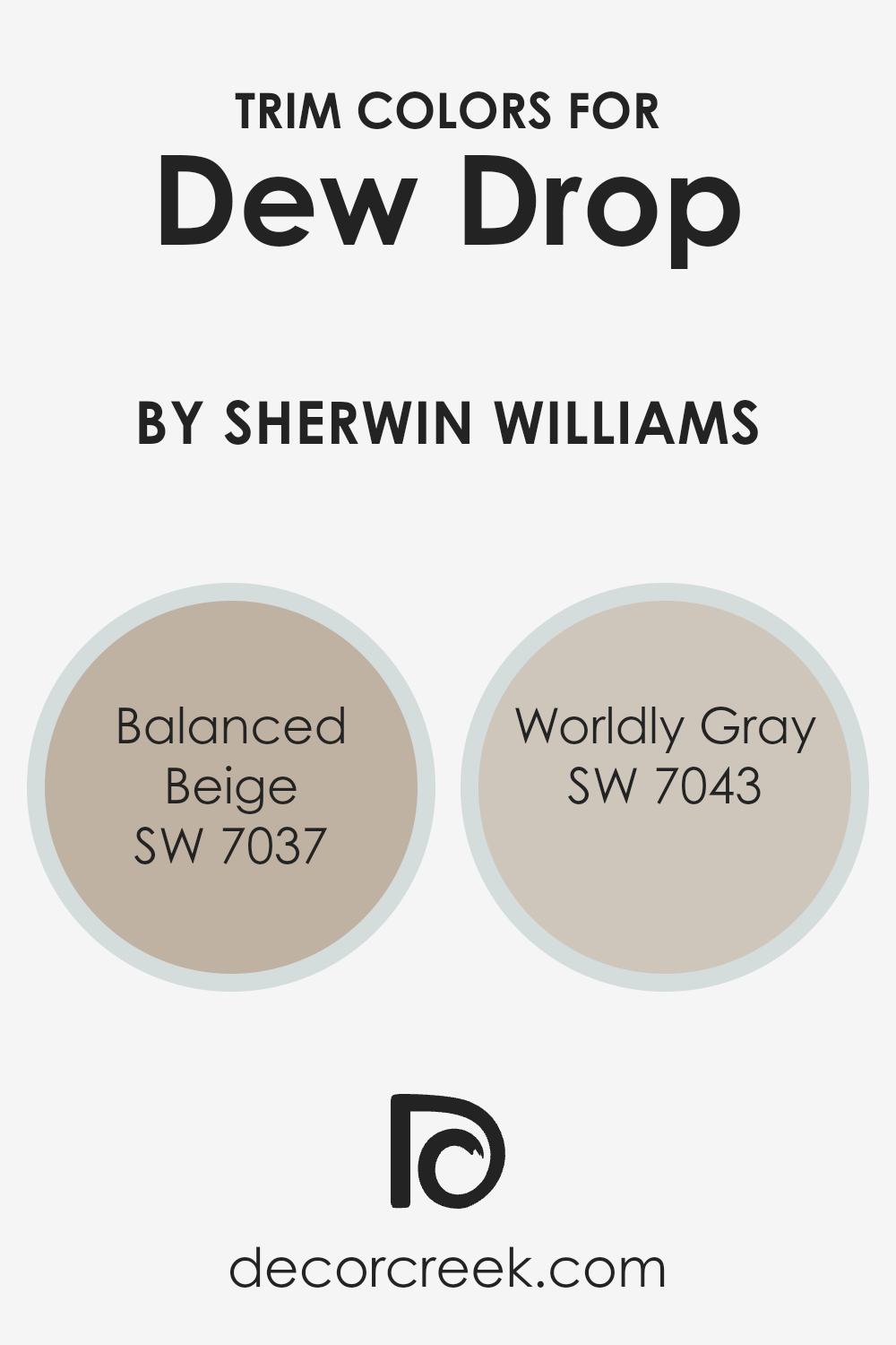
What are the Trim colors of Dew Drop SW 9641 by Sherwin Williams?
Trim colors are used to highlight and define the edges and details of a room, such as baseboards, moldings, window frames, and doorways. They add contrast and can complement or enhance the main wall color, making the overall design more cohesive and aesthetically pleasing.
For Dew Drop SW 9641 by Sherwin Williams, a soft and gentle green, choosing the right trim color can accentuate its refreshing quality while adding depth to the space. Using trim colors like SW 7037 – Balanced Beige or SW 7043 – Worldly Gray can create an inviting and harmonious atmosphere that balances the room’s overall color palette.
Balanced Beige is a warm, neutral color with a touch of earthiness, making it versatile enough to be paired with the fresh, clean vibe of Dew Drop. This subtle beige helps ground the space without taking too much attention away from the main wall color.
On the other hand, Worldly Gray offers a delicate mix of warm and cool tones, providing a more contemporary contrast that still respects the peaceful feel of Dew Drop.
Worldly Gray can add a modern touch, creating a gentle yet defining boundary that complements the soothing green hues of the walls.
You can see recommended paint colors below:
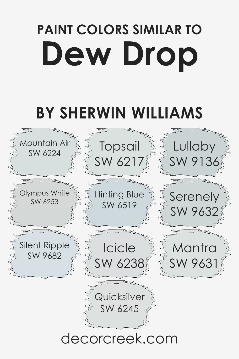
Colors Similar to Dew Drop SW 9641 by Sherwin Williams
Similar colors to Dew Drop (SW 9641) by Sherwin Williams play an important role in creating a harmonious and calming environment. These colors, with their gentle undertones and soft hues, work well together to provide a balanced and cohesive look in any space.
Choosing shades like Mountain Air (SW 6224) gives you a breezy, light feel that brightens up a room. Olympus White (SW 6253) has a cool, airy tint that flows seamlessly with Dew Drop. Silent Ripple (SW 9682) offers a subtle, muted tone that adds depth without overwhelming the senses.
Quicksilver (SW 6245) has a soft, grayish-blue hue that pairs perfectly with other similar shades, making it a versatile choice for various rooms. Topsail (SW 6217) adds a hint of aqua for a refreshing feel, while Hinting Blue (SW 6519) brings a gentle whisper of color reminiscent of clear skies.
Icicle (SW 6238) provides a just-barely-there whisper of blue that perfectly complements these tones. Lullaby (SW 9136) offers a peaceful, dreamy blue that calms the mind. Serenely (SW 9632) and Mantra (SW 9631) both carry soft, understated tones that enhance the overall serene ambiance.
These similar colors not only enhance Dew Drop but also bring a cohesive, soothing atmosphere to a room.
You can see recommended paint colors below:
- SW 6224 Mountain Air
- SW 6253 Olympus White
- SW 9682 Silent Ripple
- SW 6245 Quicksilver
- SW 6217 Topsail
- SW 6519 Hinting Blue
- SW 6238 Icicle
- SW 9136 Lullaby
- SW 9632 Serenely
- SW 9631 Mantra
How to Use Dew Drop SW 9641 by Sherwin Williams In Your Home?
Dew Drop SW 9641 by Sherwin Williams is a soft, light green paint that can bring a fresh and calming feel to any space in your home. It’s a great choice if you want to add a hint of color while keeping things light and airy. This shade can work well in a variety of rooms.
In living rooms, it gives a pleasant backdrop that pairs nicely with neutral furniture and natural textures like wood or rattan. For bedrooms, Dew Drop can create a soothing atmosphere that promotes restful sleep, especially when matched with white or cream bedding and curtains.
In kitchens or bathrooms, it can add a gentle pop of color, perfect for creating a refreshing and clean look. You can combine it with white cabinets or light countertops for a balanced and harmonious appearance. Overall, Dew Drop SW 9641 is versatile, making it easy to integrate into different styles and areas of your home.
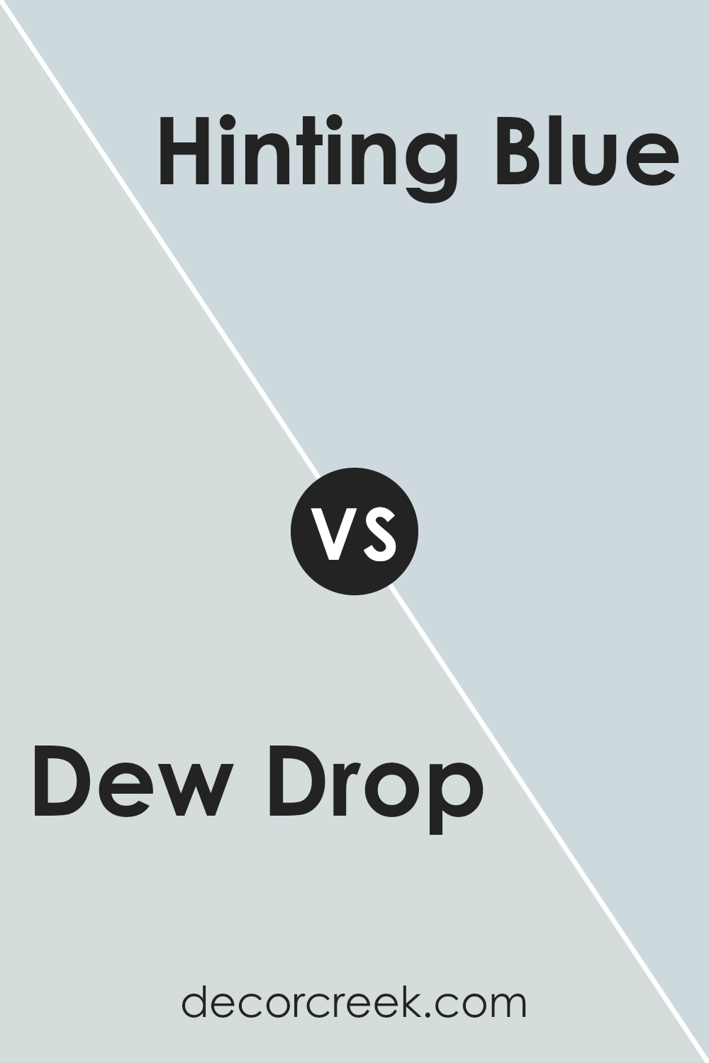
Dew Drop SW 9641 by Sherwin Williams vs Hinting Blue SW 6519 by Sherwin Williams
Dew Drop SW 9641 and Hinting Blue SW 6519 by Sherwin Williams are both calming colors, but they offer different vibes. Dew Drop is a soft, pale green that feels light and airy, like a gentle breeze or morning mist. It’s refreshing and brings a sense of calm and cleanliness to a space.
On the other hand, Hinting Blue is a subtle and soft blue with a hint of gray, sort of like the sky on a clear day when the sun isn’t too strong. It carries a touch of coolness, offering a relaxing and soothing feel.
While Dew Drop leans towards revitalizing spaces with its delicate green tint, Hinting Blue provides a more muted, peaceful environment with its gentle blue-gray hue. Both colors are versatile for homes and work well in spaces designed for relaxation, like bedrooms or living rooms.
You can see recommended paint color below:
- SW 6519 Hinting Blue
Dew Drop SW 9641 by Sherwin Williams vs Quicksilver SW 6245 by Sherwin Williams
Dew Drop (SW 9641) and Quicksilver (SW 6245) are two subtle colors by Sherwin Williams that offer different vibes. Dew Drop is a light, airy shade with green undertones, resembling fresh morning dew. It’s refreshing and lends a lively feel to spaces, making them feel open and bright. This color pairs well with whites and neutrals for a crisp look.
On the other hand, Quicksilver is a soft gray with a hint of blue, providing a cooler and more calming atmosphere. It’s a versatile shade that can be used to create a peaceful environment, ideal for bedrooms or living rooms. Quicksilver pairs nicely with other cool colors and metals, adding to its modern touch.
Both colors are gentle and soothing, yet they bring their own unique character. Dew Drop is more invigorating, while Quicksilver is calming, allowing different moods depending on your preference.
You can see recommended paint color below:

Dew Drop SW 9641 by Sherwin Williams vs Topsail SW 6217 by Sherwin Williams
Dew Drop SW 9641 and Topsail SW 6217 by Sherwin Williams are both light colors, but they bring different feelings and uses to a space. Dew Drop is a soft, muted green with a touch of gray, offering a calm and refreshing vibe. It works well in spaces where you want a gentle, natural touch.
Topsail, on the other hand, is a very light blue-gray color, which adds a cool and airy sense to any room. While both colors are light and soft, Dew Drop leans more towards green, and Topsail feels more like a breezy, pale blue.
Dew Drop can add a subtle warmth, whereas Topsail gives a light, breezy coastal feel. Both are versatile enough for bedrooms or bathrooms, but choose Dew Drop for a slightly warmer, earthy feel, and Topsail for a fresh, airy atmosphere. They both go well with whites and neutrals for a clean look.
You can see recommended paint color below:

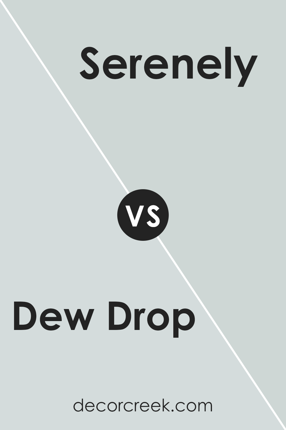
Dew Drop SW 9641 by Sherwin Williams vs Serenely SW 9632 by Sherwin Williams
Dew Drop SW 9641 by Sherwin Williams is a gentle and light greenish-blue color, reminiscent of a morning mist. It has a fresh and airy feel, making it an excellent choice for spaces that seek a touch of calm and openness. On the other hand, Serenely SW 9632 is a cooler and more muted blue with a hint of gray. This color provides a subtle and calming backdrop, ideal for creating a peaceful environment.
While both colors have soothing characteristics, Dew Drop offers a bit more warmth and brightness, which could be great for living areas. Serenely, with its cooler tone, might be more suited for bedrooms or spaces meant for relaxation.
Both colors can work well together, with Dew Drop adding a hint of warmth and Serenely providing a cool, balanced contrast. They each bring a sense of peace, but in slightly different ways, depending on the ambiance you want to create.
You can see recommended paint color below:
Dew Drop SW 9641 by Sherwin Williams vs Icicle SW 6238 by Sherwin Williams
Dew Drop SW 9641 by Sherwin Williams and Icicle SW 6238 by Sherwin Williams are two distinct colors that bring different vibes to a space. Dew Drop is a soft, pale green with a hint of freshness. It’s reminiscent of nature and can add a light, airy feel to a room. On the other hand, Icicle is a cool, light gray with subtle blue undertones. This color is more neutral and calming, offering a modern and clean look.
While Dew Drop can bring a touch of warmth and vitality due to its green tone, Icicle has a more muted and crisp appearance, making it a great backdrop for various design styles. Dew Drop works well in spaces where you want a gentle pop of color without being overwhelming.
In contrast, Icicle serves as an adaptable base, complementing both bold accents and understated decor schemes. Both colors suit different preferences, depending on whether you seek softness or simplicity.
You can see recommended paint color below:
Dew Drop SW 9641 by Sherwin Williams vs Olympus White SW 6253 by Sherwin Williams
Dew Drop SW 9641 and Olympus White SW 6253 are both popular colors from Sherwin Williams, but they have distinct characteristics. Dew Drop is a soft, muted green with a hint of gray. It feels fresh and relaxing, making it a good choice for spaces where you want a calming atmosphere, like a bedroom or bathroom. This color brings a touch of nature indoors and works well with neutral tones and natural materials.
Olympus White, on the other hand, is a light gray with blue undertones. It gives a cool, crisp feel to a room and can make spaces feel larger and more open. This color pairs nicely with both warm and cool color palettes, providing versatility in decor options.
While Dew Drop offers warmth and natural vibes, Olympus White brings a modern and airy feel to interiors. Both colors can serve as lovely backdrops, each adding its unique touch to your home.
You can see recommended paint color below:
Dew Drop SW 9641 by Sherwin Williams vs Lullaby SW 9136 by Sherwin Williams
Dew Drop SW 9641 and Lullaby SW 9136 by Sherwin Williams are both soft, soothing colors, yet they bring distinct moods to a space. Dew Drop is a light, airy shade with a touch of mint, giving it a fresh and clean feel that’s perfect for creating a calm atmosphere.
It has subtle hints of green that can brighten a room without being overpowering. On the other hand, Lullaby is more of a muted, gentle blue-green. It feels slightly deeper and more grounded compared to Dew Drop, bringing a cozy and relaxing vibe.
While Dew Drop can open up a space and make it feel larger and more open, Lullaby adds a bit more depth, making it feel warm and inviting. Both colors work well in spaces designed for relaxation, such as bedrooms or bathrooms, but the choice between them depends on whether you prefer a light and airy or a cozy and comforting ambiance.
You can see recommended paint color below:
- SW 9136 Lullaby
Dew Drop SW 9641 by Sherwin Williams vs Mountain Air SW 6224 by Sherwin Williams
Dew Drop (SW 9641) by Sherwin Williams is a soft, pale green that creates a fresh and calming atmosphere. It’s a versatile color, perfect for spaces where you want a light and airy feel. Dew Drop reflects light beautifully, making rooms seem larger and more open.
On the other hand, Mountain Air (SW 6224) is a light blue with a touch of gray. It gives a cool and soothing vibe to a room. This color brings a sense of peace and relaxation, ideal for bedrooms or any space meant for unwinding.
While both colors promote a tranquil environment, Dew Drop leans towards a slightly warmer green tone, while Mountain Air whispers blue with a hint of gray. Choosing between them depends on whether you want a hint of green or blue in your decor, but both colors are refreshing and easy on the eyes.
You can see recommended paint color below:

Dew Drop SW 9641 by Sherwin Williams vs Mantra SW 9631 by Sherwin Williams
Dew Drop (SW 9641) and Mantra (SW 9631) are both soft, calming colors from Sherwin Williams that can bring a sense of peace to any space. Dew Drop is a light, airy shade with hints of green, giving it a fresh and relaxing feel. It’s perfect for creating a soothing atmosphere in bedrooms or bathrooms.
On the other hand, Mantra offers a slightly deeper tone with a cool, bluish-gray tint. This gives it a more grounded appearance, making it a good fit for spaces where you want a bit more depth while keeping things calm.
Both colors work well with white trim or natural wood furnishings, but Mantra might add a touch more contrast due to its muted gray undertone. Whether choosing Dew Drop’s gentle brightness or Mantra’s subtle depth, both colors can help create a peaceful and inviting environment in your home.
You can see recommended paint color below:
- SW 9631 Mantra
Dew Drop SW 9641 by Sherwin Williams vs Silent Ripple SW 9682 by Sherwin Williams
Dew Drop SW 9641 and Silent Ripple SW 9682 are both soothing and soft colors by Sherwin Williams. Dew Drop is a gentle, light green with a hint of mint, bringing a fresh and airy feel to a space. It tends to evoke a sense of calmness and simplicity, perfect for creating a relaxing atmosphere in a room.
Silent Ripple SW 9682, on the other hand, is a very pale blue-gray. This color gives off a cool, peaceful vibe and works well to make a space feel more open and calming. While Dew Drop leans towards a warmer, earthier tone because of its green hue, Silent Ripple is cooler and more contemporary with its subtle gray undertone.
Both colors are ideal for those looking to create a serene and understated environment, but Dew Drop is better suited for warmth and a touch of nature, while Silent Ripple offers a crisp, clean, modern look.
You can see recommended paint color below:
Dew Drop is a soft, light green that reminds me of new leaves in spring or the fresh morning air. It’s a color that feels refreshing and peaceful.
In a room, Dew Drop can make everything seem brighter and more open. It’s like bringing a bit of the outside into your home.
You could use it in any room you like, whether it’s the living room where everyone gathers, or your bedroom where you start and end your day. Imagine waking up to a gentle shade that makes you feel calm and cheerful.
This color also works nicely with many others. You could match it with white for a crisp look or with blues and yellows to make your room feel happy and welcoming. People might choose it because it’s gentle on the eyes and makes you feel good.
In the end, SW 9641 Dew Drop feels like a breath of fresh air for our homes. It’s easy to like because it makes everything around it feel nicer and more pleasant. I think it’s a wonderful choice if you want your home to feel cozy and inviting.

Ever wished paint sampling was as easy as sticking a sticker? Guess what? Now it is! Discover Samplize's unique Peel & Stick samples.
Get paint samples

