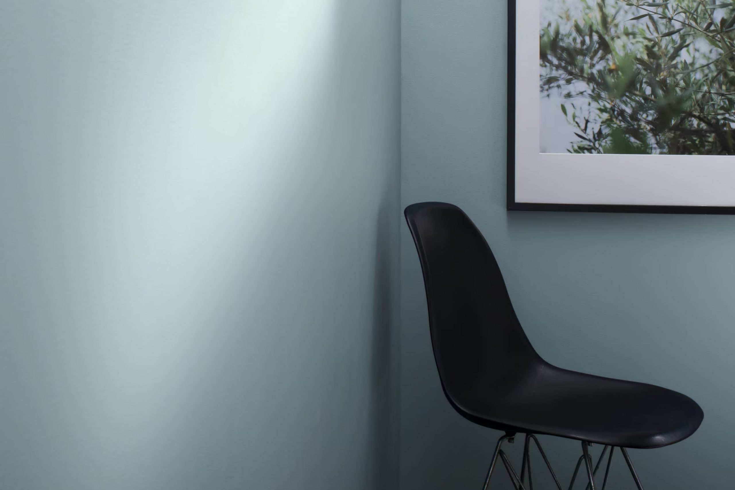
Have you ever walked into a room and instantly felt at ease, as if the walls themselves were whispering “relax”? That’s the effect HC-150 Yarmouth Blue by Benjamin Moore had on me. When I first considered repainting, I wanted a color that felt calm yet refreshing—a tall order for any shade. Yarmouth Blue, with its soft, clean vibes, turned out to be an ideal match.
While many blues can feel too bold or chilly, Yarmouth Blue strikes a perfect balance, providing a subtle backdrop that enhances rather than overpowers. It’s not just any blue; it has a hint of gray that gives it a gentle warmth, making it adaptable enough to use in various rooms, from a sunny kitchen to a cozy bedroom.
In my journey of refreshing my living area, selecting the right color was crucial, and HC-150 brought the peaceful, airy feel I was looking for. It works well with natural light, shifting subtly with the day’s progression, making each moment in the room feel special.
So if you’re considering a new color for your room, I recommend giving Yarmouth Blue a try. You might find it as soothing and flexible as I do.
What Color Is Yarmouth Blue HC-150 by Benjamin Moore?
Yarmouth Blue is a soft, soothing shade of blue with a noticeable yet subtle gray undertone that gives it a cooled-down look. This color is part of Benjamin Moore’s Historic Color collection, which reflects shades that have stayed popular through the years in home décor. Yarmouth Blue is particularly adaptable because it strikes a balance between being light enough to keep rooms feeling airy while still adding a pop of color.
It works beautifully in coastal-inspired interiors, where its gentle hue echoes the colors of the sea and sky. It’s also a good match for traditional rooms that need a touch of calm without overpowering the senses. Yarmouth Blue pairs well with crisp whites, which can highlight its light, refreshing nature.
Materials like natural wood and soft linens complement its understated charm, making it an excellent choice for living rooms, bedrooms, and bathrooms. Soft leather and brushed metals also work well with this hue, creating a more grounded and modern vibe.
Overall, Yarmouth Blue is a flexible choice that works well in multiple settings, helping you refresh any room with a subtle, pleasing splash of color.
Is Yarmouth Blue HC-150 by Benjamin Moore Warm or Cool color?
Yarmouth Blue HC-150 by Benjamin Moore is a gentle, soft blue paint color that brings a fresh and airy feel to any room. This shade is part of Benjamin Moore’s Historic Color collection, which means it has an enduring quality, fitting well in both traditional and contemporary rooms.
In the home, Yarmouth Blue can make small areas appear larger and more open, thanks to its bright yet subtle hue. It works particularly well in bathrooms and bedrooms where it adds a calm and relaxing atmosphere.
In well-lit rooms, Yarmouth Blue shines as it reflects natural light, enhancing the overall brightness. For those looking to add a hint of color without overpowering their room, Yarmouth Blue is an excellent choice. It pairs beautifully with white trims and hardwood floors, providing a clean and cohesive look that is both pleasant and inviting. This adaptability makes it a popular choice for homeowners looking to refresh their interiors.
Undertones of Yarmouth Blue HC-150 by Benjamin Moore
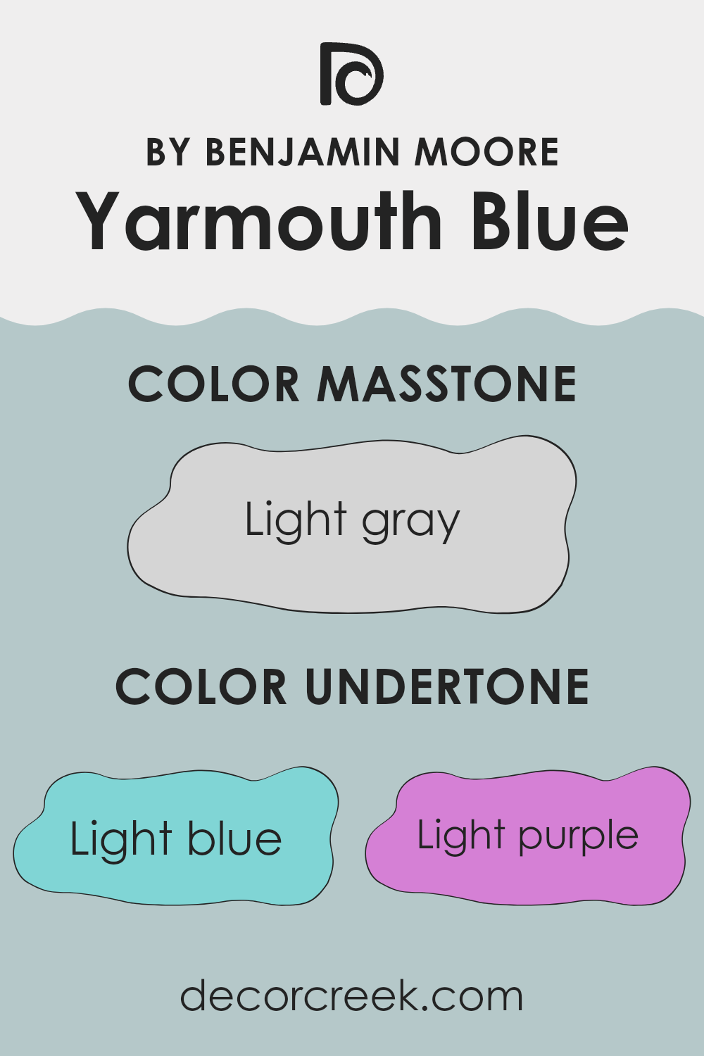
Yarmouth Blue has a range of undertones which influence how the color appears in different settings and lighting. Undertones are subtle hints of other colors that are present within the main hue. They play a crucial role in determining the overall look and feel a paint color gives to a room.
For Yarmouth Blue, the undertones include light blue, light purple, pale yellow, lilac, mint, pale pink, and grey. These undertones add depth and complexity, making the color adaptable. Depending on the lighting and surrounding colors, each undertone can become more apparent.
For example, in a room with lots of natural light, the pale yellow or light blue might stand out, giving the walls a brighter, more airy feel. In contrast, in a room with less natural light or at evening time, the grey or lilac undertones might be more noticeable, providing a more subdued and cozy atmosphere.
In interior design, understanding these undertones can help in choosing furniture and decorations that complement or enhance the painted walls. If one wishes the light blue or mint undertones to stand out, pairing the walls with similar colors in fabrics or artworks could be effective.
Conversely, to soften cooler undertones like grey or lilac and make a room feel warmer, incorporating elements with warmer colors like soft browns or warm whites might work well.
In summary, the unique blend of undertones in Yarmouth Blue allows it to adjust to various decor styles and preferences, playing a significant role in the overall aesthetic of any interior area.
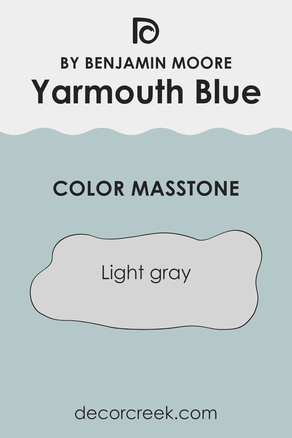
What is the Masstone of the Yarmouth Blue HC-150 by Benjamin Moore?
The base tone of Yarmouth Blue, which is a light gray, makes it incredibly adaptable for use in homes. This shade is gentle and soft, providing a subtle backdrop that doesn’t overpower a room. Its neutrality allows it to blend well with a wide range of other colors, making it perfect for living rooms, bedrooms, or bathrooms.
Whether you’re pairing it with bright colors for a lively feel or with darker shades for a more grounded atmosphere, this light gray base ensures that it maintains a balanced look without clashing.
It’s also great for small rooms or areas with limited natural light. The lightness of the gray can help make rooms feel larger and brighter. This can be a real advantage if you’re looking to refresh your home without making significant changes. Overall, its light gray undertone is a safe choice that works well with various decorating styles and preferences.
How Does Lighting Affect Yarmouth Blue HC-150 by Benjamin Moore?
Lighting plays a crucial role in how colors appear in a room. Different lighting conditions can drastically change the perception of a color, affecting its brightness, tone, and overall feel. Yarmouth Blue, a popular paint color, is a great example to see how lighting impacts color.
In natural light, Yarmouth Blue displays its true color. This is most evident during the middle of the day when natural light is brightest. The blue appears vibrant and fresh, making rooms feel open and airy.
In areas with plenty of sunlight, like south-facing rooms, Yarmouth Blue maintains its lively tone throughout the day. The natural brightness enhances the blue, making it pop and giving the room a lively feel.
However, in north-facing rooms that receive less direct sunlight, Yarmouth Blue can look slightly subdued. The cooler, softer natural light can make the blue appear more muted, giving the room a calmer, more understated atmosphere.
Artificial lighting can also affect how Yarmouth Blue looks. In rooms lit with warm artificial lights, such as incandescent bulbs, the blue might appear slightly greener or warmer. This can make the room feel cozy and welcoming, especially in the evening. Conversely, in rooms with cooler artificial lights, like some LEDs or fluorescent bulbs, Yarmouth Blue might lean a bit towards a sharper, crisper blue.
When it comes to rooms facing east or west, the color reacts uniquely to the quality of light throughout the day. In an east-facing room, the morning light can make Yarmouth Blue look very bright and vibrant, whereas, in the evening, without direct sunlight, it might appear more neutral and subdued. In west-facing rooms, the situation reverses. The color might appear cooler in the morning and then warm up and become more dynamic towards sunset.
In conclusion, Yarmouth Blue’s appearance can range from vibrant and lively to soft and subtle depending on the direction of the room and the type of light it receives. Whether illuminated by natural or artificial light, the context of lighting is key to defining its true impact in any room.
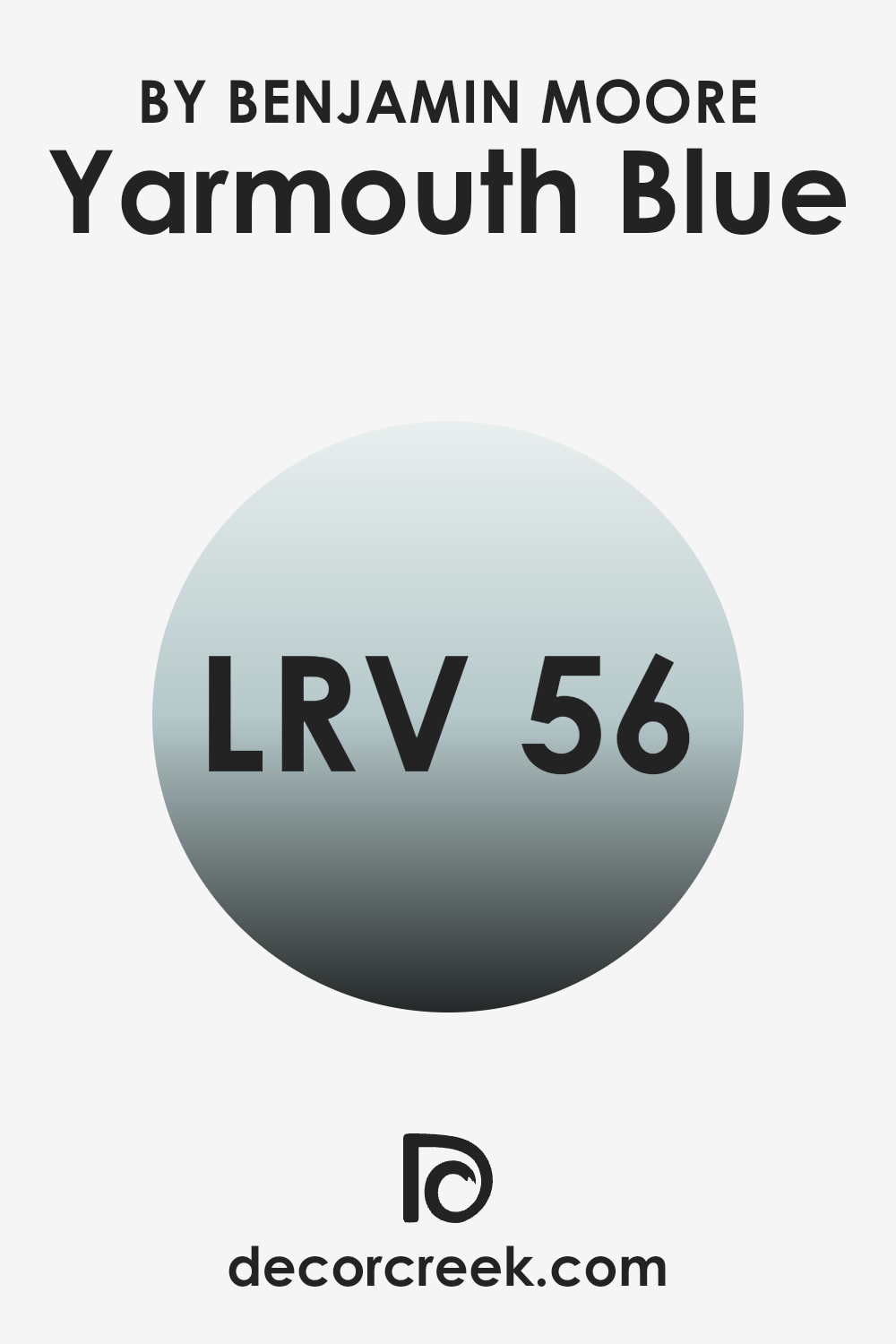
What is the LRV of Yarmouth Blue HC-150 by Benjamin Moore?
LRV stands for Light Reflectance Value, which is a measure of how much light a paint color reflects back into a room compared to how much it absorbs. LRV is rated on a scale from 1 to 99, with 1 reflecting very little light and 99 reflecting most of the light.
A higher LRV means the paint color will appear lighter and can make a room feel more open and airy. Conversely, colors with a lower LRV can make rooms feel smaller but cozier by absorbing more light.
The LRV of Yarmouth Blue is 55.82, placing it toward the middle of the scale. This means it does a moderate job of reflecting light, contributing to a balanced look that isn’t too bright or too dark. This level of LRV is effective for rooms that need an even, soothing influence without excessive brightness. With its mid-range LRV, Yarmouth Blue is adaptable, suitable for rooms with either ample light or slightly limited natural light, maintaining a steady appearance throughout different times of the day.
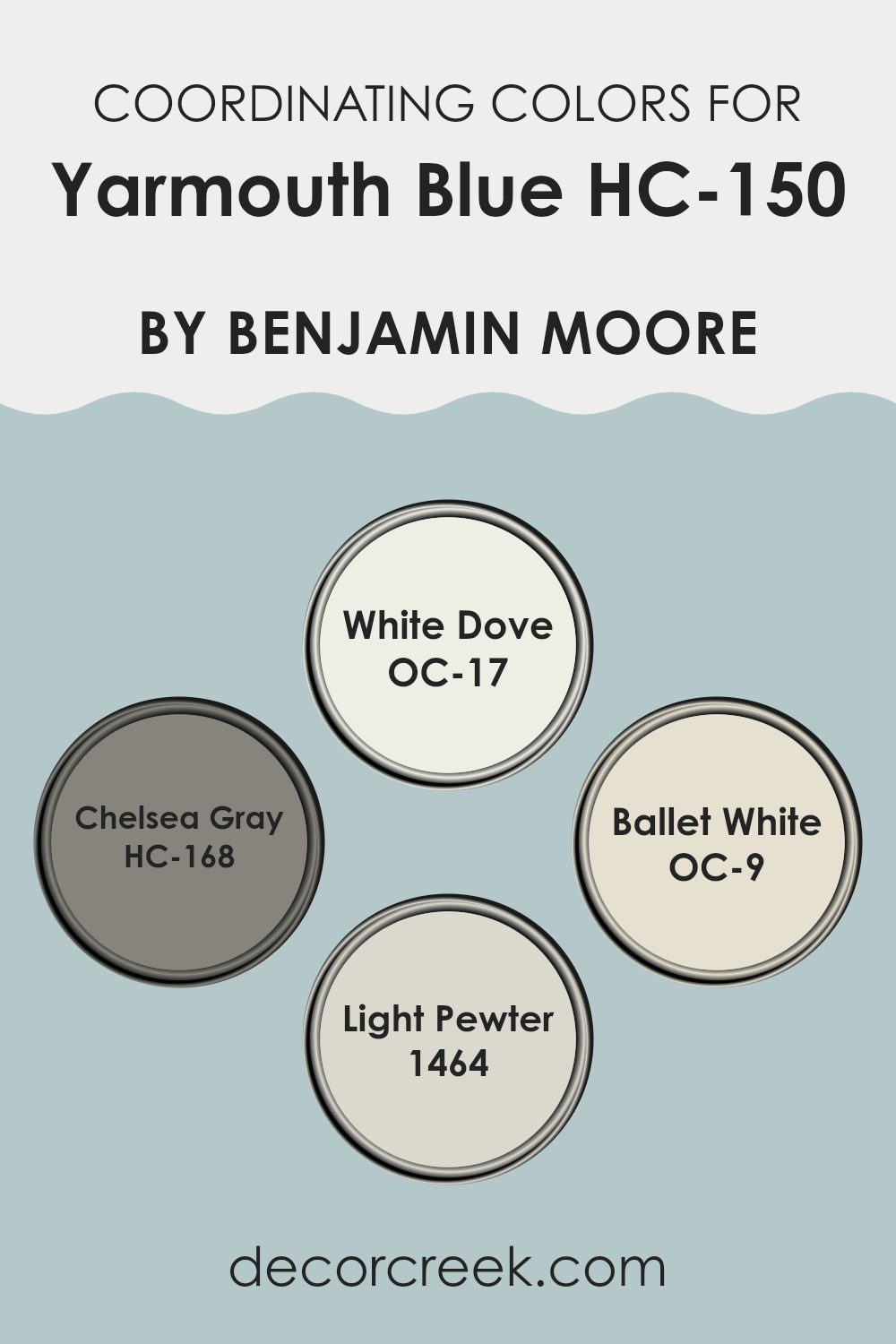
Coordinating Colors of Yarmouth Blue HC-150 by Benjamin Moore
Coordinating colors are shades that complement or enhance each other when used together in a room. They create a pleasing aesthetic and can help balance out the visual dynamics of an area. One such color, Yarmouth Blue HC-150 by Benjamin Moore, can be paired effectively with several hues to achieve different styles and moods. When selecting coordinating colors, consider harmony, contrast, and the intended ambience of the room.
White Dove OC-17 provides a clean, crisp contrast to the soft, gentle tone of Yarmouth Blue. This pairing allows Yarmouth Blue to stand out while the lightness of White Dove brings brightness to the room, making it feel airy and refreshed.
On the other hand, Chelsea Gray HC-168 offers a deeper, richer contrast that underscores a more defined and dramatic look. This color combination is ideal for creating a strong, visually compelling room.
Ballet White OC-9 is another excellent coordinating color, lending a subtle warmth to balance the coolness of Yarmouth Blue, resulting in a harmonious and inviting atmosphere. Lastly, Light Pewter 1464 bridges the gap between light and dark.
It provides a neutral backdrop that complements the depth of Yarmouth Blue without overshadowing it, perfect for achieving a balanced look. Each of these colors works well with Yarmouth Blue, providing multiple options for creating a tailored room that fulfills various design goals.
You can see recommended paint colors below:
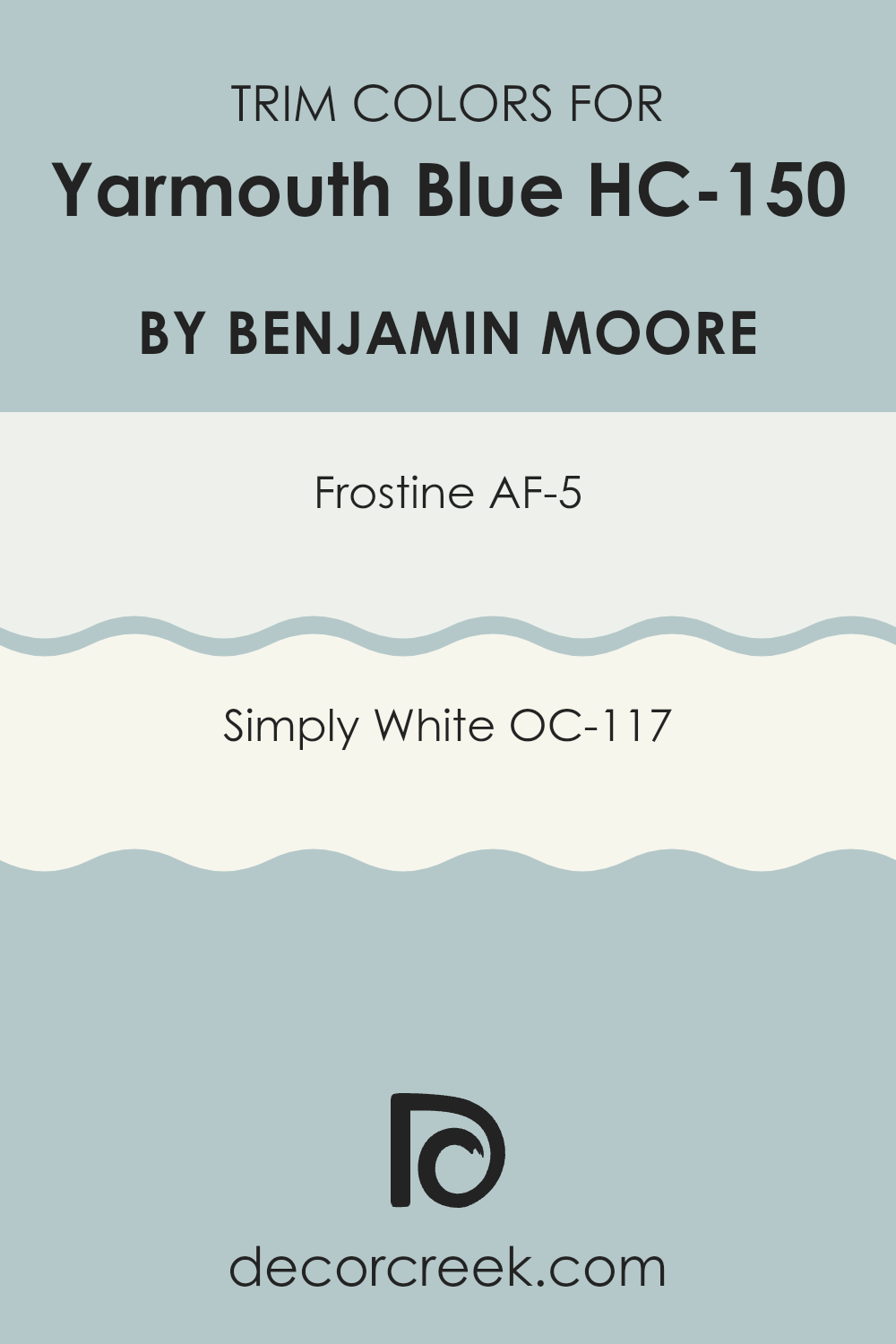
What are the Trim colors of Yarmouth Blue HC-150 by Benjamin Moore?
Trim colors serve an important role in interior design as they create visual distinctions and frame the primary colors of your walls, often enhancing the overall aesthetics of a room. Using trim colors like AF-5 – Frostine and OC-117 – Simply White by Benjamin Moore can brighten and define the edges when paired with a soft, appealing color like Yarmouth Blue.
These trim colors act like a picture frame, drawing attention to the main color and making everything look neat and well put-together, which is essential in achieving a clean and finished look in any living area.
Frostine AF-5 is a subtle white with a hint of gray, offering a fresh and airy feel to any room. It pairs beautifully with softer hues, providing a crisp border that isn’t too stark. On the other hand, Simply White OC-117 is a warm and inviting white, known for its adaptability and ability to complement various color schemes, including the gentle Yarmouth Blue. While Frostine gives off a cooler tone, Simply White adds warmth, making it an excellent choice for creating a welcoming and cozy environment.
You can see recommended paint colors below:
- AF-5 Frostine
- OC-117 Simply White
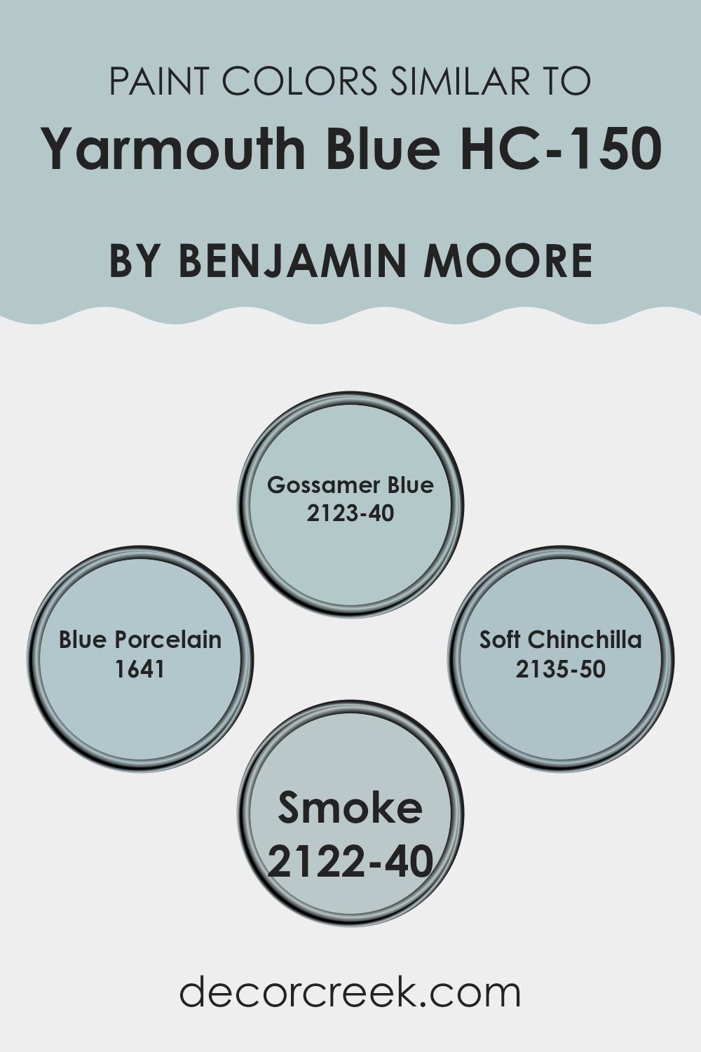
Colors Similar to Yarmouth Blue HC-150 by Benjamin Moore
Choosing similar colors is key when you want to create a harmonious and soothing atmosphere in any room. Colors that are alike have a subtle way of making interiors feel cohesive and well-thought-out without the sharp contrasts that can come from using very different shades.
For example, when considering colors close to Yarmouth Blue by Benjamin Moore, shades like Gossamer Blue, Blue Porcelain, Soft Chinchilla, and Smoke are perfect complements. These colors share a common hue but vary slightly in brightness and saturation, allowing for a smooth and visually calming transition throughout the room.
Gossamer Blue is a light, airy shade that brings a refreshing feel to a room, making it ideal for a bedroom or bathroom where a calming influence is desired. Blue Porcelain is a bit deeper, offering a subtle hint of vibrancy without overpowering the senses, perfect for creating a focal point in a room while maintaining a light atmosphere. Soft Chinchilla has a unique gray tone mixed with blue, providing a neutral base that pairs well with a variety of decor elements.
Lastly, Smoke stands out with its muted, smoky blue hue that adds a touch of mystery and depth, great for an office or a cozy reading nook. Using these similar shades in combination with Yarmouth Blue can help achieve a refined look that flows naturally from one room to another.
You can see recommended paint colors below:
- 2123-40 Gossamer Blue
- 1641 Blue Porcelain
- 2135-50 Soft Chinchilla
- 2122-40 Smoke
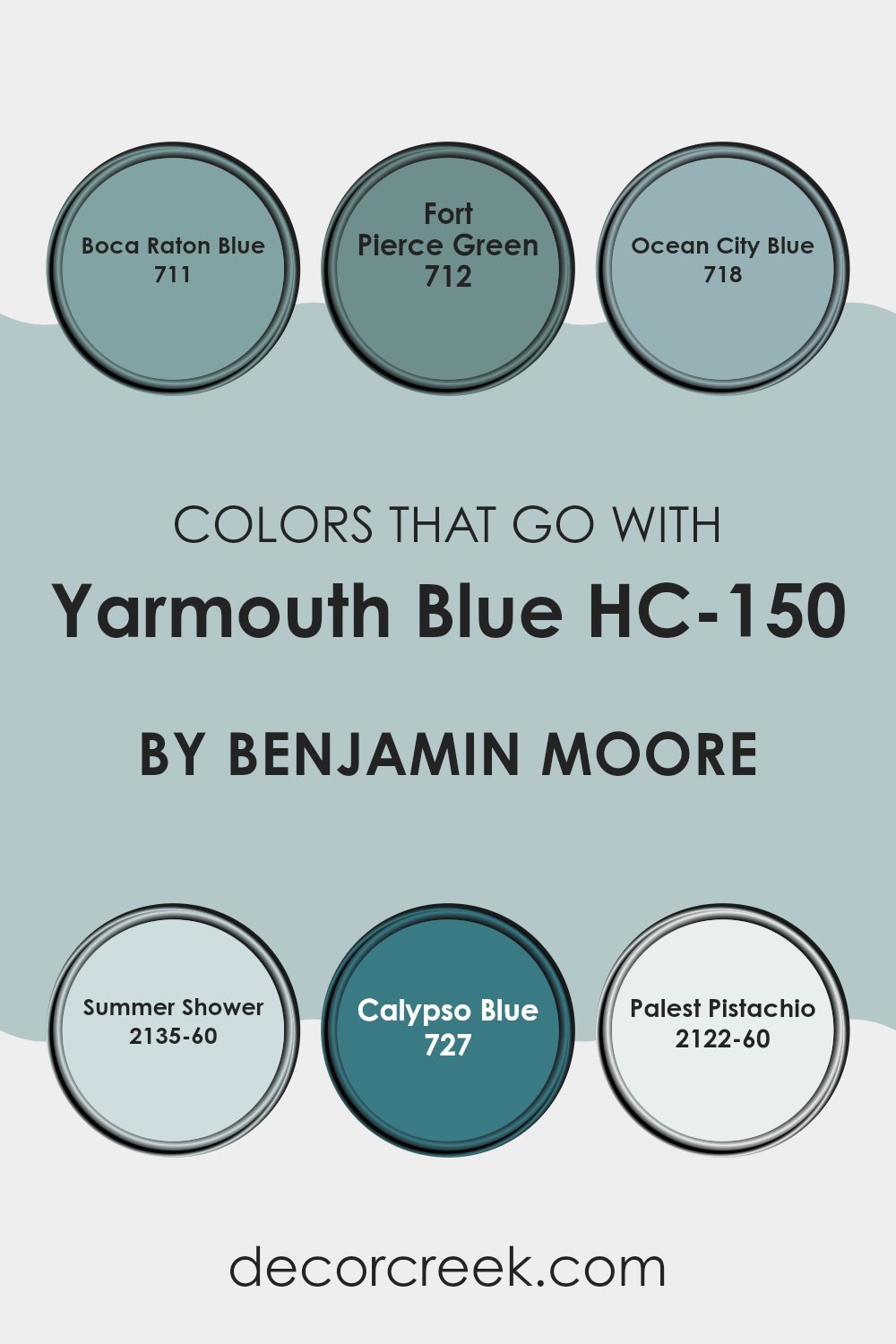
Colors that Go With Yarmouth Blue HC-150 by Benjamin Moore
Colors that complement Yarmouth Blue HC-150 by Benjamin Moore are important because they help create a harmonious and appealing room. Yarmouth Blue HC-150 is a gentle blue that can serve as a subtle backdrop or a feature wall, setting a calming tone in any area.
Using coordinating colors like Boca Raton Blue, Fort Pierce Green, Ocean City Blue, Summer Shower, Calypso Blue, and Palest Pistachio enhances this effect by adding depth and variety while keeping the overall look cohesive.
Boca Raton Blue is a vibrant shade that brings a fresh and lively feel to the calm base of Yarmouth Blue, adding a balanced pop of color. Fort Pierce Green, with its earthy hint, offers a natural touch that pairs beautifully with the softness of Yarmouth Blue, ideal for rooms that aim for a refreshing, nature-inspired look. Ocean City Blue goes deeper, lending a richer tone that contrasts nicely with the lighter Yarmouth Blue, making it great for creating a focal point in a room.
Summer Shower is a very light, almost airy blue that can open up a room and make it feel brighter and more welcoming. Calypso Blue is more intense and dynamic, giving a room a cheerful, energetic character when used alongside Yarmouth Blue.
Lastly, Palest Pistachio is a gentle green that complements cool blue hues perfectly, adding a soft and inviting touch to the palette. Together, these colors harmonize with Yarmouth Blue to create a room that feels balanced, layered, and beautifully coordinated.
You can see recommended paint colors below:
- 711 Boca Raton Blue
- 712 Fort Pierce Green
- 718 Ocean City Blue
- 2135-60 Summer Shower
- 727 Calypso Blue
- 2122-60 Palest Pistachio
How to Use Yarmouth Blue HC-150 by Benjamin Moore In Your Home?
Yarmouth Blue by Benjamin Moore is a soft, gentle blue paint that can make any room in your home feel welcoming and calm. Whether you’re sprucing up your living room or adding a touch of color to your bedroom, this shade is wonderfully adaptable.
You can use it as a main color for walls to create a cozy backdrop that pairs well with white trim or wooden furniture for a classic look. If you prefer smaller changes, consider painting an accent wall or a piece of furniture.
This color also works beautifully in bathrooms for a clean, fresh feel or in kitchens where it can contrast nicely with cabinets and appliances. Furthermore, Yarmouth Blue complements a variety of décor styles, from modern to traditional, making it easy to integrate into your existing home design. This paint is a simple yet effective way to refresh your room.
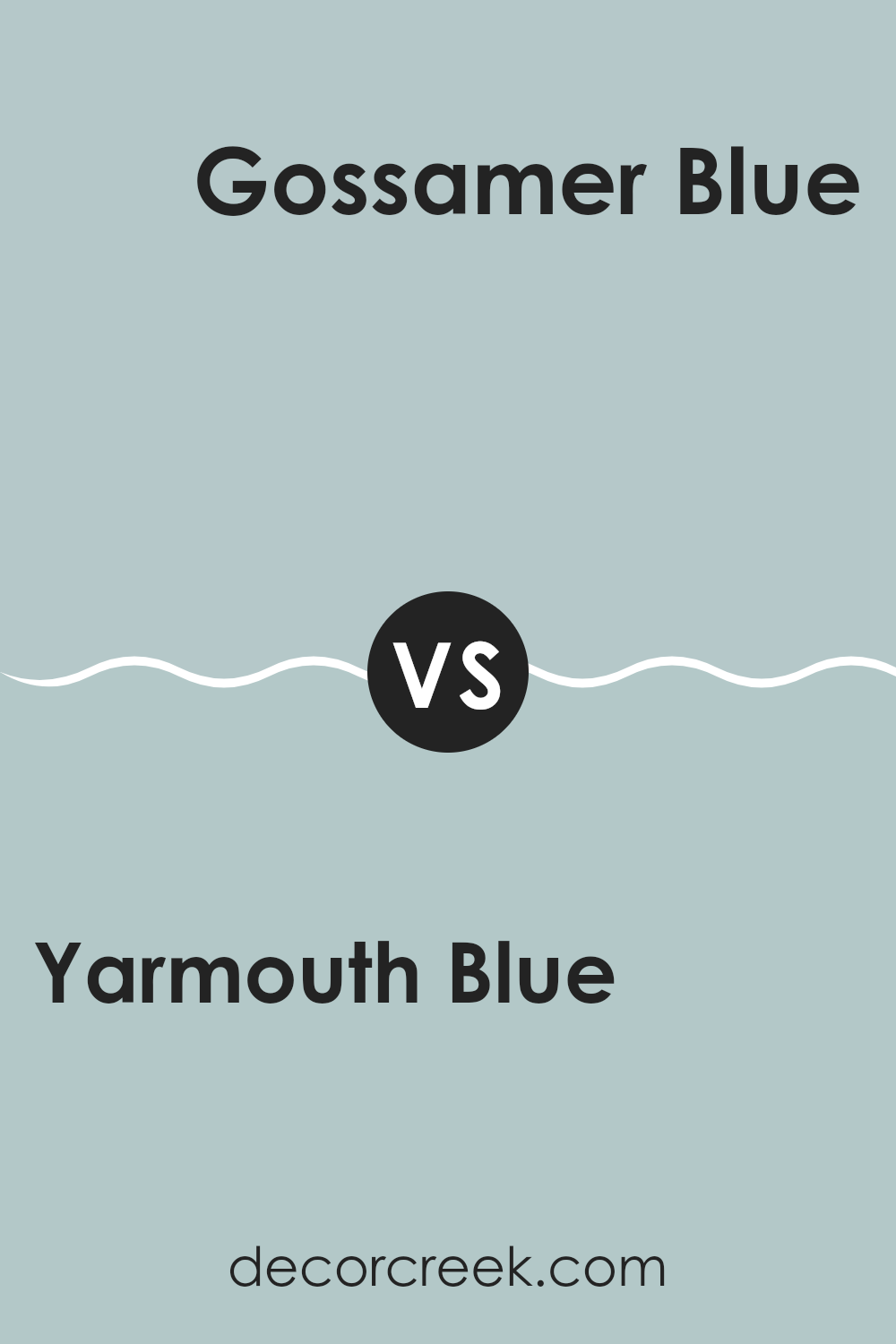
Yarmouth Blue HC-150 by Benjamin Moore vs Gossamer Blue 2123-40 by Benjamin Moore
Yarmouth Blue and Gossamer Blue are both elegant shades by Benjamin Moore. Yarmouth Blue has a muted tone that reflects a subtle, calm vibe. It’s great for creating a cozy and welcoming atmosphere in a room. This color works well in areas where relaxation is key, like bedrooms or living rooms.
On the other hand, Gossamer Blue is a bit brighter than Yarmouth Blue. It has a fresh and airy feel, making it perfect for bathrooms and kitchens, or any room where you want a more refreshed and open look. This shade has a lightness that can help smaller rooms feel more spacious.
Though both colors belong to the blue family, their differences in tone create distinct moods and can beautifully complement a range of décor styles. Choosing between them depends on the atmosphere you want to create and the amount of natural light in your room.
You can see recommended paint color below:
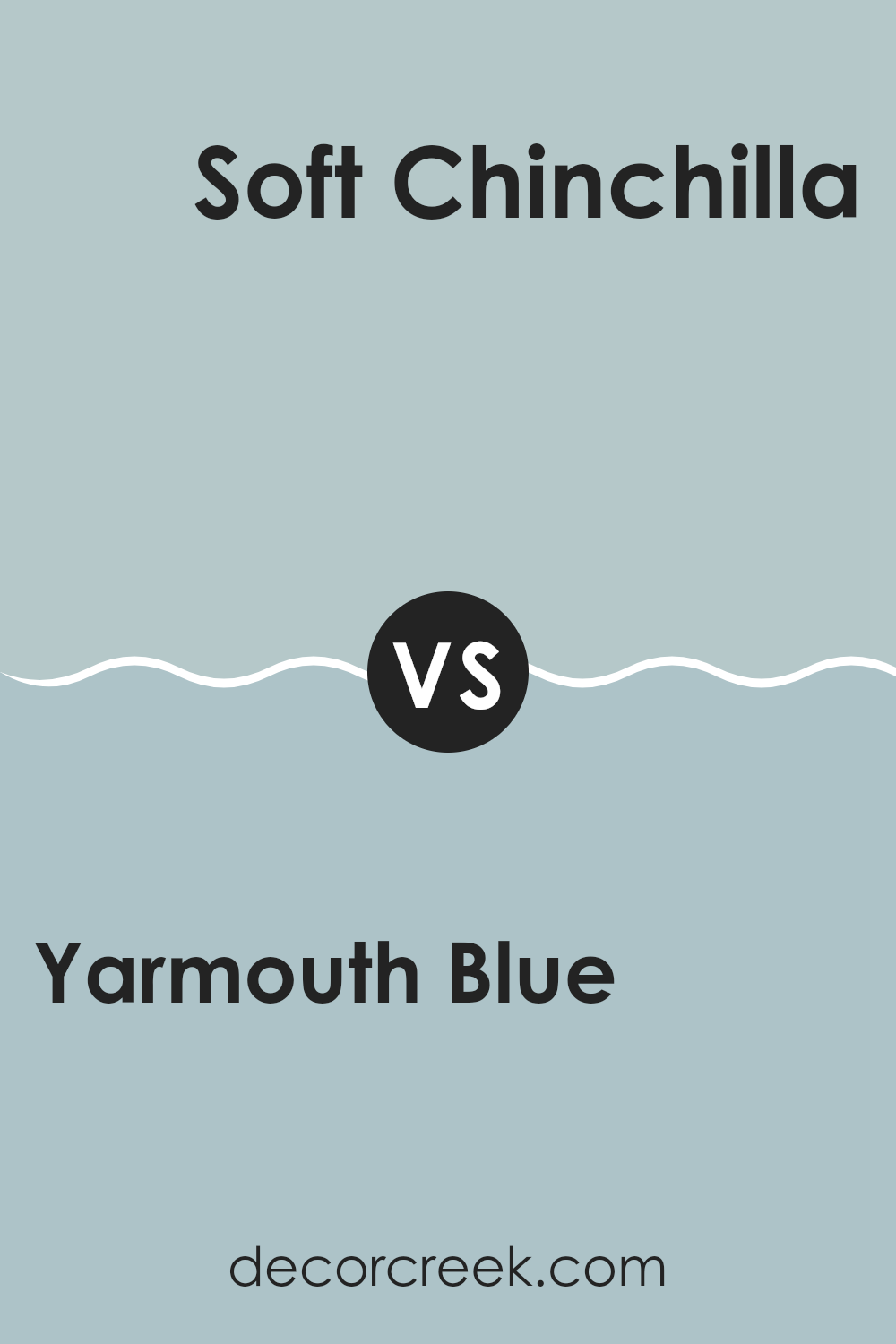
Yarmouth Blue HC-150 by Benjamin Moore vs Soft Chinchilla 2135-50 by Benjamin Moore
Yarmouth Blue by Benjamin Moore is a subtle blue with hints of gray. It gives off a calm and refreshing vibe, making it great for a peaceful living room or bedroom setting. It’s quite adaptable, pairing well with both bright accents and neutral tones for a balanced look.
On the other hand, Soft Chinchilla by Benjamin Moore leans more toward a lavender-gray, providing a slightly warmer and cozier feel. This color is excellent for rooms where you want a touch of warmth without overpowering the area with too bold a hue. It works well in smaller rooms or those with limited natural light, as it can make the area feel more welcoming.
Both colors share a base of cool tones, but Soft Chinchilla offers a warmer touch, contrasting with the crisp, fresh atmosphere of Yarmouth Blue. Depending on the room’s purpose and the mood you want to create, either could be a perfect choice.
You can see recommended paint color below:
- 2135-50 Soft Chinchilla
Yarmouth Blue HC-150 by Benjamin Moore vs Smoke 2122-40 by Benjamin Moore
Yarmouth Blue and Smoke by Benjamin Moore are both muted and calming colors, but they have different vibes. Yarmouth Blue is a soft, light blue with a hint of gray that gives it a relaxed, airy feel.
It’s great for creating a soothing atmosphere in rooms like bedrooms or bathrooms. On the other hand, Smoke is a deeper, more intense gray with blue undertones.
This color offers a stronger presence and can give a room a more grounded, secure feeling. Smoke might be better suited for a cozy living room or an accent wall that needs a bit more drama. While both colors promote a calm setting, Yarmouth Blue leans towards a lighter, more open sensation, whereas Smoke brings depth and a touch of refinement.
You can see recommended paint color below:
Yarmouth Blue HC-150 by Benjamin Moore vs Blue Porcelain 1641 by Benjamin Moore
Yarmouth Blue and Blue Porcelain by Benjamin Moore are both shades of blue, but they present unique tones that could suit different moods and rooms. Yarmouth Blue is a softer, more muted blue with a hint of gray, making it a great choice for a calming effect in areas like bedrooms or bathrooms. It reflects a gentle, subtle vibe which is adaptable for various decor styles.
On the other hand, Blue Porcelain is a brighter, more vibrant blue. It has a crisper feel that might be perfect if you’re looking to add a pop of color to a room without overpowering it. This shade could be ideal for places like a kitchen or a playroom where you want a cheerful and lively atmosphere.
Both colors offer their own unique charm, whether you are looking to create a soothing retreat or energize a room with a splash of brightness. Your choice would depend on the specific mood you aim to achieve in your decorating project.
You can see recommended paint color below:
- 1641 Blue Porcelain

In wrapping up, I’d like to remind everyone about the cool and calming feel of HC-150 Yarmouth Blue by Benjamin Moore. Reviewing this paint’s qualities was quite exciting for me as I highlighted how beautifully it works in different rooms in your home. Whether you’re painting your bedroom, bathroom, or even your living room, Yarmouth Blue adds a fresh and soothing touch to the walls, making each room look bright yet cozy.
Working with this paint was also really easy. It spreads smoothly, which is great for both beginners and experienced painters. This means you don’t have to worry about uneven spots or tricky application—it does the job well and looks pretty without much fuss.
Moreover, I noticed Yarmouth Blue pairs nicely with a lot of different colors. Whether you put it together with soft whites or even dark grays, it stands out by softening the overall look and adding a peaceful vibe. It’s perfect if you want to give your room a gentle but noticeable refresh.
So, for anyone looking to update their home with a new color, Yarmouth Blue by Benjamin Moore is a fantastic choice. It’s simple to apply, works well with many designs, and most importantly, it makes your home feel cozy and welcoming. These factors make it a top recommendation for anyone keen on giving their room a fresh new look.
Ever wished paint sampling was as easy as sticking a sticker? Guess what? Now it is! Discover Samplize's unique Peel & Stick samples.
Get paint samples

