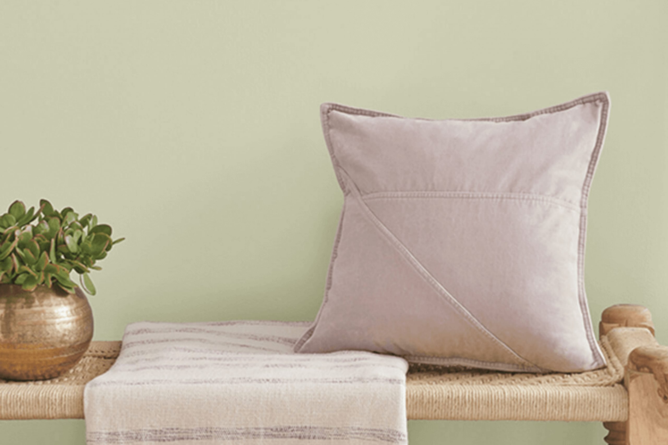
Walking into a room painted with Sherwin Williams’ SW 0029 Acanthus feels like stepping into a peaceful oasis of nature. The color captures the calm essence of lush greenery while adding a touch of elegance to any room. Acanthus is a flexible shade of green that seems to bridge the gap between the natural world and indoor comfort, making it an ideal choice for those seeking harmony in their surroundings.
The soft, muted tone of Acanthus exudes warmth and calm, creating an inviting atmosphere whether used in living rooms, bedrooms, or study areas. It pairs beautifully with neutral tones, enhancing both modern and traditional design elements.
The gentle richness of Acanthus provides a refreshing backdrop for artwork and furnishings, allowing them to pop without being overpowering. With its soothing qualities, this color turns everyday areas into peaceful retreats.
It encourages moments of quiet reflection or lively conversation, adapting easily to your mood and needs. Whether paired with crisp whites, warm woods, or bold accents, Acanthus offers a canvas that inspires creativity and comfort. Choosing this color is like bringing a bit of the natural world indoors, where you can relax and recharge amidst its subtle beauty.
What Color Is Acanthus SW 0029 by Sherwin Williams?
Acanthus by Sherwin Williams is a warm, earthy shade with a hint of green and brown, reminiscent of lush foliage or a quiet forest floor. This flexible color can complement a variety of interior styles. In traditional settings, Acanthus adds a cozy yet refined feel.
Its natural undertones make it a perfect fit for rustic and farmhouse interiors, where it can echo the surrounding wood and stone elements. In modern and minimalist homes, Acanthus can ground a room, contributing a touch of organic warmth that softens sleek lines and surfaces.
This color pairs beautifully with materials like wood, especially those with rich, deep grains or lighter tones like oak and pine, creating a harmonious balance. Textures such as linen, wool, or burlap enhance its natural appeal, adding depth and comfort. For a more luxurious touch, pairing Acanthus with velvet or brushed brass accents can create an inviting environment.
Neutral furnishings and light-colored textiles can create a soft contrast, allowing Acanthus to stand out without overpowering the room. Overall, Acanthus is a color that adapts well to various settings, providing a comforting backdrop that can enhance both natural and refined aesthetics.
Is Acanthus SW 0029 by Sherwin Williams Warm or Cool color?
Acanthus SW 0029 by Sherwin Williams is a popular paint color that can enhance the look of any home. It’s a muted green with a hint of gray, giving it a flexible and calming feel. This color works well in various areas, from living rooms to bedrooms, because it provides a soothing backdrop without being too bold or overpowering.
When used on walls, Acanthus can create a warm and inviting atmosphere. It’s a great choice for people who want a natural and earthy feel in their homes. It pairs well with neutral colors like beige, cream, and soft whites.
You can also combine it with darker accents for a more dramatic effect. Furniture with wood finishes will look great against this color, making it a good option for those who love natural materials. Overall, Acanthus is a flexible color choice that adds a touch of nature to your home.
Undertones of Acanthus SW 0029 by Sherwin Williams
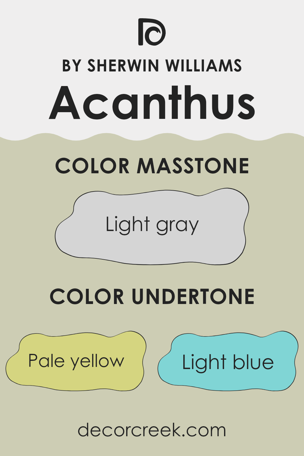
When it comes to understanding paint colors like Acanthus by Sherwin Williams, undertones play a crucial role. This particular shade has a complex blend of undertones, including pale yellow, light blue, light purple, mint, pale pink, lilac, and grey. These subtle hints can influence how the color appears in different lighting or alongside other colors.
For instance, in a room with plenty of natural sunlight, the pale yellow undertone might become more apparent, giving the room a warm, inviting feel. On the other hand, in a room with less natural light, the grey undertone might become more prominent, leading to a slightly cooler, more neutral effect.
The presence of light blue and mint undertones can add a refreshing, calming touch, making the color suitable for areas like bathrooms or kitchens. Meanwhile, the touches of light purple, lilac, and pale pink can introduce a soft, gentle vibe, perfect for living rooms or bedrooms seeking a cozy atmosphere.
Thus, the undertones in Acanthus can cause it to look slightly different in each room where it’s used. Understanding these undertones helps make informed decisions about where and how to use this color in interior rooms, helping to achieve the desired mood and effect.
What is the Masstone of the Acanthus SW 0029 by Sherwin Williams?
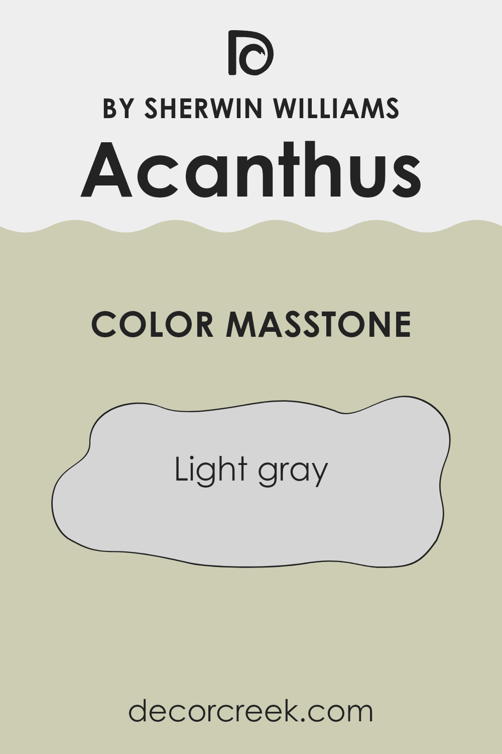
Acanthus SW 0029 by Sherwin Williams is a light gray color with a masstone of #D5D5D5. This shade of light gray has a soft and welcoming appearance, making it a flexible choice for many areas in the home.
It creates a neutral backdrop that allows other colors and decorative pieces to stand out. In living rooms, this light gray provides a calm and airy atmosphere, enhancing natural light and making rooms feel more open. In kitchens and bathrooms, it adds a clean and fresh look, complementing stainless steel appliances and white fixtures.
Bedrooms painted in this shade can feel peaceful and relaxing, helping to create a restful environment. This light gray also pairs well with wooden elements and vibrant accents, allowing homeowners to add personality and warmth to their rooms. Overall, its soft tone makes it a great choice for anyone looking to achieve a balanced and harmonious look in their home.
How Does Lighting Affect Acanthus SW 0029 by Sherwin Williams?
Lighting plays a crucial role in how we perceive colors. Different types of lighting, whether natural or artificial, can greatly influence the appearance of paint colors in a room. This can be especially true for colors like Acanthus SW 0029 from Sherwin Williams. This is a warm, earthy green that can change depending on its lighting conditions.
In natural light, Acanthus SW 0029 will often appear more vibrant and true to its earthy tone. However, the direction a room faces can dramatically change its appearance. In north-facing rooms, which often receive cooler light, this color may look muted or slightly grayer.
This is because the cool light tones down the warm undertones of the color, making it look more subdued. In contrast, south-facing rooms usually get warm, intense light throughout the day. Acanthus in this setting will look brighter and warmer, keeping more of its green and earthy characteristics. It’s in these rooms that the color will likely show closest to how it appears on the paint chip, rich and inviting.
East-facing rooms receive soft, warm light in the morning and cooler, neutral light in the afternoon. In the morning, Acanthus will look warmer and more golden-green. As the day goes on and the light gets cooler, it might take on a slightly different tone, appearing a bit more muted.
West-facing rooms get the opposite effect. In the morning, the color might seem cooler and less vivid. As the afternoon transitions to evening, the warm, orangey sunlight will bring out the yellow undertones in Acanthus, making it look richer and more dynamic.
Artificial lighting also affects how Acanthus SW 0029 looks. Warm LED or incandescent lights will emphasize the warmer undertones, while cool fluorescent or LED lighting might make it appear more subdued. It’s always a good idea to test the paint under different lighting conditions to see how it interacts with various lights throughout the day.
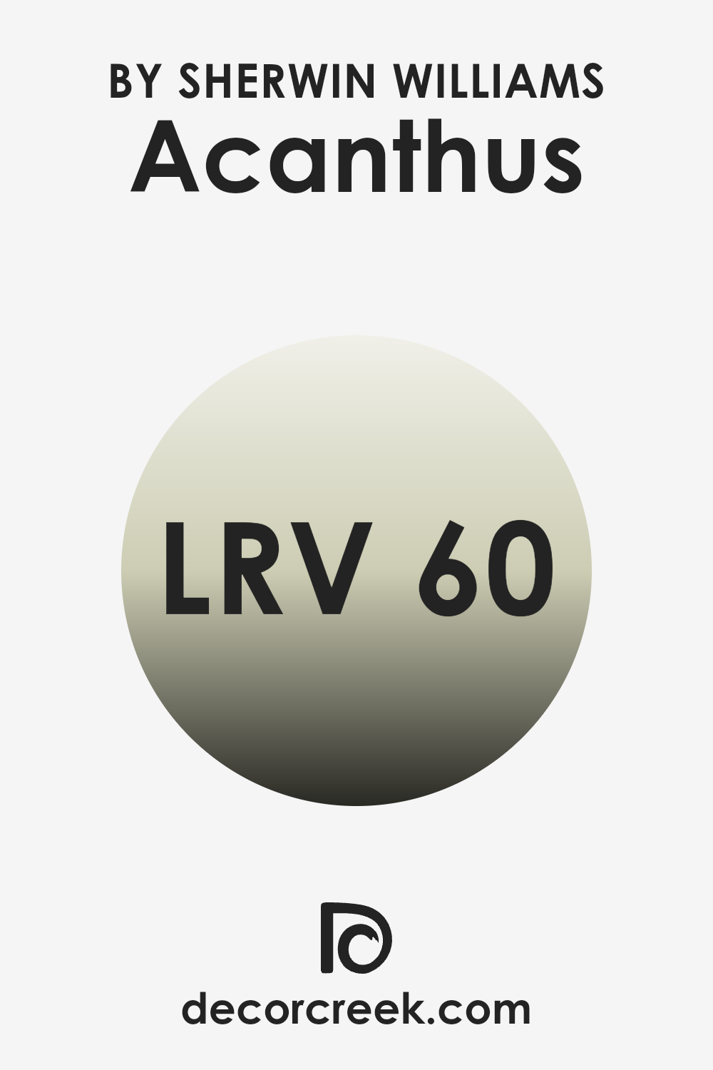
What is the LRV of Acanthus SW 0029 by Sherwin Williams?
Light Reflectance Value (LRV) is a measurement used to indicate how much light a color will reflect or absorb when it’s on a surface. The scale ranges from 0, which is absolute black and reflects no light, to 100, which is pure white and reflects all light.
When a color has a higher LRV, it means it will reflect more light and make a room feel brighter and more spacious. Conversely, colors with a lower LRV will absorb more light, making areas feel darker and cozier. For Acanthus, with an LRV of 60.139, it reflects a fair amount of light but also absorbs enough to give depth to a room.
This means it can make a room feel inviting and warm while still keeping it bright and open. Its balance of light reflection is suitable for both small and large rooms, as it doesn’t overpower with brightness nor dim a room significantly.
This makes Acanthus a flexible choice for various settings and lighting conditions, ensuring a harmonious and comfortable atmosphere.
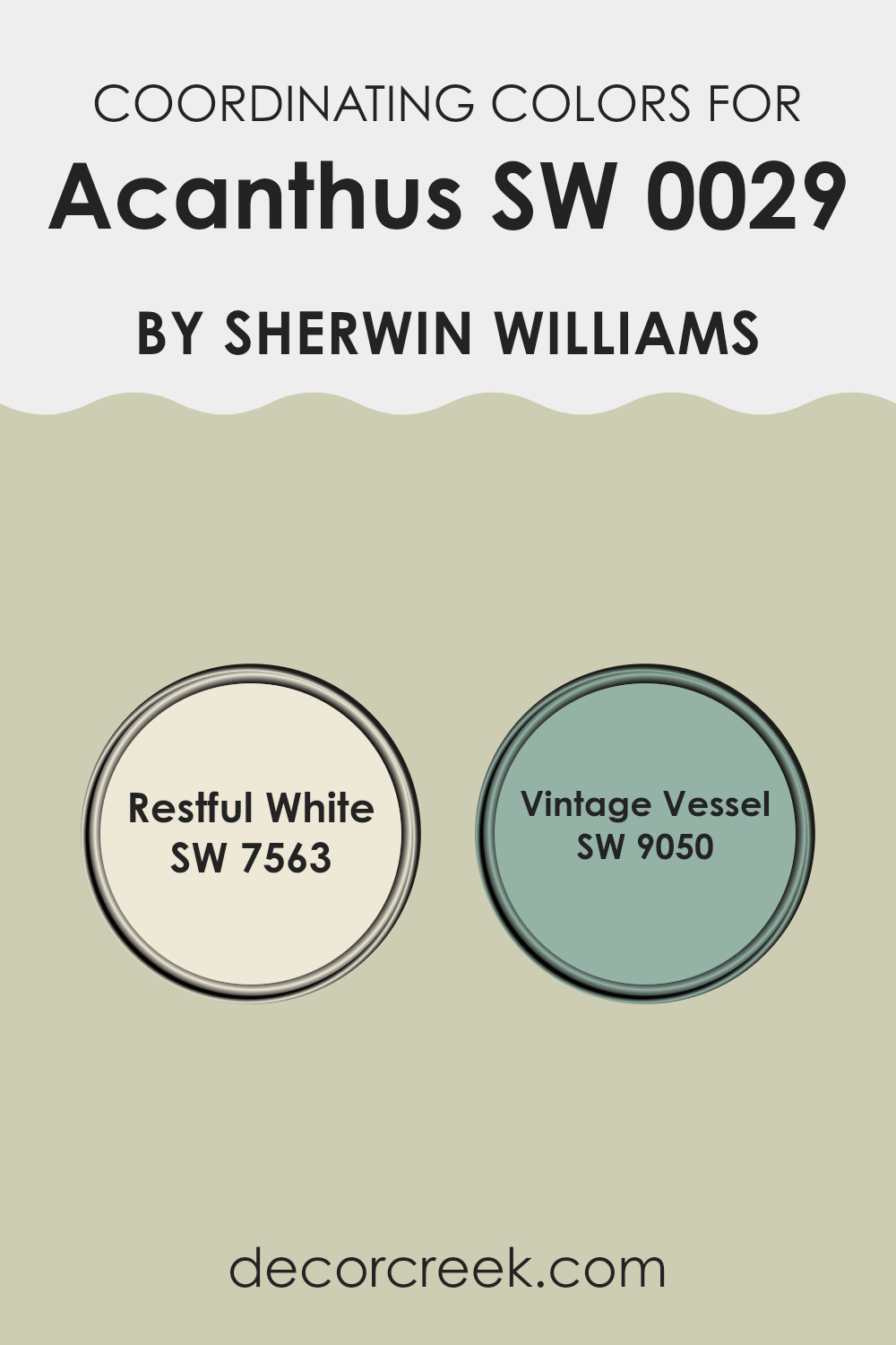
Coordinating Colors of Acanthus SW 0029 by Sherwin Williams
Coordinating colors are hues that are carefully selected to work well together in a room. They complement each other and create a harmonious look, enhancing the overall feel of a room. When choosing coordinating colors for Acanthus by Sherwin Williams, consider how they interact to produce a balanced and inviting atmosphere.
Acanthus is a rich, earthy green that can be paired with both lighter and darker shades for various effects. The goal is to ensure that each color supports the others, highlighting the beauty of each shade without clashing.
Restful White (SW 7563) is a soft, creamy white that acts as a calming backdrop. It subtly lightens a room and provides a gentle contrast to Acanthus without being too stark. This makes it ideal for creating a welcoming environment. Vintage Vessel (SW 9050) is a warm, muted red that brings a sense of warmth and coziness. It offers a delightful contrast to Acanthus, enhancing its earthy tones while adding a touch of richness.
When combined, these colors create a balanced and cohesive look, with each color enhancing the other, resulting in an area that feels natural and inviting.
You can see recommended paint colors below:
- SW 7563 Restful White
- SW 9050 Vintage Vessel
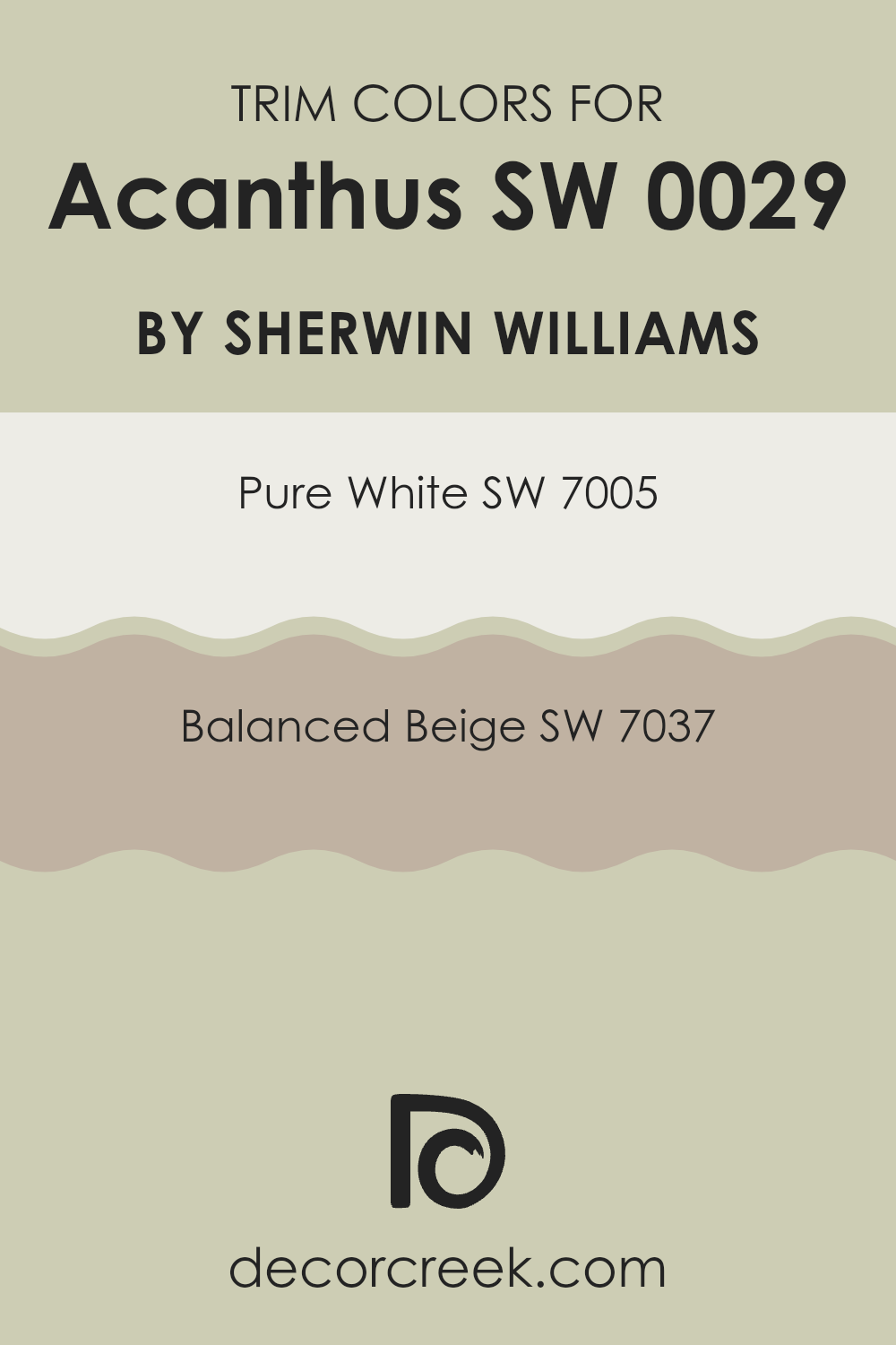
What are the Trim colors of Acanthus SW 0029 by Sherwin Williams?
Trim colors are used to highlight and define the architectural features of a room, such as baseboards, moldings, and window frames. For Acanthus by Sherwin Williams, selecting the right trim colors is key to enhancing its beauty. Acanthus is a soft, muted green that evokes a sense of nature and calmness.
Pairing it with the right trim can make a room look more cohesive and emphasize the unique characteristics of the room. Using trim colors like SW 7005 – Pure White can provide a crisp, clean edge that contrasts beautifully with the gentle green hues of Acanthus. The bright and classic look of Pure White helps the green stand out, making it the focal point of the room.
In contrast, SW 7037 – Balanced Beige offers a warmer complement to Acanthus. Balanced Beige is a taupe with a mix of warm and cool undertones that can blend seamlessly with the soft green. This color creates a more muted and enduring look, providing a subtle touch to the trim that doesn’t overpower the main color. It can make a room feel more inviting and cozy, perfect for living rooms or areas where comfort is a priority. Overall, choosing the right trim colors is crucial to ensure that the main color shines while maintaining a harmonious environment.
You can see recommended paint colors below:
Colors Similar to Acanthus SW 0029 by Sherwin Williams
Similar colors play a vital role in creating a harmonious and cohesive environment, as they help to establish a visual connection between different elements within a room. By choosing colors that are close in hue, such as those related to Acanthus by Sherwin Williams, you can cultivate a soothing and unified look.
For instance, Frostwork offers a light gray-green tint that pairs well with natural textures, enhancing a room’s calmness. Baize Green is a fresh, grassy green that brings a touch of nature indoors, offering a lively contrast while remaining subtle. Meanwhile, Softened Green provides a gentle, muted tone that can make any room feel welcoming and balanced.
Celery offers a pale, yellowish-green that naturally brightens and refreshes any area, making it feel light and airy. Valleyview provides an earthy green that grounds a room, giving it depth and warmth. Honeydew has a soft, pastel quality, adding a sense of lightness and freshness. Recycled Glass is a delicate, greenish-blue hue that introduces a hint of coolness without overpowering the scene.
Liveable Green serves as a neutral and flexible shade that goes well with various styles. Ancient Marble combines green and beige, creating warmth and elegance, while Warm Oats adds a touch of comfort with its soft, beige undertones. These colors are ideal for creating environments that feel connected and purposeful without being overpowering.
You can see recommended paint colors below:
- SW 0059 Frostwork
- SW 6429 Baize Green
- SW 6177 Softened Green
- SW 6421 Celery
- SW 9673 Valleyview
- SW 6428 Honeydew
- SW 7747 Recycled Glass
- SW 6176 Liveable Green
- SW 6162 Ancient Marble
- SW 9511 Warm Oats
How to Use Acanthus SW 0029 by Sherwin Williams In Your Home?
Acanthus SW 0029 by Sherwin Williams is a soft green paint color that brings a refreshing and calming vibe to any room. It’s flexible and works beautifully in various rooms around the home. In living rooms, Acanthus can create a cozy and inviting atmosphere, perfect for relaxing with family or friends.
It pairs well with natural wood tones and earthy accents, making it an excellent choice for those who love a nature-inspired look. In the bedroom, Acanthus offers a calming effect, helping to create a peaceful place for rest.
It can be complemented with soft white or beige linens and simple decor for a harmonious setting. For those looking to update their kitchen, this shade provides a gentle color that works nicely with white cabinets and stainless steel appliances, adding a subtle touch of color without being overpowering. Whether in large or small areas, Acanthus SW 0029 offers a fresh and pleasant look.
Acanthus SW 0029 by Sherwin Williams vs Frostwork SW 0059 by Sherwin Williams
Acanthus (SW 0029) and Frostwork (SW 0059) by Sherwin Williams are two beautiful paint colors with distinct characteristics. Acanthus is a rich, earthy green that brings warmth and a natural feel to any room. It’s perfect for creating a cozy, inviting atmosphere.
On the other hand, Frostwork is a much lighter shade with a soft, bluish undertone. This color gives rooms a fresh, airy feel, making areas look bigger and more open. When used together, Acanthus can serve as a grounding element, while Frostwork can lighten the mood and add a touch of brightness to a room.
Acanthus works well in living rooms or offices where you want a touch of nature, while Frostwork is ideal for bedrooms or bathrooms for a clean and crisp look. The two colors complement each other nicely, offering a contrast between the depth of Acanthus and the lightness of Frostwork.
You can see recommended paint color below:
- SW 0059 Frostwork
Acanthus SW 0029 by Sherwin Williams vs Warm Oats SW 9511 by Sherwin Williams
Acanthus (SW 0029) is a soft, muted green with an earthy feel. It brings a sense of nature into a room, making it ideal for creating a calm and welcoming environment. This color works well in living rooms or bedrooms, where a gentle touch is desired.
In contrast, Warm Oats (SW 9511) is a warm, light beige with yellow undertones. It exudes coziness and comfort, perfect for areas like kitchens or hallways. Due to its versatility, Warm Oats can complement other colors and styles, whether modern or traditional.
Both colors have a subtle presence, but Acanthus leans more towards a natural, green palette, while Warm Oats offers a neutral warmth. They can be used together to create a balanced and harmonious room, where Acanthus adds a hint of nature and Warm Oats provides a soothing background.
You can see recommended paint color below:
Acanthus SW 0029 by Sherwin Williams vs Valleyview SW 9673 by Sherwin Williams
Acanthus (SW 0029) by Sherwin Williams is a muted green that gives off a classic and restful vibe. It’s a great choice for creating a calm and soothing atmosphere in any room. Its earthy tone feels natural and organic, making it suitable for both traditional and modern areas.
Valleyview (SW 9673), on the other hand, leans towards a brighter, more energetic green. This color is livelier and can refresh your room with a touch of nature’s vibrance. It’s perfect for areas where you want to inspire creativity and positivity.
When compared, Acanthus feels more subdued and understated, while Valleyview is brighter and more uplifting. Choosing between them depends on the mood you want to set: Acanthus for a laid-back, cozy environment or Valleyview for a fresh and invigorating feel. Both colors offer unique ways to bring the beauty of green into your home.
You can see recommended paint color below:
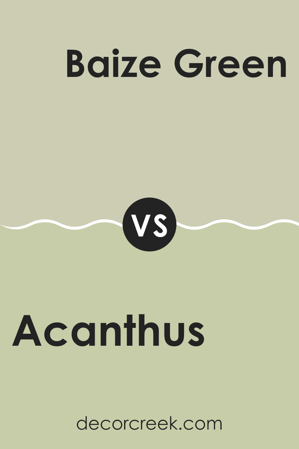
Acanthus SW 0029 by Sherwin Williams vs Baize Green SW 6429 by Sherwin Williams
Acanthus (SW 0029) by Sherwin Williams is a muted green with a hint of gray, giving it an enduring and calming appearance. It’s a flexible choice that can adapt to both classic and modern settings. On the other hand, Baize Green (SW 6429) is a more vibrant and lively green, infused with warmth and a slightly brighter tone.
This color brings energy and a fresh feel to areas. While Acanthus tends to have a more neutral quality, making it suitable for larger areas or as a backdrop for other colors, Baize Green stands out as an accent, adding a pop of life.
Both greens are beautiful, but Acanthus leans towards subtlety and understated elegance, whereas Baize Green is bolder and more eye-catching. Choosing between the two depends on whether you prefer a quieter, more enduring ambiance or a lively, energetic atmosphere.
You can see recommended paint color below:
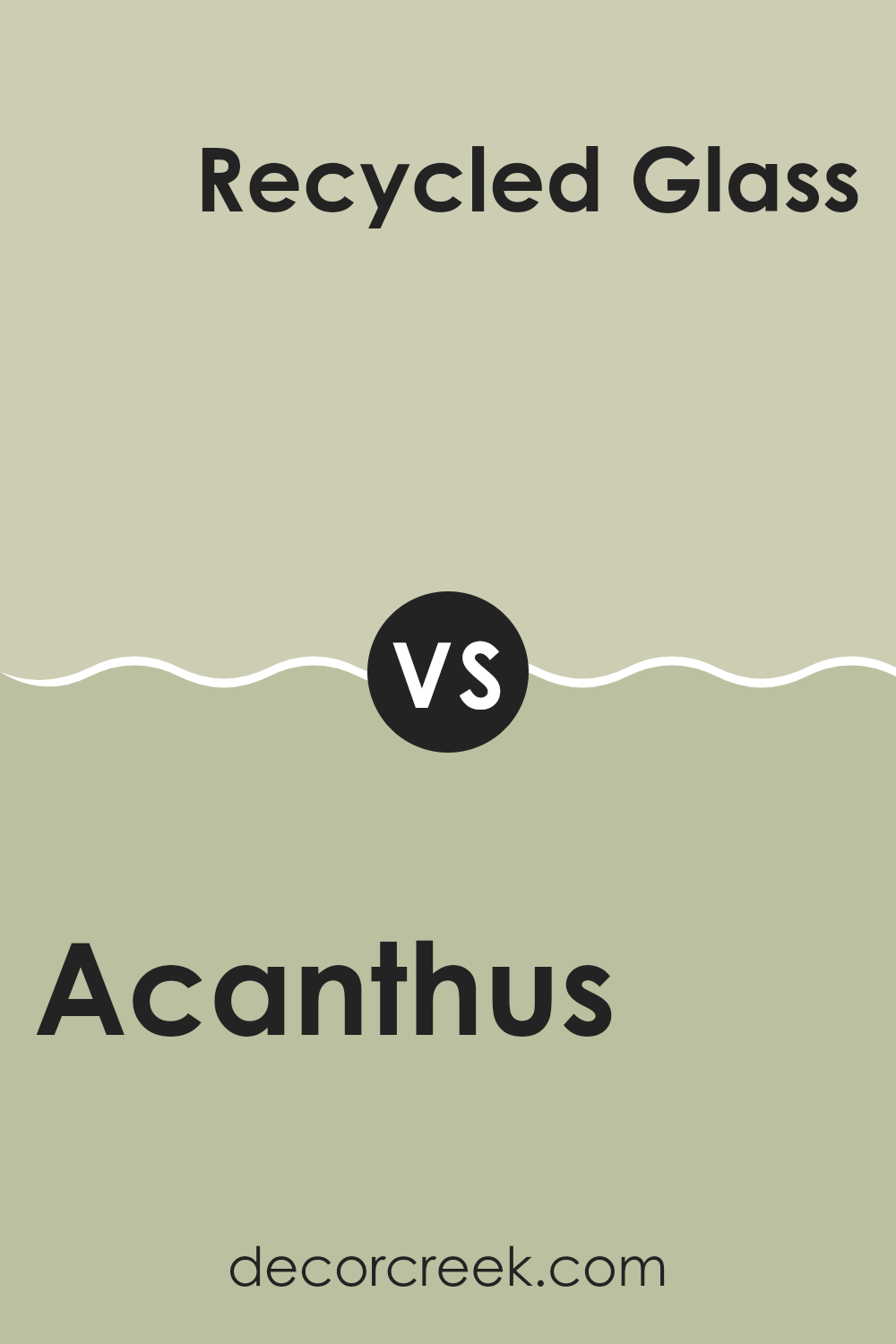
Acanthus SW 0029 by Sherwin Williams vs Recycled Glass SW 7747 by Sherwin Williams
Acanthus (SW 0029) by Sherwin Williams is a warm, earthy green that provides a natural and calming feel to a room. This color brings out the richness of nature, reminiscent of lush gardens or woodland settings. It offers a grounded and cozy atmosphere, perfect for living rooms or bedrooms.
On the other hand, Recycled Glass (SW 7747) is a lighter, brighter green with a hint of blue. This fresh color can evoke a sense of cleanliness and modernity. It’s ideal for creating a light and airy room, such as a kitchen or bathroom.
While Acanthus offers warmth and a more muted natural tone, Recycled Glass brings a crisp, lively vibe. Both colors enhance different moods: Acanthus is soothing and earnest, whereas Recycled Glass feels invigorating and refreshing. Using them together can create a harmonious balance, blending warmth with freshness in your home.
You can see recommended paint color below:
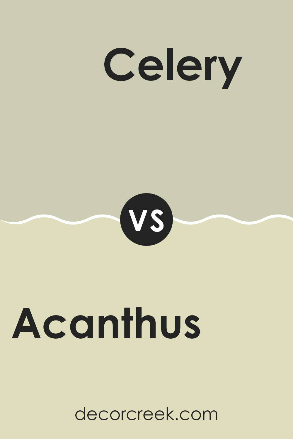
Acanthus SW 0029 by Sherwin Williams vs Celery SW 6421 by Sherwin Williams
Acanthus SW 0029 is a muted, earthy green with gray undertones, creating a calm and balanced look. It feels grounded and subtle, making it a great choice for areas where you want a soft, neutral backdrop that isn’t too bold.
On the other hand, Celery SW 6421 is a lighter, more vibrant green with a hint of yellow. It feels fresh and lively, perfect for adding a splash of energy to a room. Celery can brighten up areas and make them feel more open and inviting.
While Acanthus offers a more conservative and understated appearance, Celery brings brightness and enthusiasm. Acanthus might suit a traditional or rustic setting, while Celery can be ideal for modern or playful environments. Both colors bring a unique feel to a room, with Acanthus offering a soothing effect and Celery bringing a cheerful vibe. Choosing between them depends on the ambiance you wish to create.
You can see recommended paint color below:
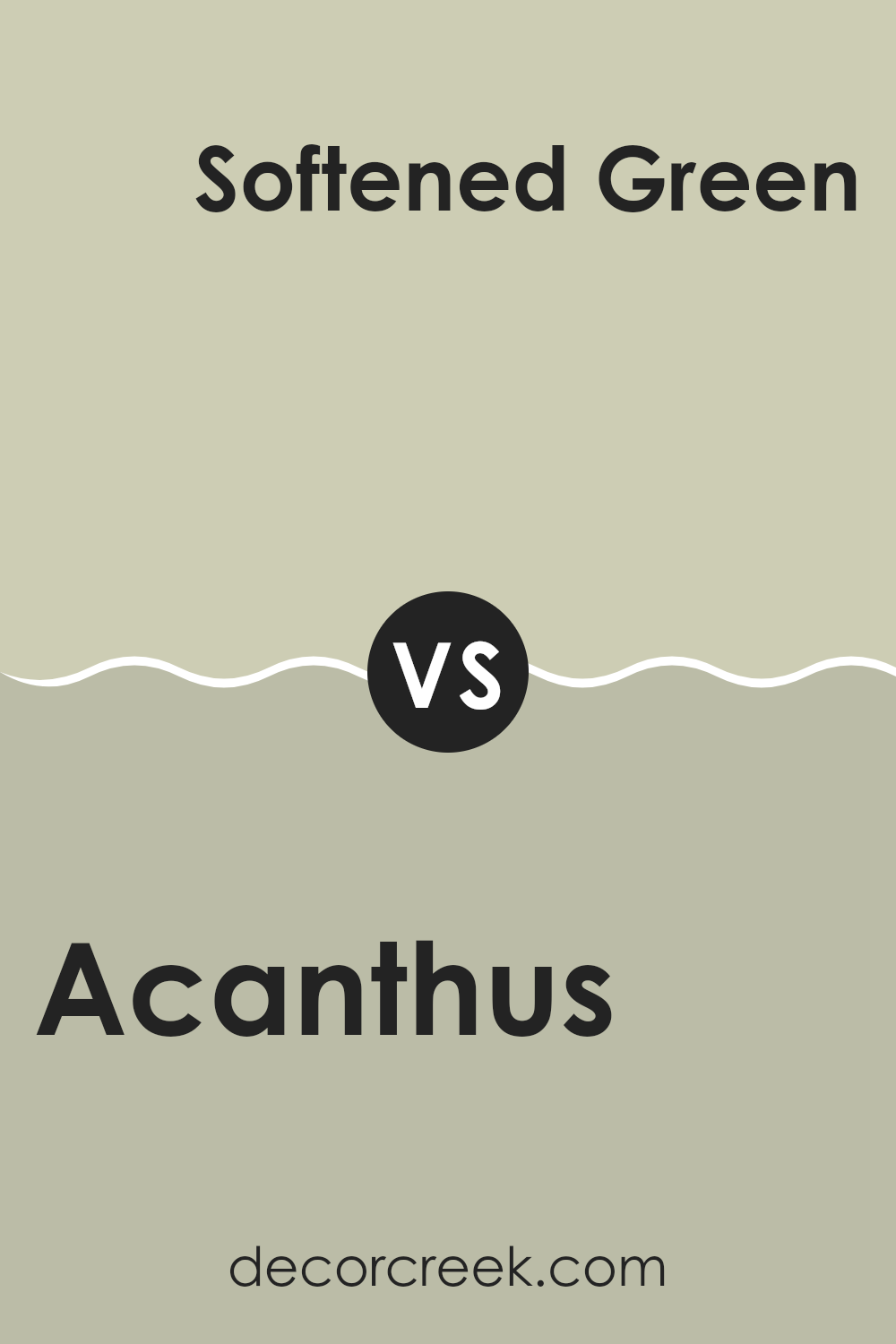
Acanthus SW 0029 by Sherwin Williams vs Softened Green SW 6177 by Sherwin Williams
Acanthus SW 0029 is a muted, earthy green with a slightly grey undertone, giving it a calm and natural look. It’s perfect for creating a cozy and peaceful environment in any room. This color feels enduring and works well as a neutral backdrop.
On the other hand, Softened Green SW 6177 is a lighter and fresher green. It’s a bit brighter than Acanthus, with a hint of softness. This makes it feel more refreshing and energizing, bringing a touch of springtime indoors. It can open up a room and bring more light and airiness to a room.
While both colors are green, Acanthus provides a more grounded and subtle vibe, while Softened Green offers a breezier and more lively feel. Depending on the mood you want to create, you can choose between the warm and understated tone of Acanthus or the light and cheerful quality of Softened Green.
You can see recommended paint color below:
Acanthus SW 0029 by Sherwin Williams vs Ancient Marble SW 6162 by Sherwin Williams
Acanthus SW 0029 by Sherwin Williams is a rich, muted green that brings a touch of nature into a room. It’s both calming and grounding, making it ideal for creating a cozy atmosphere. The color feels earthy and organic, lending itself well to both traditional and contemporary settings.
On the other hand, Ancient Marble SW 6162 is a lighter, more neutral green with a hint of beige. This color has a softer, more subtle presence compared to Acanthus. It works well as a flexible backdrop that can complement a range of decor styles, providing a gentle and soothing effect without being overpowering.
While Acanthus adds depth and an organic feel, Ancient Marble offers a gentle, understated elegance. They can both work beautifully in a home, with Acanthus perhaps making a bolder statement and Ancient Marble offering a more peaceful and flexible canvas.
You can see recommended paint color below:
Acanthus SW 0029 by Sherwin Williams vs Honeydew SW 6428 by Sherwin Williams
Acanthus and Honeydew are two distinct colors by Sherwin Williams. Acanthus is a deep, muted green that feels grounded and earthy. It can add a cozy and rich feel to a room, making it perfect for living rooms or libraries where you want a sense of warmth and comfort.
On the other hand, Honeydew is a much lighter and brighter green with a fresh and airy vibe. It brings a sense of lightness and energy, making it ideal for kitchens or bathrooms where a clean and lively atmosphere is desired.
When placed side by side, Acanthus offers a more traditional and subdued vibe, while Honeydew provides a refreshing and cheerful touch. Both colors enhance green tones but serve different moods: Acanthus for coziness and Honeydew for freshness. Using them together can create a balanced and dynamic interplay between deep and light greens in your home.
You can see recommended paint color below:
Acanthus SW 0029 by Sherwin Williams vs Liveable Green SW 6176 by Sherwin Williams
Acanthus (SW 0029) and Liveable Green (SW 6176) by Sherwin Williams are both lovely paint colors, but they offer different vibes. Acanthus is a soft green with a hint of gray, giving it a classic and enduring feel.
It’s a flexible color that can work well in both traditional and modern settings, bringing a sense of calm and elegance to any room. On the other hand, Liveable Green is a slightly warmer and more muted green.
It feels more subtle and natural, making it a great choice for those who want a light and airy atmosphere. While Acanthus leans more towards an elegant look with its gray undertones, Liveable Green’s warmth makes it inviting and cozy. Both colors would work beautifully in living areas, but your choice might depend on whether you prefer a touch of elegance or a cozy, natural feel.
You can see recommended paint color below:
After reading about Sherwin-Williams’ SW 0029 Acanthus, I’ve really come to appreciate this color. It’s a sort of green that feels both fresh and calming. When I think about using this paint in a room, I imagine it would make the place feel welcoming and peaceful. It’s a color that can make a living room cozy or a bedroom soothing.
Acanthus has a kind of natural feel because it resembles the color of leaves or nature. It’s not too bright, so it won’t make a room feel too loud or busy. Instead, it adds just enough color to make things interesting without taking over.
I also learned that this shade of green works well with other colors. You could pair it with whites or creams for a clean look or even combine it with deeper colors like navy blues or grays for a more dramatic effect.
In conclusion, SW 0029 Acanthus is a wonderful choice if you’re looking to paint a room in your house. It has the right balance of being both cool and warm. Plus, it’s a color that fits in nicely with many styles, whether your house is traditional or modern. If you’re picking out paint, this shade of green is definitely worth considering!
Ever wished paint sampling was as easy as sticking a sticker? Guess what? Now it is! Discover Samplize's unique Peel & Stick samples.
Get paint samples

