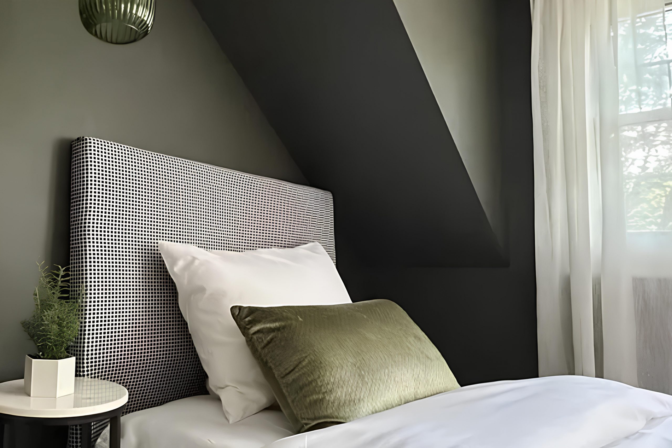
I think SW 6174 Andiron by Sherwin Williams might be the color you didn’t know you needed. When I first laid eyes on it, I noticed how its rich, deep green tones called out without being overwhelming. It strikes a perfect balance between sophistication and comfort, making it suitable for both modern and traditional spaces.
I imagine using Andiron in a cozy living room to create a welcoming atmosphere. You might also consider it in a study or library, where it can add a sense of calm focus. It pairs beautifully with natural wood tones, making furniture choices easy.
Adding metallic accents or soft textiles could enhance its allure even further.
If you find yourself searching for a color that can ground a room while still maintaining a sense of warmth, Andiron might be the answer.
It’s versatile enough to complement a range of styles, whether you’re into minimalism or prefer a more eclectic approach. Its ability to work as both a neutral backdrop and a statement shade is something you might appreciate in a home setting.
It’s a color that quietly whispers elegance and comfort, inviting you to feel at home in your own space.
What Color Is Andiron SW 6174 by Sherwin Williams?
Andiron, also known by its code SW 6174 from Sherwin-Williams, is a rich and earthy green with a touch of brown. This color brings a sense of nature into a space, creating a cozy and inviting atmosphere. It’s a versatile shade that can fit into various interior styles, particularly those that focus on natural and organic elements.
In a rustic or farmhouse interior, Andiron works beautifully with reclaimed wood and burlap textures, accentuating the warmth and comfort typical of these styles.
When used in a modern or minimalistic setting, it can provide a striking contrast against sleek materials like stainless steel or glass, bringing in a layer of depth without overwhelming the space.
Pairing Andiron with materials such as leather, stone, and wood can highlight its natural undertones, making spaces feel grounded and connected to the earth. It can also complement a cottage or traditional style, adding a lush backdrop for antique furnishings and floral patterns.
Using Andiron on accent walls or cabinetry can also create a highlighted area in your home, allowing other décor elements to stand out against this rich backdrop.
It also pairs well with neutral colors like beige, cream, and light gray, creating a balanced and harmonious look in any room.
Is Andiron SW 6174 by Sherwin Williams Warm or Cool color?
Andiron by Sherwin Williams is a rich, earthy green color that brings a sense of warmth and comfort to a home. It has a deep, natural tone that works well in many settings. When used on the walls of a living room or bedroom, Andiron creates a cozy atmosphere that feels inviting and snug.
In combination with neutral furniture and decor, it can make the space feel grounded and balanced. This color pairs beautifully with both dark and light woods, enhancing their natural beauty.
It can also be used as an accent color in a kitchen or bathroom, adding a touch of nature without being overwhelming. Andiron’s versatile shade complements a variety of styles, from rustic to modern, easily fitting into different design themes. Its organic hue can evoke a connection to nature, making it a great choice for creating a comfortable and welcoming home environment.
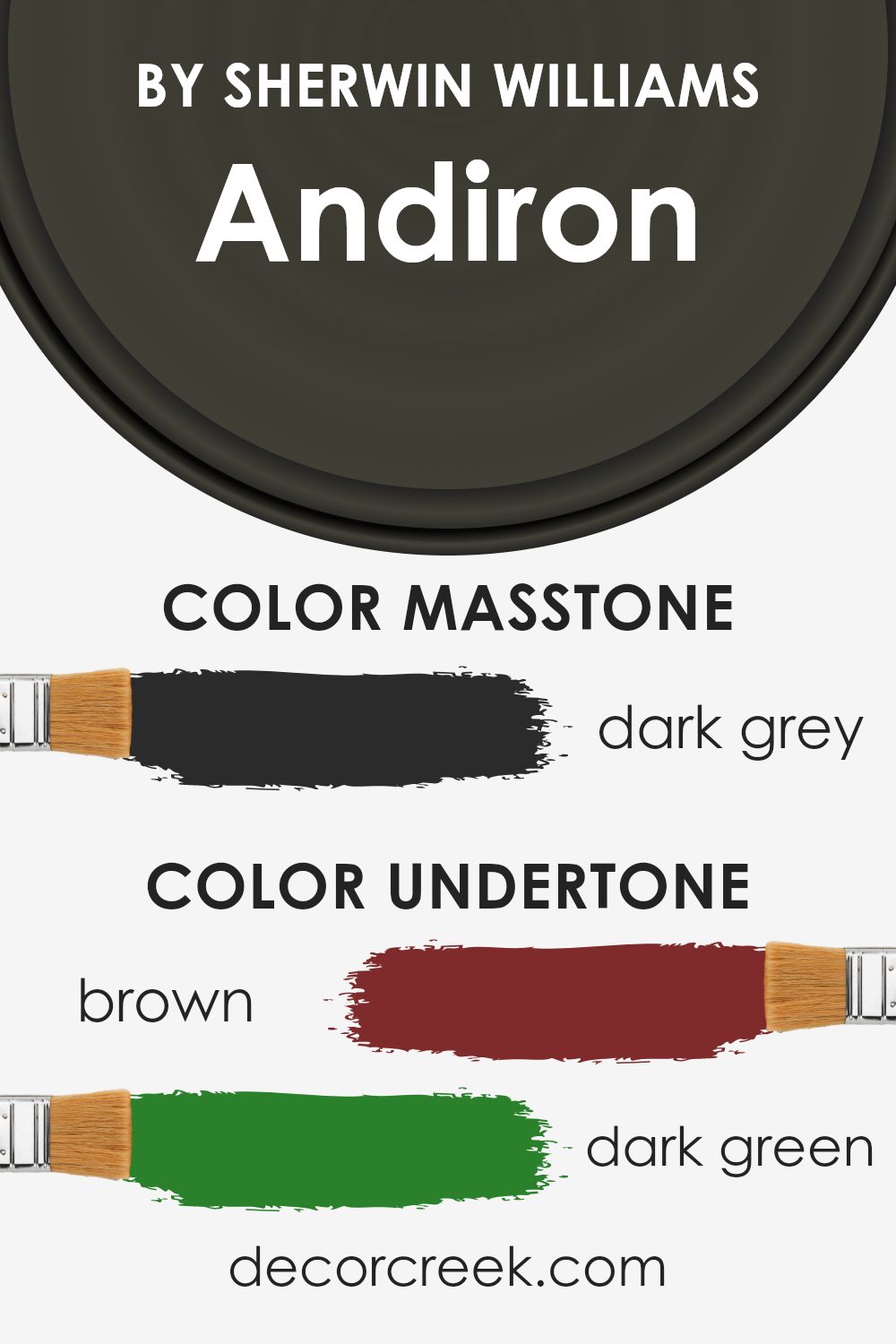
Undertones of Andiron SW 6174 by Sherwin Williams
Andiron SW 6174 by Sherwin Williams is a complex color with several undertones that influence its appearance. The primary undertones include Brown, Dark Green, Navy, Olive, Purple, Dark Turquoise, and Grey. These undertones can change how the color looks in different lighting conditions and settings.
Undertones are the subtle hues beneath the main color. They affect how we perceive the color because they can cause a paint to look different under various lights and next to different colors. For example, a green undertone might become more apparent in natural light.
In the case of Andiron, the Brown undertone adds warmth, making it feel cozy and inviting. The Dark Green and Olive undertones can bring a natural and earthy feel, enhancing spaces with a touch of the outdoors. The Navy and Purple hints give depth, adding a bit of richness and making the paint suitable for spaces where a dash of complexity is desired.
The Dark Turquoise and Grey undertones provide coolness and balance, preventing the color from feeling too warm.
When applied on interior walls, these undertones influence how the color interacts with furniture and lighting. The color may appear warm or cool depending on the setting, making it versatile for various room designs.
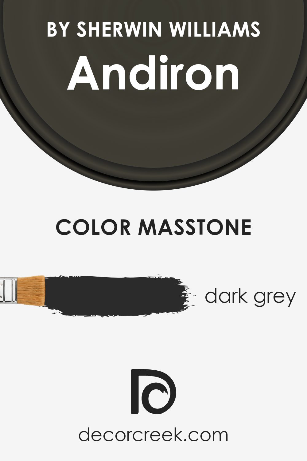
What is the Masstone of the Andiron SW 6174 by Sherwin Williams?
Andiron by Sherwin Williams is a dark gray color with a masstone of #2B2B2B. This deep and neutral shade brings a sense of warmth and coziness to any room. Its dark gray tone is versatile, working well in both modern and traditional homes.
Because of its depth, Andiron can make a large space feel more intimate and inviting. When used on walls, it creates a sophisticated backdrop that allows other colors and textures in the room to stand out.
This shade pairs beautifully with lighter colors, such as whites and soft grays, creating a balanced contrast that feels elegant. It can also complement bold colors like navy blue or forest green for a dramatic look. In well-lit rooms, the dark gray color appears rich and full, while in dimmer spaces, it adds a touch of mystery and depth.
Overall, Andiron is a versatile color that adds character and a touch of class to any home.
How Does Lighting Affect Andiron SW 6174 by Sherwin Williams?
Lighting has a big impact on how colors look. It can change the way a paint color appears on your walls. The color Andiron by Sherwin Williams is a deep, greenish hue that looks different depending on the light.
In natural light, Andiron shows its true color. However, the appearance of Andiron in any given room depends on which direction the room faces. In north-facing rooms, natural light is cooler and slightly bluish. This can make Andiron appear darker and more muted.
South-facing rooms get a lot of warm sunlight throughout the day, which makes colors look warmer and more vibrant. Here, Andiron might look lighter and richer, bringing out its green tones.
East-facing rooms are brighter in the morning and get cooler, softer light later in the day. In these spaces, Andiron may look brighter and fresher in the morning light but become more subdued as the day progresses.
West-facing rooms receive warm light in the afternoon and early evening. Andiron in these rooms might seem more intense and warm-hued during the latter part of the day, offering a cozy feel.
Artificial lighting also affects how Andiron appears. Incandescent and warm LED lights can make the color seem warmer, enhancing its rich green tone. Fluorescent lights, which are cooler, might make Andiron feel duller or more grayish.
When choosing Andiron for your space, it’s a good idea to test the color with different lighting conditions and at different times of the day. This will help you see how it changes and ensure it works with the room’s natural and artificial light. Adjustments in lighting, like the type of bulb used, can greatly influence whether Andiron feels comfortable and harmonious in your home.
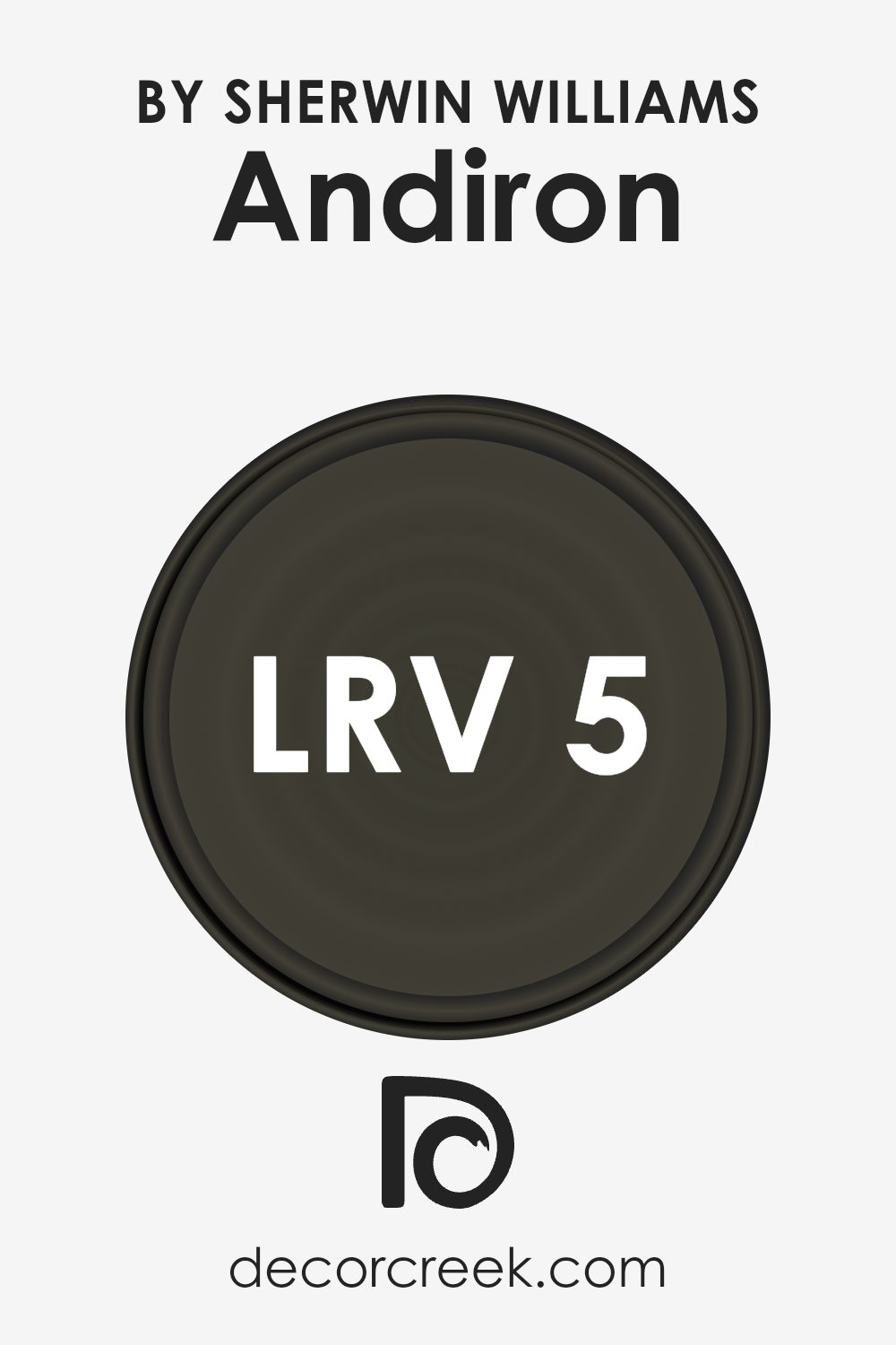
What is the LRV of Andiron SW 6174 by Sherwin Williams?
Light Reflectance Value (LRV) measures the amount of visible and usable light that reflects from a painted surface. It is an essential tool in understanding how colors will appear in a space. LRV is expressed on a scale of 0 to 100, where 0 represents absolute black, which absorbs all light, and 100 represents pure white, which reflects all light.
Colors with lower LRV values absorb more light and tend to make spaces feel smaller and more intimate, while those with higher LRV values reflect more light and can make spaces feel larger and more open.
The LRV of the color Andiron by Sherwin-Williams is 5.132, placing it on the very low end of the scale. This means it absorbs a significant amount of light, making it a very dark, rich color. When used on walls, it can create a cozy and intimate atmosphere but might make a space feel smaller if not balanced with lighter elements.
In rooms with ample natural light, Andiron can offer a dramatic and bold look, often highlighting furnishings or architectural details. However, in spaces with limited light, it can make them feel darker and more enclosed.
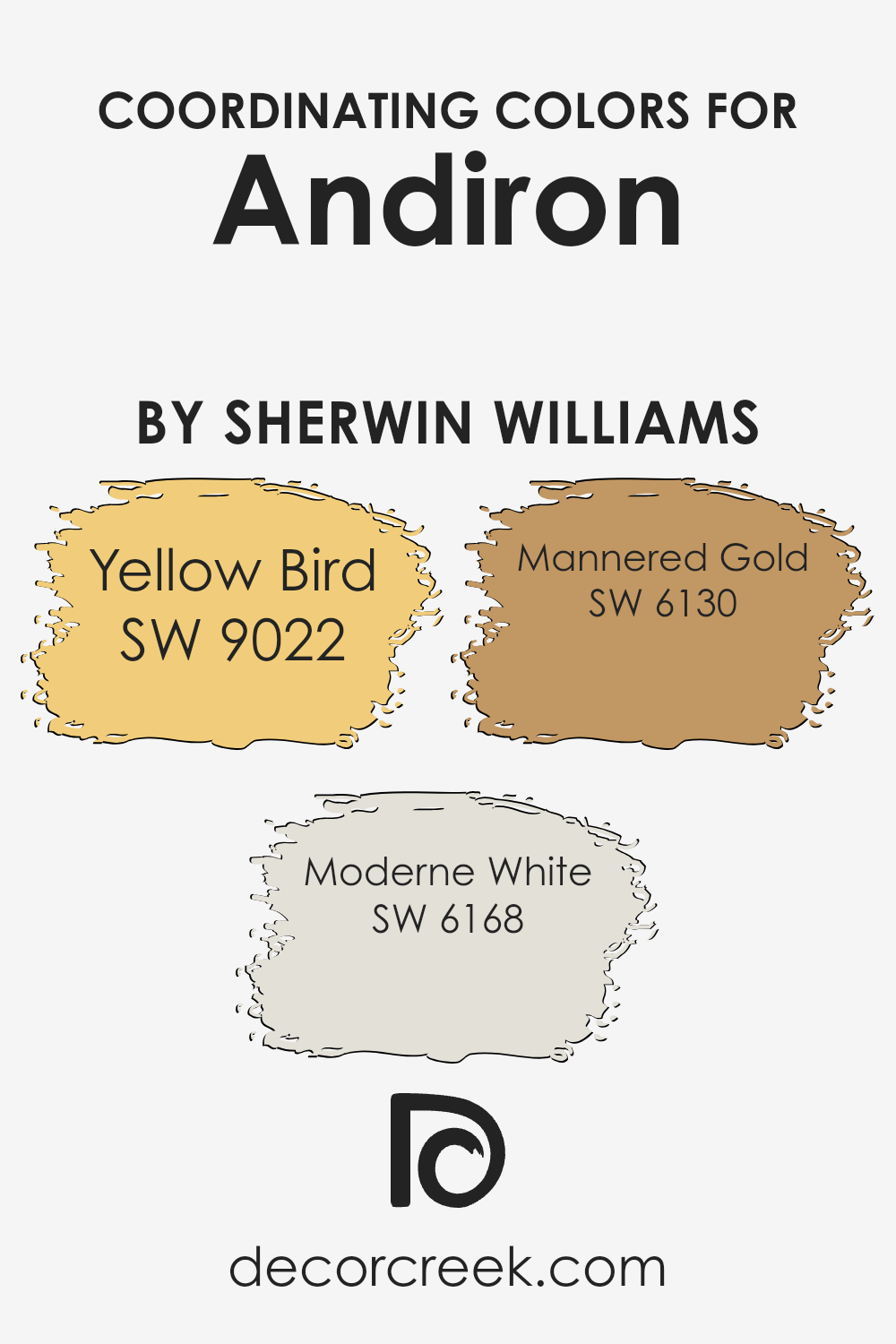
Coordinating Colors of Andiron SW 6174 by Sherwin Williams
Coordinating colors are shades that work well together to create a harmonious look. When you choose colors for a room, it’s important to pick shades that complement each other, as well as the main color. For example, with Andiron by Sherwin Williams, which is a deep and earthy green, you would want to use colors that enhance its natural beauty without clashing.
Coordinating colors can help create a smooth transition between different areas in a room or between different rooms, making the space feel more connected and balanced.
Yellow Bird is a bright and cheerful yellow that adds a splash of energy and warmth when paired with the more subdued Andiron.
Moderne White is a soft off-white, perfect for bringing light into the space and providing a calm backdrop that allows the other colors to stand out.
Mannered Gold is a rich, warm gold that complements Andiron’s depth, adding elegance and sophistication to the mix. By combining these coordinating colors, you create a balanced palette that feels cohesive and inviting. Whether using these shades for walls, accents, or decor, they offer a beautiful way to enhance any room’s overall aesthetic.
You can see recommended paint colors below:
- SW 9022 Yellow Bird
- SW 6168 Moderne White
- SW 6130 Mannered Gold
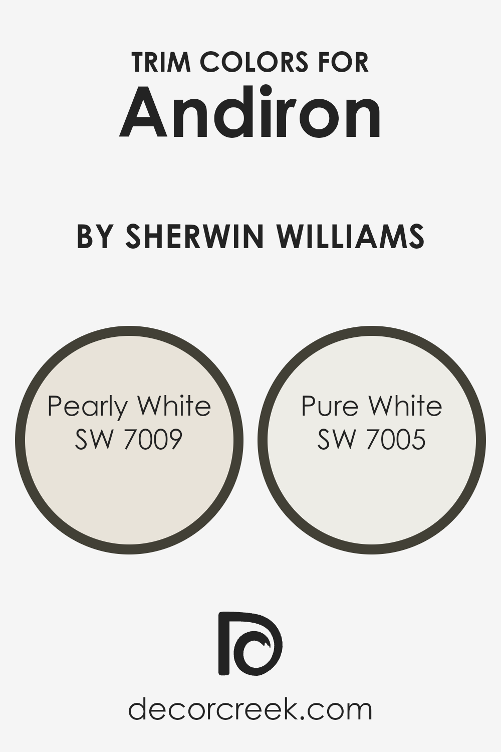
What are the Trim colors of Andiron SW 6174 by Sherwin Williams?
When choosing paint colors, trim colors play a crucial role in tying the room’s aesthetic together. Trim colors are used on baseboards, moldings, and door and window frames, providing a finishing touch that can either subtly blend with or starkly contrast the main wall color.
For Sherwin Williams’ Andiron, a bold and rich green with earthy undertones, selecting the right trim color can enhance its warmth and depth. Pearly White (SW 7009) is an excellent choice for trim as it offers a soft and gentle off-white tone that complements the complexity of Andiron.
Its understated brightness can bring out the deeper hues in the green, contributing to a balanced and inviting space.
On the other hand, Pure White (SW 7005) creates a crisp, clean border that can make the deep green of Andiron feel more vibrant and pronounced, giving the room a fresh and modern feel.
Pearly White sets a calm and relaxed vibe with its subtle warmth, making it perfect for spaces where you want a cozy yet refined look.
It’s a versatile choice that gently supports the main colors without overwhelming them. Meanwhile, Pure White stands out as a classic and timeless white that brings a sense of clarity and simplicity.
It enhances natural light and can make the room feel more open and airy. Using these trim colors with Andiron can significantly impact the overall feel of a room, providing harmony or contrast depending on the desired effect.
You can see recommended paint colors below:
Colors Similar to Andiron SW 6174 by Sherwin Williams
Choosing similar colors to Andiron from Sherwin Williams can create a visually harmonious and balanced environment. Colors like Iron Ore, a deep almost-black gray, and Foxhall Green, a muted dark green, offer a refined complement without stark contrasts.
Clove, with its rich brown tones, and Laurel Woods, which brings earthy greens, add warmth and depth to the palette. Meanwhile, the dark, olive hues of Ripe Olive and the brown-gray neutral tone of Black Fox provide a soothing atmosphere through their subtle yet significant presence.
Jasper, a deep teal, ties elegance with a touch of colorful surprise, while Sealskin, a deep charcoal, maintains a sophisticated edge.
Garden Path, a green with gentle earthy undertones, and Nocturne, a dark navy blue, are perfect for adding a sense of depth and dimension.
Together, these colors work because they maintain a consistent tone and value that complements the primary Andiron shade.
This means they don’t overwhelm each other, helping to create a cohesive look that feels intentional and connected.
Whether used for walls, accents, or furniture, each color offers its unique twist while still relating closely to each other and our main choice, creating an effortlessly stylish and calming space.
You can see recommended paint colors below:
- SW 7069 Iron Ore
- SW 9184 Foxhall Green
- SW 9605 Clove
- SW 7749 Laurel Woods
- SW 6209 Ripe Olive
- SW 7020 Black Fox
- SW 6216 Jasper
- SW 7675 Sealskin
- SW 2929 Garden Path
- SW 9520 Nocturne

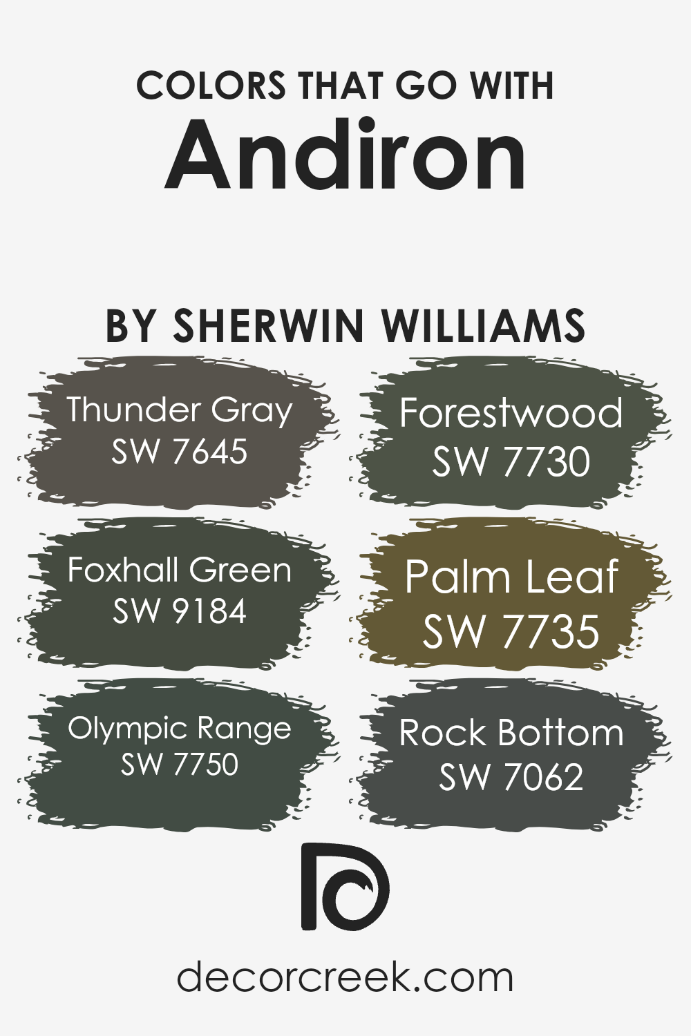
Colors that Go With Andiron SW 6174 by Sherwin Williams
Colors that go with Andiron SW 6174 by Sherwin Williams are important because they help create a harmonious and balanced look in a space. Every color has a unique personality, and when combined thoughtfully, they can enhance each other and make the room feel more inviting.
These combinations are crucial when designing with Andiron, a deep and complex color. Adding SW 7645, Thunder Gray, provides a cool, muted contrast that tempers the depth of Andiron, making it feel more grounded. SW 9184, Foxhall Green, brings a touch of nature indoors, offering a lush and dense feel that complements the rich tone of Andiron.
SW 7750, Olympic Range, adds warmth and a sense of adventure, with its deep olive tone making spaces feel cozy and snug.
SW 7730, Forestwood, with its dark, earthy brown hues, ties beautifully with Andiron, offering a sense of stability and warmth.
Meanwhile, SW 7735, Palm Leaf, brings a lighter green element that introduces a fresher, more vibrant quality. Lastly, SW 7062, Rock Bottom, with its dark, charcoal-like shading, provides a dramatic edge that accentuates the richness of Andiron.
Each of these colors, when used thoughtfully around Andiron, works to create a balanced, inviting atmosphere that makes any room feel complete and welcoming.
You can see recommended paint colors below:
- SW 7645 Thunder Gray
- SW 9184 Foxhall Green
- SW 7750 Olympic Range
- SW 7730 Forestwood
- SW 7735 Palm Leaf
- SW 7062 Rock Bottom
How to Use Andiron SW 6174 by Sherwin Williams In Your Home?
Andiron SW 6174 by Sherwin Williams is a warm, earthy color that adds a cozy feel to any space. It’s a versatile shade of dark green with brown undertones, making it perfect for creating an inviting atmosphere. This color works well in various rooms, whether it’s a living room, study, or even a bedroom.
You can use Andiron as an accent wall in a living room to create a focal point. Pairing it with neutral colors like cream or beige can help balance the space and prevent it from feeling too dark.
In a study, Andiron can encourage concentration and bring a touch of nature indoors. It also pairs beautifully with wooden furniture and natural textures.
In a bedroom, Andiron can create a restful atmosphere, helping you relax and unwind. Add some soft, white linen or gold accents to complement the richness of the color, making the space feel warm and welcoming.
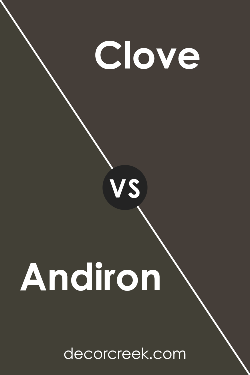
Andiron SW 6174 by Sherwin Williams vs Clove SW 9605 by Sherwin Williams
Andiron (SW 6174) by Sherwin Williams is a warm, earthy green that feels natural and comforting. It brings a sense of calmness to a space, making it ideal for living rooms or bedrooms. Its subtle undertones are slightly muted, ensuring it doesn’t overpower a room but rather blends harmoniously with other elements.
On the other hand, Clove (SW 9605) is a deep, rich brown with red undertones, creating a cozy and inviting atmosphere. It works well in spaces where you want a sense of warmth and intimacy, like dining rooms or libraries. Clove has a bold presence, adding depth and character to a space.
When comparing the two, Andiron offers a softer, more muted look, while Clove provides a stronger, more intense feel. Both colors can create a welcoming environment but cater to different moods and design preferences.
You can see recommended paint color below:
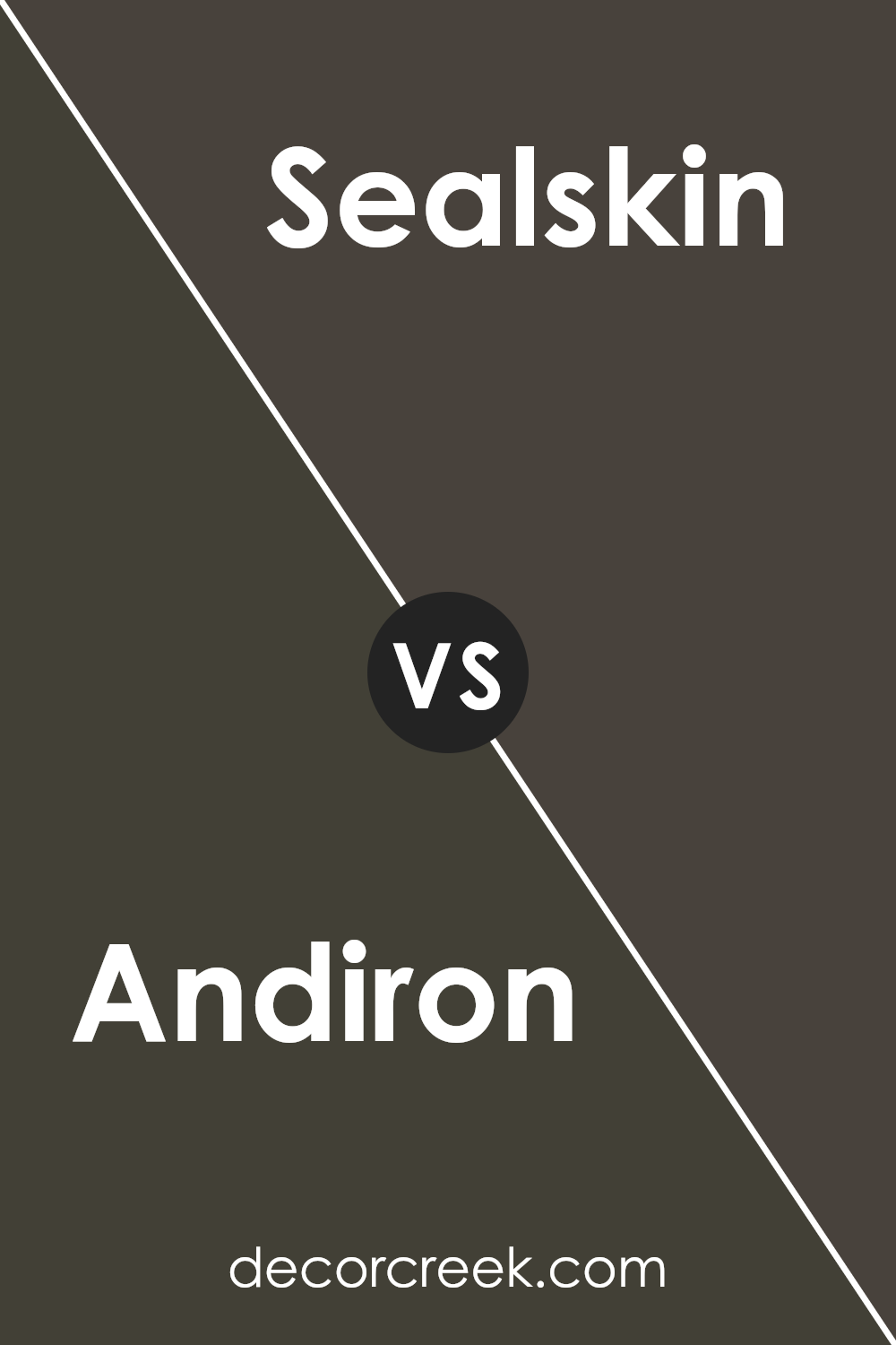
Andiron SW 6174 by Sherwin Williams vs Sealskin SW 7675 by Sherwin Williams
Andiron SW 6174 and Sealskin SW 7675 by Sherwin Williams are two distinct colors that offer different moods and styles. Andiron is a warm, earthy green with subtle yellow undertones. It creates a natural, cozy atmosphere, ideal for spaces that aim to feel welcoming and relaxed. The green hue is reminiscent of nature and can make a room feel grounded and calm.
On the other hand, Sealskin is a deep, rich black-brown. It adds a sense of drama and sophistication to any space. This color works well in modern settings and pairs beautifully with lighter accents, creating a striking contrast.
While Sealskin can make a large room feel more intimate, it might be overwhelming in smaller spaces unless used sparingly.
Overall, Andiron is perfect for those seeking warmth and an organic feel, while Sealskin offers a bold, elegant statement for more contemporary designs.
You can see recommended paint color below:
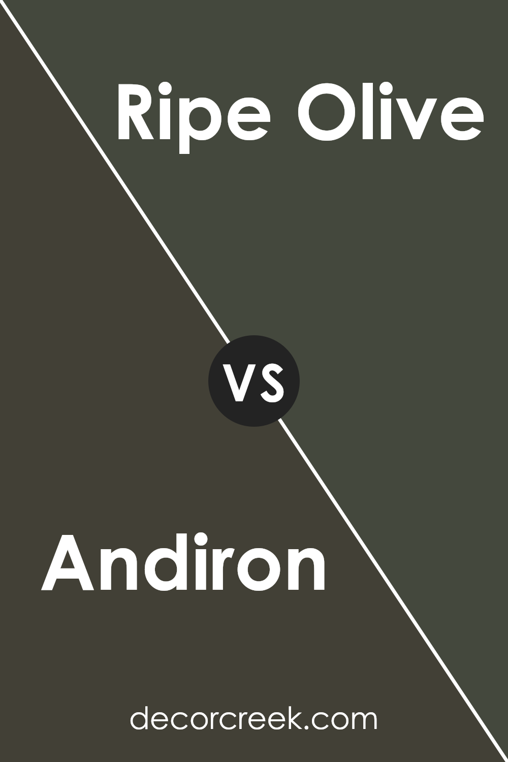
Andiron SW 6174 by Sherwin Williams vs Ripe Olive SW 6209 by Sherwin Williams
Andiron SW 6174 and Ripe Olive SW 6209 are both rich, earthy colors by Sherwin Williams, but they have distinct characteristics. Andiron is a warm, muted green with a slightly brownish tone. It has a cozy, inviting feel that works well in spaces where you want a natural, grounded atmosphere. It’s versatile and pairs beautifully with wood and neutral colors.
Ripe Olive, on the other hand, is a deeper and more intense green. It has a stronger olive tone, giving it a bold and dramatic presence. This color is excellent for creating a statement wall or adding depth to a room. Ripe Olive works well with both lighter accents and metallics.
While both colors are green, Andiron offers a softer, more subtle approach, whereas Ripe Olive makes a bolder statement. Your choice will depend on whether you want a quiet backdrop or a striking feature in your space.
You can see recommended paint color below:
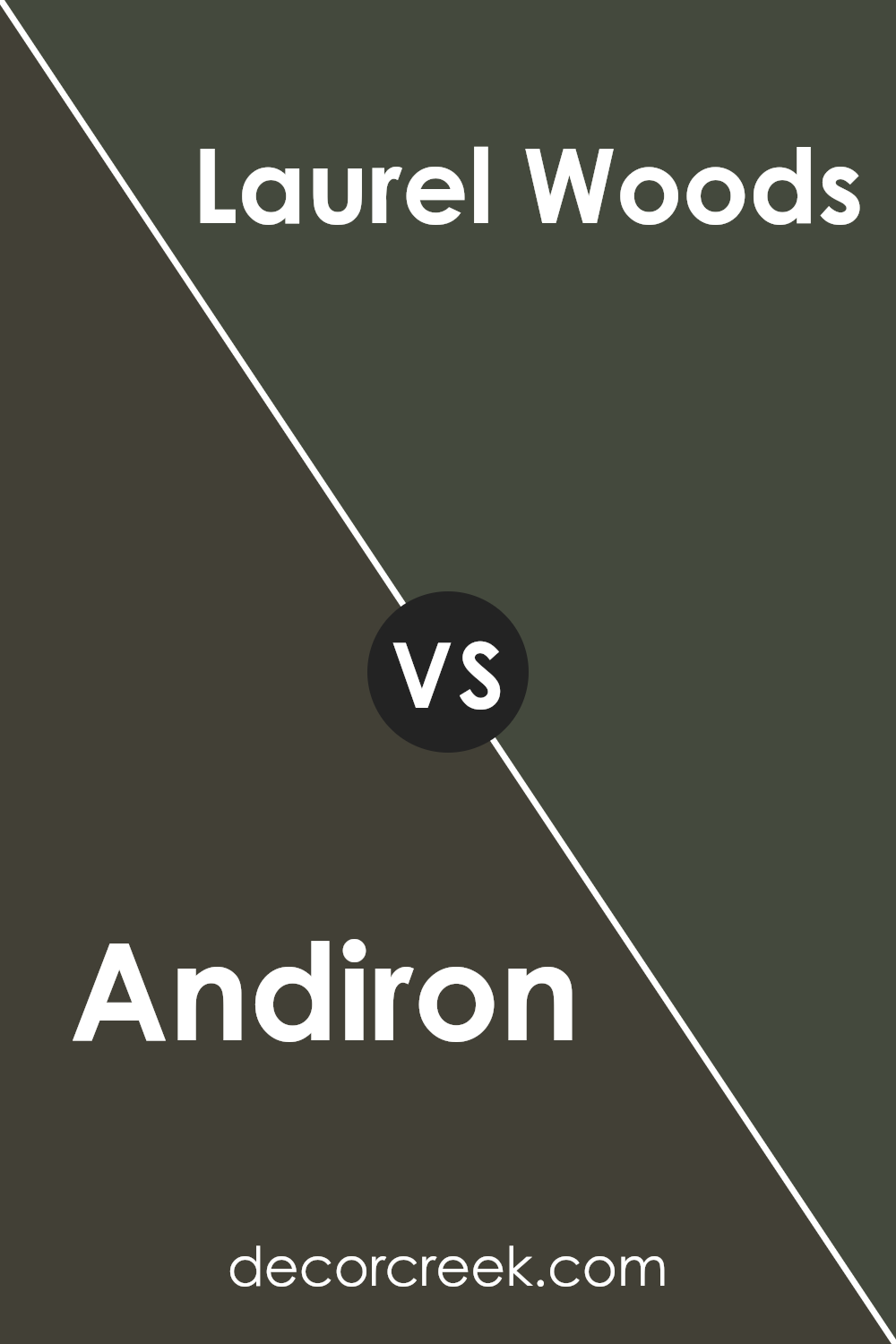
Andiron SW 6174 by Sherwin Williams vs Laurel Woods SW 7749 by Sherwin Williams
Andiron (SW 6174) by Sherwin Williams is a warm, earthy shade with a greenish-brown tone. It feels like nature, bringing comfort and a sense of being grounded into any space. This color pairs well with wooden furniture and natural textures due to its organic vibe. It’s ideal for creating cozy and inviting environments with a hint of rustic charm.
On the other hand, Laurel Woods (SW 7749) is a deeper, richer green shade. It has a stronger green pigment, which provides a bold and more sophisticated presence in a room. While Andiron tends to blend softly into spaces, Laurel Woods can stand out and make more of a statement, adding depth and a touch of drama.
In summary, Andiron offers warmth and earthiness, while Laurel Woods gives a classic and bold feel. Both colors bring the essence of the outdoors inside, but they do so with different levels of intensity.
You can see recommended paint color below:
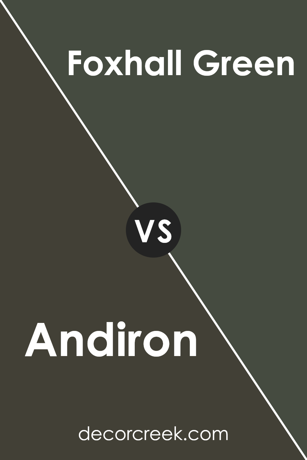
Andiron SW 6174 by Sherwin Williams vs Foxhall Green SW 9184 by Sherwin Williams
Andiron SW 6174 and Foxhall Green SW 9184 are two distinct colors by Sherwin Williams that bring unique qualities to any space. Andiron is a warm, earthy green with hints of gray, which gives it a muted, calming feel. It’s perfect for creating a cozy and inviting atmosphere in any room.
On the other hand, Foxhall Green is a darker, richer shade of green with blue undertones. It has a more dramatic and bold presence, making it ideal for accent walls or spaces where you want a touch of elegance.
Both colors have a grounding effect, but Andiron leans more towards warmth and subtlety, while Foxhall Green adds depth and sophistication with its darker hue.
Whether you’re looking to create a warm, cozy space or add a touch of boldness, these greens provide versatile options to suit different moods and styles.
Each color can enhance the overall look and feel of a room in its own way.
You can see recommended paint color below:
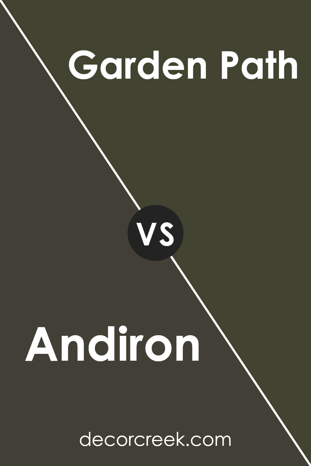
Andiron SW 6174 by Sherwin Williams vs Garden Path SW 2929 by Sherwin Williams
Andiron SW 6174 and Garden Path SW 2929 from Sherwin Williams are both lovely colors, but they give off different vibes. Andiron is a warm, earthy color that feels a bit darker and more grounded. It’s got a subtle green undertone that makes it feel natural and cozy, like a comforting blanket or a rustic cabin.
Garden Path, on the other hand, is a lighter, softer shade of green. It feels fresh and airy, almost like a gentle breeze on a spring day. This color brings a sense of nature indoors, making a room feel lively and refreshing.
When you put Andiron and Garden Path side by side, Andiron feels more robust and strong, while Garden Path feels light and gentle. Both colors are great for different moods: Andiron for a comfy, snug space and Garden Path for a bright, uplifting area.
You can see recommended paint color below:
- SW 2929 Garden Path
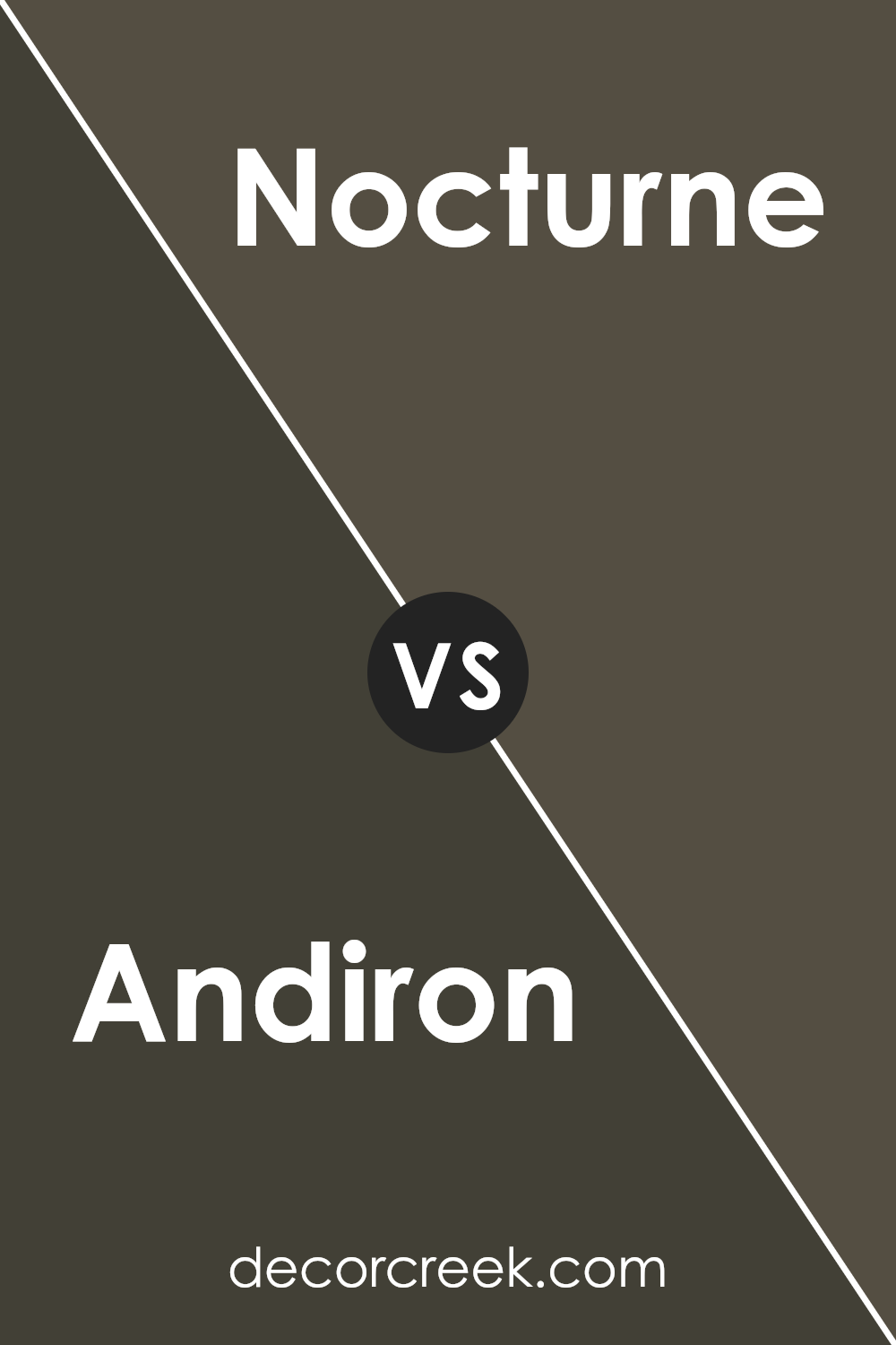
Andiron SW 6174 by Sherwin Williams vs Nocturne SW 9520 by Sherwin Williams
Andiron SW 6174 by Sherwin Williams is a warm, earthy green that feels very grounded and natural. It’s a versatile color that works well in spaces where you want to bring the outdoors inside. The hue is both calming and inviting, making it an excellent choice for living rooms, kitchens, or any room where you spend a lot of time with family and friends.
In contrast, Nocturne SW 9520 is a much darker, moodier color. It’s a deep, almost black shade of blue that can add drama and elegance to a space. This color is perfect for creating a cozy, intimate atmosphere, making it a great option for bedrooms or studies where you want to foster a feeling of retreat and calm.
While Andiron is more about warmth and comfort, Nocturne provides a sense of depth and sophistication. Both colors offer unique and beautiful options depending on the mood and style you seek for your space.
You can see recommended paint color below:
- SW 9520 Nocturne
Andiron SW 6174 by Sherwin Williams vs Iron Ore SW 7069 by Sherwin Williams
Andiron (SW 6174) and Iron Ore (SW 7069) by Sherwin Williams are two distinct colors. Andiron is a warm, earthy olive green that adds a cozy and natural feel to spaces. It’s versatile, working well in living rooms or bedrooms where a calm and inviting atmosphere is desired.
In contrast, Iron Ore is a dark, charcoal gray with a modern and dramatic touch. Its bold presence makes it perfect for accent walls or exterior features, creating contrast and sophistication.
When paired together, Andiron can soften Iron Ore’s intensity, offering a balanced look.
Andiron brings warmth and an organic vibe, while Iron Ore offers sleekness and depth. These colors complement each other, providing both inviting warmth and striking boldness.
Depending on the mood and style you want in your space, the choice between these colors can be impactful, whether used individually or together.You can see recommended paint color below:
Andiron SW 6174 by Sherwin Williams vs Black Fox SW 7020 by Sherwin Williams
Andiron SW 6174 is a warm, earthy green color by Sherwin Williams. It’s a grounded and calming shade that can bring a sense of nature into your space. Its subtle undertones make it versatile for various room styles, pairing well with both traditional and modern decor.
On the other hand, Black Fox SW 7020 is a dark, rich brown with black undertones. It’s a bold choice, adding depth and sophistication to any room. While it can make a space feel cozy, it can also make it feel darker due to its intensity.
When comparing the two colors, Andiron is more natural and muted, suitable for creating a comforting and inviting atmosphere.
Black Fox, being darker and richer, commands attention and can serve as a striking accent or main color for a dramatic effect.
Both colors can significantly impact a room, but they offer different moods and aesthetics.
You can see recommended paint color below:
Andiron SW 6174 by Sherwin Williams vs Jasper SW 6216 by Sherwin Williams
Andiron and Jasper, both by Sherwin Williams, offer distinct vibes for any space. Andiron is a warm, earthy green with subtle brown undertones, giving it a natural, organic feel. It’s reminiscent of lush forests and can add a cozy, grounded touch to a room.
In contrast, Jasper is a deep, rich blue with gray undertones. It offers a moody, elegant feel that’s perfect for creating a sense of calm and depth.
While Andiron is perfect for those looking to bring the outdoors inside, Jasper suits those who prefer a bold and dramatic atmosphere.
Neither color overwhelms, but each brings its unique presence to a room. Andiron works well in spaces needing warmth, combining beautifully with neutrals and wood tones.
Jasper, on the other hand, pairs nicely with lighter grays and whites, creating a sophisticated contrast. Together, these colors can create a dynamic and balanced environment.
You can see recommended paint color below:
Conclusion
It’s a dark, rich hue that brings a cozy and warm feeling to any room. Imagine a snug cabin in the woods; that’s the kind of vibe Andiron gives.
This shade is not too loud or too bright, which makes it great for anyone who wants their home to feel comfortable and inviting.
What’s really cool about Andiron is how it works well with so many other colors. You can pair it with lighter shades if you want some contrast, or match it with similar colors for a more even look. Whether you use it in the living room, bedroom, or even on the front door, it helps give your home a welcoming feel.
Plus, it’s a reliable choice if you want a strong base color for your walls. When you want to make a change, you can just add some new decorations or furniture, and Andiron will fit right in without needing to repaint.
Overall, I think SW 6174 Andiron is a great choice if you want a color that brings warmth and comfort to your home. It feels like a big, cozy hug in color form.
Ever wished paint sampling was as easy as sticking a sticker? Guess what? Now it is! Discover Samplize's unique Peel & Stick samples.
Get paint samples

