Immersing oneself in the art of interior design, one discovers the transformative power of color. Colors breathe life into our spaces, influencing mood, evoking emotions, and creating ambiance. Among the vast palette of hues, one that stands out for its uplifting and serene influence is Sherwin-Williams’ SW 0063 Blue Sky.
As part of their classic collection, this versatile color creates a vibrant backdrop for a multitude of interior and exterior spaces.
What Color Is SW 0063 Blue Sky?
SW 0063 Blue Sky is a beautiful, vibrant shade that captures the spirit of a clear, sunny day. It is a mid-tone, pure blue that brings to mind wide-open skies, stirring a sense of expansiveness and tranquility. The striking intensity of SW Blue Sky evokes feelings of freshness and vitality, making it an inspiring color that lends itself to countless design possibilities.
As a medium-to-light hue, SW Blue Sky strikes a balance between being energetic and calming.
While bold enough to command attention, it’s still subtle enough not to be overwhelming, providing a harmonious presence that works with a variety of design elements. Its cheerful yet peaceful essence radiates positivity and joy, making it a delightful choice for creating vibrant, inviting spaces.
Ever wished paint sampling was as easy as sticking a sticker? Guess what? Now it is! Discover Samplize's unique Peel & Stick samples.
Get paint samples

Is It a Warm Or Cool Color?
SW 0063 Blue Sky falls under the category of cool colors. Cool colors are often associated with water, sky, ice, and snow, and they have the ability to calm and soothe. As its namesake suggests, SW Blue Sky emulates the tranquil expansiveness of the sky on a clear, sunny day, bringing a sense of calm and serenity into your living space.
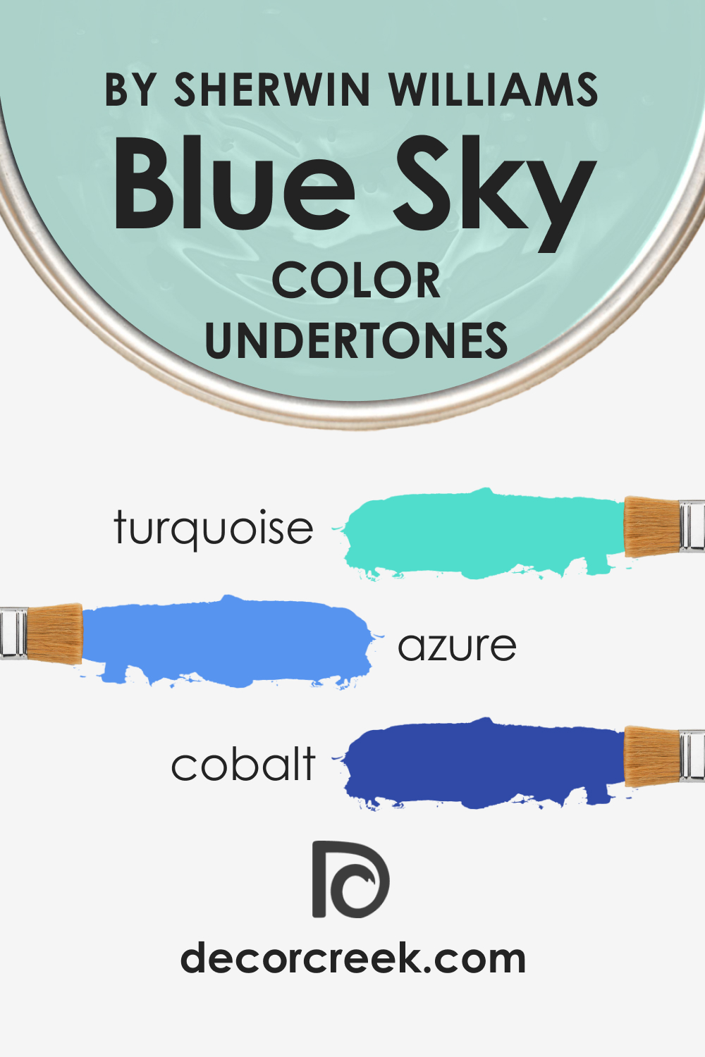
Undertones of SW 0063 Blue Sky
Identifying a color’s undertone is vital to understanding how it will interact with other hues in a room. In the case of SW 0063 Blue Sky, the primary undertones are:
- Turquoise: The presence of turquoise gives SW Blue Sky a slightly greenish cast that makes it appear vibrant and fresh.
- Azure: Azure, a bright, cyan-blue color, gives SW Blue Sky its radiant, sky-like quality.
- Cobalt: The faint trace of cobalt deepens the color and adds a hint of sophistication.
Undertones influence how we perceive the main color. They subtly shift the color’s appearance, adding depth and complexity. In SW Blue Sky’s case, the undertones contribute to its lively yet soothing vibe, making it an incredibly versatile color.
Coordinating Colors of SW 0063 Blue Sky
Coordinating colors are those that work well with the main color to create a balanced and aesthetically pleasing color scheme. When it comes to SW Blue Sky, the following colors coordinate beautifully:
- SW 6385 Dover White : This warm, creamy white provides a crisp contrast to SW Blue Sky, highlighting its vibrancy without clashing.
- SW 7531 Canvas Tan : A warm, neutral beige, Canvas Tan, pairs well with SW Blue Sky, creating a balanced and calming color palette.
Additionally, these colors can coordinate effectively with SW Blue Sky:
- SW 7023 Requisite Gray : This complex gray with both warm and cool undertones offers a sophisticated contrast to the lively energy of SW Blue Sky.
- SW 7015 Repose Gray : A light gray with a slightly warm undertone, Repose Gray complements SW Blue Sky’s coolness and brings out its brightness.
- SW 6211 Rainwashed : A soft, muted green with gray undertones, Rainwashed provides a soothing contrast and harmonious blending with SW Blue Sky.
Coordinating colors work together to create harmony in a room. They can balance each other out, add depth, create mood, and enhance the overall aesthetic appeal. By choosing coordinating colors thoughtfully, you can ensure your space feels cohesive and inviting.

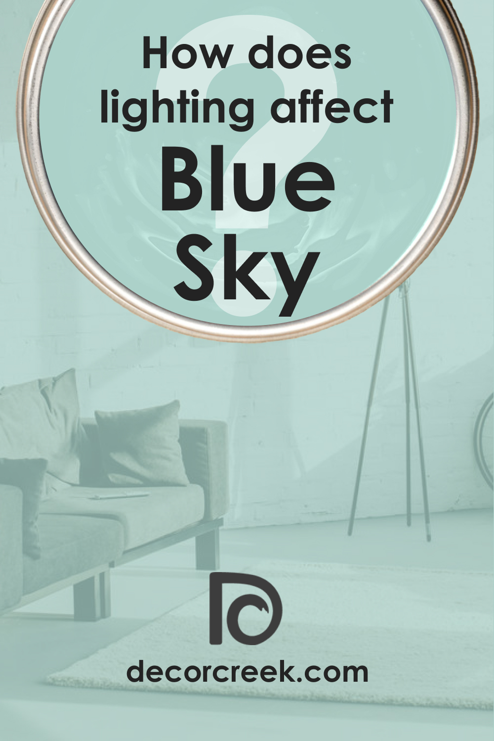
How Does Lighting Affect SW 0063 Blue Sky?
Like any other color, the appearance of SW 0063 Blue Sky can significantly change under different lighting conditions. In bright, natural daylight, SW Blue Sky is at its most vibrant and radiant, living up to its name.
Under warm, artificial light, it may appear slightly more muted and greenish. Conversely, under cool artificial light, its true blue undertones might be amplified, giving it a more profound, saturated look.
LRV of SW 0063 Blue Sky
The Light Reflectance Value (LRV) measures the percentage of light a paint color reflects. SW 0063 Blue Sky has an LRV of 61, positioning it on the lighter end of the spectrum. An LRV of 61 implies that this color reflects a significant amount of light, making it a bright, cheerful color that can make spaces feel open and airy.
Being a color with a high LRV, SW Blue Sky is ideal for rooms where you want to maximize natural light or create a feeling of spaciousness. It’s also a good choice for spaces that lack substantial natural light, as it can help to brighten the room.

However, it’s essential to note that while LRV can inform your color choices, its overall effect will also depend on factors like room size, amount of natural light, and other design elements.
LRV – what does it mean? Read This Before Finding Your Perfect Paint Color
Trim Colors of SW 0063 Blue Sky
Choosing the right trim color can enhance the wall color and create a pleasing contrast. When it comes to SW Blue Sky, consider these shades of white for trim:
- SW 7006 Extra White : This pure, bright white contrasts beautifully with SW Blue Sky, giving a fresh, crisp look to your space.
- SW 7008 Alabaster : A slightly warmer white, Alabaster provides a soft, subtle contrast, adding warmth without detracting from the vibrancy of SW Blue Sky.
- SW 7011 Natural Choice : A muted, neutral off-white, Natural Choice offers a softer contrast with SW Blue Sky, resulting in a sophisticated and elegant look.
Trim colors are essential because they create a transition between different areas, defining and enhancing architectural details. They can provide contrast, balance the color scheme, and tie together different elements in a room.

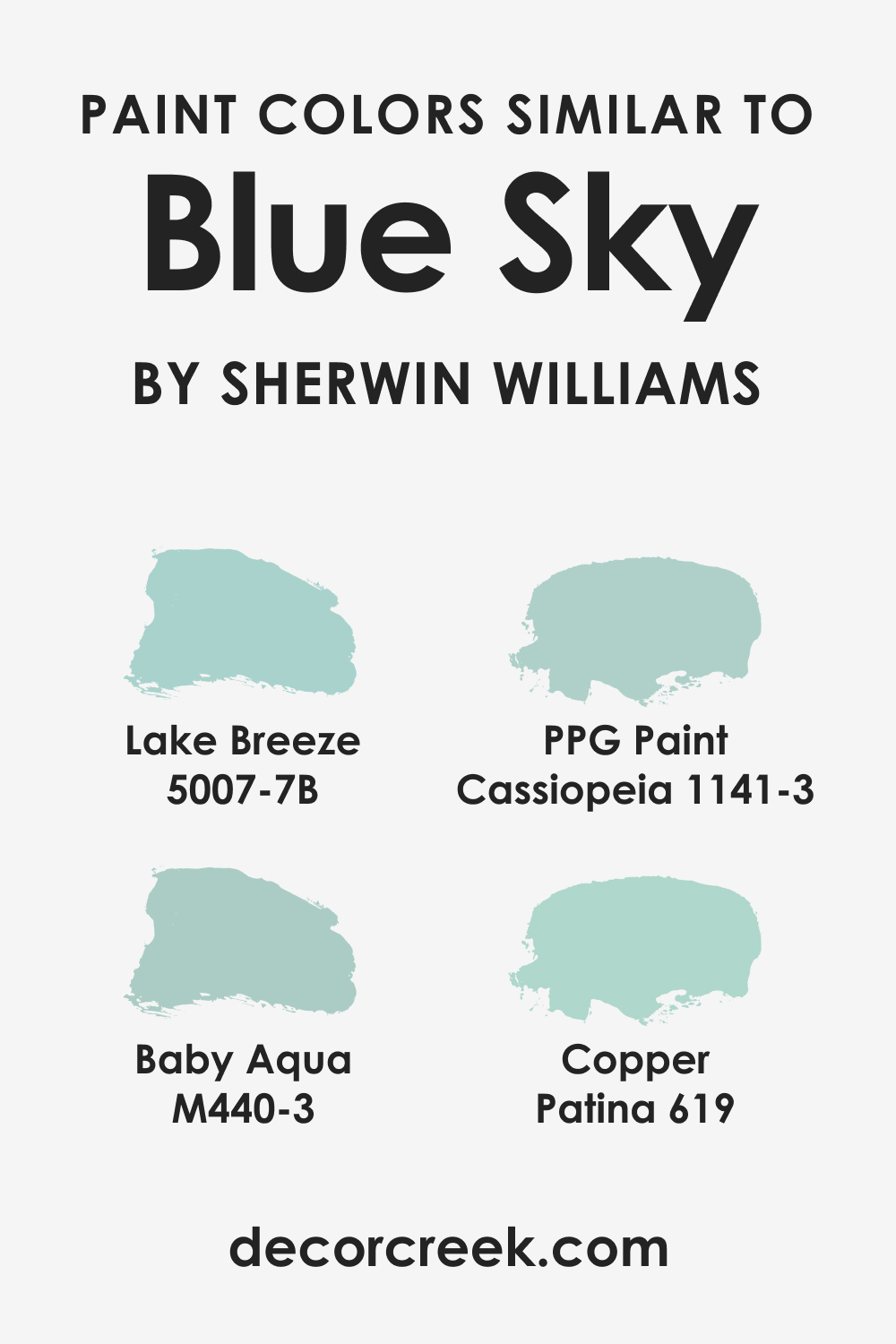
Colors Similar to SW 0063 Blue Sky
Knowing similar colors will help you easily select the substitute hue should you decide to use another blue instead of SW Blue Sky. The following blue colors can work well for this purpose:
- Behr Baby Aqua
- BM Copper Patina
- PPG Cassiopeia
- Valspar Lake Breeze
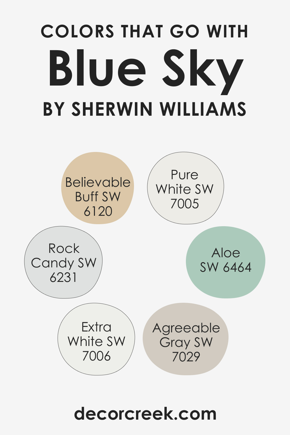
Colors That Go With SW 0063 Blue Sky
Picking colors that harmonize with each other is the key to a well-balanced interior palette. Several colors pair beautifully with SW 0063 Blue Sky:
- SW 7005 Pure White : Pure White provides a clean, crisp contrast to Blue Sky’s vibrancy.
- SW 7029 Agreeable Gray : This warm, neutral gray balances Blue Sky’s coolness and brings out its brightness.
- SW 7006 Extra White : This bright, pure white provides a sharp contrast, making Blue Sky pop.
- SW 6231 Rock Candy : A pale, icy blue, Rock Candy offers a soft, subtle contrast to Blue Sky.
- SW 6464 Aloe : This light, fresh green shares Blue Sky’s vitality and complements its cheerfulness.
- SW 6120 Believable Buff : This warm, neutral beige provides a calming balance to the brightness of Blue Sky.
Choosing colors that work well together is vital for creating a harmonious, balanced space. The right color combinations can evoke specific moods, create a flow between rooms, and enhance the overall aesthetic of your home.
How to Use SW 0063 Blue Sky In Your Home?
SW 0063 Blue Sky’s vibrant yet calming quality makes it a versatile color that can be used in various rooms and design styles. Its airy, refreshing vibe works well in living rooms, bedrooms, bathrooms, and kitchens, bringing a sense of openness and vitality. Furthermore, it’s an excellent choice for exteriors, lending a cheerful, inviting feel to the facade.
Regarding design styles, SW Blue Sky fits perfectly into coastal or Mediterranean themes with its bright, beachy vibe. It can also lend a whimsical touch to a Scandinavian-style room or playful energy to a modern design. Check out how it may work in different spaces.
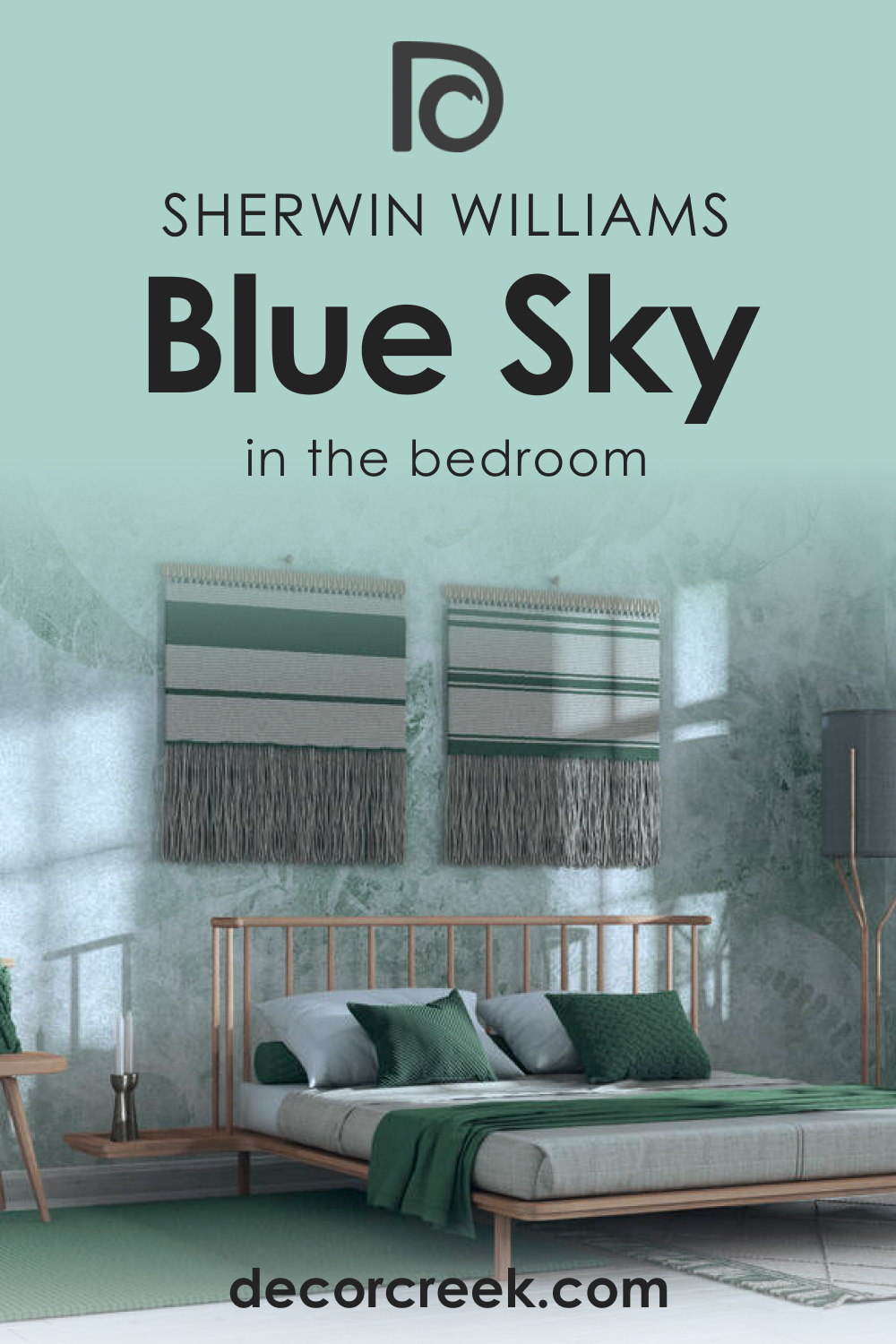
How to Use SW 0063 Blue Sky in the Bedroom?
The bedroom is a sanctuary, a place for rest and relaxation. Using SW 0063 Blue Sky in the bedroom can create a calming, serene atmosphere reminiscent of clear, sunny skies. Pair it with soft, white linens and natural elements like light wooden furniture or woven accessories to create a peaceful, airy retreat.
SW Blue Sky can also lend itself to a more vibrant bedroom design. Pair it with bright accents in colors like yellow or coral for a lively, cheerful bedroom that wakes you up in the morning with its sunny disposition. With the right accessories, SW Blue Sky can create anything from a peaceful retreat to an energetic sanctuary in your bedroom.
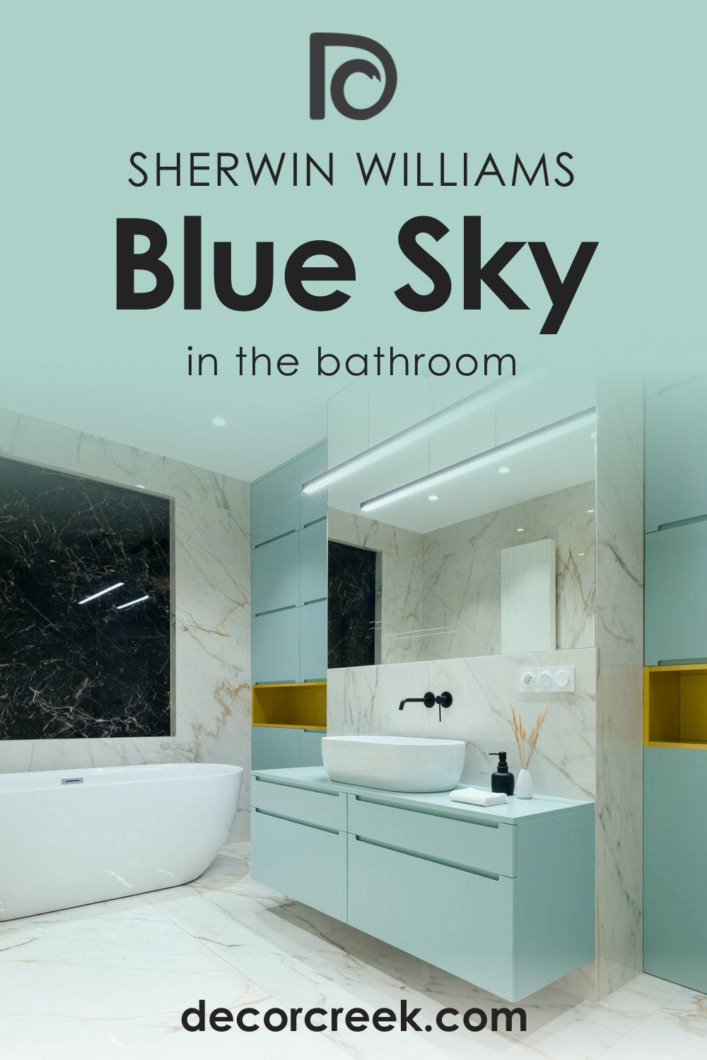
How to Use SW 0063 Blue Sky in the Bathroom?
In the bathroom, SW 0063 Blue Sky can create a spa-like ambiance. It pairs well with bright white tiles and fixtures for a fresh, clean look. You can accessorize with natural elements like bamboo or stone to enhance the relaxing vibe.
For a more dynamic bathroom, try pairing SW Blue Sky with vibrant pops of color. Turquoise towels, a bright shower curtain, or colorful wall art can create an energizing space that’s still harmonious and inviting. Whether you’re going for a calming oasis or a lively powder room.
How to Use SW 0063 Blue Sky in the Living Room?
In the living room, SW Blue Sky can create a fresh, inviting space perfect for relaxation or entertainment. Paired with soft, neutral furniture and natural elements like plants or wooden accessories, SW Blue Sky can create a relaxing, harmonious environment. It also pairs well with a crisp white trim for a classic, fresh look.
For a more energetic living room, pair SW Blue Sky with vibrant colors like yellow, coral, or bright green. With colorful accessories and accents, you can create a lively, dynamic space that’s still grounded by the calming presence of SW Blue Sky.

How to Use SW 0063 Blue Sky for an Exterior?
On exteriors, SW 0063 Blue Sky makes a cheerful, welcoming statement. It pairs beautifully with bright white or creamy trim for a crisp, fresh look. Consider using it on the front door for a pop of color or on the entire facade for a cheerful, welcoming look.
For a more sophisticated exterior, try pairing Blue Sky with dark, rich colors like navy or charcoal. The contrast will make Blue Sky stand out and add depth and interest to your home’s exterior.

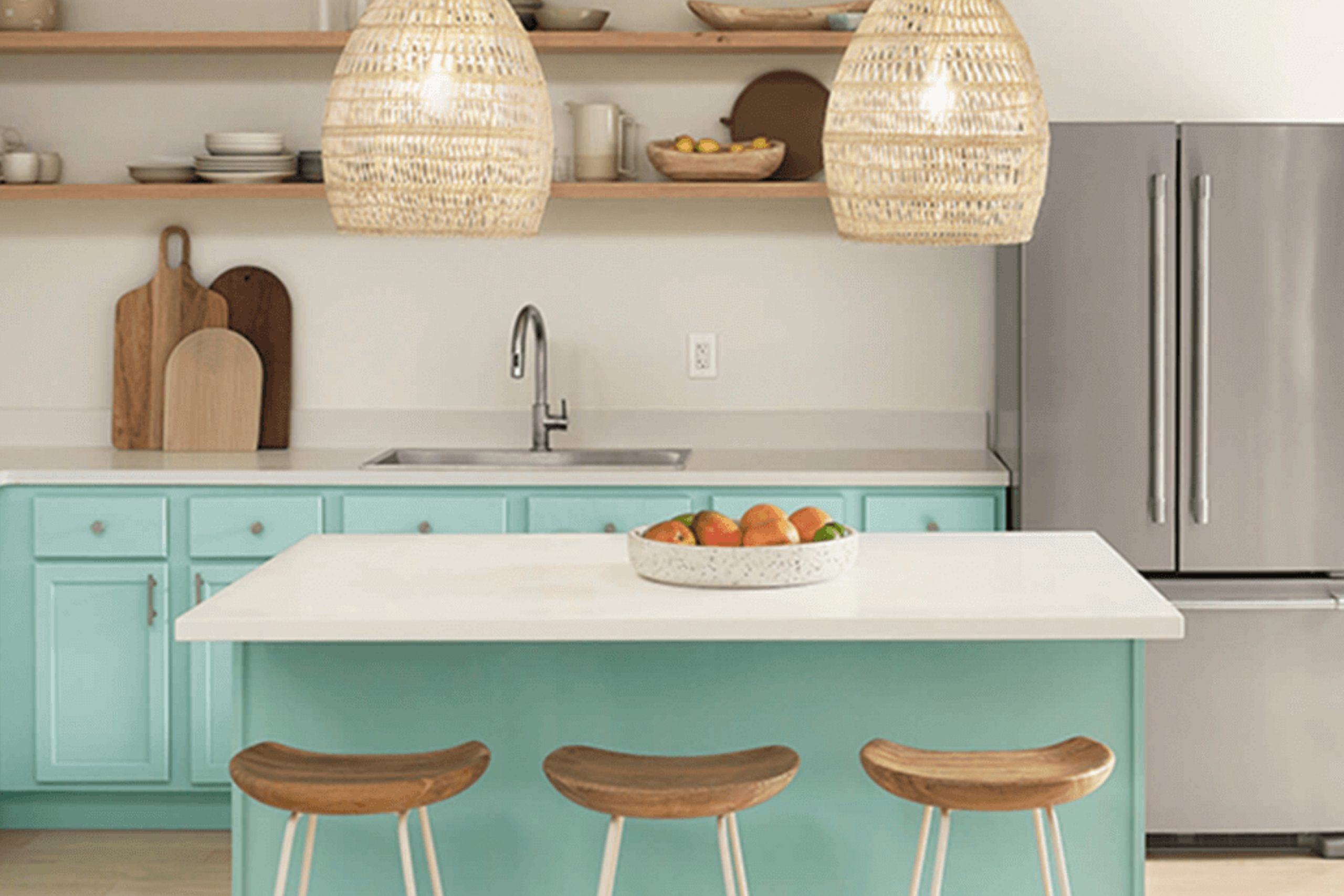
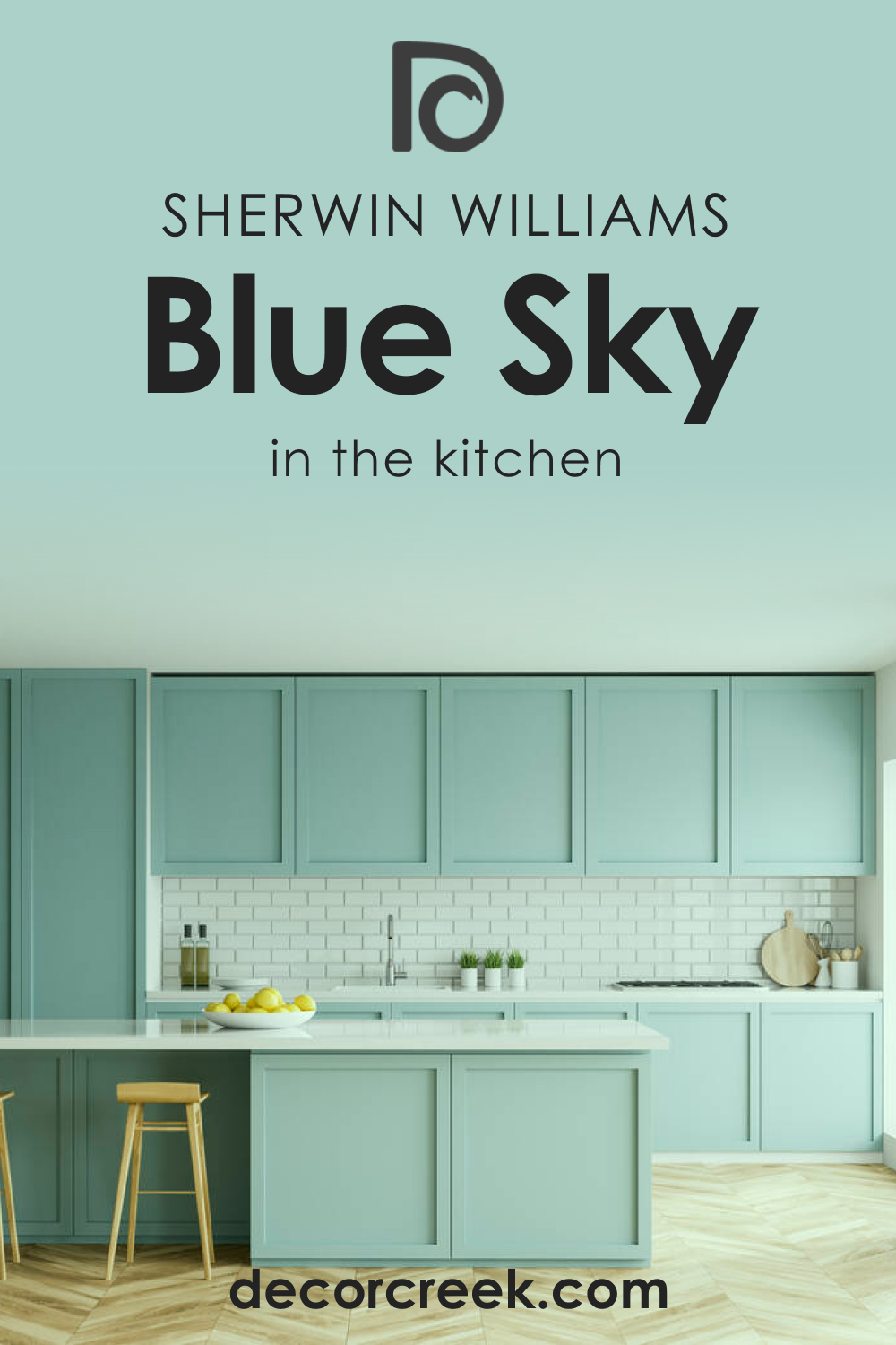
How to Use SW 0063 Blue Sky for the Kitchen?
In the kitchen, SW Blue Sky can create a cheerful, refreshing space. Paired with white cabinets and bright stainless steel appliances, it can create a fresh, clean look. You can also pair it with natural elements like wood or stone for a more rustic, down-to-earth vibe.
Comparing SW 0063 Blue Sky With Other Colors
Compared to other colors, SW 0063 Blue Sky stands out for its balance of vibrancy and tranquility. While other blues may lean towards the cool and calming side, Blue Sky’s vibrant undertones give it a unique, uplifting energy. At the same time, it’s not overly bold or bright, making it a versatile choice that can adapt to a wide variety of spaces and styles. Below, you can read how exactly this color compares with other hues.
SW 0063 Blue Sky vs. SW 6501 Manitou Blue
SW Manitou Blue is a more subdued and sophisticated shade than SW Blue Sky. While both colors are undoubtedly blue, Manitou leans more towards a cool, maritime vibe, which can evoke feelings of calm and serenity.
Comparatively, SW Blue Sky is more vibrant, giving off a cheerful, sunny vibe. If you’re torn between the two, consider the mood you want to set in your space. Manitou Blue can be a better choice for a tranquil, peaceful ambiance, while Blue Sky is ideal for creating a lively, upbeat atmosphere.

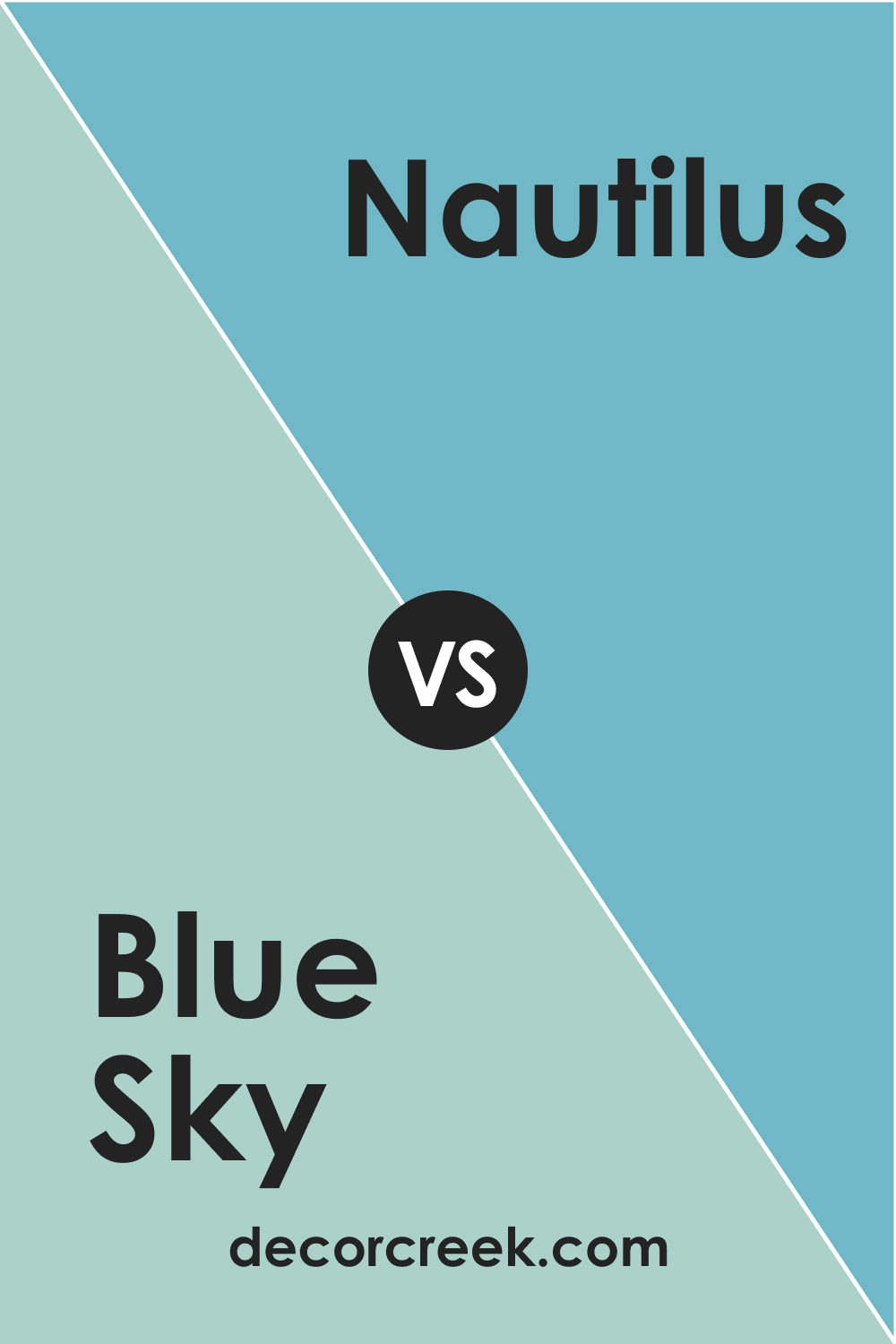
SW 0063 Blue Sky vs. SW 6780 Nautilus
SW Nautilus is a lighter, more muted blue than SW Blue Sky. Its subtler presence can evoke a serene, airy feel, which is excellent for creating a calm and tranquil space. In contrast, SW Blue Sky, with its bright and vivacious nature, can create a cheerful and lively ambiance.
If you’re seeking to create an energetic space full of life, SW Blue Sky might be a better fit, but if you prefer a more relaxed and soothing environment, consider SW Nautilus.
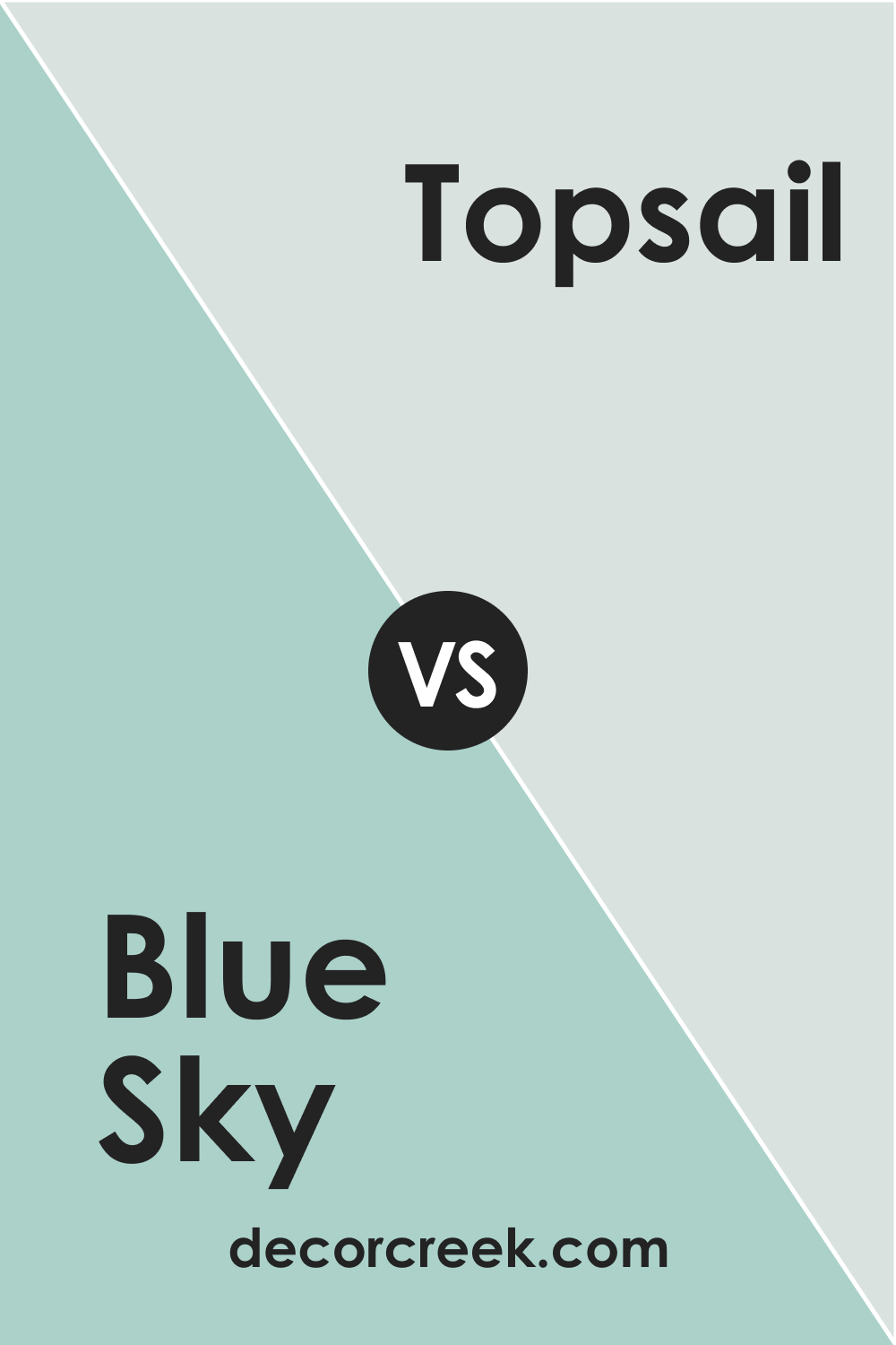
SW 0063 Blue Sky vs. SW 6217 Topsail
SW Topsail is a light, airy, and slightly green-tinted blue that offers a coastal vibe. Compared to the more saturated Blue Sky, Topsail can be seen as more calming and subtle. The soothing green undertones of Topsail lend a nature-inspired feel that pairs well with neutral and earthy tones. In contrast, the vibrant nature of Blue Sky can bring a pop of color to your space, making it more vibrant and energetic.
SW 0063 Blue Sky vs. SW 6232 Misty
SW Misty is a soft blue-gray that leans more towards a neutral color compared to Blue Sky. The gray undertones in Misty provide a more sophisticated and contemporary look. Blue Sky, on the other hand, with its pure blue undertones, is more vibrant and playful. If you’re looking for a color that’s a bit more mature and sophisticated, Misty might be your go-to, while Blue Sky can bring a touch of fun and brightness to your space.

SW 0063 Blue Sky vs. SW 6491 Open Air
SW Open Air is a softer, pastel-like blue that offers a more subtle and tranquil feel than the brighter SW Blue Sky. While both colors evoke feelings of the sky, Open Air leans more towards a peaceful, open sky on a calm day, while SW Blue Sky evokes the feeling of a vibrant, clear sky on a sunny day.
Depending on whether you want your room to feel more calm and peaceful or bright and cheerful, one of these colors may appeal more to you.

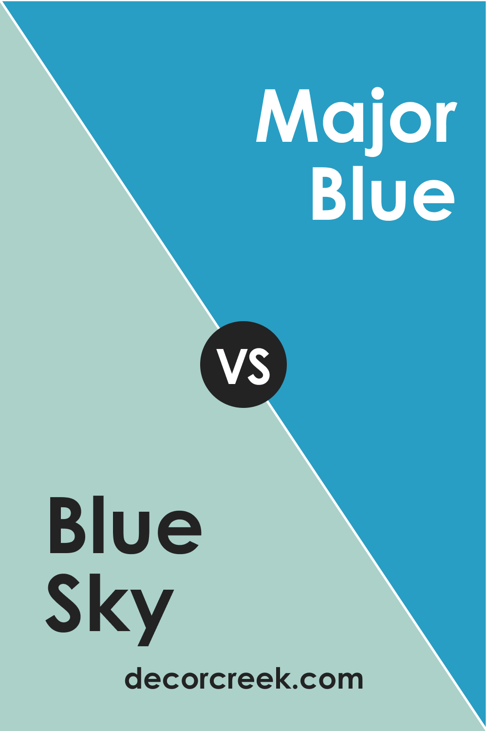
SW 0063 Blue Sky vs. SW 6795 Major Blue
SW Major Blue is a deeper, more saturated color than SW Blue Sky. It has more of a royal blue vibe that brings a level of intensity and depth that SW Blue Sky doesn’t have. While Blue Sky is reminiscent of a clear, sunny day, SW Major Blue evokes the rich tones of a deep, twilight sky.
If you’re looking for a more dramatic and impactful color, Major Blue might be the right choice, while Blue Sky can keep things light and breezy.
Conclusion
In conclusion, Sherwin-Williams’ SW 0063 Blue Sky is a remarkable color with its ability to bring a sense of open skies and sunny days into your home. Its unique blend of calming and energetic qualities makes it a versatile choice for a variety of spaces and styles. Whether you’re seeking to create a peaceful retreat or a lively, vibrant space, SW Blue Sky offers endless possibilities to transform your home with color.
Ever wished paint sampling was as easy as sticking a sticker? Guess what? Now it is! Discover Samplize's unique Peel & Stick samples.
Get paint samples
Frequently Asked Questions
⭐What type of rooms or spaces would be best suited for SW 0063 Blue Sky?
Blue Sky's vibrant yet calming qualities make it versatile for almost any room in the home. It works well in living spaces, bedrooms, and bathrooms where a refreshing and serene atmosphere is desired. It's also a great choice for kitchens, lending a cheerful, invigorating feel. The color is also suitable for exterior use, as it imparts a welcoming and friendly vibe.
⭐How does lighting affect the appearance of SW 0063 Blue Sky?
As with any paint color, lighting can have a significant impact on how Blue Sky looks. In bright, natural light, Blue Sky appears more vibrant and bright. In rooms with less natural light or in artificial light, it may appear slightly more muted but still maintains its calming, cheerful vibe.
⭐What are some good trim colors to use with SW 0063 Blue Sky?
Blue Sky pairs well with a variety of whites and light neutrals for trim. Some good options from Sherwin-Williams would be Pure White, Extra White, or Alabaster. These colors provide a clean, crisp contrast that allows Blue Sky to stand out.
⭐What are some good coordinating colors for SW 0063 Blue Sky?
SW 6385 Dover White and SW 7531 Canvas Tan work well with Blue Sky. Additional colors that can complement Blue Sky are SW 7029 Agreeable Gray, SW 6231 Rock Candy, SW 6464 Aloe, and SW 6120 Believable Buff.
⭐How does SW 0063 Blue Sky compare to other similar blue shades?
Compared to other blues, Blue Sky stands out due to its balance of brightness and serenity. While it has the refreshing qualities of lighter blues, its vibrant undertones set it apart, giving it a cheerful, uplifting energy that can energize a room without overwhelming it.


