18 Best Modern Mediterranean Homes Exterior Paint Colors
Sun-Warmed Shades for Stucco and Stone
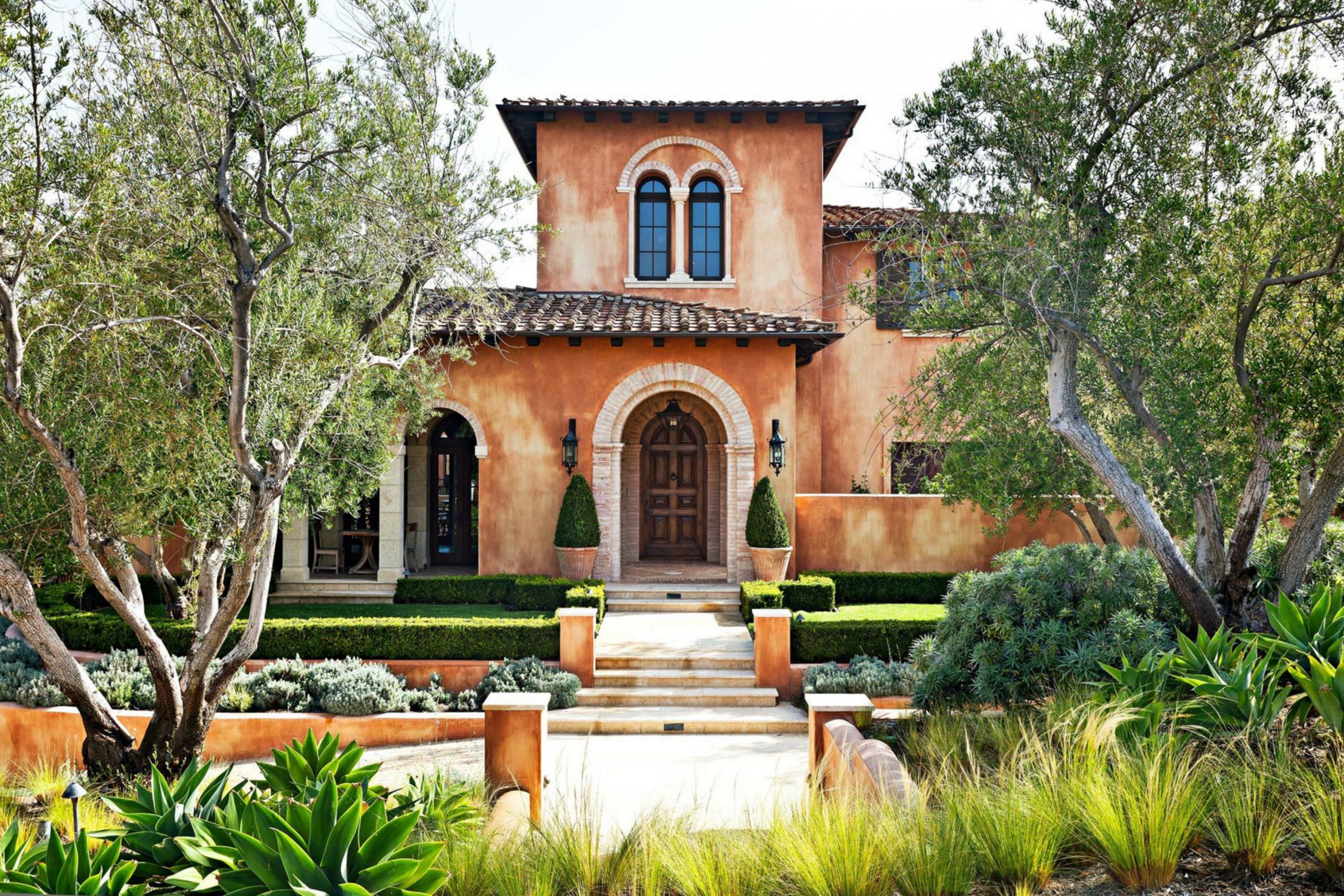
Mediterranean homes feel warm, sunny, and welcoming from the street. I look for colors that play nicely with stucco walls, clay roof tiles, stone paths, and dark iron details. My goal is a front that feels friendly in bright sun and still rich at sunset. I keep the palette natural, simple, and grounded.
Soft lights for walls, deep shades for trim, and earthy accents for doors give balance.
With the right paint, the house glows and the textures look their best.
via bhg.com
Why I Believe Exterior Colors Shape the Feeling of a Mediterranean Home
Color on the outside sets the mood before anyone steps inside. A gentle cream can make stucco look soft and sun-kissed, while a dark trim adds strength and rhythm. Earthy reds and clays echo roof tiles and garden pots, so everything feels connected. Good color also hides dust and sun fade, which matters in bright climates.
lear contrasts help arches and beams read from the sidewalk.
When the palette fits the architecture, the home feels honest and welcoming. I watch how dust and rain mark the paint, and I pick shades that hide it. I test colors next to roof tile and stone so the whole front reads like one story.
When nearby homes lean cool gray or bright white, a warm cream can set yours apart without shouting. I also think about upkeep: satin or flat sheen helps stucco look even and cuts glare.
In the end, the right set makes guests feel welcome before they ring the bell.
How I Choose the Right Exterior Paint Shade for Mediterranean Architecture
I start with the fixed parts: roof tile color, stone tone, pavers, and ironwork. I test swatches in morning light, noon glare, and late shade because the sun changes everything. I pair warm off-whites for the main body, richer browns or charcoals for trim, and clay notes for doors or shutters.
I keep undertones steady—warm with warm—so nothing looks chalky or harsh. I watch sheen too; flat or satin helps stucco look even. In the end, I pick the set that feels natural and easy to live with all year.
I also paint big sample boards and tape them to different walls so I can see them from the street. I check the light reflectance value (LRV) to make sure the body color won’t glare at noon or look dull at dusk.
I note the home’s direction—south-facing homes can take deeper walls, while north-facing homes often need a lighter body.
I hold each swatch next to gutters, sconces, and the garage door to be sure the metals and paint agree. I look at the walkway and the soil color, because those tones bounce onto the walls. I plan for upkeep by choosing trims that hide handprints around gates and doors. I also review HOA limits early so there are no surprises.
When the roof, stone, metals, and paint speak the same language, the house feels right every single day.
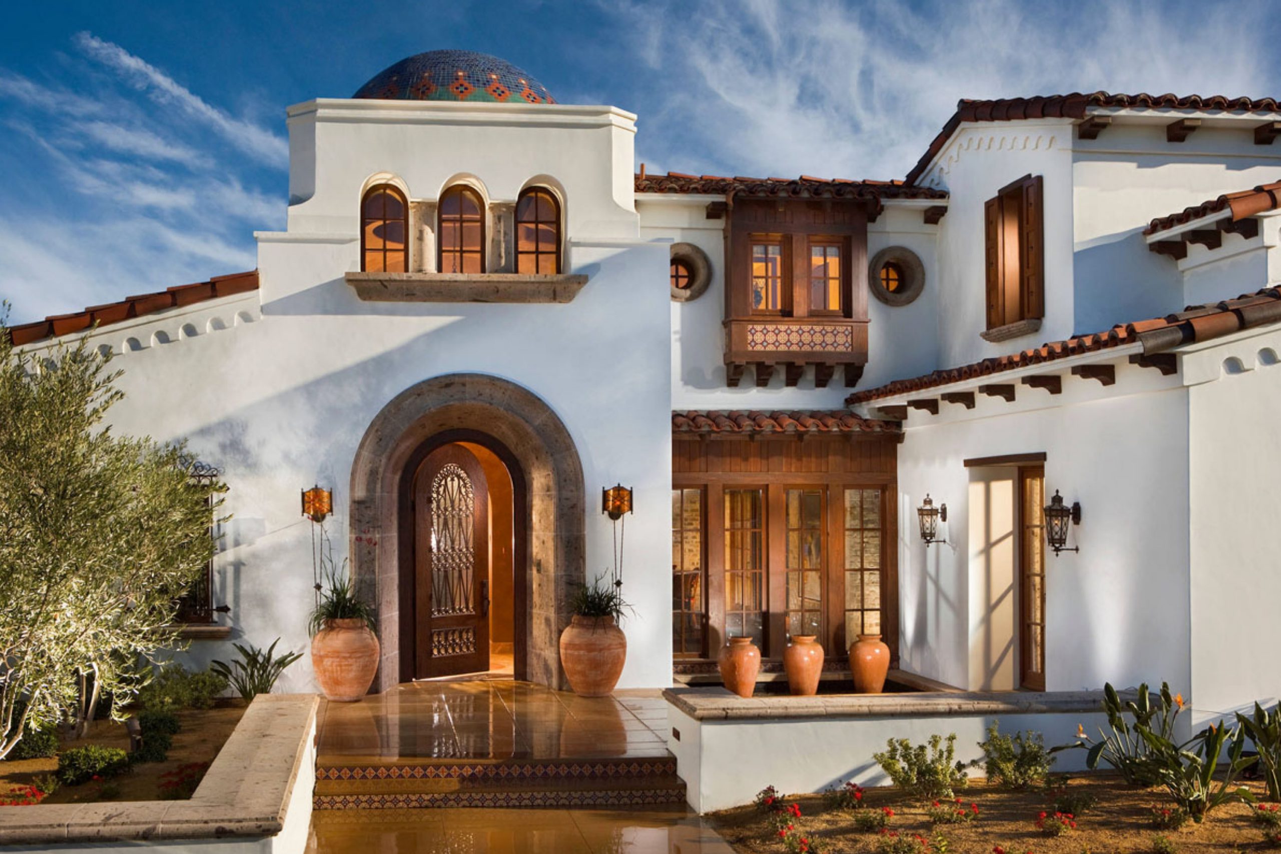
via idesignarch.com
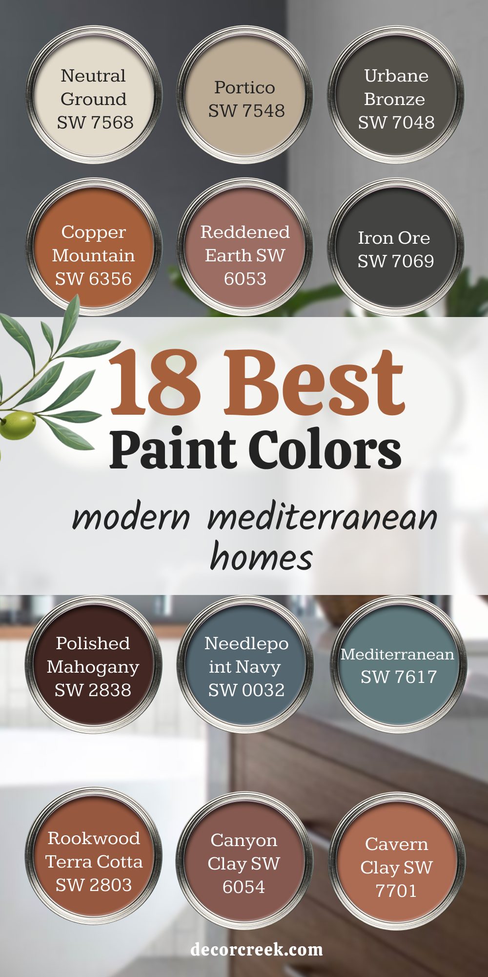
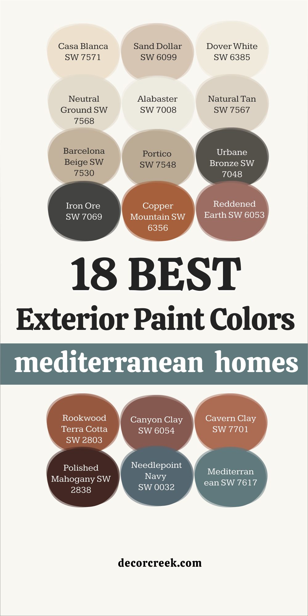
18 best Modern Mediterranean Homes Paint Colors
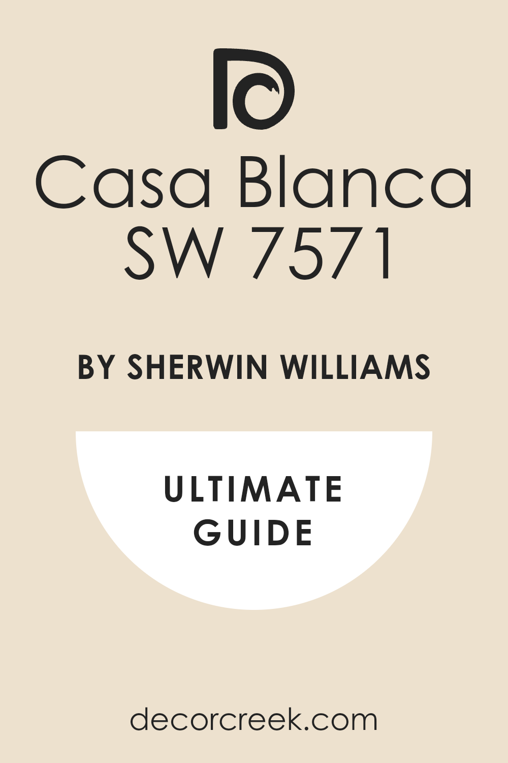
Casa Blanca SW 7571
Casa Blanca SW 7571 brings a soft, creamy glow that flatters stucco in bright sun. Casa Blanca SW 7571 pairs beautifully with terracotta roofs and sandstone paths, keeping the look sunny but not stark. Casa Blanca SW 7571 makes arches and curves feel gentle, which suits rounded Mediterranean lines. Casa Blanca SW 7571 works best as a main body color with dark bronze or black iron accents.
Casa Blanca SW 7571 also hides dust better than a sharp white, which is helpful near busy roads. Casa Blanca SW 7571 keeps the house bright without glare, and that balance feels welcoming.
🎨 Check out the complete guide to this color right HERE 👈
via decorcreek.com
Sand Dollar SW 6099
Sand Dollar SW 6099 gives walls a warm beach-sand note that looks natural with clay tiles. Sand Dollar SW 6099 reads soft in morning shade and steady in strong afternoon sun. Sand Dollar SW 6099 pairs nicely with wood doors, copper lights, and woven planters. Sand Dollar SW 6099 is a great main color when you want light walls that still feel grounded.
Snd Dollar SW 6099 lets stone trim and ledges stand out without fighting for attention.
Sand Dollar SW 6099 makes the whole front feel sun-washed and friendly.
Dover White SW 6385
Dover White SW 6385 is a creamy off-white that keeps stucco from looking cold. Dover White SW 6385 shines on homes with red or brown roof tiles, giving a classic Mediterranean vibe. Dover White SW 6385 looks lovely with dark shutters and black iron rails for clear contrast. Dover White SW 6385 helps details like lintels and corbels show up cleanly in photos.
Dover White SW 6385 resists that chalky look some whites get in harsh light.
Dover White SW 6385 is my go-to when clients want light walls that still feel warm.
🎨 Check out the complete guide to this color right HERE 👈
via decorcreek.com
Neutral Ground SW 7568
Neutral Ground SW 7568 brings a light beige note that calms bright stucco glare. Neutral Ground SW 7568 fits homes with tan stone, warm pavers, and brass fixtures. Neutral Ground SW 7568 is flexible as a body color and lets bold doors shine.
Neutral Ground SW 7568 teams well with deep browns, charcoal trims, and copper gutters.
Neutral Ground SW 7568 keeps dust marks quieter than crisp whites, which saves touch-ups. Neutral Ground SW 7568 gives an easy, relaxed curb feel from sunrise to dusk.
🎨 Check out the complete guide to this color right HERE 👈
via decorcreek.com
Alabaster SW 7008
Alabaster SW 7008 gives a gentle, milky warmth that flatters curved walls and thick plaster. Alabaster SW 7008 suits both old-world stone and clean modern lines on newer builds. Alabaster SW 7008 pairs best with walnut doors, black lanterns, and clay pots. Alabaster SW 7008 reflects light softly, so the house looks bright without glare.
Alabaster SW 7008 keeps arches readable, making photos crisp for listings.
Alabaster SW 7008 is a safe, pretty body color when you want simple and sun-ready.
🎨 Check out the complete guide to this color right HERE 👈
via decorcreek.com
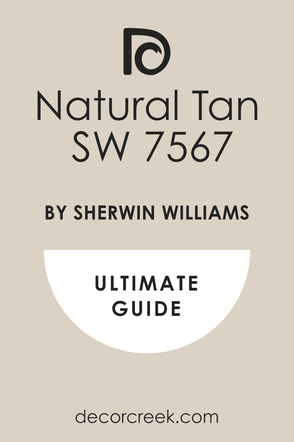
Natural Tan SW 7567
Natural Tan SW 7567 lays down a sandy base that ties roof tile, gravel, and stucco together. Natural Tan SW 7567 helps large facades feel friendly and not too stark under strong sun. Natural Tan SW 7567 works with dark wood headers and iron accents for a grounded contrast. Natural Tan SW 7567 keeps stains and dust less visible than a bright white.
Natural Tan SW 7567 loves aged bronze hardware and terracotta planters by the entry.
Natural Tan SW 7567 is steady year-round, which makes upkeep feel easier.
🎨 Check out the complete guide to this color right HERE 👈
via decorcreek.com
Barcelona Beige SW 7530
Barcelona Beige SW 7530 delivers a sun-baked beige that feels right with stone courtyards. Barcelona Beige SW 7530 supports heavy textures like troweled stucco and rough beams. Barcelona Beige SW 7530 blends smoothly with tan pavers and limestone trims. Barcelona Beige SW 7530 takes black, bronze, or deep brown trim without losing warmth.
Barcelona Beige SW 7530 is perfect for long walls where you want quiet movement, not glare.
Barcelona Beige SW 7530 keeps the home looking rich and welcoming from the street.
🎨 Check out the complete guide to this color right HERE 👈
via decorcreek.com
Portico SW 7548
Portico SW 7548 offers a warm putty tone that looks tailored on modern stucco. Portico SW 7548 pairs well with steel railings, dark gutters, and cedar doors. Portico SW 7548 helps tile roofs feel connected to the walls, not floating above. Portico SW 7548 reads steady across sun and shade so the facade stays even.
Portico SW 7548 makes stone caps and sills stand out with a gentle edge.
Portico SW 7548 is a refined main color for updated Mediterranean fronts.
Urbane Bronze SW 7048
Urbane Bronze SW 7048 brings depth for trim, shutters, and garage doors. Urbane Bronze SW 7048 adds rich contrast against creamy stucco body colors. Urbane Bronze SW 7048 pairs with bronze lighting and black iron for a cohesive look. Urbane Bronze SW 7048 grounds wide façades and frames arches with confidence.
Urbane Bronze SW 7048 hides wear on high-touch areas like gates and doors.
Urbane Bronze SW 7048 makes entries feel strong and well-crafted.
🎨 Check out the complete guide to this color right HERE 👈
via decorcreek.com
Iron Ore SW 7069
Iron Ore SW 7069 gives a near-black trim that looks crisp against warm off-whites. Iron Ore SW 7069 outlines windows and beams so shapes read from the sidewalk. Iron Ore SW 7069 pairs with copper gutters and walnut doors for a rich mix. Iron Ore SW 7069 works on metal railings and pergolas where durability matters.
Iron Ore SW 7069 keeps the palette modern while honoring classic forms.
Iron Ore SW 7069 is my pick when a home needs bold edges without fuss.
🎨 Check out the complete guide to this color right HERE 👈
via decorcreek.com
Copper Mountain SW 6356
Copper Mountain SW 6356 brings a burnished orange-brown that echoes roof tiles. Copper Mountain SW 6356 looks amazing on front doors and shutters as a warm accent. Copper Mountain SW 6356 pairs with stone steps, clay pots, and aged brass knockers. Copper Mountain SW 6356 glows at golden hour, making the entry feel inviting.
Copper Mountain SW 6356 needs a lighter body color to keep balance and clarity.
Copper Mountain SW 6356 adds a friendly, artisan touch that guests notice.
🎨 Check out the complete guide to this color right HERE 👈
via decorcreek.com
Reddened Earth SW 6053
Reddened Earth SW 6053 offers a sun-baked clay note perfect for doors or garden walls. Reddened Earth SW 6053 works with sandstone paths and terracotta planters easily. Reddened Earth SW 6053 adds warmth beside creams like Casa Blanca or Alabaster. Reddened Earth SW 6053 holds color in bright light without looking loud.
Reddened Earth SW 6053 is great for courtyard accents and outdoor niches.
Reddened Earth SW 6053 ties the landscape to the house in a simple, natural way.
🎨 Check out the complete guide to this color right HERE 👈
via decorcreek.com
Rookwood Terra Cotta SW 2803
Rookwood Terra Cotta SW 2803 brings classic pottery color to shutters and gates. Rookwood Terra Cotta SW 2803 looks authentic next to tile roofs and rough stucco. Rookwood Terra Cotta SW 2803 pairs with dark trim like Iron Ore for strong contrast. Rookwood Terra Cotta SW 2803 sings on arched doors and garden walls.
Rookwood Terra Cotta SW 2803 stays warm in shade, which helps side yards feel lively.
Rookwood Terra Cotta SW 2803 gives the facade a handcrafted feel that suits the style.
Canyon Clay SW 6054
Canyon Clay SW 6054 lays down a rich clay tone for accent bands and window boxes. Canyon Clay SW 6054 plays well with cream bodies and bronze lanterns. Canyon Clay SW 6054 adds life to simple fronts without feeling busy. Canyon Clay SW 6054 is sturdy under sun, so color stays true longer.
Canyon Clay SW 6054 looks great behind bougainvillea and olive trees.
Canyon Clay SW 6054 is my pick when a home needs a warm, earthy highlight.
Cavern Clay SW 7701
Cavern Clay SW 7701 gives a modern desert clay vibe that suits clean lines. Cavern Clay SW 7701 makes a striking front door next to light stucco walls. Cavern Clay SW 7701 pairs with black iron and natural wood for balance. Cavern Clay SW 7701 holds depth in harsh sun, so entries feel rich all day.
Cavern Clay SW 7701 brings out roof tile color without matching it exactly.
Cavern Clay SW 7701 is a confident accent that feels perfectly at home here.
🎨 Check out the complete guide to this color right HERE 👈
via decorcreek.com
Polished Mahogany SW 2838
Polished Mahogany SW 2838 brings a deep wood tone for doors, beams, and shutters. Polished Mahogany SW 2838 adds heritage to newer builds with its classic depth. Polished Mahogany SW 2838 works best against soft creams and beiges for contrast. Polished Mahogany SW 2838 helps big doors feel crafted and secure.
Polished Mahogany SW 2838 pairs with brass hardware and seeded-glass lanterns beautifully.
Polished Mahogany SW 2838 ages well outdoors, keeping the entry handsome.
Needlepoint Navy SW 0032
Needlepoint Navy SW 0032 offers a cool, inky blue for shutters and gates. Needlepoint Navy SW 0032 pairs with warm stucco to create a fresh coastal twist. Needlepoint Navy SW 0032 reads rich in sun and true in shade, which is useful. Needlepoint Navy SW 0032 teams with polished brass for a crisp, upscale note.
Needlepoint Navy SW 0032 is great on balcony rails and garage doors. Needlepoint Navy SW 0032 brings a hint of sea breeze without feeling nautical-themed.
Mediterranean SW 7617
Mediterranean SW 7617 gives a grounded gray-blue that suits stone and stucco together. Mediterranean SW 7617 works as an accent on shutters, doors, or garden walls. Mediterranean SW 7617 calms bright roofs by adding a cool counterpoint. Mediterranean SW 7617 pairs nicely with creamy bodies like Dover White or Alabaster.
Mediterranean SW 7617 holds color in strong light, so edges stay crisp.
Mediterranean SW 7617 brings quiet character that feels right by the sea or hills.
via decorcreek.com
Final Thoughts on a Restful Bedroom
Even though we’re talking exteriors, the right outdoor palette helps the whole home feel restful the moment you arrive. A warm main color, a deep trim, and an earthy accent make the front welcoming day and night. Simple, sun-smart choices also save on upkeep and keep the house looking fresh.
I always test colors in real light and next to the roof, stone, and iron.
When those pieces agree, the home greets you kindly before you open the door. That is the feeling I aim for with every Mediterranean project.
I also watch how the morning and evening light changes the look of each color. I paint big sample boards, move them around the yard, and take photos so I can compare later. I check the shades next to the driveway, mailbox, and gate because those spots matter in real life.
I keep the palette to two or three colors so the house feels clear and easy on the eyes. I pick a satin or flat sheen for stucco to hide bumps and keep glare down. I note roof, stone, plants, and metal, and I make sure the paint agrees with all of them.
If there are HOA rules, I match my choices to those too. In the end, the goal is simple: a home that welcomes you before the key even turns.
Maisie is a skilled Home Designer with a passion for color and personalized interiors. Since 2015, she has transformed homes across the U.S. A graduate of Savannah College of Art and Design (SCAD) with a BFA in Interior Design, she continues to build her knowledge through certifications and industry involvement.