Black
Black Blue
Blue Brown
Brown Gray
Gray Green
Green Neutral
 Orange
 White
White Yellow
Are you looking for a fresh yet soft color to brighten up your room? Let me introduce you to SW 9055 Billowy Breeze by Sherwin Williams. At first, you might think it’s just another shade of blue, but take a closer look.
This subtle color carries hints of gray, making it incredibly adaptable and perfect for creating a calm and relaxing atmosphere. Whether you’re hoping to refresh your living room, bedroom, or even your kitchen, Billowy Breeze offers a calming backdrop.
It pairs beautifully with many decor styles, from modern minimalist to cozy farmhouse. The color works wonderfully with natural light, shifting gently throughout the day to create a lively yet soft atmosphere. If you’re planning to repaint or starting from scratch, consider how this unique shade can improve your home’s atmosphere.
With Billowy Breeze, you can easily achieve a look that feels both fresh and elegant.

What Color Is Billowy Breeze SW 9055 by Sherwin Williams?
Billowy Breeze by Sherwin Williams is a soft and subtle shade that echoes the quiet calm of a clear sky. With its gentle blue tone, this color brings a calming atmosphere to any room. It fits beautifully in rooms that aim for a light, airy feeling, making it perfect for creating a relaxed home environment.
This color works exceptionally well in interior styles that prefer clean lines and simple beauty, such as Scandinavian, coastal, or minimalist. Its understated nature doesn’t clash with bold elements, making it adaptable for different decor themes.
Billowy Breeze pairs wonderfully with natural materials like light woods, wicker, and linen, improving its airy quality. Adding textures such as cotton throws or wool rugs in neutral tones can help create a cozy feeling within the breezy palette.
For those looking to create a peaceful retreat in their homes, Billowy Breeze offers a fresh and welcoming backdrop. It’s ideal for living rooms, bedrooms, and bathrooms where you want to encourage a relaxing atmosphere. Complementing this paint with white trim or soft pastel accents can pull the look together, resulting in a clean, refreshing room that feels like a breath of fresh air.

decorcreek.com
Is Billowy Breeze SW 9055 by Sherwin Williams Warm or Cool color?
Billowy Breeze is a light and airy blue paint offered by Sherwin Williams. This color gives homes a fresh and calming feeling, much like a gentle breeze. Its lightness adds a touch of brightness to rooms without feeling too intense.
It works well in rooms like bathrooms and bedrooms where you may want a relaxing atmosphere. Since it’s a cool color, it coordinates easily with both neutral shades and bolder accents, making decorating adaptable and enjoyable.
Its subtle tone also means it doesn’t make small rooms feel tighter, which is a big advantage for smaller rooms. People often choose Billowy Breeze when they want to add a gentle touch of color to their home that feels open and airy. This color helps create a clean and welcoming atmosphere for everyone who enters the room.
Undertones of Billowy Breeze SW 9055 by Sherwin Williams
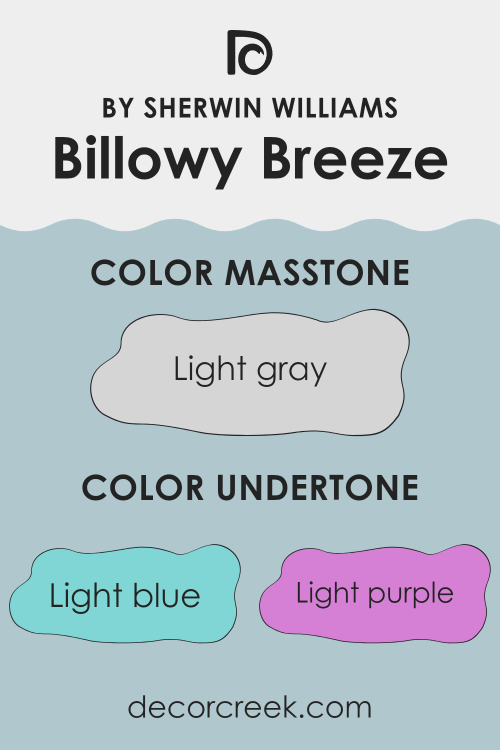
Billowy Breeze is a unique paint color that carries different undertones, which are subtle hues mixed into the main color, changing its appearance under different lighting conditions. These undertones include light blue, light purple, lilac, pale yellow, mint, pale pink, and grey. Understanding these undertones is important when selecting the right color for your room because they can strongly influence how the color appears on your walls.
Undertones work quietly. Depending on the lighting in your room, they can make the paint appear differently throughout the day. For instance, under bright sunlight, the pale yellow or mint undertones may make Billowy Breeze look brighter and more lively. In contrast, in a room with less natural light, the grey or lilac undertones could give it a softer and more muted appearance.
When applied to interior walls, the complexity of Billowy Breeze’s undertones creates a beautiful backdrop that interacts with your room’s specific conditions. The light blue and purple undertones can create a gentle, refreshing atmosphere, making a room feel airy and open. Meanwhile, the mint and pale pink can add a soft touch of warmth, making the room feel welcoming. The grey undertone ensures that the color remains soft and subtle, not making the room feel too bright.
Choosing furniture and decorations becomes a thoughtful process because these undertones may appear differently depending on your room’s lighting and the colors surrounding them. As a result, Billowy Breeze provides an adaptable option for many different rooms, adjusting beautifully to each setting.
decorcreek.com
What is the Masstone of the Billowy Breeze SW 9055 by Sherwin Williams?
Billowy Breeze SW 9055 by Sherwin Williams is a light gray color with a masstone of Light gray (#D5D5D5). This soft shade brings a fresh and clean look to any room in your home. Its light gray tone makes it an adaptable choice for walls, as it pairs well with both bright colors and darker shades.
The lightness of Billowy Breeze can help make smaller rooms feel larger and more open. This is because lighter colors reflect more light, brightening the area. It’s also soft and unobtrusive, which means it won’t clash with your furniture or home decor.
This color can act as a subtle backdrop that allows your decor to stand out. Whether you prefer modern tastes or a more traditional look, Billowy Breeze fits in naturally, creating a calm and pleasant atmosphere without making the room feel too intense. Overall, it’s an excellent choice for anyone wanting to refresh their home with a new wall color.
decorcreek.com
How Does Lighting Affect Billowy Breeze SW 9055 by Sherwin Williams?
Lighting can strongly affect how colors appear in any room. When it comes to paint like Billowy Breeze, a calming and gentle shade, the type of light in a room plays an important role in how the color is perceived.
Artificial light sources can affect colors in different ways. Incandescent bulbs, which produce warmer light, can make Billowy Breeze look slightly more yellow or warmer. Fluorescent lighting, however, often creates a cooler tone, casting a bluish effect on walls, which may bring out cooler undertones in the paint.
Natural light is considered the best type of light for showing the true appearance of paint because it provides a balanced light spectrum. In natural light, Billowy Breeze will most likely appear close to its original shade throughout the day, though the color can shift slightly depending on the time and weather conditions.
The orientation of a room can further change how Billowy Breeze appears:
- In north-facing rooms, which receive less direct sunlight and usually have cooler light, this color may appear more muted and slightly cooler, revealing more of its gray undertones.
- In south-facing rooms, filled with warm sunlight throughout the day, the color will appear brighter and warmer, highlighting its lively quality.
- In east-facing rooms, the morning light is warmer, making Billowy Breeze look softer and warmer early in the day while becoming cooler as the day continues.
- West-facing rooms receive warm evening light. Here, the paint will appear warm and welcoming in the afternoon and evening.
Considering these effects can help you decide which room is best for using Billowy Breeze, ensuring you achieve the desired mood and appearance under different lighting conditions.

decorcreek.com
What is the LRV of Billowy Breeze SW 9055 by Sherwin Williams?
LRV stands for Light Reflectance Value, which is a measure of how much light a color reflects or absorbs. This value is usually shown on a scale where higher numbers mean the color reflects more light, while lower numbers mean it absorbs more light.
In practical terms, this can affect how a color appears once it’s painted on your walls and how bright a room feels. A wall color with a high LRV will generally make a room feel more open and airy because it reflects more light, whereas a color with a low LRV may make a room feel cozier and smaller because it absorbs more light.
The LRV of Billowy Breeze is 54.511, which means it sits somewhere in the middle of the scale. As a result, this particular color isn’t strictly light or dark but offers a balanced level of reflectivity. This makes it adaptable since it can brighten up a room without feeling too intense.
In rooms with less natural light or smaller areas, a color like this can help create a sense of depth without absorbing too much light, making the room appear larger than it might with a darker shade. On the other hand, in very brightly lit rooms, it won’t appear washed out, maintaining its distinct tone even under strong light. This balance makes it a wonderful choice for different settings and for pairing with many decor styles.

decorcreek.com
Coordinating Colors of Billowy Breeze SW 9055 by Sherwin Williams
Coordinating colors are those that complement each other while sharing similar tones to create a balanced look in any room. When using a specific paint like Billowy Breeze by Sherwin Williams, finding the right coordinating colors can greatly improve the atmosphere of a room. Colors such as Pearly White, Mountain Air, and Relaxed Khaki are excellent choices that work together to create harmony and continuity.
Pearly White, with its soft and subtle tones, can brighten up a room and offer a gentle contrast to the more noticeable shades of Billowy Breeze. It’s ideal for trim or ceilings, adding a fresh and airy feeling to the room.
Mountain Air is a cooler shade that brings a light and breezy touch, reflecting the calmness of a clear sky, making it a perfect complement for creating a relaxed atmosphere. Meanwhile, Relaxed Khaki offers a warm, earthy base that pairs beautifully with the cooler tones of Billowy Breeze and Mountain Air, grounding the lighter colors and adding depth and warmth to the overall palette.
You can see recommended paint colors below:

What are the Trim colors of Billowy Breeze SW 9055 by Sherwin Williams?
Trim colors, such as SW 7037 – Balanced Beige and SW 7531 – Canvas Tan, play an important role in improving the overall look of a wall painted with Billowy Breeze by Sherwin Williams. These colors are used on moldings, window frames, doors, and other architectural details of a room, effectively framing the main color and giving the room a finished appearance.
Choosing the right trim color can help define the lines of a room and add a soft contrast that highlights the beauty of the wall color without making it feel too strong. In the case of Billowy Breeze, which is a light and airy color, using a trim color like Balanced Beige or Canvas Tan can ground the room while maintaining a connected and airy feeling.
Balanced Beige is a warm neutral that offers a calming presence, ideal for creating a gentle contrast against the lighter Billowy Breeze. Its earthy tones provide a grounded effect, which can make a room feel more welcoming and cozy. Canvas Tan, on the other hand, is a lighter shade that leans toward a soft, sandy tone. It is adaptable enough to blend naturally with Billowy Breeze, providing a subtle difference along the edges that improves architectural details without creating a harsh contrast. This pairing works especially well in rooms that aim for a light, connected appearance with a touch of warmth and definition.
You can see recommended paint colors below:

Colors Similar to Billowy Breeze SW 9055 by Sherwin Williams
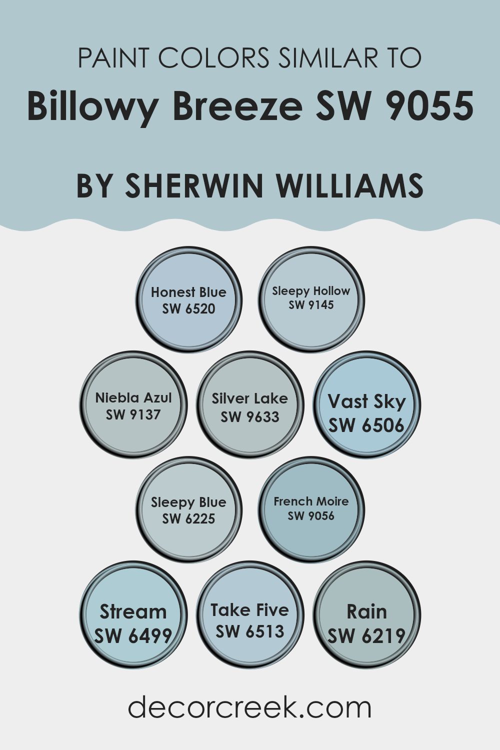
Choosing similar colors in decorating can create a balanced and pleasing atmosphere in a room. Colors like SW 6520 Honest Blue, SW 9145 Sleepy Hollow, and SW 9137 Niebla Azul work beautifully together because they share similar tones and intensities, making the transitions between them smooth and comfortable to the eye.
These colors, along with others like SW 9633 Silver Lake and SW 6506 Vast Sky, offer a cool palette that feels connected while still providing subtle variety, preventing the decor from feeling repetitive. Using similar colors, such as SW 6225 Sleepy Blue and SW 6499 Stream, ensures that each element in the room—from walls to furnishings—complements one another, strengthening the overall design harmony.
Colors like SW 6513 Take Five and SW 6219 Rain further expand the possibilities for creating a unified color scheme that feels gentle and welcoming. Additionally, SW 9056 French Moire shares a soft, muted quality with SW 9055, making it ideal for adding depth while maintaining the overall softness of the room. These shades are perfect for anyone wanting to create a connected look without harsh contrasts. By carefully selecting colors that share similar hues and saturation, you can improve the visual appeal of your interior with a subtle yet effective use of color.
You can see recommended paint colors below:
- SW 6520 Honest Blue
- SW 9145 Sleepy Hollow
- SW 9137 Niebla Azul
- SW 9633 Silver Lake
- SW 6506 Vast Sky
- SW 6225 Sleepy Blue
- SW 9056 French Moire
- SW 6499 Stream
- SW 6513 Take Five
- SW 6219 Rain
Colors that Go With Billowy Breeze SW 9055 by Sherwin Williams
Choosing the right colors that complement Billowy Breeze SW 9055 by Sherwin Williams is important because it helps create a balanced and attractive room. The selected colors play an important role in setting the mood and improving the visual appeal of a room.
For example, Silken Peacock SW 9059 brings a rich, deep blue that adds a bold contrast to the lighter, airy tone of Billowy Breeze, making it ideal for accent walls or furniture pieces. Secret Cove SW 9058 offers a dustier version of blue, providing a soft transition between darker and lighter shades, allowing for a smooth and connected look.
On the other hand, Aquitaine SW 9057 introduces a subtle gray-blue that works beautifully with Billowy Breeze for a gentle and calming feeling, perfect for bedrooms or bathrooms that need a soft backdrop. Little Boy Blu SW 9054 adds a playful, sky-blue touch to rooms, complementing Billowy Breeze in areas such as children’s rooms or creative corners.
Connor’s Lakefront SW 9060 leans toward a slightly teal blue, offering a fresh and lively feeling that can brighten any room, especially when paired with neutral furnishings. Lastly, French Moire SW 9056 introduces a muted blue with a touch of green, providing a unique detail that can add interest to living rooms or offices. Each of these colors not only supports but also improves the beauty and calm feeling of Billowy Breeze, creating a connected and attractive design palette.
You can see recommended paint colors below:
- SW 9059 Silken Peacock
- SW 9058 Secret Cove
- SW 9057 Aquitaine
- SW 9054 Little Boy Blu
- SW 9060 Connor’s Lakefront
- SW 9056 French Moire

How to Use Billowy Breeze SW 9055 by Sherwin Williams In Your Home?
Billowy Breeze SW 9055 by Sherwin Williams is a soft and gentle blue paint color that brings a fresh and airy feeling to any room. If you are looking to refresh your home, this color might be the perfect choice.
You can use it in a bedroom to create a calm and relaxing atmosphere, helping you unwind after a busy day. It’s also wonderful for bathrooms, as the light blue shade can make small rooms appear larger and brighter.
In the living room or dining area, Billowy Breeze can serve as a beautiful backdrop for wall art, furniture, and decor. It pairs well with whites, greys, and even some yellows and greens, giving you flexibility in decorating. Moreover, using this color in a home office can help maintain a clean and focused atmosphere. Whether you apply it as a main color or as an accent, Billowy Breeze is adaptable and can give your home a fresh appearance.
Billowy Breeze SW 9055 by Sherwin Williams vs Sleepy Hollow SW 9145 by Sherwin Williams
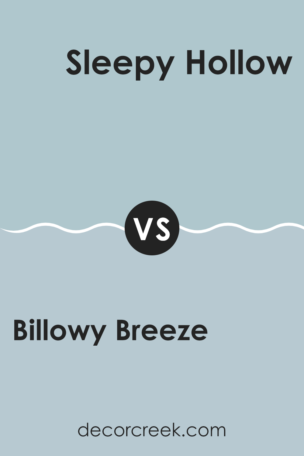
Billowy Breeze is a light and breezy pale blue with a soft, airy feeling. It has a subtle hint of gray that makes it adaptable for different rooms, creating a gentle and calming atmosphere.
In contrast, Sleepy Hollow is a deeper, more noticeable blue with distinct gray undertones. This color is moodier and richer, providing a stronger visual effect and a sense of depth to a room.
Both are wonderful choices for creating a peaceful atmosphere, but Billowy Breeze works especially well in rooms where you want to improve natural light, while Sleepy Hollow is ideal for adding character or serving as an accent in a neutral room. While they share a blue base, their effect and use can vary greatly because of their different intensity and depth.
You can see recommended paint color below:
Billowy Breeze SW 9055 by Sherwin Williams vs Honest Blue SW 6520 by Sherwin Williams
Billowy Breeze and Honest Blue, both by Sherwin Williams, create very different feelings in a room. Billowy Breeze is a gentle, muted blue with a soft, almost cloudy appearance. It provides a light and airy atmosphere, making it perfect for creating a relaxed feeling in rooms like bedrooms or bathrooms.
On the other hand, Honest Blue stands out with a bolder and more lively tone. It’s a truer blue, reminiscent of a clear sky on a sunny day, which can add a cheerful touch to a room. This color is excellent for energizing a room or for use as an accent wall to create a striking effect.
While Billowy Breeze works beautifully in rooms where calm and quiet are desired, Honest Blue is ideal for areas where a bit more energy or focus is preferred. Each color brings its own unique character to interiors, depending on the mood or style you want to create.
You can see recommended paint color below:

Billowy Breeze SW 9055 by Sherwin Williams vs Silver Lake SW 9633 by Sherwin Williams
Billowy Breeze and Silver Lake are two distinct colors by Sherwin Williams, each offering its own unique atmosphere. Billowy Breeze is a soft, pale blue that has a light and airy feeling, making it perfect for creating a relaxed and welcoming room. This color is ideal for living rooms or bedrooms where a calm and soothing atmosphere is desired.
On the other hand, Silver Lake is a deeper gray with blue undertones, presenting a more muted and neutral option. It’s adaptable for different settings, working beautifully in modern kitchens, bathrooms, or offices where a more grounded and understated look is preferred.
While Billowy Breeze adds a touch of color and opens up a room with its brightness, Silver Lake provides a steadier and more grounded feeling because of its richer tone. Both colors pair well with white trim and can match many decor styles, but they create very different moods because of their varying depth and intensity.
You can see recommended paint color below:

Billowy Breeze SW 9055 by Sherwin Williams vs Take Five SW 6513 by Sherwin Williams
“Billowy Breeze” and “Take Five” are both colors by Sherwin Williams. “Billowy Breeze” is a light blue with a soft, airy feeling, reminiscent of a clear sky on a sunny day. Its subtle tone makes it perfect for creating a bright and calming atmosphere in a room.
On the other hand, “Take Five” is a deeper teal color. This shade is richer and has a bit more green in it, giving it a slightly more lively and energetic feeling compared to the more relaxed blue of “Billowy Breeze.”
Both colors are wonderful for adding a touch of color to a room without feeling too bold. “Billowy Breeze” works beautifully in rooms where you want to keep things light and open, while “Take Five” may be better suited for areas where a bit more personality is desired. Whether used separately or together, both colors offer a fresh and clean look.
You can see recommended paint color below:
- SW 6513 Take Five

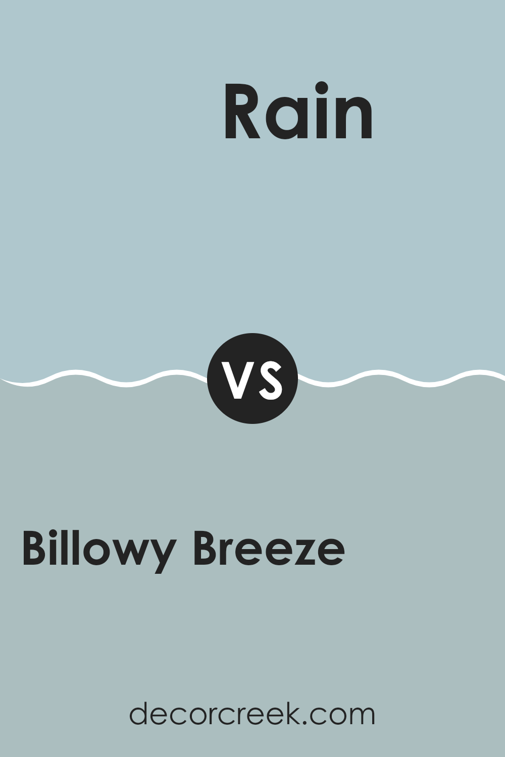
Billowy Breeze SW 9055 by Sherwin Williams vs Rain SW 6219 by Sherwin Williams
Billowy Breeze and Rain by Sherwin Williams are two distinct shades that can bring unique atmospheres to any room. Billowy Breeze has a soft, gentle depth that creates a light and airy feeling. It’s a muted kind of blue that leans toward a soft turquoise, reminiscent of a clear sky on a calm day. This color can brighten rooms and bring a fresh feeling.
In contrast, Rain is a darker and moodier shade of blue-gray. This color is closer to the appearance of a stormy sky, creating a more dramatic and intense atmosphere. It’s ideal for rooms where you want to create a sense of coziness or focus, such as studies or bedrooms.
Together, these colors can work beautifully in the same room, with Billowy Breeze brightening the atmosphere and Rain adding a grounded balance. This combination creates a dynamic setting while maintaining a connected look.
You can see recommended paint color below:
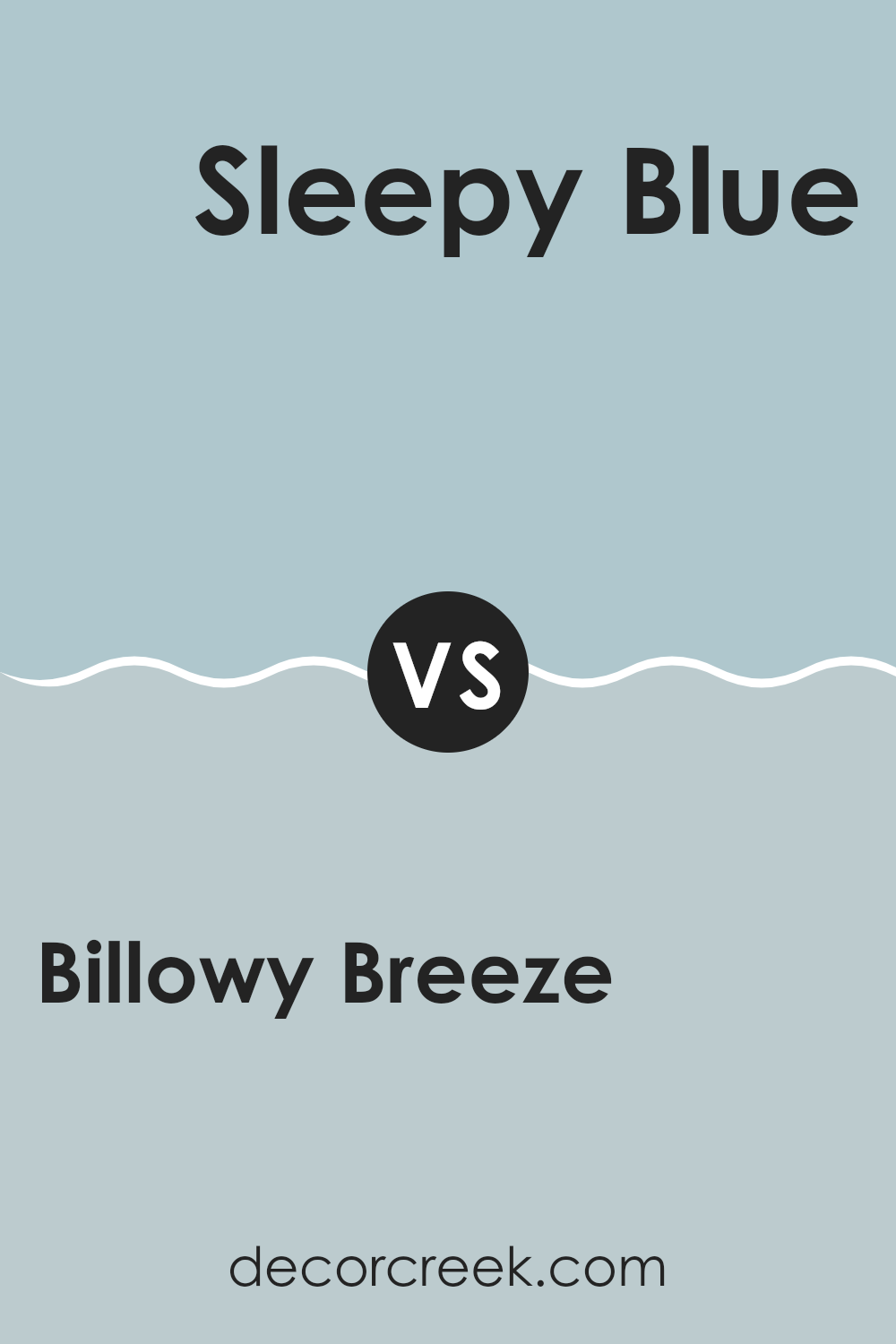
Billowy Breeze SW 9055 by Sherwin Williams vs Sleepy Blue SW 6225 by Sherwin Williams
Billowy Breeze and Sleepy Blue, both from Sherwin Williams, offer unique tones for different moods and rooms. Billowy Breeze is a soft, almost neutral blue with a gentle green undertone, giving it a fresh and light feeling that is perfect for creating a relaxing atmosphere. It’s especially wonderful in rooms that receive plenty of natural light, as the color seems to shift subtly with the changing light throughout the day.
On the other hand, Sleepy Blue is a truer blue that leans toward a calm and muted shade. It is slightly darker than Billowy Breeze and brings to mind the peacefulness of a quiet, cloudy day. This color is excellent for areas where you want a more noticeable blue without feeling too bright, making it ideal for bedrooms or bathrooms where you want a quiet retreat.
Both colors work beautifully for creating peaceful rooms, but the green undertone in Billowy Breeze adds a touch of freshness and energy, while Sleepy Blue provides a more direct and understated appearance.
You can see recommended paint color below:
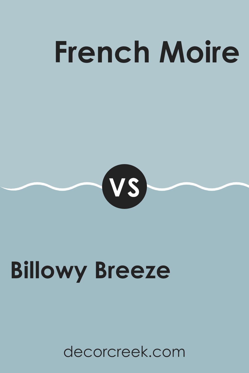
Billowy Breeze SW 9055 by Sherwin Williams vs French Moire SW 9056 by Sherwin Williams
Billowy Breeze and French Moire, both by Sherwin Williams, are two colors that present subtle yet noticeable differences in tone and mood. Billowy Breeze is a lighter and airier shade, creating a feeling of freshness and openness in any room.
It resembles a clear sky on a cheerful, sunny day and can make a room feel more spacious and welcoming. On the other hand, French Moire is slightly deeper and richer, leaning more toward a calming sea blue that offers a comforting and cozy feeling.
This color can give a room a more grounded and secure atmosphere, making it ideal for rooms meant for relaxation or focus. In terms of coordination, both colors work beautifully with soft neutrals and can be used together for a layered look that feels balanced without becoming repetitive. Overall, Billowy Breeze creates a fresh and airy feeling, while French Moire provides a calming and steady presence.
You can see recommended paint color below:
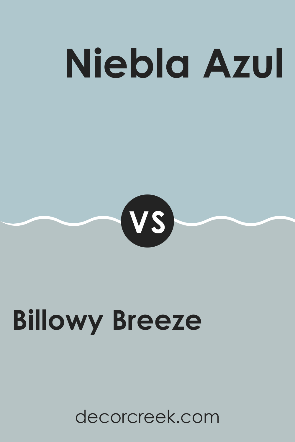
Billowy Breeze SW 9055 by Sherwin Williams vs Niebla Azul SW 9137 by Sherwin Williams
Billowy Breeze and Niebla Azul are two paint colors from Sherwin Williams that create subtle yet distinct atmospheres in any room. Billowy Breeze is a soft and light blue that has a breezy, fresh feeling, reminiscent of a clear, sunny sky.
It’s a color that makes rooms feel open and airy, perfect for creating a relaxed and welcoming atmosphere. On the other hand, Niebla Azul is a deeper shade of blue with a hint of gray. This color creates a more grounded and calming effect, offering a sense of stability and quietness that is ideal for a peaceful retreat or a focused workspace.
Although both colors share a blue base, Billowy Breeze leans toward a clearer, sky-like tone, whereas Niebla Azul brings in more depth with its gray undertone. These differences make them suitable for different preferences and rooms, depending on the atmosphere you want to create.
You can see recommended paint color below:
Billowy Breeze SW 9055 by Sherwin Williams vs Stream SW 6499 by Sherwin Williams
Billowy Breeze and Stream are both colors produced by Sherwin Williams, but they offer distinct tones and moods for different rooms. Billowy Breeze is a soft, pale blue with a grayish tint, giving it a calm and subtle appearance. It’s a color that works beautifully in rooms where you want a soothing and light atmosphere, such as bedrooms and bathrooms. Think of it like a gentle sky on a cloudy day.
On the other hand, Stream is a much bolder and brighter blue with a lively and energetic feeling. This color can create a strong visual effect in a room and is wonderful for adding a splash of brightness to areas that might otherwise go unnoticed, like a small bathroom or an accent wall in a living room. Its cheerful feeling can bring freshness and fun.
In summary, while both colors share a blue base, Billowy Breeze is quieter and more muted, making it perfect for relaxing rooms. Stream, on the other hand, is dynamic and lively, ideal for bringing energy and cheer into any room.
You can see recommended paint color below:

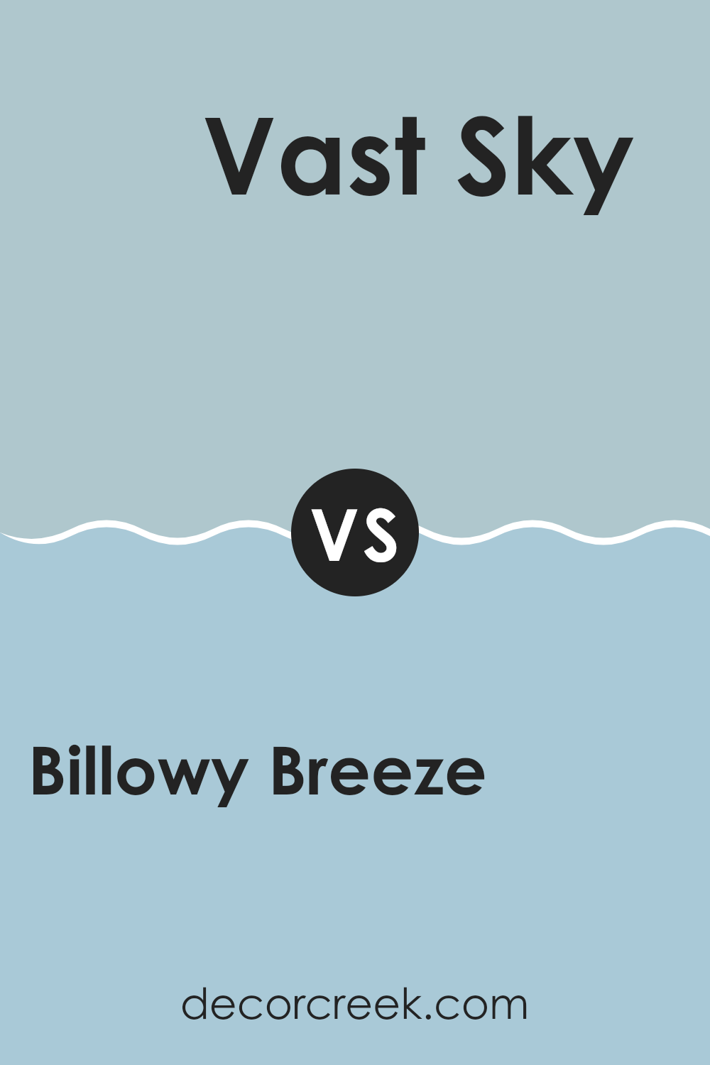
Billowy Breeze SW 9055 by Sherwin Williams vs Vast Sky SW 6506 by Sherwin Williams
Billowy Breeze and Vast Sky by Sherwin Williams are two shades that offer distinctly fresh feelings, ideal for creating a calm and welcoming atmosphere. Billowy Breeze is a soft, muted blue with a hint of green, giving it a cool and gentle appearance that feels very calming. It fits beautifully in rooms meant for relaxation, like bedrooms or bathrooms, as its subtle tone pairs easily with soft whites and neutral colors.
On the other hand, Vast Sky is a brighter blue that leans more toward the color of a clear sky. It has a lively and more energetic feeling that can make a room feel airy and open. This color works wonderfully in areas that benefit from a sense of freshness, such as kitchens or living rooms, especially where natural light can highlight its lively quality.
Compared to Vast Sky, Billowy Breeze is more understated, while Vast Sky offers a bolder appearance. Choosing between them depends on the mood you want to create in your room: calming with Billowy Breeze or energizing with Vast Sky.
You can see recommended paint color below:
- SW 6506 Vast Sky
After looking closely at SW 9055 Billowy Breeze by Sherwin Williams, I’m excited to share my thoughts. This paint color feels like a breath of fresh air. Imagine a clear sky on a breezy day—that’s Billowy Breeze. It’s a calm blue that isn’t too bright or too dull, perfect for making any room feel peaceful and cozy.
I tried it in a bedroom, and it made the room feel like a comfy nest, perfect for reading or simply relaxing. It also looks fantastic in the bathroom for a clean and welcoming appearance. Whether it’s sunny or gloomy outside, this color always brings a touch of the outdoors into your home.
What’s wonderful about this paint is that it pairs beautifully with many other colors. You can combine it with soft yellows, greys, or even white for a lovely contrast. Since it’s not a very dark color, it makes the room appear larger and brighter.
In conclusion, SW 9055 Billowy Breeze by Sherwin Williams is a perfect choice if you’re looking to give your room a fresh and cheerful feeling. It’s easy on the eyes and works beautifully in any room that needs a touch of calm simplicity. Give it a try, and you may fall in love with the way it refreshes your home!

decorcreek.com
Ever wished paint sampling was as easy as sticking a sticker? Guess what? Now it is! Discover Samplize's unique Peel & Stick samples.
Get paint samples