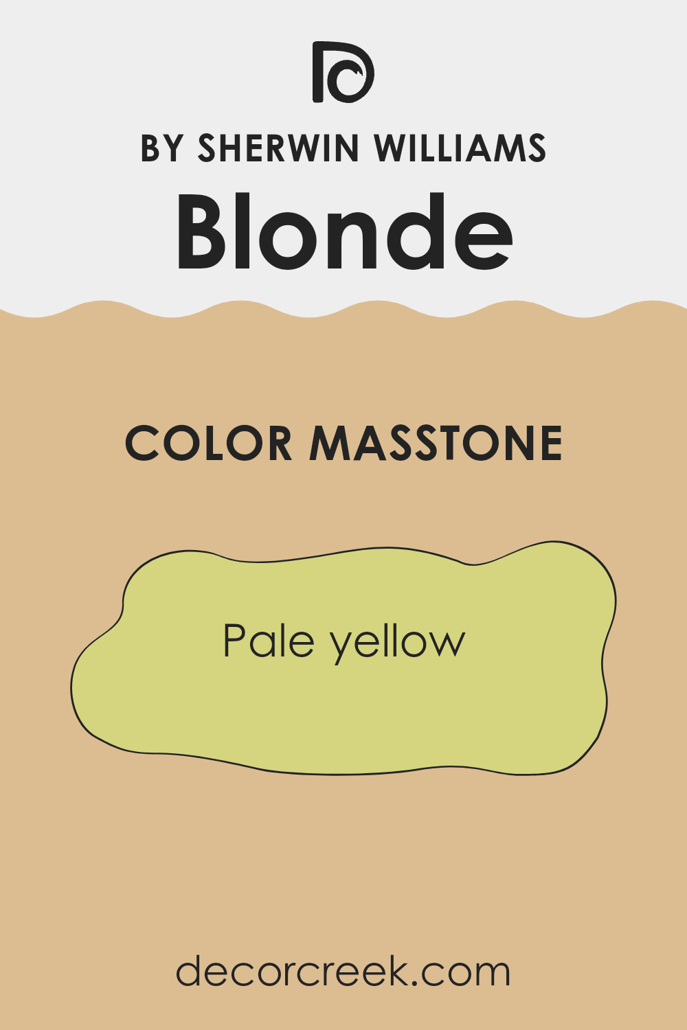
If you’re thinking about giving your room a fresh coat of paint, let me tell you about SW 6128 Blonde by Sherwin Williams. This color is like a warm hug for your walls, creating a cozy and welcoming vibe in any room. Picture the warm, soothing tones of honey or the soft golden glow of a sunset; that’s what Blonde brings to your interior.
I’ve used this paint in several projects and I’ve noticed how it beautifully brightens up rooms without being too strong. Whether you’re painting a sunlit kitchen or a more dimly lit study, Blonde has a way of lifting the atmosphere in a subtle yet effective manner. It pairs wonderfully with a wide range of decor styles and colors, making it a flexible choice for anyone looking to update their home.
Blonde isn’t just a pretty color; it’s also practical. It hides imperfections well and offers a durable finish that stands up to everyday life. Its warm undertone can make your living area feel more inviting, perfect for rooms where you want to relax and unwind.
If you’ve got plans to refresh your home’s look, SW 6128 Blonde is definitely worth considering.
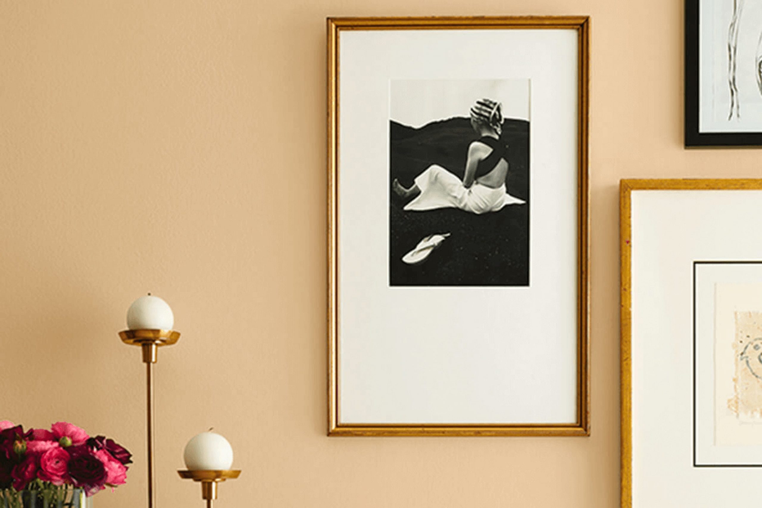
What Color Is Blonde SW 6128 by Sherwin Williams?
Blonde by Sherwin Williams is a warm, inviting hue that brings a cozy and cheerful feel to any room. This color is a soft shade that can be described as a blend of buttery yellow and light caramel, which makes it adaptable for various decorating styles. It particularly shines in rooms that aim for a comfortable, welcoming atmosphere, such as living rooms and kitchens.
This color pairs beautifully with natural materials like wood, enhancing its warm characteristics. Wooden floors, furniture, and trim can all be complemented by this welcoming shade. Additionally, Blonde works well with soft textures like cotton and linen in upholstery and drapes, adding to the cozy vibe of the room. For a harmonious look, combine it with creams and whites which will help balance and highlight the warmth of Blonde.
Blonde is well-suited for country, rustic, and even some modern interiors, thanks to its ability to act as a warm neutral. It’s a great choice for anyone looking to create a room with a bright yet soft ambiance that feels both welcoming and relaxed. Whether you’re redecorating a quaint country-style dining room or looking for the right color to warm up a contemporary living room, Blonde is an adaptable choice that can help create a friendly and inviting environment.

Is Blonde SW 6128 by Sherwin Williams Warm or Cool color?
Blonde by Sherwin Williams is a warm and inviting yellow paint color that is perfect for adding a cozy touch to any room in a home. Its comforting hue strikes a perfect balance between being too bright or too muted, making it a flexible choice for living rooms, kitchens, or even bedrooms. The color has a natural, soft brightness that can make small rooms feel larger and more open, while also bringing a sense of warmth and sunlight into larger, darker rooms.
When paired with neutral tones like whites or grays, Blonde can create a clean, fresh look. Alternatively, matching it with darker colors such as navy or brown adds a rich contrast that can enhance the overall aesthetic of a home.
This color is particularly effective in rooms with plenty of natural light, where it can play off the sunlight to enhance its warm tones and create a welcoming environment. Overall, Blonde is perfect for homeowners looking for a gentle touch of color that feels cheerful and cozy.
Undertones of Blonde SW 6128 by Sherwin Williams
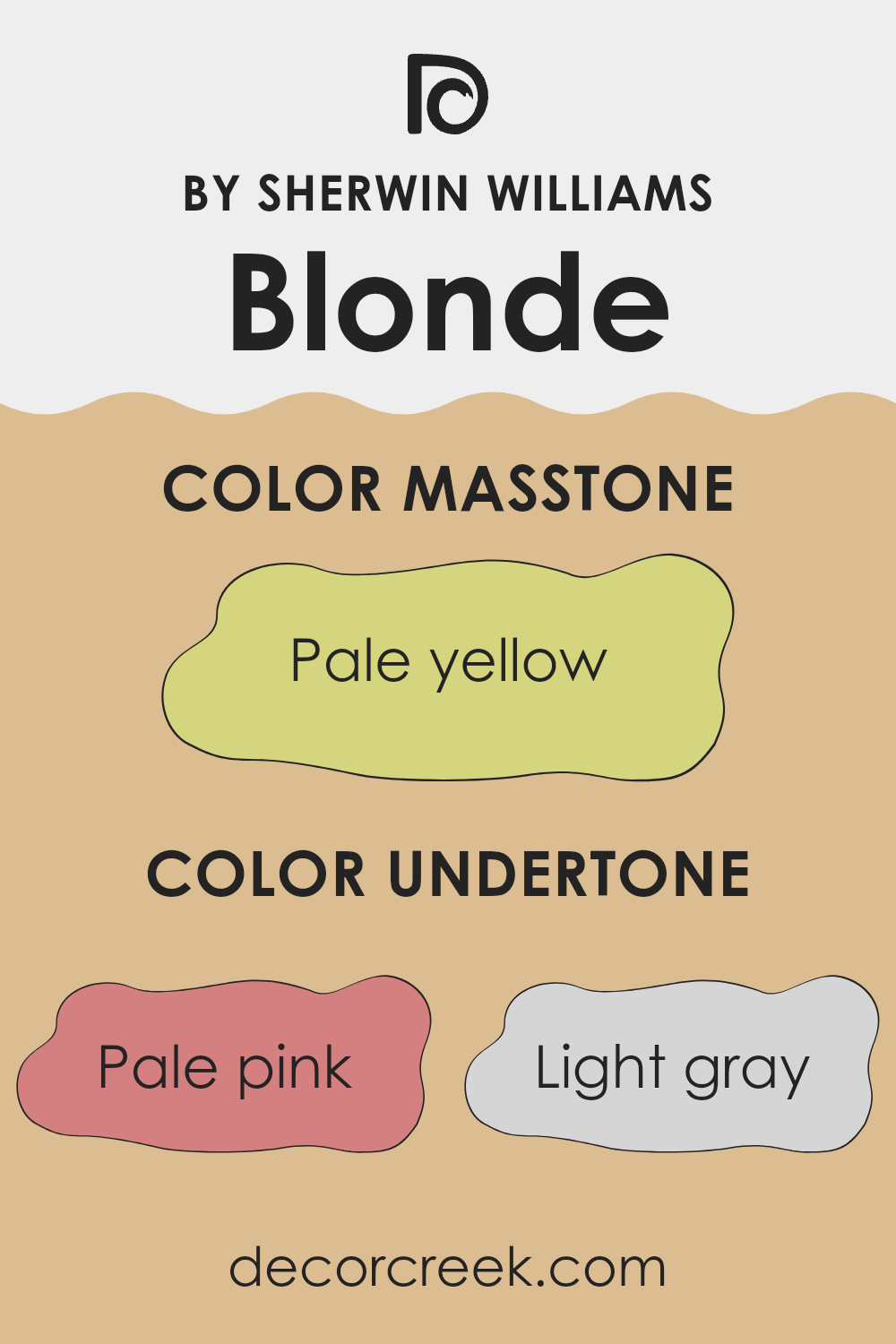
Blonde is a unique and adaptable color from Sherwin Williams. It’s characterized by a warm, creamy tone that brings an inviting atmosphere to any room. The varied undertones in this color are what make it particularly special, allowing it to adjust smoothly to different lighting conditions and decor styles.
Undertones are subtle colors that influence the main hue of the paint. They’re not always immediately noticeable but play a crucial role in determining how the color looks in varying environments. For example, pale pink, light purple, and lilac undertones add a gentle warmth, making the room feel cozy and welcoming. These softer hues are excellent for rooms aiming for a soft, nurturing feel.
On the other hand, undertones like light gray and grey give Blonde a more neutral appearance, making it easier to pair with modern furnishings and metal fixtures, creating a balanced look. Yellow and orange undertones bring out a sunny, cheerful vibe, perfect for energizing a room, while mint, light green, and olive introduce a touch of nature, promoting a calm, refreshing atmosphere.
When applied to interior walls, the mix of tones in Blonde ensures it complements various decor elements. For instance, in a room with ample sunlight, the yellow and orange undertones might become more pronounced, enhancing the room’s overall brightness.
In rooms with less natural light, the grays and lilacs can help maintain a sense of lightness. Due to all these undertones interacting, Blonde is never just one flat color; it evolves throughout the day and in different lighting conditions, always adding depth and interest to the walls.
What is the Masstone of the Blonde SW 6128 by Sherwin Williams?
Blonde by Sherwin Williams, with a masstone of pale yellow, brings a cheerful and light presence into any home. This shade has a soft and inviting quality that makes rooms feel more open and warm. Because it’s a gentle color, not too bright or too strong, it works well in almost any room, whether it’s a kitchen, living area, or a bedroom.
Its subtle brightness can enhance natural light in a room, giving a perception of more room which is especially beneficial in smaller rooms or areas with limited natural light. Furthermore, pale yellow pairs well with many other colors.
It can act as a neutral backdrop for bolder colors or blend smoothly with soft tones for a more harmonized look. Overall, using this specific yellow tone can make a home feel welcoming and airy, giving off a positive vibe that’s comfortable and pleasing to the eye.
decorcreek.com
How Does Lighting Affect Blonde SW 6128 by Sherwin Williams?
Lighting significantly influences how we perceive colors, impacting their appearance and the ambiance of a room. Different types of light can make a paint color look completely different.
Taking the color Blonde by Sherwin Williams as an example, we see these variations clearly. Under artificial light, such as incandescent bulbs, this warm yellow hue tends to look richer and more golden. Fluorescent lighting, on the other hand, might give it a slightly greener tint because of its cooler tone.
Natural light brings out the truest color, but the direction of the room also plays a crucial role. In north-facing rooms, light is typically cooler and can make colors appear more muted. Here, Blonde might lose some of its warmth and appear more subdued. South-facing rooms get a lot of bright sunlight throughout the day, which can intensify the warm yellow, making the room feel brighter and more cheerful.
In east-facing rooms, the morning light can make Blonde look very vivid and bright, perfect for starting the day with energy. As the light changes, the color will shift subtly, maintaining a fairly warm and welcoming glow throughout the day. Meanwhile, west-facing rooms see the strongest light in the late afternoon, which will make Blonde appear warmer and more intense, possibly amplifying its golden qualities as the sun sets.
In different settings, this particular shade can offer a range of experiences, making it a flexible choice for many homes. The way Blonde interacts with light exemplifies why considering lighting is crucial when selecting paint colors, ensuring the chosen hue matches the intended feel and functionality of each room.

What is the LRV of Blonde SW 6128 by Sherwin Williams?
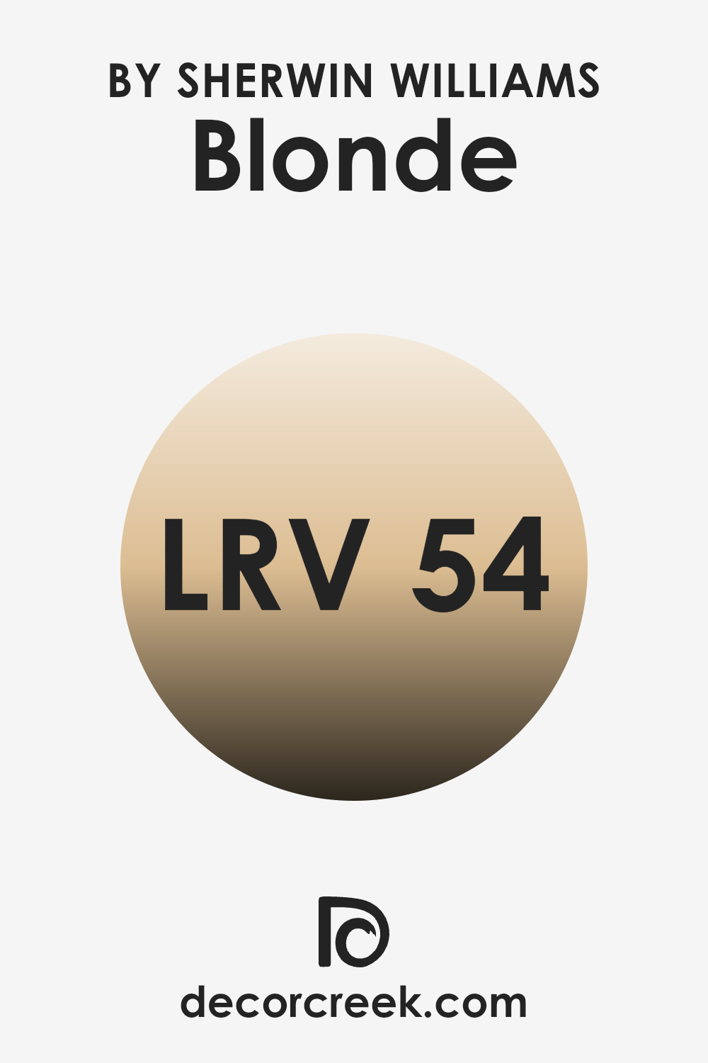
LRV stands for Light Reflectance Value, and it is a measure used to describe the percentage of light a paint color reflects back into the room when illuminated. Essentially, LRV helps you understand how light or dark a color might appear once it’s on your walls.
A higher LRV means the color reflects more light, making it appear lighter, while a lower LRV indicates that the color absorbs more light, appearing darker. This measurement is very useful when choosing paint colors for a room, as it can significantly impact the atmosphere and brightness of the room.
The LRV for Blonde (SW 6128) by Sherwin Williams is recorded at 53.828, which places it in the mid-range category of light reflection. This means it neither reflects too much nor too little light but maintains a balanced brightness that can help in making a room feel adequately illuminated without being too bright. Generally, a color with this LRV provides flexibility in various lighting conditions, appearing fairly consistent throughout the day. This neutral and balanced light reflection makes it a practical choice for rooms where you want a neither too dark nor too stark appearance.
Coordinating Colors of Blonde SW 6128 by Sherwin Williams
Coordinating colors are those that complement a base color, creating a harmonious and pleasing palette in an interior. For instance, if you start with a primary color like the warm, buttery shade of Blonde from Sherwin Williams, selecting the right coordinating colors can enhance the atmosphere you wish to establish. Coordinating colors work by balancing or accentuating the base color, allowing for a unified look that flows beautifully from one room to another.
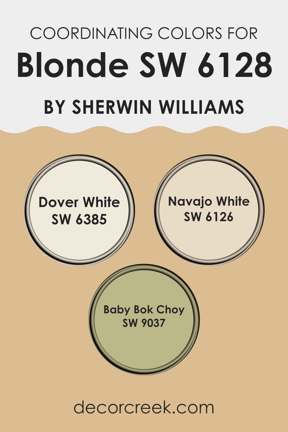
In the case of Blonde, coordinating colors include Dover White, Navajo White, and Baby Bok Choy. Dover White is a soft, creamy white with a touch of warmth, making it ideal for trim and ceilings where you want a subtle contrast without sharp transitions.
Navajo White offers a slightly deeper, almond-toned hue, providing a richer layer when paired next to Blonde, suitable for a comforting and cohesive feel in living rooms or bedrooms. Baby Bok Choy introduces a muted green, soft and earthy, which pairs well with the warmth of Blonde for those looking to add a natural, calming element to their rooms. These coordinating colors can help create an inviting environment by using variations in saturation and hue that complement the base color.
You can see recommended paint colors below:
- SW 6385 Dover White (CHECK A SAMPLE)
- SW 6126 Navajo White (CHECK A SAMPLE)
- SW 9037 Baby Bok Choy (CHECK A SAMPLE)
What are the Trim colors of Blonde SW 6128 by Sherwin Williams?
Trim colors are the accents used on architectural details like door frames, window sills, and baseboards, typically in colors that complement the primary wall color, creating a clean and appealing finish. The right trim color can highlight these features and pull together the overall look of a room.
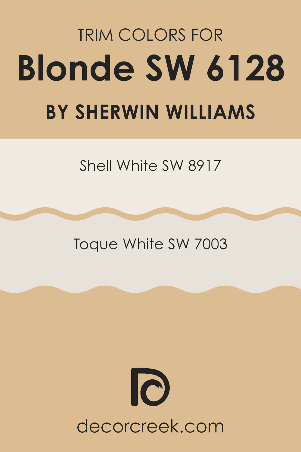
For walls painted with Blonde by Sherwin Williams (SW 6128), the use of trim colors like Shell White (SW 8917) and Toque White (SW 7003) works wonderfully to create a warm, welcoming ambiance that balances the rich hues of Blonde.
Shell White (SW 8917) is a soft, warm white with just a hint of creaminess, making it perfect for creating a subtle contrast against the deeper, golden tones of Blonde. On the other hand, Toque White (SW 7003) leans closer to a neutral, crisp white that offers a sharper contrast, which can effectively highlight the architectural details of a room. Both options serve as flexible choices that harmonize well with Blonde, helping to enhance its natural charm and providing a polished finishing touch to the décor.
You can see recommended paint colors below:
Colors Similar to Blonde SW 6128 by Sherwin Williams
Similar colors play a crucial role in creating a harmonious and pleasing palette, especially in interior design. When colors like those similar to Blonde by Sherwin Williams are used together, they produce a cohesive look that feels intentional and balanced.
These gentle hues blend effortlessly, allowing for a smooth transition between different rooms in a home or uniting various elements within a single room. Utilizing similar colors can subtly enhance architectural features without feeling too intense, ideal for achieving a refined yet inviting atmosphere.
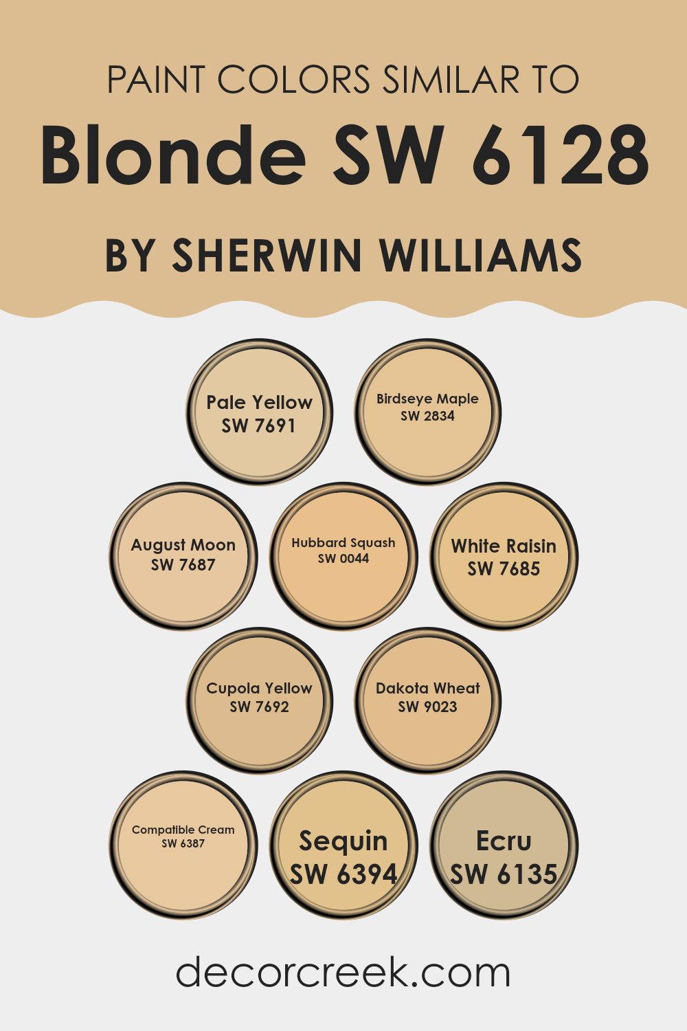
For example, Pale Yellow has a soft, sunlit charm which makes it perfect for brightening up small rooms. Birdseye Maple offers a slightly richer tone that still maintains a light warmth, ideal for cozy settings. August Moon and Hubbard Squash introduce deeper yellow shades, lending a sense of warmth and earthiness. White Raisin adds a dash of creamy brightness, great for softening edges and adding light.
Cupola Yellow provides a muted golden hue, reminiscent of vintage charm. Dakota Wheat carries a subdued golden brown tone, excellent for adding depth while maintaining lightness. Compatible Cream offers an understated elegance, making it adaptable for various applications.
Sequin, slightly brighter, can add a touch of subtle glamour. Last but not least, Ecru stands out with its neutral creamy presence, serving as a perfect base or complementary background color in multiple decor styles. Together, these shades help to build a visually soothing environment.
You can see recommended paint colors below:
- SW 7691 Pale Yellow (CHECK A SAMPLE)
- SW 2834 Birdseye Maple
- SW 7687 August Moon (CHECK A SAMPLE)
- SW 0044 Hubbard Squash (CHECK A SAMPLE)
- SW 7685 White Raisin (CHECK A SAMPLE)
- SW 7692 Cupola Yellow (CHECK A SAMPLE)
- SW 9023 Dakota Wheat (CHECK A SAMPLE)
- SW 6387 Compatible Cream (CHECK A SAMPLE)
- SW 6394 Sequin
- SW 6135 Ecru (CHECK A SAMPLE)
Colors that Go With Blonde SW 6128 by Sherwin Williams
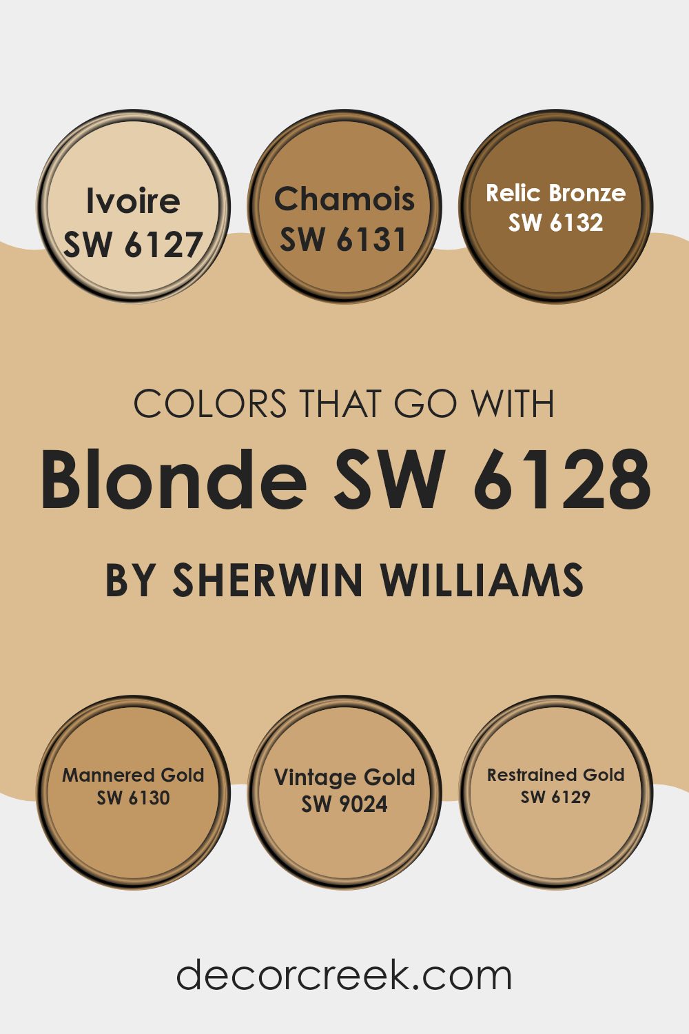
When decorating with Blonde SW 6127 by Sherwin Williams, choosing the right complementary colors is crucial as they set the mood and tie a room together. Colors like Ivoire, Chamois, Relic Bronze, Mannered Gold, Vintage Gold, and Restrained Gold are perfect matches. Each of these colors works in harmony with Blonde’s warm undertones, creating a cohesive and welcoming atmosphere.
Ivoire is a soft, creamy hue with a gentle warmth that can lighten up any room, giving it a fresh and welcoming feel. Chamois, with its subtle earthy tones, adds a natural, unassuming elegance to interiors, perfect for those looking for a touch of understated beauty. Relic Bronze brings a deeper, rich note into the mix, offering a bold contrast that can enhance the depth of a room.
Mannered Gold has a more pronounced golden color, adding a touch of luxury and warmth, ideal for creating a cozy and chic room. Vintage Gold, slightly muted compared to Mannered Gold, offers a hint of nostalgia and warmth, ideal for rooms meant to feel more lived-in and homey. Lastly, Restrained Gold is a balanced mix of earthy and amber tones, perfect for those wanting a harmonious yet impactful color scheme. Together, these colors work with Blonde to create a diverse yet unified palette, allowing for many interior styles and preferences.
You can see recommended paint colors below:
- SW 6127 Ivoire (CHECK A SAMPLE)
- SW 6131 Chamois (CHECK A SAMPLE)
- SW 6132 Relic Bronze (CHECK A SAMPLE)
- SW 6130 Mannered Gold (CHECK A SAMPLE)
- SW 9024 Vintage Gold (CHECK A SAMPLE)
- SW 6129 Restrained Gold (CHECK A SAMPLE)
How to Use Blonde SW 6128 by Sherwin Williams In Your Home?
Blonde by Sherwin Williams is a warm, inviting color that brings a cozy feel to any room. It’s a soft yellow with a hint of beige, making it a perfect choice for creating a comforting and welcoming atmosphere. This color works great in living rooms or dining areas where families gather and spend a lot of time. It’s bright enough to add a cheerful touch but muted enough not to feel too intense.
Using Blonde in a smaller area like a bathroom or hallway can make the room appear larger and more open. For bedrooms, pairing this paint with soft whites or grays can create a calm, cozy retreat ideal for relaxing.
Since it’s a flexible color, it also works well with wood finishes and can complement both modern and traditional decor. Adding Blonde to a single wall as an accent can also be effective, giving a room character without the commitment of painting the entire room.
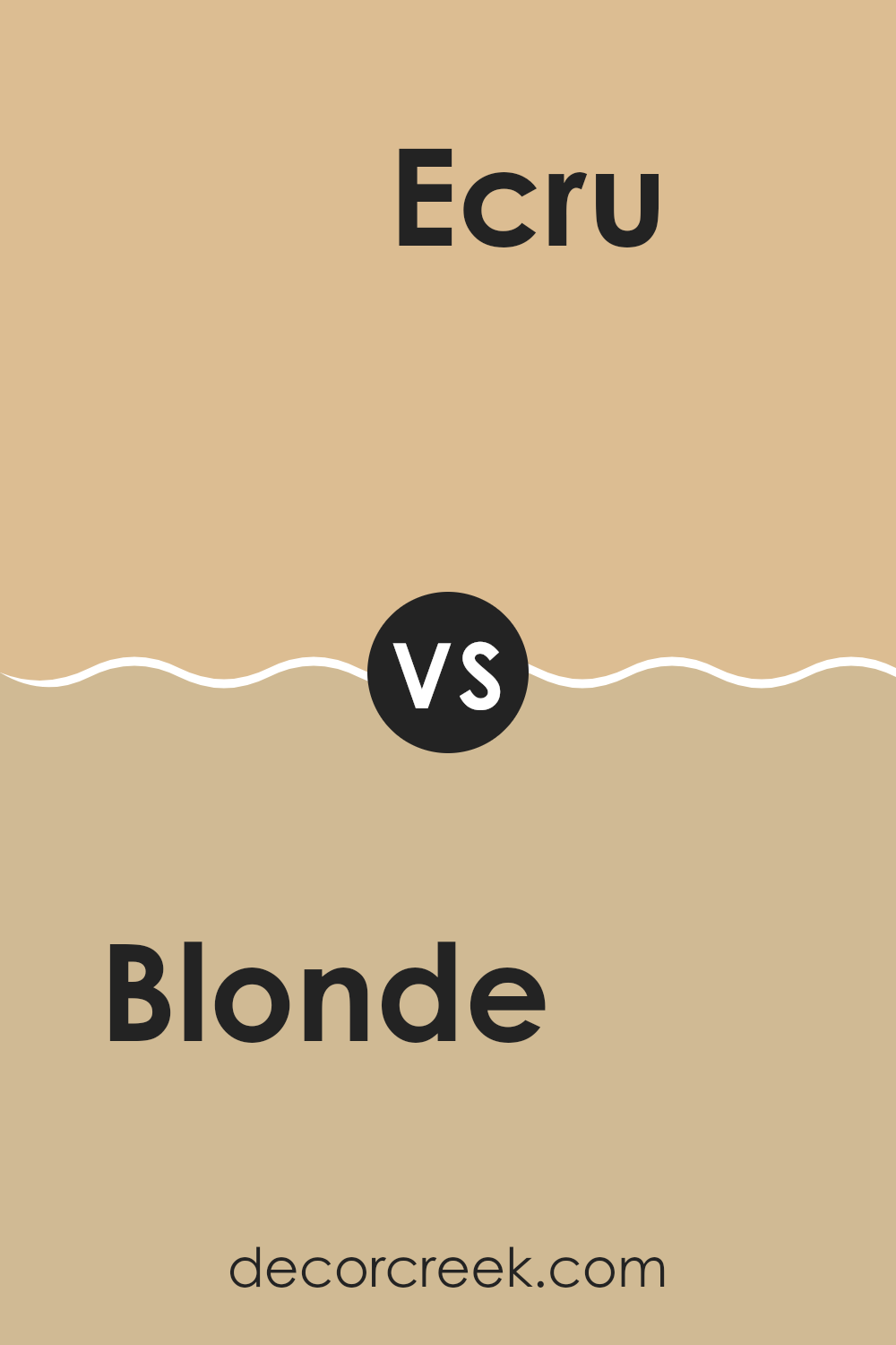
Blonde SW 6128 by Sherwin Williams vs Ecru SW 6135 by Sherwin Williams
Blonde and Ecru by Sherwin Williams are two different paint colors that can change the feel of a room. Blonde is a warm, light yellow color that brings a bright and sunny tone to a room. It gives off a cheerful vibe and can make a room feel more inviting.
Ecru, on the other hand, is a softer, subtle beige. It’s more neutral and flexible, providing a calm and classy look without being too bold. Both colors are great for creating a cozy environment but serve different moods and styles.
Blonde might be better for someone looking to add a hint of warmth and cheer, whereas Ecru works well for those who prefer something more understated that can easily blend with various decor styles.
You can see recommended paint color below:
- SW 6135 Ecru (CHECK A SAMPLE)
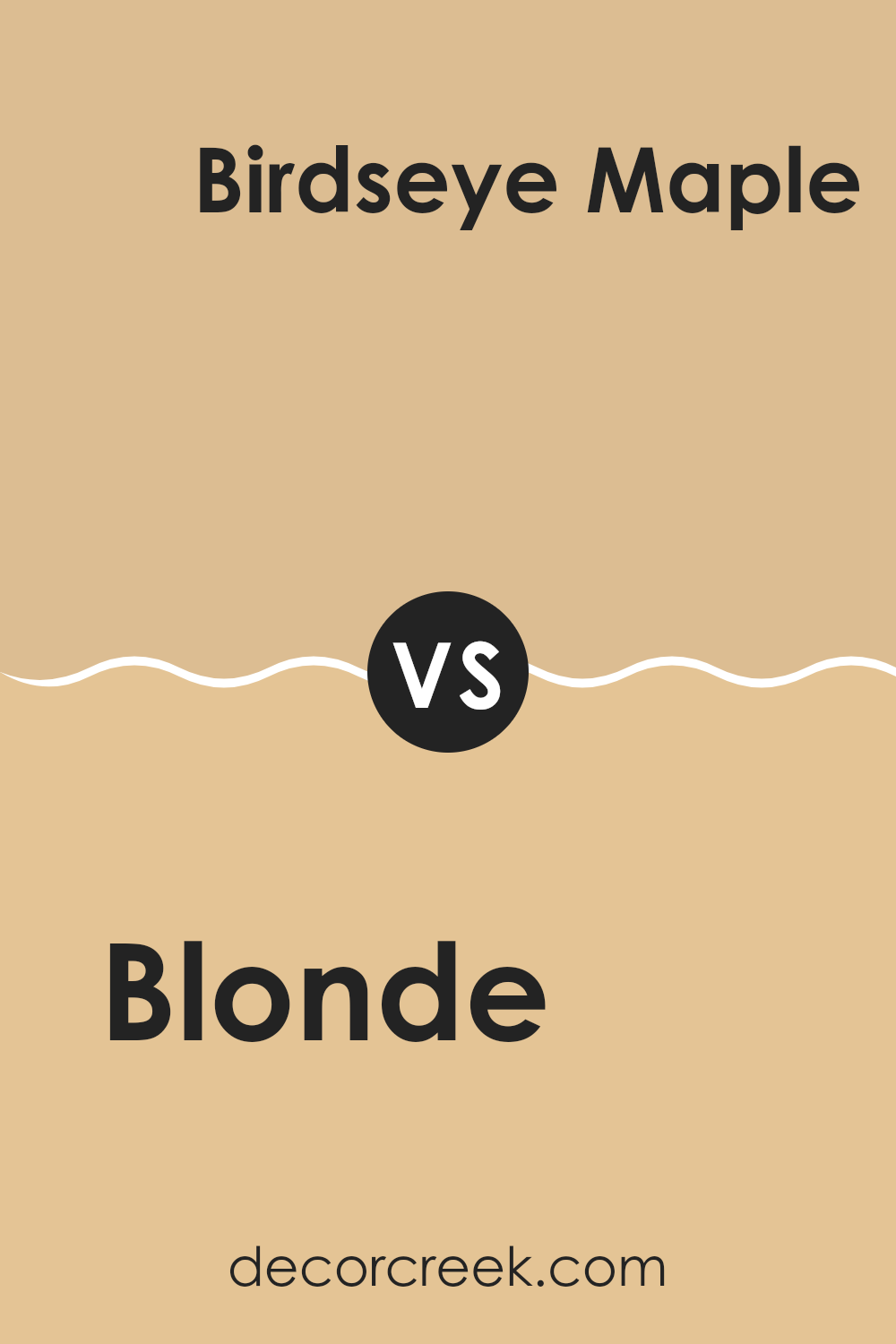
Blonde SW 6128 by Sherwin Williams vs Birdseye Maple SW 2834 by Sherwin Williams
Blonde SW 6128 by Sherwin Williams is a warm, neutral beige with a soft and welcoming feel. It’s perfect for creating a cozy and inviting atmosphere in any room. This color pairs beautifully with both bright and muted shades, serving as an adaptable backdrop for various decor styles.
On the other hand, Birdseye Maple SW 2834 is a deeper, richer hue that leans more towards medium brown with golden undertones. It brings a sense of warmth and elegance to a room, offering a robust color that enhances the feeling of stability and grounding.
While both colors share a warm base, Blonde is lighter and more neutral, making it easier to match with a wide array of other colors. Birdseye Maple, however, provides a stronger presence due to its deeper tone, ideal for making a statement or highlighting focal points. Each of these colors can set a different mood and are suitable for different types of rooms depending on the atmosphere you want to create.
You can see recommended paint color below:
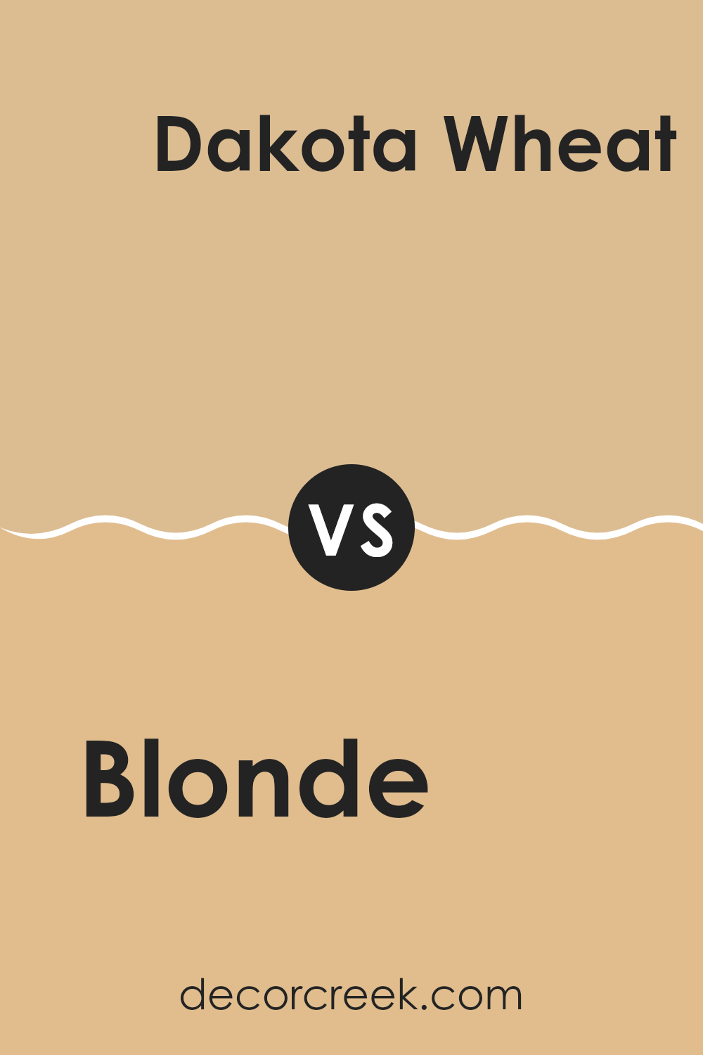
Blonde SW 6128 by Sherwin Williams vs Dakota Wheat SW 9023 by Sherwin Williams
Blonde and Dakota Wheat by Sherwin Williams are both warm, inviting colors, but they have distinct differences in hue and depth that affect their impact on a room. Blonde is a lighter, creamy color resembling the pale, golden shade of natural blonde hair. It reflects light well, making rooms appear brighter and more open, which is perfect for small rooms or areas with limited natural light.
On the other hand, Dakota Wheat is a deeper, golden beige that conjures the image of ripe wheat fields. This color has a richer, more earthy quality, giving it a cozy warmth ideal for creating a welcoming atmosphere in rooms like living rooms or bedrooms. Dakota Wheat can also help in large rooms, making them feel more snug and intimate.
In summary, while both colors share a warm base, Blonde offers a lighter, airier feel, and Dakota Wheat provides a deeper, homier touch. Choosing between them depends on the desired effect in your room—brightness with Blonde or richness with Dakota Wheat.
You can see recommended paint color below:
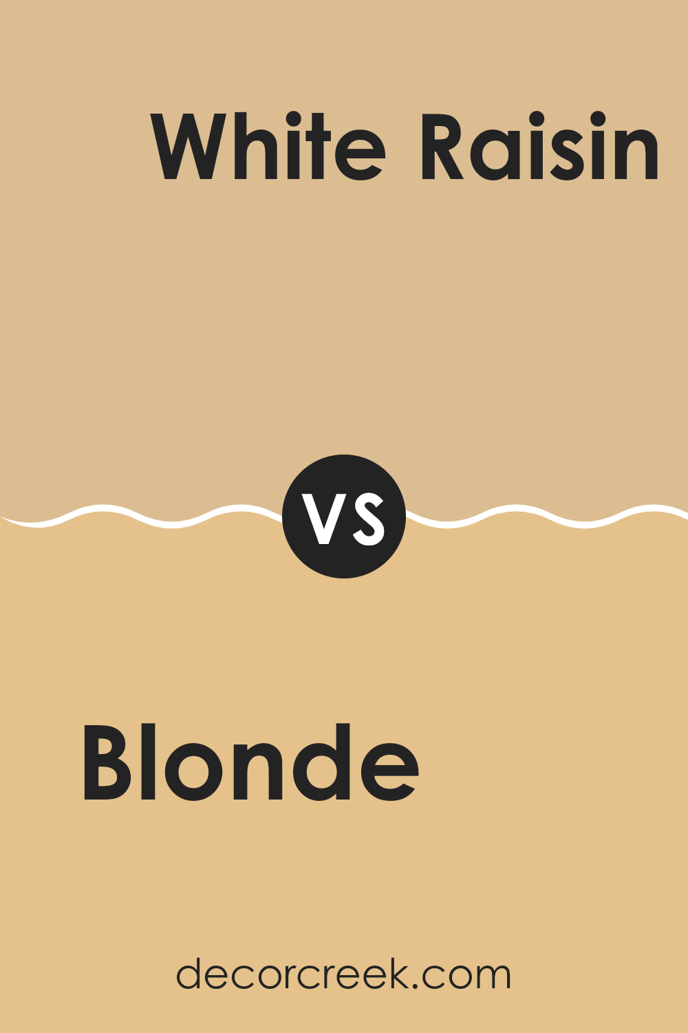
Blonde SW 6128 by Sherwin Williams vs White Raisin SW 7685 by Sherwin Williams
Blonde by Sherwin Williams is a warm, muted yellow with a cozy feel, perfect for creating a welcoming atmosphere in any room. It’s not too bright, making it easy to pair with other colors and decor styles.
On the other hand, White Raisin by Sherwin Williams is a softer, creamy color that leans more towards a gentle tan. It’s great for rooms where you want a hint of warmth without overpowering the room with color.
While Blonde offers a sunnier touch, ideal for kitchens or living areas, White Raisin is more subdued and suits rooms where you prefer a subtler, soothing backdrop, such as bedrooms or bathrooms. Both colors reflect light well, brightening rooms efficiently, but their tones provide different levels of warmth and mood.
You can see recommended paint color below:
- SW 7685 White Raisin (CHECK A SAMPLE)
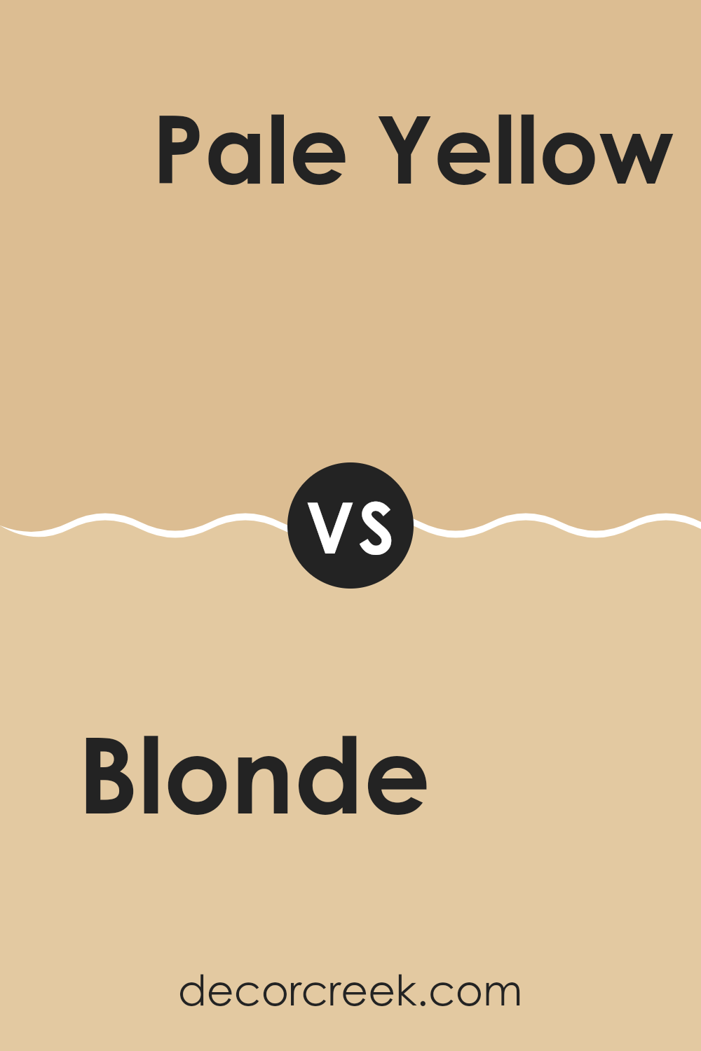
Blonde SW 6128 by Sherwin Williams vs Pale Yellow SW 7691 by Sherwin Williams
Blonde by Sherwin Williams is a warm, neutral paint color that tends to bring a cozy and inviting feel to any room. It’s got hints of cream and beige, making it a flexible choice for rooms where you want an understated yet welcoming vibe.
On the other hand, Pale Yellow by Sherwin Williams is brighter and more vibrant. This color adds a cheerful touch to a room, brightening interiors with its light and sunny quality.
While Blonde tends to be more subdued and can blend smoothly with various decor styles, Pale Yellow stands out more and is a great option if you’re looking to add a splash of brightness. Both colors work well in rooms that get a lot of natural light, but Pale Yellow especially can make small, darker rooms feel larger and more open.
You can see recommended paint color below:
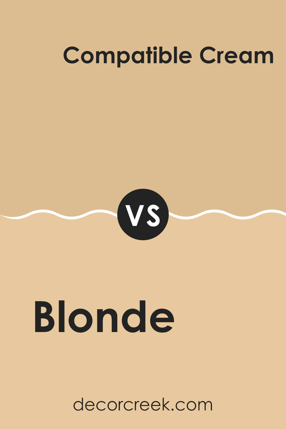
Blonde SW 6128 by Sherwin Williams vs Compatible Cream SW 6387 by Sherwin Williams
Blonde by Sherwin Williams is a warm, soft beige with a light, airy feel, ideal for creating a cozy and inviting atmosphere. It reflects natural light well, making rooms appear more expansive and welcoming. Its subtle yellow undertones provide a gentle hint of color without feeling too intense, making it adaptable for various settings, from living rooms to bedrooms.
On the other hand, Compatible Cream is a deeper, richer hue, also warm, with a more pronounced presence of yellow. This color adds a touch of cheerfulness and can make a room feel more intimate and comfortable. It pairs well with a wide range of décor and is particularly effective in areas where a more vibrant, yet not too bold, backdrop is desired.
Both colors work well together, with Blonde serving as a lighter counterpart to the deeper Compatible Cream, allowing for a balanced and harmonious color scheme in any home.
You can see recommended paint color below:
- SW 6387 Compatible Cream (CHECK A SAMPLE)
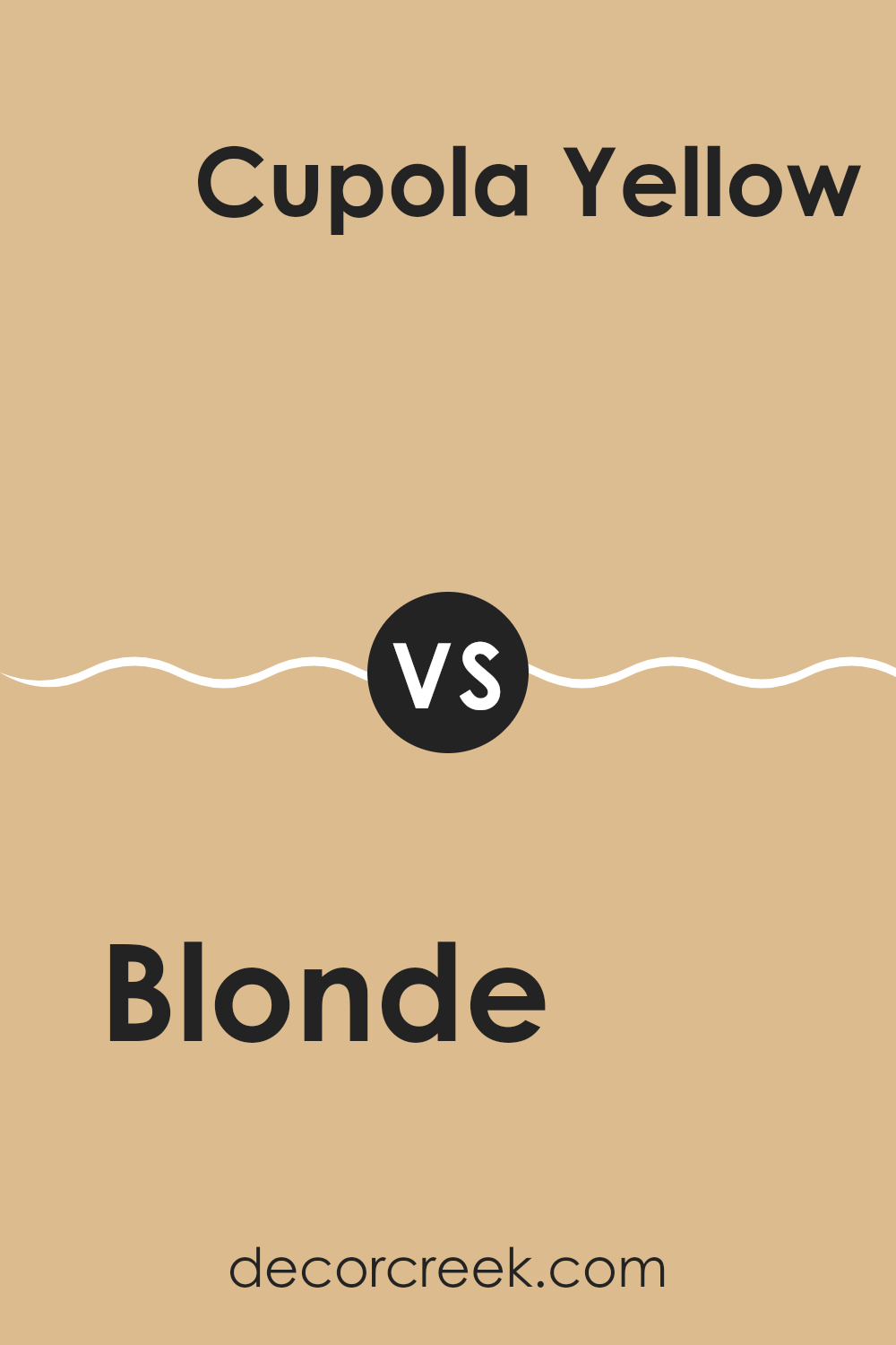
Blonde SW 6128 by Sherwin Williams vs Cupola Yellow SW 7692 by Sherwin Williams
Comparing Blonde and Cupola Yellow from Sherwin Williams, these two paint colors offer distinctly different vibes for any room. Blonde is a soft, muted tan with a warm base that gives it a cozy feel, making it ideal for creating a relaxed atmosphere in rooms like living areas or bedrooms. Its subtle warmth makes it flexible for pairing with various decor styles.
On the other hand, Cupola Yellow presents a brighter, more vibrant hue. It’s a cheerful yellow with a noticeable presence, perfect for rooms where you want to inject energy and brightness, such as kitchens or dining areas. Its liveliness can instantly make a room feel more inviting and cheerful.
While both colors bring warmth to interiors, Blonde is more understated, and Cupola Yellow is bolder. Choosing between them depends on the mood and functionality you want in your room: calming and neutral with Blonde, or bright and lively with Cupola Yellow.
You can see recommended paint color below:
- SW 7692 Cupola Yellow (CHECK A SAMPLE)
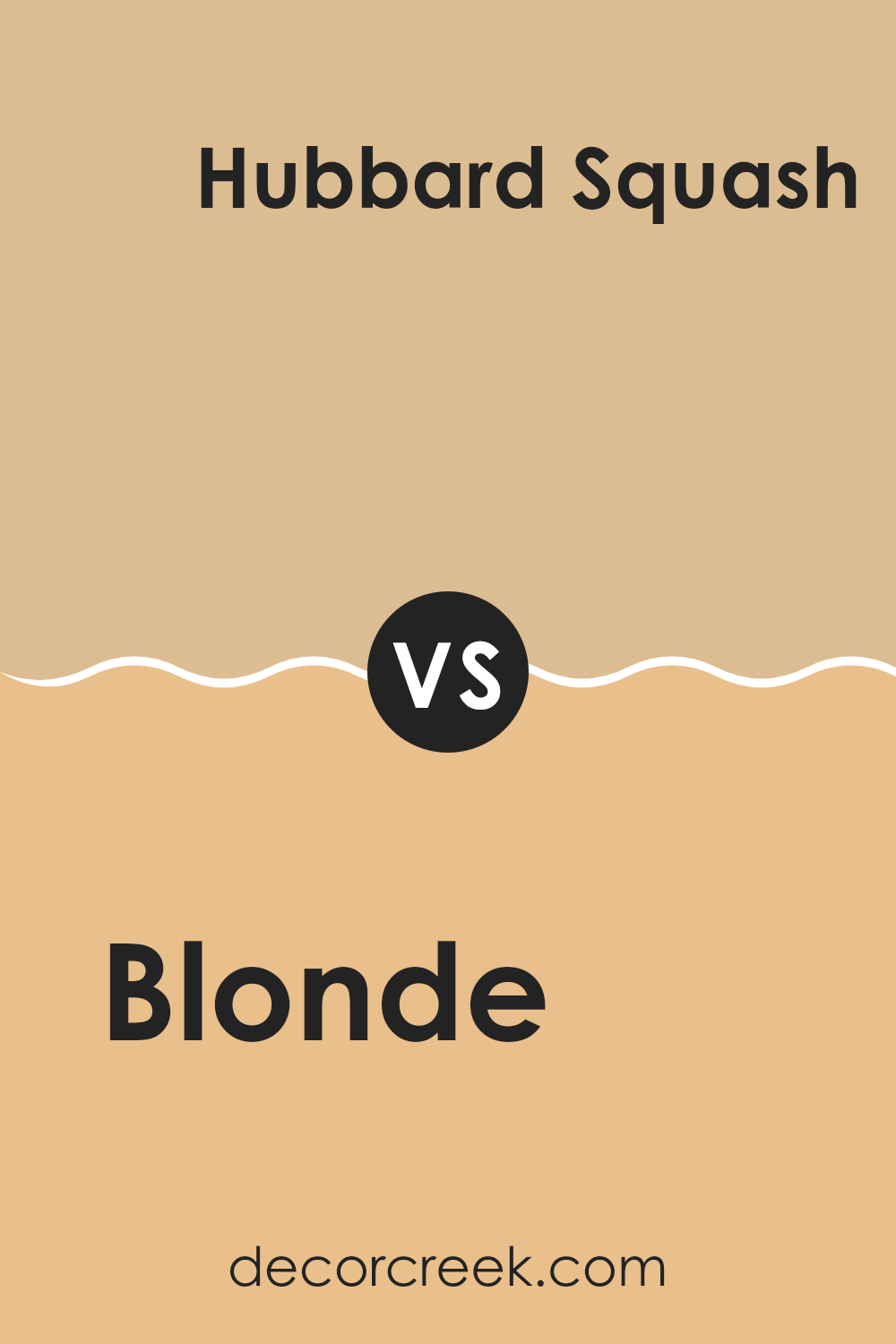
Blonde SW 6128 by Sherwin Williams vs Hubbard Squash SW 0044 by Sherwin Williams
Blonde by Sherwin Williams is a warm, light beige color with yellow undertones. It’s a soft and inviting shade that offers a hint of coziness without feeling too strong. This color is adaptable, working well in various settings like living rooms or bedrooms, creating a gentle backdrop that allows other decor elements to stand out.
In contrast, Hubbard Squash is a much deeper, rich mustard yellow that adds a bold pop of color to any area. This color is vibrant and can make a statement whether used on an accent wall or throughout a room. It works particularly well in rooms that benefit from a cheerful, energizing vibe, such as kitchens or dining areas.
Together, the two colors can complement each other beautifully, with Blonde serving as a neutral base and Hubbard Squash providing an exciting contrast. This combination can warm up a room, offering both comfort and visual interest.
You can see recommended paint color below:
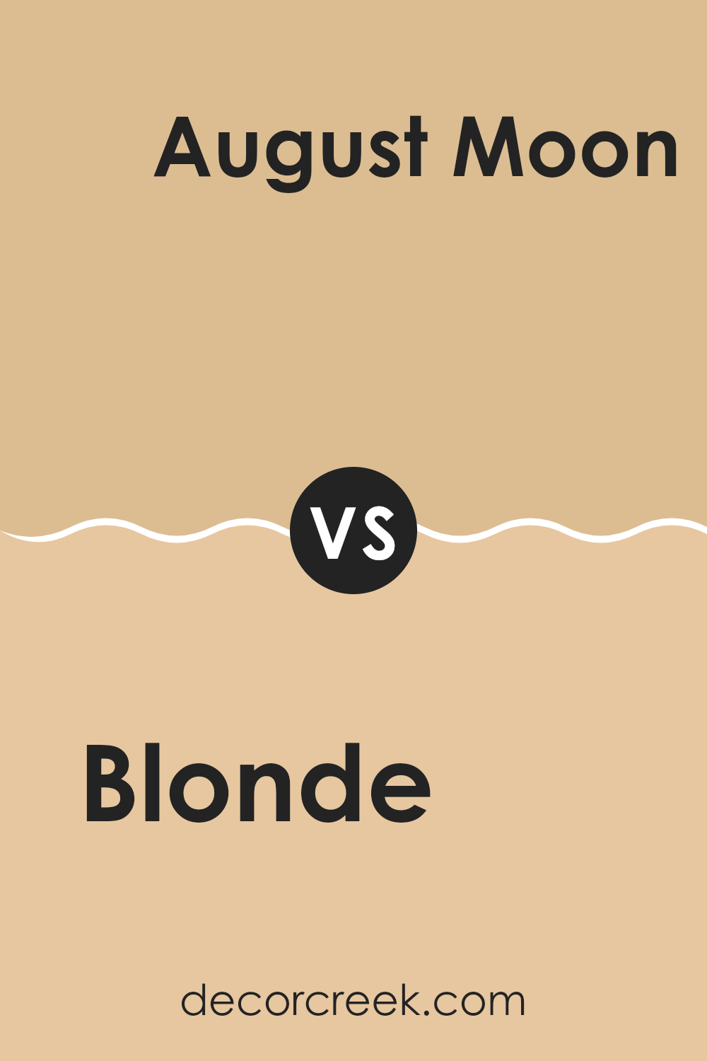
Blonde SW 6128 by Sherwin Williams vs August Moon SW 7687 by Sherwin Williams
Blonde SW 6128, by Sherwin Williams, is a warm, pale yellow hue that brings a sunny brightness to rooms. This color resembles the light tones of golden wheat fields and has a soft and inviting feel. It pairs well with earthy, natural elements and can make small rooms appear larger and more open.
On the other hand, August Moon SW 7687 is a darker, muted gray with a subtle brown undertone, also by Sherwin Williams. This color evokes the feel of twilight, providing a calming yet grounded ambiance. It’s ideal for those seeking a neutral backdrop that still offers some warmth. This shade complements both modern and rustic decor, making it adaptable for various settings.
Together, these colors can create a balanced and harmonious look, with Blonde adding brightness and light, and August Moon providing depth and stability. They work well in a room that benefits from contrast while maintaining a cozy atmosphere.
You can see recommended paint color below:
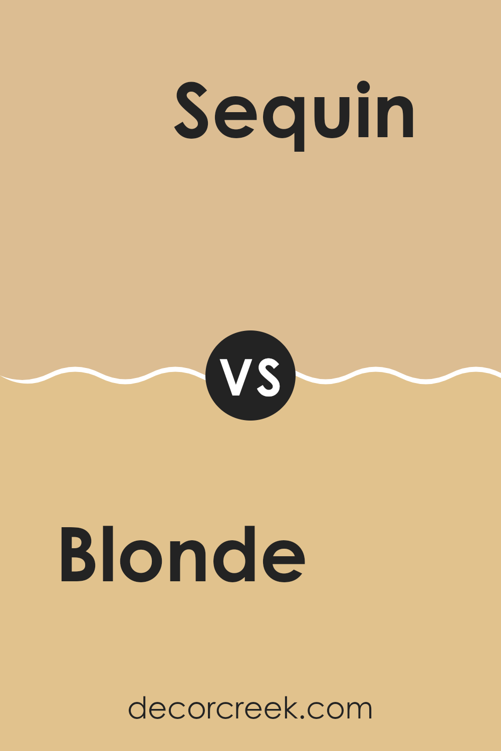
Blonde SW 6128 by Sherwin Williams vs Sequin SW 6394 by Sherwin Williams
Blonde and Sequin by Sherwin Williams are two distinctive paint colors that offer unique vibes to any room. Blonde appears as a soft, warm beige that brings a cozy and inviting atmosphere to rooms. Its gentle earthy tone makes it great for creating a soothing background in living areas or bedrooms.
On the other hand, Sequin is a light, cheerful yellow that adds brightness and a sense of happiness to a room. This color is more vivid compared to Blonde, making it a good choice for areas where you want to inject energy and vibrancy, like kitchens or dining rooms.
Both colors reflect light well but in different ways. Blonde tends to mute brightness, giving a relaxed feel, whereas Sequin reflects light more actively, potentially energizing a room. While both are light hues, their different undertones can affect the mood of a room, with Blonde leaning toward understated warmth and Sequin toward a fun, lively atmosphere.
You can see recommended paint color below:
Concluding my thoughts on SW 6128 Blonde by Sherwin Williams, this paint color has truly impressed me. It’s a warm, cheerful yellow that brings a sunny vibe to any room. It’s not too bright but just right to make the place feel welcoming and cozy, kind of like a sunny day. This color works well in living rooms or kitchens because it adds a touch of happiness and energy.
I’ve noticed that it pairs wonderfully with white trim or even soft blue accents, which can make a room feel more lively and inviting. It’s like when you put on your favorite yellow t-shirt—it just makes you feel good.
Blonde by Sherwin Williams also covers the walls really well, so you don’t need to put a lot of coats, which can save time and effort when you’re painting. It reflects light nicely, making smaller rooms seem larger and darker rooms brighter. That’s a big win, especially in areas that need a little extra sparkle.
Overall, SW 6128 Blonde is a great choice if you’re looking to brighten up your home with a color that’s easy to use and looks great everywhere. It has certainly made a fan out of me, and I think it could do the same for many others looking for that perfect splash of warmth and cheer in their homes.

Ever wished paint sampling was as easy as sticking a sticker? Guess what? Now it is! Discover Samplize's unique Peel & Stick samples.
Get paint samples
