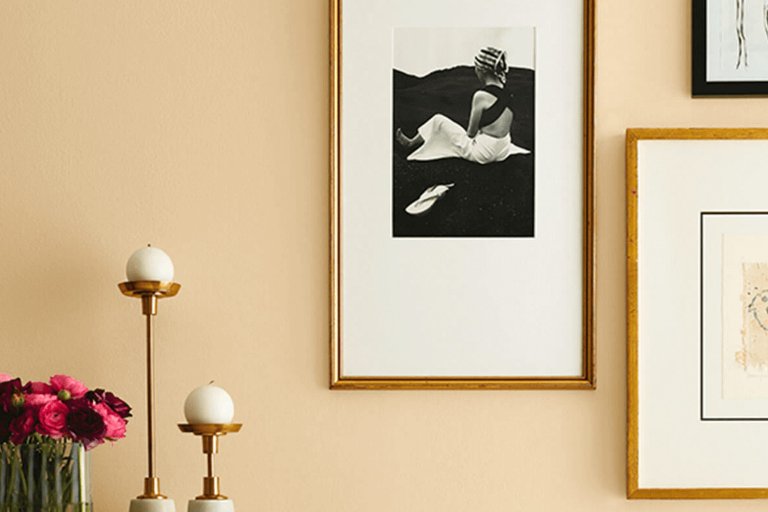
If you’re on the lookout for a color that subtly warms up a room without overpowering it, let me tell you about SW 7691 Pale Yellow by Sherwin Williams. I chose it myself when I wanted to refresh my living room with something gentle and soothing. This shade of yellow brings a soft, sunlit quality to any area, making it ideal for creating a cozy, inviting atmosphere.
As someone who has always appreciated a touch of brightness but didn’t want anything too bold, Pale Yellow struck the perfect balance for my needs. It’s light enough to make small rooms feel larger and airier, yet has enough warmth to add a cheerful vibe. Whether you’re painting a whole room or just an accent wall, this color works wonders in lifting the mood and complementing various decor styles.
With Pale Yellow, I found that it pairs beautifully with whites and grays, which helps in achieving a modern yet classic look. It’s also incredibly flexible, fitting just as well in a kitchen or a nursery, providing a backdrop that feels both welcoming and fresh.
If you’re considering giving your own home a little makeover, Pale Yellow might just be the perfect pick for you too.
What Color Is Pale Yellow SW 7691 by Sherwin Williams?
Pale Yellow by Sherwin Williams is a light and airy color that adds a subtle warmth to any room. This color resembles the soft glow of morning sunlight, making rooms feel more open and inviting. Its gentle hue works especially well in small rooms or areas lacking natural light, as it provides an illusion of spaciousness and brightness without being overpowering.
This particular shade pairs beautifully with a variety of interior styles. In traditional settings, it complements rich woods and classic patterns, creating a classic look. It’s equally effective in country-style interiors, where it harmonizes with rustic elements and natural materials like linen and rough-hewn wood.
For a more modern approach, this color works well with sleek furniture and clean lines, providing a slight contrast while maintaining a light, minimalistic feel. Pale Yellow’s versatility extends to the textures and materials it complements. It looks stunning with matte finishes such as unglazed ceramic or chalky painted surfaces, which enhance its softness.
On the other hand, pairing it with glossy finishes like polished marble or shiny metals can add a pleasant touch of glamour to an otherwise understated decor. Overall, this shade is perfect for creating a cozy, welcoming environment in your home.
Is Pale Yellow SW 7691 by Sherwin Williams Warm or Cool color?
Pale Yellow by Sherwin Williams is a warm and welcoming color that can greatly enhance the atmosphere of a home. Its soft and cheerful hue brings a sense of brightness to any room, making rooms feel more open and airy.
This shade is particularly effective in areas that don’t get a lot of natural light, as it can help to mimic the feeling of sunlight and make the area appear larger and more inviting. Using this color in living rooms and kitchens can add a cozy, yet vibrant touch, creating a comfortable room where family and guests like to gather.
It pairs well with white trim and cabinets, which can bring a clean and fresh contrast to the warmth of the yellow. Additionally, it works well in bedrooms, offering a gentle and sunny start to the day. Overall, Pale Yellow is flexible and can be a great choice for anyone looking to add a subtle splash of color to their home.
Undertones of Pale Yellow SW 7691 by Sherwin Williams
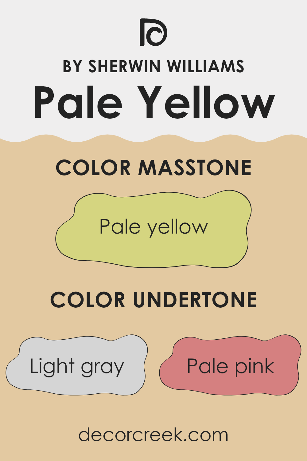
Pale Yellow from Sherwin Williams, a warm and inviting color, provides a foundation that carries multiple undertones. Undertones are subtle colors that influence the main hue, affecting how it’s perceived under different lighting conditions and when paired with other colors.
The undertones in Pale Yellow include light gray, pale pink, light purple, mint, light blue, yellow, gray, lilac, orange, light green, and olive. Each of these plays a crucial role in the appearance of Pale Yellow. For example, light gray and gray can mute the vibrancy of the yellow, giving it a more subdued feel, while pale pink and lilac introduce a soft, almost floral quality. Similarly, more vivid undertones like orange and light green inject a dose of energy and freshness into the color.
On interior walls, these undertones contribute to the paint’s adaptability. In brightly lit rooms, Pale Yellow may appear more vivid, as the lighter undertones like mint and light blue become more pronounced. In rooms with less natural light, the darker undertones like olive and gray may make the color appear deeper and richer.
This complexity in undertones allows Pale Yellow to complement various decor styles and palettes. Whether in a living room or a bedroom, the undertones help the color adjust subtly to its surroundings, making it flexible for any room. As lighting changes throughout the day, so does the perception of Pale Yellow, offering a dynamic look that keeps the room feeling fresh and lively.
What is the Masstone of the Pale Yellow SW 7691 by Sherwin Williams?
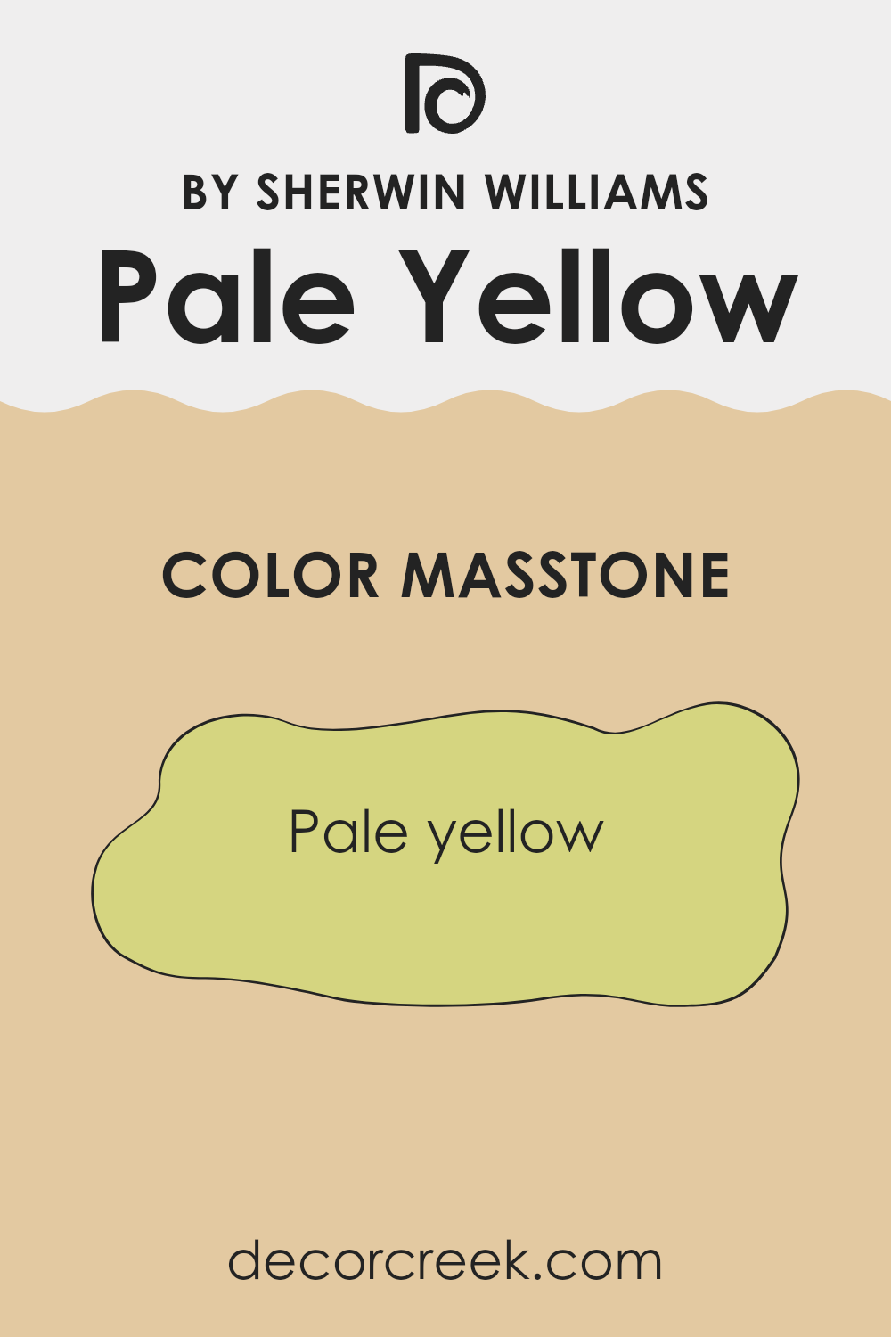
Pale Yellow SW 7691 by Sherwin Williams, with its masstone of a soft, muted yellow (#D5D580), brings a subtle splash of cheerfulness to any home. This particular shade of yellow is light and gentle, making it an excellent choice for creating a welcoming atmosphere without overpowering the senses.
In rooms that receive a lot of natural light, Pale Yellow can help enhance the brightness, making rooms feel more open and airy. For smaller rooms or areas with less natural light, this color can add a touch of warmth, making the room feel cozy and more inviting.
Additionally, the versatility of Pale Yellow allows it to blend well with various decor styles and colors. Whether paired with soft neutrals for a calm, cohesive look or used alongside bolder hues for a lively contrast, this color can adapt to many different interior aesthetics. It’s particularly effective in living areas, kitchens, and bathrooms where a light, fresh feel is desirable.
How Does Lighting Affect Pale Yellow SW 7691 by Sherwin Williams?
Lighting plays a crucial role in how colors are perceived in any environment. Depending on the type of light, a color can appear differently. This is important to consider when choosing paint colors for a room.
Take, for example, the color pale yellow. Under artificial light, pale yellow tends to look warm and cozy. This is because most artificial lights, especially incandescent and warm LEDs, emit a yellowish glow that enhances warm hues. So, in a room with soft artificial lights, pale yellow walls might feel brighter and more welcoming.
In natural light, the appearance of pale yellow can vary significantly throughout the day. Natural light is fullest during midday, emitting a balanced white light that shows the truest color. Thus, pale yellow will appear bright and lively. However, during sunrise and sunset, natural light has a reddish tone, making pale yellow seem softer and more muted.
The room’s orientation also affects how pale yellow appears:
– North-facing rooms: These rooms get less direct sunlight, making them generally cooler in tone. In north-facing rooms, pale yellow can seem more subdued and slightly greenish or grayish. It’s subtle but can make the room feel slightly less vibrant.
– South-facing rooms: These rooms enjoy abundant sunlight, making them the best to showcase pale yellow. Here, the color will look its brightest, most cheerful, and true, thanks to the ample natural light that emphasizes its warm tones.
– East-facing rooms: Morning light is cooler, so pale yellow will have a gentle, soft look in the morning, turning vivid and bright as the day progresses. It’s an excellent choice for rooms where you spend your mornings.
– West-facing rooms: Evening light brings warmth, causing pale yellow to glow warmly in the afternoons and evenings. This can create a cozy and inviting atmosphere, ideal for living rooms used later in the day.
Overall, lighting conditions influence how colors like pale yellow are perceived, defining the mood and feel of the room. Understanding this will help you decide where and how to use different colors effectively in your home decor.
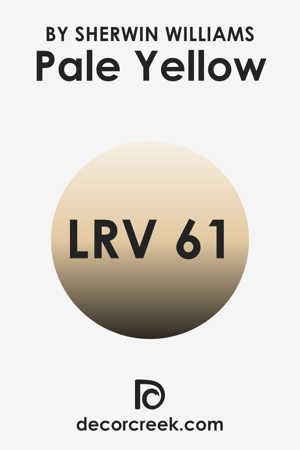
What is the LRV of Pale Yellow SW 7691 by Sherwin Williams?
LRV stands for Light Reflectance Value, and it measures the percentage of light a paint color reflects from or absorbs into a painted surface. Essentially, LRV helps you understand how light or dark a color may look once applied to your walls. The scale used for measuring LRV ranges from a low of 1 (almost black, absorbing most light) to a high nearing a perfect reflection of light.
This value is critical when choosing paint colors because it affects how bright or dim a room feels. Lighter colors with higher LRVs make a room feel more open and airy, as they reflect more light back into the room. Conversely, dark colors with lower LRVs can make a room feel smaller and cozier because they absorb more light.
In the case of the color with an LRV of 60.9, it reflects a moderate amount of light, making it a relatively light shade but not one of the lightest. This means it has sufficient brightness to make a room feel lively and warm without being overpoweringly bright. A color like this would work well in a variety of areas, especially those that could use a lift without the starkness that comes with higher LRVs.
It’s a practical choice for living areas, kitchens, or even bedrooms where you want a hint of cheerfulness without sacrificing a soft, welcoming ambiance. The specific LRV value indicates that it will provide a good balance between reflecting and absorbing light, making it flexible for different lighting conditions and room sizes.
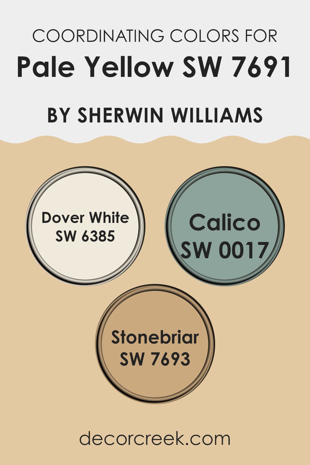
Coordinating Colors of Pale Yellow SW 7691 by Sherwin Williams
Coordinating colors are carefully selected shades that complement a primary color, creating a harmonious look in any room. Such colors enhance each other and can balance out a room or an outfit, making them aesthetically pleasing. In the case of Pale Yellow by Sherwin Williams, colors like Dover White, Calico, and Stonebriar serve as excellent coordinating choices. These colors work together to create a soft, welcoming atmosphere, each adding its unique touch while maintaining a seamless overall feel.
Dover White is a warm, creamy white that offers a gentle contrast to the brighter tones of Pale Yellow, providing a calm background that lets other colors pop without overpowering. Calico is a muted beige with hints of gray, acting as a neutral base that complements both warm and cool hues, thus supporting Pale Yellow in achieving a balanced look.
Stonebriar rounds out this palette with its earthy, slightly gray-green tone, adding a hint of depth and natural elegance that grounds the combination and ties the look together harmoniously. These choices make it easy to design rooms that feel cohesive and thoughtfully put together.
You can see recommended paint colors below:
- SW 6385 Dover White
- SW 0017 Calico
- SW 7693 Stonebriar
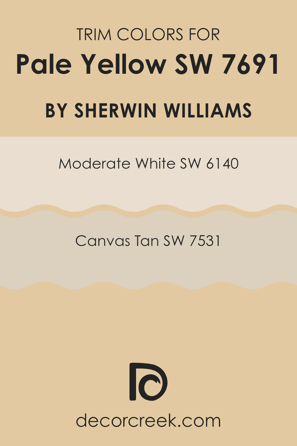
What are the Trim colors of Pale Yellow SW 7691 by Sherwin Williams?
Trim colors are used to accentuate or complement the main color of a room, adding depth and highlighting architectural details such as door frames, skirting boards, and crown moldings. For a soft and gentle wall color like Pale Yellow, the choice of trim colors needs to be carefully considered to ensure they balance and not overwhelm the walls.
Using colors such as Moderate White and Canvas Tan as trim provides a subtle contrast that enhances the soothing quality of Pale Yellow, allowing the room to feel coherently designed without harsh visual disruptions.
Moderate White is a very light shade that borders on pure white without becoming stark. It reflects light beautifully, making it highly effective for use in areas that receive less natural sunlight, thereby brightening rooms subtly.
On the other hand, Canvas Tan is a warm beige that brings a slight earthy feel to a room when used as a trim color. It complements the sunny tones in Pale Yellow by adding a bit of weight and warmth, grounding the airier feeling of lighter yellows without clashing. Both choices support the main color by providing a soft backdrop that enhances the overall appeal of the room.
You can see recommended paint colors below:
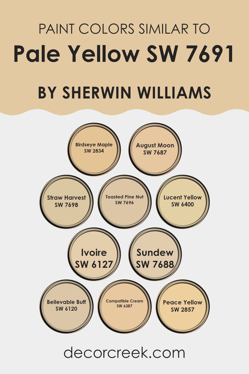
Colors Similar to Pale Yellow SW 7691 by Sherwin Williams
Similar colors, like the ones that relate to Pale Yellow by Sherwin Williams, play a crucial role in creating a harmonious and visually pleasing environment. These tones share underlying hues, allowing them to blend seamlessly when used together in decor. They can form a gentle gradation or variance in a room without stark contrasts, making the area appear cohesive yet still interesting. By using similar colors, you can also easily add depth and dimension to a room without the colors clashing, as these shades complement each other.
For instance, Birdseye Maple is a soft, muted tan that works well in a room where you want a hint of warmth without overpowering brightness. August Moon has a deeper, golden tone, offering a cozy, inviting atmosphere when paired with other yellows. Straw Harvest brings a richer, deeper yellow to the table, perfect for accentuating areas or for use in a monochromatic scheme.
Toasted Pine Nut stands out as a subdued beige with yellow undertones that can help ground a room while keeping it light and airy. Lucent Yellow is bolder, brighter, and a cheerful choice that can energize a room. Ivoire offers a creamy, soft touch that is flexible for many settings, blending well with both bold and subdued colors.
Sundew has a very subtle pink hue, presenting a unique twist when mixed with yellows. Believable Buff is a neutral option that balances the brightness of yellow with a more down-to-earth feel. Compatible Cream is similar to Believable Buff but leans more towards a creamy texture, offering smoothness to the visual texture of a room.
Lastly, Peace Yellow delivers a soft radiance that can make any room feel sunny and lively, mimicking the gentle rays of morning light. Each of these colors can work together or stand alone to create an environment that feels cohesive and refined yet inviting.
You can see recommended paint colors below:
- SW 2834 Birdseye Maple
- SW 7687 August Moon
- SW 7698 Straw Harvest
- SW 7696 Toasted Pine Nut
- SW 6400 Lucent Yellow
- SW 6127 Ivoire
- SW 7688 Sundew
- SW 6120 Believable Buff
- SW 6387 Compatible Cream
- SW 2857 Peace Yellow
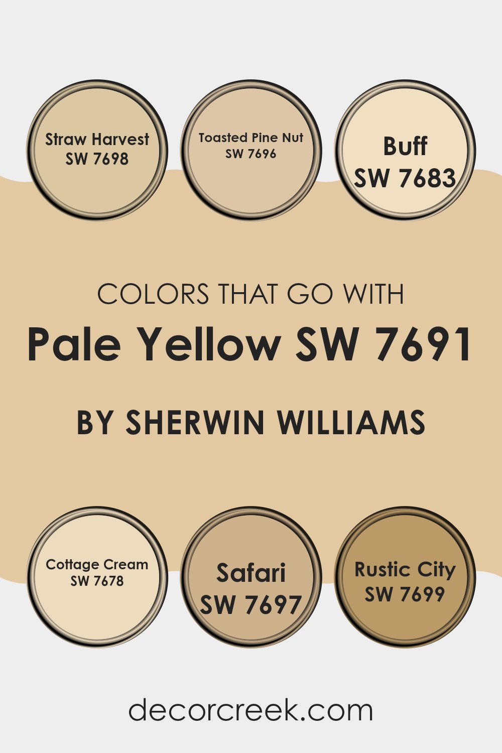
Colors that Go With Pale Yellow SW 7691 by Sherwin Williams
Choosing the right colors to complement Pale Yellow SW 7691 by Sherwin Williams is crucial because it helps create a cohesive and appealing look in any room. Pale Yellow is a soft and subtle shade that invites a sense of calm and brightness, making it flexible for various decorating styles. When paired with compatible colors, such as Straw Harvest, Toasted Pine Nut, Buff, Cottage Cream, Safari, and Rustic City, it allows for a harmonious flow throughout the room, enhancing the overall aesthetic and mood.
Straw Harvest SW 7698 is a warm, golden hue that echoes the sunny tones in Pale Yellow, providing a seamless blend that enriches the environment. Toasted Pine Nut SW 7696 offers a slightly deeper, earthy tone that grounds the lightness of Pale Yellow, adding depth to the palette.
Buff SW 7683 is a muted, creamy color, almost like a soft beige, which acts as a neutral backdrop that lets Pale Yellow shine without overpowering it. Cottage Cream SW 7678 has a delicate, almost whitish tint that reflects light beautifully, amplifying the brightness of areas.
Safari SW 7697, with its gentle brown, brings a touch of nature and warmth, perfect for cozy settings. Lastly, Rustic City SW 7699 has a robust, darker hue that contrasts nicely with Pale Yellow, providing a striking balance and adding character to the design. Together, these colors support and enhance Pale Yellow, enabling various design themes from subtle elegance to vibrant liveliness.
You can see recommended paint colors below:
- SW 7698 Straw Harvest
- SW 7696 Toasted Pine Nut
- SW 7683 Buff
- SW 7678 Cottage Cream
- SW 7697 Safari
- SW 7699 Rustic City
How to Use Pale Yellow SW 7691 by Sherwin Williams In Your Home?
Pale Yellow SW 7691 by Sherwin Williams is a warm and welcoming color, ideal for adding a touch of brightness to any room in your home. It works exceptionally well in areas that could use a little more light, such as north-facing rooms or smaller areas that don’t get a lot of natural sunlight. With its sunny tones, Pale Yellow can make these rooms feel more open and cheerful.
This shade is flexible and can be used in various ways. For a subtle touch, you might paint one accent wall to add a splash of color without overpowering the room. In the kitchen or bathroom, combining Pale Yellow with white cabinets or fixtures can create a clean and fresh look. Alternatively, in a bedroom or living room, pairing it with soft blues or greens can produce a relaxed and comfortable atmosphere.
Pale Yellow also pairs nicely with darker colors like navy or gray, providing a beautiful contrast that can make your furniture or decor items stand out. It’s an excellent choice for anyone looking to brighten up their home with a sense of warmth and cheer.
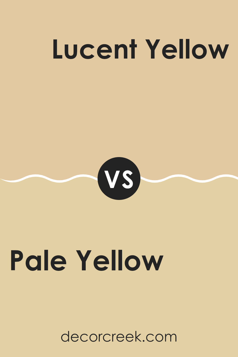
Pale Yellow SW 7691 by Sherwin Williams vs Lucent Yellow SW 6400 by Sherwin Williams
Pale Yellow SW 7691 and Lucent Yellow SW 6400 by Sherwin Williams are both yellow hues, yet they have distinct shades that set them apart. Pale Yellow is a soft, muted yellow that has a gentle, subtle quality to it. This softness makes it easy to pair with other colors and ideal for creating a soothing and warm atmosphere in areas like living rooms or bedrooms.
On the other hand, Lucent Yellow is a brighter and more vibrant shade. This color stands out more and carries a cheerful, energetic vibe. It’s great for adding a punch of color to a room, making it a good choice for areas where you want to foster a lively and inviting atmosphere, such as kitchens or children’s play areas.
Both colors bring warmth, but their intensity and the moods they convey are quite different, with Pale Yellow providing a quieter backdrop and Lucent Yellow offering a bolder statement.
You can see recommended paint color below:
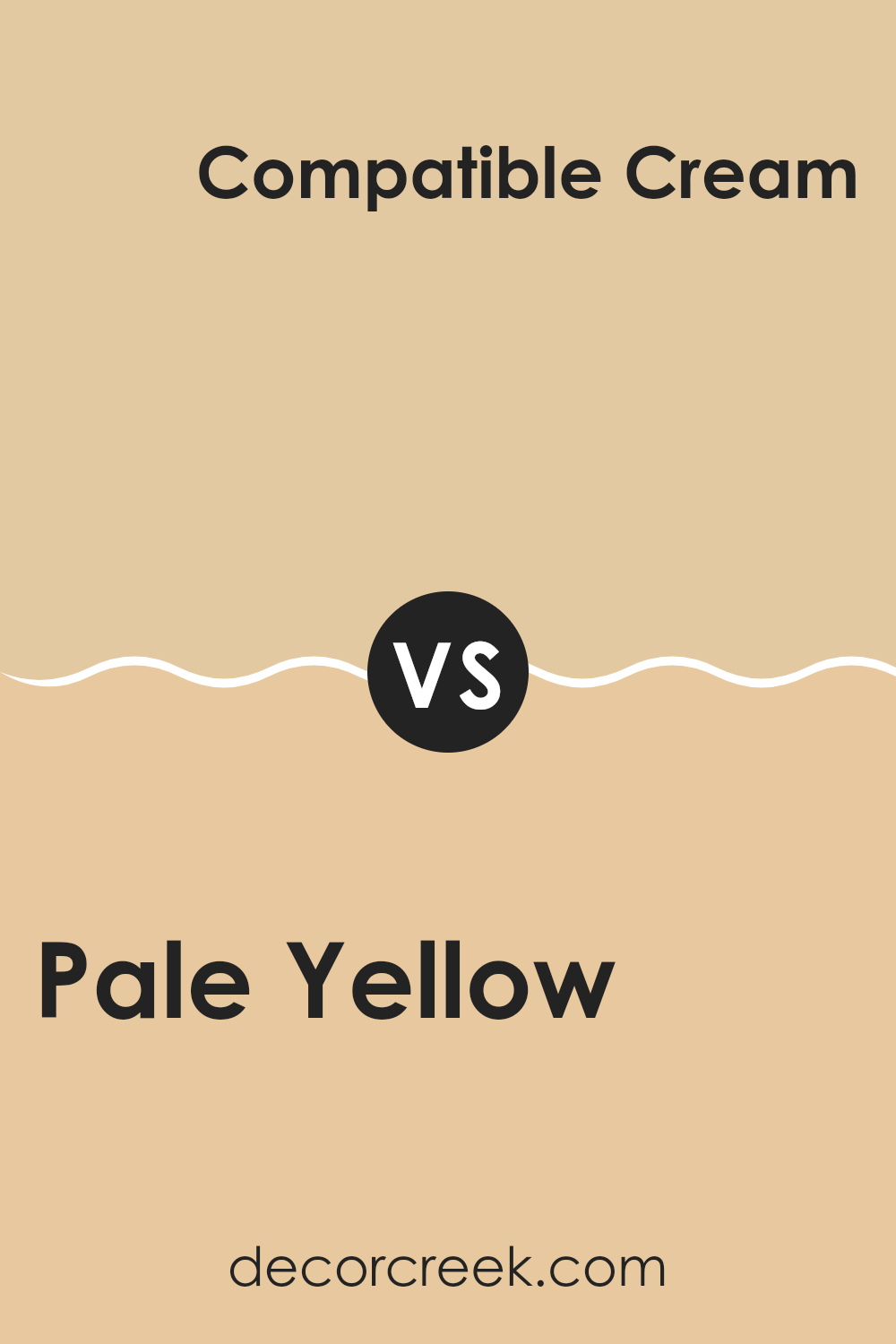
Pale Yellow SW 7691 by Sherwin Williams vs Compatible Cream SW 6387 by Sherwin Williams
The two colors from Sherwin Williams, Pale Yellow and Compatible Cream, offer subtle distinctions that create different moods and aesthetics in areas. Pale Yellow is a soft, light yellow with cheerful tones that can make a room feel sunny and lively.
It reflects light well, making it a great choice for small or darker rooms that could benefit from a brighter look. On the other hand, Compatible Cream sports a richer, deeper yellow, leaning slightly towards a golden hue.
This warmth in Compatible Cream makes it ideal for creating cozy and welcoming environments, perfect for living rooms or bedrooms where a soothing atmosphere is desired. When used together, Pale Yellow can act as a refreshing contrast to the warmth of Compatible Cream, providing a balanced palette that enlivens and enriches interior rooms. Each color, while distinct, complements the other, allowing for flexible design choices.
You can see recommended paint color below:
- SW 6387 Compatible Cream
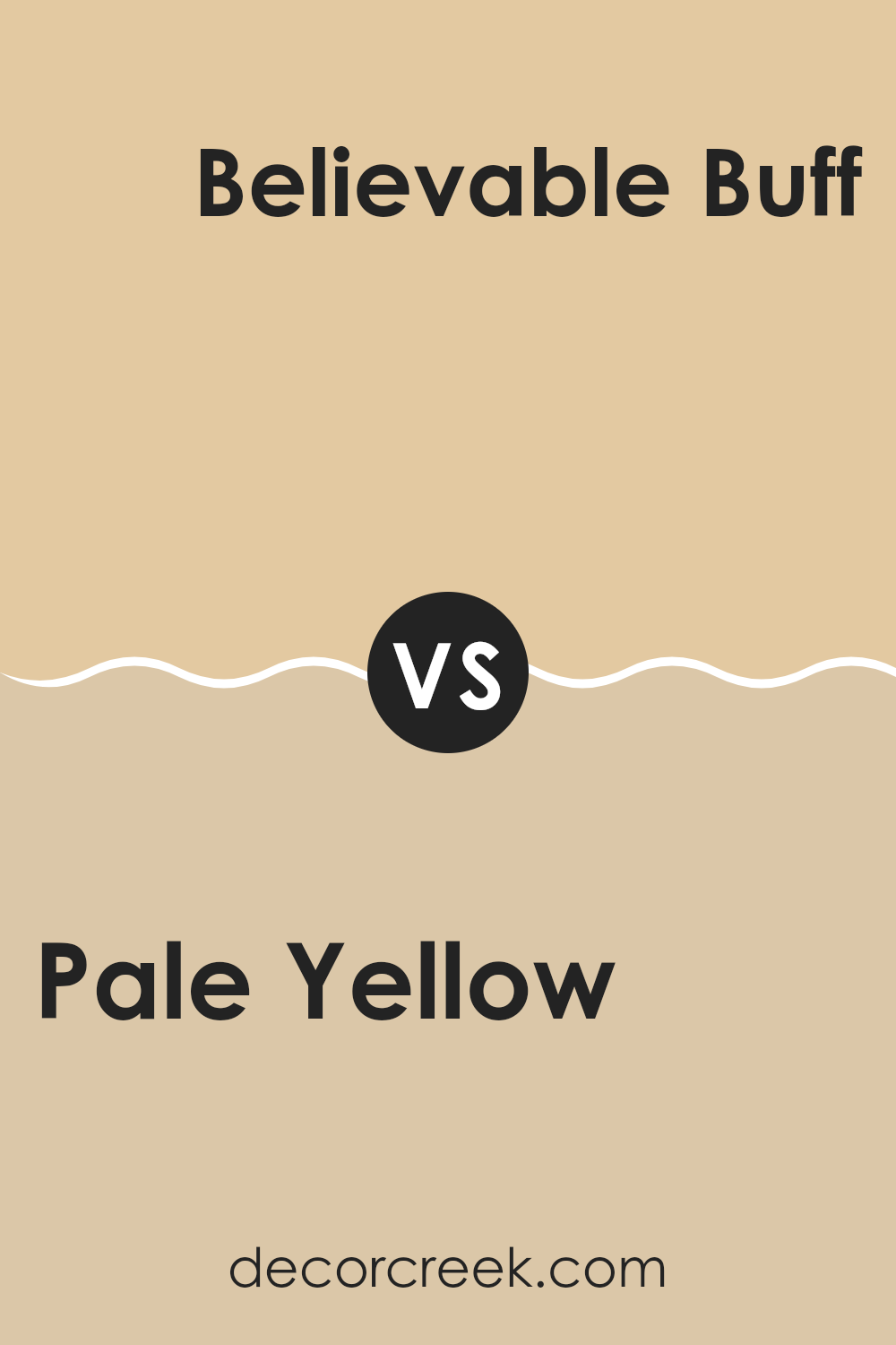
Pale Yellow SW 7691 by Sherwin Williams vs Believable Buff SW 6120 by Sherwin Williams
Pale Yellow SW 7691 is a light and soft color that uplifts any room with a subtle brightness, resembling the gentle hue of morning sunlight. It is ideal for rooms where you want a calm and inviting atmosphere, without too much intensity. This shade goes well with other light colors and greenery, enhancing rooms with a natural vibe.
On the other hand, Believable Buff SW 6120 is a warm, neutral beige with a cozy feel, lending itself well to areas where comfort is key. It pairs beautifully with darker accents and wood tones, creating a grounding and comfortable environment. This color suits areas where you want a more snug, secure feel, without going too dark.
Both colors are flexible and suit various decorating styles, but Pale Yellow generally enhances light and airiness, while Believable Buff focuses on warmth and comfort. These colors can work well together in different parts of a home to achieve a balanced and welcoming feeling.
You can see recommended paint color below:
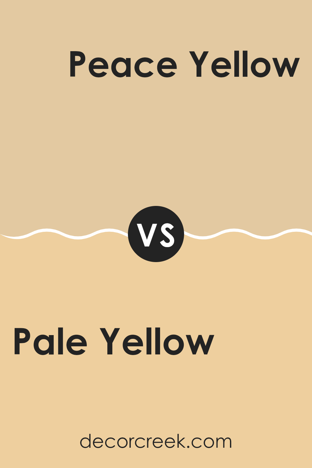
Pale Yellow SW 7691 by Sherwin Williams vs Peace Yellow SW 2857 by Sherwin Williams
Pale Yellow and Peace Yellow by Sherwin Williams are two distinct shades, despite their similar names. Pale Yellow is a softer, more muted yellow that tends to bring a gentle warmth to a room. It works well in areas where you want to add a touch of lightness without overpowering the room with bright colors.
Its subtlety makes it an excellent choice for living rooms and bedrooms where a calm atmosphere is desired. On the other hand, Peace Yellow has a more pronounced vibrancy, standing out a bit more than Pale Yellow. It carries a cheerful energy that can instantly brighten up a room.
This makes Peace Yellow a perfect pick for kitchens, dining areas, or any room where you want to inject a lively, welcoming feel. Compared to Pale Yellow, it has a bolder presence, which can stimulate a more upbeat and energetic environment.
You can see recommended paint color below:
- SW 2857 Peace Yellow
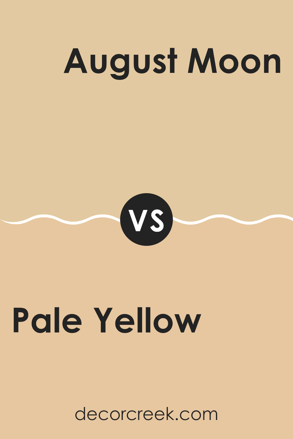
Pale Yellow SW 7691 by Sherwin Williams vs August Moon SW 7687 by Sherwin Williams
The pale yellow shade known as “Pale Yellow” by Sherwin Williams is a soft, airy color that lightly lifts the atmosphere of a room. Its gentle hue makes it a fantastic choice for room that aim to have a calm and inviting feel. This color brings a slight warmth to the walls without overpowering the senses, ideal for creating a subtly cheerful ambiance.
In contrast, “August Moon” from Sherwin Williams is a darker, more muted yellow. It offers a cozy, almost nostalgic vibe that’s quite comforting. This color is perfect for adding a touch of depth to a room while maintaining a connection to yellow’s naturally cheerful qualities. It works well in areas where a more subdued, yet still warm, atmosphere is desired.
Both colors reflect variations of yellow, with Pale Yellow providing a lighter, breezier feel, and August Moon offering a richer, more grounded experience. Whichever you choose vastly depends on the kind of mood and aesthetic you aim to achieve in your room.
You can see recommended paint color below:
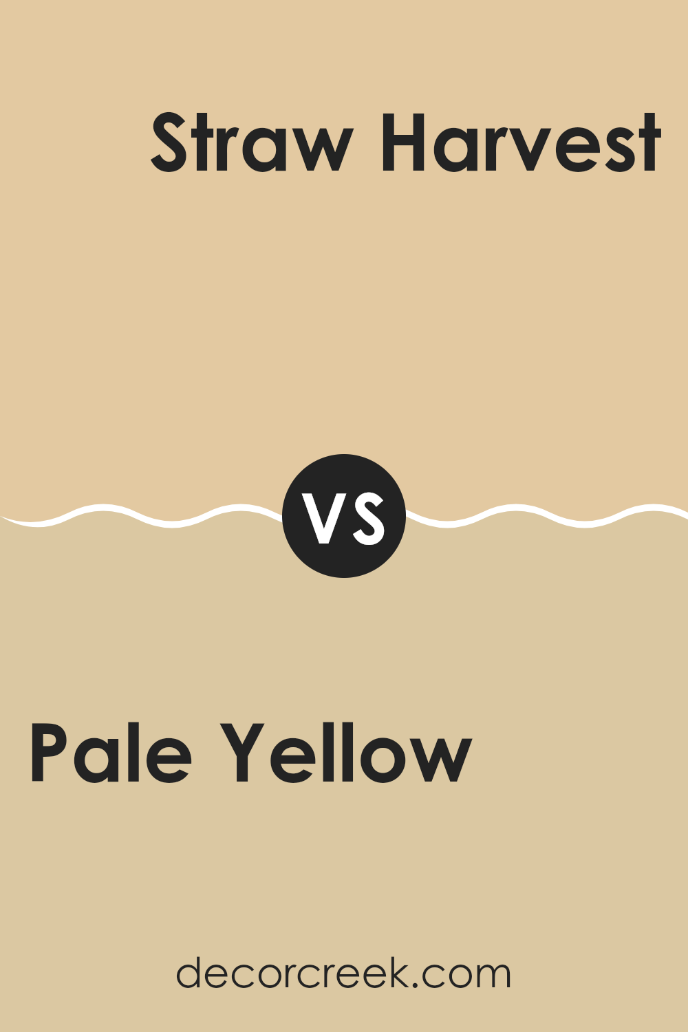
Pale Yellow SW 7691 by Sherwin Williams vs Straw Harvest SW 7698 by Sherwin Williams
Pale Yellow and Straw Harvest are two shades by Sherwin Williams that offer subtle yet distinct tones. Pale Yellow, as the name suggests, is a soft, light yellow that brings a fresh and airy feel to a room. It’s almost like a hint of sunshine, making it perfect for areas where you want a light and uplifting atmosphere without overpowering brightness.
On the other hand, Straw Harvest is a deeper, warmer yellow. This color resembles the natural tone of dry wheat fields and provides a cozy, inviting vibe. It’s richer than Pale Yellow, so it works well in areas where you want a bit more color intensity and warmth.
While Pale Yellow is great for creating a subtle background that can make a room feel larger and more open, Straw Harvest, with its earthy undertones, offers a homely charm that can make large rooms feel more intimate. Both colors work beautifully in their own right, depending on the mood and function you want for your room.
You can see recommended paint color below:
- SW 7698 Straw Harvest
Pale Yellow SW 7691 by Sherwin Williams vs Sundew SW 7688 by Sherwin Williams
Pale Yellow is a soft, gentle color that leans towards a muted, creamy hue. It’s perfect for creating a cozy, welcoming atmosphere in any room. This shade is bright enough to lighten up a room but subtle enough not to overpower it. It adds a refreshing hint of cheerfulness without being too bold or dramatic.
On the other hand, Sundew has a warmer tone, almost blending into a neutral tan. It’s less vibrant compared to Pale Yellow but offers a rich, soothing presence. Sundew can work well in areas where you want a hint of warmth without veering too far from a neutral palette.
When put side by side, Pale Yellow brings more light and freshness, while Sundew offers depth and a sense of warmth. Both colors can work beautifully to complement each other, especially in a setting where balance between brightness and subtlety is desired.
You can see recommended paint color below:
- SW 7688 Sundew
Pale Yellow SW 7691 by Sherwin Williams vs Ivoire SW 6127 by Sherwin Williams
Pale Yellow by Sherwin Williams is a soft and gentle shade that can add a light and airy feel to any room. It has a subtle brightness that’s not too overpowering, making it a great choice for creating a relaxed and cheerful atmosphere. This color works well in small rooms or areas with less natural light, as it helps to make the room appear larger and more inviting.
On the other hand, Ivoire by Sherwin Williams is a richer, creamier color. It leans more towards a warm beige than a true yellow, providing a cozy and welcoming feel. Ivoire is perfect for those who prefer a more muted look but still want to keep a touch of warmth in their decor. It pairs beautifully with natural elements and darker woods, creating a balanced and harmonious look.
Overall, while both colors are in the yellow family, Pale Yellow is brighter and lighter, ideal for a fresh, sunlit vibe. Ivoire, being creamier and deeper, offers a more understated yet warm aesthetic.
You can see recommended paint color below:
- SW 6127 Ivoire
Pale Yellow SW 7691 by Sherwin Williams vs Birdseye Maple SW 2834 by Sherwin Williams
Pale Yellow by Sherwin Williams is a soft, warm shade that can brighten up any room with its cheerful vibe. It’s like capturing a hint of sunshine indoors, which makes it great for creating a cozy, welcoming atmosphere. This light, airy hue easily complements various decor styles and works wonderfully in rooms like kitchens or living areas where you want a refreshing, yet subtle splash of color.
Birdseye Maple, also by Sherwin Williams, offers a richer, deeper yellow with a golden tone that adds a bit more warmth and depth compared to Pale Yellow. This color resembles the warm glow of maple wood and brings a natural, earthy feel to a room. It’s excellent for areas where you want to inject a bit of nature-inspired warmth and coziness, such as dens or dining rooms.
While both colors share a base in the yellow family, Pale Yellow is lighter and softer, making it ideal for smaller or more light-filled rooms. In contrast, Birdseye Maple, with its golden depths, suits rooms where a bolder, yet still inviting color is desired.
You can see recommended paint color below:
Pale Yellow SW 7691 by Sherwin Williams vs Toasted Pine Nut SW 7696 by Sherwin Williams
Pale Yellow and Toasted Pine Nut are two distinct colors by Sherwin Williams that bring their unique vibe to areas. The Pale Yellow has a soft and gentle tone, resembling the light that fills a room on a sunny morning. This color is ideal for creating a calm, cheerful room that feels inviting. It works beautifully in kitchens, bathrooms, or nurseries due to its light and airy feel.
On the other hand, Toasted Pine Nut offers a warmer and deeper hue, much like the shade of roasted nuts. This color adds a cozy and comforting touch to any room, making it perfect for living areas or dining rooms. Its richness provides a welcoming atmosphere, and its warmth can make large areas feel more intimate.
Both colors can complement each other well in a home. Using Pale Yellow in a room with plenty of natural light can make the room feel vibrant, while Toasted Pine Nut can anchor and warm the room. Combining them can balance brightness with cozy warmth, catering to different tastes and styles in home decor.
You can see recommended paint color below:
Conclusion
In wrapping up my thoughts on SW 7691 Pale Yellow by Sherwin Williams, I’d say it’s a lovely shade if you’re looking to make any room feel sunnier and more inviting. This light yellow hue adds a subtle touch of cheerfulness without being too bright or flashy. It’s kind of like having a little bit of sunshine indoors, which is especially nice in rooms that don’t get a lot of natural light.
Pale Yellow works well in a variety of areas, whether it’s a cozy corner in your living room or a peaceful spot for reading in your bedroom. It pairs beautifully with white trims, giving a fresh and clean look. Also, it goes nicely with blues and greens if you want some contrast.
Overall, Sherwin Williams’ Pale Yellow is a great choice if you’re looking for a paint color that feels warm and welcoming. It’s simple, friendly, and makes the room look just a bit happier. If you’ve been thinking about adding a splash of color to your walls, Pale Yellow might be just what you need to make your home feel a little brighter and more like your own special place.
Ever wished paint sampling was as easy as sticking a sticker? Guess what? Now it is! Discover Samplize's unique Peel & Stick samples.
Get paint samples

