Black
Black Blue
Blue Brown
Brown Gray
Gray Green
Green Neutral
 Orange
 White
White Yellow
I recently came across SW 6775 Briny by Sherwin Williams, and I must say, it’s quite a unique shade. At first glance, Briny might just seem like another teal, but there’s more to it than meets the eye.
What sets Briny apart is its ability to bring vibrancy while maintaining a hint of soothing calmness. This makes it adaptable for various rooms, whether you’re looking to add a splash of color to a bedroom or create a striking feature wall in your living area.
Painting your walls with Briny can refresh your home’s look without dominating your existing decor. The color has a lively yet calming quality that can enhance furnishings from rustic woods to contemporary metals. If you are considering a makeover for your room or just thinking of updating with a fresh pop of color, Briny might just be the shade for you.
See how this singular teal can turn your room into a more inviting and lively area.
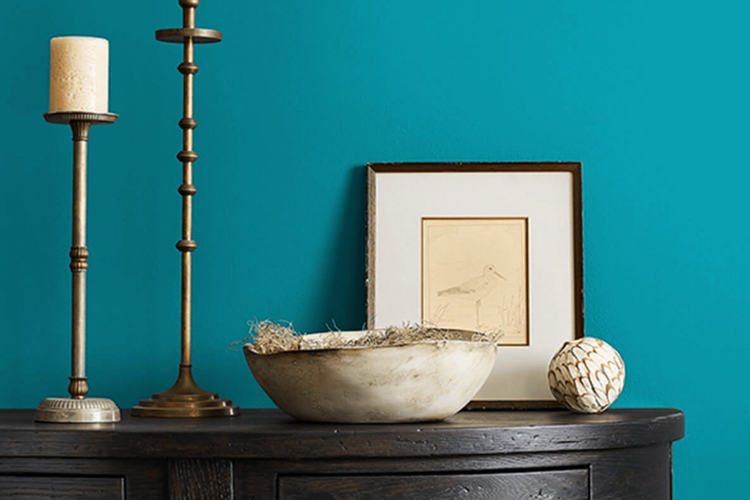
What Color Is Briny SW 6775 by Sherwin Williams?
Briny by Sherwin Williams is a vibrant shade of teal that brings a refreshing and lively energy to any room. This color has a perfect balance of blue and green, making it adaptable and an immediate attention grabber. It has a unique quality that allows it to be both energetic and soothing at the same time.
This teal shade works wonderfully in various interior design styles, especially in coastal, modern, and eclectic decor. In coastal-style interiors, it mirrors the colors of the sea, creating a light, airy and enjoyable room.
For a modern look, Briny can be used as a striking accent wall to contrast with neutral furnishings and decor elements, which helps to ground the room without dominating it. In eclectic rooms, this color can help to tie together varied textures and era-spanning furnishings, offering a cohesive yet playful atmosphere.
Briny pairs beautifully with natural materials like light woods, linen, and cotton, enhancing the freshness of the color. It also contrasts well with metallic finishes such as brushed nickel or matte black, adding a contemporary edge to a room. In terms of textures, combining it with soft textiles or glass elements can create an aesthetically pleasing environment that feels comfortable and stylish.

decorcreek.com
Is Briny SW 6775 by Sherwin Williams Warm or Cool color?
Sherwin Williams’ Briny SW 6775 is a refreshing shade that can bring a cool and lively feel to any room. It’s a bold turquoise that balances between blue and green, infused with just enough brightness to make rooms feel more dynamic without being too bold.
When used in homes, Briny SW 6775 is particularly effective in creating a vibrant but welcoming environment. It’s great for bathrooms and kitchens where the vibrant color can help energize the room and make it feel clean and fresh.
In living areas or bedrooms, using this color as an accent wall can add a splash of cheerfulness, especially in rooms that get a lot of natural light. The color matches well with whites and grays, allowing for numerous styling options from modern and trendy to coastal and relaxed. Overall, Briny SW 6775 is ideal for those looking to add a touch of lively color to their home without going too bold.
Undertones of Briny SW 6775 by Sherwin Williams
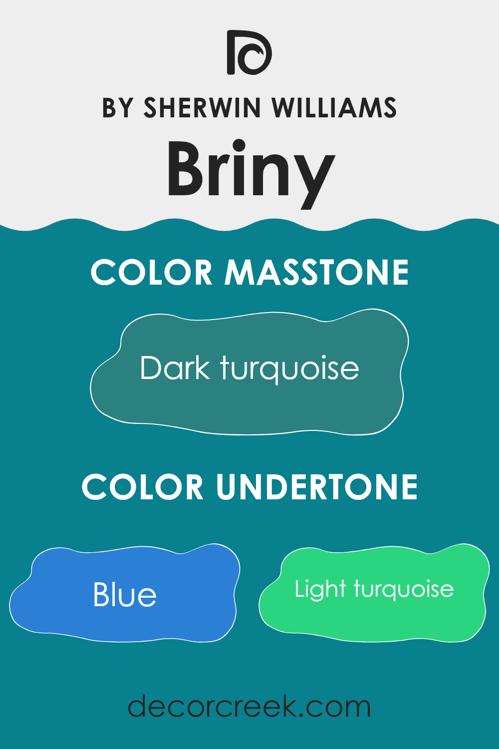
BrinySW 6775 by Sherwin Williams is a complex color with a rich blend of undertones that influence how it appears in different settings. The undertones of a paint color are like hidden colors that emerge under various lighting conditions, affecting the overall look of the paint once applied to surfaces.
Undertones can include shades such as blue, light turquoise, navy, and others. For example, the blue undertone in BrinySW 6775 gives a cool, calming effect, making it suitable for rooms designed for relaxation like bedrooms. Light turquoise adds a vibrant splash, ideal for energizing a room without being too bold. Darker tones like navy and dark green lend depth and can help ground a room or make it feel more intimate.
When applied to interior walls, the multiple undertones in BrinySW 6775 interact with light and room elements in different ways. In a room with ample natural light, the light turquoise and light blue undertones might become more prominent, creating a fresh and airy feel. In contrast, in a room with less light or at night, the darker undertones like navy and dark grey might stand out more, giving the room a more enclosed and cozy atmosphere.
Thus, the variety of undertones in BrinySW 6775 makes it an adaptable paint choice, suitable for different rooms and moods, depending on the desired effect and the existing conditions in the room. Understanding these undertones can help you select decor and additional colors for an appealing room setup.
decorcreek.com
What is the Masstone of the Briny SW 6775 by Sherwin Williams?
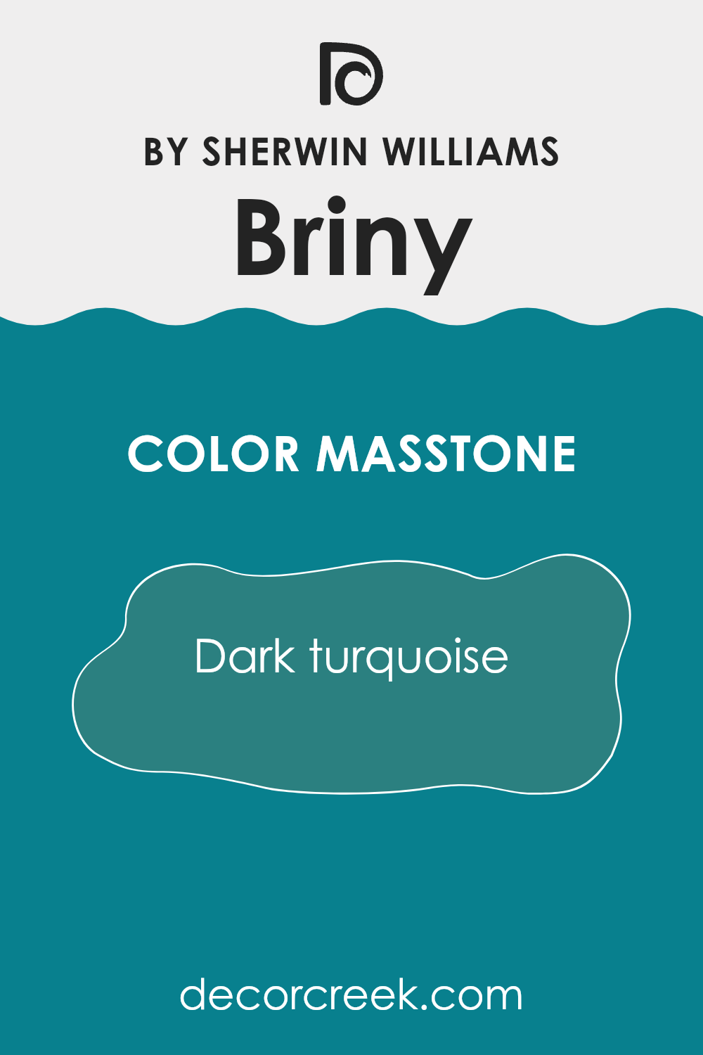
BrinySW 6775 by Sherwin Williams has a masstone of dark turquoise, a rich blend of blue and green that creates a striking presence in any room. This dark turquoise hue brings a distinctive character, offering a bold yet calming atmosphere due to its deep saturation and balanced tones.
When used in homes, it works exceptionally well for creating focal points, whether as an accent wall in a living room or for bathroom vanities. Its depth of color means it pairs beautifully with both neutrals and more vibrant colors, allowing an adaptable approach to decorating.
In rooms aiming for a refreshing feel without being too bold, this dark turquoise shade can make a room feel grounded yet lively. Moreover, it holds up impressively in various lighting conditions, maintaining its allure throughout the day, from natural morning light to dimmer evening settings.
decorcreek.com
How Does Lighting Affect Briny SW 6775 by Sherwin Williams?
Lighting plays a crucial role in how colors are perceived in any room. The same color can look different under various light sources, significantly impacting its appearance and the atmosphere it creates.
For instance, consider the color Briny by Sherwin Williams. This is a cool, calming blue with a hint of green, perfect for creating a relaxing and fresh look. However, its appearance can change dramatically depending on the light it’s exposed to.
Natural Light: Under natural sunlight, Briny will appear more vibrant and lively. The blue and green tones become more pronounced, giving the room a brighter, more cheerful look.
Artificial Light: In artificial light, the type of bulb can affect how Briny looks. With warm lighting, such as from incandescent bulbs, this color might look slightly muted, with the green tones becoming more subdued. On the other hand, in cooler light, like that from fluorescents, the blue tones may dominate, making the room feel cooler.
Room Orientation:
- North-Faced Rooms: Rooms that face north often receive less direct sunlight, which can make colors appear slightly darker and cooler. In a north-facing room, Briny might look more subdued and the green undertones could become more prominent, giving the room a calmer feel.
- South-Faced Rooms: South-facing rooms are bathed in plenty of sunlight throughout the day. Here, Briny will shine brightly, showing off its vibrant side. The room will feel airy and lively, making it a pleasant room.
- East-Faced Rooms: East-facing rooms get the most light in the morning when the light is warm and golden. In these rooms, Briny will look softer and warmer in the mornings, transitioning to a neutral tone as the day progresses and the natural light diminishes.
- West-Faced Rooms: As west-facing rooms receive intense evening light, Briny will reflect these warm tones. The color can appear bolder and more dynamic in the afternoons and evenings, creating a more energized environment.
Understanding how Briny interacts with different lighting situations helps in choosing the right color for the right room to achieve the desired mood and effect.

decorcreek.com
What is the LRV of Briny SW 6775 by Sherwin Williams?
LRV stands for Light Reflectance Value, a measure that indicates how much light a color will reflect or absorb when applied. This value is expressed via a scale where the maximum, representing total reflection of light, a bright white, would have a value near the top of the scale, while the minimum, absorbing most light and appearing very dark, sits closer to the bottom.
The LRV helps individuals understand how light or dark a color might appear when painted on a wall and can significantly impact the mood and visual size of a room. Lighter colors can make a room feel more open and airy, whereas darker colors might make the same room feel smaller and cozier.
The LRV of Briny, registered at 17.494, indicates that it is a dark shade. This lower LRV means it will absorb more light than it reflects, which can have dramatic effects in interior rooms. In rooms with less natural light or smaller rooms, using a color with such a low LRV can make the area appear even smaller and darker. However, in well-lit or larger rooms, this color can add depth and character to the surroundings. The specific LRV of Briny helps users anticipate these effects, making it easier to decide if it’s appropriate for their room depending on the atmosphere they wish to create.

decorcreek.com
Coordinating Colors of Briny SW 6775 by Sherwin Williams
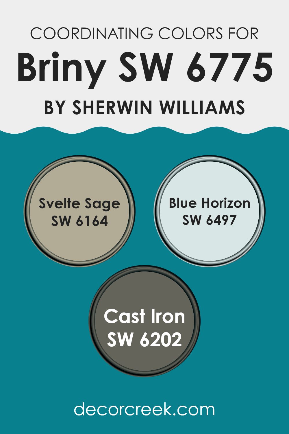
Coordinating colors are those that harmoniously blend with a primary color to create a visually appealing palette. They can be selected to either contrast with or complement the primary color, enhancing the overall aesthetics of any room. When decorating with a primary shade like Sherwin Williams Briny SW 6775, a vibrant teal, choosing the right coordinating colors is crucial to achieving a balanced and attractive look.
One such coordinating color is SW 6164 – Svelte Sage. This shade is a soft, muted green that pairs beautifully with the richer hue of Briny, offering a gentle contrast while still maintaining a natural feel. It’s an excellent choice for those wanting a subtle splash of color without being too bold.
Another great pairing is SW 6497 – Blue Horizon, a light and airy blue that brings to mind the clear sky on a sunny day. This color complements Briny by echoing some of its coolness, creating a refreshing and harmonious atmosphere. Lastly, SW 6202 – Cast Iron is a deep, almost charcoal gray that serves as a fantastic grounding color. It provides a strong visual anchor that enhances the vividness of Briny, making it stand out even more. This darker shade adds a modern twist to any palette, making it ideal for creating striking yet elegant rooms.
You can see recommended paint colors below:
What are the Trim colors of Briny SW 6775 by Sherwin Williams?
Trim colors are essential elements in interior and exterior design, acting like the frame for a painting that highlights its beauty. When choosing trim colors for a room painted with Briny SW 6775 by Sherwin Williams, it’s crucial to select shades that complement or subtly contrast with this vibrant color to ensure a balanced and harmonious look.
Eider White SW 7014 and Natural Linen SW 9109 are excellent choices for trim as they both provide a soft backdrop that can enhance the boldness of Briny without dominating it.
Eider White SW 7014 is a light greyish-white that has a calming effect, making it an ideal trim color because it doesn’t clash with more intense hues and instead adds a clean, refined edge to the room. Natural Linen SW 9109, on the other hand, offers a warm, beige tone that brings a cozy and inviting feel to a room. This color works well with Briny as it softens the overall appearance, providing a soothing contrast to the cooler blue, thereby tying the room’s elements together beautifully.
You can see recommended paint colors below:

Colors Similar to Briny SW 6775 by Sherwin Williams
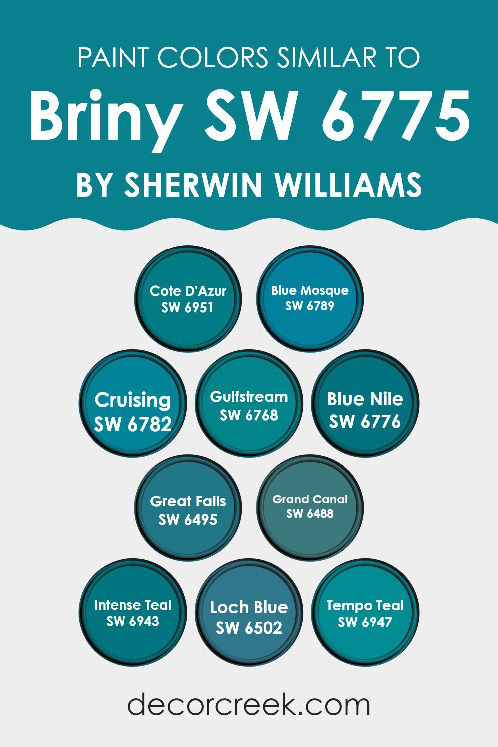
Similar colors play a crucial role in creating visually pleasing and cohesive color schemes. By selecting hues that share a common base, such as the blues and teals related to Briny by Sherwin Williams, designers can craft rooms that flow harmoniously from one area to the next.
These close relatives on the color wheel help to produce a subtle variation that adds depth and complexity without being too bold. This approach is perfect for achieving a balanced look that feels connected and intentionally designed.
For example, Cote D’Azur offers a vivid sky blue that brightens up any room with its refreshing vibe, while Blue Mosque gives a deeper, marine-inspired blue which suggests a feeling of calm depths. Cruising is another lovely option, with a lighter, more playful blue that seems to wash rooms in a soft, leisurely mood. Gulfstream, with its vibrant teal, injects energy and character.
Blue Nile provides a rich, deep aquatic shade that is both striking and grounding. Great Falls is a softer, more subdued blue, ideal for quieter, more reflective rooms. Grand Canal carries a unique blend of blue with hints of lush green, perfect for infusing a room with a sense of nature. Intense Teal, true to its name, provides a dynamic punch of color, lively and captivating.
Loch Blue offers a muted, dusty blue, wonderful for a more understated or professional setting. Finally, Tempo Teal mixes blue and green in a way that feels both fresh and familiar, ideal for areas that call for a modern but welcoming tone. By using these similar colors, one creates a thread of continuity that ties different rooms together beautifully.
You can see recommended paint colors below:
- SW 6951 Cote D’Azur
- SW 6789 Blue Mosque
- SW 6782 Cruising
- SW 6768 Gulfstream
- SW 6776 Blue Nile
- SW 6495 Great Falls
- SW 6488 Grand Canal
- SW 6943 Intense Teal
- SW 6502 Loch Blue
- SW 6947 Tempo Teal
Colors that Go With Briny SW 6775 by Sherwin Williams
Choosing colors that harmonize with Briny SW 6775 by Sherwin Williams can significantly impact the aesthetics and mood of a room. These complementary colors help create a cohesive look, ensuring that each room flows nicely into the next.
Using colors like SW 6774 – Freshwater and SW 6773 – Rapture Blue can give a lovely contrast while maintaining a balanced vibe. On the other hand, darker shades like SW 6776 – Blue Nile introduce a dramatic flair that can make elements stand out, especially when used for accent walls or furniture.
The color SW 6772 – Cay offers a lighter, more subdued option, great for creating a calming atmosphere, ideal for bedrooms or bathrooms. If looking for a color that is slightly more vibrant, SW 6771 – Bathe Blue is a good choice, providing a refreshing pop without being too bold. Meanwhile, SW 9046 – Gentle Aquamarine is perfect for those wanting to keep things light and airy, making it excellent for common areas where a relaxed vibe is welcome. Choosing the right colors to complement Briny SW 6775 allows for a beautifully decorated home that feels connected and thoughtfully designed.
You can see recommended paint colors below:
- SW 6774 Freshwater
- SW 6773 Rapture Blue
- SW 6776 Blue Nile
- SW 6772 Cay
- SW 6771 Bathe Blue
- SW 9046 Gentle Aquamarine

How to Use Briny SW 6775 by Sherwin Williams In Your Home?
Briny SW 6775 by Sherwin Williams is a vibrant shade of blue that instantly brings a fresh and airy feel to any room. It’s a perfect choice for those looking to add a splash of color without being too bold. This shade works wonderfully in bathrooms for a crisp, clean look, or in kitchens to create a cheerful environment. It’s also a great option for a child’s bedroom or playroom because of its bright and playful nature.
For those who might be a bit hesitant to paint an entire room with Briny, consider using it on an accent wall to liven up a living room or dining area. It pairs well with neutral tones like whites and grays, which can help balance the brightness and create a pleasant contrast.
Additionally, incorporating Briny into your home through small touches like a painted bookshelf or a set of chairs can also make a noticeable impact without the commitment of painting large areas. Whether you’re looking to refresh a single room or add some character to smaller furniture pieces, Briny is an adaptable color that can help you achieve a lively and inviting atmosphere.
Briny SW 6775 by Sherwin Williams vs Cruising SW 6782 by Sherwin Williams
The color Briny by Sherwin Williams is a vibrant shade of teal that combines the richness of blue with a hint of green. This color has a lively, fresh feel that can brighten up any room, giving it a cheerful and inviting atmosphere. It works well in areas that could use a pop of color or where you want to add some energetic vibes.
On the other hand, Cruising by Sherwin Williams is a deeper blue that leans towards a navy shade. It’s a cooler and more reserved color, providing a classic look that can make rooms feel more grounded and secure. Cruising has an air of formality to it and is excellent for creating a more refined, mature atmosphere.
Both colors offer distinct vibes: Briny brings an upbeat and youthful energy, ideal for lively social rooms like living rooms or kitchens, whereas Cruising offers a more traditional and calm feel, suitable for rooms like offices or bedrooms where a more subdued ambiance is desired.
You can see recommended paint color below:
- SW 6782 Cruising

Briny SW 6775 by Sherwin Williams vs Tempo Teal SW 6947 by Sherwin Williams
Main color Briny and Tempo Teal, both by Sherwin Williams, are unique shades of teal, but they have distinct differences. Briny is a lighter sea-inspired teal that has a fresh and airy feel. This color can brighten up rooms and give them a breezy, oceanic vibe. It is adaptable and works well in bathrooms or kitchens, adding a touch of calmness without being too bold.
On the other hand, Tempo Teal is a much darker and more intense color. It carries a striking and bold look, making it great for creating a statement in a room. This shade could be ideal for an accent wall or for furniture pieces that you want to stand out. It can add depth and drama to any room, contrasting strongly with lighter colors.
Both colors add a touch of the natural world but in very different ways—Briny uplifts and lightens, while Tempo Teal adds depth and intensity.
You can see recommended paint color below:
- SW 6947 Tempo Teal

Briny SW 6775 by Sherwin Williams vs Blue Mosque SW 6789 by Sherwin Williams
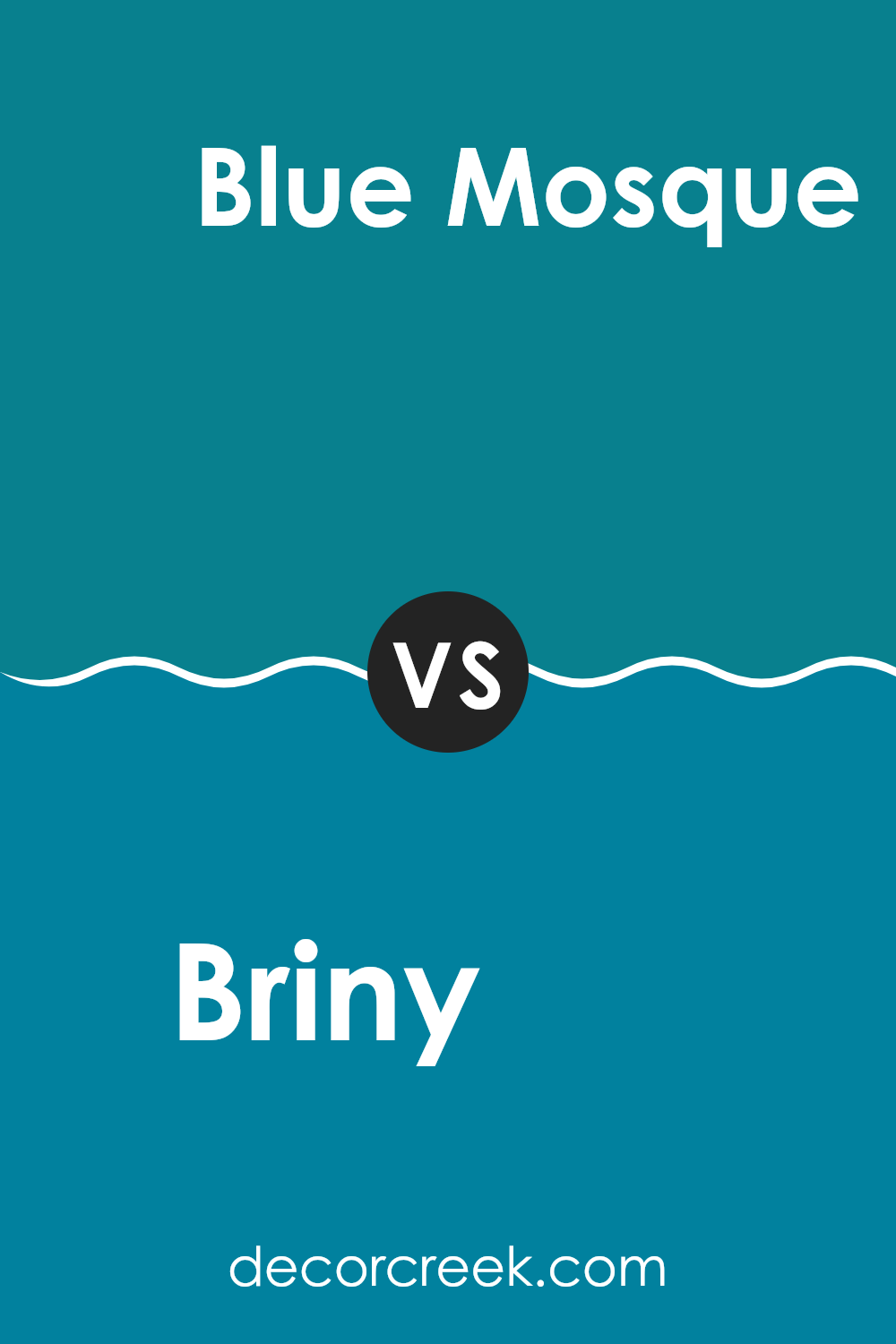
Briny and Blue Mosque are both colors offered by Sherwin Williams, each carrying their own unique charm. Briny is a soft, muted shade of blue with a touch of gray. It evokes the subtle calmness of a seaside morning, gentle and low-key, making it perfect for creating a relaxed atmosphere in rooms meant for unwinding.
On the other hand, Blue Mosque is a deeper, more vibrant blue. It has a lively and more energetic feel compared to Briny, resembling the rich hues found in decorated ceramic tiles or a clear summer sky. This color can add a playful, dynamic vibrancy to a room, making it ideal for areas where you want to add a splash of enthusiasm and brightness.
When comparing the two, Briny works well in environments where you want an understated, soothing presence. Blue Mosque is better suited for rooms that benefit from a bold, striking touch. Depending on your room’s purpose and the mood you want to set, either color could be the perfect choice.
You can see recommended paint color below:
Briny SW 6775 by Sherwin Williams vs Gulfstream SW 6768 by Sherwin Williams
Briny SW 6775 and Gulfstream SW 6768, both from Sherwin Williams, offer distinct shades of blue that bring a fresh and lively vibe to any room. Briny is a muted teal that leans towards a sea-green hue. It has a calm and understated quality, making it perfect for creating a soothing atmosphere in places like bedrooms or bathrooms.
On the other hand, Gulfstream is a brighter, more vibrant turquoise. It’s bolder and stands out more, ideal for areas where you want to add a splash of energy and cheer, like in a kitchen or as an accent wall in a living room.
While Briny suggests a subtle oceanic feel, Gulfstream resembles the vivid colors of tropical waters. Each color offers its unique appeal, with Briny providing a more reserved and gentle background, and Gulfstream stepping forward with a lively zest.
You can see recommended paint color below:
- SW 6768 Gulfstream

Briny SW 6775 by Sherwin Williams vs Loch Blue SW 6502 by Sherwin Williams
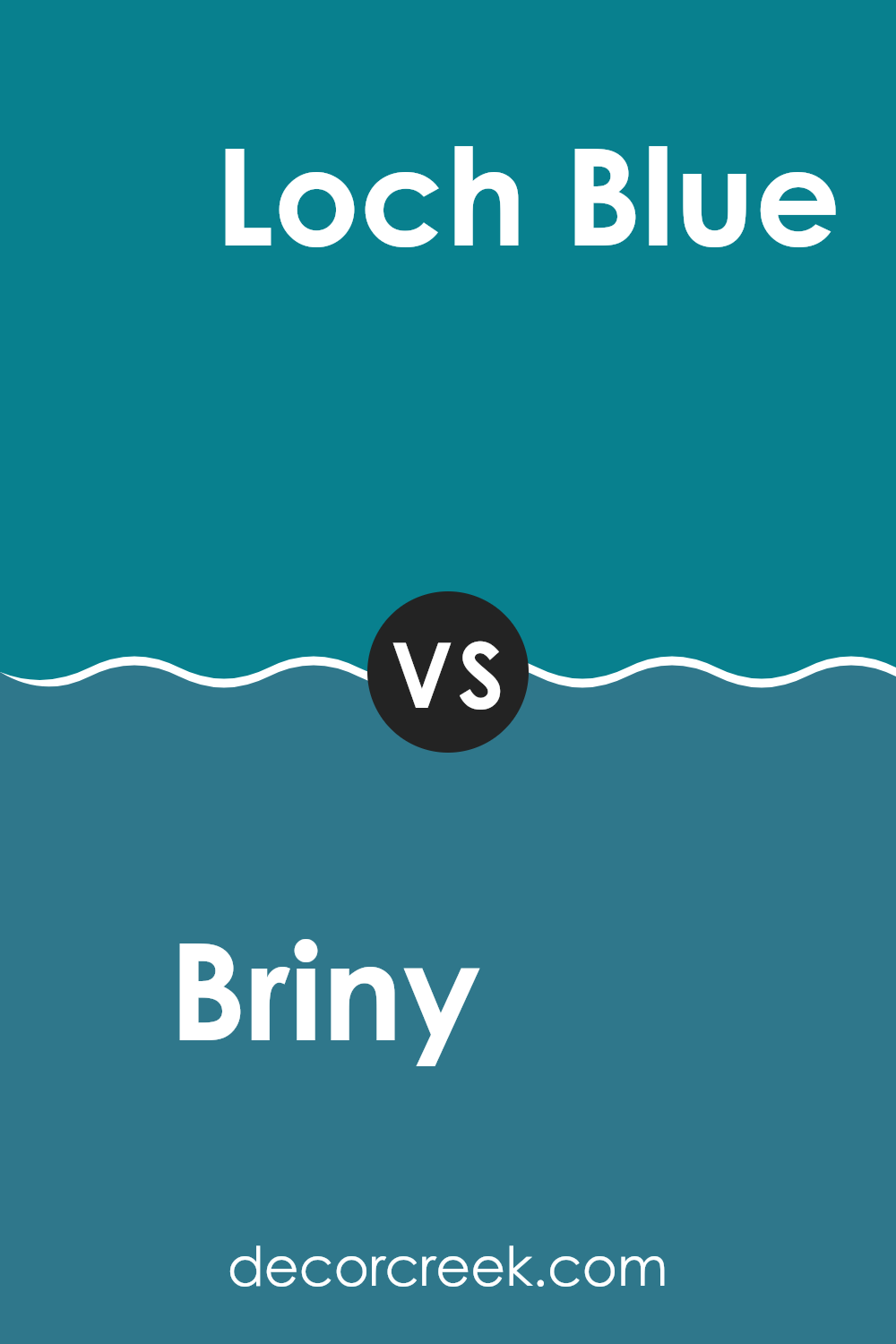
Briny SW 6775 and Loch Blue SW 6502 are both paints from Sherwin Williams, each offering its own unique shade of blue. Briny is a vibrant and fresh color, reminiscent of the open sea. It has a lively and energetic feel to it, making it perfect for rooms where you want a splash of brightness and cheer.
On the other hand, Loch Blue is a deeper, more subdued shade of blue. It has a calm and grounding effect, ideal for creating a relaxed and cozy environment. The richness of Loch Blue can help add a touch of maturity and depth to a room.
When deciding between these two, consider the mood and atmosphere you want to set in your room. Briny works well in lively, dynamic areas, while Loch Blue is better suited for rooms where calm and collectedness are desired.
You can see recommended paint color below:
Briny SW 6775 by Sherwin Williams vs Blue Nile SW 6776 by Sherwin Williams
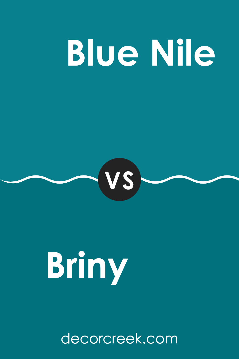
Briny and Blue Nile are two shades of blue offered by Sherwin Williams but with distinct tonal differences. Briny is a lighter, more oceanic blue, creating a breezy and refreshing feel. It has a softness that can brighten up a room and give it a more open, airy look. It’s particularly well-suited for bathrooms or bedrooms where a calm, clean vibe is desired.
On the other hand, Blue Nile is darker and more vivid. This color has a more pronounced presence, making a strong visual statement. It can add a sense of richness and depth to a room, perfect for areas like living rooms or dining rooms where a touch of drama can enhance the overall ambiance.
When used together, they can complement each other beautifully, with Briny offering a lighter backdrop and Blue Nile standing out as a striking accent. Each brings its own unique mood, yet harmoniously blend for adaptable interior designs.
You can see recommended paint color below:
Briny SW 6775 by Sherwin Williams vs Grand Canal SW 6488 by Sherwin Williams
Briny and Grand Canal, both by Sherwin Williams, are unique shades of blue that stand apart in any color palette. Briny is a softer and lighter hue, giving a calm and gentle feel to any room. It’s perfect for creating a peaceful environment, whether it’s in a bedroom or a cozy reading nook.
On the other hand, Grand Canal is a deeper and more vibrant blue. This color is bold and makes a strong statement, ideal for accent walls or decor elements that you want to draw attention to.
While Briny brings a more relaxed vibe, Grand Canal offers an energetic burst, making it great for rooms that benefit from a splash of drama or vibrancy. Together, these two colors can work well in a single room, with Briny softening the intensity of Grand Canal, offering a balanced and appealing visual experience.
You can see recommended paint color below:
- SW 6488 Grand Canal

Briny SW 6775 by Sherwin Williams vs Intense Teal SW 6943 by Sherwin Williams
“Briny” and “Intense Teal” by Sherwin Williams are two distinct colors that can make a room feel very different. “Briny” is a light, airy teal that adds a fresh look to any room. It’s great for making a small room seem bigger and more open.
On the other hand, “Intense Teal” is a deeper, bolder shade that has a strong presence. It’s perfect for creating a focal point in a room or adding a dramatic flair. Both colors can work well in various settings like kitchens or living rooms, and they can be paired with neutrals like white or gray.
While “Briny” is subtle and gentle, “Intense Teal” stands out more and can really define a room. Depending on what mood or style you’re going for, either color can be a solid choice.
You can see recommended paint color below:

Briny SW 6775 by Sherwin Williams vs Great Falls SW 6495 by Sherwin Williams
“Briny” from Sherwin Williams is a vibrant blue with a noticeable brightness that brings a fresh and lively feel to rooms. It has a marine-like quality that makes it an excellent choice for bathrooms or any area where you want a clean, refreshed look.
On the other hand, “Great Falls” is also a blue shade but leans towards a more muted, subtle teal that mimics the natural color of weathered sea glass. This color looks lovely in living areas or bedrooms, offering a more relaxed and understated vibe compared to Briny.
While both colors draw from a watery palette, Briny appears brighter and more forward, really popping against white trim or in well-lit rooms. Great Falls, in contrast, has a softer presence which can help in creating a calming environment without being too bold. These two paints provide distinct atmospheres: Briny energizes, while Great Falls calms. Choosing between them depends on the mood or effect you want to achieve in your room.
You can see recommended paint color below:
- SW 6495 Great Falls

Briny SW 6775 by Sherwin Williams vs Cote D’Azur SW 6951 by Sherwin Williams
Sherwin Williams’ Briny SW 6775 and Cote D’Azur SW 6951 are two distinct shades of blue, each bringing its own unique vibe to a room. Briny is a vibrant turquoise that has a lively and energetic presence, recalling the freshness of tropical waters. This color works well in areas where you want to add a vibrant splash, making them feel more playful and inviting.
On the other hand, Cote D’Azur is a deeper, richer blue that suggests the deep, luxurious ocean hues found along the French Riviera. This shade is perfect for adding a sense of depth and richness to a room, and it pairs beautifully with light, neutral tones or rich wood finishes, providing a striking contrast.
While both colors share a blue base, Briny leans towards a lighter, more spirited tone, whereas Cote D’Azur offers a deeper, more intense feel. Depending on your room’s purpose and the mood you want to set, either color could be an excellent choice.
You can see recommended paint color below:
- SW 6951 Cote D’Azur

As I finish writing about SW 6775 Briny by Sherwin Williams, I feel excited to share how much I adore this color! Picture the ocean on a bright sunny day—that’s Briny for you. It’s a cheerful blue that reminds you of the sea and the sky. Using Briny in your room can make it feel like a sunny day at the beach, which is fun and calming.
This color is not just pretty, but also really practical. It hides smudges and marks well, which is great if you have kids or pets. Briny looks amazing when painted on walls, but you can also use it on things like chairs or doors to add a splash of color without making everything blue. It pairs nicely with light yellows, crisp whites, and even soft greens, so you can mix and match to see what makes you happiest.
All in all, SW 6775 Briny by Sherwin Williams is a beautiful choice if you want to brighten up a room and make it feel like a joyful day outside. Whether you’re painting your bedroom, bathroom, or just a single piece of furniture, Briny brings a bit of the outdoor cheer inside your home.
I had a great time learning about this color and imagining how it can freshen up a room. It’s definitely a paint color worth considering if you’re thinking about giving your room a new look.

decorcreek.com
Ever wished paint sampling was as easy as sticking a sticker? Guess what? Now it is! Discover Samplize's unique Peel & Stick samples.
Get paint samples