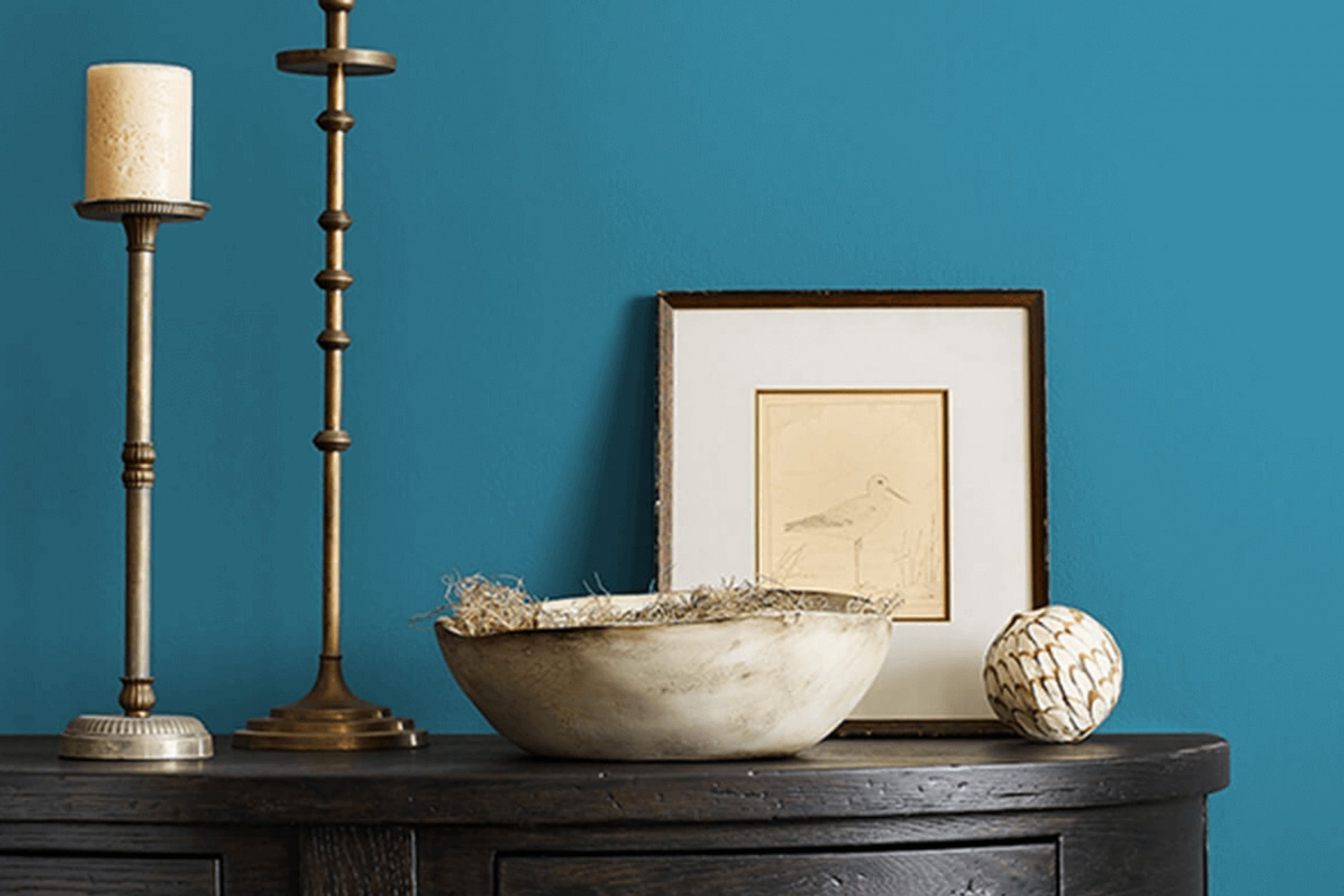
Choosing a paint color can be a tricky task, but I want to share my experience with SW 6502 Loch Blue by Sherwin Williams. This soothing shade of blue has a gentle presence that can significantly change the mood of any room. When I was looking for a color to freshen up my living space, I came across Loch Blue and decided to give it a try.
Loch Blue has a balanced blend of depth and brightness that adds just the right amount of personality without overwhelming the space. It’s not just another blue; it has a unique appeal that works well in a variety of lighting conditions, complementing both modern and traditional decors.
Whether you’re updating a bedroom to create a peaceful retreat or adding a splash of color to your bathroom, Loch Blue provides a serene backdrop.
I found that this color pairs wonderfully with crisp whites and soft grays, which help to enhance its cool tones. Accessories in gold or brass can introduce an element of understated luxury.
If you’re considering a change and want a color that brings calmness and a hint of cheer, I would recommend trying out Loch Blue. It might just be the refreshing touch your home needs.
What Color Is Loch Blue SW 6502 by Sherwin Williams?
Loch Blue by Sherwin Williams is a vibrant yet soothing shade of blue that brings a fresh and lively angle to any space. This color has a medium depth, striking a balance between too light and too dark, making it extremely versatile for various decorating needs. Its soothing properties make it an excellent choice for creating a relaxing atmosphere in bedrooms and bathrooms, while its liveliness can add a splash of energy to living rooms and kitchens.
Loch Blue works wonderfully in interior styles such as coastal, contemporary, and even Scandinavian due to its clean and crisp feel. In a coastal-inspired room, pairing this blue with whites, gentle greys, and sandy beiges can mimic the colors of the seaside, enhancing the beachy vibe of the space. When used in a contemporary setting, this shade pairs well with bold contrasts like black or charcoal, adding a dynamic yet fresh look.
For materials and textures, Loch Blue goes well with natural elements like wood and stone. These materials add warmth to the coolness of the blue, creating a balanced aesthetic. Soft textiles like cotton, linen, or wool in neutral colors also complement this shade beautifully, providing a cozy feel to the interior.
Overall, Loch Blue is a flexible color option that can bring life and vibrancy to a varied range of interior settings.
Is Loch Blue SW 6502 by Sherwin Williams Warm or Cool color?
Loch Blue SW 6502, by Sherwin Williams, is a vibrant shade of blue that brings a fresh and lively atmosphere to any room. This particular color is great for adding a pop of color without overwhelming the space. It can work beautifully in a bedroom or a bathroom where you want to introduce some energy and cheerfulness. Due to its bright yet soft nature, it is also ideal for a child’s room or a play area.
When used in a living room, Loch Blue can make the space feel more inviting and cozy. It pairs well with neutral colors such as whites, grays, and tans, allowing for flexibility in your decor choices. If you’re looking to create a visual contrast, you can combine it with warm colors or earth tones.
Furthermore, in a smaller space, using this shade on a feature wall can make the room appear larger and more open. In terms of finishes, Loch Blue works well with both modern and traditional furnishings, making it a versatile choice for many homes.
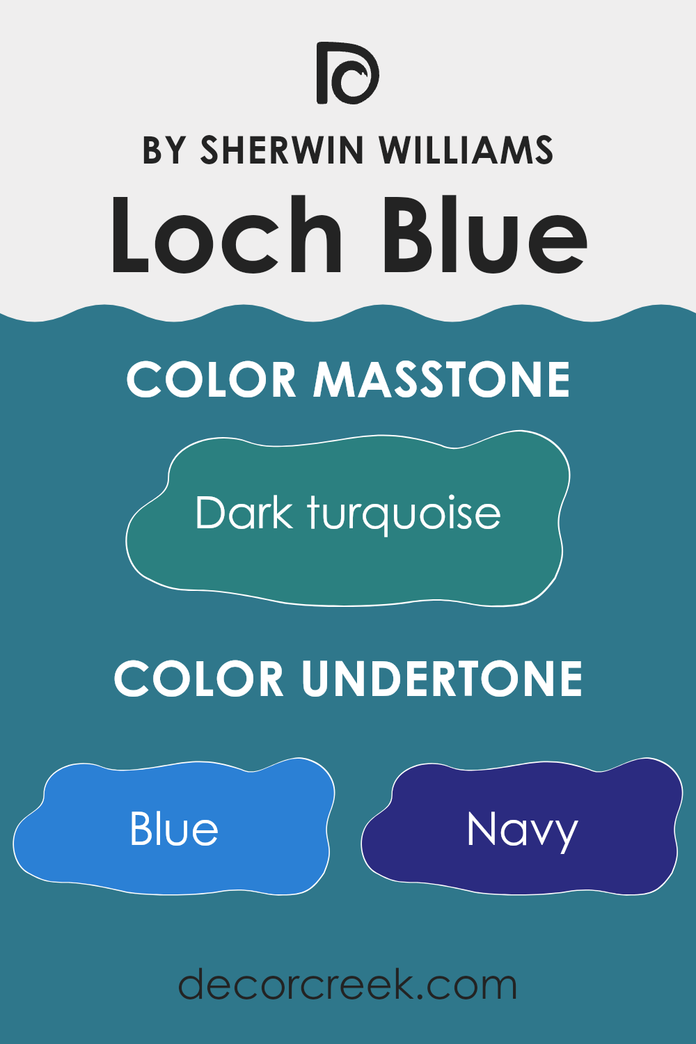
Undertones of Loch Blue SW 6502 by Sherwin Williams
Loch Blue is a versatile paint color known for its calming and refreshing qualities. Undertones are subtle colors that influence the main hue, often affecting how the paint looks under different lighting conditions or when placed beside other colors. Loch Blue, primarily a deep blue shade, contains several undertones including navy, grey, and touches of lighter blues like turquoise and light blue which can change its appearance.
In interior settings, these undertones play a crucial role. Navy and dark blue give the color depth, making it a good choice for a feature wall or a room that is meant to feel cozy and somewhat dramatic. Grey undertones help neutralize the intensity of the blue, which means it can work well in spaces that need a calm and steady look.
Light turquoise and light blue undertones contribute to a fresher, more vibrant feel, which can make a room feel more inviting and energetic. These lighter undertones can make spaces appear larger and more open. When Loch Blue is painted on interior walls, its range of undertones allows it to adapt to various décor styles and pair well with many colors, from stark whites and soft creams to bold blacks and greens.
It can be particularly effective in bedrooms or living rooms where the goal is to create a relaxing and inviting atmosphere. Understanding its undertones can help homeowners and decorators choose complementary colors for furnishings and accessories, enhancing the overall aesthetic of the space.
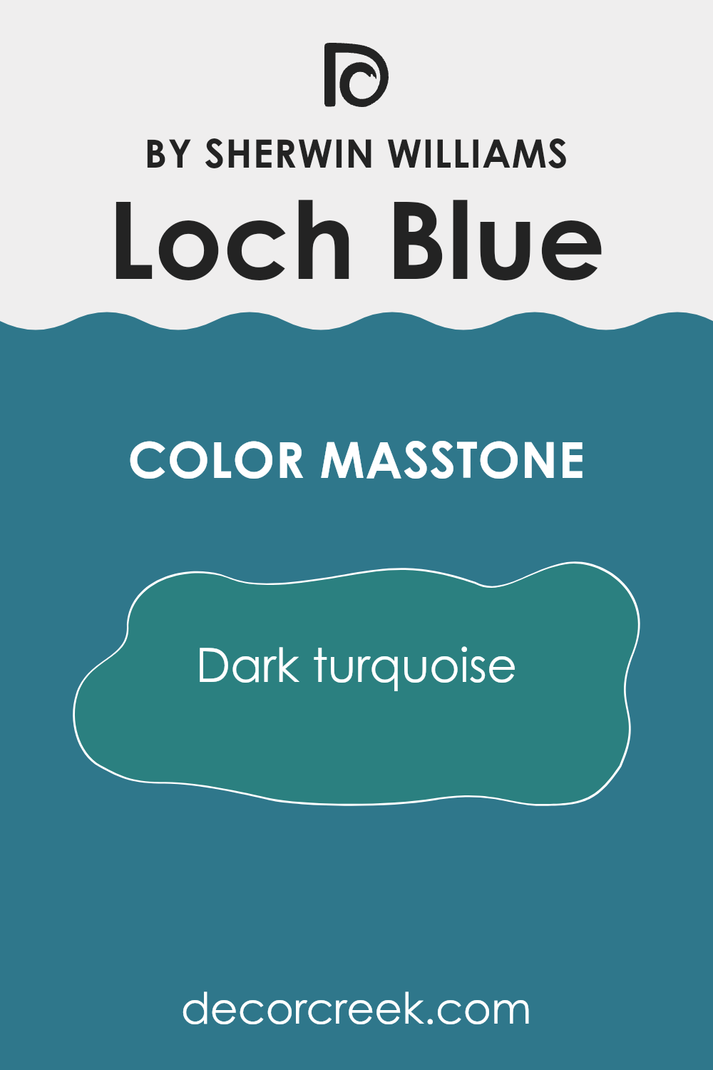
What is the Masstone of the Loch Blue SW 6502 by Sherwin Williams?
The masstone of dark turquoise in the color Loch BlueSW 6502, with its vibrant blend of blue and green hues, adds a lively yet cozy atmosphere to any home. This particular shade is great for making spaces feel fresh and lively without being too overwhelming.
It has a calming effect that works well in busy areas of the house like the living room or kitchen, where a touch of color can add a lot of personality. Additionally, its unique tone can also make small rooms appear bigger and more inviting because dark turquoise naturally draws the eye, creating a sense of expanded space.
This color pairs beautifully with neutral tones like whites or grays, which help balance its richness. Practical for both traditional and modern decor, it is versatile enough to fit various interior styles, allowing homeowners to utilize it in multiple ways to create welcoming environments.
How Does Lighting Affect Loch Blue SW 6502 by Sherwin Williams?
Lighting significantly impacts how we perceive colors because it influences the wavelengths that reach our eyes and, ultimately, how we interpret those colors. The color Loch Blue by Sherwin Williams, for instance, can appear substantially different under various lighting conditions.
In artificial lighting, Loch Blue might look deeper and more intense, especially under warm, yellow-toned lights. These types of lights can make the blue appear richer and slightly darker, potentially bringing out more of its green undertones. In cooler, white artificial light, however, Loch Blue might seem brighter and truer to its swatch color, as cool light mimics the clearness of natural daylight.
Natural light brings a dynamic element to Loch Blue, varying throughout the day and depending on the weather. Under bright, direct sunlight, the color will appear lighter and more vibrant. On cloudy days, it might lose some of its vibrancy, taking on a softer, more muted tone.
The direction of the natural light coming into a room also affects how Loch Blue is perceived:
– North-facing rooms generally receive less direct sunlight, leading to a cooler, more consistent light throughout the day. Here, Loch Blue can appear more subdued and subtle, possibly with a slight grayish tone.
– South-facing rooms are bathed in ample sunlight for most of the day, which can make the color vibrant and lively, enhancing its true blue quality.
– East-facing rooms get plenty of sunlight in the morning, giving Loch Blue a bright, cheerful look in the early hours that might gradually fade to a cooler tone as the day progresses.
– West-facing rooms experience stronger light in the afternoon to evening. This lighting can make Loch Blue look dramatically brighter and more dynamic during these times, especially during sunset when the light has a golden quality.
Understanding how different light sources impact the appearance of colors like Loch Blue is essential for designing spaces that use these hues effectively.
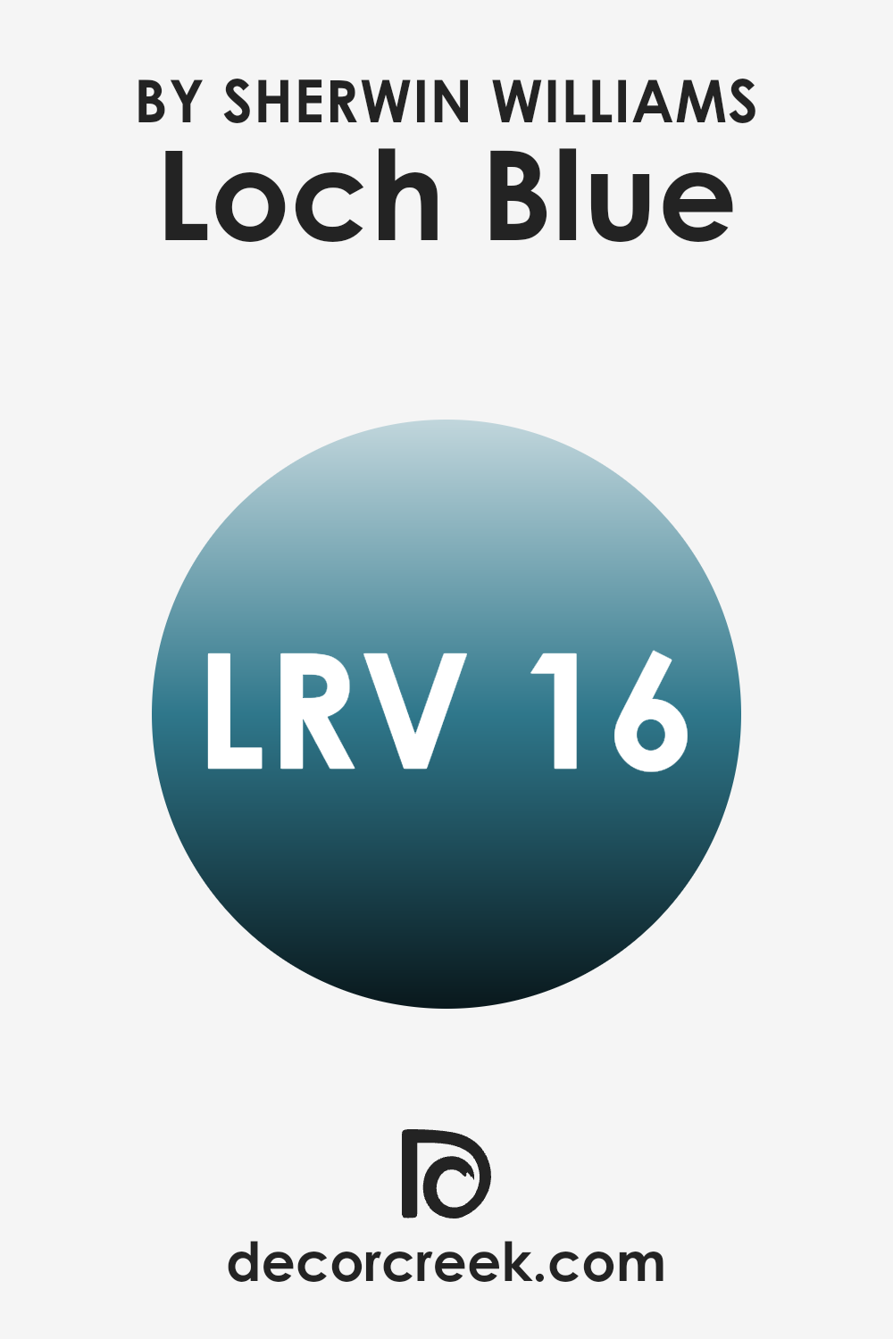
What is the LRV of Loch Blue SW 6502 by Sherwin Williams?
LRV stands for Light Reflectance Value, which measures the percentage of light a paint color reflects back into the room as opposed to absorbing it. This number can range from a very low to a very high value, influencing how light or dark a color appears once it’s applied on a wall.
Paints with a higher LRV reflect more light, making a room feel brighter and larger, while those with a lower LRV absorb more light, which can make a space feel cozier but potentially smaller and darker as well. It’s a useful metric to consider when choosing paint colors, as it helps predict how the color will feel under different lighting conditions.
In the case of the specified color with an LRV around ten and twenty, it’s clear that it’s a darker shade. This means the paint will absorb more light than it reflects, creating a deeper, richer appearance on the walls. In rooms with ample natural or artificial light, this color can provide a bold and sumptuous look; however, in a dimly lit or smaller room, it might make the space appear more enclosed.
When using darker colors like this, lighting and room size are crucial considerations to prevent the room from feeling too tight or oppressive.
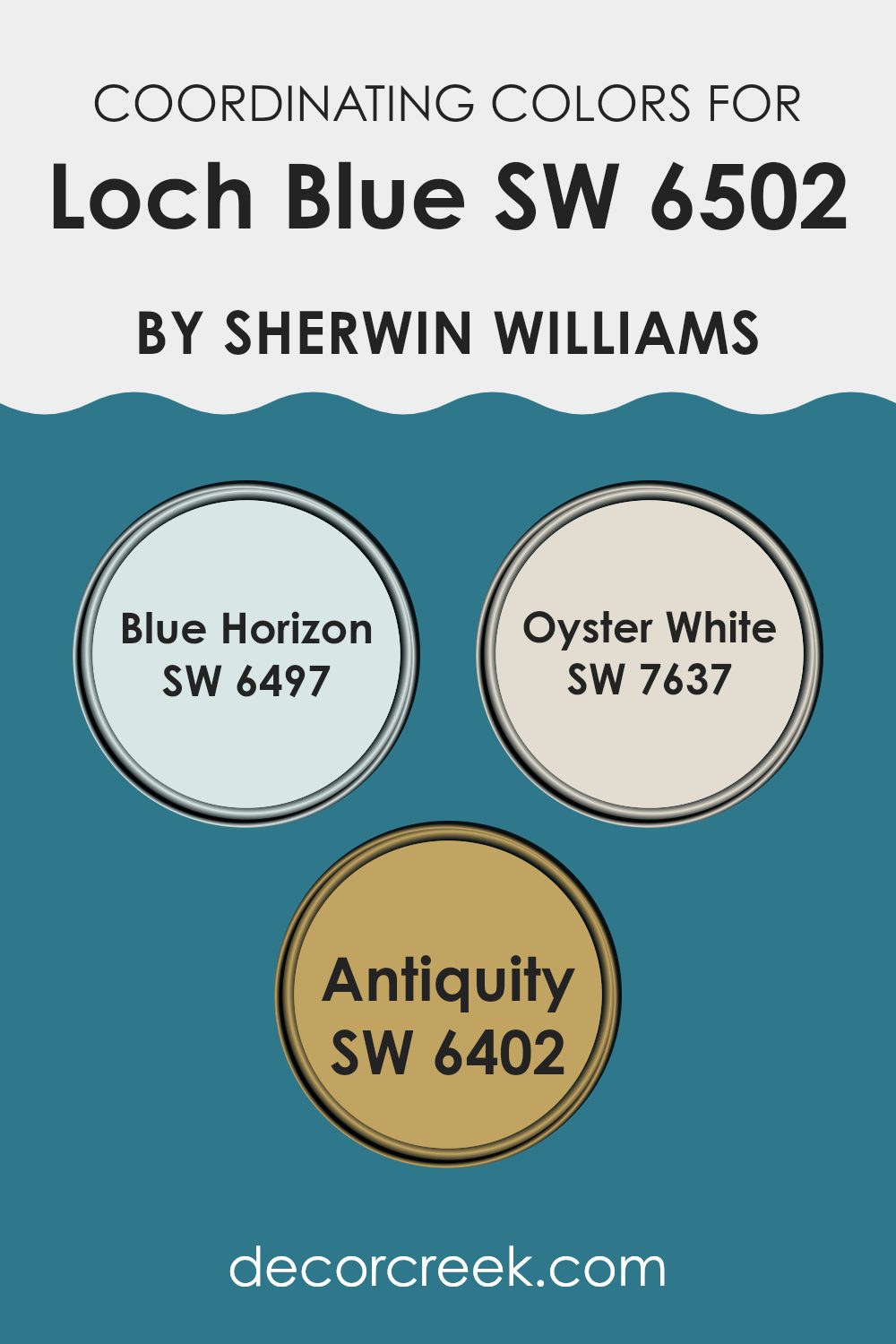
Coordinating Colors of Loch Blue SW 6502 by Sherwin Williams
Coordinating colors are those that complement each other nicely on the color wheel, working together to create a cohesive look. For example, when decorating with a hue like blue, choosing colors that coordinate effectively can enhance the overall mood and aesthetic of a room. Loch Blue by Sherwin Williams, a rich blue shade, pairs well with a variety of colors that help to either calm its brightness or enhance its depth.
One such coordinating color is Blue Horizon. This lighter, softer blue offers a gentle contrast to the deeper tones of Loch Blue, providing a fresh and airy feel to any space without overwhelming it. Another beautiful coordinating color is Oyster White, a subtle off-white with warm undertones that adds a soothing touch while making the vibrant Loch Blue stand out even more.
Finally, the shade of Antiquity, a muted, earthy green, complements Loch Blue by adding an element of warmth and natural elegance. This combination allows for a balanced and visually appealing palette that can be applied to a variety of interior styles and settings.
You can see recommended paint colors below:
- SW 6497 Blue Horizon
- SW 7637 Oyster White
- SW 6402 Antiquity
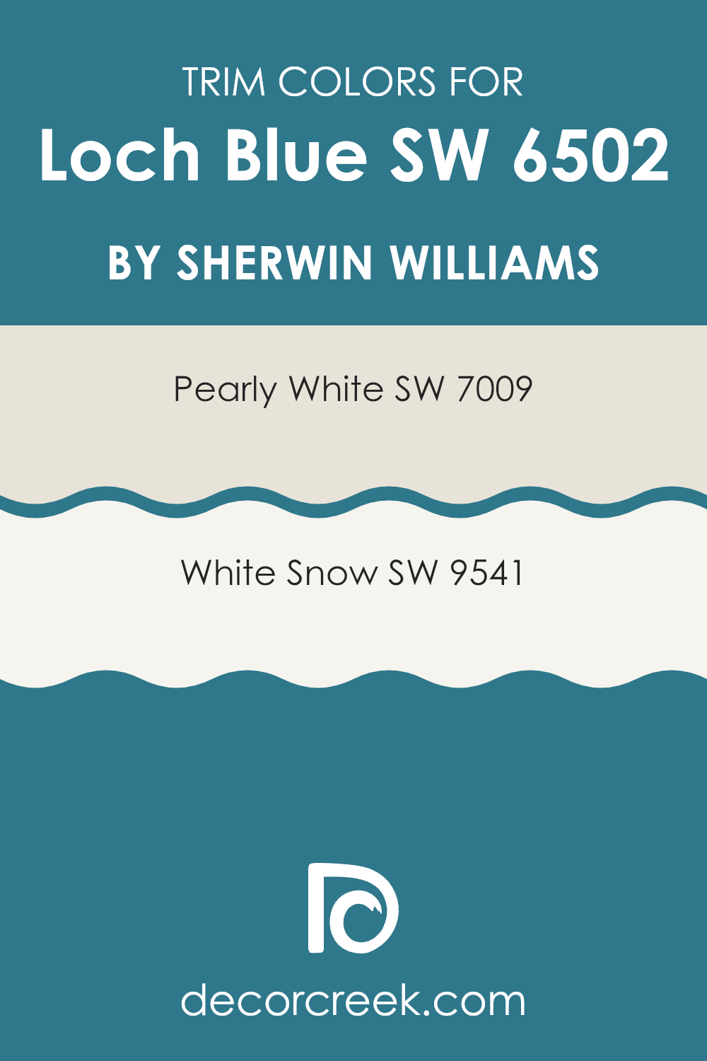
What are the Trim colors of Loch Blue SW 6502 by Sherwin Williams?
Trim colors, such as SW 7009 – Pearly White and SW 9541 – White Snow by Sherwin Williams, play a crucial role in enhancing the appeal of a primary paint color like Loch Blue. Trim colors are strategically used on elements like door frames, moldings, and skirtings to define and highlight architectural details.
The contrast established between the trim and the wall color can make the overall color scheme stand out, ensuring that features like windows and doors are clearly visible and aesthetically pleasing. Pearly White SW 7009 provides a gentle off-white tone that can softly contrast with deeper hues like Loch Blue, giving a clean and fresh look without overpowering the main color.
On the other hand, White Snow SW 9541 offers a brighter and crisper white tone that brings a more pronounced contrast, which can effectively accentuate the richness of Loch Blue. These trim colors can significantly affect the visual impact of a room, subtly complementing the overall decor while framing the spaces in a refined way.
You can see recommended paint colors below:
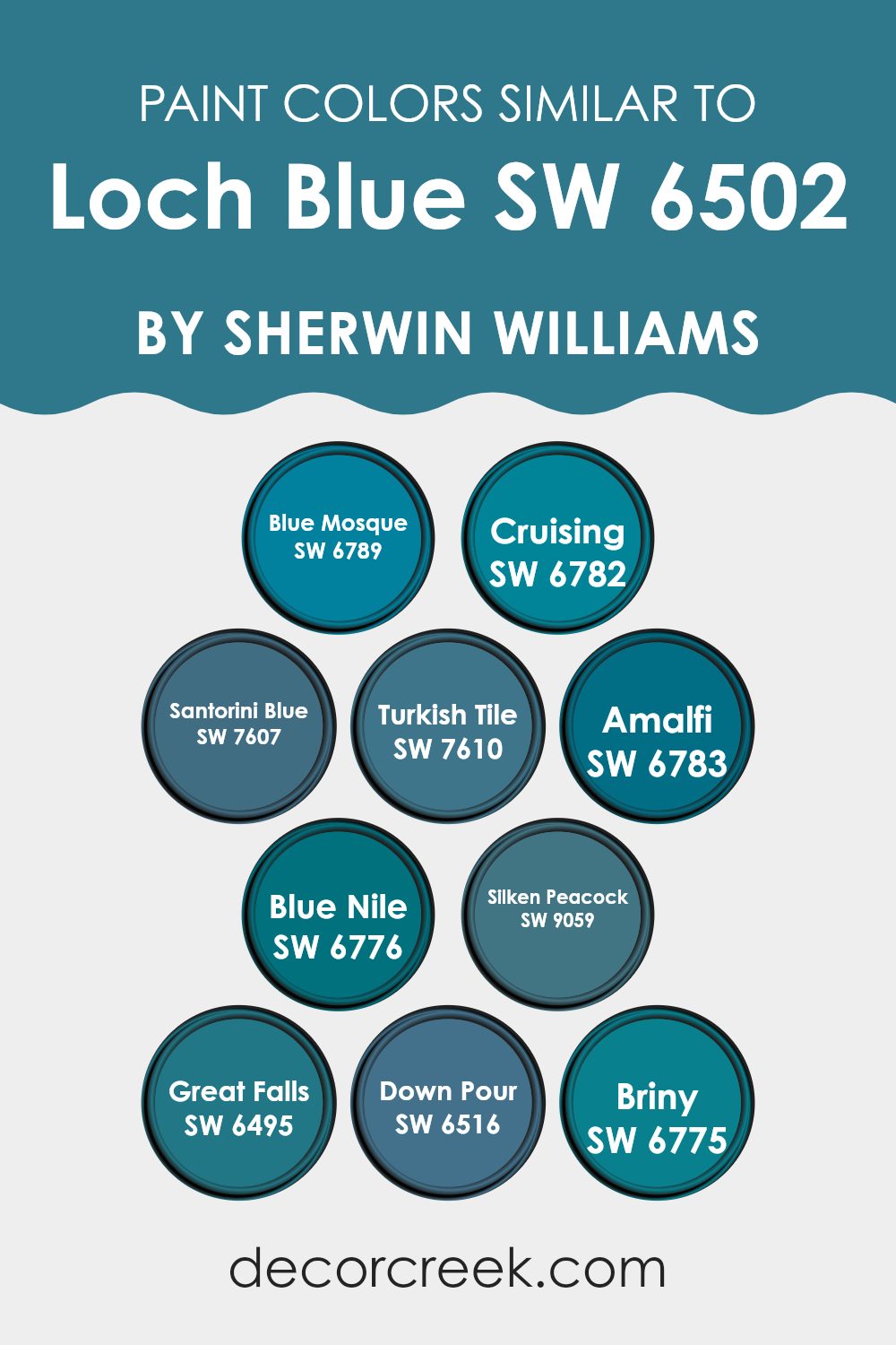
Colors Similar to Loch Blue SW 6502 by Sherwin Williams
Similar colors play a significant role in creating a harmonious and visually appealing aesthetic, especially when desiring a cohesive look in home or space decor. Colors like those akin to Loch Blue support a smooth transition between spaces, making them feel connected and consistent.
When using shades such as Blue Mosque, which is a deep twilight blue, or Cruising, a light and breezy sky blue, one can create a gradient effect that adds dimension and flow to an area. Santorini Blue offers a vivid, oceanic feel that pulls in a sense of freshness, while Turkish Tile introduces a vibrant peacock blue that can act as an eye-catching accent color.
Amalfi provides a soothing cornflower hue that’s perfect for a calming space, and Blue Nile offers a darker, more mysterious blue, ideal for creating depth or a statement wall. Silken Peacock stands out with its rich teal tone, bringing in a touch of luxury without overwhelming the senses. Great Falls lends itself to a muted, dusty blue, excellent for achieving a more understated look.
Down Pour boasts a bold, intense navy making it suitable for dramatic and moody aesthetic choices. Lastly, Briny has a unique aquamarine vibe, perfect for those looking to add a hint of coastal flair. Utilizing similar colors like these allows one to maintain a unified theme while also having the flexibility to differentiate spaces slightly.
You can see recommended paint colors below:
- SW 6789 Blue Mosque
- SW 6782 Cruising
- SW 7607 Santorini Blue
- SW 7610 Turkish Tile
- SW 6783 Amalfi
- SW 6776 Blue Nile
- SW 9059 Silken Peacock
- SW 6495 Great Falls
- SW 6516 Down Pour
- SW 6775 Briny
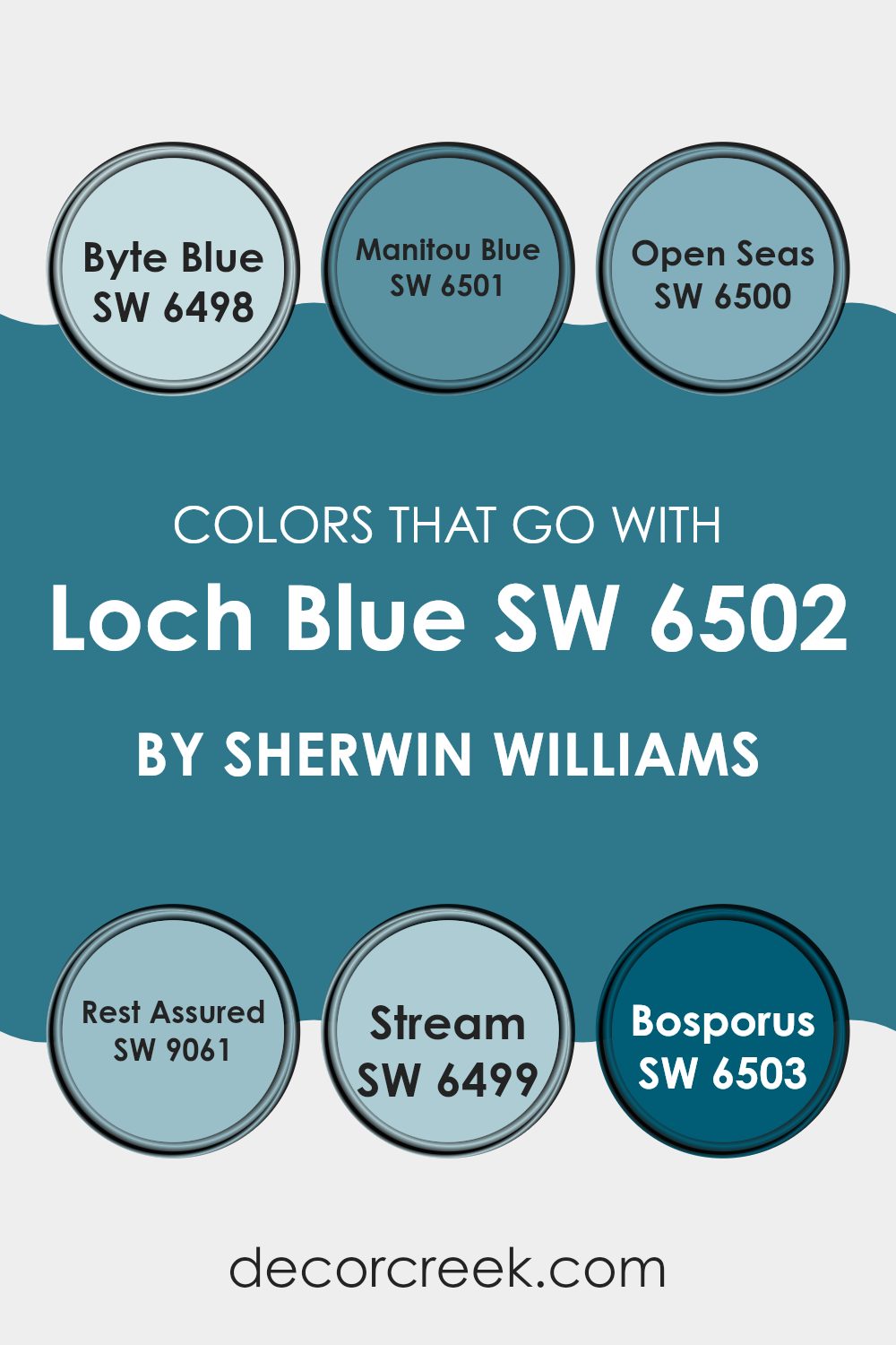
Colors that Go With Loch Blue SW 6502 by Sherwin Williams
Choosing the right colors to pair with Loch Blue SW 6502 by Sherwin Williams is crucial because it ensures that the design feels cohesive and well-balanced. Loch Blue is a deep, vibrant shade that can act as a strong foundation in a room. Complementing it with the proper hues can enhance the blue’s richness while maintaining a harmonious atmosphere. Colors such as Byte Blue, Manitou Blue, Open Seas, Rest Assured, Stream, and Bosporus work beautifully together, enabling a seamless aesthetic.
Byte Blue is a lively, vivid blue that adds a touch of brightness, working well in spaces that need a pop of color. Similarly vibrant, Manitou Blue offers a slightly lighter shade that brings a fresh and lively feeling to interiors.
Open Seas has a greenish tint, which introduces a subtle contrast when paired with the more straightforward blues. Rest Assured is a softer, grayish-blue that provides a calm and gentle complement, great for creating a restful environment. Stream has a hint of teal, offering a unique twist that can enrich a space with a different kind of blue.
Lastly, Bosporus is a deep, sea-inspired color that adds depth and interest to any space, making it an excellent partner for the robust Loch Blue. These colors work in tandem to create a space that feels cohesive and lively, perfect for any wall can make a whole room feel well put together and modern.
You can see recommended paint colors below:
- SW 6498 Byte Blue
- SW 6501 Manitou Blue
- SW 6500 Open Seas
- SW 9061 Rest Assured
- SW 6499 Stream
- SW 6503 Bosporus
How to Use Loch Blue SW 6502 by Sherwin Williams In Your Home?
Loch Blue by Sherwin Williams is a vibrant and welcoming shade of blue that can add a fresh splash of color to any room in your home. It’s perfect for those looking to add a bit of cheer and brightness to their living space.
When used in a living room or an entryway, this color can create a striking first impression, making the space feel more inviting. For a calming effect, consider painting a bedroom in Loch Blue, as it can help set a relaxing tone that is ideal for resting.
If you are not ready to paint an entire room, you can use Loch Blue for a feature wall or on accent pieces like chairs or cabinets to inject some color without overwhelming the space. This versatile shade pairs well with neutral colors, such as white or gray, allowing you to create a balanced and harmonious look throughout your home. Using Loch Blue can be a simple way to refresh your living environment.
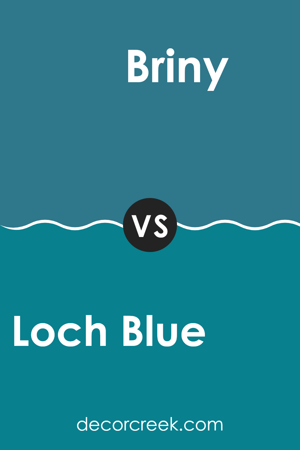
Loch Blue SW 6502 by Sherwin Williams vs Briny SW 6775 by Sherwin Williams
Loch Blue and Briny are two distinct paint colors offered by Sherwin Williams. Loch Blue is a calm, soothing shade that leans towards a soft, subtle blue with a hint of gray. This color has a gentle appeal that makes it great for creating a relaxed atmosphere in any room.
On the other hand, Briny is a brighter and more vibrant shade of blue. It has a more energetic feel, which can add a lively touch to spaces that benefit from a splash of color, like bathrooms or kids’ rooms.
While Loch Blue is softer and more muted, making it versatile and easy to match with various decor styles, Briny stands out more and can serve as a focal point in a room. Both colors offer unique qualities but cater to different tastes and design needs.
You can see recommended paint color below:
- SW 6775 Briny
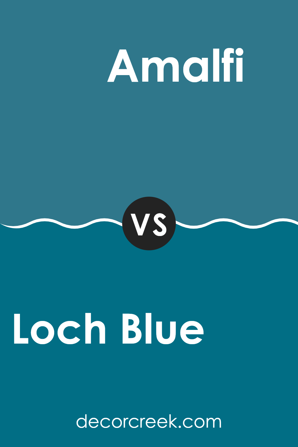
Loch Blue SW 6502 by Sherwin Williams vs Amalfi SW 6783 by Sherwin Williams
Loch Blue and Amalfi are two distinct paint colors offered by Sherwin Williams, each bringing a unique vibe to a space. Loch Blue is a soft, welcoming blue with a subtle gray undertone, making it versatile for various interior designs.
It creates a calm, gentle background, ideal for relaxing spaces like bedrooms or cozy living areas. On the other hand, Amalfi is a rich, vibrant teal that leans towards the adventurous side, offering a bolder look.
It’s perfect for adding a pop of color and energy to any room, especially dynamic spaces such as kitchens or playrooms. Both colors have their charm, with Loch Blue providing a more muted, classic feel and Amalfi presenting a lively, cheerful ambiance. The choice between them would depend on the mood you wish to set in your space.
You can see recommended paint color below:
- SW 6783 Amalfi
Loch Blue SW 6502 by Sherwin Williams vs Cruising SW 6782 by Sherwin Williams
Loch Blue and Cruising are two distinct colors by Sherwin Williams. Loch Blue is a soft, muted blue with a slightly gray undertone, giving it a calm and gentle appearance. It works well in spaces where you want a peaceful vibe, such as bedrooms or bathrooms.
On the other hand, Cruising is a much brighter and more vivid blue. It has a vibrant, almost electric look that can add a lively burst of color to an area. This makes it great for places where you want to bring some energy, like a playroom or a creative workspace.
While both colors are shades of blue, Loch Blue is more understated and subdued, whereas Cruising stands out due to its intensity. So, if you’re looking for a soothing and quiet color, Loch Blue is a good choice. If you prefer something more fun and bold, Cruising might be the way to go.
You can see recommended paint color below:
- SW 6782 Cruising
Loch Blue SW 6502 by Sherwin Williams vs Blue Nile SW 6776 by Sherwin Williams
Loch Blue and Blue Nile are both unique shades offered by Sherwin Williams, yet they present different vibes due to their tones.
Loch Blue is a vibrant, yet soft blue that has a calming presence, suitable for spaces where you want a splash of color without overwhelming brightness. It’s lighter and more muted, making it perfect for a cozy bedroom or a peaceful living area.
On the other hand, Blue Nile is a much bolder and brighter blue. It stands out more and adds a lively punch of color to any space. This shade can energize a room, making it a great choice for areas like playrooms or creative spaces where you want to inspire activity and excitement.
While both colors share the base of blue, Loch Blue leans towards a gentle and quiet look, whereas Blue Nile aims for an energetic and vivid appearance. The choice between the two would largely depend on the mood and function of the room you are decorating.
You can see recommended paint color below:
Loch Blue SW 6502 by Sherwin Williams vs Great Falls SW 6495 by Sherwin Williams
Loch Blue and Great Falls are two distinct shades by Sherwin Williams, both offering unique vibes for any space. Loch Blue is a vibrant, medium blue that has a lively and welcoming feel. It’s perfect for adding a cheerful touch to any room and works well in living areas or bedrooms where you want a bit of energy and brightness.
On the other hand, Great Falls leans towards a deeper, teal-like blue. It’s a cooler shade that brings a calm and slightly more reserved atmosphere. This color is excellent for spaces where you want a touch of elegance without going too dark, such as bathrooms or a study.
While both colors share a blue base, Loch Blue is unmistakably brighter, making spaces feel more vibrant. Great Falls, with its teal undertones, offers a more subtle and composed look. Depending on the mood you’re aiming for, each color has its strengths—Loch Blue for a lively feel and Great Falls for a more relaxed environment.
You can see recommended paint color below:
- SW 6495 Great Falls
Loch Blue SW 6502 by Sherwin Williams vs Blue Mosque SW 6789 by Sherwin Williams
Loch Blue and Blue Mosque are two distinctive shades from Sherwin Williams. Loch Blue is a lighter, subtler blue with a soft, welcoming feel. It’s perfect for creating a relaxed atmosphere in spaces like bedrooms or living rooms. The color is versatile and pairs well with both bright accents and neutral tones.
On the other hand, Blue Mosque is a much deeper and more vivid blue. This color has a strong presence and can make a bold statement when used in interior spaces. It’s particularly effective in areas where you want to draw attention or add a splash of drama, like dining areas or accent walls.
When comparing them, Loch Blue offers a gentler approach, suitable for a laid-back setting, while Blue Mosque stands out with its richness, ideal for more dynamic or themed spaces. Both colors bring their unique vibe to a room, depending on how you want to impact the space’s mood and style.
You can see recommended paint color below:
Loch Blue SW 6502 by Sherwin Williams vs Santorini Blue SW 7607 by Sherwin Williams
Loch Blue and Santorini Blue, both by Sherwin Williams, are distinct shades of blue, each bringing its unique flair to spaces. Loch Blue has a vibrant, aquatic quality that closely resembles the crisp, refreshing waters of a mountain lake. This color is brighter and can make a space feel lively and energetic. It pairs well with whites and greys for a clean, refreshing look.
On the other hand, Santorini Blue has a more muted tone, inspired by the coastal views of its namesake Greek island. This color leans towards a greyer, more subdued hue, making it great for those looking for a softer blue that still offers a hint of coastal charm without overwhelming a room. It works beautifully with soft neutrals and materials like natural wood for a balanced, calming atmosphere.
Both colors offer unique possibilities for creating welcoming, pleasant spaces, whether you’re aiming for a more vibrant pop of color with Loch Blue or a gentle, subdued feel with Santorini Blue.
You can see recommended paint color below:
- SW 7607 Santorini Blue
Loch Blue SW 6502 by Sherwin Williams vs Down Pour SW 6516 by Sherwin Williams
Loch Blue and Down Pour are both hues offered by Sherwin-Williams, each bringing a unique vibe to spaces. Loch Blue is a softer, lighter shade that resembles a clear sky on a sunny day.
It’s a refreshing color that adds a gentle touch of cheer to any room, making it more inviting and pleasant. In contrast, Down Pour is a deeper, more intense blue, reminiscent of the ocean during a storm.
It provides a striking and bold look, perfect for making a statement in a space. This color tends to stand out more and can give a room a more dramatic feel. Both colors have their charm and can set different moods depending on what you’re going for in a space.
You can see recommended paint color below:
Loch Blue SW 6502 by Sherwin Williams vs Turkish Tile SW 7610 by Sherwin Williams
Loch Blue and Turkish Tile are both vibrant colors from Sherwin Williams, each bringing its unique charm to a space. Loch Blue is a soft, soothing blue with a hint of gray. It’s subtle and understated, making it perfect for creating a calm and cozy atmosphere in rooms like bedrooms or bathrooms.
On the other hand, Turkish Tile is a bolder, more intense blue with a touch of green. This color is lively and cheerful, ideal for spaces where you want to add a splash of energy or a dynamic feel, such as a kitchen or a creative studio.
While both colors share a blue base, Loch Blue leans towards a muted, gentle hue, and Turkish Tile stands out with its vivid and brighter tone. Together, these colors can work well in a complementary scheme for someone looking to mix quiet areas with more lively spaces in their home.
You can see recommended paint color below:
Loch Blue SW 6502 by Sherwin Williams vs Silken Peacock SW 9059 by Sherwin Williams
Loch Blue and Silken Peacock, both by Sherwin Williams, offer distinct vibes in the blue color family. Loch Blue is a light, breezy shade that brings a fresh and airy feel to spaces. It’s perfect for creating a relaxed environment, ideal for bedrooms or bathrooms where you want a light and calming atmosphere.
On the other hand, Silken Peacock is a deeper and more vivid blue. It has a bold presence that can make a statement in any room. This color works well in areas where you want to add a splash of energy or a dramatic flair, like living rooms or dining areas.
While both colors share a blue base, Loch Blue leans towards a softer, more muted tone, whereas Silken Peacock stands out with its richer, more vibrant hue. Choosing between them depends on your desired mood and the room’s function.
You can see recommended paint color below:
- SW 9059 Silken Peacock

Using Loch Blue in different parts of a house really makes things look nicer. For example, if it’s painted in a bedroom, it turns the room into a calm place, perfect for reading or taking a good nap. In a living room, it adds a splash of color that isn’t too shockingly bright, which makes everything feel welcoming and peaceful.
If someone is thinking about adding a new color to their walls, Loch Blue is a great choice. It’s pretty and calming, and it also helps brighten rooms without making them feel too cold. This color works well with many other colors, so it’s easy to mix into most styles, whether the room has lots of wooden furniture or more modern pieces.
All in all, Loch Blue by Sherwin Williams is a wonderful pick if you are looking for a new paint color. It adds just the right amount of joy and calm to any room, and I think a lot of people would appreciate its beauty like I do.
Ever wished paint sampling was as easy as sticking a sticker? Guess what? Now it is! Discover Samplize's unique Peel & Stick samples.
Get paint samples

