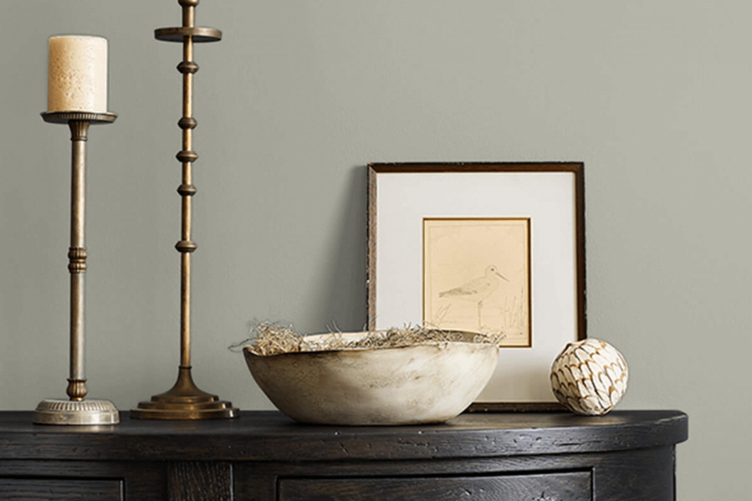
When I first came across SW 6199 Rare Gray by Sherwin Williams, I noticed how it blended warmth and neutrality. Rare Gray is a flexible color that seems to fit in a variety of areas effortlessly. Whether it’s a living room that needs a touch of calmness or a home office requiring a supportive backdrop, this shade works well.
It has a soft undertone that seems to change subtly with the lighting, adding depth and character without overpowering the room. I appreciate how Rare Gray can work alongside brighter colors or other neutrals, offering a perfect balance that is neither too bold nor too plain.
This shade helped me create a peaceful environment while maintaining a modern edge. It’s a great choice if you’re looking for something that keeps things fresh yet classic. It strikes that fine line between being interesting and staying understated, which is a rare find.
To me, Rare Gray offers the right amount of sophistication with just a hint of warmth, making it an excellent option for anyone looking to refresh their room with a reliable and stylish palette.
What Color Is Rare Gray SW 6199 by Sherwin Williams?
Rare Gray by Sherwin Williams is a soft, neutral gray with slightly warm undertones, making it flexible and easy to incorporate into various interiors. This color is subtle and calm, providing a gentle background that doesn’t overpower a room. It’s the kind of gray that adapts to its surroundings, softly reflecting other colors and tones in the room.
Rare Gray works wonderfully in modern and contemporary settings, where it can provide a clean, understated backdrop, allowing furniture and artwork to stand out. It also fits well in transitional rooms, blending traditional and modern elements seamlessly. The color’s warmth allows it to pair beautifully with natural materials like light wood and stone, enhancing their natural beauty.
For textures, Rare Gray complements soft fabrics such as linen and cotton, adding a cozy feel to a room. It pairs nicely with metallic accents—like brushed nickel or matte black—for a touch of contrast and interest. Additionally, pairing this gray with woven textures or rattan can add depth and visual interest to a room. Whether in a living room, bedroom, or kitchen, Rare Gray provides a comforting yet stylish foundation for any interior design style.
Is Rare Gray SW 6199 by Sherwin Williams Warm or Cool color?
Rare Gray SW 6199 by Sherwin Williams is a flexible shade that brings a touch of understated elegance to any room. This color is a soft gray with warm undertones, making it a perfect choice for creating a cozy and welcoming atmosphere in the home. It works well in various lighting conditions, appearing warm in natural sunlight and maintaining its cozy feel under artificial light.
Rare Gray is a neutral color that can be paired with a wide range of other colors, allowing homeowners to easily integrate it into existing decor. It provides a subtle, calming backdrop without overpowering the room. This makes it ideal for living rooms, bedrooms, or offices where a relaxing environment is desired.
Additionally, Rare Gray can help highlight bolder accent colors or features in the room, such as colorful furniture or artwork, by providing a gentle contrast. Its adaptability and warmth make it a popular choice for many home interiors.
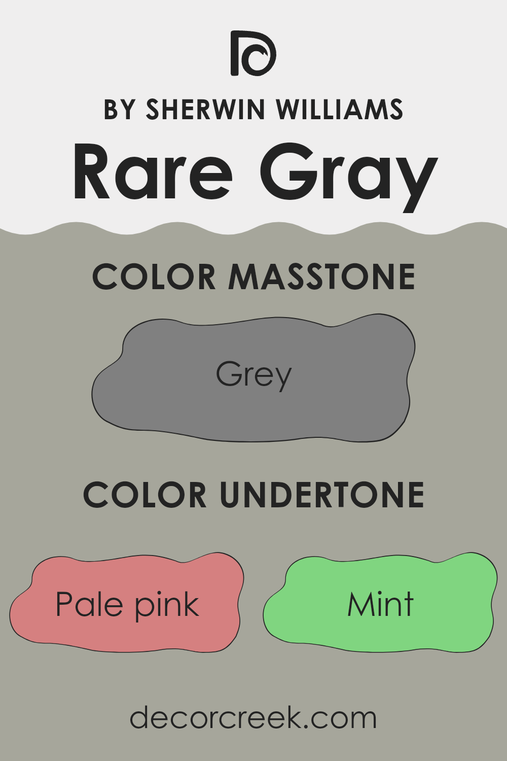
Undertones of Rare Gray SW 6199 by Sherwin Williams
Rare Gray by Sherwin Williams is a color that blends shades of gray with other subtle undertones, creating a balanced and flexible hue. This paint color’s undertones can make it appear different depending on the lighting and surrounding colors in a room.
The pink and pale yellow undertones can add warmth to the gray, making a room feel cozy and welcoming. On the other hand, mint and light green hints can lend a fresh and soft ambiance, which pairs well with natural elements like plants and wooden furniture.
Cooler undertones like lilac, light blue, and light purple bring a calm and peaceful vibe to a room, ideal for bedrooms or areas meant for relaxation. Meanwhile, blue and dark turquoise undertones can offer a crisp, modern feel with a touch of sophistication, which works well in minimalist areas.
With light gray and olive undertones, this color becomes grounding and can complement both earthy tones and vibrant accents, allowing flexibility in design choices. The varied undertones mean that Rare Gray can shift from cool to warm depending on the time of day and lighting conditions, making it an excellent choice for different interior styles.
Overall, the undertones of Rare Gray provide depth and adaptability, making it a dynamic choice for walls in any room.
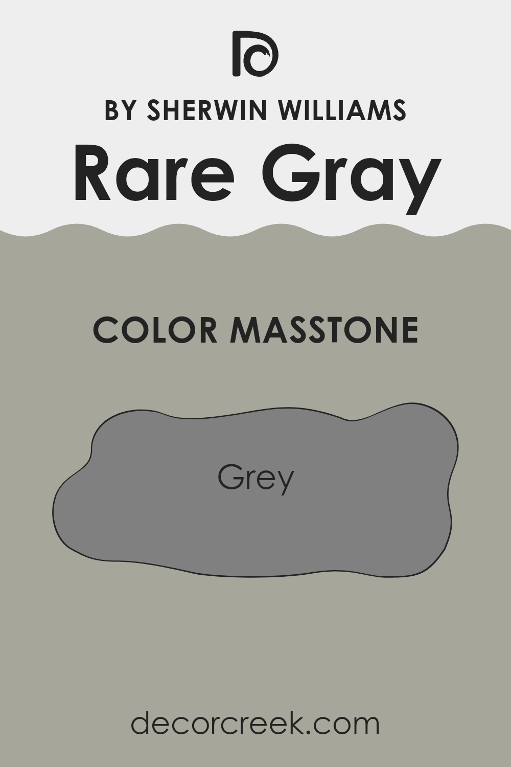
What is the Masstone of the Rare Gray SW 6199 by Sherwin Williams?
Rare Gray SW 6199 by Sherwin Williams is a flexible color that can easily fit into various home settings. Its masstone, which appears as a standard gray (#808080), plays a significant role in how this hue works within interior rooms.
Gray is a neutral color, which means it effortlessly complements a wide range of other colors without clashing. This makes it a good choice for living rooms, bedrooms, or kitchens where a relaxed and harmonious atmosphere is desired. The gray tone can make a room feel more open and spacious, which is particularly beneficial in smaller areas.
It reflects just the right amount of natural light, creating a soft and inviting ambiance. Whether paired with vibrant accents or other muted tones, Rare Gray serves as an excellent backdrop that allows homeowners to customize their areas according to personal taste. This adaptability makes it a popular choice for those seeking a classic look.
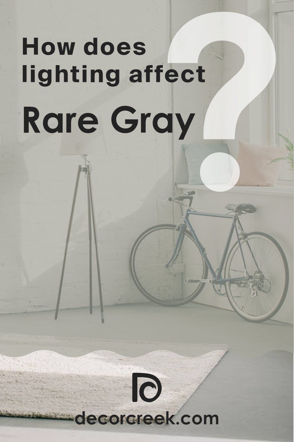
How Does Lighting Affect Rare Gray SW 6199 by Sherwin Williams?
Lighting plays a significant role in how colors appear in a room. The intensity, angle, and type of light can alter the perception of a color. This is particularly true for paint colors like Rare Gray SW 6199 by Sherwin Williams, which can look different depending on the lighting conditions.
In natural light, colors can change throughout the day. In north-facing rooms, where light tends to be cooler and more consistent, Rare Gray might appear subdued and slightly bluish due to the indirect sunlight. The color can feel calm and crisp but may also seem a bit chilly because of the cool tones typically present in northern light.
In south-facing rooms, where sunlight is direct and warmer for most of the day, Rare Gray may take on a warmer, creamier look. The added warmth can enhance the gray’s undertones, making it feel cozier and more inviting.
East-facing rooms receive bright light in the morning, which can make Rare Gray appear lighter and more vibrant. As the day progresses, the room might dim, causing the color to seem more muted. In the morning, the color can highlight its subtle warmth, while in the afternoon, it might shift to a cooler tone.
West-facing rooms receive warm light in the late afternoon and evening. Early in the day, Rare Gray could appear cooler since west-facing rooms do not get much direct sunlight. However, as the afternoon turns to evening, the warmer light can enhance the color’s depth and provide a richer appearance.
Artificial lighting also has a considerable impact. Under soft, warm bulbs, Rare Gray can appear warmer and more inviting. Cool white or fluorescent lighting might accentuate its bluer tones, making it appear more muted. Therefore, the choice of light bulbs along with the room’s orientation impacts the ultimate look of Rare Gray in a room.
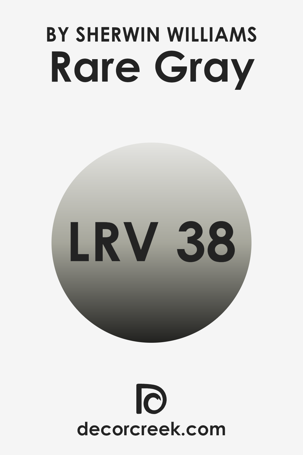
What is the LRV of Rare Gray SW 6199 by Sherwin Williams?
Light Reflectance Value (LRV) is a measurement used to determine how much light a color reflects or absorbs. It is a numerical scale ranging from 0, which means no light is reflected and the color is completely black, to 100, where all light is reflected, and the color is pure white. LRV helps predict how a paint color will look in different lighting conditions.
A higher LRV indicates a lighter color that will reflect more light and make areas feel brighter and more open. In contrast, a lower LRV suggests a darker color that absorbs more light, making a room feel cozier or more intimate.
The LRV of 37.756 for Rare Gray means it’s a mid-tone color, sitting comfortably between light and dark on the LRV scale. This value indicates that the color will reflect a moderate amount of light, making it suitable for rooms where a balance between light and depth is desired.
While it won’t make a room feel overly bright, it also won’t make it feel too dim or cramped. Rare Gray’s LRV allows it to maintain its color integrity under various lighting conditions, giving areas an understated, balanced appearance. This level of light reflection makes it flexible for different areas of a home, adapting well to both natural and artificial lighting without overpowering the room.
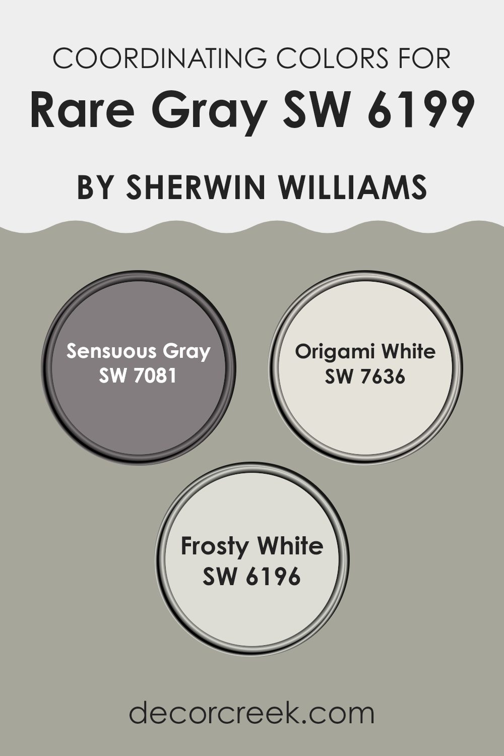
Coordinating Colors of Rare Gray SW 6199 by Sherwin Williams
Coordinating colors are hues that complement each other well, creating a cohesive look in a room. These colors work together because they share certain undertones or contrast beautifully, allowing each to stand out while maintaining harmony. When selecting coordinating colors for a specific shade like Rare Gray, it’s important to consider tones that naturally blend.
For instance, Sensuous Gray, with its warm and slightly purple undertones, pairs well with such neutrals, adding depth without overpowering. Origami White, on the other hand, offers a clean and crisp feel with its subtle touch of warmth, which makes it a perfect backdrop that highlights other colors nicely.
Frosty White has an airy, fresh quality that can enhance the overall brightness of a room, combining beautifully with both deeper and lighter shades. When used alongside those colors, it provides balance and enhances the overall look of a room. Together, these colors create an inviting atmosphere. They allow each shade to shine on its own, yet also complement one another, offering a flexible palette that can suit various styles and settings.
You can see recommended paint colors below:
- SW 7081 Sensuous Gray
- SW 7636 Origami White
- SW 6196 Frosty White
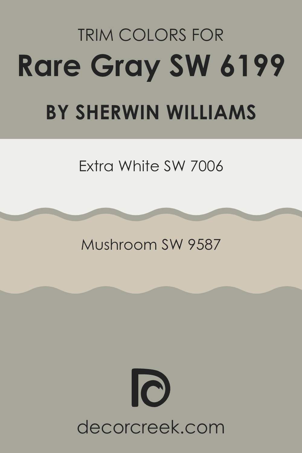
What are the Trim colors of Rare Gray SW 6199 by Sherwin Williams?
Trim colors are accent colors you apply to features like molding, doors, and window frames to create contrast or complement the main wall color in a room. Using trim colors with Rare Gray by Sherwin Williams can really change up a room’s feel. Rare Gray is a soft and understate shade of gray that pairs well with many colors.
When you select trim colors, it’s like choosing the right frame for a picture – it enhances and defines the overall look. Using Extra White as a trim color can create a clean, bright border around Rare Gray. Extra White is a crisp, clean white that can make the main wall color pop, providing a fresh and neat appearance.
On the other hand, Mushroom brings a different feel. It is a warm, earthy tone that can add a cozy and inviting touch to Rare Gray, making the room feel more grounded and homely. Each trim choice can give the same room a unique character, highlighting or softening other colors, depending on what you want to achieve.
You can see recommended paint colors below:
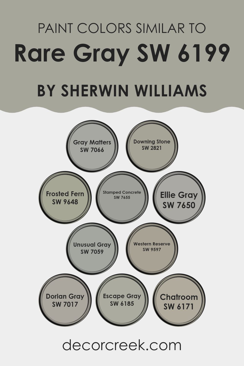
Colors Similar to Rare Gray SW 6199 by Sherwin Williams
Similar colors are important because they create harmony and balance in a room. When these colors are combined thoughtfully, they can set a mood or theme that feels unified and pleasant. For example, colors that are similar to Rare Gray by Sherwin Williams include those like Gray Matters, which has a strong, neutral presence, and Downing Stone, which offers a warm and earthy feel.
Frosted Fern adds a touch of freshness with its subtle green hint, while Stamped Concrete brings in a cool, industrial vibe. Ellie Gray provides a soft and soothing touch, effortlessly blending into various settings.
Western Reserve offers a deeper, more traditional look, while Unusual Gray stands out with its unique and interesting tones, making it a flexible choice. Dorian Gray projects a balanced, everyday gray, easily fitting into modern designs. Escape Gray adds depth with its underlying blue-green tones, perfect for those seeking a calming effect.
Lastly, Chatroom has an inviting quality with its warm, gray-green hue, ideal for creating a cozy atmosphere. Each of these colors complements Rare Gray, allowing for a cohesive and thoughtful color scheme in any room. They work together to enhance the aesthetic of a room, offering both variety and consistency.
You can see recommended paint colors below:
- SW 7066 Gray Matters
- SW 2821 Downing Stone
- SW 9648 Frosted Fern
- SW 7655 Stamped Concrete
- SW 7650 Ellie Gray
- SW 7059 Unusual Gray
- SW 9597 Western Reserve
- SW 7017 Dorian Gray
- SW 6185 Escape Gray
- SW 6171 Chatroom
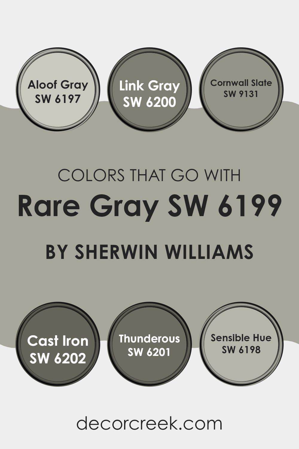
Colors that Go With Rare Gray SW 6199 by Sherwin Williams
Rare Gray SW 6199 by Sherwin Williams is a flexible color that looks great in many rooms. Pairing it with the right colors can enhance its beauty while adding depth and interest to a room. One excellent companion is SW 6197 – Aloof Gray, a soft, muted gray that complements Rare Gray by providing a gentle contrast.
Aloof Gray brings a light and airy feel, which balances Rare Gray’s subtle depth. Another great option is SW 6200 – Link Gray, which is a slightly darker shade that adds warmth and creates a cozy atmosphere. Link Gray works by adding a rich layer next to Rare Gray’s subtle tones.
For a touch of sophistication, SW 9131 – Cornwall Slate combines well with Rare Gray. Its deep blue-green shade introduces a striking focal point, offering a bold yet harmonious look. If you are looking for something darker, consider SW 6202 – Cast Iron. This deep, charcoal-like color adds drama and sophistication, creating an elegant backdrop for Rare Gray.
SW 6201 – Thunderous works beautifully when you want to introduce a touch of nature with its profound, stormy vibe. Lastly, SW 6198 – Sensible Hue, a soft and inviting color, enhances Rare Gray’s calmness, wrapping the room in a peaceful atmosphere. Together, these colors work in harmony, each accentuating the unique qualities of Rare Gray.
You can see recommended paint colors below:
- SW 6197 Aloof Gray
- SW 6200 Link Gray
- SW 9131 Cornwall Slate
- SW 6202 Cast Iron
- SW 6201 Thunderous
- SW 6198 Sensible Hue
How to Use Rare Gray SW 6199 by Sherwin Williams In Your Home?
Rare Gray SW 6199 by Sherwin Williams is a flexible paint color that can be used beautifully in various rooms of your home. This warm gray shade offers a neutral backdrop that complements many styles and color palettes.
You might choose Rare Gray for your living room to create a cozy and inviting atmosphere. It pairs well with both contemporary and traditional furnishings. In the bedroom, Rare Gray can help foster a calming environment that is perfect for relaxation.
It also works nicely in the kitchen or dining area, where its subtle hue can enhance the beauty of your cabinetry and fixtures. Additionally, Rare Gray is a fantastic choice for an office area, as it provides a professional and clean look without feeling too cold or sterile. Its gentle tone makes it easy to accessorize with colorful artwork or textiles, adding personality and warmth to your areas.
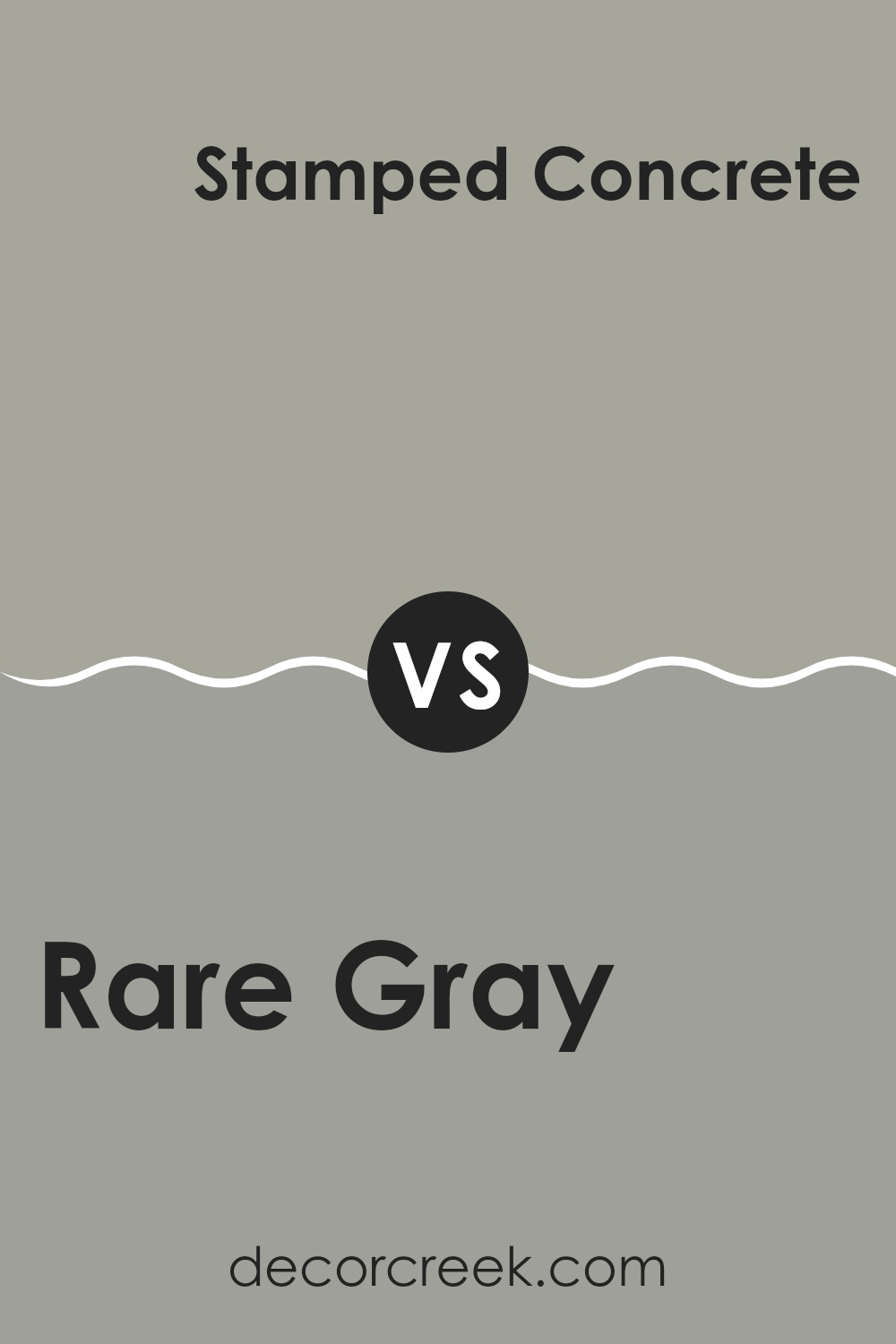
Rare Gray SW 6199 by Sherwin Williams vs Stamped Concrete SW 7655 by Sherwin Williams
Rare Gray and Stamped Concrete are two different shades offered by Sherwin Williams. Rare Gray has a gentle, muted appearance with soft undertones of green, making it a flexible choice that can suit many different areas. It’s a calming and neutral color, perfect for creating a light and airy feel.
On the other hand, Stamped Concrete is darker and more grounded. It has strong gray tones without carrying as much warmth, making it feel more industrial and modern. This color works well in areas where you need a bit more depth and a solid, stable feel.
When comparing the two, Rare Gray is softer and lends itself well to rooms that aim for a subtle and warm ambiance. Stamped Concrete, in contrast, is bold and best suited for areas where a more assertive, contemporary look is desired. Both colors have their own charm and can be used strategically to create different moods within a home.
You can see recommended paint color below:
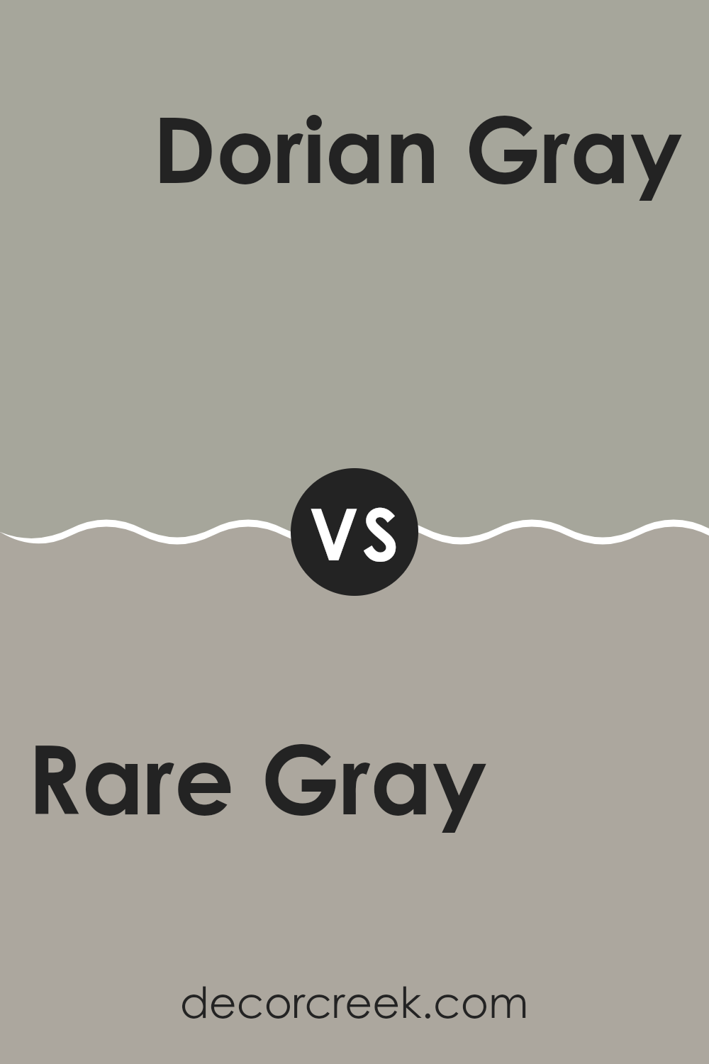
Rare Gray SW 6199 by Sherwin Williams vs Dorian Gray SW 7017 by Sherwin Williams
Rare Gray SW 6199 and Dorian Gray SW 7017 by Sherwin Williams are two distinct yet flexible colors. Rare Gray is a soft gray with green undertones, offering a gentle and calming feeling. It’s perfect for creating a soothing atmosphere in any room, whether it’s a living room or bedroom. The hint of green adds a unique touch, making it subtly stand out.
On the other hand, Dorian Gray is a warm gray with more of a greige tone, incorporating both gray and beige qualities. It provides a neutral and balanced backdrop, which can make rooms feel cozy and inviting. This color works well in living areas, dining rooms, or offices, complementing a wide range of other colors and styles.
Both colors are excellent choices for different purposes: Rare Gray adds a soft, peaceful vibe with its green hues, while Dorian Gray offers warmth and versatility with its neutral undertones.
You can see recommended paint color below:
Rare Gray SW 6199 by Sherwin Williams vs Chatroom SW 6171 by Sherwin Williams
Rare Gray SW 6199 and Chatroom SW 6171, both by Sherwin Williams, offer subtle, neutral tones that complement various styles. Rare Gray is a balanced gray with a hint of warmth, making it flexible for different areas. It doesn’t lean too cold or too warm, which allows it to work well with various colors and decor.
On the other hand, Chatroom is a muted green with gray undertones. It brings a natural, organic feel, making rooms feel calm and grounded. While both are subtle and neutral, the touch of green in Chatroom offers a bit more color compared to Rare Gray.
Rare Gray serves as an excellent backdrop for more colorful accents but remains neutral. Chatroom can also be paired with other colors, but its green undertone gives rooms a slightly different atmosphere. Both colors are adaptable, but the choice depends on whether you prefer a hint of green or a pure gray.
You can see recommended paint color below:
Rare Gray SW 6199 by Sherwin Williams vs Gray Matters SW 7066 by Sherwin Williams
Rare Gray (SW 6199) and Gray Matters (SW 7066) by Sherwin Williams are two distinctive shades of gray that vary in their undertones and overall feel. Rare Gray is a softer, warmer hue that can bring comfort to a room.
It has subtle beige undertones, making it a flexible choice for cozy, inviting rooms. This color pairs well with natural materials and warm accents for a calming effect. On the other hand, Gray Matters is a cooler, more industrial shade of gray.
It leans toward a neutral tone with bluish undertones, giving it a modern and crisp appearance. This color is especially suitable for areas that aim for a more contemporary and sleek feel. It works well with metallic finishes and stark white or bold colors, highlighting its edgy, clean look. Both colors have unique personalities, making each suitable for different design preferences and atmospheres.
You can see recommended paint color below:
Rare Gray SW 6199 by Sherwin Williams vs Downing Stone SW 2821 by Sherwin Williams
Rare Gray SW 6199 and Downing Stone SW 2821 are two distinct shades from Sherwin Williams, each bringing its unique character to a room. Rare Gray is a soft, muted gray that offers a calming and neutral backdrop, lending a sense of openness and lightness. It’s flexible and pairs well with a variety of colors, making it suitable for both modern and traditional settings.
On the other hand, Downing Stone is a warmer, earthier tone. It has a slightly brownish undertone that gives it a cozy and inviting feel. This color works well in areas where warmth and comfort are desired, such as living rooms or bedrooms.
While both colors are neutral, Rare Gray tends to feel lighter and airier, whereas Downing Stone feels grounded and warm. The choice between these colors depends on whether you prefer a cooler, more airy atmosphere or a warm, cozy environment.
You can see recommended paint color below:
Rare Gray SW 6199 by Sherwin Williams vs Escape Gray SW 6185 by Sherwin Williams
Rare Gray SW 6199 and Escape Gray SW 6185 by Sherwin Williams are both popular choices, but they bring different vibes to a room. Rare Gray is a soft, muted gray with a hint of warmth, making it flexible and easy to pair with various accents or decor styles. It’s subtle and doesn’t dominate the room, creating a cozy feeling.
On the other hand, Escape Gray leans slightly more towards a greenish-gray tone. It’s a bit earthier, which can make it feel more connected to nature. This color adds depth to a room, giving it a touch of elegance without being overpowering.
Both colors are quite neutral, making them suitable for many settings. However, Rare Gray offers a more classic, subtle backdrop, while Escape Gray can bring a hint of color that feels fresh and slightly adventurous. Both can set a calming tone, but they each have their own unique twist.
You can see recommended paint color below:
Rare Gray SW 6199 by Sherwin Williams vs Western Reserve SW 9597 by Sherwin Williams
Rare Gray (SW 6199) and Western Reserve (SW 9597) by Sherwin Williams are two distinct colors. Rare Gray is a soft, muted gray with warm undertones, which gives it a gentle and calming feel. It’s a flexible color that suits various rooms, providing a neutral backdrop that complements many different styles and decor.
On the other hand, Western Reserve is a deeper, more saturated shade with a mix of gray and green tones. This color adds a hint of drama and richness to a room, making it ideal for accent walls or areas where you want a touch of warmth. Its earthy undertones bring in a cozy and inviting atmosphere.
When comparing the two, Rare Gray is subtler and more understated, making it great for larger areas. Western Reserve, with its richer hue, can add depth and character to specific parts of a room. Both colors offer unique vibes, so the choice depends on the mood you want to create in your home.
You can see recommended paint color below:
Rare Gray SW 6199 by Sherwin Williams vs Ellie Gray SW 7650 by Sherwin Williams
Rare Gray SW 6199 and Ellie Gray SW 7650 by Sherwin Williams are both soothing gray tones. Rare Gray is a warm gray with subtle beige undertones, giving it a cozy, earthy feel. It has a softness that makes areas feel comfortable and inviting. It’s a flexible color that works well in many settings, from living rooms to bedrooms.
Ellie Gray, on the other hand, is a cooler gray with bluish undertones. It offers a crisper, more modern look compared to Rare Gray. Ellie Gray’s cooler vibe can give a room a fresh, sleek feel. It pairs nicely with whites and other cool colors.
When choosing between the two, consider the mood you want to create. Rare Gray is ideal for warmth and coziness, while Ellie Gray suits a clean and contemporary style. Both colors have their own charm and can produce beautiful results in different home styles.
You can see recommended paint color below:
Rare Gray SW 6199 by Sherwin Williams vs Unusual Gray SW 7059 by Sherwin Williams
Rare Gray (SW 6199) and Unusual Gray (SW 7059) are both subtle, muted grays from Sherwin Williams, but they have distinct undertones and vibes. Rare Gray leans slightly toward green undertones, giving it a warm, earthy feel.
This makes it suitable for creating a cozy and inviting atmosphere. In contrast, Unusual Gray is more of a true gray with very subtle blue undertones, making it feel cooler and more neutral. This color can work well in modern areas or areas where you want a clean and minimalist look.
Both colors provide a flexible backdrop that pairs well with a variety of other colors and décor styles. However, choosing between them largely depends on the ambiance you wish to achieve: Rare Gray adds warmth, while Unusual Gray offers a cool, neutral balance.
You can see recommended paint color below:
Rare Gray SW 6199 by Sherwin Williams vs Frosted Fern SW 9648 by Sherwin Williams
Rare Gray SW 6199 and Frosted Fern SW 9648 by Sherwin Williams are two distinct colors that offer different vibes for a room. Rare Gray is a soft, neutral gray with subtle warm undertones, making it flexible for various design styles. It’s understated and works well as a backdrop without overpowering other elements in a room.
In contrast, Frosted Fern is a gentle, muted green with a cool, refreshing feel. This color can bring a sense of nature and calmness to an area, making it ideal for areas where you want a touch of outdoor inspiration without being too bold.
When used together, Rare Gray provides a quiet base that allows Frosted Fern to stand out more. The gray’s warmth pairs nicely with the fresh, clean look of the green, creating a harmonious balance. Both colors are subtle in their own right but work well in different settings depending on the mood you wish to create.
You can see recommended paint color below:
When I think about SW 6199 Rare Gray by Sherwin Williams, it feels like a color that perfectly balances between being warm and cool. It’s a shade that can make any room feel calm and welcoming at the same time. Rare Gray isn’t just an ordinary gray; it has a special tone that can mix well with almost anything. Whether in the living room, bedroom, or kitchen, this color brings a sense of balance that makes it work everywhere.
What I love about Rare Gray is how it changes with the light. In the morning, it can look fresh and bright, while in the evening, it feels cozy and snug. It doesn’t overpower or seem boring; instead, it complements whatever is around it. This makes it a perfect choice whether I want to make a room look bigger or just add a touch of calmness.
Rare Gray’s magic lies in its simplicity. It doesn’t scream for attention, but it quietly supports other colors or even becomes the star when paired with the right pieces. It is like a gentle whisper in a room full of chatter, making everything come together harmoniously.
For anyone looking to give their home a gentle refresh without going too bold, Rare Gray is the way to go.
Ever wished paint sampling was as easy as sticking a sticker? Guess what? Now it is! Discover Samplize's unique Peel & Stick samples.
Get paint samples

