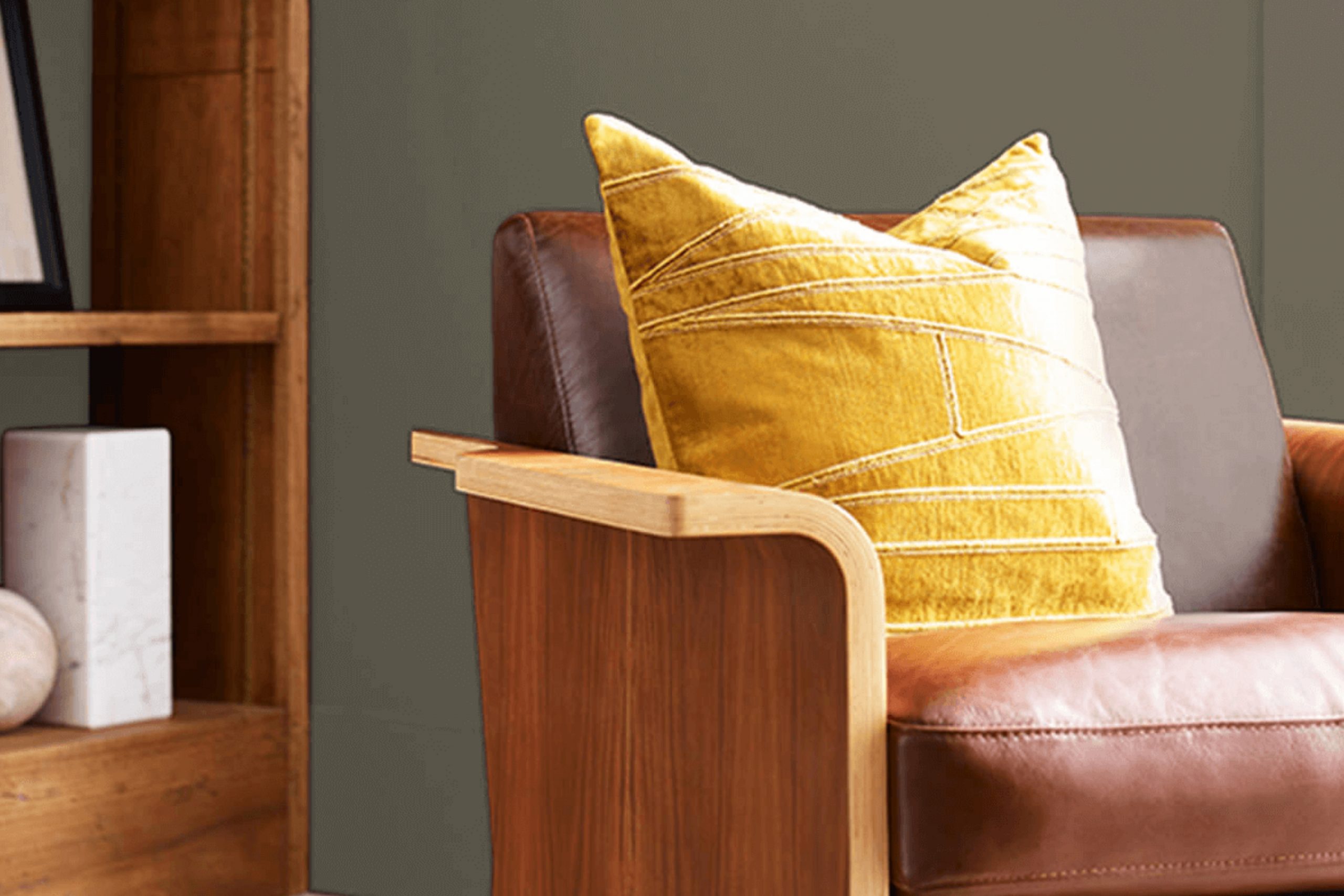
As you start your next painting project, consider SW 6166 Eclipse by Sherwin Williams. This color, a deep, almost mystical gray, holds a subtle hint of blue, making it both flexible and unique. I’ve found it works incredibly well in various rooms, whether it’s adding depth to a cozy study or elegance to a chic bedroom. The color carries a sense of calm but stays dynamic enough to keep the room interesting.
I particularly like how Eclipse changes under different lighting conditions. In natural light, the blue undertones are more noticeable, lending a cool vibe to the room. However, under artificial lighting, it shifts slightly to show a warmer, more enveloping hue. Its adaptability makes it perfect for those looking for a color that complements both a modern home style and a more traditional decor.
This color leads you away from the ordinary grays and into a realm that adds a refined and unexpectedly warm layer to any room. It’s easy to apply and pairs beautifully with crisp whites or rich, dark woods, giving you plenty of room to experiment with your decor.
By choosing Eclipse, you’re not just painting your walls; you’re setting the stage for endless possibilities in home design.
What Color Is Eclipse SW 6166 by Sherwin Williams?
Sherwin Williams’ Eclipse is a rich, deep hue of gray that borders on charcoal, offering a bold yet understated backdrop for various interior styles. This color provides a strong foundation for decor, stretching from modern minimalism to rustic farmhouse and even industrial designs. Its versatility works well with natural elements like wooden beams or exposed brick, giving a sense of grounded earthiness to any room. In contemporary settings, Eclipse pairs beautifully with sleek, metallic finishes such as brushed nickel or chrome, enhancing the modern aesthetic.
Eclipse also complements soft textiles like velvet or silk, adding an inviting warmth to rooms. It acts as a stunning contrast to bright and pastel colors, making it an excellent choice for a room featuring vibrant artworks or decorative accents. When used in living areas or bedrooms, this color can create a cozy, enclosed feel, perfect for areas meant for relaxation and unwinding.
The depth of Eclipse makes it ideal for large areas, as it can help to make them feel more intimate and protected. Its ability to absorb light rather than reflect it can make smaller rooms feel snug and homely, which is particularly beneficial in living areas or studies. Overall, Eclipse is a flexible and dynamic color that adapts well across different materials and textures, making it a compelling choice for many interior projects.
Is Eclipse SW 6166 by Sherwin Williams Warm or Cool color?
Eclipse 6166 by Sherwin Williams is a deep, rich navy blue that provides a bold touch without overpowering a room. This shade can make small areas appear cozier and larger rooms feel more intimate and inviting.
Because of its depth, Eclipse 6166 pairs well with brighter colors like whites or light grays, creating a striking contrast. This color works beautifully in bedrooms or living areas, offering a strong backdrop that can highlight décor and furniture effectively.
It is also a great choice for accent walls, helping to draw attention to specific areas of a home. When used in a matte finish, the color adds a modern twist, while a glossy finish can make it look more traditional. This versatility makes Eclipse 6166 a popular option for those wanting to add a touch of drama to their home without going too bold.
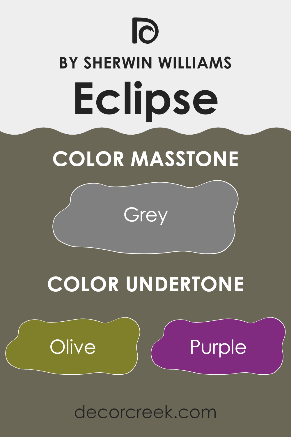
Undertones of Eclipse SW 6166 by Sherwin Williams
The color Eclipse, with the code SW 6166, is intriguing because of the wide variety of undertones it exhibits. Undertones are subtle colors that can influence the main hue depending on lighting and surrounding colors. For Eclipse, these undertones range across many shades including olive, purple, brown, and more, making it a flexible choice in home decor.
Understanding undertones is important because they can dramatically change the way a color looks on your walls. For example, if Eclipse is used in a room with lots of natural light, the lighter undertones like pale pink or pale yellow might become more noticeable, giving the room a softer look.
In contrast, in a room with less light or at night under artificial lighting, darker undertones like navy or dark grey might stand out, giving the walls a more grounded, deep appearance. When using Eclipse on interior walls, these undertones play a significant role in the ambiance of the room. The variety of undertones can harmonize with different decors and furnishings.
For instance, pairing this color with furniture or accessories that highlight its olive or dark green undertones can enhance a natural, earthy vibe. Alternatively, complementing it with elements that bring out its purple or lilac undertones can create a more mysterious or cozy atmosphere. Overall, the impact of these undertones makes Eclipse a flexible color choice, capable of adapting to various styles and preferences, enriching the overall aesthetic of any room.
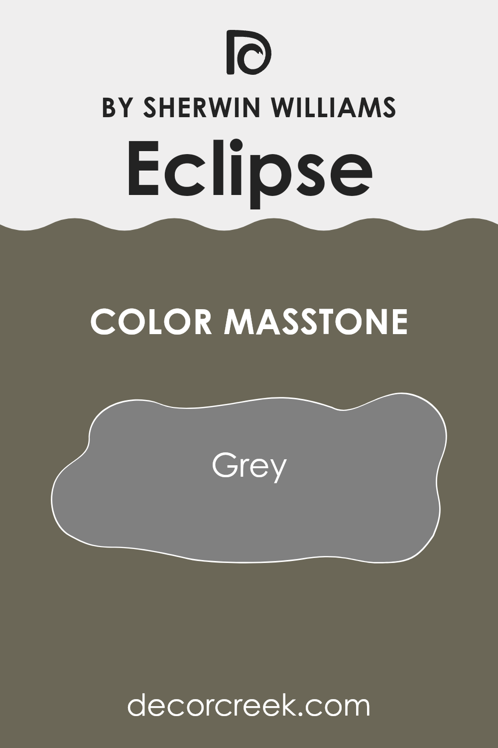
What is the Masstone of the Eclipse SW 6166 by Sherwin Williams?
Eclipse SW 6166 by Sherwin Williams is a popular shade of grey that homeowners often choose for its neutral and balanced appearance. This specific grey, known in technical terms as masstone, resembles the color code #808080. Its mid-tone quality makes it incredibly flexible, fitting well in various parts of the house, from living rooms to bedrooms.
In a home, this shade of grey provides a calm and steady backdrop. It’s neither too dark nor too light, making it easy to pair with all sorts of colors, whether bright accents like blues and yellows or other neutrals. This flexibility is a big plus for those who enjoy changing their decor seasonally or simply prefer a classic look.
Moreover, Grey (#808080) is excellent at hiding minor wall imperfections and is less prone to showing marks and smudges compared to lighter shades. This makes it a practical choice for high-traffic areas and families with kids or pets. Its understated elegance allows you to create a cozy and inviting atmosphere, essential for making a house feel like a home.
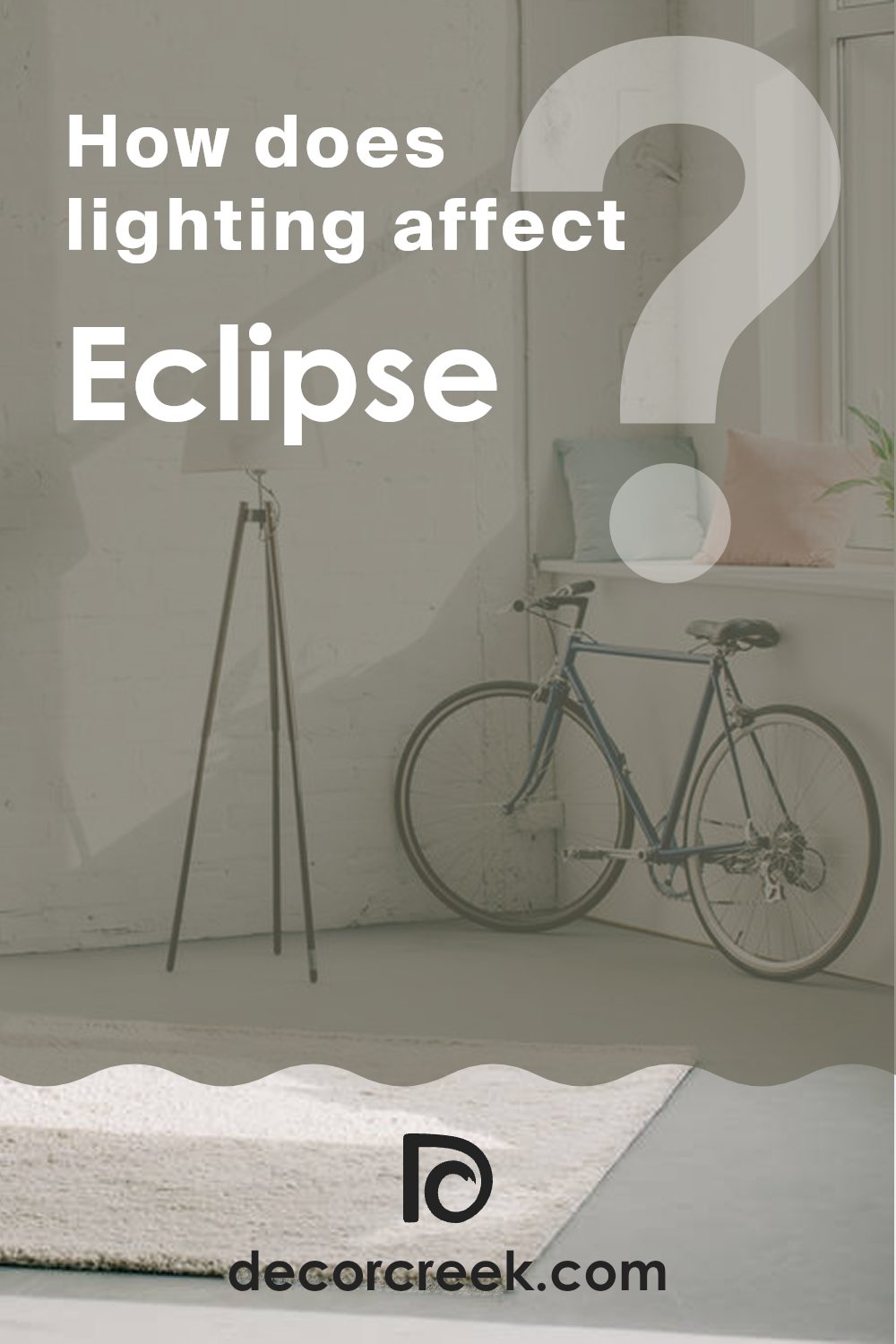
How Does Lighting Affect Eclipse SW 6166 by Sherwin Williams?
Lighting plays a crucial role in how we perceive colors in an environment. The type of light and the direction it comes from can significantly affect the appearance of a color. For example, a paint color like Eclipse by Sherwin Williams can look quite different under various lighting conditions due to its unique undertones.
When it comes to artificial light, the impact on this paint color can vary based on the temperature of the bulb. Warm light bulbs tend to enhance the cozy and inviting qualities of Eclipse, making it appear softer and more muted. Conversely, cool light bulbs might make it appear slightly bolder and more dramatic, by highlighting its deeper undertones.
In natural light, the appearance of Eclipse changes throughout the day and depends heavily on the direction the room faces. In north-facing rooms that receive less direct sunlight, this color can appear more shadowy and profound, bringing out its cooler undertones. This effect might make the room feel more intimate and comfy, especially in areas used for relaxation.
South-facing rooms bathe in abundant natural light most of the day, which can make Eclipse look lighter and warmer, enhancing its width and making the room feel more welcoming and open. This is ideal for living rooms or kitchens where a friendly, airy vibe is desirable.
In east-facing rooms, the morning light can make Eclipse appear bright and lively, perfect for starting the day. However, as the day progresses, the color might lose some of its vibrancy and take on a subtler tone, which can be quite calming.
West-facing rooms will experience the opposite effect; the color might appear duller in the morning but gain richness and depth in the afternoon and evening as it catches the warm sunset light. This dynamic change can add a delightful element of variation to areas used mostly in the afternoon or evening.
Understanding these nuances can help in making informed choices about paint colors in your home to achieve the desired ambiance in any room.
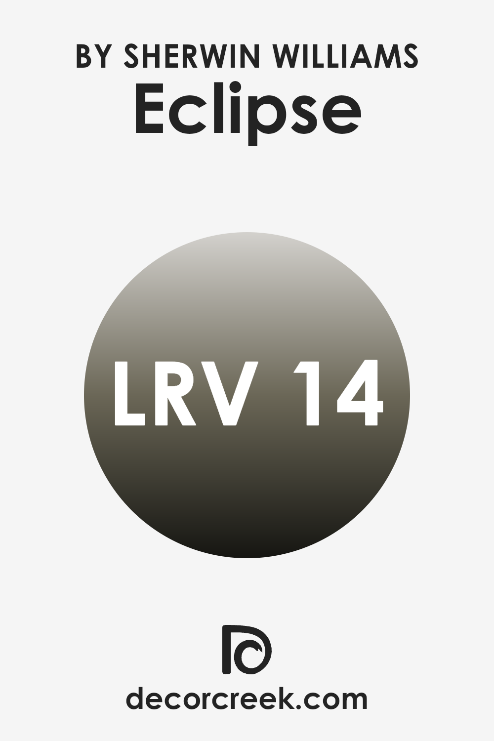
What is the LRV of Eclipse SW 6166 by Sherwin Williams?
LRV stands for Light Reflectance Value, which is a measurement that reveals how much light a color reflects or absorbs. LRV is expressed on a scale where zero means complete absorption of light and nearly 100 indicates total reflection.
This value is crucial when choosing paint colors because it impacts how light or dark a color will appear on your walls. A higher LRV means the color will appear lighter and can make a room feel more open and airy, whereas a lower LRV means the color will appear darker and can make a room feel more enclosed.
With an LRV of 13.59, the color mentioned above is on the darker end of the scale, meaning it absorbs more light than it reflects. This can bring a bold and dramatic look to a room, making it popular for areas where a strong visual impact is desired. However, using this color in a small or dimly lit room might make the room feel smaller or more cramped. Proper lighting will be crucial when using this darker shade, as it can help to mitigate the absorbing effect and add some brightness to the room.
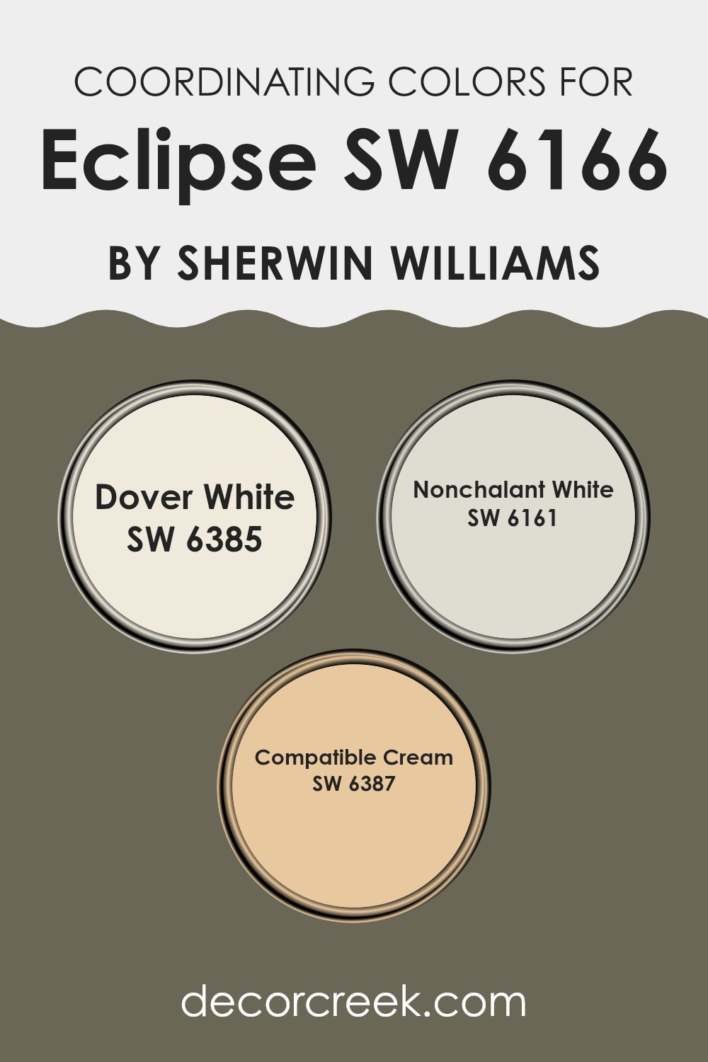
Coordinating Colors of Eclipse SW 6166 by Sherwin Williams
Coordinating colors are shades that complement each other and enhance the overall aesthetic of a room when used together. They are often picked to create a harmonious look, ensuring that no single color overpowers another. For instance, when paired with Eclipse SW 6166 by Sherwin Williams, a deep neutral tone, there are several coordinating colors that can bring balance and subtlety to the decor.
Dover White SW 6385 is a soft, warm white that offers a fresh, clean look. It easily complements the richer hue of Eclipse, providing a gentle contrast that is pleasing to the eye and excellent for trim or ceiling colors to highlight architectural features.
Nonchalant White SW 6161 is another neutral, but with a cooler undertone compared to Dover White. This color is perfect for creating a seamless color flow, adding a sense of calmness without creating stark transitions. Compatible Cream SW 6387 possesses a richer, more golden tone that warms up any room beautifully.
Its creamy texture works well with Eclipse, bringing a cozy and inviting atmosphere to rooms, especially when used on walls or as an accent color. These shades together ensure a cohesive and appealing palette that enhances the room’s character and feel.
You can see recommended paint colors below:
- SW 6385 Dover White
- SW 6161 Nonchalant White
- SW 6387 Compatible Cream
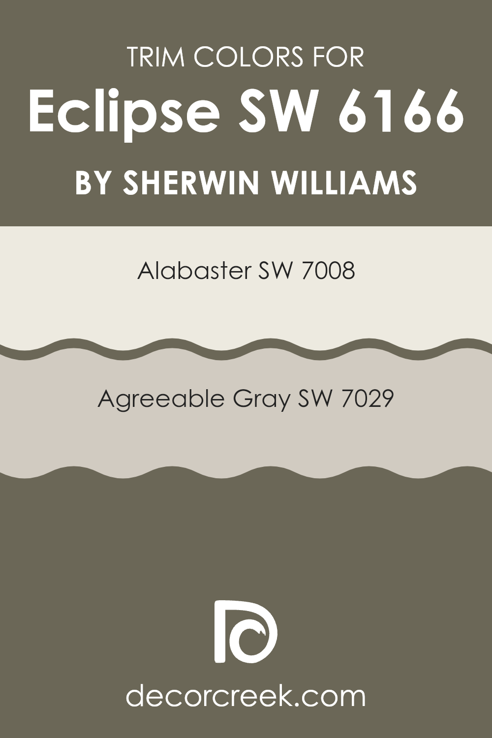
What are the Trim colors of Eclipse SW 6166 by Sherwin Williams?
Trim colors are essential in painting and decorating because they help to define and accentuate the architectural details of a room, such as door frames, window sills, and baseboards. A well-chosen trim color can create a visual framework that complements the wall colors and enhances the overall aesthetic of the room. For a color like EclipseSW 6166 by Sherwin Williams, which is a deep, rich tone, selecting the right trim colors can be crucial in making the room feel balanced and visually appealing.
Using SW 7008 – Alabaster as a trim color offers a crisp, clean contrast to EclipseSW 6166. Alabaster is a light, neutral white that provides a fresh and bright boundary that can make the darker hues pop while also giving the room a more open and airy feel.
On the other hand, SW 7029 – Agreeable Gray as a trim color brings a subtle warmth to the edges of a room colored with EclipseSW 6166. This shade of gray is soft and light, providing a smooth transition that connects the darker walls with the lighter elements in the room, adding a gentle, cohesive look to the room.
You can see recommended paint colors below:
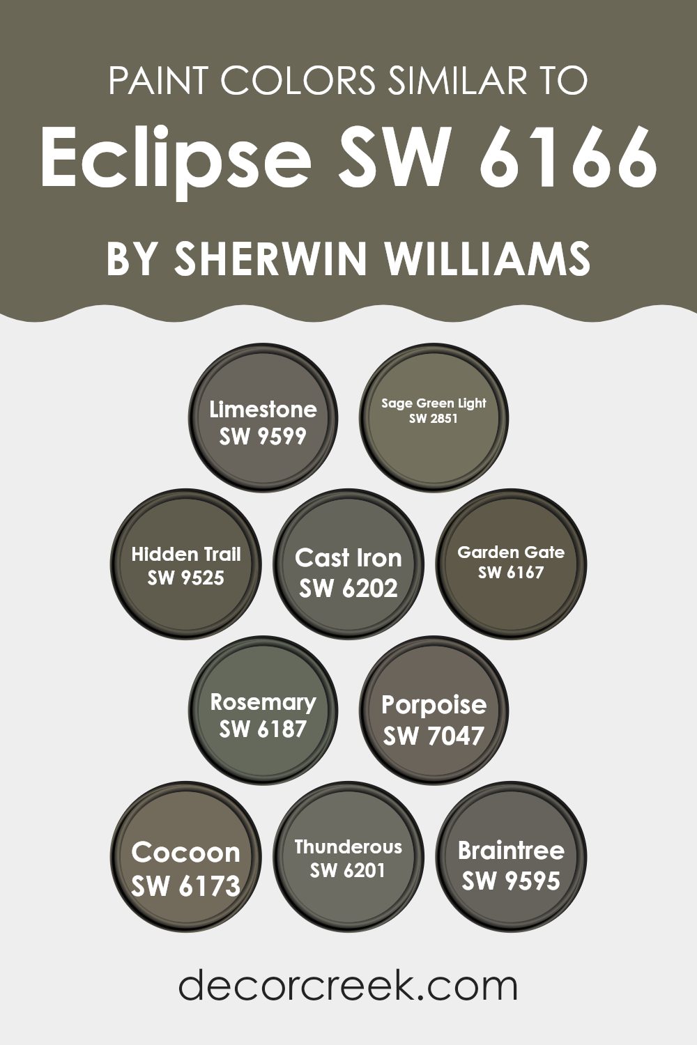
Colors Similar to Eclipse SW 6166 by Sherwin Williams
Using similar colors in design can create a harmonious and aesthetically pleasing environment. These colors, akin to Eclipse by Sherwin Williams, bring consistency and a seamless visual flow to a room. By employing shades that complement each other, designers can achieve a balanced look that gently guides the eye from one area to another without harsh contrasts.
This approach is particularly useful in areas aiming for a cohesive, soothing atmosphere. Colors like Limestone and Sage Green Light are subtle enough to blend with bolder colors like Eclipse, while still holding their character.
The subdued gray of Limestone offers a soft backdrop, ideal for highlighting more vibrant decor elements. Sage Green Light, with its whisper of green, introduces a hint of nature-inspired calmness, making it perfect for areas that aim to be both refreshing and comforting.
Further enhancing the palette, Cast Iron provides a strong, grounding force with its deeper hue, creating a perfect counterpoint to lighter shades. Hidden Trail and Garden Gate add earthy richness, their muted browns creating a warm, inviting feel.
Porpoise and Thunderous introduce a refined neutrality, their gray tones offering a modern twist that can make interiors feel both classic and contemporary. Cocoon adds a unique blend, with its deeper, cozy essence, ideal for areas seeking a touch of intimacy.
Lastly, Rosemary and Braintree enrich the scheme with hints of herbal greens and soft grays, subtly injecting life and movement into the design. These colors together form a flexible palette that can be manipulated to suit various styles and preferences, allowing for a personalized yet cohesive aesthetic.
You can see recommended paint colors below:
- SW 9599 Limestone
- SW 2851 Sage Green Light
- SW 9525 Hidden Trail
- SW 6202 Cast Iron
- SW 6167 Garden Gate
- SW 6187 Rosemary
- SW 7047 Porpoise
- SW 6173 Cocoon
- SW 6201 Thunderous
- SW 9595 Braintree
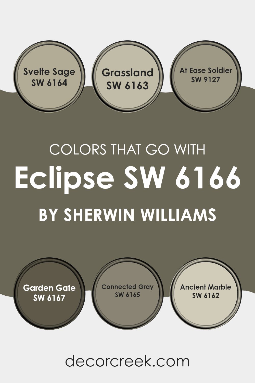
Colors that Go With Eclipse SW 6166 by Sherwin Williams
Choosing the right colors to complement Eclipse SW 6166 from Sherwin Williams is a key way to bring your room together. Colors like Svelte Sage, Grassland, At Ease Soldier, Garden Gate, Connected Gray, and Ancient Marble offer a harmonious palette that can enhance the ambiance and aesthetic of any room. These colors work well together because they blend subtle earthy tones with a sense of calm coherence, making them flexible for various decorating styles, from rustic to modern.
Svelte Sage is a soft, muted green with a hint of gray, giving a gentle, calming feel to areas that need a touch of understated color. Grassland complements it by being a slightly richer shade of green, providing a natural, soothing background that pairs well with wooden furnishings and natural fibers.
At Ease Soldier is a deeper, military-inspired green which is perfect for creating a focal point in a room or adding depth when used on accent walls. Garden Gate is another step deeper, offering a strong, dark green that works beautifully in creating contrast, especially in well-lit areas.
Meanwhile, Connected Gray presents itself as a neutral, mid-tone gray, offering a sturdy, unintrusive base that can support a variety of decor pieces. Lastly, Ancient Marble is a lighter, almost pastel green, offering a fresh and airy feel that is excellent for smaller rooms or as a ceiling color to brighten up the room. All these colors work together to create a cohesive palette that enhances the overall look and feel of rooms styled with EclipseSW 6166.
You can see recommended paint colors below:
- SW 6164 Svelte Sage
- SW 6163 Grassland
- SW 9127 At Ease Soldier
- SW 6167 Garden Gate
- SW 6165 Connected Gray
- SW 6162 Ancient Marble
How to Use Eclipse SW 6166 by Sherwin Williams In Your Home?
Eclipse by Sherwin Williams is a dark, almost charcoal gray paint color that can add a bold touch to any room. It’s ideal for creating a striking contrast when paired with lighter colors like white or soft gray. If you’re thinking of using this color in your home, consider painting one accent wall in Eclipse to make your living room or bedroom stand out. This can also help in making your room look more dynamic without overpowering it with a very dark shade on all walls.
For those who want a modern look or a cozy feel, using Eclipse on kitchen cabinets or bathroom vanities can be a great choice. It complements metallic fixtures and works well with natural wood or stone elements, allowing you to have a stylish room.
Furthermore, entryways or corridors painted in Eclipse can make your home feel warm and welcoming, suggesting an inviting room right from the door. This color is also durable and hides scuffs well, making it practical for busy areas.
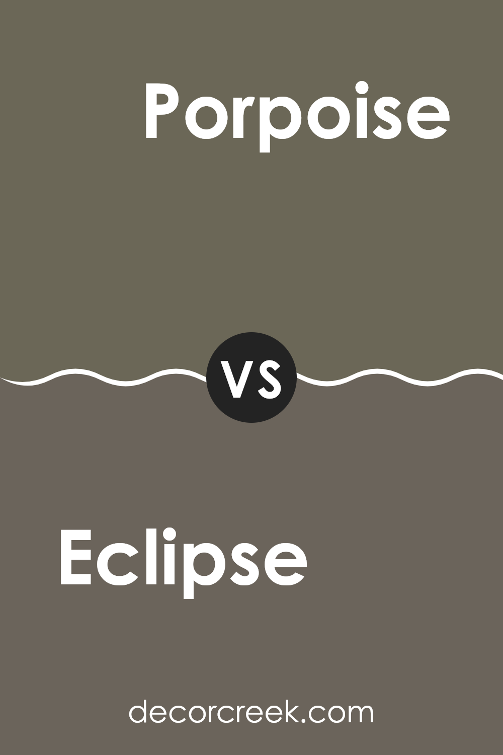
Eclipse SW 6166 by Sherwin Williams vs Porpoise SW 7047 by Sherwin Williams
Eclipse and Porpoise are two different shades from Sherwin Williams. Eclipse is a darker, grey tone that can give a room a more closed, cozy feeling. It works well in areas where you want to create a sense of comfort and quiet, like bedrooms or study rooms.
On the other hand, Porpoise is a lighter grey that has a hint of warmth. This color is flexible and can make small areas appear larger and more open.
It’s a great choice for living rooms or kitchens where you want a friendly, welcoming atmosphere. Both colors pair well with bright or soft accents and can adapt to various decor styles, but they set very different moods in a room due to their underlying tones.
You can see recommended paint color below:
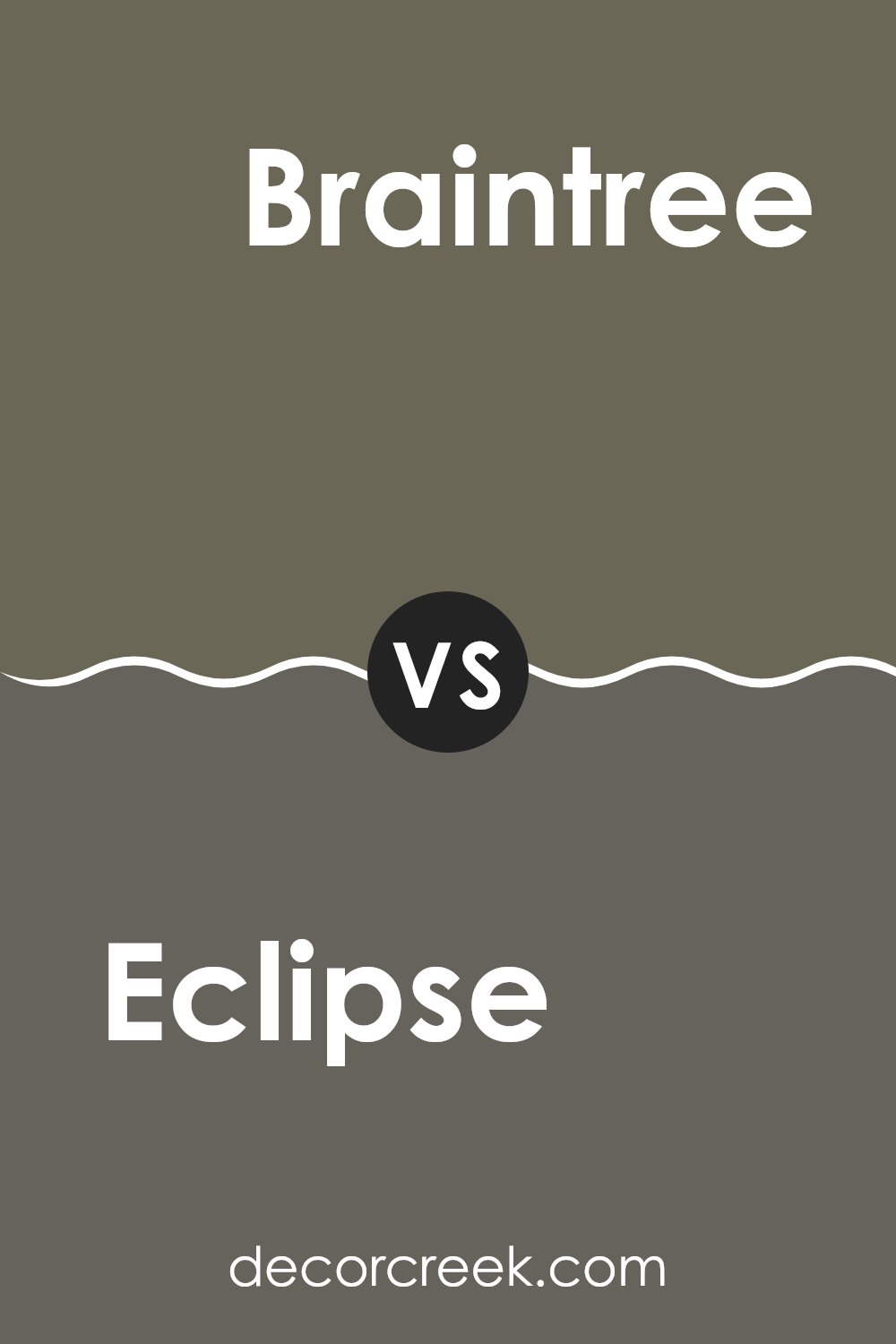
Eclipse SW 6166 by Sherwin Williams vs Braintree SW 9595 by Sherwin Williams
Eclipse and Braintree by Sherwin Williams are both unique shades that can add different vibes to a room. Eclipse is a deep, dark gray that almost leans towards black. It’s perfect for creating a bold, strong look in a room, maybe for an accent wall or cabinets to make a statement.
On the other hand, Braintree is a much lighter, soft gray with a hint of warmth. This color is great for those who prefer a more subtle and gentle ambiance in their surroundings. It can make small rooms appear larger and brighter.
When comparing these two, Eclipse offers a more dramatic and impactful presence, whereas Braintree provides a gentle, calming backdrop. Both colors are flexible and can be used in various styles of interior décor, depending on the mood you want to create.
You can see recommended paint color below:
Eclipse SW 6166 by Sherwin Williams vs Garden Gate SW 6167 by Sherwin Williams
Eclipse and Garden Gate, both by Sherwin Williams, are closely related in their darker, soothing tones, perfect for creating a cozy atmosphere in any room. Eclipse is a deep, almost charcoal gray that brings to mind a quiet night sky.
It’s an excellent choice for areas where you want a strong, grounding color that still feels warm. On the other hand, Garden Gate is slightly lighter and incorporates more brown undertones, offering a softer and more earthy feel.
This color could be great for areas where you would like a bit of darkness and richness without going too bold. Used together, they could complement each other well in a room, providing a harmonious blend with just enough contrast to add visual interest. Both are flexible colors that can work beautifully across various rooms, enhancing the decor without overpowering it.
You can see recommended paint color below:
- SW 6167 Garden Gate
Eclipse SW 6166 by Sherwin Williams vs Rosemary SW 6187 by Sherwin Williams
Eclipse and Rosemary are two distinct paint colors offered by Sherwin Williams. Eclipse is a deep, dark gray with a sense of weight and depth, making it suitable for areas where a strong, assertive feel is desired. It works well in areas like living rooms or on accent walls, providing a solid, grounding backdrop.
On the other hand, Rosemary is a green hue that leans towards a natural, earthy palette. It evokes the feeling of walking through a lush forest and brings a warm, welcoming vibe to any room. This color is perfect for bedrooms, or studies, or any room where a calming, nature-inspired touch is beneficial.
When used together, these colors can create a balanced and harmonious look, with Rosemary adding warmth to the coolness of Eclipse, offering a pleasing contrast ideal for many interior design styles.
You can see recommended paint color below:
Eclipse SW 6166 by Sherwin Williams vs Hidden Trail SW 9525 by Sherwin Williams
Eclipse and Hidden Trail, both from Sherwin Williams, are distinct in their hues and vibes. Eclipse is a deep, dark gray that almost borders on black. It’s a solid choice if you want a strong, bold look in a room, offering a backdrop that makes lighter colors pop out sharply.
On the other hand, Hidden Trail is a warm beige that gives off a soft, welcoming feel. It creates a subtle, cozy atmosphere, perfect for areas where comfort is a priority like living rooms or bedrooms.
Their contrasting natures mean that Eclipse works great as an accent or for dramatic flair, while Hidden Trail is ideal for a gentle, calming environment. Together, they could combine for a balanced visual experience, with the darkness of Eclipse grounding the lightness of Hidden Trail.
You can see recommended paint color below:
Eclipse SW 6166 by Sherwin Williams vs Cast Iron SW 6202 by Sherwin Williams
Eclipse and Cast Iron, both from Sherwin Williams, differ subtly yet noticeably in their shades and overall impact. Eclipse is a deep, dark gray that mimics the color of the night sky just before it turns completely black. This shade is calm and somewhat moody, making it a great choice for areas designed to offer a sense of quiet and retreat.
On the other hand, Cast Iron is a shade darker than Eclipse, leaning closer to a true, deep black. It offers a stronger, bolder presence, perfect for creating drama and intensity in a room. This color can anchor a room by giving it depth and focus, especially in areas with ample natural light or as an accent wall in a lighter room.
Both colors, while similar, serve different purposes based on how dark or prominent you want the room’s features to be. Eclipse works well as a softer dark tone, whereas Cast Iron provides stark, powerful contrast.
You can see recommended paint color below:
- SW 6202 Cast Iron
Eclipse SW 6166 by Sherwin Williams vs Cocoon SW 6173 by Sherwin Williams
Eclipse and Cocoon, both by Sherwin Williams, offer distinct vibes for a room. Eclipse is a darker gray, almost bordering on black, providing a strong and solid feel to walls. This color is great if you want to add some drama or a sense of boldness to your room. It pairs well with bright accents or furniture, which can lighten the mood without losing the impact of the dark backdrop.
On the other hand, Cocoon is a softer, warm gray with a hint of brown. This shade is much lighter than Eclipse, making it more flexible and airy. It’s excellent for creating a cozy atmosphere in areas like living rooms or bedrooms, where you might want a more welcoming and relaxed feel.
In terms of pairing and styling, Cocoon is easier to blend with a wide range of decoration themes due to its neutrality and softness, while Eclipse demands more careful consideration to balance its depth and intensity. Each offers a unique touch, whether you’re looking for drama or comfort.
You can see recommended paint color below:
- SW 6173 Cocoon
Eclipse SW 6166 by Sherwin Williams vs Sage Green Light SW 2851 by Sherwin Williams
Eclipse is a dark, nearly black shade that offers a strong, bold look, perfect for making a dramatic statement in any room. It absorbs light due to its depth, making areas feel cozier and more intimate, ideal for areas like bedrooms or living rooms where a calming, yet powerful ambiance is desired.
On the other hand, Sage Green Light is a much softer, lighter color. As a pale green, it has a fresh and clean appearance that can make rooms feel more open and airy. This color is great for areas where you want to promote a sense of calm without making the room feel too closed off.
When comparing these colors, Eclipse provides a striking contrast against brighter hues and works well in a color scheme that includes sharp, clear colors to bring out its depth. Sage Green Light is easier to blend with various decor elements, offering flexibility in designing a room with a more gentle and welcoming vibe.
You can see recommended paint color below:
Eclipse SW 6166 by Sherwin Williams vs Limestone SW 9599 by Sherwin Williams
Eclipse and Limestone by Sherwin Williams are two unique colors that bring their own distinct qualities to a room. Eclipse is a deep, dark gray that often appears almost like a soft black. This color is perfect for adding a touch of drama and modern feel to any room, especially when used on accent walls or for trim. It pairs well with bright colors and metallic finishes, offering a striking contrast.
Limestone, on the other hand, is much lighter, featuring a warm gray tone that mimics the natural look of stone. This color is very adaptable and provides a calm, cozy atmosphere to interiors. It’s excellent for areas where you want to foster a relaxed and inviting vibe, such as living rooms and bedrooms.
Together, these colors can create a balanced palette in a home, with Eclipse adding boldness and grounding elements, while Limestone keeps the environment light and airy.
You can see recommended paint color below:
Eclipse SW 6166 by Sherwin Williams vs Thunderous SW 6201 by Sherwin Williams
“Eclipse” and “Thunderous” are two interesting paint colors by Sherwin Williams. “Eclipse” is a deep, almost charcoal gray that brings a strong and bold feel to any room. It’s dark enough to make a statement yet neutral enough to be flexible in various decorating styles.
On the other hand, “Thunderous” is a softer, medium gray shade with a bit more warmth. This color can make rooms feel cozy and inviting without being too dark. When comparing these two, “Eclipse” would be a better choice for making dramatic changes, perfect for an accent wall or cabinets.
Meanwhile, “Thunderous” works well for larger areas like living room walls since it keeps the room feeling light and open. Both colors go well with other hues, making them practical options for interior design.
You can see recommended paint color below:
- SW 6201 Thunderous
To wrap up, I think SW 6166 Eclipse by Sherwin Williams is a fantastic paint color. It’s a really dark gray that looks almost like the color of the night sky, which can make any room feel cozy and just a bit mysterious. I’ve seen pictures of rooms painted with Eclipse, and they always look super stylish and modern.
Using Eclipse in your home could be a great idea if you like colors that are not too bright but still have a lot of characters. It works well in places like bedrooms or living rooms where you want a calm and relaxing vibe. Plus, it pairs nicely with lots of other colors, so you can have fun picking out furniture and decorations that go with it.
Overall, Eclipse by Sherwin Williams seems like a great choice if you’re thinking about trying a new paint color in your house. It’s cool, easy to match with other things, and can make your room look amazing. Definitely think about this color the next time you want to freshen up your room!
Ever wished paint sampling was as easy as sticking a sticker? Guess what? Now it is! Discover Samplize's unique Peel & Stick samples.
Get paint samples

