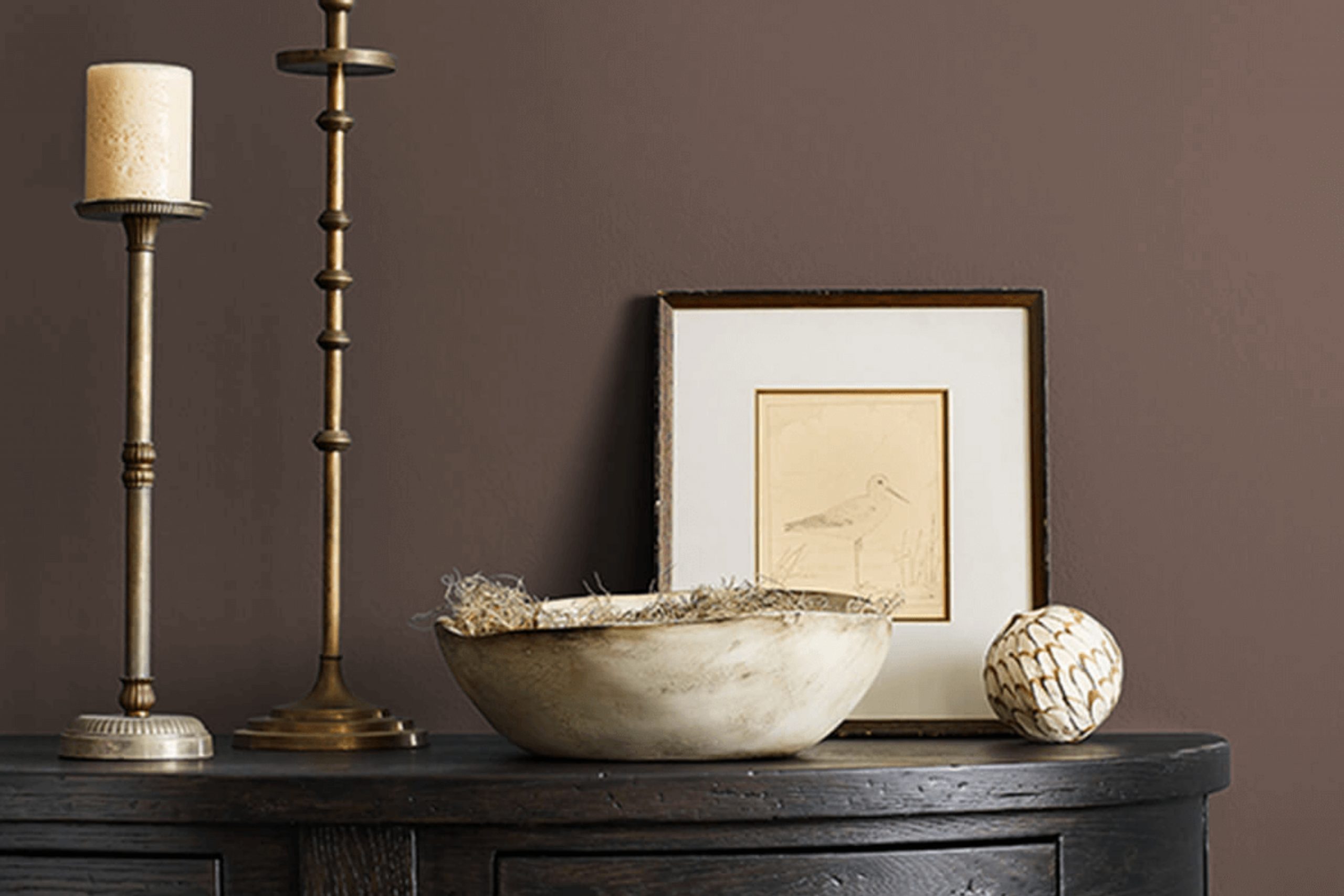
There’s something about SW 7510 Chateau Brown by Sherwin Williams that immediately draws you in. It’s a shade that feels both timeless and current, providing a sense of warmth and sophistication. With this color, spaces are wrapped in a comforting embrace that feels like a gentle nod to nature.
You might notice how easily it grounds a room. Whether applied in a cozy living area, a serene bedroom, or a classic office space, Chateau Brown brings a sense of calm and balance. It isn’t imposing but instead offers a strong, steady presence that invites relaxation.
It’s easy to imagine this color complementing a variety of design styles. Paired with lighter tones, it can highlight the finer details of a room, while darker accents can enhance its richness. The versatility of Chateau Brown becomes apparent, acting as both a peaceful backdrop and an intriguing focal point.
With SW 7510 Chateau Brown, your environment can feel more cohesive and inviting. It’s a choice that seems to gently whisper elegance and comfort, seamlessly blending with numerous aesthetics while still standing out in its unique way.
What Color Is Chateau Brown SW 7510 by Sherwin Williams?
Chateau Brown by Sherwin Williams is a rich, warm brown color with a touch of elegance. This shade combines earthy tones with subtle hints of red, giving it a cozy and inviting feel. It’s a versatile color that can be used in various interior styles but shines particularly in traditional, rustic, and modern farmhouse settings. Chateau Brown brings a sense of comfort and warmth, making it ideal for living rooms, libraries, or bedrooms where coziness is valued.
This color pairs beautifully with natural materials like wood and stone. In a space with wooden beams or a stone fireplace, Chateau Brown complements these elements and creates a harmonious environment. It also works well with leather furniture, adding a timeless and classic touch. For textiles, consider pairing this color with natural fibers such as wool or cotton in neutral or warm tones, which can enhance the warmth of the color.
Accent colors like soft creams, muted greens, or deep burgundy can balance Chateau Brown and bring subtle contrast. Use these in pillows, throws, or artwork for added interest. Overall, Chateau Brown is a steadfast choice for creating a warm and welcoming atmosphere in the home.
Is Chateau Brown SW 7510 by Sherwin Williams Warm or Cool color?
Chateau Brown by Sherwin Williams is a rich, warm color that can bring a welcoming feel to any home. This shade of brown has a grounding quality, making spaces feel cozy and comfortable. It works well in living rooms and dining areas, where warmth and a bit of elegance are often desired. Because it’s a medium to dark tone, it pairs nicely with lighter, neutral colors, offering a nice contrast that can make both colors stand out.
In bedrooms, Chateau Brown creates a snug and intimate atmosphere, perfect for relaxation. When used in décor, it can highlight wooden furniture and bring out the natural beauty of other materials. Under both natural and artificial light, this color maintains its warm quality, ensuring a consistent look throughout the day.
Overall, Chateau Brown is versatile, combining well with different styles and adding depth to any space without being overpowering. It’s a color that can adapt to various settings, making it a favorite for many homeowners.
Undertones of Chateau Brown SW 7510 by Sherwin Williams
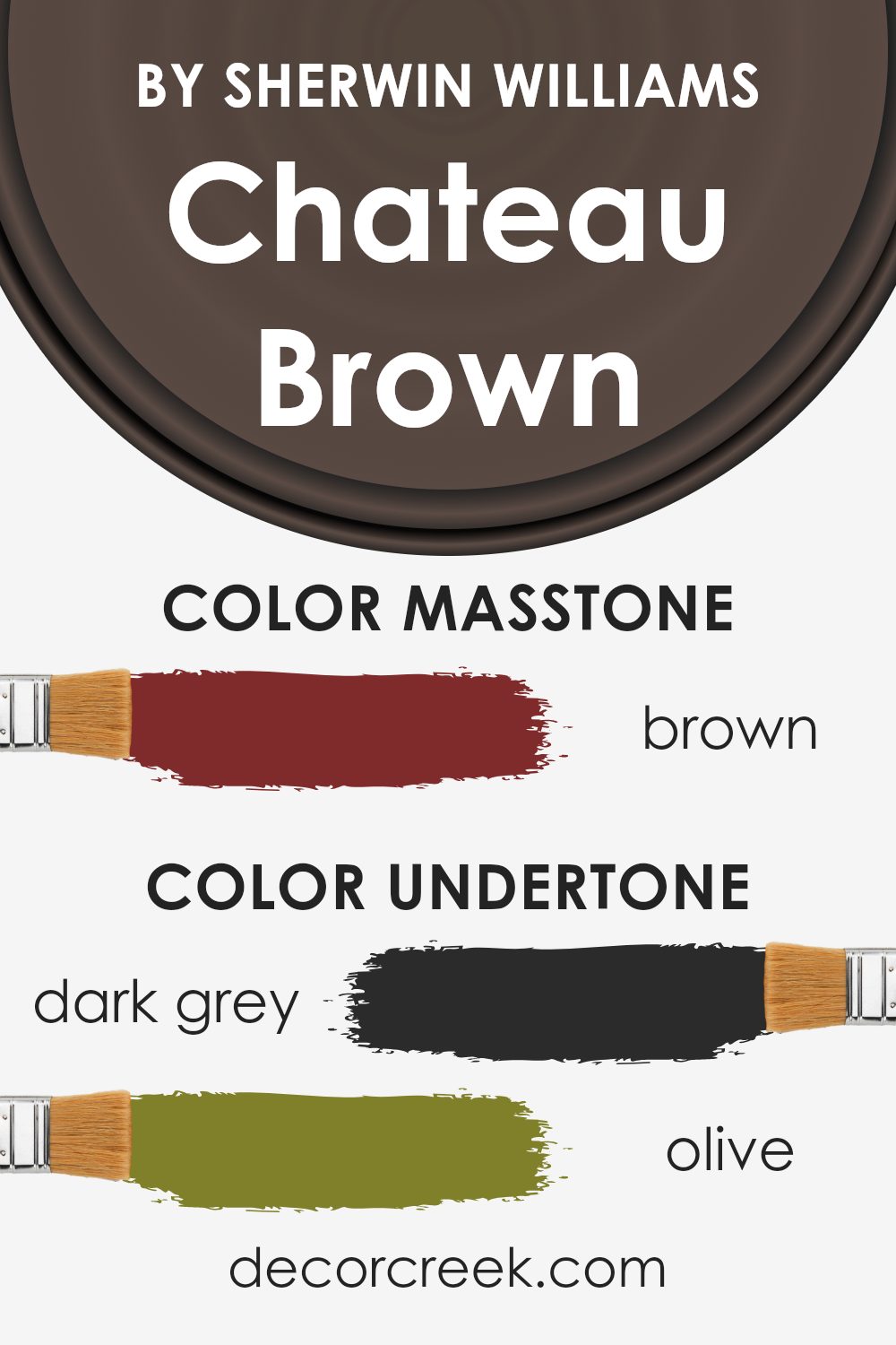
Chateau Brown by Sherwin-Williams is a complex color that exhibits a range of undertones, including dark grey, olive, dark green, purple, navy, grey, dark turquoise, red, orange, pink, and pale pink. These undertones influence how we perceive Chateau Brown in different settings and lighting conditions.
Depending on the lighting, the color can appear warmer or cooler. For example, if the light in a room has a warmer tone, the orange and red undertones might become more prominent, giving the walls a cozier feel. Conversely, in a cooler light setting, the grey, dark green, or navy undertones might stand out, making the space feel more restrained.
The presence of olive and dark green gives Chateau Brown an earthy quality, while the traces of purple and navy lend depth and complexity. This mix of undertones means that the paint color can complement a variety of styles and furnishings. It pairs well with natural materials like wood or stone, which can enhance the olive and dark green undertones.
The subtlety of the pale pink undertones can make a space feel softer, while the bolder elements like dark turquoise and red can add visual interest and energy. Ultimately, the way Chateau Brown looks depends heavily on its surroundings and the ambient light, making it a versatile choice.
What is the Masstone of the Chateau Brown SW 7510 by Sherwin Williams?
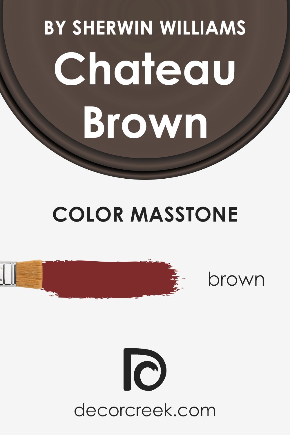
Chateau Brown, identified by the code SW 7510, is a warm brown color from Sherwin Williams. Its masstone, which is the main color you see, is a rich brown (#802B2B). This hue can significantly influence the ambiance of a home. Its deep natural tones make it a versatile choice for various spaces, providing a sense of comfort and coziness.
In living rooms, it can create an inviting and warm atmosphere, making guests feel relaxed. In dining areas, it offers a backdrop that enhances social gatherings, making meals feel both casual and intimate. The masstone brown adds depth to walls and can be paired with lighter shades or natural materials for a balanced look.
Using this color in bedrooms can help create a restful environment, ideal for unwinding. The earthy tone lends itself to both traditional and modern styles, enhancing the overall aesthetic without being overwhelming.
How Does Lighting Affect Chateau Brown SW 7510 by Sherwin Williams?
Lighting dramatically influences how colors appear in a room. The appearance of a paint color can change based on the type, direction, and intensity of light. Consider Chateau Brown by Sherwin Williams, a warm and rich brown. Its appearance will vary significantly depending on the lighting conditions.
In natural light, Chateau Brown appears deep and warm. However, the direction in which the room faces can alter its appearance. In north-facing rooms, which tend to have cooler and softer light, Chateau Brown may look a bit darker and cooler. The lack of direct sunlight means the color might appear more muted and subdued. It maintains its richness but can appear more understated.
In south-facing rooms, the strong, warm sunlight makes Chateau Brown appear brighter and more vibrant. The abundance of natural light enhances the warmth of the color, making it feel more inviting and cozy. This direction brings out the warmth in Chateau Brown, making it an excellent choice for rooms that are used frequently during the day.
East-facing rooms receive direct sunlight in the morning, and Chateau Brown will appear warm and glowing in the early hours. As the sun moves, the light becomes indirect, and the color may take on a slightly cooler aspect in the afternoon, though it still retains its overall warmth.
West-facing rooms have the opposite light pattern. In the morning, the light is indirect, making Chateau Brown appear darker and more muted. However, as the sun sets, the light becomes warmer and more direct, enhancing the rich, warm tones of the color, resulting in a cozy and welcoming atmosphere.
Overall, both artificial and natural light will affect how Chateau Brown appears in a room. Pairing the color with different light sources will produce varying results, which allows for flexibility and creativity in achieving the desired mood and ambiance.
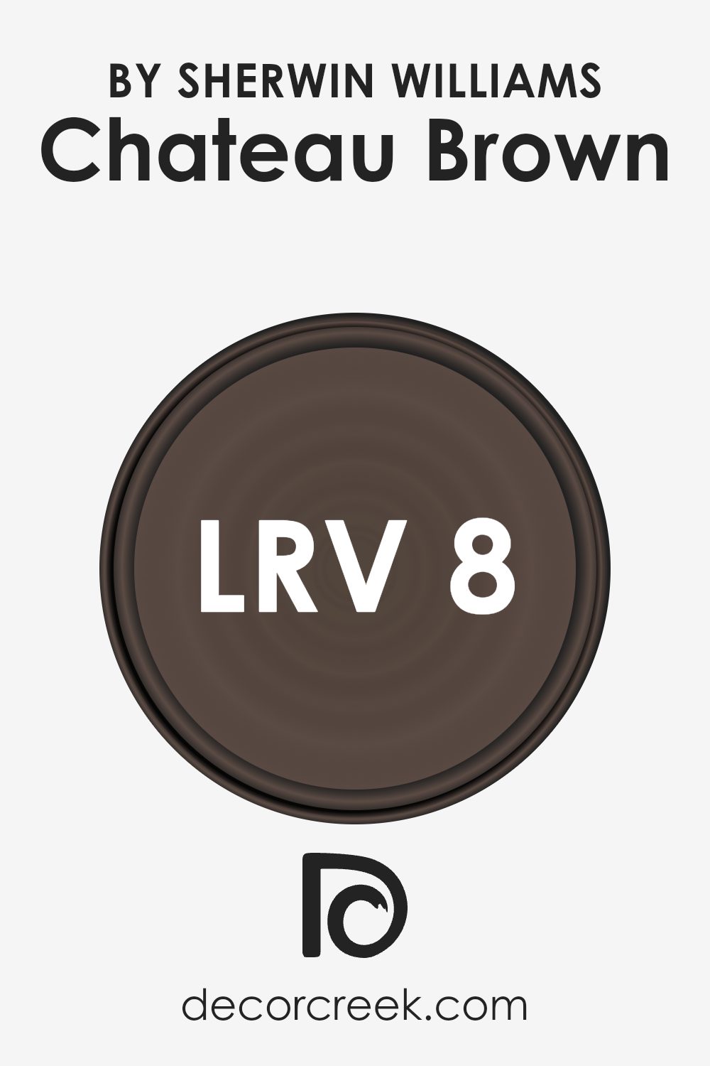
What is the LRV of Chateau Brown SW 7510 by Sherwin Williams?
LRV stands for Light Reflectance Value, and it measures how much light a color reflects or absorbs. The scale runs from 0 to 100, with 0 being absolute black, which reflects no light, and 100 being pure white, which reflects most of the light. Colors with a low LRV absorb more light, making them appear darker and potentially making a room feel more intimate and cozy.
In contrast, colors with a high LRV reflect more light, which can make a space feel larger and more open. The LRV is important when choosing paint colors because it influences how bright or dark a space will feel and how the color will look under different lighting conditions.
Chateau Brown by Sherwin Williams has an LRV of 7.607, indicating that it is a very dark color. This low LRV means that Chateau Brown absorbs most of the light that hits it, making it appear quite rich and deep on walls. In a room, this color will create a dramatic and intimate atmosphere, giving the space a warm and cozy feeling.
However, because it reflects little light, it may make a room appear smaller, especially if the space does not have a lot of natural light. To balance its depth, it can be paired with lighter colors or used as an accent in certain areas to create visual interest without overwhelming a room.
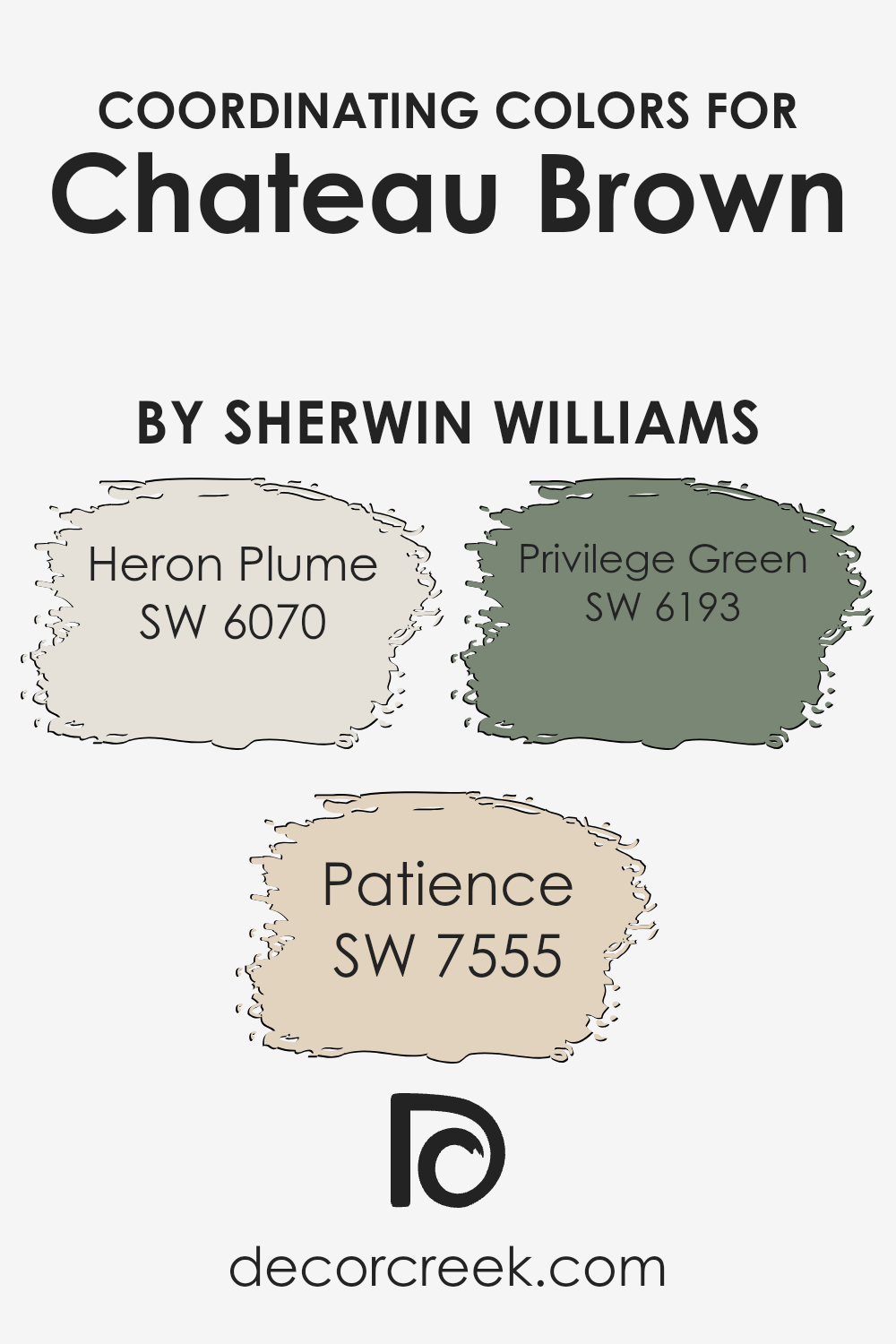
Coordinating Colors of Chateau Brown SW 7510 by Sherwin Williams
Coordinating colors are chosen to complement and enhance a primary color, creating a harmonious palette. When paired with Chateau Brown, a rich and warm shade by Sherwin Williams, the coordinating colors Heron Plume, Patience, and Privilege Green work beautifully together. Heron Plume SW 6070 is a soft, light greige that adds a touch of subtle elegance, balancing the depth of Chateau Brown with its gentle neutrality. It brings lightness and a refined backdrop when used on walls or furniture.
Patience SW 7555, a warm off-white, adds an inviting and cozy feel to the palette. Its warmth complements the richness of Chateau Brown, making it ideal for spaces where comfort and goodwill are paramount.
Privilege Green SW 6193 offers a muted, earthy tone that adds freshness and a natural touch to the scene. It pairs well with the warm base of Chateau Brown while providing a hint of color that is calm and grounding. Together, these colors create a balanced and cohesive look, offering variety while maintaining a unified appearance in a room.
You can see recommended paint colors below:
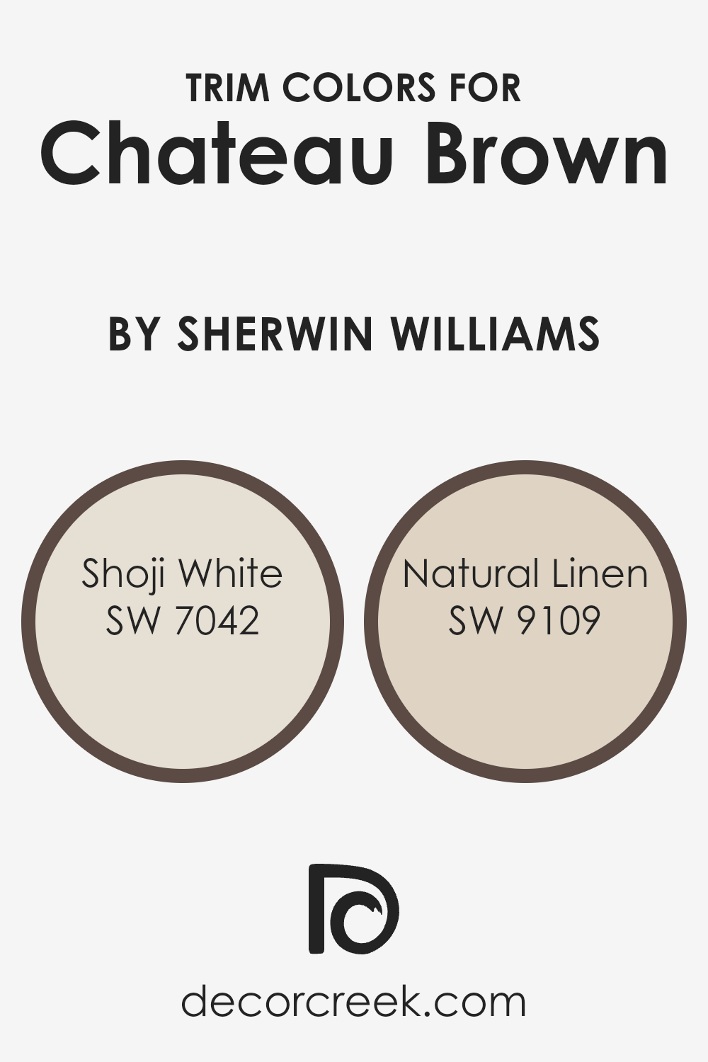
What are the Trim colors of Chateau Brown SW 7510 by Sherwin Williams?
Trim colors are the colors used on the edges and borders of walls, such as door frames, window sills, and baseboards. They help to define and highlight these areas, giving a room a more polished and complete look. Trim colors are important because they create contrast and can make wall colors stand out more.
For a color like Chateau Brown from Sherwin Williams, using the right trim colors can enhance its warm, earthy tones, and provide a balanced, cohesive aesthetic. By carefully selecting trim colors, you can change the visual dynamics of a space without overwhelming it.
Shoji White is a soft, creamy off-white that brings a clean, subtle warmth to any room, which can beautifully complement the richness of Chateau Brown. It adds a touch of brightness without clashing with darker tones. On the other hand, Natural Linen is a gentle, beige-like neutral that enriches spaces with its understated elegance. It offers a softer transition compared to stark white trim, ensuring your room feels inviting and harmonious when paired with the earthy hue of Chateau Brown.
You can see recommended paint colors below:
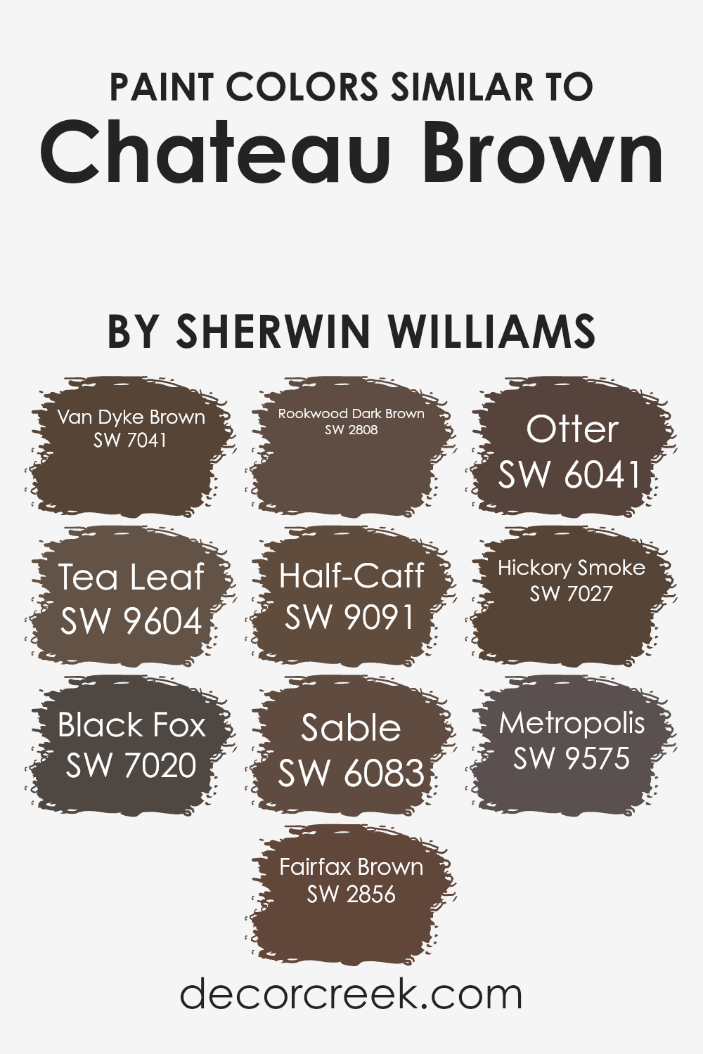
Colors Similar to Chateau Brown SW 7510 by Sherwin Williams
Similar colors play a crucial role in creating a cohesive and harmonious design scheme, as they provide visual continuity and can enhance the overall aesthetic of a space. When using colors similar to Chateau Brown by Sherwin Williams, they can seamlessly blend together to create a warm and inviting atmosphere.
Each of these colors has its unique qualities that complement Chateau Brown. Van Dyke Brown offers a deep, rich tone that adds depth, while Tea Leaf brings a softer, earthy feel perfect for a cozy environment. Black Fox introduces a dark, neutral shade that pairs well with lighter tones for a balanced look. Fairfax Brown provides a classic, timeless warmth, making it versatile for both modern and traditional spaces.
Rookwood Dark Brown carries a historic charm, with a darker hue that grounds a space. Half-Caff offers a lighter, more muted color that can subtly enhance the richness of brown tones without overwhelming. Sable brings a soft, elegant brown ideal for creating a comforting and intimate atmosphere. Otter carries a neutral, earthy note that works well in blending spaces naturally.
Hickory Smoke, with its subtle gray undertones, adds a sophisticated touch, and Metropolis has a muted quality that complements a wide range of design styles. By choosing similar colors like these, you can create depth and interest without overpowering the main hue.
You can see recommended paint colors below:
- SW 7041 Van Dyke Brown
- SW 9604 Tea Leaf
- SW 7020 Black Fox
- SW 2856 Fairfax Brown
- SW 2808 Rookwood Dark Brown
- SW 9091 Half-Caff
- SW 6083 Sable
- SW 6041 Otter
- SW 7027 Hickory Smoke
- SW 9575 Metropolis
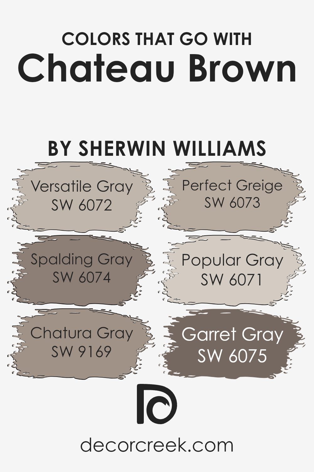
Colors that Go With Chateau Brown SW 7510 by Sherwin Williams
Selecting colors that complement Chateau Brown (SW 7510) is crucial for creating a cohesive and welcoming space. These colors enhance the warmth and depth of Chateau Brown, offering a balanced and harmonious look. Pairing it with Versatile Gray (SW 6072) introduces a light and adaptable shade that brings in a sense of brightness and neutrality.
Meanwhile, Spalding Gray (SW 6074) has a deeper tone, adding a touch of elegance and contrast that enriches the environment. Chatura Gray (SW 9169) offers a modern feel. It provides a subtle yet distinct undertone, tying together various elements of a room.
Perfect Greige (SW 6073) blends the warmth of beige with the coolness of gray, creating a comfortable backdrop that suits a variety of styles. Popular Gray (SW 6071) is a lighter, more muted option that quietly complements other colors, lending an airy quality to the space.
Lastly, Garret Gray (SW 6075) is a medium-toned gray that provides a grounded feeling, making the room feel more intimate. Together, these shades work seamlessly with Chateau Brown, ensuring a well-curated look that feels both fresh and timeless. Choosing the right companion colors can really enhance the overall ambiance and visual appeal of the space.
You can see recommended paint colors below:
- SW 6072 Versatile Gray
- SW 6074 Spalding Gray
- SW 9169 Chatura Gray
- SW 6073 Perfect Greige
- SW 6071 Popular Gray
- SW 6075 Garret Gray
How to Use Chateau Brown SW 7510 by Sherwin Williams In Your Home?
Chateau Brown (SW 7510) by Sherwin Williams is a rich and earthy paint color that brings a warm and cozy feeling to any space. With its deep brown tone, it can easily be used to create an inviting and grounded atmosphere in various areas of the home.
In living rooms, Chateau Brown can add depth and comfort, making it a great choice for accent walls or entire rooms. This color pairs well with neutral furniture, such as beige or cream, and can be complemented with metallic accents, like gold or bronze, for a touch of warmth.
In addition, using Chateau Brown in a dining room can create a pleasant and intimate setting, perfect for family gatherings and dinners. For bedrooms, the color’s warmth can promote relaxation and restfulness. Pairing it with soft textiles and natural materials can enhance the cozy effect.
Overall, Chateau Brown is a versatile choice that brings a natural, welcoming vibe to the home.
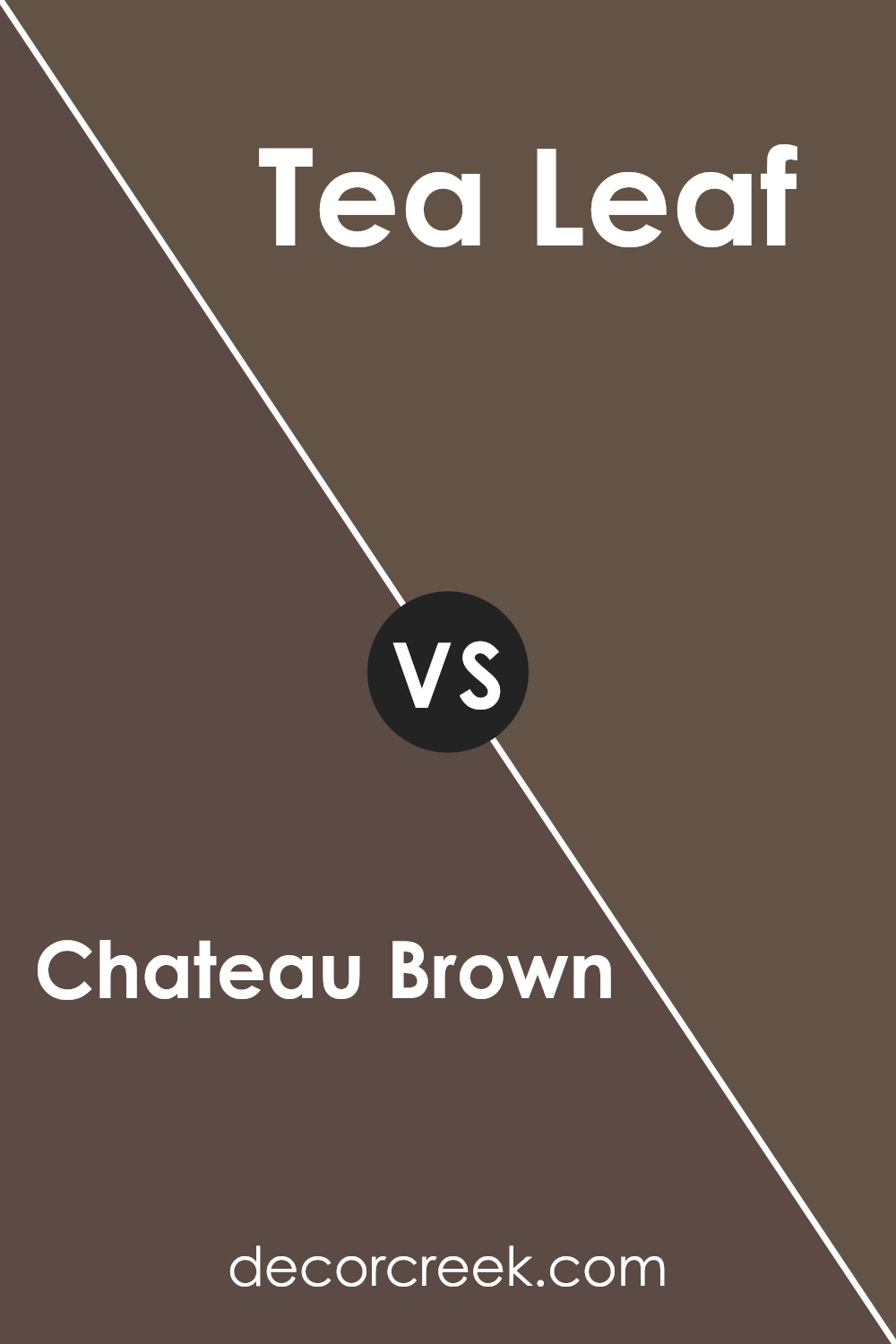
Chateau Brown SW 7510 by Sherwin Williams vs Tea Leaf SW 9604 by Sherwin Williams
Chateau Brown and Tea Leaf are two colors by Sherwin Williams that offer distinct vibes. Chateau Brown is a warm, rich brown that resembles chocolate. It’s cozy, making it perfect for creating an inviting space. This color works well in living rooms or dining areas, where warmth and comfort are desired.
Tea Leaf, on the other hand, is a gentle, muted green. It brings a touch of nature indoors, reminiscent of soft foliage. This color is calming, making it suitable for bedrooms or study areas where relaxation and focus are important.
When comparing the two, Chateau Brown is more intense and dramatic, while Tea Leaf has a lighter, more soothing presence. Combining them could create an interesting balance, with the brown providing depth and the green offering a refreshing contrast. Both colors bring unique qualities to a space, allowing for versatile applications depending on the mood you wish to create.
You can see recommended paint color below:
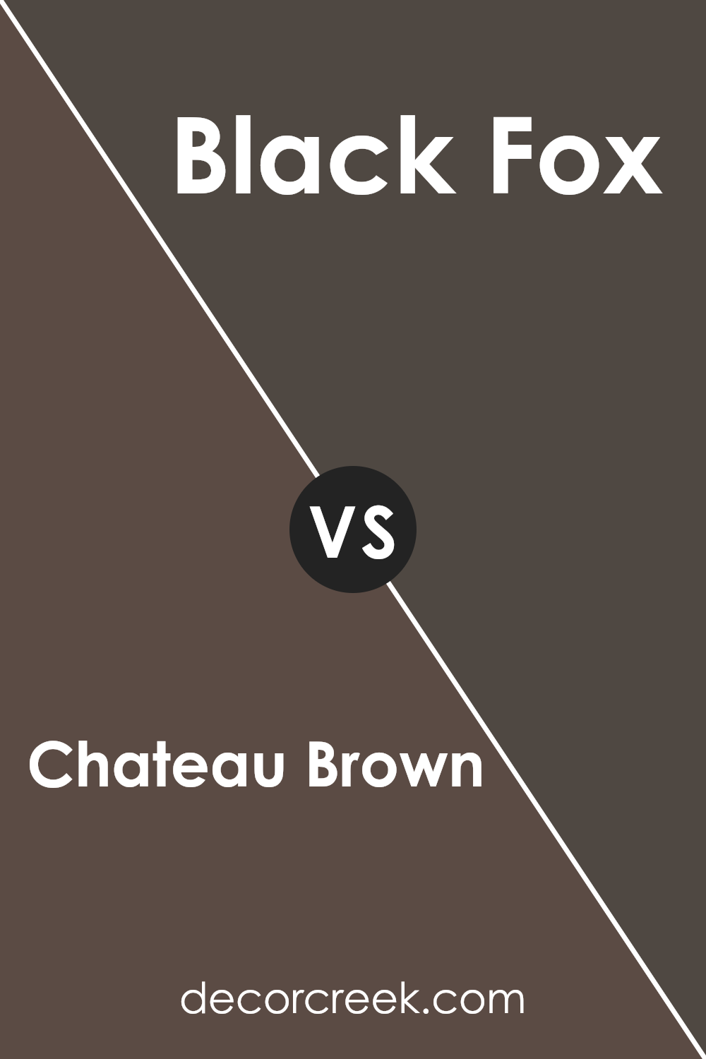
Chateau Brown SW 7510 by Sherwin Williams vs Black Fox SW 7020 by Sherwin Williams
Chateau Brown SW 7510 by Sherwin Williams is a warm, rich brown color. It has a comforting and grounded feel, perfect for creating cozy and inviting spaces. It works well in living rooms, dens, or any area where you want a sense of warmth and stability. The color has a subtle earthy tone that pairs nicely with natural materials and brings a touch of rustic charm.
Black Fox SW 7020 is a dark and dramatic color, a deep charcoal with brown undertones. It offers a bold contrast and is excellent for adding depth to a space. Black Fox can be used as an accent wall or for cabinetry to create a stylish, modern look. It’s versatile enough to act as a neutral backdrop while making a strong statement.
When comparing the two, Chateau Brown is warmer and softer, while Black Fox is darker and more intense. Together, they can create a balanced, harmonious palette.
You can see recommended paint color below:
Chateau Brown SW 7510 by Sherwin Williams vs Fairfax Brown SW 2856 by Sherwin Williams
Chateau Brown SW 7510 and Fairfax Brown SW 2856, both by Sherwin Williams, are rich, warm browns that add depth to a space. Chateau Brown is a medium-toned brown with a hint of warmth that can add comfort to rooms. It’s versatile enough to be used in various settings, from living rooms to kitchens, creating a cozy atmosphere.
On the other hand, Fairfax Brown is a darker, more muted brown, bringing a touch of elegance with its deeper tones. It works well in spaces where a subtle yet rich color is desired, such as a study or a formal dining room. The deeper tone of Fairfax Brown can provide a backdrop that makes other colors and furniture pieces stand out.
In summary, while both colors are warm and inviting, Chateau Brown offers a lighter, more versatile option, whereas Fairfax Brown presents a darker, more reserved choice for those seeking a bolder statement.
You can see recommended paint color below:
- SW 2856 Fairfax Brown
Chateau Brown SW 7510 by Sherwin Williams vs Hickory Smoke SW 7027 by Sherwin Williams
Chateau Brown (SW 7510) and Hickory Smoke (SW 7027) by Sherwin Williams are two distinct colors that offer unique vibes. Chateau Brown is a warm, earthy shade that brings a cozy, comforting feel to a space. It’s a rich brown that can make a room feel inviting and grounded. Ideal for living rooms or bedrooms, it can blend well with natural materials or cozy textiles.
On the other hand, Hickory Smoke is a cool, muted gray that provides a more modern and sleek look. It has a slightly smoky undertone, making it versatile enough to complement a variety of color schemes. Hickory Smoke is perfect for spaces where you want a relaxed environment without the heaviness of darker colors.
When comparing the two, Chateau Brown feels warmer and more traditional, while Hickory Smoke is contemporary and fresh. Both can be used to achieve different moods depending on the ambiance you want to create.
You can see recommended paint color below:
- SW 7027 Hickory Smoke
Chateau Brown SW 7510 by Sherwin Williams vs Van Dyke Brown SW 7041 by Sherwin Williams
Chateau Brown SW 7510 and Van Dyke Brown SW 7041 by Sherwin Williams are two rich brown shades, each with its unique characteristics. Chateau Brown is a warm, medium brown with a hint of red undertone. It’s versatile and can add a cozy feel to spaces, making it suitable for living rooms or bedrooms.
Van Dyke Brown, on the other hand, is a darker and deeper brown. It has a more robust presence, giving rooms a strong and grounded feel. This color is great for creating a dramatic look, often used in studies or dining rooms for a more formal vibe.
While Chateau Brown offers warmth and comfort, ideal for spaces seeking a welcoming mood, Van Dyke Brown provides depth and boldness, perfect for rooms requiring an accented touch. Both colors are beautiful and can enhance interiors, but their impact varies based on the atmosphere you wish to create.
You can see recommended paint color below:
Chateau Brown SW 7510 by Sherwin Williams vs Metropolis SW 9575 by Sherwin Williams
Chateau Brown SW 7510 by Sherwin Williams is a warm, earthy color that brings a sense of coziness and comfort to a space. It’s a deep brown with a slightly reddish undertone, making it perfect for creating a welcoming and grounded environment. This color works well in living rooms or bedrooms, providing a rich, enveloping backdrop that pairs beautifully with natural wood tones and soft fabrics.
On the other hand, Metropolis SW 9575 by Sherwin Williams is a cooler, more neutral gray. This shade offers a sleek and modern feel, fitting well in contemporary and minimalist designs. Metropolis creates a subtle backdrop that allows colorful accessories or artwork to stand out.
It’s a versatile color that can be used in various settings, from kitchens to offices, adding a refined touch without overwhelming the senses. Together, these colors offer different moods—one warm and inviting, the other cool and sophisticated.
You can see recommended paint color below:
- SW 9575 Metropolis
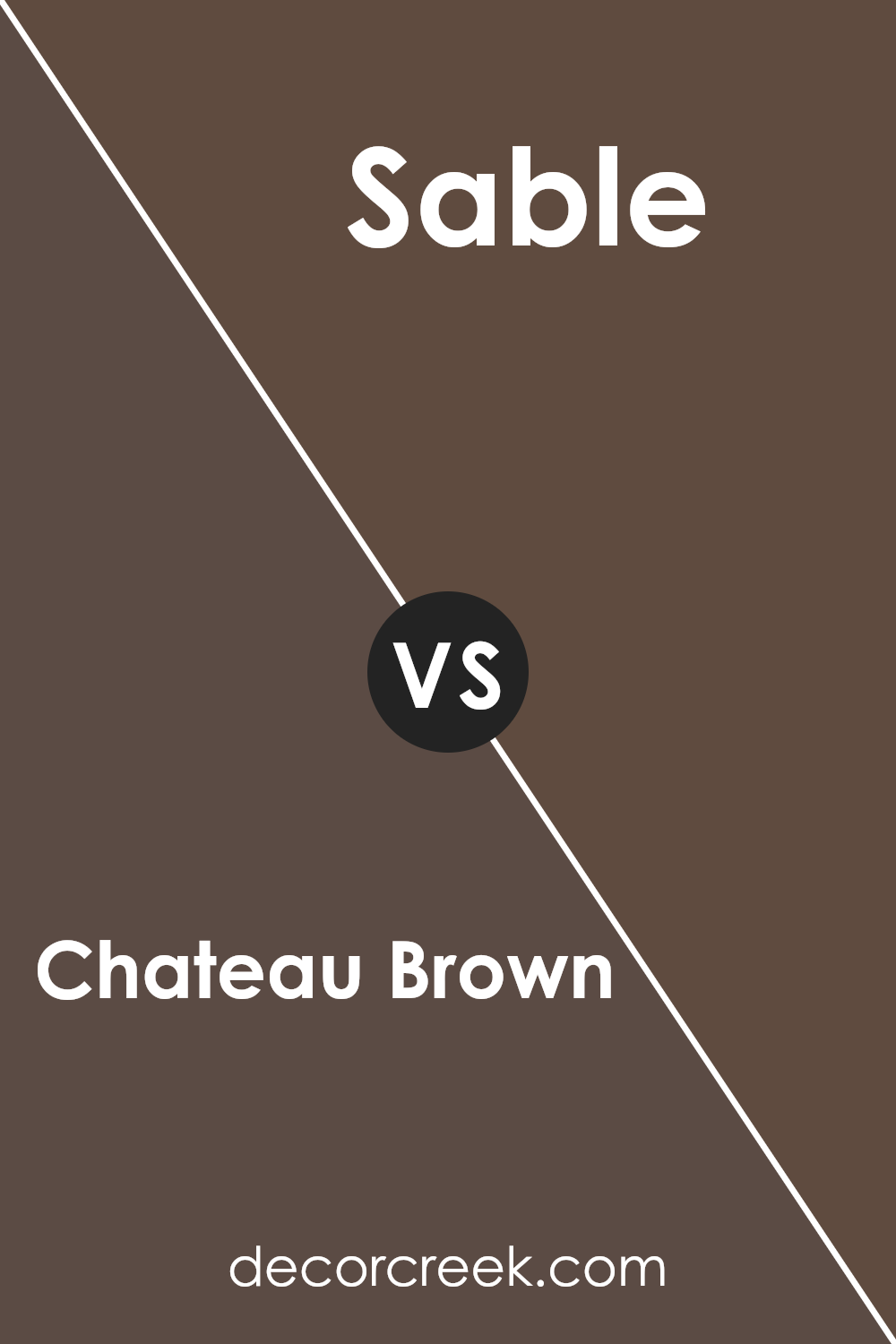
Chateau Brown SW 7510 by Sherwin Williams vs Sable SW 6083 by Sherwin Williams
Chateau Brown SW 7510 and Sable SW 6083 by Sherwin Williams are two warm, earthy colors that can add depth to any room. Chateau Brown is a medium brown with a subtle reddish undertone, giving it a cozy, inviting feel.
It works well in living rooms or dining areas where a welcoming atmosphere is desired. Sable, on the other hand, is a bit darker and more muted, with a hint of gray that gives it a subdued look. This makes Sable a great choice for spaces where a calm and grounded vibe is preferred, like a study or bedroom.
While both colors are rich and warm, Chateau Brown stands out with its slight warmth, whereas Sable is more reserved and understated. Pairing these colors together could create a balanced contrast, with Chateau Brown adding a touch of warmth and Sable providing a cool, grounded backdrop.
You can see recommended paint color below:
- SW 6083 Sable
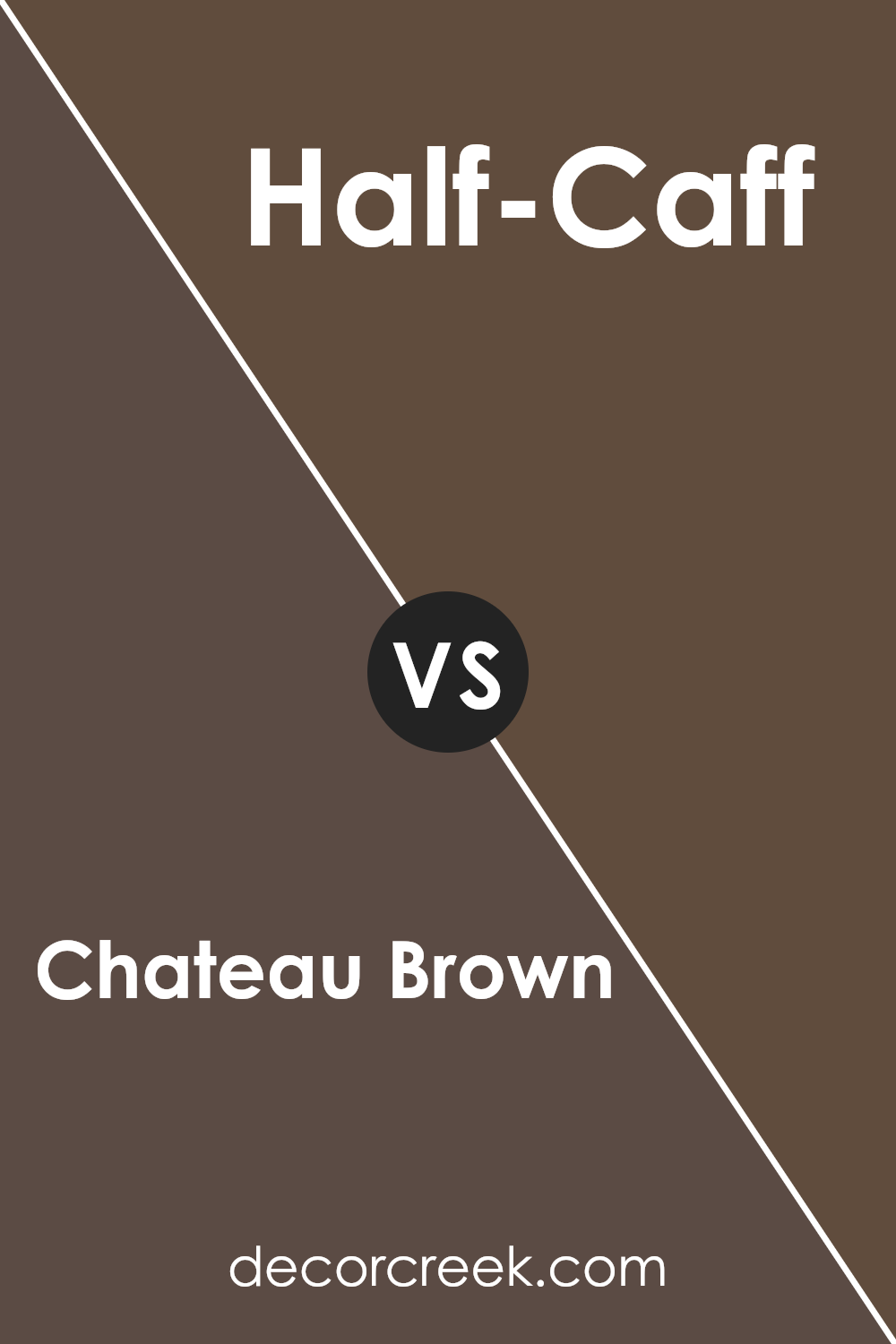
Chateau Brown SW 7510 by Sherwin Williams vs Half-Caff SW 9091 by Sherwin Williams
Chateau Brown SW 7510 and Half-Caff SW 9091 are both warm, earthy colors by Sherwin Williams, but they offer different vibes. Chateau Brown is a rich, deep brown that gives a cozy, grounded feeling to a room. It’s perfect for adding warmth and a sense of stability. You might choose this color for spaces where you want to encourage relaxation and comfort, like a living room or study.
On the other hand, Half-Caff is a lighter, softer brown with a hint of beige. It feels more open and airy compared to Chateau Brown. This color works well in spaces where you want to keep things light yet warm, like kitchens or bedrooms.
It has a more subtle presence, making it a good choice if you want to ensure a space feels inviting without being too dark. Together, they can be used for a balanced, warm interior palette.
You can see recommended paint color below:
- SW 9091 Half-Caff
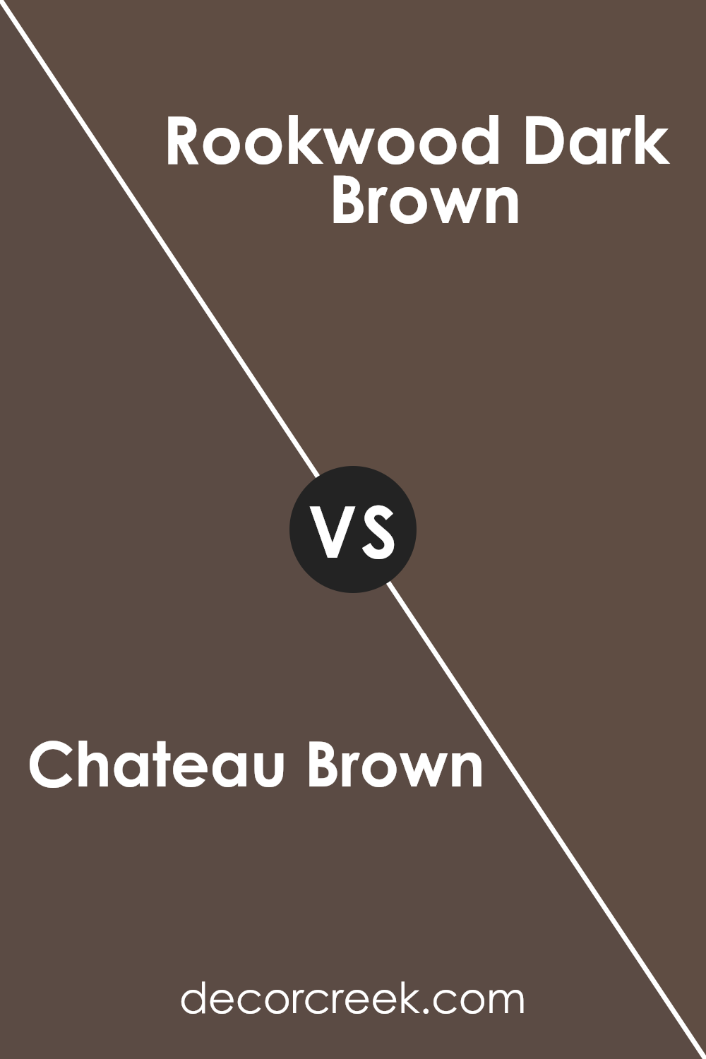
Chateau Brown SW 7510 by Sherwin Williams vs Rookwood Dark Brown SW 2808 by Sherwin Williams
Chateau Brown SW 7510 and Rookwood Dark Brown SW 2808, both by Sherwin Williams, are rich, warm shades of brown but have distinct characteristics. Chateau Brown SW 7510 is a softer, medium-toned brown with a slight hint of warmth, making it versatile for various spaces. It imparts a cozy and inviting feel, suitable for living rooms and bedrooms.
On the other hand, Rookwood Dark Brown SW 2808 is a deeper, more intense brown. It has a classic, historic quality that adds depth and character to any room. This color works well for accent walls, trim, or spaces where a dramatic effect is desired.
While Chateau Brown lends itself to a more relaxed setting, Rookwood Dark Brown is bold and sophisticated. Choosing between them depends on whether you want a gentle, comforting atmosphere or a strong, striking presence. Both colors can add a touch of elegance and warmth to interiors.
You can see recommended paint color below:
- SW 2808 Rookwood Dark Brown
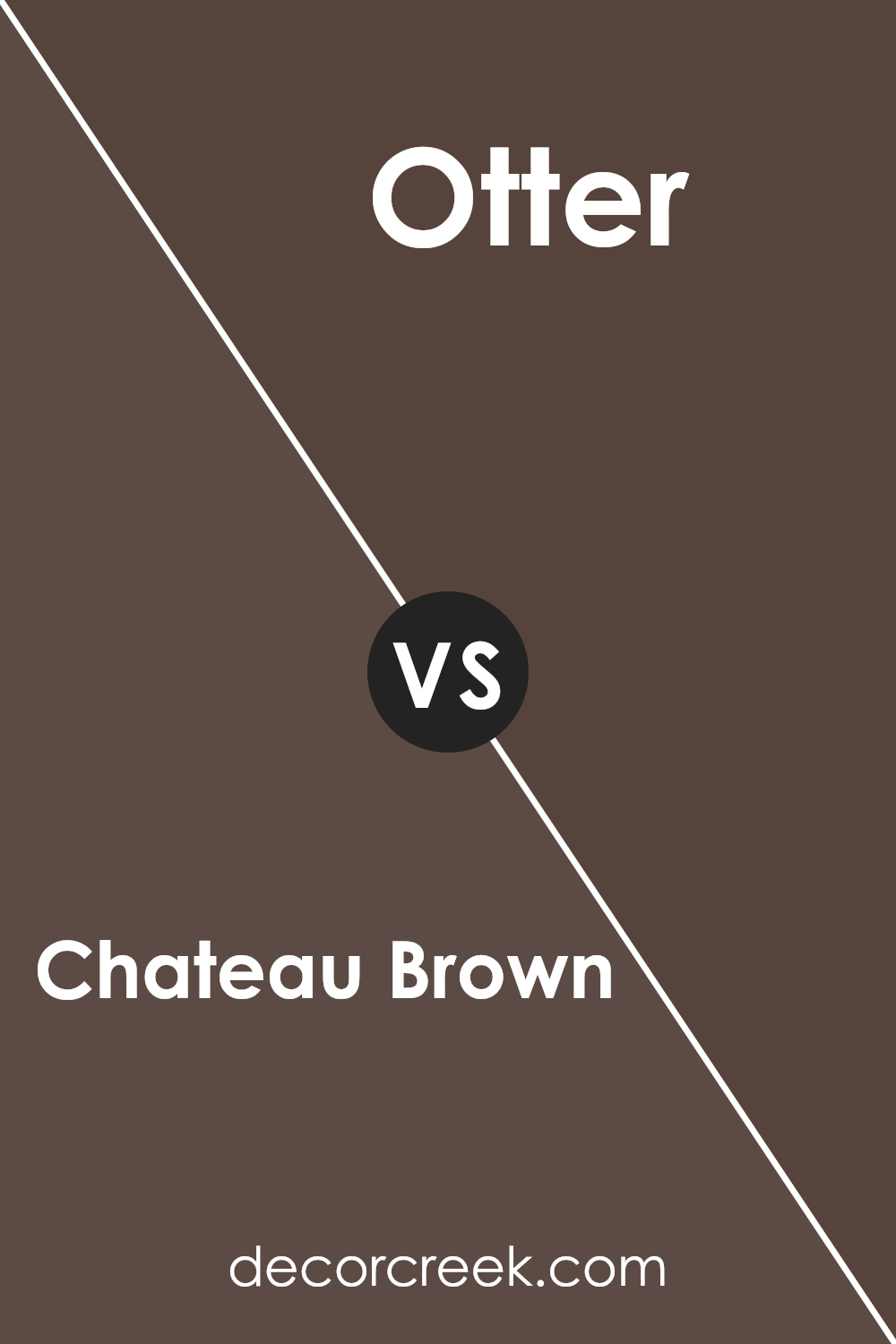
Chateau Brown SW 7510 by Sherwin Williams vs Otter SW 6041 by Sherwin Williams
Chateau Brown SW 7510 and Otter SW 6041, both from Sherwin Williams, provide distinct warm tones that can fit a variety of home settings. Chateau Brown is a rich, earthy brown with inviting and cozy characteristics. It offers a grounding effect, making it perfect for spaces where comfort and warmth are essential.
Otter, on the other hand, is a slightly darker and cooler brown, with a subtle hint of purple undertone. It evokes a feeling of depth and is ideal for creating a more dramatic look. While Chateau Brown has a more natural, clay-like appearance, Otter leans towards elegance with its deeper tone.
Both colors work well in pairing with neutral shades or lighter accents, and they can be used in living rooms, studies, and bedrooms to create a comforting atmosphere. However, the choice between the two depends on whether you prefer a warmer or slightly cooler room vibe.
You can see recommended paint color below:
- SW 6041 Otter
Conclusion
It’s a deep, rich brown that makes any room feel warm and cozy. When I imagine painting walls with this color, I think it would be like wrapping the room in a big, soft blanket. It’s perfect for a living room or study where you want to feel relaxed and at ease.
Chateau Brown reminds me of the earth and natural things, like a sturdy tree or rich soil. This makes it a good choice if you want your home to feel grounded and comforting. I also learned that this color can fit well with other colors, too, like creams or greens, which means you can be creative with furniture and decorations.
Even though some might think a dark color could make a room feel small, I believe Chateau Brown actually makes it feel welcoming and snug. Overall, I think using this color is like giving your home a warm hug. It’s not too strong and has a pleasant, calming quality.
It’s a color that can make any room in your home feel special and inviting to anyone who walks in.
Ever wished paint sampling was as easy as sticking a sticker? Guess what? Now it is! Discover Samplize's unique Peel & Stick samples.
Get paint samples

