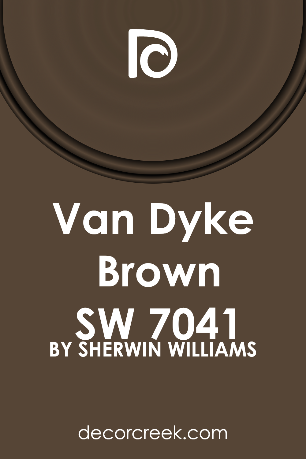
Introducing a classic yet versatile paint color, SW 7041 Van Dyke Brown by Sherwin Williams, a shade that brings warmth and elegance to any space. This color has a timeless appeal, offering a deep, rich brown that easily complements a wide range of decor styles.
Whether you’re looking to add sophistication to your living room, create a cozy atmosphere in your bedroom, or bring an earthy element to your kitchen, Van Dyke Brown is an excellent choice. Its ability to pair well with both bold and subtle hues makes it a go-to option for designers and homeowners alike.
In this article, we’ll explore the best ways to use Van Dyke Brown in your home, giving you practical tips for incorporating this beautiful shade into your interior.
Perfect for those who appreciate the finer details of home design, SW 7041 Van Dyke Brown by Sherwin Williams offers not just a paint color, but a transformative experience for your space.
What Color Is Van Dyke Brown SW 7041 by Sherwin Williams?
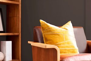
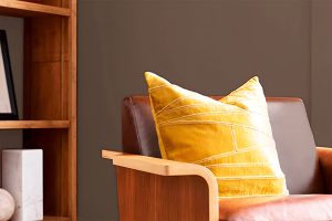
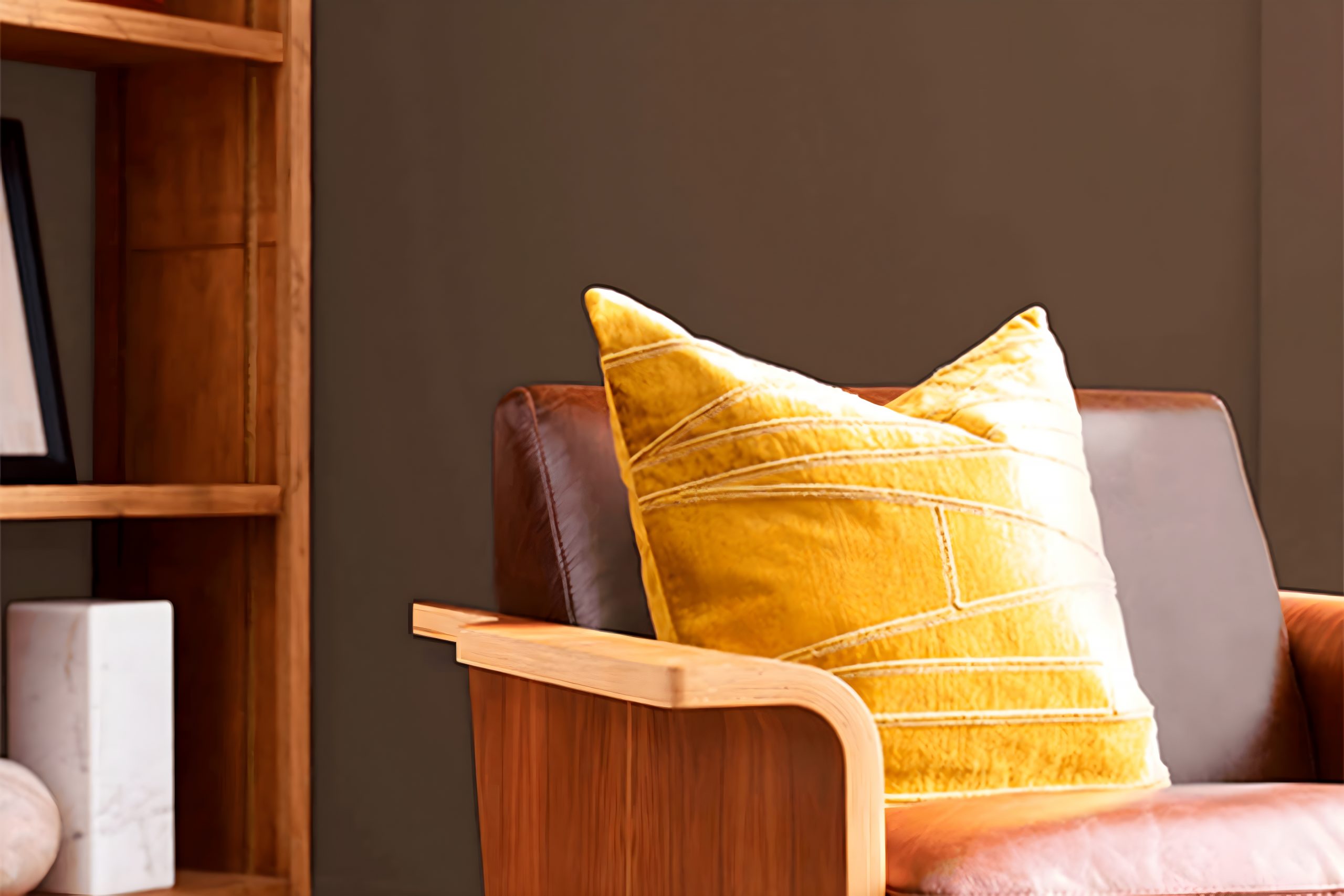
Van Dyke Brown is a rich, earthy color with a deep, warm undertone that brings a sense of comfort and grounded elegance to any space. This color exudes a timeless charm, making it a versatile choice for various interior styles.
It works exceptionally well in traditional settings where its depth adds a classic elegance, but it can also enhance modern or industrial decor by adding warmth and sophistication.
This color pairs beautifully with natural materials, such as wood, leather, and stone, creating a cohesive and inviting ambience. In a room with wooden beams or hardwood floors, Van Dyke Brown can serve as an excellent wall color, enhancing the natural grain and warmth of the wood.
When combined with leather furniture, it creates a rich, luxurious feel, perfect for a study or cozy living room. The color also complements stone features, such as fireplaces or wall accents, adding depth and texture to the space.
In terms of textures, Van Dyke Brown works well with both smooth and rough surfaces. It can add depth to smooth, sleek finishes, such as polished metal or glass, providing a stunning contrast.
On the other hand, when paired with rough textures like burlap, wool, or raw silk, it enhances the room’s natural, earthy feel.
Overall, Van Dyke Brown is a sophisticated and versatile color, perfect for creating a warm, inviting space. It’s ideal for anyone looking to add a touch of timeless elegance to their home.
Ever wished paint sampling was as easy as sticking a sticker? Guess what? Now it is! Discover Samplize's unique Peel & Stick samples.
Get paint samples

Is Van Dyke Brown SW 7041 by Sherwin Williams Warm or Cool color?
Van Dyke Brown by Sherwin Williams is a rich, deep hue that brings a sense of warmth and elegance to any room. This particular shade of brown has a timeless quality, making it versatile enough to work in a variety of home styles, from classic to modern. Its depth adds a layer of sophistication, making spaces feel more grounded and inviting.
In homes, this color can create a cozy atmosphere, perfect for living rooms or dining areas where a sense of togetherness is key. When paired with the right lighting, Van Dyke Brown can produce a comforting ambience, ideal for relaxing after a long day. It’s also flexible in terms of coordinating with other colors.
Lighter shades or contrasting colors can stand out against it, offering a beautiful balance and enhancing the overall aesthetic of a room.
Furthermore, this shade works well with natural materials, such as wood or leather, enhancing their organic qualities and bringing an additional layer of richness to interiors.
Its ability to blend seamlessly with a range of textures and materials makes it a go-to choice for anyone looking to create a space that feels both refined and welcoming.
Undertones of Van Dyke Brown SW 7041 by Sherwin Williams
Van Dyke Brown is a unique color that holds a special warmth and depth, thanks to its interesting undertones. When we talk about undertones, we mean those subtle colors lurking beneath the main color, influencing how it looks in different lighting situations. This paint has dark grey and olive undertones, a mix that gives it a rich, earthy vibe.
Understanding undertones is crucial because they greatly affect our perception of the main color. For example, a brown with a grey undertone might look cooler or more muted, while an olive undertone adds warmth, making the color seem more inviting.
In the case of Van Dyke Brown, these undertones combine to create a color that feels both grounding and sophisticated.
When used on interior walls, the effects of these undertones come into play with natural and artificial lighting. In rooms with plenty of sunlight, the olive undertones might make the walls look slightly warmer, enhancing the cozy feel of the space.
In artificial light, the dark grey undertones could emerge more, giving the room a more refined and elegant look. This duality makes Van Dyke Brown a versatile choice for interiors, providing a backdrop that can shift and adapt with the day’s rhythm, adding character and depth to any room.
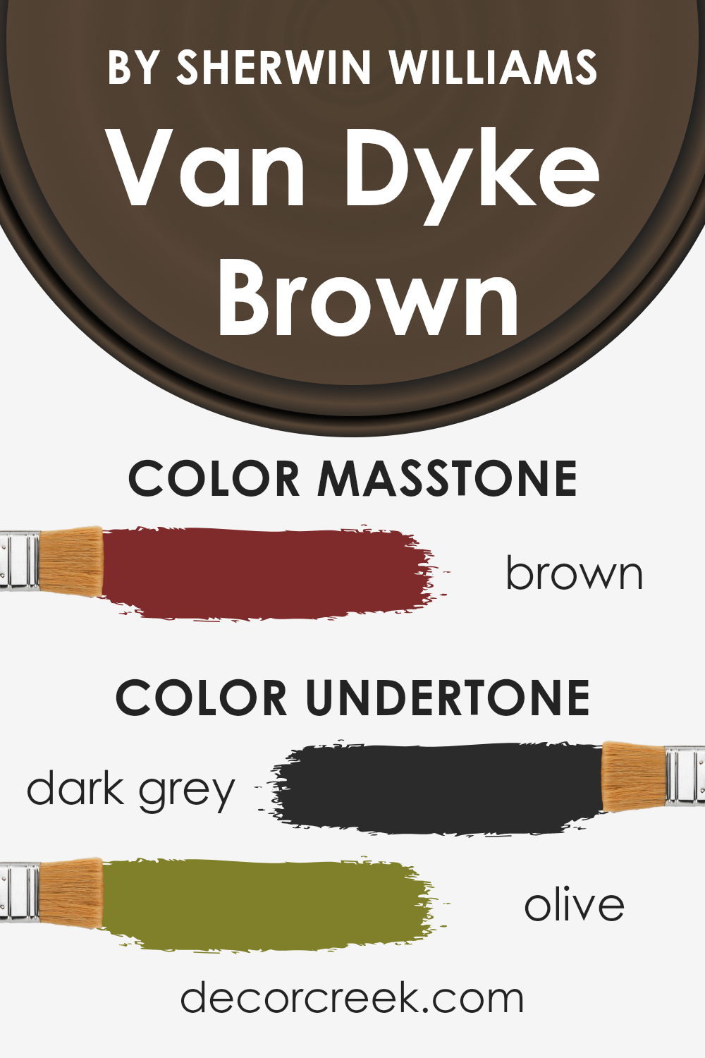
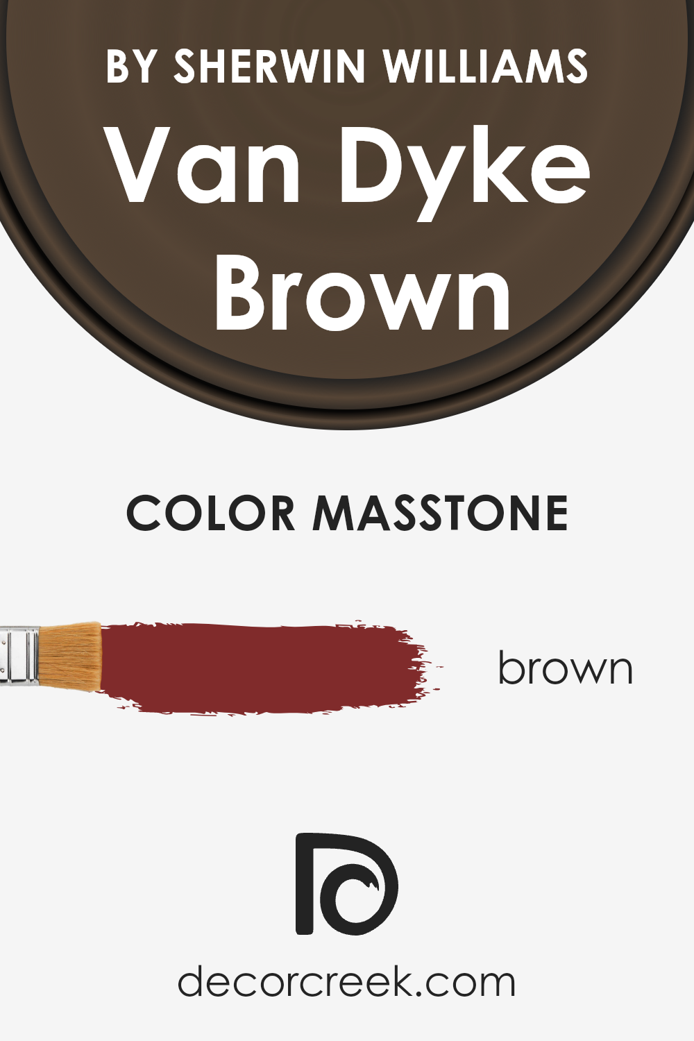
What is the Masstone of the Van Dyke Brown SW 7041 by Sherwin Williams?
Van Dyke Brown by Sherwin Williams, with its masstone of Brown (#802B2B), presents a rich and warm hue that adds depth and sophistication to any space. This particular shade of brown, characterized by its deep, almost velvety appearance, is perfect for creating a cozy and inviting atmosphere in homes.
When applied to walls, it serves as a stunning backdrop that can enhance the look of furniture and decor, allowing them to stand out without overpowering the room. Its natural earthiness makes it versatile, fitting well in a variety of settings, from traditional spaces that aim for a classic look to more modern homes seeking a touch of elegance.
Importantly, this color tends to absorb light, providing a feeling of warmth and intimacy. For rooms that aim to be a sanctuary or a comfortable retreat, Van Dyke Brown offers just the right mix of serenity and style.
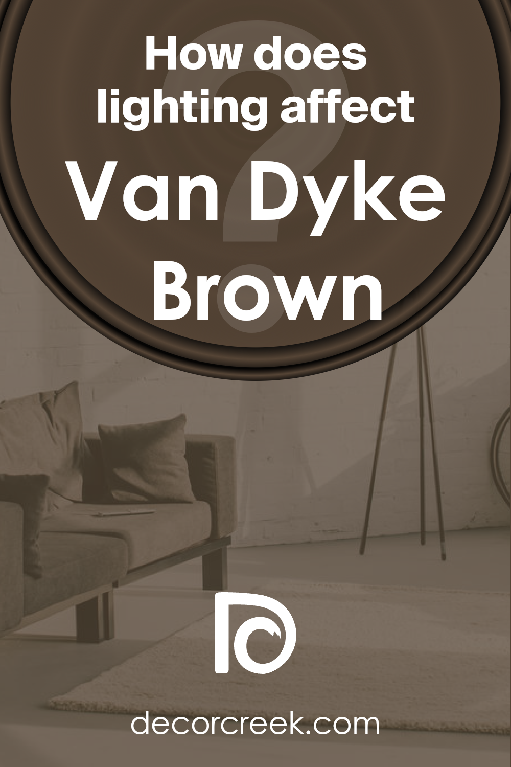
How Does Lighting Affect Van Dyke Brown SW 7041 by Sherwin Williams?
Lighting has a big influence on how we see colors. It can change how a color looks, depending on whether the light is natural (from the sun) or artificial (like light bulbs). Colors don’t change on their own; it’s how our eyes and brain perceive them under different lighting conditions. Let’s take a color as an example, like a rich, deep brown.
In artificial light, this deep brown color might look warmer and more inviting. Artificial light, especially if it’s warm-toned like many home lights, can make this color look softer and cozier. It’s great for creating a welcoming atmosphere in living rooms or bedrooms.
In natural light, the same deep brown can look different depending on the time of day and the direction of the light. Natural light is usually brighter and can bring out the true color more vividly.
In north-faced rooms, which get less direct sunlight, this brown might appear a bit cooler and more muted, creating a calm and collected feel. This kind of room doesn’t get a lot of light, which can make the color appear more consistent throughout the day but possibly darker.
South-faced rooms get a lot of bright, direct sunlight making the color look lighter and more vivid. It can bring out the warmth in the brown, making the room feel bright and cheerful, even energizing.
East-faced rooms get bright light in the morning, which can make this brown feel vibrant and warm early in the day, then transitioning to a softer tone as the day progresses. It’s perfect for rooms used mainly in the morning.
West-faced rooms have the opposite effect. They get a lot of sunlight in the afternoon and evening, so the color might appear dull in the morning but warm and inviting in the afternoon and evening.
Overall, lighting can significantly impact how colors look in a room. This rich, deep brown can transform from a cozy, warm shade under artificial light to vibrant and lively in natural light, with variations throughout the day depending on the room’s orientation.
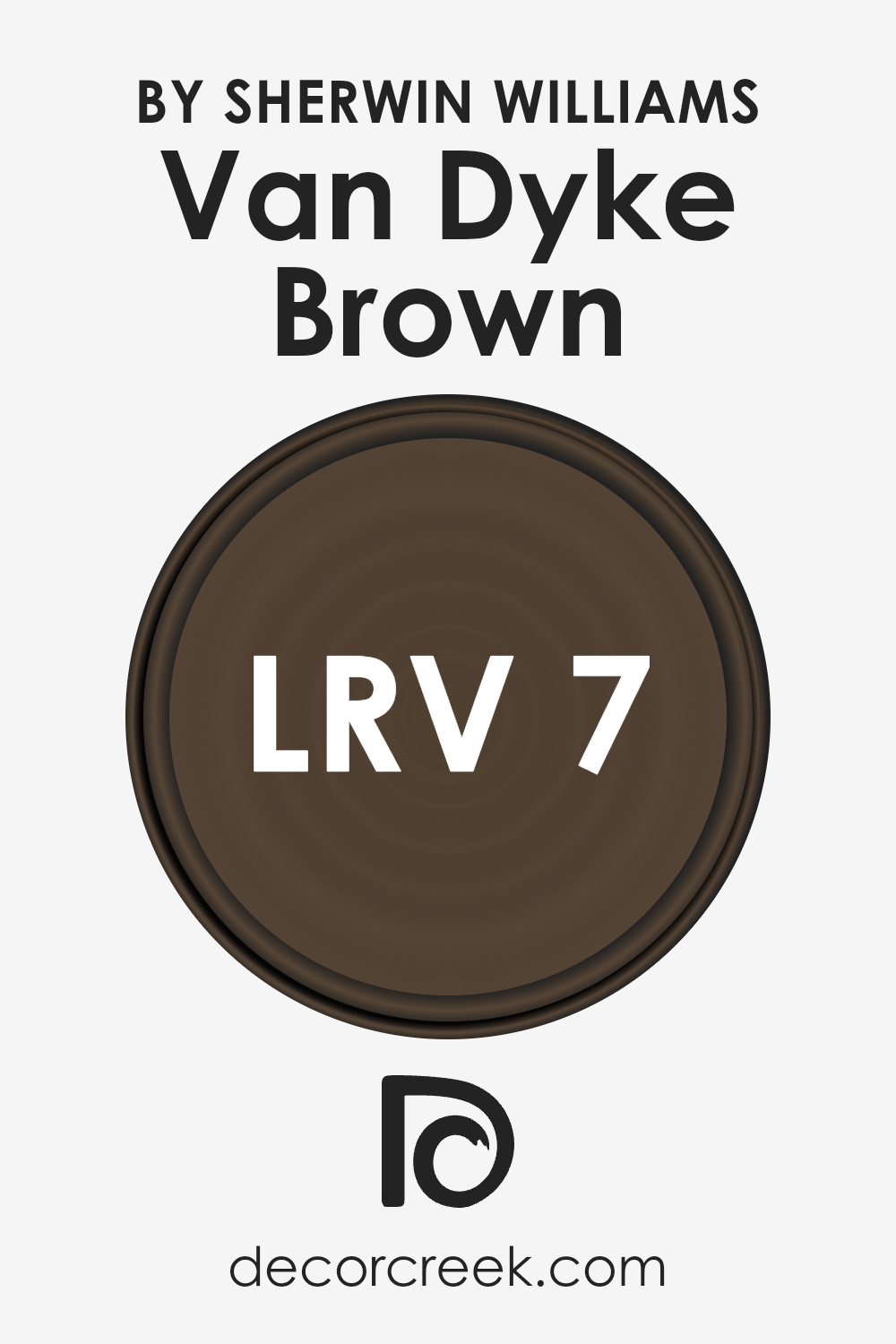
What is the LRV of Van Dyke Brown SW 7041 by Sherwin Williams?
LRV stands for Light Reflectance Value, and it measures the amount of light a paint color reflects back into a room, on a scale from 0 to 100. Colors with a lower LRV, closer to 0, are darker and absorb more light, making a room feel cozier but smaller.
On the other hand, colors with a higher LRV, closer to 100, are lighter and reflect more light, creating a sense of openness and space.
The LRV of Van Dyke Brown, which is 6.547, tells us that it’s a dark color that will absorb a lot of light rather than reflecting it. This means when you use this color on walls, it will create a rich, intimate atmosphere, but it might also make the space appear smaller and require good lighting to balance the darkness of the walls.
This LRV helps homeowners and designers decide if Van Dyke Brown is the right choice depending on how light or cozy they want a room to feel.
LRV – what does it mean? Read This Before Finding Your Perfect Paint Color
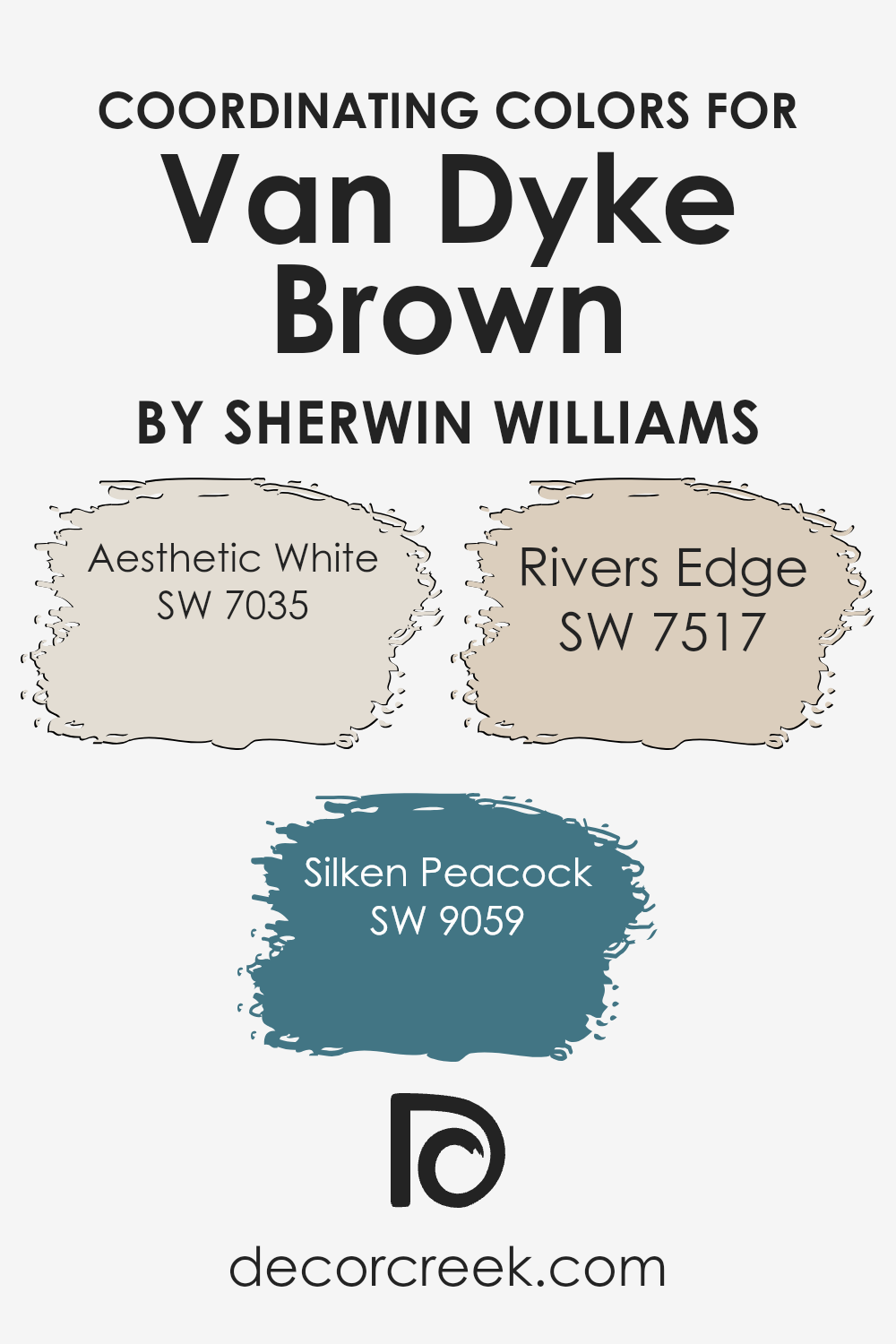
Coordinating Colors of Van Dyke Brown SW 7041 by Sherwin Williams
Coordinating colors are shades that work well together to enhance the aesthetic appeal and create harmony in a space. They can either be contrasting, to add a vibrant touch, or complementary, softly blending into each other for a subtle look.
When using coordinating colors, the aim is to balance the visual weight and dynamic of the room, ensuring that no single color overpowers the other but rather, they all contribute to a cohesive design.
For the rich, deep hue of Van Dyke Brown, a palette of coordinating colors includes Aesthetic White, Silken Peacock, and Rivers Edge. Aesthetic White is a soft and warm white with a hint of beige, making it an excellent choice for creating a light and airy feel that still carries depth.
It’s perfect as a background color, allowing the deeper tones to stand out without overwhelming the space. Silken Peacock, with its bold and vibrant blue-green shade, adds a touch of sophistication and energy, ideal for an accent wall or decorative accessories.
Lastly, Rivers Edge offers a tranquil, natural green that brings a sense of calm and freshness to the mix, complementing the earthiness of Van Dyke Brown. Together, these colors form a balanced and inviting palette, suitable for any room looking to achieve a harmonious and welcoming atmosphere.
You can see recommended paint colors below:
- SW 7035 Aesthetic White
- SW 9059 Silken Peacock
- SW 7517 Rivers Edge
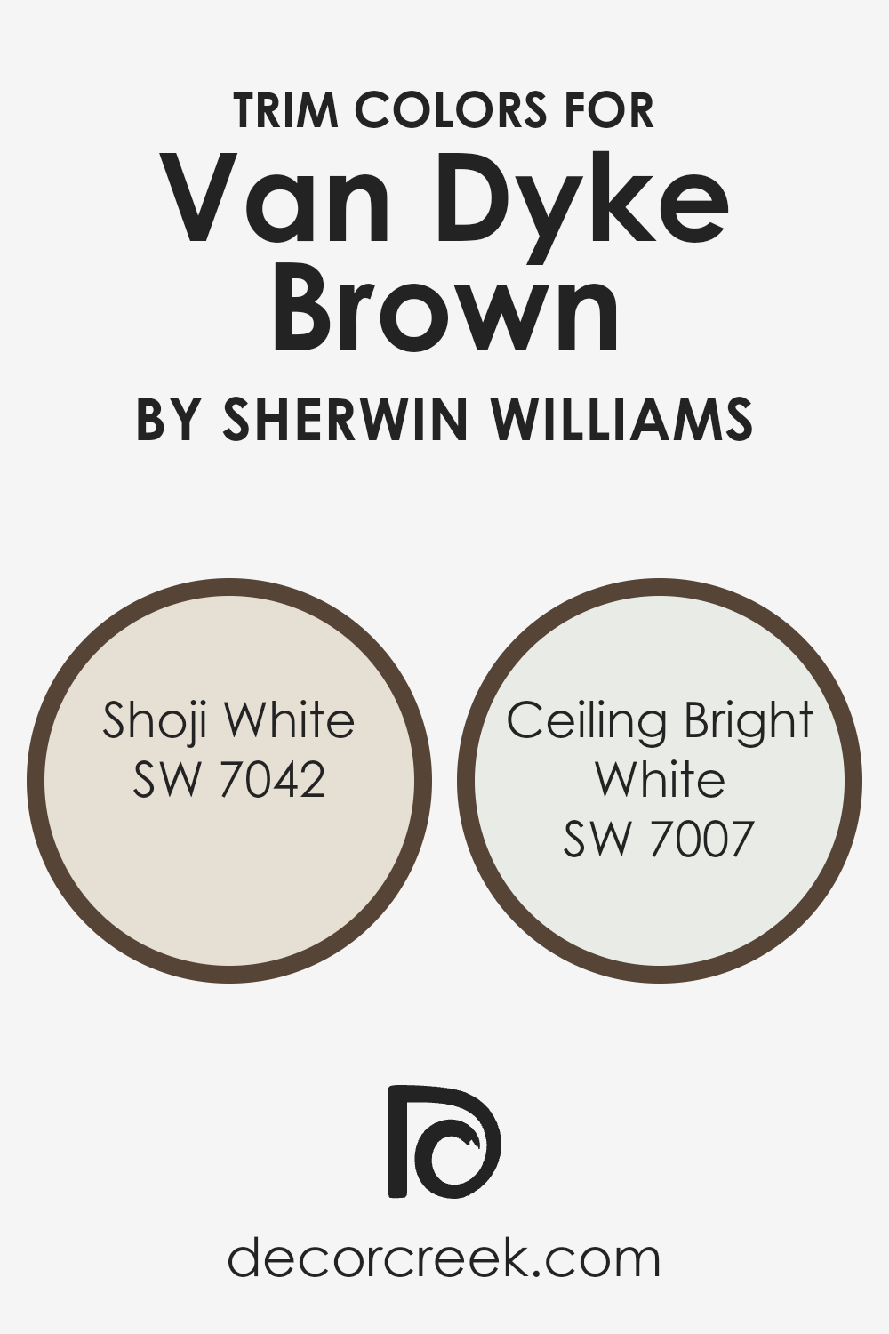
What are the Trim colors of Van Dyke Brown SW 7041 by Sherwin Williams?
Trim colors are accent colors applied to molding, door frames, window frames, and other architectural features in a room to enhance the overall look of the walls painted with a primary color, such as Van Dyke Brown by Sherwin-Williams.
When carefully selected, trim colors can add contrast, depth, and definition to the spaces, creating a more polished and visually appealing appearance. For Van Dyke Brown, a rich and earthy hue, choosing the right trim colors is crucial to highlight its natural beauty without overpowering it.
SW 7042 – Shoji White is a soft, off-white color with a warm undertone that brings a gentle contrast against the deeper tones of Van Dyke Brown. It offers a subtle highlight to the room’s architecture, softly blending with the warmth of Van Dyke Brown without causing a stark transition.
On the other hand, SW 7007 – Ceiling Bright White, is a crisp, clean white that delivers a sharper contrast to the rich brown, enhancing the room’s brightness and giving a more defined separation between the wall color and trim.
This combination of trim colors with Van Dyke Brown creates a balanced and inviting space, with each shade contributing to a sophisticated and cohesive look.
You can see recommended paint colors below:
- SW 7042 Shoji White
- SW 7007 Ceiling Bright White
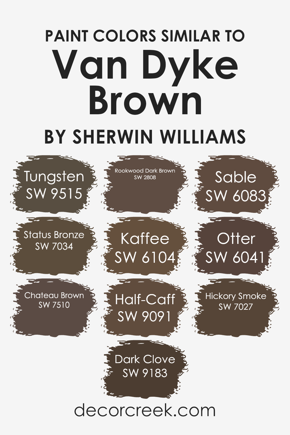
Colors Similar to Van Dyke Brown SW 7041 by Sherwin Williams
When decorating a space, choosing the right color palette can significantly impact the overall look and feel. Similar colors, like variations of Van Dyke Brown, play a crucial role in creating a cohesive and harmonious environment.
These shades, while distinct, share a common base that allows them to work well together, providing depth and complexity to an interior design scheme. By carefully selecting similar colors, designers can ensure that the different elements of a room blend smoothly, avoiding abrupt transitions that can disrupt the aesthetic flow.
For example, Tungsten and Status Bronze offer subtle variations of warmth and depth, with Tungsten leaning toward a cooler, steel-like tone and Status Bronze offering a rich, earthy quality.
Chateau Brown and Dark Clove, meanwhile, provide a more traditional feel; Chateau Brown has a welcoming, homely appeal, whereas Dark Clove adds an element of sophistication with its deeper, spicier undertone.
Exploring darker tones, Rookwood Dark Brown and Kaffee introduce a stately elegance, the former with a hint of historic charm and the latter exuding a coffee-rich warmth. For those preferring a softer approach, Half-Caff and Sable fuse mild strength with velvety smoothness, making them ideal for creating inviting, comfortable spaces.
Otter and Hickory Smoke round out the selection by offering lighter options that still retain the essence of Van Dyke Brown, with Otter providing a gentler, muted option and Hickory Smoke presenting a smoky subtlety that can lighten areas without losing depth.
By understanding the unique qualities of these similar colors, one can craft spaces that feel both unified and dynamically engaging.
You can see recommended paint colors below:
- SW 9515 Tungsten
- SW 7034 Status Bronze
- SW 7510 Chateau Brown
- SW 9183 Dark Clove
- SW 2808 Rookwood Dark Brown
- SW 6104 Kaffee
- SW 9091 Half-Caff
- SW 6083 Sable
- SW 6041 Otter
- SW 7027 Hickory Smoke
How to Use Van Dyke Brown SW 7041 by Sherwin Williams In Your Home?
Van Dyke Brown is a rich, deep brown paint color created by Sherwin Williams. Its warmth and depth make it a perfect choice for creating cozy and inviting spaces in your home. You can use this versatile color in various ways.
For instance, it works wonderfully as an accent wall in a living room or bedroom, adding a touch of sophistication and warmth to the space. If you’re keen on making a bold statement, painting your kitchen cabinets in Van Dyke Brown can transform the area into a chic and stylish space.
Additionally, this color pairs beautifully with lighter shades, such as creams or soft beiges, making it easy to incorporate into most color schemes. It’s also ideal for creating a comforting and elegant atmosphere in a study or home office.
For those wanting to add a bit of rustic charm to their home, incorporating Van Dyke Brown in furniture or decorative elements like picture frames or shelving can achieve this look effortlessly. Its earthy quality brings a grounded feel to any room, making your home feel more inviting.
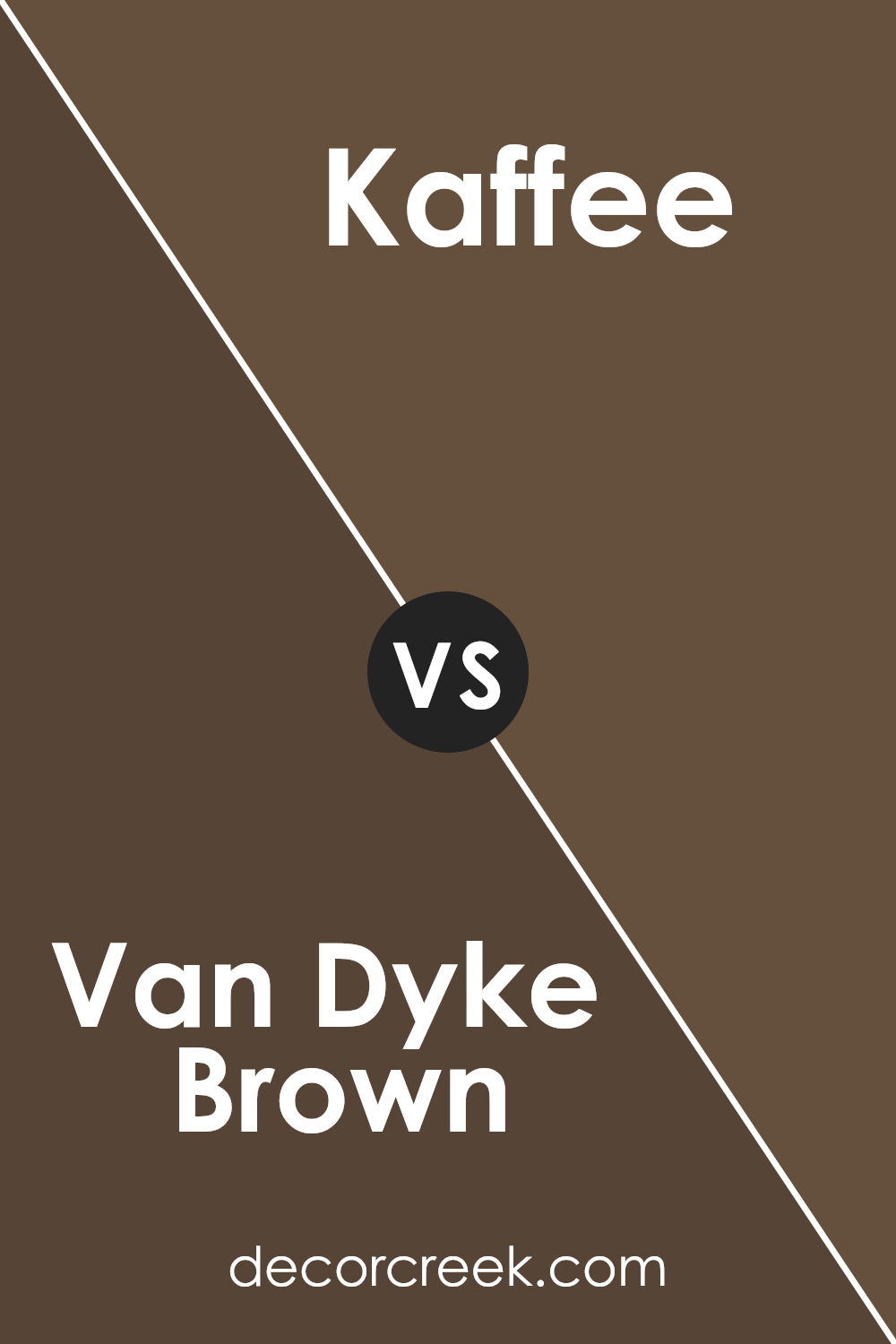
Van Dyke Brown SW 7041 by Sherwin Williams vs Kaffee SW 6104 by Sherwin Williams
Van Dyke Brown and Kaffee are two rich, warm tones from Sherwin Williams, but they have their unique flavors. Van Dyke Brown is the deeper of the two, offering a strong, almost earthy presence.
It’s the kind of color that feels like a cozy, well-worn leather jacket, adding depth and sophistication to a space. On the other hand, Kaffee is a touch lighter, leaning towards a chocolaty warmth that wraps a room in comfort without overwhelming it.
While both colors bring a sense of warmth and comfort to any space, Van Dyke Brown serves up a more intense, bold vibe, making a statement wherever it’s applied. Kaffee, while still rich, gives a softer, more inviting feel, making it ideal for creating a cozy, welcoming atmosphere.
Whether you’re looking to add some drama or simply warm up a room, these colors have you covered, each in its own unique way.
You can see recommended paint color below:
- SW 6104 Kaffee
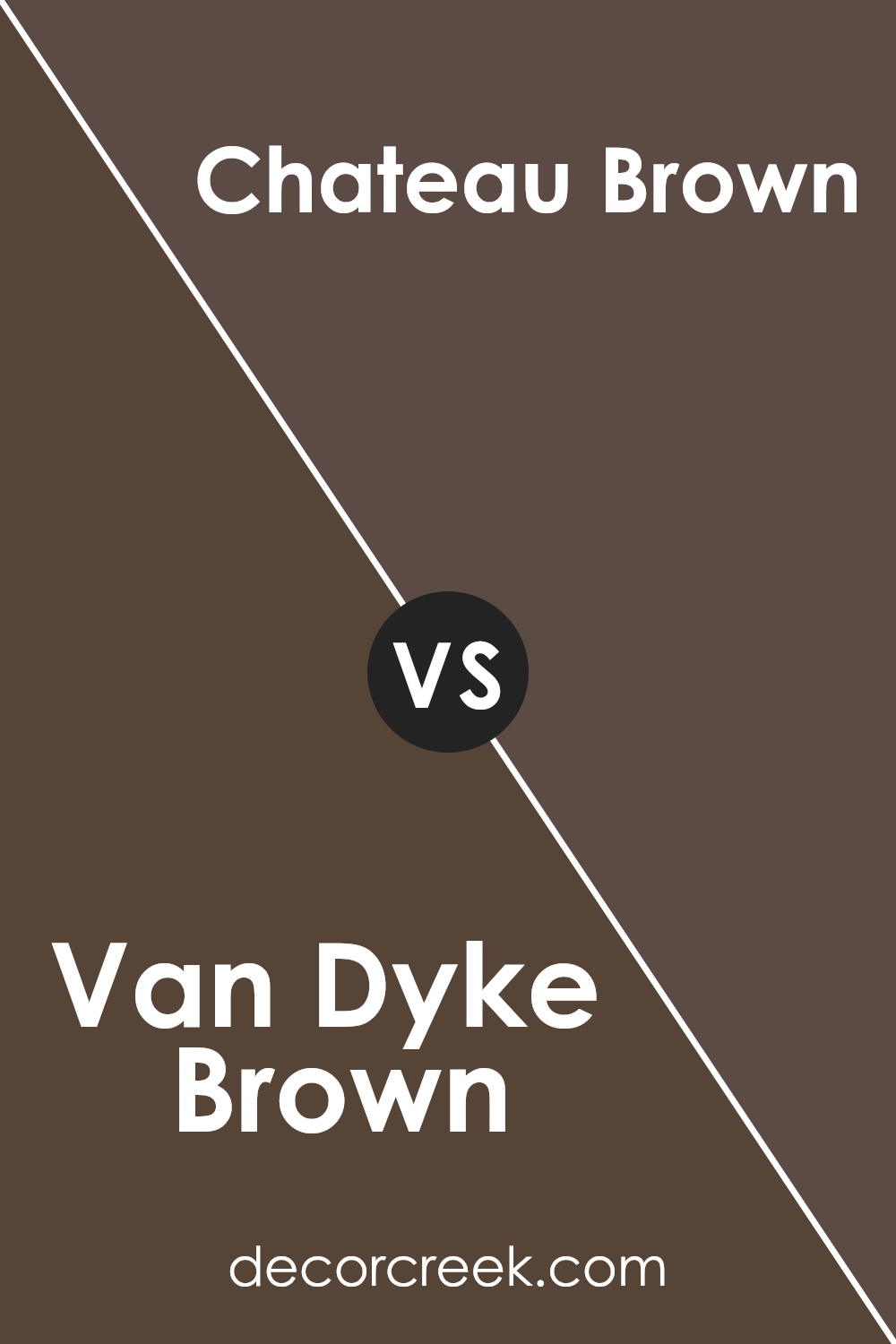
Van Dyke Brown SW 7041 by Sherwin Williams vs Chateau Brown SW 7510 by Sherwin Williams
Van Dyke Brown and Chateau Brown, both from Sherwin Williams, are warm and inviting colors, but they offer distinct vibes for your space. Van Dyke Brown is a deep, rich shade, leaning towards a dark chocolate.
It’s the kind of color that makes a statement and can really anchor a room, giving it a cozy, sophisticated feel.
On the other hand, Chateau Brown is lighter and softer. It’s more of a medium brown, with a welcoming warmth that’s versatile for various settings. While Van Dyke Brown adds depth and drama, Chateau Brown brings a relaxed and friendly atmosphere.
So, if you’re deciding between the two, consider the mood you want to create. For an intimate, elegant look, Van Dyke Brown is your go-to. If you prefer something lighter and more adaptable, Chateau Brown might be the perfect pick.
You can see recommended paint color below:
- SW 7510 Chateau Brown
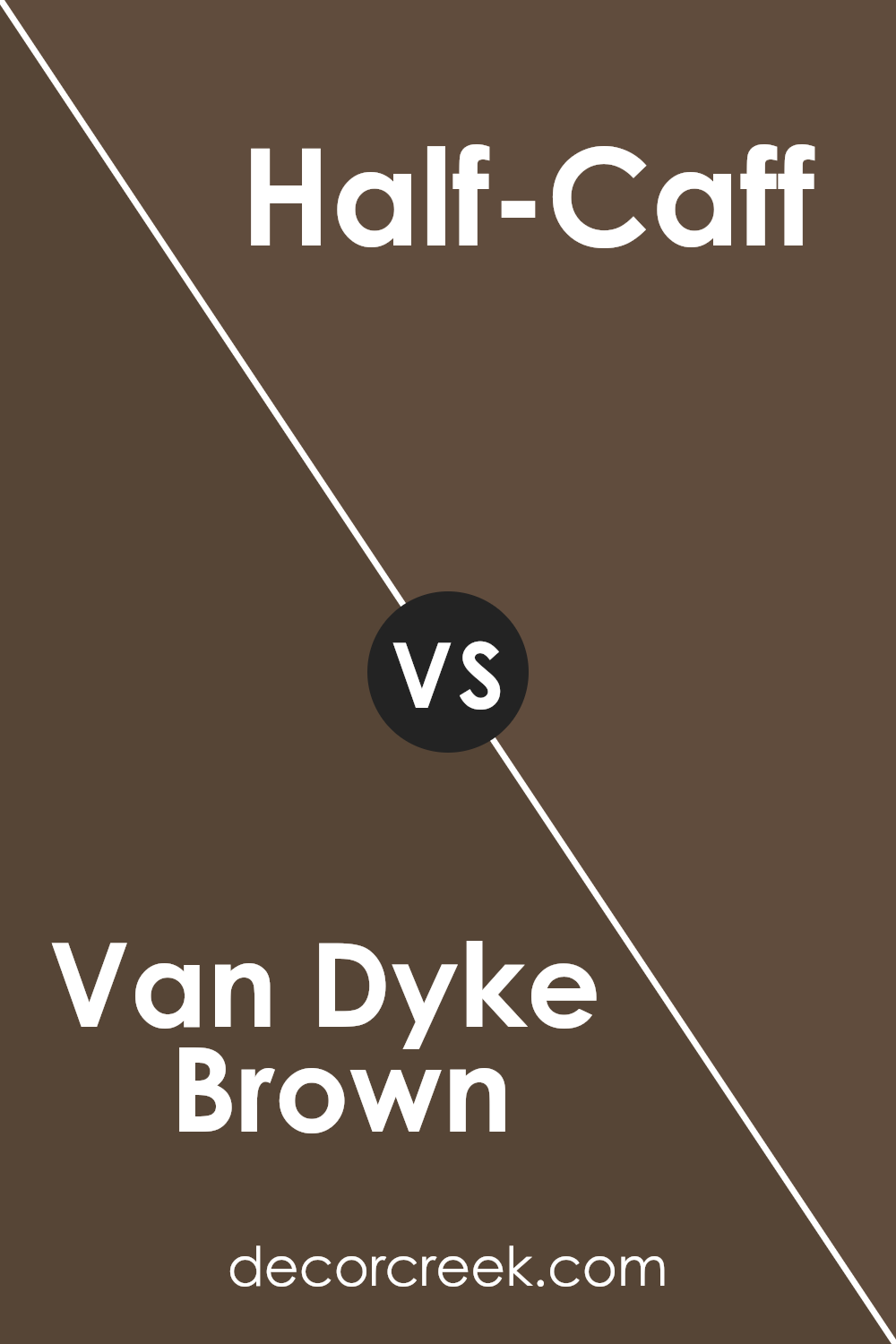
Van Dyke Brown SW 7041 by Sherwin Williams vs Half-Caff SW 9091 by Sherwin Williams
Van Dyke Brown is a deep, rich brown color that brings a sense of warmth and earthiness to any space. It’s like the dark, fertile soil of a well-tended garden, providing a solid, comforting base that can make a room feel grounded and cozy.
Its depth means it can serve as an excellent backdrop for both bright and muted accents, offering versatility in decor choices.
In comparison, Half-Caff offers a lighter, softer approach to brown. Think of it as the color of a milky coffee, providing a gentle warmth without the intensity of Van Dyke Brown.
Half-Caff is more subdued and has a more versatile appeal, easily blending with a wide range of color palettes. It’s perfect for creating a calm, inviting atmosphere in a space.
Both colors carry the inherent stability and natural feel of brown, but where Van Dyke Brown delivers boldness and depth, Half-Caff offers a softer, more approachable vibe. Whether you’re looking for a strong foundation or a gentle hug for your walls, these colors have something special to offer.
You can see recommended paint color below:
- SW 9091 Half-Caff
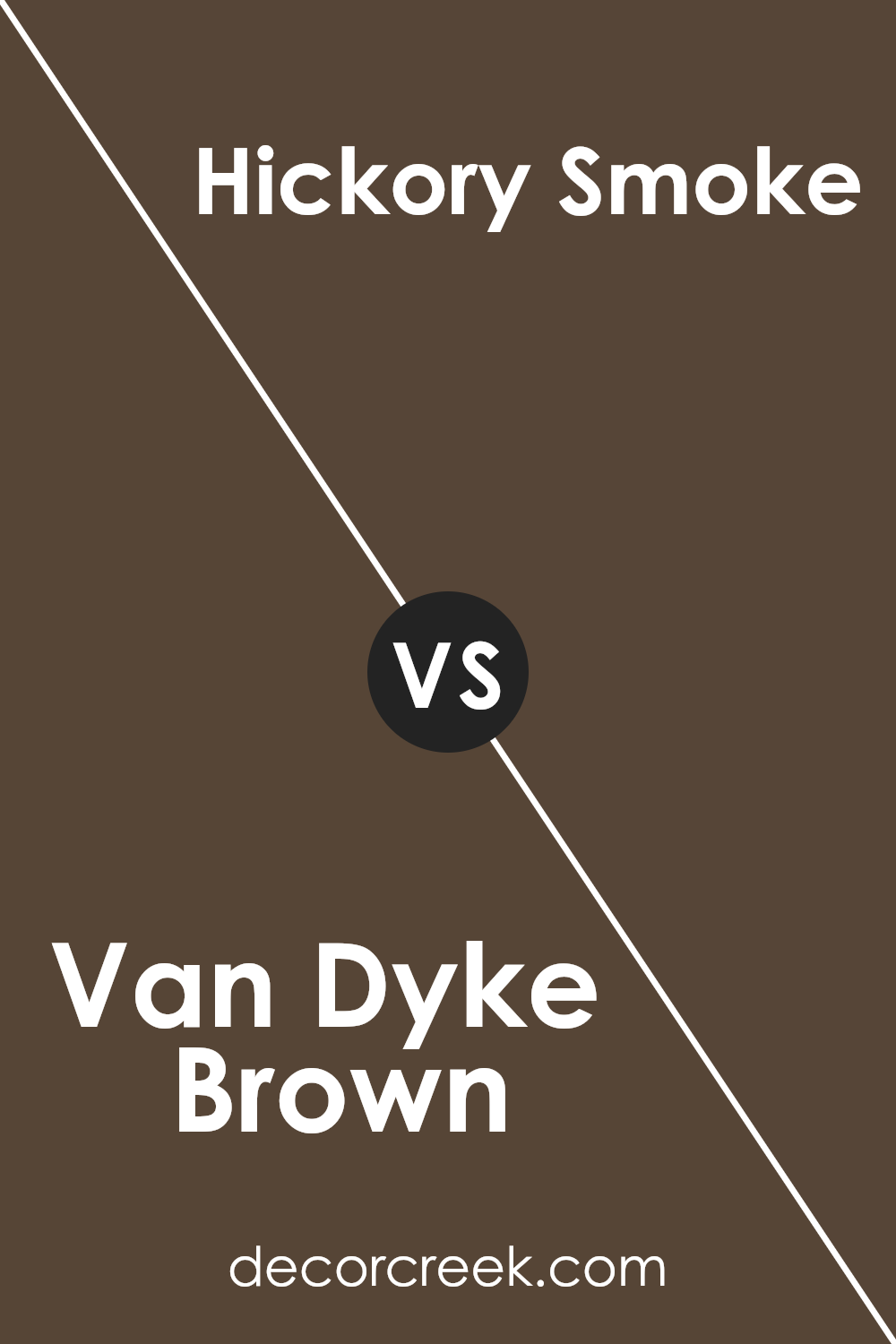
Van Dyke Brown SW 7041 by Sherwin Williams vs Hickory Smoke SW 7027 by Sherwin Williams
Van Dyke Brown and Hickory Smoke, both from Sherwin Williams, offer unique takes on warm, earthy hues. Van Dyke Brown is a dark, chocolatey color that brings a rich, cozy feel to any space.
Its deep tones make it perfect for creating an intimate atmosphere in rooms or accent walls, adding a sense of sophistication and comfort.
On the other hand, Hickory Smoke is a lighter, more subdued gray-brown. This color has a softer vibe, making it incredibly versatile for various settings. It’s a great choice for those seeking a neutral backdrop that still adds warmth to the room but in a gentler, more understated manner.
While both hues share an earthiness, Van Dyke Brown leans towards a bolder, more dramatic look, whereas Hickory Smoke offers a calmer, more relaxed aesthetic.
This contrast in mood and intensity makes them suitable for different purposes yet equally appealing in their right.
You can see recommended paint color below:
- SW 7027 Hickory Smoke
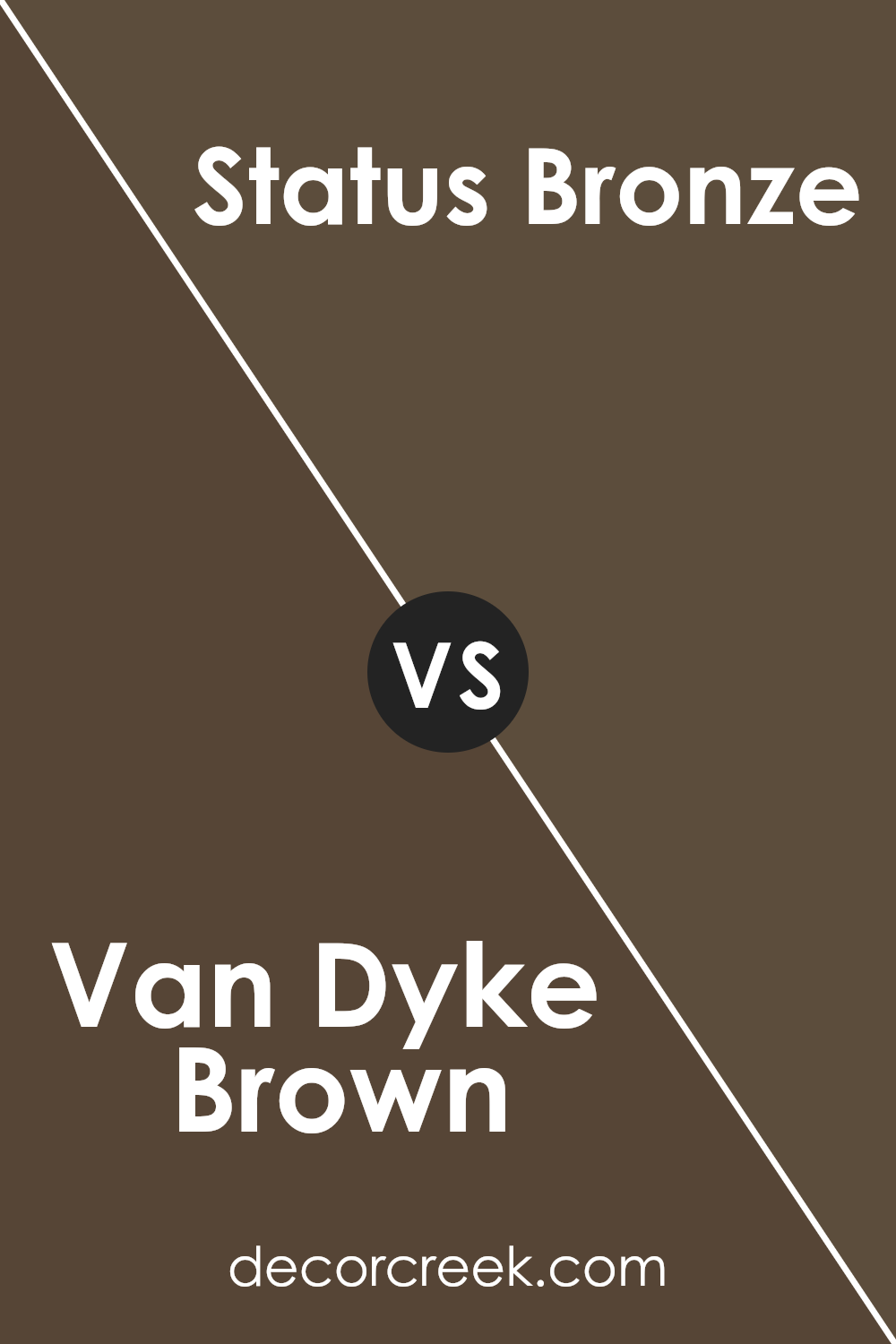
Van Dyke Brown SW 7041 by Sherwin Williams vs Status Bronze SW 7034 by Sherwin Williams
Van Dyke Brown and Status Bronze are both colors by Sherwin Williams but they bring different vibes to a space. Van Dyke Brown is a deep, rich brown that feels classic and grounding.
It’s the kind of color that makes a room feel cozy, warm, and secure, like a comfortable leather chair that’s been used for years.
On the other hand, Status Bronze has a lighter touch. It’s still in the brown family but leans toward a softer, more muted bronze tone. This color has a subtle elegance to it, adding a touch of sophistication without being too bold. It’s like the soft glow of a sunset that gently lights up a room.
While both colors share a connection to nature and warmth, Van Dyke Brown offers a stronger, more enveloping presence. Status Bronze, however, provides a lighter, airier feel.
Choosing between them depends on the mood you want to set. For a solid, earthy base, Van Dyke Brown is perfect. If you prefer something with a gentler, refined elegance, Status Bronze is the way to go.
You can see recommended paint color below:
- SW 7034 Status Bronze
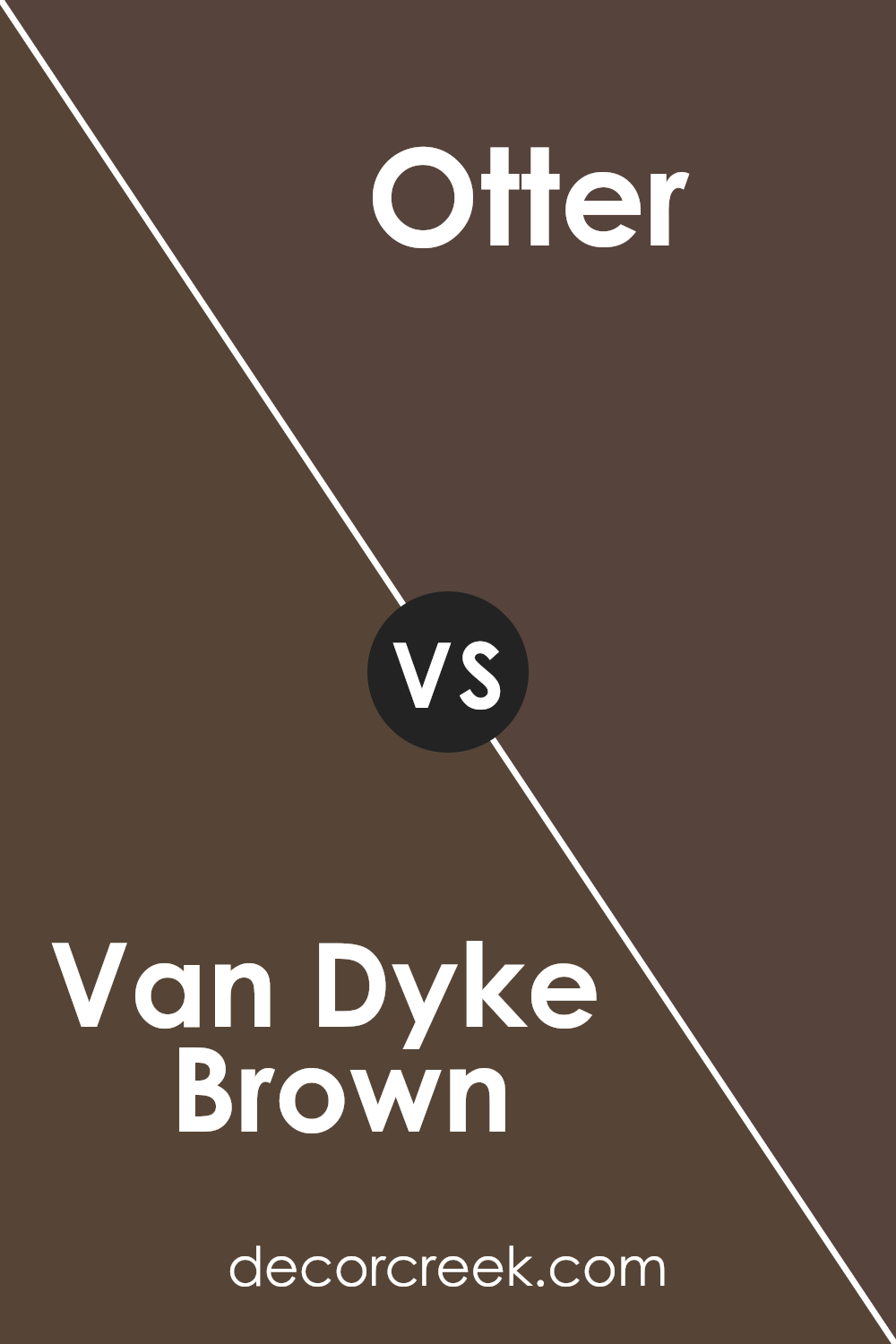
Van Dyke Brown SW 7041 by Sherwin Williams vs Otter SW 6041 by Sherwin Williams
Comparing Van Dyke Brown and Otter by Sherwin Williams, you’ll see a couple of interesting differences. Van Dyke Brown is a deeper, richer color. Imagine a dark chocolate, almost shadowy in its depth, providing a strong, warm feel to any space.
It’s the kind of color that’s bold and makes a statement, perfect for creating a cozy, inviting atmosphere in rooms.
On the other hand, Otter is lighter, leaning towards a mid-tone brown. Think of the soft, natural color of woodland animals, which offers a sense of calm and warmth without overwhelming a space.
It’s versatile, fitting nicely in many areas of a home without drawing too much attention.
Both colors share a warmth and natural feel, but Van Dyke Brown offers depth and boldness, while Otter brings a softer, more gentle energy. Depending on the vibe you’re going for, each color has its unique charm and functionality.
If you’re aiming for a more dramatic and cozy ambiance, Van Dyke Brown is your go-to. For a balanced and neutral setting, Otter will do the trick.
You can see recommended paint color below:
- SW 6041 Otter
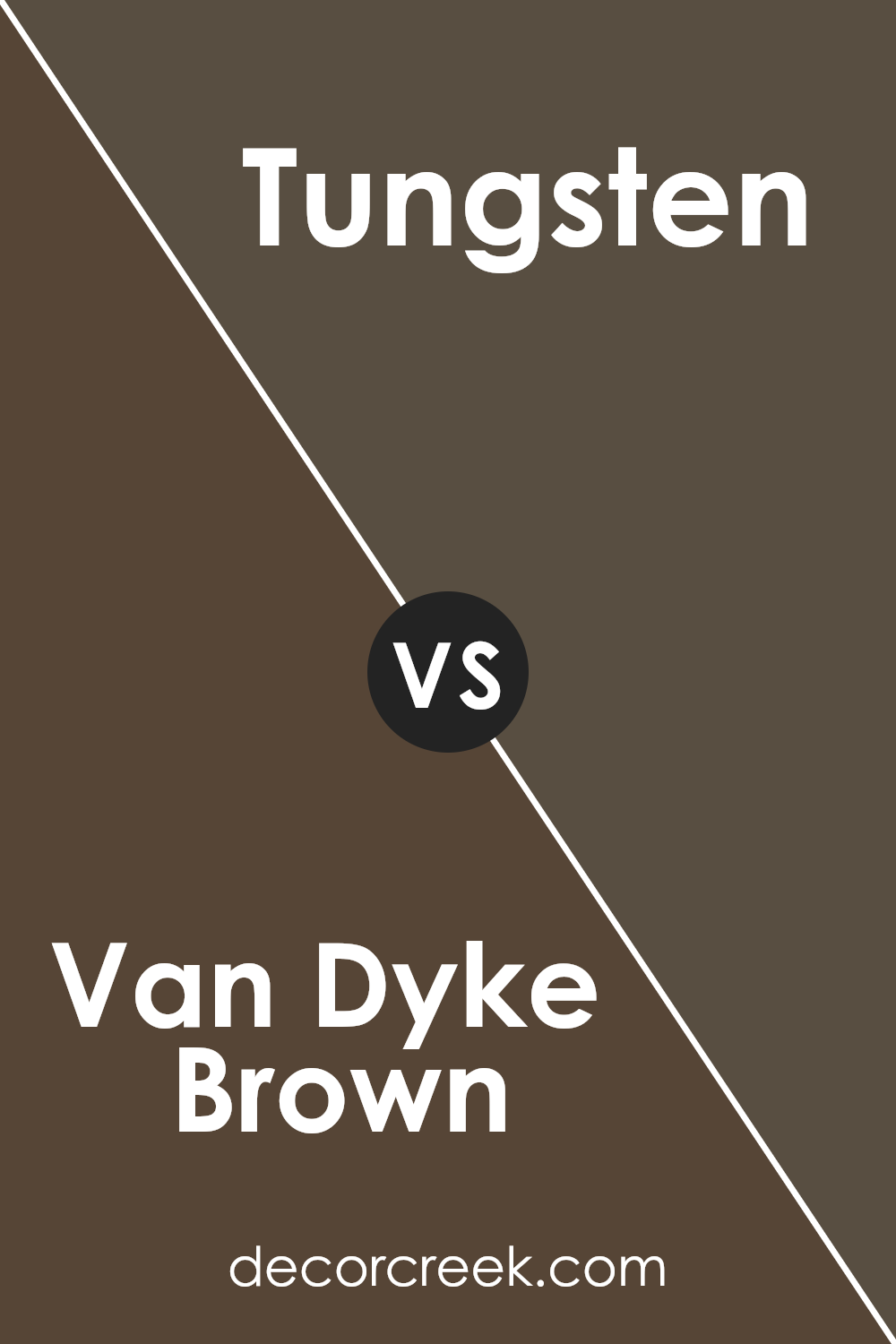
Van Dyke Brown SW 7041 by Sherwin Williams vs Tungsten SW 9515 by Sherwin Williams
Van Dyke Brown and Tungsten by Sherwin Williams are both unique colors, but they serve different moods and spaces. Van Dyke Brown is a rich, deep brown that brings a warm, cozy feel to any room. Its earthy tone can make large spaces feel more inviting and add a sense of sophistication.
On the other hand, Tungsten is a lighter, cooler gray with subtle blue undertones. This color offers a fresh, modern look that can brighten up spaces while keeping them feeling calm and collected.
When comparing these two, think about the vibe you want for your space. Van Dyke Brown works best in areas where you want to create an intimate, warm atmosphere, like living rooms or dens.
Tungsten is more suited for creating a sleek, contemporary feel, ideal for bathrooms, kitchens, or even home offices. Both colors are versatile but in different ways. Van Dyke Brown leans towards traditional and timeless, while Tungsten edges more towards a minimalist, modern aesthetic.
Choosing between them depends on the style and atmosphere you’re aiming for in your space.
You can see recommended paint color below:
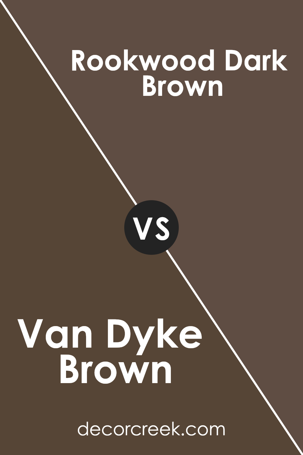
Van Dyke Brown SW 7041 by Sherwin Williams vs Rookwood Dark Brown SW 2808 by Sherwin Williams
Both Van Dyke Brown SW 7041 and Rookwood Dark Brown SW 2808 by Sherwin Williams are deep, rich colors but with different tones and vibes. Van Dyke Brown leans more towards a classic, timeless brown, providing a warm and cozy atmosphere to any space.
Its versatility means it can easily fit into many design schemes, offering a sophisticated backdrop that’s not too overwhelming.
On the other hand, Rookwood Dark Brown has a stronger, more pronounced presence. It’s darker and feels more grounded, giving off a robust, earthy vibe.
This color can make a bold statement in a room, perfect for creating an accent wall or adding depth to your decor. It pairs well with contrasting light colors to balance its intensity.
While both colors share a brown base, Van Dyke Brown is softer and more flexible in blending with your home’s existing colors. Rookwood Dark Brown demands more attention and is ideal for those looking to make a stronger decorative statement.
Both choices offer unique beauty and charm, depending on what mood or style you’re aiming for in your space.
You can see recommended paint color below:
- SW 2808 Rookwood Dark Brown
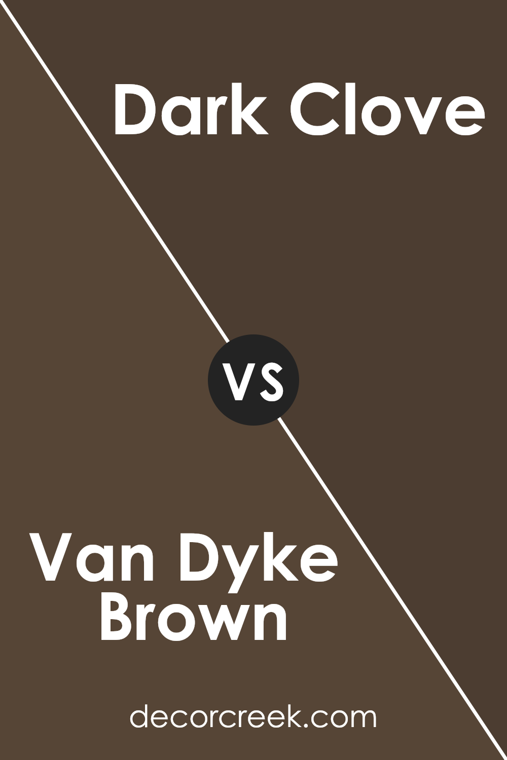
Van Dyke Brown SW 7041 by Sherwin Williams vs Dark Clove SW 9183 by Sherwin Williams
Van Dyke Brown and Dark Clove are two distinct colors offered by Sherwin Williams, each bringing its own unique vibe to the table. The main difference lies in their tones and the atmosphere they create when applied to a space.
Van Dyke Brown is a deep, warm, chocolatey brown that feels rich and cozy, making it perfect for creating a snug and inviting ambiance in rooms. Its depth means it works well in areas where you want to establish a strong sense of comfort and elegance, like living rooms or studies.
On the other hand, Dark Clove has a murkier, more muted quality. While it’s also a dark color, it leans towards a slightly cooler, greyish-brown shade. This gives it a more understated and versatile character, making it a great choice for those seeking a sophisticated, yet subtle backdrop that works with a wide range of decor.
In essence, while both colors share a certain darkness and richness, Van Dyke Brown exudes a warmer, more enveloping feel, whereas Dark Clove offers a cooler, more refined elegance. Both can dramatically transform spaces, but the choice between them depends on the mood you’re aiming to achieve.
You can see recommended paint color below:
- SW 9183 Dark Clove
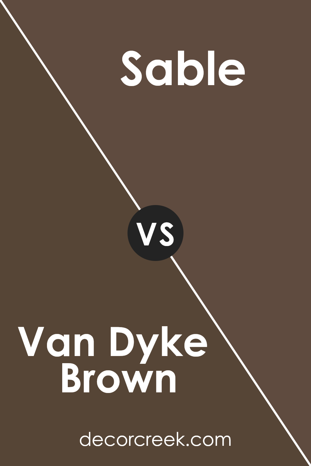
Van Dyke Brown SW 7041 by Sherwin Williams vs Sable SW 6083 by Sherwin Williams
Van Dyke Brown and Sable, both from Sherwin Williams, have unique tones that set them apart. Van Dyke Brown is a deep, rich brown with a warm undertone.
It gives a cozy and comfortable feeling, perfect for creating a snug and inviting atmosphere in a room. Think of it as a dark chocolate that adds depth and sophistication.
On the other hand, Sable is a lighter shade of brown with a slightly reddish tint. It’s warmer and less intense than Van Dyke Brown, making it more versatile for spaces that aim for a soft yet welcoming vibe.
It’s like the color of autumn leaves or a well-worn leather, adding a touch of warmth and natural elegance to a space.
Although both colors share a brown base, Van Dyke Brown leans towards a darker, more serious palette, while Sable offers a lighter, warmer approach.
Whether you prefer the boldness of Van Dyke Brown or the softer touch of Sable can depend on the mood and style you want to achieve in your space.
You can see recommended paint color below:
- SW 6083 Sable
Conclusion
Van Dyke Brown SW 7041 by Sherwin Williams is a rich, earthy hue that brings a certain warmth and depth to spaces. It offers a touch of elegance and sophistication, making it a perfect choice for those looking to add a classic and timeless feel to their interiors.
This color works beautifully in various settings, from living rooms and bedrooms to dining areas, creating a cozy and inviting atmosphere.
Despite its richness, Van Dyke Brown maintains versatility, easily pairing with a wide range of color schemes and decor styles. Whether used as a main color for walls or as an accent to highlight specific areas, it provides a solid foundation that complements both traditional and modern designs.
This makes Van Dyke Brown SW 7041 by Sherwin Williams a popular choice among homeowners and interior designers looking to introduce a sense of warmth and character into their projects.
Ever wished paint sampling was as easy as sticking a sticker? Guess what? Now it is! Discover Samplize's unique Peel & Stick samples.
Get paint samples