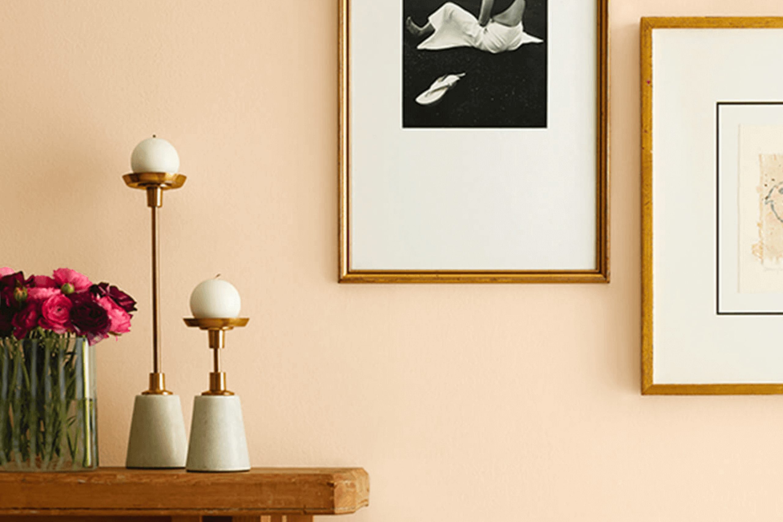
When you think about refreshing your living room, color is often the first step toward change. One paint that might catch your eye is Sherwin Williams’ SW 7721 Crescent Cream. This shade offers a soft, inviting warmth that can instantly brighten your room. It’s flexible, fitting well in various settings, from a cozy bedroom to a bustling kitchen.
Crescent Cream strikes a balance between yellow and beige, creating a sunny but subtle atmosphere. It reflects natural light beautifully, giving your room an open and airy feel. As the sun moves, the color seems to shift, changing from a buttery glow in the morning to a richer hue in the evening. This dynamic aspect brings a unique character to your walls, making your décor feel lively and warm.
Pairing Crescent Cream with complementary colors can enhance your home’s aesthetic. For a classic look, you might choose crisp white trim. For something bold, consider deep blues or greens to add some contrast. Crescent Cream’s neutral undertones mean it works with many styles, allowing you to express your personal taste easily.
Overall, Crescent Cream is more than just a paint color; it’s a warm and welcoming foundation for your home’s design. It can encourage comfort and positivity while allowing you room for creativity and expression.
What Color Is Crescent Cream SW 7721 by Sherwin Williams?
Crescent Cream is a soft, warm cream color from Sherwin Williams that brings a gentle brightness to any room. This color is flexible and can make a room feel cozy and inviting. It works well in a variety of interior styles, from traditional to modern, and even in more rustic or farmhouse-inspired settings.
In traditional areas, Crescent Cream provides a classic backdrop that allows other design elements, such as rich wood tones or elegant furnishings, to stand out. It’s also a great choice for modern styles where you want a softer alternative to stark white, adding warmth without overpowering other design elements.
This shade pairs beautifully with natural materials. It complements wood, whether light oak or dark walnut, enhancing the beauty of the grain and providing a neutral contrast. Linen and cotton fabrics in similar or lighter shades blend well with Crescent Cream, creating a harmonious and relaxed atmosphere. Stone textures, like soft marbles or light granites, work nicely with this color too, adding a touch of understated elegance.
Crescent Cream offers a flexible option for those looking to brighten up a room while maintaining a cozy and welcoming feel. It balances well with both muted and vibrant accents, making it a practical choice for a cohesive design.
Is Crescent Cream SW 7721 by Sherwin Williams Warm or Cool color?
Crescent Cream SW 7721 by Sherwin Williams is a warm, inviting color that works well in various home settings. This soft, buttery cream color brings a cozy and welcoming feeling to any room. Its gentle tone makes areas appear larger and airier, adding an open feeling to small areas. Crescent Cream pairs beautifully with other neutral tones and earthy colors, making it flexible for any design style, from traditional to modern.
In living rooms, it creates a comforting backdrop, enhancing the natural light and providing a subtle warmth that makes the room feel more inviting. In bedrooms, Crescent Cream promotes a restful atmosphere, encouraging relaxation and comfort.
Kitchens benefit from its warm undertones, which complement wooden cabinets or stainless-steel appliances. Bathrooms become more soothing when painted with this shade, offering a spa-like ambiance. Overall, Crescent Cream is an excellent choice for homeowners looking for a gentle yet warm color to enhance their areas.
Undertones of Crescent Cream SW 7721 by Sherwin Williams
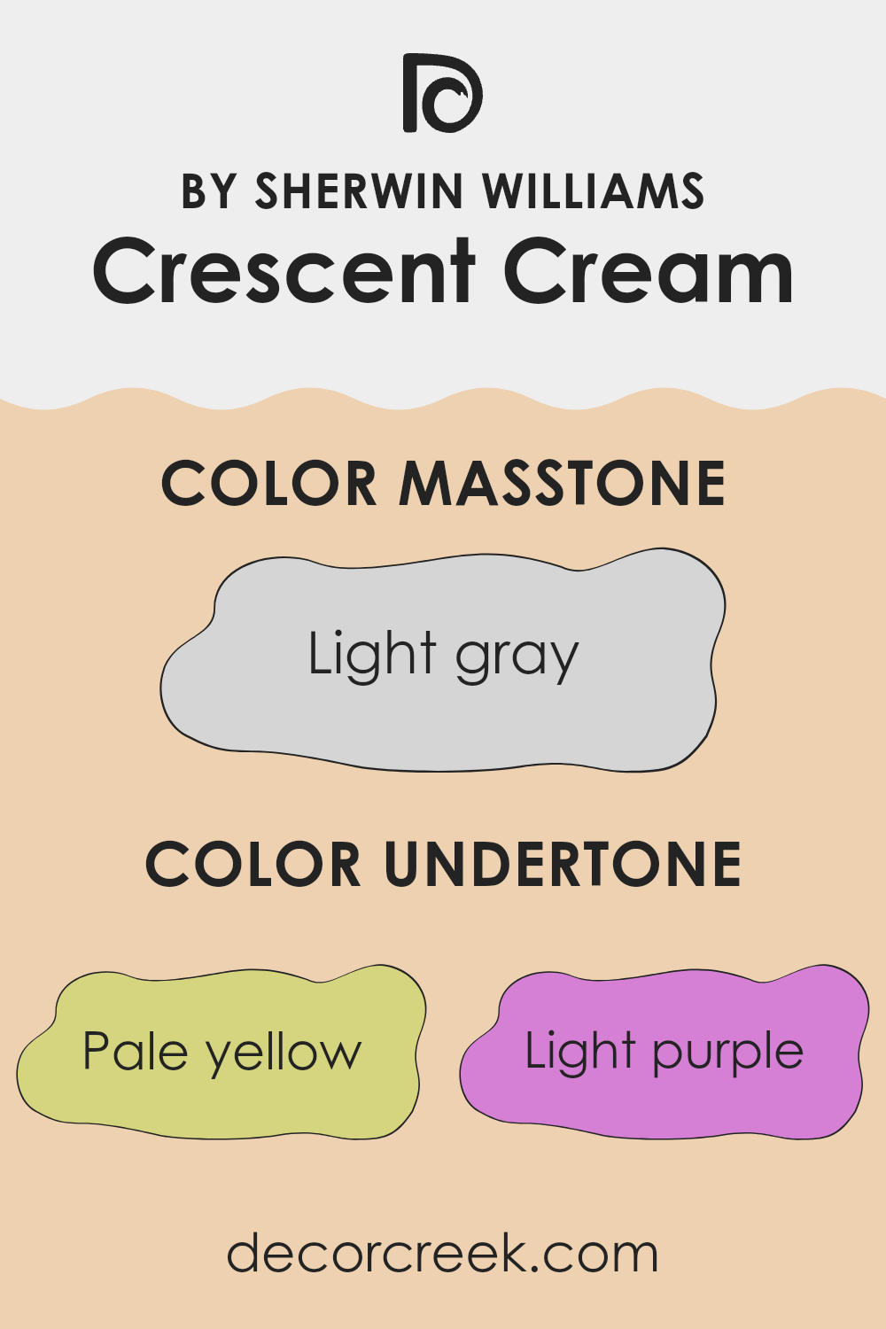
Crescent Cream from Sherwin Williams is a color with subtle undertones that add depth and character to any room. The undertones of pale yellow, light purple, pale pink, light blue, mint, lilac, and grey influence how we perceive this soft, warm shade. These colors are not immediately visible, but they can subtly shift the cream’s appearance depending on the lighting and surrounding decor.
The pale yellow undertone gives Crescent Cream a warm, sunny feel, making it ideal for creating cozy areas. Light purple and lilac add a touch of sophistication, while pale pink introduces a gentle warmth that is both welcoming and soft.
Light blue and mint undertones bring a hint of coolness, offering balance to the warmth and preventing it from feeling too intense. The grey undertone helps neutralize the color, ensuring it remains flexible and easy to pair with other colors. When applied to interior walls, these undertones can change how Crescent Cream looks throughout the day. In natural daylight, the color might appear brighter and slightly more yellow.
In the evening, under artificial light, the cooler blue or purple undertones can become more pronounced. This adaptability makes the color a flexible choice for both modern and traditional interiors. Its ability to change with different lighting means it can suit various moods and settings.
What is the Masstone of the Crescent Cream SW 7721 by Sherwin Williams?
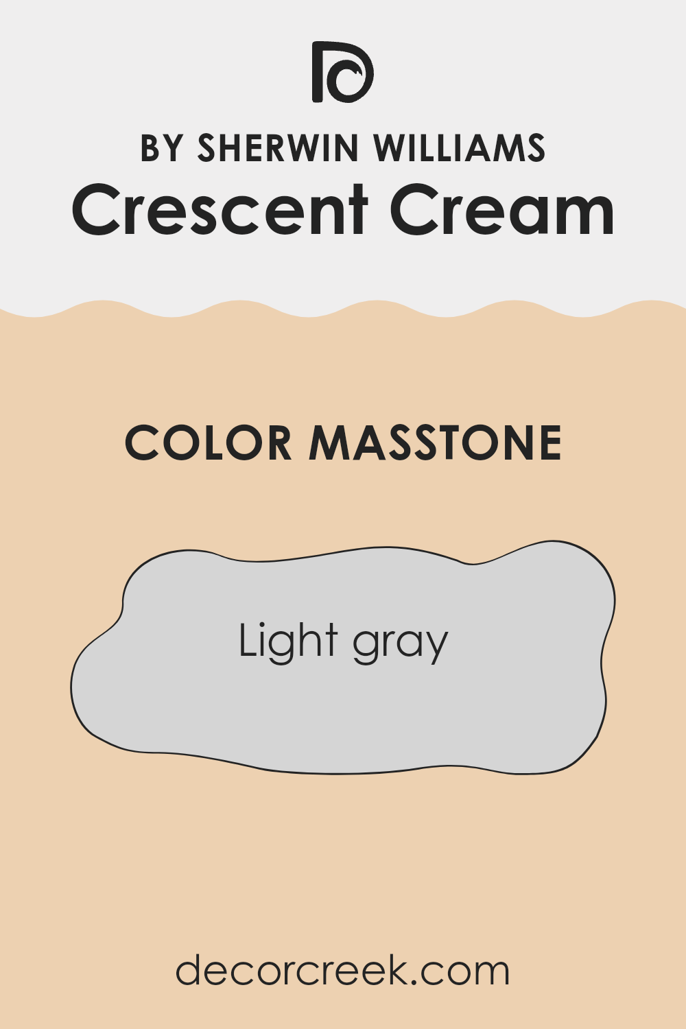
Crescent Cream SW 7721 by Sherwin Williams has a masstone of light gray (#D5D5D5), which influences its functionality and feel in home settings. This light gray undertone plays a significant role in making this color adaptable and neutral, complementing various design styles.
Because of its subtle gray presence, Crescent Cream can create a calm and gentle atmosphere. It often works well in living areas or bedrooms to promote relaxation without being too stark or cold. The light gray masstone allows the shade to pair beautifully with a wide range of other colors, making it ideal for both traditional and modern areas.
It helps to reflect natural light, enhancing the sense of room and making rooms feel more open and airy. This quality makes it suitable for smaller areas where the aim is to maximize brightness and a welcoming environment. Crescent Cream’s balance ensures it stays classic and flexible in any setting.
How Does Lighting Affect Crescent Cream SW 7721 by Sherwin Williams?
Lighting dramatically influences how colors appear in a room. This is because light can affect the brightness, shade, and even hue of a color. For Crescent Cream SW 7721 by Sherwin Williams, lighting can make a significant difference in its appearance.
In artificial light, Crescent Cream will depend on the warmth of the light bulbs you choose. Under warm incandescent or LED lights, this creamy color may appear more yellow or rich, enhancing its cozy and inviting traits. Conversely, under cool fluorescent lights, Crescent Cream might look slightly muted or less warm, as the blue tones in these lights can counteract its warmth.
Natural light changes throughout the day and impacts Crescent Cream differently in various directions. In north-facing rooms, which receive cooler, consistent light, Crescent Cream might take on a slightly grayish or subdued appearance. This is due to the indirect nature of northern light, which lacks warmth.
In south-facing rooms, where sunlight is strong and warm, Crescent Cream will appear brighter and warmer. This bright exposure can enhance its sunny and creamy qualities, making these rooms feel cheerful and welcoming.
East-facing rooms get bright light in the morning, which is often warm and golden. Crescent Cream in east-facing areas will appear luminous and fresh in the morning, but as the day progresses and light fades, the color might become softer.
West-facing rooms receive warm light in the late afternoon and evening. During this time, Crescent Cream can glow warmly, making areas feel cozy and rich. In the morning, however, the light is weaker and may make the color look more muted.
Overall, Crescent Cream is quite adaptable, but its appearance will shift depending on the lighting in your room. Understanding how light affects it can help you achieve the desired feel in each room.

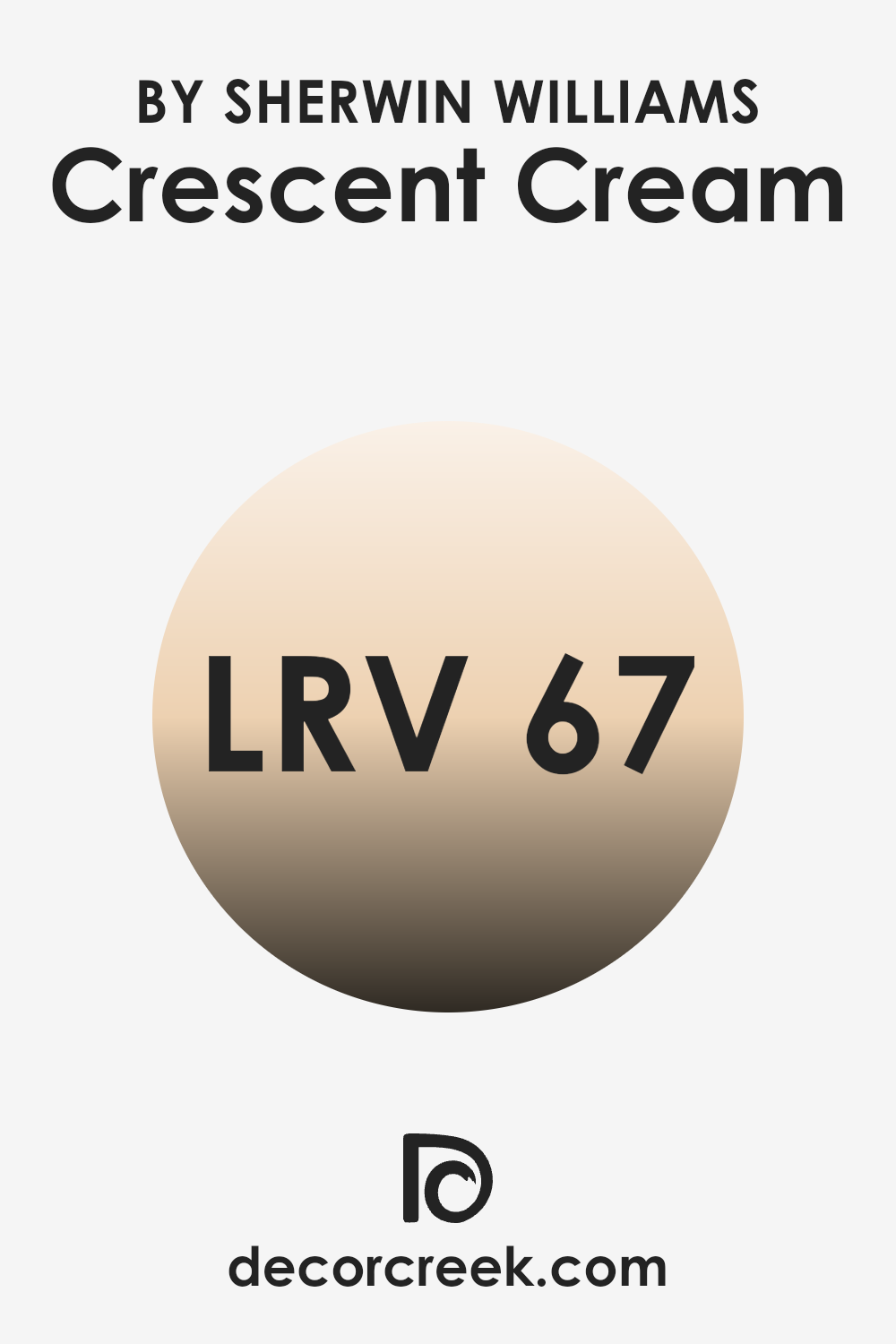
What is the LRV of Crescent Cream SW 7721 by Sherwin Williams?
Light Reflectance Value, or LRV, is a measure of how much light a color reflects. It ranges from 0, which is completely black and absorbs all light, to 100, which is pure white and reflects all light. The higher the LRV, the more light the color reflects, making it appear brighter and lighter in a room.
Colors with a lower LRV absorb more light, making them look darker and sometimes smaller depending on the room. When deciding on a paint color, LRV is important because it helps predict how the color will interact with the light in a specific room, influencing the overall feel and perception of room.
Crescent Cream has an LRV of 66.574, which means it reflects a good amount of light. This makes it a light, bright color that can help open up a room and make it feel larger and more airy. With this level of reflectance, Crescent Cream works well in areas that might not get a lot of natural light, as it helps to bounce the available light around the room, preventing the room from feeling dim or cramped. Its ability to reflect light also means that the color can change slightly depending on the lighting conditions, sometimes appearing warmer or cooler based on the time of day and the type of lighting used.
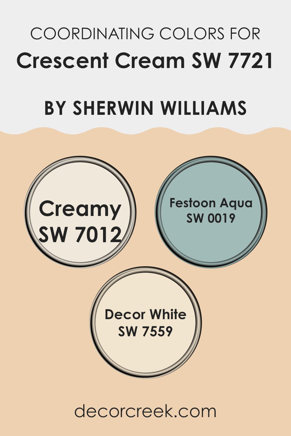
Coordinating Colors of Crescent Cream SW 7721 by Sherwin Williams
Coordinating colors are hues that work well together, creating a harmonious and visually appealing palette. They are chosen based on how they complement each other in terms of hue, saturation, and brightness. When it comes to Crescent Cream by Sherwin Williams, selecting the right coordinating colors enhances its warmth and inviting nature.
One great option is SW 7012 Creamy, which offers a soft, welcoming off-white with a subtle yellow undertone that complements the warmth of Crescent Cream. It brings a clean and cozy feel to any room, making it a flexible choice as a background or main color.
Another beautiful coordinating color is SW 0019 Festoon Aqua. This color introduces a refreshing splash of teal that can add a touch of lively energy to your palette while maintaining a sense of balance. It’s perfect if you want a bit of color without overpowering the senses.
Lastly, SW 7559 Decor White is an excellent choice for trim or accents. This color is a classic, bright white that pairs seamlessly with Crescent Cream, providing a crisp contrast that enhances the overall light and airy feel. Together, these colors create a coordinated scheme that is both inviting and visually appealing.
You can see recommended paint colors below:
- SW 7012 Creamy
- SW 0019 Festoon Aqua
- SW 7559 Decor White
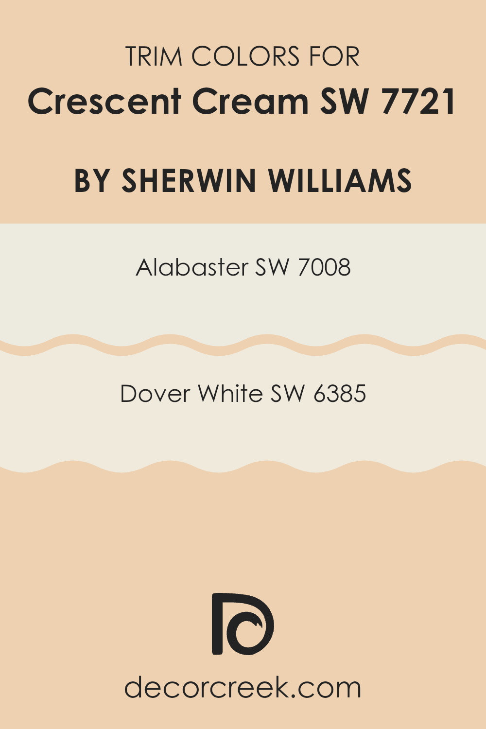
What are the Trim colors of Crescent Cream SW 7721 by Sherwin Williams?
Trim colors refer to the shades used to highlight and define the edges and borders of a room, such as baseboards, moldings, and window frames. These colors are essential for creating contrast and depth in a room, enhancing the overall aesthetic of the paint scheme. When Crescent Cream by Sherwin Williams is used as the main wall color, trim colors like Alabaster SW 7008 and Dover White SW 6385 can complement it beautifully.
Alabaster is a soft, warm white that adds a touch of brightness without being too stark, making it a flexible choice that works harmoniously with the warm yellow tones of Crescent Cream. Dover White, on the other hand, has a creamy, inviting hue with subtle undertones that contribute a cozy feel, making it ideal for providing a gentle transition between the walls and the trim.
Using these trim colors with Crescent Cream helps create a balanced and visually pleasing environment. Alabaster, with its ability to reflect light, can make rooms feel more spacious and airy, while the creamy warmth of Dover White adds an element of warmth and approachability.
These whites not only highlight the architectural details of the room but also frame the Crescent Cream in a way that enhances its cheerful and welcoming nature. By selecting the right trim colors, you can make Crescent Cream’s sunny tones more prominent, resulting in a room that feels both cohesive and inviting.
You can see recommended paint colors below:
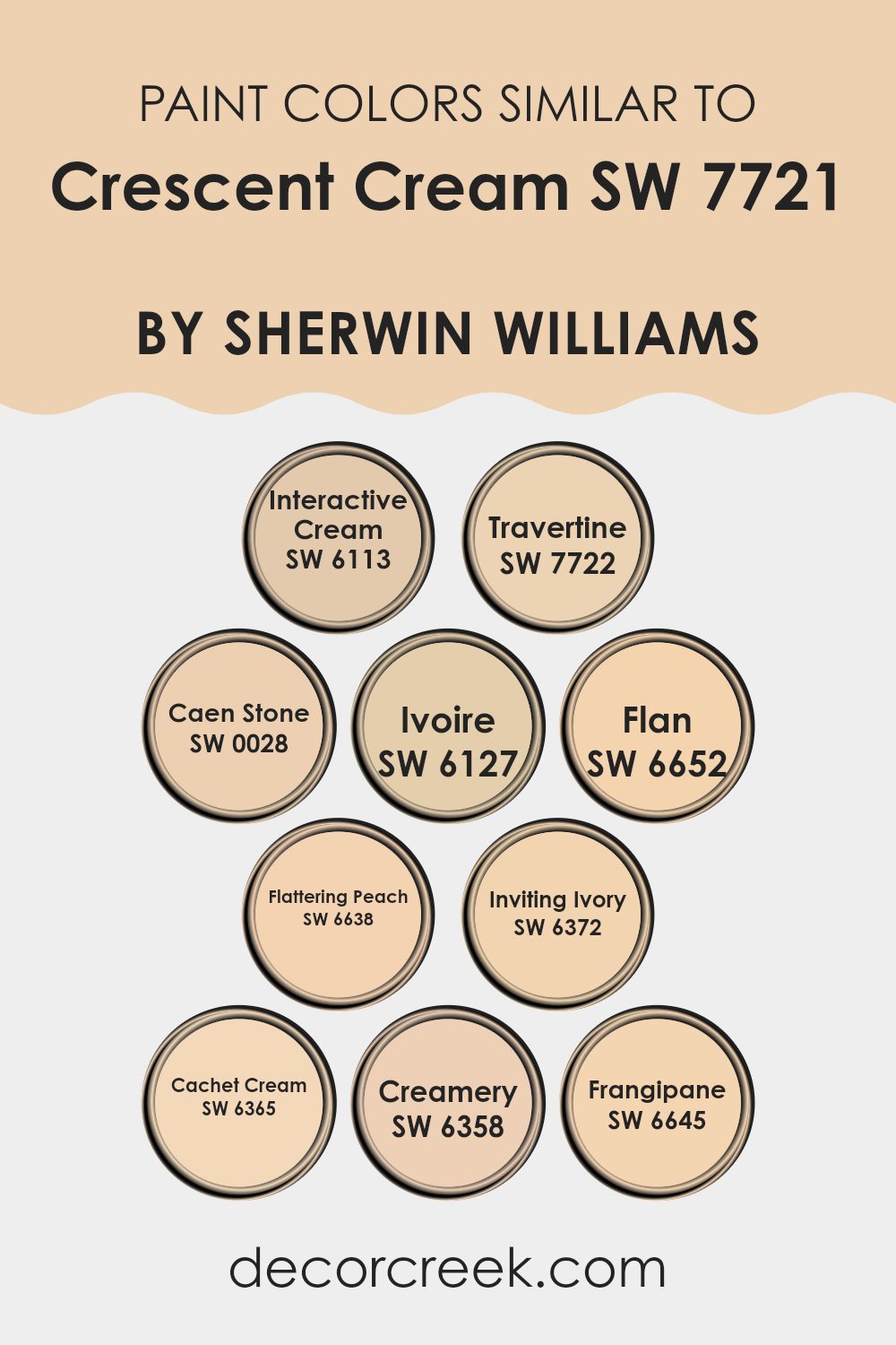
Colors Similar to Crescent Cream SW 7721 by Sherwin Williams
Similar colors play an important role in design because they create harmony and a sense of unity. When you choose colors that are closely related, like those similar to Crescent Cream by Sherwin Williams, you create a visually pleasing effect. These colors work together because they share common undertones, which make them blend seamlessly.
For example, SW 6113 – Interactive Cream has a warm, inviting feel, similar to Crescent Cream, making it perfect for cozy rooms. SW 7722 – Travertine offers a soft, neutral backdrop that can work well in both modern and traditional settings. These colors help establish a calm and welcoming environment.
Moving along the palette, SW 0028 – Caen Stone provides a rich and earthy tone, while SW 6127 – Ivoire adds a subtle golden hint that’s perfect for bringing warmth to a room. SW 6652 – Flan is a sweet, buttery shade that can create a cheerful atmosphere, and SW 6638 – Flattering Peach adds a gentle, warm blush.
SW 6372 – Inviting Ivory is flexible and clean, making it suitable for nearly any room. SW 6365 – Cachet Cream offers a soft, refined touch, and SW 6358 – Creamery brings an element of cozy creaminess.
Lastly, SW 6645 – Frangipane delights with its soft, light peach tone, tying the palette together beautifully. Each of these colors enhances the overall vibe, creating areas that feel comfortable and cohesive.
You can see recommended paint colors below:
- SW 6113 Interactive Cream
- SW 7722 Travertine
- SW 0028 Caen Stone
- SW 6127 Ivoire
- SW 6652 Flan
- SW 6638 Flattering Peach
- SW 6372 Inviting Ivory
- SW 6365 Cachet Cream
- SW 6358 Creamery
- SW 6645 Frangipane
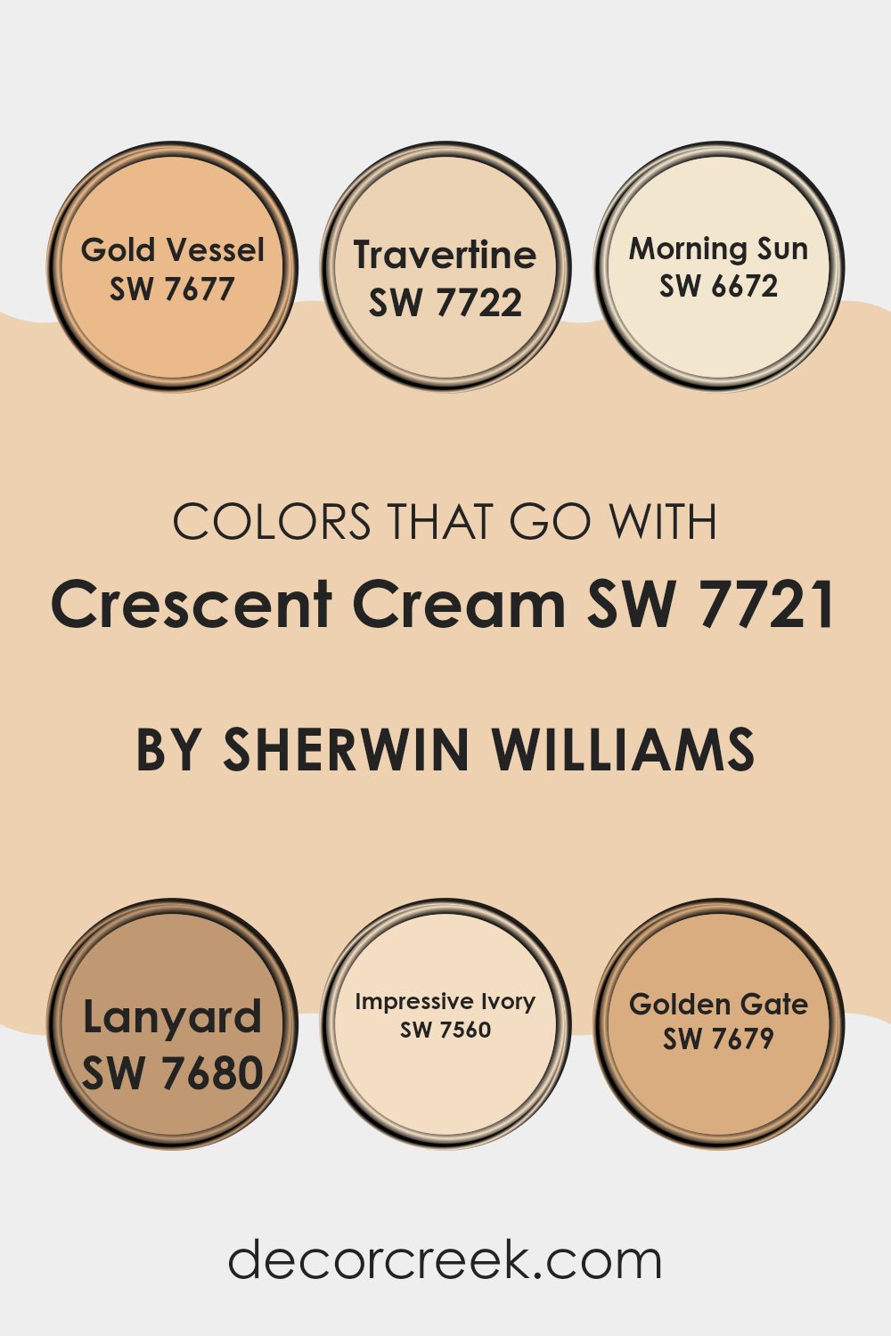
Colors that Go With Crescent Cream SW 7721 by Sherwin Williams
Choosing colors that complement Crescent Cream SW 7721 by Sherwin Williams is important because it helps create a harmonious and pleasing environment. Crescent Cream is a warm, inviting shade that pairs beautifully with other colors to enhance a rooms overall feel. When used together, these colors can make a room feel cozier and more inviting.
For instance, using SW 7677 – Gold Vessel, a rich and warm golden hue, adds depth and elegance, while SW 7722 – Travertine, a soft and subtle beige, provides a neutral base perfect for balancing bolder accents.
On the other hand, SW 6672 – Morning Sun, a bright and cheerful yellow, brings a sunny and uplifting vibe to the room, making it feel vibrant and lively. Meanwhile, SW 7680 – Lanyard, a warm brown, can ground the palette and offer a sense of stability. SW 7560 – Impressive Ivory is a crisp, clean white that adds brightness and a touch of sophistication to the mix.
Finally, SW 7679 – Golden Gate, a deep, earthy orange, introduces a bold and energetic element that ties everything together nicely. Combining these colors creates a well-rounded and inviting area that perfectly complements Crescent Cream.
You can see recommended paint colors below:
- SW 7677 Gold Vessel
- SW 7722 Travertine
- SW 6672 Morning Sun
- SW 7680 Lanyard
- SW 7560 Impressive Ivory
- SW 7679 Golden Gate
How to Use Crescent Cream SW 7721 by Sherwin Williams In Your Home?
Crescent Cream SW 7721 by Sherwin Williams is a warm and inviting paint color that can bring a cozy feel to any home. It’s a soft, creamy yellow with a hint of warmth, making it perfect for areas where you want to add a touch of cheerfulness without being too bold.
This color works well in living rooms, dining areas, or bedrooms, offering a welcoming atmosphere. You can pair it with neutral colors like whites and grays to keep the room calm and balanced, or add in some earth tones like browns and greens for a natural look.
Crescent Cream can also be a great choice for kitchens, as its warmth complements wooden cabinets and stainless steel appliances nicely. Whether used on all walls or as an accent, it provides a light, airy backdrop that is flexible and classic, making your home feel comfortable and inviting.
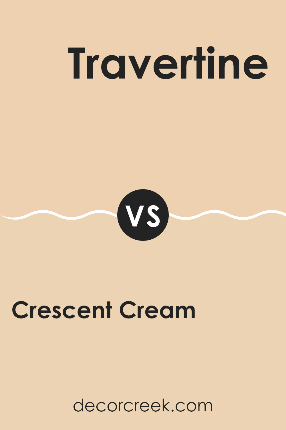
Crescent Cream SW 7721 by Sherwin Williams vs Travertine SW 7722 by Sherwin Williams
Crescent Cream SW 7721 and Travertine SW 7722 by Sherwin Williams are two soft, warm colors. Crescent Cream is a light, creamy yellow that brings warmth and brightness to any room. It feels inviting and cozy, making it suitable for living rooms, kitchens, or any area where a welcoming atmosphere is desired.
Travertine, on the other hand, is slightly more muted with a touch of beige. It offers a natural, earthy tone that is calming and flexible. Travertine works well in settings that favor a more understated backdrop, such as bedrooms or offices, where a calm environment is preferred.
Both colors complement each other well. Crescent Cream can be used to add a pop of light and warmth, while Travertine provides a more grounded and neutral color. When used together, they create a balanced and harmonious look, ideal for various home interiors.
You can see recommended paint color below:
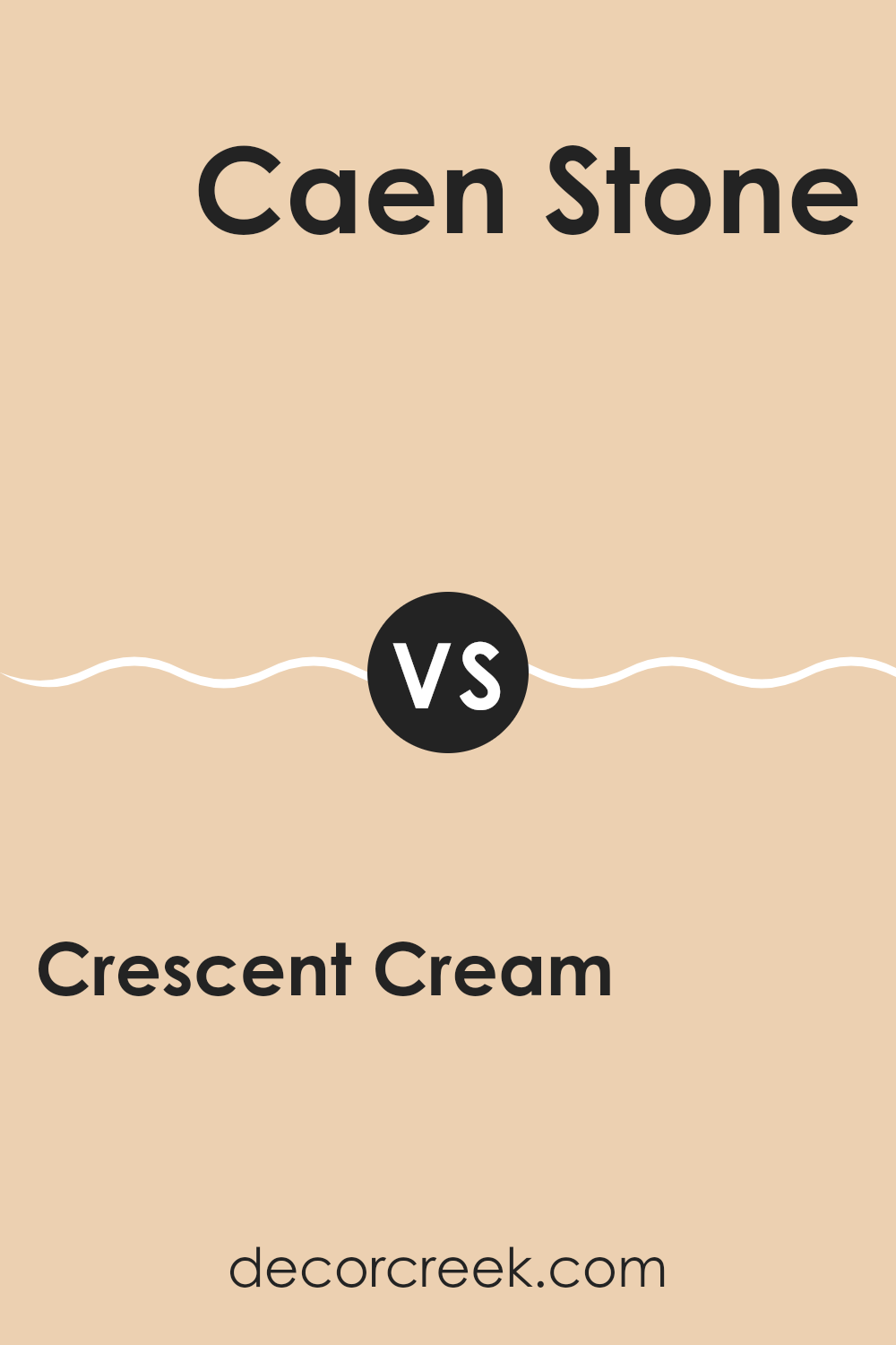
Crescent Cream SW 7721 by Sherwin Williams vs Caen Stone SW 0028 by Sherwin Williams
Crescent Cream SW 7721 and Caen Stone SW 0028 by Sherwin Williams each bring a unique charm to a room. Crescent Cream is a soft, warm, buttery yellow that gives off a cozy and welcoming vibe. It can brighten up a room while still feeling mellow and easy to live with. It’s especially nice in areas like kitchens or living rooms where a touch of warmth is desired.
On the other hand, Caen Stone is more grounded with its earthy, muted brown tone. It provides a sense of stability and richness, making it suitable for areas where you want a touch of sophistication and depth, like studies or dining rooms. The brown undertones of Caen Stone offer a nice contrast to Crescent Cream, as they add richness to the palette.
When used together, Crescent Cream can lighten up the heavier tone of Caen Stone, creating a balanced and harmonious look.
You can see recommended paint color below:
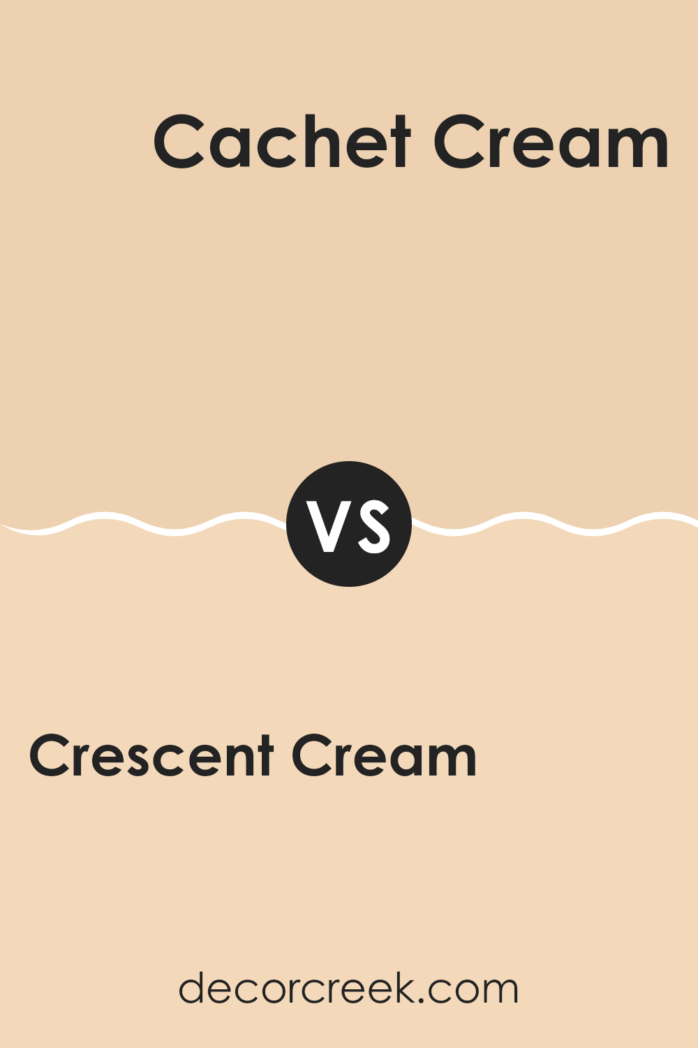
Crescent Cream SW 7721 by Sherwin Williams vs Cachet Cream SW 6365 by Sherwin Williams
Crescent Cream SW 7721 and Cachet Cream SW 6365 are both light, warm colors by Sherwin Williams, but they have distinct appearances and uses. Crescent Cream is a soft, pale yellow with a delicate warmth, creating a subtle, cheerful glow in a room. It works well in rooms where you want a gentle touch of color without overpowering brightness.
Cachet Cream, on the other hand, is slightly richer and deeper in tone. It has a hint more of peach or orange undertones, giving it a cozy, inviting feel. This makes Cachet Cream a good choice for areas where you want warmth and a cozy atmosphere, such as living rooms or bedrooms.
Both colors are flexible and can work well in various settings. They pair nicely with neutrals and can accentuate natural materials like wood. However, Crescent Cream offers a lighter, more airy feel, while Cachet Cream provides more depth and warmth.
You can see recommended paint color below:
- SW 6365 Cachet Cream
Crescent Cream SW 7721 by Sherwin Williams vs Flan SW 6652 by Sherwin Williams
Crescent Cream SW 7721 and Flan SW 6652 are both soft, inviting colors by Sherwin Williams, but they have distinct personalities that set them apart. Crescent Cream is a gentle, warm cream color with hints of yellow. It brings a cozy and welcoming vibe, making it perfect for areas where you want a comforting atmosphere.
On the other hand, Flan SW 6652 is richer and more golden, leaning towards a deeper yellow shade. It offers a vibrant yet still warm feel, ideal for areas that need a touch of energy while remaining soothing.
Crescent Cream works well in rooms where light needs to be soft and subtle, often found in living rooms or bedrooms. Flan excels in kitchens or bathrooms where a splash of warmth and a bit more intensity might be desired. Overall, Crescent Cream is understated, while Flan adds a bolder touch.
You can see recommended paint color below:
- SW 6652 Flan
Crescent Cream SW 7721 by Sherwin Williams vs Frangipane SW 6645 by Sherwin Williams
Crescent Cream SW 7721 and Frangipane SW 6645 by Sherwin Williams are both warm and inviting colors, but they offer different moods and uses. Crescent Cream is a soft, light yellow with a creamy undertone, creating a gentle, welcoming feel. It’s often used in areas where a subtle and calming background is desired, such as living rooms or bedrooms.
On the other hand, Frangipane is a more vibrant yellow with a slight hint of orange. This color is lively and cheerful, making it a great choice for areas where you want to add energy and brightness, such as kitchens or playrooms.
While Crescent Cream offers a more understated look, Frangipane can be a statement color, adding a splash of sunshine to any room. Both colors can complement warm wood tones and neutral palettes, but the choice depends on whether you want a calm or energetic atmosphere.
You can see recommended paint color below:
- SW 6645 Frangipane
Crescent Cream SW 7721 by Sherwin Williams vs Ivoire SW 6127 by Sherwin Williams
Crescent Cream SW 7721 and Ivoire SW 6127 by Sherwin Williams are two warm, inviting colors that can add a cozy feel to any room. Crescent Cream is a soft, buttery yellow that feels light and pleasant, giving off a sunny and cheerful vibe. It’s a great choice if you’re looking to brighten up a room but want to keep a mellow tone.
On the other hand, Ivoire is a richer and more golden tone. It has a slight hint of beige, making it a touch deeper than Crescent Cream. It’s a good pick for areas where you want a warm, comfortable atmosphere with a bit more depth.
Both colors work well in living areas, bedrooms, or kitchens, where warmth is often desired. Crescent Cream is perfect if you prefer a lighter, airier feel, while Ivoire is ideal if you want a bit more warmth and richness in the color.
You can see recommended paint color below:
- SW 6127 Ivoire
Crescent Cream SW 7721 by Sherwin Williams vs Flattering Peach SW 6638 by Sherwin Williams
Crescent Cream and Flattering Peach are two distinct colors from Sherwin Williams that offer different aesthetics. Crescent Cream is a soft, warm cream color that feels light and airy. It’s perfect for creating an inviting and cozy atmosphere in any room. This color works well in living rooms and bedrooms, adding a touch of elegance without being too intense.
On the other hand, Flattering Peach is a warm, cheerful shade of peach. It’s vibrant and lively, creating a bright and energetic feel. This color is great for areas where you want to feel uplifted and energized, such as kitchens or children’s rooms.
While both colors share a warm undertone, Crescent Cream is more neutral, making it flexible and easy to pair with other colors. Flattering Peach, with its boldness, can be a statement color or used as an accent to add character. Together, they can be combined for a harmonious look, or used separately depending on the mood you want to achieve.
You can see recommended paint color below:
- SW 6638 Flattering Peach
Crescent Cream SW 7721 by Sherwin Williams vs Creamery SW 6358 by Sherwin Williams
Crescent Cream (SW 7721) and Creamery (SW 6358) are both warm, inviting colors by Sherwin Williams, but they have subtle differences. Crescent Cream is a soft, pale yellow with a gentle hint of warmth. It feels light and refreshing, making it perfect for areas you want to feel bright and airy. This color can make a room feel sunny and cheerful.
On the other hand, Creamery is slightly deeper with a more pronounced creamy undertone. It has a bit more warmth compared to Crescent Cream, giving it a cozier feel. Creamery can be a good choice if you want to create an inviting and snug atmosphere, ideal for living areas or bedrooms that benefit from a touch of richness.
Both colors are flexible and can be paired with a variety of other shades, but Crescent Cream leans towards a brighter feel, while Creamery offers a warmer, more comforting vibe.
You can see recommended paint color below:
- SW 6358 Creamery
Crescent Cream SW 7721 by Sherwin Williams vs Interactive Cream SW 6113 by Sherwin Williams
Crescent Cream SW 7721 and Interactive Cream SW 6113 are both warm, inviting colors by Sherwin Williams, but they have distinct differences. Crescent Cream is a soft, light cream color that gives a gentle, airy feel to a room.
It’s perfect for making rooms feel spacious and bright, without being too stark. On the other hand, Interactive Cream has a slightly deeper, richer tone. It brings warmth and coziness to a room, making it feel welcoming and comfortable.
While both colors can be used to create a relaxed atmosphere, Crescent Cream is ideal for areas where you want to maintain a light and fresh look, such as living rooms or bedrooms. Interactive Cream, with its warmer undertone, works well in areas where you want more depth and a homier feel, like kitchens or dining rooms. Both are flexible, but their subtle differences can affect the mood of a room.
You can see recommended paint color below:
Crescent Cream SW 7721 by Sherwin Williams vs Inviting Ivory SW 6372 by Sherwin Williams
Crescent Cream (SW 7721) by Sherwin Williams is a gentle, warm color that gives off a cozy and inviting vibe. It has a subtle yellow undertone that adds a bit of cheerfulness without being too bold. This makes it a flexible choice for various rooms, offering a feeling of comfort and lightness.
On the other hand, Inviting Ivory (SW 6372) is a softer, more muted hue with a creamier appearance. It leans slightly towards beige, providing a calm and relaxing atmosphere. This color works well in rooms where a more subtle warmth is desired, offering a touch of elegance and simplicity.
Both colors are warm and comforting, but Crescent Cream is brighter and more vibrant, while Inviting Ivory is softer and more subdued. Depending on the mood you wish to create in a room, either color could be an excellent choice, with Crescent Cream adding more energy and Inviting Ivory offering a calmer feel.
You can see recommended paint color below:
- SW 6372 Inviting Ivory

SW 7721 Crescent Cream by Sherwin Williams is a color that I find really delightful. It’s like a gentle, soft yellow that reminds me of sunshine on a lazy afternoon. This shade feels warm and comforting, making any room feel a bit more cheerful and inviting. When I look at Crescent Cream, I think of cozy blankets and happy days spent playing outside.
One of the things I like most about Crescent Cream is how it makes everything look brighter without being too loud or flashy. It’s friendly and easy to pair with other colors. You can match it with whites or dark browns to create a room that feels balanced and pleasant. This color is perfect for a kitchen, living room, or even a bedroom because it creates a welcoming atmosphere.
I think Crescent Cream is a lovely choice if you want something that feels positive and light. It’s like adding a touch of sunshine to any room. Whether you’re painting an entire wall or just an accent, Crescent Cream by Sherwin Williams is a great way to bring warmth and happiness into your home.
It’s a color that makes me smile every time I see it.
Ever wished paint sampling was as easy as sticking a sticker? Guess what? Now it is! Discover Samplize's unique Peel & Stick samples.
Get paint samples

