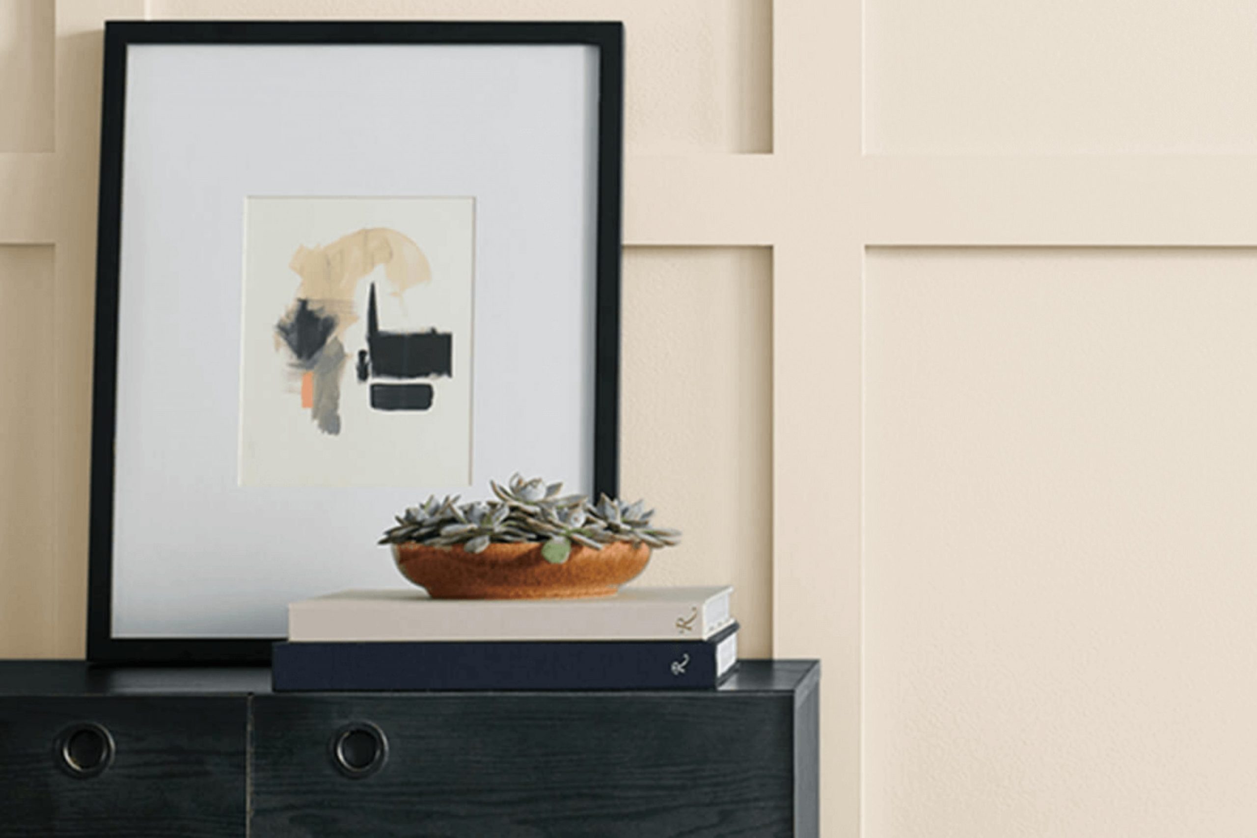
When selecting paint colors for your home, deciding on the right shade can make all the difference. If you’re considering SW 6105 Divine White by Sherwin Williams, there are a few things you’ll want to keep in mind before making your final decision.
First, it’s crucial to understand that Divine White is not a stark white. It has a warm undertone that brings a cozy and inviting feel to any room. This subtle warmth can help soften a room while maintaining a crisp and clean look.
However, how Divine White appears can vary greatly depending on the lighting in your room. Natural light brings out its creamy side, while artificial light can pull its base colors to the surface. I recommend testing a sample in various parts of your room at different times of the day to see how the color changes.
With its flexibility, Divine White can be a great choice if you’re looking for a white that’s soft without being too yellow or stark.
By considering these factors, you can feel more confident about whether SW 6105 Divine White is right for your room.
Is Divine White SW 6105 Right for My Home?
Divine White is a soft and warm shade of white that brings a cozy and inviting feel to any room. Its subtle creamy undertones make it far more forgiving than a stark white, providing a gentle ambiance that feels both fresh and lived-in. As a shade, it’s incredibly flexible and works beautifully in a range of interior styles, particularly traditional, farmhouse, and even modern settings where a touch of warmth is desired.
I’ve found that Divine White pairs exceptionally well with natural materials like wood and stone. In a room with hardwood floors and wooden furniture, this color can create a seamless blend of natural elements, enhancing the organic appeal of the room. It also looks stunning against textured fabrics like linen or wool, adding a layer of softness that makes any room feel more welcoming.
For those who enjoy a bit of contrast, Divine White is an excellent backdrop for bolder colors or mixed metal accents such as brass or copper. In kitchens, it can be used on cabinets to provide a light, airy feel, and in bedrooms, it creates the perfect calming retreat when combined with soft textiles and subtle patterns.
Whether you are styling a new home or updating a room, Divine White offers a classic canvas that is both adaptable and appealing.

What are the right undertones of Divine White SW 6105 ?
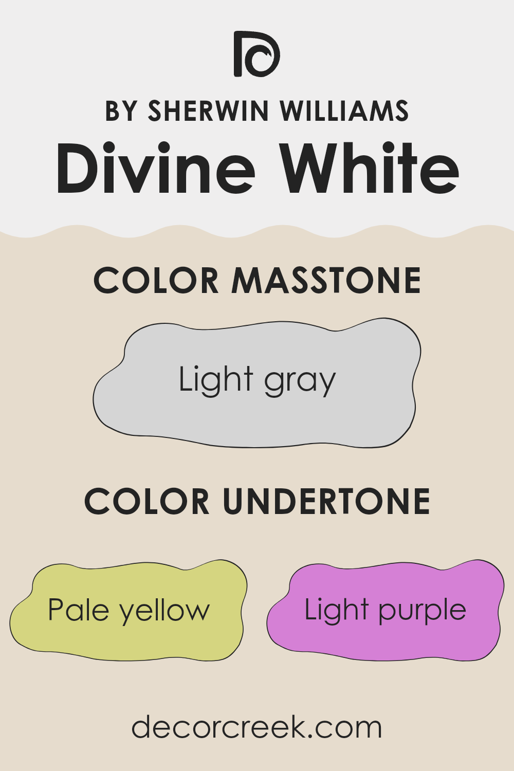
Divine White is a flexible paint color that subtly incorporates a palette of understones, making it an interesting choice for interior walls. The undertones in this specific shade include pale yellow, light purple, light blue, pale pink, mint, lilac, and gray. Each of these undertones plays a role in how the paint color appears under different lighting conditions and when paired with different decor elements.
Undertones are secondary colors that influence the primary shade of the paint. They can make the color appear warmer or cooler and can significantly affect the mood and feel of a room. For example, a pale yellow undertone can make a room feel warmer and more welcoming, while a light blue undertone might give a fresher, calmer feel.
With Divine White, the mix of undertones — from the warmth of pale yellow and pale pink to the coolness of mint and light blue — provides a balanced backdrop that can subtly shift in appearance throughout the day. This makes it a great choice for areas that are used for various purposes at different times. On interior walls, these undertones blend to create a soft, neutral canvas that can easily complement various styles and tastes in furniture and decorations.
Whether it’s bright daylight or artificial lighting, the undertones help ensure that the walls will maintain a pleasant, cohesive look.
Best Coordinating Colors to use with Divine White SW 6105 by Sherwin Williams this year.
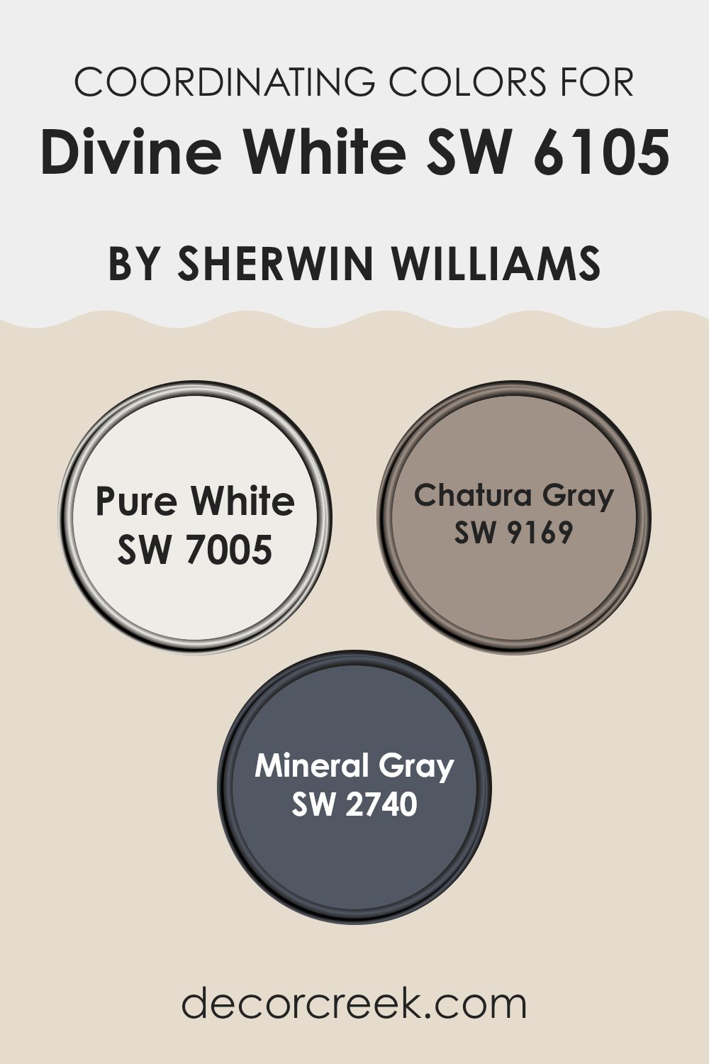
Coordinating colors are complementary shades that work well together to enhance the aesthetic appeal of a room. When chosen correctly, these colors create a balanced and harmonious look. For example, Divine White by Sherwin Williams can be perfectly complemented by shades such as Pure White, Chatura Gray, and Mineral Gray. These colors support each other, bringing out the best features of each shade while maintaining a cohesive design.
Pure White (SW 7005) is a clean and crisp shade that adds a fresh and airy feel to the surroundings. It works wonderfully as a trim or base color that highlights the softer tones of Divine White. Chatura Gray (SW 9169) is a deeper, more muted shade of gray that provides a strong contrast against lighter colors, offering a grounding effect.
Mineral Gray (SW 2740) is another complementary choice, slightly lighter than Chatura Gray with a warm undertone, which helps in creating a cozy and inviting atmosphere when used alongside Divine White. These coordinating colors ensure that the overall palette remains balanced, improving the decor without feeling too strong for the senses.
You can see recommended paint colors below:
- SW 7005 Pure White
- SW 9169 Chatura Gray
- SW 2740 Mineral Gray
Trendy Trim Colors of Divine White SW 6105 by Sherwin Williams to use this year.
Trim colors, such as Shoji White and Accessible Beige by Sherwin Williams, are crucial for enhancing the subtle tones of a primary wall color like Divine White. These colors are selected to complement the main shade, serving as accents for features like door frames, skirting boards, and cornices.
The right trim color can subtly contrast or harmonize with the main color, defining areas more clearly and adding a polished finish to the room. Using specific trim colors can also impact the perceived size and brightness of a room, either amplifying natural light or adding a sense of coziness.
Shoji White SW 7042 is a light, neutral color that brings a fresh and airy feel to rooms. It pairs well with Divine White as it maintains a light, clean look while providing just enough distinction to highlight detailed trim work subtly. Accessible Beige SW 7036, on the other hand, offers a warmer approach, adding a gentle contrast that enhances the warmth of a room. This cozy beige helps create a welcoming atmosphere and works particularly well in areas with richer colors or where a more pronounced definition is desired.
You can see recommended paint colors below:

Evergreen Colors Similar to Divine White SW 6105 by Sherwin Williams
Similar colors create a harmonious and balanced visual effect, enhancing the overall aesthetic of a room without drawing too much attention. When colors like Divine White from Sherwin Williams are used as a base, similar hues work well to complement and subtly vary the primary color, allowing for design flexibility while maintaining a cohesive look.
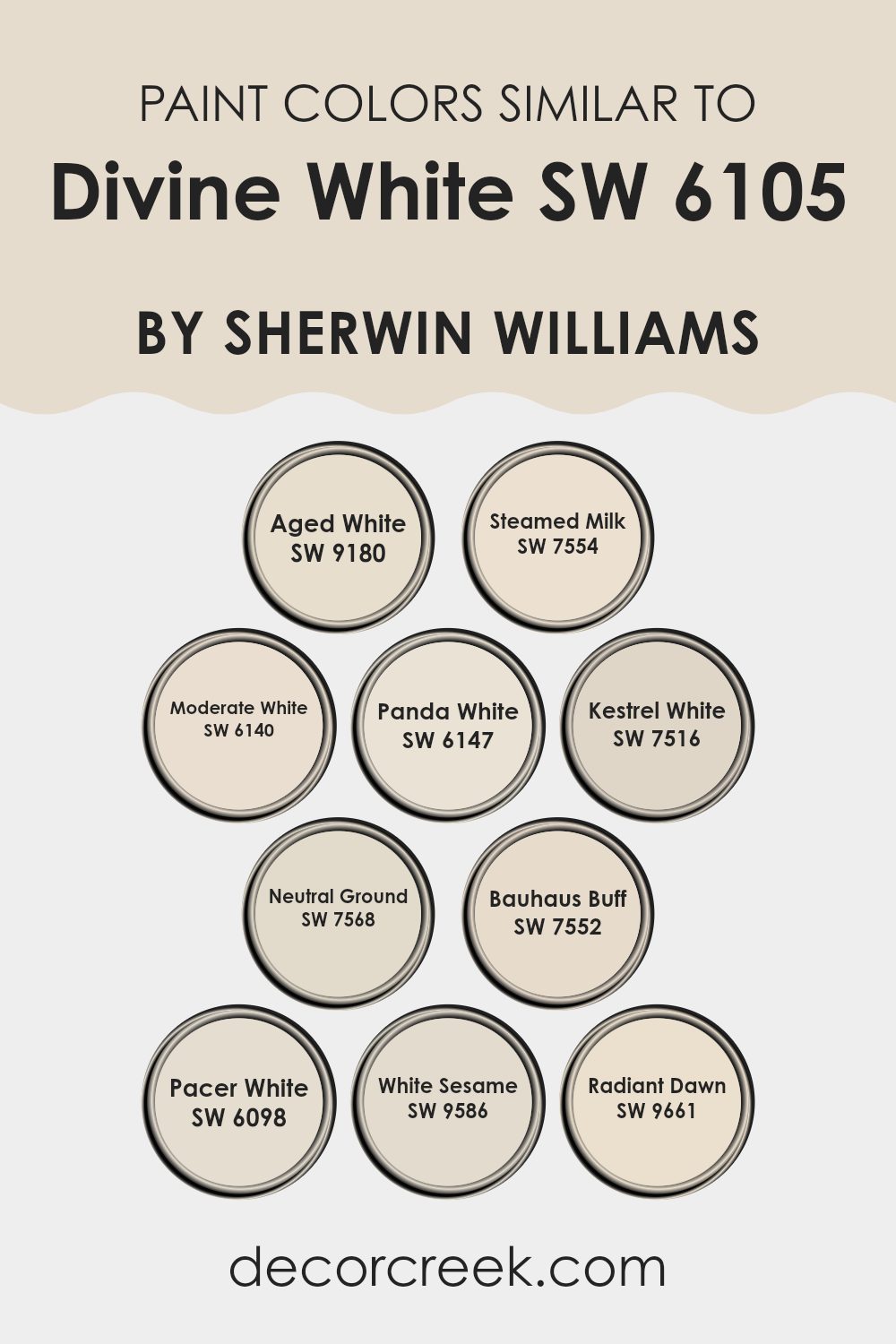
Aged White is a calm and muted hue, perfect for bringing a warm and inviting ambience to a room. Steamed Milk has a creamier presence, providing a soft backdrop that feels comforting. Moderate White leans slightly towards a cooler tone, offering a fresh and clean look that brightens areas efficiently.
Panda White adds a touch of softness with its very light grey undertones, making it ideal for those seeking a hint of neutrality without going stark white. Kestrel White incorporates a little more depth with its grayish cast, perfect for elegant yet understated rooms. Neutral Ground stands out with its beige nuances, infusing warmth into any area it touches.
Bauhaus Buff rounds out areas with its slightly golden glow, bringing in a dash of sunshine and cheer. Pacer White is straightforward yet refined, a clean and understated option that pairs well with vibrant or subdued accents alike. White Sesame offers a light grayish tone that looks stunning when used in modern decor or minimalist styles.
Lastly, Radiant Dawn is distinctive with a soft touch of beige, beautifully reflecting light and adding a subtle vibrancy to the surroundings. Each of these shades complements Divine White, making them flexible choices for consistent yet creative interior designs.
You can see recommended paint colors below:
- SW 9180 Aged White
- SW 7554 Steamed Milk
- SW 6140 Moderate White
- SW 6147 Panda White
- SW 7516 Kestrel White
- SW 7568 Neutral Ground
- SW 7552 Bauhaus Buff
- SW 6098 Pacer White
- SW 9586 White Sesame
- SW 9661 Radiant Dawn
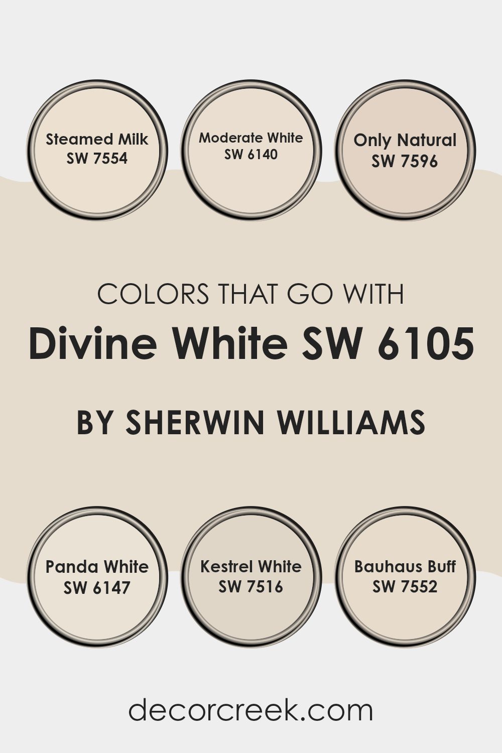
Colors that Go With Divine White SW 6105 by Sherwin Williams
Choosing colors that complement Divine White SW 6105 by Sherwin Williams is essential to create a harmonious and visually appealing room. This shade of white acts as a flexible backdrop, allowing other colors to stand out without feeling too much. For instance, Steamed Milk SW 7554 offers a slightly creamier tone, providing a gentle contrast that warms up areas softly. It blends perfectly with the purity of Divine White, resulting in a cozy yet bright atmosphere.
Moderate White SW 6140, on the other hand, has a subtle hint of gray that works well to add a slight depth to interiors, pairing beautifully with the clean and clear nature of Divine White. Only Natural SW 7596 introduces a touch of earthiness to the palette, anchoring lighter shades and adding richness.
Panda White SW 6147 comes forth with a bit more body than Divine White, adding an understated style when used together. Kestrel White SW 7516 aligns closer to a muted beige, softening the transitions between the neutral shades and providing a seamless color flow throughout the room. Lastly, Bauhaus Buff SW 7552 offers a dusty yellow undertone that brightens environments, bringing energy into the calmness of Divine White.
Together, these colors create a balanced and inviting room where every element stands out yet works cohesively.
You can see recommended paint colors below:
- SW 7554 Steamed Milk
- SW 6140 Moderate White
- SW 7596 Only Natural
- SW 6147 Panda White
- SW 7516 Kestrel White
- SW 7552 Bauhaus Buff
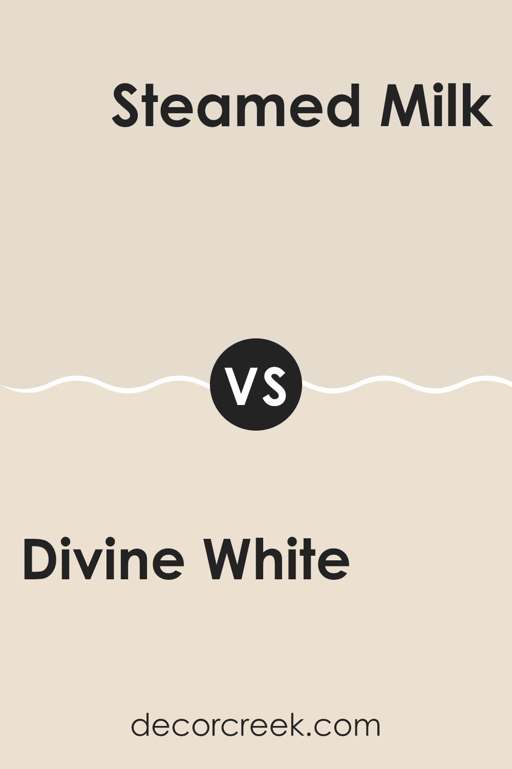
Divine White SW 6105 by Sherwin Williams vs Steamed Milk SW 7554 by Sherwin Williams
Divine White and Steamed Milk are both warm, neutral paint colors from Sherwin Williams, but they have subtle differences in tone and depth. Divine White is a soft and creamy white with a touch of beige, making it a cozy and inviting option for any room.
It is slightly lighter and has a more neutral undertone, providing a clean and airy feel. On the other hand, Steamed Milk has a richer, more beige tone which gives it a warmer appearance. This color can help create a comforting and welcoming atmosphere, especially in areas like living rooms or bedrooms.
When used together, these colors complement each other well, with Divine White offering a gentle contrast to the deeper tones of Steamed Milk. Whether you’re looking to paint a whole room or just an accent wall, either of these colors could be a great choice.
You can see recommended paint color below:
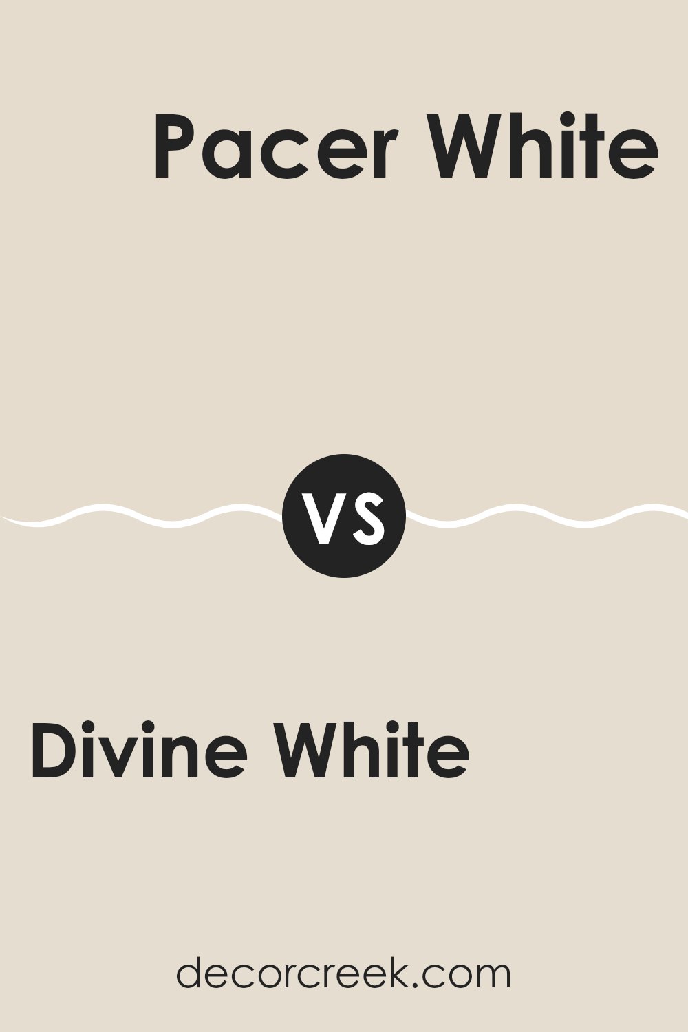
Divine White SW 6105 by Sherwin Williams vs Pacer White SW 6098 by Sherwin Williams
Divine White and Pacer White by Sherwin Williams are two neutral colors, but with subtle differences in their tones. Divine White has a soft, creamy undertone that gives it a warm and welcoming feel.
It can make rooms feel cozy and is a great option for areas where you want a touch of warmth without going for a full beige or yellow. On the other hand, Pacer White leans slightly towards a grayish tone, making it cooler compared to Divine White.
This color can be ideal for modern rooms or areas where you prefer a cleaner, more muted backdrop. Both colors are flexible and can work well in various lighting conditions, but your choice depends on the type of mood you want to set in your room. Divine White works better to add warmth, while Pacer White is better for a neutral or slightly cool palette.
You can see recommended paint color below:
Divine White SW 6105 by Sherwin Williams vs Moderate White SW 6140 by Sherwin Williams
The Divine White and Moderate White from Sherwin Williams are both soft, subtle colors, but they do have some differences. Divine White has a slightly creamy undertone, making it warm and inviting, perfect for creating a cozy feel in a room. It works well in areas that have a lot of natural light, as it captures and enhances the warmth.
On the other hand, Moderate White leans towards a neutral, balanced beige without strong yellow or pink undertones. This color is very flexible and is excellent for areas where you want a clean, straightforward look without the warmth that Divine White provides.
It’s particularly effective in areas with balanced, natural light or artificial light, as it maintains its true color without shifting too much.
Both colors are quite mild and are great for creating a relaxed and welcoming atmosphere.
The choice between them would depend on the specific feel you want for your room and how the natural light interacts with the colors.
You can see recommended paint color below:

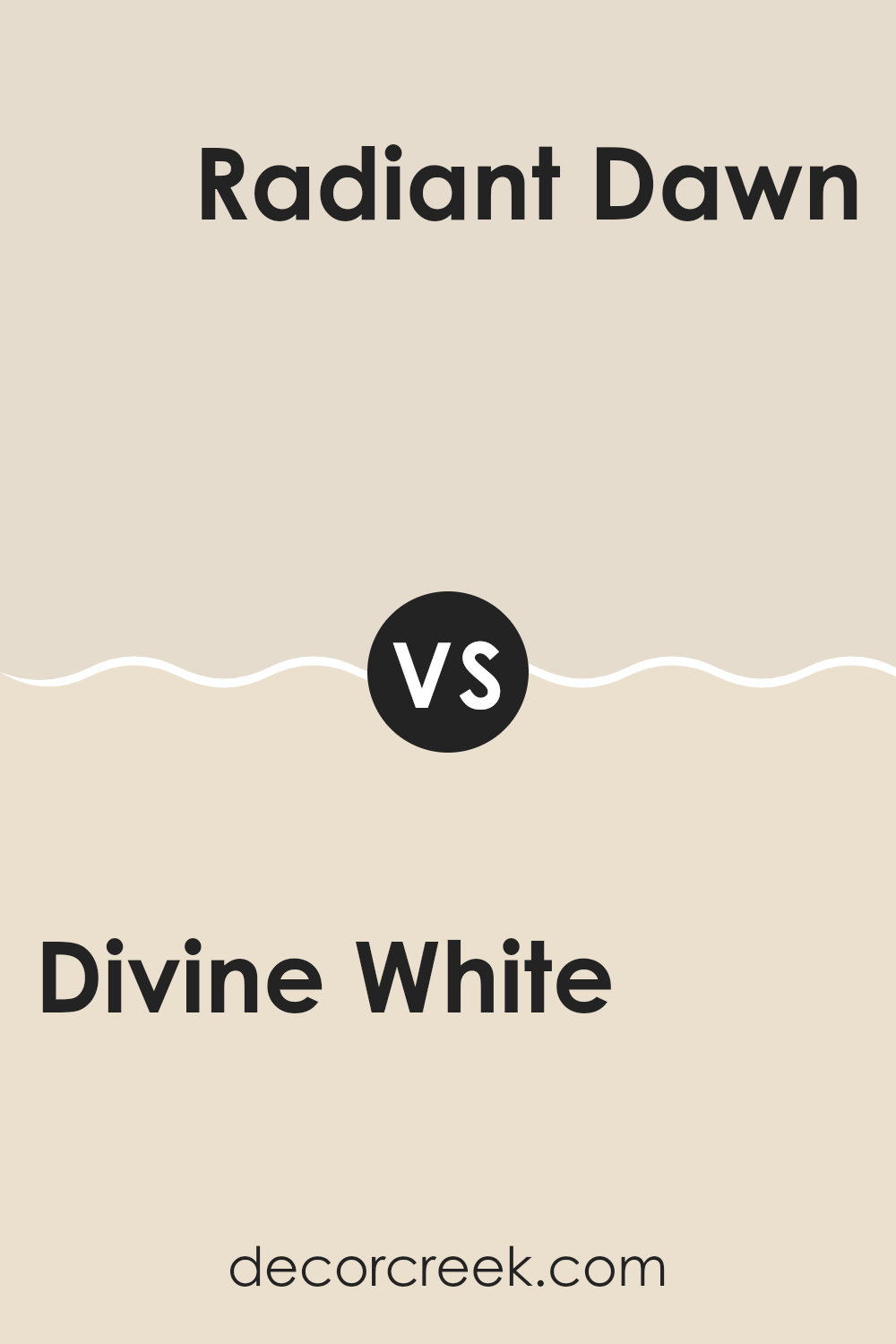
Divine White SW 6105 by Sherwin Williams vs Radiant Dawn SW 9661 by Sherwin Williams
Divine White and Radiant Dawn are both unique colors that stand out in their own ways. Divine White has a soft and warm tone that offers a subtle coziness to any room. It’s like a gentle hug for your walls, providing a comfortable and inviting atmosphere. This color works well in nearly all areas of a home, especially where you want to create a relaxed and welcoming feel.
On the other hand, Radiant Dawn has a cooler, fresh vibe that brings a light and airy feel to a room. It’s like the first light of dawn, suggesting freshness and a new start. This color is perfect for areas where you want to promote a clear and fresh mood, such as bathrooms or kitchens.
While Divine White leans towards a creamy, soothing presence, Radiant Dawn highlights a brighter, crisper tone. Both colors offer their unique charm, improving rooms with their distinct character.
You can see recommended paint color below:
- SW 9661 Radiant Dawn
Divine White SW 6105 by Sherwin Williams vs Kestrel White SW 7516 by Sherwin Williams
Divine White and Kestrel White are both paint colors by Sherwin Williams, each offering its unique shade of white. Divine White has a soft and creamy undertone, making it a warm and inviting option for areas meant to feel cozy and comfortable. This color works well in living rooms, bedrooms, or any room where a calm and welcoming atmosphere is desired.
On the other hand, Kestrel White leans towards a light gray cast, giving it a cooler presence compared to Divine White. This makes it more suitable for modern and minimalist interiors, as it provides a clean and crisp background that complements contemporary decor and brighter accent colors.
Both colors reflect light well, improving the sense of room in a room . However, the choice between Divine White and Kestrel White ultimately depends on the mood you want to create in your room and the existing elements in your decor. Divine White is better for a warmer, cozier feel, while Kestrel White is ideal for a sleek, fresh look.
You can see recommended paint color below:
Divine White SW 6105 by Sherwin Williams vs White Sesame SW 9586 by Sherwin Williams
Divine White and White Sesame are both colors by Sherwin Williams that offer subtle variations in their white tones. Divine White is a soft white with a warm undertone, making it a perfect choice for creating a cozy and inviting atmosphere in any room. It pairs well with a variety of decor styles and works beautifully in areas that need a gentle, soothing presence.
On the other hand, White Sesame is also a warm white, but it has a slightly grayer cast compared to Divine White. This gives it a more neutral appearance, which can be useful for those seeking a clean and simple look without the warmth of yellow undertones. White Sesame is flexible and can serve as an excellent backdrop for both modern and classic interiors.
Though both colors are whites, their different undertones influence how they interact with lighting and surrounding colors, making them suitable for different types of rooms and style preferences.
You can see recommended paint color below:
Divine White SW 6105 by Sherwin Williams vs Neutral Ground SW 7568 by Sherwin Williams
Divine White and Neutral Ground, both by Sherwin Williams, are subtle, warm neutral colors. Divine White leans more towards a soft, creamy hue that provides a calm and inviting atmosphere. It works beautifully in areas where a gentle, light touch of color is needed without feeling too much in the room.
On the other hand, Neutral Ground stands out as a slightly darker shade. It has a beige tone that registers as both warm and flexible, making it an excellent choice for various places in a home, from living rooms to bedrooms.
It pairs well with other colors, allowing for many design options. When comparing the two, Divine White offers a brighter, lighter feel, perfect for smaller or darker rooms to give an illusion of more room, whereas Neutral Ground provides a bit more depth and can anchor larger areas without making them feel closed in. These characteristics make each color unique and suited for different decorating needs.
You can see recommended paint color below:
Divine White SW 6105 by Sherwin Williams vs Panda White SW 6147 by Sherwin Williams
Divine White and Panda White, both from Sherwin Williams, offer subtle differences in tone that can affect the mood of a room. Divine White leans toward a warm tone, incorporating creamy and soft beige undertones. This gives it a welcoming and cozy feel, making it a great choice for living areas like family rooms or bedrooms where a comforting atmosphere is desirable.
On the other hand, Panda White has a cooler presence, mainly because it includes a slight hint of gray. This cooler tone makes Panda White an excellent option for areas that aim for a fresher, cleaner look, such as bathrooms and modern kitchens.
When deciding between the two, consider the lighting in your room and the mood you want to create. Divine White works well in areas with less natural light as its warmth brings a cozy brightness. Panda White is ideal in well-lit or naturally bright areas, improving the room with a crisp, clean appeal.
You can see recommended paint color below:
Divine White SW 6105 by Sherwin Williams vs Bauhaus Buff SW 7552 by Sherwin Williams
Both Divine White and Bauhaus Buff by Sherwin Williams are subtle and warm neutrals, but they offer distinct tones that could affect the atmosphere of a room differently. Divine White leans towards a slightly creamy off-white. It has a soft and welcoming feel that makes it great for creating a cozy and comfortable ambiance in areas like living rooms and bedrooms.
On the other hand, Bauhaus Buff has a deeper, beige tone which brings a bit more warmth and richness compared to Divine White. This color is excellent for adding a touch of style without being too bold. It works well in areas where you want a bit more color on the walls but still prefer something light.
When deciding between the two, consider the amount of natural light your room gets. Divine White might look better in a well-lit area, improving the room with its light-reflective qualities, while Bauhaus Buff could be ideal for areas that you want to feel warmer and more enclosed.
You can see recommended paint color below:
Divine White SW 6105 by Sherwin Williams vs Aged White SW 9180 by Sherwin Williams
Divine White and Aged White are both off-white colors from Sherwin Williams, but they offer subtly different tones. Divine White has a touch of creaminess, giving off a warm, welcoming feel. It’s great for areas where you want a cozy, soft atmosphere without going too yellow. It pairs well with various decor styles, maintaining a gentle, inviting ambiance.
On the other hand, Aged White leans slightly toward the greige spectrum, meaning it mixes gray with beige. This color is perfect for those who prefer a hint of earthiness while keeping things light and airy. Aged White supports areas that aim for a neutral, calm setting without being stark or cold.
Both colors are flexible and can brighten up a room while remaining understated. They work well in various settings like living rooms, kitchens, and bedrooms. Choosing between them depends on whether you want your white with a creamy warmth or a muted, earthy tone.
You can see recommended paint color below:
In wrapping up, my thoughts on SW 6105 Divine White by Sherwin Williams are really positive. If you’re looking to paint your room in a color that’s soft and warm, but still bright, this could be the perfect choice. It’s like a gentle hug for your walls!
The color works well in so many different rooms, whether it’s your living room where you hang out and watch TV, or in your bedroom where you sleep. It helps make small rooms look a bit bigger and it also goes well with lots of other colors, meaning you can easily use different colored decorations and furniture without worrying about clashes.
When I used Divine White in my own home, it brightened up the areas and gave a clean and fresh feeling everywhere I used it. From my experience, it’s easy to apply, and once it’s on the wall, it looks even and smooth. I’m really happy with how it turned out, and I think it makes my home feel more welcoming.
So, if you’re thinking about giving your room a new look, Divine White is definitely a paint color to consider. It’s simple, it looks good, and it creates a warm, inviting environment in any home.

Ever wished paint sampling was as easy as sticking a sticker? Guess what? Now it is! Discover Samplize's unique Peel & Stick samples.
Get paint samples

