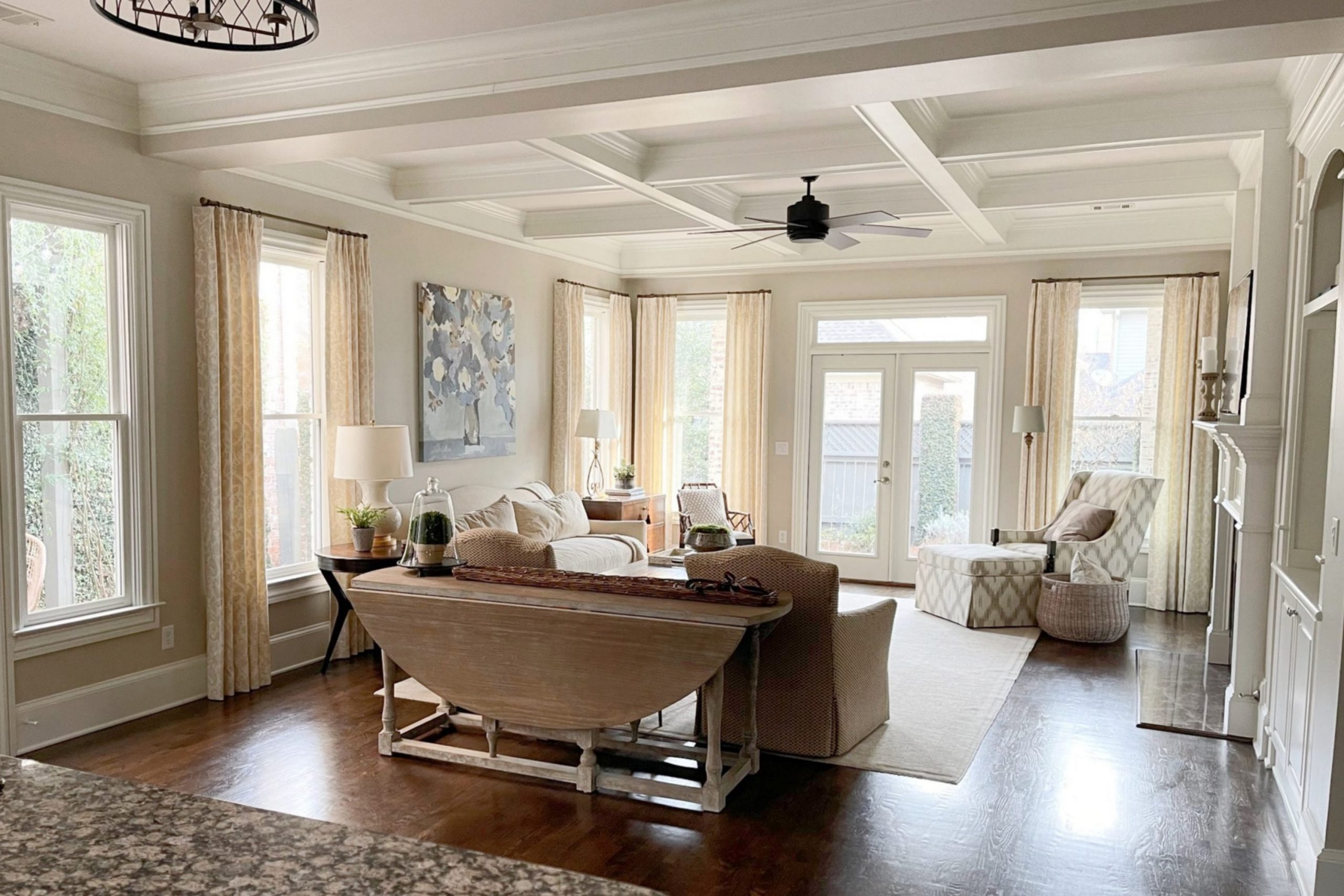
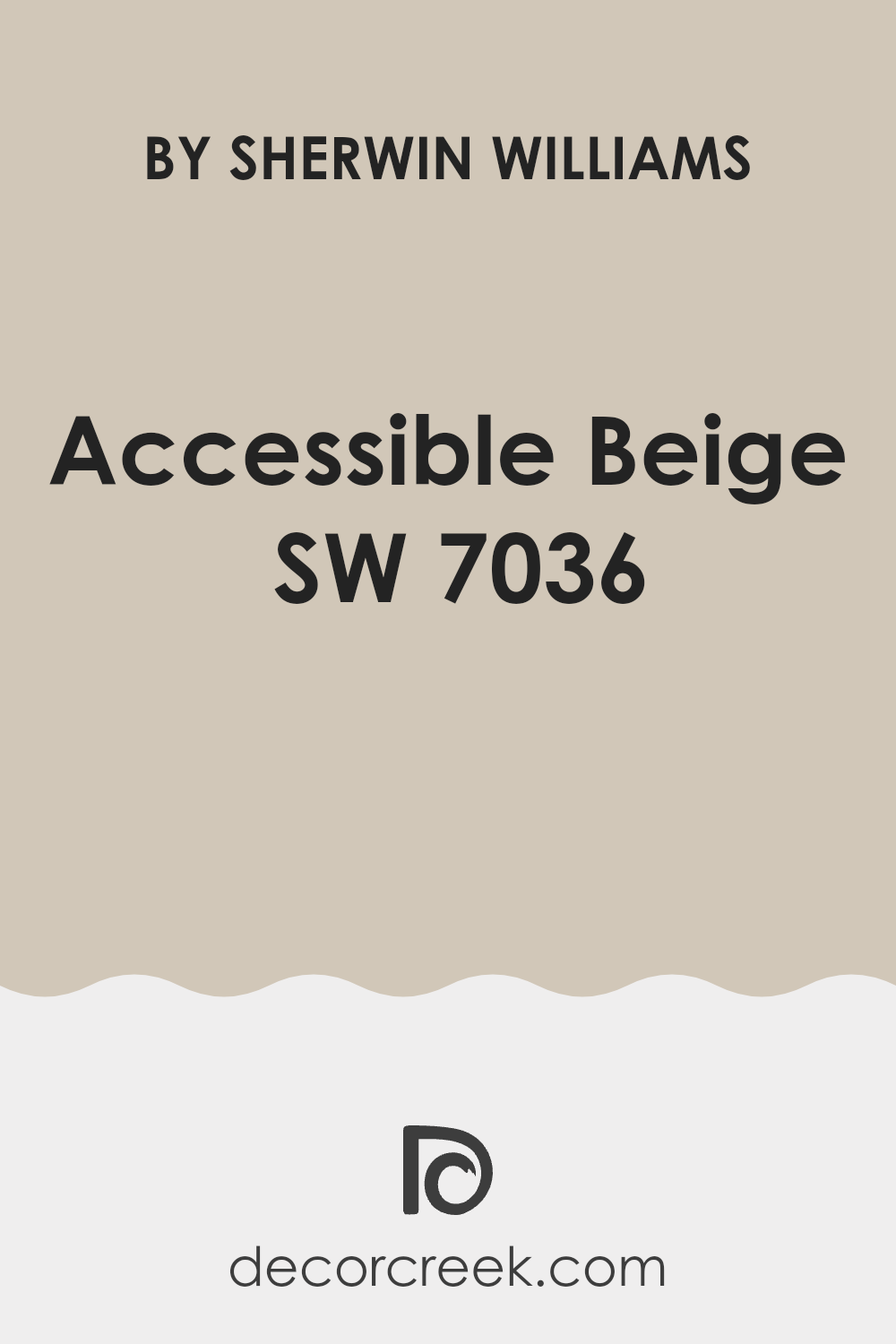
Choosing the right paint color can feel stressful, especially with so many shades available. If you’re considering Sherwin Williams SW 7036 Accessible Beige for your next project, here’s what you should know from my experience. This shade is a popular choice for its flexibility and warm, welcoming tone.
It’s a neutral beige that plays well in various lighting conditions, making it a reliable choice for any room in your house. Whether you’re painting a sun-soaked living room or a dimly lit hallway, Accessible Beige adjusts beautifully, maintaining its balance between warm and cool tones.
I have used this color in several rooms and have found it remarkably adaptable, pairing well with both modern and traditional decor. It doesn’t clash with bold colors nor does it make subtle hues look washed out. If you’re aiming for a cohesive look throughout your home, this could be the perfect base color. Moreover, Accessible Beige has a way of making rooms look more expansive, bringing an airy feel to smaller rooms.
Consider this color if you’re looking for something that will help create a calm and inviting atmosphere.
Is Accessible Beige SW 7036 Right for My Home?
When I first saw Accessible Beige, I was struck by its warm and welcoming tone. This color is a cozy beige with grey undertones, making it very flexible for different home styles. It’s not just a simple beige; the depth created by the subtle gray presence adds a contemporary edge, which I really appreciate.
I’ve found that Accessible Beige works wonderfully in a variety of interior styles, especially in modern farmhouse, Scandinavian, and traditional settings. Its neutrality provides a perfect backdrop for these decor themes, allowing other design elements to stand out. In my home, it has brought a sense of warmth and comfort, creating a pleasant, cohesive room.
As for pairing with materials and textures, Accessible Beige is superb with natural wood, which highlights its warmth. I love combining it with soft textiles like linen or wool to enhance the warmth of the room. It also looks stunning against brushed metals, like nickel or bronze, which add a touch of sleekness to the overall cozy vibe.
Overall, choosing Accessible Beige has made my home feel more inviting and put together. It’s a color that doesn’t feel too heavy but instead quietly supports a calm and stylish atmosphere.
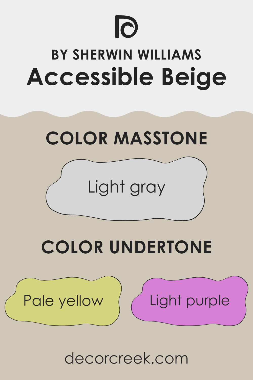
What are the right undertones of Accessible Beige SW 7036 ?
Accessible Beige is a popular neutral paint choice due to its flexibility and warm, inviting nature. While it might seem just a plain beige at first glance, its nuanced appearance is influenced by a range of subtle undertones that can alter its look depending on lighting and surrounding colors. The undertones in this shade include pale yellow, light purple, light blue, pale pink, mint, lilac, and grey.
Undertones are secondary colors that affect the overall perception of the primary color. In the case of Accessible Beige, these undertones help determine how the color will behave in different settings. For example, pale yellow and mint undertones add a touch of warmth, making the color feel cozier and more welcoming. Light blue and lilac bring a cooler presence, which can make a room feel more open and airy. Grey and pale pink add a softness that can smooth out the overall feel of the room.
When used on interior walls, Accessible Beige provides a neutral backdrop that is far from boring. The mix of warm and cool undertones allows it to complement a wide variety of decor styles and colors. In rooms with ample natural light, the warmer undertones might be more pronounced, creating a sunny, cheerful vibe. In rooms with less light, the cooler undertones may become evident, giving the room a more subdued and calm atmosphere. This ability to adjust makes Accessible Beige a reliable choice for almost any room.
decorcreek.com
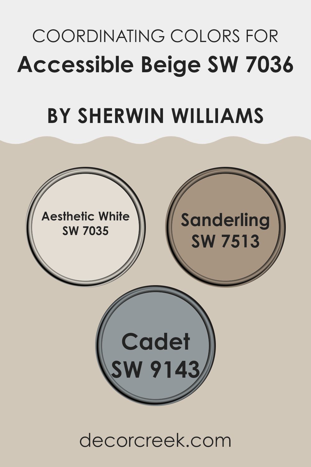
Best Coordinating Colors to use with Accessible Beige SW 7036 by Sherwin Williams this year.
Coordinating colors are shades that complement each other and work well together to create a harmonious look. These colors are chosen based on their ability to enhance the main color, in this case, Accessible Beige. By selecting shades that coordinate, you can achieve a cohesive decor scheme that improves the aesthetic appeal of your room. For example, certain colors have been specifically picked by Sherwin Williams to complement Accessible Beige and bring out its warm, welcoming nature.
Aesthetic White SW 7035 is a soft, subdued white with a hint of warmth, making it an ideal pairing with Accessible Beige. It acts as a clean, gentle background that allows richer or warmer tones to stand out without feeling too heavy. Sanderling SW 7513, on the other hand, offers a slightly deeper contrast, adding depth and interest to interiors.
Its subtle earthiness allows it to blend smoothly with Accessible Beige, creating a cohesive but layered look. Lastly, Cadet SW 9143 provides a strong anchor in the color palette. This deeper, muted tone can highlight architectural features or furniture, creating focal points and adding a sense of balance to the overall color scheme. All these colors help to support and enhance the primary color, ensuring a polished and pulled-together look.
You can see recommended paint colors below:
- SW 7035 Aesthetic White
- SW 7513 Sanderling
- SW 9143 Cadet
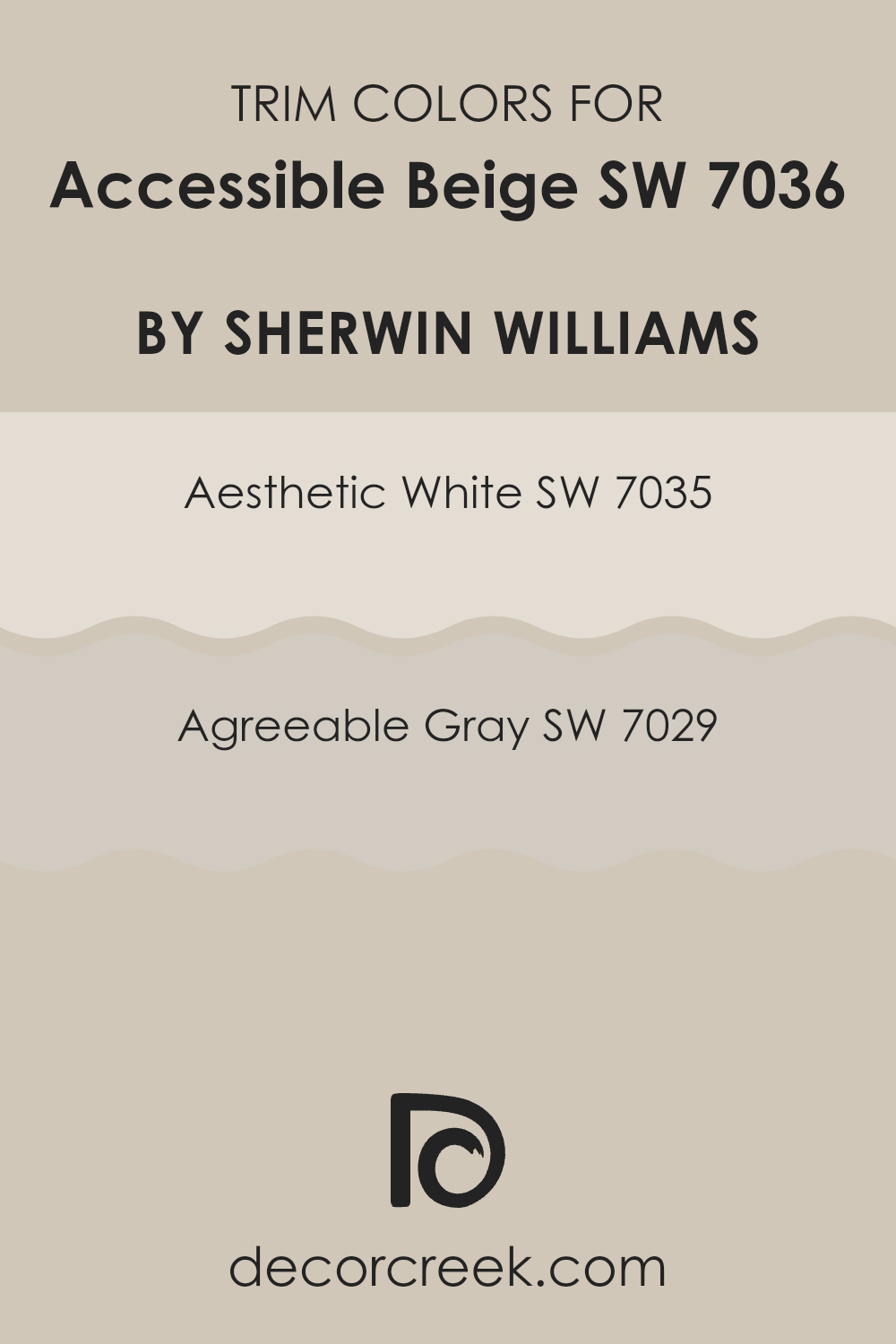
Trendy Trim Colors of Accessible Beige SW 7036 by Sherwin Williams to use this year.
Trim colors are vital details in painting and decorating that outline and accent architectural features. When used with a neutral base like Accessible Beige, choosing the right trim color can enhance the aesthetic value of a room by creating subtle contrasts and highlighting features.
SW 7035 Aesthetic White and SW 7029 Agreeable Gray are both excellent choices as trim colors for Accessible Beige, because they maintain a balanced color scheme while adding depth and interest to the overall appearance of the room.
SW 7035 Aesthetic White is a soft and gentle white that brings a clean and fresh look to the trim, making it a perfect complement to the warm tones of Accessible Beige. It reflects light beautifully, adding a sense of brightness without feeling too heavy. On the other hand, SW 7029 Agreeable Gray is a warm gray with earthy undertones that offers a subtle contrast to Accessible Beige. This color is ideal for someone looking to introduce a slightly darker element to the trim, providing definition and character to the room without creating a stark contrast.
You can see recommended paint colors below:
- SW 7035 Aesthetic White
- SW 7029 Agreeable Gray
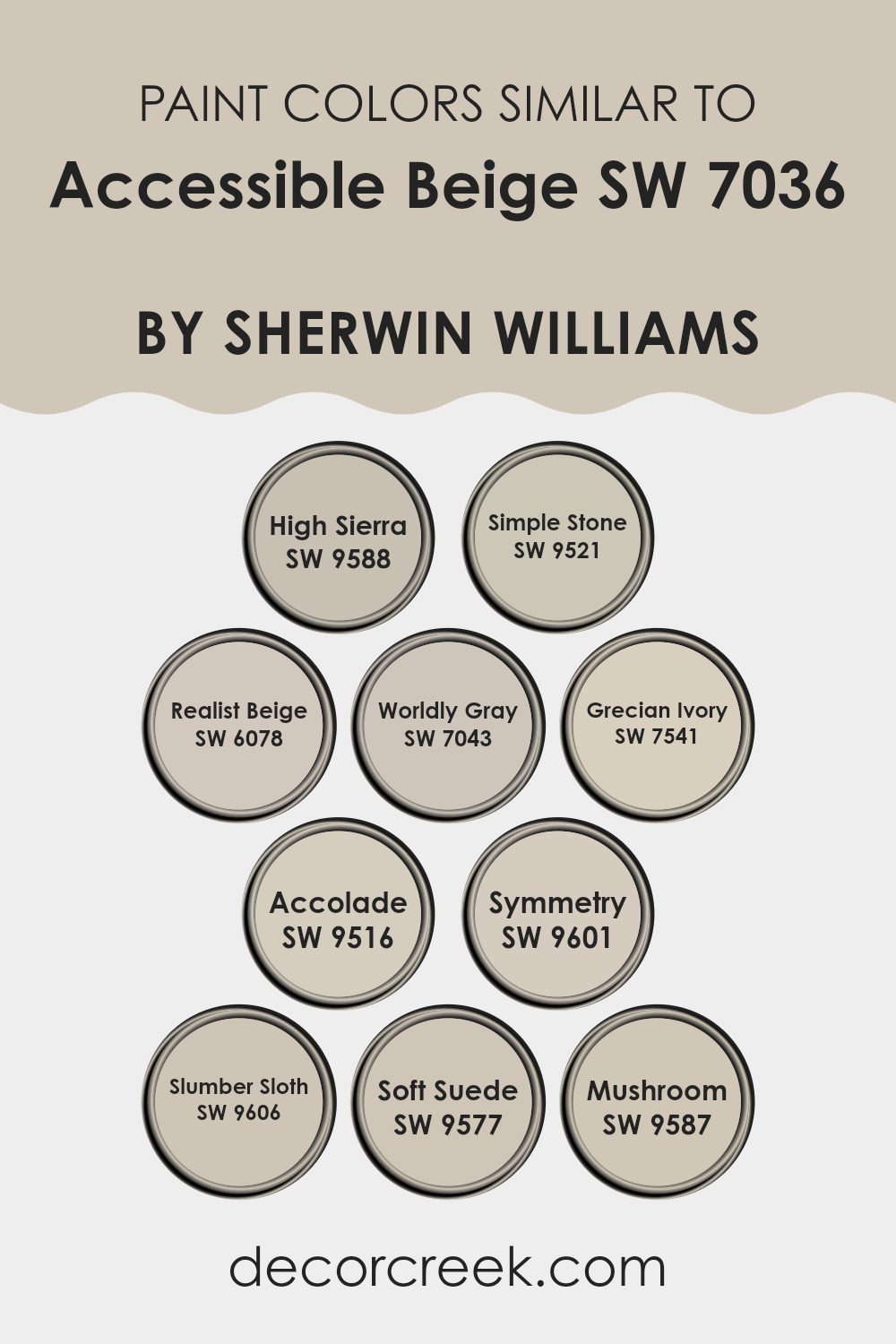
Evergreen Colors Similar to Accessible Beige SW 7036 by Sherwin Williams
Choosing similar colors for a room can be crucial for creating a harmonious and calming environment. Colors that are closely related provide a seamless visual experience, allowing the eyes to move smoothly from one area to another without abrupt changes. This can be particularly important in open-plan rooms, where walls and different sections of the interior are visually connected. For example, using shades like High Sierra, which holds a warm, earthy tone, alongside Accessible Beige aids in developing a cohesive look.
Simple Stone and Realist Beige each bring their unique yet subtly different hues to complement Accessible Beige. Simple Stone gives off a slightly cooler, understated vibe, making it ideal for contemporary rooms, while Realist Beige offers a warmer undertone, perfect for creating a cozy atmosphere.
Continuing this theme, Worldly Gray steps in as a more muted option, providing a gentle contrast that is still within the warm spectrum. Grecian Ivory, with its hint of softness, works beautifully in rooms that seek a touch of brightness without feeling too intense. Accolade, Symmetry, and Slumber Sloth move toward a balanced palette, each contributing to a neutral but inviting room. Accolade is slightly richer, adding depth, whereas Symmetry presents a more balanced beige, and Slumber Sloth brings a plush, soft gray that complements without contrasting sharply.
On the richer end, Soft Suede and Mushroom present deeper, comforting earth tones that pair well with the foundational Accessible Beige, adding both warmth and a sense of grounding to the environment. Each color, while similar, offers a unique attribute that enhances the overall aesthetic, making them ideal for those who prefer a cohesive yet subtly diverse color scheme.
You can see recommended paint colors below:
- SW 9588 High Sierra
- SW 9521 Simple Stone
- SW 6078 Realist Beige
- SW 7043 Worldly Gray
- SW 7541 Grecian Ivory
- SW 9516 Accolade
- SW 9601 Symmetry
- SW 9606 Slumber Sloth
- SW 9577 Soft Suede
- SW 9587 Mushroom
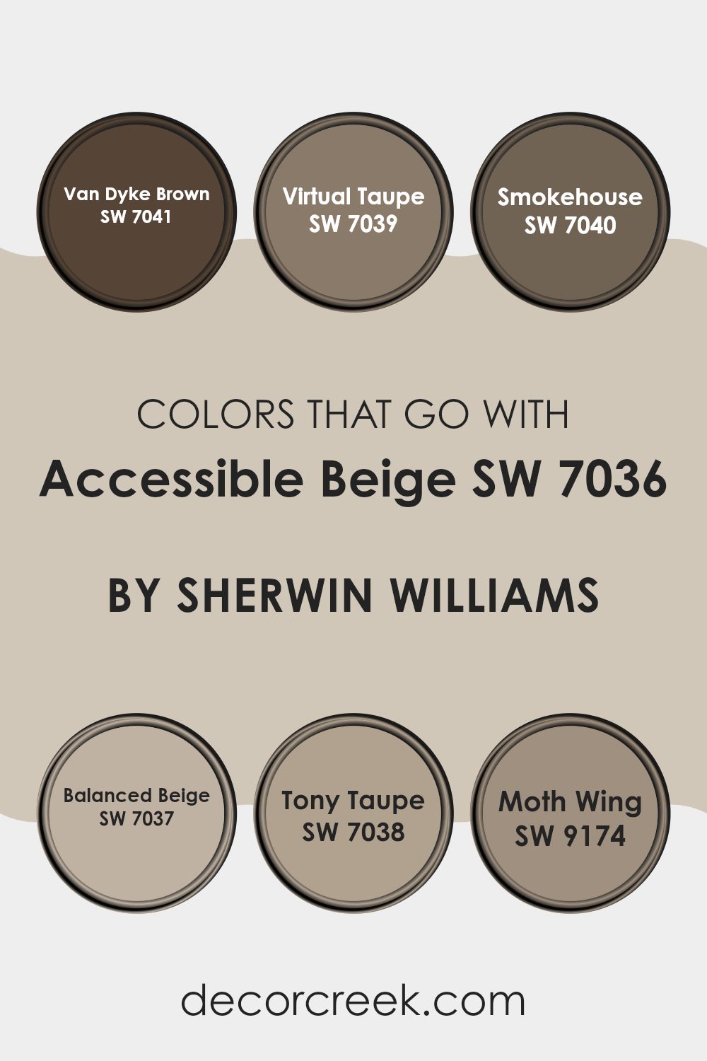
Colors that Go With Accessible Beige SW 7036 by Sherwin Williams
Choosing the right colors to complement Accessible Beige SW 7036 by Sherwin Williams is crucial for achieving a harmonious look. The specific shades that pair well with this flexible beige include a range of deeper and coordinating tones that ensure a cohesive and appealing aesthetic. When these colors are used together, they create a visually pleasing environment that enhances the beauty of Accessible Beige, allowing it to stand out as a warm and welcoming neutral backdrop.
Van Dyke Brown SW 7041 is a deep, rich brown that provides a strong contrast to the lighter Accessible Beige, which helps in defining rooms and accentuating architectural details. Virtual Taupe SW 7039 offers a slightly lighter hue than Van Dyke Brown, bringing a calm and grounding energy to the area without overpowering the softer beige.
Smokehouse SW 7040 introduces a smoky, subtle grey tone that works seamlessly with Accessible Beige to produce a soft, understated look. Balanced Beige SW 7037 is similar to Accessible Beige but has slightly different undertones, allowing for a layered effect that is subtle yet effective in creating depth.
Tony Taupe SW 7038 is a balanced blend between grey and brown, delivering a neutral palette that complements the soothing quality of Accessible Beige. Lastly, Moth Wing SW 9174 teases with a hint of soft, dusky taupe that integrates smoothly with Accessible Beige, ensuring every element in the room feels connected. Together, these colors support and enhance the beauty of Accessible Beige, enabling a room that feels cohesive, inviting, and stylish.
You can see recommended paint colors below:
- SW 7041 Van Dyke Brown
- SW 7039 Virtual Taupe
- SW 7040 Smokehouse
- SW 7037 Balanced Beige
- SW 7038 Tony Taupe
- SW 9174 Moth Wing
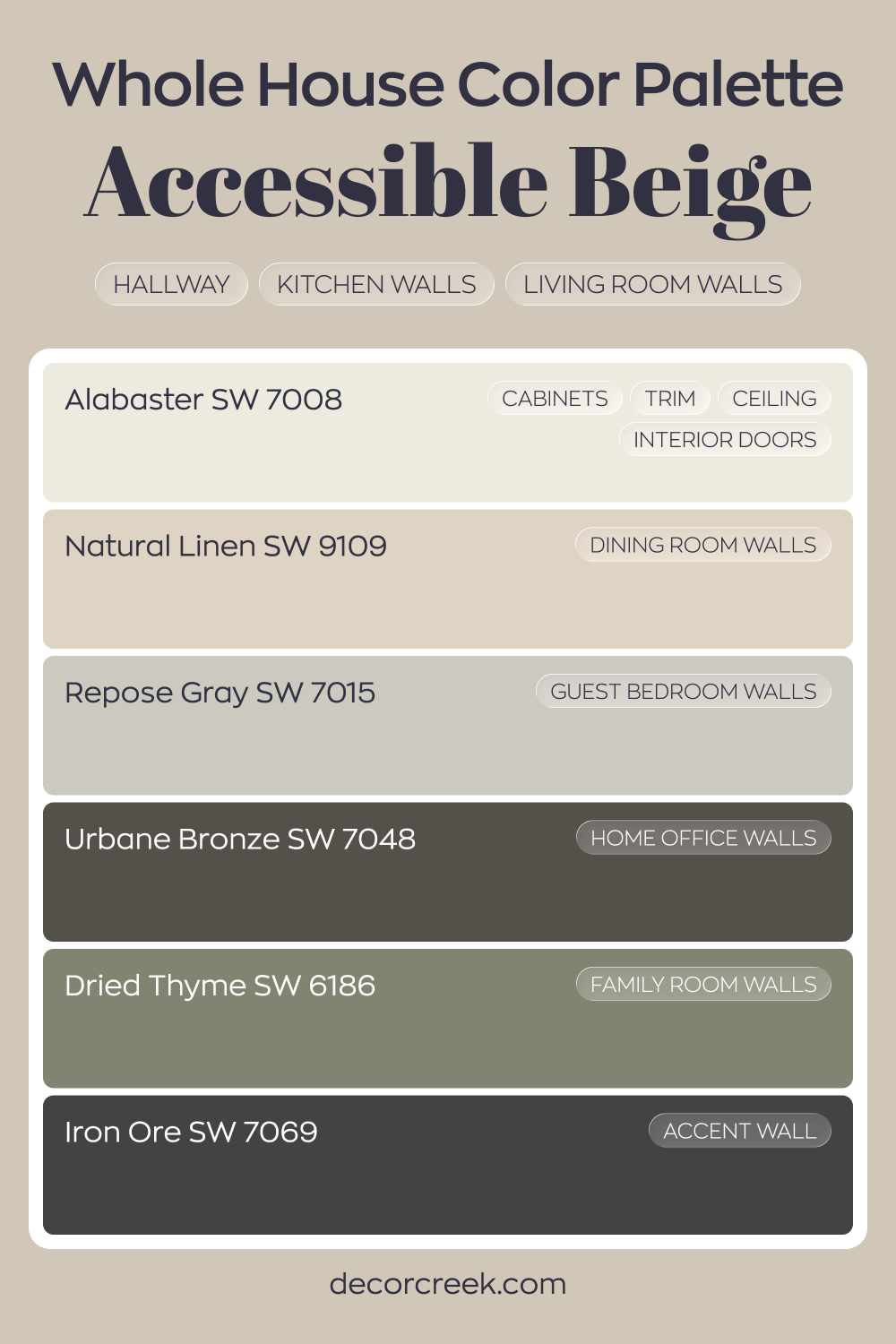
Whole house paint color palette built around Accessible Beige SW 7036
Accessible Beige SW 7036 anchors the hallway, kitchen, and living room with a warm, welcoming look. Alabaster on cabinets, trim, ceilings, and interior doors keeps everything crisp and bright. Natural Linen in the dining room adds softness while staying in the same warm family.
Repose Gray in the guest bedroom offers a gentle contrast, while Dried Thyme in the family room introduces a muted green note that feels cozy and grounded.
Urbane Bronze in the house office deepens the palette, adding strength and character. Iron Ore on an accent wall sharpens the overall look with dramatic contrast.
This combination feels balanced and intentional. Warm neutrals blend with earthy and dark accents, giving the house depth while keeping the overall feeling cohesive.
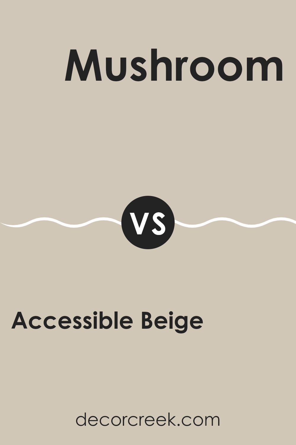
Accessible Beige SW 7036 by Sherwin Williams vs Mushroom SW 9587 by Sherwin Williams
Accessible Beige and Mushroom, both from Sherwin Williams, offer unique takes on neutral tones for home interiors. Accessible Beige is a warm color with a grayish tint, making it very flexible for any room. It pairs well with many types of furniture and decor, providing a cozy, welcoming feel without being too stark or bright.
On the other hand, Mushroom steps in with a darker, earthier tone that resembles the natural color of mushrooms. This shade can add a bit more depth and warmth to rooms, ideal for creating a snug and inviting atmosphere, especially in areas like living rooms or bedrooms.
Both colors work well in various lighting situations, with Accessible Beige reflecting more light, making it suitable for smaller or dimmer rooms, while Mushroom’s richer hue suits well-lit or larger rooms.
You can see recommended paint color below:
- SW 9587 Mushroom
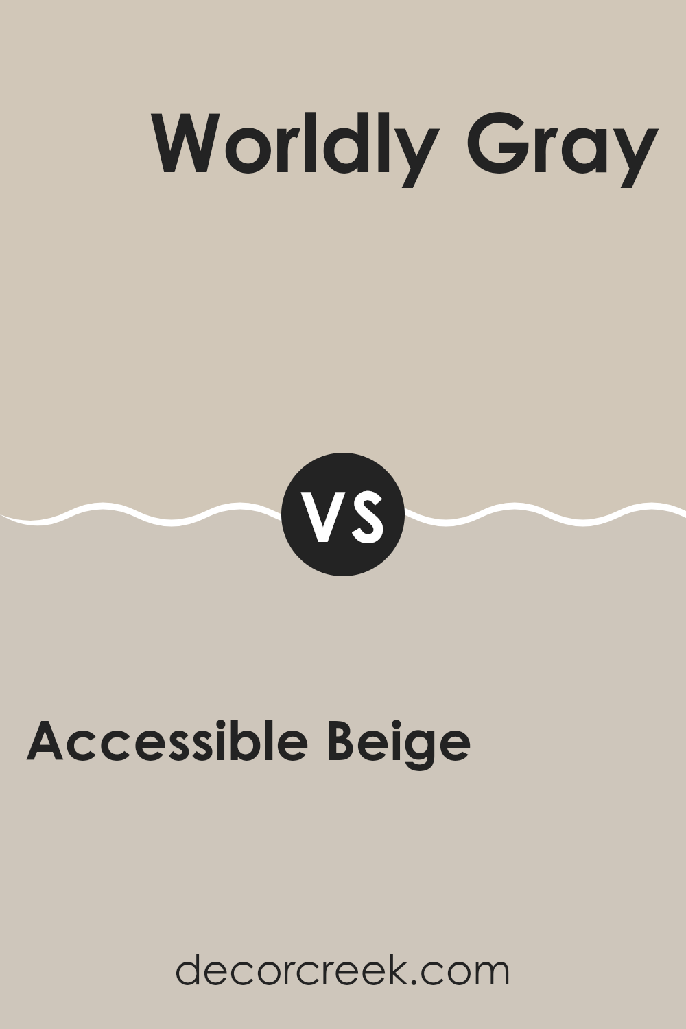
Accessible Beige SW 7036 by Sherwin Williams vs Worldly Gray SW 7043 by Sherwin Williams
Accessible Beige is a warm neutral color that adds a cozy vibe to any room. It has a soft, welcoming feel, making it perfect for living rooms or bedrooms. The beige undertones in this color create a friendly and inviting atmosphere.
Worldly Gray, meanwhile, is a bit cooler but still falls within the neutral spectrum. This color has more gray in it than Accessible Beige, giving it a slightly more modern and fresh look. It’s a great choice for those who prefer a subtle hint of refined style without going too bold.
Both colors are flexible and can easily pair with various decor styles. Accessible Beige works well in rooms where you want a touch of warmth, while Worldly Gray is ideal if you’re going for a more contemporary look. Each offers a unique way to beautify your home while keeping the tones understated and harmonious.
You can see recommended paint color below:
- SW 7043 Worldly Gray
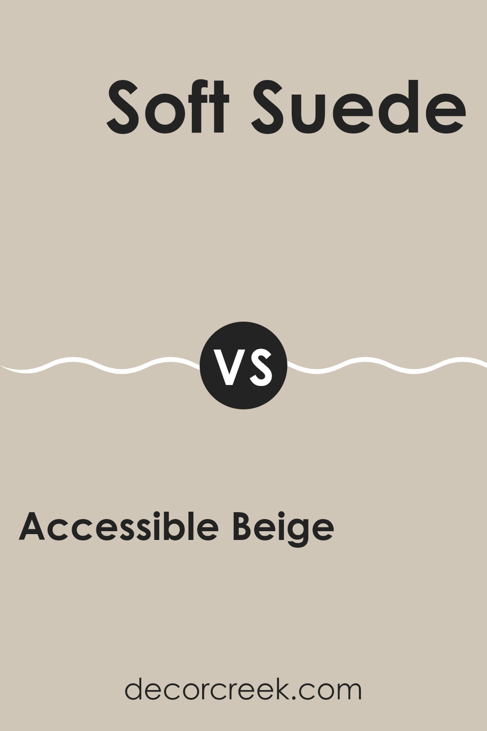
Accessible Beige SW 7036 by Sherwin Williams vs Soft Suede SW 9577 by Sherwin Williams
Accessible Beige and Soft Suede are both neutral hues, but they bring distinct vibes to a room. Accessible Beige is a light color, offering a fresh and open feel to rooms, making them appear larger. It’s a flexible shade that pairs well with various decor styles, from modern to classic.
On the other hand, Soft Suede is a deeper, warmer color that adds a cozy and welcoming feel. It works well in rooms where you want to create a sense of comfort, like living rooms or bedrooms.
While Accessible Beige brings a brightness that can enhance natural light, Soft Suede provides a more intimate ambiance, perfect for settings with soft lighting. Both colors work beautifully with other shades and materials, but the choice between them would depend on the mood you’re aiming to achieve in your room.
You can see recommended paint color below:
- SW 9577 Soft Suede
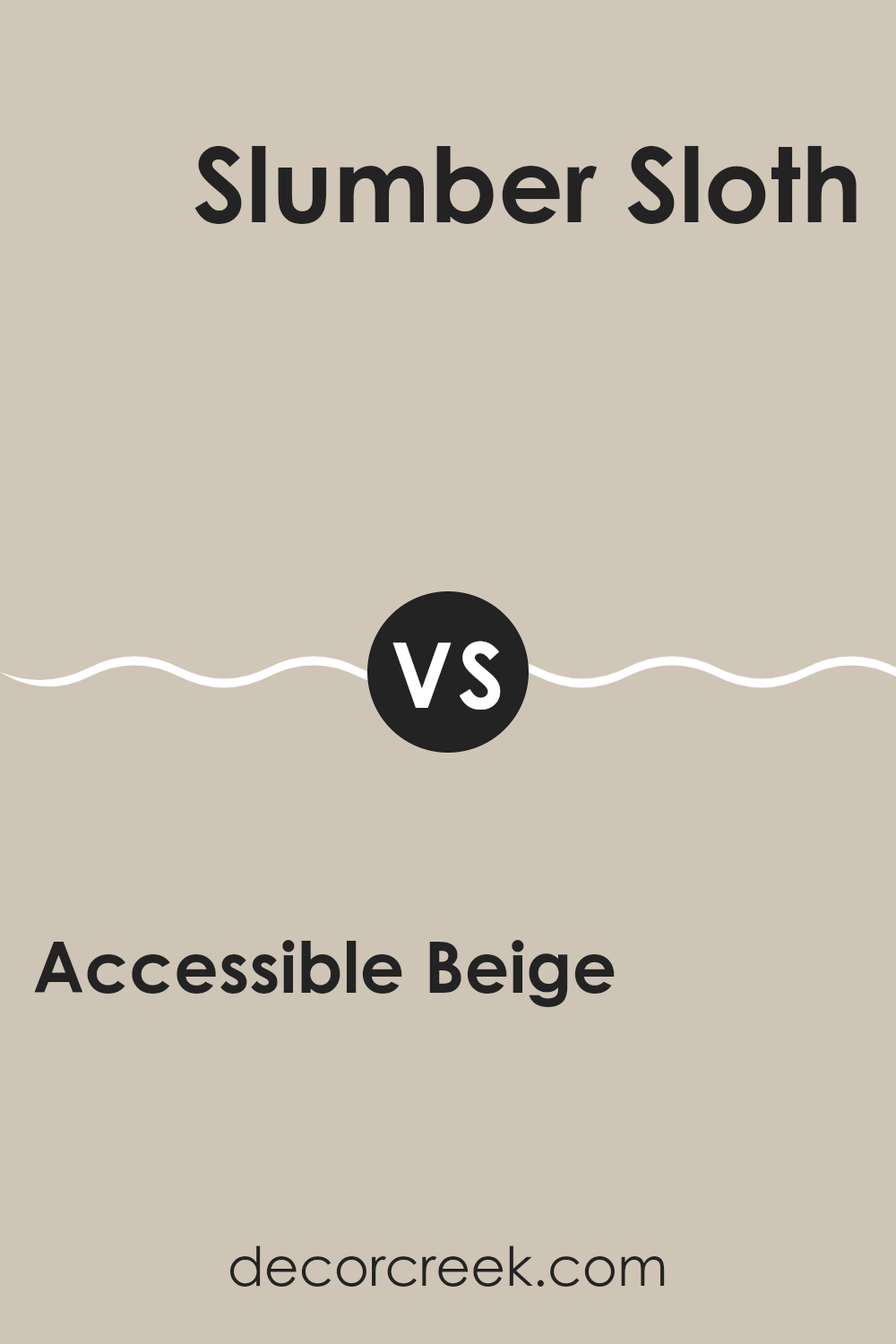
Accessible Beige SW 7036 by Sherwin Williams vs Slumber Sloth SW 9606 by Sherwin Williams
Accessible Beige and Slumber Sloth by Sherwin Williams are two neutral colors, but they have distinct tones and vibes. Accessible Beige is a warm neutral with a light taupe base. It’s quite flexible and can brighten rooms while adding a cozy feel.
On the other hand, Slumber Sloth is darker, offering a deeper, more muted gray-brown tone. This color is perfect for creating a cozy, comforting atmosphere in rooms meant for relaxation.
While Accessible Beige works well in lively areas like living rooms and kitchens due to its lighter and warmer hue, Slumber Sloth is better suited for bedrooms or quiet study areas because of its darker, soothing quality. Both colors offer a stylish backdrop, but the choice between them depends on the mood you want to set and the natural light in your room.
You can see recommended paint color below:
- SW 9606 Slumber Sloth
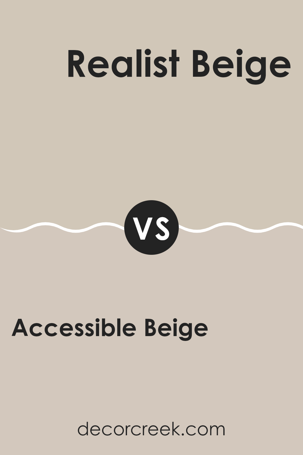
Accessible Beige SW 7036 by Sherwin Williams vs Realist Beige SW 6078 by Sherwin Williams
Accessible Beige and Realist Beige are two popular beige paint colors from Sherwin Williams, each offering a unique shade that can enhance the look of your home. Accessible Beige has a slightly grey tone, which makes it very flexible for rooms that receive both natural and artificial light. It manages to retain a warm look, even though it leans toward a cooler beige. This color works well in nearly any setting, helping small rooms appear larger and more open.
On the other hand, Realist Beige has a warmer, more golden tone. This shade is excellent for creating a cozy and inviting atmosphere, especially in rooms that benefit from a lot of natural sunlight. It pairs beautifully with rich wood finishes and other warm colors.
Both colors offer a neutral backdrop for various decorating styles, but the choice between them depends on the atmosphere you want to create. Accessible Beige leans more toward a modern neutral, while Realist Beige offers a traditional, warm feel.
You can see recommended paint color below:
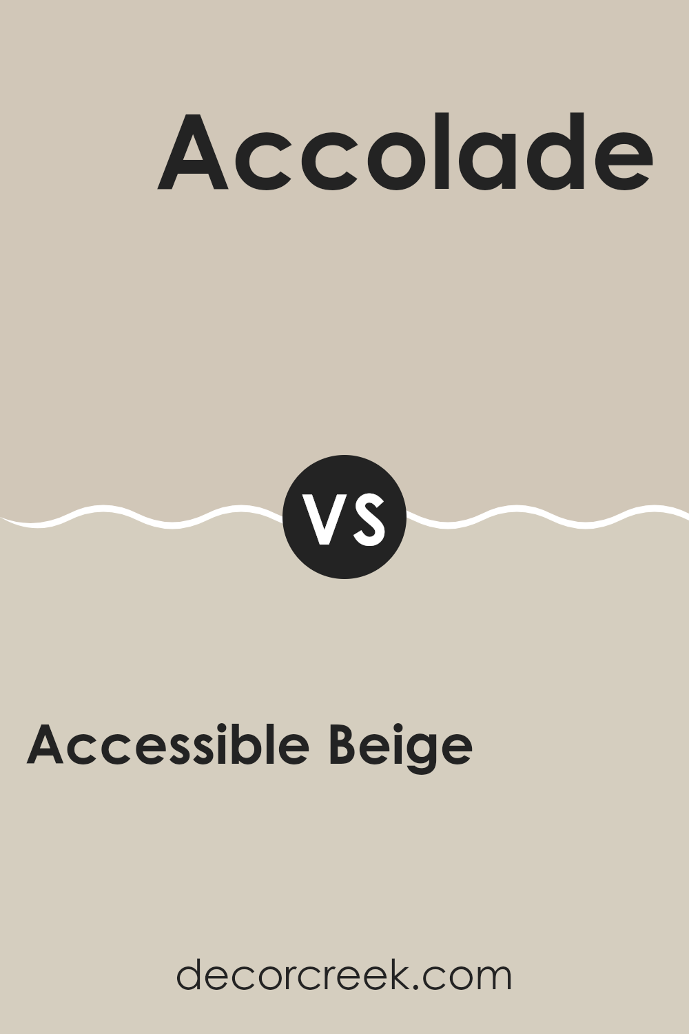
Accessible Beige SW 7036 by Sherwin Williams vs Accolade SW 9516 by Sherwin Williams
Accessible Beige is a warm neutral with gray undertones, making it very flexible for various rooms. It’s a subtle shade that works well in rooms where you want a cozy, inviting feel without going too dark. It pairs nicely with both bright and muted colors, allowing it to adapt to different decor styles smoothly.
On the other hand, Accolade is a lighter, softer color with a hint of warmth. This shade is closer to an off-white and provides a fresh, clean look to any room. It’s particularly useful for making smaller rooms appear larger and brighter. Due to its light tone, it serves as an excellent background for vibrant colors and can help them stand out.
In summary, while both colors provide a neutral base, Accessible Beige lends a warm depth suitable for comfort and cohesiveness, whereas Accolade offers a brighter, airier feel, enhancing openness and light in a room. Both are flexible but serve slightly different aesthetic purposes.
You can see recommended paint color below:
- SW 9516 Accolade
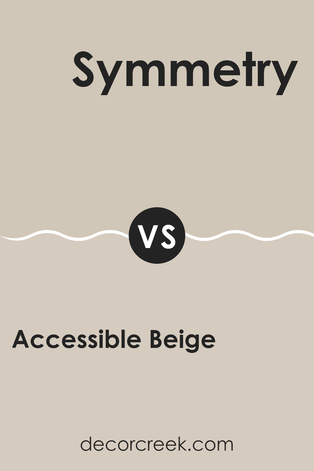
Accessible Beige SW 7036 by Sherwin Williams vs Symmetry SW 9601 by Sherwin Williams
Accessible Beige and Symmetry are two distinct paint colors by Sherwin Williams, each offering a unique vibe for interior rooms. Accessible Beige is a warm, welcoming beige with a slight gray undertone, making it a flexible and inviting choice for almost any room. It strikes a balance between beige and gray, providing a neutral backdrop that complements various decor styles and colors.
On the other hand, Symmetry is a much darker shade, characterized by its deep blue-gray tone. It is bold and commands attention, making it ideal for accent walls or rooms where a strong, distinct color is desired. Unlike the lighter and softer feel of Accessible Beige, Symmetry adds drama and depth to a room.
Both colors work well in modern homes but serve different purposes due to their contrasting tones. While Accessible Beige is perfect for creating a cozy, subtle environment, Symmetry is better suited for making a striking interior statement.
You can see recommended paint color below:
- SW 9601 Symmetry
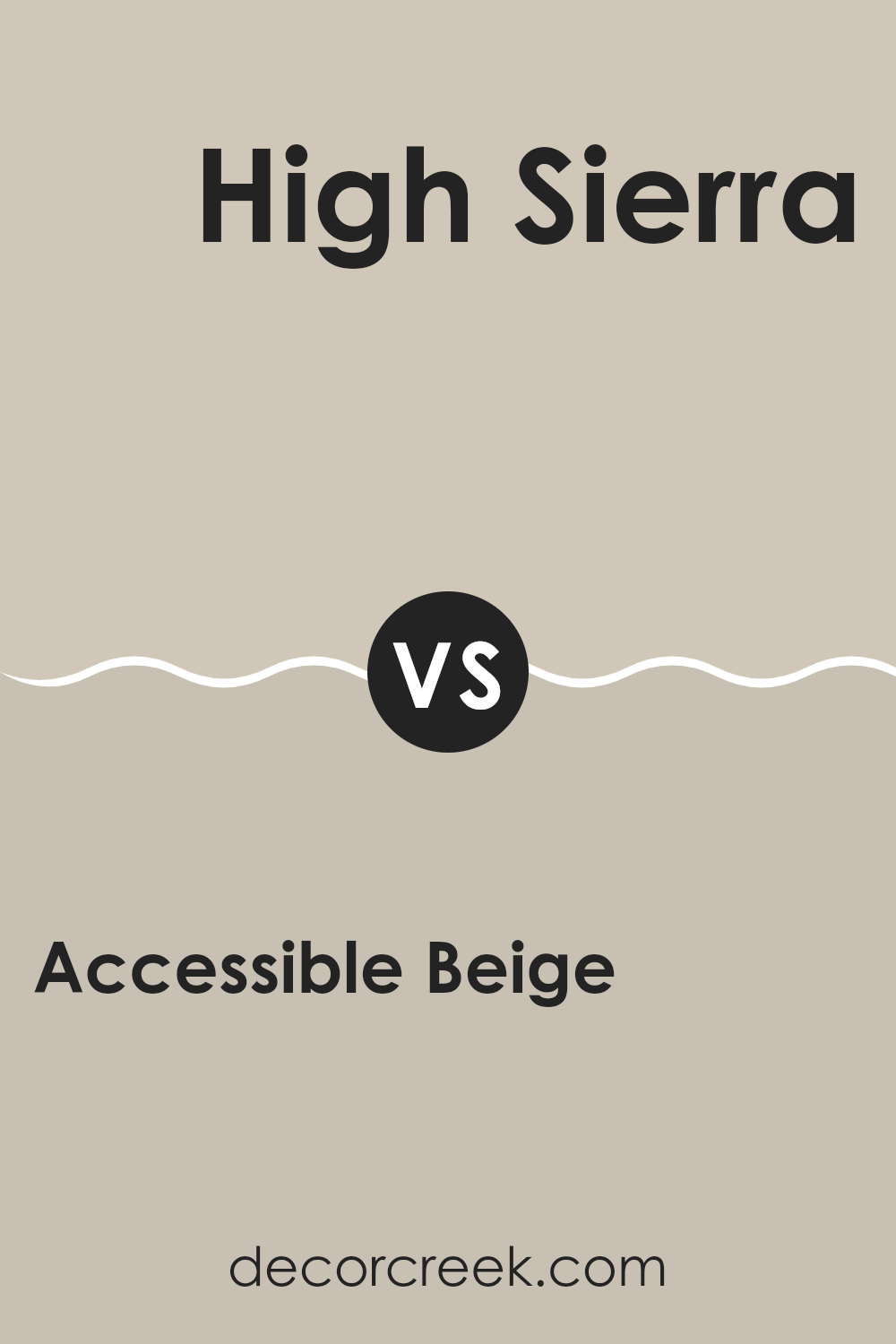
Accessible Beige SW 7036 by Sherwin Williams vs High Sierra SW 9588 by Sherwin Williams
Accessible Beige and High Sierra are two distinct paint colors from Sherwin Williams, each offering a unique vibe for interior rooms. Accessible Beige is a warm, welcoming beige with gray undertones. It’s extremely flexible, great for any room, and pairs well with a wide range of decor. This color keeps rooms looking light and open, making it a suitable choice for small rooms or areas with limited natural light.
On the other hand, High Sierra is a deeper, bolder color with a strong presence of gray and hints of blue. This shade can make a dramatic impact and is ideal for accent walls or for creating a cozy atmosphere in larger rooms. It works particularly well in areas that need a touch of drama or where you want to draw attention.
In conclusion, while Accessible Beige offers a neutral, soft backdrop suitable for any setting, High Sierra provides depth and personality, making it a choice for more specific design needs.
You can see recommended paint color below:
- SW 9588 High Sierra
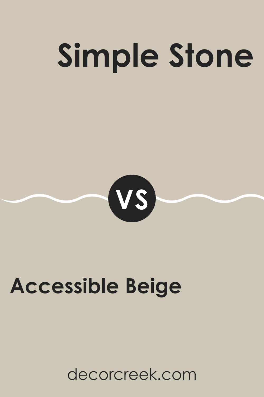
Accessible Beige SW 7036 by Sherwin Williams vs Simple Stone SW 9521 by Sherwin Williams
Accessible Beige and Simple Stone are two calm neutral colors by Sherwin Williams. Accessible Beige is a warm beige with gray undertones, making it very flexible for different rooms and lighting conditions. It creates a cozy and inviting atmosphere in any room.
On the other hand, Simple Stone carries a slightly cooler tone, leaning toward a muted blend of beige and gray. This color can give a more subdued and understated look, offering an excellent background for various decor styles, from modern to traditional.
Both colors are quite flexible and can work well in various settings like living rooms, bedrooms, and offices. However, the warmth of Accessible Beige tends to be more welcoming, while Simple Stone offers a cleaner, crisper feel that pairs well with contemporary furnishings. When deciding between the two, consider the mood you want to set and the lighting in your room, as this can significantly influence how the color is perceived.
You can see recommended paint color below:
- SW 9521 Simple Stone
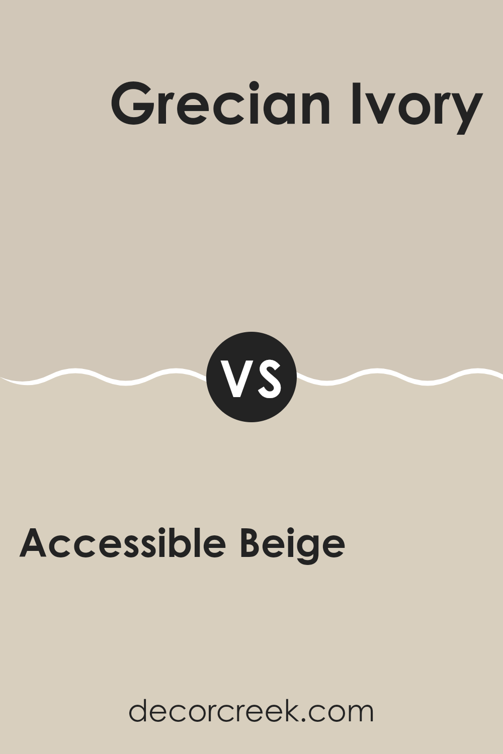
Accessible Beige SW 7036 by Sherwin Williams vs Grecian Ivory SW 7541 by Sherwin Williams
Accessible Beige and Grecian Ivory are two paint colors offered by Sherwin Williams that both provide a warm neutral base, but they have distinct tones that could affect the mood and feel of a room.
Accessible Beige is a light to medium beige that leans a bit toward gray. This makes it highly flexible for any room, making it easier to pair with different decor styles and colors. It provides a subtle backdrop that can help other elements in the room stand out, making it a safe choice for anyone wanting a neutral without committing to a true gray.
On the other hand, Grecian Ivory is lighter, offering a softer look with a creamy, almost buttery undertone. This color tends to add a bit of warmth to rooms, making them feel cozy and welcoming. Because of its lighter and warmer hue, Grecian Ivory is perfect for rooms looking to achieve a bright and airy atmosphere without feeling too stark.
When choosing between these two, consider the amount of natural light your room receives as well as size and function. Accessible Beige works well in larger, busier areas as it hides marks and scuffs, whereas Grecian Ivory is ideal for creating a more intimate, calming room.
You can see recommended paint color below:
In wrapping up, SW 7036 Accessible Beige by Sherwin Williams is truly a special shade that works wonders in any room. It’s not just any beige—it has just the right mix of warmth to make a room feel cozy but still keeps things bright.
It’s perfect for anyone wanting to freshen up their home without making things look too different. Plus, it goes well with a whole lot of other colors, whether it’s dark blues, soft pinks, or even bold greens. This makes it easy to use no matter what your favorite colors are or what style your room is.
Accessible Beige is more than just a paint color. It’s a way to make your home feel more welcoming and comfy without having to change too much. Whether you’re just painting one room or the whole house, this color could be the perfect choice. It’s reliable, pretty, and always makes rooms look great. So, if you’re thinking of giving your walls a new look, Accessible Beige is definitely worth thinking about!
It’s a simple choice that can really make a big difference in your home.

Ever wished paint sampling was as easy as sticking a sticker? Guess what? Now it is! Discover Samplize's unique Peel & Stick samples.
Get paint samples

