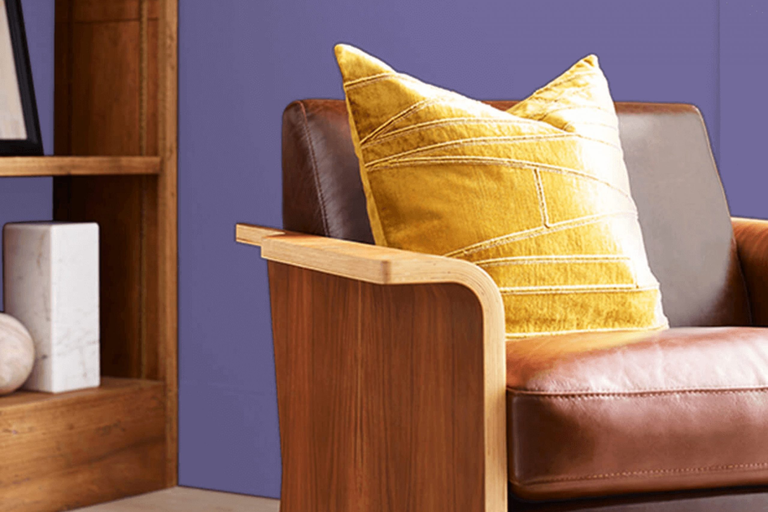
Choosing the right paint color can feel stressful, but I found a shade that really stands out for its unique charm and flexibility. I’m talking about SW 6824 Forget-Me-Not by Sherwin Williams, a hue that truly captures the essence of subtlety and refinement.
This shade is a soft, delightful blue that reminds you of a clear sky on a sunny day, bringing a sense of calm and freshness to any room. Whether you’re looking to paint a bedroom, a kitchen, or even a home office, SW 6824 Forget-Me-Not provides that perfect blend of calm and energy, making it a great choice for rooms where you spend a lot of time.
I’ve noticed that it pairs beautifully with a wide range of decor styles, from modern minimalist to cozy cottage. The flexibility of SW 6824 Forget-Me-Not means that you can use it as a base to build on with various textures and accent colors. For example, combining it with warm woods and whites creates a breezy, inviting atmosphere, whereas dark metals and rich earth tones give it a more grounded, bold look.
This shade not only enhances the aesthetic of a room but also influences the mood, making rooms feel more open and airy. If you are searching for a color that refreshes your room without overpowering it, SW 6824 Forget-Me-Not might just be the ideal choice for you.
What Color Is Forget-Me-Not SW 6824 by Sherwin Williams?
Forget-Me-Not by Sherwin Williams is a vibrant and cheerful blue hue that brings a fresh, airy feel to any room. With a balance of brightness and softness, this color resembles the delicate petals of its namesake flower. It’s a flexible shade that can open up small rooms or add a playful pop of color to larger areas.
This particular blue works well in a variety of interior styles. It’s perfect for coastal themes where it complements the natural light and pairs beautifully with sandy neutrals and soft whites. In a modern setting, this blue can create a striking contrast with clean lines and minimalist furniture. It also fits into a country or shabby chic style, adding a touch of rustic charm when paired with distressed wood elements and soft, floral fabrics.
Forget-Me-Not pairs wonderfully with natural materials and textures. In a room with hardwood floors or wooden furniture, this blue can enhance the warmth of the wood. It also looks stunning with metallic accents like copper or gold, which add a touch of luxury without dominating the room.
Additionally, incorporating fabrics like linen or cotton in lighter colors can keep the room feeling light and airy, making the most of this delightful blue shade.
Is Forget-Me-Not SW 6824 by Sherwin Williams Warm or Cool color?
Forget-Me-Not by Sherwin Williams is a soft and gentle blue color that brings a fresh and airy feel to any room in a house. This shade of blue is reminiscent of a clear sky on a sunny day, which can make small rooms appear bigger and more open.
It’s perfect for bedrooms and bathrooms where you want a calming vibe without using a stark white. This color pairs beautifully with white trim and can also handle being the backdrop for colorful decor pieces like vibrant throw pillows or bold artwork.
It’s a flexible color that can work well in various lighting conditions, maintaining its beauty whether in natural sunlight or under indoor lights. In homes, using Forget-Me-Not helps create a peaceful and welcoming atmosphere, making it a great choice for those looking to freshen up their living areas.
Undertones of Forget-Me-Not SW 6824 by Sherwin Williams
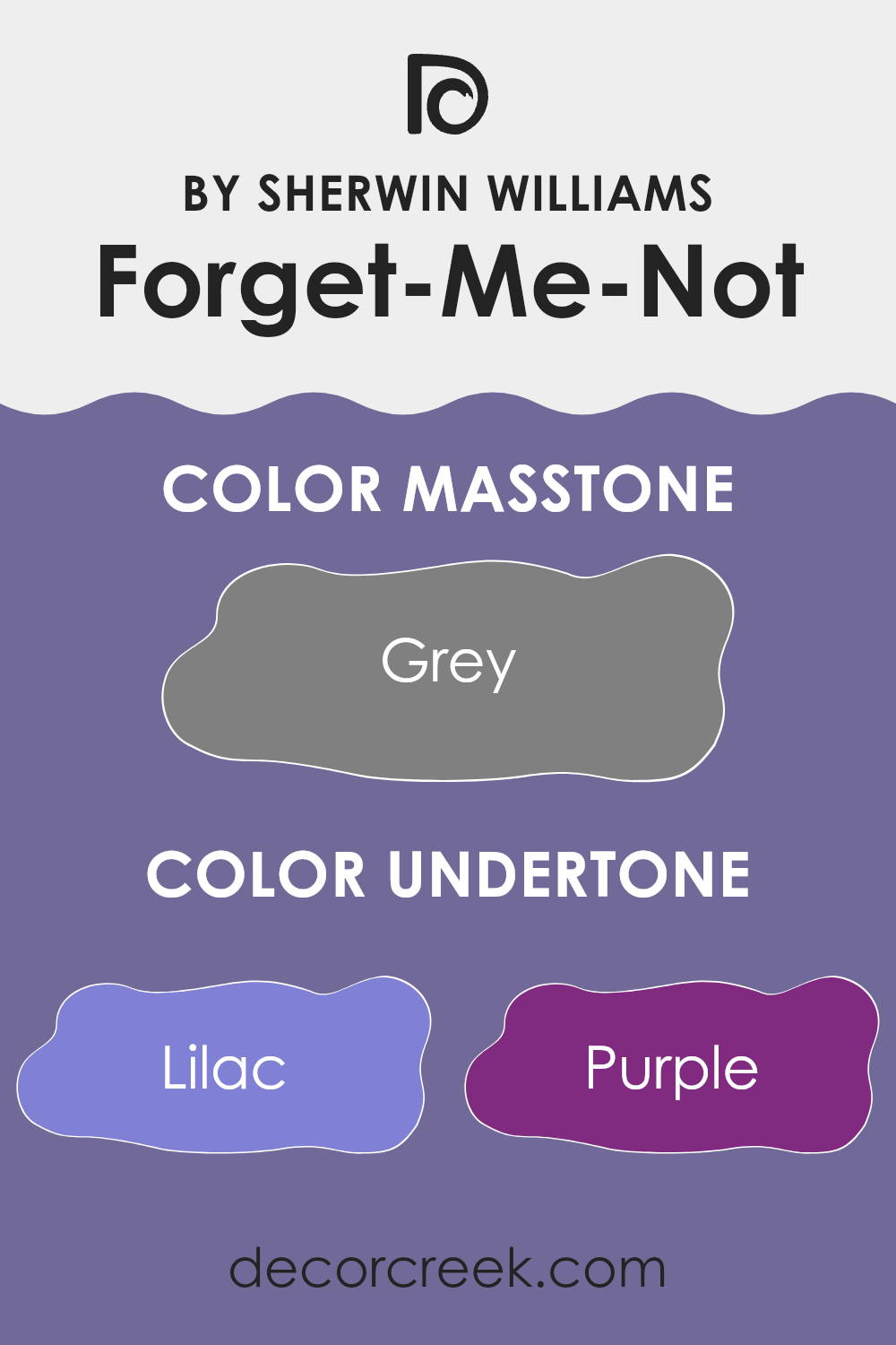
Forget-Me-Not by Sherwin Williams is a flexible paint color with a complex mix of undertones which greatly influences how it appears in different settings. Undertones are subtle colors that lie beneath the primary color and they can shift the perception of the color depending on the lighting and surrounding elements.
This particular shade features a blend of various undertones including lilac, purple, and different shades of blue and turquoise, which infuse a cool feel to it. Added touches of colors like pale pink, mint, and light purple warm it up slightly, bringing a soft, gentle quality to the color. Darker undertones like navy and dark blue give it depth and richness.
In an interior room, the effect of these undertones can be quite remarkable. In rooms with plenty of natural light, the cooler undertones like light blue and lilac might become more prominent, giving the walls a fresh and airy feel. In areas with less light, the darker undertones like navy or dark blue could seem stronger, lending the room a more enclosed and cozy atmosphere.
The presence of both cool and warm undertones makes Forget-Me-Not a flexible choice for many rooms. It can cool down a brightly lit room or warm up a darker area depending on the balance of its undertones and the lighting conditions. This quality makes the paint color suitable for different rooms and styles, enhancing the overall aesthetic appeal of the home while adding a layer of complexity to the walls.
What is the Masstone of the Forget-Me-Not SW 6824 by Sherwin Williams?
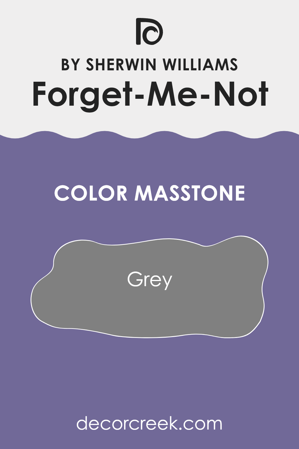
Forget-Me-NotSW 6824 is a unique color that looks grey when seen in its full depth. Since it is grey, it fits really well in almost all parts of a home. This neutral shade can create a soothing backdrop in living rooms and bedrooms, making small rooms look bigger and more open.
It’s easy to match with different kinds of furniture and decor, which means you won’t have a hard time finding things that go well with your walls.
Grey is known for being easy on the eyes, so it’s good for rooms where you spend a lot of time or need to concentrate. It’s also great for selling a house because it’s a popular color that most people like. Since Forget-Me-NotSW 6824 is essentially grey, it can be paired with brighter colors for a lively feel or with other neutrals for a more subdued look, giving you lots of decorating options.
How Does Lighting Affect Forget-Me-Not SW 6824 by Sherwin Williams?
Lighting plays a crucial role in how we perceive colors. Different types of light can make the same color look different. For instance, warm light often makes colors appear more vibrant, whereas cool light can make them seem muted.
The color Forget-Me-Not SW 6824 by Sherwin Williams is a unique shade that reacts differently under various lighting conditions. In artificial light, this color tends to look slightly more saturated and vibrant. The typical yellow or warm tones of most indoor lighting enhance the blue in Forget-Me-Not, making the walls feel more lively and striking.
In natural light, the appearance of Forget-Me-Not can change depending on the time of day and weather conditions. On a sunny day, the blue will appear crisp and bright, giving a fresh and cheerful vibe to the room. However, on a cloudy day, the same color might look softer and more subdued, lending a calm and gentle feel to the room.
The orientation of the room also affects how Forget-Me-Not looks:
- North-Faced Rooms: These rooms get less direct sunlight, which means the color might appear slightly darker and less vibrant. The cool light from the north can make Forget-Me-Not look more subdued and gentle, perfect for creating a quiet and peaceful room.
- South-Faced Rooms: These rooms benefit from ample sunlight throughout the day. Here, Forget-Me-Not will look brighter and more dynamic. The abundant light brings out the cheerful aspects of the color, making the room feel lively and inviting.
- East-Faced Rooms: Morning light is warm and bright in these rooms, making Forget-Me-Not appear vibrant and fresh in the mornings but cooler and more toned down as the day progresses. This is ideal for rooms used mainly in the morning.
- West-Faced Rooms: Evening light in these rooms can make Forget-Me-Not glow warmly in the afternoons and evenings. This is perfect for rooms used mostly in the later parts of the day, as the color adds a relaxed and cozy atmosphere.
Overall, Forget-Me-Not’s ability to adjust its vibe depending on lighting and room orientation makes it a flexible choice for many rooms.

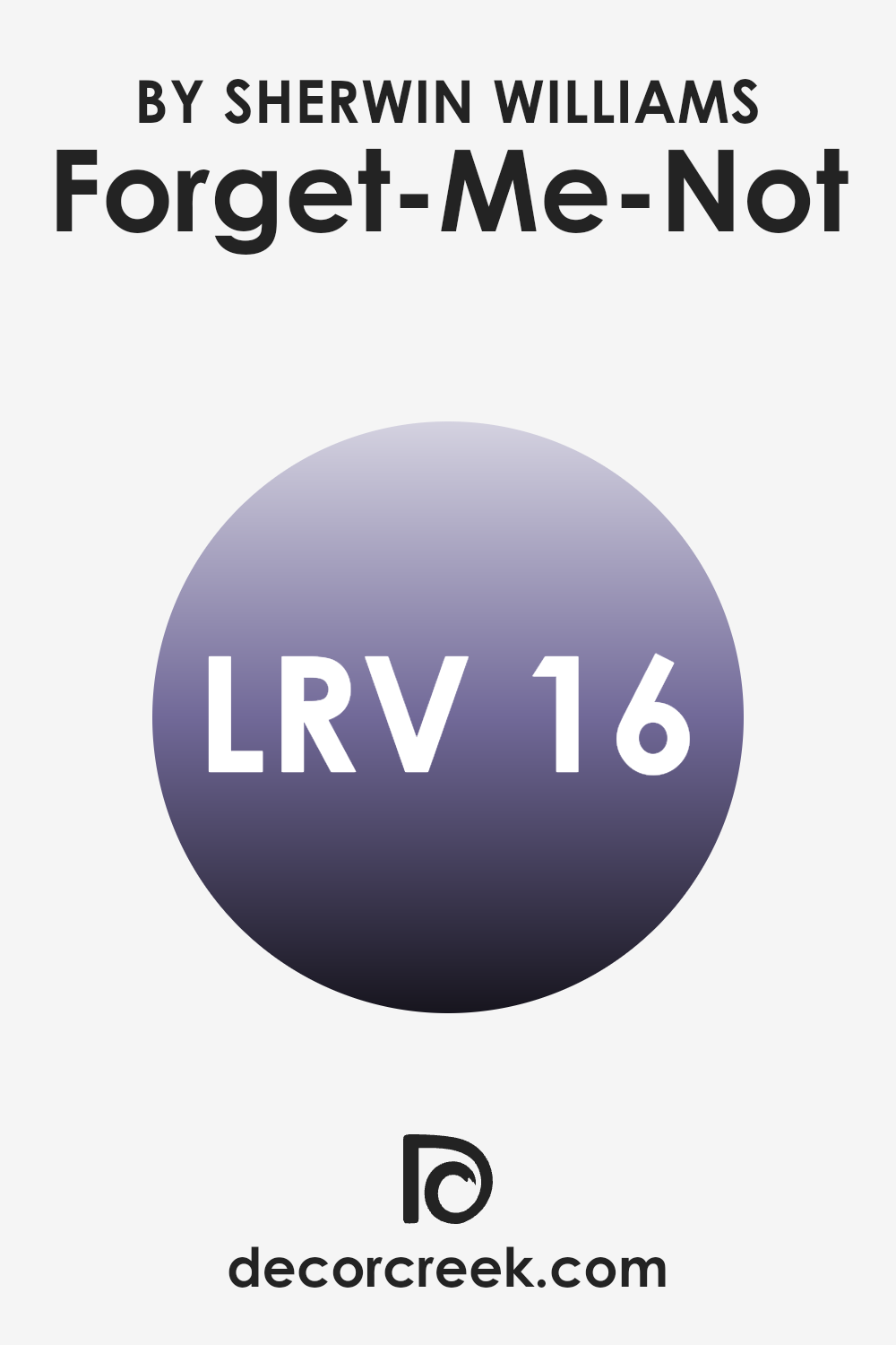
What is the LRV of Forget-Me-Not SW 6824 by Sherwin Williams?
LRV stands for Light Reflectance Value, which measures the percentage of light a paint color reflects from or absorbs into a painted surface. A higher LRV means the color reflects more light, making it appear brighter and lighter, while a lower LRV means it absorbs more light, appearing darker.
This value helps in choosing paint colors based on how bright or dark one wants the room to appear. It is particularly useful for understanding how the color might look in different lighting conditions or in various parts of a home.
For the color with an LRV of 15.826, such as the one mentioned, it falls on the darker end of the scale. This means it will absorb a higher amount of light instead of reflecting it. In a practical sense, this darker LRV will make the color appear rich and deep on walls, which might be ideal for creating a more cozy and intimate atmosphere in a room.
However, it may also make a small room appear even smaller or darker if not paired with adequate lighting or lighter accents. Therefore, considering a balance of lighting and other design elements becomes crucial when using darker hues like this.
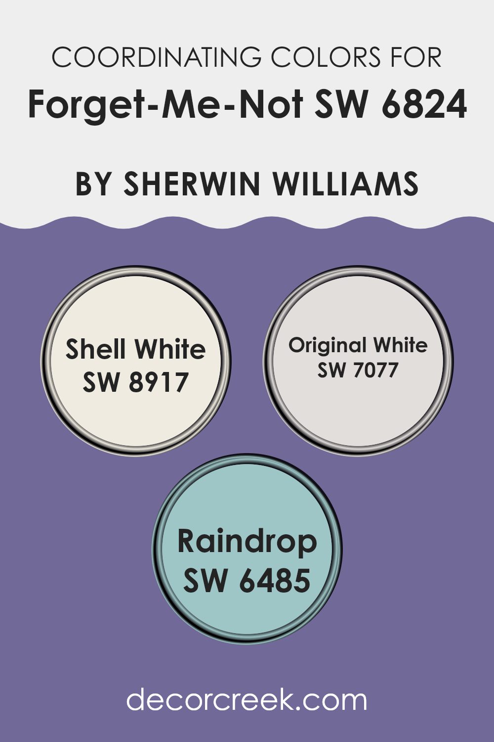
Coordinating Colors of Forget-Me-Not SW 6824 by Sherwin Williams
Coordinating colors are a group of colors carefully chosen to complement each other when used in a room or on a project. The main idea is to pick colors that create a harmonious visual experience, enhancing the base color without overpowering it. For instance, when using a vibrant shade like a sky blue, selecting coordinating colors can balance and highlight that primary shade effectively.
In the case of a fresh color such as sky blue, Shell White, Original White, and Raindrop are excellent coordinating colors. Shell White is a warm, creamy white that adds a soft, calming touch to the overall look, creating a friendly and welcoming ambiance. Original White, slightly brighter and crisper than Shell White, offers a clear contrast that helps define rooms when paired with more pronounced colors.
Raindrop adds a bit more color flair by introducing a gentle, subtle blue-green tone that works beautifully to offer a refreshing, light splash of color that is neither too bold nor too muted. These colors together create a clean and refreshing palette that complements the sky blue’s youthful energy.
You can see recommended paint colors below:
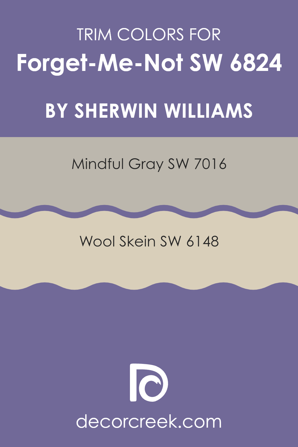
What are the Trim colors of Forget-Me-Not SW 6824 by Sherwin Williams?
Trim colors are selected to complement the main color used on the walls, creating a defined finish that highlights architectural details like doors, window frames, and moldings. They are vital as they help frame the room, adding depth and drawing attention to the features of an interior.
For a bold and vivid hue like Forget-Me-Not by Sherwin Williams, choosing the right trim colors can both contrast and balance the intensity of the blue, ensuring that it stands out beautifully without feeling too heavy.
Mindful Gray and Wool Skein are two great choices for trim with Forget-Me-Not. Mindful Gray is a subtle, warm gray that provides a gentle break from the vibrant blue, promoting a smooth visual flow from wall to trim. It’s a neutral shade that works well in various lighting conditions, making it suitable for different rooms.
On the other hand, Wool Skein is a soft, beige color with a touch of yellow undertones, which adds a warm contrast to the cool blue, offering a natural, understated frame to the rich wall color. Both options support the main color without competing for attention, enhancing the overall look of the room.
You can see recommended paint colors below:
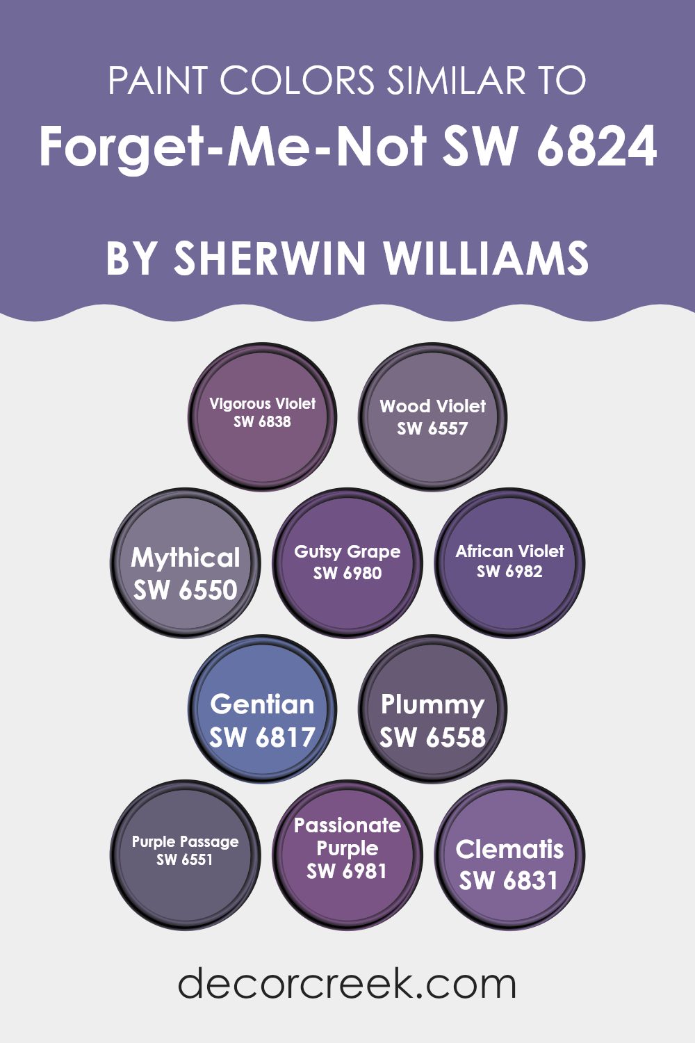
Colors Similar to Forget-Me-Not SW 6824 by Sherwin Williams
Similar colors are essential in design for creating a harmonious and cohesive look. When colors are similar, they share a common hue but differ slightly in lightness or saturation. This subtle difference helps create depth and visual interest without flooding the viewer with too much contrast. For example, using a palette of similar colors can smooth transitions between different areas in a home or artwork, making the overall feel unified and pleasing to the eye.
Consider a color like Forget-Me-Not by Sherwin Williams, a delightful shade that pairs well with related colors. Vigorous Violet is a lively and bold purple that adds a splash of brightness. Wood Violet, on the other hand, is a deeper purple that brings richness and depth to rooms.
Mythical has a dreamy purple hue that offers a mystical feel to interiors. Gutsy Grape is vibrant and energetic, perfect for accentuating areas that need a pop. African Violet is a refined deep purple that lends an air of mystery and luxury. Gentian is a vibrant and refreshing color that feels fresh and invigorating.
Plummy has a lush, berry-like tone that feels warm and inviting. Purple Passage is a deep, enchanting purple that provides an excellent backdrop for decor elements. Passionate Purple is rich and vivid, ideal for creating focal points in a room. Lastly, Clematis is a fresh, light purple with a gentle presence that can brighten rooms effortlessly. These colors work together to create environments that are visually interesting and cohesive.
You can see recommended paint colors below:
- SW 6838 Vigorous Violet
- SW 6557 Wood Violet
- SW 6550 Mythical
- SW 6980 Gutsy Grape
- SW 6982 African Violet
- SW 6817 Gentian
- SW 6558 Plummy
- SW 6551 Purple Passage
- SW 6981 Passionate Purple
- SW 6831 Clematis
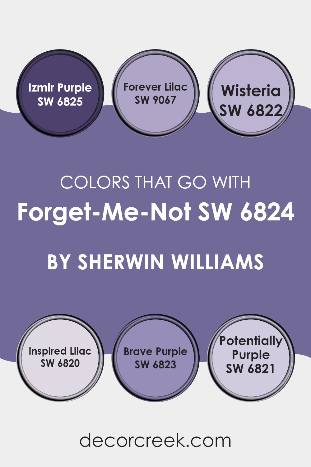
Colors that Go With Forget-Me-Not SW 6824 by Sherwin Williams
Choosing the right colors to complement Forget-Me-Not SW 6824 by Sherwin Williams is crucial for creating harmonious color schemes in any room. These selected colors help balance or accent the main hue, ensuring the room feels well designed and cohesive.
For instance, Izmir Purple SW 6825 provides a deeper, more intimate purple tone that creates striking contrast with the lighter, airy quality of Forget-Me-Not. This intense purple can make the lighter shades in the room pop and add depth to the overall design.
Forever Lilac SW 9067 is a soft, muted purple that brings a gentle touch to rooms while maintaining a colorful warmth that pairs nicely with the subtle vibrancy of Forget-Me-Not. Next, Wisteria SW 6822 offers a slightly dusty purple that lends an enduring charm and works beautifully to achieve a sense of flow and continuity in color transitions.
Inspired Lilac SW 6820 features a refreshing burst of lavender hues that provides a simple and clean appearance. Brave Purple SW 6823 shows off a bold purple presence that makes a statement yet still blends delightfully with quieter shades.
Lastly, Potentially Purple SW 6821 is a flexible dusky lilac that can act as a bridge among stronger and lighter tones, ensuring a seamless yet dynamic palette. These colors collectively enrich the environment, allowing for design flexibility and personal expression.
You can see recommended paint colors below:
- SW 6825 Izmir Purple
- SW 9067 Forever Lilac
- SW 6822 Wisteria
- SW 6820 Inspired Lilac
- SW 6823 Brave Purple
- SW 6821 Potentially Purple
How to Use Forget-Me-Not SW 6824 by Sherwin Williams In Your Home?
Forget-Me-Not SW 6824 by Sherwin Williams is a subtle and soft blue color that brings a peaceful and refreshing vibe to any room. This shade is perfect for creating a relaxed atmosphere in rooms like bedrooms or bathrooms where you want to unwind.
Its light blue tone pairs well with white trim or furniture, enhancing the freshness of the room. You can use it as a main wall color or as an accent to add a gentle splash of color. It’s also great in a nursery or a child’s room, providing a calming backdrop that’s not too bold or overpowering.
Additionally, Forget-Me-Not works nicely in small rooms; it can help make them appear bigger and brighter. By painting this color in common areas, such as the living room, you can create a cohesive and inviting environment that feels airy and light.
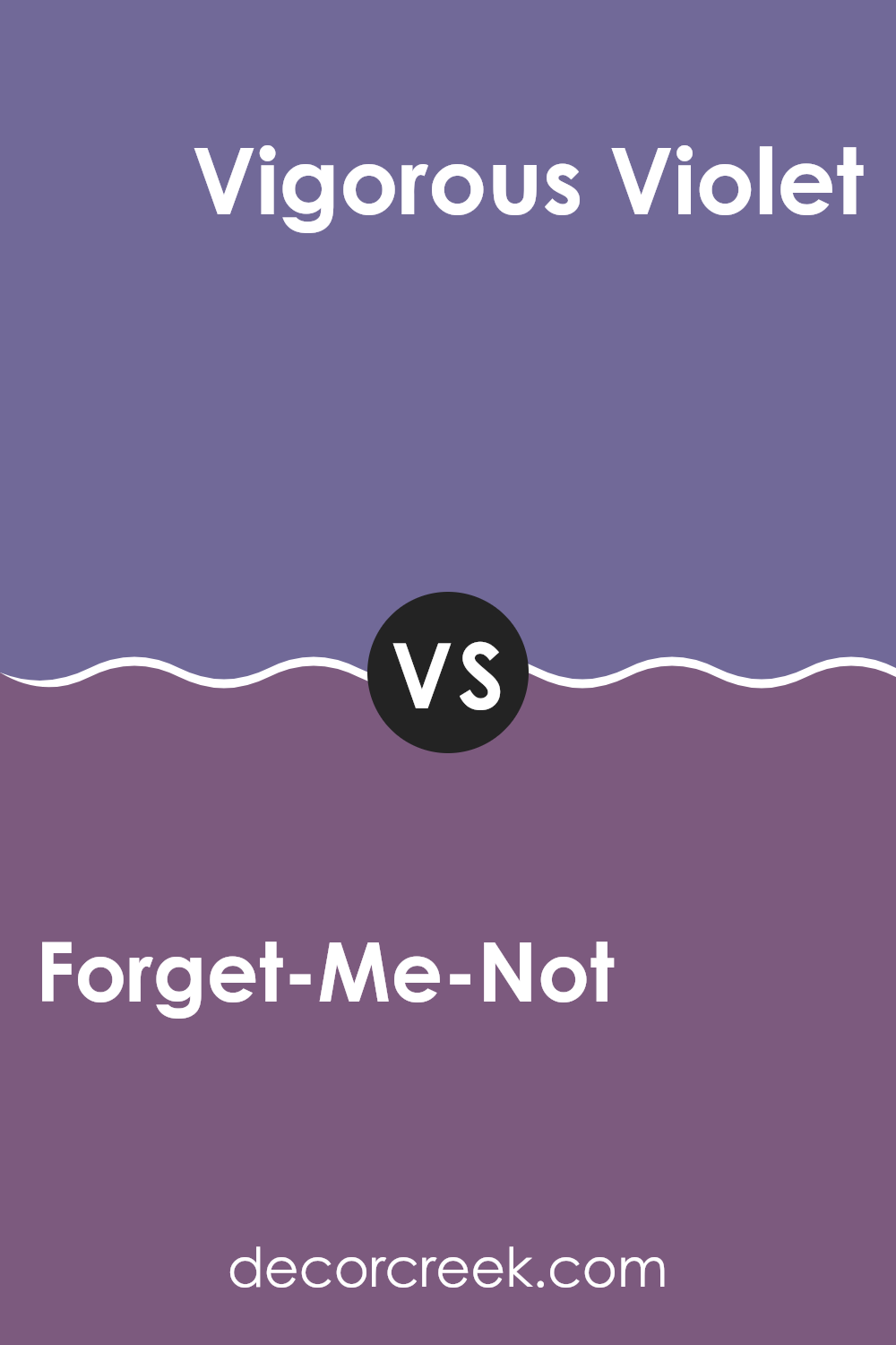
Forget-Me-Not SW 6824 by Sherwin Williams vs Vigorous Violet SW 6838 by Sherwin Williams
Forget-Me-Not is a vibrant shade of blue with a clear, playful feel, making it perfect for energizing a room or adding a pop of color. It’s a refreshing blue that reminds you of a clear sky on a sunny day.
On the other hand, Vigorous Violet is a bold, deep purple that offers a strong visual impact. It’s a color that stands out and can make any area feel more dynamic and lively. While Forget-Me-Not has a more calming and light presence, Vigorous Violet brings intensity and drama, making it great for accent walls or creative rooms.
Both colors are quite distinctive and can set very different moods depending on what you’re aiming for in your decorating project. Whether looking for freshness or a touch of boldness, each provides unique possibilities.
You can see recommended paint color below:
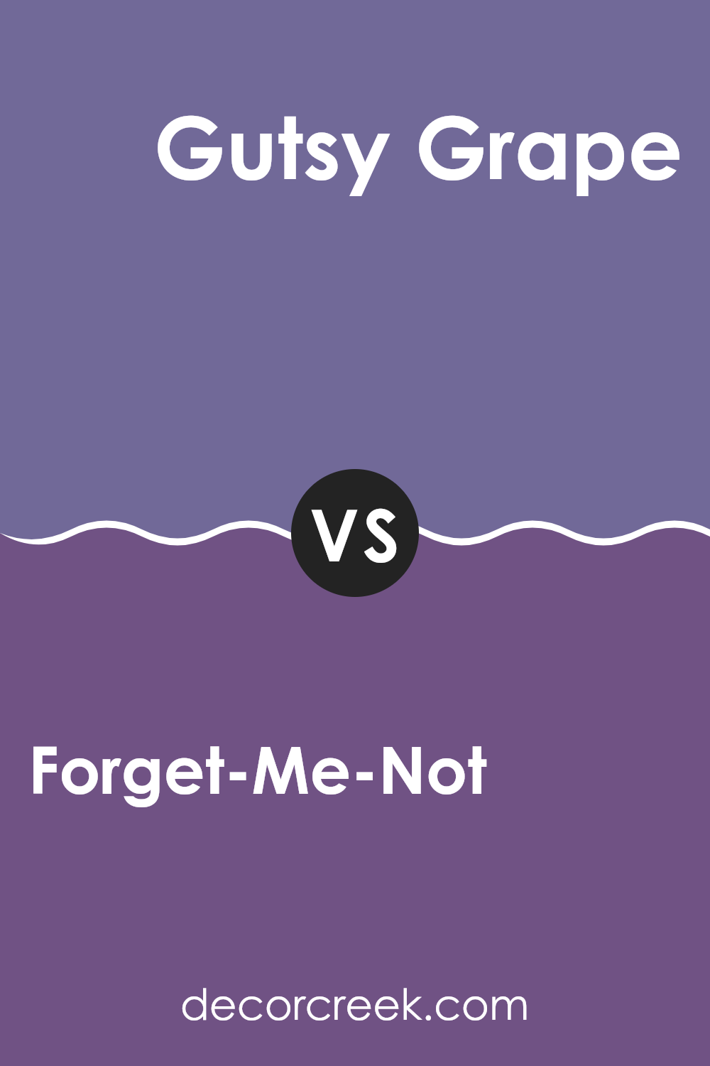
Forget-Me-Not SW 6824 by Sherwin Williams vs Gutsy Grape SW 6980 by Sherwin Williams
The main color, Forget-Me-Not, is a soft and light shade of blue with a refreshing and calming feel. It brings to mind clear skies and calm waters, making it ideal for creating a relaxed atmosphere in rooms such as bedrooms or bathrooms.
In contrast, Gutsy Grape is a bold, deep purple color that offers a rich and vibrant feel. This color is perfect for adding a pop of intensity and energy to an area, suitable for accent walls or decor items that you want to stand out.
While Forget-Me-Not has a gentle and airy appeal, Gutsy Grape packs a punch with its dramatic and deep tones. Using them together could provide a dynamic contrast—calming blue tones balancing the energizing effects of a strong purple. Each color has its unique charm, appealing to different tastes and styles for decoration.
You can see recommended paint color below:
- SW 6980 Gutsy Grape
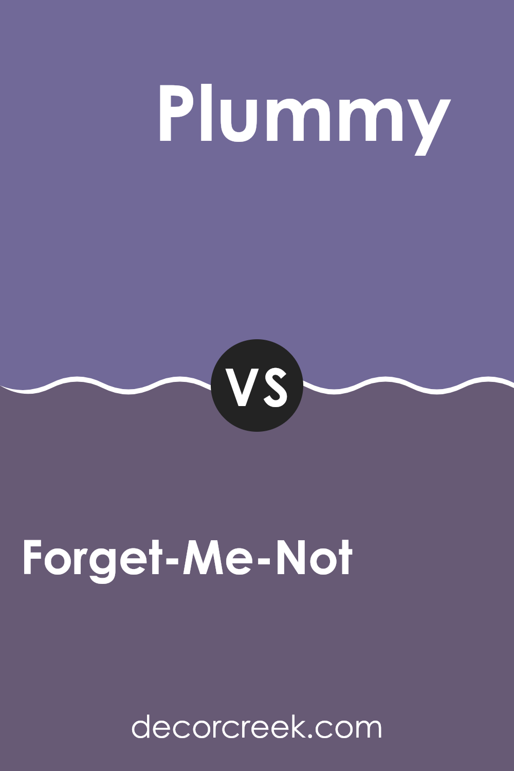
Forget-Me-Not SW 6824 by Sherwin Williams vs Plummy SW 6558 by Sherwin Williams
Forget-Me-Not by Sherwin Williams is a lively blue shade that’s light and airy, bringing a sense of freshness to any room. It evokes the clear, open sky of a sunny day and works well in rooms that aim for a bright and inviting atmosphere. This color can make small rooms feel larger and more open.
On the other hand, Plummy by Sherwin Williams is a deep, rich purple with a hint of red. This color provides a bold and cozy feeling, ideal for creating a warm and inviting area. It’s perfect for accent walls or rooms where you want a touch of drama and intensity.
Both colors offer distinct vibes—Forget-Me-Not is cool and calming, excellent for a relaxed environment, while Plummy is warm and more intense, suitable for a more vibrant and energetic room. Choosing between them depends on the mood and function you want for your room.
You can see recommended paint color below:
- SW 6558 Plummy
Forget-Me-Not SW 6824 by Sherwin Williams vs African Violet SW 6982 by Sherwin Williams
The color Forget-Me-Not is a soft, cheerful blue with a slight hint of green, giving it a fresh, spring-like feel. It’s light and airy, making it perfect for creating a relaxed and inviting atmosphere in rooms like bedrooms or bathrooms.
On the other hand, African Violet is a deeper, more intense color. It’s a rich purple with undertones that can feel both warm and cool, depending on the lighting. This color adds a bold touch to any room, suitable for accent walls or decor highlights.
Despite both being floral-inspired hues, Forget-Me-Not is subtler and tends to brighten rooms, reflecting more light. African Violet, with its depth and intensity, draws the eye and can make a strong style statement. These colors can complement each other in a room, with the lighter blue softening the impact of the bold purple.
You can see recommended paint color below:
- SW 6982 African Violet
Forget-Me-Not SW 6824 by Sherwin Williams vs Wood Violet SW 6557 by Sherwin Williams
Forget-Me-Not and Wood Violet are both colors from Sherwin Williams that bring to life unique shades of blue and purple. Forget-Me-Not is a vibrant and fresh blue, lighter in tone, and has a cheerful vibe to it. It reminds one of a clear sky on a sunny day and tends to make rooms feel more open and airy.
On the other hand, Wood Violet is a deeper, richer purple, providing a sense of depth and luxury. It’s the kind of color that can make a statement in a room, either as a dramatic focal wall or through accents around the interior. Wood Violet is best suited for those looking to add a touch of mystery or drama to their environment.
Both colors offer distinct visual experiences and can drastically alter the atmosphere of any room, depending on how they are used. Whether looking for brightness and cheerfulness with Forget-Me-Not, or depth and richness with Wood Violet, both colors present appealing options for various decorating styles.
You can see recommended paint color below:
Forget-Me-Not SW 6824 by Sherwin Williams vs Mythical SW 6550 by Sherwin Williams
Forget-Me-Not is a bright and vibrant shade of blue that exudes freshness and liveliness. It’s a color that stands out, reminiscent of a clear spring day. This blue is perfect for energizing a room or adding a pop of joyful color in decorative accents.
On the other hand, Mythical is a lighter, more muted blue. It has a subtle touch of purple, making it softer and more calming compared to the energetic Forget-Me-Not. Mythical is ideal for creating a gentle and relaxing atmosphere in any room, particularly suited for areas where you want a touch of color without overpowering the senses.
These two shades, while both blue, offer distinct vibes. Forget-Me-Not is more about vibrancy and activation, whereas Mythical leans toward a soothing and understated presence. When choosing between them, consider the mood and function of your room.
You can see recommended paint color below:
Forget-Me-Not SW 6824 by Sherwin Williams vs Passionate Purple SW 6981 by Sherwin Williams
Forget-Me-Not is a soft, pastel blue with subtle green undertones, giving it a calm and gentle vibe. It resembles a light sky on a clear day and can easily brighten up any room without feeling too strong. This color is ideal for creating a relaxed and breezy atmosphere in rooms like bedrooms or bathrooms where you want to feel at ease.
Passionate Purple, in contrast, is a deep, vibrant purple that brings a lot of energy and personality into a room. It’s a bold color that can make a strong statement when used as an accent wall or in decorative touches. Despite its intensity, it’s also quite flexible because it pairs well with both dark and light neutrals.
While Forget-Me-Not is more about softness and light, Passionate Purple is all about depth and drama. Depending on the mood you’re aiming for, either could be a great choice. Forget-Me-Not works well in rooms where calm is key, and Passionate Purple is perfect when you want to add a splash of excitement.
You can see recommended paint color below:
- SW 6981 Passionate Purple
Forget-Me-Not SW 6824 by Sherwin Williams vs Clematis SW 6831 by Sherwin Williams
Forget-Me-Not and Clematis are both vibrant paint colors by Sherwin Williams, but they bring their unique vibes to rooms. Forget-Me-Not is a softer shade with a calming blue tone that leans slightly toward a subtle aqua.
This color fits well in bedrooms or bathrooms where a peaceful atmosphere is desired. On the other hand, Clematis is a more vivid and punchier color. This shade of purple is quite bright and can add a pop of energetic color to a room, making it ideal for places meant for creativity and activity, like a playroom or an artistic studio.
While both colors are bold in their own way, Forget-Me-Not offers a gentler touch, and Clematis stands out with its louder presence. Each works well for giving rooms a distinct character, whether you want a calming retreat or a lively spot.
You can see recommended paint color below:
- SW 6831 Clematis
Forget-Me-Not SW 6824 by Sherwin Williams vs Gentian SW 6817 by Sherwin Williams
Forget-Me-Not SW 6824 and Gentian SW 6817 are both vibrant shades of blue from Sherwin Williams, but they offer distinct vibes for room settings. Forget-Me-Not has a bright and airy feel, lighter in tone and infused with a subtle freshness that makes it ideal for creating a welcoming atmosphere in rooms like living rooms or bedrooms. It acts almost like a soft sky blue, reflecting light and adding a sense of openness.
On the other hand, Gentian SW 6817 leans toward a deeper, richer blue. This color is more intense and provides a strong presence in a room, perfect for making a statement or highlighting an area. Because of its bolder nature, Gentian works well in areas where you want to add depth or focus, such as on an accent wall or for cabinetry.
Choosing between them depends on the mood you’re aiming for: lighter and airier with Forget-Me-Not, or more dramatic and anchored with Gentian. Both are beautiful; your choice depends on your personal style and the function of the room.
You can see recommended paint color below:
- SW 6817 Gentian
Forget-Me-Not SW 6824 by Sherwin Williams vs Purple Passage SW 6551 by Sherwin Williams
Forget-Me-Not and Purple Passage, both by Sherwin Williams, are distinctive hues that each bring a unique vibe to a room. Forget-Me-Not is a lively and bright blue color.
It has a fresh, cheerful quality that makes it perfect for brightening up a room, especially in areas aimed at relaxation or creativity. It pairs well with light neutrals or even bold yellows for a more dynamic look.
On the other hand, Purple Passage is a deeper, more intense color. It leans toward a rich purple with hints of gray. This color is ideal for adding a touch of drama and depth to an area. It works well in a room that aims for a more grounded or bold feel. Pairing it with silvers or dark woods can enhance its luxurious quality.
The choice between these two would depend on the atmosphere you want to create—Forget-Me-Not for a light and airy feel, and Purple Passage for a more striking and grounded effect.
You can see recommended paint color below:
In wrapping up thoughts on SW 6824 Forget-Me-Not by Sherwin Williams, I have to say, it’s a pretty cool paint color! When you first see it, it’s like looking at a bright sky or a deep, beautiful ocean. This color can really cheer up any room, making it feel happy and alive. Whether it’s for a playroom, a kitchen, or even a bathroom, this shade of blue adds a fun spark anywhere it goes.
One of the best things I noticed is how it mixes well with other colors. Whether you put it next to soft whites or bold yellows, it stands out in a good way but doesn’t shout too loud. It’s kind of like that one friend who’s fun to be around without being too loud. Using this color can also breathe new life into old furniture or make decorations pop.
Overall, SW 6824 Forget-Me-Not isn’t just another blue paint; it has its unique charm. It’s the kind of color that makes you feel good when you look at it. For anyone thinking about adding a splash of color to their home, this might just be the perfect pick. It’s easy to like, easy to use, and can make any room look great.
Ever wished paint sampling was as easy as sticking a sticker? Guess what? Now it is! Discover Samplize's unique Peel & Stick samples.
Get paint samples

