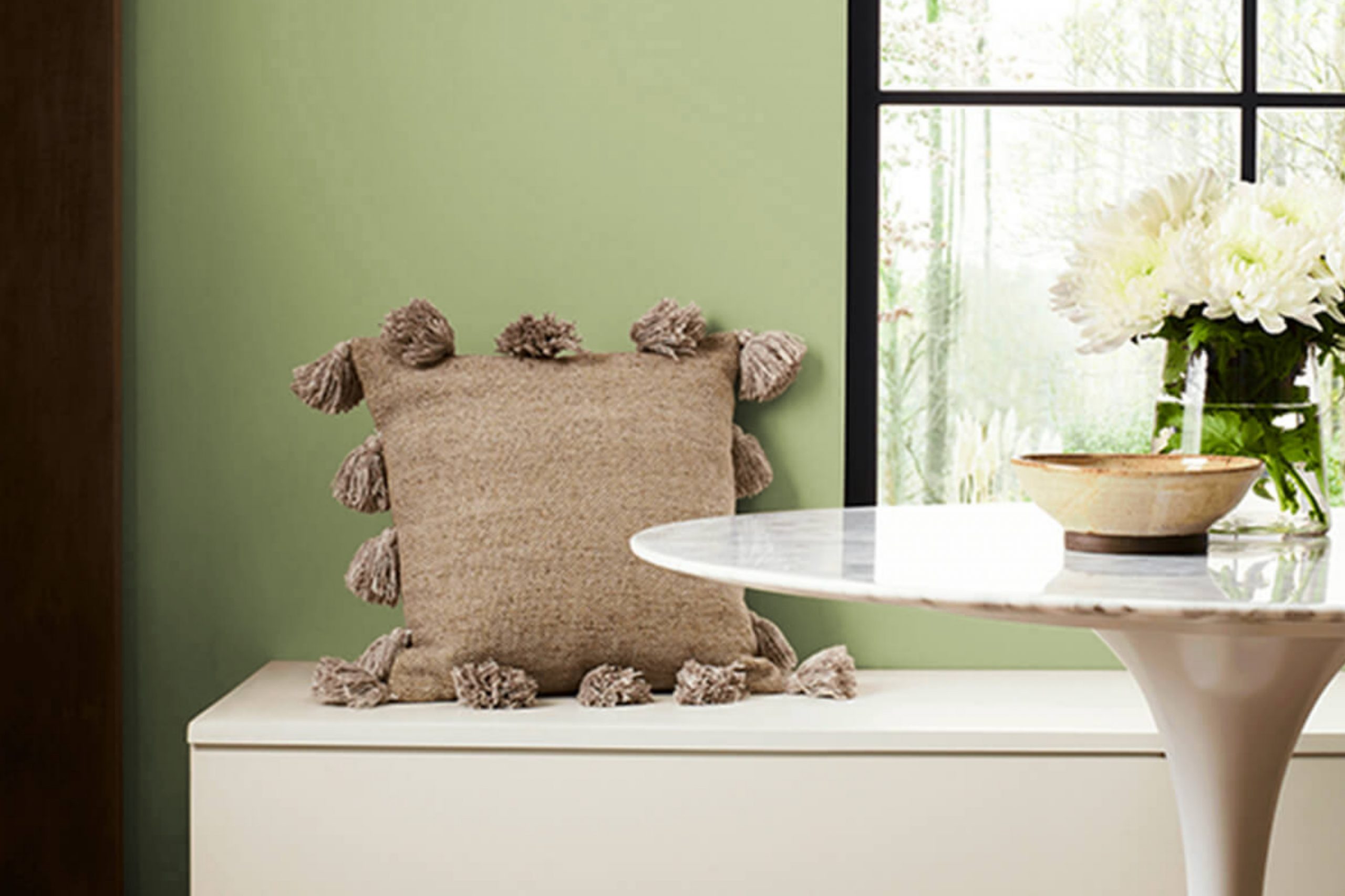
If you’re looking to refresh a room with a color that is both vibrant and soothing, you might want to consider SW 6430 Great Green by Sherwin Williams. As someone who appreciates the impact of a beautifully painted interior, this shade caught my attention for its unique blend of energy and calmness. The color reminds me of lush fields—a perfect backdrop for both relaxation and revitalization.
This green manages to be bright without overpowering your senses, which makes it ideal for almost any area in your home, whether it’s a bustling kitchen or a quiet study. The color has a lively quality that can boost your mood, yet it also harmonizes well with natural elements, enhancing the overall feeling of peace.
Choosing the right paint color can feel like a challenge, but with Great Green, you get an adaptable shade that pairs well with both light and dark accents, giving you flexibility in decorating. It doesn’t just change the look of your walls; it reshapes the entire ambiance of your interior.
Whether you’re planning to redecorate completely or just aiming for a quick refresh, SW 6430 Great Green offers a delightful balance that can meet your needs.
What Color Is Great Green SW 6430 by Sherwin Williams?
Great Green SW 6430 by Sherwin Williams is a vibrant and refreshing shade that brings a lively splash of nature into any room. This color has a vivacious character that can instantly perk up an interior. With its balance of blue and yellow undertones, it works beautifully to create a refreshing yet calming atmosphere, suitable for various interior styles.
This particular shade of green is extremely adaptable and fits seamlessly into modern and contemporary settings, as well as traditional and coastal designs. It has a crisp, clean vibe that works well in living rooms, kitchens, and bedrooms, adding a touch of brightness while maintaining a welcoming ambience.
When it comes to pairing materials and textures, Great Green SW 6430 combines well with natural wood finishes ranging from light oaks to rich walnuts. This green also looks stunning against white trims or when used in a room with ample natural light. For a more textured look, it coordinates well with linens, cottons, and even leather, providing a delightful contrast that enhances its natural appeal.
Metals, particularly brass and copper, offer a striking complement to this green, making it a popular choice for fixtures and accents in interior design. By using this lively green, you can create a fresh and inviting environment that feels both stylish and comfortable.
Is Great Green SW 6430 by Sherwin Williams Warm or Cool color?
Great Green is a vibrant and soothing shade offered by Sherwin Williams. Perfect for bringing a touch of nature indoors, this color works well in various rooms within a home. Its lively yet calming hue makes it great for living rooms where families gather and want to feel both energized and relaxed. In bedrooms, it creates a restful atmosphere, helping to promote a peaceful sleep environment.
This color pairs nicely with natural wood tones, whites, and grays, making it adaptable for different decorating styles. Whether someone aims to create a modern look with sleek furniture or a rustic feel with vintage pieces, Great Green serves as a beautiful backdrop. Additionally, its richness adds depth to smaller interiors, making them appear more inviting and spacious.
Overall, Great Green is an excellent choice for anyone looking to freshen up their room with a splash of color that’s both lively and soothing. Its ability to create a friendly and relaxing environment makes it a popular choice for homeowners.
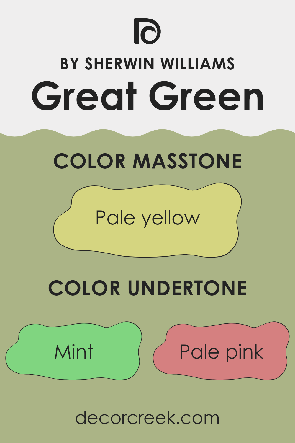
Undertones of Great Green SW 6430 by Sherwin Williams
Great Green is a vibrant shade offered by Sherwin Williams, which is enriched with a variety of undertones that subtly influence how it appears in different environments. The undertones of a color are like its quiet background notes that, while often not immediately obvious, affect its overall perception and how it interacts with other colors.
For instance, undertones such as mint and light green give Great Green a fresh, lively vibe, making it great for rooms that aim to energize. Pale pink and lilac undertones add a slight softness to the color, ensuring it doesn’t overpower the room. Neutral grey and light gray undertones help balance the brightness, making the paint more adaptable across various lighting conditions.
Yellow and orange undertones bring a touch of warmth, useful for adding a cozy feel to interiors that might otherwise feel too cool. The hint of light blue and lilac can inject subtle coolness, perfect for creating a calming atmosphere when needed.
When applied to interior walls, these undertones influence the mood of the room. In natural light, you might notice the green looking more vibrant due to its mint and light green hints. Under artificial lighting, the softer pink and gray undertones might become more pronounced, making the walls seem more inviting.
This ability to complement different lighting conditions makes Great Green adaptable and a practical choice for any interior, ensuring the color remains balanced and pleasing to the eye throughout the day. Understanding these undertones can greatly assist in choosing decor items and furnishings in colors that harmonize beautifully with the overall scheme, creating a cohesive and attractive room.
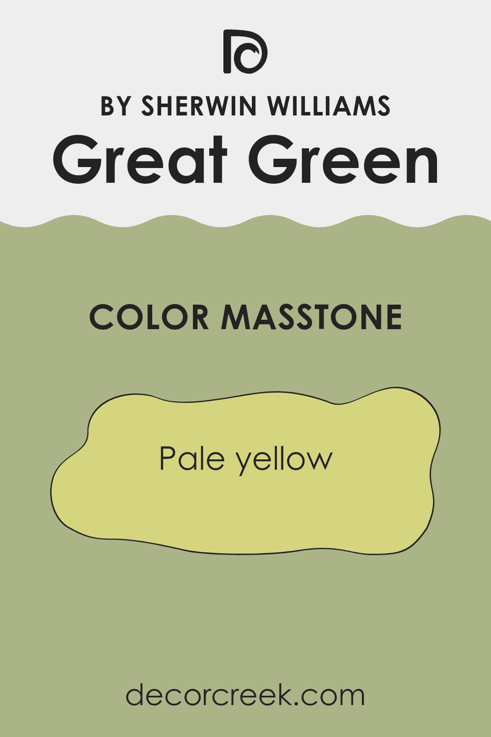
What is the Masstone of the Great Green SW 6430 by Sherwin Williams?
Great Green SW 6430 by Sherwin Williams has a masstone of Pale Yellow (#D5D580). This masstone provides the color with a subtle yellow base that is soft and gentle on the eyes. When used in homes, the pale yellow tint offers a warm and inviting atmosphere, making rooms feel more open and brighter.
This is particularly effective in interiors that receive limited natural light, as the pale yellow can help to reflect light around the area, creating a more lively and welcoming environment. Additionally, the mild yellow tone of this color can easily blend with various decor styles and other colors, offering flexibility in home decorating.
It doesn’t overpower the senses but instead adds a light, cheerful touch to the interiors, which can help in creating a relaxed mood in living areas. This makes it an adaptable choice for walls, especially in living rooms, kitchens, or even bedrooms.
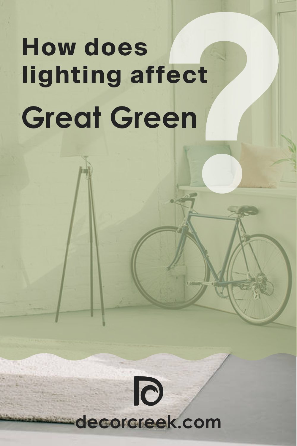
How Does Lighting Affect Great Green SW 6430 by Sherwin Williams?
Lighting plays a crucial role in how we perceive colors, consistently affecting their appearance under various light sources. Different lighting conditions can make the same color paint look very different on your walls. This can be particularly noticeable with a vivid shade like Great Green by Sherwin Williams.
In artificial light, such as LED or fluorescent bulbs, Great Green might appear slightly altered from its true color. Bright artificial lights tend to enhance the vibrancy of green, making it appear more lively and dynamic. However, under warmer, dimmer lights, the same green might look a bit muted, leaning towards darker shades.
In the presence of natural light, this green offers a fresh and energetic aura, especially in rooms with abundant sunlight. Yet, its perception changes based on the direction the room faces. In a north-facing room, where light can be cooler and more subtle, Great Green may seem slightly more shadowed and less vibrant. On the other hand, in a south-facing room that receives ample, bright sunlight throughout the day, the color can look very vivid and can reflect a true, energetic green.
For east-facing rooms, the morning light can make Great Green look bright and cheerful, enhancing its natural tone. As the day progresses and the light becomes less intense, the color might not be as bright but still maintains a pleasant appearance.
Conversely, in west-facing rooms, the color will spend much of the day looking softer until the late afternoon and evening when it might pick up vibrancy due to the warmer tones of the setting sun. Understanding these effects can help when deciding which rooms to paint, based on their orientation and the type of light they receive. This way, you can ensure that the color behaves just as you expect throughout the day.
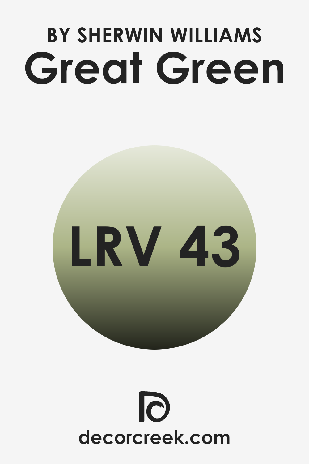
What is the LRV of Great Green SW 6430 by Sherwin Williams?
LRV stands for Light Reflectance Value, which is a measure of the amount of visible and usable light that a color reflects from or absorbs into a painted surface. In simpler terms, LRV helps you understand how bright or dark a color will appear when it’s used in a room.
A higher number means the color reflects more light, making it appear lighter, while a smaller number means it absorbs more light, making the color look darker. This value is critical when choosing paint since it affects how light or dark an interior feels once the walls are painted.
Looking specifically at the LRV of 42.893 for a certain shade of green, this number places it towards the darker end of the scale, albeit not extremely dark. What this means for an interior is that when this color is applied to walls, it won’t reflect back most of the light hitting the surface.
Rooms painted in this color might require more artificial lighting to keep the area feeling lively and open, especially in places that don’t get a lot of natural sunlight. This specific shade will add a depth of color and can make large, bright interiors feel more contained and cozy.
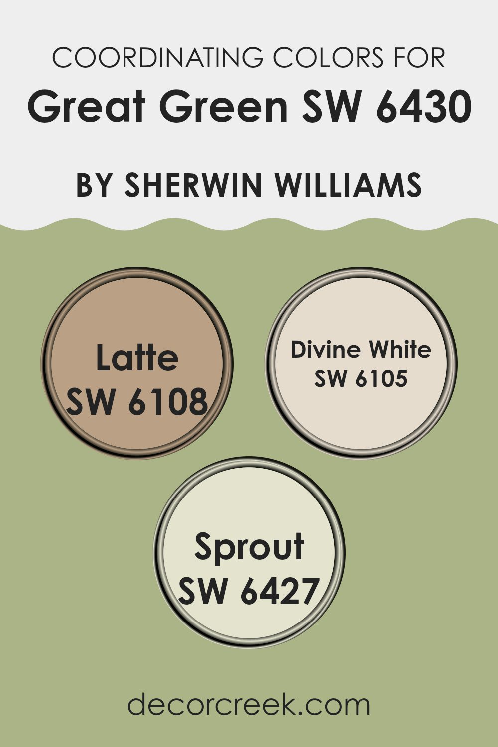
Coordinating Colors of Great Green SW 6430 by Sherwin Williams
Coordinating colors work by complementing each other on walls, furniture, and decor to create a harmonious and visually appealing room. For Great Green by Sherwin Williams, a vibrant green shade, coordinating colors like Latte, Divine White, and Sprout enhance its boldness without overpowering the senses.
These colors offer a balanced palette, ensuring that each area where they are used achieves a cohesive and unified look. By using these coordinating colors strategically, you can achieve a pleasing color flow throughout your home, making it both inviting and stylish.
Latte is a warm, comforting beige that provides a subtle contrast against the boldness of Great Green. It works well in rooms where a soft, neutral background is needed, allowing furniture and art to stand out. Divine White is a soft, creamy white with a very slight hint of warmth.
This color is great for trim, ceilings, or even as a main wall color to create a fresh and clean look that pairs beautifully with bolder hues. Sprout, a light and airy green with a hint of yellow, works wonderfully to accentuate interiors without competing for attention, offering a gentle nod to the natural world and giving areas an uplifting feel.
You can see recommended paint colors below:
- SW 6108 Latte
- SW 6105 Divine White
- SW 6427 Sprout
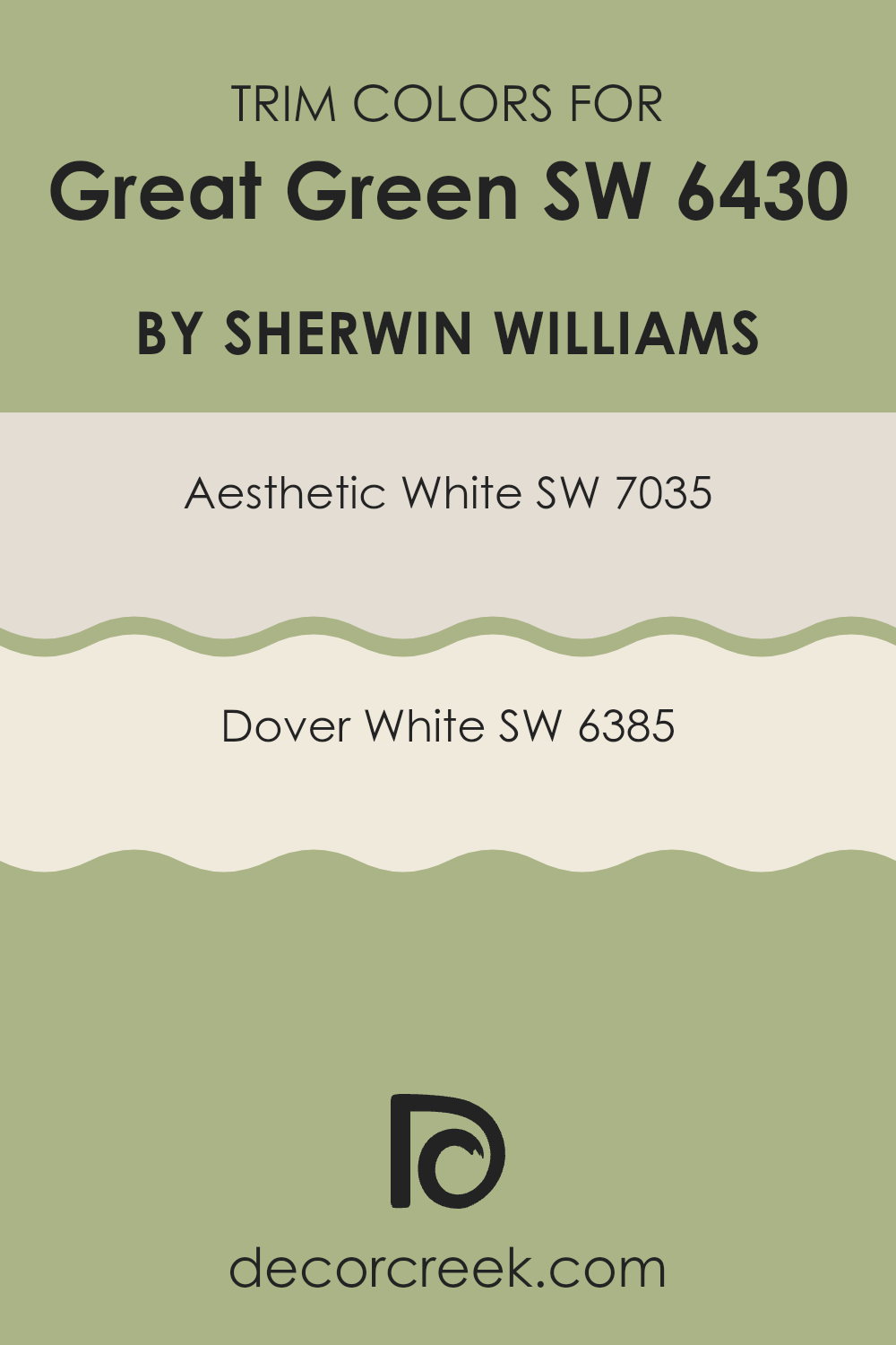
What are the Trim colors of Great Green SW 6430 by Sherwin Williams?
Trim colors are selected hues used to highlight or define the edges and features of a room, such as window frames, doors, and baseboards, enhancing the visual appeal and depth of the interior. For a vivid color like Great Green by Sherwin Williams, choosing the right trim color can significantly impact the overall aesthetic by providing a clean, crisp border that defines the interiors distinctly and beautifully.
Utilizing complementary trim colors such as SW 7035 – Aesthetic White or SW 6385 – Dover White can help balance the boldness of the green, ensuring the room feels harmonious and pleasing to the eye. Aesthetic White is a soft, subtle off-white with a gentle warmth that makes it an adaptable choice for trim, working well to soften the intensity of richer, darker colors like Great Green.
It blends seamlessly while adding a touch of coziness to the atmosphere. On the other hand, Dover White has a creamy, inviting quality that offers a slightly richer and warmer contrast to the crispness of Great Green, enhancing the interior’s overall warmth and providing a more pronounced frame to the bold wall color. These choices in trim colors play a crucial role in achieving a balanced and inviting room.
You can see recommended paint colors below:
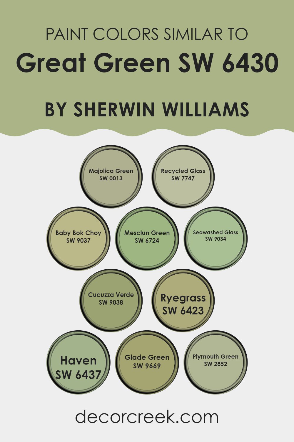
Colors Similar to Great Green SW 6430 by Sherwin Williams
Using similar colors in design and decoration can create a harmonious and cohesive look, which is soothing to the eye and makes rooms feel more unified and inviting. Similar colors, such as those related to Sherwin Williams’ Great Green SW 6430, allow for a smooth visual transition from one shade to another, providing a subtle variation that adds interest without the stark contrasts that come with using highly differing colors.
This technique is valuable in achieving a balanced aesthetic that can tie different elements and interiors together seamlessly. For instance, Majolica Green SW 0013 is a deep, shaded green that brings a grounding, earthy feel, perfect for enhancing cozy, intimate areas. Recycled Glass SW 7747 has a lighter touch, reminiscent of soft sea glass, ideal for adding a fresh, clean look.
Baby Bok Choy SW 9037 offers a pale, delicate green that brings a light and airy feel to any room, while Mesclun Green SW 6724 presents a lively, leafy tone that adds vitality. Seawashed Glass SW 9034 captures the essence of weathered beach glass, providing a muted, calming hue.
Cucuzza Verde SW 9038, with its slightly more vibrant personality, injects a bit of zest, contrasting subtly with the quieter tones. Ryegrass SW 6423 grows a bit darker, enriching interiors with its robust verdancy. Haven SW 6437, true to its name, offers a safe and enveloping tone, perfect for retreat and relaxation areas.
Green SW 9669 captures the feeling of a sunlit forest clearing with its bright and cheerful green, and lastly, Plymouth Green SW 2852 showcases a vintage hue that recalls traditional elegance in a modern setting. Each of these colors works well individually yet also complements the other shades akin to Great Green, making them adaptable for various applications in home decor.
You can see recommended paint colors below:
- SW 0013 Majolica Green
- SW 7747 Recycled Glass
- SW 9037 Baby Bok Choy
- SW 6724 Mesclun Green
- SW 9034 Seawashed Glass
- SW 9038 Cucuzza Verde
- SW 6423 Ryegrass
- SW 6437 Haven
- SW 9669 Glade Green
- SW 2852 Plymouth Green
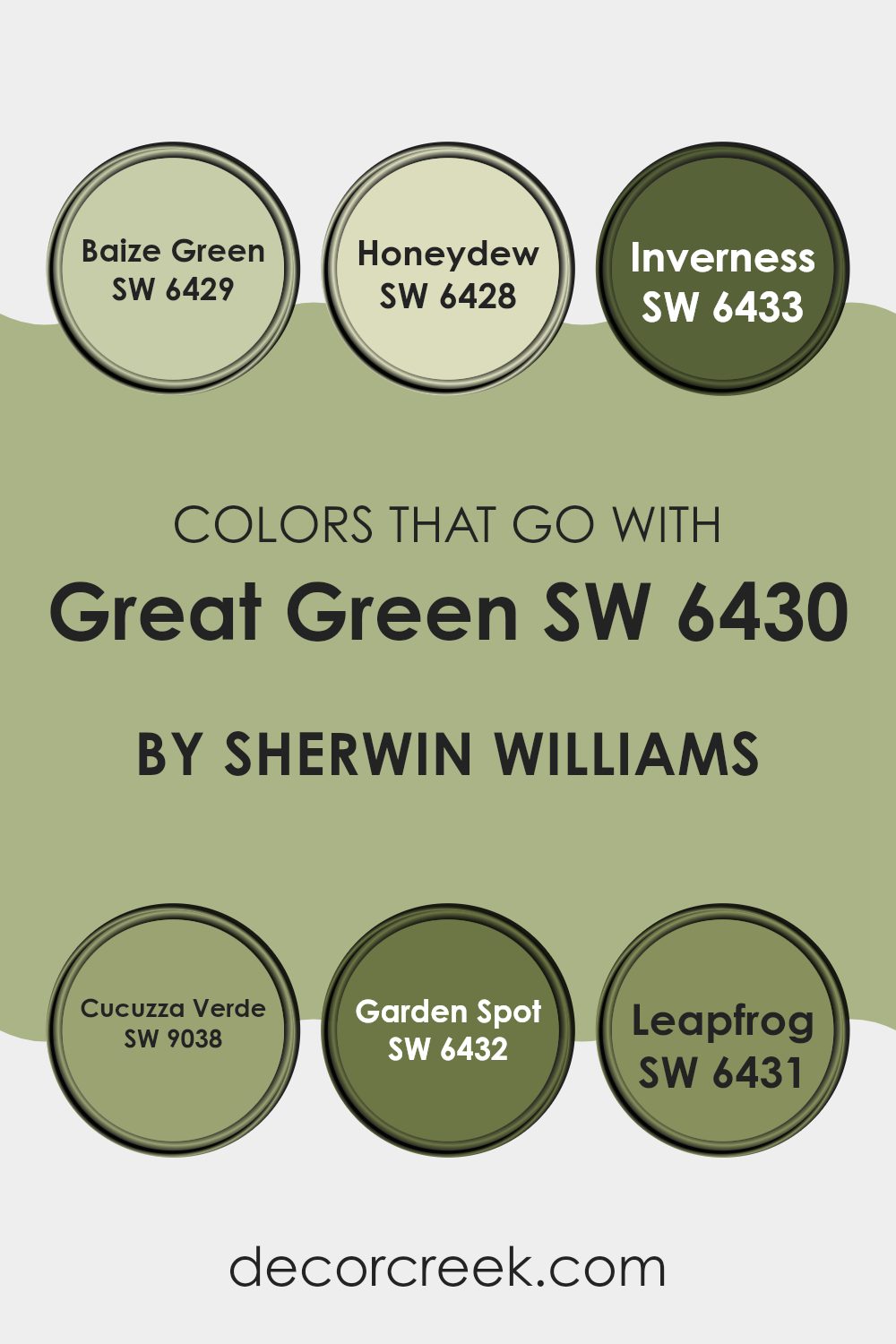
Colors that Go With Great Green SW 6430 by Sherwin Williams
Choosing colors that blend well with Great Green SW 6430 from Sherwin-Williams is essential for creating a pleasing and cohesive color scheme in your rooms. When selecting complementary colors, it helps to think about how they will interact with each other to evoke the desired atmosphere and achieve a harmonious look.
For instance, combining Great Green with colors such as Baize Green, Honeydew, Inverness, Cucuzza Verde, Garden Spot, and Leapfrog can enhance the visual impact and mood of an interior. Baize Green SW 6429 is a deeper, richer shade, adding depth and contrast to the vibrant Great Green, making it perfect for an accent wall or to highlight architectural details.
Honeydew SW 6428, on the other hand, is a soft, muted green that brings a touch of lightness and freshness, ideal for creating a relaxed feel in interiors like bathrooms or kitchens. Inverness SW 6433 provides a subdued and earthy tone, which pairs well with Great Green for a more nature-inspired look, excellent for living rooms or studies.
Cucuzza Verde SW 9038 has an organic and slightly vibrant character, which complements the freshness of Great Green, suitable for areas that benefit from an energetic yet natural vibe. Garden Spot SW 6432 exhibits a lively and youthful green that adds brightness and a playful touch when used alongside Great Green.
Lastly, Leapfrog SW 6431 offers a bold and dynamic green which can be used strategically in children’s areas or creative interiors to inject energy and fun. By using these harmonious shades, you can effectively design inviting and appealing environments.
You can see recommended paint colors below:
- SW 6429 Baize Green
- SW 6428 Honeydew
- SW 6433 Inverness
- SW 9038 Cucuzza Verde
- SW 6432 Garden Spot
- SW 6431 Leapfrog
How to Use Great Green SW 6430 by Sherwin Williams In Your Home?
Great Green by Sherwin Williams is a vibrant and lively shade of green that can add a fresh burst of energy to any room in your home. This color works great in interiors where you want to bring in a touch of nature and vitality. For instance, painting your kitchen or dining area with Great Green can create a welcoming and cheerful atmosphere where family and friends like to gather.
You can also use it in a home office or study area to help maintain a lively and energetic vibe, possibly boosting productivity. In a bedroom, pairing Great Green with softer hues and natural textures can make the room feel refreshing yet comfortable.
Additionally, it’s excellent for accent walls. You could paint one wall in this shade to act as a focal point without overpowering the room. Matching this color with simple decorations and neutral tones will keep your interior balanced and pleasing to the eye.
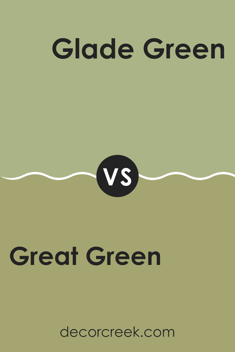
Great Green SW 6430 by Sherwin Williams vs Glade Green SW 9669 by Sherwin Williams
Great Green and Glade Green, both from Sherwin Williams, offer distinct vibes despite their shared color family. Great Green is a vivid and bold shade, packing a punch that can energize a room instantly.
It’s perfect for creating standout interiors or accent walls where you want to make a strong impact. On the other hand, Glade Green takes a much subtler approach. It’s a softer, more understated green that works beautifully in areas meant for relaxation and calm.
Its muted tone pairs well with natural materials and light colors, making it a good choice for bedrooms or quiet sitting areas. While Great Green draws your eye with its brightness, Glade Green blends smoothly into its surroundings, offering a gentle hint of color.
You can see recommended paint color below:
- SW 9669 Glade Green
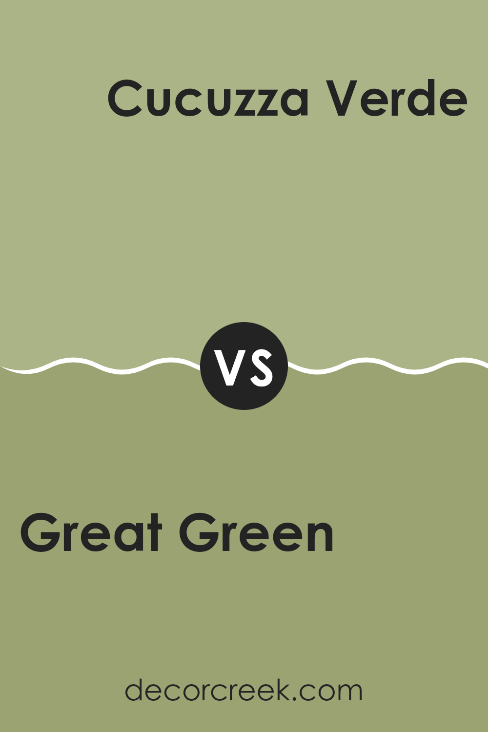
Great Green SW 6430 by Sherwin Williams vs Cucuzza Verde SW 9038 by Sherwin Williams
Great Green is a vibrant shade that stands out boldly. Its rich, deep tones provide a strong sense of nature and freshness. In contrast, Cucuzza Verde is a paler, more muted green. It feels soft and gentle, making it ideal for creating a calming atmosphere in rooms meant for relaxation.
Great Green makes a statement and could be perfect for accents or areas where you want to draw attention. On the other hand, Cucuzza Verde’s subdued hue works well for larger interiors, creating a background that is easy on the eyes.
While Great Green adds energy and a touch of liveliness, Cucuzza Verde offers a more laid-back, soothing feel. Both colors bring their own unique flavor of green, each fitting different types of moods and interiors.
You can see recommended paint color below:
- SW 9038 Cucuzza Verde
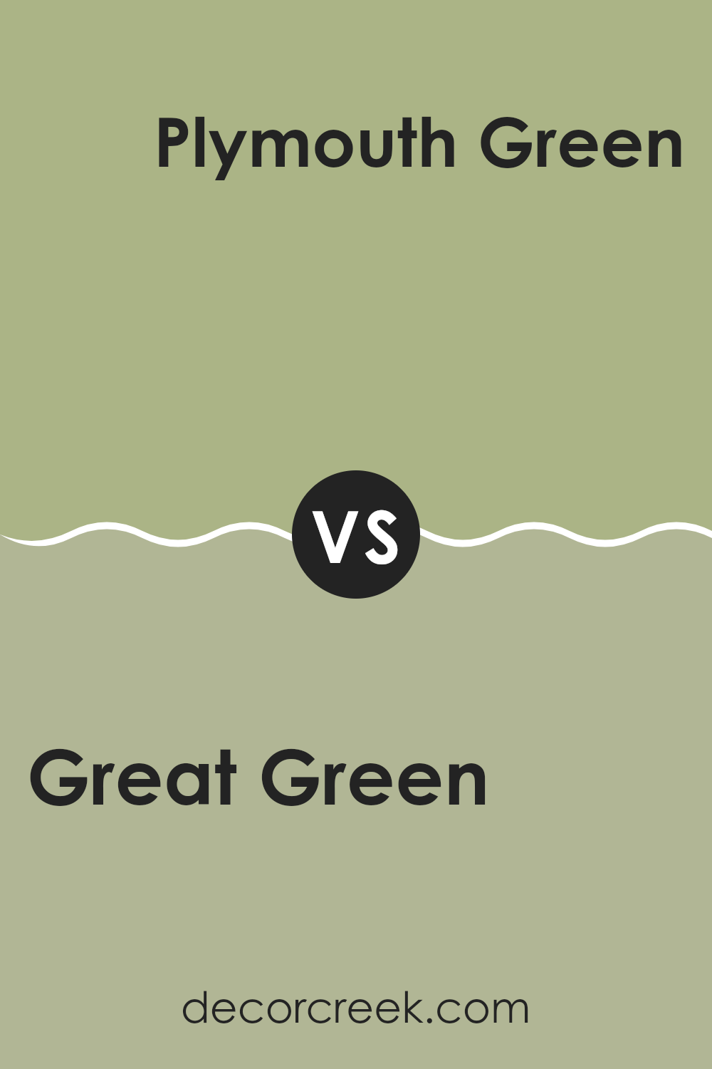
Great Green SW 6430 by Sherwin Williams vs Plymouth Green SW 2852 by Sherwin Williams
Great Green and Plymouth Green, both by Sherwin Williams, showcase distinct tones of green, each suitable for different decorating styles or moods. Great Green is a vibrant, lively shade that packs a punch and can make any room feel energized and full of life. It’s bold and could be ideal for a focal point in an interior, such as an accent wall.
On the other hand, Plymouth Green offers a more subdued, traditional green hue that mimics the colors of nature and can provide a calming effect in a room. It is less intense and could be easier to incorporate into various interiors without overpowering other design elements.
Both colors provide unique options for decorating, depending on the look or feel you aim for. Great Green is more daring and eye-catching, while Plymouth Green is understated and blends more seamlessly with natural elements.
You can see recommended paint color below:
- SW 2852 Plymouth Green
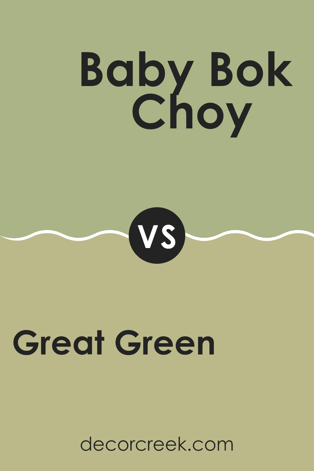
Great Green SW 6430 by Sherwin Williams vs Baby Bok Choy SW 9037 by Sherwin Williams
Great Green SW 6430 by Sherwin Williams and Baby Bok Choy SW 9037 by Sherwin Williams are two distinct colors that offer unique tones. Great Green is a vibrant, rich green that brings to mind lush foliage or a deep forest. It makes a bold statement and can really draw the eye in a room.
On the other hand, Baby Bok Choy is a much softer, lighter green with a subtle, muted quality that feels calm and gentle. This color is excellent for creating a relaxed atmosphere in an interior.
When comparing these two, Great Green is more suited for areas where energy and impact are desired, while Baby Bok Choy works well in rooms intended for rest or minimal style. Both will add a natural, fresh feel to any decor, but the choice between them depends on the mood you want to set.
You can see recommended paint color below:
- SW 9037 Baby Bok Choy
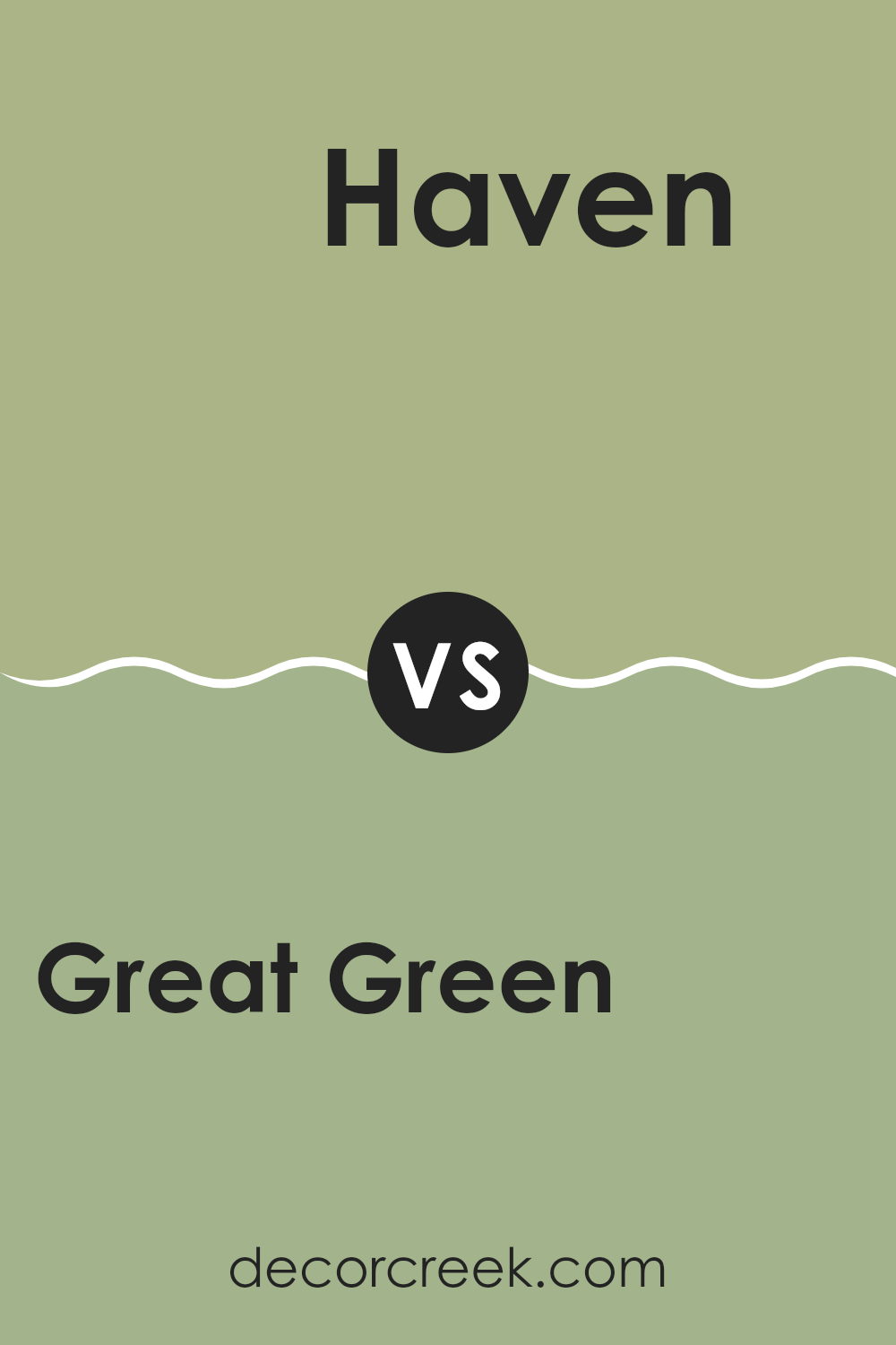
Great Green SW 6430 by Sherwin Williams vs Haven SW 6437 by Sherwin Williams
Great Green by Sherwin Williams is a bold and vibrant shade of green. It stands out with its rich and lush vibes, making it an excellent choice for rooms where you want to add a sense of energy and freshness. On the other hand, Haven, also by Sherwin Williams, is a more subdued green.
It leans towards a softer, more muted tone that can make an interior feel calm and comfortable without being too overpowering. While both colors share a green base, Great Green has a more intense, lively appearance compared to the gentler, laid-back feel of Haven.
Great Green would work well in an area that needs a pop of color, like an accent wall or a lively room like a playroom or kitchen. Haven, meanwhile, is ideal for places where you want to relax, such as bedrooms or living areas. These two greens offer different moods and can be chosen based on the atmosphere you wish to create in your interior.
You can see recommended paint color below:
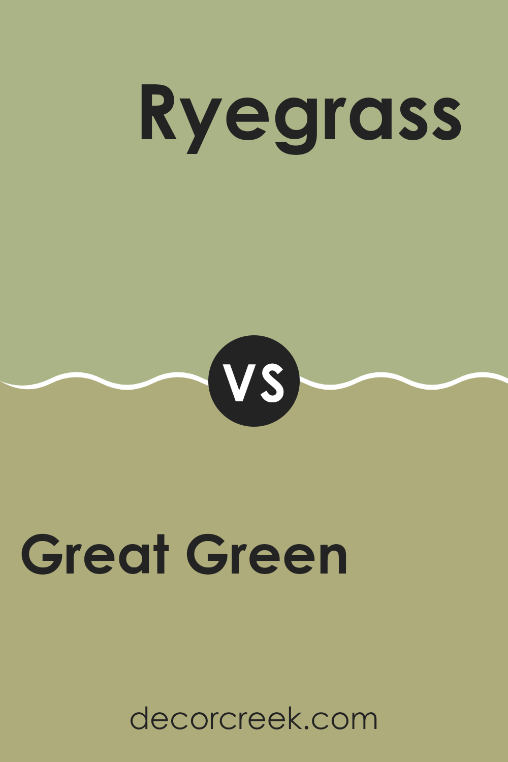
Great Green SW 6430 by Sherwin Williams vs Ryegrass SW 6423 by Sherwin Williams
Great Green and Ryegrass by Sherwin Williams are two shades that, while similar, have distinct qualities. Great Green is a vibrant and lively green with a somewhat deep and lush feel to it. It has a strong presence, which makes it an excellent choice for areas where you want to add a rich splash of nature-inspired color.
On the other hand, Ryegrass is a lighter and softer green. It gives off a fresh and soothing vibe, making it ideal for creating a calm and relaxed atmosphere in rooms like bedrooms or home offices. Ryegrass’ gentle tone can make small interiors appear more open and airy.
When comparing these two, Great Green stands out more and could draw more attention in an interior. Ryegrass, being subtler, pairs well with other colors without overpowering them. Depending on what mood or style you’re aiming for in a room, either could be the perfect fit, with Great Green adding energy and Ryegrass bringing a sense of calm.
You can see recommended paint color below:
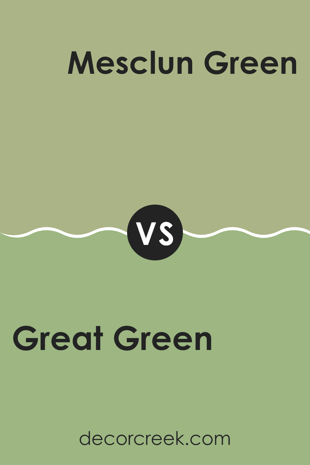
Great Green SW 6430 by Sherwin Williams vs Mesclun Green SW 6724 by Sherwin Williams
Great Green SW 6430 and Mesclun Green SW 6724, both by Sherwin Williams, present distinctive shades of green that can set different moods in a room. Great Green is a deep, vibrant shade that brings a sense of freshness and vitality to an interior. It’s a strong color that makes a statement and works well in energetic rooms like living rooms or kitchens.
On the other hand, Mesclun Green is a lighter, more playful green. This color is more subdued compared to Great Green and carries a cheerful and bright quality, making it perfect for bedrooms or offices to create a lively yet relaxed atmosphere.
In decorating, Great Green serves well in larger, well-lit areas where its boldness can really shine without overpowering the room. Mesclun Green, due to its softer tone, is more adaptable for smaller interiors or as an accent wall, where it can add a touch of brightness without dominating other design elements. Both colors offer unique options depending on your room and style needs.
You can see recommended paint color below:
- SW 6724 Mesclun Green
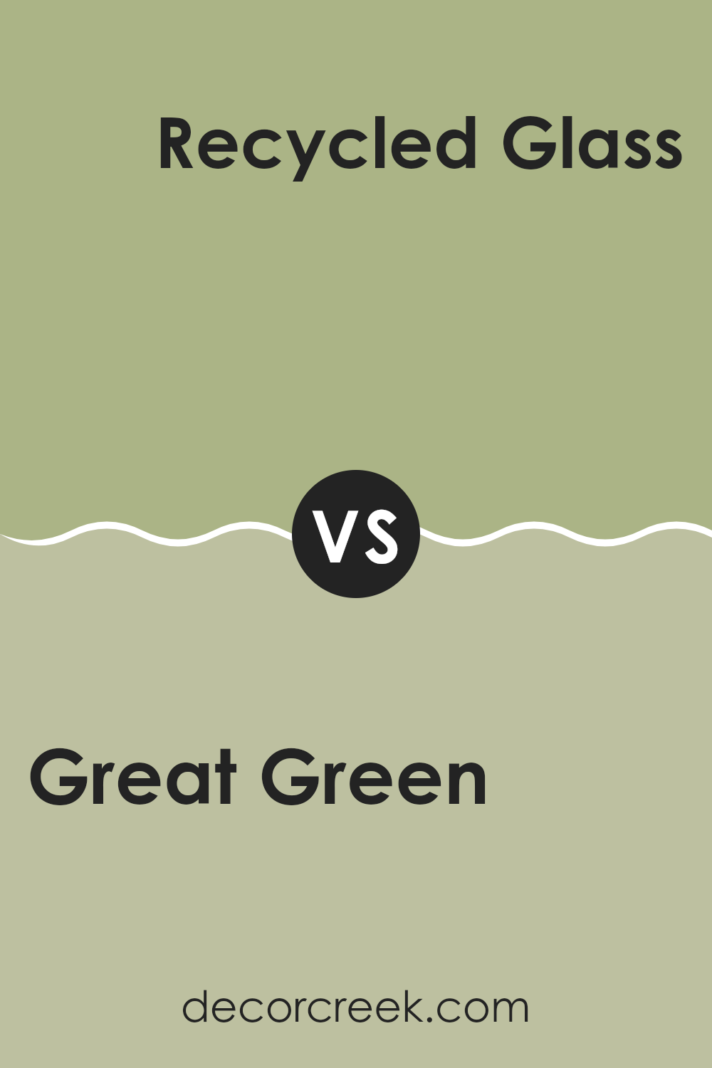
Great Green SW 6430 by Sherwin Williams vs Recycled Glass SW 7747 by Sherwin Williams
Great Green by Sherwin Williams is a vibrant, bold shade that stands out with its strong presence. It’s a lively color that brings freshness and energy to a room, perfect for creating a focal point in any interior.
On the other hand, Recycled Glass is a much softer, more subdued green. It offers a gentle, soothing feel that can make an area feel airy and bright without overpowering the senses. This color is ideal for those looking to add a touch of calm and simplicity to their environment.
While Great Green is more about making a statement and drawing attention, Recycled Glass is about blending in and providing a quiet backdrop. These two greens serve different purposes, but both can significantly enhance an interior depending on your desired atmosphere.
You can see recommended paint color below:
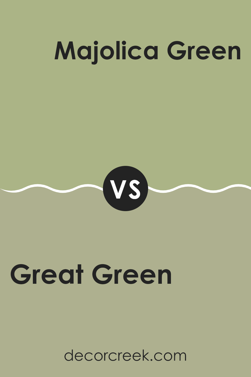
Great Green SW 6430 by Sherwin Williams vs Majolica Green SW 0013 by Sherwin Williams
Great Green by Sherwin Williams is a lively and bright shade that brings a sense of freshness to any room. It has a vibrant, leafy tone that resembles spring foliage, making it an excellent choice for creating an energetic and cheerful ambiance in interiors.
On the other hand, Majolica Green, from the same brand, presents a deeper, more subdued hue. This color leans more toward a historic or traditional look, invoking the richness of dense forest greens. It’s well-suited for areas where a calmer, more grounded feeling is desired, providing a strong background that can complement a variety of decor styles.
While Great Green pops with its brighter, more youthful appeal, Majolica Green offers a classic elegance that works wonderfully in formal interiors or studies. Both colors offer unique vibes, allowing you to choose based on the mood you want to achieve in your decorating project.
You can see recommended paint color below:
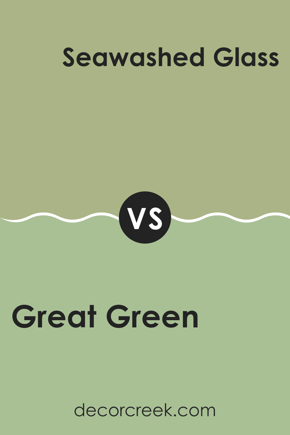
Great Green SW 6430 by Sherwin Williams vs Seawashed Glass SW 9034 by Sherwin Williams
Great Green by Sherwin Williams is a deep, vibrant shade that brings a rich, natural look to interiors. Its boldness can make a strong statement in a room, perfect for creating a cozy yet lively atmosphere. Since it’s darker, it works well in larger or well-lit areas to avoid a cramped feel.
Seawashed Glass, in comparison, is much lighter and leans towards a soft blue-green hue. This color has an airy, fresh feel to it, making it ideal for smaller rooms or interiors where you want to promote a sense of openness and light. It pairs nicely with both neutrals and darker tones, offering flexibility in decorating.
Both colors have their unique charm and uses in home décor. Great Green serves as a striking backdrop or accent wall, while Seawashed Glass is excellent for a more subtle or modest vibe. Your choice between them would depend on what kind of mood or effect you want to achieve in your interior.
You can see recommended paint color below:
- SW 9034 Seawashed Glass
After reading about the paint color SW 6430 Great Green by Sherwin Williams, I learned a lot about how this color can make rooms in your house look really nice. This shade of green is lively and makes you think of nature, which can make you feel happy and calm when you see it on your walls. It’s a good choice if you want something different from usual colors like blue or grey but still want your home to have a calm and happy feeling.
When you use this color in places like the living room or kitchen, it can make the room seem fresh and full of life. Also, since it’s a paint made by Sherwin Williams, you know it’s going to be good quality and will stay looking nice for a long time.
So, if you’re thinking of changing things up at home and want a color that feels fresh and full of nature, SW 6430 Great Green might be just what you need. It’s not just pretty, but also makes you feel good when you’re around it, turning your interior into a happier room.
Ever wished paint sampling was as easy as sticking a sticker? Guess what? Now it is! Discover Samplize's unique Peel & Stick samples.
Get paint samples

