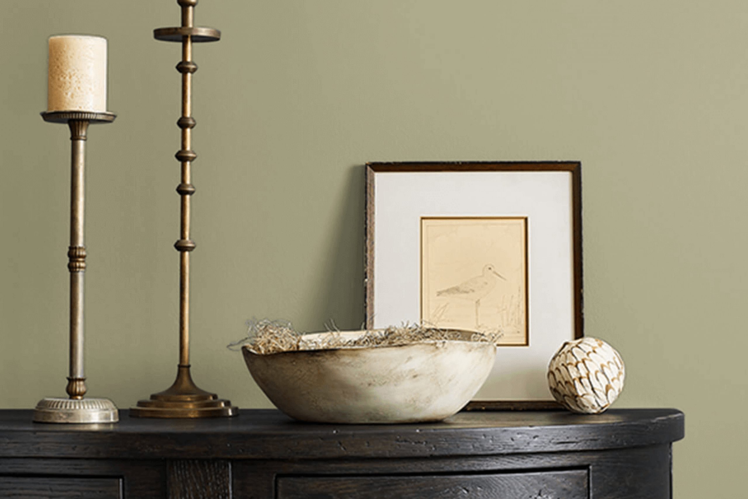
When I first came across SW 7728 Green Sprout by Sherwin Williams, it felt like stumbling upon a hidden gem. This particular shade of green offers more than just a splash of color; it is an invitation to create areas that feel both fresh and nurturing. There’s something uniquely calming about its presence, resonating with a natural charm that subtly uplifts any room.
Green Sprout delivers a lively yet soothing energy that adapts to various settings, making it an ideal choice for both personal and common areas. Whether you’re redecorating a bedroom, living room, or office, this hue promises to breathe new life into your room without feeling too bold.
As you consider this color, you’ll find that it pairs beautifully with both neutral tones and more vibrant shades, offering endless possibilities for creativity and personal expression. What struck me most is how Green Sprout can change with the light, adding depth and character throughout the day.
In the morning, it feels crisp and invigorating, while in the evening, it adopts a more mellow, relaxing tone. This go-to shade encourages you to experiment and find the perfect balance that reflects your personality and style. Choosing SW 7728 Green Sprout means committing to a color that brings warmth and positivity into your home.
What Color Is Green Sprout SW 7728 by Sherwin Williams?
Green Sprout by Sherwin Williams is a fresh and lively shade of green with subtle yellow undertones. This paint color is reminiscent of new growth and springtime energy. It brings a sense of life and movement to a room, adding vibrancy without feeling too bold.
This color fits beautifully in modern and contemporary interiors, where its clean and crisp nature enhances the simplicity and openness of the room. It’s also well-suited to bohemian and eclectic styles, where it can act as a lively backdrop to a mix of patterns, textures, and colors. In farmhouse or cottage-style settings, Green Sprout can add a warm and inviting touch, reminiscent of the natural outdoors.
Pair this color with materials like natural wood to enhance its organic feel. The warm tones of oak or walnut can complement Green Sprout perfectly. For contrast, use soft fabrics like linen or cotton in neutral shades such as creamy white or beige. Metallic accents in brass or copper can add a hint of glamour, while matte black fixtures can offer a modern edge.
Whether used on an accent wall or throughout an entire room, Green Sprout brings a fresh and cheerful atmosphere.
Is Green Sprout SW 7728 by Sherwin Williams Warm or Cool color?
Green Sprout SW 7728 by Sherwin-Williams is a soft, muted green that brings a fresh and natural feel to home interiors. Its gentle hue makes it a go-to choice for various rooms, creating a calming and welcoming atmosphere.
This shade pairs well with both neutral and bolder colors, making it an excellent background for different decor styles. In living rooms, it can serve as a soothing backdrop, allowing furniture and artwork to stand out. In kitchens, it can evoke the freshness of herbs and vegetables, enhancing the culinary room.
Bathrooms and bedrooms painted in Green Sprout can feel relaxing, contributing to a restful environment. The color complements wooden elements nicely, while also working well with whites and grays for a more modern look. Overall, Green Sprout SW 7728 is a great choice for those looking to add a touch of nature-inspired color to their home without feeling too bold.
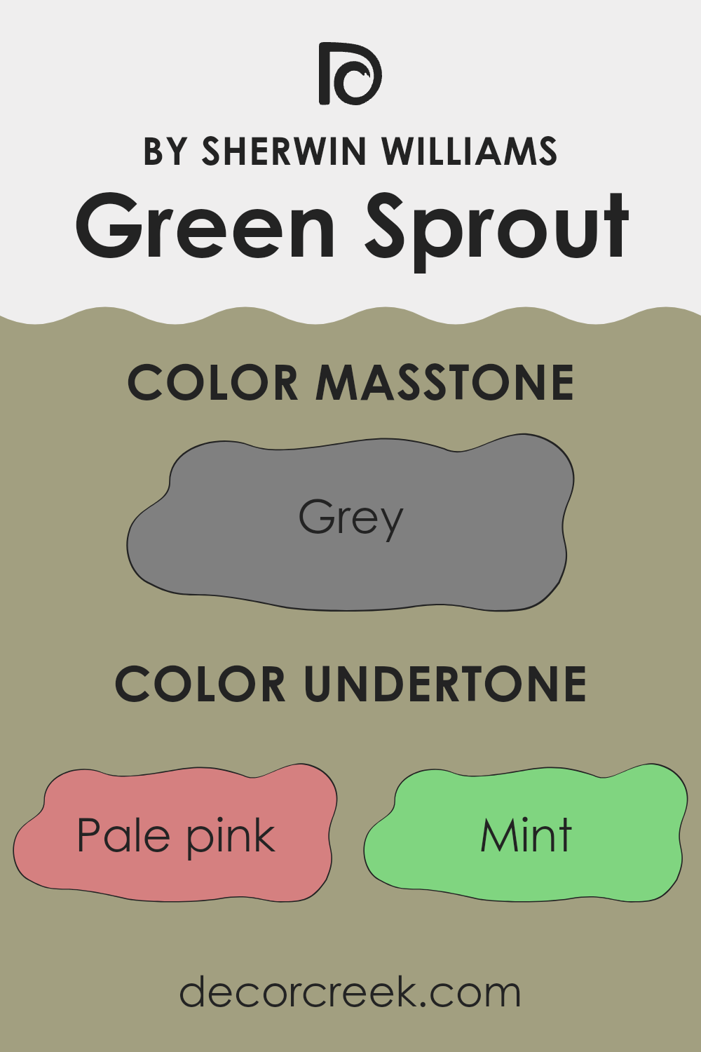
Undertones of Green Sprout SW 7728 by Sherwin Williams
Green Sprout SW 7728 by Sherwin Williams is a color that subtly plays with a complex set of undertones, influencing how it appears in different areas. These undertones include shades like pale pink, mint, pale yellow, and lilac, as well as deeper tones like olive, dark turquoise, and navy. Undertones are the slight hues underneath the main color, which affect how we perceive the primary color in various lighting conditions.
When applied to interior walls, Green Sprout can appear warmer or cooler depending on the presence of specific undertones within the room. For example, the pale pink and pale yellow undertones might give the color a warmer, more inviting feel in natural sunlight, while the mint and light blue undertones could lend a cooler, refreshing touch under bright, artificial lighting.
The dark green and olive hints add depth and richness, suggesting a natural, grounded feel in a room with wooden or earth-toned decorations. Conversely, the presence of undertones like violet or purple might provide a subtle hint of elegance and mystery, especially in shadowed areas. Overall, these undertones allow the paint to seamlessly adapt to various interior settings, making it a go-to for different design styles.
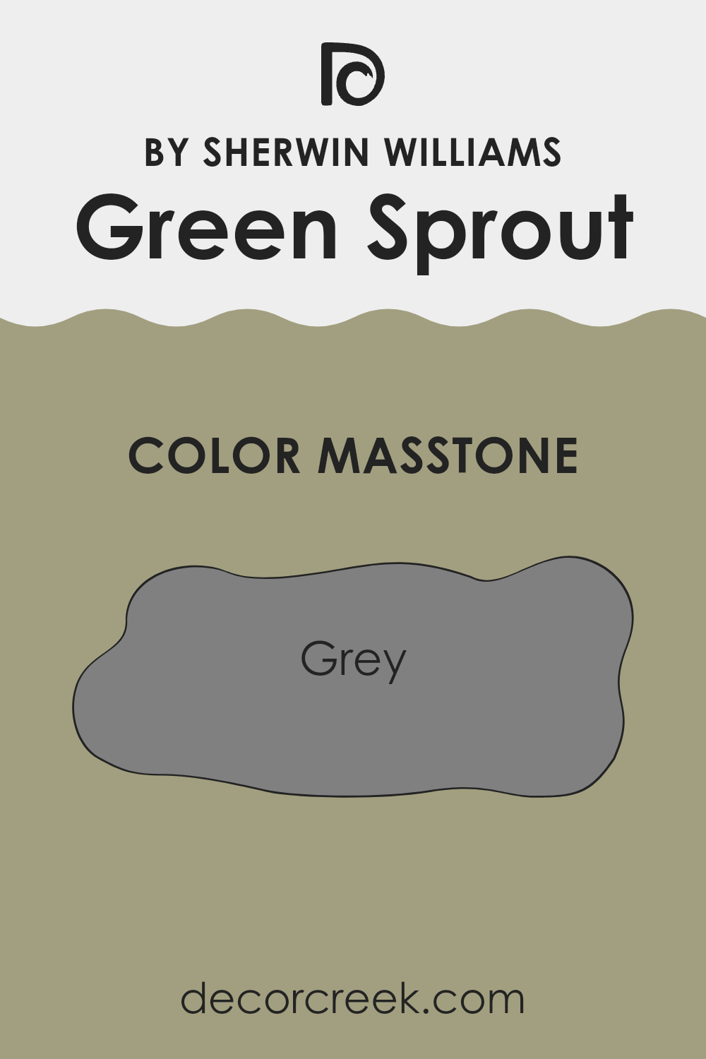
What is the Masstone of the Green Sprout SW 7728 by Sherwin Williams?
Green Sprout SW 7728 by Sherwin Williams has a gray masstone, which gives the color a subtle and calming quality. This subtle gray undertone makes Green Sprout a go-to color choice for home interiors. The gray masstone softens the green, making it neither too vibrant nor too muted.
This balance allows it to fit well in various rooms, whether you want to create a relaxed atmosphere in a bedroom or a welcoming feel in a living room. In homes, the gray influence means that Green Sprout SW 7728 pairs well with both warm and cool colors.
It can complement natural wood accents and crisp whites, offering a refreshing backdrop that is easy on the eyes. Additionally, depending on the lighting, the shade can look different at various times of the day, providing slight shifts in its appearance that keep a room feeling fresh and inviting.
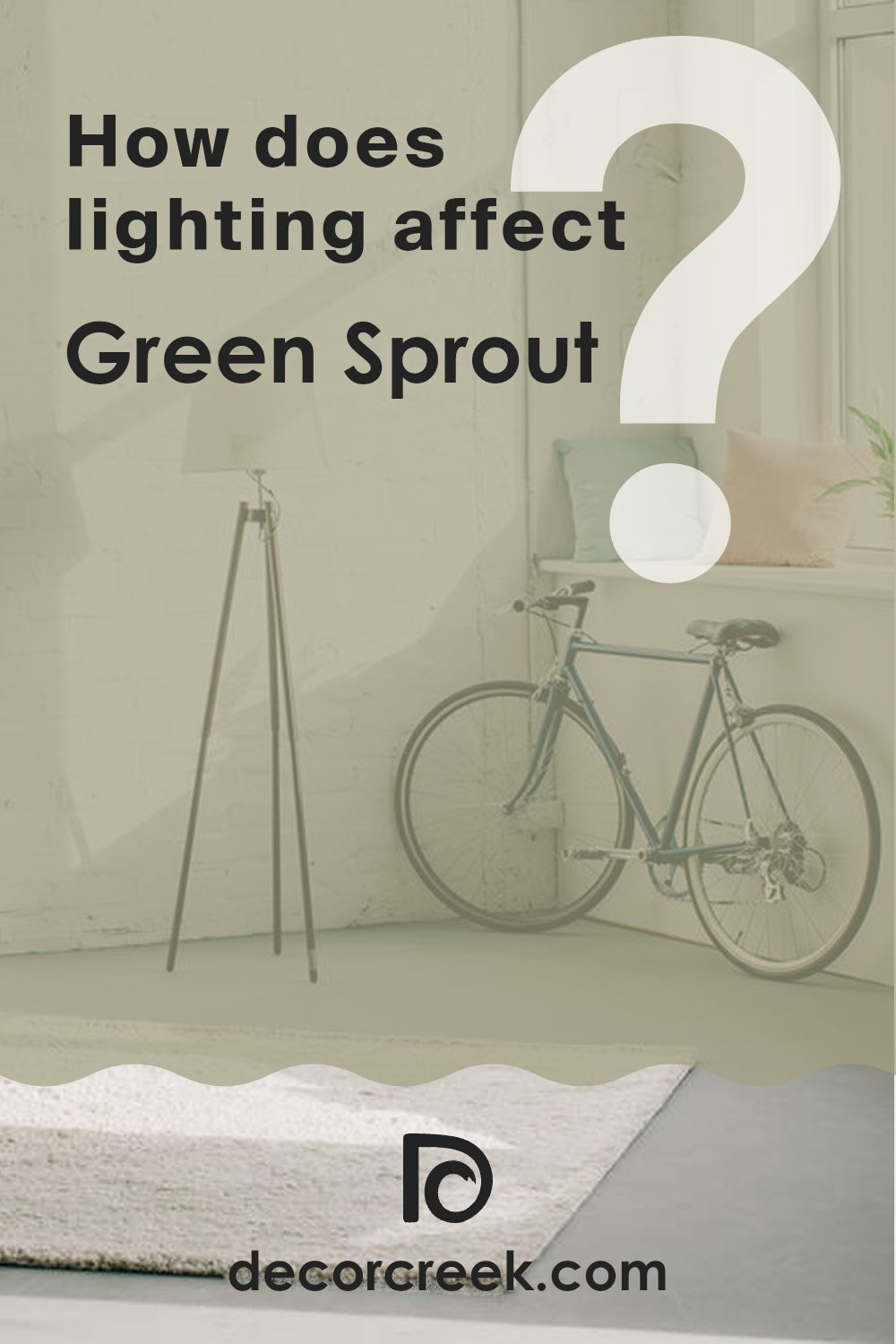
How Does Lighting Affect Green Sprout SW 7728 by Sherwin Williams?
Lighting plays a crucial role in how we perceive colors. Depending on the type of light, colors can appear brighter, darker, warmer, or cooler. Natural light changes throughout the day, influencing how a color appears in a room. Artificial light also affects colors based on whether it’s warm or cool.
The color Green Sprout by Sherwin Williams, with its earthy, muted green tones, looks differently depending on lighting. In natural light, the direction from which the light enters a room can significantly change its appearance.
In a north-facing room, Green Sprout can appear cooler and more muted. Northern light is generally softer and has a blue-toned hue, which might make Green Sprout look a bit more subdued. This could make the room feel calm, although some might find the color less vibrant in such areas.
In a south-facing room, Green Sprout will appear warmer and brighter. Southern light tends to be warmer and more direct, especially during the middle of the day, which can make the green tones of Green Sprout come alive more vibrantly. This could make a room feel inviting and cheerful.
In east-facing rooms, where the light is cooler and more direct in the morning, Green Sprout will again take on a softer, cooler tone early in the day. However, by afternoon as the light fades, the color might lose some of its brightness, taking on a more subtle appearance.
West-facing rooms capture warm light in the evenings. As the day goes on, Green Sprout can seem richer and more enveloping, becoming warmer as the sunlight intensifies later in the day.
Under artificial lighting, the type of bulbs used will also modify the appearance of Green Sprout. With warm lights, the color may appear cozier, while cool lights could make it seem more crisp and muted. Understanding these effects can help in choosing the right lighting to achieve the desired mood and style in a room.
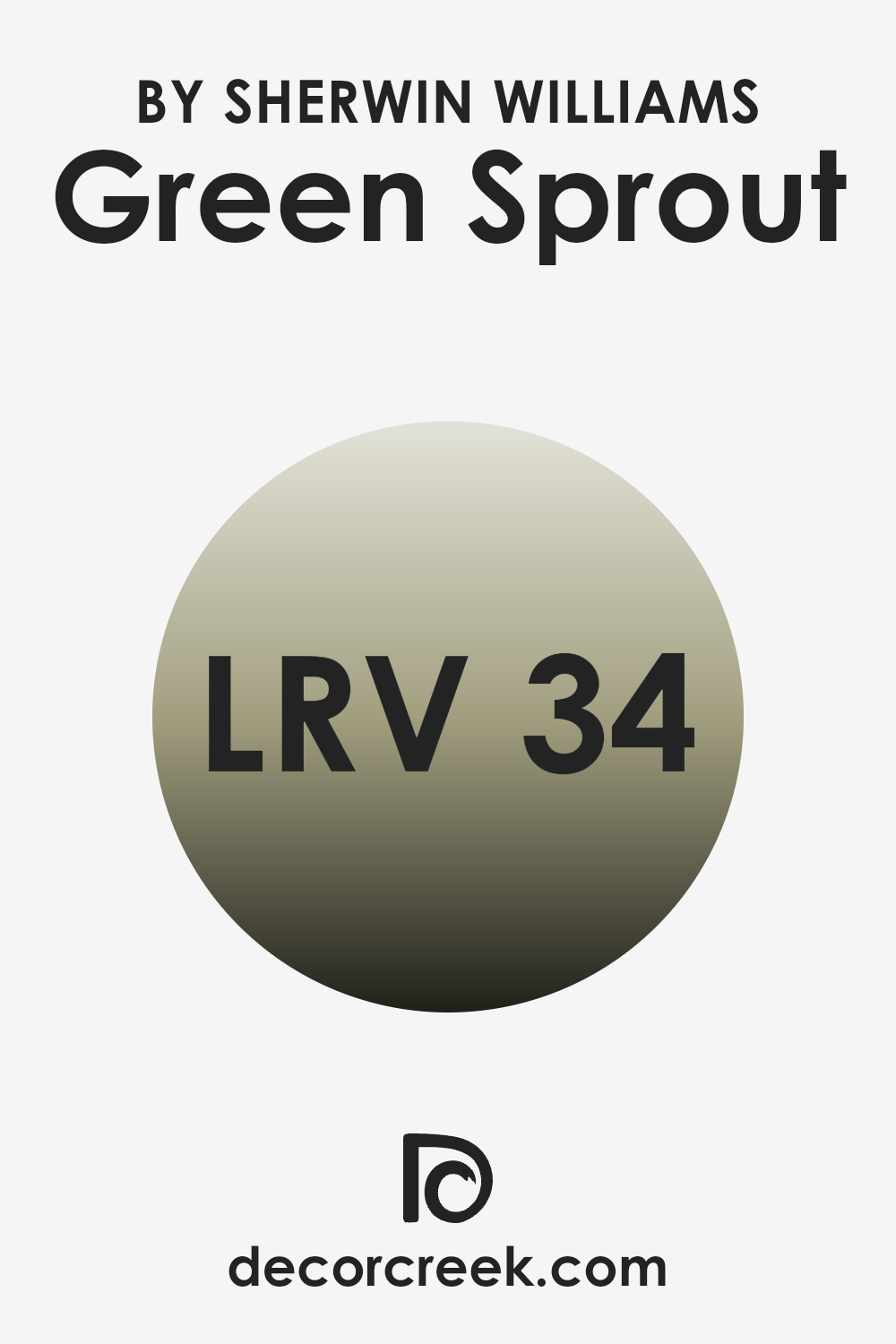
What is the LRV of Green Sprout SW 7728 by Sherwin Williams?
LRV stands for Light Reflectance Value, which measures the amount of light a color reflects. On a scale from 0 to 100, a color that reflects all light is at 100, while a color absorbing all light sits at 0. LRV helps us understand how light or dark a paint color will appear when applied to walls.
For instance, colors with high LRV values (above 50) are usually lighter and can make areas feel brighter and more expansive. In contrast, colors with lower LRV values are darker and absorb more light, creating a cozier atmosphere but potentially making a room feel more intimate or smaller.
Green Sprout by Sherwin-Williams has an LRV of 33.869, indicating it’s a medium-dark color. This means it absorbs more light than it reflects, leading it to appear rich and substantial on walls. In a room with ample natural sunlight, it can bring warmth and depth without overpowering the room. Conversely, in a room with limited light, the color may come across as more intense and significantly impact how the room feels.
This makes it a go-to choice for creating a grounded and comfortable environment, depending on the light available and the atmosphere you wish to create.
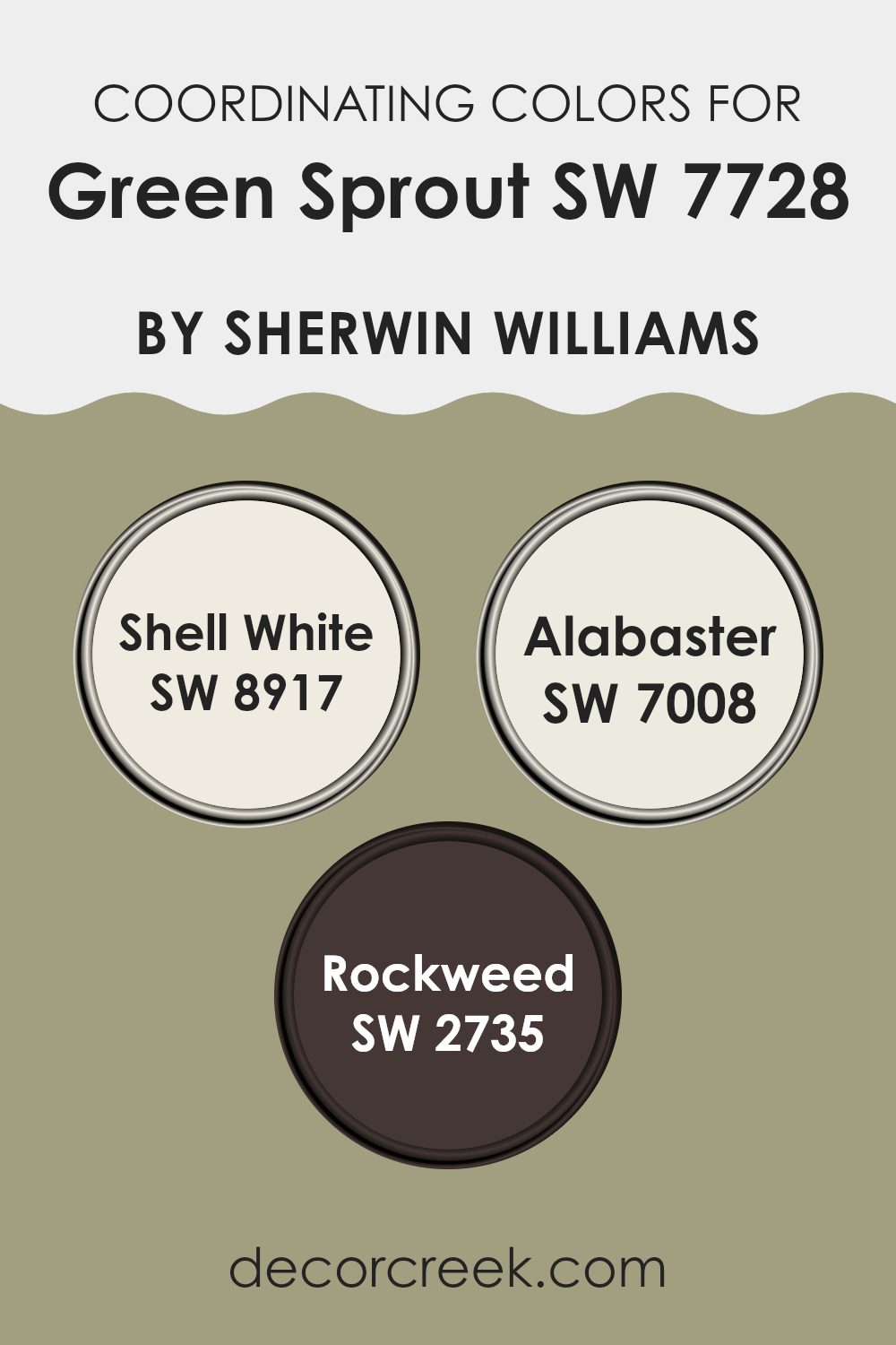
Coordinating Colors of Green Sprout SW 7728 by Sherwin Williams
Coordinating colors are a selection of shades that are chosen to complement a primary color, creating a harmonious color scheme in a room. When using Green Sprout by Sherwin Williams as the main color, coordinating colors help enhance its natural beauty, providing balance and contrast to a design. These colors work together because they share certain tonal qualities or create appealing visual contrasts. By carefully selecting coordinating colors, you can achieve a sense of unity and cohesion in a room, making it visually pleasing and comfortable.
Shell White is a subtle and soft off-white with a hint of warmth, making it a go-to choice to pair with Green Sprout. It adds a touch of brightness without taking over the room. Alabaster, another light shade, is a creamy white that brings a sense of calm and peace.
Its gentle tone complements the green by providing a neutral backdrop. Rockweed, on the other hand, is a deep, earthy green that adds depth and richness. Its darker tone serves as an anchor, offering a bold contrast to both Green Sprout and the lighter coordinating colors.
Together, these colors create a balanced and visually appealing palette that enhances the overall aesthetics of a room.
You can see recommended paint colors below:
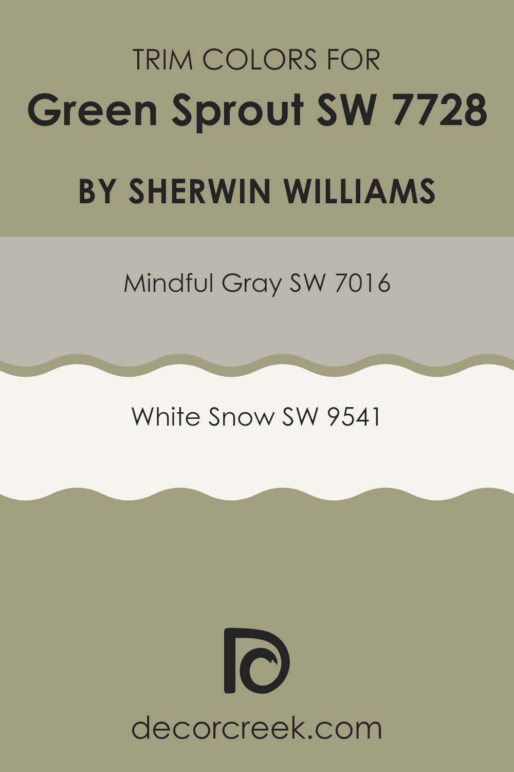
What are the Trim colors of Green Sprout SW 7728 by Sherwin Williams?
Trim colors are the shades used on the edges, frames, and borders of rooms and homes to accentuate the primary walls’ color and provide an aesthetic balance. They create contrast and help define architectural details like doors, windows, and baseboards. For a main wall color like Green Sprout by Sherwin Williams, trim colors play a crucial role in enhancing its warm, nature-inspired tone. Using trim colors like Mindful Gray and White Snow offers a clean and crisp finish that complements the earthy feel of Green Sprout.
Mindful Gray—a soft, muted shade—adds a calming touch, making it a great choice for trims that require a neutral balance without being too stark. On the other hand, White Snow, a bright, pure white, brings a sharpness and simplicity that beautifully highlights the room’s features and ensures the green pops.
Mindful Gray and White Snow provide a harmonious blend between bold and subtle for Green Sprout walls, their purpose being to neither overpower nor fade into the background. Mindful Gray brings a soothing yet charming hint, ideal for those who prefer a gentle touch of neutrality that doesn’t compete with the walls.
Meanwhile, White Snow is perfect for those who appreciate a more traditional look by offering a classic brightness that makes the Green Sprout appear vibrant and lively without overshadowing it. Together, these trim choices help create an inviting and balanced room that can be both comfortable and stylish.
You can see recommended paint colors below:
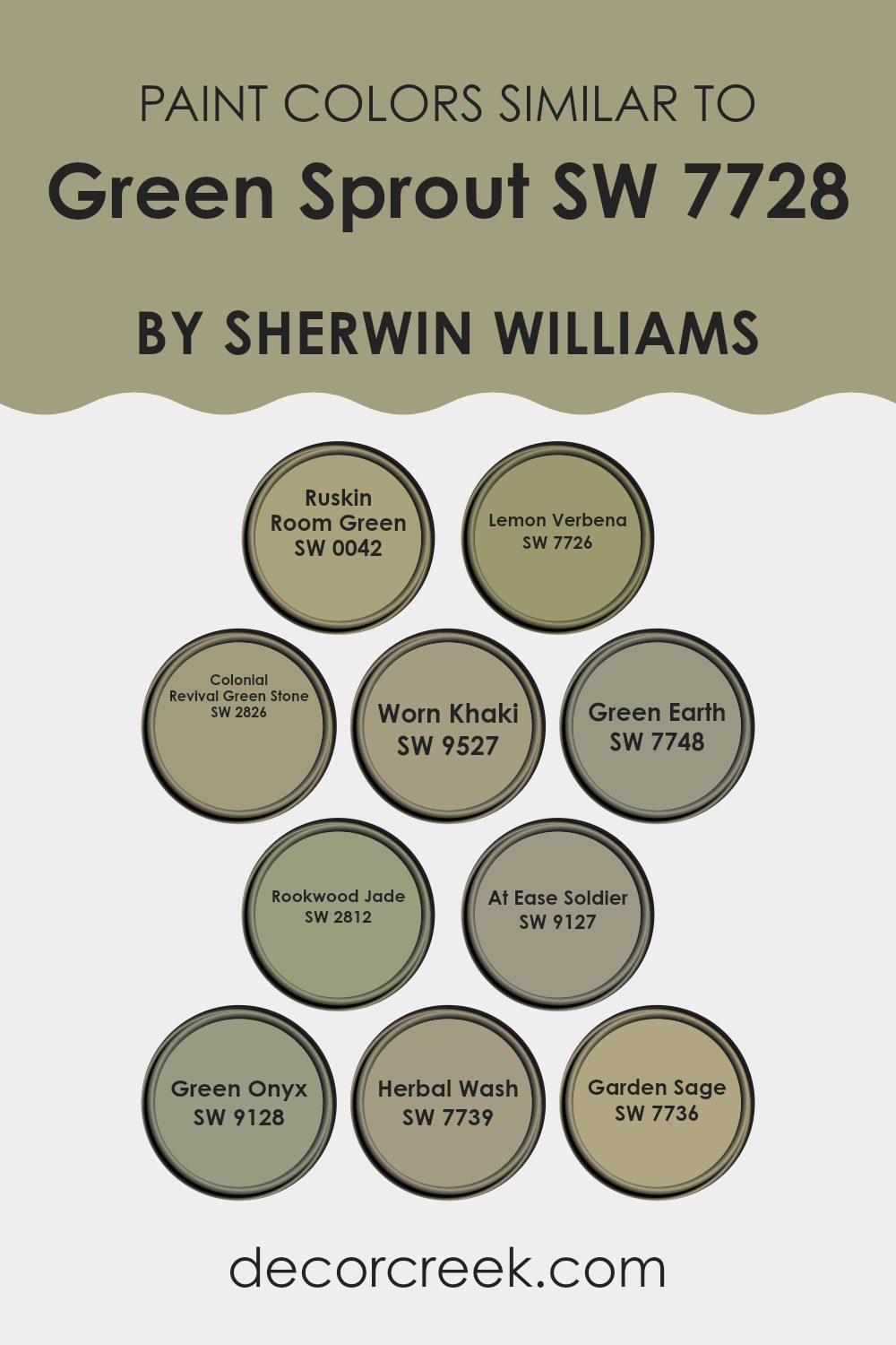
Colors Similar to Green Sprout SW 7728 by Sherwin Williams
Choosing similar colors to a main shade allows for a cohesive and harmonious look in any room. Green Sprout (SW 7728) by Sherwin Williams is complemented beautifully by a range of its neighboring hues. Ruskin Room Green (SW 0042) provides a classic touch, exuding a calming, muted green that reflects elegance.
Lemon Verbena (SW 7726) offers a lively and brighter green, adding freshness and lightness to any setting. Colonial Revival Green Stone (SW 2826) introduces a deeper, more historical green, enriched with depth and nostalgic allure.
Furthermore, Worn Khaki (SW 9527) presents a soft green with earthy undertones, delivering warmth and subtlety. Green Earth (SW 7748) is a mid-tone green with a hint of warmth, creating a welcoming environment, while Rookwood Jade (SW 2812) showcases a more charming jade tone that is both inviting and bold. At Ease Soldier (SW 9127) combines green with a slight touch of gray, resulting in a relaxed and calming effect.
Green Onyx (SW 9128) is a deeper and richer green with a touch of elegance. Herbal Wash (SW 7739) stands as an organic, refreshing green, while Garden Sage (SW 7736) introduces a softer, soothing touch that is perfect for creating comforting areas. Together, these colors bring a unified aesthetic that flows seamlessly throughout any area.
You can see recommended paint colors below:
- SW 0042 Ruskin Room Green
- SW 7726 Lemon Verbena
- SW 2826 Colonial Revival Green Stone
- SW 9527 Worn Khaki
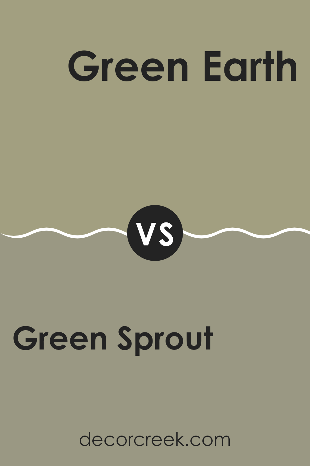
- SW 7748 Green Earth
- SW 2812 Rookwood Jade
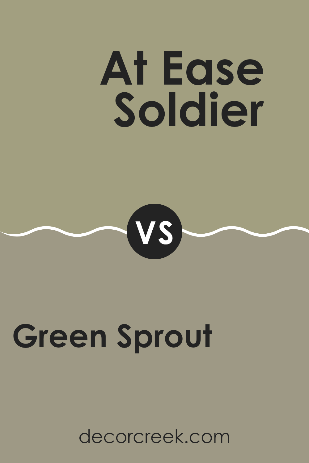
- SW 9127 At Ease Soldier
- SW 9128 Green Onyx
- SW 7739 Herbal Wash
- SW 7736 Garden Sage
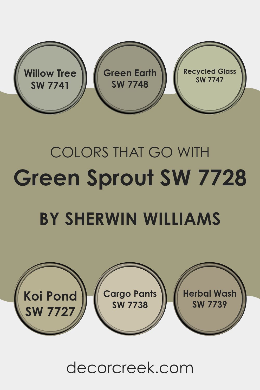
Colors that Go With Green Sprout SW 7728 by Sherwin Williams
When you’re using Green Sprout by Sherwin-Williams for your room, it’s important to pick colors that go well with it to create a harmonious look. Green Sprout is a lively green, and it pairs well with other earth tones and natural shades. Colors like Willow Tree and Green Earth work well because they have a grounding quality that complements the freshness of Green Sprout.
Willow Tree is a soft green with a hint of gray, giving it a calming, natural feel. Green Earth, on the other hand, is a gentle, warm green that feels comforting and earthy. Other colors that match well with Green Sprout include Recycled Glass, Koi Pond, Cargo Pants, and Herbal Wash. Recycled Glass is a light, minty green that brings a fresh and airy vibe, making areas feel light and open.
Koi Pond has a deeper, more muted green tone with hints of blue, which adds depth and richness. Cargo Pants is a go-to khaki green that gives a relaxed yet sturdy feel to the room. Herbal Wash is a soft, muted green with a touch of warmth, perfect for adding a cozy and inviting feel. Using these colors together with Green Sprout helps create a room that is balanced and visually appealing.
You can see recommended paint colors below:
- SW 7741 Willow Tree
- SW 7748 Green Earth
- SW 7747 Recycled Glass
- SW 7727 Koi Pond
- SW 7738 Cargo Pants
- SW 7739 Herbal Wash
How to Use Green Sprout SW 7728 by Sherwin Williams In Your Home?
Green Sprout SW 7728 by Sherwin Williams is a warm, earthy green that brings a natural, calming feel to any room. It’s a go-to color that works well in different rooms, making it a great choice for home interiors.
You can use Green Sprout to create a cozy living room by pairing it with neutral-colored furniture and natural materials like wood and stone. In the kitchen, it can add a fresh and lively touch, especially when used on cabinets or accent walls, alongside white or cream finishes.
For bedrooms, this shade can provide a restful atmosphere, working nicely with soft textiles and minimalistic decor. If you have a home office, Green Sprout can create a balanced environment that supports concentration and calmness. It’s a color that complements both modern and traditional styles, and can easily coordinate with brighter accents or muted tones, making it an ideal choice for any home.
Green Sprout SW 7728 by Sherwin Williams vs Colonial Revival Green Stone SW 2826 by Sherwin Williams
Green Sprout (SW 7728) and Colonial Revival Green Stone (SW 2826) are two different shades of green offered by Sherwin Williams.
Green Sprout is a lively, fresh green that brings a sense of energy and brightness to a room. It is suitable for areas where you want to feel invigorated, like kitchens or playrooms. Its bright tone can make a room feel more open and vibrant.
On the other hand, Colonial Revival Green Stone is a more muted, historical green. This color has a classic charm, giving rooms a cozy and comfortable feel. It works well in traditional settings, like living rooms or libraries, where a calmer, more settled atmosphere is desired.
When choosing between these two, consider the mood and style you want for your room. Green Sprout adds freshness and vitality, while Colonial Revival Green Stone offers a classic, comfortable look.
You can see recommended paint color below:
- SW 2826 Colonial Revival Green Stone
Green Sprout SW 7728 by Sherwin Williams vs Garden Sage SW 7736 by Sherwin Williams
Green Sprout (SW 7728) and Garden Sage (SW 7736) by Sherwin Williams are both shades of green, but they offer different vibes. Green Sprout is a cheerful and bright green that feels fresh and lively, like a thriving plant in early spring. It can bring a sense of energy and vitality to a room. This color is great for areas where you want a burst of freshness and uplift.
On the other hand, Garden Sage is softer and has a muted quality, reminiscent of sage herbs in a garden. It’s more subdued compared to Green Sprout, giving it a calm and relaxed feel. Garden Sage can be a good choice for creating a cozy and inviting atmosphere, perfect for any room you want to relax in.
Both colors offer their own unique charm, with Green Sprout being more vibrant and dynamic, while Garden Sage is more calming and subtle.
You can see recommended paint color below:
- SW 7736 Garden Sage
Green Sprout SW 7728 by Sherwin Williams vs Worn Khaki SW 9527 by Sherwin Williams
Green Sprout (SW 7728) by Sherwin Williams is a fresh and vibrant green that brings a lively and energetic feel to a room. It’s reminiscent of new grass or fresh leaves, making it ideal for areas where you want a natural and invigorating atmosphere.
On the other hand, Worn Khaki (SW 9527) is a warm, earthy beige tone. It exudes a sense of calm and coziness, similar to the color of well-worn, comfortable fabric. This neutral shade pairs well with a variety of colors, making it ideal for many design styles.
While Green Sprout adds a splash of life and nature to a room, Worn Khaki provides a soothing and stable backdrop. Together, they create a balanced environment, with Green Sprout adding vibrancy and Worn Khaki offering comfort and warmth. These colors can be used to create a harmonious contrast in any design setting.
You can see recommended paint color below:
Green Sprout SW 7728 by Sherwin Williams vs Herbal Wash SW 7739 by Sherwin Williams
Green Sprout (SW 7728) and Herbal Wash (SW 7739) are two unique green shades offered by Sherwin Williams. Green Sprout is a lively, vibrant green that can bring energy and a fresh look to a room. It works well in areas where you want to create a lively and cheerful atmosphere, such as kitchens, playrooms, or living rooms.
On the other hand, Herbal Wash is a softer, more muted green. It feels calming and relaxing, making it a great choice for bedrooms, bathrooms, or any area where you want a peaceful vibe. This shade has a more natural and earthy tone to it, which can make a room feel grounded and soothing.
Both colors reflect different aspects of green. While Green Sprout energizes, Herbal Wash calms. Choosing between them depends on the feeling you want to create in your room.
You can see recommended paint color below:
- SW 7739 Herbal Wash
Green Sprout SW 7728 by Sherwin Williams vs Green Onyx SW 9128 by Sherwin Williams
Green Sprout (SW 7728) and Green Onyx (SW 9128) by Sherwin Williams are two distinct shades of green. Green Sprout is a light, vibrant green that has a fresh and energizing quality. It can bring a lively touch to a room, perfect for areas where a cheerful atmosphere is desired. Due to its brightness, it works well in rooms with plenty of natural light, helping to accentuate the room.
On the other hand, Green Onyx is a darker, more muted green. It carries a calm and soothing presence, creating a cozy and inviting atmosphere. This shade is ideal for areas where a relaxed and comforting environment is preferred, such as bedrooms or reading nooks.
While Green Sprout is lively and full of energy, Green Onyx offers a more subdued, restful feel. Both colors bring unique characteristics to interior rooms, allowing for go-to design choices depending on the mood you’re aiming to create.
You can see recommended paint color below:
Green Sprout SW 7728 by Sherwin Williams vs Ruskin Room Green SW 0042 by Sherwin Williams
Green Sprout and Ruskin Room Green are two shades of green by Sherwin Williams that each offer a unique vibe. Green Sprout is a vibrant and lively green, almost like fresh leaves in spring. It brings a feeling of energy and rejuvenation to a room, making it ideal for areas where you want a pop of color and a lively atmosphere.
Ruskin Room Green, on the other hand, is a more muted and subdued green. It has a deeper tone, closer to earthy or historical greens, giving it a calm, grounded feel. This makes it perfect for creating a cozy environment, where a softer, more relaxed green is desired.
By choosing between these two, you can decide if you want a bold and refreshing look with Green Sprout or a more traditional and calming presence with Ruskin Room Green. Both can enhance a room, but in different ways.
You can see recommended paint color below:
- SW 0042 Ruskin Room Green
Green Sprout SW 7728 by Sherwin Williams vs Green Earth SW 7748 by Sherwin Williams
Green Sprout (SW 7728) by Sherwin Williams is a bright and vivid green color. It feels lively and brings to mind fresh spring growth. This makes it a great choice for areas where you want to feel energized and awake. It can brighten up a room and give it a sense of nature and new beginnings.
On the other hand, Green Earth (SW 7748) by Sherwin Williams is more muted and earthy. It has a subtle, calming presence that doesn’t stand out too much. It works well if you’re looking for a more relaxed and understated look. This color is soothing and can make a room feel warm and grounded.
Both colors are green but have different vibes. Green Sprout is more energetic and fresh, while Green Earth is calm and grounded. They can both be used effectively, depending on the mood you want to create in a room.
You can see recommended paint color below:
Green Sprout SW 7728 by Sherwin Williams vs At Ease Soldier SW 9127 by Sherwin Williams
Green Sprout SW 7728 and At Ease Soldier SW 9127 by Sherwin Williams are both pleasant shades of green, but they offer distinct vibes. Green Sprout is a vibrant, lively shade reminiscent of fresh spring leaves. It has a brightness that can energize a room and give it a lively, cheerful feel. Ideal for kitchens or living areas, it brings a touch of nature indoors.
On the other hand, At Ease Soldier is a more muted and calming green. It has a grayish undertone that makes it feel more subdued and relaxing. This color works well in bedrooms or home offices where a peaceful atmosphere is desired.
It pairs nicely with neutral tones, adding a gentle pop of color without overtaking the room. Both colors can complement various styles, but the choice comes down to whether you prefer the lively energy of Green Sprout or the calmness of At Ease Soldier.
You can see recommended paint color below:
- SW 9127 At Ease Soldier
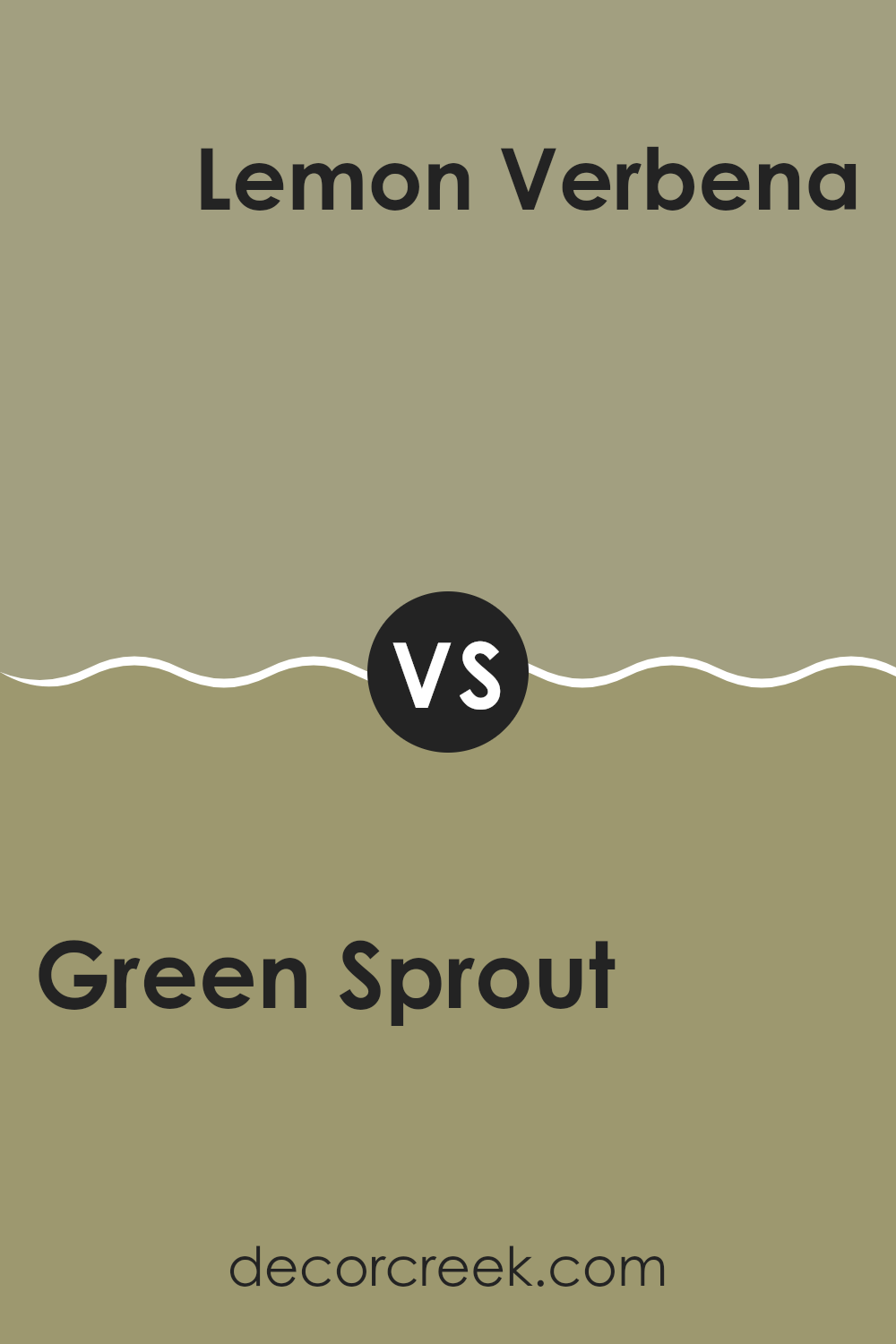
Green Sprout SW 7728 by Sherwin Williams vs Lemon Verbena SW 7726 by Sherwin Williams
Green Sprout and Lemon Verbena are two lovely green shades by Sherwin Williams. Green Sprout is a natural, earthy green with a touch of gray, giving it a calm and grounded appearance. It’s a go-to color that can be used in various rooms, offering a connection to nature and a soothing backdrop.
On the other hand, Lemon Verbena is a brighter, livelier green with hints of yellow. This color brings energy and happiness into a room, making it perfect for lively rooms like kitchens or playrooms. It captures the freshness of spring and is more vibrant compared to the subtlety of Green Sprout.
While Green Sprout fits well in areas meant for relaxation, Lemon Verbena is great for areas where you want a bit of zest and fun. Both colors have their unique charm, but their use depends on the mood and atmosphere you want to create in your room.
You can see recommended paint color below:
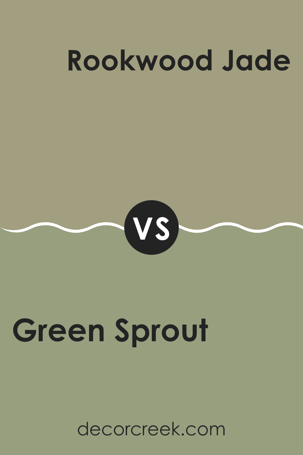
Green Sprout SW 7728 by Sherwin Williams vs Rookwood Jade SW 2812 by Sherwin Williams
Green Sprout SW 7728 and Rookwood Jade SW 2812 are both attractive greens by Sherwin Williams, but they have distinct personalities. Green Sprout is a vibrant, lively green that feels fresh and energetic. It’s perfect for bringing a sense of nature and vitality into a room. This color works well in areas where you want to create a lively and uplifting atmosphere, such as a kitchen or sunroom.
Rookwood Jade, on the other hand, is a deeper, more muted green. It has an elegant and historic feel and can add a touch of charm to any room. This jade color is a go-to and can be used in traditional settings or to add depth to modern designs.
It’s a great choice for living rooms or bedrooms where you want calm and richness. Both colors beautifully highlight different aspects of green, allowing you to choose the one that fits your mood and style best.
You can see recommended paint color below:
After reading about SW 7728 Green Sprout by Sherwin Williams, I feel like I’ve learned a lot about this paint color. Green Sprout is a warm, earthy green that reminds me of leaves on a tree or grass on a sunny day. It’s not too bright or too dark, making it a friendly color for any room.
What I like about Green Sprout is how it can make any room feel cozy and welcoming. Whether it’s the living room, bedroom, or kitchen, this green adds a feeling of nature and calmness. It’s easy to pair with other colors, like brown or cream, which can make furniture and decorations look even nicer.
When I think about using Green Sprout, I imagine it making rooms feel fresh and lively. It’s like bringing a little piece of the outside world into the home. It works well with wood accents and soft lighting, creating a peaceful atmosphere.
Overall, learning about Green Sprout has made me excited about how colors can change how a room feels. This green seems like a great choice for anyone wanting a natural and inviting look for their home.
Ever wished paint sampling was as easy as sticking a sticker? Guess what? Now it is! Discover Samplize's unique Peel & Stick samples.
Get paint samples

