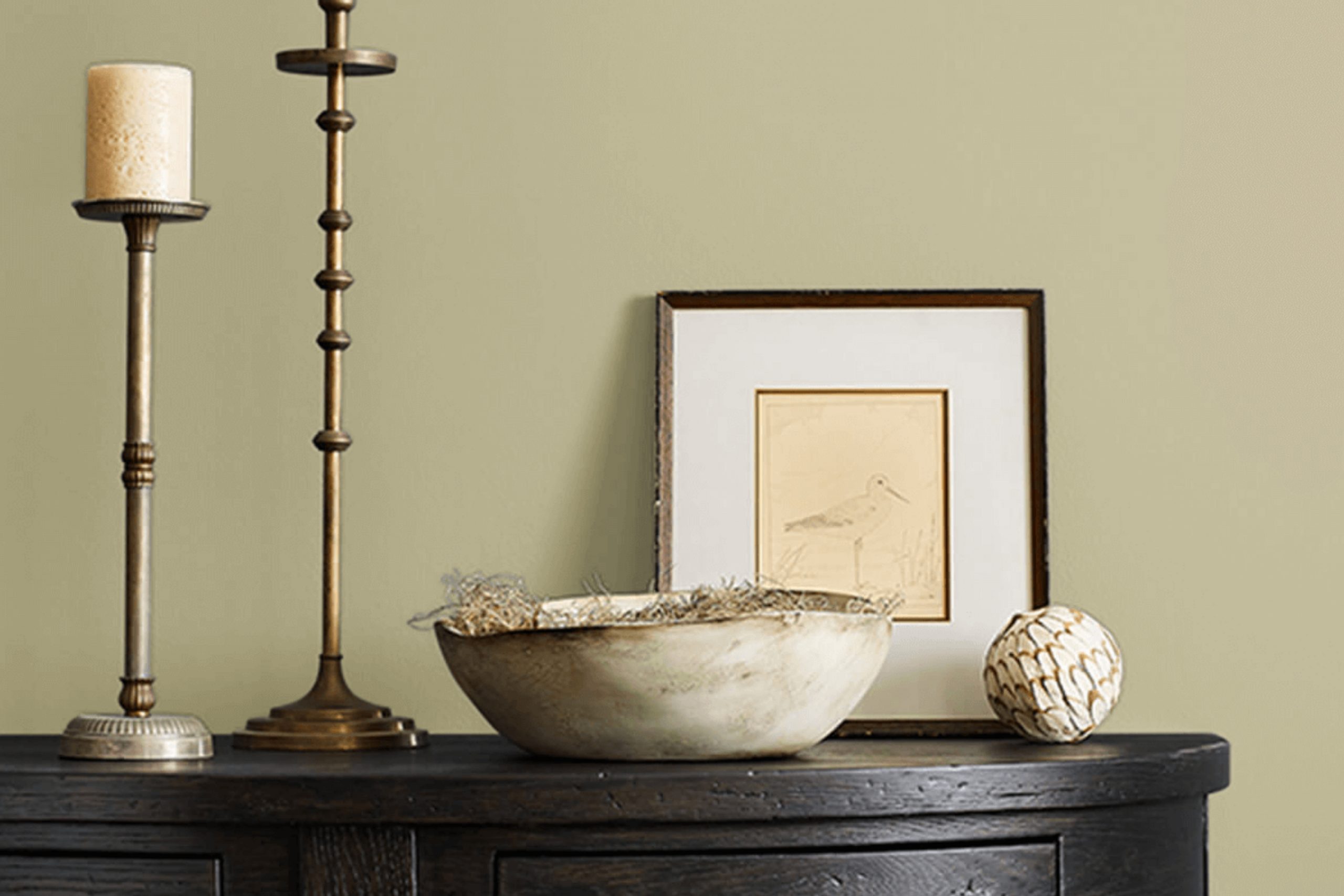
Have you ever walked by a pond and felt an immediate sense of calm and clarity? That’s exactly the vibe I’m talking about with Sherwin Williams’ SW 7727 Koi Pond. This color is more than just paint; it’s like bringing a little piece of peaceful nature inside your home. The hue has an incredible way of grounding a room, making it feel both warm and inviting.
The gentle green tones create a natural backdrop that is both soothing and refreshing. It sets the stage perfectly for either a vibrant, lively setting or a calm, minimalist ambiance. Whether you’re planning to redo your living room, kitchen, or even a cozy corner for reading, Koi Pond has the ability to fit seamlessly, enhancing the existing elements without being too dominant.
I find that it pairs beautifully with natural materials like wood and stone, adding to its organic appeal. Introducing this color into your room feels like opening a window to the outside, inviting a subtle breath of rejuvenating fresh air.
Every glance at its tone reminds you of lush gardens and calm landscapes. A choice like this can subtly influence mood, making your home feel more connected to nature.
What Color Is Koi Pond SW 7727 by Sherwin Williams?
Koi Pond, from Sherwin Williams, is a rich green with a subtle earthy undertone. This color lies in a flexible zone between olive and moss, providing a calming yet grounded atmosphere to any room. It’s particularly well-suited for interiors that aim to connect with nature or promote a sense of calm and relaxation.
The color works wonderfully in rustic and farmhouse styles, where it adds depth to rooms. Its natural vibe also complements bohemian interiors, giving them an organic touch. In a modern setting, Koi Pond can serve as an accent color to soften sleek lines and add warmth.
Pair this hue with warm, natural materials like wood, whether it’s light oak or richer walnut, to enhance its earthy feel. Textures such as wool, cotton, or linen will play well against this color, adding a cozy layer to rooms like bedrooms or living areas.
Stone elements, such as slate or rough-hewn tiles, can provide a striking contrast that highlights the color’s richness. For a balanced palette, complement Koi Pond with neutrals like beige or off-white, or add a splash of color with burnt orange or muted gold accents for a cheerful yet harmonious look.
Is Koi Pond SW 7727 by Sherwin Williams Warm or Cool color?
Koi Pond by Sherwin Williams is a soft, muted green that brings a touch of nature into a home. This color creates a calm and relaxing environment, making it an excellent choice for rooms where people want to unwind. In living rooms and bedrooms, Koi Pond offers a cozy and inviting feel, promoting a sense of comfort. It works well with both natural and artificial lighting, enhancing the overall ambiance of the room without being too intense.
In a home office, Koi Pond provides a gentle backdrop that can help with focus and concentration. It’s a flexible color that pairs well with a variety of materials and finishes, such as wood, metal, and stone. This makes it easy to incorporate into existing decor, whether the style is modern or traditional.
Using Koi Pond in kitchens or dining areas can add a hint of nature-inspired freshness, and it pairs beautifully with plants or white accents for a balanced look.
Undertones of Koi Pond SW 7727 by Sherwin Williams
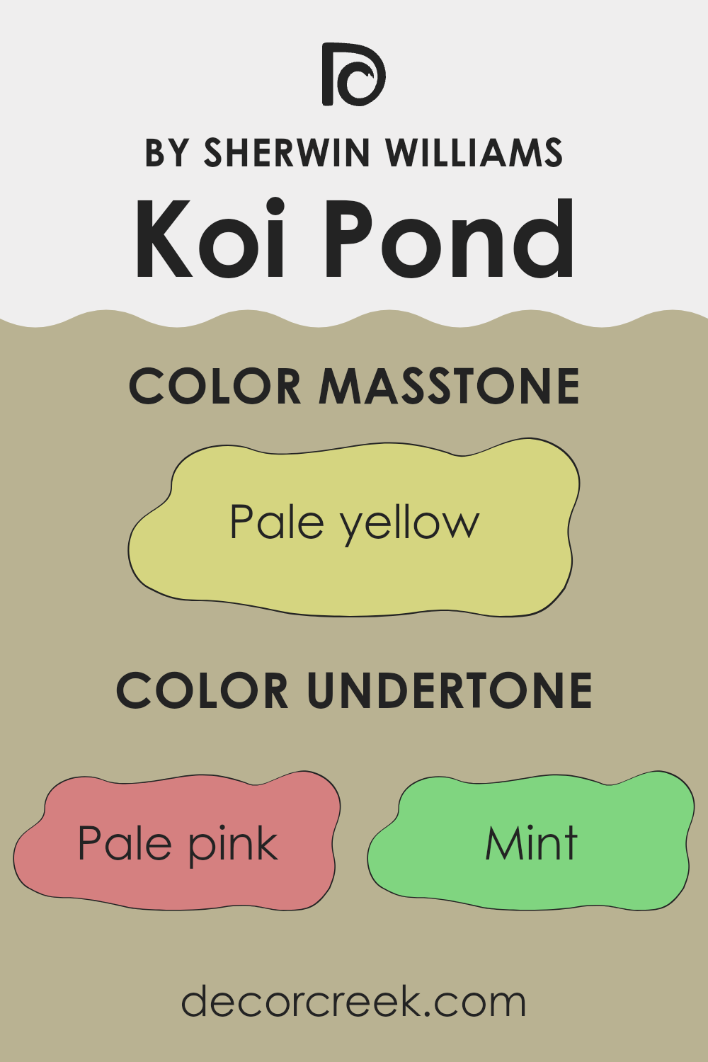
Koi Pond by Sherwin Williams is a complex color that has multiple undertones affecting how it appears on walls. Undertones are subtle hues beneath the main color that can influence its overall look and feel. For Koi Pond, the undertones include pale pink, mint, grey, light gray, light purple, light blue, lilac, yellow, orange, light green, and olive.
These undertones mean that Koi Pond can look different depending on the lighting and surrounding decor. For instance, the presence of pale pink and light purple undertones may make the color seem warmer and softer under certain lights, giving it a gentle, cozy feel. On the other hand, mint and light blue undertones can make the color feel cooler and more refreshing, especially in natural light.
Grey and light gray undertones add a neutral quality, helping Koi Pond fit into various settings without clashing. Yellow and orange bring a hint of warmth, while light green and olive can provide an earthy vibe. Lilac adds a touch of refinement. Altogether, these undertones mean Koi Pond can shift subtly, making it adaptable for interior walls.
Its appearance depends on the room’s lighting, nearby furnishings, and personal taste.
What is the Masstone of the Koi Pond SW 7727 by Sherwin Williams?
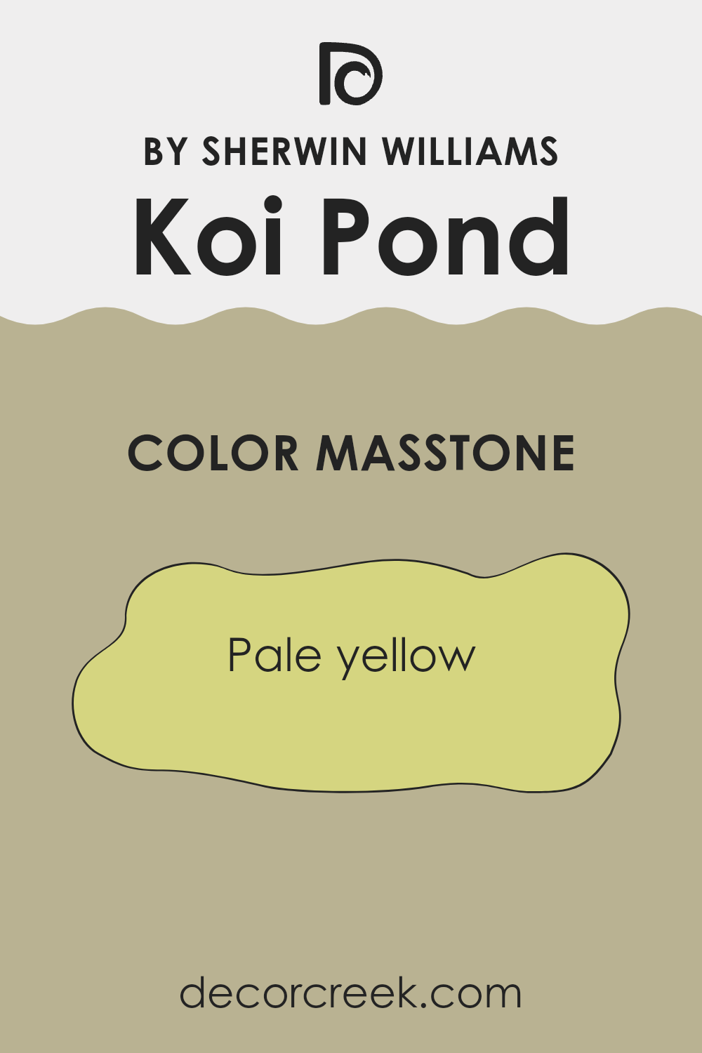
Koi Pond, identified by Sherwin Williams as SW 7727, presents a pale yellow tone with the masstone of #D5D580. This gentle hue adds a soft, warm feel to any room, making it ideal for rooms needing a touch of lightness and cheer.
It can brighten up a room without being too overpowering, resulting in a welcoming and cozy atmosphere. The warm yellow can reflect natural light effectively, giving the illusion of more room. It’s a good choice for kitchens or living rooms where you want an inviting vibe. When paired with light neutrals like soft whites or light grays, it creates an airy feel.
Adding darker contrasts, like deep blues or earthy browns, can highlight architectural features while maintaining balance. This shade is flexible enough to be used in various designs, from traditional settings to more contemporary styles, keeping the feel warm and pleasing.
How Does Lighting Affect Koi Pond SW 7727 by Sherwin Williams?
Lighting plays a crucial role in how we perceive color. This is because different types of light can change the appearance of colors in a room. The color Koi Pond (SW 7727) by Sherwin Williams is a great example of how lighting affects paint colors.
When we look at Koi Pond under artificial lighting, the color might seem different compared to natural light. Incandescent lights give off a warmer, yellowish glow, which can make Koi Pond look warmer and more yellow, emphasizing its earthy tone. On the other hand, fluorescent lighting, which tends to be cooler and bluish, could make Koi Pond appear slightly duller or more muted.
In natural light, however, Koi Pond shows its true colors more accurately. The way it looks will vary throughout the day as the natural light changes. In the morning, the color might appear fresher and brighter, while in the late afternoon, it could take on a warmer, deeper tone.
Room orientation also impacts how Koi Pond looks. In north-facing rooms, which typically have cooler and more consistent lighting, Koi Pond might appear more subdued or even slightly grayish. This is because these rooms don’t get direct sunlight, leading to cooler illumination that can change how colors are seen.
In south-facing rooms, which bask in sunlight for much of the day, Koi Pond appears brighter and more vibrant. The warm and intense light makes the color feel alive and more saturated.
East-facing rooms get morning light, which is warm, making Koi Pond appear more yellow and vibrant in the mornings, while transitioning to a more neutral tone by afternoon.
In west-facing rooms, which receive warm afternoon light, Koi Pond might look brighter and more intense later in the day, adding warmth and richness to the room as the sun sets. Understanding these nuances can help in making design choices that feel right at different times and settings.

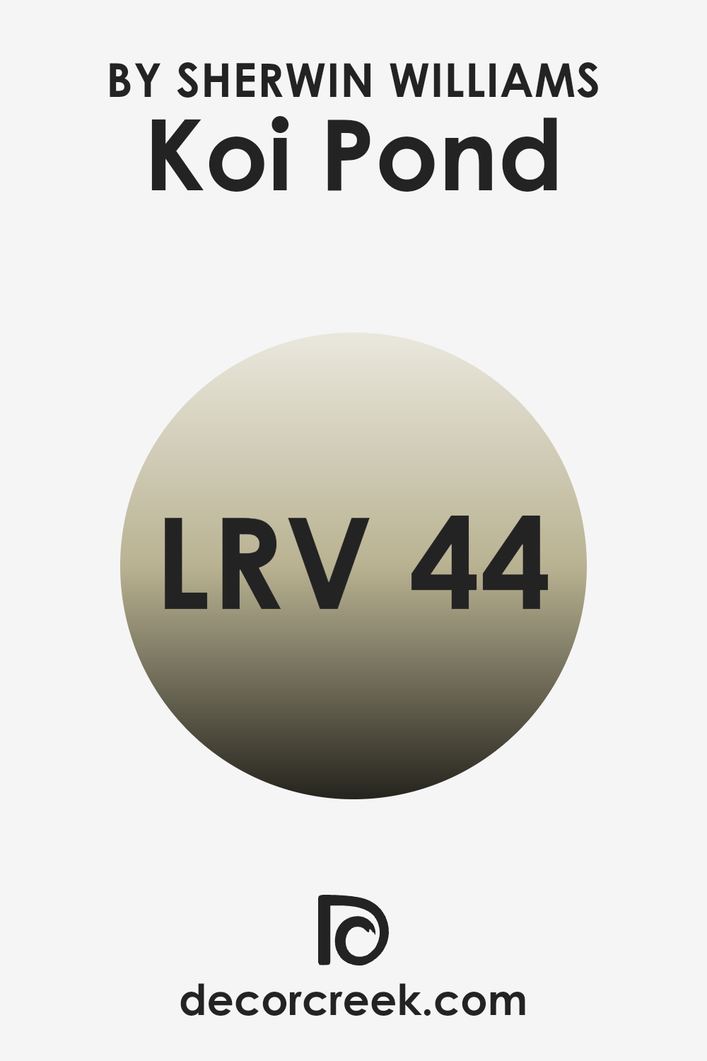
What is the LRV of Koi Pond SW 7727 by Sherwin Williams?
LRV, or Light Reflectance Value, measures how much light a color reflects. On a scale from 0 to 100, where 0 is absolute black (no light reflected) and 100 is pure white (all light reflected), LRV tells us how bright or dark a color will appear once it’s on the walls. The higher the LRV, the more light the color reflects, making a room feel brighter and, sometimes, more open.
Conversely, lower LRV colors absorb more light, which can make rooms feel more intimate and cozier. Understanding a color’s LRV is crucial when planning a room, as it influences both the room’s mood and the amount of artificial light needed.
Koi Pond’s LRV of 44.266 places it in the mid-range, meaning it’s neither too dark nor too light. This balanced light reflectance allows Koi Pond to bring a warm and inviting atmosphere to a room without feeling too strong or heavy. Because it doesn’t reflect too much light, it can create a calm and soothing environment, ideal for areas where you want to feel comfortable and relaxed. It’s flexible enough for various settings, as it will neither wash out in bright light nor make a room feel too enclosed in low-light conditions.
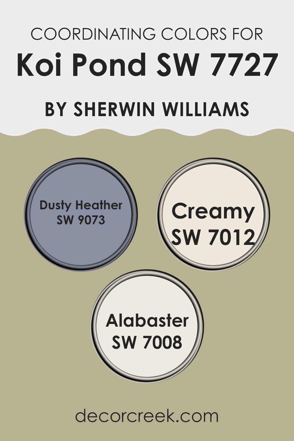
Coordinating Colors of Koi Pond SW 7727 by Sherwin Williams
Coordinating colors work together to create a harmonious and balanced look in a room. When choosing colors that complement Koi Pond (SW 7727), a soft and earthy green by Sherwin Williams, it’s essential to select shades that highlight its natural beauty.
Dusty Heather (SW 9073) is a gentle, muted lavender that introduces a subtle touch of color, adding depth without overpowering the room. Its mellow tone is perfect for a backdrop that soothes and grounds the room. Creamy (SW 7012) offers a warm, inviting touch with its soft, buttery hue. This color pairs well with Koi Pond by adding a cozy and homely feel to the environment.
Alabaster (SW 7008), on the other hand, is a flexible off-white that brightens a room, providing a clean and fresh contrast to the more earthy undertones of Koi Pond. Its crispness adds clarity and light, making rooms feel airy and open. Together, these colors create a seamless and inviting palette that works beautifully in any room, bringing together natural elements and inviting warmth.
You can see recommended paint colors below:
- SW 9073 Dusty Heather
- SW 7012 Creamy
- SW 7008 Alabaster
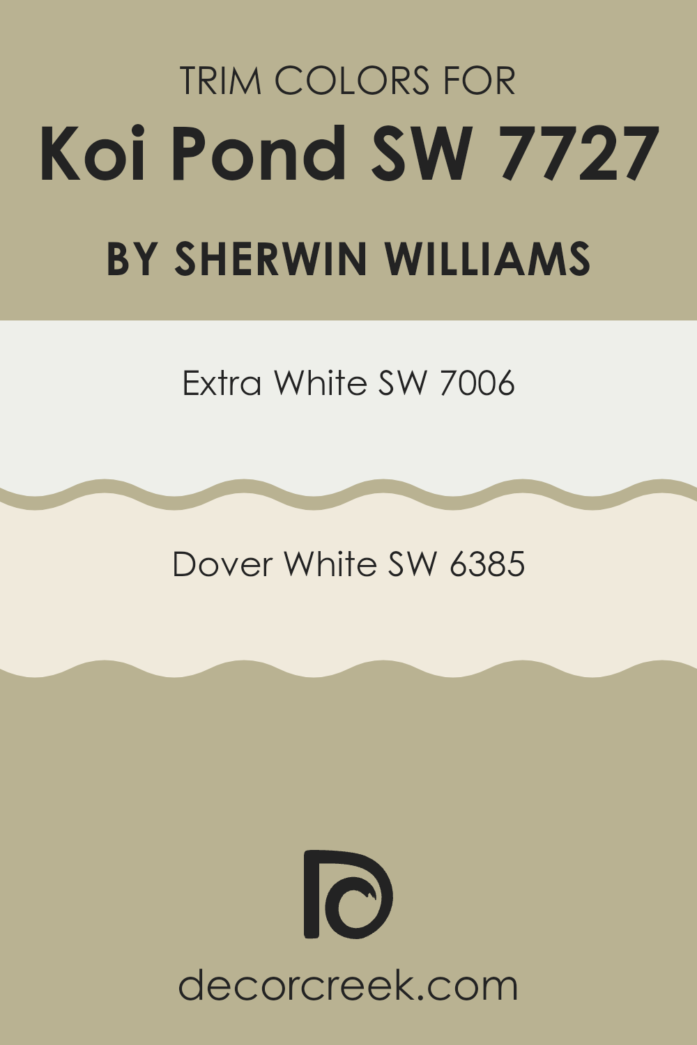
What are the Trim colors of Koi Pond SW 7727 by Sherwin Williams?
Trim colors are the shades used to outline or highlight various elements of a room, often applied to moldings, window frames, and doors. They serve as accents that enhance the main color, in this case, the earthy green of Koi Pond by Sherwin Williams. When you pair the right trim colors with a primary color like Koi Pond, it can create balance and make the main color more appealing and noticeable.
Using trim colors like SW 7006 Extra White and SW 6385 Dover White can accentuate the natural and calming quality of Koi Pond while providing a crisp and clean look. These trim colors can subtly highlight architectural features without overpowering the main color.
SW 7006 Extra White is a bright, cool white that offers a clean and crisp finish. Its brightness can reflect more light and open up rooms, making it a popular choice for trim when you want a fresh and modern contrast. On the other hand, SW 6385 Dover White is a warm white with a soft, creamy undertone. Dover White is great for creating a welcoming and cozy atmosphere, which can make Koi Pond appear softer and more inviting. Using these trim colors around your room can highlight natural beauty and create a balanced, unified feel.
You can see recommended paint colors below:
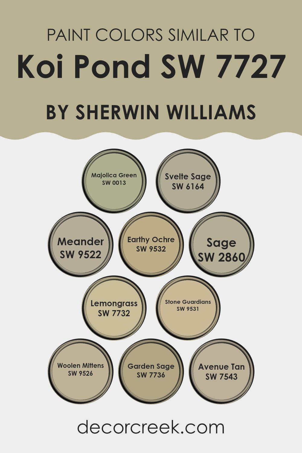
Colors Similar to Koi Pond SW 7727 by Sherwin Williams
Similar colors to Sherwin Williams’ Koi Pond, such as Majolica Green and Svelte Sage, are vital in creating a harmonious atmosphere. Majolica Green is a deep, rich shade that brings to mind the elegance of aged ceramics and offers a sense of nature’s depth. Svelte Sage is a gentle, subdued green that finds the sweet spot between being natural and refined, perfectly complementing both vibrant and neutral tones.
On the other hand, Meander and Earthy Ochre provide warmer tones. Meander is a soft blue reminiscent of peaceful water currents, keeping the room’s mood calm and steady. Earthy Ochre adds a sunny touch, with its warm orange-brown, reminiscent of a sunlit clay path.
For a touch of traditional green, Sage is perfect for adding layers of natural color without being too intense. Lemongrass introduces a playful hint of yellow-green, brightening the room subtly. Stone Guardians and Woolen Mittens offer grounding neutrals; the former is cooler with a slight greyness, while the latter is warm and comforting, almost like a favorite sweater.
Garden Sage stands out with its vibrant, refreshing hue, encouraging a lively yet grounded atmosphere. Lastly, Avenue Tan brings a soft, adaptable brown background, tying all these colors together cohesively in any design. Finding the right balance with these colors ensures a room feels inviting and well-rounded.
You can see recommended paint colors below:
- SW 0013 Majolica Green
- SW 6164 Svelte Sage
- SW 9522 Meander
- SW 9532 Earthy Ochre
- SW 2860 Sage
- SW 7732 Lemongrass
- SW 9531 Stone Guardians
- SW 9526 Woolen Mittens
- SW 7736 Garden Sage
- SW 7543 Avenue Tan
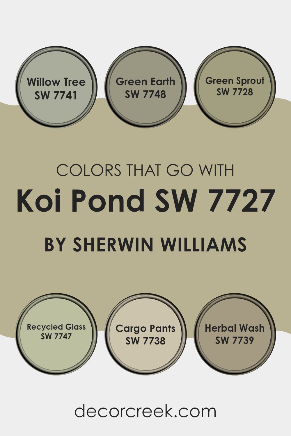
Colors that Go With Koi Pond SW 7727 by Sherwin Williams
Choosing colors that complement Koi Pond SW 7727 by Sherwin Williams is important because they enhance the room’s overall feeling and mood. When paired with Koi Pond, these colors can create a harmonious and balanced ambiance. Koi Pond is a rich, earthy green that can serve as a grounding element in any room, and selecting the right accompanying shades brings out its best features.
Willow Tree SW 7741 adds a gentle, muted green that balances and softens Koi Pond’s intensity. Green Earth SW 7748 introduces a toned-down hue with subtle earthiness, creating a natural connection with the environment. Green Sprout SW 7728 provides a brighter, lively green that brings energy to the room without being too intense.
Recycled Glass SW 7747 brings a touch of freshness with its light, airy quality, making rooms feel open. Cargo Pants SW 7738 is a deeper, more subdued green that adds depth and richness, giving a cozy and inviting feeling. Finally, Herbal Wash SW 7739 adds a warm, welcoming touch with its soft, muted tone. Together, these colors form a palette that feels cohesive and inviting, accentuating the beauty of Koi Pond and bringing a sense of nature and comfort into any room.
You can see recommended paint colors below:
- SW 7741 Willow Tree
- SW 7748 Green Earth
- SW 7728 Green Sprout
- SW 7747 Recycled Glass
- SW 7738 Cargo Pants
- SW 7739 Herbal Wash
How to Use Koi Pond SW 7727 by Sherwin Williams In Your Home?
Koi Pond by Sherwin Williams is a beautiful and muted green paint color that adds a natural touch to any home. Its calming and earthy tone makes it a great choice for various rooms. You can use it in a living room to create a cozy and inviting atmosphere.
Pair it with natural woods and neutral furniture to enhance its soothing vibe. In a bedroom, Koi Pond can provide a peaceful backdrop that encourages rest and relaxation. Accentuate it with soft bedding and plants to complete the look.
Additionally, this color works well in kitchens or dining areas, where it can bring a fresh and lively feel, especially when combined with white or cream cabinets. Koi Pond’s versatility also makes it suitable for a home office, offering a balanced ambiance that can help with focus. It’s a color that truly brings the essence of the outdoors inside your living rooms.
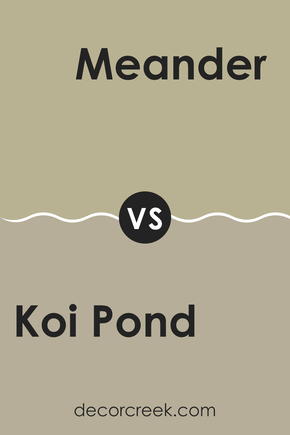
Koi Pond SW 7727 by Sherwin Williams vs Meander SW 9522 by Sherwin Williams
Koi Pond (SW 7727) and Meander (SW 9522) by Sherwin Williams are two different colors with unique characteristics. Koi Pond is a rich green color that can bring a sense of nature and freshness to a room.
It resembles the calm and lush feel of a pond surrounded by greenery, making it a cozy yet lively choice. On the other hand, Meander has a soothing quality with its soft blue tones. It feels airy and light, like a gentle breeze on a clear day.
While Koi Pond adds depth and warmth, Meander offers a refreshing and calming vibe. Both colors can work well as dominant shades or accent colors, depending on the mood you want for a room. Whether you choose the earthy energy of Koi Pond or the relaxed feel of Meander, each color brings its own charm to a room.
You can see recommended paint color below:
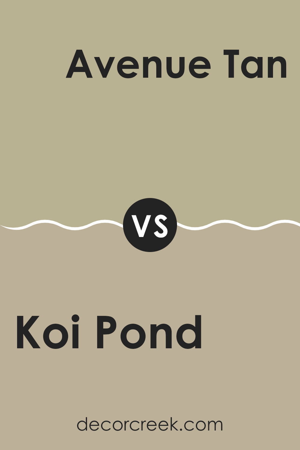
Koi Pond SW 7727 by Sherwin Williams vs Avenue Tan SW 7543 by Sherwin Williams
Koi Pond (SW 7727) by Sherwin Williams is a calming green with hints of blue, reminiscent of peaceful waters. It brings a soothing and natural vibe to any room and works well in areas where relaxation or reflection is desired. The color connects with nature, providing a gentle backdrop that pairs beautifully with natural wood finishes or white accents.
In contrast, Avenue Tan (SW 7543) is a warm, neutral beige with subtle earth tones. It’s flexible and creates a cozy, inviting atmosphere, perfect for living areas or bedrooms. Avenue Tan complements a variety of colors due to its neutral nature, making it easy to coordinate with bold or muted shades.
When comparing the two, Koi Pond offers a fresh, cool feel, while Avenue Tan provides warmth and versatility. Both colors can be used effectively, but the choice depends on whether you desire a peaceful, nature-inspired look or a warm, inviting atmosphere.
You can see recommended paint color below:
- SW 7543 Avenue Tan
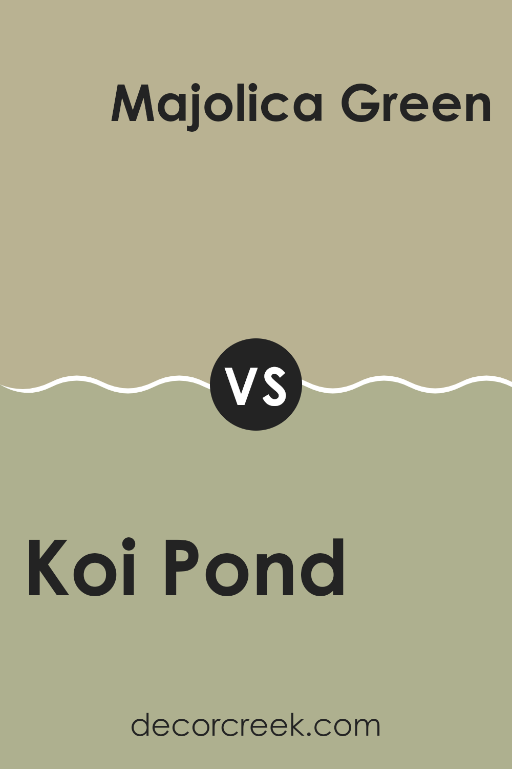
Koi Pond SW 7727 by Sherwin Williams vs Majolica Green SW 0013 by Sherwin Williams
Koi Pond and Majolica Green are two distinct greens by Sherwin Williams. Koi Pond SW 7727 is a soft, muted green with earthy undertones. It brings a sense of calm and can make a room feel cozy and inviting, especially when paired with natural textures and warm wood tones.
On the other hand, Majolica Green SW 0013 is a richer, more vibrant shade. This color leans toward a teal-green, giving it a more lively and energetic vibe. It’s bolder than Koi Pond and can add a pop of color to a room, making a strong statement without feeling too intense.
Both colors work well in different settings. Koi Pond is ideal for creating a peaceful atmosphere, perfect for relaxing rooms like bedrooms or living areas. Majolica Green can be used to highlight a particular area or as an accent wall, adding interest and depth to a room. Each color offers its own charm and flexibility.
You can see recommended paint color below:
Koi Pond SW 7727 by Sherwin Williams vs Garden Sage SW 7736 by Sherwin Williams
Koi Pond and Garden Sage are two beautiful colors by Sherwin Williams that each bring their unique charm. Koi Pond is a teal shade with blue and green undertones, giving it a fresh and calming feel. It can remind you of the peacefulness of water, like a quiet pond.
On the other hand, Garden Sage is a muted green that feels earthy and natural. It carries a more subdued tone, bringing to mind the relaxing vibe of a garden or natural setting. When placed side by side, Koi Pond stands out with its vibrant and brighter hue, perfect for rooms where you want a pop of color.
Garden Sage, however, offers a softer, more understated look that can blend seamlessly into various rooms. Both colors work well in different areas but can create distinctly different atmospheres depending on what you’re looking to achieve in your room.
You can see recommended paint color below:
- SW 7736 Garden Sage
Koi Pond SW 7727 by Sherwin Williams vs Earthy Ochre SW 9532 by Sherwin Williams
Koi Pond and Earthy Ochre are both colors by Sherwin Williams, but they offer different vibes. Koi Pond is a soft, calm green that feels peaceful and works well in rooms meant for relaxation, like bedrooms or bathrooms. It’s a subtle shade that can remind you of nature and brings a sense of freshness indoors.
On the other hand, Earthy Ochre is a warm, rich brownish-yellow. It has a cozy, welcoming feel and adds warmth to a room. This color can make living rooms and dining areas feel more inviting and grounded.
While Koi Pond is great for creating a soothing environment, Earthy Ochre brings in warmth and comfort. They can complement each other well if used together, with Koi Pond adding a calming touch and Earthy Ochre bringing warmth and depth. Both colors are flexible, but they offer different qualities to a room based on their unique tones.
You can see recommended paint color below:
Koi Pond SW 7727 by Sherwin Williams vs Stone Guardians SW 9531 by Sherwin Williams
Koi Pond and Stone Guardians by Sherwin Williams are two distinct colors with their own unique characteristics. Koi Pond is a soft, earthy green with warm undertones that make it adaptable and inviting. It creates a calm and grounded atmosphere, making it ideal for rooms that seek a natural and peaceful feel.
On the other hand, Stone Guardians is a more neutral, gentle gray with a hint of warmth. This color offers a subtle elegance and can easily match with a variety of other shades. It’s perfect for creating a clean and modern look in any room.
While Koi Pond brings a touch of nature indoors with its green tones, Stone Guardians offers a more understated and classic backdrop. Both colors are understated and flexible, allowing them to fit different styles and settings. Whether you’re looking for the earthiness of Koi Pond or the calm neutrality of Stone Guardians, each color has its own charm to offer.
You can see recommended paint color below:
Koi Pond SW 7727 by Sherwin Williams vs Svelte Sage SW 6164 by Sherwin Williams
Koi Pond and Svelte Sage are two beautiful colors from Sherwin Williams. Koi Pond is a rich, medium green with a hint of blue, reminiscent of peaceful water in a garden pond. It’s a vibrant and lively shade that brings energy to a room without being too intense. It works well as an accent in living rooms or kitchens, adding a touch of nature inside.
On the other hand, Svelte Sage is a softer, muted green with gray undertones. It has a calming and understated look, perfect for creating a relaxed atmosphere. It works well in bedrooms or bathrooms, giving rooms a gentle, soothing feel.
While both colors are green, Koi Pond is bolder and a bit more vivid, making it great for statement walls or lively rooms. Svelte Sage is more flexible and subtle, ideal for those who want a touch of green without it being too strong. Both colors can be paired with natural woods and earthy tones for a harmonious look.
You can see recommended paint color below:
Koi Pond SW 7727 by Sherwin Williams vs Sage SW 2860 by Sherwin Williams
Koi Pond and Sage are two colors from Sherwin Williams that share a calm, nature-inspired vibe but have distinct characteristics. Koi Pond is a soft, muted green with a slight hint of blue, reminiscent of a peaceful water setting.
It’s a soothing color that can help create a relaxing atmosphere in a room. On the other hand, Sage is more of a classic green with a slight gray undertone, giving it an earthy and grounded feel. While both colors offer a sense of calmness and are great for creating a cozy room, Koi Pond leans more towards a watery, refreshing feel, while Sage brings warmth and a natural, earthy touch.
Both colors are flexible and can be paired with natural woods and neutral tones, but Koi Pond might feel slightly fresher, whereas Sage provides a more traditional or vintage vibe.
You can see recommended paint color below:
Koi Pond SW 7727 by Sherwin Williams vs Woolen Mittens SW 9526 by Sherwin Williams
Koi Pond (SW 7727) and Woolen Mittens (SW 9526) by Sherwin Williams are two distinct colors that bring different vibes to a room. Koi Pond is a rich, earthy green that draws inspiration from the natural world, evoking feelings of vitality and freshness.
It’s a great choice for creating an inviting and lively atmosphere in a room. On the other hand, Woolen Mittens is a soft, warm gray. This color has a cozy and comforting effect, ideal for creating a calm and relaxed environment.
Koi Pond works well as an accent color to add a pop of nature-inspired vibrancy, while Woolen Mittens can serve as a flexible, neutral backdrop that complements a variety of other colors. Together, these colors can balance each other out, with Koi Pond adding energy and Woolen Mittens providing calming stability.
You can see recommended paint color below:
Koi Pond SW 7727 by Sherwin Williams vs Lemongrass SW 7732 by Sherwin Williams
Koi Pond and Lemongrass are both colors from Sherwin Williams that have distinct characteristics. Koi Pond is a soothing, muted green with a hint of gray, evoking the natural, calming feel of a garden or forest. It’s a flexible color that works well in rooms where you want a soft, neutral backdrop with just a touch of color.
On the other hand, Lemongrass is a brighter, warmer green with yellow undertones. It’s more vibrant and lively, making it a great choice for adding a pop of color to a room. Lemongrass can make a room feel cheerful and energetic, unlike the more subdued and calm feel of Koi Pond.
When deciding between the two, think about the mood you want to create. If you want something gentle and understated, Koi Pond is ideal. For a room that feels fresh and lively, Lemongrass is a great option.
You can see recommended paint color below:
- SW 7732 Lemongrass
After reading about SW 7727 Koi Pond by Sherwin Williams, I feel like I’ve learned a lot about this paint color. Koi Pond is a special shade of green that reminds me of peaceful water where colorful fish swim. It’s not too bright or too dark, making it just right for many walls in a home.
When you use Koi Pond, it can make a room feel calm and gentle. It’s a great choice if you want a room where you can relax and feel at ease. This color can make you think of nature, like the calmness of a pond, which is really nice if you love the outdoors.
I also learned that Koi Pond works well with lots of other colors. You can use it with light colors to keep things soft and airy or pair it with darker colors to make it feel cozy. It’s like having a color that gets along with everyone!
So, if you’re thinking about painting a room and want something that feels peaceful and natural, SW 7727 Koi Pond could be a wonderful option. It’s more than just a color; it brings a little piece of nature and calm into our homes.

Ever wished paint sampling was as easy as sticking a sticker? Guess what? Now it is! Discover Samplize's unique Peel & Stick samples.
Get paint samples

