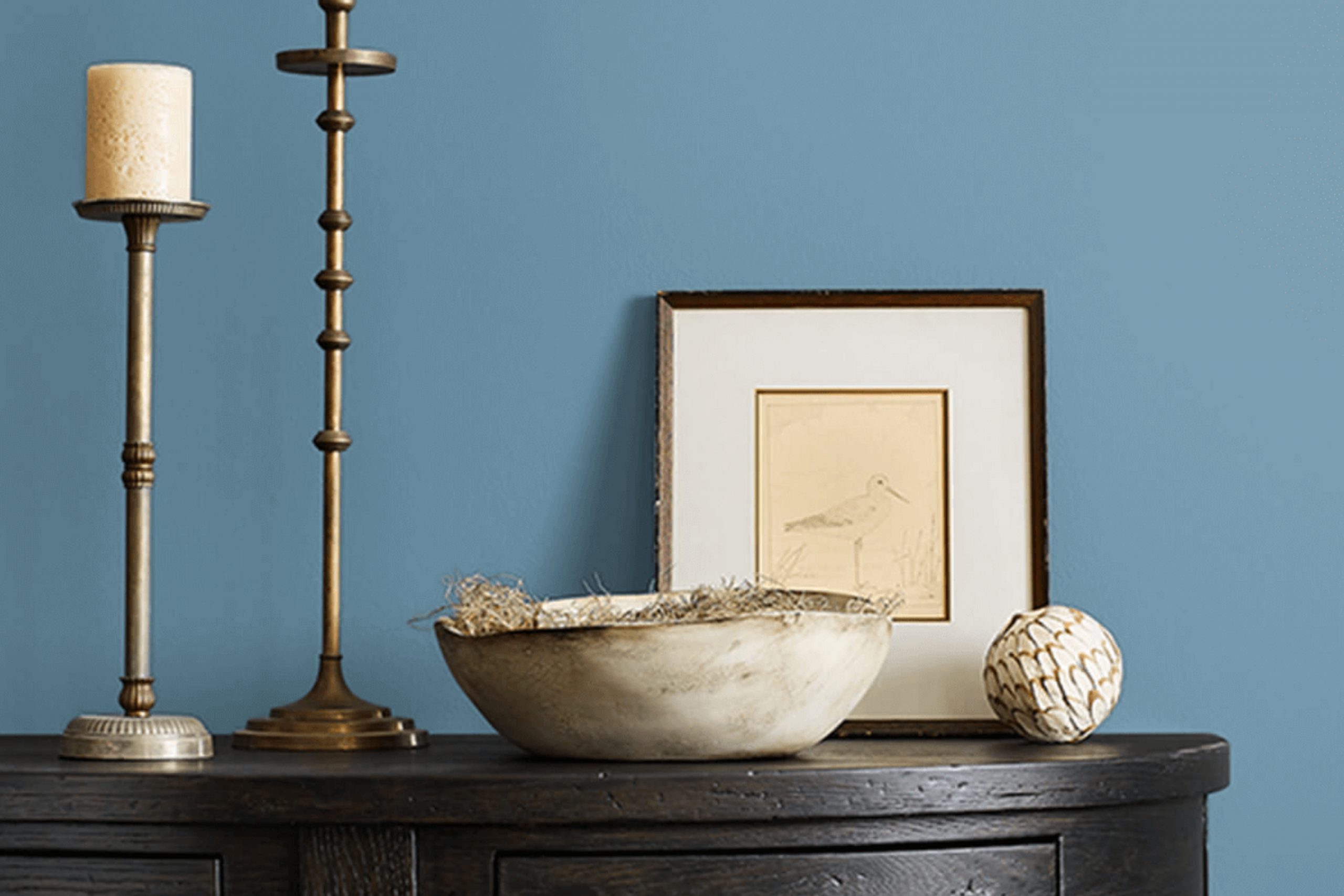
There’s something truly special about finding a color that feels just right. When I consider SW 6515 Leisure Blue by Sherwin Williams, I am reminded of calm ocean waves and peaceful skies. This shade of blue carries a soothing quality that seems to wrap me in a gentle, comforting embrace. It doesn’t shout for attention but rather whispers peace with its soft, muted tone. Perfect for areas where relaxation is key, this color invites warmth and comfort into a room.
Leisure Blue isn’t overly bold or overpowering. Instead, it offers a subtle presence that enhances any room without stealing the show. Its versatility is truly impressive; whether in a bedroom, living room, or kitchen, it seamlessly blends with various styles and elements. Pair it with whites or soft grays for a classic look, or with wood tones to add a touch of nature indoors.
As I think about where to use this color, I can picture a cozy reading nook or a serene bedroom retreat. It’s a color that allows you to unwind, making your home feel like a peaceful haven.
Leisure Blue has a calming effect that helps take the stress out of everyday life, creating an environment that feels refreshing and restoring.
What Color Is Leisure Blue SW 6515 by Sherwin Williams?
Leisure Blue by Sherwin Williams is a soft, calming shade that evokes the peacefulness of a clear sky or the gentle waves of the ocean. With its balanced blend of blue-green undertones, this color adds a refreshing and light feel to any room. It’s perfect for creating a relaxing atmosphere in places like bedrooms, bathrooms, or even living rooms.
When it comes to interior styles, Leisure Blue fits well with coastal and cottage-inspired themes, where its breezy feel enhances the coastal vibe. It’s also a great match for modern and minimalist areas, where its unobtrusive hue complements clean lines and simple decor.
Pairing Leisure Blue with natural materials brings out its best qualities. Light wood tones, such as oak or pine, enhance its warmth, while crisp white trims create a fresh contrast. You can also pair it with soft fabrics like cotton or linen for a cozy touch. Textures such as woven baskets or jute rugs add a natural element that works harmoniously with this blue.
Additionally, if you’re looking to add a bit of drama, consider combining Leisure Blue with dark metals like iron or brass for contrast. Whether used as a main wall color or a subtle accent, this shade is adaptable and brings a sense of calm to any room.
Is Leisure Blue SW 6515 by Sherwin Williams Warm or Cool color?
Leisure Blue SW 6515 by Sherwin Williams is a soft and calming blue shade that adds a peaceful feel to any home room. This color brings a touch of the sky into a room, creating a soothing atmosphere. It’s not an overpowering shade, but rather a gentle, relaxing color that works well in bedrooms, bathrooms, or living rooms where a calm ambiance is desired.
When used on walls, Leisure Blue provides a clean and fresh backdrop that can complement a variety of design styles, from modern to traditional. Its subtle hue pairs well with neutral colors like whites, grays, and beiges, adding just enough color without overpowering the room. Additionally, it can be used to highlight furniture and accessories, letting them stand out elegantly.
Because of its cool undertone, Leisure Blue can also help make areas feel larger and more open, adding to the comfort and coziness of a home.
Undertones of Leisure Blue SW 6515 by Sherwin Williams
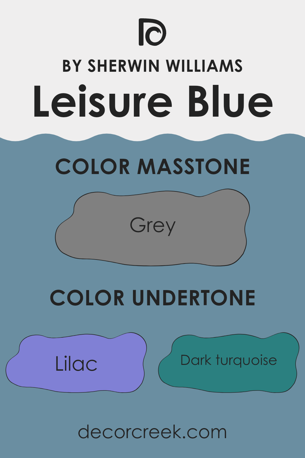
Leisure Blue by Sherwin Williams is a color with a complex mix of undertones that can change how it looks in different settings. This shade of blue has a base of blue and teal, with subtle hints of various colors that affect its overall appearance. The lilac and violet undertones bring a soft, gentle quality that can make the blue appear more muted or calm. Light turquoise and mint give it a refreshing and airy feel, while touches of purple add depth and richness.
The presence of undertones like dark turquoise, navy, and dark blue provides a more grounding and stable feeling to the color. Conversely, light colors such as pale pink, pale yellow, and light gray can make Leisure Blue feel more open and fresh, countering any heaviness from the darker undertones.
In a room, Leisure Blue can appear differently depending on lighting and surrounding colors. In bright light, it can look more vibrant due to the influence of turquoise and light purple. In dimmer settings, the darker undertones like navy and dark green might stand out more, giving it a subdued and cozy feel. These shifts make this color adaptable for various rooms, affecting mood and ambiance significantly.
What is the Masstone of the Leisure Blue SW 6515 by Sherwin Williams?
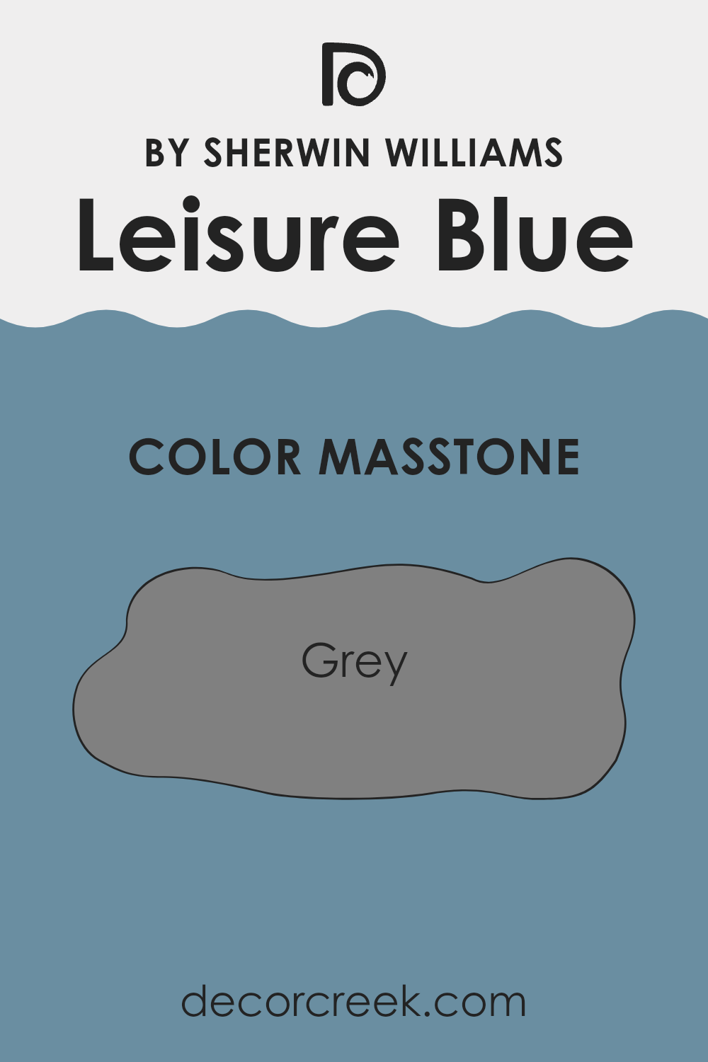
Leisure Blue SW 6515 by Sherwin Williams is a soothing color that carries a subtle grey undertone. This combination makes it an adaptable choice for interiors seeking a calm and understated atmosphere.
The grey masstone adds depth and balance, preventing the blue from appearing too bright or overpowering. In a home, this color works well in areas meant for relaxation, like bedrooms or living rooms. It pairs nicely with neutral tones and can complement both modern and traditional decor styles.
The grey hint in Leisure Blue allows it to blend seamlessly with other shades, making it a great backdrop for artwork or colorful accents. It creates a peaceful environment without losing its charm. Overall, the grey masstone in Leisure Blue ensures there is harmony in the room , making it a suitable choice for anyone wanting a subtle, calming color in their home.
How Does Lighting Affect Leisure Blue SW 6515 by Sherwin Williams?
Lighting significantly affects how we perceive colors, including the hue, saturation, and brightness. Sherwin Williams’ Leisure Blue (SW 6515) is no exception; it can look different under various lighting conditions.
In natural light, the color can appear more true to its intended shade. Leisure Blue is a soft blue with green undertones, and its look will change depending on the room’s orientation.
In north-facing rooms, the light is generally cooler and less direct. This can make colors appear slightly duller or muted. Leisure Blue may appear a bit grayer or cooler in these areas due to the lack of warm sunlight. However, this can enhance its calm and restful qualities, making it a soothing choice for a room with northern exposure.
South-facing rooms receive more direct sunlight, offering warmer and brighter natural light. Here, Leisure Blue will likely look most vibrant and alive. The sunlight will bring out its undertones, making it appear brighter and slightly warmer, which can create a more cheerful and inviting atmosphere.
East-facing rooms benefit from bright, warm light in the morning and cooler light in the afternoon. Leisure Blue may appear slightly warmer when the morning sun illuminates it, enhancing its green undertones. In the afternoon, when the light is cooler, the color can appear more subdued but still charming.
West-facing rooms receive soft, cool light in the morning and warm, golden light in the late afternoon and evening. Leisure Blue might seem cooler and grayer in the morning, but as the sun sets, it will gain warmth, creating a cozy ambiance.
In artificial light, whether warm or cool bulbs are used will impact how the color looks. Warm bulbs can enhance the blue’s subtle warmth, while cooler bulbs might bring out the green undertones more prominently. Adjusting the artificial light will help tailor the room’s mood to your preference.
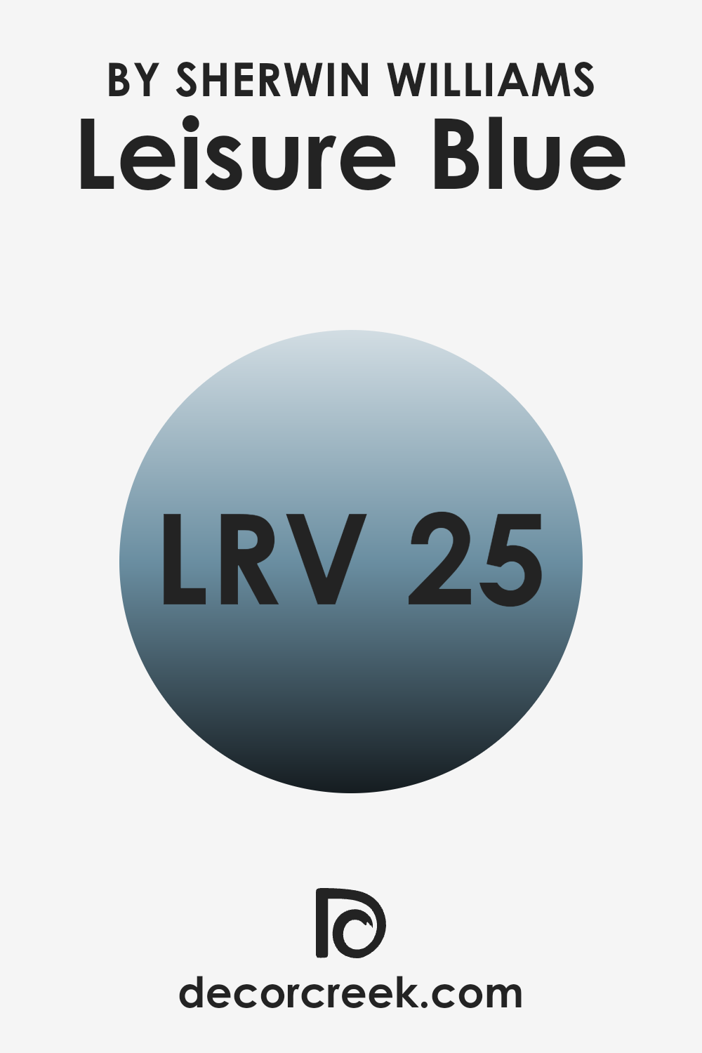
What is the LRV of Leisure Blue SW 6515 by Sherwin Williams?
LRV, or Light Reflectance Value, is an important measurement that tells us how much light a paint color will reflect. It’s measured on a scale from 0 to 100, where 0 means the color absorbs all light (like a true black), and 100 means it reflects all light (like a bright white). The LRV helps to predict how bright or dark a color will look once it is on a wall.
A color with a high LRV will make a room feel more open and spacious because it reflects more light, while a color with a low LRV will absorb more light, making a room feel cozier and more enclosed. With an LRV of 24.86, Leisure Blue is on the lower end of the LRV scale, meaning it will absorb more light than it reflects.
This makes it appear darker and richer on the walls. In a brightly lit room, Leisure Blue can give off a comfortable and intimate atmosphere as it softens the light that enters. In a darker room, however, it might make the room feel a bit smaller and more contained since it doesn’t reflect much light. It’s a color that works well in rooms where you want to create a cozy vibe, such as bedrooms or reading nooks.
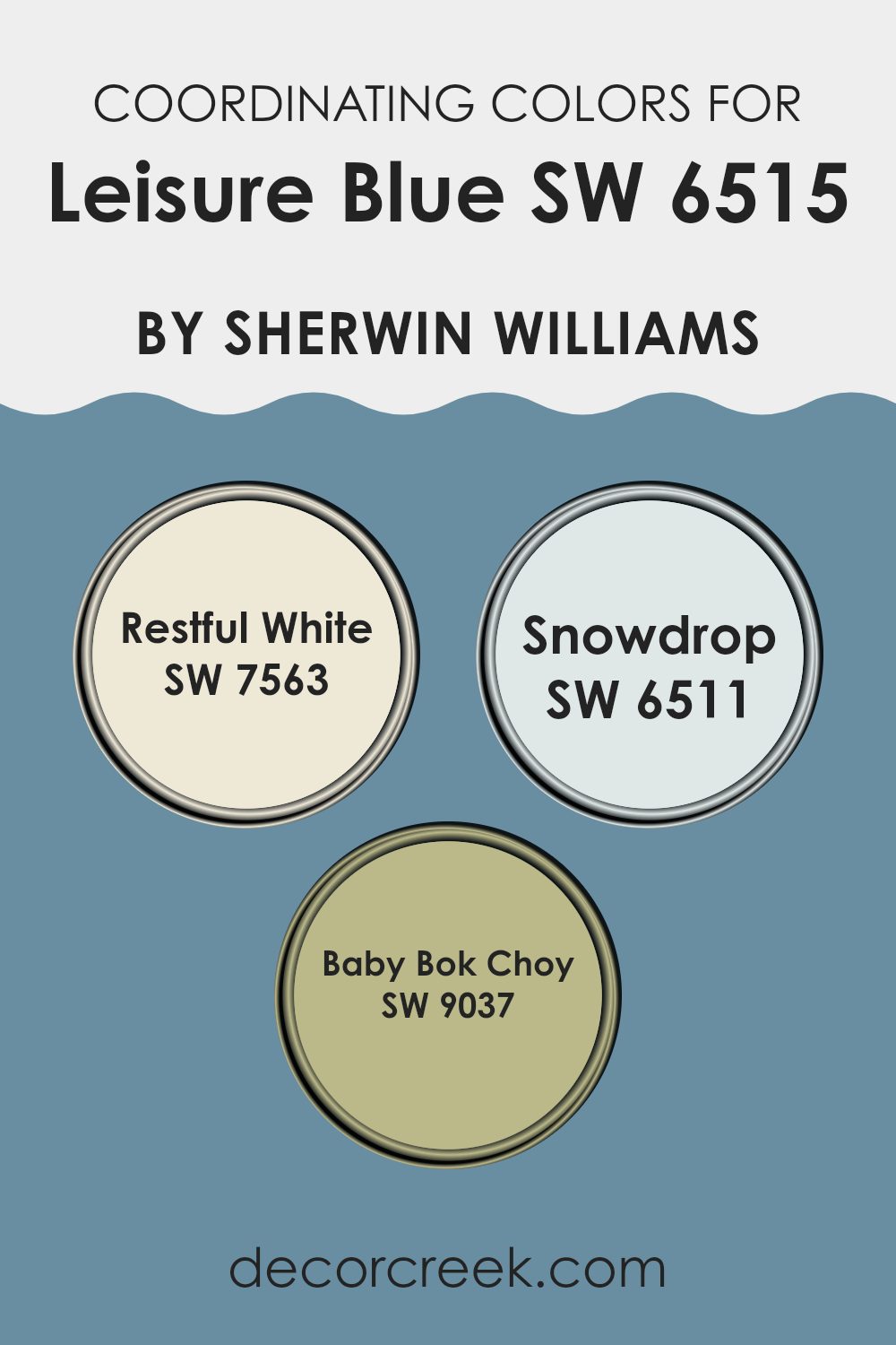
Coordinating Colors of Leisure Blue SW 6515 by Sherwin Williams
Coordinating colors are colors that complement each other and create a balanced look when used together in a room. They work by harmonizing with a main color, which helps to unify the overall design. When you have a color like Leisure Blue by Sherwin Williams, which is a calming and peaceful hue, you choose coordinating colors that enhance its beauty without overpowering it. The idea is to create harmony and cohesion. Choosing coordinating colors involves understanding how different colors interact with each other in terms of contrast, depth, and warmth or coolness.
Restful White is a subtle, warm white that offers a cozy background, which pairs well with the calmness of Leisure Blue. This shade provides a soft, welcoming feel that complements the blue’s calm nature.
Snowdrop is another great choice, offering a clean, crisp white with a hint of coolness. Its fresh tone perfectly balances and enhances Leisure Blue, creating a refreshing and uplifting atmosphere. Baby Bok Choy adds an interesting twist to the palette with its light green hue. This color brings in a touch of nature and organic energy, making the combination more dynamic and lively. Together, these colors create a visually appealing and harmonious look.
You can see recommended paint colors below:
- SW 7563 Restful White
- SW 6511 Snowdrop
- SW 9037 Baby Bok Choy
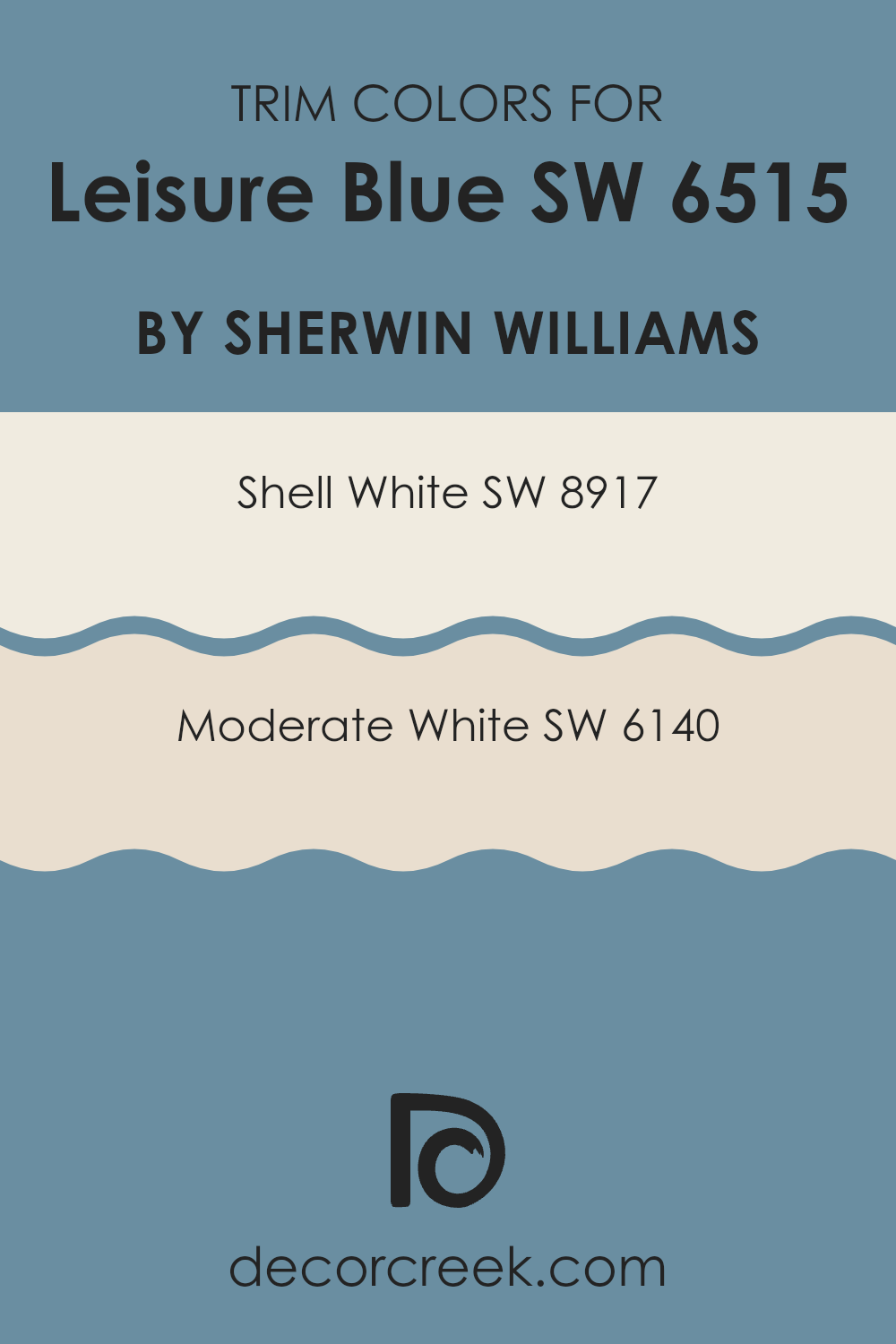
What are the Trim colors of Leisure Blue SW 6515 by Sherwin Williams?
Trim colors play an important role in home design by adding depth and contrast to a primary color scheme like Leisure Blue. They help define the edges of a room or a building, bringing out the main color and making areas feel complete. Using trim colors like Sherwin-Williams’ Shell White (SW 8917) or Moderate White (SW 6140) can make paint jobs look polished and well-balanced.
These colors highlight architectural details, such as moldings, window frames, and doors, providing a neat outline that complements the main blue tone. The right trim color can brighten up a room or even make it feel larger, enhancing the overall aesthetic.
Shell White, a soft cream shade, adds warmth and brightness to areas, ensuring the room feels inviting without overpowering the main color. Meanwhile, Moderate White is a warm and neutral beige that blends seamlessly with cooler tones like Leisure Blue, adding a subtle contrast to highlight details without dominating them.
These two shades give a room an elegant and harmonious look. By defining boundaries and enhancing features, these white tones help Leisure Blue stand out in a way that feels cozy and welcoming, showing how thoughtful trim color selection can change the mood of a room.
You can see recommended paint colors below:
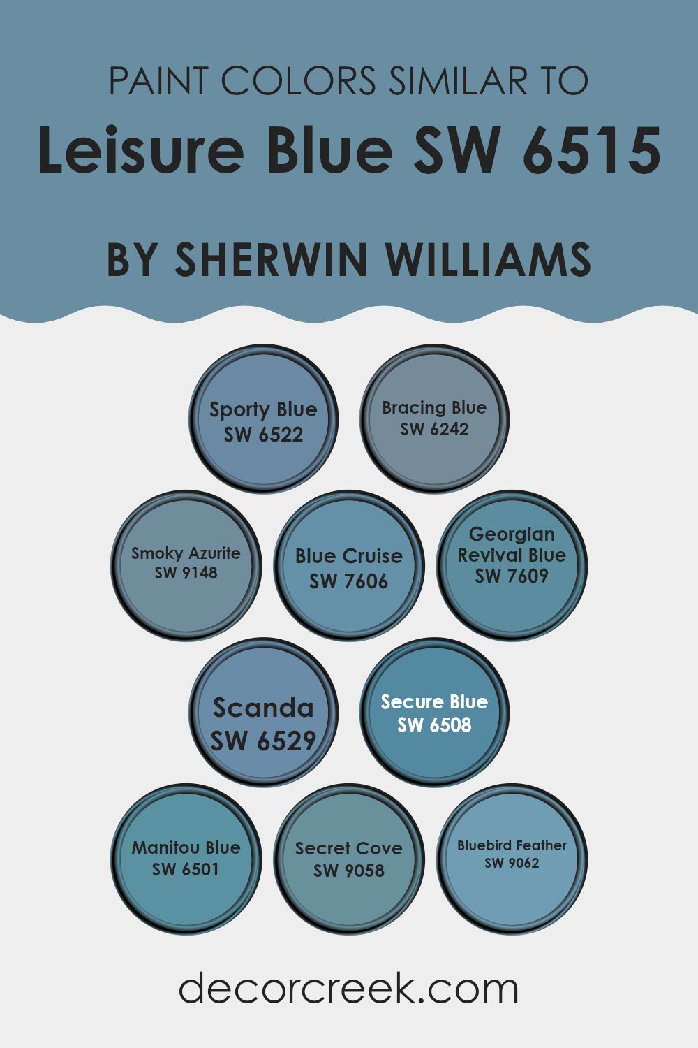
Colors Similar to Leisure Blue SW 6515 by Sherwin Williams
Similar colors are important in design because they create a sense of harmony and cohesion. When you incorporate colors that are close in hue, like those related to Leisure Blue, you ensure a smooth visual experience. These colors work well together as they share subtle tonal qualities, creating a peaceful flow from one to another. Whether used in home decor or art projects, similar shades bring balance and unity, softening the overall look without jarring contrasts, making the room comfortable and pleasing to the eye.
For instance, Sporty Blue is a lively hue that brings an energetic touch, while Bracing Blue offers a cooler, more refreshing feel. Smoky Azurite carries a hint of sophistication with its muted tones. Blue Cruise has a casual, relaxed vibe, ideal for informal settings.
Georgian Revival Blue is a nod to historical elegance, deep and rich in its intensity. Scanda offers a lighter, more airy appearance, much like a gentle sky. Secure Blue gives a sense of stability and depth. Manitou Blue carries a bold, vibrant character, perfect for making a statement. Secret Cove feels mysterious and immersive, while Bluebird Feather brings a gentle, cheerful brightness. These colors, though different, share essences that complement and enhance each other effortlessly.
You can see recommended paint colors below:
- SW 6522 Sporty Blue
- SW 6242 Bracing Blue
- SW 9148 Smoky Azurite
- SW 7606 Blue Cruise
- SW 7609 Georgian Revival Blue
- SW 6529 Scanda
- SW 6508 Secure Blue
- SW 6501 Manitou Blue
- SW 9058 Secret Cove
- SW 9062 Bluebird Feather
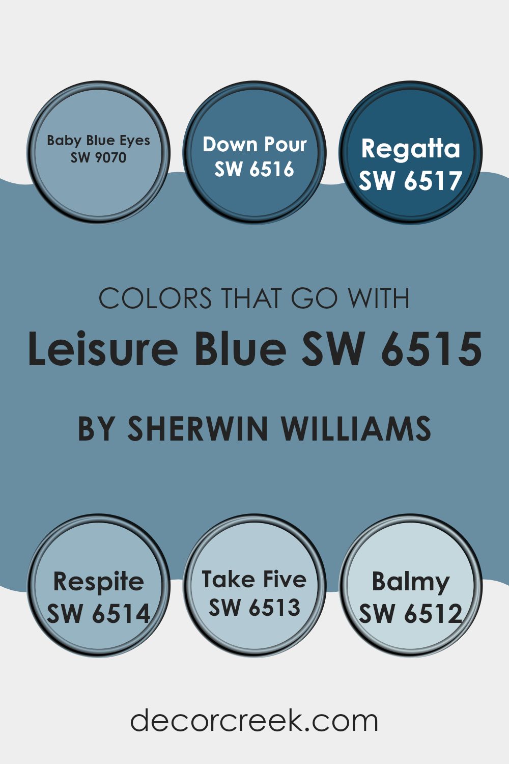
Colors that Go With Leisure Blue SW 6515 by Sherwin Williams
Choosing colors to pair with Leisure Blue SW 6515 by Sherwin Williams is key in creating a harmonious and visually appealing room. Leisure Blue is a light, calming shade, and when combined with other colors, it can set different moods in a room. Pairings like SW 9070 – Baby Blue Eyes complement its softness, adding a gentle and airy feel.
Baby Blue Eyes has a lightness that evokes a sense of subtle freshness. On the other hand, a bolder choice like SW 6516 – Down Pour introduces a striking, deep blue that can add depth and interest, creating a dynamic yet balanced room.
For those who appreciate a nautical or coastal theme, SW 6517 – Regatta is ideal. Its vibrant, darker blue suggests a sense of adventure and liveliness. If you want a sense of retreat, SW 6514 – Respite offers a slightly muted blue with a touch of gray—perfect for a calm setting. For something more playful, SW 6513 – Take Five, with its mid-tone blue, adds a fun and comfortable vibe.
Finally, SW 6512 – Balmy, a soft and warm blue, brings a cozy, welcoming feel. With these colors, you can craft environments that are either relaxing, exciting, or somewhere in between.
You can see recommended paint colors below:
- SW 9070 Baby Blue Eyes
- SW 6516 Down Pour
- SW 6517 Regatta
- SW 6514 Respite
- SW 6513 Take Five
- SW 6512 Balmy
How to Use Leisure Blue SW 6515 by Sherwin Williams In Your Home?
Leisure Blue SW 6515 by Sherwin Williams is a calming and adaptable color that can be used in many areas of the home. It is a soft, muted blue with a hint of green, making it a perfect choice for creating a peaceful atmosphere.
In a bedroom, Leisure Blue can be used on the walls to create a soothing environment that promotes relaxation and restful sleep. Pair it with white and gray accents for a classic look. In a living room, Leisure Blue can be used as an accent wall, providing a gentle pop of color without overpowering the room.
This shade works well with natural wood tones and can be complemented by navy or beige furnishings. In a bathroom, Leisure Blue can make the room feel fresh and clean. Whether used on walls, cabinetry, or as part of a tile design, this color adds a light, airy feel to your home.
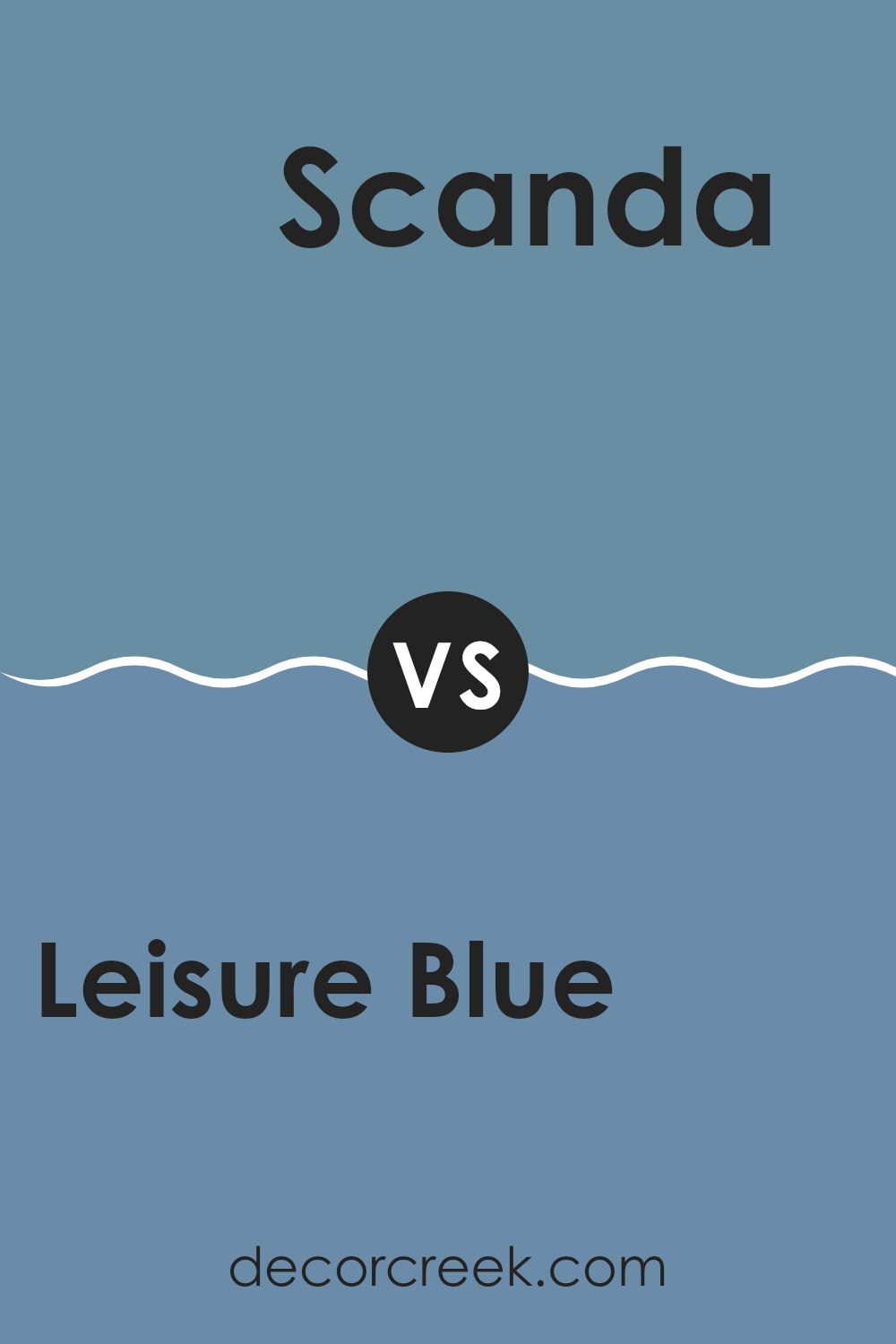
Leisure Blue SW 6515 by Sherwin Williams vs Scanda SW 6529 by Sherwin Williams
Leisure Blue SW 6515 and Scanda SW 6529 by Sherwin Williams are two distinct shades of blue that offer different vibes. Leisure Blue is a medium-toned blue with a slight gray undertone, making it feel softer and more subtle. It is a calm and adaptable color that can work well in various settings, from bedrooms to living rooms, providing a relaxed atmosphere.
On the other hand, Scanda is a lighter and brighter shade of blue with a hint of green. It feels fresher and more energetic than Leisure Blue. Scanda can bring a playful and airy feel to a room, making it great for areas where you want a hint of liveliness, like kitchens or bathrooms.
When choosing between these colors, consider the mood you want to create. Leisure Blue is perfect for a cozy and calm setting, while Scanda is ideal if you’re aiming for a more vibrant and refreshing look.
You can see recommended paint color below:
- SW 6529 Scanda
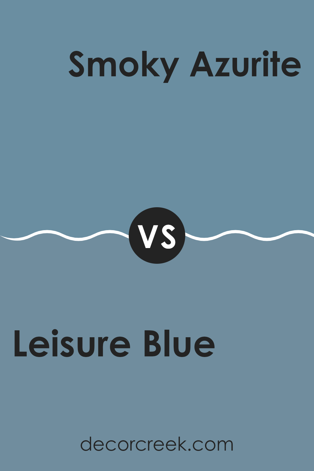
Leisure Blue SW 6515 by Sherwin Williams vs Smoky Azurite SW 9148 by Sherwin Williams
Leisure Blue SW 6515 by Sherwin Williams is a refreshing and calming shade of blue. It leans towards the cooler side, evoking a sense of relaxation and calmness. In contrast, Smoky Azurite SW 9148 by Sherwin Williams is a deeper, more muted blue. It has a hint of gray that gives it a more subdued and refined look.
Leisure Blue is perfect for creating bright and lively areas. It works well in rooms where you want to encourage a feeling of openness and energy, such as living rooms or bathrooms. On the other hand, Smoky Azurite brings a sense of depth and coziness, making it ideal for places like bedrooms or study areas where a more intimate and grounded atmosphere is desired.
Both colors complement various styles but choose one based on how vibrant or mellow you want your room to feel.
You can see recommended paint color below:
Leisure Blue SW 6515 by Sherwin Williams vs Secret Cove SW 9058 by Sherwin Williams
Leisure Blue SW 6515 is a soft, light blue that feels airy and gentle. It’s a calming shade that can create a peaceful atmosphere in a room, making it great for areas where you want to relax, like bedrooms or living rooms. On the other hand, Secret Cove SW 9058 is a deeper, richer blue.
This color has more intensity and can bring a sense of depth and coziness to a room. Secret Cove is well-suited for areas where you want a bit more drama and contrast, like a study or an accent wall.
While both colors belong to the blue family, Leisure Blue gives off a brighter, more open vibe, whereas Secret Cove offers a warmer, more intimate feel. They both have unique qualities that can complement different interior design goals, making them adaptable choices for various projects.
You can see recommended paint color below:
- SW 9058 Secret Cove
Leisure Blue SW 6515 by Sherwin Williams vs Secure Blue SW 6508 by Sherwin Williams
Leisure Blue SW 6515 and Secure Blue SW 6508 by Sherwin Williams are both beautiful shades of blue, but they offer different vibes. Leisure Blue is a softer, more muted blue that feels calm and light.
It works well in areas where you want a gentle and airy atmosphere. Secure Blue, on the other hand, is a deeper and richer shade. It has a more pronounced presence, making it great for adding a touch of elegance and depth to a room.
While Leisure Blue is perfect for creating a relaxed and open feel, Secure Blue can make a room feel more cozy and intimate. Both colors can work well in different settings, depending on whether you want a soft, calming environment or a more dynamic, strong presence. They can also be paired together nicely, with Leisure Blue as a base and Secure Blue as an accent.
You can see recommended paint color below:
Leisure Blue SW 6515 by Sherwin Williams vs Bluebird Feather SW 9062 by Sherwin Williams
Leisure Blue SW 6515 and Bluebird Feather SW 9062 are both shades of blue by Sherwin Williams, but they have distinct characteristics. Leisure Blue is a soft, calming hue with a medium tone. It has a balanced mix of warmth and coolness, making it adaptable for various rooms, from living rooms to bedrooms.
This color offers a relaxed feel and pairs well with neutrals and whites. On the other hand, Bluebird Feather is lighter and has a more delicate, airy presence. It leans towards a pastel shade, ideal for creating a fresh and light atmosphere.
This color is perfect for smaller areas or areas where you want to maximize natural light. It complements lighter grays and soft whites beautifully. While both colors share a blue base, Leisure Blue has a more grounded, cozy feel, whereas Bluebird Feather provides a brighter, more uplifting vibe.
You can see recommended paint color below:
- SW 9062 Bluebird Feather
Leisure Blue SW 6515 by Sherwin Williams vs Blue Cruise SW 7606 by Sherwin Williams
Leisure Blue SW 6515 and Blue Cruise SW 7606 by Sherwin Williams are both shades of blue, but they have distinct characteristics that set them apart. Leisure Blue is a softer, more muted blue that can evoke a gentle, calming atmosphere.
It’s perfect for areas where you want a peaceful feel, like a bedroom or a reading nook. On the other hand, Blue Cruise is a slightly darker and more vibrant shade. It has a bit more energy, making it suitable for areas where you want a bit of a livelier vibe, like a family room or an accent wall in a home office.
The brightness of Blue Cruise can make a statement, while Leisure Blue offers a more understated, calming presence. Both can be used to add different blue tones to your home, depending on the mood and function of the room.
You can see recommended paint color below:
Leisure Blue SW 6515 by Sherwin Williams vs Georgian Revival Blue SW 7609 by Sherwin Williams
Leisure Blue and Georgian Revival Blue by Sherwin Williams are two distinct shades of blue that have their own unique appeal. Leisure Blue SW 6515 is a softer, more muted blue that exudes a sense of calm and relaxation. It’s ideal for areas where you want to create a soothing atmosphere, such as bedrooms or bathrooms. Its lighter hue makes it adaptable and easy to pair with both light and dark accents.
On the other hand, Georgian Revival Blue SW 7609 is a richer, deeper blue with a classic and enduring feel. This shade works well in more formal settings, like dining rooms or libraries, where a touch of traditional elegance is desired. It pairs nicely with warm woods and earth tones, adding depth to a room.
While both colors are beautiful, Leisure Blue offers a gentle and airy feel, whereas Georgian Revival Blue provides a more vibrant and formal look. Each can be used to create different moods and styles in a room.
You can see recommended paint color below:
Leisure Blue SW 6515 by Sherwin Williams vs Manitou Blue SW 6501 by Sherwin Williams
Leisure Blue SW 6515 and Manitou Blue SW 6501 are two lovely shades by Sherwin Williams, each offering a unique feel. Leisure Blue is a soft, calming color that sits somewhere between blue and gray.
It feels soothing and gentle, making it a great choice for areas where you want a peaceful atmosphere. Manitou Blue, on the other hand, is more vibrant and cheerful. It has a brighter and clearer blue hue, bringing energy and a refreshing vibe to a room.
When used together, Leisure Blue provides a subtle backdrop, while Manitou Blue can be the lively accent that adds a pop of color. Leisure Blue is perfect for creating a cozy, relaxing nook or bedroom, whereas Manitou Blue can brighten up common areas like kitchens or living rooms. Both colors work well with whites and neutrals, but Manitou Blue can also pair nicely with natural wood tones for a modern look.
You can see recommended paint color below:
Leisure Blue SW 6515 by Sherwin Williams vs Bracing Blue SW 6242 by Sherwin Williams
Leisure Blue SW 6515 and Bracing Blue SW 6242, both by Sherwin Williams, offer unique takes on the color blue. Leisure Blue is a soft, muted shade that creates a calm and restful atmosphere. It’s perfect for bedrooms or living rooms where you want to relax. This color tends to have a hint of gray, making it adaptable and easy to pair with neutral or warm tones.
In contrast, Bracing Blue is a darker, more intense shade. It brings a bold, dramatic touch to any room. This deeper blue works well in offices or dining rooms where you want a stronger visual impact. While it can also invoke feelings of calm, Bracing Blue’s intensity can add sophistication and confidence to a room.
When choosing between the two, consider the mood you want to set. Leisure Blue is soothing and subtle, while Bracing Blue is striking and powerful. Both colors offer classic appeal, but their effect is quite different.
You can see recommended paint color below:
Leisure Blue SW 6515 by Sherwin Williams vs Sporty Blue SW 6522 by Sherwin Williams
Leisure Blue SW 6515 and Sporty Blue SW 6522 by Sherwin Williams are two distinct shades of blue, each bringing its own feel. Leisure Blue is softer and more muted, offering a calm and relaxed vibe.
This makes it ideal for areas where a soothing atmosphere is desired, like bedrooms or living rooms. On the other hand, Sporty Blue is brighter and more vibrant. It has a playful and energetic tone, making it a great choice for lively areas such as playrooms or creative studios.
While both colors share a blue base, their different intensities affect how they influence the room’s mood. Leisure Blue is perfect for creating a comforting environment, while Sporty Blue is better suited for areas where energy and dynamism are needed. When choosing between these two, consider the purpose of the room and how you want it to make you feel.
You can see recommended paint color below:
- SW 6522 Sporty Blue
After reading about SW 6515 Leisure Blue by Sherwin Williams, I feel like I’ve learned a lot about what makes this color special. It’s a shade of blue, but not just any blue—it’s one that reminds me of the sky on a clear day or the sea when it’s calm. It’s a relaxing color that can make a room feel peaceful and happy at the same time.
Leisure Blue can be used in many places in a house. It works well in bedrooms, where you want to relax and have sweet dreams. It’s also a great color for bathrooms, making them feel fresh and clean, like a morning swim. Even living rooms can look great with this color, bringing calmness into places where we spend time with family or friends.
After reading everything about Leisure Blue, I believe it’s a wonderful choice for someone who wants their home to feel comforting and welcoming. It’s a color that can be used in many ways, without being too hard to understand or too bright to see. So, if you’re thinking about changing the colors in a room or painting something new, SW 6515 Leisure Blue might just be the perfect choice for you.
It’s like bringing a little bit of the outside peacefulness inside to enjoy every day!
Ever wished paint sampling was as easy as sticking a sticker? Guess what? Now it is! Discover Samplize's unique Peel & Stick samples.
Get paint samples

