Color is an essential aspect of our daily lives. It influences our emotions, guides our aesthetic choices, and forms the backbone of our personal and communal identities. Understanding the nuances of color, such as Sherwin-Williams’ SW 6501 Manitou Blue, helps us make informed decisions about décor, fashion, and even branding.
In this article, we will dive deep into the beauty and versatility of Manitou Blue, exploring its undertones, coordinating colors, the influence of lighting, and much more.

What Color Is SW 6501 Manitou Blue?
SW 6501 Manitou Blue is a beautiful mid-tone blue shade reminiscent of a tranquil lake under a clear sky. It’s a color that inspires peace and tranquility, providing a calming effect to any environment it’s used in. The richness of this blue color holds a certain depth and complexity, allowing it to make a statement while remaining sophisticated and inviting.
This shade of blue manages to balance being vibrant and soothing simultaneously. It adds a pop of color without being overwhelming and has the ability to transform a room into a serene sanctuary. Manitou Blue stands out while also being subtle enough to work harmoniously with a variety of other colors, making it an excellent choice for various uses.

Ever wished paint sampling was as easy as sticking a sticker? Guess what? Now it is! Discover Samplize's unique Peel & Stick samples.
Get paint samples

Is It a Warm Or Cool Color?
As a hue hailing from the blue family, SW 6501 Manitou Blue is considered a cool color. Cool colors are known for their calming, soothing effect and are often associated with elements of nature, such as the sky and the ocean.
Undertones of SW 6501 Manitou Blue
Identifying undertones can be a tricky aspect of color theory, but it’s a crucial step in understanding how a color will interact with other hues. SW 6501 Manitou Blue has the following undertones:
- Green: The subtle green undertone in Manitou Blue gives it a fresh and natural feel. This helps to ground the color, making it less intense while adding a hint of earthiness.
- Grey: Manitou Blue also contains a grey undertone. This reduces the saturation of the blue, creating a more muted and sophisticated shade that’s versatile and easy to incorporate into various color schemes.
- Violet: Lastly, a slight violet undertone adds depth and interest to Manitou Blue. It contributes to the coolness of the color and enhances its soothing qualities.
Understanding undertones is crucial because they can affect how a color appears in different lighting and when paired with other colors.
The right combination can create a harmonious palette, while a mismatch can create a jarring visual effect.

Coordinating Colors of SW 6501 Manitou Blue
Coordinating colors are hues that work well together, creating a balanced and visually pleasing color scheme. When used with Manitou Blue, the following coordinating colors create a harmonious palette:
- SW 6497 Blue Horizon : A lighter blue shade that adds brightness and contrast while maintaining a soothing palette.
- SW 9180 Aged White : A warm off-white hue that complements the cool tones of Manitou Blue and adds a touch of sophistication and elegance.
- SW 7533 Khaki Shade : A warm, earthy hue that contrasts beautifully with Manitou Blue, grounding the palette and adding depth.
Additional coordinating colors that would pair beautifully with Manitou Blue include:
- SW 6204 Sea Salt : A soft, greenish-blue that enhances the tranquil vibe of Manitou Blue.
- SW 7636 Origami White : A versatile off-white with a hint of warmth to balance the coolness of Manitou Blue.
- SW 7701 Cavern Clay : A southwestern terra-cotta color that provides a striking contrast to Manitou Blue while maintaining an earthy, natural palette.
Coordinating colors are essential for creating a cohesive and pleasing visual experience. They can highlight, complement, or contrast with the main color to add interest and depth to the overall design.

How Does Lighting Affect SW 6501 Manitou Blue?
Lighting has a significant impact on how we perceive color. In the case of Manitou Blue, natural daylight can accentuate its green undertones, making the color appear slightly more teal. In artificial light, such as incandescent lighting, the color may shift towards a cooler, greyer blue due to the yellow tint of the light.
Furthermore, the intensity of the light also plays a role. Bright lighting can make Manitou Blue seem lighter and more vibrant, while in dim lighting, it might appear darker and more muted. Therefore, when using this color, it’s crucial to consider the lighting conditions in the space to ensure the desired effect is achieved.

LRV of SW 6501 Manitou Blue
The Light Reflectance Value (LRV) of color measures how much light it reflects. On a scale of 0 (absolute black) to 100 (pure white), SW 6501 Manitou Blue has an LRV of 25. This places it in the medium-dark range of the scale.
A color with an LRV of 25 is considered a deeper hue but not so dark as to be overwhelming. It will add depth and interest to a space without making it feel small or cramped. This makes Manitou Blue versatile and well-suited for both large and small spaces.
The LRV also indicates that Manitou Blue can create a significant contrast when paired with lighter colors, such as white or light gray. This can be used to great effect in highlighting architectural details or creating a striking color scheme.

LRV – what does it mean? Read This Before Finding Your Perfect Paint Color
Trim Colors of SW 6501 Manitou Blue
Trim colors are used to accentuate and frame the main wall color. When paired with Manitou Blue, the following shades of white from Sherwin-Williams create a beautiful contrast:
- SW 7006 Extra White : A pure, brilliant white that will create a striking contrast against the depth of Manitou Blue.
- SW 7008 Alabaster : A slightly off-white shade that will provide a softer contrast, maintaining a soothing palette.
- SW 7011 Natural Choice : A warm white that adds elegance and a touch of warmth to the cool tones of Manitou Blue.
Trim colors are vital as they help define and emphasize architectural details, such as moldings, doors, and windows. They also provide a visual break, preventing a color scheme from becoming overwhelming.

Colors Similar to SW 6501 Manitou Blue
Knowing similar colors to Manitou Blue can be beneficial when you’re looking to create a specific mood but want to explore different shades. Similar colors might share the same undertones, color family, or intensity, allowing for subtle variations in the color scheme. For SW Manitou Blue, these could include:
- Behr Harbor
- PPG Aqua Blue
- Valspar My Skiff
Each color can be used as SW Manitou Blue’s substitute, thanks to the very similar appearance all of them share!

Colors That Go With SW 6501 Manitou Blue
Creating a cohesive color scheme involves more than just selecting a primary color; it’s also crucial to choose accompanying colors that harmonize with it. Here are six colors that go well with Manitou Blue:
- SW 7011 Natural Choice
- SW 7533 Khaki Shade
- SW 7015 Repose Gray
- SW 7641 Colonnade Gray
- SW 6106 Kilim Beige
- SW 6039 Poised Taupe
Choosing colors that work well together ensures that the room feels balanced and harmonious, with each color complementing and enhancing the others rather than clashing or competing.

How to Use SW 6501 Manitou Blue In Your Home?
Manitou Blue is a versatile color that can be used in various rooms and interior design styles. It’s particularly well-suited to coastal, Scandinavian, and modern farmhouse styles, thanks to its soothing and earthy undertones. Check out how it may work in different rooms.
How to Use SW 6501 Manitou Blue in the Bedroom?
The bedroom is a space of relaxation and rest, and the calming influence of Manitou Blue is perfectly suited to this environment. Painting the walls in this soothing blue can help promote a serene atmosphere, ideal for unwinding after a long day. Pair it with soft whites and warm woods for a harmonious color scheme.
Alternatively, use Manitou Blue on a feature wall behind the bed to create a focal point in the room. Balance it with neutral tones on the other walls and in your soft furnishings to prevent the color from becoming overwhelming. The versatility of this shade allows it to adapt well to different light levels throughout the day, maintaining its soothing presence from dawn to dusk.

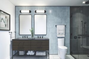
How to Use SW 6501 Manitou Blue in the Bathroom?
In the bathroom, Manitou Blue can inject a fresh and invigorating vibe reminiscent of clear skies and tranquil waters. Consider painting the walls in this hue to create a refreshing ambiance, and pair it with white or light grey tiles to create a clean, airy feel.
Manitou Blue can also be used effectively on bathroom cabinets or vanity units, creating a striking contrast with white sanitaryware. Pair this with metallic accents in brushed nickel or chrome for a modern, stylish aesthetic that feels connected to the color of the water.

How to Use SW 6501 Manitou Blue in the Living Room?
Manitou Blue can bring a sense of calm to the often busy and communal space of the living room. Applying it to the walls can create a peaceful backdrop for daily activities. To balance its cool undertones, pair it with warm, natural materials such as a wood coffee table or leather armchair.
For a more subtle incorporation of Manitou Blue, consider painting a feature wall or alcoves in your living room. This introduces the calming hue without it becoming dominant. Combine it with light neutrals or warm earth tones for a balanced and inviting color scheme.

How to Use SW 6501 Manitou Blue for an Exterior?
Manitou Blue is a stunning choice for exteriors, lending a home a tranquil yet sophisticated curb appeal. Apply it on the siding for a striking look, which can be balanced with white or off-white trims and a warm-hued front door.
Alternatively, consider using Manitou Blue as an accent color on the exterior. Painting shutters or the front door in this hue can create an attractive contrast with lighter siding colors. This provides a splash of color that is both charming and calming, enhancing the overall appeal of your home.

How to Use SW 6501 Manitou Blue in the Kitchen?
Manitou Blue is an excellent choice for the kitchen, where it can create a fresh, inviting atmosphere. Consider painting the walls with this color to introduce a calming vibe into the heart of the home. Balance it with white cabinets and light countertops for a crisp, clean look.
Another option is to use Manitou Blue as an accent color in the kitchen. It could be applied on an island, for example, where it can create a striking focal point. This vibrant splash of color against a backdrop of lighter tones can give your kitchen a unique and stylish appearance.

How to Use SW 6501 Manitou Blue for Kitchen Cabinets?
Manitou Blue can make a stunning statement when used on kitchen cabinets. This creates an eye-catching feature that adds depth and interest to the kitchen. To ensure the color doesn’t become overwhelming, pair it with light walls and countertops.
If you’re not ready to commit to painting all of your cabinets Manitou Blue, consider using it on lower cabinets or on a freestanding piece of furniture. This allows you to incorporate this tranquil color into the kitchen, bringing in-depth interest without overwhelming the space.

Comparing SW 6501 Manitou Blue With Other Colors
Comparing different colors is vital to creating a balanced and harmonious color scheme. By understanding how one color interacts with and contrasts against another, you can make informed decisions about which colors to use in your design.
This is especially important when dealing with complex colors like SW Manitou Blue, which have distinctive undertones that can be highlighted or downplayed depending on the colors they’re paired with. Just check out how it may look and work compared with other colors!
SW 6501 Manitou Blue vs. SW 7064 Passive
Compared to SW 7064 Passive , a gray color with cool undertones, Manitou Blue appears more vibrant and lively. While Passive brings a subdued and modern touch, Manitou Blue brings a certain earthiness owing to its green and violet undertones. Both colors share a cool temperature, making them pair well together. However, the vivacity of Manitou Blue creates a striking contrast against the more reserved Passive.

SW 6501 Manitou Blue vs. SW 7015 Repose Gray
SW 7015 Repose Gray is a versatile light gray with neutral undertones. When compared to Manitou Blue, it’s much lighter and subtler, lacking the depth and complexity of Manitou Blue. While Repose Gray is a fantastic choice for a neutral backdrop, Manitou Blue can bring more character and mood to a space.

SW 6501 Manitou Blue vs. SW 6106 Kilim Beige
SW 6106 Kilim Beige is a warm neutral with an earthy undertone. In contrast, Manitou Blue is cooler with its blue-green character. The warm and cool contrast between Kilim Beige and Manitou Blue can create an interesting dynamic in a color scheme, with Kilim Beige’s warmth tempering the coolness of Manitou Blue, creating a balanced and harmonious palette.

SW 6501 Manitou Blue vs. SW 6524 Commodore
Compared to SW 6524 Commodore , a deep, traditional blue, Manitou Blue has a softer, more muted quality. Commodore’s bold intensity makes it a show-stopping choice, while Manitou Blue’s understated elegance lends itself to a more tranquil, soothing environment. Despite their differences, both colors carry the calmness associated with blues but deliver it in distinct ways.

SW 6501 Manitou Blue vs. SW 7006 Extra White
SW 7006 Extra White is a pure , bright white. When compared to Manitou Blue, it offers a stark contrast, making the depth and richness of Manitou Blue stand out even more. The combination of Extra White and Manitou Blue can create a crisp and refreshing color scheme, where the white enhances the vibrancy of Manitou Blue.

SW 6501 Manitou Blue vs. SW 6486 Reflecting Pool
SW 6486 Reflecting Pool is a light, vibrant teal with a playful spirit. When compared with Manitou Blue, it comes across as lighter and more whimsical, while Manitou Blue seems deeper and more grounded. The two could pair well in a scheme where Reflecting Pool adds a touch of levity to the more serious Manitou Blue.

Conclusion
SW 6501 Manitou Blue is a wonderfully versatile color with depth and complexity that allows it to shine in various applications. Its cool, tranquil vibe makes it a perfect choice for creating peaceful, relaxing spaces. Yet, it’s also vibrant enough to add a pop of color to any room.
Its undertones, coordinating colors, and similar shades all contribute to its adaptability. Whether used in a bedroom, living room, or exterior setting, Manitou Blue promises to enhance any space with its soothing yet lively presence.

Ever wished paint sampling was as easy as sticking a sticker? Guess what? Now it is! Discover Samplize's unique Peel & Stick samples.
Get paint samples
Frequently Asked Questions
⭐What is the LRV of SW 6501 Manitou Blue, and why is it important?
The Light Reflectance Value (LRV) of Manitou Blue is 25. LRV measures the percentage of light a paint color reflects, which can impact how light or dark the color appears. A low LRV like Manitou Blue's indicates a deeper, richer color that absorbs more light.
⭐What are the best-coordinating colors for SW 6501 Manitou Blue?
Manitou Blue pairs well with a range of colors, including SW 6497 Blue Horizon, SW 9180 Aged White, and SW 7533 Khaki Shade. These coordinating colors can help enhance Manitou Blue's unique qualities and create a balanced color scheme.
⭐Is SW 6501 Manitou Blue a warm or cool color?
Manitou Blue is a cool color. It has undertones of green and violet, which give it a cooler temperature compared to other blues. This makes it a calming and soothing color, perfect for creating tranquil spaces.
⭐Can SW 6501 Manitou Blue be used in any room?
Yes, Manitou Blue is a versatile color that can be used in any room, from bedrooms and bathrooms to kitchens and living rooms. Its calming qualities make it particularly well-suited to spaces where relaxation and serenity are desired.
⭐What trim colors work well with SW 6501 Manitou Blue?
When it comes to trim colors, shades of white from the same brand typically work well with Manitou Blue. This includes colors like SW 7006 Extra White, SW 7004 Snowbound, and SW 7008 Alabaster. These lighter shades provide a beautiful contrast to the depth of Manitou Blue.