The world of colors can be a labyrinth of subtle nuances, undertones, and complex emotions that a certain shade can invoke. But, when chosen wisely, colors can transform a simple room into a delightful oasis of comfort and style. One such enchanting hue is Sherwin-Williams’ SW 7608 Adrift.
This color, with its calming and sophisticated aura, brings to mind the serene vastness of the sea, making it an excellent choice for those looking to infuse their living spaces with tranquility and poise.
This article dives deep into the dynamics of this color, exploring its undertones, coordinating colors, light reflectance value, and how it interacts with various interior design elements.

What Color Is SW 7608 Adrift?
SW 7608 Adrift is a medium to dark tone that treads the delicate line between blue and gray. It’s the embodiment of the calm before the storm, capturing the mood of the sky when it’s filled with hefty clouds, creating an atmosphere that’s both soothing and majestic.
It’s the color that makes you think of a quiet sea voyage, where the boundary between the water and the sky blurs, producing a stunning spectacle of nature’s artistry.
More than just a paint color, SW 7608 Adrift is a mood, an emotion. It carries with it a sense of tranquility and peace, akin to watching the waves gently ebb and flow. But it also possesses a touch of mystery, mimicking the deep, unexplored parts of the ocean.
It’s this intriguing balance between calm and enigmatic that gives Adrift its unique appeal and makes it a favorite among homeowners and interior designers.

Ever wished paint sampling was as easy as sticking a sticker? Guess what? Now it is! Discover Samplize's unique Peel & Stick samples.
Get paint samples

Is It a Warm Or Cool Color?
SW 7608 Adrift falls into the category of cool colors. This coolness emanates from its underlying blue and gray tones, reminiscent of the sea and sky. It’s these cool tones that give Adrift its calming, serene vibe, making it an excellent choice for spaces where relaxation and tranquility are desired.
Undertones of SW 7608 Adrift
Undertones are the secondary colors that subtly influence the main hue. They can significantly affect how we perceive the color, often becoming more visible under different lighting conditions or when placed next to other colors.
This understanding of undertones is crucial when planning a color scheme, as it helps ensure that the colors harmonize well with each other, creating a cohesive and aesthetically pleasing design.
SW Adrift has the following undertones:
- Blue: The blue undertone in Adrift is evident in natural light. It contributes to the color’s overall calming and soothing effect.
- Gray: Gray is the undertone that gives Adrift its subtle neutrality, providing a sense of balance and sophistication.
- Green: A soft hint of green adds a touch of freshness and vitality to Adrift, preventing it from becoming overly somber.

Coordinating Colors of SW 7608 Adrift
Coordinating colors are the hues that work well with the main color, either by complementing or contrasting with it. They are critical in creating a balanced and cohesive look, and their careful selection can enhance the aesthetic appeal of a space by highlighting the main color’s unique characteristics. For SW Adrift, consider the following coordinating colors:
- SW 7006 Extra White : This crisp white provides a striking contrast against Adrift, making the latter pop while maintaining an overall balanced and refreshing look.
- SW 7693 Stonebriar : Stonebriar’s earthy tan hue complements Adrift’s cool tones, adding warmth and grounding the color scheme.
- SW 9113 Mudslide : A deeper, earthier tone, Mudslide offers a robust contrast to Adrift, enhancing the depth and richness of the color palette.
Additional coordinating colors:
- SW 7064 Passive : A light gray with blue undertones, Passive harmonizes beautifully with Adrift, creating a soothing, monochromatic color scheme.
- SW 7047 Porpoise : This warm gray shares Adrift’s sea-inspired vibe, providing a slightly warmer but equally tranquil counterpart.
- SW 9140 Blustery Sky : A darker, more intense shade of blue-gray, Blustery Sky amplifies Adrift’s coastal feel while adding depth and drama to the color scheme.

How Does Lighting Affect SW 7608 Adrift?
Lighting plays a significant role in how we perceive SW 7608 Adrift. In abundant natural light, the color may appear slightly lighter, with its blue undertones becoming more evident. However, under artificial light, Adrift may lean more towards gray, and the intensity of the color might seem to deepen.
It’s always advisable to observe a paint swatch at different times of the day and under various lighting conditions to understand how the color might transform.

LRV of SW 7608 Adrift
The Light Reflectance Value (LRV) of color indicates how much light it reflects. SW 7608 Adrift has an LRV of 37, which puts it in the medium-dark range. A color with an LRV of 37 will absorb more light than it reflects, making it a somewhat darker hue. This means that while Adrift will add a sense of depth and richness to a space, it might also make smaller rooms feel somewhat confined if not balanced with lighter tones or adequate lighting.
However, in larger spaces or rooms with ample natural light, Adrift can contribute to a feeling of comfort and coziness, adding an element of sophistication and elegance.

LRV – what does it mean? Read This Before Finding Your Perfect Paint Color
Trim Colors of SW 7608 Adrift
Choosing the right trim color is vital in highlighting architectural details and providing a clean, finished look to a room. For SW 7608 Adrift, here are some ideal options:
- SW 7006 Extra White : For a sharp, crisp contrast, Extra White is an excellent choice. It enhances Adrift’s cool undertones and brings a modern, fresh feel to the space.
- SW 7008 Alabaster : A slightly warmer white, Alabaster softens the contrast with Adrift, giving the space a cozy and inviting vibe.
- SW 7012 Creamy : Creamy offers a smooth, creamy contrast that mellows out Adrift’s cool tones, lending the room a serene and comfortable atmosphere.
Trim colors essentially frame your wall colors and can significantly affect the room’s overall aesthetic. The right trim color can enhance the main wall color, add depth and dimension, and create a cohesive and harmonious look.

Colors Similar to SW 7608 Adrift
Knowing similar colors is important because it provides options and flexibility in your design process. Some colors similar to SW 7608 Adrift include:
- Behr Atmosphere
- BM Colonial Blue
- PPG Dresden Dream
- Valspar Lucy Blue
Each of these colors shares the cool, oceanic vibe of SW Adrift but offers slight variations in tone and intensity, providing more choices to find the perfect match for your design vision.

Colors That Go With SW 7608 Adrift
The colors that work well with Adrift are those that either complement its cool undertones or provide a warm contrast to balance it out. For a harmonious palette, consider the following options:
- SW 6263 Exclusive Plum
- SW 7069 Iron Ore
- SW 2840 Hammered Silver
- SW 0002 Chelsea Mauve
- SW 6770 Bubble
- SW 6675 Afternoon
- SW 7014 Eider White
They can help to enhance SW Adrift’s calming vibe, add depth and complexity to the color scheme, or provide a pop of warmth to keep the space from feeling too cool. Using colors that look good together is crucial in creating a cohesive and harmonious look, ultimately contributing to a pleasing and comfortable living space.

How to Use SW 7608 Adrift In Your Home?
SW 7608 Adrift’s soothing and sophisticated vibe makes it a versatile choice for various rooms and interior design styles. It can bring a calming influence to a home office, provide a relaxing backdrop for a bedroom, or add depth and elegance to a living room.
Its ocean-inspired vibe aligns well with coastal and nautical themes, but it can also fit beautifully into contemporary, minimalist, or even rustic design schemes. Check out how it may work in different rooms.
How to Use SW 7608 Adrift in the Bedroom?
In the bedroom, Adrift can create a peaceful sanctuary where you can unwind after a long day. Its tranquil blue-gray tones invoke feelings of calmness and relaxation, contributing to a restful night’s sleep. Pair it with crisp white linens for a fresh, airy feel, or choose bedding in warm earth tones to create a cozy, inviting atmosphere. Metallic accents in silver or gold can add a touch of sophistication and elegance.

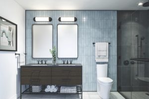
How to Use SW 7608 Adrift in the Bathroom?
In the bathroom, Adrift can evoke the refreshing feel of a luxurious spa. Its cool undertones can create a serene and soothing ambiance, perfect for a relaxing bath at the end of the day. Pair it with white fixtures for a clean, modern look, or go for natural wood accents to add warmth and organic appeal.

How to Use SW 7608 Adrift in the Living Room?
The living room can benefit from the depth and complexity of Adrift. It provides a sophisticated backdrop for various color palettes, from neutrals and earth tones to more vibrant hues. Combine it with warm, rich colors like terracotta or mustard for a dynamic and visually interesting space, or keep things calm and cohesive with a monochromatic scheme of blues and grays.

How to Use SW 7608 Adrift for an Exterior?
As an exterior color, Adrift can bring a sense of elegance and timelessness. It’s particularly effective for coastal homes, where it harmonizes beautifully with the surrounding sea and sky, but it can also provide a touch of sophistication to a suburban home. Pair it with white trim for a crisp, classic look, or choose a contrasting color like warm brown or rich burgundy for a more striking effect.

How to Use SW 7608 Adrift for the Kitchen?
In the kitchen, Adrift can add depth and interest without being overwhelming. It’s a great choice for creating a calm, relaxing ambiance where you can enjoy cooking and dining. Pair it with white cabinets for a fresh, modern vibe, or choose wood tones for a more traditional feel.

How to Use SW 7608 Adrift for the Kitchen Cabinets?
For kitchen cabinets, Adrift can be a unique and stylish choice. It offers a soothing alternative to the common whites and woods, while its depth adds character and visual interest. To maintain a light and airy feel, pair Adrift cabinets with a lighter wall color like SW 7006 Extra White or SW 7064 Passive. For a bold, contemporary look, try it with a contrasting color like SW 9113 Mudslide or SW 7693 Stonebriar.

Comparing SW 7608 Adrift With Other Colors
Comparing interior paint colors is a crucial step in the process of decorating or renovating a home for several reasons:
- Understanding undertones and color harmony
- Creating the desired mood
- Visualizing the final look
- Enhancing lighting and perception
In essence, comparing interior paint colors can be seen as a form of planning that ensures the final design aligns with your vision, enhancing the aesthetics, mood, and overall functionality of the space. Below, we compare SW Adrift to show you how this works.
SW 7608 Adrift vs SW 7006 Extra White
When comparing SW 7608 Adrift to SW 7006 Extra White , there is a clear contrast. Extra White, as its name suggests, is a pure, bright white. It’s a versatile color that can work with nearly any hue but stands out particularly well when paired with a medium-dark color like Adrift. The contrast between the two colors can bring out the richness and depth of Adrift, highlighting its cool, calming undertones.
Using Extra White as a trim color against an Adrift wall can create a crisp, fresh feel in the room. Alternatively, using it on the walls with Adrift as a feature color or on the furniture can create an airy, spacious feel. The bright white also helps balance the somewhat darker vibe of Adrift, preventing it from overpowering the room.

SW 7608 Adrift vs SW 7693 Stonebriar
When SW 7608 Adrift is compared to SW 7693 Stonebriar , a warm, earthy tan, an interesting dynamic is created. Stonebriar’s warmth beautifully balances the coolness of Adrift, resulting in a well-rounded and harmonious color scheme. The two colors share a similar intensity level, which adds to the overall cohesiveness.
In a room, using Stonebriar as an accent color or on the furniture against an Adrift wall can bring a cozy, inviting feel. This combination works especially well in a living room or a bedroom, where the goal is to create a comforting and relaxing environment. The warm tan also adds a touch of natural charm to Adrift’s somewhat sophisticated and modern vibe.

SW 7608 Adrift vs SW 9113 Mudslide
SW 9113 Mudslide is a robust brown with gray undertones. When paired with SW 7608 Adrift, it enhances the sophistication of the blue-gray hue and adds a touch of earthiness. The depth of Mudslide beautifully complements the complexity of Adrift, creating a rich, layered look.
In a space where both colors are used, Mudslide can serve as a strong accent color, providing a stark contrast to Adrift’s cooler tones. Alternatively, using it on the walls with Adrift furniture or accents can create a rich, welcoming environment. The combination of Adrift and Mudslide is ideal for creating a space that feels grounded yet stylish and modern.

SW 7608 Adrift vs SW 6244 Naval
When compared to Naval, a deep, rich navy color , Adrift stands out with its cool and calming blue-gray tone. The darker depth of Naval can provide an excellent contrast to Adrift, highlighting its tranquility. Naval also has a certain sophistication that, when paired with Adrift, creates an elegantly harmonious color scheme. This pair would work particularly well in a room where you want to imbue a sense of calm and elegance, such as a study or a bedroom.

SW 7608 Adrift vs SW 6258 Tricorn Black
Tricorn Black is a deep, saturated black that creates a striking contrast with the calm, cool tones of Adrift. The intensity of Tricorn Black can serve to underscore the subtle sophistication and depth of Adrift, making the latter stand out even more. This pairing can create a dramatic and contemporary look, particularly suitable for modern interior design schemes where bold contrast is desired.

SW 7608 Adrift vs SW 6204 Sea Salt
Sea Salt is a crisp, light greenish-blue that can highlight the cooler undertones in Adrift, creating a refreshing and calming palette. The airy, beachy vibe of Sea Salt complements Adrift’s serene nature, producing a coastal feel that’s perfect for bathrooms, bedrooms, or any space where you want to evoke a sense of tranquility.
This combination could also work well in spaces with lots of natural light, enhancing the freshness of Sea Salt and the cool tranquility of Adrift.

Conclusion
SW 7608 Adrift is a captivating color with an undeniable charm. Its unique blend of blue and gray undertones brings a sense of calm and tranquility, while its depth and complexity lend a touch of sophistication and elegance.
Whether used as a main wall color or as an accent, Adrift has the potential to transform a space, creating an atmosphere that’s both soothing and stylish. It’s a testament to the power of color and its ability to change not just the look of a room but also the feel of it. With careful planning and thoughtful pairing, Adrift can help create a home that truly reflects your unique style and personality.

Ever wished paint sampling was as easy as sticking a sticker? Guess what? Now it is! Discover Samplize's unique Peel & Stick samples.
Get paint samples
Frequently Asked Questions
⭐What color undertones does SW 7608 Adrift have?
Adrift is a serene blue-gray color with cool undertones. It carries subtle hints of both blue and gray, which creates a tranquil, calming ambiance.
⭐What is the Light Reflectance Value (LRV) of SW 7608 Adrift?
The Light Reflectance Value of Adrift is 37. This means it's a medium-dark color that can absorb more light and create a sense of depth in a room.
⭐What colors coordinate well with SW 7608 Adrift?
Adrift pairs well with a variety of colors. It beautifully coordinates with SW 7006 Extra White, SW 7693 Stonebriar, and SW 9113 Mudslide. Other colors like SW 6219 Rain, SW 6258 Tricorn Black, and SW 6252 Ice Cube can also complement Adrift nicely.
⭐In which rooms does SW 7608 Adrift work best?
Adrift's calming, cool undertones make it a versatile color for any room. It's particularly suitable for bedrooms, bathrooms, and living rooms, where a serene, calming ambiance is desired. It can also work well in kitchens, especially on kitchen cabinets.
⭐What trim colors work well with SW 7608 Adrift?
For trim colors, consider using lighter shades, especially whites, to create a striking contrast. Some good options from the same brand include SW 7006 Extra White, SW 7008 Alabaster, and SW 7012 Creamy.