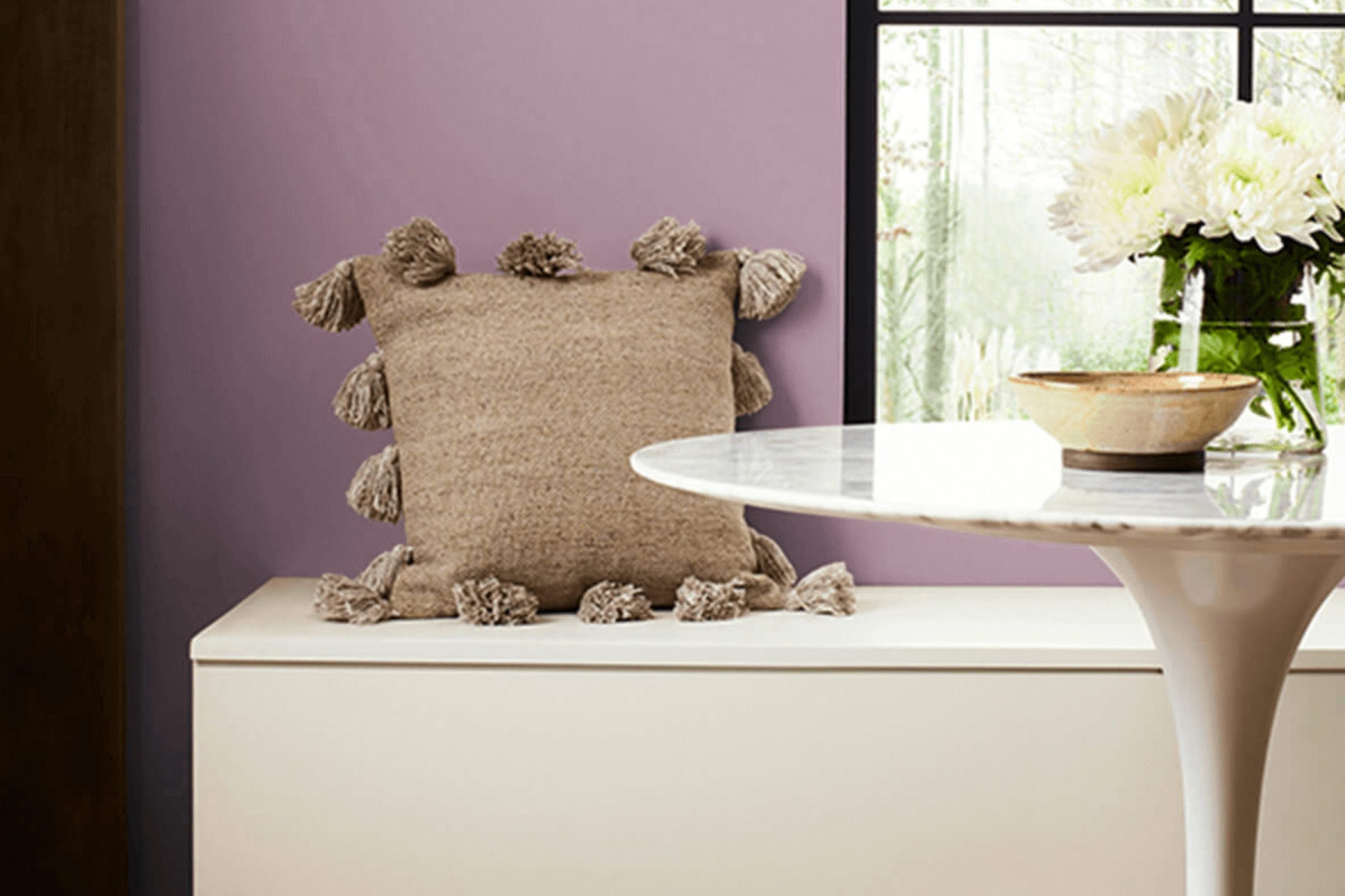
I recently had the pleasure of working with SW 6283 Thistle, a unique paint color by Sherwin Williams that has completely changed the way I look at room makeovers. Thistle isn’t just another purple; it has a subtle elegance that balances beautifully between a calm lavender and a muted violet. This shade responds well in different lighting conditions, sometimes appearing more reflective and light, and at other times showing a deeper, more enigmatic hue.
In my experience, Thistle offers an interesting dynamic to rooms. It’s not just a backdrop but an active element in home decor, complementing both contemporary and traditional styles. Its flexibility extends from bedrooms to living areas, providing a soft yet profound presence. Whether you’re looking to refresh a single room or rework your entire home, Thistle brings a fresh perspective without feeling too intense.
The color pairs well with neutral shades, rich woods, and even metallic finishes, giving you plenty of decorating options. It’s perfect for someone looking to introduce color into their room while maintaining a sense of peace and maturity.
As I continue to use Thistle in various projects, I find its understated charm increasingly appealing, making each room uniquely inviting.
What Color Is Thistle SW 6283 by Sherwin Williams?
Thistle by Sherwin Williams is a gentle purple hue that offers a subtle blend of gray undertones, making it a flexible choice for various interior styles. With its soft and calming appearance, this color is perfect for creating a cozy and welcoming atmosphere in any room. It’s especially effective in bedrooms and living rooms, where a touch of soothing color can support relaxation.
The muted tone of Thistle works beautifully in modern and minimalist interiors, as it provides a hint of color without feeling too intense. It also pairs well with traditional decor, lending a fresh, contemporary feel to classic designs. In terms of materials, Thistle goes perfectly with natural wood, which complements its earthy base. Textures such as linen, wool, and cotton also look fantastic with this color, adding depth and interest to the decor.
For those looking to add a touch of elegance, Thistle coordinates wonderfully with metallic accents like brass or copper, offering a subtle contrast that draws the eye. It’s equally attractive when used with stone elements, such as marble or granite, creating a balanced and harmonious look. Whether used as a main wall color or as an accent, Thistle provides a soft backdrop that enhances the aesthetic appeal of your room without dominating it.
Is Thistle SW 6283 by Sherwin Williams Warm or Cool color?
ThistleSW 6283 by Sherwin Williams is a unique color that brings a subtle yet distinctive vibe to any room. This shade is akin to a soft, muted purple that can create a cozy and inviting atmosphere. Due to its light and airy feel, it works perfectly in small rooms, helping to make them appear larger and more open. It’s also flexible enough to complement various decor styles, from modern to rustic.
When used in a bedroom, Thistle adds a touch of gentle warmth, making the room relaxing and comfortable. In living areas, this color pairs well with neutral furniture, allowing for pops of color through accessories like cushions or artwork. Because it isn’t overly bold, Thistle is easy on the eyes and can be used as a main wall color or as an accent to add a bit of personality without feeling too intense.
In summary, ThistleSW 6283 by Sherwin Williams is an excellent choice for those looking for a color that offers both beauty and flexibility in their home decor.
Undertones of Thistle SW 6283 by Sherwin Williams
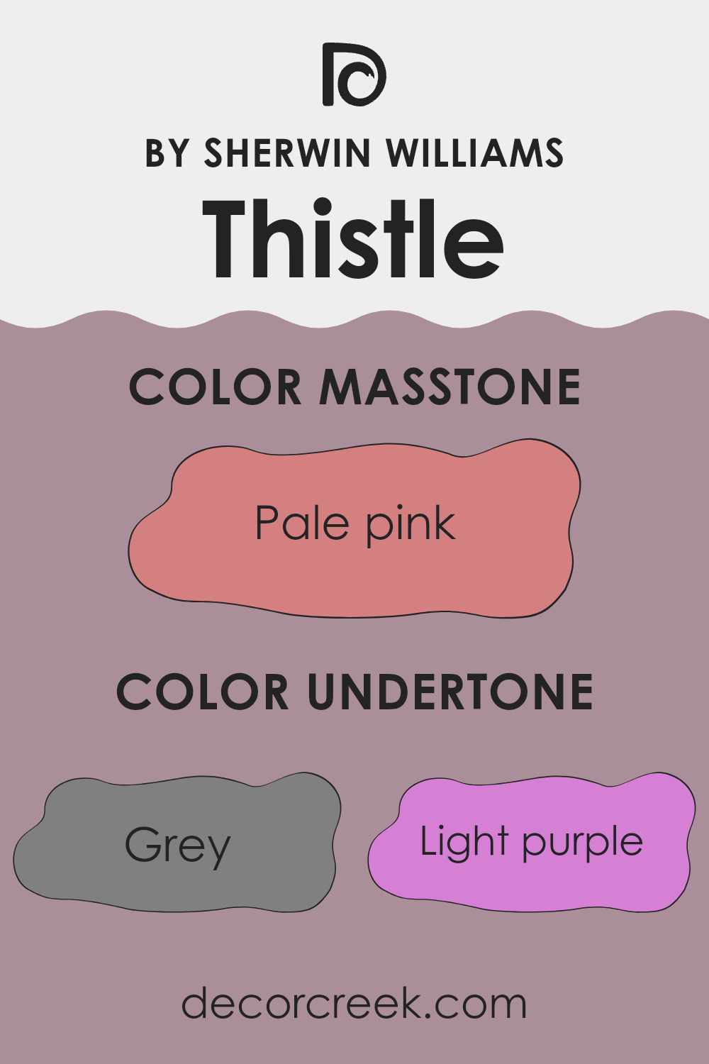
The color Thistle, a subtle shade of purple, contains a variety of undertones that influence how it appears in different settings. By definition, an undertone is a color that subtly emerges from underneath the surface color, affecting the overall hue. The undertones of Thistle include shades of grey, light purple, lilac, and more vibrant touches like pale yellow, mint, and light blue. Each undertone plays a crucial role in how the color is perceived.
When used on interior walls, Thistle’s array of undertones, such as grey and light gray, can cool down bright light, helping to create a calming environment. The lighter purple and lilac undertones bring out a gentle and soothing feel. Meanwhile, the presence of faint yellow and green influences can mildly energize the room without feeling too intense.
The blend of Thistle’s undertones can affect the mood and style of a room. For example, in rooms with lots of natural light, the yellow and violet undertones might become more noticeable, giving the walls a lively yet soft character. In rooms with less natural light, the cooler grey and light blue might stand out, setting a more subdued and relaxing tone.
In summary, understanding the complexity of Thistle’s undertones can help in deciding how and where to use this color in home decor. The way these undertones interact can greatly alter the ambiance of a room, making it important to consider the lighting and other colors in the room.
What is the Masstone of the Thistle SW 6283 by Sherwin Williams?
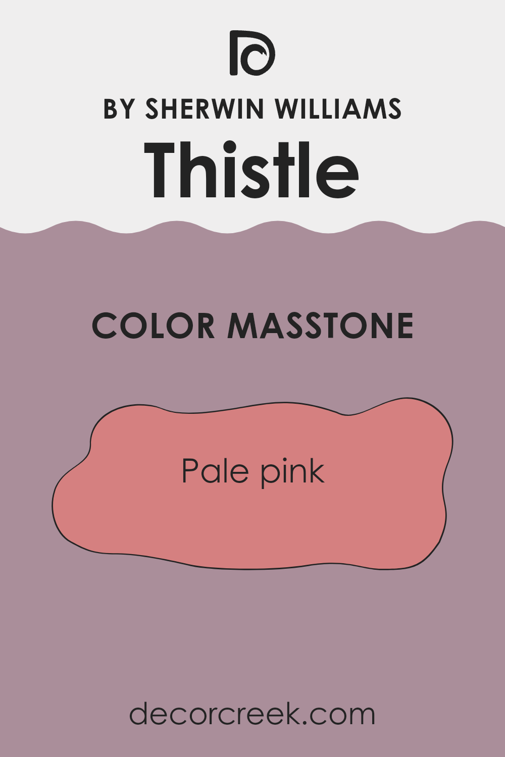
ThistleSW 6283 by Sherwin Williams is a unique shade resembling pale pink. With its subtle, warm tones, it brings a light and airy feel to any room. This color is particularly effective in creating a nurturing atmosphere, ideal for rooms like bedrooms or living areas where comfort is key.
The gentle nature of ThistleSW 6283 allows it to blend seamlessly with different decor styles, from modern to traditional, without overpowering other elements in the room. It pairs well with soft whites or gray accents, enhancing the overall coziness of the area.
In smaller rooms, this pale pink can help reflect light, making the area appear larger and more open. Overall, ThistleSW 6283 works beautifully in homes by offering a soft backdrop that is soothing and easy on the eyes.
How Does Lighting Affect Thistle SW 6283 by Sherwin Williams?
Lighting plays a crucial role in how we perceive colors in different environments. The same paint can look different under various lighting conditions due to the light’s color temperature and intensity.
The color Thistle is a subtle and gentle purple-grey hue that can change based on the lighting it’s exposed to. In artificial light, such as LED or incandescent bulbs, Thistle may appear slightly warmer or take on a cozier grey tone depending on the type of bulb used. LED lights, which can range from warm yellow to cool blue, directly influence how this color is perceived. Under warm indoor lighting, Thistle might look more muted and softer, enhancing its grey qualities, while in cooler light, the purple tones might become more pronounced.
In natural light, Thistle responds dynamically as the light changes throughout the day. In rooms that face north, which receive less direct sunlight and generally have cooler, more muted natural light, Thistle can appear more greyish and subdued. The cooler tones of the north light enhance the grey components of the color.
In south-facing rooms, the abundant and warmer sunlight throughout the day will make Thistle look lighter and bring out more of its subtle purple undertones, giving the room a fresher feel. The ample light makes the color appear vibrant and lively.
East-facing rooms receive the morning light, which is generally cooler and brighter early in the day. Here, Thistle might start the day appearing more distinctly purple and transition to a softer tone as the day progresses and the light dims.
For west-facing rooms, the situation is somewhat the reverse of east-facing rooms. Thistle will be influenced by the intense and warm light of the afternoon sun, making the color appear warmer and more vivid during sunset. Later, as natural light fades, the color could look more subdued and closer to its gray base.
Overall, Thistle’s perception is significantly affected by the lighting, giving the color a flexible character that can adapt to different rooms and atmospheres based on its exposure to light.
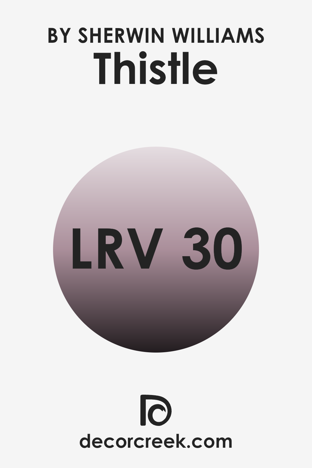
What is the LRV of Thistle SW 6283 by Sherwin Williams?
LRV stands for Light Reflectance Value, which is a measure used to describe the amount of visible and usable light that reflects from or absorbs into a surface. Simply put, it indicates how light or dark a paint color will look once applied to a wall.
Higher LRVs mean the color reflects more light, appearing lighter, and making rooms feel more open and airy. Conversely, lower LRVs mean the color absorbs more light, appearing darker, which can make a room feel cozier but smaller. LRV is especially useful when choosing paint colors, as it helps predict how a color will change under different lighting conditions throughout the day.
For ThistleSW 6283, with an LRV of 30.179, the color falls into the darker category of the scale. In practical terms, this means it won’t reflect a lot of light but will absorb more, giving it a denser appearance on the walls.
This property can be used to create a more intimate and enveloping feel in a room, perfect for areas where you might want a more concentrated atmosphere like dining rooms or bedrooms. However, it’s important to consider lighting in these rooms because the lower LRV could make the room appear even darker if not properly lit. Additionally, this deeper color could highlight imperfections in the wall surface more than a lighter shade would.
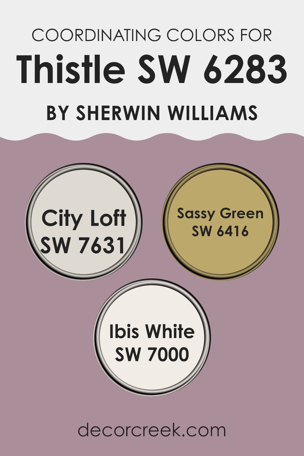
Coordinating Colors of Thistle SW 6283 by Sherwin Williams
Coordinating colors are chosen to complement a main color, helping to create a balanced and harmonious look in any room. For instance, Thistle, a unique color, can be paired with several other shades that enhance its beauty and allow for a creative yet cohesive color scheme. For example, City Loft, Sassy Green, and Ibis White each offer distinct hues that coordinate well with Thistle, providing options to design a visually appealing and coordinated interior.
City Loft is a light, soft gray that offers a subtle contrast to the more vibrant tones of Thistle, providing a neutral background that allows other colors to stand out. This shade is perfect for larger areas or furniture, giving a clean and calm appearance to the room.
Sassy Green, on the other hand, is a lively and bold green that adds a touch of nature-inspired freshness, ideal for accent walls or decor items to inject energy into the room. Finally, Ibis White is a bright and crisp white that serves as an excellent choice for trim, ceilings, or even as a main wall color to refresh the room and make it feel more open and airy. Together, these colors create a dynamic and attractive palette when coordinated with Thistle.
You can see recommended paint colors below:
- SW 7631 City Loft
- SW 6416 Sassy Green
- SW 7000 Ibis White
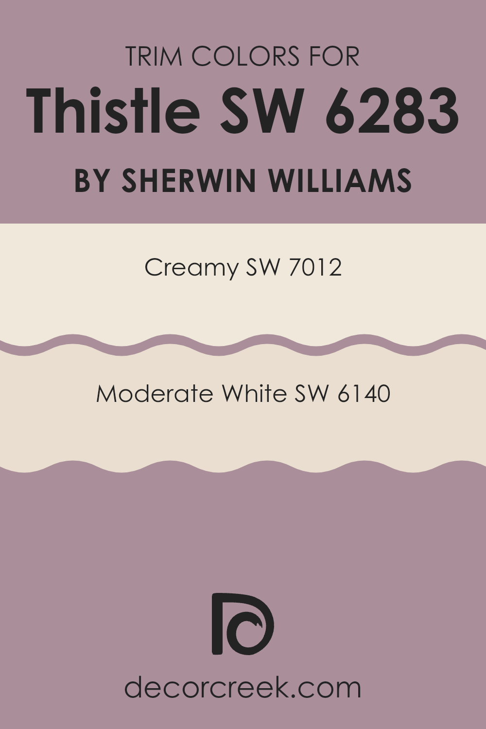
What are the Trim colors of Thistle SW 6283 by Sherwin Williams?
Trim colors are used on the architectural details of a room such as baseboards, moldings, doors, and window frames to enhance the overall aesthetics and define the room. These colors, especially when thoughtfully selected, can really highlight the unique features of a room, providing a subtle contrast that helps to accentuate the main wall color. For instance, when considering a distinctive shade like Thistle, choosing the right trim color is crucial to ensure that the walls stand out beautifully without feeling too heavy.
Creamy (SW 7012) is a soft, warm white with a touch of yellow undertones, providing a gentle contrast that’s neither too stark nor too subtle when paired with darker or vibrant wall colors. Moderate White (SW 6140) leans toward a neutral, pale taupe, offering a slightly stronger yet still understated juxtaposition against deeper tones.
Both these shades are excellent choices for trims when using a characterful wall color like Thistle, as they offer just the right balance, helping to frame the room in a pleasant yet noticeable way.
You can see recommended paint colors below:
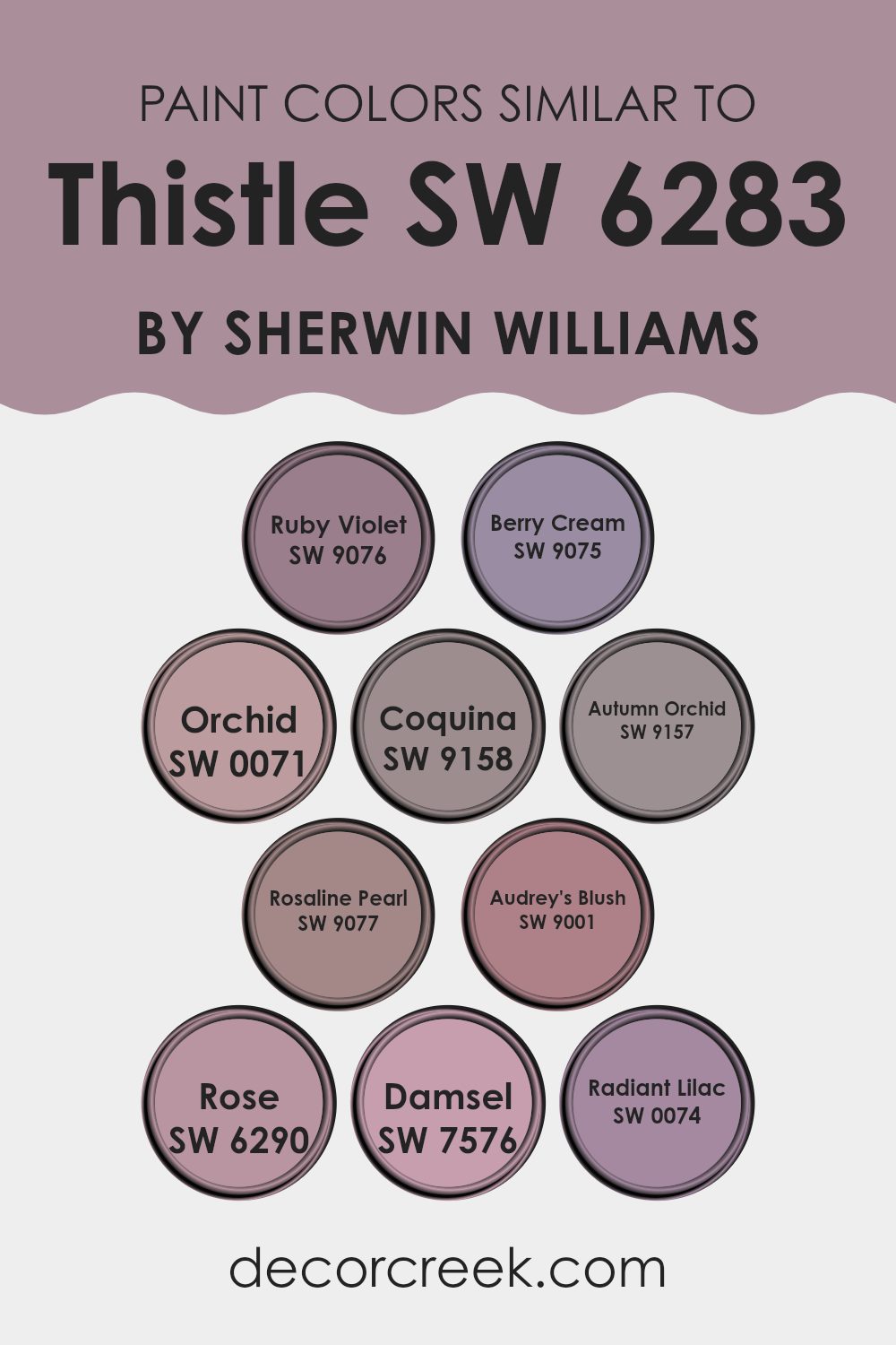
Colors Similar to Thistle SW 6283 by Sherwin Williams
Similar colors play a crucial role in interior design as they create a harmonious and cohesive look. For instance, when colors are closely related on the color spectrum, they naturally complement each other, making a room feel thoughtfully arranged and visually comforting. This is evident with the array of hues similar to Thistle by Sherwin Williams, which consist of subtle variations that blend seamlessly when used together in a design scheme.
SW 9076 – Ruby Violet adds a gentle vivacity with its muted burgundy tone, perfect for adding depth without overpowering. Next, SW 9075 – Berry Cream offers a lighter, creamy pink that softens interiors with a subtle, cheerful touch. SW 0071 – Orchid presents a lavender hue that infuses rooms with a light, airy feel, while SW 9158 – Coquina serves a soft beige that pulls these purples back to a neutral earthiness.
Similarly, SW 9157 – Autumn Orchid provides a dusky version of lavender, grounding the brighter tones in the palette. The shade SW 9077 – Rosaline Pearl lends rooms an almost pearl-like, nuanced blush tone that reflects light beautifully. For those looking for something a bit richer, SW 9001 – Audrey’s Blush is a deep, romantic rose that feels mature and grounded.
SW 6290 – Rose has a true rose color, striking yet familiar, that resonates warmth. A bit more intense, SW 7576 – Damsel is a dark, dramatic plum shade that brings luxury and depth, contrasting nicely with lighter tones. Lastly, SW 0074 – Radiant Lilac provides a burst of soft purple, bright and refreshing but still soothing, rounding out a diverse yet compatible palette.
You can see recommended paint colors below:
- SW 9076 Ruby Violet
- SW 9075 Berry Cream
- SW 0071 Orchid
- SW 9158 Coquina
- SW 9157 Autumn Orchid
- SW 9077 Rosaline Pearl
- SW 9001 Audrey’s Blush
- SW 6290 Rose
- SW 7576 Damsel
- SW 0074 Radiant Lilac
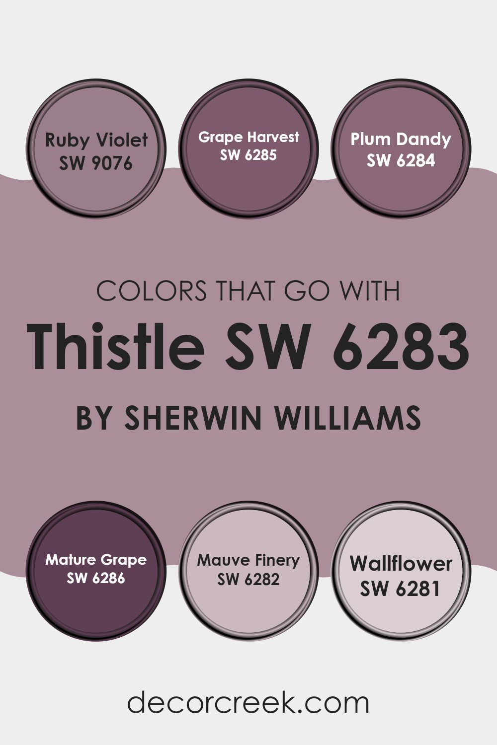
Colors that Go With Thistle SW 6283 by Sherwin Williams
When decorating with the color Thistle SW 6283 by Sherwin-Williams, choosing the right complementary colors is essential to create a harmonious and appealing room. This unique neutral shade can be paired with a variety of colors to enhance its purple hue and bring warmth and coziness to any room.
For example, SW 9076 – Ruby Violet offers a deeper red-purple tone that enriches the environment, providing a bold contrast that allows Thistle to stand out. SW 6285 – Grape Harvest, a deeper and slightly muted purple, complements Thistle by adding depth and interest to the color scheme without feeling too intense.
Additional colors that pair well with Thistle include SW 6284 – Plum Dandy, which has a vibrant purplish-pink tinge that can lighten the mood of a room while still keeping the decor tied together. For a more subdued look, SW 6286 – Mature Grape introduces a very dark purple that can be used for accent walls or furniture, lending a grounding effect to rooms with Thistle.
SW 6282 – Mauve Finery, a lighter and softer purple, offers a gentle contrast, making the room feel airy and light. Lastly, SW 6281 – Wallflower is a subtle, more grayish-purple that works well for those who prefer minimal but noticeable color contrast, perfect for creating a relaxed and cozy atmosphere. Combining these colors with Thistle can enhance the aesthetic of any room, making it more enjoyable and visually appealing.
You can see recommended paint colors below:
- SW 9076 Ruby Violet
- SW 6285 Grape Harvest
- SW 6284 Plum Dandy
- SW 6286 Mature Grape
- SW 6282 Mauve Finery
- SW 6281 Wallflower
How to Use Thistle SW 6283 by Sherwin Williams In Your Home?
Thistle SW 6283 by Sherwin Williams is a unique shade of purple. With its vibrant yet soothing hue, it’s perfect for adding a splash of color to any room without feeling too intense. You can use it in many ways at home.
For instance, painting an accent wall in the living room or bedroom with this color can create a focal point and add some personality to the setting. It’s also ideal for a bathroom or a reading nook, providing a calm backdrop that stands out.
Additionally, if you want a subtle touch of color, consider using Thistle SW 6283 for furniture pieces like a bookshelf or a side table. This can introduce a pop of color that ties the room together without dominating the décor. Pair it with neutral shades such as whites or greys to let it really shine, or match it with complementary colors like yellows or soft greens for a cheerful palette.
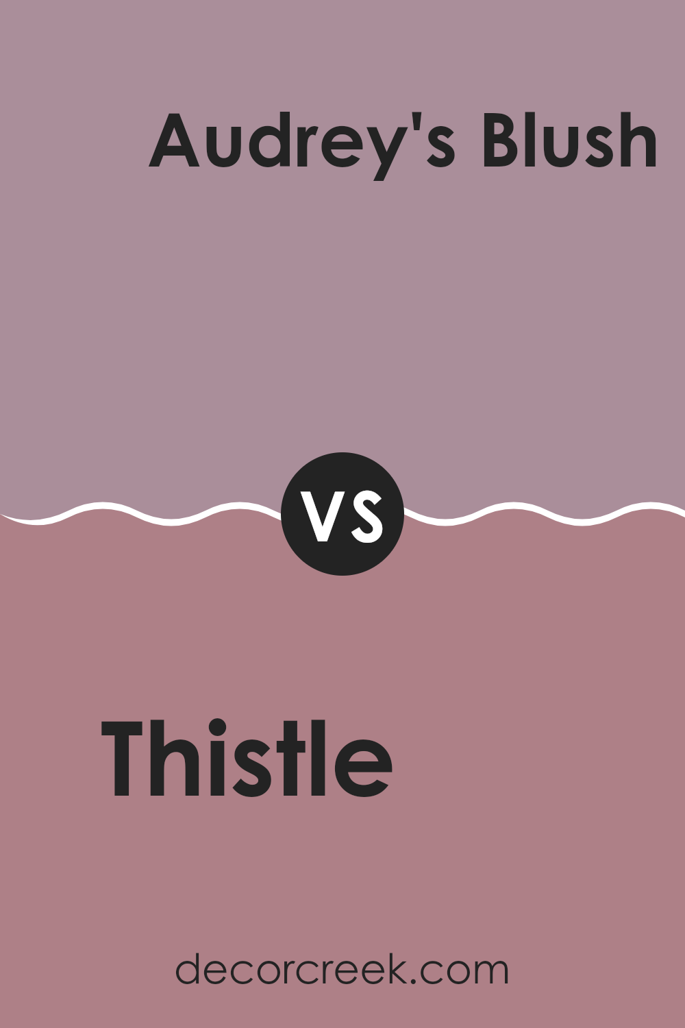
Thistle SW 6283 by Sherwin Williams vs Audrey’s Blush SW 9001 by Sherwin Williams
Thistle is a gentle, pale purple with a soft gray undertone, bringing a calm and light feel to any room. On the other hand, Audrey’s Blush is a subtle, soft pink with a warm undertone, creating a cozy and welcoming atmosphere.
While Thistle leans toward a cooler tone, making it great for rooms aiming for a more delicate and airy appearance, Audrey’s Blush offers warmth, perfect for rooms where you want to establish a comforting and inviting vibe. Both colors are flexible but serve different moods and themes in home decor.
Thistle works well in rooms that aim for a minimal and open feel, whereas Audrey’s Blush is ideal for adding a touch of warmth to a more intimate setting.
You can see recommended paint color below:
- SW 9001 Audrey’s Blush
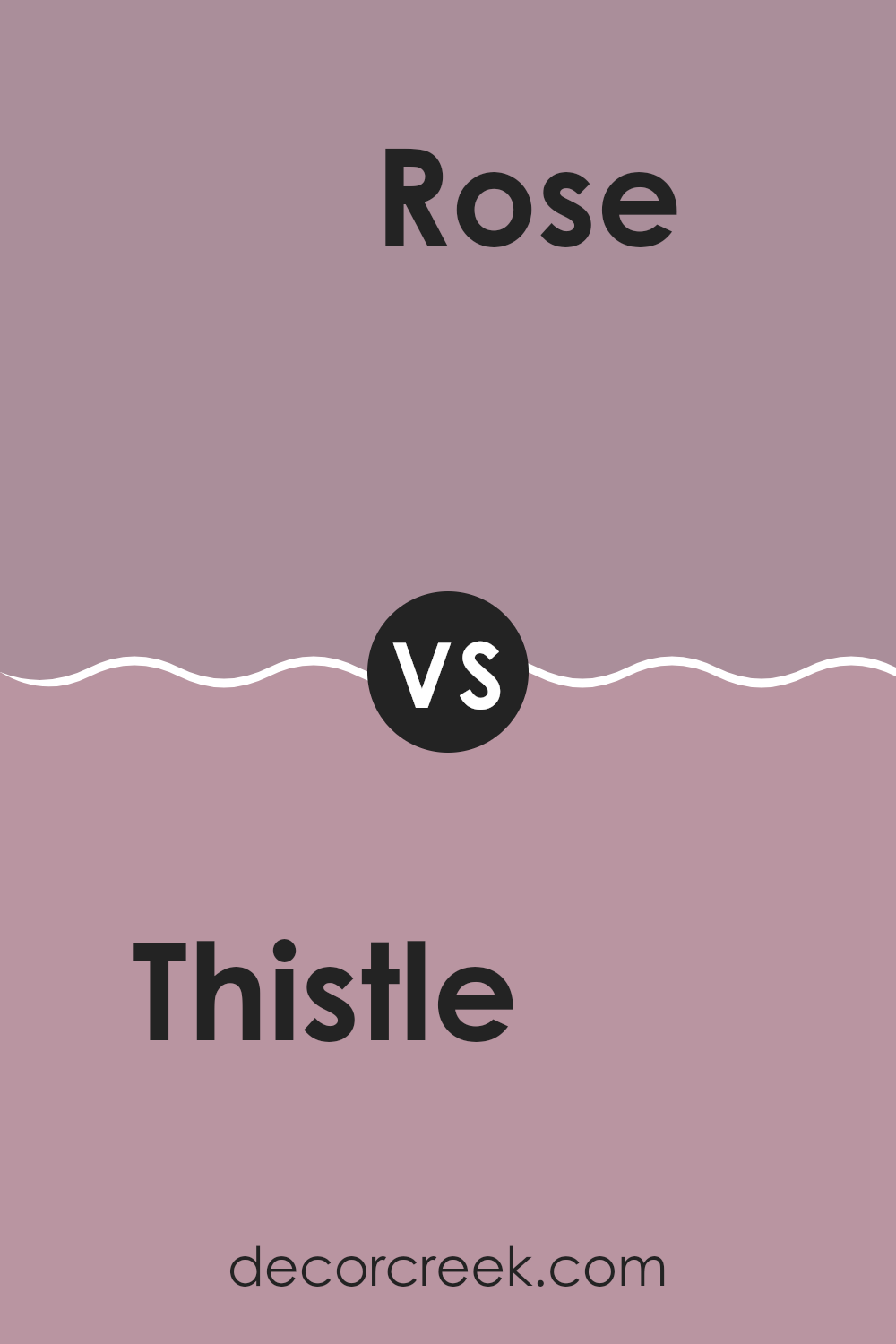
Thistle SW 6283 by Sherwin Williams vs Rose SW 6290 by Sherwin Williams
Thistle and Rose, both from Sherwin Williams, are distinctive colors that offer unique atmospheres. Thistle is a soft purple with hints of gray, giving off a light, airy vibe that’s gentle on the eyes.
It’s a soothing color that works well in bedrooms or rooms meant for relaxation. On the other hand, Rose is a deeper, more vibrant pink that brings a lively and cheerful tone.
This color immediately brightens a room and infuses it with energy, making it great for areas where you entertain guests or seek inspiration. While Thistle provides a muted elegance, Rose offers a bold pop of color. Choosing between them depends on whether you prefer a calm retreat or a dynamic room.
You can see recommended paint color below:
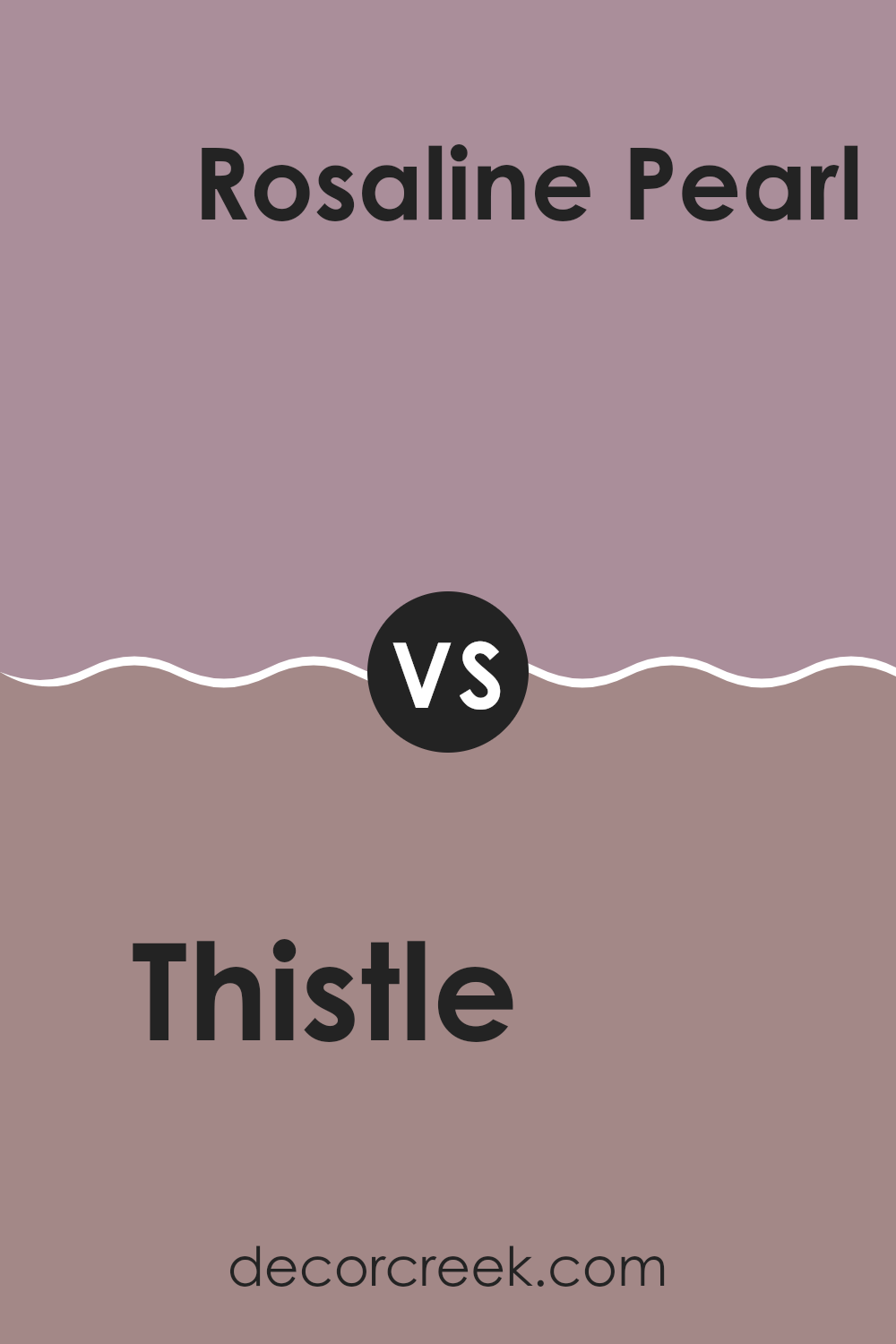
Thistle SW 6283 by Sherwin Williams vs Rosaline Pearl SW 9077 by Sherwin Williams
Thistle SW 6283 by Sherwin Williams is a soft purple with gray undertones, giving it a muted, subtle appearance. It’s flexible, working well in rooms that aim for a calm and gentle ambiance without being too bold.
On the other hand, Rosaline Pearl SW 9077 is a warmer hue, blending pink with hints of beige. This color leans toward a soft, romantic vibe that can give rooms a cozy, welcoming feel. Thistle is cooler and more understated, making it great for a modern look or for complementing more neutral shades.
Rosaline Pearl, with its warmer tones, pairs well with earthy colors and can add a touch of warmth to a room. Both colors are light enough to make small rooms appear larger while providing a subtle touch of color.
You can see recommended paint color below:
- SW 9077 Rosaline Pearl
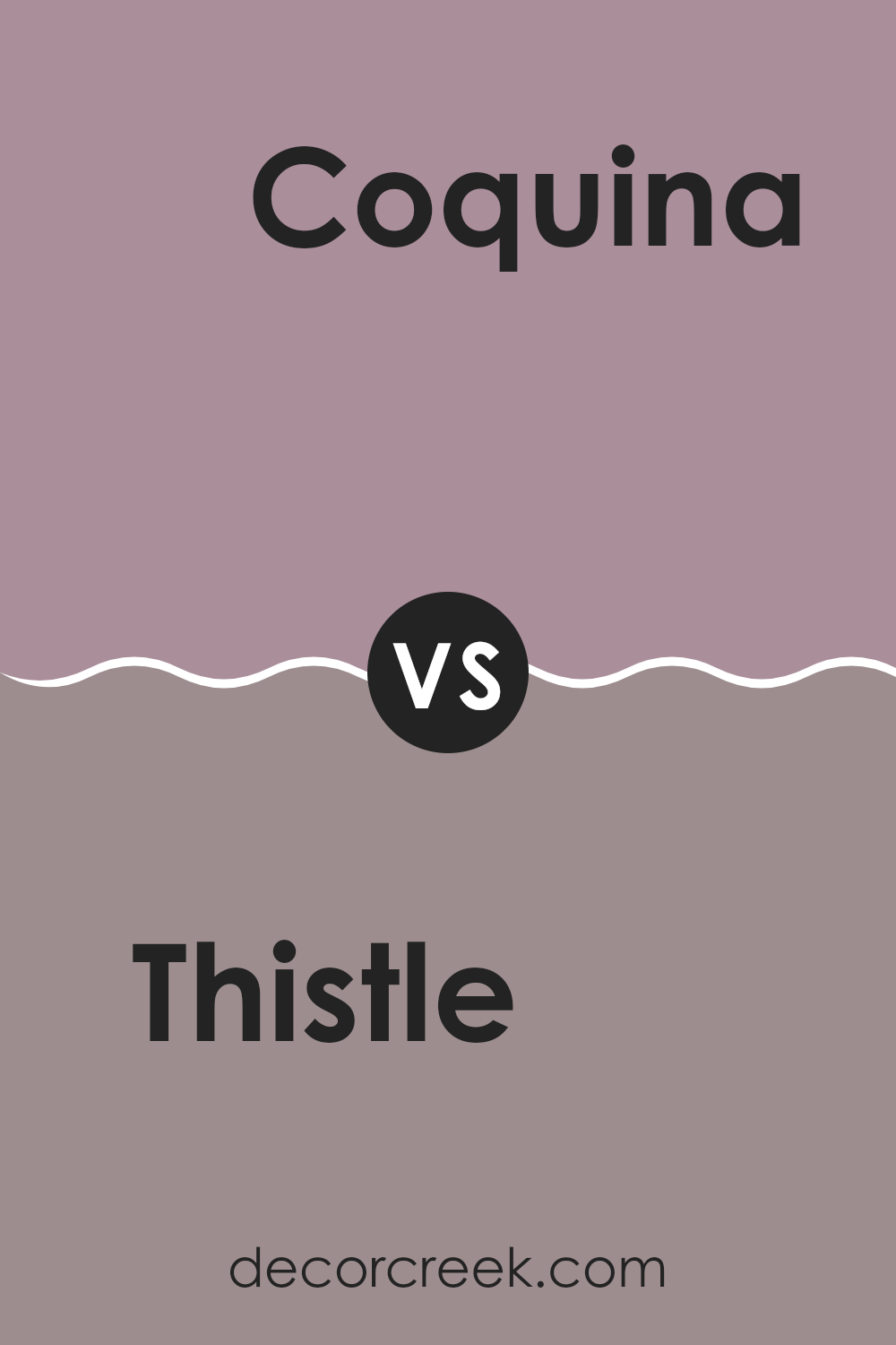
Thistle SW 6283 by Sherwin Williams vs Coquina SW 9158 by Sherwin Williams
Thistle SW 6283 is a gentle, subtle purple with gray undertones that gives it a smooth, muted appearance. This color works well in rooms where you want a calm and soothing vibe without being too bold. It’s light enough to make rooms feel airy yet offers enough color to add a hint of personality.
On the other hand, Coquina SW 9158 leans toward a warm beige with peachy undertones, creating a cozy and welcoming feel. This color is more grounded and earthy, making it a great choice for areas where you seek comfort and warmth, like living rooms or bedrooms.
When comparing these two colors, Thistle provides a cooler touch that could be great for a modern look or a nursery, while Coquina brings warmth that can enhance the homeliness of shared rooms. Each offers a unique atmosphere, so your choice might depend on the mood you want to set in your room.
You can see recommended paint color below:
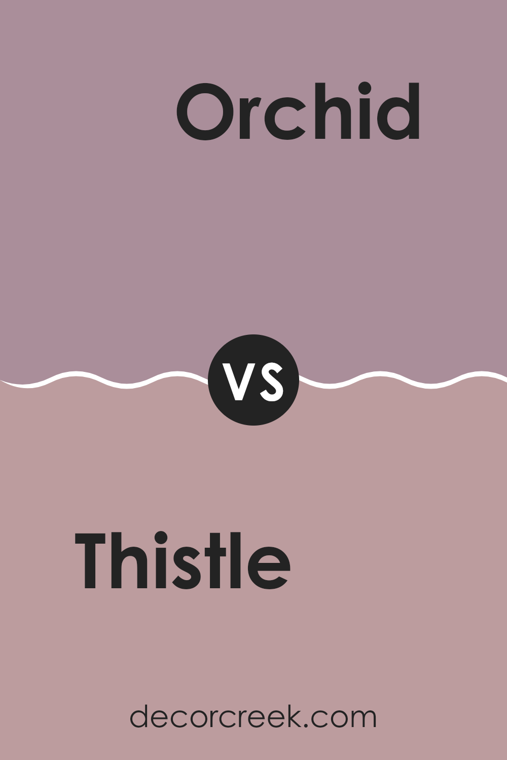
Thistle SW 6283 by Sherwin Williams vs Orchid SW 0071 by Sherwin Williams
Thistle by Sherwin Williams is a soft, muted purple with a grayish tone, giving it a gentle and calming look. It leans slightly cool and its subtlety can make rooms feel airy and light, a perfect backdrop for adding various decor styles without feeling too intense.
On the other hand, Orchid by Sherwin Williams is a more vivid and brighter shade of purple. It stands out more boldly compared to Thistle, bringing a sense of cheer and energy to a room. Orchid has a playful brightness that can make it a focal point in design, often used to add a pop of color in areas that need a lift.
While both colors share a base in purple, Thistle’s understated hue offers a quiet backdrop, suitable for more reserved or relaxed settings. Orchid, with its brighter and more dynamic look, is ideal for rooms designed to inspire activity and joy. Together, they cater to different moods and design needs, from subtle elegance to vibrant energy.
You can see recommended paint color below:
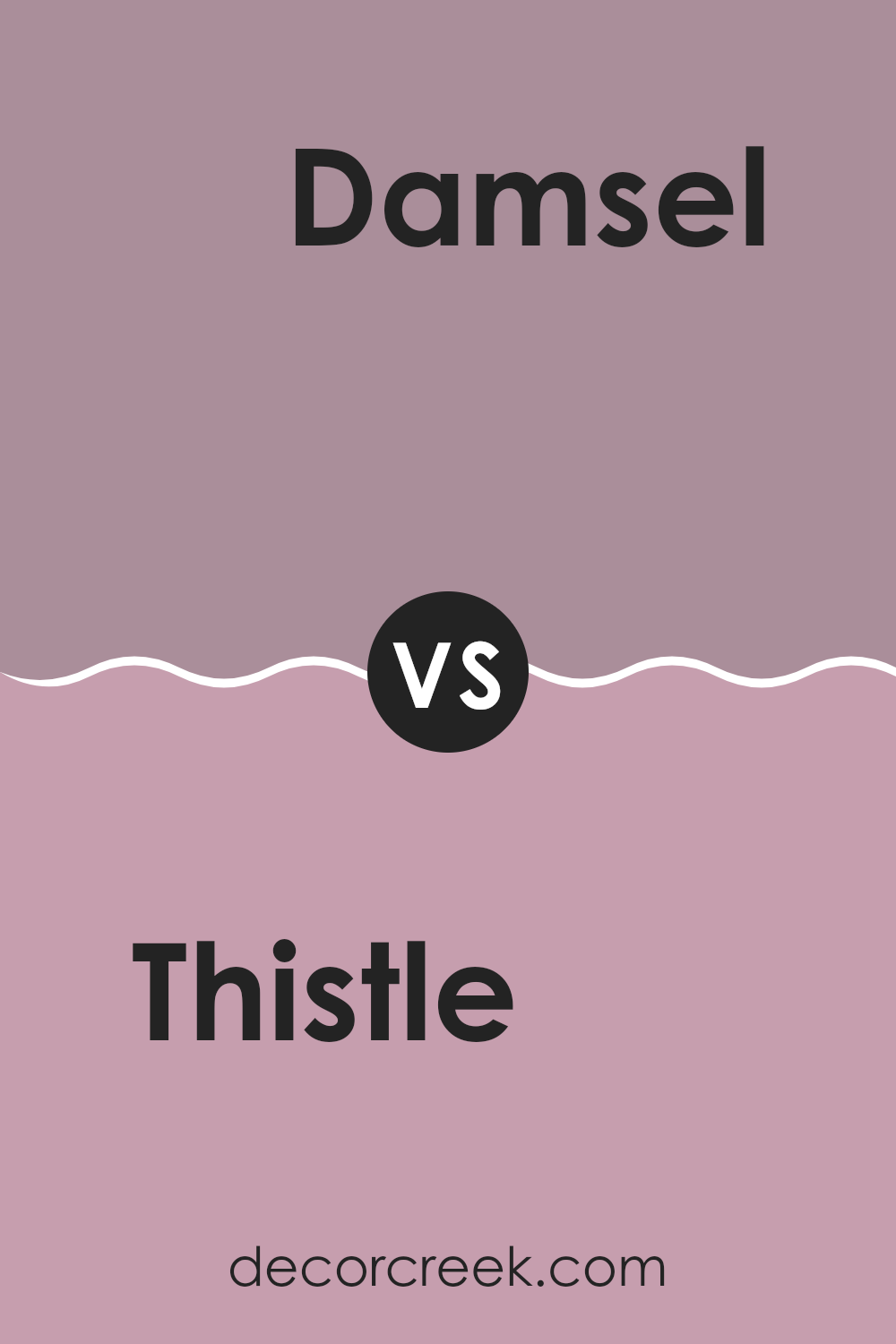
Thistle SW 6283 by Sherwin Williams vs Damsel SW 7576 by Sherwin Williams
Thistle by Sherwin Williams is a soft, light purple with a grayish tone, making it subtle and soothing for areas meant to feel calm and relaxed. It’s gentle enough to use in large areas like living rooms or bedrooms without feeling too intense.
On the other hand, Damsel is a much darker hue, a deep, rich navy blue that can add a bold statement to any room. It’s perfect for creating dramatic accents, like on a feature wall or for cabinetry, offering a striking contrast to lighter tones.
While Thistle reflects light and opens up a room, Damsel draws in the focus and can make areas feel more enclosed but impactful. Together, these colors can complement each other beautifully, with Thistle lightening the atmosphere and Damsel providing depth and interest.
You can see recommended paint color below:
- SW 7576 Damsel
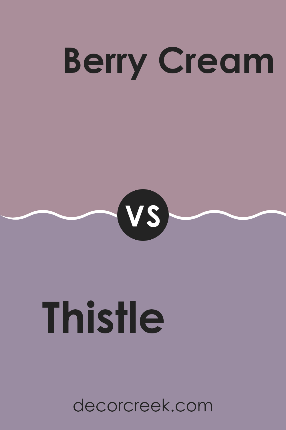
Thistle SW 6283 by Sherwin Williams vs Berry Cream SW 9075 by Sherwin Williams
Thistle SW 6283 is a gentle pastel purple with a subtle gray undertone, giving it a soft and calming appeal. It’s ideal for creating a soothing atmosphere in rooms meant for relaxation, such as bedrooms and bathrooms.
In contrast, Berry Cream SW 9075 presents a much richer, deeper pink shade that injects a cheerful and vibrant energy into a room. Berry Cream is warmer and can add a playful, inviting touch to living areas or dining rooms where a more dynamic vibe is desired.
When comparing the two, Thistle has a cooler, more muted presence which works well for understated elegance, while Berry Cream stands out with its lively hue, potentially serving as a focal point or adding a punch of color to uplift a room’s mood. Both colors offer unique vibes and can beautifully complement different design needs depending on the desired effect in the room.
You can see recommended paint color below:
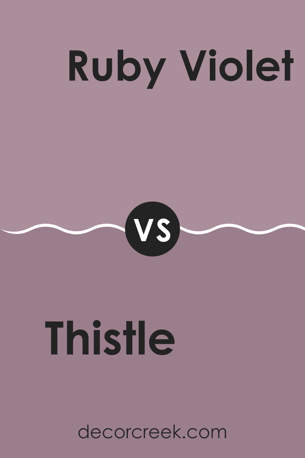
Thistle SW 6283 by Sherwin Williams vs Ruby Violet SW 9076 by Sherwin Williams
The two colors, Thistle and Ruby Violet, both by Sherwin Williams, are distinctly different and cater to varied aesthetic preferences. Thistle is a soft, subtle purple with a grayish tone that gives it a muted look, making it ideal for creating a gentle, soothing ambiance in a room. It pairs well with light, neutral furnishings and can also complement darker shades for a balanced decor.
On the other hand, Ruby Violet is a bold, vibrant purple with deep red undertones, offering a more dramatic and lively appearance. This color stands out and can be a striking choice for an accent wall or for rooms intended to make a strong visual statement. It works well with bright whites and darker shades of gray for a modern, high-contrast look.
While Thistle provides a calm and understated backdrop, Ruby Violet invites energy and excitement into a room, making each color well-suited for different purposes and tastes in interior design.
You can see recommended paint color below:
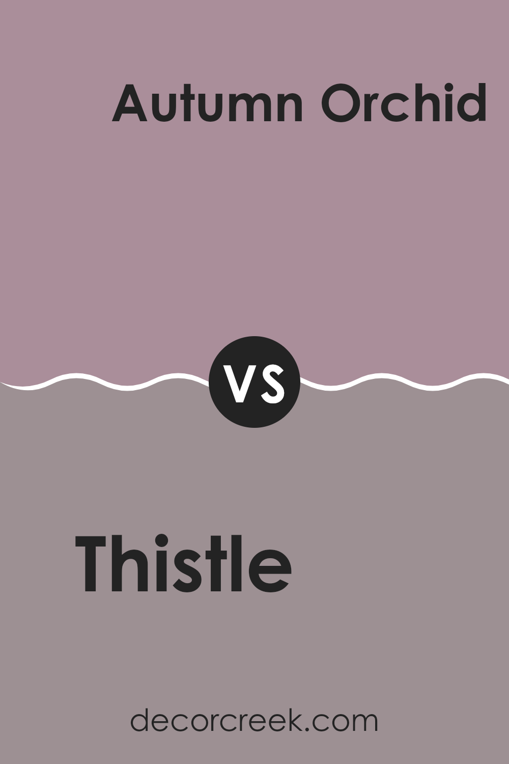
Thistle SW 6283 by Sherwin Williams vs Autumn Orchid SW 9157 by Sherwin Williams
Thistle is a light, cool lavender color with a softness that brings a gentle calm to any room. It has a hint of gray, which mutes the purple slightly, making it flexible for decorating without overpowering a room. It works well in bedrooms or bathrooms where a touch of subtle color is desired.
Autumn Orchid, on the other hand, is a darker, warmer shade leaning more toward a muted, dusty rose. This color offers a cozy, welcoming vibe, ideal for living areas or as an accent wall where a deeper, more inviting tone is preferred. It pairs well with earthy, rich hues and can add depth to a room’s aesthetic.
Both colors offer distinct vibes: Thistle providing a cool, calming presence and Autumn Orchid bringing warmth and a bit of richness. Each has its unique appeal depending on the mood and style you are aiming to achieve in your room.
You can see recommended paint color below:
- SW 9157 Autumn Orchid
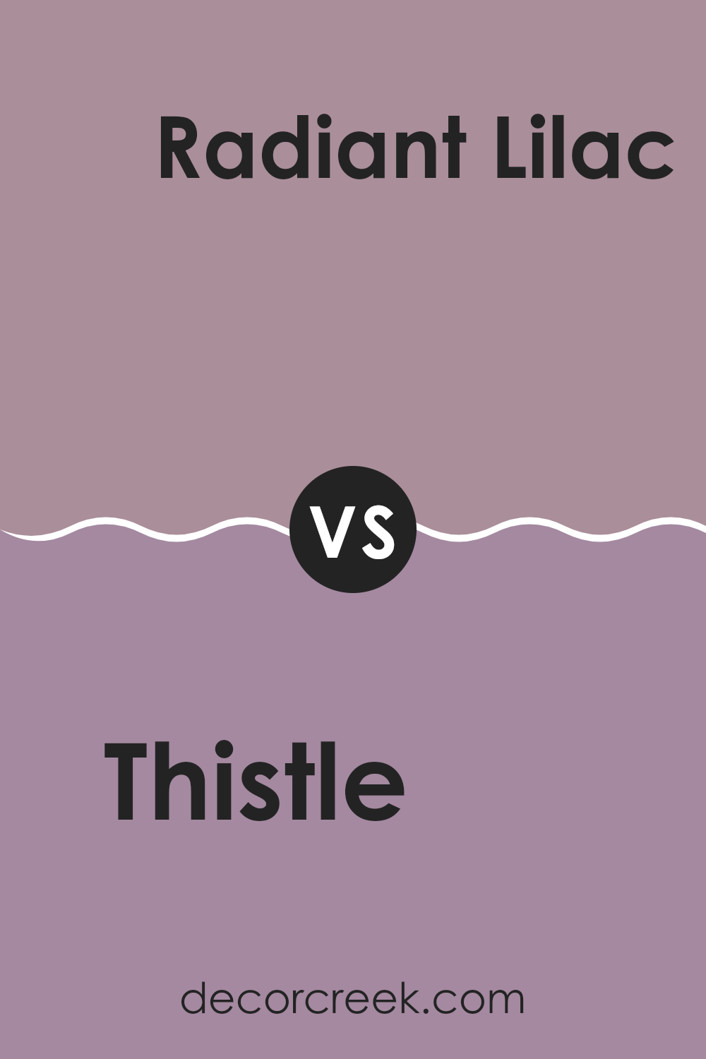
Thistle SW 6283 by Sherwin Williams vs Radiant Lilac SW 0074 by Sherwin Williams
Thistle SW 6283 by Sherwin Williams is a soft, light purplish-gray hue that gives a gentle and airy feeling to any room. It’s quite muted, making it very flexible for different areas of a home, such as bedrooms or living rooms. It pairs well with both bold and subdued accents, offering a calming backdrop that’s not too intense.
On the other hand, Radiant Lilac SW 0074 is a more pronounced shade. It leans toward a vibrant lavender, bringing a cheerful and lively vibe. This color works well when you want to make a statement or add a pop of personality. It’s especially good in rooms that benefit from a bit of energy, like a bathroom or an accent wall in a creative room.
Together, both colors offer unique options: Thistle is more reserved and understated, while Radiant Lilac is bolder and more outgoing. Depending on your room’s needs and your personal style, either could be a great choice.
You can see recommended paint color below:
Writing about SW 6283 Thistle by Sherwin Williams has been really interesting! This color is a kind of purple that looks soft and pretty. It’s not too bright, but it has just the right amount of color to make any room look nice. I learned that Thistle is great for places where you want a calm feeling, like bedrooms or maybe a cozy reading corner.
I tried to look at many pictures of rooms painted in Thistle and found out that it works well with lots of different colors. For example, it looks really good with white or gray. This is super helpful because it means that Thistle can be used in many different room styles and doesn’t only have to be in a room for kids or just for girls.
Another cool thing I found is that this color can make small rooms seem bigger and more airy, which is great if someone has a small room and they want it to feel larger.
In conclusion, SW 6283 Thistle is a lovely purple color by Sherwin Williams that can make any room feel warm and inviting. It’s easy to use with other colors, and it can help make small rooms look and feel bigger. I think lots of people would enjoy this color in their homes because it makes rooms nice and also looks very calming.
Ever wished paint sampling was as easy as sticking a sticker? Guess what? Now it is! Discover Samplize's unique Peel & Stick samples.
Get paint samples

