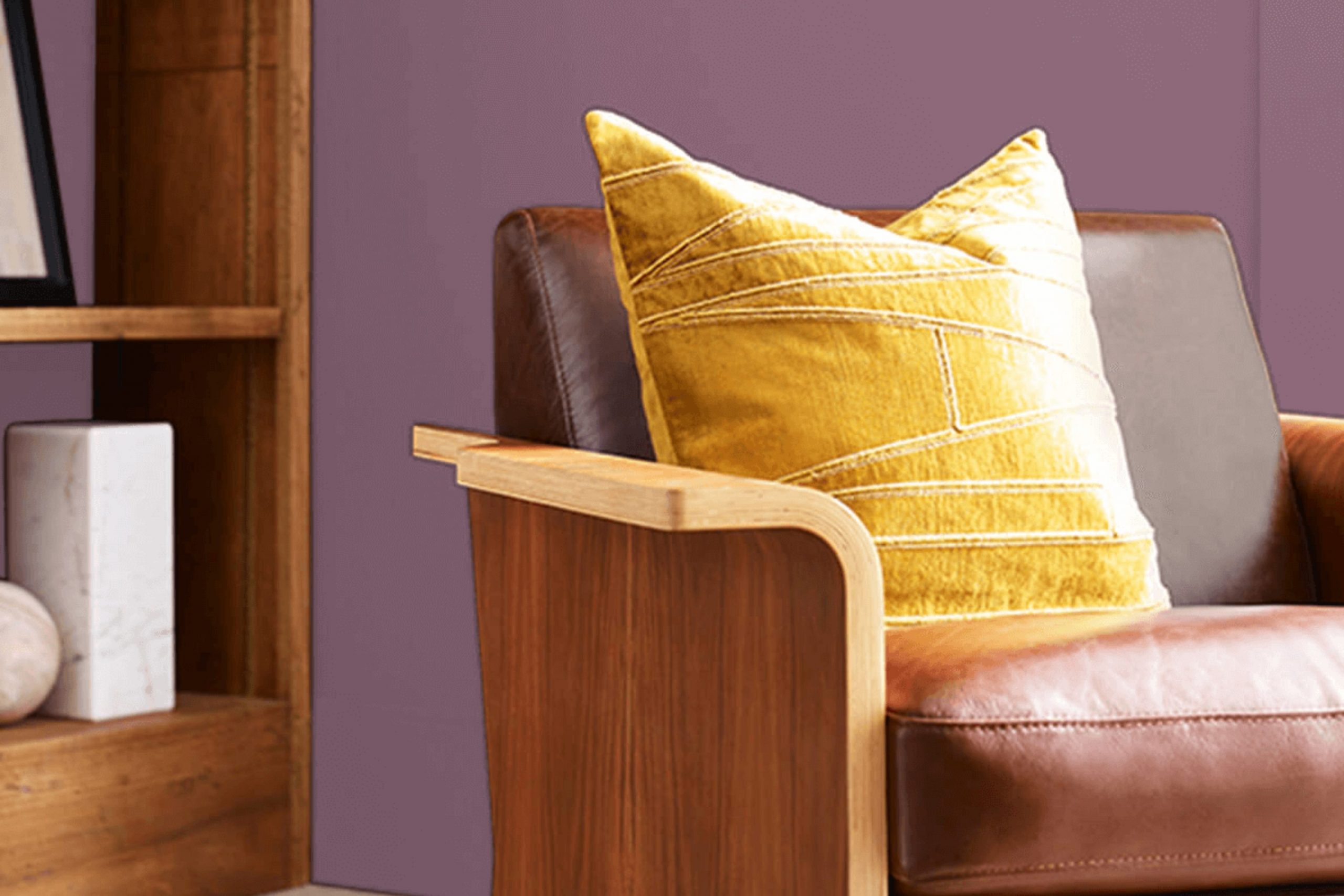
If you’re considering a paint color that adds a bold yet refined touch to your room, let me introduce you to Sherwin Williams’ SW 6284 Plum Dandy. This shade is a rich, deep plum that manages to strike a unique balance between being vibrantly energetic and elegantly reserved. It’s a color that can create a focal point in a room or bring a sense of warmth and depth when used as an accent.
From personal experience, I can say that Plum Dandy works exceptionally well in living areas or bedrooms where you want to inject a bit of personality without feeling too intense. The color pairs beautifully with soft neutrals and warm woods, providing a cozy, inviting atmosphere.
Whether you’re looking to update a single piece of furniture or thinking about a complete room makeover, consider how this distinctive plum can reshape your decor. It’s not just about changing the look of your walls—it’s about enhancing the overall feel of your setting.
So, if you’re ready for a change, why not give Plum Dandy a try?
What Color Is Plum Dandy SW 6284 by Sherwin Williams?
Plum Dandy by Sherwin Williams is a warm, deep shade of purple with rich burgundy undertones. This color has a cozy, inviting quality that adds a touch of elegance and comfort to any room without feeling too intense. It suits walls, accents, and even cabinetry, offering a flexible backdrop or focal point in various areas of a home.
This shade works particularly well in traditional, bohemian, and contemporary interiors. Its deep and vibrant character can bring out the richness of antique wooden furniture typical in traditional rooms, or add a sense of mystery and fun in bohemian-styled interiors. In contemporary settings, it offers a bold contrast to minimalist, clean lines, especially when paired with sleek modern finishes.
Plum Dandy pairs beautifully with materials like dark wood, leather, and velvet, enhancing the texture and depth of these elements. Soft furnishings in this color look luxurious and welcoming. It also goes well with brushed gold or copper accents, which highlight the depth of the purple and create a warm, inviting atmosphere. Light, neutral colors like creamy whites or soft grays can balance its depth, making any room feel more open while still grounded by the richness of this unique hue.
Is Plum Dandy SW 6284 by Sherwin Williams Warm or Cool color?
Plum Dandy by Sherwin Williams is a vibrant and playful paint color that brings a sense of warmth and creativity to any room. It’s a rich plum shade that really makes a statement whether it’s used on a feature wall or throughout an entire room.
Because of its deep and cozy hue, it works really well in rooms where you want to create a cozy vibe, like living rooms or bedrooms. It’s also very adaptable, pairing nicely with both light colors, like soft whites, to bring some balance, and with bold colors, like mustard or teal, for a more dynamic look.
Plum Dandy can also help to bring out furnishings, especially wooden pieces or lighter fabrics, making them stand out more. In rooms that need a touch of warmth, like north-facing rooms that get less light, the richness of this color can add a much-needed cozy feel. In summary, if you’re looking to add some warmth and personality to your home, Plum Dandy is quite a reliable choice.
Undertones of Plum Dandy SW 6284 by Sherwin Williams
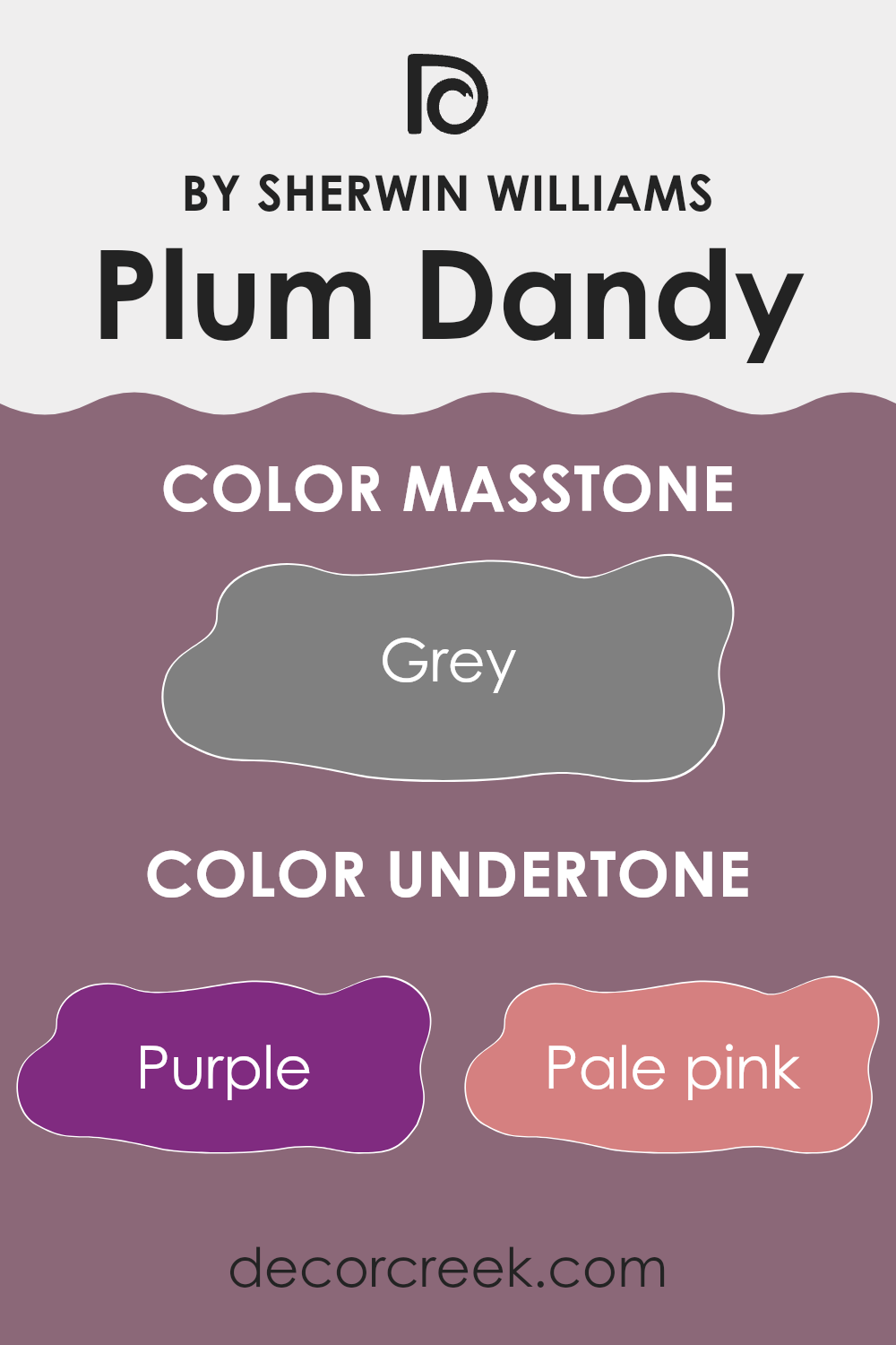
Plum Dandy is an adaptable paint color that features a rich blend of undertones. These undertones are like hidden shades that subtly influence how the color appears under different lighting conditions and when paired with various decor elements. The primary undertone in Plum Dandy is purple, giving the wall a vibrant yet cozy feel. Additional undertones such as pale pink and lilac add a soft, gentle touch, making the room feel welcoming.
When painted on interior walls, the mix of darker undertones like navy and dark green gives Plum Dandy a grounding effect, ideal for creating a cozy corner or an accent wall. Lighter undertones like mint and pale yellow can make the color pop, adding brightness and a sense of airiness to a room when it catches natural light.
The presence of unusual undertones like olive and dark turquoise injects a unique twist, providing an opportunity to introduce diverse décor pieces that mesh or contrast beautifully depending on the desired ambiance. Such undertones can enhance the depth of the color, making it appear more dynamic and engaging.
Overall, the varied undertones in Plum Dandy mean it can adapt well in different settings—from bedrooms and living rooms to offices, providing warmth and character. It’s the interplay of these undertones that determines how the color interacts with the room, light, and furnishings, ultimately affecting the mood and style of the room.
What is the Masstone of the Plum Dandy SW 6284 by Sherwin Williams?
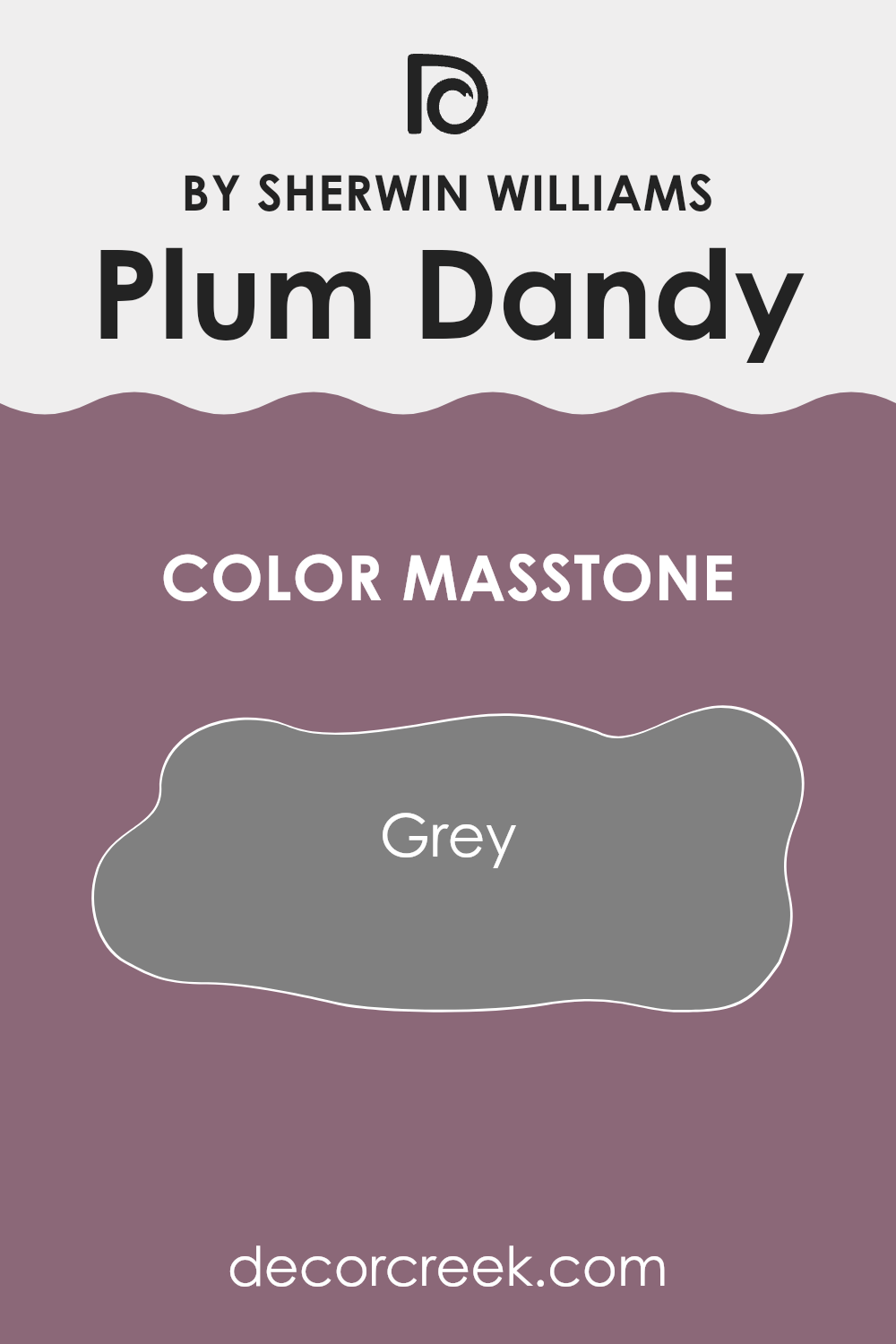
Plum Dandy SW 6284 by Sherwin Williams, when observed in its purest form or masstone, presents a shade of grey. This grey tone influences how the color interacts with rooms in a home. Grey is known for its neutrality, offering a balanced backdrop that pairs well with a variety of decor styles and colors.
In a home setting, this shade of grey can create a calm and inviting atmosphere because it doesn’t overwhelm the senses. This neutrality can make rooms appear larger and more open, making it a good choice for rooms of any size.
It’s flexible enough to work in living rooms, bedrooms, and even kitchens, where it can complement both vibrant and muted accents. Its adaptability means you can easily update your decor without worrying about clashing colors, offering a practical choice for long-term interior styling.
decorcreek.com
How Does Lighting Affect Plum Dandy SW 6284 by Sherwin Williams?
Lighting can significantly impact how colors appear in any room. The type of light, whether natural or artificial, can change how a color looks on your walls. For instance, let’s consider a color like Plum Dandy, a rich, warm plum shade.
In artificial light, this color can look very different depending on the type of bulbs used. Warmer yellow lights can enhance its richness, making it appear more vibrant and cozy. Cooler LED lights might make it look a bit more subdued, as they can reduce the warmth of the color.
In natural light, the appearance of Plum Dandy also varies. Sunlight can reveal the truest version of this color, displaying its depth and warmth fully. However, the amount and angle of sunlight change throughout the day and depending on which way your room faces, the perception of this color might shift.
In rooms facing north, light tends to be cooler and more consistent throughout the day. This can make Plum Dandy appear slightly darker and less vibrant, as there is less sunlight to bring out its warm tones. In contrast, south-facing rooms get plenty of sunlight, which can make this color look brighter and more dynamic throughout the day, enhancing its warm characteristics.
East-facing rooms receive light in the morning when the sunlight is warm and bright. This morning light can make Plum Dandy look lively and inviting early in the day, but the color might lose some of its vibrancy as the light fades. On the other hand, west-facing rooms get the evening light which is warmer. Here, the color can appear particularly rich and welcoming in the afternoon and evening as the sun sets. Understanding these differences is crucial when deciding on using this color in your decor. By considering how light interacts with Plum Dandy, you can ensure it always shows its best side in your room.
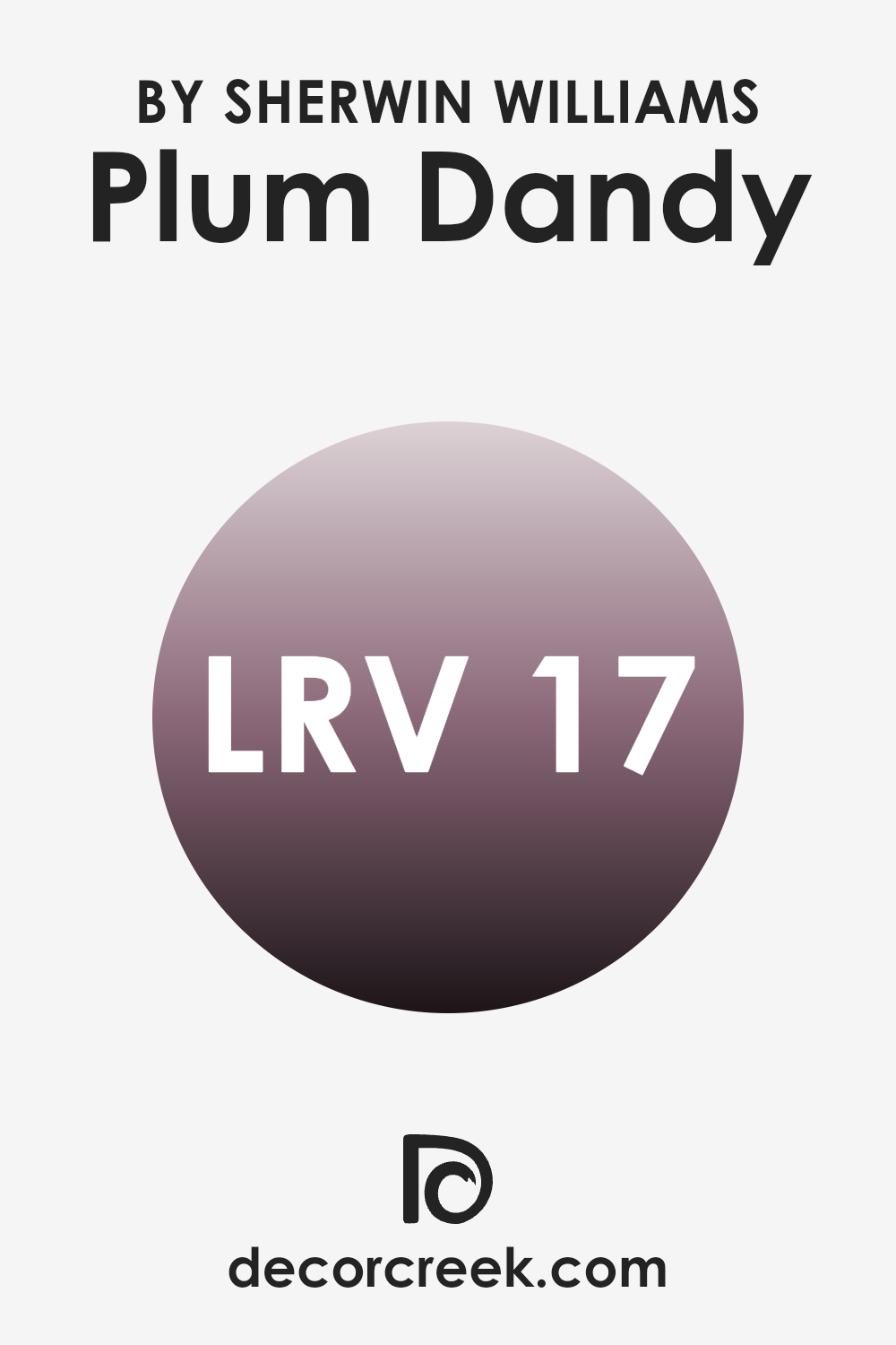
What is the LRV of Plum Dandy SW 6284 by Sherwin Williams?
LRV stands for Light Reflectance Value, a measurement used to determine how much light a paint color reflects or absorbs when it’s applied to a surface. This value ranges between 0 and 100, with lower numbers indicating that the color absorbs more light and higher numbers indicating more reflection.
The LRV helps in making informed decisions about how a paint color will look in a specific room, influencing the overall ambiance. For instance, a higher LRV can make a room feel more open and airy, while a lower LRV creates a cozier and more wrapped-in feel.
The LRV of Plum Dandy, which is 16.832, suggests that it is a dark color that absorbs a lot of light instead of reflecting it. In practical terms, this means that if used on walls, Plum Dandy will darken the room significantly, especially in areas with limited natural light.
When using a color with a low LRV like Plum Dandy, it’s beneficial to have good artificial lighting or balance it with lighter colors in the decor to prevent the room from feeling too closed in. This attribute makes it an ideal choice for creating a more intimate and secluded atmosphere in a room.
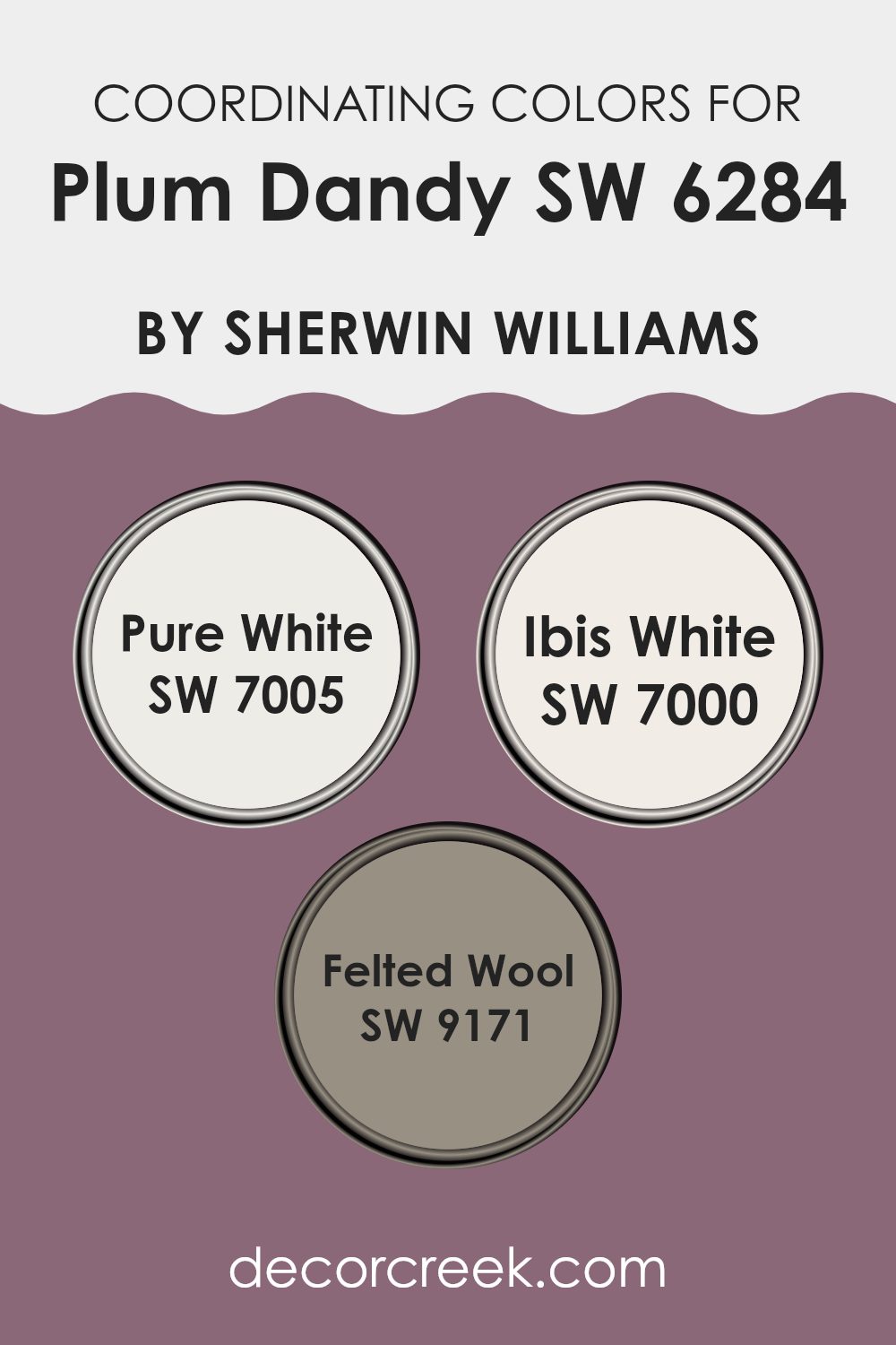
Coordinating Colors of Plum Dandy SW 6284 by Sherwin Williams
Coordinating colors work by complementing each other to create a harmonious look in any room. These colors typically share a similar tone or contrast in a way that is pleasing to the eye. For example, Plum Dandy is a rich, deep purple hue which can be beautifully paired with a range of colors that balance or enhance its intensity. Coordinating colors for Plum Dandy include Pure White, Ibis White, and Felted Wool, each offering a unique contribution to the overall aesthetic.
Pure White is a crisp and clean color that brings a fresh clarity to interiors, making it a perfect backdrop that allows colors like Plum Dandy to really stand out. It acts like a blank canvas, providing a sharp contrast that highlights the richer hues of accompanying colors.
Ibis White, on the other hand, offers a slightly warmer tone, giving a soft, subtle pairing that harmonizes with the warmth of Plum Dandy without competing for attention. Completing the set, Felted Wool introduces a natural, muted gray that complements the plum, ensuring the setting remains balanced and grounded. Together, these shades support and enhance Plum Dandy, allowing for a range of design possibilities that combine both neutrality and depth.
You can see recommended paint colors below:
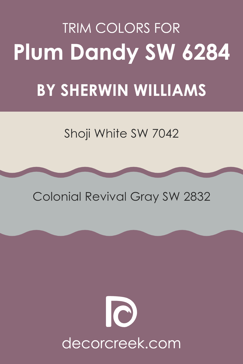
What are the Trim colors of Plum Dandy SW 6284 by Sherwin Williams?
Trim colors are specific shades used to paint the architectural details like door frames, window trims, baseboards, and cornices in a room or on a building’s exterior. These colors are crucial because they can highlight and define these details, improving the overall appearance of a room. Using trim colors effectively can act as a visual guide that helps emphasize the structure’s best features, creating a more organized and visually pleasing look.
For the color Plum Dandy by Sherwin Williams, choosing a trim color like SW 7042 – Shoji White or SW 2832 – Colonial Revival Gray can significantly influence the mood and style of a room. Shoji White is a soft, warm white that offers a gentle contrast, giving a clean and inviting finish to any room. This makes it an excellent choice for trims, adding a subtle distinction without overpowering the rich tones of Plum Dandy.
On the other hand, Colonial Revival Gray is a medium gray that provides a stronger contrast, yet harmonizes beautifully, bringing out the depth and richness of Plum Dandy, which can make the wall color appear more lively and expressive. Both options offer a practical way to improve the visual impact of a room’s design with their distinct yet complementary natures.
You can see recommended paint colors below:
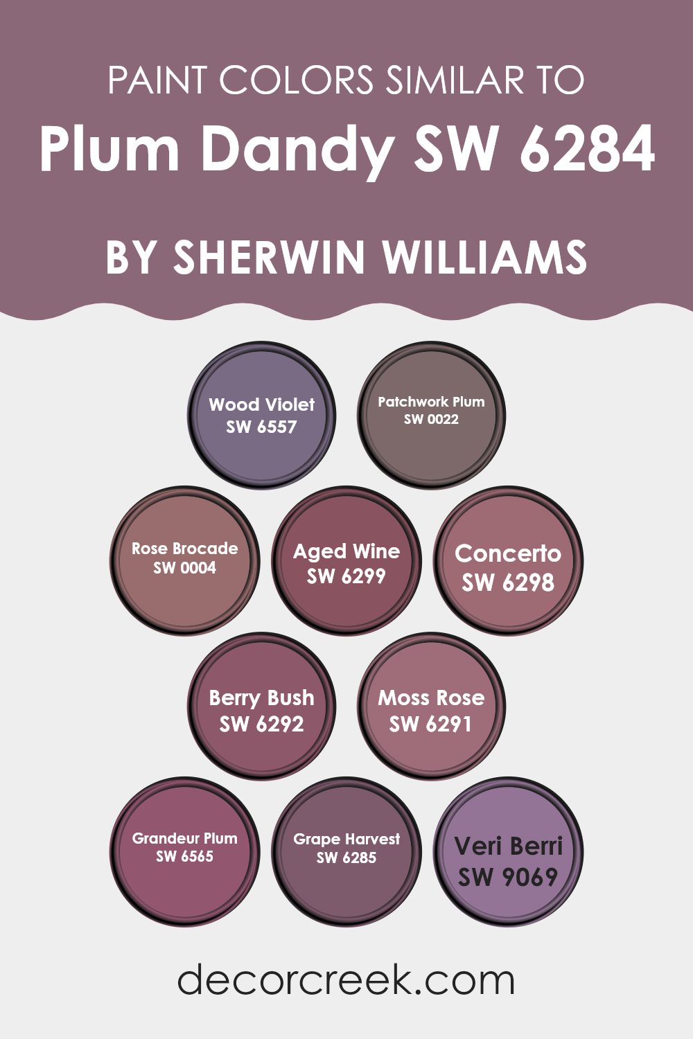
Colors Similar to Plum Dandy SW 6284 by Sherwin Williams
The importance of similar colors in interior design can’t be overstated. Using colors like SW 6557 – Wood Violet, a gentle hue with a hint of mystique, and SW 0022 – Patchwork Plum, which deepens the atmosphere with a rich, dark tone, creates a cohesive and inviting room. They work by blending harmoniously, such as SW 0004 – Rose Brocade, a soft romantic shade with quiet depth, and SW 6299 – Aged Wine that carries a mature, classic vibe, inviting a sense of comfort and continuity.
SW 6298 – Concerto offers a subdued, muted undertone that works well to balance brighter elements in a room—think of it as the quiet backdrop to more vivid furnishings. Variations like SW 6292 – Berry Bush provide a fresh burst of color that is lively yet not overpowering, perfect for rooms meant for relaxation.
Furthermore, hues like SW 6291 – Moss Rose, with its slightly pinkish cast, add a touch of warmth, while SW 6565 – Grandeur Plum introduces an element of richness and depth. Similarly, SW 6285 – Grape Harvest brings in a dusky, refined element to the palette, ideal for creating a focal point in a room. Completing this grouping, SW 9069 – Veri Berri lends a playful yet muted tone, keeping the overall aesthetic grounded. Collectively, these colors create a seamless visual flow, making any room feel more coherent and naturally more comfortable.
You can see recommended paint colors below:
- SW 6557 Wood Violet
- SW 0022 Patchwork Plum
- SW 0004 Rose Brocade
- SW 6299 Aged Wine
- SW 6298 Concerto
- SW 6292 Berry Bush
- SW 6291 Moss Rose
- SW 6565 Grandeur Plum
- SW 6285 Grape Harvest
- SW 9069 Veri Berri
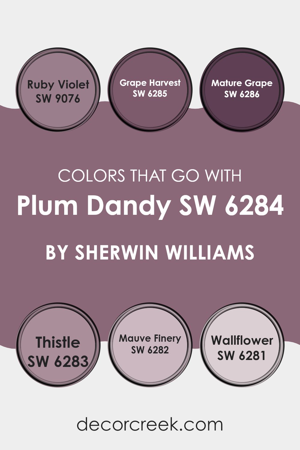
Colors that Go With Plum Dandy SW 6284 by Sherwin Williams
Choosing harmonious colors to pair with Plum Dandy SW 6284 by Sherwin Williams enhances the aesthetic appeal and balance of any room. Plum Dandy is a deep, rich plum hue that brings a feeling of warmth and charm.
When pairing it with complementary colors like Ruby Violet, Grape Harvest, Mature Grape, Thistle, Mauve Finery, and Wallflower, each color contributes unique elements that collectively create a cohesive and appealing palette. These combinations can be used to design a room with a fluid color transition, ensuring that each color supports and enhances the others.
Ruby Violet, a vivid shade of deep purple, adds a bold pop of color that creates a striking contrast with Plum Dandy’s subtler tone. It works well in areas that demand a touch of drama. Grape Harvest is a muted purple with gray undertones, offering a more subdued option that blends smoothly with Plum Dandy, ideal for creating a soothing atmosphere in a bedroom or living area.
Mature Grape, darker and richer, deepens the overall scheme and adds an element of mystery and allure. Thistle, on the lighter side, introduces a soft lavender that lightens the palette and brings a fresh feel to the combination. Mauve Finery, a pale purple with hints of pink, injects a gentle warmth, making it perfect for rooms intended to be cozy and inviting.
Wallflower, the lightest among these, is a subdued lavender, which is excellent for contrasting darker furnishings or accent pieces against lighter walls. Together, these colors achieve a harmonious balance, enhancing the visual interest and mood of interiors styled around Plum Dandy.
You can see recommended paint colors below:
- SW 9076 Ruby Violet
- SW 6285 Grape Harvest
- SW 6286 Mature Grape
- SW 6283 Thistle
- SW 6282 Mauve Finery
- SW 6281 Wallflower
How to Use Plum Dandy SW 6284 by Sherwin Williams In Your Home?
Plum Dandy SW 6284 by Sherwin Williams is a unique and striking color that brings a rich, warm tone to any room. This shade of purple can add a sense of coziness and comfort to an interior, making it ideal for areas where you want to relax and feel at ease, like living rooms or bedrooms.
To use Plum Dandy in your home, you might consider painting one accent wall with this color to create a focal point in the room. This approach feels less intense than painting all walls and can tie the room’s design elements together. Pairing this paint with light-colored decor such as beige, soft yellows, and creamy whites can highlight the depth of Plum Dandy while still keeping the overall feel of the room light and airy.
Additionally, adding it to smaller elements like a bookshelf or a cabinet can also introduce a splash of color without making the room feel too heavy. Accessories such as cushions or curtains in Plum Dandy can alternatively give a burst of color, enhancing the overall appeal of the room.
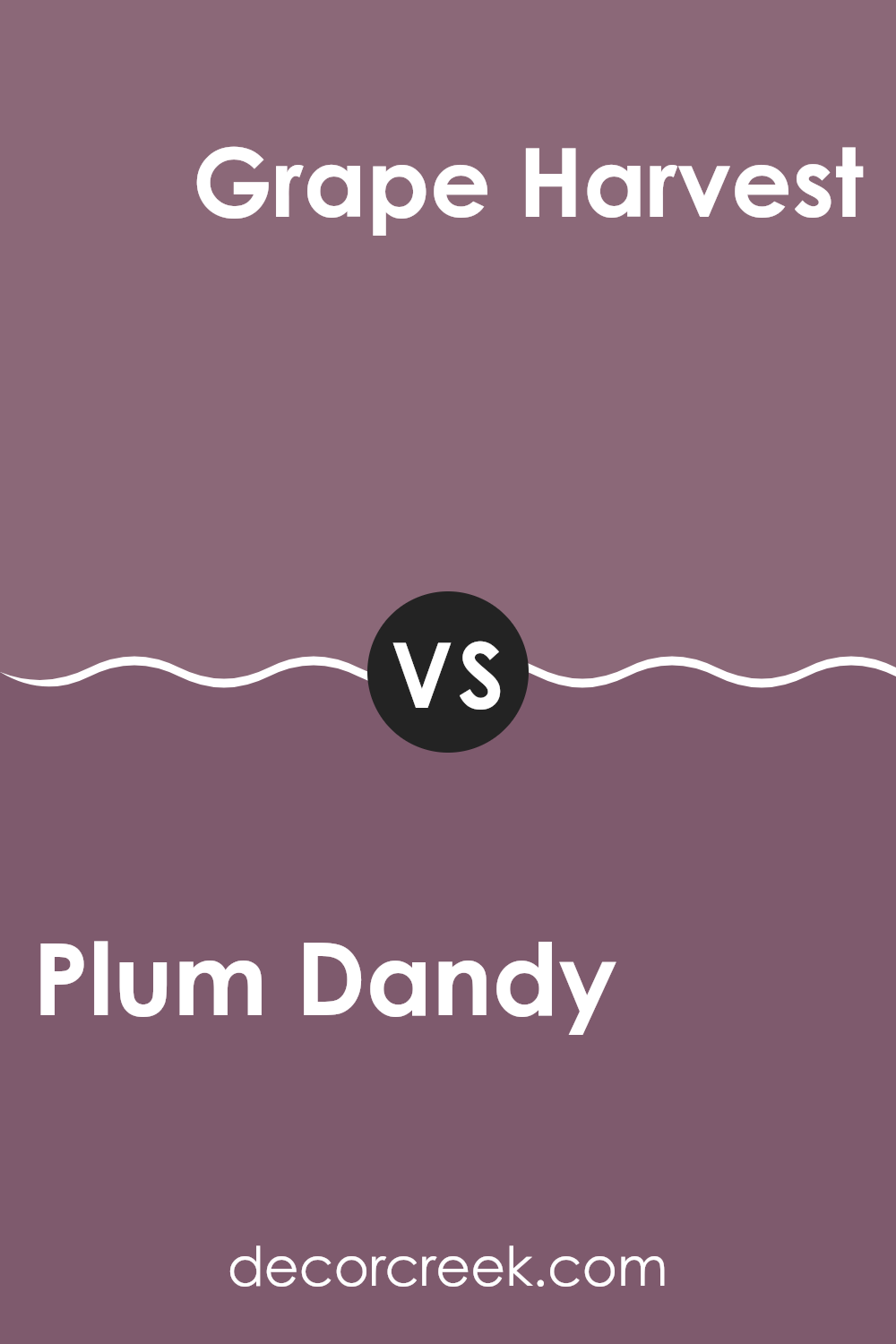
Plum Dandy SW 6284 by Sherwin Williams vs Grape Harvest SW 6285 by Sherwin Williams
Plum Dandy and Grape Harvest are two shades by Sherwin Williams that offer a cozy feel perfect for adding a touch of warmth to a room. Plum Dandy is a more vibrant color with a noticeable reddish tint, giving it a lively and bright ambience.
In contrast, Grape Harvest is less intense and leans towards a softer, more muted purple with subtle brown undertones. This makes it an excellent choice for rooms that need a calm and gentle appearance. Both colors pair well with neutral furnishings and can create different moods depending on the lighting and accompanying decor.
While Plum Dandy tends to stand out and can be the star of a room, Grape Harvest supports other colors and works beautifully in a more understated role. Choose Plum Dandy if you prefer a bolder look, and Grape Harvest if you’re after a more subdued vibe.
You can see recommended paint color below:
- SW 6285 Grape Harvest
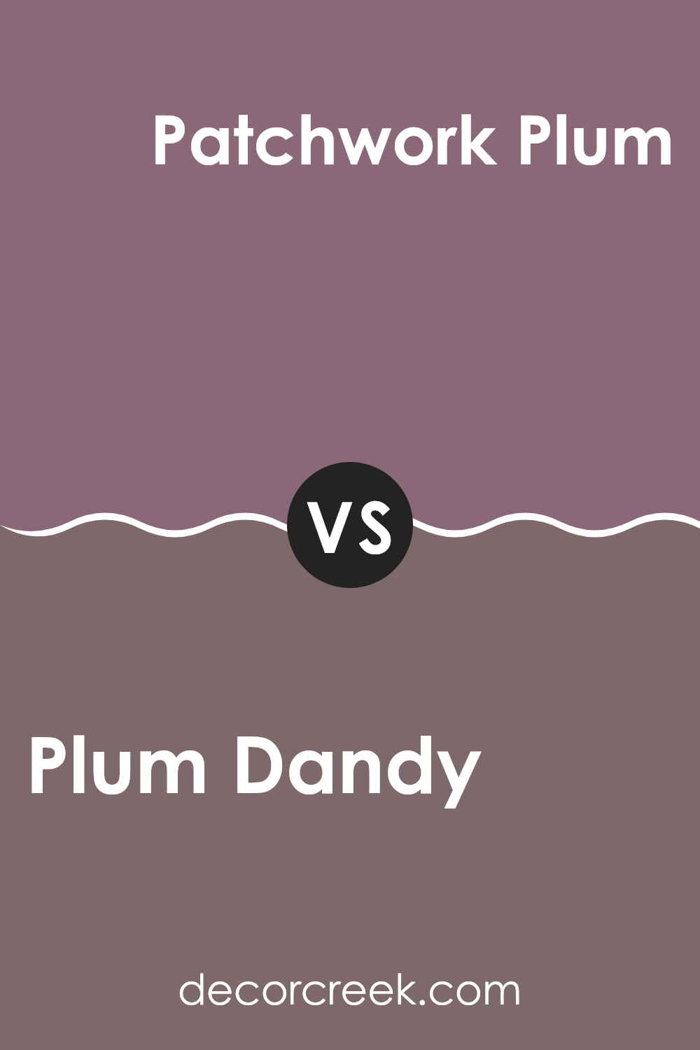
Plum Dandy SW 6284 by Sherwin Williams vs Patchwork Plum SW 0022 by Sherwin Williams
Plum Dandy and Patchwork Plum by Sherwin Williams are both shades of plum, but they present unique tones that can create different moods in a room. Plum Dandy is a deeper, richer plum color with a strong purple hue that provides a cozy and inviting atmosphere. It tends to darken a room, making it ideal for areas where a warm, enveloping feel is desired, like in a bedroom or a living-room accent wall.
On the other hand, Patchwork Plum is a lighter, softer shade of plum with hints of gray. This color is more subtle and is excellent for rooms that you want to keep airy and light while still introducing color. It works well in smaller rooms or areas that don’t get much natural light.
Both colors can add a touch of elegance to any room, but the choice between them would depend on the specific mood and brightness you want to achieve in your room.
You can see recommended paint color below:
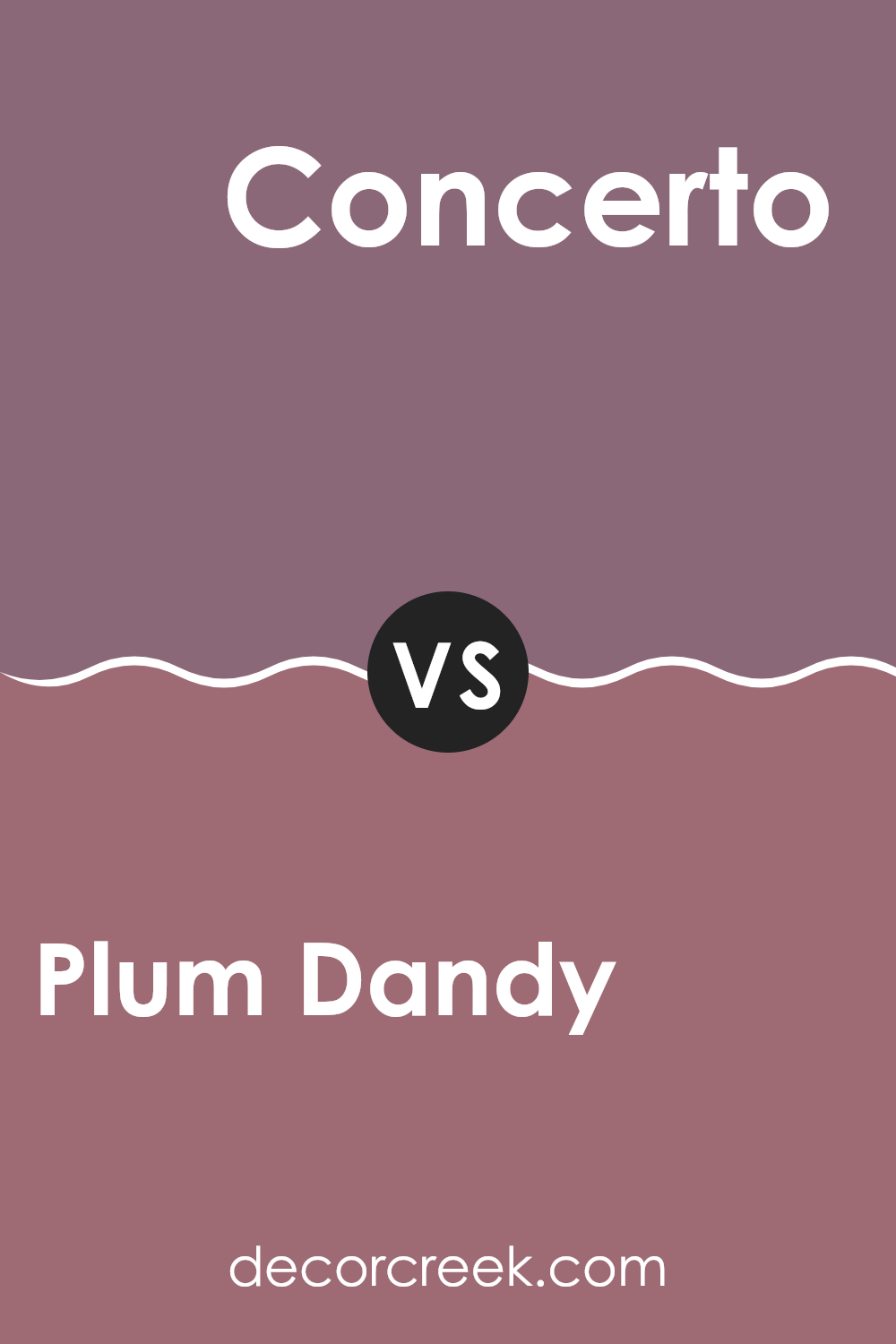
Plum Dandy SW 6284 by Sherwin Williams vs Concerto SW 6298 by Sherwin Williams
Plum Dandy and Concerto, both from Sherwin Williams, are rich, deep colors but have distinct tones and moods. Plum Dandy is a warm, deep plum shade.
It’s a cozy and welcoming color, perfect for rooms where you want to create a comforting atmosphere. On the other hand, Concerto is a darker, more muted gray with slight purple undertones.
It leans more toward a neutral palette, making it flexible for various uses and pairing well with a wide range of decor items. While Plum Dandy brings a touch of warmth to a room, Concerto offers a subtle, subdued feel. Both colors are ideal for adding depth to a room, but the choice between them depends on the desired impact: warm and cozy or cool and understated.
You can see recommended paint color below:
- SW 6298 Concerto
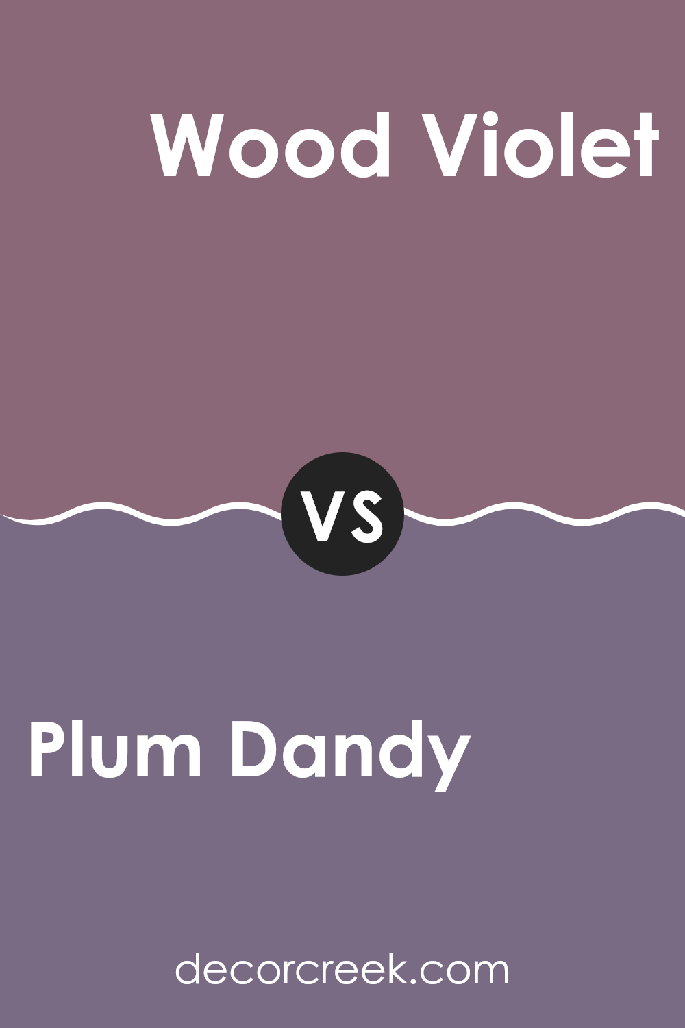
Plum Dandy SW 6284 by Sherwin Williams vs Wood Violet SW 6557 by Sherwin Williams
Plum Dandy and Wood Violet by Sherwin Williams are both rich, deep purples, but with distinct tones and moods. Plum Dandy is a muted, smoky purple that gives off a cozy and warm feel, ideal for creating a welcoming atmosphere in rooms such as living rooms or bedrooms. Its subdued quality means it pairs well with soft neutrals and wood finishes, adding a subtle hint of color without feeling too intense.
On the other hand, Wood Violet is brighter and more vivid, with a noticeable hint of blue that gives it a fresher and more energetic vibe. This makes it a great choice for areas where you want to add some cheerfulness and brightness, like bathrooms or study areas. It also works well with white trims and modern decor for a striking contrast.
In summary, while both colors share a purple base, Plum Dandy is more understated and cozy, whereas Wood Violet is livelier and more vibrant.
You can see recommended paint color below:
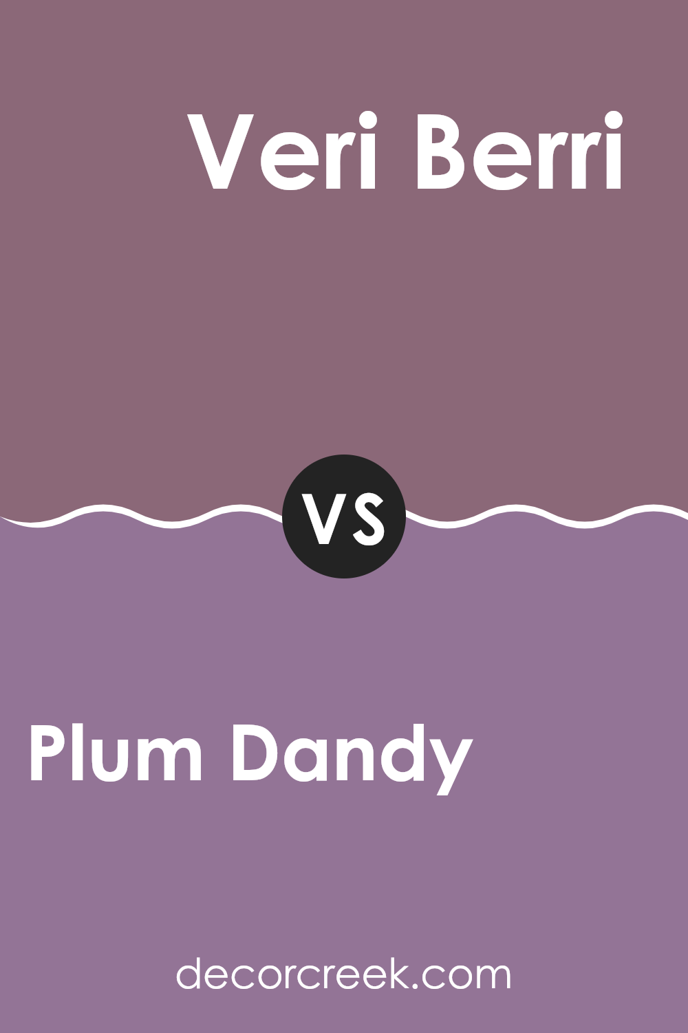
Plum Dandy SW 6284 by Sherwin Williams vs Veri Berri SW 9069 by Sherwin Williams
Plum Dandy and Veri Berri by Sherwin Williams are both rich, berry-inspired shades, but they have distinct characteristics. Plum Dandy is a deeper hue resembling the dark tones of ripe plums, making it a bold choice for rooms needing a touch of drama. It’s darker and offers a cozy feel, which is great for places like living rooms or bedrooms where you want a warmer setting.
On the other hand, Veri Berri is a bit lighter and carries a more vibrant berry color. This tone closely resembles fresh berries and adds a lively splash of color to any area. It’s an excellent option for enhancing rooms like kitchens or dining rooms where a bright and cheerful atmosphere is desirable.
In summary, while both colors play into a berry theme, Plum Dandy gives a room a darker, more comforting vibe, whereas Veri Berri brightens an area with its vivid and energetic hue.
You can see recommended paint color below:
- SW 9069 Veri Berri
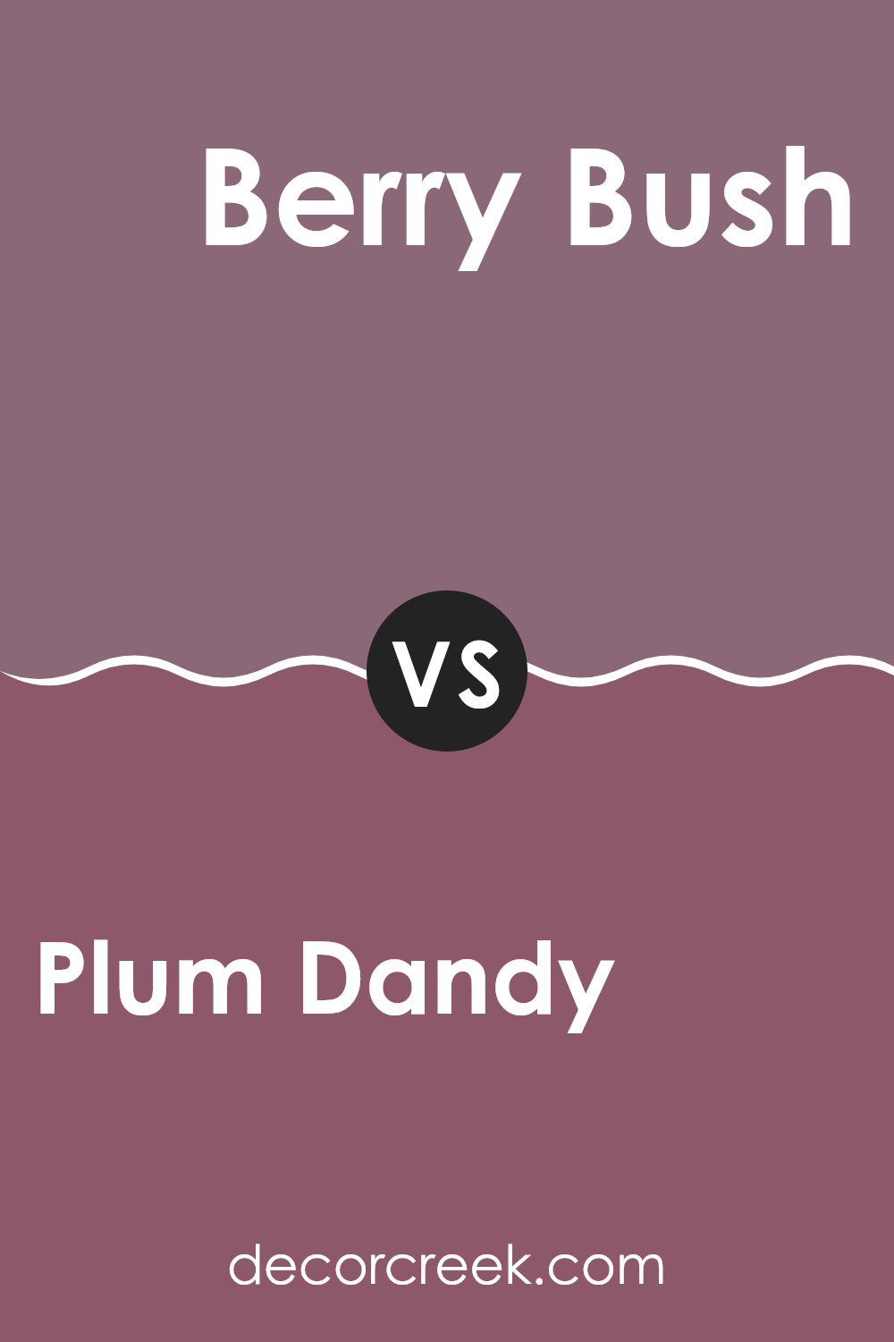
Plum Dandy SW 6284 by Sherwin Williams vs Berry Bush SW 6292 by Sherwin Williams
Plum Dandy and Berry Bush, both by Sherwin Williams, are rich and vibrant colors, though they carry distinct tones. Plum Dandy has a deeper, muted purple hue which gives off a cozy and warm feeling, making it perfect for creating a welcoming room in areas like living rooms or bedrooms. It resembles the darker flesh of a ripe plum, lending it a gentle and cozy vibe.
On the other hand, Berry Bush is a brighter, more vivid color. It has a lively red-purple tone that stands out more boldly compared to Plum Dandy. This makes it a great choice for rooms where you want to add a splash of energy and personality, such as an accent wall or a children’s play area.
In essence, while both colors share a base in the purple family, Plum Dandy offers a more subdued, inviting warmth, whereas Berry Bush offers a punchier, more energetic presence. Choose Plum Dandy for a softer, more understated look, or Berry Bush for a more dynamic and vibrant effect.
You can see recommended paint color below:
- SW 6292 Berry Bush
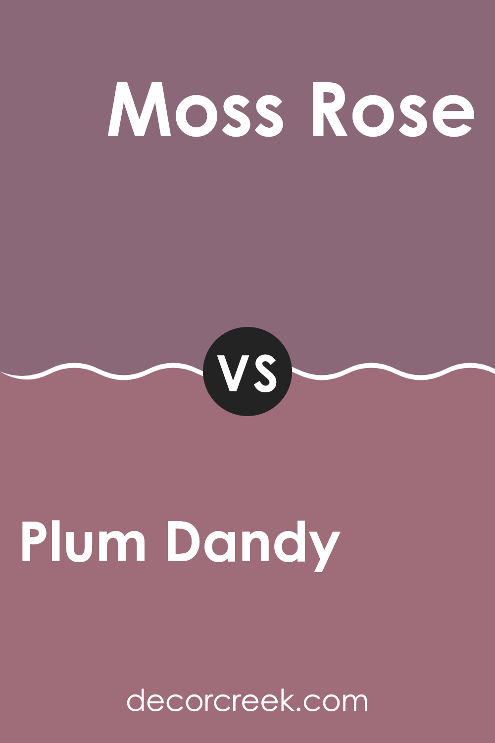
Plum Dandy SW 6284 by Sherwin Williams vs Moss Rose SW 6291 by Sherwin Williams
Plum Dandy and Moss Rose by Sherwin Williams are two vivid colors, each offering a distinct aura for interior rooms. Plum Dandy is a deep, muted purple with hints of gray, creating a cozy and comfortable atmosphere.
This color is flexible, working well in living rooms or bedrooms to add a touch of subtle richness. On the other hand, Moss Rose is a warmer tone, presenting a soft pink that exudes freshness and femininity.
This color is ideal for rooms intended to feel light and airy, such as bathrooms or nurseries. Both colors, while unique in their own rights, can potentially complement each other, especially in a floral or romantic-themed decor, enhancing the overall aesthetic of a room with their gentle contrast.
You can see recommended paint color below:
- SW 6291 Moss Rose
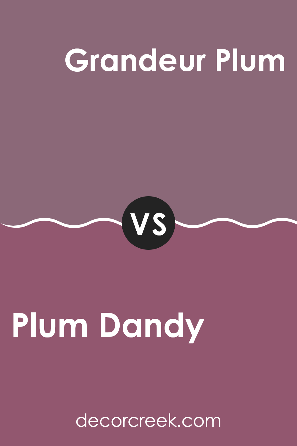
Plum Dandy SW 6284 by Sherwin Williams vs Grandeur Plum SW 6565 by Sherwin Williams
Plum Dandy and Grandeur Plum, both by Sherwin Williams, offer unique takes on plum shades that can set unique moods in any room. Plum Dandy is a lighter, more subdued tone, perfect for creating a cozy and welcoming atmosphere in rooms.
Its softness makes it flexible, suitable for living areas or bedrooms where you want a gentle touch of color without feeling too intense. On the other hand, Grandeur Plum is richer and deeper, lending itself to more dramatic and eye-catching applications.
This shade is ideal for making a statement, whether as an accent wall or in dining rooms, where it can create a more intimate setting with its darker, more pronounced hue. Although both colors share a plum base, the intensity and depth of Grandeur Plum set it distinctly apart from the softer, more relaxed vibe of Plum Dandy.
You can see recommended paint color below:
- SW 6565 Grandeur Plum
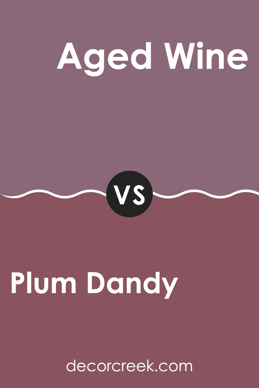
Plum Dandy SW 6284 by Sherwin Williams vs Aged Wine SW 6299 by Sherwin Williams
Plum Dandy and Aged Wine, both by Sherwin Williams, are rich, deep hues that offer warmth and depth to any room. Plum Dandy is a true plum color with a vibrant, berry-like tone that feels lively and inviting.
It’s the kind of color that can make a room feel cozy yet fresh. On the other hand, Aged Wine is a darker shade that leans more toward a burgundy, reminiscent of a fine red wine. Its darker base gives it an air of mystery and makes it perfect for creating a more intimate atmosphere.
Both colors are great choices for adding a touch of drama to a room, yet they each bring their own unique character. Plum Dandy is more playful and lighter, suitable for rooms that want to maintain a lively yet cozy vibe. Aged Wine, being darker, suits areas where a quieter, more subdued, but equally warm feel is desired. The choice between them would depend on the mood you’re trying to achieve and the level of boldness you prefer in your color scheme.
You can see recommended paint color below:
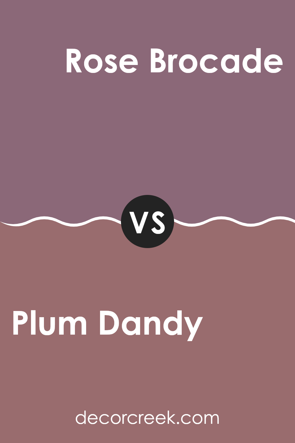
Plum Dandy SW 6284 by Sherwin Williams vs Rose Brocade SW 0004 by Sherwin Williams
Plum Dandy and Rose Brocade are two unique colors from Sherwin Williams. Plum Dandy is a rich, deep purple with a hint of grey. It gives off a cozy and warm feel, making it perfect for creating a snug atmosphere in a room. Rose Brocade, on the other hand, is a soft, muted pink that has a vintage charm. It’s lighter and offers a more soothing touch, ideal for areas where you want a gentle, welcoming vibe.
When used in home decor, Plum Dandy works well in areas that benefit from a darker, more dramatic color, like living rooms or bedrooms. It pairs nicely with light neutrals or creamy whites for a balanced look. Rose Brocade is great for areas that need a subtle pop of color, such as bathrooms or nurseries, complementing white or pale gray beautifully.
In essence, while Plum Dandy adds depth and warmth, Rose Brocade introduces a tender and airy quality to interiors. Both colors have their unique appeal, depending on the mood and style you want to create.
You can see recommended paint color below:
In wrapping up my thoughts on SW 6284 Plum Dandy by Sherwin Williams, I must say, I’m quite pleased with this paint color. It’s like a cozy blanket on a chilly day, warm and comforting. When I decided to give my room a new look, I chose Plum Dandy because it wasn’t just another pink or purple. It has this special touch that sets it apart, something that makes the room feel just right.
I noticed that this color goes well with lots of other colors. Whether I paired it with soft creams or even bold greens, it looked fantastic. It’s perfect for anyone looking to add a bit of warmth and charm to their room without making things too bright or too dark. It’s like the color knows just how to balance the look of a room.
So, if you’re thinking about painting something new and want a color that feels warm, inviting, and a little unique, Plum Dandy might be what you’re looking for. It’s made my room a lot more enjoyable, and I think it could do the same for yours. Whether it’s for a whole room or just an accent wall, this color definitely brings something special to the table.
Ever wished paint sampling was as easy as sticking a sticker? Guess what? Now it is! Discover Samplize's unique Peel & Stick samples.
Get paint samples

