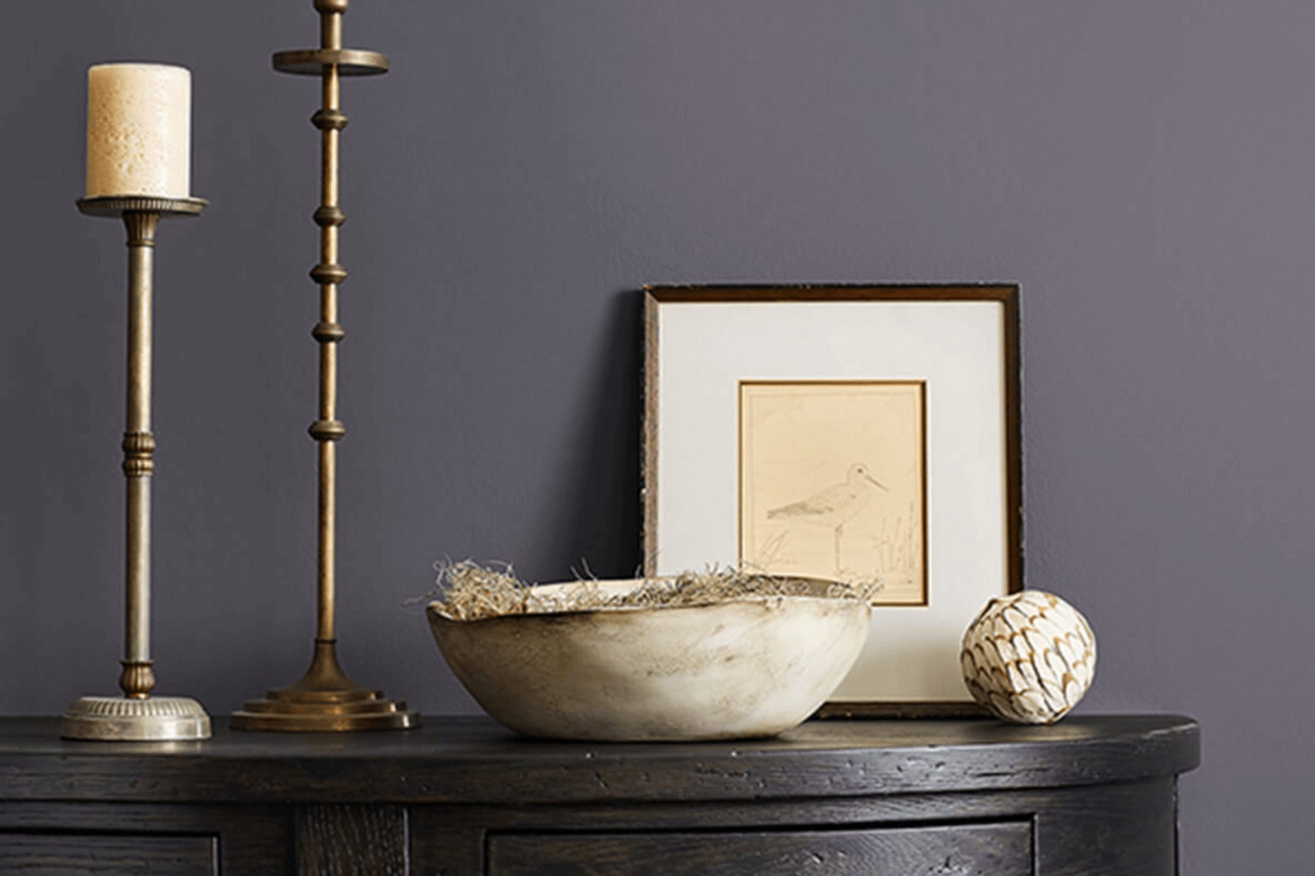
Have you ever thought about how the perfect shade of dark blue could change the look and feel of your room? Let me introduce you to SW 6264 Midnight by Sherwin Williams, a deep, rich blue that might just be what you’re looking for.
This shade is not just any dark blue; it has a vibrancy that brings a refined and contemporary flair to any room without feeling too intense. It works wonders in accentuating areas, creating a strong but calm presence. Whether you’re considering a fresh look for your living room, a relaxing atmosphere for your bedroom, or even an elegant touch for your office, SW 6264 Midnight could provide the mood you need.
Not only is its deep hue beautiful, but it also pairs well with a variety of decor styles and complements a wide range of colors.
Just imagine changing a room into something truly unique. Let’s see how SW 6264 Midnight could work for you!
What Color Is Midnight SW 6264 by Sherwin Williams?
Midnight by Sherwin Williams is a deep, dark blue that gives off a feeling of calm and depth. This color brings to mind the night sky just before it turns completely black. It’s not just a straight blue; there’s a hint of green in it, which makes it a unique shade that catches the eye.
This moody blue is especially great for creating a cozy, intimate atmosphere in your home. It works well in modern and contemporary interior styles, along with more traditional or dramatic decor. Imagine it in a reading nook, as an accent wall in a bedroom, or throughout a dining room for a dramatic effect.
When it comes to materials, Midnight pairs wonderfully with natural wood, whether it’s light oak or a richer walnut. These combinations bring warmth to the cool tone of the blue. Metallic finishes like brass or gold also work well, adding a touch of luxury and brightness to the color’s deep base. For textures, think about velvet for an extra touch of luxury or linen for a more relaxed vibe.
Overall, Midnight is a flexible color that can create a striking impact, whether used for a full room or just an accent. Its ability to pair with a range of materials and textures makes it easy to incorporate into various design themes.
Is Midnight SW 6264 by Sherwin Williams Warm or Cool color?
MidnightSW 6264 by Sherwin Williams is a dark, rich color often chosen for its deep tone and striking presence. It’s perfect for creating a bold statement in a room, particularly when used on accent walls or for specific features like doors or cabinets.
The strong character of this color provides a powerful contrast against lighter colors, making the room visually interesting. Additionally, when paired with soft lighting, it can add a cozy and inviting atmosphere to any room.
However, because it’s so dark, it’s important to use it thoughtfully to avoid making a room feel too enclosed. In larger rooms or rooms with plenty of natural light, MidnightSW 6264 can make the area feel more grounded and focused. It’s an excellent choice for those looking to add a touch of drama and personality to their home without feeling too intense overall.
Undertones of Midnight SW 6264 by Sherwin Williams
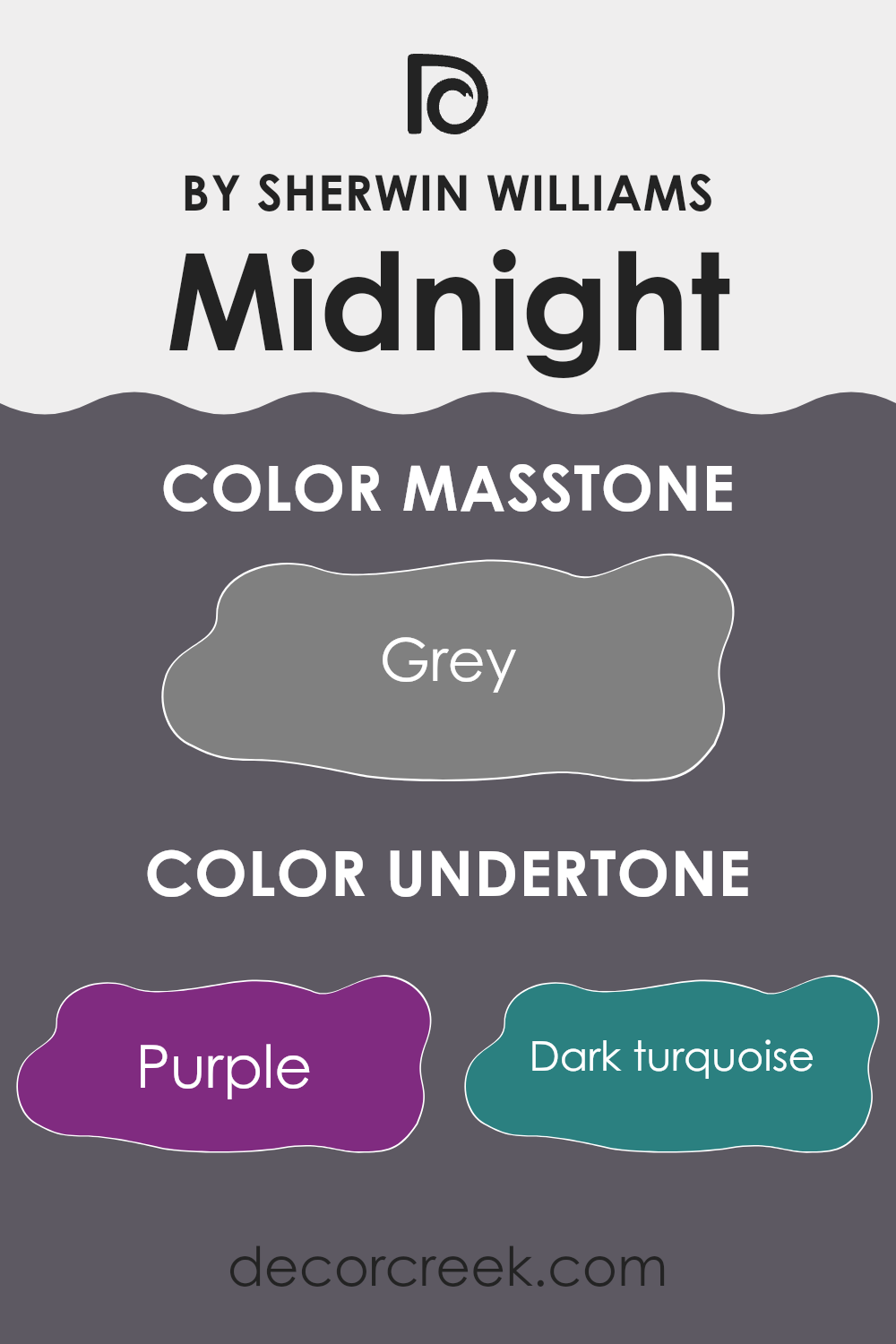
MidnightSW 6264 is a dark and mysterious color that can bring a lot of character to a room. Because it has rich undertones of colors like purple, dark turquoise, and navy, this paint can create a varied appearance depending on the lighting and surrounding colors. For instance, in a room with natural light, the purple undertone might become more noticeable, adding a subtle hint of warmth to the room. On the other hand, in artificial lighting, the dark turquoise and navy undertones might stand out more, giving the walls a cooler feel.
These undertones also mean that MidnightSW 6264 is highly adaptable. It can pair well with many different types of décor and can suit various rooms, from a cozy study to a sleek living room. The mix of undertones like olive, brown, and dark green can help it complement natural materials like wood or leather, enhancing the richness of these textures.
When using MidnightSW 6264 on interior walls, it’s important to consider the room’s existing colors and sources of light to fully understand how these undertones will interact with other elements. The result can be a dynamic and interesting room that reflects different moods throughout the day, from a vibrant, energetic morning to a calm and cozy evening. It’s this interaction of undertones that helps create a unique atmosphere in any room.
What is the Masstone of the Midnight SW 6264 by Sherwin Williams?
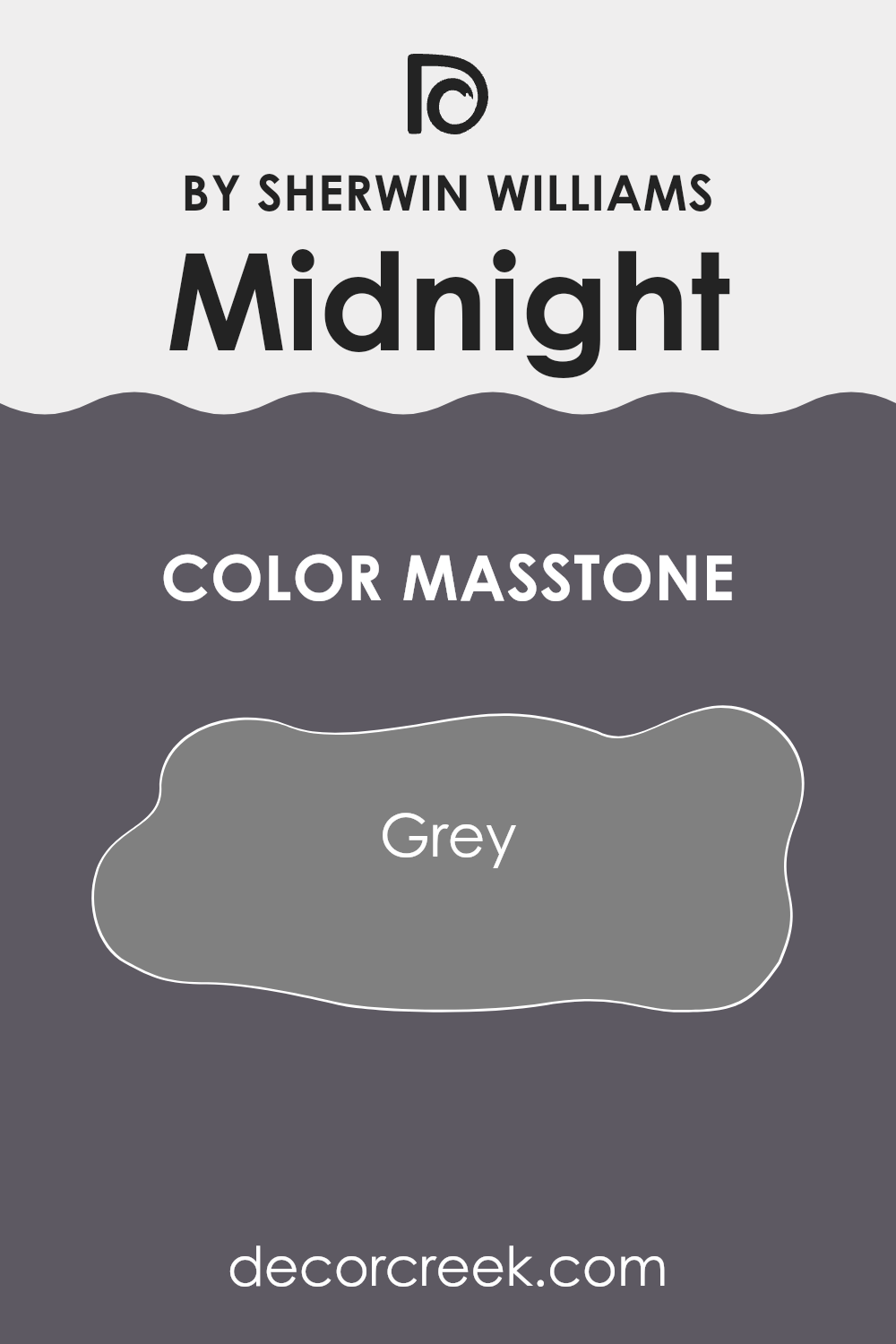
MidnightSW 6264 by Sherwin Williams is a unique shade with a masstone of Grey (#808080). This particular grey offers a balanced tone that brings a calming atmosphere to any room.
When used in homes, its neutral character makes it highly flexible, blending well with different styles and colors. Whether in a modern setting or a more traditional room, this shade can be a perfect backdrop as it doesn’t dominate other elements in the room but instead complements them.
The neutrality of Grey (#808080) ensures it can pair easily with brighter colors or serve as a stand-alone color for a more understated look. It’s particularly useful in small rooms, making them appear larger, as light shades naturally reflect more light. In larger areas, it helps create a cohesive look without breaking the visual flow. Overall, MidnightSW 6264 is adaptable and practical for enhancing the aesthetic of any home environment.
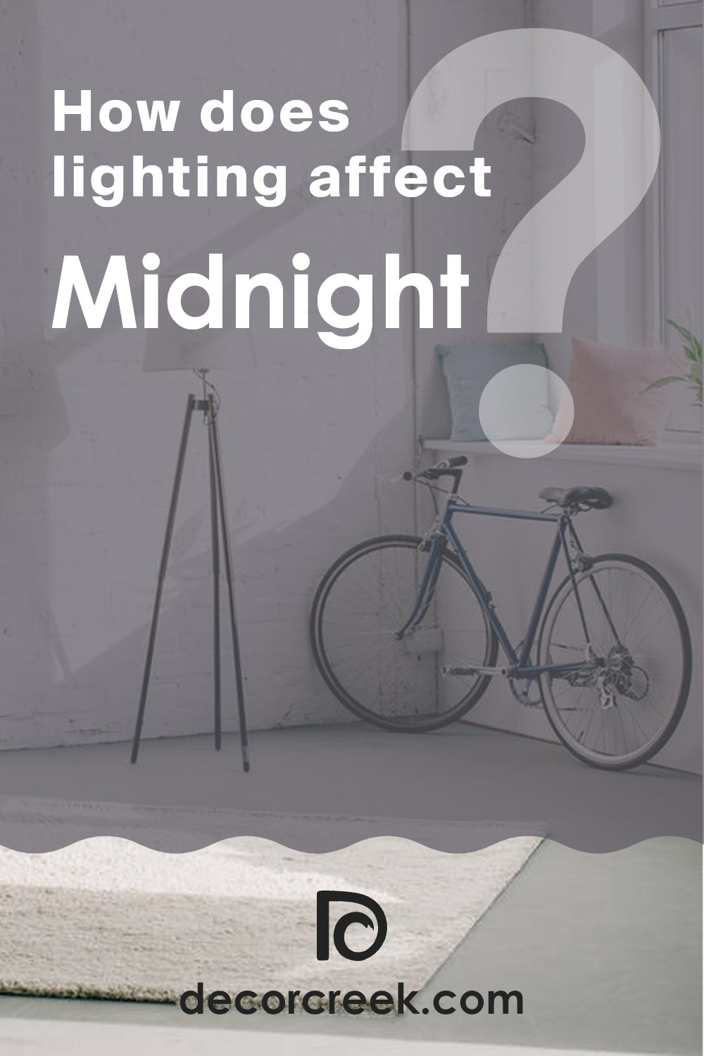
How Does Lighting Affect Midnight SW 6264 by Sherwin Williams?
Lighting plays a crucial role in how we perceive colors. Different light sources can significantly alter the appearance of a color in any room. For example, a specific shade of dark navy blue might look different under various lighting conditions due to the light’s temperature and intensity.
In artificial light, such as incandescent bulbs or LED lights, the color MidnightSW 6264, a deep navy blue, can appear richer and more vibrant. This happens because artificial light often highlights the depth and vividness of darker colors, making them stand out more prominently.
In natural light, the perception of this navy blue can change throughout the day. Under bright midday sunlight, it might look slightly lighter or have a soft glow. However, during the early morning or late evening, when the sunlight is softer and warmer, the color could appear more subdued and muted.
The orientation of rooms also affects how the color displays. In north-facing rooms, which receive less direct sunlight and have cooler light, MidnightSW 6264 can appear darker and somewhat more profound. This setting is ideal if you want to create a more enclosed, cozy feel.
In south-facing rooms, which are bathed in more intense and warmer light for most of the day, this navy blue will reveal a slightly more vibrant version of itself, brightening up due to the abundance of light.
In east-facing rooms, the morning sunlight can make MidnightSW 6264 look very striking and dynamic, especially in the early hours. As the day progresses and the natural light decreases, the color will gradually return to its darker, more typical shade.
Lastly, in west-facing rooms, the color will experience softer illumination in the morning and become dramatically vivid and bold in the evening as the sun sets, producing a stunning effect against this dark blue backdrop. Understanding these nuances can help in selecting the right paint and room placement based on the lighting available, enhancing the overall ambiance of your room.
What is the LRV of Midnight SW 6264 by Sherwin Williams?
LRV stands for Light Reflectance Value, which is a measure of how much light a color reflects. Think of it as a scale that shows how much visible light bounces off a painted surface compared to a pure white base, which would reflect almost all light that hits it. Paint colors with a higher LRV reflect more light, making a room feel lighter and airier.
Conversely, colors with a lower LRV absorb more light, which can make a room feel cozier but smaller and darker. This measurement is crucial when choosing paint colors as it helps predict how light or dark a color will appear once it’s on your walls.
The LRV for MidnightSW 6264 is 10.317, indicating that it is on the lower end of the scale. This means it’s a dark color that doesn’t reflect much light. In practical terms, when used on interior walls, it is likely to absorb light rather than reflect it, potentially making a room feel smaller and more enclosed.
This could be ideal for creating a dramatic, intimate setting but might not be the best choice if you’re looking to brighten up a dark room. When planning your color scheme, consider both natural and artificial light sources, as they will influence the overall impact of the color on your room.

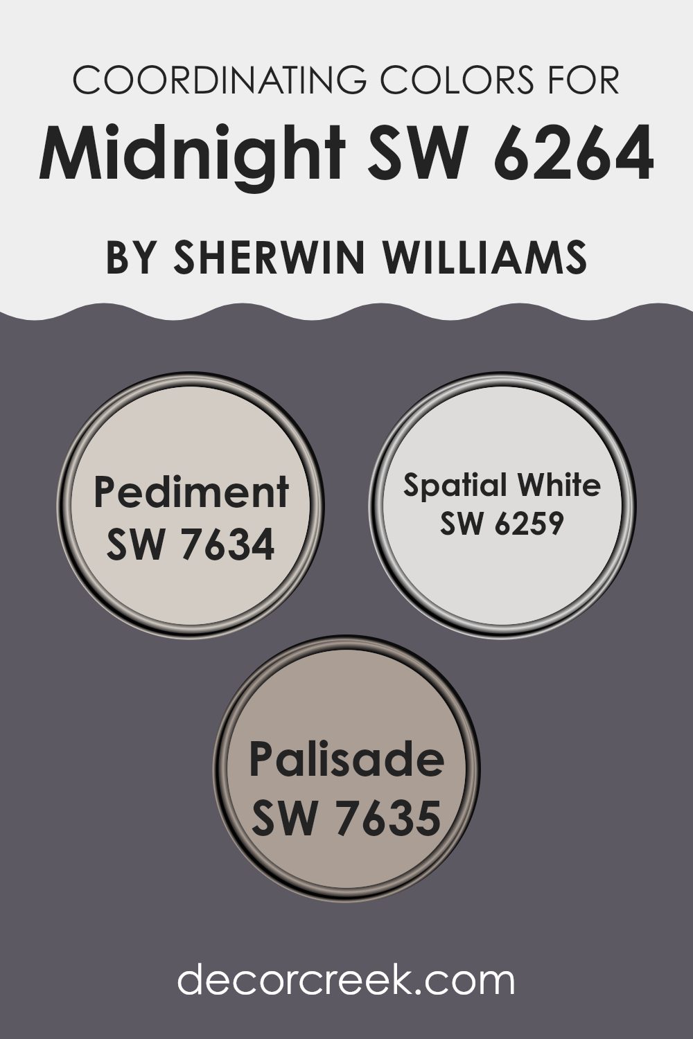
Coordinating Colors of Midnight SW 6264 by Sherwin Williams
Coordinating colors are those that complement each other nicely and create a balanced look when used together in a room. They work by enhancing the main color, bringing out its best tones, or adding depth to the overall design. In the case of Midnight SW 6264 by Sherwin Williams, which is a deep, rich color, there are several coordinating colors that pair well with it, providing a harmonious range of options for decorating a room.
Pediment SW 7634 is a subtle greige that works well with more robust colors like Midnight. It has a warm, neutral tone that can soften the intensity of darker hues, making it perfect for balancing out a room that features strong, dark walls. Spatial White SW 6259 is a clean, clear white that offers a crisp contrast to deeper shades.
It’s excellent for trim, ceilings, and even furniture, adding brightness and a sense of openness to rooms. Lastly, Palisade SW 7635 adds a touch of earthy peach, offering a slightly warmer alternative that complements the cooler dark blue of Midnight. This combination can create a cozy yet vibrant atmosphere, ideal for rooms needing a touch of warmth. Together, these colors work seamlessly to create aesthetic interiors that are pleasant and inviting.
You can see recommended paint colors below:
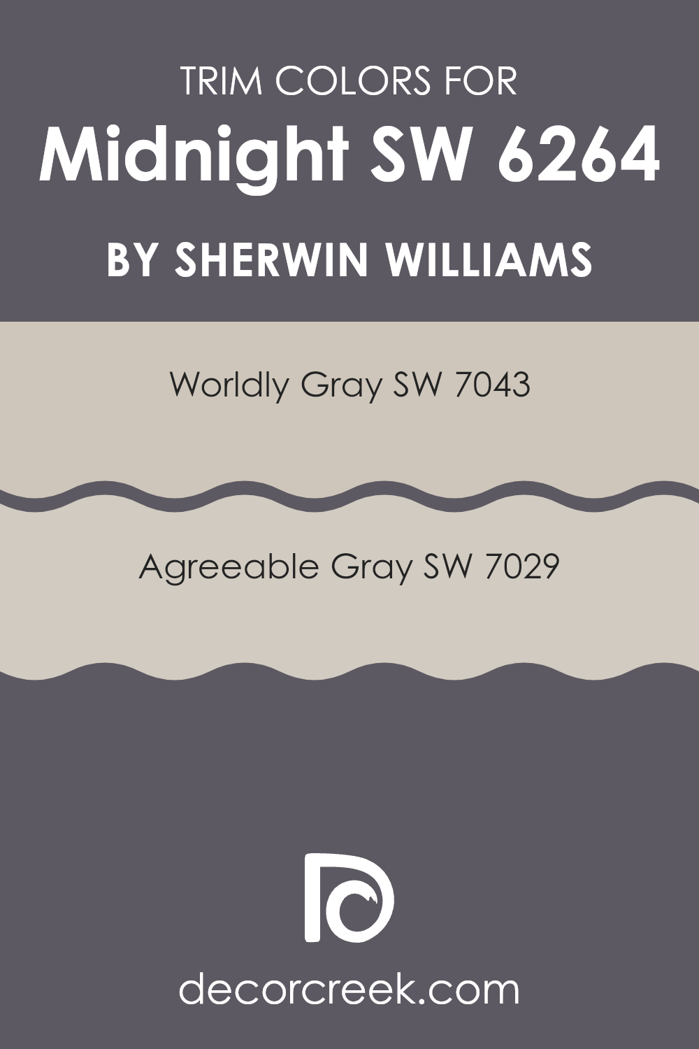
What are the Trim colors of Midnight SW 6264 by Sherwin Williams?
Trim colors, like SW 7043 Worldly Gray and SW 7029 Agreeable Gray by Sherwin Williams, play a crucial role in interior and exterior design by outlining and accentuating architectural features and details. These colors are especially important when coordinated with darker shades, such as a deep blue or navy. They act as a visual frame, enhancing the overall aesthetics and making the primary color stand out more prominently.
The use of lighter trim colors, such as gray tones, can also help in creating a visual balance by softening the impact of a bold wall color, providing a pleasing contrast that is easy on the eyes. SW 7043 Worldly Gray is a neutral shade that carries an earthy undertone, making it flexible and easy to pair with a variety of color schemes. This particular gray manages to offer warmth, which can temper the boldness of darker colors without feeling too intense.
SW 7029 Agreeable Gray, on the other hand, is a lighter and softer gray that gives a fresher look. It is subtle yet effective in highlighting the distinct elements of a room, ensuring that features like moldings, door frames, and window trims are attractively defined against richer, darker backdrops. Both colors contribute to a harmonious color palette that enhances the main color’s intensity and depth.
You can see recommended paint colors below:
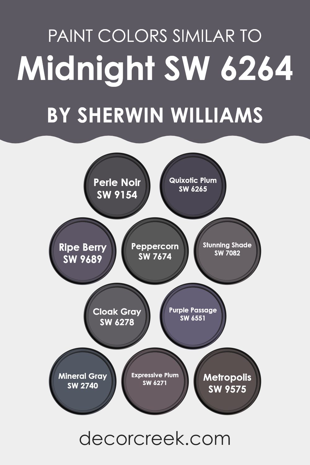
Colors Similar to Midnight SW 6264 by Sherwin Williams
Similar colors play a crucial role in design because they create harmony and a cohesive look. When colors are similar, they blend well together, producing a pleasing aesthetic that is easy on the eyes. Using hues that are closely related can also give a sense of depth and continuity in a room. For example, various shades of dark, moody colors like those close to Midnight make a room feel more coherent and connected, allowing for a subtle yet impactful stylistic expression.
If you look at colors like Perle Noir, it presents as a deep, almost black grey, adding rich depth to its surroundings. Quixotic Plum offers a mysterious, deep plum hue that feels both warm and inviting. Ripe Berry, a bit more vivid, injects an energetic pulse into rooms with its berry-inspired tone. Peppercorn, not far off, serves a greyish-charcoal color, anchoring rooms with its strong presence. Stunning Shade introduces a darker, shadowy grey that works well in creating a more enclosed, cozy feel.
Cloak Gray mixes slight bluish undertones within its cloudy grey, offering a unique twist that can give a room an enigmatic vibe. Purple Passage steps in with its paler, more subdued lavender-grey, softening the visual palette when used. Mineral Gray is straightforward and reliable, providing a stable, neutral base for any palette.
Expressive Plum, as its name suggests, uses a bolder, deeper plum to make a distinctive mark on a room, perfect for feature walls or dramatic accents. Lastly, Metropolis gives off a muted plum tone, which is highly adaptable, helping to bridge lighter and darker elements in a room. These similar colors all work harmoniously to support each other, enhancing the overall ambiance without feeling too intense.
You can see recommended paint colors below:
- SW 9154 Perle Noir
- SW 6265 Quixotic Plum
- SW 9689 Ripe Berry
- SW 7674 Peppercorn
- SW 7082 Stunning Shade
- SW 6278 Cloak Gray
- SW 6551 Purple Passage
- SW 2740 Mineral Gray
- SW 6271 Expressive Plum
- SW 9575 Metropolis
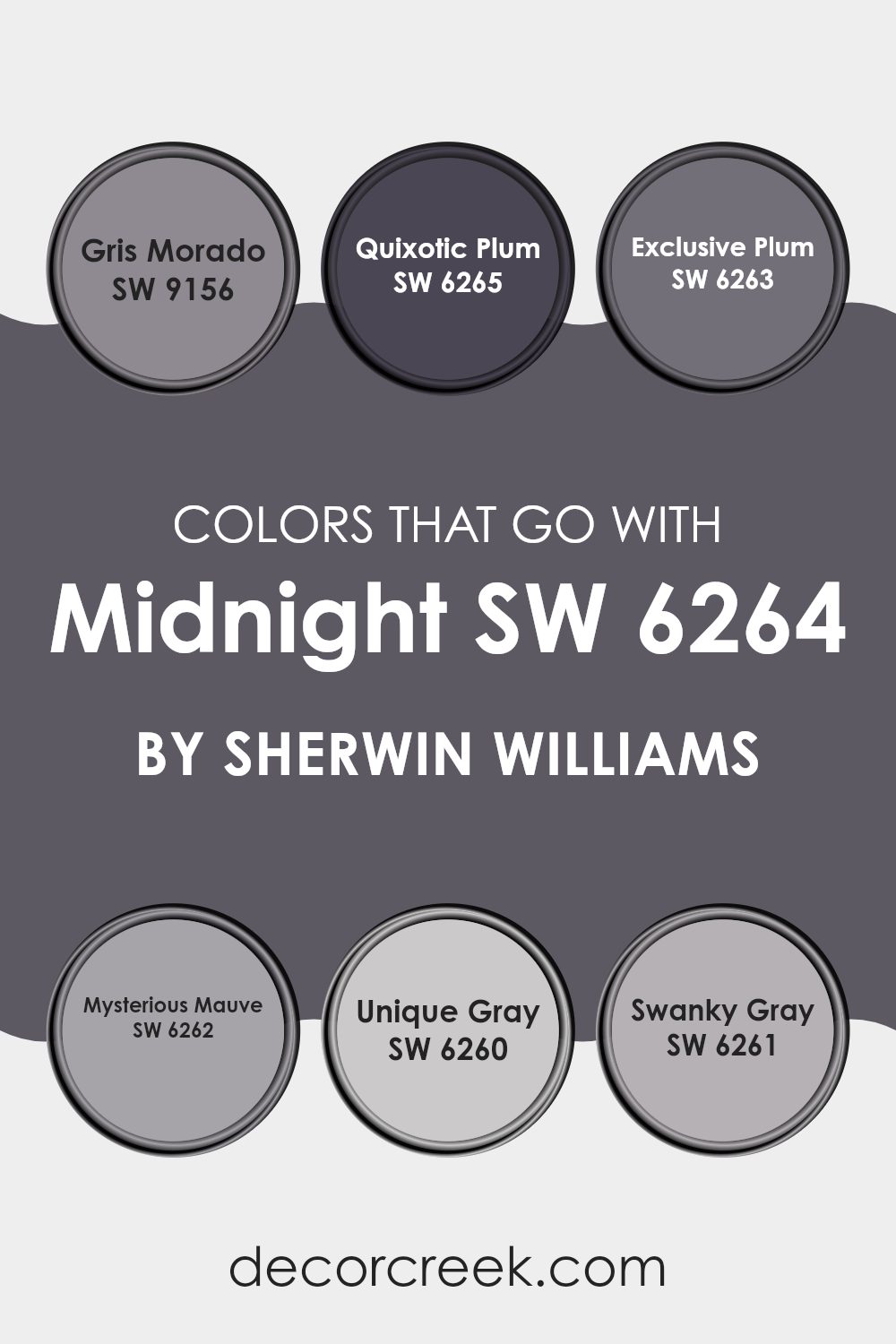
Colors that Go With Midnight SW 6264 by Sherwin Williams
Colors that complement MidnightSW 6264 by Sherwin Williams are essential because they help in creating a balanced and cohesive look for any room. By using shades like SW 9156 – Gris Morado and others, one can achieve a harmonious atmosphere that feels both comfortable and stylish. These colors work together by either providing a striking contrast or by subtly blending with MidnightSW 6264, depending on what you are aiming for in your design.
SW 9156 – Gris Morado is a deep, moody gray with a hint of purple that adds depth to the color palette. It works well in rooms that need a touch of mystery and charm. Next, SW 6265 – Quixotic Plum is a vibrant, deep plum that offers a bold splash of color, perfect for accent walls or decorative touches. SW 6263 – Exclusive Plum has a softer, more subdued look, ideal for creating a cozy and inviting environment.
SW 6262 – Mysterious Mauve is a gentle mauve that contributes to a calm and collected vibe in a room. For something more underplayed, SW 6260 – Unique Gray provides a neutral base that works well with more pronounced colors without taking center stage. Lastly, SW 6261 – Swanky Gray is a sleek, modern gray that brings an urban feel to the color scheme, working beautifully in contemporary interiors. Together, these colors support and enhance the unique characteristics of MidnightSW 6264, opening up a variety of design possibilities.
You can see recommended paint colors below:
- SW 9156 Gris Morado
- SW 6265 Quixotic Plum
- SW 6263 Exclusive Plum
- SW 6262 Mysterious Mauve
- SW 6260 Unique Gray
- SW 6261 Swanky Gray
How to Use Midnight SW 6264 by Sherwin Williams In Your Home?
Midnight SW 6264 by Sherwin Williams is a deep, rich blue paint that adds a lot of character to any room. It works really well in areas where you want to create a strong, bold look. For example, using it on a feature wall in your living room can really make the room stand out and draw attention. It’s also a great choice for bedrooms, where a darker color can help the room feel cozy and support relaxation.
If you enjoy a dramatic and cozy atmosphere, you can paint all the walls in a smaller room, like a bathroom or a study. Pair it with lighter furniture or accents like white trim or light wooden shelves to keep the room from feeling too dark.
Midnight is also flexible enough to be used outside, such as on doors or shutters, giving your home’s exterior a stylish and modern look. It works well with different lighting, showing various shades throughout the day, making it a dynamic choice for your home.
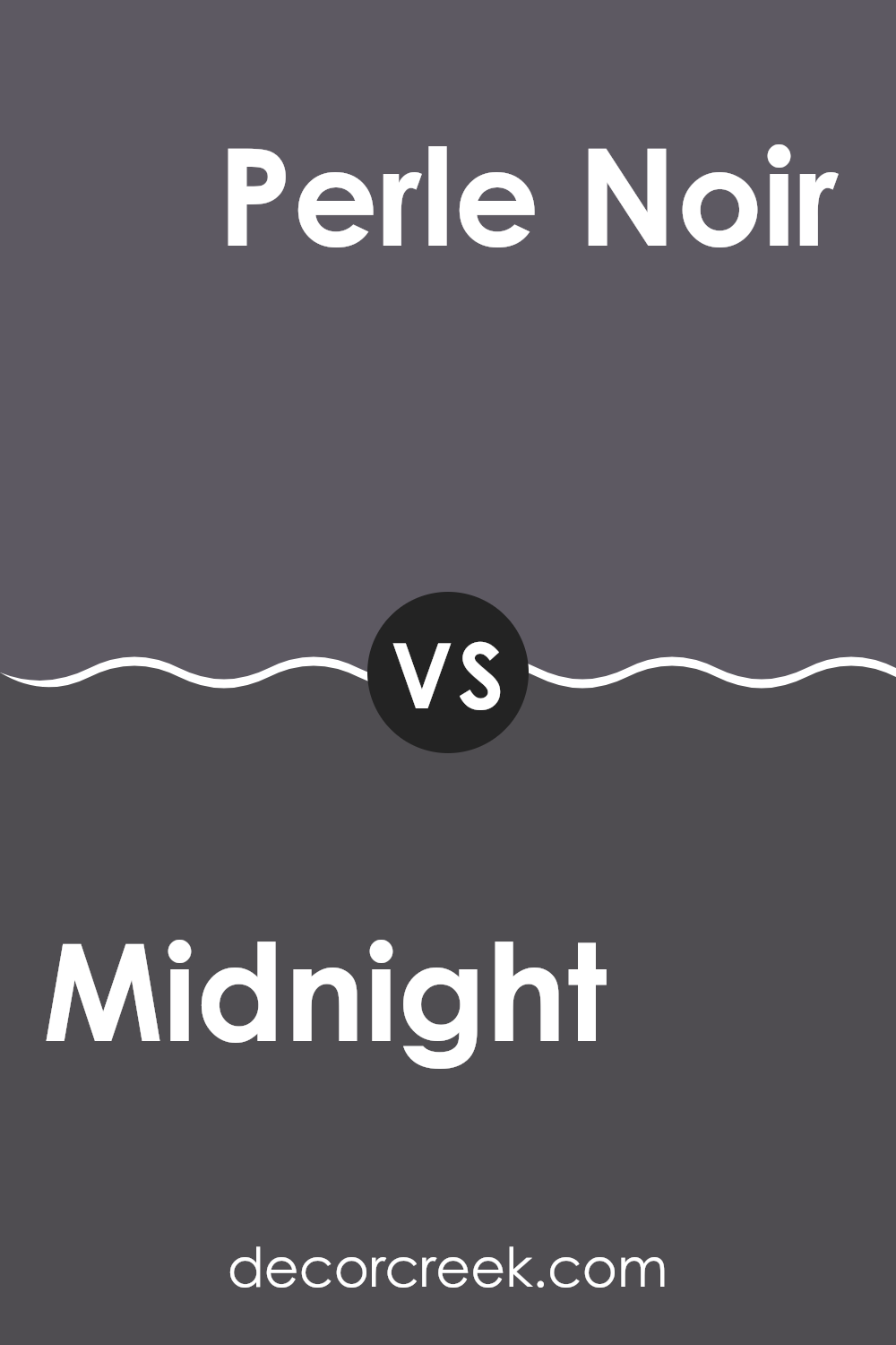
Midnight SW 6264 by Sherwin Williams vs Perle Noir SW 9154 by Sherwin Williams
Midnight by Sherwin Williams is a deep, rich navy blue that closely resembles the dark blue of a night sky just before it turns completely black. This color tends to add a strong, bold feel to rooms, making it great for accent walls or areas where a touch of drama is desired.
On the other hand, Perle Noir by Sherwin Williams leans closer to a true black with subtle hints of gray. It’s a softer alternative to a harsh black, offering a bit of warmth despite its dark tone. Perle Noir can give rooms a cozy, inviting atmosphere, especially when used in well-lit areas or paired with contrasting lighter colors.
Both colors are quite dark, but Midnight introduces a sense of rich color with its blue tones, whereas Perle Noir provides a neutral palette that pairs easily with other colors. Their uses in interior design are flexible, but their impact is distinctly different, with Midnight leaning toward color and drama, and Perle Noir toward a more muted, understated look.
You can see recommended paint color below:
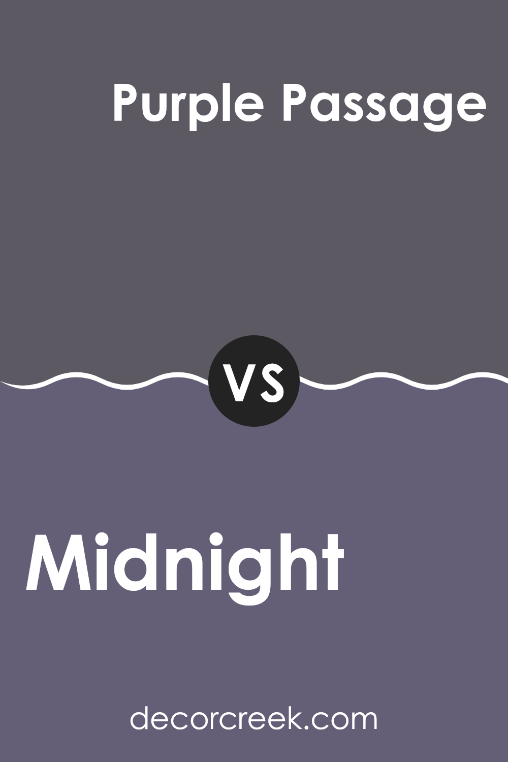
Midnight SW 6264 by Sherwin Williams vs Purple Passage SW 6551 by Sherwin Williams
Midnight SW 6264 by Sherwin Williams is a dark, almost black shade with hints of navy, making it a strong and bold choice. It pairs well with bright accents or can be used to create a cozy, intimate room due to its deep, enveloping tone.
On the other hand, Purple Passage SW 6551 is a lighter, soft purple that adds a touch of freshness without being too vivid. It has subtle hints of gray, making it a more muted and gentle color, ideal for creating a calm atmosphere in a room.
While Midnight lends a powerful and dramatic feel to interiors, Purple Passage provides a more gentle and relaxing effect. Both colors have their unique appeal, with Midnight being more dominant and Purple Passage offering a softer approach to adding color to a room.
You can see recommended paint color below:
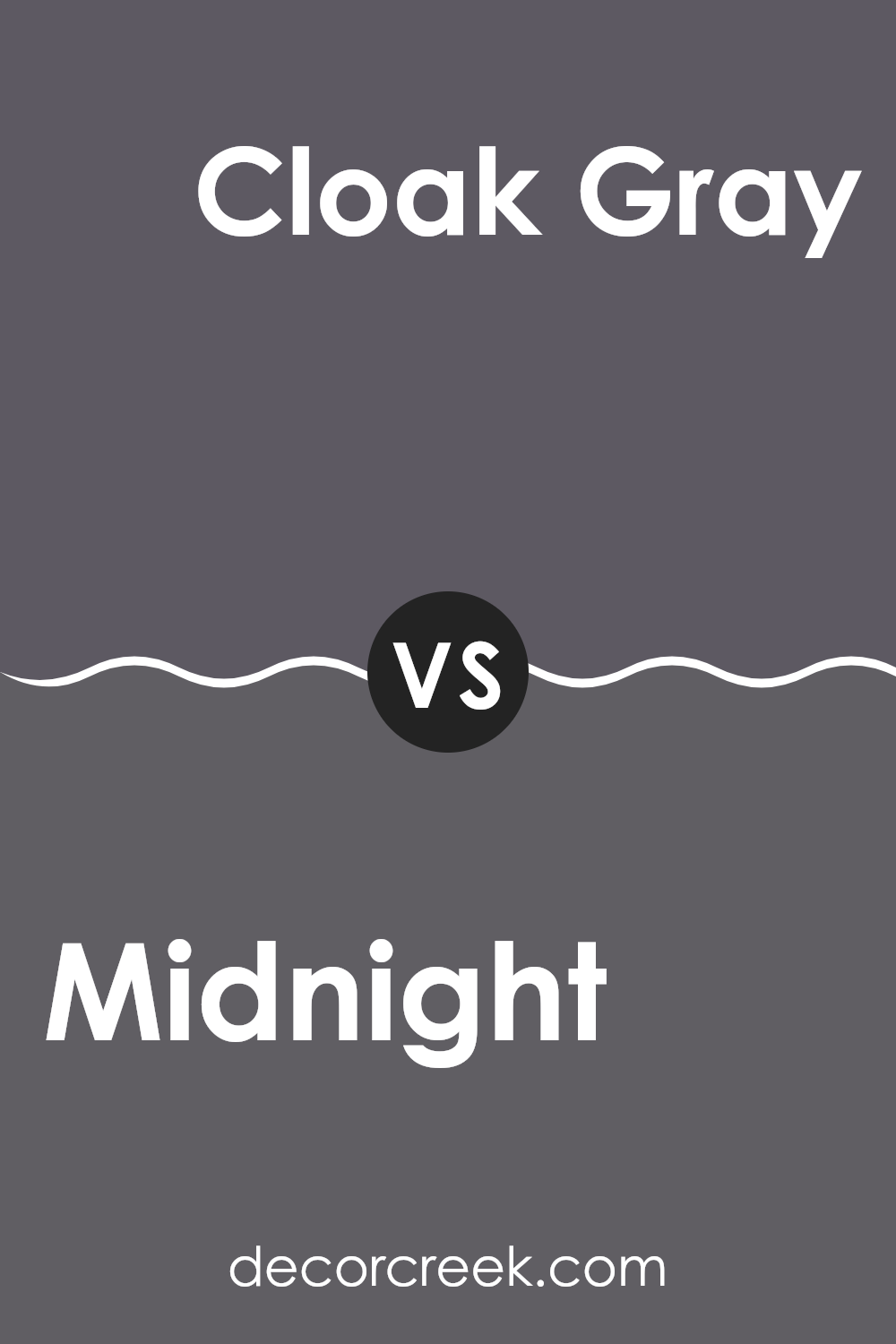
Midnight SW 6264 by Sherwin Williams vs Cloak Gray SW 6278 by Sherwin Williams
Midnight and Cloak Gray are both colors by Sherwin Williams with unique tones. Midnight is a deep, dark blue, almost black in low light, giving a rich and bold feel to any room. It’s great for creating a cozy, intimate ambiance and tends to make a strong statement whether on an accent wall or throughout a room.
On the other hand, Cloak Gray is a softer, more neutral shade. It’s a muted gray that leans slightly toward green, which makes it highly adaptable across different decorating styles. Cloak Gray works well as a background color, helping other colors stand out, and is less intense than Midnight, providing a lighter, more open feeling to a room.
Both colors have their distinct uses, where Midnight might be preferred in a bedroom or a movie room for its depth and the cozy feeling it offers, Cloak Gray could be better suited for living areas or offices where a calming, less dramatic backdrop is desired.
You can see recommended paint color below:
- SW 6278 Cloak Gray
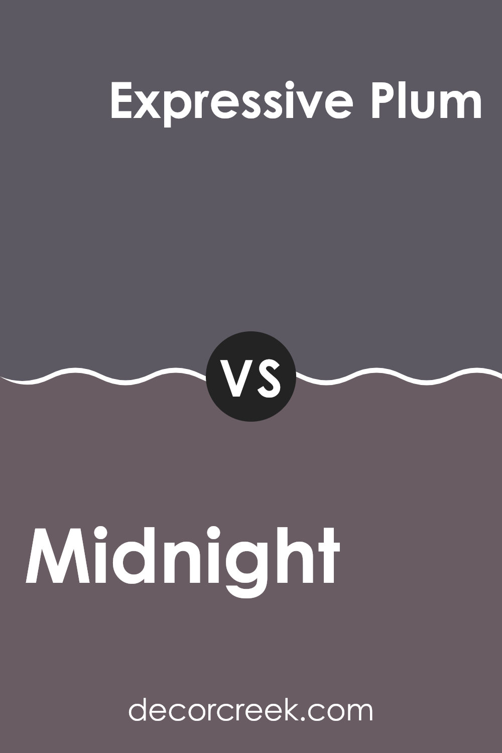
Midnight SW 6264 by Sherwin Williams vs Expressive Plum SW 6271 by Sherwin Williams
Midnight SW 6264 is a deep, dark blue with a touch of grey, giving it a muted yet strong presence. It’s a solid choice if you’re looking for a color that stands out without feeling too intense in a room. This shade can make smaller rooms feel more intimate and cozy.
Expressive Plum SW 6271, on the other hand, is a bold, deep purple with hints of grey. This color adds a dramatic flair and works well in areas where you want to make a statement, such as a focal wall or in a dining room setting.
Both colors are dark and can serve as excellent backgrounds for highlighting decor or artwork. While Midnight leans toward a cooler tone, Expressive Plum brings a warmer feel, which can influence the mood and perceived temperature of a room. Choosing between them depends on whether you prefer the cooler undertones of dark blue or the richer depths of dark purple.
You can see recommended paint color below:
- SW 6271 Expressive Plum
Midnight SW 6264 by Sherwin Williams vs Metropolis SW 9575 by Sherwin Williams
The two colors, Midnight and Metropolis by Sherwin Williams, both showcase unique aspects of darker tones, ideal for creating distinctive ambiences in a room. Midnight is a deep, rich blue, almost mirroring the color of the sky at its darkest hour. It brings a sense of calm and depth to interiors, making it perfect for quiet, reflective rooms like a bedroom or an office.
On the other hand, Metropolis leans more toward a gray scale but retains some complexity with hints of blue. This color is more neutral compared to Midnight, offering flexibility in various decorating schemes. It works well in high-traffic rooms such as living rooms or kitchens, as it can easily complement different decor styles.
While both colors share a dark base, Midnight presents a bolder choice with its blue undertones, whereas Metropolis is subtler, providing a flexible backdrop for both vibrant and muted furnishing choices. Choosing between them depends on the desired mood and the specific functional needs of a room.
You can see recommended paint color below:

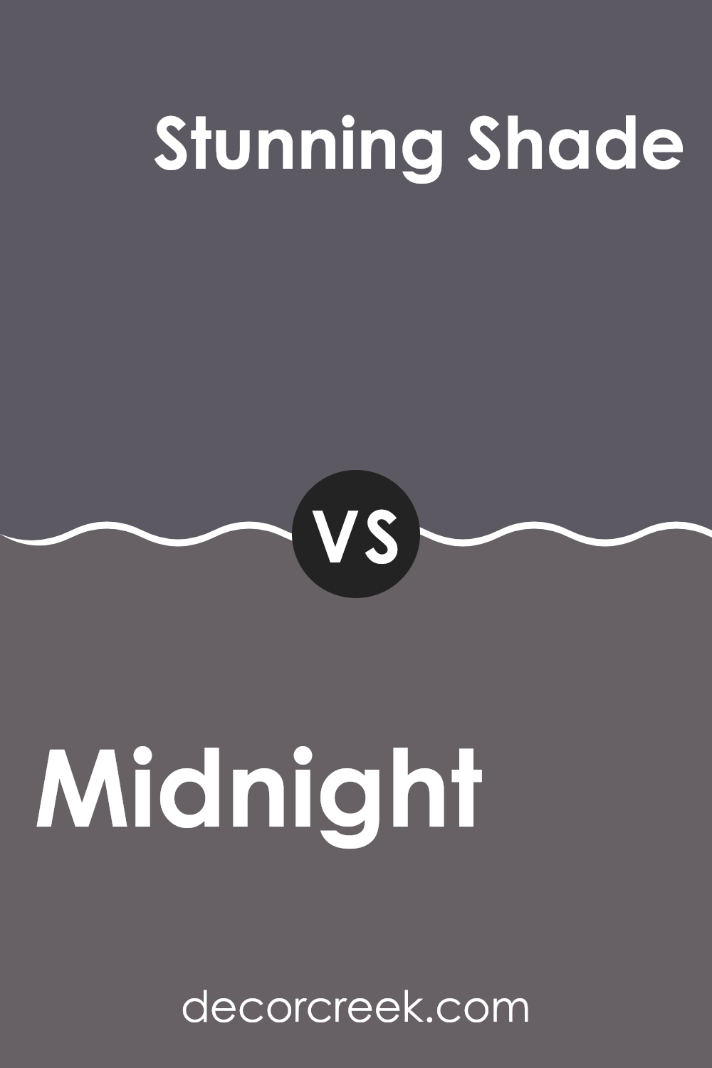
Midnight SW 6264 by Sherwin Williams vs Stunning Shade SW 7082 by Sherwin Williams
‘Midnight’ by Sherwin Williams is a deep, rich navy blue that closely resembles the night sky just before it turns completely black. It’s a strong color that carries a lot of presence and can give a room a cozy, enveloping feel. Being so dark, it works well in rooms meant for relaxation like bedrooms or living rooms where it brings a snug and secure atmosphere.
On the other hand, ‘Stunning Shade’ is another darker color, but with a unique twist. It leans more toward a charcoal gray, layered with subtle blue undertones. This color is flexible and muted, making it easier to match with various decor styles and colors. It serves as a great backdrop for art or can act as a foundation for bolder decor choices.
Both colors can dramatically affect the mood and feel of a room. ‘Midnight’ offers a deeper, bolder tone that feels more enclosed and private, while ‘Stunning Shade’ provides a softer, more neutral base that allows other design elements to stand out.
You can see recommended paint color below:
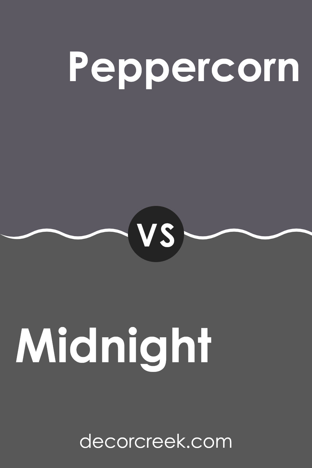
Midnight SW 6264 by Sherwin Williams vs Peppercorn SW 7674 by Sherwin Williams
Midnight and Peppercorn, both by Sherwin Williams, offer unique shades that can significantly affect the mood and style of a room. Midnight is a deep, dark blue that resembles the night sky just before it turns completely black. This color is perfect for creating a bold statement in a room, providing a dramatic backdrop that can make lighter colors pop or give a cozy, enveloping feel to a room.
Peppercorn, on the other hand, is a strong gray with warm undertones. It’s not as intense as Midnight, giving it a more neutral appearance that is flexible enough to work in many settings. This color can complement a wide range of decor styles and works well as both an accent and a main wall color.
While both colors are dark and can be used for similar purposes, Midnight leans toward a cooler tone with its blue base, whereas Peppercorn offers a softer, warmer feel due to its gray composition. Choosing between them depends on whether you prefer the cooler drama of blue or the subdued warmth of gray.
You can see recommended paint color below:
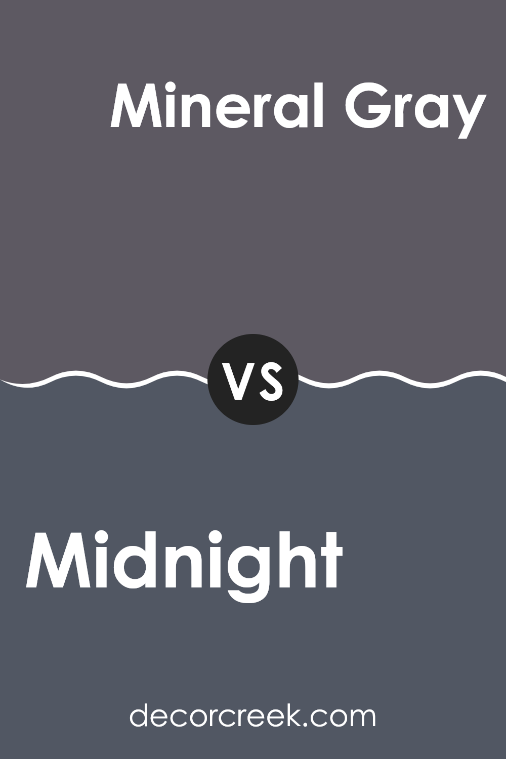
Midnight SW 6264 by Sherwin Williams vs Mineral Gray SW 2740 by Sherwin Williams
The main color, Midnight, is a deep blue that resembles the night sky. This color brings a strong sense of calm and is often used to create a cozy and secure feeling in rooms like living rooms or bedrooms. In contrast, Mineral Gray is a warm grey that has an earthy, natural feel to it.
This color is flexible and works well in a variety of rooms, providing a soothing backdrop that complements many decor styles. When comparing these two, Midnight is darker and more intense, perfect for making a bold statement or accenting a room.
Mineral Gray, on the other hand, is lighter and more understated, ideal for those who prefer a more subtle approach. Both colors offer unique aesthetic benefits and can enhance the atmosphere of a room depending on how they are used.
You can see recommended paint color below:
- SW 2740 Mineral Gray
Midnight SW 6264 by Sherwin Williams vs Ripe Berry SW 9689 by Sherwin Williams
Midnight SW 6264 and Ripe Berry SW 9689 by Sherwin Williams are two distinct colors with unique appearances. Midnight is a deep, dark blue that almost appears black under certain lighting. It is a strong color that adds a bold touch to rooms, making it a good choice for accent walls or furniture. This color can give a room a grounded feeling, perfect for creating a moody or cozy atmosphere.
On the other hand, Ripe Berry is a vibrant, deep red that leans toward a berry hue. This lively color can immediately draw the eye and add energy to any area where it is used. Ripe Berry can warm up a room and works well when used in accessories like pillows, throws, or even a statement wall in a room that needs a touch of brightness.
Both colors offer distinct vibes—Midnight creates a more calm, quiet feel, while Ripe Berry introduces a burst of warmth and vitality. The choice between them depends on the desired effect in a decorating project.
You can see recommended paint color below:
Midnight SW 6264 by Sherwin Williams vs Quixotic Plum SW 6265 by Sherwin Williams
Midnight SW 6264 is a deep, blue-black shade that closely resembles the dark sky on a clear night. It has a rich, saturated tone that makes it great for creating a strong, dramatic look in any room. This color can serve as a powerful background, helping other colors to stand out, or work well on accent walls or for furniture to bring a bold statement to a room.
On the other hand, Quixotic Plum SW 6265 is a dark plum color with hints of purple. It offers a warmer feel compared to Midnight, due to its red and purple undertones. This makes it a good choice for creating a cozy and inviting atmosphere. It pairs beautifully with lighter, neutral colors and can add a touch of warmth to interiors when used on walls or as an accent.
Both colors are quite dark and can work well in similar settings, but the warmth of Quixotic Plum provides a different mood compared to the cooler, more neutral tone of Midnight.
You can see recommended paint color below:
Reflecting on Sherwin Williams’ SW 6264 Midnight, I am truly impressed with this deep, almost mystical shade of blue that can add a touch of mystery and elegance to any room. As I have learned, Midnight is not just any blue; it carries a depth that can make a room feel cozy and inviting while also presenting a bold statement. It is dark, yes, but it’s also filled with wonder, like the night sky just waiting for us to look up and admire its beauty.
This shade of paint could work wonders in a bedroom to help inspire calm and restful nights, or in a living room to build a setting that speaks both comfort and style. It pairs beautifully with bright whites or soft, light grays which help bring out its rich tones and textures even more.
In conclusion, using SW 6264 Midnight can help create a unique and intimate atmosphere in a home, making any room feel special and well thought out. It’s definitely a color that captures attention and can make your walls not just parts of your house, but parts of your home’s personality.
Whether aiming for a modern look or a classical aura, Midnight by Sherwin Williams stands out as a smart choice for anyone ready to give their home a dash of depth and intrigue.
Ever wished paint sampling was as easy as sticking a sticker? Guess what? Now it is! Discover Samplize's unique Peel & Stick samples.
Get paint samples

