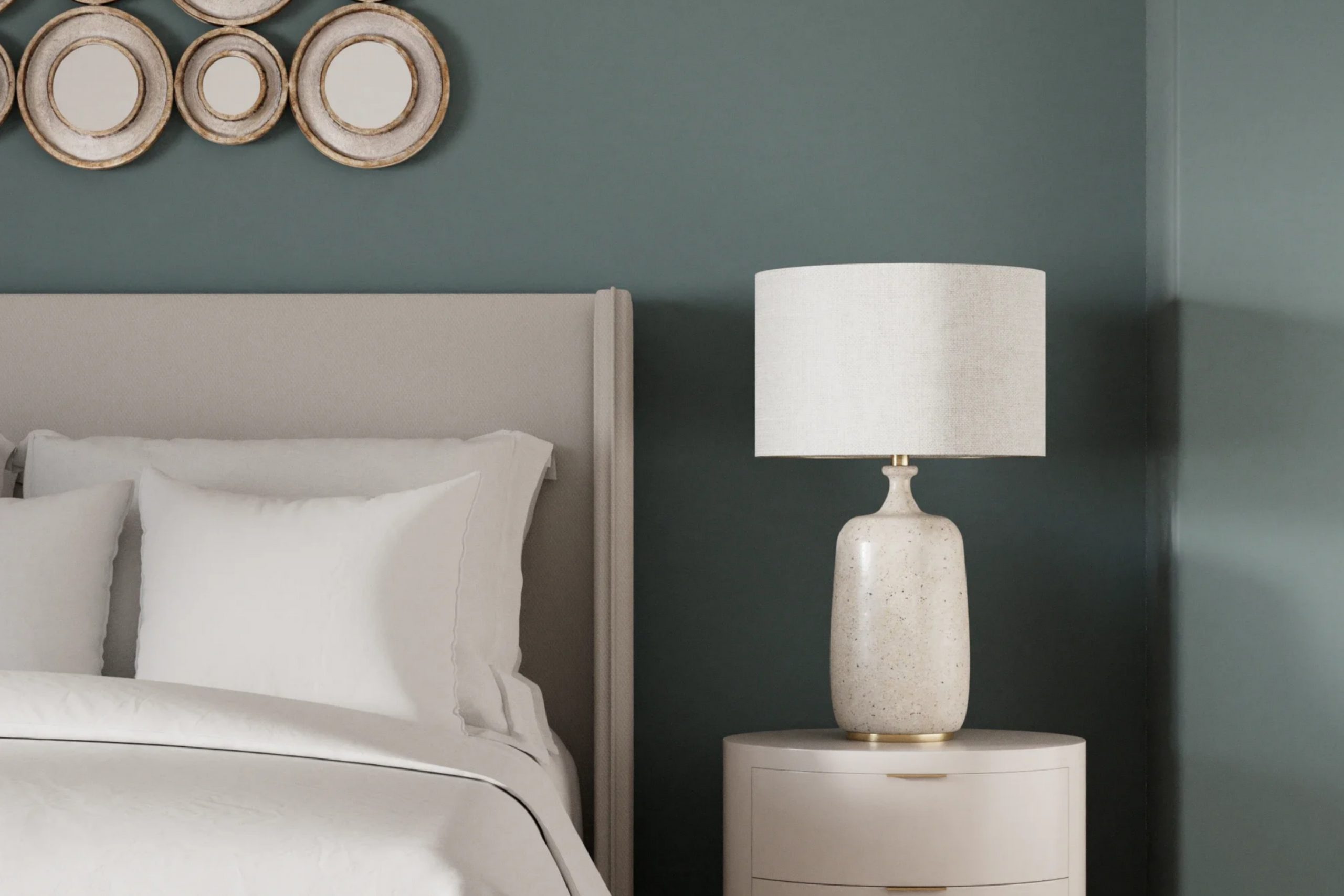
When I first see SW 9655 Mountain Pass by Sherwin Williams, it’s like opening a window to a serene landscape. The rich, earthy hue immediately reminds me of a peaceful mountain retreat, where the air is crisp and the world feels far away. This color has the unique ability to bring a sense of calm and groundedness to any space, making it a perfect choice for creating a relaxing atmosphere in your home.
I notice how it pairs beautifully with natural elements like wood and stone, accentuating their textures while adding warmth. Whether it’s used as a statement wall or throughout an entire room, Mountain Pass effortlessly adapts to both traditional and modern settings. It’s versatile yet distinctive; understated but memorable.
There’s a comforting depth to this tone, akin to being wrapped in a cozy blanket on a cool evening.
Choosing Mountain Pass means inviting a little piece of nature indoors. It encourages a sense of balance, reminding me of the beauty found in untouched landscapes. This color allows for personal expression, offering a backdrop that is both neutral and impactful.
It’s a choice that means bringing warmth and harmony into your space, making it feel more inviting and alive.
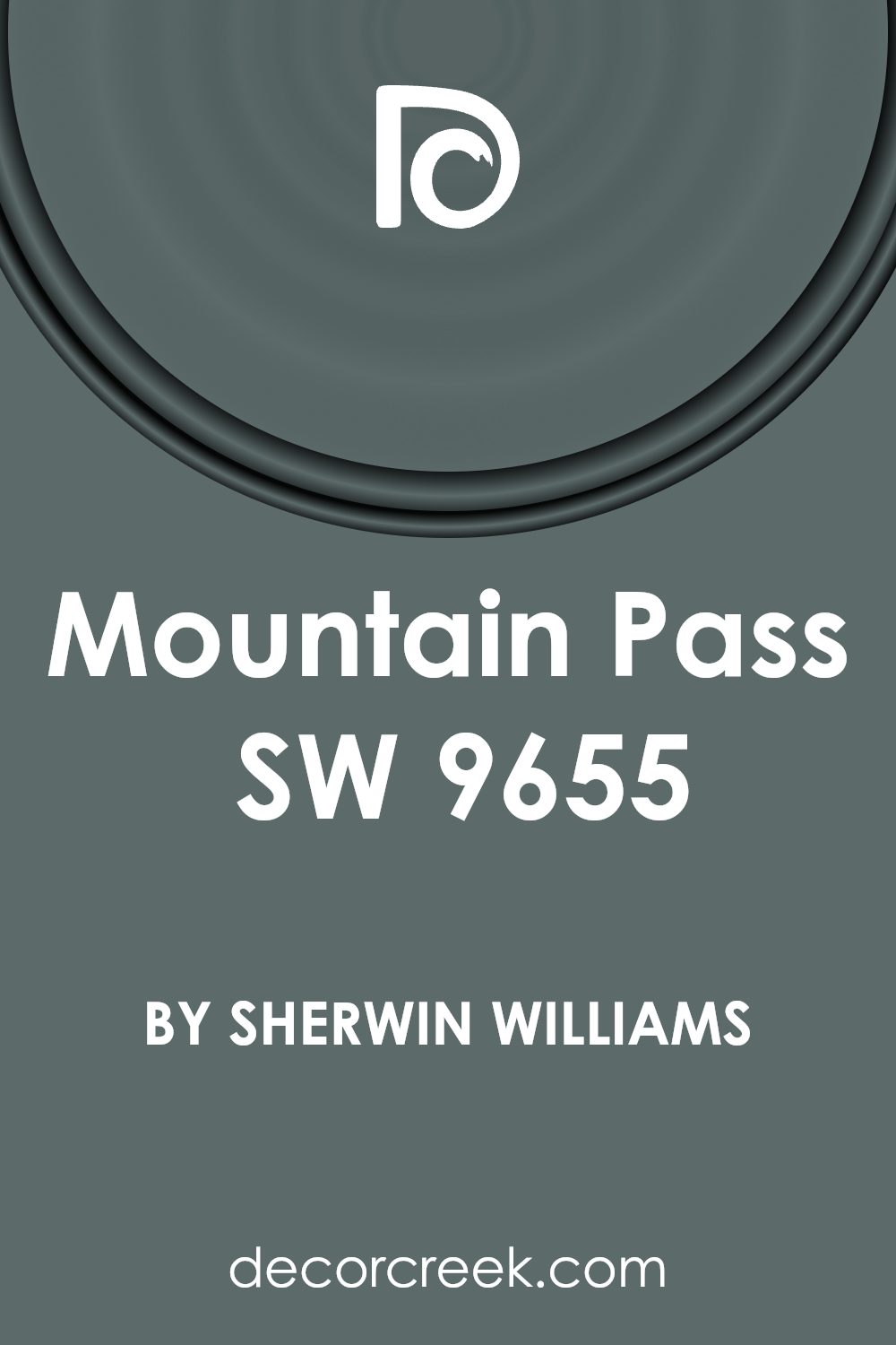
What Color Is Mountain Pass SW 9655 by Sherwin Williams?
Mountain Pass (SW 9655) by Sherwin Williams is a rich, earthy green tone that brings a touch of nature into your space. The color has a warm undertone, which makes it incredibly inviting and cozy. It’s perfect for creating a peaceful yet dynamic atmosphere in various room settings. This shade works beautifully in rustic and modern interiors that emphasize natural elements. It pairs especially well with materials like warm woods, leather, and stone, enhancing their natural elegance.
In a rustic style home, Mountain Pass gives a room the feeling of being nestled in a forest, complementing exposed beams and stone fireplaces. In more modern settings, it can act as a striking accent or the main wall color, offering a bold backdrop for metal and glass elements.
Textures that harmonize with Mountain Pass include cozy linens, soft wool throws, and woven natural fibers like jute and sisal. These materials add depth and warmth to the space. Crisp white trim or contrasting deep browns can further enhance the color’s richness, offering a balanced look. Whether in a living room, study, or bedroom, this versatile shade adds warmth and a touch of the natural world to your home.
Is Mountain Pass SW 9655 by Sherwin Williams Warm or Cool color?
Mountain Pass (SW 9655) by Sherwin Williams is a versatile neutral color that adds warmth and depth to interior spaces. Its subtle earthy tones make rooms feel cozy and inviting without being overwhelming. This color works well in various settings, from living rooms to bedrooms, providing a gentle backdrop that complements a wide range of furniture and decor styles.
In a home, Mountain Pass can help create a unified look, tying different spaces together with its calming hue. It pairs beautifully with natural materials like wood and stone, enhancing the overall harmony in the space. This shade also works great with accents in bolder colors like deep greens or blues, allowing them to stand out without clashing.
Given its adaptability, Mountain Pass is a reliable choice for those who want a color that isn’t too bold yet still makes a subtle statement. It ensures a comfortable atmosphere, making any home feel welcoming and stylish.
Undertones of Mountain Pass SW 9655 by Sherwin Williams
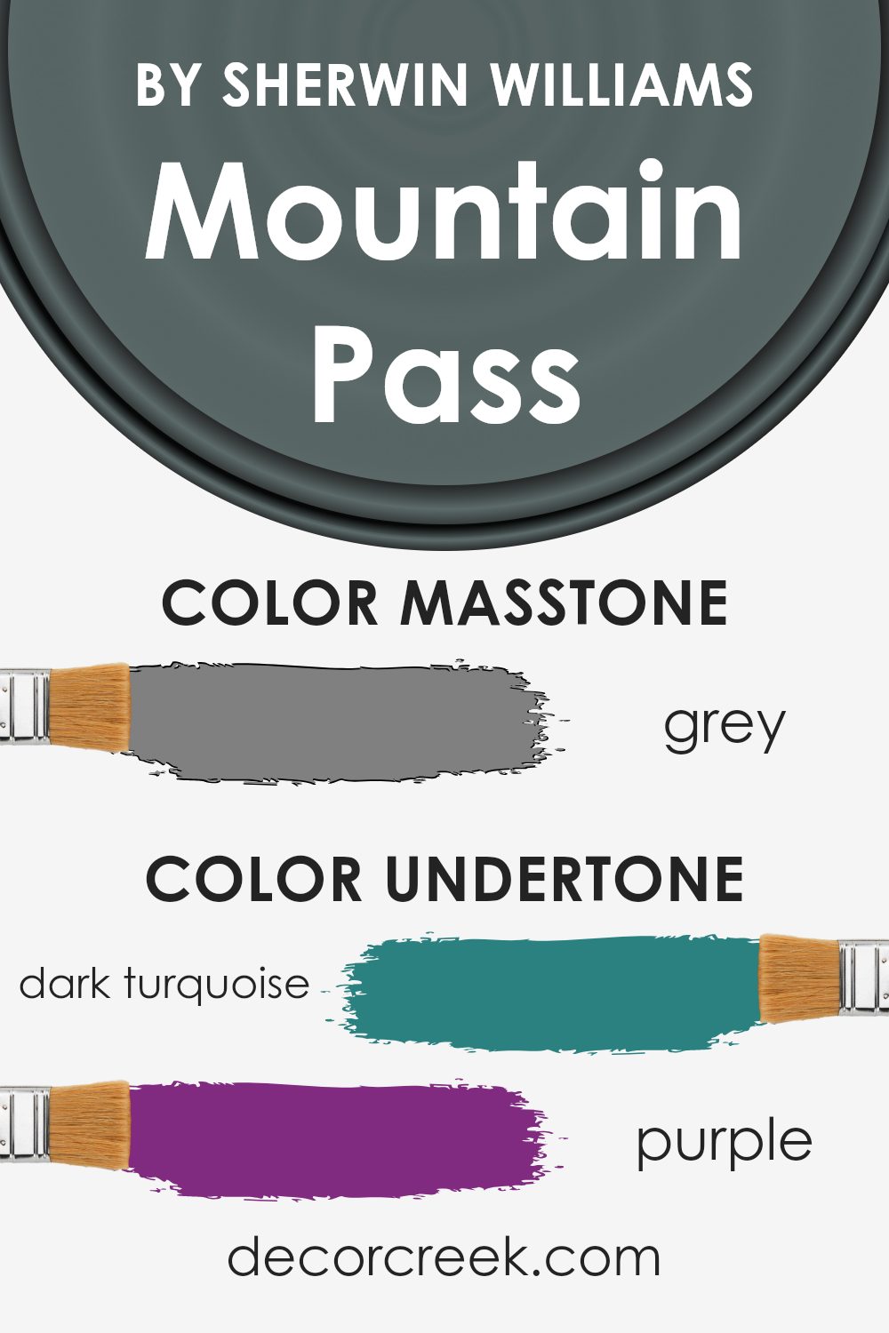
Mountain Pass SW 9655 by Sherwin Williams is a color that’s both calm and complex due to its various undertones. Colors like dark turquoise, purple, and olive add depth and richness, giving the paint a unique feel. These undertones can make the color appear different depending on the light. In bright light, the dark turquoise might stand out more. In shadowy spots, purple or dark green could become noticeable.
The paint’s green and blue undertones can bring a refreshing and natural feel to a room. If a room has a lot of green outdoor views, the green hues might blend and create a seamless transition from indoors to outdoors. Navy and dark grey hints can introduce a more classic feel, making the room feel grounded.
Undertones can change the mood of the space. A room painted with Mountain Pass might feel warm and cozy because of the brown and dark grey, giving it an inviting atmosphere.
On the other hand, lilac, mint, and light turquoise undertones add lightness and a modern touch. These can lift the room’s energy. Meanwhile, pink, violet, and pale pink contribute a subtle softness, making it welcoming. Overall, Mountain Pass adapts well to its surroundings, thanks to its diverse undertones.
What is the Masstone of the Mountain Pass SW 9655 by Sherwin Williams?
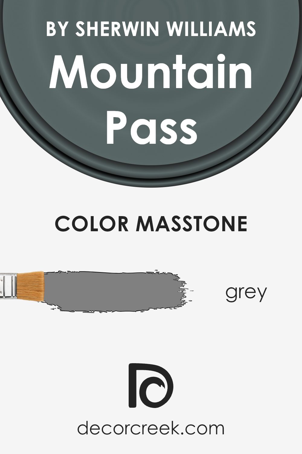
Mountain Pass SW 9655 by Sherwin Williams is a versatile gray paint color. Its masstone, which is the color at its most concentrated, is similar to a pure gray (#808080). This neutral gray can fit well into many home styles and settings.
Because it doesn’t have strong undertones of any other color, it works as a balanced and calming backdrop. In living rooms, it can pair seamlessly with different furniture finishes, fabrics, and accent colors, allowing homeowners to easily change decor without needing to repaint. In bedrooms, this gray creates a restful environment, making it an excellent choice for spaces meant for relaxation.
In kitchens and bathrooms, its neutrality gives an organized and clean appearance, blending well with both modern and traditional designs. Mountain Pass SW 9655’s straightforward nature helps it work well with various lighting conditions, ensuring it looks consistent throughout the day, while maintaining a polished and timeless feel.
How Does Lighting Affect Mountain Pass SW 9655 by Sherwin Williams?
Lighting plays a significant role in how we perceive colors in a given space. The same color can look quite different depending on light conditions. The color “Mountain Pass” by Sherwin Williams, a cool shade with green undertones, exemplifies how dramatically lighting can influence color appearance.
In natural light, “Mountain Pass” takes on a clear and vibrant hue. The natural light offers a true representation of its shades, allowing the green undertones to stand out. However, in artificial light, the color may appear slightly muted or altered.
Different types of artificial light, like incandescent, fluorescent, or LED, can change how the color is seen. Incandescent bulbs generally cast a warm, yellowish glow that may make the green undertones of “Mountain Pass” appear more subdued. In contrast, cool white LED lighting may enhance its crispness, presenting the color closer to its natural light appearance.
The orientation of a room also affects how colors are perceived. In north-facing rooms, which receive less direct sunlight and generally have a cooler, bluish light, “Mountain Pass” might look darker and more subdued. The cool light can accentuate its green undertones, giving the room an elegant look but potentially making it feel cooler overall.
In south-facing rooms, the abundant sunlight has a warm quality, amplifying any yellow or warm undertones that may be present. However, since “Mountain Pass” is a cooler color, it might look a bit lighter and more balanced, remaining relatively unchanged by warm sunlight.
East-facing rooms receive warm sunlight in the morning and cool light later in the day. In these rooms, “Mountain Pass” can appear brighter and more lively during the morning hours and cooler in the afternoon.
Finally, in west-facing rooms, which have warm afternoon and evening light, the color may take on a softer, warmer tone later in the day, bringing a cozy and inviting atmosphere.
Lighting can significantly influence “Mountain Pass,” shifting its appearance throughout the day and under different lighting conditions.
What is the LRV of Mountain Pass SW 9655 by Sherwin Williams?
Light Reflectance Value, or LRV, is a measurement that tells you how much light a color reflects. It’s a scale that goes from 0, which is absolute black and reflects no light, to 100, which is pure white and reflects all light. When you look at paint colors, the LRV gives you an idea of how light or dark a color will appear when on a wall.
A lower LRV means the color is darker and absorbs more light, while a higher LRV means the color is lighter and reflects more light. This measurement helps you understand how the color will interact with light in a room and can guide you to choosing the right shade based on the room’s lighting and size.
The LRV of 13.537 for Mountain Pass indicates that this is a relatively dark color. With a lower LRV, the color tends to absorb more light, making it appear richer and more intense on walls. This can create a cozy and intimate atmosphere in a room. However, in a space with limited natural light, such a dark color might make the room feel smaller and potentially a bit closed in.
On the other hand, in a large, well-lit room, this deep hue can add dramatic contrast and make other design elements pop. It’s important to consider the amount of light available in the room and the mood you want to set when choosing a color with such a low LRV.

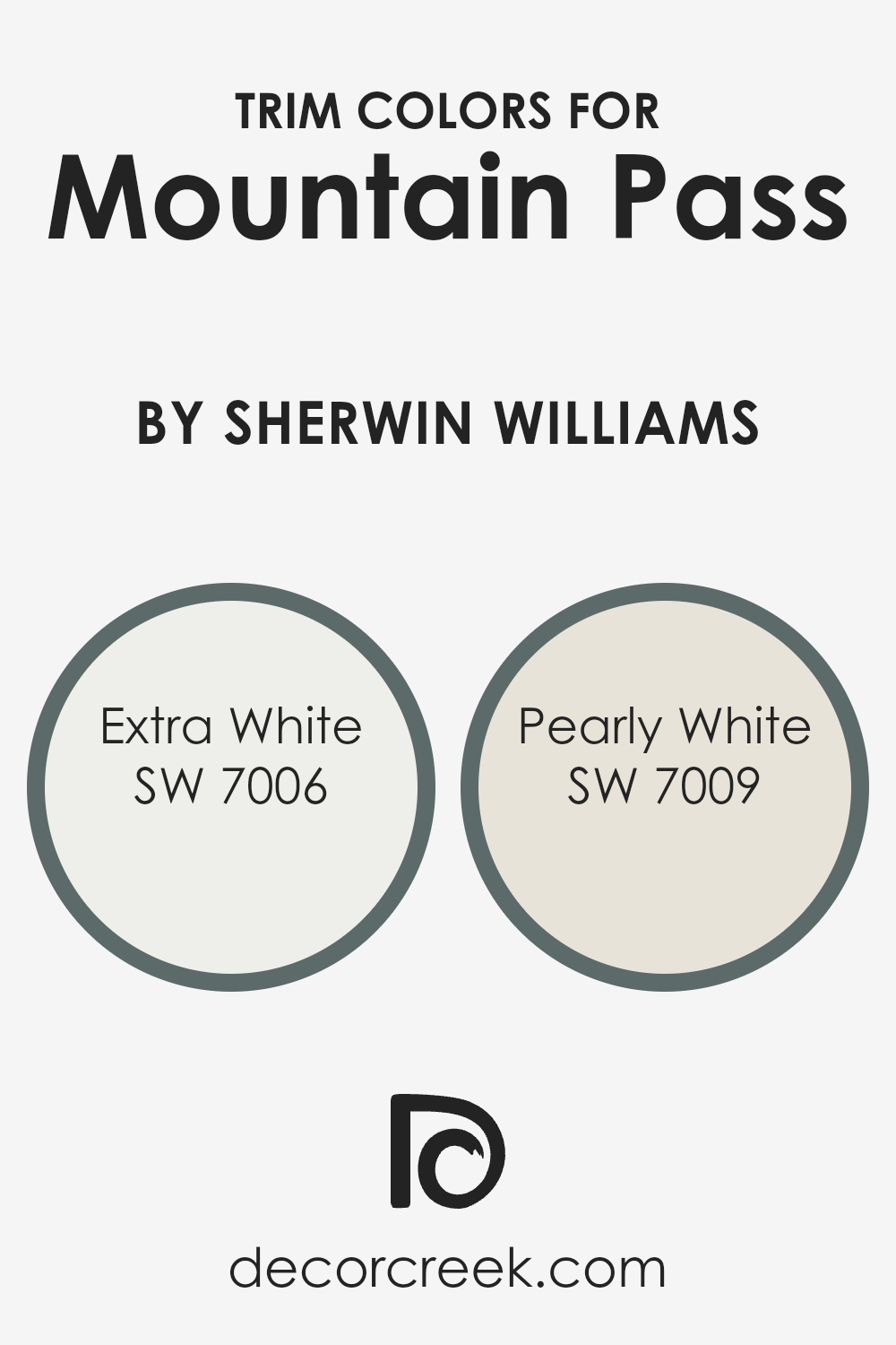
What are the Trim colors of Mountain Pass SW 9655 by Sherwin Williams?
Trim colors are accents used to highlight the architectural features of a space. They outline areas such as windows, door frames, and baseboards, offering a contrasting or complementary tint to the main wall color. For Mountain Pass by Sherwin Williams, using the right trim colors is crucial as it enhances and defines the space, giving it a polished and cohesive look.
Trim colors bring balance and highlight the beautiful earthy tones of Mountain Pass, making the walls stand out without clashing. They add dimension and contribute to the overall appearance and style of a room.
SW 7006 – Extra White can be used as a trim color to bring attention to details in a fresh and clean way. Its crisp, bright white tone adds an invigorating contrast to the warm, muted hue of Mountain Pass. On the other hand, SW 7009 – Pearly White offers a soft, warm white that subtly enhances and complements the wall color.
It provides a more subtle contrast for those looking to keep the visual differences gentle but effective. Both colors complement Mountain Pass beautifully and can be chosen based on whether a stark or gentle outline is preferred.
You can see recommended paint colors below:
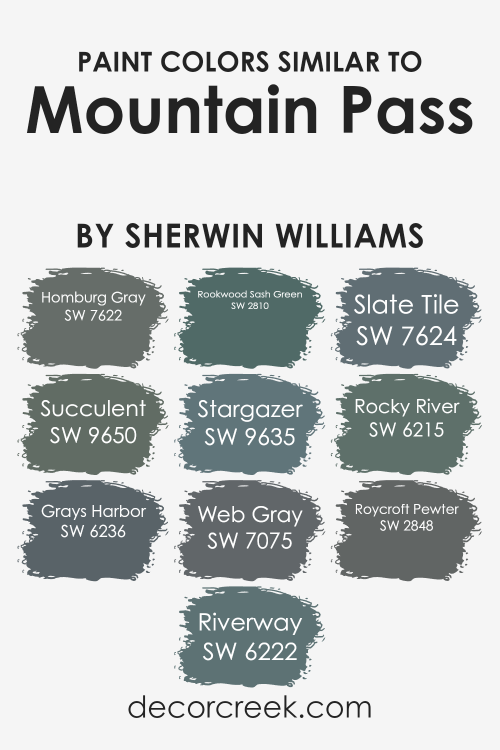
Colors Similar to Mountain Pass SW 9655 by Sherwin Williams
Similar colors are essential in design because they create visual harmony and balance. When colors complement each other, the result is a coherent and pleasing aesthetic. When considering colors similar to Mountain Pass by Sherwin Williams, such as SW 7622 – Homburg Gray, these shades work together effortlessly. Homburg Gray is a deep, muted gray-green that brings out the natural, earthy undertones of Mountain Pass.
SW 9650 – Succulent presents a rich, lush green, adding a touch of vitality and freshness to the palette. Grays Harbor (SW 6236) is a strong, deep blue-gray that adds depth without overwhelming the subtlety of Mountain Pass. Despite their differences, these similar hues blend seamlessly, enhancing the overall color scheme.
Additionally, colors like Riverway (SW 6222), a dark teal, and Rookwood Sash Green (SW 2810), a classic dark green, provide complementary depth. Stargazer (SW 9635) adds a celestial elegance with its muted blue, while Web Gray (SW 7075) offers a cool, sophisticated touch.
Slate Tile (SW 7624) and Rocky River (SW 6215) both introduce a mix of blue and green undertones, creating a tranquil environment. Roycroft Pewter (SW 2848) rounds out the selection with its grounded, historical depth, creating an atmosphere that feels both timeless and fresh. Together, these shades create a cohesive and inviting space.
You can see recommended paint colors below:
- SW 7622 Homburg Gray
- SW 9650 Succulent
- SW 6236 Grays Harbor
- SW 6222 Riverway
- SW 2810 Rookwood Sash Green
- SW 9635 Stargazer
- SW 7075 Web Gray
- SW 7624 Slate Tile
- SW 6215 Rocky River
- SW 2848 Roycroft Pewter
How to Use Mountain Pass SW 9655 by Sherwin Williams In Your Home?
Mountain Pass SW 9655 by Sherwin Williams is a warm, earthy shade that brings a touch of nature into your home. It’s a versatile color that can be used in many rooms. In the living room, it creates a cozy and welcoming atmosphere, making it a great backdrop for wooden furniture and natural textures.
Pair it with cream or ivory accents for a balanced look. In the bedroom, it offers a calm and relaxing mood, perfect for unwinding. Combine it with soft blues or greens for a harmonious feel. In the kitchen, Mountain Pass can add warmth, especially when used with white or light-colored cabinets and countertops. Adding small decor pieces in metallic finishes can enhance the overall feel.
Whether on one accent wall or throughout a room, this color provides a comforting and grounded environment, making it a great choice for those who love nature-inspired interiors.
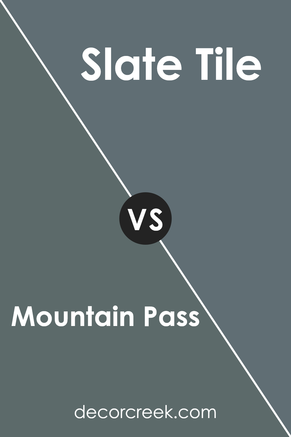
Mountain Pass SW 9655 by Sherwin Williams vs Slate Tile SW 7624 by Sherwin Williams
Mountain Pass SW 9655 by Sherwin Williams is a soft and muted color that creates a calm and relaxing atmosphere. It has a subtle quality that makes it versatile for various settings, offering a gentle and peaceful appearance.
On the other hand, Slate Tile SW 7624 is a darker, more dramatic shade. It exudes a strong and bold presence, making it perfect for adding depth and richness to a space. Slate Tile can make a room feel cozy and intimate, giving it a more modern and refined look.
Comparing the two, Mountain Pass is lighter and more muted, suitable for areas where you want to encourage relaxation and calmness. Meanwhile, Slate Tile is for spaces where you want a striking contrast and a sense of depth. Both colors have their unique appeal, with Mountain Pass being understated and soothing, whereas Slate Tile is more intense and bold.
You can see recommended paint color below:
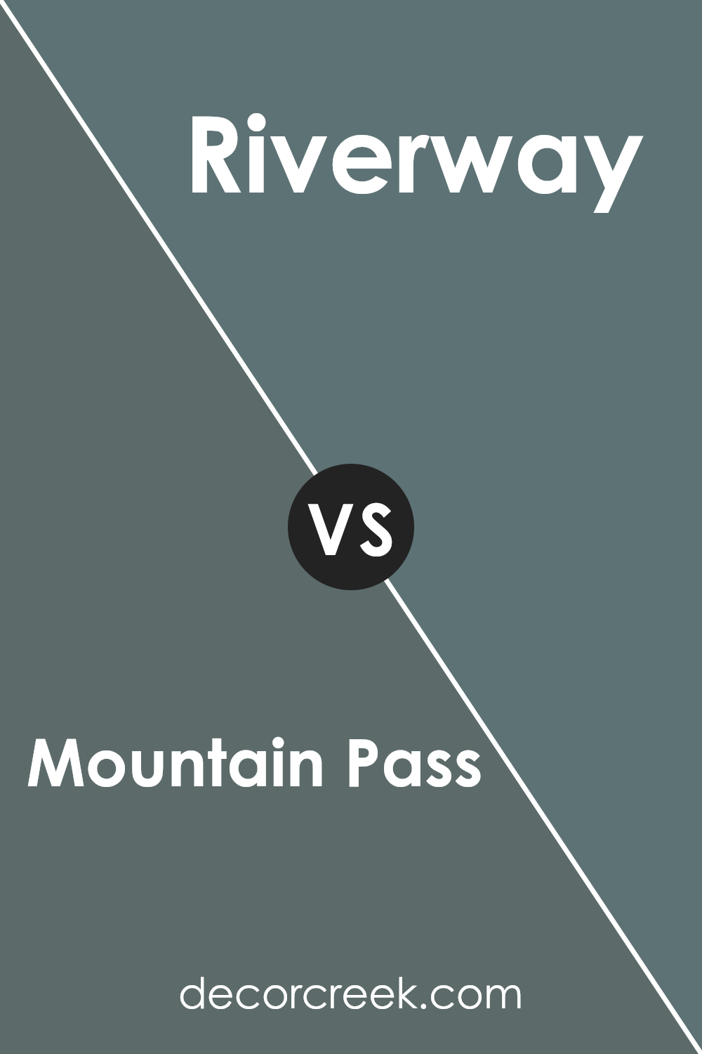
Mountain Pass SW 9655 by Sherwin Williams vs Riverway SW 6222 by Sherwin Williams
Mountain Pass SW 9655 by Sherwin Williams is a light and gentle shade with a subtle, soft tone that gives a calming impression. This color leans towards delicate, muted whites with hints of warmth, making it perfect for creating a bright, open feeling in any room. It works well in areas where you want to have a clean and airy atmosphere.
On the other hand, Riverway SW 6222 by Sherwin Williams is a deeper, more intense color. It combines blue and green tones, resulting in a rich teal hue. This color is great for adding a bold yet soothing touch to spaces. Its depth can create a cozy and intimate environment, providing a strong contrast to lighter colors like Mountain Pass.
When comparing these two, Mountain Pass is ideal for subtle backgrounds, while Riverway offers a more vibrant and distinct look. The two colors can complement each other in a range of design schemes.
You can see recommended paint color below:
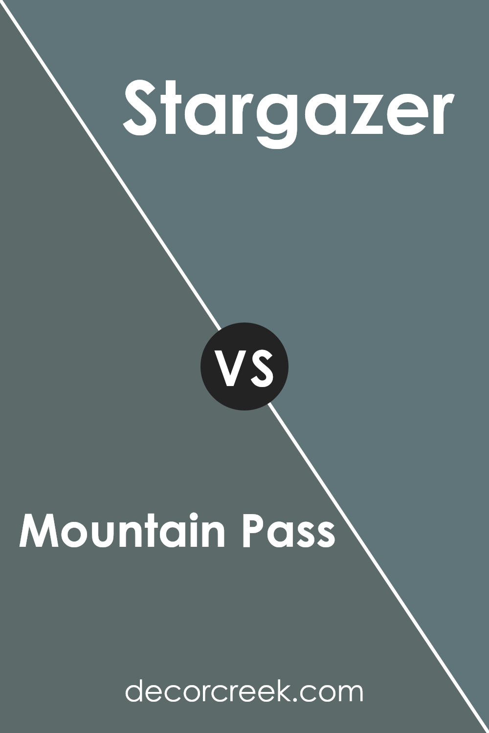
Mountain Pass SW 9655 by Sherwin Williams vs Stargazer SW 9635 by Sherwin Williams
Mountain Pass SW 9655 is a light, cool shade that evokes a sense of openness and airiness. It’s a soft, muted color that leans toward a gentle gray with a hint of blue, making spaces feel larger and more relaxed. This color is suitable for creating a calming atmosphere and pairs well with whites and other neutrals.
On the other hand, Stargazer SW 9635 is a deeper and moodier color. It has a richer tone, blending gray with more pronounced blue undertones. This makes it an excellent choice for creating a sense of depth and drama in a room. Stargazer adds warmth and coziness, making it a good option for bedrooms or living areas where you want to create an inviting and intimate feel.
While Mountain Pass is ideal for creating a light and airy space, Stargazer works better for a cozy and sophisticated environment. Both colors are versatile and can complement various styles and decor.
You can see recommended paint color below:
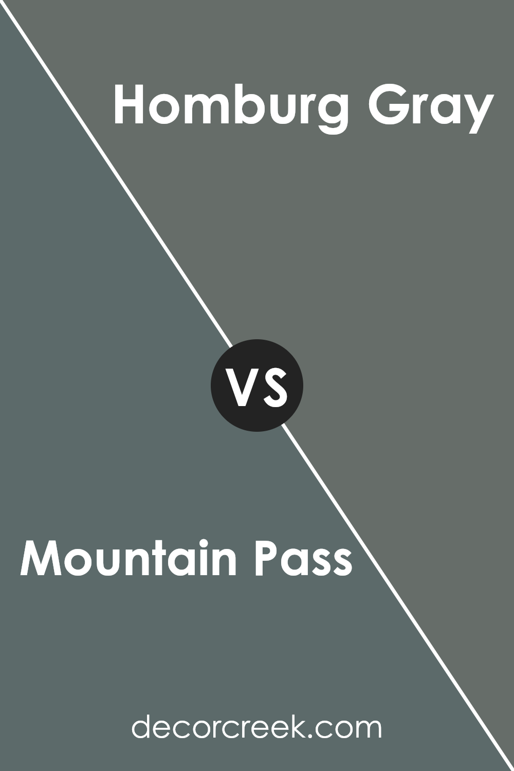
Mountain Pass SW 9655 by Sherwin Williams vs Homburg Gray SW 7622 by Sherwin Williams
Mountain Pass SW 9655 by Sherwin Williams is a soft, light shade that feels airy and open. It has a gentle quality, making spaces feel larger and more welcoming. It’s perfect for creating a calm and inviting environment. On the other hand, Homburg Gray SW 7622 is a deeper, rich gray.
It carries a sense of strength and modernity, giving rooms a more grounded and cozy atmosphere. While Mountain Pass is more about lightness and openness, Homburg Gray provides a sense of enclosure and warmth. Mountain Pass pairs well with brighter accents or neutral tones, while Homburg Gray can beautifully complement deeper colors and metallics.
Both colors have unique qualities, with Mountain Pass being more about brightness and openness, and Homburg Gray offering depth and richness. Whether you want a fresh, airy feel or a more intimate, cozy setting, each color serves a distinct purpose.
You can see recommended paint color below:
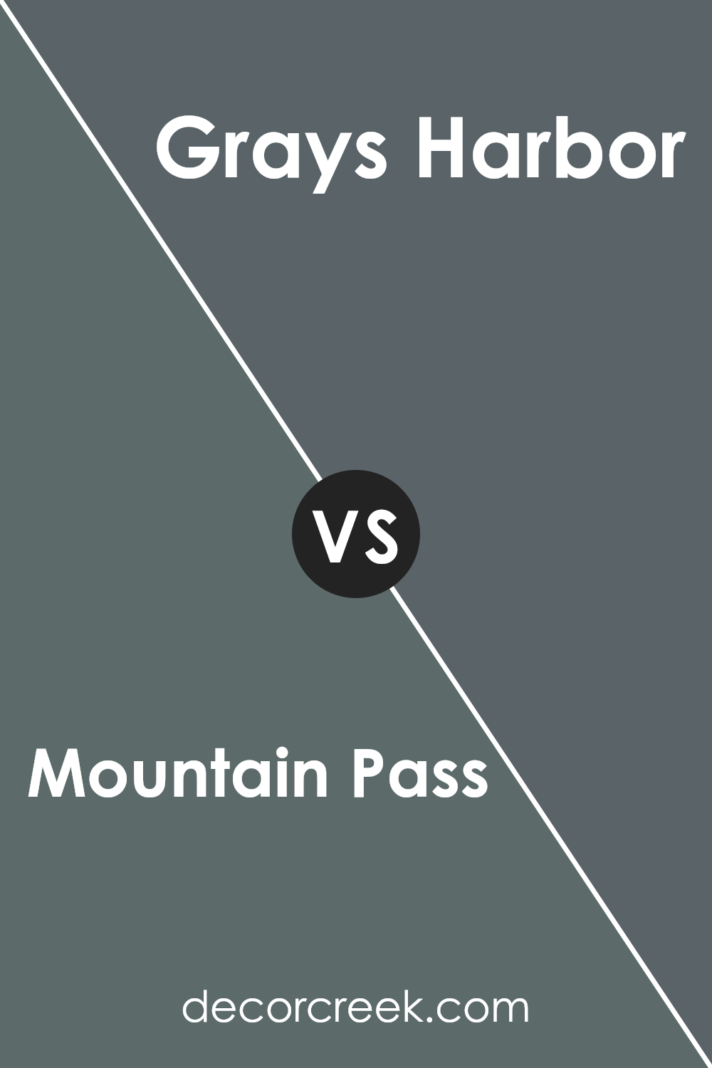
Mountain Pass SW 9655 by Sherwin Williams vs Grays Harbor SW 6236 by Sherwin Williams
Mountain Pass SW 9655 and Grays Harbor SW 6236 by Sherwin Williams are two distinct colors with their own unique feel. Mountain Pass is a light, soft hue with a gentle and airy presence. It’s reminiscent of a pale, misty morning or a subtle off-white with a hint of warmth. This makes it ideal for creating bright and open spaces in living areas or bedrooms.
On the other hand, Grays Harbor is a deeper, more dramatic shade. It is a rich blend of gray and blue, offering a moody and sophisticated touch. This color can bring depth and a modern look to a room, making it perfect for accent walls, offices, or cozy spaces like reading nooks.
While Mountain Pass adds a fresh and light ambiance, Grays Harbor provides a bold and calming atmosphere. Both colors can enhance spaces in their own way, depending on the mood you want to create.
You can see recommended paint color below:
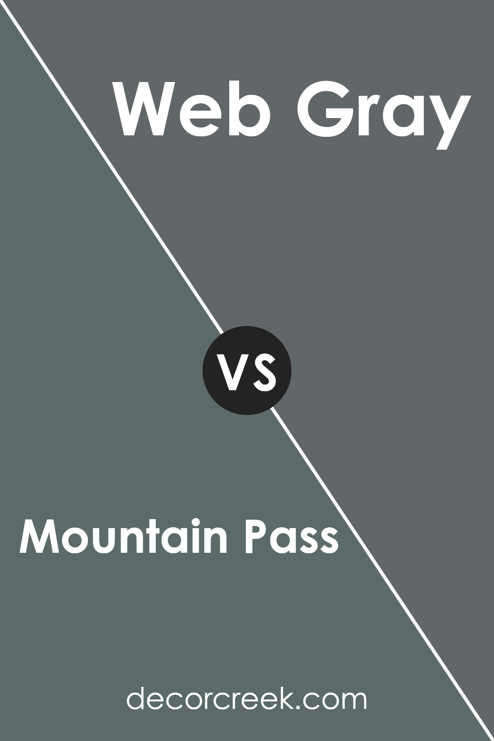
Mountain Pass SW 9655 by Sherwin Williams vs Web Gray SW 7075 by Sherwin Williams
Mountain Pass SW 9655 by Sherwin Williams is a light and airy color, reminiscent of pale grayish-blue skies or misty mountain ranges. It brings a feeling of openness and freshness to a room, making spaces feel larger and more inviting. This color works well in spaces where you want a gentle and soothing atmosphere, such as bedrooms or living areas.
On the other hand, Web Gray SW 7075 offers a much deeper, more grounded look. It’s a rich, solid gray that adds a touch of modern elegance and maturity to any space. It’s versatile and pairs well with both light and bold colors, making it ideal for accent walls, kitchens, or any place where a strong color statement is desired.
While Mountain Pass offers lightness and expansion, Web Gray delivers depth and a more defined presence. Both can complement different design themes but offer contrasting effects due to their distinct tones.
You can see recommended paint color below:
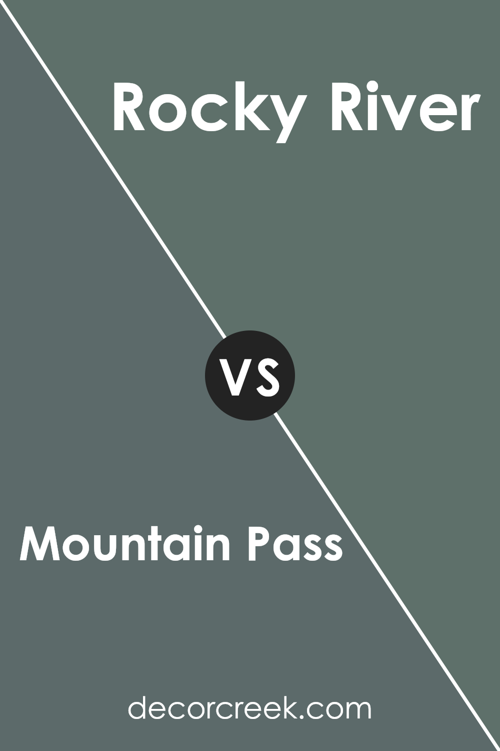
Mountain Pass SW 9655 by Sherwin Williams vs Rocky River SW 6215 by Sherwin Williams
Mountain Pass SW 9655 by Sherwin Williams is a soft, muted color that feels gentle and warm. It has a creamy, pale hue that brings a sense of calmness and coziness to a room. Think of the gentle colors you might find in a misty mountain landscape just after sunrise—a very relaxing and soothing shade for any space looking to add warmth without being overpowering.
On the other hand, Rocky River SW 6215 is a deeper, richer color. It is more intense and is reminiscent of the cool, muted tones you might see in a shaded river. This color has a stronger presence and can create a more dramatic effect in a room.
While both are inspired by natural elements, Mountain Pass is lighter and airier, whereas Rocky River is more robust and grounding. Choosing between them would depend on whether you want a subtle or more bold feeling in your space.
You can see recommended paint color below:
- SW 6215 Rocky River
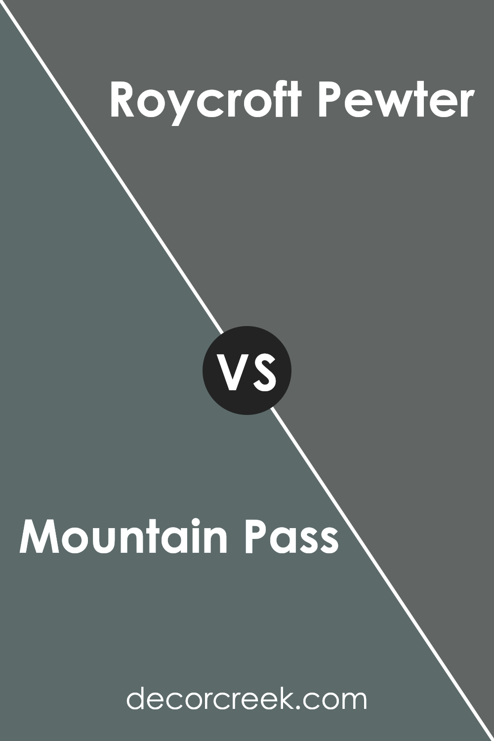
Mountain Pass SW 9655 by Sherwin Williams vs Roycroft Pewter SW 2848 by Sherwin Williams
Mountain Pass SW 9655 and Roycroft Pewter SW 2848 by Sherwin Williams are two distinct colors that each offer unique qualities. Mountain Pass is a soft, creamy white that creates a light and airy feel in a space. It’s versatile and can easily blend with various design styles, making it a great choice for brightening up a room.
In contrast, Roycroft Pewter is a rich, deep gray with earthy undertones. It brings a sense of coziness and warmth, making it ideal for creating a more intimate and grounded atmosphere. This color works well in traditional or historical settings, adding a touch of classic charm.
While Mountain Pass illuminates spaces, Roycroft Pewter adds depth and character. Using Mountain Pass can make a small room feel larger, whereas Roycroft Pewter can make a vast space feel more inviting. Together, they can balance each other out in a home’s interior design, depending on the mood or style you want to achieve.
You can see recommended paint color below:
- SW 2848 Roycroft Pewter
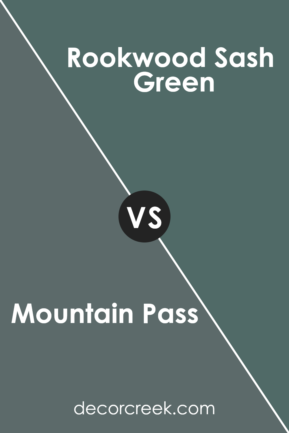
Mountain Pass SW 9655 by Sherwin Williams vs Rookwood Sash Green SW 2810 by Sherwin Williams
Mountain Pass SW 9655 by Sherwin Williams and Rookwood Sash Green SW 2810 are both distinct colors that bring different moods to a space.
Mountain Pass is a soft, light color that leans towards a grayish white. It’s airy and opens up rooms, making them feel spacious and clean. This color is versatile, working well in modern or minimalist designs, and pairs nicely with both bright hues and more muted tones, adding subtle elegance to any room.
On the other hand, Rookwood Sash Green is a deeper, more traditional shade with rich green undertones. It offers a warm, earthy vibe and can add depth and character to a space. This color is ideal for creating cozy, inviting environments and is often used in historic or vintage settings.
While Mountain Pass refreshes and lightens, Rookwood Sash Green provides warmth and intimacy, making them suitable for different styles and purposes in your home.
You can see recommended paint color below:
- SW 2810 Rookwood Sash Green
Mountain Pass SW 9655 by Sherwin Williams vs Succulent SW 9650 by Sherwin Williams
Mountain Pass SW 9655 and Succulent SW 9650 are two interesting colors by Sherwin Williams. Mountain Pass is a soft, muted color that often gives a calming feel to a room. It has light, airy tones that can make a space feel larger and more open. It’s great for creating a refreshing atmosphere.
On the other hand, Succulent has a bit more vibrancy. It’s a richer hue with a slightly deeper intensity. This color can add a touch of warmth and energy to a room, making it feel cozy and inviting.
When compared, Mountain Pass is more subdued and airy, perfect for those who prefer a gentle background. Succulent, with its stronger presence, can be more noticeable and striking. Both colors can be used in various settings but will influence the mood of a room differently. It’s important to consider what feeling you want the space to have when choosing between these two colors.
You can see recommended paint color below:
Conclusion
SW 9655 Mountain Pass by Sherwin Williams is a paint color that really stands out to me. It’s like having a piece of nature right on your walls. Imagine the strength and calm of a mountain, packed into a can of paint.
In my experience, Mountain Pass can make a room feel warm and welcoming. It reminds me of earth tones, like soil and rocks, which is nice because it feels natural and not too flashy. This shade works well in many rooms, whether it’s a cozy living room or a busy kitchen.
When you walk into a room painted with Mountain Pass, it feels like being in the middle of the woods on a cool day. It isn’t a bright color that jumps at you, but rather one that wraps you up like a comforting hug. I think it’s a color that can make people feel calmer and happy.
Overall, Mountain Pass is great if you want a color that’s like a gentle giant—quiet but strong. It’s perfect for anyone who loves nature and wants a bit of that feeling in their own home. There’s something special about bringing a touch of the outdoors inside, and that’s what Mountain Pass can do for you.
Ever wished paint sampling was as easy as sticking a sticker? Guess what? Now it is! Discover Samplize's unique Peel & Stick samples.
Get paint samples

