Sherwin-Williams presents a captivating hue in their diverse palette with SW 9635 Stargazer. This intriguing paint color embodies the mystery and beauty of a night sky sprinkled with distant stars.
Perfect for anyone looking to introduce a touch of sophistication and depth into their space, Stargazer manages to strike a delicate balance between being bold enough to make a statement and understated enough to complement a variety of décor styles and color schemes.
As part of Sherwin-Williams’s remarkable collection, SW 9635 Stargazer stands out for its versatility and transformative power. Whether applied in a cozy reading nook, a serene bedroom, or an elegant living area, this color promises to envelop the room in a serene ambiance reminiscent of gazing into the cosmos on a clear night.
It works harmoniously with natural light during the day, showcasing a soft, ethereal glow, and transitions gracefully into the evening, adding depth and intrigue to the room’s atmosphere.
For designers, homeowners, and DIY enthusiasts looking to create a space that speaks of timeless elegance while invoking a sense of wonder, SW 9635 Stargazer by Sherwin-Williams offers an exquisite option.
Its unique charm and adaptability make it an inspired choice for anyone aspiring to bring a piece of the celestial into their home.

What Color Is Stargazer SW 9635 by Sherwin Williams?
The color Stargazer by Sherwin Williams is a deeply captivating hue that exudes a sense of mystery and sophistication. It’s a rich, dark tone that resembles the night sky, making it an excellent choice for creating an intimate and serene environment.
This shade falls within the realm of dark teals or deep sea blues, providing a perfect backdrop for both contemporary and traditional spaces. Its versatility allows it to adapt seamlessly to various interior styles, including modern minimalist, art deco, and even rustic chic, thanks to its ability to pair beautifully with a wide range of materials and textures.
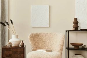
In a modern minimalist setting, Stargazer adds depth and character when used as an accent wall, contrasting wonderfully with sleek, monochromatic furniture and metallic accents like brass or copper.
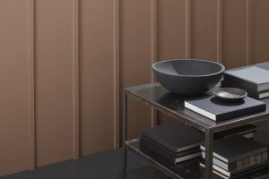
In more ornate decor styles such as art deco, it works splendidly with luxurious textures like velvet and satin, paired with geometric patterns and glossy finishes, enhancing the opulence of the space.
For a rustic chic ambiance, Stargazer complements natural wood tones, from light ash to dark walnut, creating a cozy yet sophisticated aesthetic. The color thrives alongside exposed brick, leather, and woven textiles, offering a harmonious balance between earthy elements and the profound elegance of this bold hue.
Whether incorporated through paint, accessories, or fabric, Stargazer by Sherwin Williams brings a touch of the celestial to any space, inviting a sense of tranquility and depth.
Ever wished paint sampling was as easy as sticking a sticker? Guess what? Now it is! Discover Samplize's unique Peel & Stick samples.
Get paint samples

Is Stargazer SW 9635 by Sherwin Williams Warm or Cool color?
The unique hue of Stargazer by Sherwin Williams carries a depth that elevates home interiors with a subtle sophistication. This color, rooted in a serene blue with a slight nod to the mysteries of the evening sky, introduces a soothing ambiance to any space.
Its versatility allows it to pair beautifully with a wide array of decor styles, from the modern and minimalist to the rich and traditional. The strength of this specific shade lies in its ability to act both as a striking focal point or a peaceful backdrop.
In well-lit areas, Stargazer tends to display a more vibrant, lively blue, while in dimmer environments, it can shift to exhibit deeper, more contemplative tones.
This chameleon-like quality ensures that spaces decorated with this color remain dynamic and adaptive to changing natural light, thus perpetually engaging and pleasantly harmonious.
Importantly, its balanced saturation level means it can complement both neutral palettes and serve as a foundation for introducing bolder accents, making it a remarkable choice for those looking to create a serene yet distinguished home atmosphere.
Undertones of Stargazer SW 9635 by Sherwin Williams
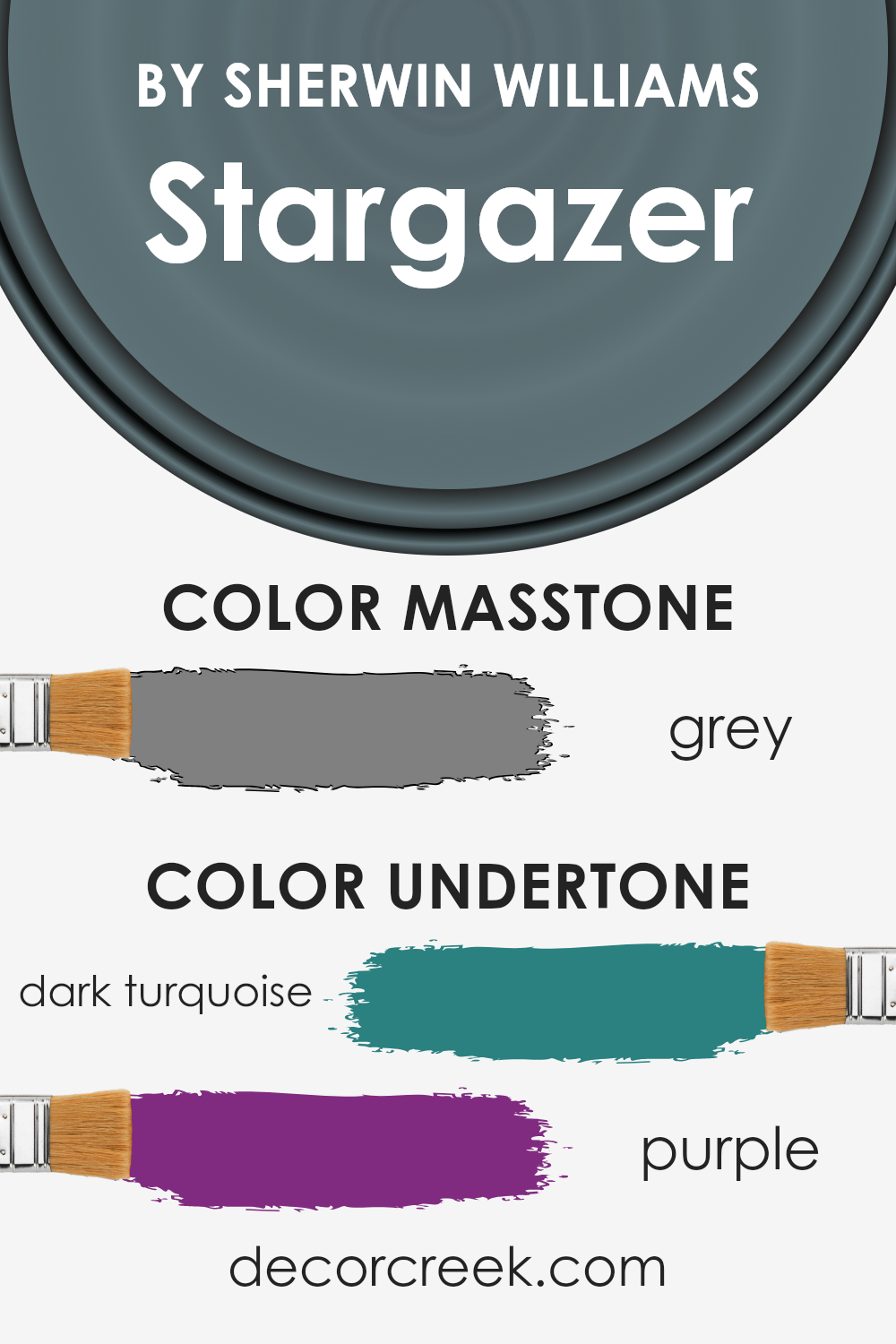
Stargazer, a captivating color option, harbors the profound ability to transform interior spaces through its complex undertones. At its core, it features a dynamic interplay between dark turquoise and purple. These underlying hues are not immediately apparent but subtly influence the color’s perception and ambiance it creates.
The undertone of dark turquoise infuses a sense of calm and depth, reminiscent of serene ocean depths. It introduces an element of tranquility and sophistication, making spaces appear more inviting and thought-provoking.
On the other hand, the purple undertone adds a layer of richness and mystery, enhancing the overall sense of luxury and creativity within a room.
When applied to interior walls, the interplay of these undertones can have a profound effect. In natural light, the turquoise aspect may become more pronounced, creating a refreshing and calming atmosphere.
Artificial lighting, particularly warmer tones, might draw out the purple undertones, enveloping the room in a cozy, intriguing aura.
This duality makes the color extraordinarily versatile, capable of adapting to various lighting conditions and decor styles.
The presence of these undertones also means that Stargazer can act as a chameleon, subtly shifting in appearance to complement a wide range of furnishings and accents.
This unique characteristic enables designers and homeowners to use the color in diverse settings, from creating a serene retreat in a bedroom to crafting an elegant backdrop in a dining area.
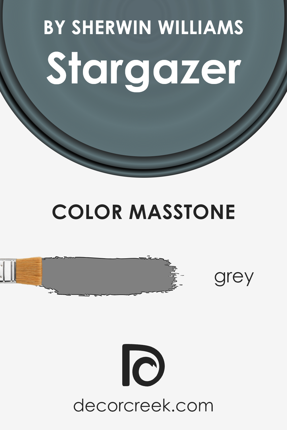
What is the Masstone of the Stargazer SW 9635 by Sherwin Williams?
StargazerSW 9635, a captivating hue by Sherwin Williams, boasts a masstone that intriguingly aligns with the classic grey (#808080), offering a versatile and sophisticated palette for any home.
This particular shade of grey acts as a foundational color, exuding a timeless elegance that can seamlessly integrate into a myriad of interior styles, from the minimalist and modern to the cozy and traditional.
Its neutral undertone provides the perfect backdrop for homeowners to experiment with textures, patterns, and a spectrum of accent colors, allowing for personal expression without overwhelming the senses.
The neutrality of the masstone ensures that it can amplify natural light in well-lit spaces, making rooms appear more spacious and airy, while in dimmer environments, it contributes to a cozy, comforting atmosphere.
This adaptability makes it an excellent choice for various applications, be it living rooms, bedrooms, or kitchens, providing a soothing and stable ambience that encourages relaxation and warmth.
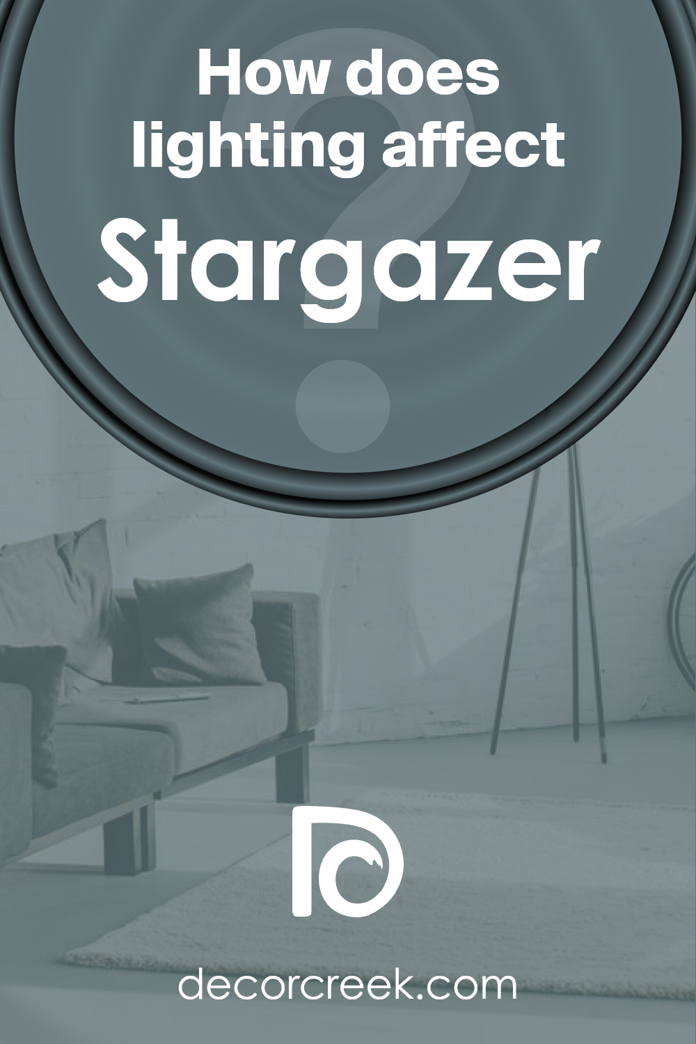
How Does Lighting Affect Stargazer SW 9635 by Sherwin Williams?
Lighting significantly influences how we perceive colors, transforming their appearance and ambiance in a space. The type and direction of light can alter a color’s intensity, shade, and character.
Understanding these effects is crucial when selecting paint, such as a nuanced hue like Stargazer by Sherwin Williams, to ensure the desired outcome in various lighting conditions.
In artificial light, colors can appear warmer or cooler depending on the temperature of the light bulbs used. Incandescent bulbs, which emit warmer light, can enhance the warm undertones of a color like Stargazer, making it seem cozier and more inviting.
Conversely, fluorescent lighting tends to emit a cooler, bluish tone, which can slightly mute the warmth of the color, giving it a more neutral presence.
Natural light brings its own set of considerations. Due to the Earth’s rotation, the quality of natural light in a room changes throughout the day and varies by the room’s orientation. In north-facing rooms, light is cooler and more consistent throughout the day.
Here, our chosen color may appear slightly softer and more serene, as the cooler light emphasizes its subtler, understated qualities.
In south-facing rooms, abundant, warmer sunlight can make the color appear brighter and more vibrant, accentuating its warmer tones. This creates a lively and inviting atmosphere, making the most of the hue’s depth.
East-facing rooms enjoy the warm, golden tones of the morning sun, which can make the color appear lively and warm early in the day, gradually transitioning to a cooler, more balanced tone as the sun moves.
Conversely, in west-facing rooms, the color will receive less warmth in the morning, presenting a truer representation of its base tone, and become warmer and more vivid in the afternoon and evening as it catches the sunset’s redder light.
Understanding these nuances allows for strategic use of color like Stargazer in interior design, ensuring that spaces achieve their intended effect regardless of their orientation or light source.
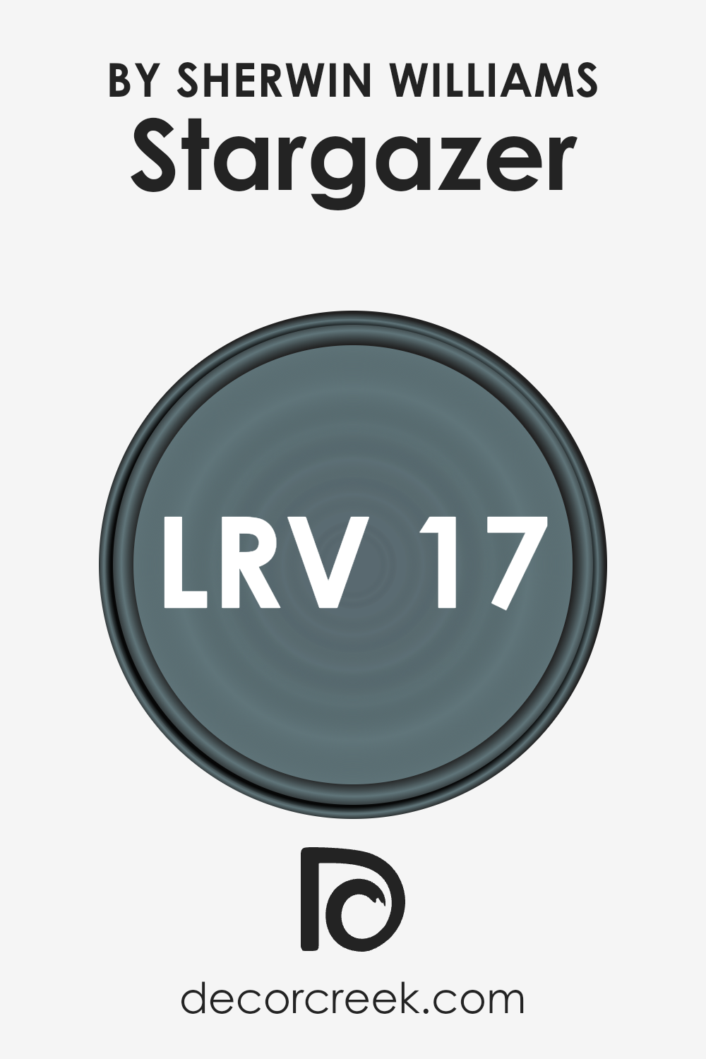
What is the LRV of Stargazer SW 9635 by Sherwin Williams?
LRV, or Light Reflectance Value, plays a critical role in the way colors appear in any given space. Essentially, it is a measurement that indicates the percentage of visible and usable light that a paint color reflects from or absorbs into a surface.
LRV values range from 0 to 100, with 0 absorbing all light (appearing as pure black) and 100 reflecting all light (appearing as pure white). The LRV of a color can significantly affect its appearance in a room by changing how light or dark the color looks under various lighting conditions.
It also informs decisions on how a specific paint color can alter the perception of a space’s size and atmosphere.
Lighter colors with higher LRVs make rooms feel more spacious and airy because they reflect more light, while darker colors with lower LRVs create a more intimate and cozy ambiance by absorbing more light.
Given that the LRV for the mentioned color is 16.567, it’s classified towards the darker end of the spectrum. This implies that when used on walls, it will absorb a significant amount of light rather than reflecting it.
As a result, it has the potential to make spaces appear smaller, more enclosed, and quite dramatic depending on the lighting.
In rooms with ample natural light, this color can offer a rich and deep appearance, adding an element of sophistication.
However, in spaces with limited light, it could overwhelmingly darken the area, necessitating careful consideration of lighting fixtures and room size.
The specific LRV of 16.567 indicates that this color is well-suited for creating focal points or accent walls rather than covering all walls in a small, dimly lit room.
LRV – what does it mean? Read This Before Finding Your Perfect Paint Color
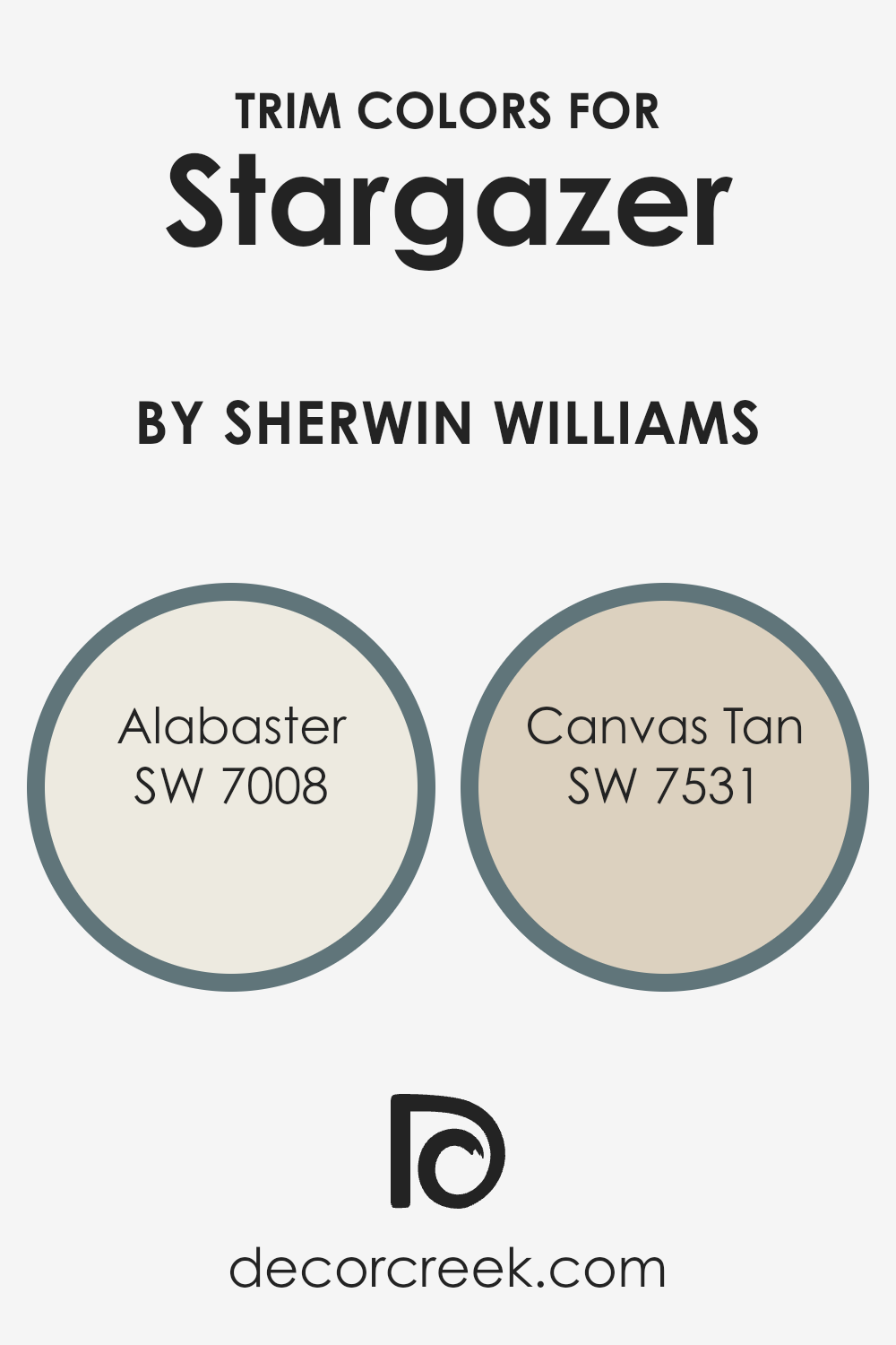
What are the Trim colors of Stargazer SW 9635 by Sherwin Williams?
Trim colors are essentially the hues selected for the finishing touches on architectural elements such as door frames, baseboards, moldings, and window casings.
These colors play a crucial role in interior and exterior design by accentuating the details of a home or building, drawing attention to architectural features, and creating contrast that defines spaces.
When considering a unique and alluring shade like Stargazer by Sherwin Williams, the choice of trim color becomes pivotal in either subtly complementing the deep, captivating essence of the primary color or in offering a striking delineation that enhances its distinctiveness.
The right trim color can amplify the beauty of Stargazer, encapsulating a sense of coherence and balance within the space.
Alabaster (SW 7008) is a warm, soft white with a hint of creaminess, providing a subtle contrast that can soften the intensity of a bolder hue like Stargazer while adding a serene, welcoming glow to any room.
This color’s gentle luminosity can illuminate Stargazer’s depth without overshadowing its impact, making it an ideal choice for creating a harmonious yet distinct ambiance.
On the other hand, Canvas Tan (SW 7531) offers a richer, earthier foundation as a trim color. Its natural, understated elegance pairs seamlessly with the deep, cosmic allure of Stargazer, grounding the vibrant wall color with a touch of warmth and natural sophistication.
This combination ensures a cohesive look that celebrates the beauty of both colors, resulting in an aesthetically pleasing and balanced space.
You can see recommended paint colors below:
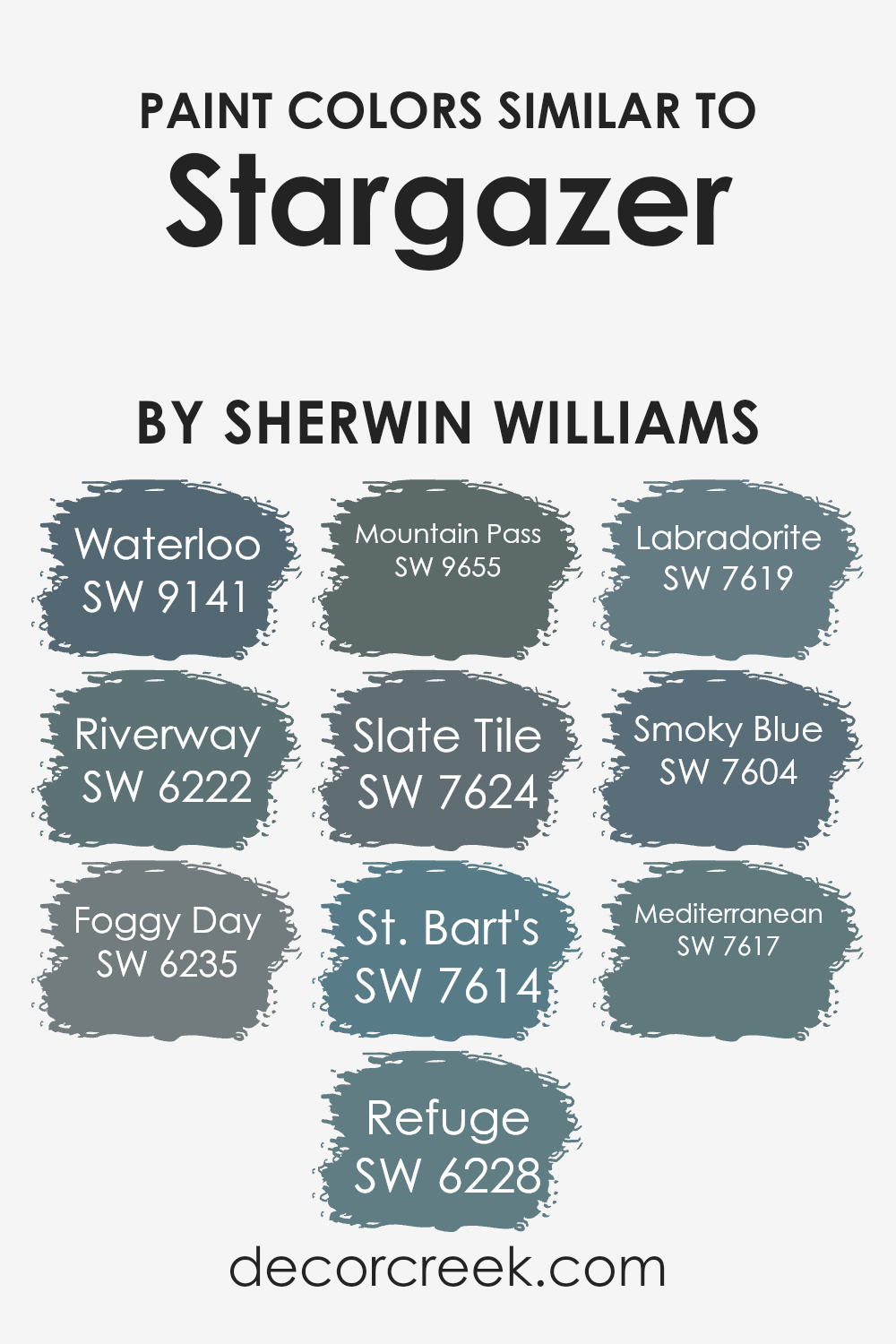
Colors Similar to Stargazer SW 9635 by Sherwin Williams
Similar colors play a significant role in design and decoration by creating a harmonious and cohesive aesthetic. Colors that share a similar tone or hue can seamlessly blend with one another, contributing to an elegant and unified visual experience.
This principle is exemplified in the color choices related to a particular shade by Sherwin Williams.
The subtle art of pairing colors enables designers and homeowners to craft spaces that feel balanced and thoughtfully curated.
Whether it’s through the contrast of light and dark shades or the gentle progression from one color to the next, similar colors can define the mood and character of any room.
Among the hues that complement a notable Sherwin Williams color are a range of both soothing and deep tones. Waterloo presents a somber and deep yet strikingly sophisticated appeal, perfect for creating a focal point in a room.
Riverway, on the other hand, introduces a serene and deep green-blue, reminiscent of the tranquility found in natural waterways.
Foggy Day, with its grey undertone, exudes calmness and neutrality, whereas Refuge offers a slightly deeper hue, encapsulating a sense of safety and serenity.
ountain Pass and Slate Tile both share an affinity for the majestic and imposing presence of natural stone and landscapes, adding depth to the palette. The blue-green richness of St.
Bart’s brings a refreshing and tropical vibe, complemented by the complex depth of Labradorite, which captures the allure of the gemstone it’s named after.
Smoky Blue, with its subtle smokiness, bridges the gap between color and emotion, offering a hint of mystery. Finally, Mediterranean evokes the vibrancy and warmth of its namesake sea, rounding off the collection with a burst of energy and life.
Together, these colors illustrate the beauty and versatility of similar hues, each contributing to a comprehensive and harmonious design scheme.
You can see recommended paint colors below:
- SW 9141 Waterloo
- SW 6222 Riverway
- SW 6235 Foggy Day
- SW 6228 Refuge
- SW 9655 Mountain Pass
- SW 7624 Slate Tile
- SW 7614 St. Bart’s
- SW 7619 Labradorite
- SW 7604 Smoky Blue
- SW 7617 Mediterranean
How to Use Stargazer SW 9635 by Sherwin Williams In Your Home?
Stargazer by Sherwin Williams is a captivating paint color that brings a sense of sophistication and tranquility into any home. This unique hue, a deep yet vibrant blue with a hint of teal, resembles the night sky and can create a serene backdrop in a variety of settings.
It’s perfect for creating a soothing and inviting atmosphere in living rooms, where it can be paired with soft neutrals, like creams and light grays, to maintain a balance between calm and engaging.
In bedrooms, Stargazer offers a peaceful oasis, encouraging relaxation and restful sleep. Its rich depth also makes it an excellent choice for accent walls, providing a stunning contrast to lighter shades and adding a focal point to the room.
For those looking to incorporate this dynamic color into their home, consider using it in areas that benefit from a touch of elegance and tranquility, effectively transforming any space into a sophisticated retreat.
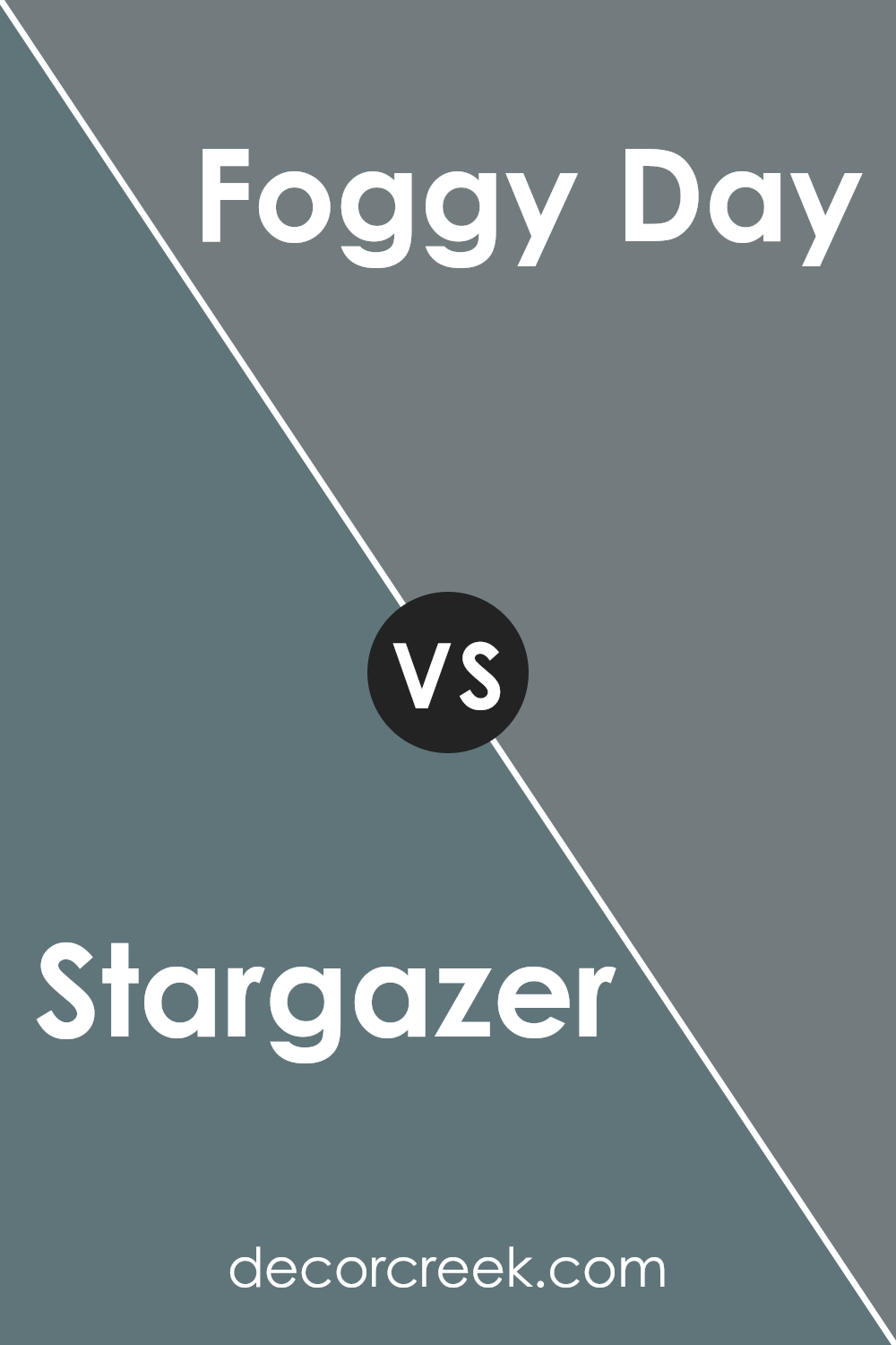
Stargazer SW 9635 by Sherwin Williams vs Foggy Day SW 6235 by Sherwin Williams
Stargazer and Foggy Day , despite both being from Sherwin Williams, present unique characteristics that set them apart. Stargazer carries a deep, rich hue that evokes a sense of mystery and depth, akin to a night sky awaiting the first twinkling stars.
Its profound intensity can add a layer of sophistication and drama to any space, making it ideal for accent walls or rooms aiming for a bold statement.
On the other hand, Foggy Day offers a more subdued experience. This color embodies the calm and tranquil essence of an overcast sky, providing a soft, soothing backdrop that enhances serenity and relaxation in a space.
Its versatility makes it an excellent choice for living areas and bedrooms, where a gentle ambiance is desired.
While both colors share a connection to the sky’s ever-changing palette, Stargazer leans towards the enchantment of the celestial, and Foggy Day captures the peaceful quiet of a clouded atmosphere.
You can see recommended paint color below:
- SW 6235 Foggy Day
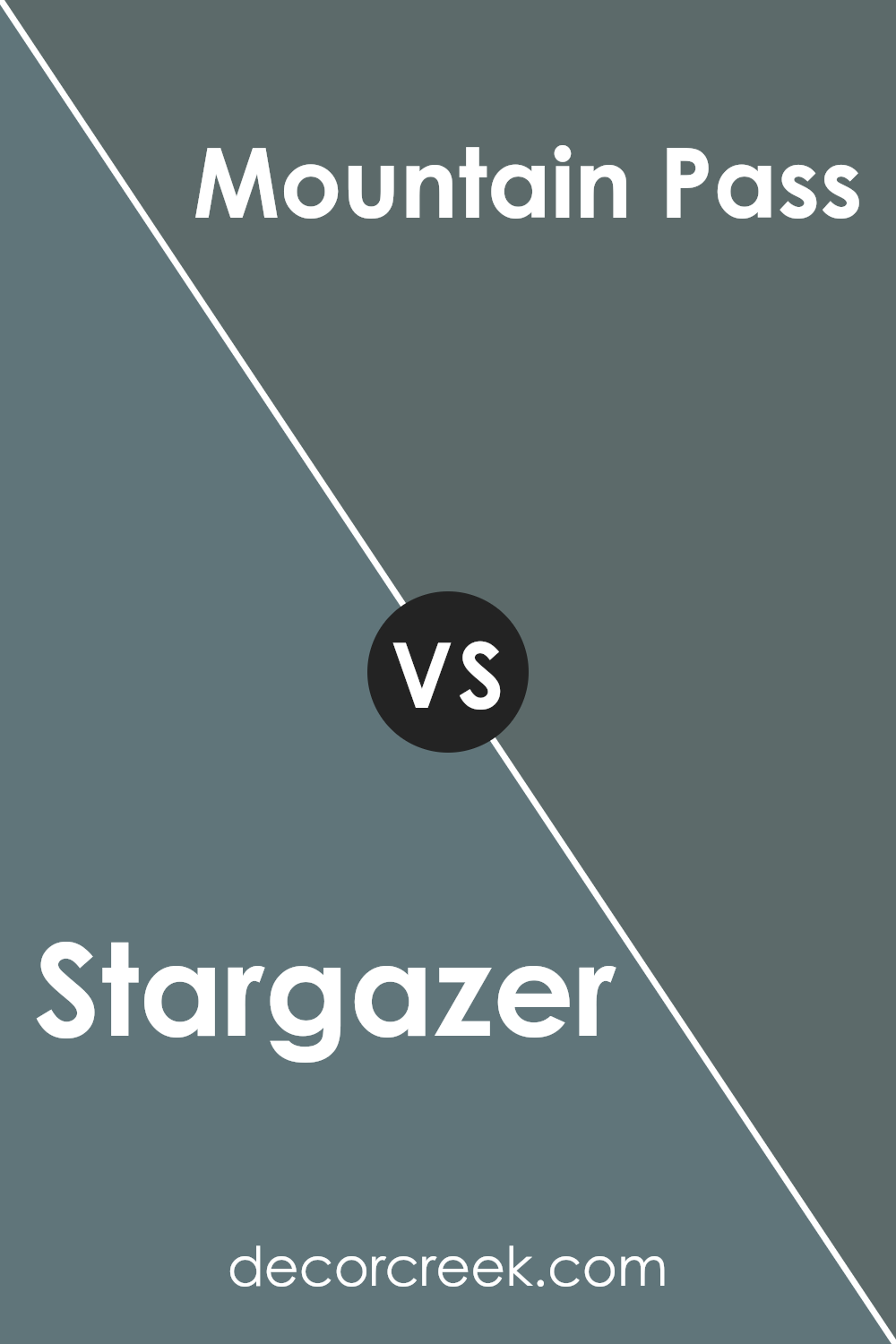
Stargazer SW 9635 by Sherwin Williams vs Mountain Pass SW 9655 by Sherwin Williams
Stargazer and Mountain Pass , both from Sherwin Williams, offer distinct moods and aesthetics for interior and exterior design. Stargazer embodies a vibrant, rich navy tone that can bring a sense of depth and sophistication to a space.
This color has the capability to act as a bold statement or a neutral backdrop, depending on its application and the accompanying palette. It’s particularly effective in creating an elegant ambiance in living areas, bedrooms, and dining spaces.
On the other hand, Mountain Pass presents a serene, soft green hue, reminiscent of nature and tranquility. This color tends to infuse spaces with a calm, refreshing vibe, making it ideal for rooms where relaxation and recharging are key, such as bathrooms and bedrooms.
Its earthy quality allows it to harmonize well with natural elements and materials, promoting a grounded and cohesive interior design.
While Stargazer leans towards a cooler, more dramatic spectrum, offering a modern and luxurious feel, Mountain Pass veers towards a warmer, organic look, establishing a soothing and inclusive atmosphere. Both colors showcase Sherwin Williams’ range in offering versatile and mood-enhancing options for discerning homeowners and designers.
You can see recommended paint color below:
- SW 9655 Mountain Pass
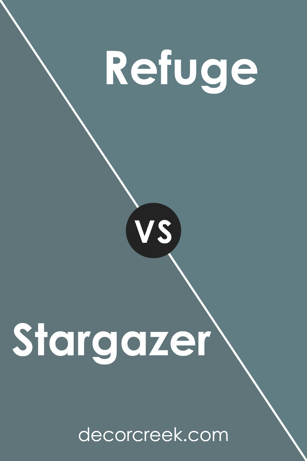
Stargazer SW 9635 by Sherwin Williams vs Refuge SW 6228 by Sherwin Williams
Stargazer and Refuge , both from Sherwin Williams, contrast beautifully in hue and mood, offering distinct ambiances for any space. Stargazer, a subtle, soft lavender exudes serenity and sophistication, embodying an air of tranquility perfect for creating a soothing retreat.
Its lightness and slight coolness can make small spaces feel larger and more open, all while introducing a delicate touch of color that’s both inviting and calming.
Refuge, on the other hand, is a deep, rich teal that leans towards the darker spectrum, evoking depth and drama. This color can transform any room into a striking statement space, offering a sense of refuge and coziness.
Its saturated tones are ideal for accent walls or rooms that aim for a more enveloped feel, complementing well with natural materials and metallic accents.
Together, Stargazer and Refuge offer a versatile palette that can range from airy and light to deeply immersive, enabling creative combinations that cater to diverse aesthetic preferences and spaces.
You can see recommended paint color below:
- SW 6228 Refuge
Stargazer SW 9635 by Sherwin Williams vs Waterloo SW 9141 by Sherwin Williams
Stargazer and Waterloo , both by Sherwin Williams, offer unique aesthetic experiences through their hues. Stargazer presents a deep, vibrant teal that evokes the mysteries of the night sky. It carries a certain brightness that can energize a space while still maintaining an element of sophistication and depth.
This color tends to blend the calming properties of blue with the renewing qualities of green, making it versatile for both relaxing and invigorating environments.
In contrast, Waterloo embodies a darker, more subdued approach. This shade leans more towards a slate blue, offering a sense of serenity and stability that is often sought after in spaces designed for focus and tranquility.
It’s a color that, due to its depth, can make a strong statement in design, yet it remains subtle enough to act as a neutral backdrop for a variety of decor styles.
When comparing the two, Stargazer introduces a lively vibrance that can lift the mood of a room, while Waterloo provides a grounded, calming presence. Each color, with its distinct characteristics, caters to different aesthetic and emotional needs, making them suitable for various settings and preferences.
You can see recommended paint color below:
Stargazer SW 9635 by Sherwin Williams vs Labradorite SW 7619 by Sherwin Williams
Stargazer SW 9635 and Labradorite SW 7619 , both by Sherwin Williams, showcase a fascinating divergence in the spectrum of interior design colors. Stargazer is a rich, deep blue with a vibrancy that evokes the night sky.
Its depth allows it to stand out as a bold choice for statement walls or accent pieces, offering a serene yet dramatic flair to any space. Its cosmic-inspired hue creates an ambiance of sophistication and mystery, perfect for spaces designed to impress or provide a contemplative atmosphere.
On the other hand, Labradorite presents a complex, warm gray tone with green undertones, resembling the natural stone it’s named after. This color offers a more subdued, neutral palette, making it highly versatile for various decorating styles.
It’s particularly effective in spaces where the goal is to create a soothing, organic feel, blending seamlessly with both modern and traditional decors.
While both colors embody their unique appeal, Stargazer provides a splash of deep, celestial-inspired drama, and Labradorite offers a grounded, subtle elegance. Each creates distinct atmospheres, making the choice between them a matter of aesthetic preference and desired ambience in a space.
You can see recommended paint color below:
Stargazer SW 9635 by Sherwin Williams vs Smoky Blue SW 7604 by Sherwin Williams
Stargazer and Smoky Blue , both from Sherwin Williams, present a captivating comparison within the realm of paint colors, catering distinctly to different aesthetic preferences and atmospheres. Stargazer stands out as a deep, celestial color, reminiscent of a clear night sky, providing a sense of vastness and serenity.
It leans on the cooler side of the spectrum, offering depth and sophistication, perfect for creating a focal point in a space.
In contrast, Smoky Blue is a softer, more muted shade that balances between blue and gray. This color exudes tranquility and versatility, making it an excellent choice for a calm and collected ambiance.
Smoky Blue’s subtle undertones enable it to blend seamlessly with various decor styles, from modern to traditional, ensuring a timeless appeal.
While Stargazer aims to make a bold statement with its rich, dark hue, Smoky Blue prioritizes a soothing and harmonious environment. Each color, with its unique charm, offers distinctive possibilities for transforming spaces, whether one seeks dramatic flair or understated elegance.
You can see recommended paint color below:

Stargazer SW 9635 by Sherwin Williams vs St. Bart’s SW 7614 by Sherwin Williams
Stargazer SW 9635 by Sherwin Williams is a deeply saturated, dark hue that evokes the mystery and boundless depth of the night sky. Its rich, almost enigmatic quality makes it a bold choice for spaces looking to convey drama and intensity.
On the other hand, St. Bart’s SW 7614 is a serene and inviting shade, reminiscent of the tranquil waters of its namesake Caribbean island. This color offers a refreshing and calming presence, making it ideal for creating a relaxed and soothing ambiance.
The contrast between the two is striking. Stargazer embodies a sense of sophistication and cosmopolitan flair with its darker, more intense palette, making it suitable for accent walls or spaces where a strong, impactful color is desired. Meanwhile, St. Bart’s exudes peace and relaxation, lending itself well to bedrooms, bathrooms, or any area where a sense of calm is the goal.
The choice between them depends on the atmosphere one wishes to create: the dramatic allure of Stargazer for a bold statement, or the gentle tranquility of St. Bart’s for a serene retreat.You can see recommended paint color below:
Stargazer SW 9635 by Sherwin Williams vs Mediterranean SW 7617 by Sherwin Williams
Stargazer and Mediterranean , both from Sherwin Williams, offer unique visual experiences. Stargazer is a deep, sooty blue that seems to capture the night sky just before it turns completely black. Its richness provides a sense of depth and mystery, making it an ideal choice for creating striking, sophisticated spaces.
On the other hand, Mediterranean is a vibrant azure hue that, true to its name, conjures images of the sparkling seas bordering sun-drenched southern European coasts. This color brings a refreshing burst of energy and openness, reminiscent of summer days by the sea.
While Stargazer leans towards a cooler, more introspective ambiance, Mediterranean offers a warmer, more outgoing and lively vibe. The contrast between these two hues lies not just in their color temperatures but also in the moods they evoke; Stargazer promotes a sense of calm and reflection, while Mediterranean encourages vitality and joy.
Despite these differences, both colors are incredibly versatile, able to enhance a variety of spaces depending on the aesthetic one wishes to achieve.
You can see recommended paint color below:
- SW 7617 Mediterranean
Stargazer SW 9635 by Sherwin Williams vs Slate Tile SW 7624 by Sherwin Williams
Stargazer SW 9635 by Sherwin Williams is a vivid and lively hue that leans heavily into the realm of deeper blues, offering a sense of both creativity and calmness. This color, embodying the vastness and depth of the night sky, brings an element of serenity and reflection into spaces, making it ideal for areas where relaxation or concentration is key.
Its richness provides a backdrop that can either stand out as a focal point or support bolder colors and designs.
On the other hand, Slate Tile SW 7624 occupies a more subdued position in the color spectrum. This shade of gray with blue undertones presents a sense of sturdy reliability and versatility. It works effortlessly in various settings, from the modern to the traditional, due to its neutral, yet profoundly deep and complex character.
Slate Tile lends itself to a more understated elegance, providing a solid foundation that complements a wide range of decor styles and colors.
While both colors share a certain depth and sophistication, Stargazer exudes a more pronounced, dynamic character with its deep blue tones, offering a sense of escapism and imagination. Slate Tile, conversely, grounds spaces with its earthly, muted tones, promoting stability and subtlety.
The choice between them hinges on the desired ambiance and the balance between enchantment and pragmatism in a space.
You can see recommended paint color below:
Stargazer SW 9635 by Sherwin Williams vs Riverway SW 6222 by Sherwin Williams
Stargazer and Riverway by Sherwin Williams represent distinct tones, each bringing its unique ambiance to spaces. Stargazer is a mystical, deep tone that seems to draw inspiration from the night sky.
Its profound, dark base is softened by hints of navy, making it a versatile choice for adding a touch of sophistication and depth to rooms without overwhelming them with stark darkness. It pairs beautifully with light neutrals, acting as an elegant backdrop that enhances decor without competing for attention.
Riverway, on the other hand, embodies the serene essence of a deep, flowing river. This color possesses a tranquility that comes from its rich, teal base, which balances green and blue hues to create a calming, yet invigorating presence.
It’s particularly effective in spaces meant for relaxation or creative inspiration, offering a refreshing contrast to light tones and woods, imbuing rooms with a sense of balance and harmony.
Together, Stargazer and Riverway showcase the versatility of Sherwin Williams’ palette, from the ethereal depth of the night sky to the peaceful flow of river waters, offering distinctive choices for interior spaces.
You can see recommended paint color below:
- SW 6222 Riverway
Conclusion
In the exploration of the color Stargazer by Sherwin-Williams, a profound insight into its versatility and aesthetic appeal is captured. This shade stands out as a unique choice for anyone looking to infuse their space with a touch of sophistication and calm.
Its distinctive hue has the ability to elevate the ambiance of any room, making it an ideal choice for those interested in interior design that evokes tranquility and elegance.
The analysis delves into how its application can significantly impact the perception of space, suggesting that Stargazer possesses a transformative power, adept at creating atmospheres that are both inviting and inspiring.
Furthermore, the article accentuates Stargazer’s compatibility with a myriad of design elements and color palettes, highlighting its exceptional adaptability. Whether incorporated into a minimalist aesthetic or employed as a contrasting element in a more vibrant setting, this color demonstrates an impressive capacity to complement a wide range of styles.
Its nuanced tone, neither too overpowering nor too subdued, offers a perfect balance that can harmonize with various textures and materials, underscoring its utility in design projects that aim for a cohesive yet captivating look. This exploration into Stargazer’s qualities underscores its status as a compelling choice for designers and homeowners alike, seeking to infuse their projects with a timeless yet contemporary flair.

Ever wished paint sampling was as easy as sticking a sticker? Guess what? Now it is! Discover Samplize's unique Peel & Stick samples.
Get paint samples