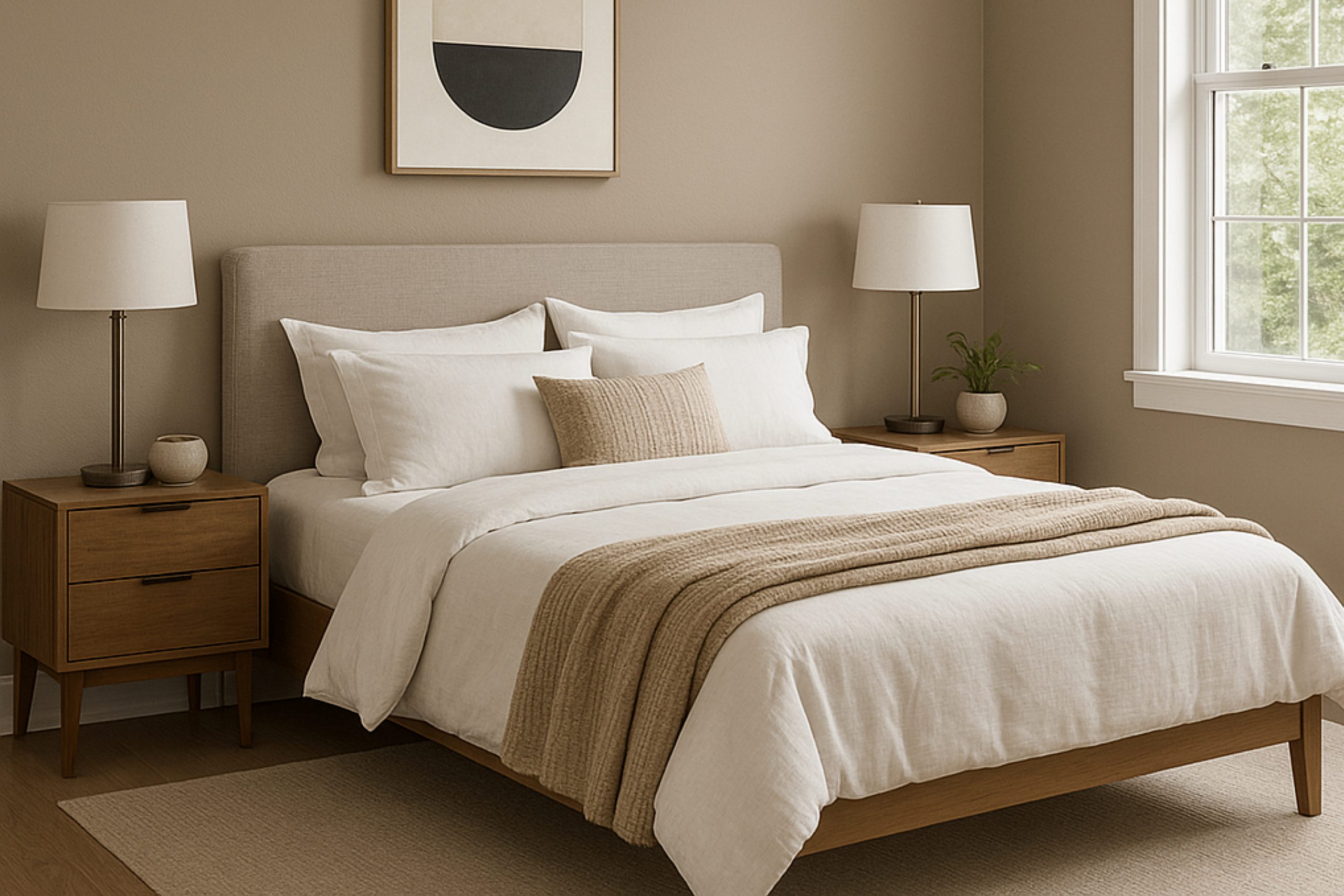
Imagine waking up in a calm, soothing atmosphere every day, surrounded by a color that echoes the peace of sandy beaches and the gentle murmur of the sea. That’s the essence of SW 7534 Outerbanks by Sherwin Williams. This remarkable shade stands out for its ability to bring a sense of ease and simplicity into any room, making your home a retreat from the bustling world outside.
As you consider refreshing your home’s walls or adding character to your furnishings, you’ll find that Outerbanks has an adaptable charm.
It pairs beautifully with both bright accents and subdued hues, providing a perfect backdrop for any interior style you prefer.
Whether you’re looking to revitalize your living room, bedroom, or even your kitchen, this color adjusts brilliantly to different lighting conditions, maintaining its beauty from dawn until dusk.
With Outerbanks, you are not just painting your walls, but setting a backdrop for life’s countless beautiful moments. This color helps create a warm, welcoming room where you can unwind, entertain friends, and make lasting memories.
Let’s open a new chapter in your home’s aesthetic journey with SW 7534 Outerbanks—a hue that is more than just a color, but a daily comfort of calm and ease.
What Color Is Outerbanks SW 7534 by Sherwin Williams?
Outerbanks by Sherwin Williams is a warm, muted taupe that balances between beige and gray. Its earthy tones make it adaptable for various decorating themes, providing a cozy, welcoming feeling to any room. This color isn’t too dark or too light, making it just right for creating a balanced look in your home.
Outerbanks works exceptionally well in interior styles that emphasize comfort and simplicity, such as rustic, modern farmhouse, and Scandinavian. Its neutral hue serves as an excellent backdrop, allowing furniture and decor pieces to stand out. For a more contemporary look, it pairs beautifully with clean lines and minimalist designs.
In terms of materials and textures, Outerbanks looks stunning with natural wood, adding warmth and depth to the neutral color. It also pairs well with soft, textured fabrics like wool or linen in lighter shades to create contrast while maintaining a harmonious room. Additionally, metallic accents in gold or brass can add a touch of luxury to the subtle backdrop provided by Outerbanks, without overpowering the senses.
Overall, Outerbanks is a go-to choice for anyone looking to create a cozy, inviting room that feels both stylish and down-to-earth.
Is Outerbanks SW 7534 by Sherwin Williams Warm or Cool color?
Outerbanks by Sherwin Williams is a rich and warm shade of beige that brings a cozy and comforting vibe to any room. This particular color is great for creating a welcoming atmosphere in homes, making it ideal for living rooms and bedrooms where relaxation is key. Its earthy tone helps it blend well with various decor styles, from rustic to modern.
Additionally, Outerbanks is adaptable enough to pair well with both dark and light furnishings, which makes it easy for homeowners to use without needing to buy new furniture.
When used on walls, it serves as a subtle background that allows other design elements like artwork or colorful accents to stand out.
This color also has a natural feel to it, which can help make a room feel grounded and put together.
Its softness ensures that while it adds character to a room, it does so without overpowering the senses, thus maintaining a comfortable environment.
Undertones of Outerbanks SW 7534 by Sherwin Williams
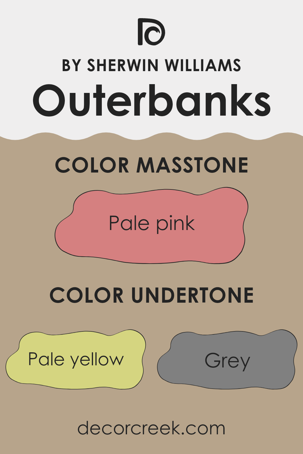
Outerbanks by Sherwin Williams is a complex paint color that carries various undertones which subtly influence its overall appearance and the feeling it creates in a room. Understanding these undertones helps us figure out why the color sometimes looks different under various lighting conditions and how it complements other colors in a room.
The undertones in this particular shade include pale yellow, grey, mint, light purple, and more, contributing to its unique and adaptable nature. For example, the pale yellow undertone can make the paint appear warmer in sunlit rooms, bringing a cozy glow to the room. Conversely, the grey undertone might be more noticeable in areas with less natural light, giving the color a more muted, neutral look.
When used on interior walls, the complexity of Outerbanks with its multiple undertones can work to its advantage or need careful consideration, depending on the room’s lighting and existing decor. For instance, in a brightly lit room with natural light, the warmer undertones like yellow and orange may become prominent, creating a welcoming and lively feeling.
In contrast, cooler undertones like mint or light blue might stand out in a room with fluorescent lighting, offering a fresher look.
These undertones also play a crucial role in color coordination. They can either complement or contrast with other colors in the furnishings and decor, affecting the overall aesthetic of the room. Thus, being aware of these undertones can assist in making more informed choices in decorating and selecting accompanying colors. After all, the right balance and combination can significantly enhance the ambiance of any room, making it feel just right.
What is the Masstone of the Outerbanks SW 7534 by Sherwin Williams?
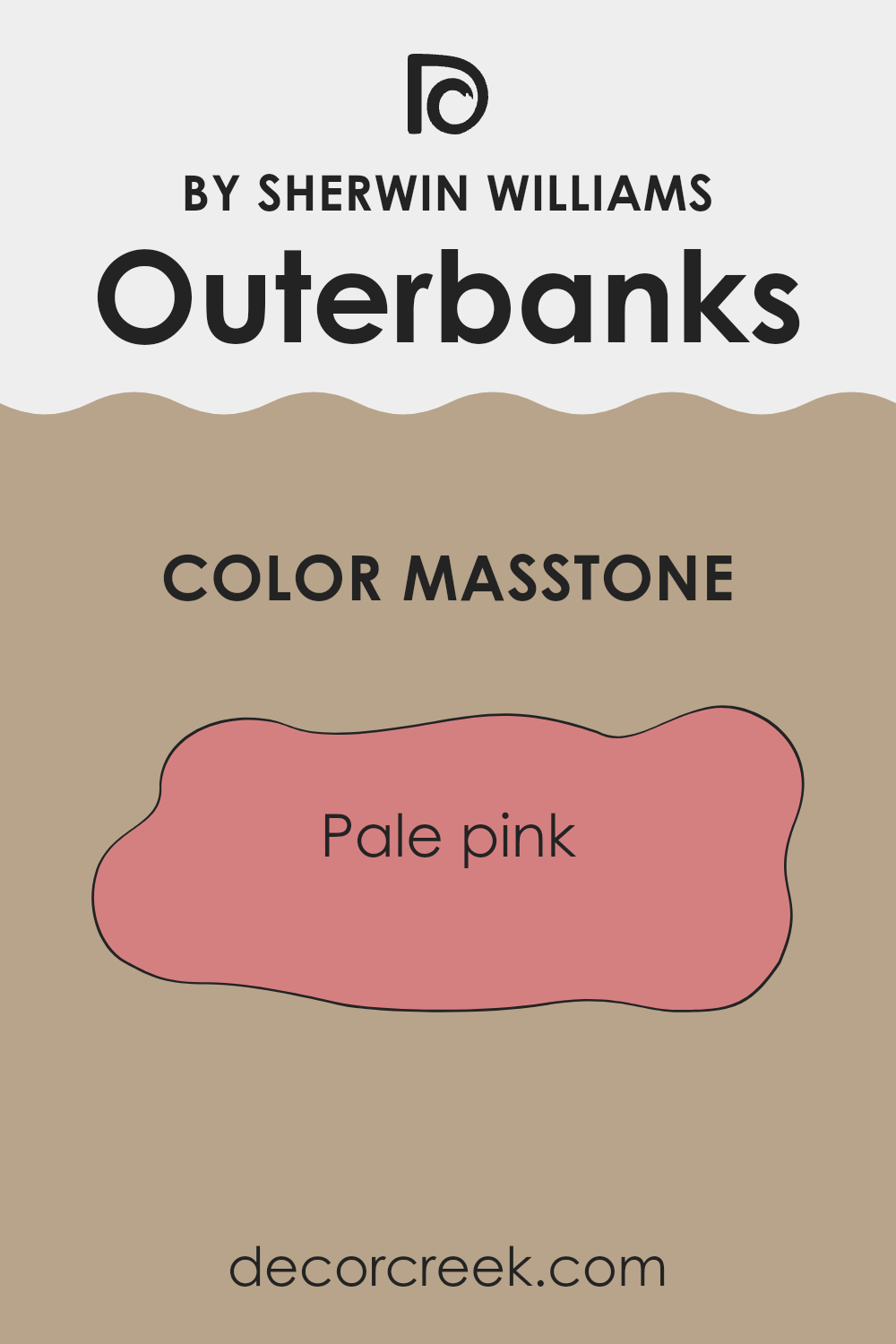
Outerbanks SW 7534 by Sherwin Williams has a masstone of pale pink, represented by the color code #D58080. This subtle shade of pink can create a cozy and warm atmosphere in any room. The softness of the hue makes it ideal for bedrooms and living areas, where a calming effect is often desired. Additionally, its lightness works well to enhance smaller rooms, making them appear more open and airy.
In a home setting, the pale pink can also serve as a neutral backdrop, pairing well with various decor styles and color schemes. It complements whites and creams for a gentle contrast or can be matched with bolder colors like deep blues or greens for a more dynamic look.
The adaptability of pale pink allows it to be easily incorporated into most home decor styles without overpowering the room, making it a practical choice for those looking to add a touch of warmth without going too bold.
How Does Lighting Affect Outerbanks SW 7534 by Sherwin Williams?
Lighting greatly impacts how colors appear in any room, whether it’s sunlight or artificial lighting. The perception of color changes depending on the type of light under which it is viewed. Natural light makes colors look different at various times of the day, while artificial light can enhance or soften the colors depending on the light bulbs used.
Taking the color in question as an example, a unique shade of brown with gray undertones, it will show varying characteristics in different lighting environments. Under artificial light, such as LED or incandescent bulbs, it will probably appear slightly warmer, enhancing its earthy tones. This can make a room feel cozy and welcoming, particularly in the evening.
In natural light, the dynamic changes throughout the day. In a room facing north, which receives less direct sunlight and hence cooler, softer light, this color might appear more subdued and neutral, maintaining its gray qualities. This ambiance is suitable for creating a calm, gentle environment.
Rooms that face south benefit from plentiful sunlight, making the paint look warmer and more vibrant throughout the day. This exposure tends to bring out the subtle richness of the color, making the room feel open and lively.
East-facing rooms see the most change in the morning when the sunrise throws warm light into the room, brightening and warming the color. As the day progresses, the intensity of the sunlight decreases, and the color will return to its more neutral and muted state.
Finally, west-facing rooms get the evening light, which can cast a golden glow, warming the color significantly towards the end of the day. During the morning, the color will stay closer to its true shade, as the light is more indirect and softer.
Thus, the way this hue is perceived can really depend on the room’s orientation and the type of light it receives, affecting the overall mood and feeling of the room.
decorcreek.com
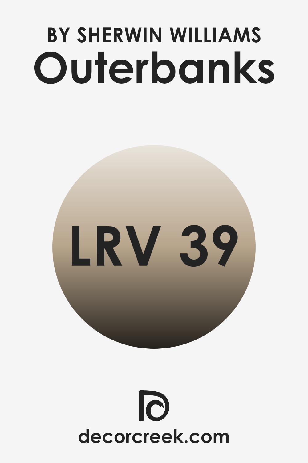
What is the LRV of Outerbanks SW 7534 by Sherwin Williams?
LRV stands for Light Reflectance Value, which is a measure of the amount of visible and usable light that is reflected from a surface when illuminated by a light source. The scale ranges from 1 to 100, where lower values indicate that the surface absorbs more light and higher values indicate that the surface reflects more light.
LRV is an important factor to consider when choosing paint colors for a room because it can significantly impact the atmosphere and brightness of the room.
A higher LRV can make a room feel brighter and more open, while a lower LRV can make a room feel cozier and more subdued.
The LRV for the color Outerbanks by Sherwin Williams is 38.65, which is closer to the middle but tends toward the darker side of the scale. This means that it will reflect some light but also absorb a fair amount of it. In practical terms, this makes it an adaptable color that won’t make a room feel too bright or too dark.
It’s a good middle ground and can be a suitable choice for rooms that need a balance between warmth and light. Walls painted with this color might appear more muted and subtle, which could make it easier to decorate with various types of furniture and decorations without the walls overpowering the room.
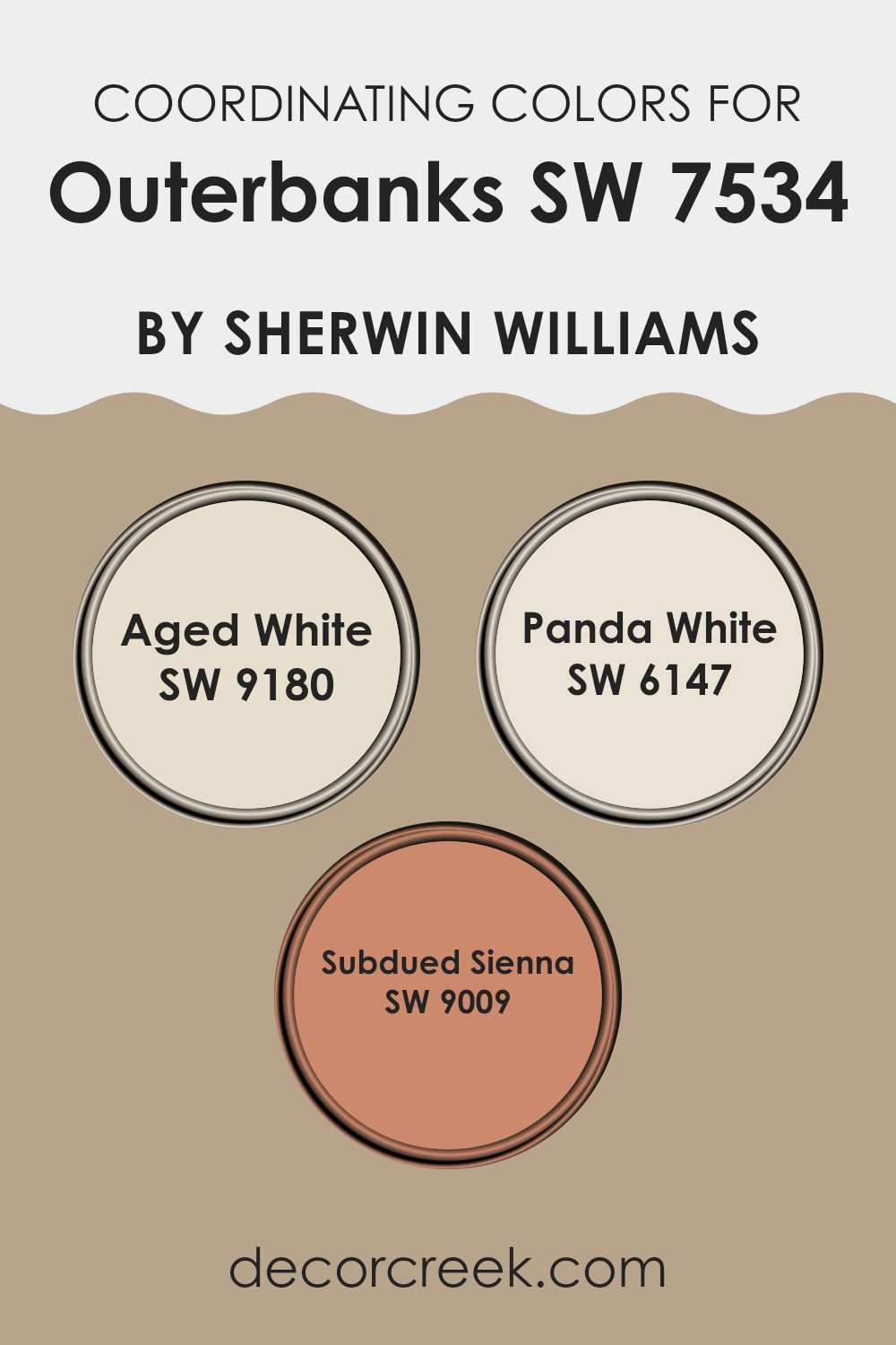
Coordinating Colors of Outerbanks SW 7534 by Sherwin Williams
Coordinating colors are essentially hues that harmonize well when used together in design and decor, creating a balanced and pleasing visual effect. When selecting coordinating colors for a room, it’s important to choose shades that complement the primary color in terms of tone, saturation, and luminosity, to achieve a cohesive look.
For example, if you are using a base color like beige, selecting coordinating colors involves finding other hues that maintain the warmth and neutrality of the beige, while adding visual interest and contrast to the room.
Aged White by Sherwin Williams is a subtle off-white with a warm undertone that pairs beautifully with milder, earthy colors like beige. It is ideal for creating a soft backdrop or for enlarging a room visually without stark contrasts. Panda White, another coordinating color, offers a slightly creamier tone, which works well to maintain an airy yet cozy feel in rooms that benefit from a touch of warmth without overpowering other design elements.
Subdued Sienna is a muted, earthy clay color that adds a touch of nature-inspired warmth, perfect for accentuating focal points or adding depth to a room in a gentle yet impactful manner.
These colors together create environments that are homely and inviting, providing a delicate balance to enrich a room’s aesthetics.
You can see recommended paint colors below:
- SW 9180 Aged White
- SW 6147 Panda White
- SW 9009 Subdued Sienna
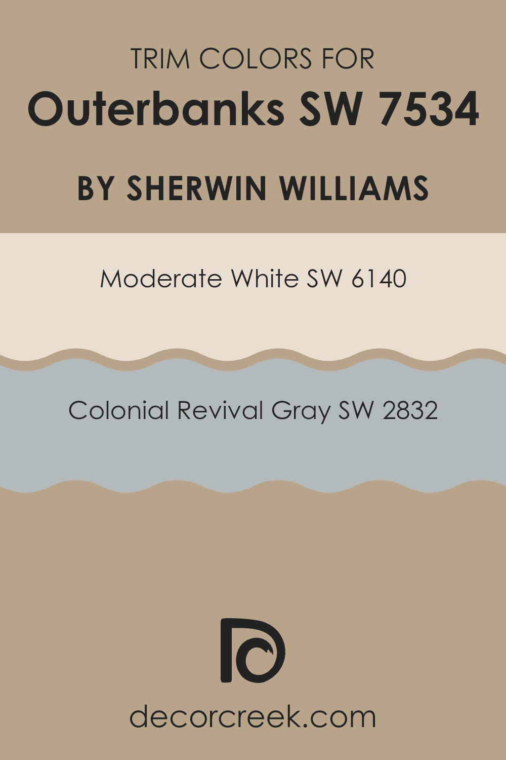
What are the Trim colors of Outerbanks SW 7534 by Sherwin Williams?
Trim colors are essential accents used to highlight and define the key features of a building’s exterior or an interior room, such as window frames, doors, and baseboards. When paired effectively with the main color, as with Outerbanks by Sherwin Williams, trim colors can enhance the architectural details and bring harmony between the various elements of a design.
Opting for contrasting trim colors, such as SW 6140 – Moderate White or SW 2832 – Colonial Revival Gray, can create a subtle yet noticeable impact that complements the overall color scheme.
SW 6140 – Moderate White is a soft, creamy white that provides a gentle contrast that isn’t too stark against richer, deeper hues. This makes it an excellent choice for trims, giving a clean and fresh outline to each design element without overpowering the main color.
On the other hand, SW 2832 – Colonial Revival Gray offers a slightly deeper, historical gray shade that pairs beautifully with subtle or vibrant colors, adding a touch of classic depth to the room.
Both colors allow for a seamless blend with Outerbanks, ensuring the room feels cohesive and well thought out while still allowing the architectural details to stand out.
You can see recommended paint colors below:
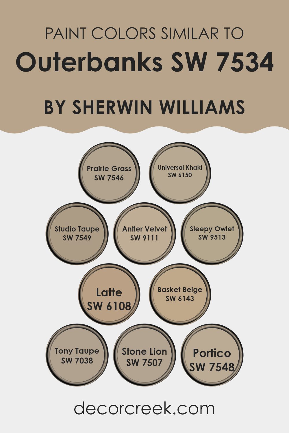
Colors Similar to Outerbanks SW 7534 by Sherwin Williams
Choosing similar colors, such as those related to Outerbanks SW 7534 by Sherwin Williams, plays a crucial role in creating a cohesive and harmonious environment. These shades help ensure that the room feels balanced and visually appealing. For instance, Prairie Grass SW 7546, a subdued green, brings a hint of nature into your interiors without overpowering the senses.
Similarly, Universal Khaki SW 6150 offers a warm, sandy feel that pairs beautifully with a variety of decor styles, making it incredibly adaptable.
Studio Taupe SW 7549 is another excellent choice, providing a slightly darker, richer tone that complements natural wood elements or white trim perfectly. If you prefer something with a softer, almost velvety finish, Antler Velvet SW 9111 gives off a cozy vibe, ideal for bedrooms. Neighboring in the palette, Sleepy Owlet SW 9513 is a gentle gray with just enough warmth to make smaller rooms seem inviting.
For those who like a bit creamier hue, Latte SW 6108 draws in a delightful warmth that can lighten up darker corners. Basket Beige SW 6143 is a straightforward beige, offering a neutral backdrop for bolder colors and designs.
Moving into slightly deeper tones, Tony Taupe SW 7038 provides a sturdy foundation that anchors lighter shades and accessories. Stone Lion SW 7507 offers a natural, transitional color that bridges the gap between taupe and beige. Finally, Portico SW 7548 is a balanced beige that works well both indoors and out, supporting a seamless visual flow from one room to another. Collectively, these hues unite to form a palette that supports a wide range of design choices, making any room feel coherent and thoughtfully designed.
You can see recommended paint colors below:
- SW 7546 Prairie Grass
- SW 6150 Universal Khaki
- SW 7549 Studio Taupe
- SW 9111 Antler Velvet
- SW 9513 Sleepy Owlet
- SW 6108 Latte
- SW 6143 Basket Beige
- SW 7038 Tony Taupe
- SW 7507 Stone Lion
- SW 7548 Portico
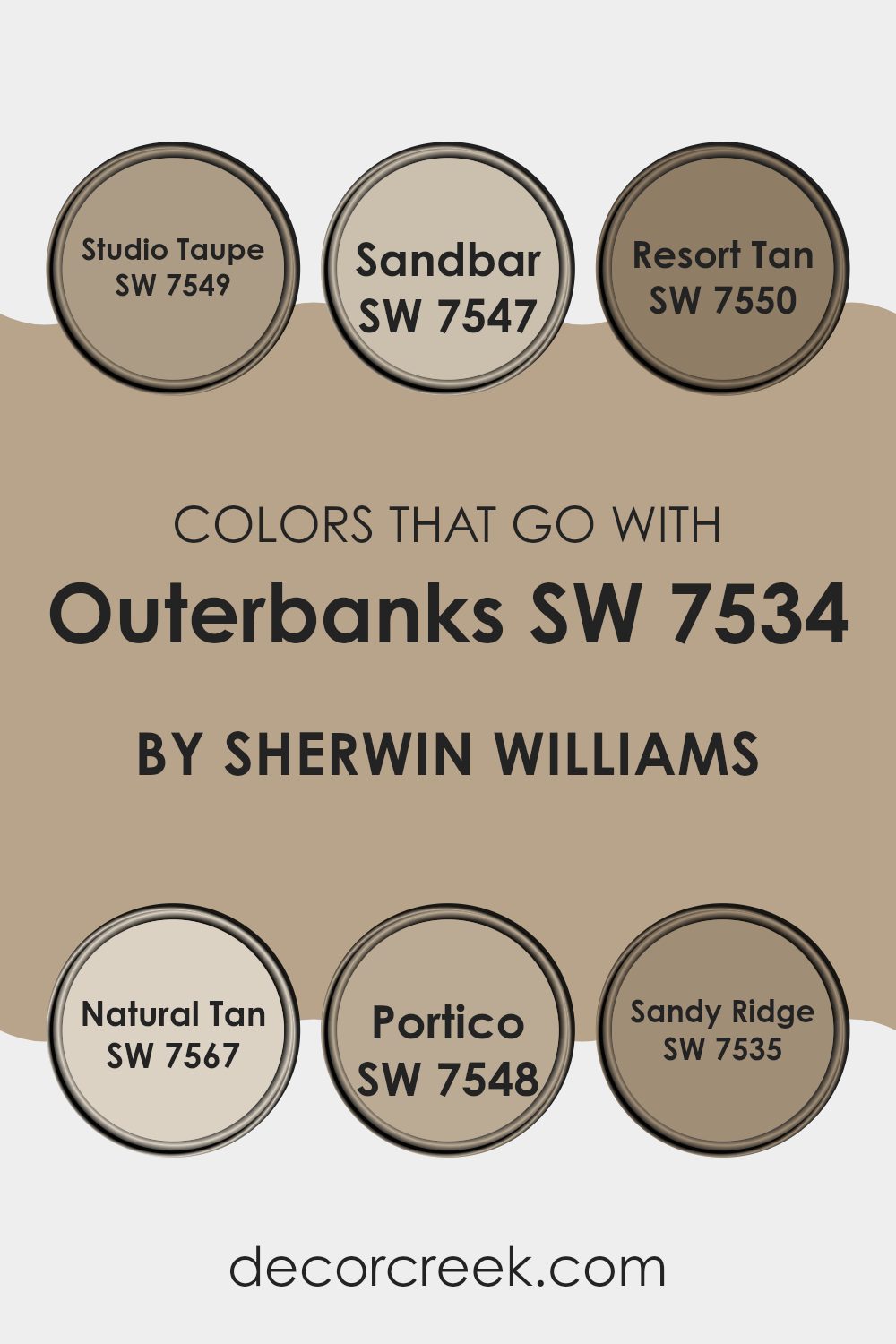
Colors that Go With Outerbanks SW 7534 by Sherwin Williams
Choosing the right complementing colors for Outerbanks SW 7534 by Sherwin Williams is essential as it allows for creating harmonious color schemes in your room. These colors help in balancing, contrasting, or enhancing the main color, Outerbanks, which can make your decorating project more complete and aesthetically pleasing.
Colors like Studio Taupe, Sandbar, Resort Tan, Natural Tan, Portico, and Sandy Ridge are specifically selected because they have tones that beautifully coordinate with Outerbanks, ensuring any room feels well put together.
Studio Taupe SW 7549 offers a steady, neutral base, akin to a light gray with a touch of earth, making it easily adaptable to various interior styles. Sandbar SW 7547 has a slightly warmer hue, resembling the softness of a sunny beach, which pairs effortlessly with the calmness of Outerbanks.
Moving to Resort Tan SW 7550, this color brings a bolder, earthier feel, reminiscent of rich clay, and adds depth when combined with lighter shades.
Natural Tan SW 7567 is a gentle, light brown that reflects an unobtrusive elegance, perfect for creating a subtle contrast without overpowering the senses. Portico SW 7548 leans towards a muted green, offering a hint of nature and freshness to balance the warmth of Outerbanks. Lastly, Sandy Ridge SW 7535 resonates with the shade of damp sand, providing a soothing yet inviting atmosphere when used alongside similar neutrals. By integrating these colors, you can achieve a cohesive and inviting look that enhances the overall appeal of your room.
You can see recommended paint colors below:
- SW 7549 Studio Taupe
- SW 7547 Sandbar
- SW 7550 Resort Tan
- SW 7567 Natural Tan
- SW 7548 Portico
- SW 7535 Sandy Ridge
How to Use Outerbanks SW 7534 by Sherwin Williams In Your Home?
Outerbanks SW 7534 by Sherwin Williams is a beautiful, warm gray paint color that brings a cozy and comfortable feel to any room. Its neutral tone makes it perfect for living areas like the living room or bedrooms, where you want a calm and inviting atmosphere. You can use it as the main color on walls to set a gentle backdrop that works well with all kinds of furniture and decorations, whether they are bright and colorful or more subdued.
This paint color also works great for painting cabinets or shelves. It’s a practical choice that hides everyday wear and tear well, while still keeping your room looking fresh and clean.
If you’re looking for a way to refresh your kitchen or bathroom without making drastic changes, painting the cabinets with Outerbanks can be a simple and effective solution.
Moreover, if you have a small room that you want to appear bigger, Outerbanks can help.
Lighter wall colors can make rooms feel more open and airy. Adding accessories like mirrors and good lighting will complement the wall color and enhance the effect, making your room look more spacious.
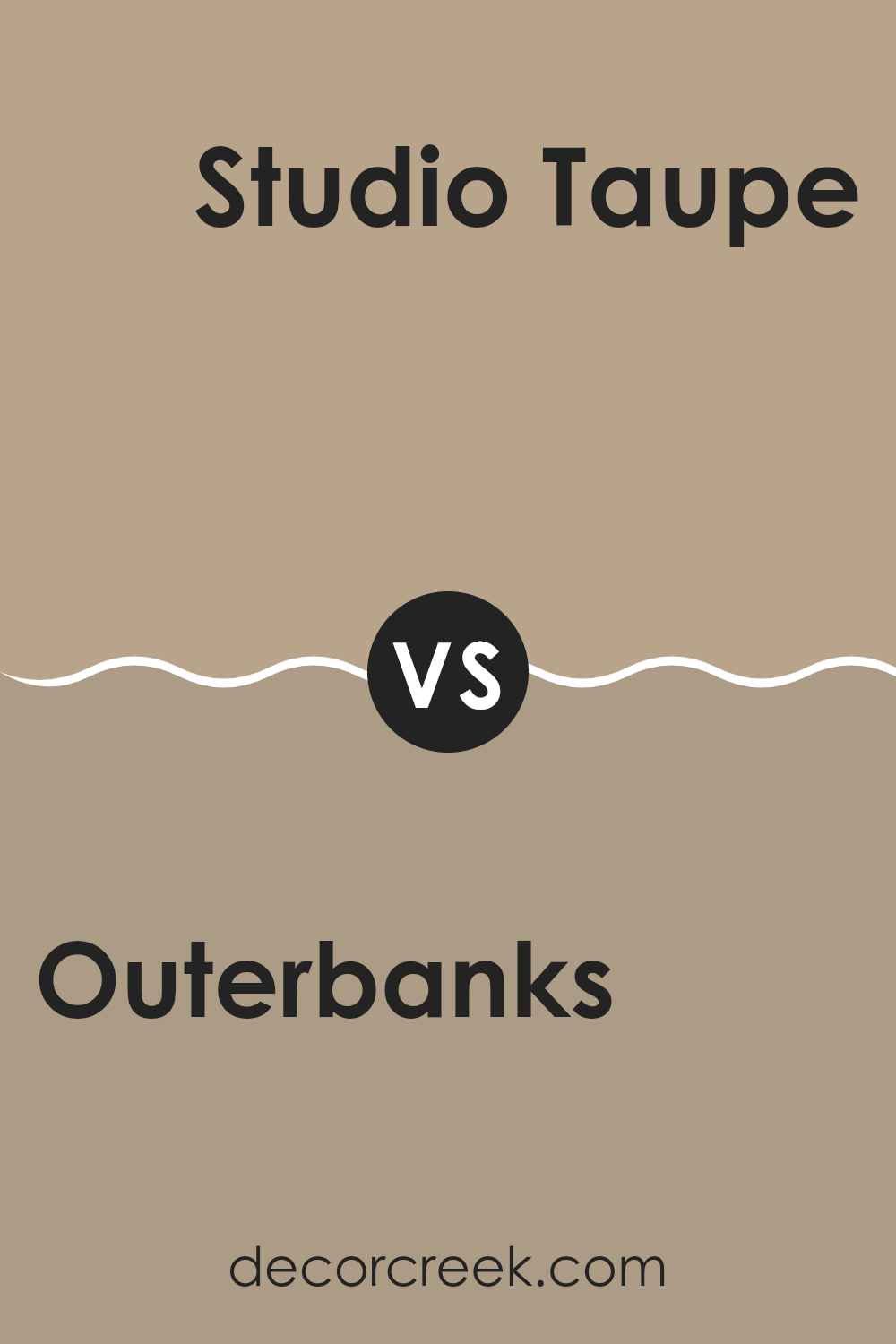
Outerbanks SW 7534 by Sherwin Williams vs Studio Taupe SW 7549 by Sherwin Williams
Outerbanks and Studio Taupe are both warm, neutral colors by Sherwin Williams, but they carry distinct tones and moods. Outerbanks is a lighter shade, presenting a softer and more airy feel, making it ideal for creating a cozy and inviting atmosphere in rooms. Its gentle warmth is adaptable, blending well with both bright and muted colors.
On the other hand, Studio Taupe is a deeper, richer color that provides a strong foundation in rooms, adding depth and a sense of steadiness.
It pairs wonderfully with a wide array of accent colors, making it a popular choice for a more grounded look. Both colors are flexible and can work well in various settings, from living rooms to bedrooms, yet their differences in depth and tone might cater to individual preferences based on the desired mood.
You can see recommended paint color below:
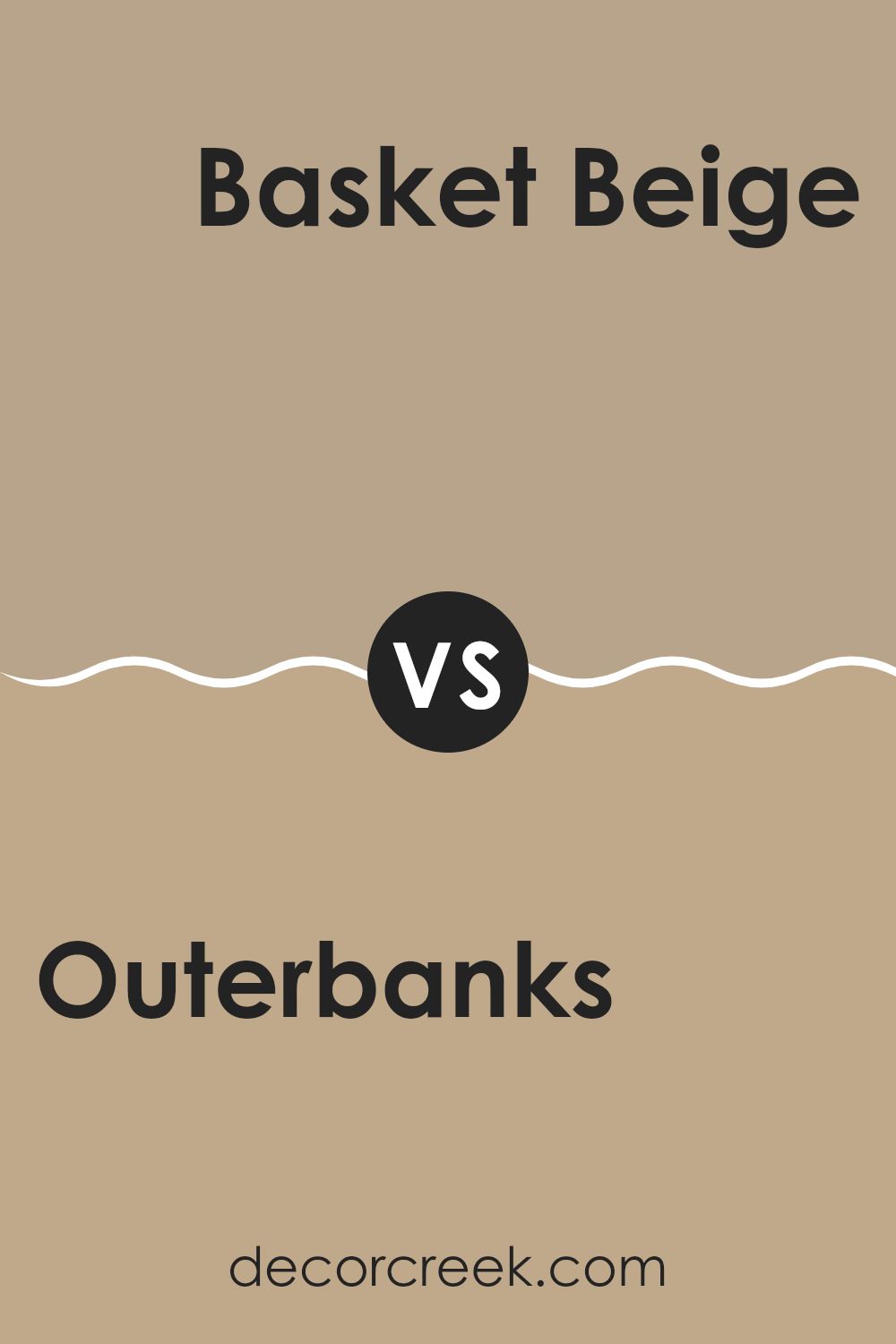
Outerbanks SW 7534 by Sherwin Williams vs Basket Beige SW 6143 by Sherwin Williams
Outerbanks and Basket Beige are two paint colors by Sherwin Williams. Outerbanks is a soft brown with a hint of gray, giving it a warm but neutral look that’s adaptable for any room. This color is somewhat darker and can give a cozy feel to a room. On the other hand, Basket Beige is a lighter, more straightforward beige.
It has a warm undertone but is brighter than Outerbanks, making rooms feel more open and light.
While both colors are neutral, Outerbanks tends to add a bit more character due to its deeper tone, whereas Basket Beige offers a calmer, simpler backdrop. Both colors can easily pair with various decor styles and are ideal for creating a welcoming atmosphere in homes.
You can see recommended paint color below:
- SW 6143 Basket Beige
Outerbanks SW 7534 by Sherwin Williams vs Prairie Grass SW 7546 by Sherwin Williams
Outerbanks and Prairie Grass are two distinct paint colors from Sherwin Williams. Outerbanks is a muted tan with a warm base that feels comforting and cozy, making it a great choice for creating a relaxed mood in rooms. It’s adaptable enough to work in various areas like living rooms or bedrooms.
On the other hand, Prairie Grass has a deeper, greenish hue that brings a natural and earthy touch to rooms.
This color is perfect for those who want to add a bit of nature to their interiors, helping rooms like studies or dining rooms feel grounded and welcoming. Both colors offer an appealing palette but cater to different design preferences and room purposes. Outerbanks leans toward a neutral backdrop, while Prairie Grass acts more as a statement with its richer tone.
You can see recommended paint color below:
Outerbanks SW 7534 by Sherwin Williams vs Sleepy Owlet SW 9513 by Sherwin Williams
Outerbanks and Sleepy Owlet are two interesting shades by Sherwin Williams. Outerbanks has a rich taupe-like tone, resembling a mix between brown and gray. It brings a warm and cozy feel to the room, perfect for creating a welcoming atmosphere in any room. On the other hand, Sleepy Owlet is a lighter, softer shade. With a hint of green under its gray overtone, it gives off a more airy and fresh vibe, making it ideal for those looking to brighten up a smaller or darker room.
While Outerbanks lends a more grounded, earthy feeling, ideal for areas like living rooms or studies, Sleepy Owlet offers a lighter touch that can enhance areas such as bathrooms or small offices.
Regardless of personal style, both colors provide a subtle, refined backdrop that can complement various decor styles without overpowering the room.
You can see recommended paint color below:
Outerbanks SW 7534 by Sherwin Williams vs Latte SW 6108 by Sherwin Williams
Outerbanks and Latte, both by Sherwin Williams, are warm, inviting colors, though they bring different moods to a room. Outerbanks is a beige with gray undertones, giving it a fresh and modern look that’s highly adaptable. It’s a perfect backdrop for various decor styles and works well in rooms that need a neutral but contemporary feel.
In contrast, Latte is a richer, more golden beige, lending a cozier and more comforting touch. This color is great for areas where you want a welcoming and homey atmosphere, like living rooms or bedrooms.
While both colors offer warmth, Outerbanks leans toward a cooler, muted palette, and Latte toward a warmer, slightly more lively one. Their adaptability makes them excellent choices for different needs and tastes in interior design.
You can see recommended paint color below:
Outerbanks SW 7534 by Sherwin Williams vs Antler Velvet SW 9111 by Sherwin Williams
The main color, Outerbanks, and the second color, Antler Velvet, both offer unique tones that can enhance different rooms beautifully. Outerbanks has a warm beige hue with gray undertones, providing a cozy and inviting atmosphere that’s adaptable for any room. It works especially well in areas where a soft, neutral backdrop is desired to let other decor elements stand out.
On the other hand, Antler Velvet is darker, leaning toward a deep taupe that borders on gray. This color is ideal for creating a more dramatic and intimate feel in a room, especially suitable for accent walls or furniture pieces. Its depth adds character and pairs beautifully with a range of contrasting tones.
Both colors are grounded in neutrality, making them easy to incorporate into various design styles. Yet, they serve different purposes based on their intensity. Outerbanks brightens and opens up a room, while Antler Velvet anchors it with an earthy, refined presence.
You can see recommended paint color below:
Outerbanks SW 7534 by Sherwin Williams vs Universal Khaki SW 6150 by Sherwin Williams
The main color, Outerbanks, is a warm, sandy hue that brings to mind quiet beaches and gentle dunes. It has a soft, welcoming beige tone that’s great for creating a cozy and comforting atmosphere in any room. In contrast, Universal Khaki is slightly darker and carries more gray in its base, giving it a sturdier and more grounded look.
This shade works beautifully in areas aiming for subtle elegance and a sense of stability. Both colors complement a variety of decorating styles and naturally bring warmth to rooms.
While Outerbanks pairs nicely with soft whites and other light neutrals for a bright, airy effect, Universal Khaki is better suited for combining with richer tones and wood finishes to anchor a room with a touch of depth and sophistication.
You can see recommended paint color below:
Outerbanks SW 7534 by Sherwin Williams vs Tony Taupe SW 7038 by Sherwin Williams
Outerbanks and Tony Taupe, both by Sherwin Williams, are neutral shades that provide a soothing backdrop for any room, but they have distinct undertones and intensities. Outerbanks is a lighter, warm beige that adds a soft, cozy feel to rooms. Its mild warmth makes it suitable for areas where a touch of brightness is needed without overpowering the room with color.
On the other hand, Tony Taupe is a deeper taupe, leaning towards a gray-brown. This color is excellent for creating a more grounded, stable look.
It works well in areas that require a stronger color presence to add depth and dimension. While both colors are adaptable and can blend with various decor styles, Outerbanks works best in rooms seeking a subtle, airy feel, whereas Tony Taupe is ideal for making a more impactful, defined statement.
You can see recommended paint color below:
Outerbanks SW 7534 by Sherwin Williams vs Stone Lion SW 7507 by Sherwin Williams
The main color, Outerbanks, and the second color, Stone Lion, are both warm neutrals from Sherwin Williams but have distinct tones that set them apart. Outerbanks leans more towards a soft, sandy beige with a cozy and welcoming feel. It’s lighter and can make a room feel airy and more open. This color works well in living areas and bedrooms where you want a calm and relaxed atmosphere.
On the other hand, Stone Lion has a deeper, greyish-taupe hue. It’s a bit darker than Outerbanks, providing a grounding, more defined look.
This color is excellent for adding depth to a room and works nicely in areas that require a bit of elegance without being too bold. It’s particularly effective in entryways or dining rooms.
Together, these colors can complement each other nicely in a home, with Outerbanks providing a lighter backdrop and Stone Lion offering contrast as an accent or for trim. They both maintain a warm, inviting vibe without overpowering the senses.
You can see recommended paint color below:
Outerbanks SW 7534 by Sherwin Williams vs Portico SW 7548 by Sherwin Williams
Outerbanks and Portico by Sherwin Williams are two colors that bring their own unique vibes to a room. Outerbanks is a calming taupe with warm undertones, making it a cozy choice for any area. It’s the kind of color that feels inviting and can make a room feel like a peaceful retreat. On the other hand, Portico is a neutral beige shade but with a hint of gray. This slight gray tone gives it a modern and stylish edge, making it ideal for contemporary interiors.
When comparing these two, it’s clear that Outerbanks leans towards a warmer feel, perfect for creating a welcoming atmosphere.
Portico, with its gray influences, offers a cooler palette, which pairs well with modern decor and can give a room a clean, crisp look. Both colors are adaptable and can be used in various rooms, from living areas to bedrooms, depending on the mood you want to create. The choice between them really comes down to whether you prefer a warmer or cooler hue in your decor.
You can see recommended paint color below:
- SW 7548 Portico
Writing about SW 7534 Outerbanks by Sherwin Williams has truly shown me the special charm of this paint color. Choosing the right paint for a room can make a big difference in how it feels. Outerbanks is a color that can make any room feel warm and welcoming. It’s a soft light brown that brings to mind the beach on a sunny day.
This color is perfect if you want to make your room feel cozy and calm. Whether it’s for a busy kitchen or a quiet bedroom, Outerbanks adds a warm touch that makes your room look beautiful.
One thing I really like is how well it pairs with many other colors. Whether your furniture or decorations are blue, green, or even brighter tones, Outerbanks still complements them perfectly.
It’s also a shade that stays pleasing over time — you can see it every day and still enjoy it. That makes it a smart choice since you won’t feel the need to change it anytime soon.
Whether you’re painting a new room or updating an older one, Outerbanks is a dependable color that can make your home feel more inviting and comforting. After learning and writing about SW 7534 Outerbanks, I’m even thinking of using it in one of my own rooms!
.decorcreek.com
Ever wished paint sampling was as easy as sticking a sticker? Guess what? Now it is! Discover Samplize's unique Peel & Stick samples.
Get paint samples

