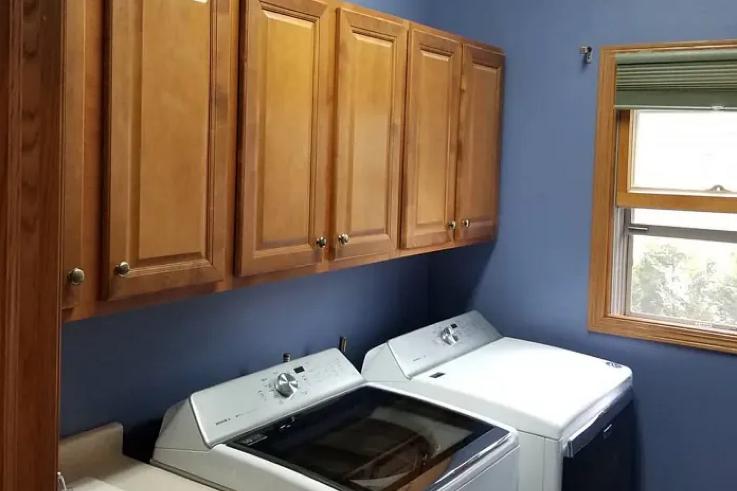
Searching for the perfect shade of blue can feel like a daunting task, with endless options that can blend together after a while. But when I stumbled upon SW 6536 Searching Blue by Sherwin Williams, it felt like I had found something truly special. This shade is not too overpowering, nor is it too subtle; it strikes a delicate balance that works beautifully in a variety of spaces.
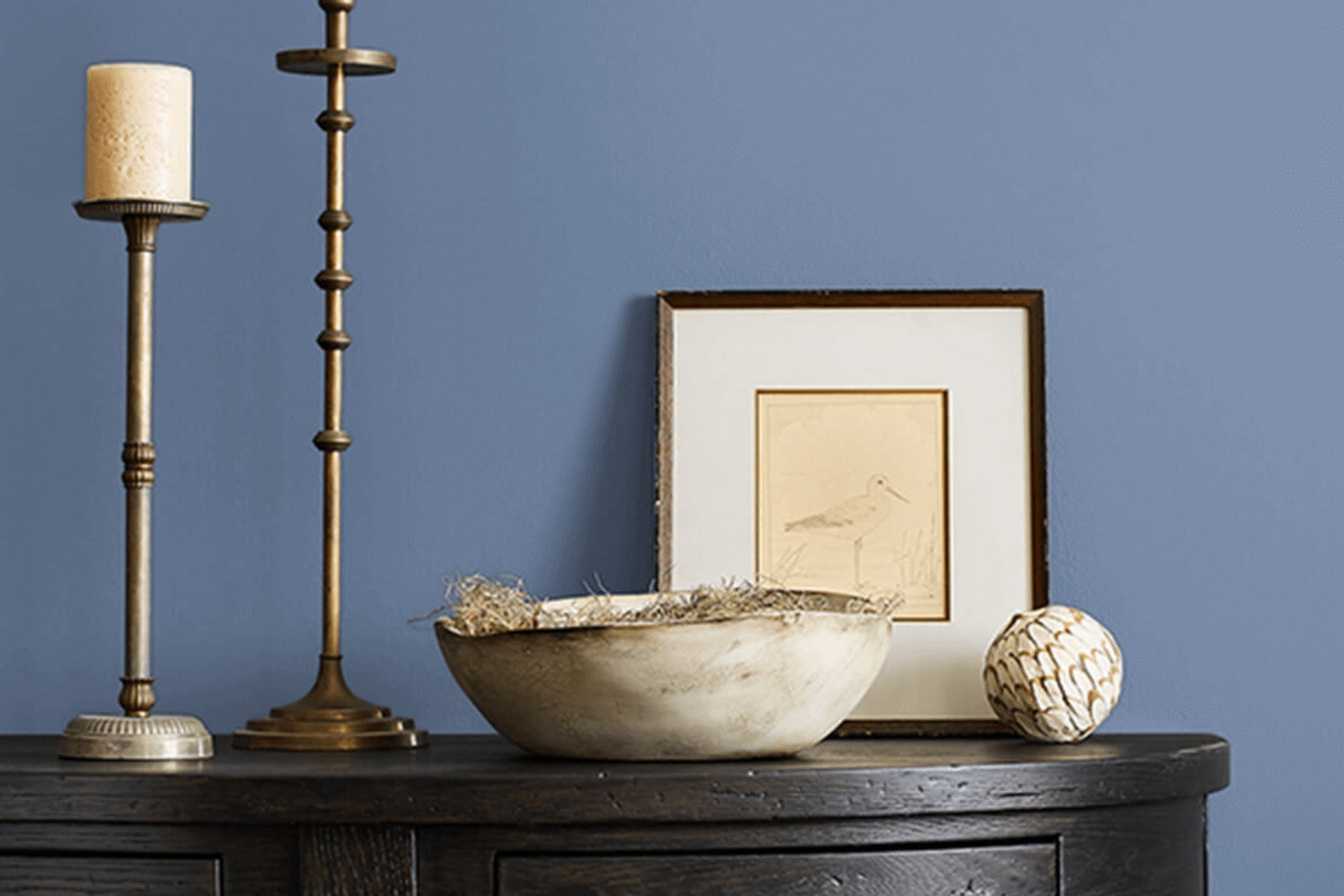
I found that Searching Blue offers a sense of clarity and calmness that many of us seek in our living or working environments. It has a fresh, airy quality that breathes life into a room, whether it’s used as an accent wall or envelops the entire space. The versatility of this color is remarkable—it pairs nicely with soft neutrals as well as more vibrant colors, allowing for a wide range of decorative themes.
If you’re looking for a blue that makes a statement without shouting, SW 6536 Searching Blue might just be what your space needs. Its unique hue is soothing yet affirming, providing a backdrop that enhances everything around it while standing confidently on its own.
Whether you’re redoing a small room or transforming a larger area, I recommend considering this shade for a fresh, inviting look.
What Color Is Searching Blue SW 6536 by Sherwin Williams?
Searching Blue SW 6536 by Sherwin Williams is a vibrant and lively shade of blue that brings a fresh and energetic vibe to any room. This color has a playful charm that can brighten up spaces and make them feel more inviting.
This shade of blue is particularly versatile and works well in a variety of interior styles. It’s a perfect match for modern and contemporary designs where its boldness can create a striking contrast against neutral tones. It also fits beautifully in coastal and nautical themes, reflecting the hues of the ocean and sky.
When it comes to pairing with materials and textures, Searching Blue is quite adaptable. It looks stunning with natural wood, helping to ground the space and add warmth. Metallic finishes like silver or chrome can give a room a more modern look when combined with this blue. For a softer approach, fabrics like cotton or linen in white or soft gray can create a cozy and relaxed atmosphere.
In summary, Searching Blue is a dynamic and cheerful color that enriches various decor styles. Whether used as an accent or a dominant color scheme, it can effectively enhance the overall aesthetic of a room by pairing with the right materials and textures.
Is Searching Blue SW 6536 by Sherwin Williams Warm or Cool color?
Searching Blue by Sherwin Williams is a vibrant blue color that adds a fresh touch to any room. This particular shade can make small spaces appear bigger and more open. When used on walls, it creates a striking contrast with white or light-colored trims, making features in a room stand out.
It’s also flexible enough to work in various rooms, whether it’s a bedroom that needs a calming vibe or a living room that could use some cheer. In homes with a lot of natural light, Searching Blue tends to look brighter, bringing a lively atmosphere.
In dimly lit spaces, however, it can appear more subdued, providing a sense of coziness. This color pairs well with modern and rustic styles alike, making it a versatile choice for furniture and decor. Opting for this shade can refresh an outdated space or give a new home a unique character.
Undertones of Searching Blue SW 6536 by Sherwin Williams
Searching Blue, a versatile paint color from Sherwin Williams, has a complex range of undertones, influencing how it appears under different lighting conditions. Undertones are essentially subtle colors that emerge from the main color under certain lighting conditions, affecting the overall hue.
The multifaceted undertones of Searching Blue include lilac, dark turquoise, and various shades of blue like navy and light blue. There are also hints of soft colors like mint, pale pink, and light purple, which bring a gentle warmth to the dominant cool blue. Understandably, these underlying shades play a significant role in how the color behaves in a space.
When applied to interior walls, Searching Blue creates a dynamic ambiance. For instance, in a room with ample natural light, the lighter undertones like light blue and pale pink might become more pronounced, giving the room a fresh and airy feel. In contrast, in spaces with less natural light, darker undertones like navy or dark turquoise could appear more dominant, adding a sense of depth and richness.
Moreover, the presence of diverse undertones like violet and light turquoise allows Searching Blue to adapt seamlessly with different decor styles and colors. It can be paired comfortably with both soft neutrals and vibrant accents without clashing. This adaptability makes it an excellent choice for many rooms, from living areas to bedrooms, as it complements various furnishings and fabrics.
Overall, the unique combination of undertones in Searching Blue adds a layer of complexity to its character, making it not just a simple paint color but a dynamic backdrop that can influence the mood and style of any interior space.
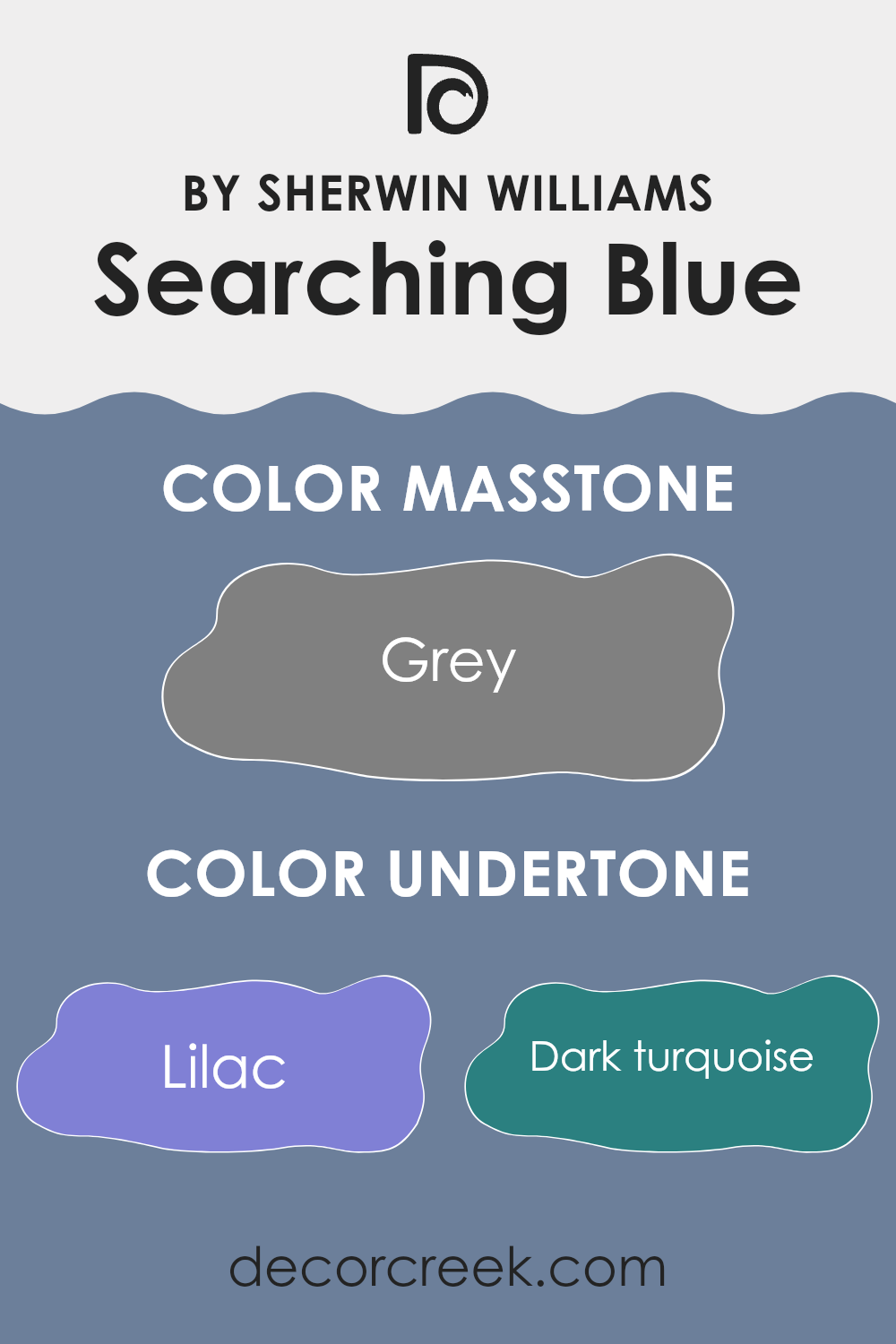
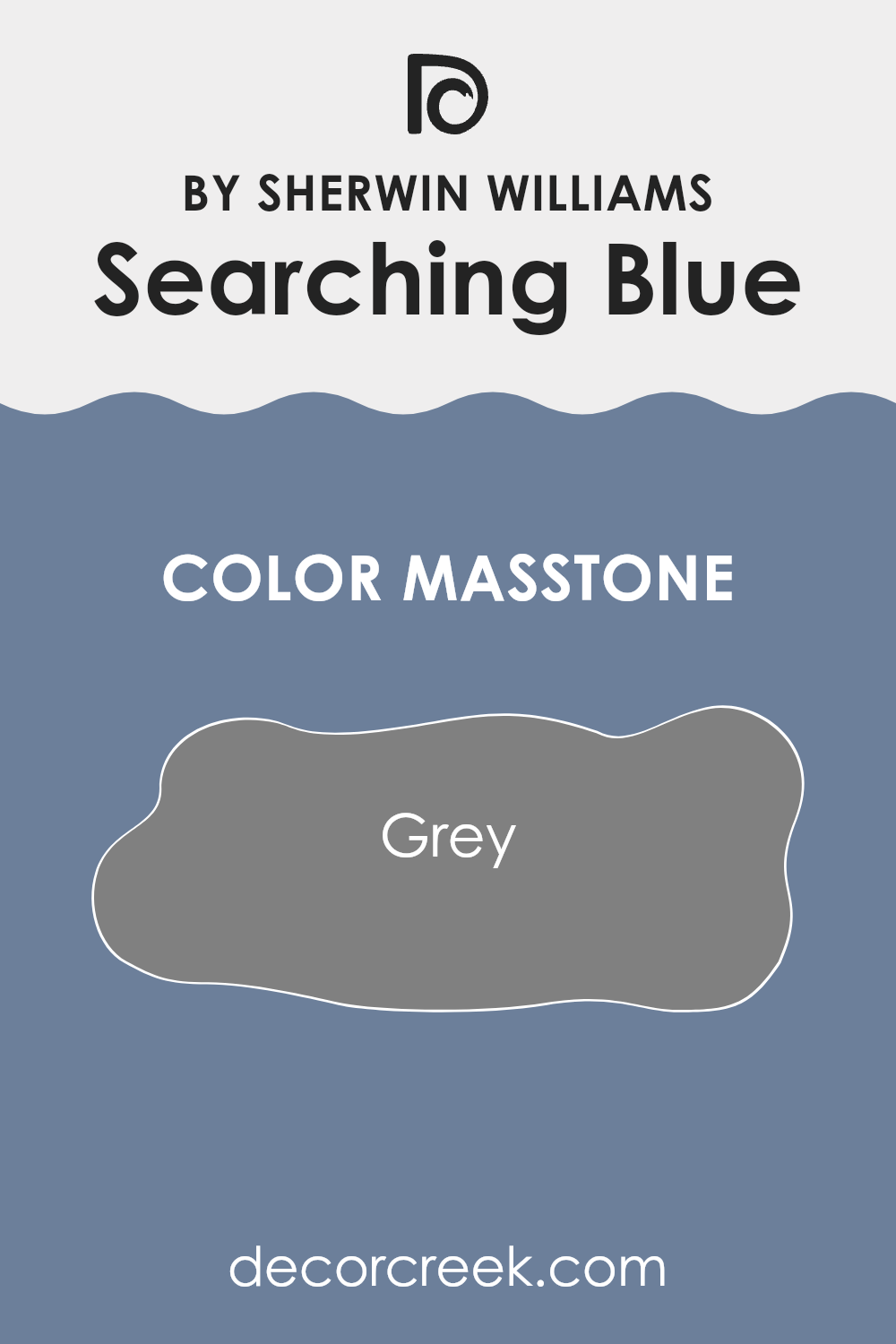
What is the Masstone of the Searching Blue SW 6536 by Sherwin Williams?
The masstone of Grey (#808080) in the paint “Searching Blue” affects how it looks in homes. This grey tone means the color appears muted and calm. In a room, it provides a subtle background instead of dominating the space.
This makes it easy to match with different decor styles and colors. Whether you have bright furniture, metal fixtures, or natural wood elements, Grey (#808080) works well alongside them without clashing.
This neutrality is great for those who often change their home’s decor. It makes the color versatile and practical. Whether used in a living room, bedroom, or bathroom, it helps create a pleasant backdrop that complements multiple color schemes. Grey (#808080) acts almost like a canvas, letting other colors in the room stand out. This makes Searching Blue a good choice for anyone wanting a flexible color that looks good without too much effort.
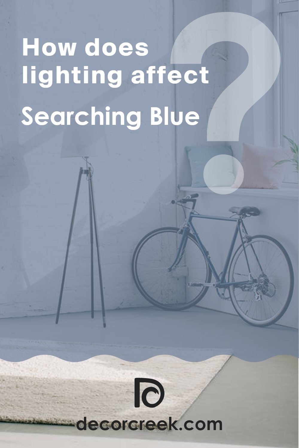
How Does Lighting Affect Searching Blue SW 6536 by Sherwin Williams?
Lighting significantly influences how colors appear in various environments, affecting both the mood of a space and the perceived color itself. The paint color Searching Blue SW 6536 by Sherwin Williams is a vibrant shade that can look different depending on the light source.
In artificial light, Searching Blue tends to appear slightly darker than it does in natural light. Fluorescent lighting can give it a slightly greenish tint, while incandescent lighting can make it look warmer and more towards a navy shade.
It’s vital to consider the type of bulbs used in a room when choosing this color for an interior.
In natural light, Searching Blue displays its true color best. However, the amount and angle of sunlight can alter this perception throughout the day.
Rooms facing different directions will showcase Searching Blue in unique ways due to the varying quality of natural light they receive.
In a north-facing room, light tends to be cooler and more consistent throughout the day, which may make Searching Blue appear slightly more muted and subtle. This could make it a good choice for creating a calm, consistent look in spaces like studies or libraries.
In south-facing rooms, where light is warmer and more abundant, Searching Blue will look brighter and more vivid. This vibrant quality can make the room feel lively and energizing, ideal for living rooms or playrooms.
East-facing rooms receive the most light in the morning when the sun rises. Here, Searching Blue will appear bright and fresh in the morning, gradually becoming softer as the day progresses. This makes it suitable for bedrooms or breakfast nooks, offering a cheerful vibe in the morning.
Conversely, west-facing rooms get the most sunlight during late afternoon. In these rooms, Searching Blue will start softer and become more vivid toward the evening. This can add a dynamic quality to spaces used more often in the afternoon or evenings, like dining rooms or home offices.
Understanding how lighting affects colors like Searching Blue can help in planning interior spaces that feel comfortable and appealing at all times of the day.
What is the LRV of Searching Blue SW 6536 by Sherwin Williams?
LRV stands for Light Reflectance Value, a measure used to determine how much light a paint color reflects back into a room. It is expressed as a percentage on a scale where lower numbers mean the color absorbs more light and appears darker, while higher numbers indicate that the color reflects more light and appears lighter.
LRV is an important aspect to consider when choosing paint colors because it can greatly influence the brightness and feel of a space. A color with a high LRV will make a room feel more open and airy, whereas a color with a low LRV can give a room a cozier and more enclosed feel.
For the specific color with an LRV of 20.613, it falls into the darker category. This means it will absorb more light than it reflects, giving it a rich, deep appearance on the walls. Such a lower LRV can make a room feel smaller and more intimate, which could be perfect for creating a focused atmosphere in places like a home office or a bedroom. In spaces with limited natural light, this color might make the room feel even smaller or darker, so it’s recommended to use it in areas with adequate lighting to balance out its deep tone.

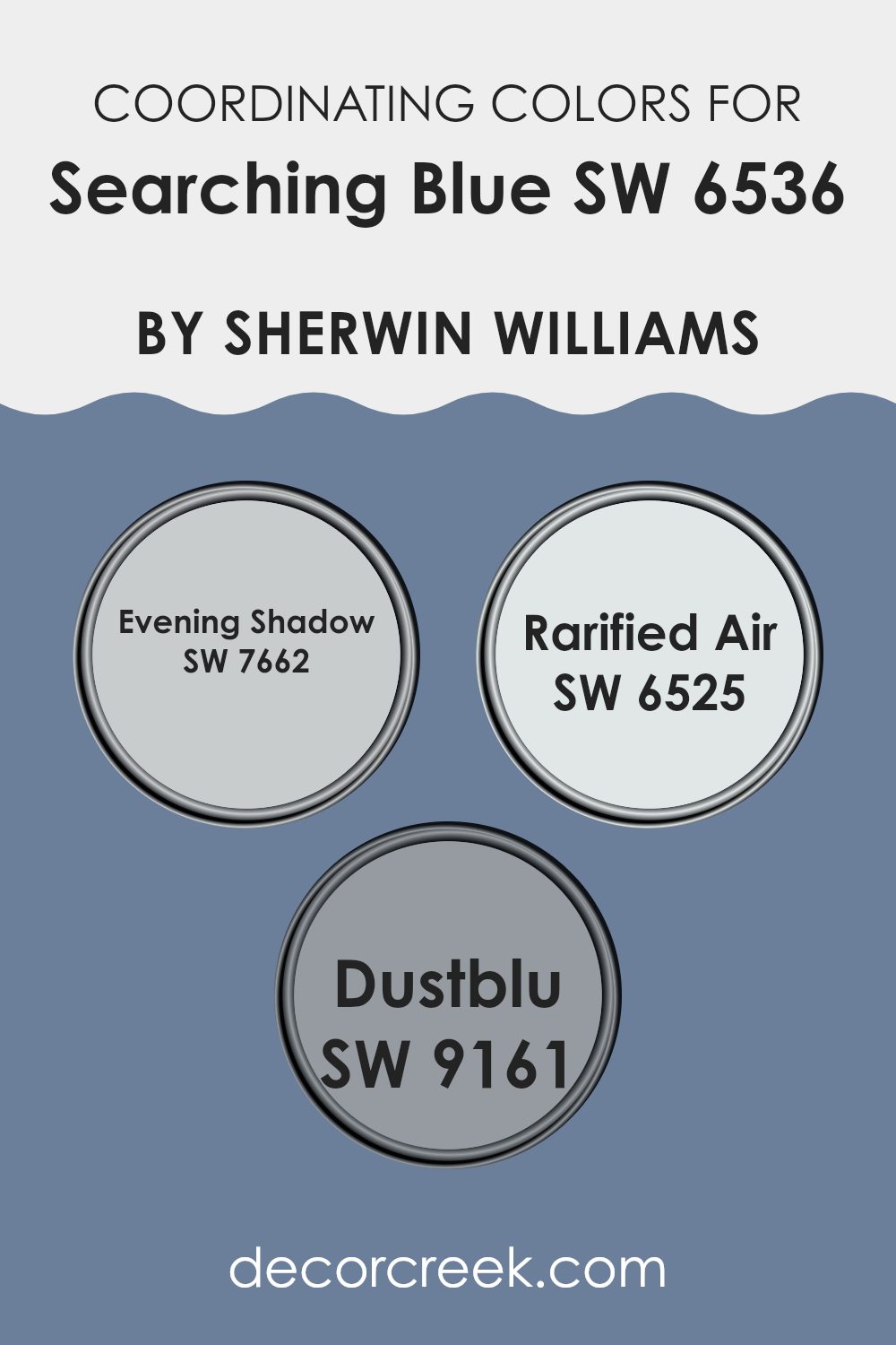
Coordinating Colors of Searching Blue SW 6536 by Sherwin Williams
Coordinating colors are complementary shades that pair well together to create a harmonious look. They can be used in interior design to achieve a balanced and appealing aesthetic. When working with a primary color, such as Searching Blue by Sherwin Williams, it’s essential to select coordinating colors that enhance its tone without overwhelming it. The selected coordinating colors should ideally set the mood of the space while keeping a unified color scheme that is easy on the eyes.
Evening Shadow SW 7662 is a gentle gray with a hint of blue, making it a subtle choice that pairs nicely with bolder shades like Searching Blue. It’s a soft backdrop that allows more vibrant colors to stand out without clashing. Rarified Air SW 6525 is a light, airy blue that provides a fresh and clean look.
It works well to give a sense of openness and lightness in a room, acting as a breathing space between more intense colors. Dustblu SW 9161, with its muted blue-green hues, offers a dusty appearance that works exceptionally well with earthier or muted decor elements, lending a grounded feel to the environment. Together, these colors complement Searching Blue by either softening or enhancing the space, depending on their application.
You can see recommended paint colors below:
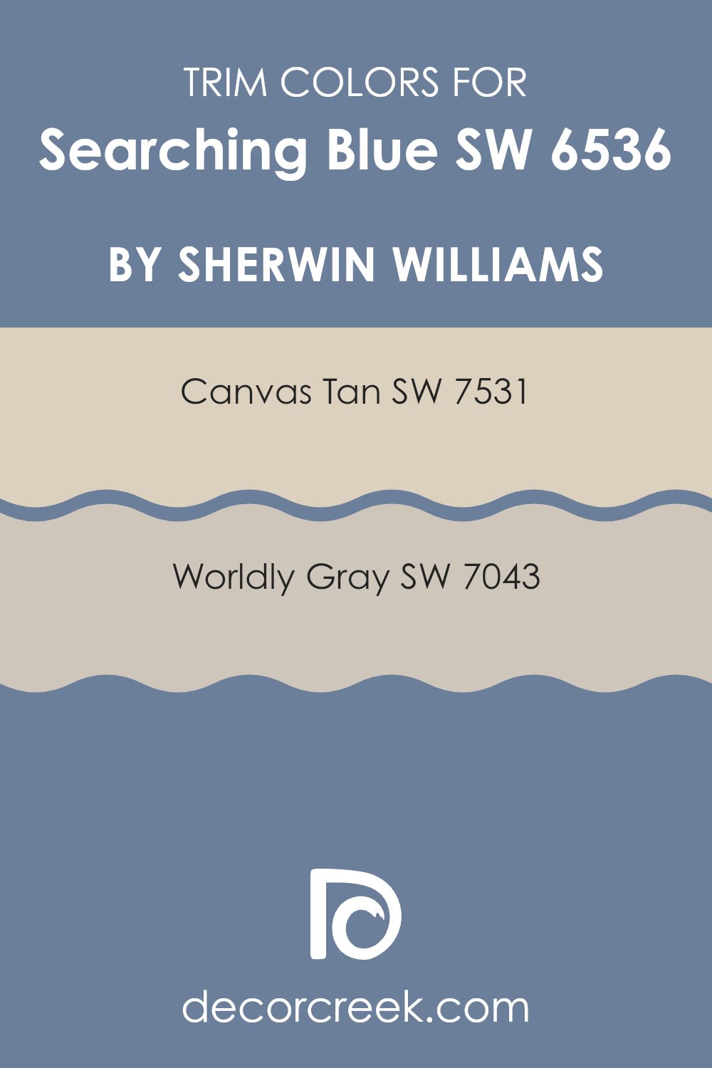
What are the Trim colors of Searching Blue SW 6536 by Sherwin Williams?
Trim colors are used to accentuate and complement the main colors on walls, providing a finishing touch that defines and enhances the overall aesthetic of a room. An effective trim color can highlight architectural details, frame sections of your space, or simply provide a clean, contrasting line that makes the main colors stand out even more vividly.
For instance, when paired with Searching Blue (SW 6536) by Sherwin Williams, trim colors like Canvas Tan (SW 7531) and Worldly Gray (SW 7043) can help in creating a visually appealing palette that gives a room a neat and balanced look.
Canvas Tan is a warm, neutral beige that can soften the boldness of a rich hue like Searching Blue, providing a subtle but inviting contrast. It’s a versatile shade that works well in spaces that aim for a relaxed and cozy feel. On the other hand, Worldly Gray offers a cooler, more understated contrast to the blue, suggesting a modern and clean look.
It’s a medium gray that adapts seamlessly with various decor elements and styles, enhancing the contemporary vibe of a space without overpowering it. These trim colors work beautifully against Searching Blue, helping to define spaces while maintaining a harmonious balance.
You can see recommended paint colors below:
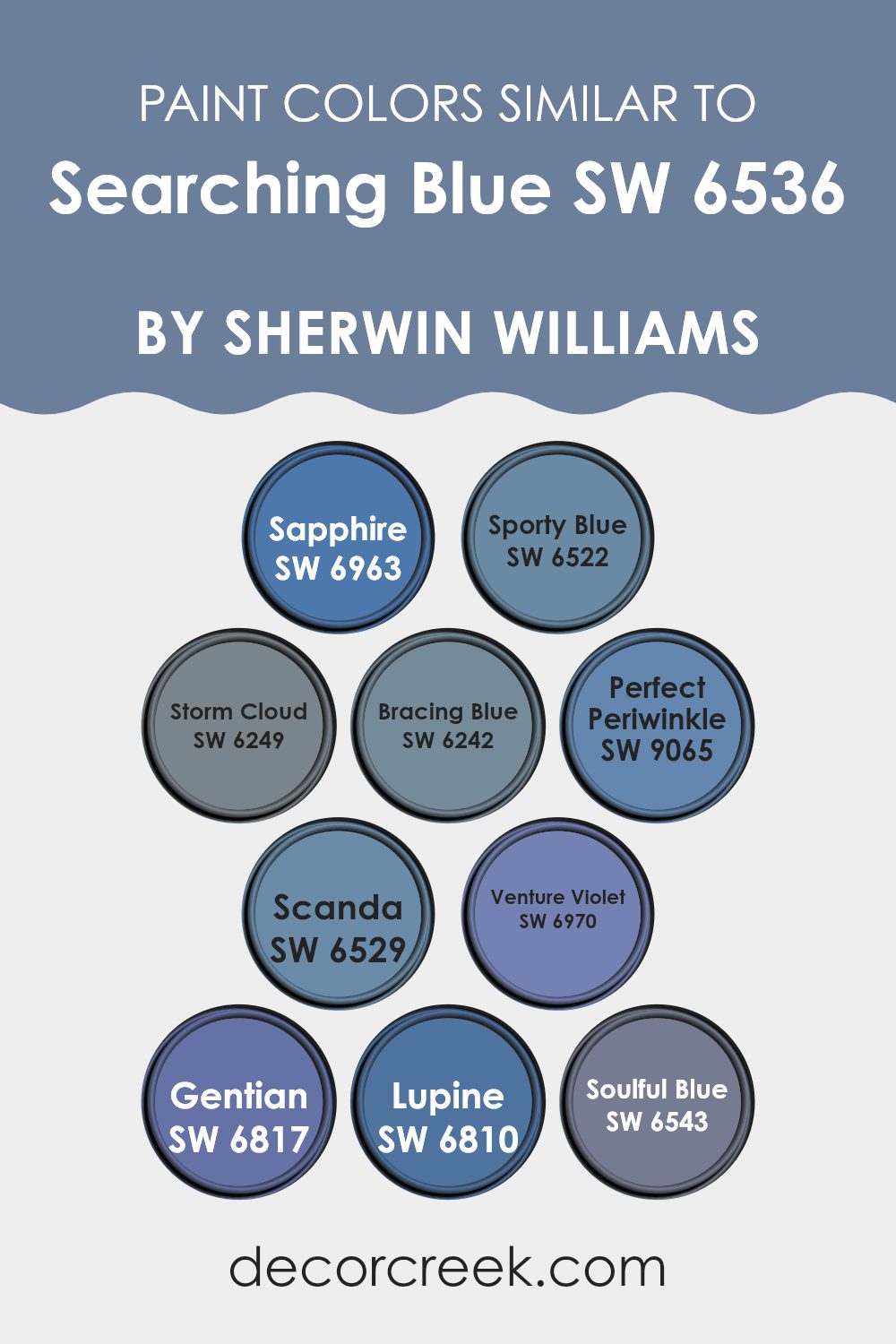
Colors Similar to Searching Blue SW 6536 by Sherwin Williams
Similar colors play an essential role in creating harmonious and aesthetically pleasing environments, establishing a sense of unity and fluidity within spaces. Colors closely related to Searching Blue by Sherwin Williams, such as Sapphire, Sporty Blue, Storm Cloud, and Bracing Blue, offer a versatile palette for enhancing both interior and exterior designs.
Sapphire shines as a vibrant deep blue that injects energy into any space, while Sporty Blue offers a slightly more muted tone, fantastic for adding a calm yet playful touch. Storm Cloud, with its darker, almost greyish hue, brings depth and drama, making it ideal for accent walls or furniture. Bracing Blue is another calming shade, slightly lighter, which works beautifully in living rooms or bedrooms to create a soothing atmosphere.
Continuing with similar colors, Perfect Periwinkle, Scanda, Venture Violet, Gentian, Lupine, and Soulful Blue each present unique opportunities for design. Perfect Periwinkle blends blue with hints of lavender, resulting in a gentle, inviting color, perfect for nurturing spaces. Scanda leans towards a lighter, airy blue, excellent for creating a refreshing vibe. Venture Violet introduces a touch of purple, offering a playful pop of color that’s surprisingly versatile.
Gentian and Lupine edge towards richer, more floral-inspired blue tones, providing fantastic options for creating vibrant, cheerful rooms. Lastly, Soulful Blue serves as a subtle, soft blue that works great in spaces designed for relaxation and calm. Each of these colors can work beautifully on their own or as part of a gradient theme alongside others, allowing for personal creativity and expression in decor.
You can see recommended paint colors below:
- SW 6963 Sapphire
- SW 6522 Sporty Blue
- SW 6249 Storm Cloud
- SW 6242 Bracing Blue
- SW 9065 Perfect Periwinkle
- SW 6529 Scanda
- SW 6970 Venture Violet
- SW 6817 Gentian
- SW 6810 Lupine
- SW 6543 Soulful Blue
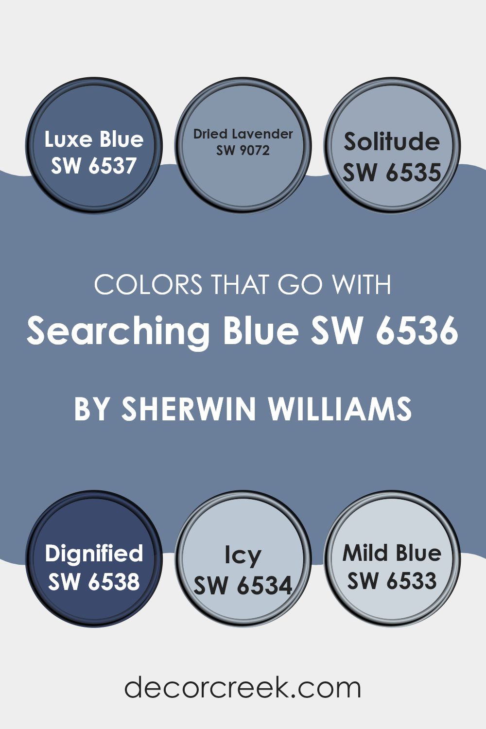
Colors that Go With Searching Blue SW 6536 by Sherwin Williams
Choosing the right colors that complement Searching Blue SW 6536 by Sherwin Williams is crucial because it helps create a cohesive look and mood in any space. These companion colors have been selected for their ability to blend harmoniously with Searching Blue, offering variability in shades and emotions that can enhance the atmosphere of a room.
SW 6537 – Luxe Blue is slightly deeper than Searching Blue, providing a robust contrast that enriches the primary hue without overpowering. It helps in crafting a balanced palette where Searching Blue remains a focal point. SW 9072 – Dried Lavender introduces a soft, gentle purple that infuses a subtle, uplifting vibe, making it ideal for spaces meant to soothe and welcome.
SW 6535 – Solitude mirrors the main shade closely but with a lighter, airier touch that opens up a room and reflects light beautifully. On the other hand, SW 6538 – Dignified is a bold, darker blue that grounds the scheme and offers a sense of stability and depth, particularly in well-lit areas. SW 6534 – Icy steps back with a very pale, almost white-blue that refreshes the palette, offering a light and breezy feel that complements the more intense shades.
, SW 6533 – Mild Blue is a subdued, easy-going shade that fits smoothly into the lineup, providing a gentle bridge between the cooler and warmer tones in the set. Together, these colors create a versatile and pleasant environment that enhances the beauty and usability of spaces decorated with Searching Blue.
You can see recommended paint colors below:
- SW 6537 Luxe Blue
- SW 9072 Dried Lavender
- SW 6535 Solitude
- SW 6538 Dignified
- SW 6534 Icy
- SW 6533 Mild Blue
How to Use Searching Blue SW 6536 by Sherwin Williams In Your Home?
Searching Blue SW 6536 by Sherwin Williams is a vibrant color that can add a lively splash to any room in your home. This shade of blue has a cheerful and bright feel, making it perfect for spaces where you want to boost energy and create a playful atmosphere.
You can use it in a child’s bedroom to inspire creativity or in a home office to set a stimulating backdrop for work and study. In the living room, pairing Searching Blue with neutral colors like white or gray can make the space feel more open and inviting.
It’s also a great color for a bathroom, where it can pair nicely with white fixtures and cabinetry for a clean, fresh look. For those looking to add only a touch of this blue, consider using it for a feature wall or in smaller decorative elements such as throw pillows, vases, or artwork to liven up the space.
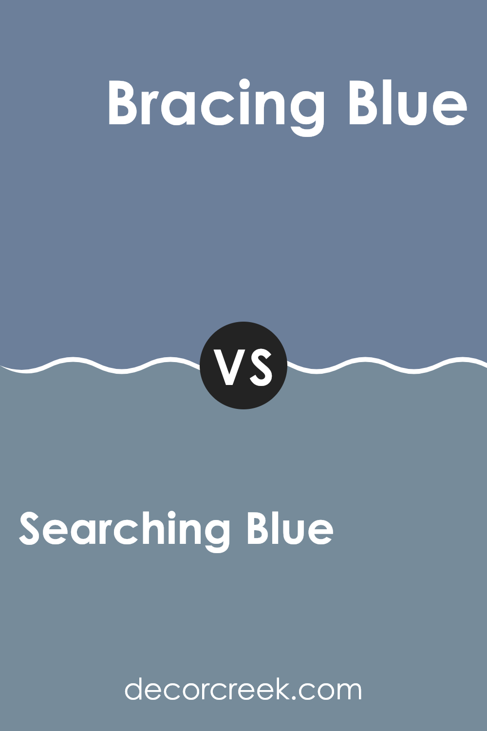
Searching Blue SW 6536 by Sherwin Williams vs Bracing Blue SW 6242 by Sherwin Williams
In comparing the two paint colors from Sherwin Williams, Searching Blue and Bracing Blue, we see distinct tones and moods that they can produce in a space. Searching Blue is a lighter and more subtle shade that leans towards a soft, gentle ambiance.
It’s perfect for creating a calm and welcoming atmosphere in your home. On the other hand, Bracing Blue is noticeably darker with a stronger presence. This color is ideal for adding a bit of drama or a bold statement to a room.While both colors fall within the blue spectrum, Searching Blue might be considered better suited for a bedroom or nursery where softer colors are typically preferred.
Bracing Blue, with its deeper tone, could be an excellent choice for an office or dining room, where a bolder, more pronounced color is desirable.Overall, the choice between Searching Blue and Bracing Blue depends on the type of atmosphere you aim to achieve in your space.
You can see recommended paint color below:
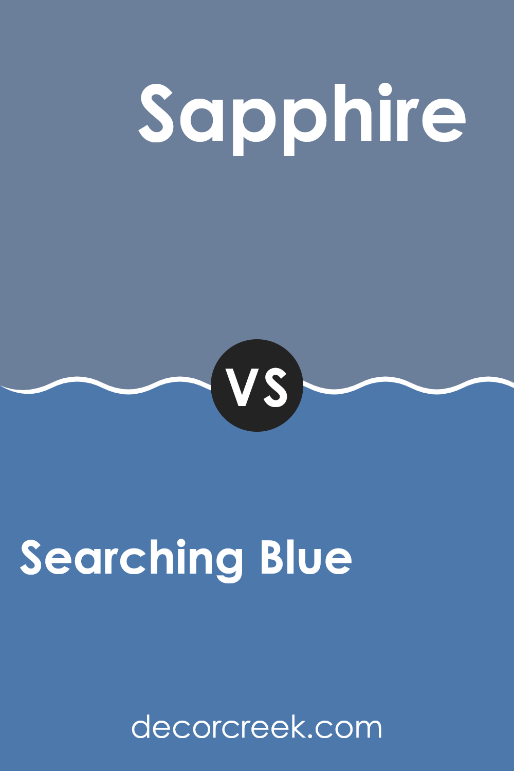
Searching Blue SW 6536 by Sherwin Williams vs Sapphire SW 6963 by Sherwin Williams
Searching Blue and Sapphire, both by Sherwin Williams, offer unique shades of blue for different decorating needs. Searching Blue is a softer, lighter blue that brings a calm and relaxed feel to a room. It’s perfect for spaces like bedrooms or bathrooms where a gentle atmosphere is desired.
On the other hand, Sapphire is a bold, vivid blue that stands out more noticeably. It adds a lively and energetic touch, making it great for areas like playrooms or creative spaces where a splash of brightness can inspire.
Both colors are versatile, but while Searching Blue creates a soothing background, Sapphire commands attention and can act as a striking focal point. Painters might choose Searching Blue for a subtle look or Sapphire for a more dynamic impact.
You can see recommended paint color below:
- SW 6963 Sapphire
Searching Blue SW 6536 by Sherwin Williams vs Sporty Blue SW 6522 by Sherwin Williams
Searching Blue and Sporty Blue are two distinct shades from Sherwin Williams. Searching Blue is a deeper, more muted tone, offering a more restrained and subtle appearance. It tends to give a calming feeling to any space and works well in areas where a touch of formality is desired.
On the other hand, Sporty Blue stands out with its brighter, more vibrant energy. It’s lighter compared to Searching Blue and brings a lively and cheerful vibe to rooms, making it a great choice for spaces used for activity and enjoyment, like playrooms or casual living areas.
Both colors hold their unique charm and can effectively set different moods in your home depending on what you’re going for—calmness or energy.
You can see recommended paint color below:
- SW 6522 Sporty Blue
Searching Blue SW 6536 by Sherwin Williams vs Lupine SW 6810 by Sherwin Williams
Searching Blue and Lupine by Sherwin Williams are two distinct shades that can set very different moods in a space. Searching Blue is a deeper blue with a strong presence, perfect for creating a bold statement in a room.
It works well in spaces where you want to inspire focus and depth, such as a home office or a cozy reading nook. On the other hand, Lupine is a brighter, more vibrant shade. This purple has a cheerful and lively vibe, making it ideal for energizing a space like a playroom, entryway, or even a kitchen.
It’s a color that can inject a sense of fun and personality into an area. Essentially, while Searching Blue brings a depth and intensity to a room, Lupine adds brightness and vibrancy, offering two very different ways to style a space depending on the desired atmosphere and function.
You can see recommended paint color below:
Searching Blue SW 6536 by Sherwin Williams vs Scanda SW 6529 by Sherwin Williams
Searching Blue and Scanda by Sherwin Williams are two distinct colors that can give any space a unique look. Searching Blue is a deeper, more intense shade that leans towards a rich navy. It brings a strong sense of calmness and can make a bold statement in a space, ideal for creating a focal point in a room.
On the other hand, Scanda is a lighter, softer blue with a hint of gray. It’s very gentle and airy, making it perfect for achieving a relaxed, fresh feel in a room. This color works great in spaces that aim to be soothing and light. The difference in depth between these two colors allows them to serve different purposes in decor.
While Searching Blue adds drama and depth, Scanda keeps things light and breezy. Both colors pair well with many accents and can be used in various settings, depending on the atmosphere you want to create.
You can see recommended paint color below:
- SW 6529 Scanda
Searching Blue SW 6536 by Sherwin Williams vs Gentian SW 6817 by Sherwin Williams
Searching Blue and Gentian, both by Sherwin Williams, are two distinctive shades of blue, each with its unique charm. Searching Blue presents as a soft, muted blue with a hint of gray, making it a subtle choice for a calm and soothing atmosphere. It’s ideal for those looking to add a touch of color without overwhelming a space, fitting well in bedrooms or living areas.
On the other hand, Gentian is a much more vibrant and brighter shade of blue. This color stands out boldly and can energize a room with its brightness. It’s perfect for creating a lively focal point in spaces like playrooms or creative studios where a splash of cheer is welcome.
Both colors offer different vibes and can be chosen based on the mood you wish to achieve. Searching Blue leans towards a quieter, more understated look, while Gentian is about making a lively statement. Whether you prefer the calming effect of Searching Blue or the dynamic energy of Gentian, each shade offers its unique personality to fit various decorating needs.
You can see recommended paint color below:
- SW 6817 Gentian
Searching Blue SW 6536 by Sherwin Williams vs Venture Violet SW 6970 by Sherwin Williams
Searching Blue and Venture Violet, both from Sherwin Williams, are striking colors that offer distinct vibes for any space. Searching Blue is a calming, muted blue shade that can make rooms feel airy and relaxed. It works particularly well in bedrooms or living rooms where a touch of softness is desired. This shade pairs nicely with neutral tones and can be a beautiful backdrop for wood furniture.
On the other hand, Venture Violet is a bold, vivid purple that adds a punch of personality and brightness. It’s perfect for accent walls or areas where you want to make a statement, like a dining room or entryway. Venture Violet can energize a space and works especially well with modern decor and bright contrasts, such as yellows or crisp whites.
Both shades have their unique appeal and can beautifully set the mood in different environments, depending on what you’re aiming for in your design.
You can see recommended paint color below:
- SW 6970 Venture Violet

Searching Blue SW 6536 by Sherwin Williams vs Storm Cloud SW 6249 by Sherwin Williams
Sherwin Williams’ Searching Blue is a vibrant, energetic shade of blue that brings a sense of freshness and brightness to a space. It’s the kind of color that makes a room feel alive and full of possibility. This lively blue can really lighten up an area, making it perfect for spaces where you want to promote creativity and happiness.
On the other hand, Storm Cloud by Sherwin Williams is a much darker, moodier blue. It has a strong, almost grayish undertone, which gives it a more grounded and calming feel compared to Searching Blue. Storm Cloud is ideal for areas where you might want a more subdued and cozy atmosphere. This color works well in spaces designed for relaxation or focused work.
Both colors offer unique vibes—Searching Blue adds a splash of bright cheer, while Storm Cloud offers a soothing, deep hue. They could work beautifully together in a home, depending on whether you’re looking to inspire energy or create a quiet retreat.
You can see recommended paint color below:
- SW 6249 Storm Cloud

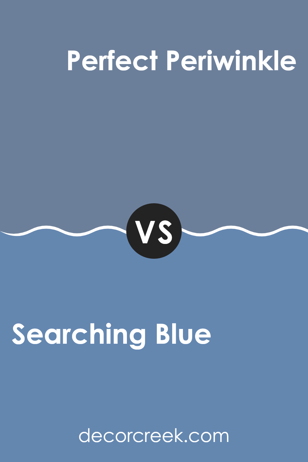
Searching Blue SW 6536 by Sherwin Williams vs Perfect Periwinkle SW 9065 by Sherwin Williams
Searching Blue and Perfect Periwinkle by Sherwin Williams are both unique shades, but they convey different vibes and can be better suited for different spaces. Searching Blue has a depth that resembles a deep, relaxing sea. This shade is ideal if you’re looking to create an atmosphere that feels calming yet strong, as it brings a presence to the room without being overpowering.
On the other hand, Perfect Periwinkle is lighter and carries a hint of lavender that makes it feel fresh and airy. This color is great for brightening up a space and can give an uplifted feel to any room. It combines the peacefulness of blue with a gentle touch of purple for a playful yet gentle appearance.
Both colors can work beautifully in their respective right settings—Searching Blue perhaps in a cozy study or bedroom, while Perfect Periwinkle could be perfect for a lively living room or a nursery. Choose between these based on what mood or effect you want to create in your space.
You can see recommended paint color below:
- SW 9065 Perfect Periwinkle
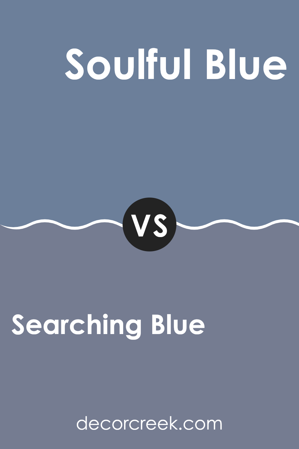
Searching Blue SW 6536 by Sherwin Williams vs Soulful Blue SW 6543 by Sherwin Williams
Searching Blue and Soulful Blue are both beautiful colors by Sherwin Williams, but they carry different vibes due to their hues. Searching Blue is a bright, lively type of blue with a freshness that can lighten up a room. It’s great for creating a cheerful and vibrant atmosphere. On the other hand, Soulful Blue is deeper and somewhat muted. It offers a more subdued and calm feeling, making it perfect for areas where you want a more laid-back and quiet mood.
Despite their differences, both colors share a blue base, which naturally brings a sense of coolness and relaxation to spaces. Searching Blue, being lighter, tends to make smaller rooms feel larger and more open. In contrast, Soulful Blue, with its darker tone, adds depth and can give a feeling of coziness to larger spaces.
Choosing between the two depends on what feel you want for your room. For a brighter, more energizing space, Searching Blue is the go-to, while Soulful Blue is ideal for a soothing and peaceful environment.
You can see recommended paint color below:
- SW 6543 Soulful Blue
Conclusion
It’s clear that Searching Blue is not just any blue; it’s a special shade that can make any room look more lively and fun. Whether you want to paint a bedroom, living room, or even a kitchen, Searching Blue brings a fresh and energetic vibe to walls.
I found out that this color also works well with many other colors. You can pair it with whites to keep things light and airy or with darker colors for a bold look. It really is like having a bit of the sky inside your home, making you feel relaxed and happy.
As a final thought, SW 6536 Searching Blue by Sherwin Williams is a fantastic choice if you’re looking to liven up your home with a new color. Whether you’re painting a small area or a large room, this shade of blue can definitely add that perfect splash of color you’re looking for.
It’s fun, lively, and most importantly, it makes any room feel more welcoming.
Ever wished paint sampling was as easy as sticking a sticker? Guess what? Now it is! Discover Samplize's unique Peel & Stick samples.
Get paint samples

