If you are thinking about updating a room or adding a splash of color to your home, SW 6193 Privilege Green by Sherwin Williams might be on your radar. This shade is a unique blend of calm and inspiration, making it perfect for rooms where you want a touch of nature without feeling too intense.
Before you decide to repaint your walls with this adaptable color, there are a few key aspects you should consider. First, it’s important to think about the lighting in your room; Privilege Green can change dramatically depending on light exposure.
Also, consider the existing colors in your decor to ensure they complement each other. I’ve found that testing the paint in a small area first can save a lot of guesswork. Now, let’s get into the finer details on how this color can be used effectively in your decorating plans.
Is Privilege Green SW 6193 Right for My Home?
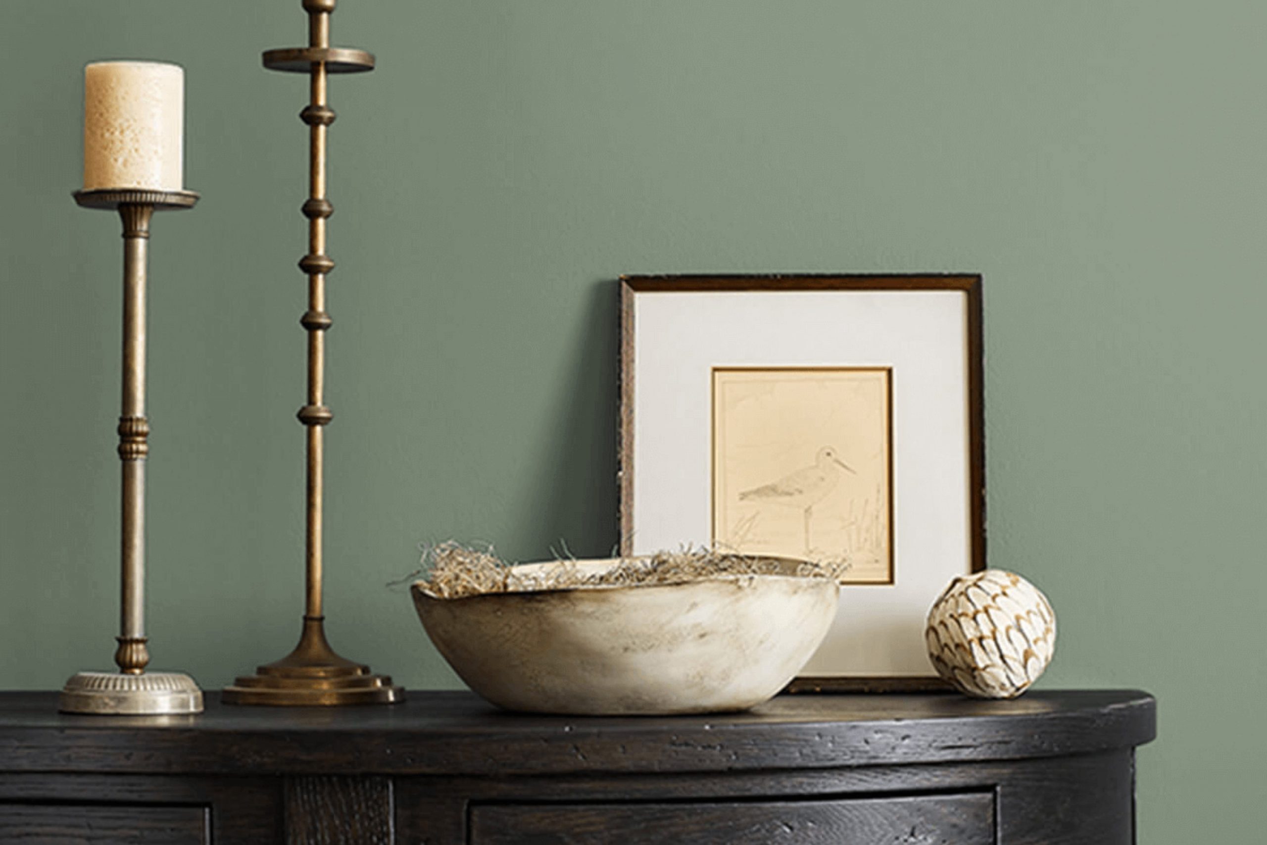
When I first laid eyes on Privilege Green, I was struck by its rich, deep tone. It’s a type of green that reminds me of luscious, dense foliage or the patina on aged copper. This color has a warm, inviting presence that feels both comforting and sturdy, making it an excellent pick for anyone looking to infuse their room with a touch of nature’s depth.
In my experience, Privilege Green works wonderfully in interior styles that lean towards the traditional or have rustic elements. It brings warmth to rooms with lots of wood accents, such as paneled dens or cozy, book-filled studies. I’ve also seen it used in more modern settings, where its boldness can stand out against sleek, minimalist decor, providing a striking contrast.
When it comes to materials and textures, this shade pairs beautifully with natural elements. Think along the lines of dark wood furniture, leather upholstery, or woven textiles that add a tactile dimension to the room. It also looks stunning with metallic finishes—gold or brass accents particularly bring out the warmth in the green.
Overall, Privilege Green is an adaptable and hearty choice, ideal for anyone looking to create a cozy yet stylish nook in their home. It offers a delightful pop of color that is neither too intense nor too muted, perfect for crafting an inviting atmosphere.
decorcreek.com
What are the right undertones of Privilege Green SW 6193 ?
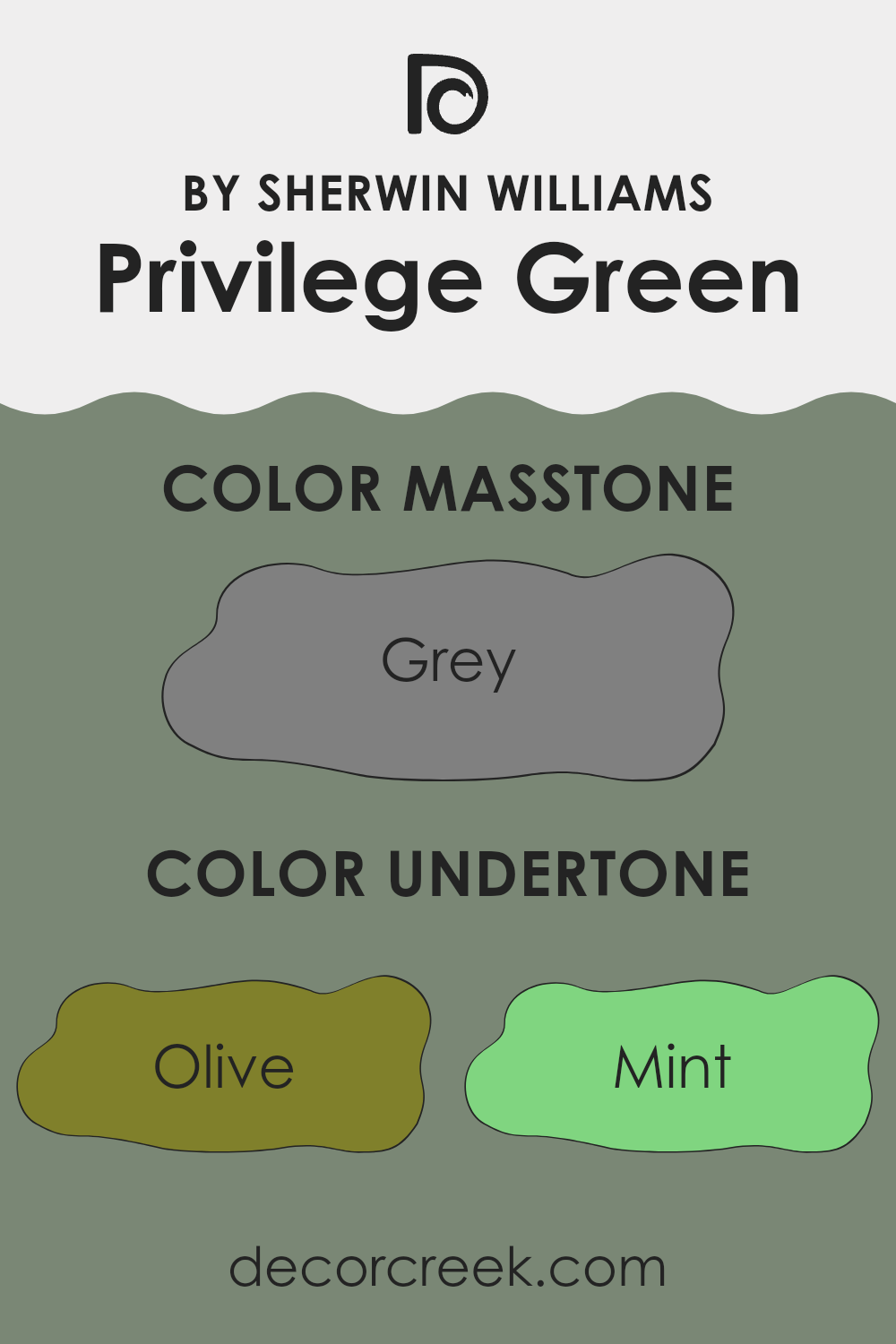
Privilege Green is a unique paint color characterized by a dynamic set of undertones, which greatly influence its perception in various lighting conditions and environments. Undertones, which are subtle hints of other colors present in the main hue, essentially shape how we perceive color. They can either cool down or warm up a color, and they play a crucial role in achieving the desired ambiance in a room.
The undertones of olive, mint, and dark green found in Privilege Green make it naturally lean towards earthy and natural vibes, which can make a room feel more grounded and connected to the outdoors. Those hints of mint and light green add freshness, enhancing the vibrancy of the rooms, while the dark green deepens the richness, providing depth and warmth.
On interior walls, the complexity of Privilege Green’s undertones like light turquoise and dark turquoise can bring a soothing yet invigorating feel to a room, making it ideal for rooms where both relaxation and focus are needed, such as home offices or studies. The subtler tones of lilac and pale pink do not feel too intense but softly blend, ensuring that the main green hue remains pronounced while becoming more adaptable to different decor styles and palettes.
In essence, the undertones of Privilege Green make it an adaptable choice for interior walls. These undertones help the color adjust under different lighting conditions, from sunlit natural light to artificial lights, ensuring the color remains lively and appealing throughout the day. Whether pairing with soft neutrals or bold accent colors, this variety of undertones allows for creative freedom in designing a cohesive yet inviting room.
decorcreek.com
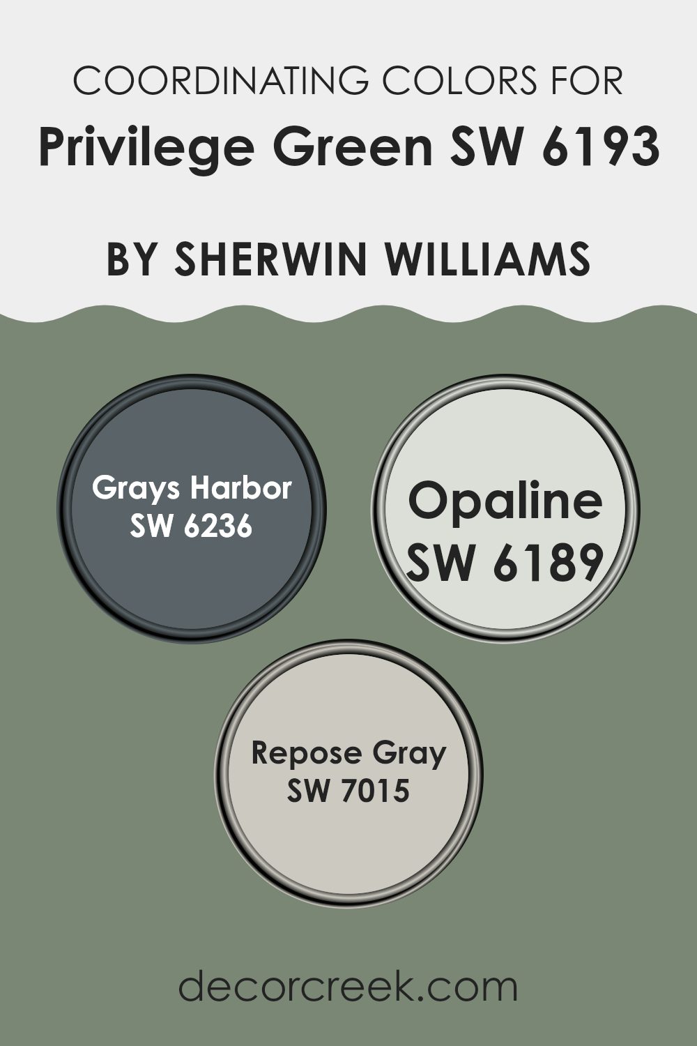
Best Coordinating Colors to use with Privilege Green SW 6193 by Sherwin Williams this year.
Coordinating colors are shades that complement each other well when used together in decor or design. For example, colors that coordinate with Privilege Green by Sherwin Williams are designed to create a harmonious look, either by creating subtle differences or by offering a striking contrast that is pleasant to the eye. These coordinating shades often belong to the same color family or share a similar saturation and brightness, making the overall room feel balanced.
Grays Harbor is a deep charcoal gray with a robust presence that can anchor the vibrant tones of a green like Privilege Green, providing a grounded and calming effect in any room. Opaline, on the other hand, is a gentle off-white with subtle green undertones that softly lightens and refreshes the room, offering a natural complement to the more intense green.
Lastly, Repose Gray stands out as an adaptable light gray with warm undertones, making it ideal for creating a neutral backdrop that allows the green to really pop. These shades work together by balancing depth and light, allowing each color’s unique characteristics to enhance the overall aesthetic of a room.
You can see recommended paint colors below:
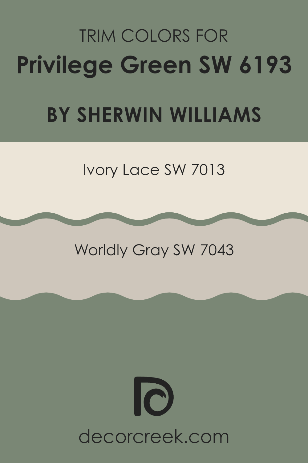
Trendy Trim Colors of Privilege Green SW 6193 by Sherwin Williams to use this year.
Trim colors act as accenting hues that define and complement the main colors of a room, enhancing architectural details such as moldings, door frames, and baseboards. Choosing the right trim color can make a significant difference in the overall look of a room, making architectural features stand out and giving a finished look to the room.
When paired with a distinct and rich color like Privilege Green by Sherwin Williams, trim colors like Ivory Lace and Worldly Gray can add a subtle contrast that highlights this strong hue without feeling too intense.
Ivory Lace by Sherwin Williams is a soft and warm white that provides a gentle contrast against deeper shades, making it an excellent choice for complementing the lush tone of Privilege Green. Its creamy undertone adds a hint of coziness to the room while keeping it light and airy. Worldly Gray, on the other hand, is a muted gray with both warm and cool undertones, offering adaptability that works well with a variety of decorating styles. This color is perfect for those looking to add a touch of neutrality and balance to the vibrant green, ensuring the room feels harmonious and inviting.
You can see recommended paint colors below:
- SW 7013 Ivory Lace
- SW 7043 Worldly Gray
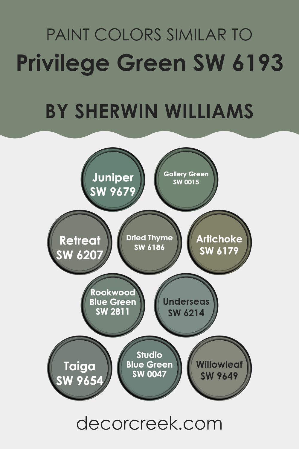
Evergreen Colors Similar to Privilege Green SW 6193 by Sherwin Williams
Similar colors play a crucial role in interior design because they create a harmonious atmosphere by blending seamlessly with each other. When you select colors like Privilege Green and its similar shades, you ensure that the room maintains a cohesive look without stark contrasts. This approach is especially useful in achieving a fluid and aesthetic transition in rooms that are open-concept or have connecting areas.
Starting with Juniper and Gallery Green, both shades bring a depth similar to Privilege Green but add slight nuances; Juniper is a bit more reserved, whereas Gallery Green has a subtle vibrancy that brightens rooms. Retreat and Dried Thyme offer a peaceful green palette that’s easy on the eyes, making them perfect for rooms where comfort is key.
Artichoke’s slightly gray undertone makes it adaptable for various decorative styles, providing a bridge between modern and traditional. Rookwood Blue Green introduces a misty, blueish touch that complements wood elements splendidly. Underseas and Taiga lean toward a richer, deeper green, adding a touch of drama without feeling too intense.
Finally, Studio Blue Green and Willowleaf stand out with their unique blend of blue and green tones, ideal for accent walls or as base colors in thematic décor. Each of these colors supports a gentle but distinct presence, enhancing the overall feel without dominating the room.
You can see recommended paint colors below:
- SW 9679 Juniper
- SW 0015 Gallery Green
- SW 6207 Retreat
- SW 6186 Dried Thyme
- SW 6179 Artichoke
- SW 2811 Rookwood Blue Green
- SW 6214 Underseas
- SW 9654 Taiga
- SW 0047 Studio Blue Green
- SW 9649 Willowleaf
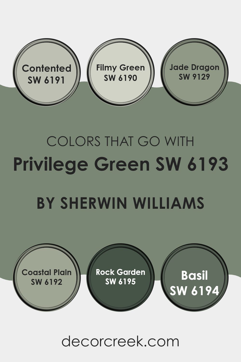
Colors that Go With Privilege Green SW 6193 by Sherwin Williams
Choosing the right colors to match with Privilege Green SW 6193 by Sherwin Williams is crucial for creating a harmonious and visually appealing room. Colors like Contented, Filmy Green, Jade Dragon, Coastal Plain, Rock Garden, and Basil each offer a unique contribution to the overall aesthetic, ensuring a balanced and inviting environment. These colors complement Privilege Green by bridging the gap between neutral tones and more pronounced hues, making them ideal for design schemes that aim for a cohesive yet vibrant look.
Contented is a soft, gentle gray with a hint of green that offers a subtle contrast, perfect for creating a calming background. Filmy Green, slightly lighter, introduces a light, airy quality that enhances rooms without overpowering them. Jade Dragon adds a touch of drama with its deeper, more intense green that pairs beautifully with the lushness of Privilege Green.
Coastal Plain shifts towards a more earthy tone, grounding the palette with its rich, natural green which works well in more organic settings. Rock Garden is a darker shade, providing depth and focus, making it perfect for accentuating key areas. Lastly, Basil brings a lively, herbal freshness that revitalizes the overall color scheme, adding a splash of brightness to enliven any room. Together, these colors create a diverse yet unified palette that complements and enhances the base tone of Privilege Green, making any decorating project look cohesive and well-thought-out.
You can see recommended paint colors below:
- SW 6191 Contented
- SW 6190 Filmy Green
- SW 9129 Jade Dragon
- SW 6192 Coastal Plain
- SW 6195 Rock Garden
- SW 6194 Basil
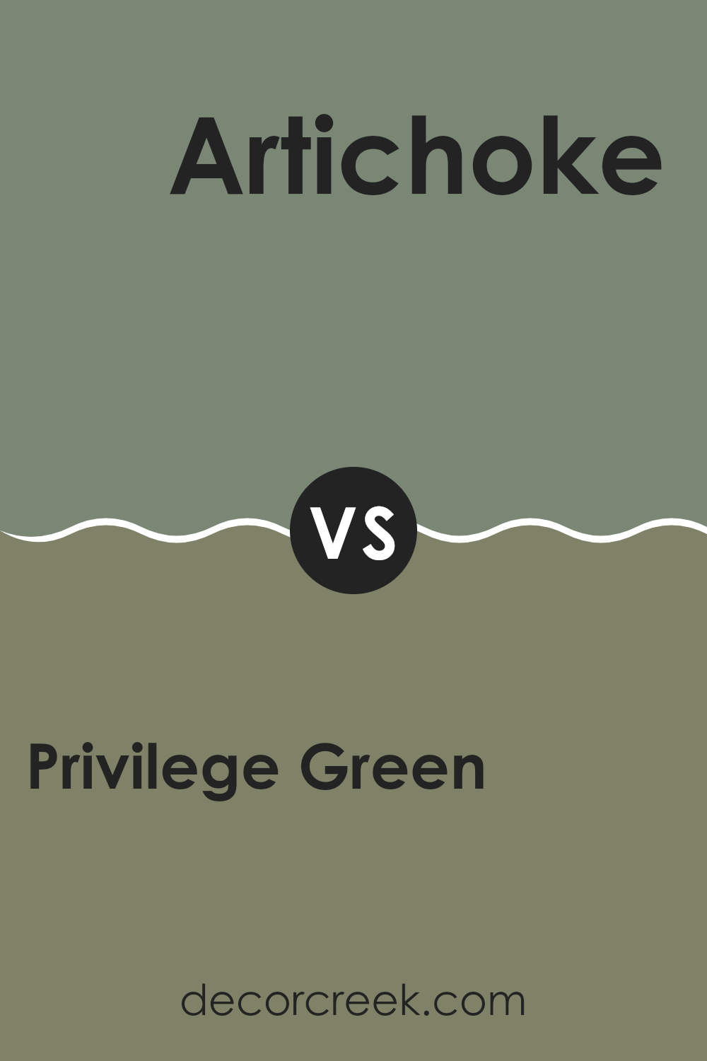
Privilege Green SW 6193 by Sherwin Williams vs Artichoke SW 6179 by Sherwin Williams
Privilege Green and Artichoke by Sherwin Williams are two distinct green shades that can significantly impact a room’s atmosphere. Privilege Green is a deep, lush green that leans towards a cooler tone. It’s quite bold and can give a room a fresh, vibrant look. This color works well in areas where you want to bring the outdoors inside, such as studies or reading rooms.
On the other hand, Artichoke is a slightly muted green with gray undertones, giving it a more neutral appearance. This color is softer and more subdued compared to Privilege Green, making it easier to incorporate into various decor styles. It’s excellent for rooms where you desire a calm and inviting environment, such as kitchens or living rooms.
When choosing between these two, consider the mood you want to set in your room. Privilege Green adds energy and life, while Artichoke offers a gentle and soothing backdrop.
You can see recommended paint color below:
- SW 6179 Artichoke
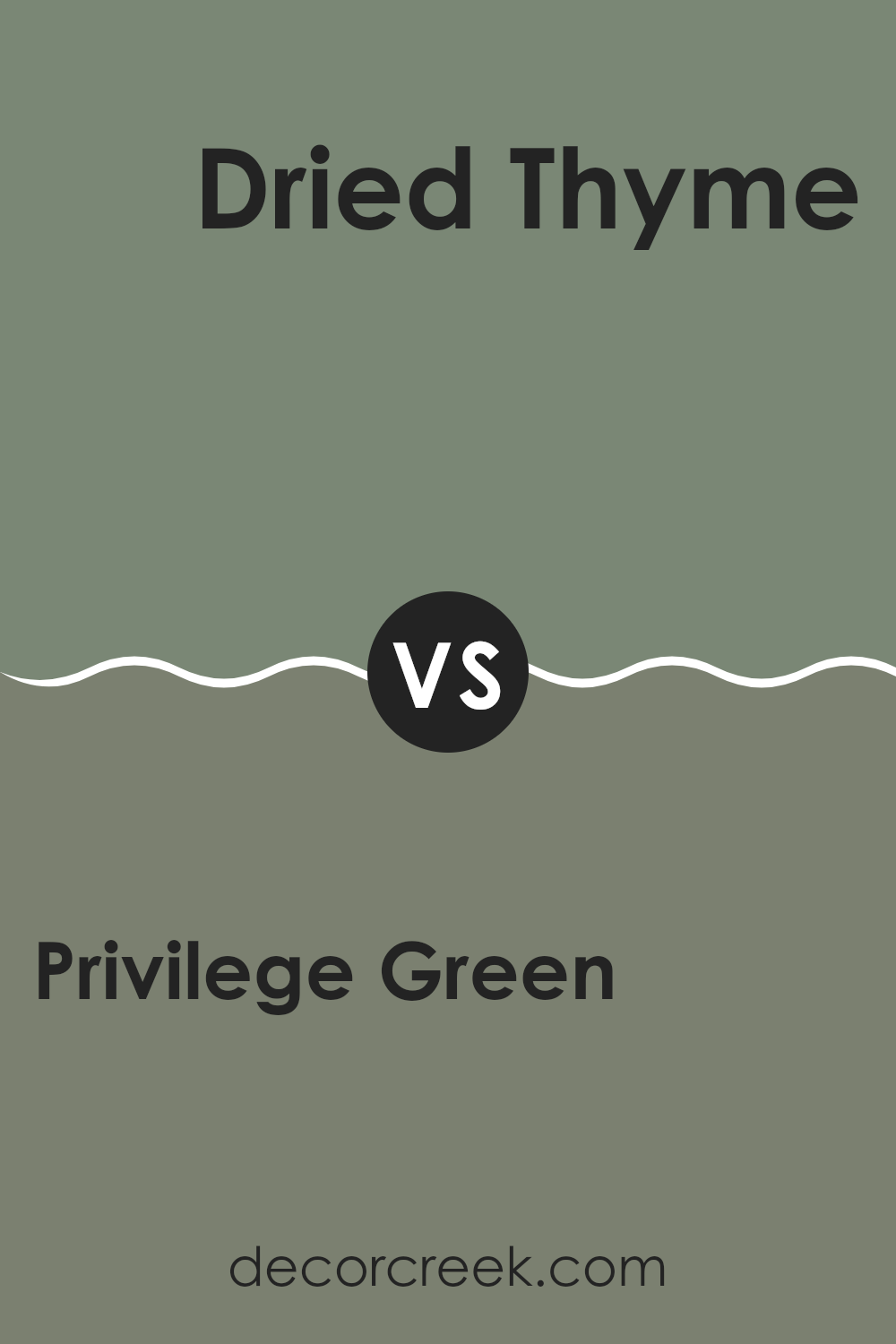
Privilege Green SW 6193 by Sherwin Williams vs Dried Thyme SW 6186 by Sherwin Williams
Privilege Green and Dried Thyme, both by Sherwin Williams, are distinct yet complementary shades. Privilege Green is a softer, lighter green that carries a hint of gray, making it adaptable for various rooms, providing a calm and soothing atmosphere. It’s great for creating a gentle backdrop in a room, allowing other decor elements to stand out.
On the other hand, Dried Thyme is a darker shade of green with deeper, earthier tones. This color has a stronger presence and can give a room a more grounded feel. Its richness makes it suitable for accent walls or for areas where a bolder statement is desired.
Both colors work well in natural light and can fit into a nature-inspired palette. While Privilege Green brings a lightness and an airy feel, Dried Thyme offers depth and a sense of solidity, making them good choices depending on the mood you want to achieve in your room.
You can see recommended paint color below:
- SW 6186 Dried Thyme
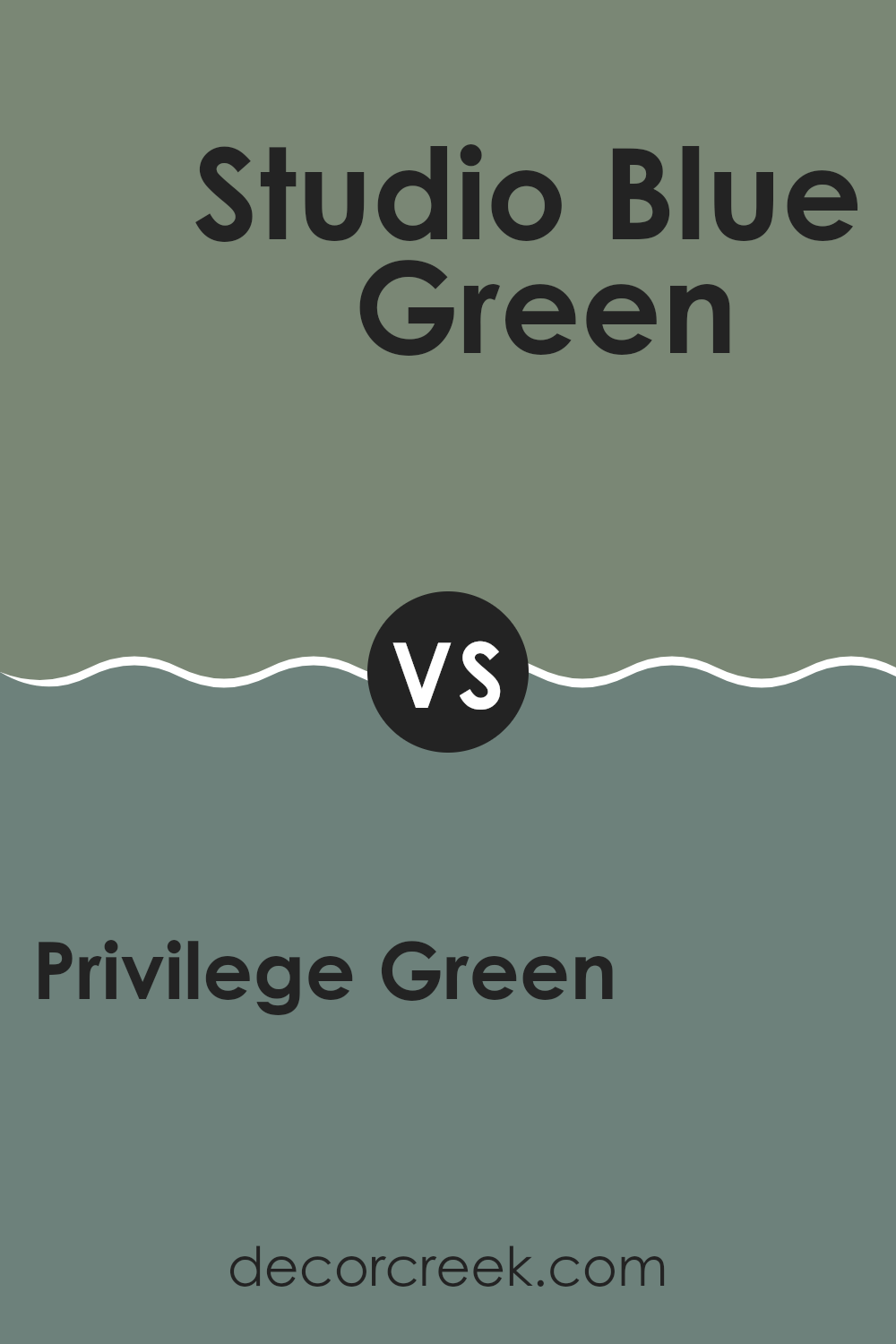
Privilege Green SW 6193 by Sherwin Williams vs Studio Blue Green SW 0047 by Sherwin Williams
Privilege Green by Sherwin Williams is a rich, deep green that brings a cozy, warm feel to any room. It has an earthy tone that leans slightly toward olive, making it a perfect choice for settings where you want to add a touch of nature-inspired robustness.
On the other hand, Studio Blue Green by Sherwin Williams is a lighter and more muted color, blending green and blue hues to achieve a calm, soothing presence. This color can make a room feel more open and airy.
Both of these colors are beautiful and can work well in various decor styles, but they create different moods. Privilege Green is better for creating a dense, enveloping atmosphere, often desirable in dens or libraries. Studio Blue Green is ideal for bedrooms or bathrooms where you might want a lighter, fresher vibe. Depending on the room and the lighting, each color offers a unique aesthetic that can enhance the room in different ways.
You can see recommended paint color below:
- SW 0047 Studio Blue Green
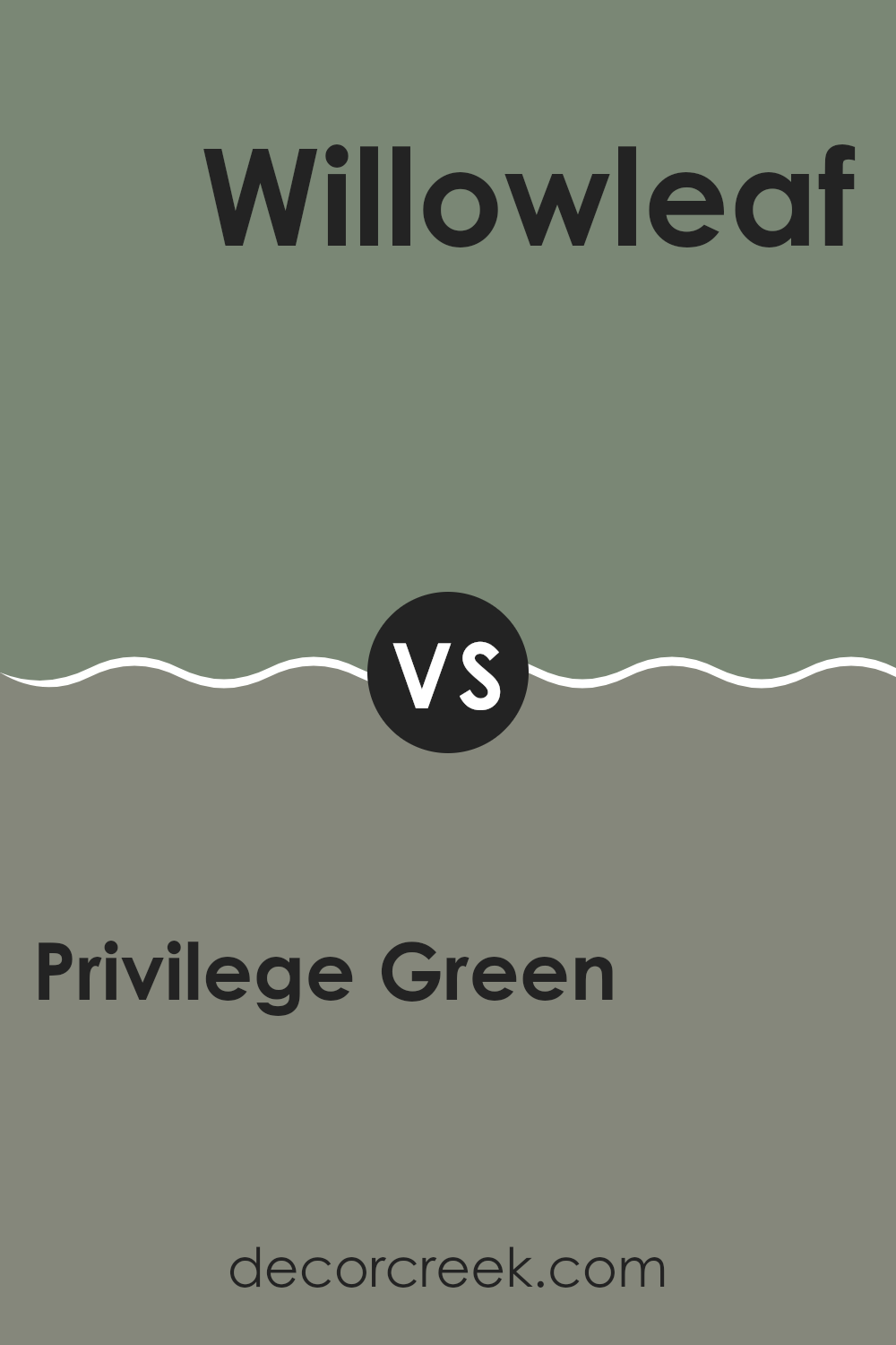
Privilege Green SW 6193 by Sherwin Williams vs Willowleaf SW 9649 by Sherwin Williams
Privilege Green and Willowleaf by Sherwin Williams are two distinct shades of green that can give a room very different vibes. Privilege Green is a deeper, richer shade that looks a lot like the classic green you might see in a forest. This color is perfect for someone wanting to create a cozy, comforting room as it feels more enclosed and snug.
On the other hand, Willowleaf is lighter and has a fresher, more energetic feel. This color reminds you of early spring leaves and can make a small room feel more open and airy. It’s great for brightening up a room or giving it a youthful, fresh look.
In summary, if you’re looking to create a cozy, traditional atmosphere, Privilege Green is your go-to. But if you prefer something lighter that makes your room feel livelier and more open, Willowleaf would be an excellent choice. Each brings its unique green but serves very different purposes depending on your decor goals.
You can see recommended paint color below:
- SW 9649 Willowleaf
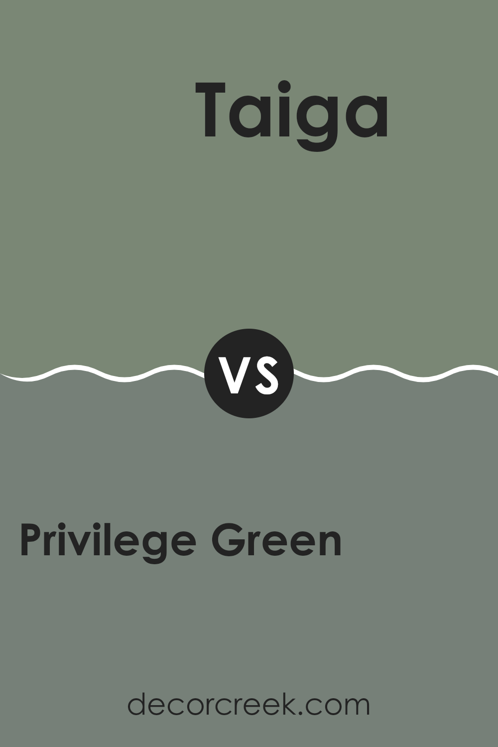
Privilege Green SW 6193 by Sherwin Williams vs Taiga SW 9654 by Sherwin Williams
Privilege Green and Taiga are both colors by Sherwin Williams but they have different vibes. Privilege Green is a warm, muted green with yellow undertones, making it cozy and welcoming.
It works well in rooms that aim for a natural and subtle feel. On the other hand, Taiga is a much darker green, almost leaning towards a deep forest tone. It has a richer and more intense look, perfect for creating a bold statement in a room.
Taiga can make small rooms feel smaller, so it’s better used in larger areas or as an accent to add depth. Both colors are great choices depending on what kind of mood or style you’re going for in a room.
You can see recommended paint color below:
- SW 9654 Taiga
Privilege Green SW 6193 by Sherwin Williams vs Gallery Green SW 0015 by Sherwin Williams
Privilege Green and Gallery Green, both by Sherwin Williams, offer unique takes on green paint. Privilege Green is a soothing, muted shade with a hint of gray, making it a subtle choice for rooms where you want a touch of nature without excessive brightness. It works well in areas where relaxation and calm are desired, like bedrooms or quiet living areas.
On the other hand, Gallery Green is a darker, richer green that can create a bold statement in a room. It has a strong presence and is ideal for creating a focal point, especially in areas designed for concentration and thought, like studies or libraries.
Both colors bring their unique style to interiors but serve different purposes based on their intensity and tone. Ultimately, choosing between them depends on the desired atmosphere and the room’s function.
You can see recommended paint color below:
- SW 0015 Gallery Green
Privilege Green SW 6193 by Sherwin Williams vs Retreat SW 6207 by Sherwin Williams
Privilege Green and Retreat, both by Sherwin Williams, are two distinct shades of green that can change the ambiance of any room. Privilege Green is a darker, more intense color that resembles a deep forest shade.
It adds a rich and welcoming feel to rooms, making it ideal for creating a cozy, sheltered atmosphere. On the other hand, Retreat is a slightly softer green with gray undertones. It has a more muted presence, making it easier to pair with different decor styles and colors.
Retreat can help make a room feel calm and collected without feeling too intense. Both colors are excellent choices for someone looking to incorporate green into their environment, but the selection ultimately depends on the desired intensity and mood of the room.
You can see recommended paint color below:
Privilege Green SW 6193 by Sherwin Williams vs Juniper SW 9679 by Sherwin Williams
Privilege Green and Juniper by Sherwin Williams are two distinct shades of green, each offering a unique vibe to any room. Privilege Green is a darker, more muted tone, perfect for creating a cozy and inviting atmosphere.
Its subtle richness works well in areas where you want a calm and grounded feel, like in a study or living room. On the other hand, Juniper sports a brighter, more vibrant hue. This color brings a lively and refreshing energy, ideal for rooms meant to inspire creativity and brightness, such as kitchens or children’s play areas.
While both colors share the same color family, Privilege Green leans towards a deeper, earthy base, whereas Juniper offers a fresher, crisper look. Each color can complement a variety of decor styles and preferences, depending on the mood you wish to set.
You can see recommended paint color below:
- SW 9679 Juniper
Privilege Green SW 6193 by Sherwin Williams vs Rookwood Blue Green SW 2811 by Sherwin Williams
Privilege Green and Rookwood Blue Green, both from Sherwin Williams, are unique in their own ways. Privilege Green is a muted, soothing shade that leans more toward a classic green. This color is adaptable, working well in rooms meant to feel calm and grounded.
On the other hand, Rookwood Blue Green has a distinct touch of blue, giving it a slightly cooler tone compared to Privilege Green. This shade is perfect for creating a refreshing and calm atmosphere, making it ideal for bathrooms or bedrooms where a relaxed vibe is desired.
While both colors are beautiful, your choice would depend on the mood you want to set and the existing decor in your room. Rookwood Blue Green might be the go-to for a more airy and light feel, whereas Privilege Green fits well in settings where warmth and richness are preferred.
You can see recommended paint color below:
- SW 2811 Rookwood Blue Green
Privilege Green SW 6193 by Sherwin Williams vs Underseas SW 6214 by Sherwin Williams
Privilege Green and Underseas are both colors by Sherwin Williams that offer distinct tones for various decorating needs. Privilege Green presents a soft, gentle green with a touch of gray, making it adaptable for rooms where you want a muted natural vibe. This color goes well in areas where you’re looking to create a calm, peaceful setting, like in bedrooms or offices. It strikes a balance between being noticeable and understated, which allows for easy pairing with both light and dark accents.
On the other hand, Underseas is a deeper, more ocean-inspired green with notable blue undertones. This color is slightly bolder and more striking, providing a rich backdrop that can make white trimmings or furniture pop. It’s ideal for creating a cozy, inviting atmosphere in rooms meant for relaxation, such as living rooms or reading nooks. Its darker shade could also serve to add depth and interest to a room, making it perfect for creating a statement wall.
In general, if you’re going for a softer, more neutral feel, Privilege Green is a great choice. If you want something with more depth and a hint of drama, Underseas could be the better option.
You can see recommended paint color below:
- SW 6214 Underseas
After learning about SW 6193 Privilege Green by Sherwin Williams, I can say that it’s a really cool paint color that could make any room look fresh and lively. This shade of green is not too bright but also not too dark, making it just right for someone who wants to add some nature vibes to their room without going overboard. It’s like when you pick the perfect green leaf from a tree; it’s calm and pleasant, just like this color.
What’s great about Privilege Green is that it fits well in many places. Whether you want to paint your bedroom to feel like it’s spring all year round, or you’re up for giving your living room a new, earthy touch, this color comes in handy. It’s like having a little piece of the forest inside your home, which can make you feel relaxed and happy.
I can also imagine how fun it would be to use this color in a playroom or even as a background wall for showing off drawings or artwork. The calm green will surely highlight anything in front of it, making everything look even better.
So, if anyone is thinking about choosing a new paint color, I would definitely suggest thinking about SW 6193 Privilege Green. It’s simple, looks great, and brings a bit of the outside world inside your home, which is pretty awesome.
decorcreek.com
Ever wished paint sampling was as easy as sticking a sticker? Guess what? Now it is! Discover Samplize's unique Peel & Stick samples.
Get paint samples

