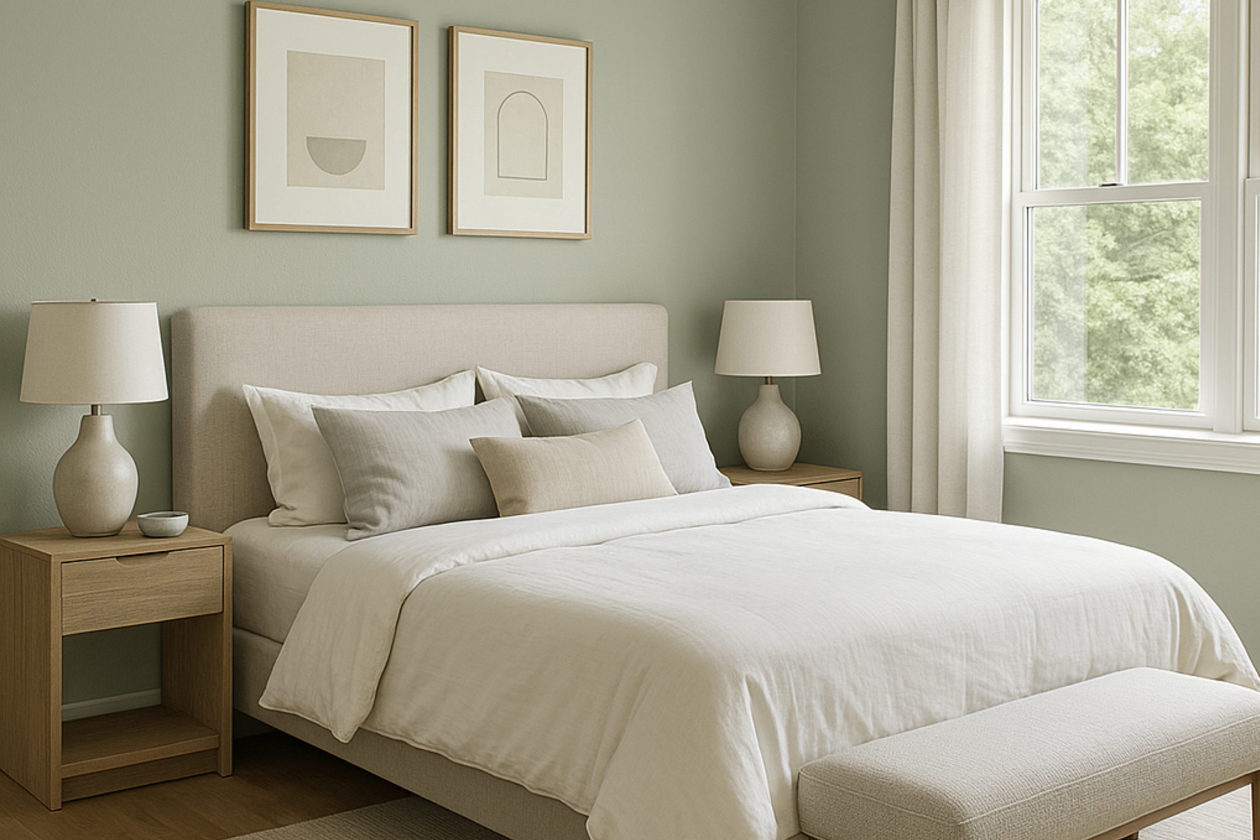
When you look for a fresh wave of color to bring life into your space, SW 6191 Contented by Sherwin Williams stands out as a serene choice. This gentle gray-green hue offers more warmth than typical grays, making your rooms feel cozy yet spacious. It’s a soft backdrop that pairs well with both modern and traditional decor, delivering a touch of sophistication without overpowering your existing design elements.
Choosing the right paint color can often feel overwhelming with so many options available. However, Contented strikes a fine balance by providing a peaceful aura that’s versatile for any room, whether it’s your light-filled living room or a quiet bedroom retreat.
Equally impressive, this color remains steady under different lighting conditions, maintaining its beauty and integrity throughout the day.
If you’re planning to refresh your home’s color scheme, consider the subtle charm of Contented. It’s a reliable and attractive option that promises to enliven your surroundings without demanding too much from your existing decor.
This color supports a range of complementary shades from soft neutrals to bold accents, giving you the freedom to express your style effortlessly.
What Color Is Contented SW 6191 by Sherwin Williams?
The color Contented by Sherwin Williams is a subtle green hue that brings a soft and airy feel to any room. This color has a touch of grey, making it versatile and soothing, perfect for creating a relaxed atmosphere in your home. It’s light enough to make spaces appear bigger while providing enough color to add character.
Contented works exceptionally well in various interior styles, especially in modern, minimalist, and traditional settings. In a modern environment, its understated elegance ties together sleek furniture and metal accents, complements stainless steel appliances in kitchens, or fixtures in bathrooms.
For minimalist spaces, it serves as a gentle backdrop that highlights natural wood finishes or simple, structured furniture. In traditional rooms, it pairs beautifully with classic wood trim, detailed moldings, and richer textures like velvet or silk, bringing a fresh twist to classic aesthetics.
This color goes well with materials such as natural wood, showing off its warmer undertones. Textures like linen, wool, and cotton also match well, promoting a comfortable, lived-in feel. Contented is also great for pairing with stone elements, such as marble or granite, which enhance its naturalistic vibe, making it a fantastic choice for various living spaces throughout the home.
Is Contented SW 6191 by Sherwin Williams Warm or Cool color?
Contented (SW 6191) is a paint color from Sherwin Williams that is versatile and understated. This particular shade is a mix that sits comfortably between gray and green, making it a nice choice for homeowners who want a hint of color in their space without overwhelming the senses.
It works well in rooms with varying amounts of light, providing a soothing, neutral backdrop that allows furniture and decor to stand out. It’s particularly effective in bedrooms and living rooms where a calm atmosphere is often desired.
Contented can also help small spaces appear larger, as its subtle hue doesn’t crowd the visual field like darker colors might. Furthermore, it pairs nicely with a wide range of other colors, from soft whites to bold blacks, allowing for flexibility in design choices. The softness of this color can help soften sharper design elements, making rooms feel more cohesive and thoughtfully put together.
Undertones of Contented SW 6191 by Sherwin Williams
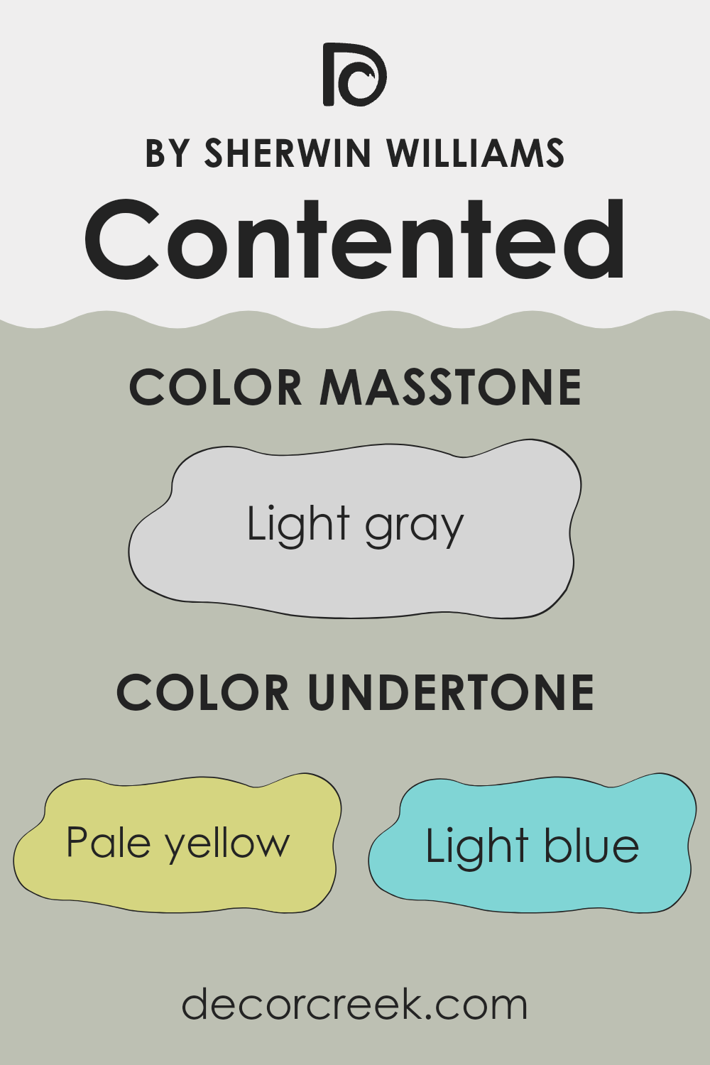
Contented is a unique paint color that carries a blend of subtle undertones which can significantly influence its appearance in different settings. Understanding undertones is crucial because they can alter the perceived color under various lighting conditions. For instance, pale yellow undertones can make a room feel warmer and more welcoming when the light hits it, whereas light blue undertones might give a fresher, cooler feel.
When using Contented on interior walls, its complexity becomes quite apparent. For example, light purple undertones add a hint of vibrancy without overwhelming the space, making it ideal for a bedroom or bathroom where a touch of softness is desired. The mint undertones can bring a sense of freshness and vitality, which could rejuvenate a kitchen or an office space.
Pale pink undertones in Contented provide a gentle, nurturing vibe, perfect for creating a comforting atmosphere in a living room or a child’s bedroom. On the other hand, lilac undertones offer a subtle hint of sophistication and are often perfect for spaces intended for relaxation or creativity.
Grey undertones are particularly effective in providing a neutral backdrop, allowing for flexibility in decorating with various color accents and furniture styles. They keep the overall feel grounded and balanced, making Contented a versatile choice for many rooms.
Altogether, the undertones of this paint color can enhance the spatial aesthetics, playing an essential role in how the color adjusts its character from morning light to the dim of evening, affecting mood and perceived space size.
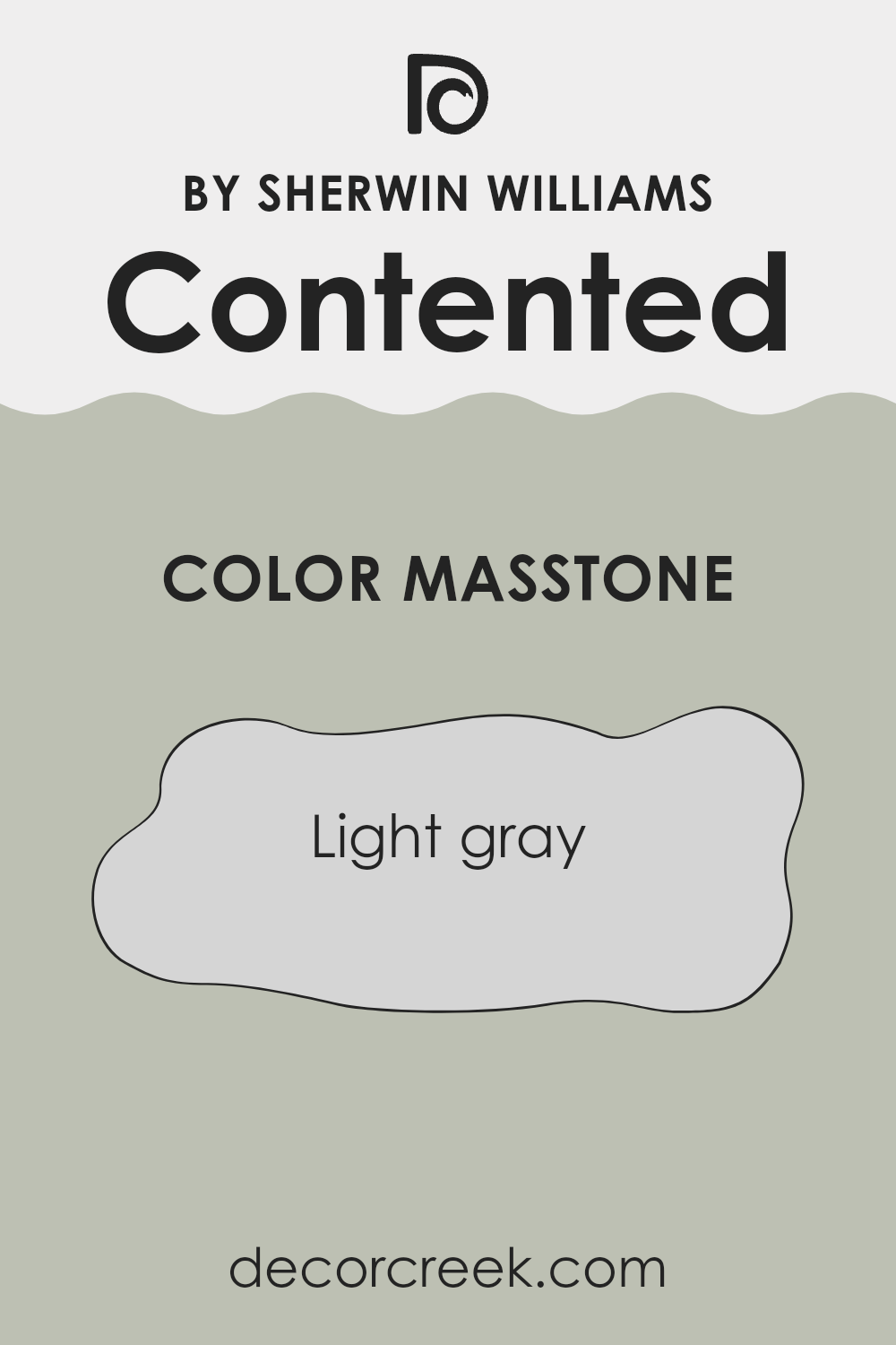
What is the Masstone of the Contented SW 6191 by Sherwin Williams?
ContentedSW 6191 by Sherwin Williams has a masstone of light gray, represented by the color code #D5D5D5. This light gray shade is exceptionally versatile and works well in many areas of a home. Its lightness allows it to reflect natural light, which can make smaller rooms appear larger and more open.
Additionally, since light gray is such a neutral color, it pairs easily with other colors, whether they’re bright and loud or more subdued. This makes it an excellent choice for walls, as it provides a soft backdrop that can highlight furniture and decor without competing for attention.
It’s also a great pick for rooms that have lots of artwork or colorful accents, as it quietly supports rather than overshadows other elements in the space. Because of its neutrality, it’s adaptable to varying styles, whether the home’s interior is modern, traditional, or somewhere in between.
This color can help create a clean, orderly feel in any space, making it a go-to choice for those looking to refresh their homes.
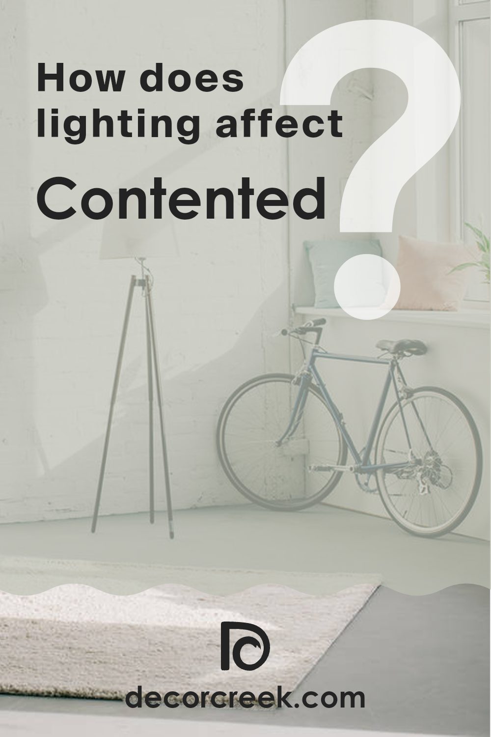
How Does Lighting Affect Contented SW 6191 by Sherwin Williams?
Lighting plays a crucial role in how we perceive colors. Different light sources can drastically affect the appearance of a color due to their varying intensities and hues. When considering the color Contented, a soft, grayish-green, its appearance changes depending on whether it’s viewed under artificial or natural lighting.
In artificial light, such as LED or fluorescent bulbs, the color Contented may appear slightly more muted and cooler.
Artificial light tends to lean towards blue or yellow hues, influencing the perceived shade of the color. Under warm-toned bulbs, Contented might look softer and more welcoming, whereas cooler-toned bulbs could enhance its green undertones, giving it a crisper look.
Natural light, on the other hand, brings out the truest form of Contented. In the bright light of day, especially in direct sunlight, this color will appear lighter and more vibrant.
The green and gray tones will be more balanced, providing a fresh and lively look. However, as the day progresses and the quality of light changes, so will the appearance of Contented, potentially showing more depth in the early morning or late afternoon.
The orientation of the room plays a big role too. In north-facing rooms, which receive less direct sunlight, Contented will look cooler and a bit more subdued, possibly enhancing its gray tones. This can give a calm and gentle feel to the room.
In south-facing rooms that get ample sunlight, the color will appear brighter and more vivid. The warm southern light can enhance the green undertones, making the room feel fresh and lively.
For rooms facing east, the morning light will bring out the brightness of Contented, making it appear very vibrant and active in the morning, while turning more neutral and subdued as the day goes on.
West-facing rooms will see the opposite effect; the color may appear duller during the morning but become warmer and more dynamic in the afternoon and evening as it catches the sunset.
In summary, the color Contented is highly versatile but its appearance can vary significantly with different types of light and room orientations. This highlights the importance of considering both lighting and exposure when choosing a color for a room.
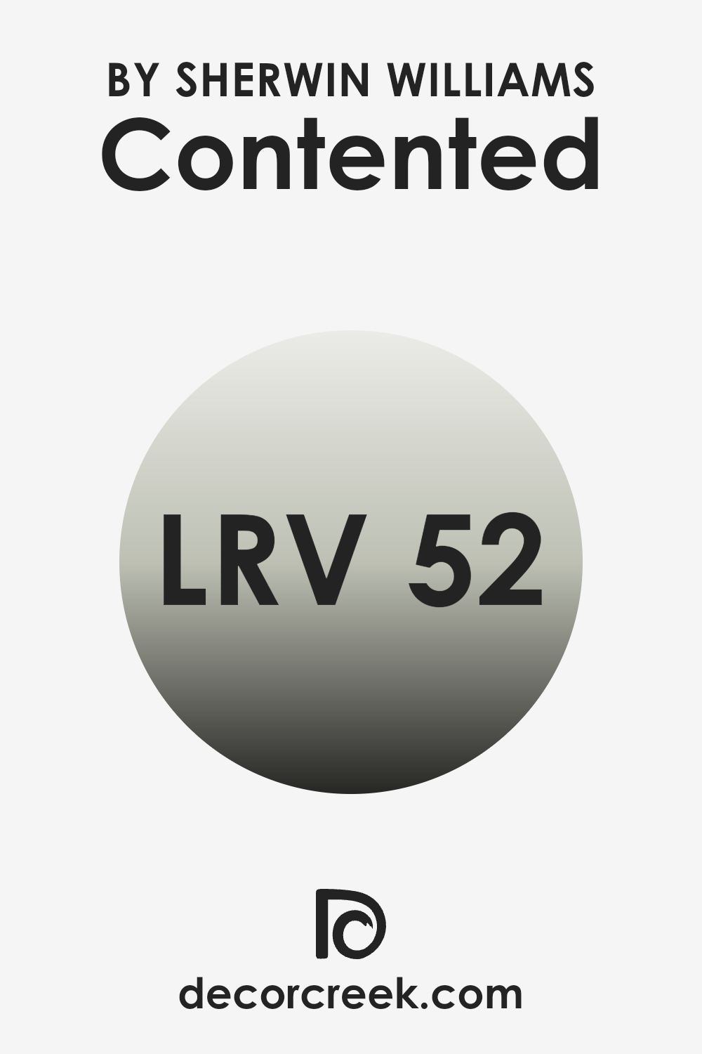
What is the LRV of Contented SW 6191 by Sherwin Williams?
Light Reflectance Value, or LRV, is a measurement that tells how much light a paint color reflects or absorbs once it’s applied to a wall. The scale for this measurement runs from 1 to 99, where a lower number indicates that the color absorbs more light, making it appear darker, and a higher number means it reflects more light, making it appear lighter.
This value is crucial when selecting paint colors because it helps predict how the color will look under different lighting conditions in your space. For the paint color Contented (SW 6191) with an LRV of 51.872, this indicates that it’s almost perfectly in the middle of the LRV scale.
This midpoint LRV suggests that Contented is a balanced color that neither reflects nor absorbs light excessively. It offers a versatile appearance that can adapt whether a room receives a lot of natural light or is mostly lit by artificial lighting. In bright spaces, this color will appear more vibrant and noticeable, whereas in poorly lit rooms, it might look slightly more subdued but will not make the space feel overly dark or confined.
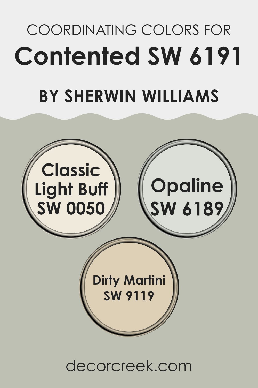
Coordinating Colors of Contented SW 6191 by Sherwin Williams
Coordinating colors are those that complement each other while sharing either a similar color temperature (warm or cool) or a contrasting approach that balances well. When used together, coordinating colors create a harmonious appearance.
For instance, if we consider a specific paint shade like Contented SW 6191 by Sherwin Williams, finding colors such as Classic Light Buff SW 0050, Opaline SW 6189, and Dirty Martini SW 9119 can provide a smooth visual transition or a pleasant contrast that enhances the overall aesthetic.
Classic Light Buff SW 0050 is a soft, pale beige that offers a subtle warmth, working effectively to bring out a gentle brightness in a room without overwhelming the main color. Opaline SW 6189, on the other hand, is a soft and light pastel that adds a touch of delicacy and can easily blend with textures and other accent decor.
Dirty Martini SW 9119 is a more muted, greenish-gray tone that provides a grounding effect, offering balance against lighter shades, making it ideal for adding depth and interest to a space. These coordinating colors work together to create a cohesive look that enhances the beauty and feel of each individual color.
You can see recommended paint colors below:
- SW 0050 Classic Light Buff
- SW 6189 Opaline
- SW 9119 Dirty Martini
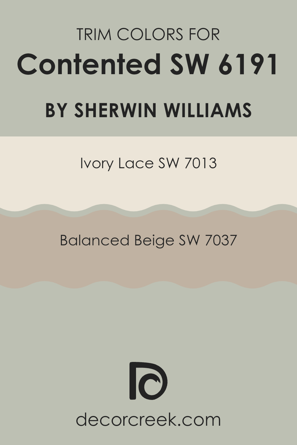
What are the Trim colors of Contented SW 6191 by Sherwin Williams?
Trim colors, such as SW 7013 – Ivory Lace and SW 7037 – Balanced Beige, play a critical role in enhancing the overall appearance of a room painted with Contented by Sherwin Williams. These colors are used for elements like door frames, window sills, crown moldings, and baseboards, creating sharp, clean lines that define and separate spaces on walls.
The choice of trim colors can significantly influence the room’s aesthetic, either by contrasting with or complementing the wall color, thus adding depth and dimension to the space. Ivory Lace (SW 7013) is a soft, warm white that provides a gentle contrast to the cooler tones of Contented, highlighting features with a subtle distinction that is neither too stark nor overpowering.
Balanced Beige (SW 7037), on the other hand, offers a richer, deeper contrast, setting off the green-grey hue of Contented with its earthy, warm beige tones. This color can help in creating a more defined and cozy atmosphere, particularly in spaces that aim for a warmer, more inviting feel. Each of these trim colors, when used wisely, can greatly enhance the aesthetic appeal and overall feel of a room.
You can see recommended paint colors below:
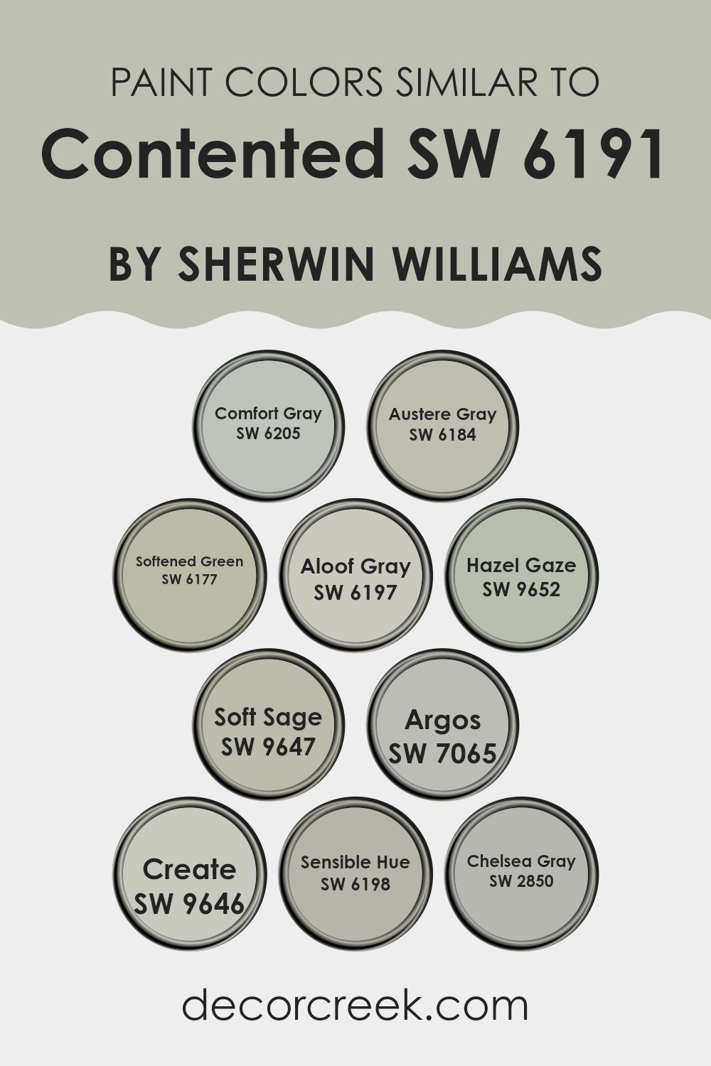
Colors Similar to Contented SW 6191 by Sherwin Williams
Using similar colors in a design can create a harmonious and cohesive look that feels balanced and visually appealing. Colors like Comfort Gray, which is a soothing blend of blue, green, and gray, provides a versatile backdrop for various interior styles, while Austere Gray offers a more understated touch with its cooler hues.
Similar to these, Softened Green brings a subtle hint of nature indoors with its gentle, leafy tones, adding a fresh and inviting vibe. On the other hand, Aloof Gray is a light, neutral gray that works beautifully to create a calm and composed space.
Further, incorporating tones such as Hazel Gaze, a rich and earthy hue, adds a touch of warmth and character, making rooms feel more inviting. Soft Sage, similar in its nature-inspired influence but lighter, can brighten spaces while keeping them grounded. Argos offers a deeper gray that anchors a room, providing depth and focus.
Likewise, Create is a unique color that blends gray with hints of green, suggesting creativity and freshness. Sensible Hue and Chelsea Gray round out the palette, with the former being a subtle blend of grayish green and the latter a solid, steady gray, perfect for adding stability and sophistication to any setting.
These shades, when used together, can make any space feel more intentional and refined without feeling overwhelming.
You can see recommended paint colors below:
- SW 6205 Comfort Gray
- SW 6184 Austere Gray
- SW 6177 Softened Green
- SW 6197 Aloof Gray
- SW 9652 Hazel Gaze
- SW 9647 Soft Sage
- SW 7065 Argos
- SW 9646 Create
- SW 6198 Sensible Hue
- SW 2850 Chelsea Gray
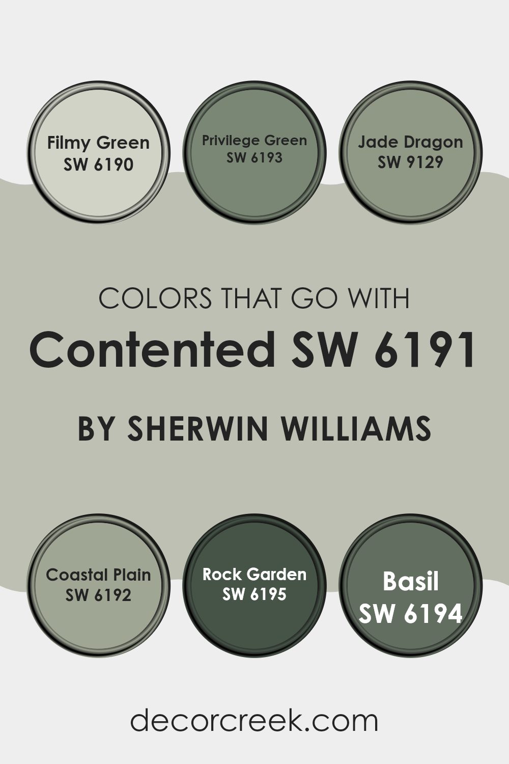
Colors that Go With Contented SW 6191 by Sherwin Williams
Choosing complementary colors for Contented SW 6191 by Sherwin Williams is essential in creating a coherent and appealing color scheme in any space. These colors help balance the atmosphere, highlight key features, and enhance the overall aesthetic appeal. For example, Filmy Green SW 6190 is a soft, pale green that provides a subtle contrast to Contented, making it ideal for creating a gentle, soothing vibe in a room.
In contrast, Privilege Green SW 6193 offers a slightly richer and deeper tone, giving depth and interest when paired with Contented, and making it perfect for accentuating areas or for use on statement furniture pieces.
Colors like Jade Dragon SW 9129, with its vibrant and fresh tone, inject a lively spark into spaces and pairs beautifully with the calmer Contented to add a dynamic flare. Coastal Plain SW 6192 offers a green that’s a tad earthier, great for grounding a space or lending an organic feel when used alongside Contented.
Rock Garden SW 6195 is another great companion, offering a darker, more intense hue that provides excellent visual contrast and can help in defining spaces or creating focal points. Lastly, Basil SW 6194 is a robust green that works wonderfully to add a touch of nature’s freshness while keeping the decor soothing and cohesive. Together, these colors work harmoniously to enhance the beauty and versatility of Contented.
You can see recommended paint colors below:
- SW 6190 Filmy Green
- SW 6193 Privilege Green
- SW 9129 Jade Dragon
- SW 6192 Coastal Plain
- SW 6195 Rock Garden
- SW 6194 Basil
How to Use Contented SW 6191 by Sherwin Williams In Your Home?
Contented SW 6191 by Sherwin Williams is a versatile paint color that is perfect for creating a cozy and welcoming atmosphere in any home. This shade is a soft green that can blend well with various decor styles, from modern to traditional.
You can use Contented in your living room on walls to provide a fresh and airy feel that is calming, making it an ideal backdrop for relaxing and entertaining. In bedrooms, this shade works beautifully to create a gentle, restful environment, aiding in relaxation.
It’s also a great choice for bathrooms, where it can pair nicely with white or wood accents to create a clean and refreshing look. For those looking to refresh their kitchen, Contented can be applied to cabinets or walls for a subtle hint of color. This paint color is easy to work with and can help to brighten up spaces while providing a pleasant aesthetic that feels like home.
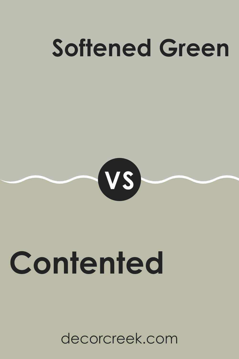
Contented SW 6191 by Sherwin Williams vs Softened Green SW 6177 by Sherwin Williams
Comparing the two Sherwin Williams paints, Contented and Softened Green, you’ll find some subtle but notable differences. Contented has a muted, cool gray-green tone that brings a restful vibe to spaces, making it an excellent choice for many rooms in your home. It’s versatile and pairs well with a variety of decor styles, adding a calming presence.
In contrast, Softened Green leans more towards a true green, albeit with a soft, gentle hue. This color is slightly warmer and richer compared to Contented, making it a great option if you’re looking to add a bit more color to a room without overwhelming it. Softened Green also reflects more light, which can help smaller spaces feel bigger and more open.
Both shades offer a refreshing touch but with different intensities and impressions. Contented works well for a subtle, neutral background, while Softened Green offers a gentle hint of nature and growth.
You can see recommended paint color below:
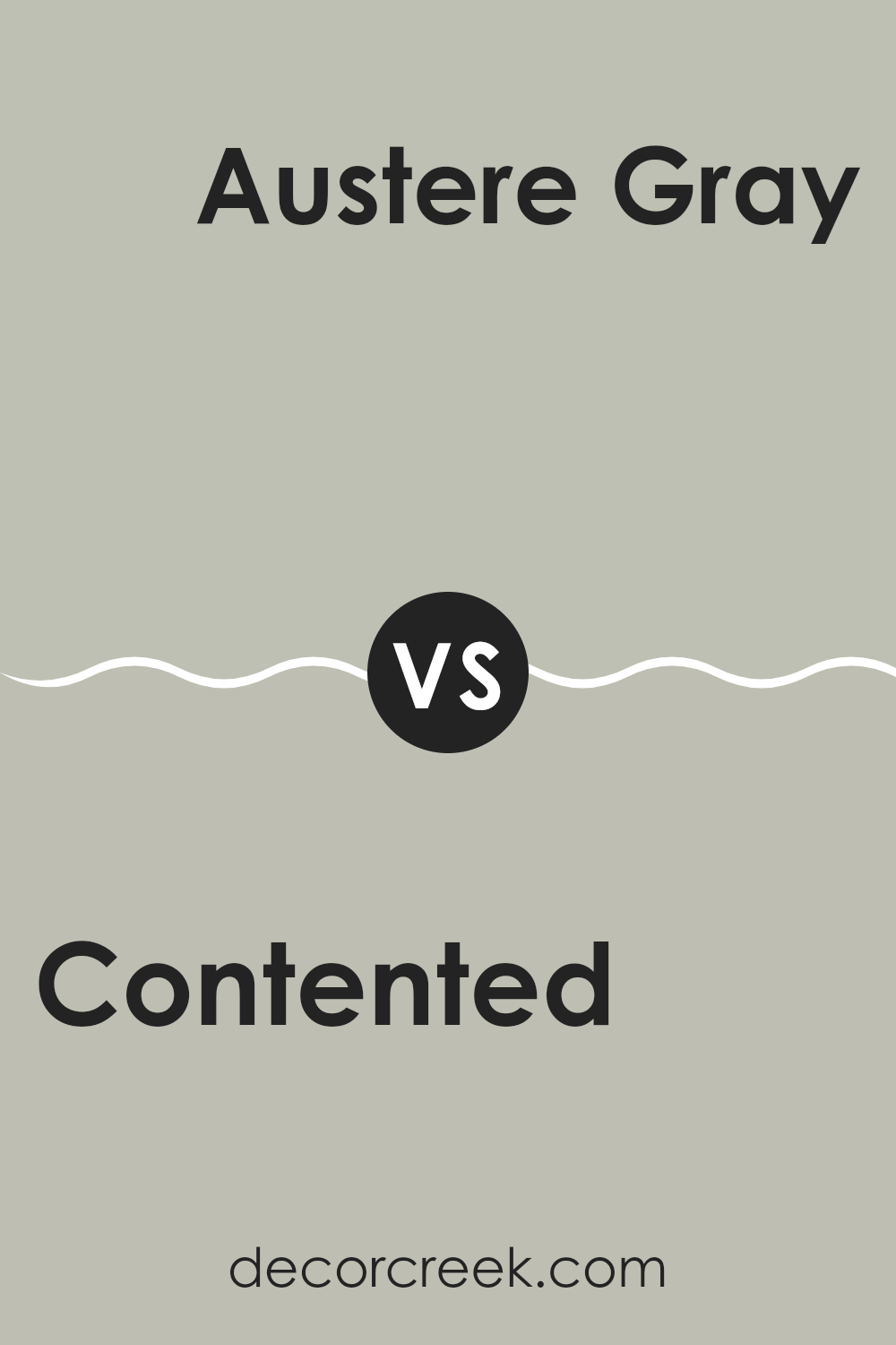
Contented SW 6191 by Sherwin Williams vs Austere Gray SW 6184 by Sherwin Williams
Contented and Austere Gray, both from Sherwin Williams, offer unique tones for various decorating needs. Contented is a soft, gentle green with a hint of grey, making it a perfect choice for creating a cozy and welcoming atmosphere in spaces like living rooms or bedrooms. The calming hue pairs well with natural elements and light woods to enhance a relaxed vibe.
On the other hand, Austere Gray is a cooler tone, leaning more towards a subdued green-gray. This color is excellent for those looking to achieve a more understated yet modern look. It works particularly well in spaces that aim for a minimalistic aesthetic, complementing modern furnishings and metal accents.
Both colors bring their own unique feel to a room, with Contented leaning towards a warmer, inviting space, and Austere Gray offering a cooler, more reserved look. Choosing between them depends on the room’s desired mood and style.
You can see recommended paint color below:
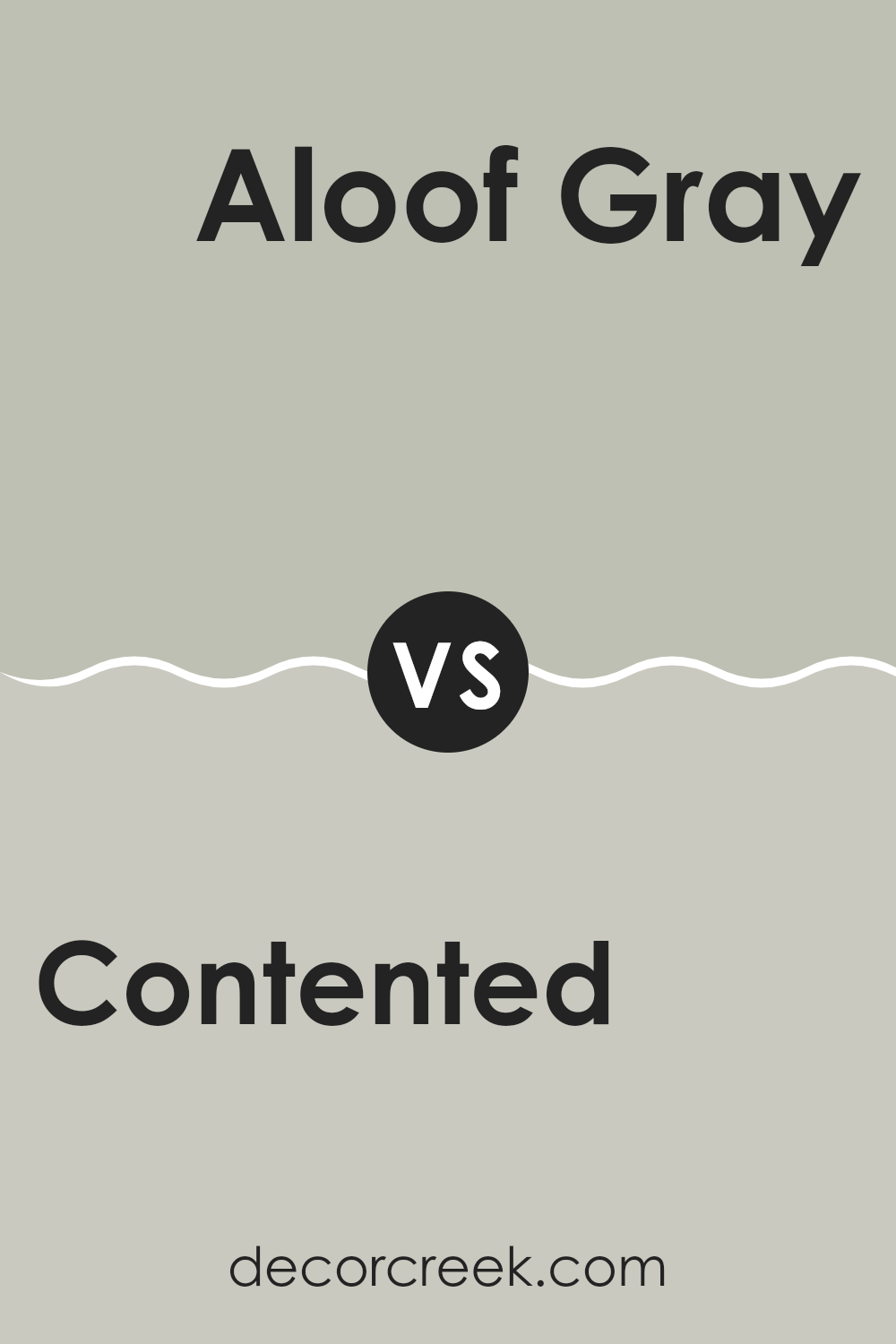
Contented SW 6191 by Sherwin Williams vs Aloof Gray SW 6197 by Sherwin Williams
Contented and Aloof Gray, both by Sherwin Williams, each bring a unique vibe to a space. Contented is a softer, warmer grey with a hint of green, making it feel cozy and inviting. It has a slightly muted earthiness which works well in rooms where a relaxing and welcoming tone is desired.
On the other hand, Aloof Gray stands out due to its cooler, more detached appearance. This color leans more towards the classic gray side, providing a neutral backdrop that blends well with modern and minimalistic decors.
While Contented adds a hint of color and warmth, Aloof Gray offers a clean, straightforward gray that is versatile in various settings. Both colors can refresh a space, but the choice between the two largely depends on the atmosphere you want to create—warm and subtle, or cool and straightforward.
You can see recommended paint color below:
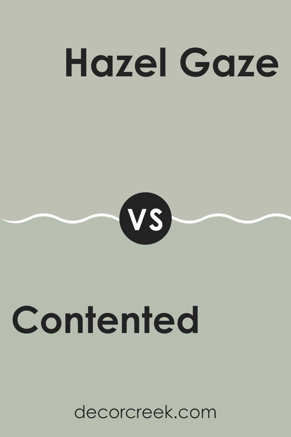
Contented SW 6191 by Sherwin Williams vs Hazel Gaze SW 9652 by Sherwin Williams
Contented SW 6191 is a soft, soothing green with a hint of gray that gives it a subtle, muted feel. This color is versatile and gentle, making it an excellent choice for spaces where you want to create a calm and relaxed atmosphere. It blends well with natural elements and works beautifully in rooms that get plenty of sunlight.
On the other hand, Hazel Gaze SW 9652 has a warmer tone, blending rich browns with a hint of green. This color feels cozy and welcoming, and it’s perfect for creating a comforting space. Hazel Gaze pairs well with soft creams and darker browns, ideal for both modern and rustic decor styles.
While both colors offer a sense of calm, Contented leans more towards a fresher, lighter look, whereas Hazel Gaze leans into warmth and depth, adding a more enveloping feel. Each brings its unique vibe to a room, depending on the mood you’re trying to achieve.
You can see recommended paint color below:
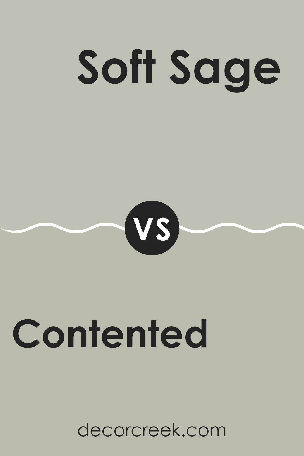
Contented SW 6191 by Sherwin Williams vs Soft Sage SW 9647 by Sherwin Williams
Contented and Soft Sage by Sherwin Williams are both green hues, but they present unique tones that can affect the mood of a room differently. Contented is a muted gray-green that has a calming effect, ideal for creating a cozy and welcoming space. It works well in areas where you want to promote relaxation, like living rooms or bedrooms.
Soft Sage, on the other hand, is lighter and has a fresher feel. This color tends to breathe life into a space, making it perfect for kitchens, bathrooms, or any area that benefits from a bright and airy look. The cooler undertone in Soft Sage helps it pair well with whites and creams, offering a clean and crisp environment.
Both colors are versatile and pair well with various decor styles, but Contented leans towards a warmer, more sheltered atmosphere, while Soft Sage provides a more refreshing and open vibe.
You can see recommended paint color below:
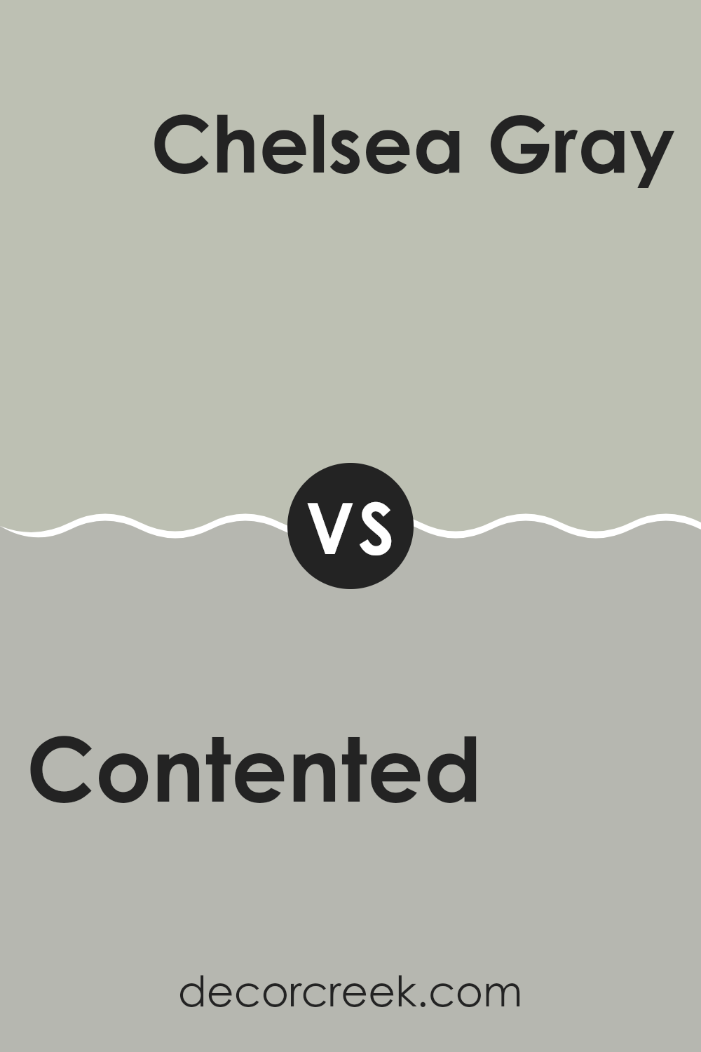
Contented SW 6191 by Sherwin Williams vs Chelsea Gray SW 2850 by Sherwin Williams
Comparing Contented and Chelsea Gray by Sherwin Williams, both colors offer unique tones that can enhance any space. Contented is a soft, soothing green with a hint of gray. It gives a room a fresh, calm feeling, almost like bringing a bit of nature inside. This color works well in spaces where you want to relax and feel at ease, like bedrooms or living rooms.
On the other hand, Chelsea Gray is a deeper, more pronounced gray that carries an understated elegance. This color is versatile enough to be used in high-traffic areas like kitchens and hallways, as it tends to hide marks and scuffs better due to its darker tone. Chelsea Gray can also be a great choice for modern settings or to add contrast when paired with lighter colors.
Both colors are adaptable and can create different moods depending on the surrounding decor and lighting, making them great options for updating the look of your home.
You can see recommended paint color below:
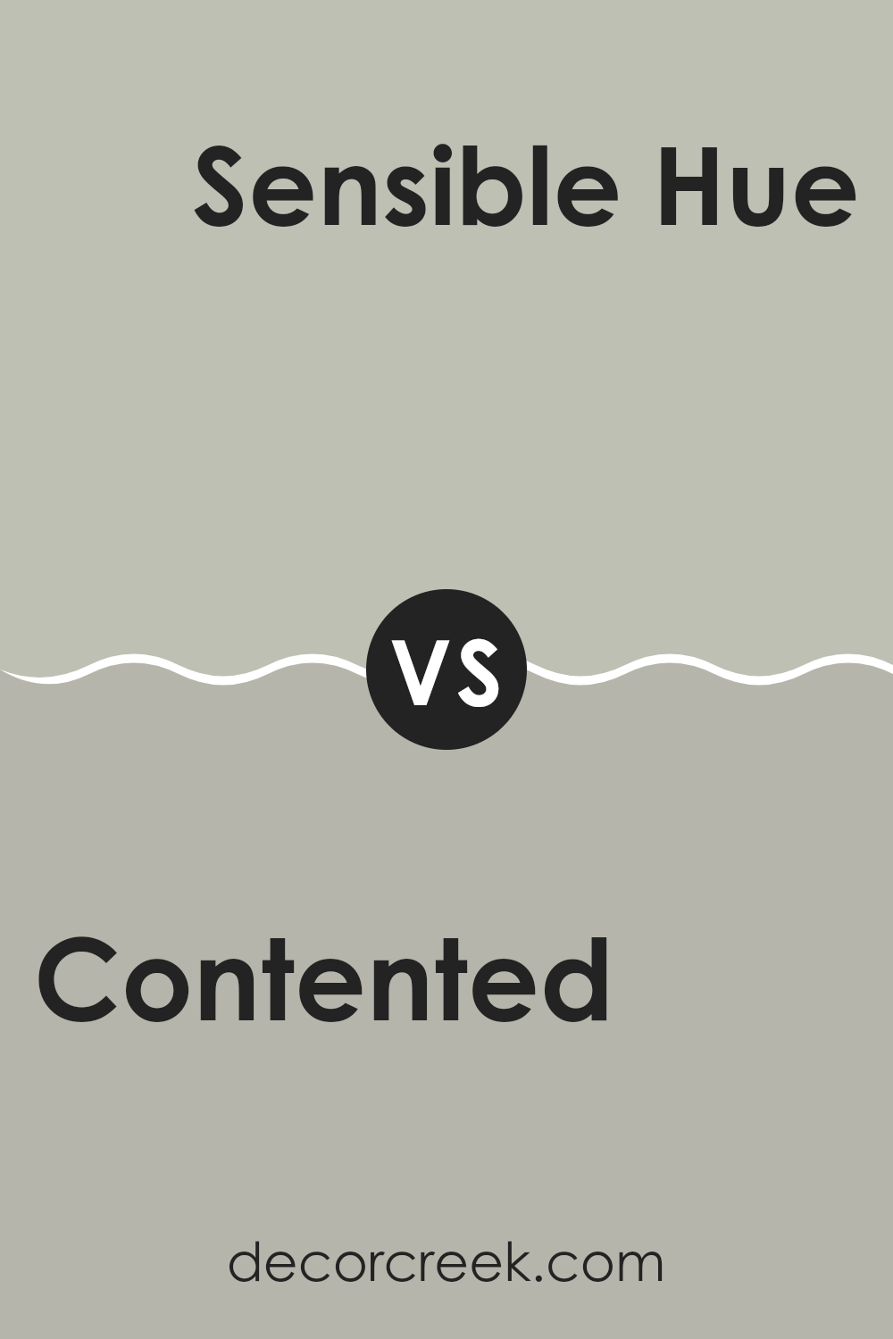
Contented SW 6191 by Sherwin Williams vs Sensible Hue SW 6198 by Sherwin Williams
The main color, Contented, and the second color, Sensible Hue, both by Sherwin Williams, share a soothing aesthetic but differ subtly in their tones. Contented is a soft, grayish-green that gives off a calm and gentle vibe, ideal for creating a peaceful environment in any room. It mirrors the quietness of a misty garden and works well in spaces that aim for a natural, relaxed feel.
On the other hand, Sensible Hue is slightly more reserved. It leans towards a neutral gray with just a hint of green, making it highly versatile and perfect for those looking to maintain a low-key but stylish atmosphere. This color can easily blend with different decor styles and serves as a wonderful background that allows other colors in the room to stand out.
Both colors are great choices if you’re looking for hues that are understated yet beautiful, but the choice between a greener tone or a more neutral base depends on your personal preference and the overall look you’re aiming for in your space.
You can see recommended paint color below:
- SW 6198 Sensible Hue
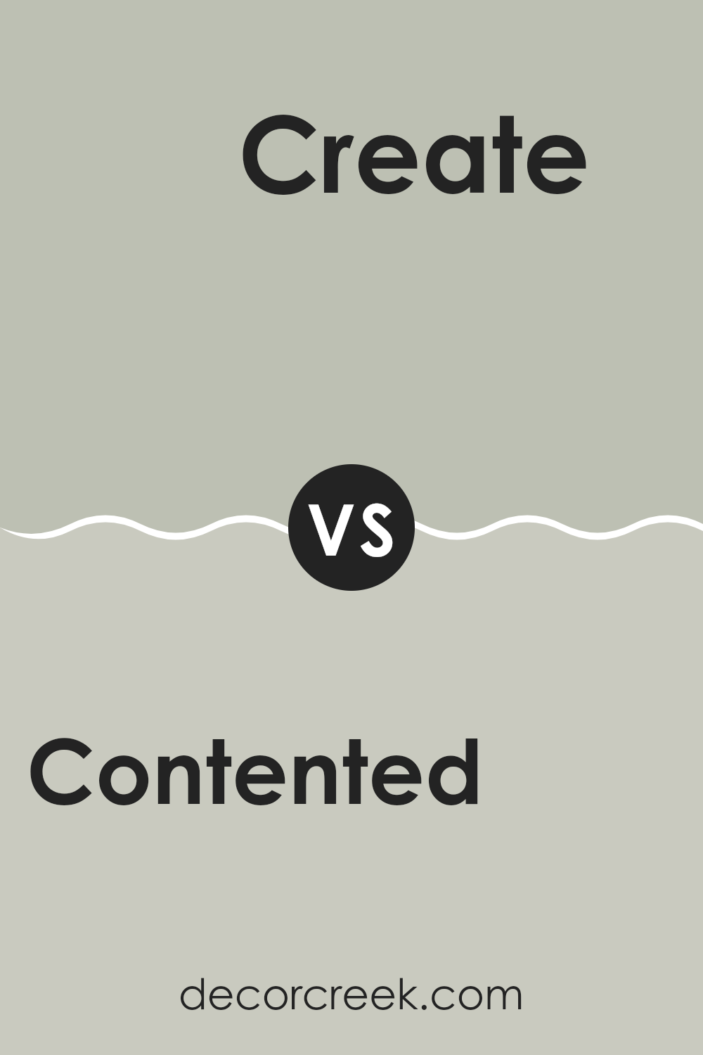
Contented SW 6191 by Sherwin Williams vs Create SW 9646 by Sherwin Williams
The main color, Contented, is a gentle green with a soft, muted quality that feels calming and refreshing. It’s ideal for creating a peaceful atmosphere in spaces like bedrooms or living areas. This color pairs well with light woods and neutral furnishings to maintain a relaxed environment.
On the other hand, Create is a darker, richer green that carries a bit more energy and boldness. It’s perfect if you’re looking to add a touch of drama without overwhelming a space. This color works well in areas that benefit from a focal point or where you want to add a sense of depth. It complements white trim or furniture beautifully, providing a striking contrast.
Both colors offer unique vibes – Contented is more about softness and light, while Create brings depth and strength. Depending on the mood you want for your room, either could be a great choice.
You can see recommended paint color below:
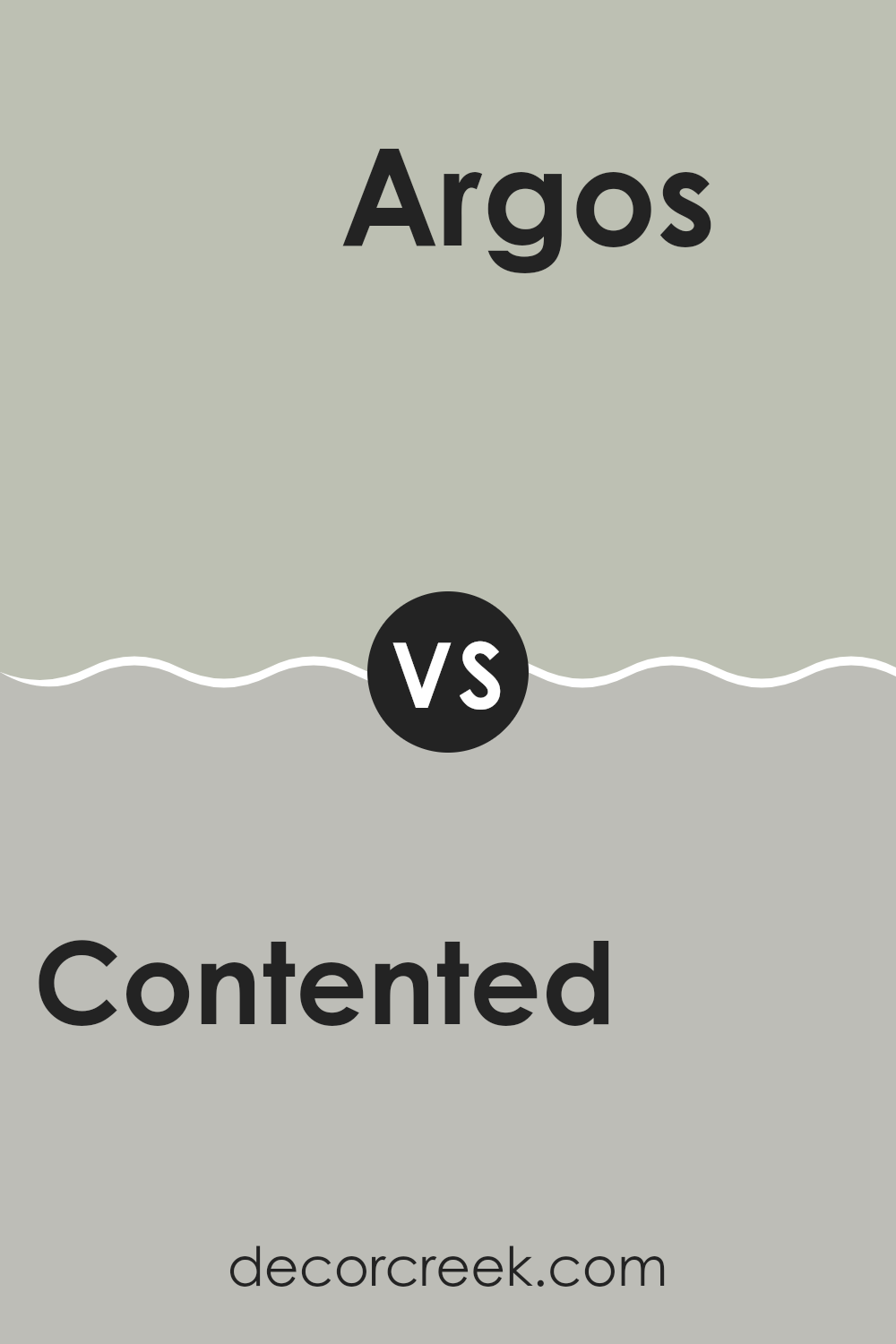
Contented SW 6191 by Sherwin Williams vs Argos SW 7065 by Sherwin Williams
Contented and Argos, both from Sherwin Williams, have their unique appeal. Contented is a gentle green with a soft, soothing quality. It leans slightly towards a gray undertone, making it adaptable and easy to pair with different decor styles. You could say it has a fresh yet understated vibe, which works well in spaces where you want a calm and relaxed atmosphere.
On the other hand, Argos is a cooler shade of gray that offers a minimalistic and clean look. It has a neutral base, making it incredibly versatile for various spaces, whether it’s a modern living room or a sleek office. Argos is less about warmth and more about providing a sharp, clear backdrop that doesn’t overpower.
Both colors serve distinct yet valuable roles in interior design. Contented brings a hint of nature and softness, while Argos offers clarity and neutrality. Depending on what you’re looking for in a space—whether it’s warmth and coziness or a crisp and straightforward look—either color can be a great choice.
You can see recommended paint color below:
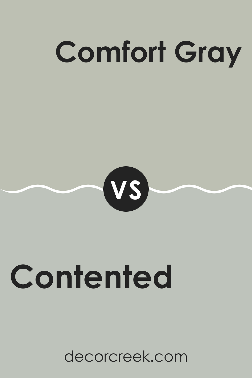
Contented SW 6191 by Sherwin Williams vs Comfort Gray SW 6205 by Sherwin Williams
Contented by Sherwin Williams is a soft, soothing green with a subtle gray undertone, giving it a muted appearance that works well in various lighting conditions. It’s a versatile color that offers a refreshing yet understated look, making it suitable for spaces where you want a touch of nature without overwhelming brightness.
Comfort Gray, also by Sherwin Williams, leans more towards a gray shade with robust green undertones. Despite its name, it might come across as closer to a mild sea green rather than a traditional gray. This color can give a room a more grounded, calm feel, and pairs well with both light and dark accents.
Both colors share a calming vibe with their green-gray composition, but Contented is lighter and softer, making it ideal for small rooms or spaces needing a lighter touch. In contrast, Comfort Gray provides a deeper, richer hue that can serve as a statement color in a space, potentially hiding marks and scuffs better due to its deeper tone. These colors can be used in complementary ways in a home to create a cohesive environment with varied visual interest.
You can see recommended paint color below:
Conclusion
In this review of SW 6191 Contented by Sherwin Williams, I shared why this paint color is such a great choice. Contented is a lovely green color, but it’s not too bright or too dark, making it just right for any room in your house. It’s kind of like the color of soft leaves in spring, and it brings a calm and happy feeling wherever you use it.
I explained how Contented can make small rooms feel bigger and more open because of its light and airy feel. It’s perfect for bedrooms, living rooms, or even bathrooms. I also talked about how Contented matches well with a lot of different colors for furniture and decorations, like white, brown, and even some blues. This means it’s very easy to use—you won’t have trouble finding things that look good with it.
Lastly, I mentioned the good quality of Sherwin Williams paints, which cover the walls well and last a long time. This means you don’t have to repaint often and the color stays looking fresh.
Overall, choosing SW 6191 Contented for your walls is a smart pick because it’s pretty, easy to match, and comes in good quality paint. If you want a color that makes your room feel happy and cozy, Contented could be the perfect color for you!
Ever wished paint sampling was as easy as sticking a sticker? Guess what? Now it is! Discover Samplize's unique Peel & Stick samples.
Get paint samples

