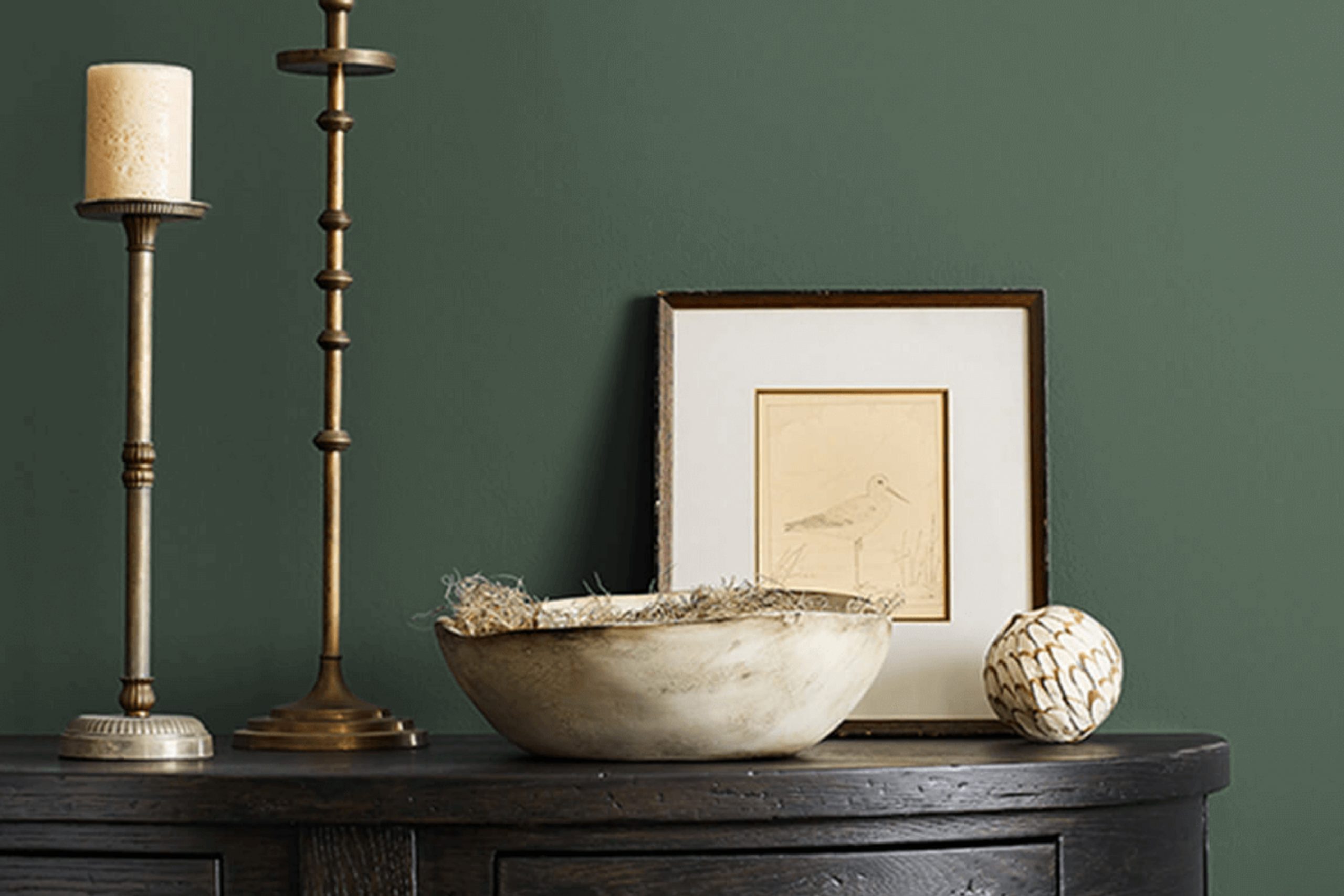
When you come across the color SW 6195 Rock Garden by Sherwin Williams, you notice a shade that brings the calming essence of nature right into your room. This rich, deep green hue reminds one of lush forests and peaceful landscapes. It has an earthy and grounded feel, yet it holds a certain depth that adds character and warmth to any room.
I often find that using Rock Garden as a wall color or as an accent helps create a cozy and inviting atmosphere. It’s perfect for rooms where you want to relax and unwind, such as living rooms or bedrooms.
Whether paired with neutral tones or vibrant accents, this flexible green can both soothe and refresh your surroundings. It’s a color that seems to balance boldness with subtlety, offering a strong presence that doesn’t feel too intense.
Combining Rock Garden with natural materials like wood and stone can further enhance its organic vibe, making your room feel grounded and balanced.
Adding touches of white or cream can bring out its richness, while gold or brass accents can add a touch of elegance. With SW 6195 Rock Garden, you can refresh your environment into a peaceful retreat, bringing the calm of nature indoors in a beautifully effortless way.
What Color Is Rock Garden SW 6195 by Sherwin Williams?
Rock Garden by Sherwin Williams is a rich, earthy green with a strong presence, perfect for creating a cozy and inviting atmosphere in any room. This color is reminiscent of deep forest hues, providing a sense of comfort and warmth. It works beautifully in both modern and traditional interior styles, offering flexibility.
In modern interiors, this green can be used to add depth and interest to minimalist rooms. Pairing it with clean lines and simple forms will create a striking contrast. In traditional settings, it harmonizes well with classic wood tones and intricate patterns, enhancing the lasting feel of the room.
Materials that pair well with Rock Garden include natural woods, which highlight the earthy quality of the color. Textured fabrics like linen, wool, or velvet also complement it beautifully, adding a tactile element to the room. Metal accents in brass or aged gold can introduce a touch of warmth and refinement, ensuring the room feels balanced.
This color works well in living rooms, bedrooms, and even kitchens, where it can be used on cabinets for a bold statement. Whether as an accent wall or across all walls in a room, Rock Garden sets a perfect backdrop, creating a warm and inviting environment throughout the home.
Is Rock Garden SW 6195 by Sherwin Williams Warm or Cool color?
Rock Garden SW 6195 is a paint color by Sherwin Williams that brings a deep, earthy green into home rooms. This shade can greatly influence the mood of a room, making it feel more grounded and connected to nature. Rock Garden is flexible and works well in various parts of the home, whether on walls, cabinets, or as an accent color.
It pairs beautifully with neutral tones, such as beige or soft whites, to create a balanced look. Adding warm wood tones or metallic accents can enhance its natural feel. In rooms like living rooms or bedrooms, this color adds depth and a sense of warmth, providing a cozy yet modern touch.
In kitchens or bathrooms, it can bring a fresh, natural vibe, especially when combined with lighter countertops or tiles. Overall, Rock Garden SW 6195 provides a calming yet stylish option for those looking to add a touch of nature indoors.
Undertones of Rock Garden SW 6195 by Sherwin Williams
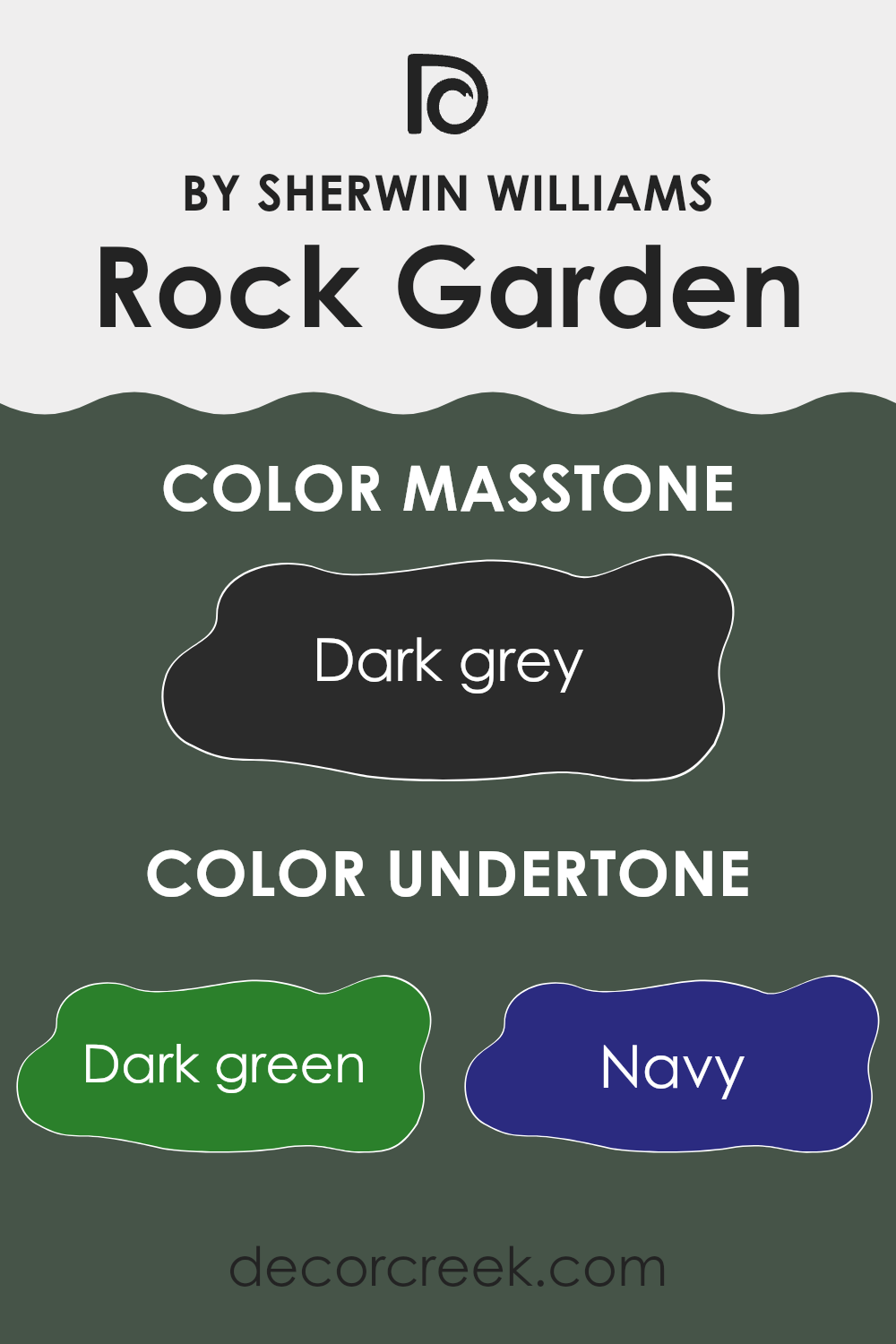
Rock Garden SW 6195 by Sherwin Williams is a paint color with a complex mix of undertones that affect how it looks on interior walls. This color has a base that mainly appears as a deep green, but it contains undertones that can shift its appearance in different lighting.
The dark green undertone ensures that it usually presents as a rich, earthy green, reminiscent of moss or lush foliage. The navy undertone can give it a cool, moody feel, especially in low light. This can make rooms feel cozy or intimate.
The dark turquoise undertone adds a hint of blue-green, contributing subtle depth and vibrancy. The brown undertone grounds the color, adding warmth and making it feel more natural and inviting. Olive undertones can give the paint a slightly yellowish tint, depending on the light.
The purple undertone adds a hint of mystery, while the grey undertone helps to mute and balance all the other influences, leading to a more neutral feel. These undertones mean it can appear different throughout the day, adding complexity to a room’s look. In sunny rooms, it may appear more vibrant and lively, while in dim lighting, it can feel more muted and subdued.
What is the Masstone of the Rock Garden SW 6195 by Sherwin Williams?
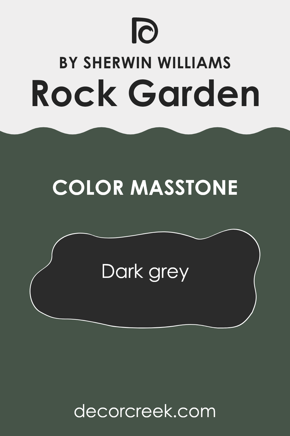
Rock Garden SW 6195 by Sherwin Williams, with its dark grey masstone (#2B2B2B), brings an element of depth and richness to home interiors. This shade is flexible and can create a cozy, intimate atmosphere in any room. Its deep grey tone works well with both contemporary and traditional styles, allowing homeowners to add a touch of elegance without feeling too bold.
This color serves as an excellent backdrop for lighter furnishings and accessories, making them stand out without clashing. When used on walls or even accent pieces, it can add a modern and stylish edge to living rooms. Its neutral characteristics mean it pairs well with a wide variety of colors, from soft pastels to vibrant hues, enhancing their brightness and character.
Lighting plays a crucial role in how this shade is perceived; natural light brings out its warmer undertones, while artificial light can highlight its cooler aspects. Overall, it offers a sense of comfort and modern appeal.
How Does Lighting Affect Rock Garden SW 6195 by Sherwin Williams?
Lighting plays a big role in how we perceive colors. It can change the appearance and mood of a room. Rock Garden SW 6195 by Sherwin Williams is a deep, rich green that changes character based on the light it receives.
In artificial light, especially warm light, Rock Garden can look softer and slightly muted. It may appear darker and lose some of its green intensity. Under cool artificial light, it can take on a more intense and striking green tone.
Natural light changes throughout the day, affecting how colors appear. In north-facing rooms, which usually get cooler and more consistent light, Rock Garden might look darker and more subdued. The light in these rooms tends to enhance the blue undertones of the green, giving it a cool, calming feel.
In south-facing rooms, which get more direct sunlight and warmer light throughout the day, Rock Garden can appear lighter and more vivid. The warm light will bring out the warmer tones of the green, creating a more vibrant and lively atmosphere.
East-facing rooms receive warm, yellow light in the morning that becomes cooler and more neutral as the day progresses. In the morning, Rock Garden might have a warm, inviting look. Later in the day, the color can seem more muted and cooler.
West-facing rooms experience the opposite, with cooler light in the morning and warm, rich light in the late afternoon and evening. In these rooms, Rock Garden can appear quite dark and shaded in the morning, becoming warmer and more intense as the sun sets.
Understanding how lighting affects Rock Garden can help in choosing the right room and lighting setup to achieve the desired look and feel. It’s always a good idea to test paint samples at different times of the day to see how the color changes in all conditions.
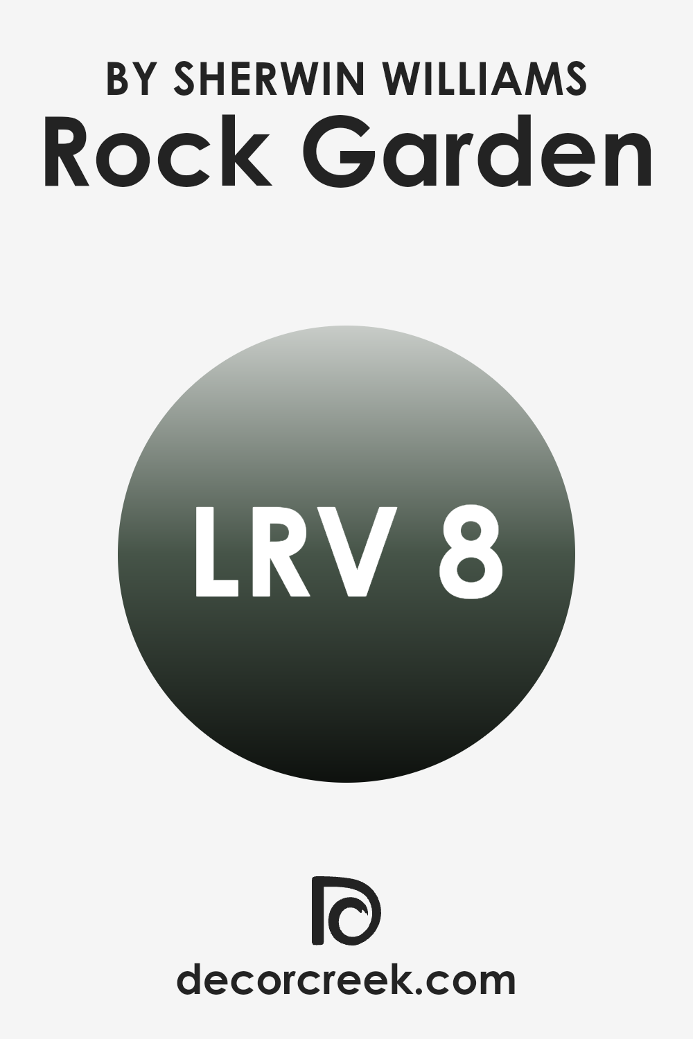
What is the LRV of Rock Garden SW 6195 by Sherwin Williams?
Light Reflectance Value, or LRV, is a measurement that tells us how much light a color reflects versus how much it absorbs. The scale ranges from 0, which is completely black and absorbs all light, to 100, which is completely white and reflects all light. When you choose a paint color, its LRV can help you understand how bright or dark it will appear once on your walls.
A low LRV means that the color will absorb more light and feel darker, often making a room feel cozier and more intimate. In contrast, a high LRV means the color reflects more light, which can make a room feel larger and more open.
The LRV of 8.086 for the color Rock Garden is on the low end of the scale, meaning it will absorb most of the light that hits it. This particular color will likely come across as deep and rich, creating a warm, enclosed atmosphere in any room. The deep green tones may feel quite dramatic, especially in rooms with limited natural light.
In a well-lit room, however, it can add a touch of sophistication by providing a strong, grounded backdrop for furniture and decor, without feeling overpowering. If you’re aiming for a cozy, moody vibe, a color with an LRV like this one will do the trick.
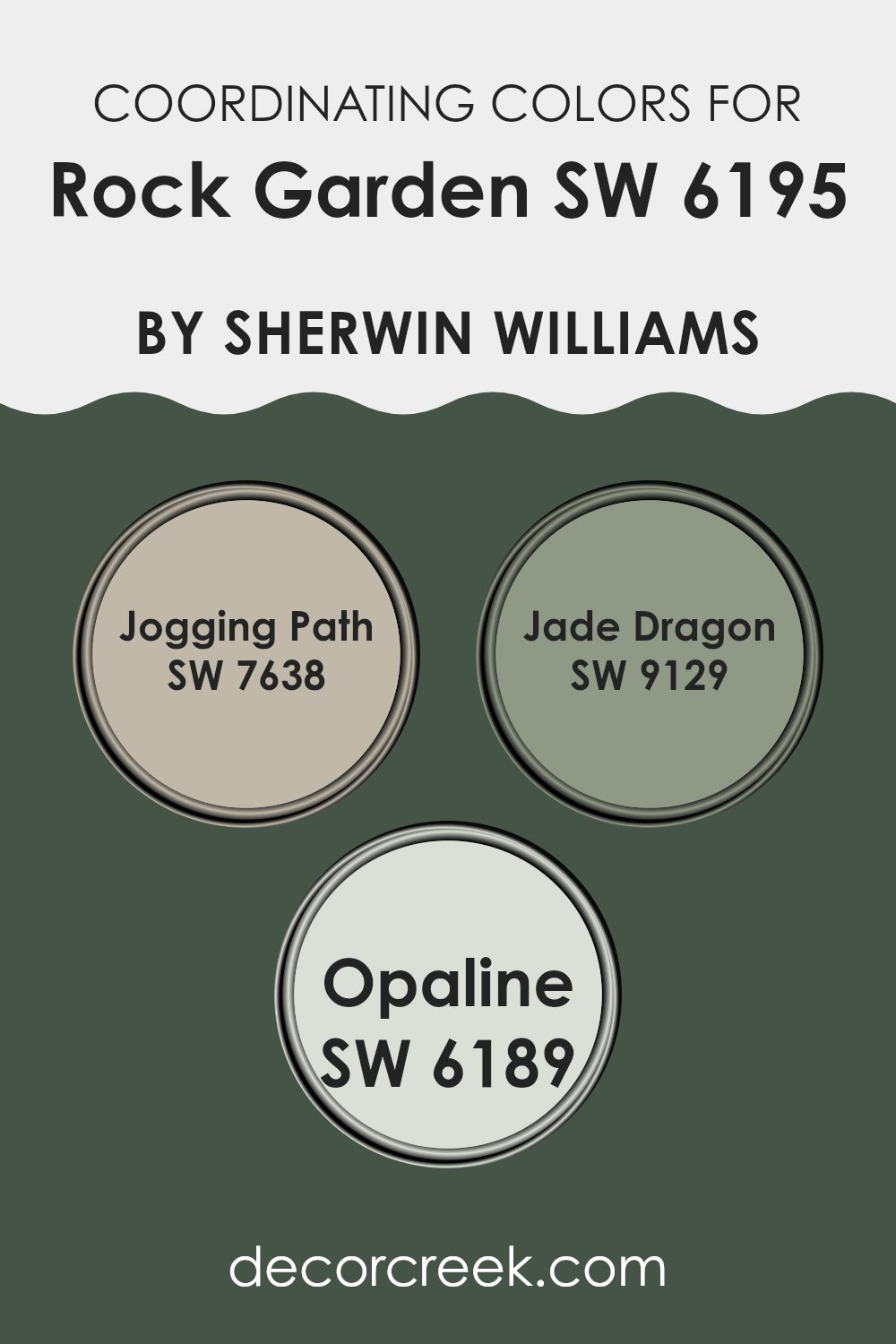
Coordinating Colors of Rock Garden SW 6195 by Sherwin Williams
Coordinating colors are hues that complement each other and work together to create a harmonious look in a room. These colors often come from the same color family or are specially chosen to bring out the best in one another. When paired, they can enhance a room’s aesthetic without clashing.
For example, Rock Garden, a rich, earthy green by Sherwin Williams, works beautifully with a selection of coordinating colors to create a balanced and inviting environment. Jogging Path is a warm, neutral gray that adds a sense of calm and comfort.
It pairs well with deeper colors, providing a subtle backdrop that allows bolder shades to stand out. Jade Dragon is a rich, deep teal that brings a touch of elegance and depth. It works wonderfully with other natural tones, adding an intriguing contrast without feeling too strong. Opaline is a soft, pale green with hints of blue, offering a gentle, soothing feel that lightens up a room when used alongside Rock Garden. By blending these coordinating colors thoughtfully, you can create a cohesive design that feels both fresh and welcoming.
You can see recommended paint colors below:
- SW 7638 Jogging Path
- SW 9129 Jade Dragon
- SW 6189 Opaline
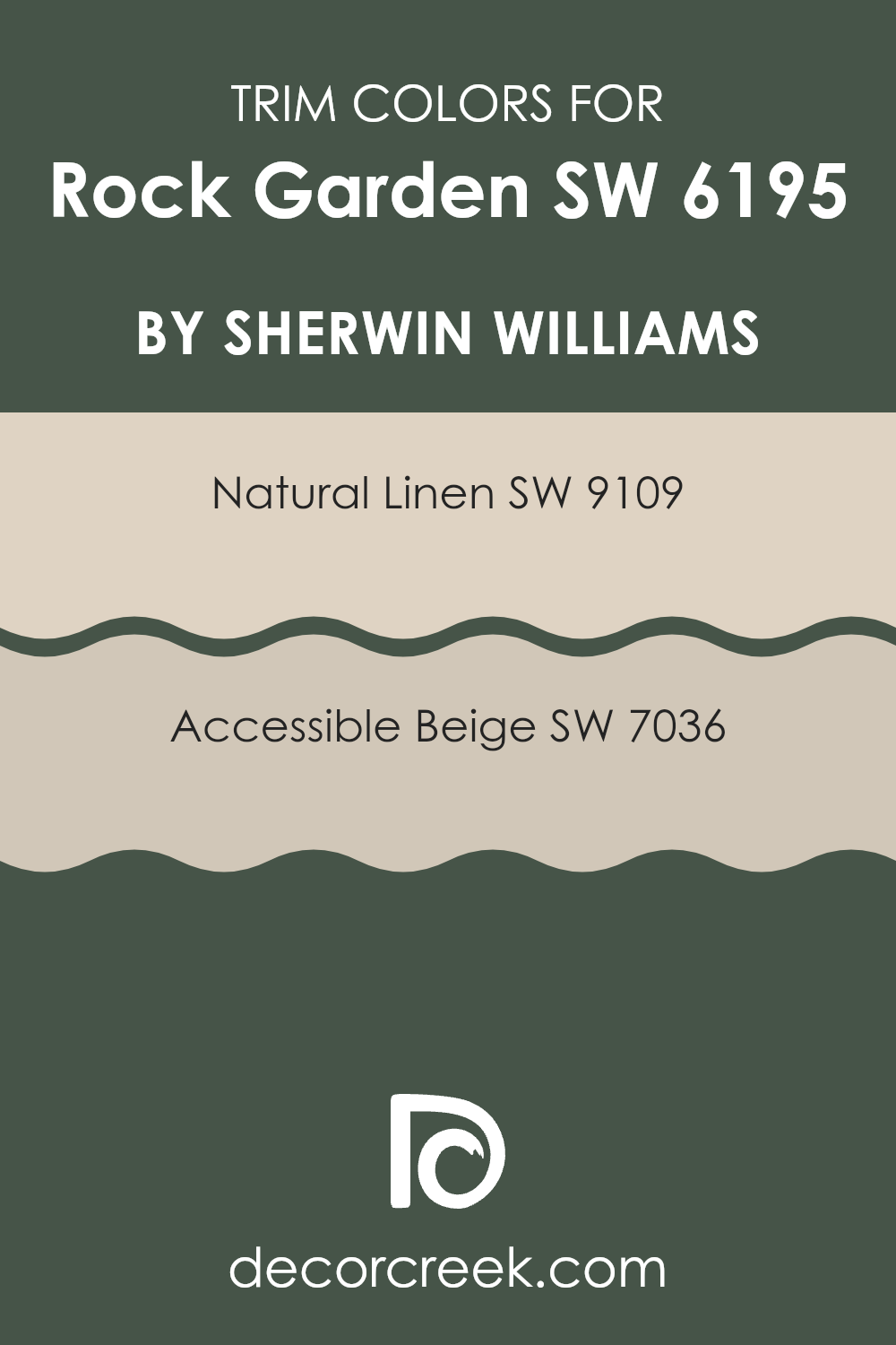
What are the Trim colors of Rock Garden SW 6195 by Sherwin Williams?
Trim colors refer to the paint colors used for finishing touches on features like window frames, door frames, and moldings. These colors are crucial as they highlight the primary wall color, making it stand out while adding depth and contrast to a room. In the case of Rock Garden by Sherwin Williams, choosing the right trim colors is key to creating a balanced look.
Rock Garden is a deep, rich green that can be complemented beautifully by certain neutrals. Using neutral colors for trims allows Rock Garden to stand out without feeling too bold in the room. Natural Linen and Accessible Beige by Sherwin Williams are excellent choices for trim around Rock Garden.
Natural Linen is a soft, warm beige with a hint of creaminess, offering a gentle contrast without harsh edges. This color brings a subtle warmth that complements the dark green of Rock Garden, making it feel inviting. Accessible Beige is another great choice because it is a light, flexible beige with a warm undertone, which aligns well with the deep green.
This trim color adds a touch of brightness and lends a cohesive look to a room dominated by Rock Garden’s lush tone.
You can see recommended paint colors below:
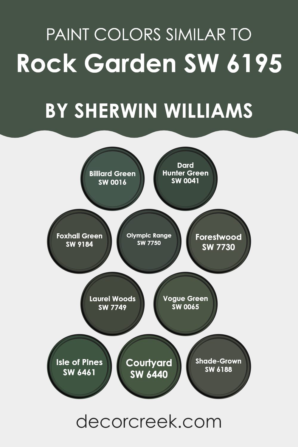
Colors Similar to Rock Garden SW 6195 by Sherwin Williams
Similar colors play an essential role in design by creating harmony and balance. When using shades similar to Rock Garden, such as SW 0016 Billiard Green and SW 0041 Dard Hunter Green, a sense of depth is achieved while maintaining a cohesive look.
These rich greens add a classic, elegant touch to any room, giving it a unified appearance without feeling too strong. SW 9184 Foxhall Green and SW 7750 Olympic Range bring subtle variations of earthiness that naturally blend with one another. These tones can provide a cozy backdrop, enhancing the warmth and charm of a room.
The darker SW 7730 Forestwood and SW 7749 Laurel Woods evoke the feeling of a deep forest, offering a connection to nature. These shades promote a comforting and calm setting that’s ideal for relaxing environments.
With SW 0065 Vogue Green and SW 6461 Isle of Pines, there is a celebration of the vibrant essence of nature, further enhancing the natural appeal of the room. Meanwhile, SW 6440 Courtyard and SW 6188 Shade-Grown express softer green notes that mellow the palette, providing calm without losing interest. Together, these similar colors create a balanced and inviting atmosphere, beautifully complementing each other while each retains its unique character.
You can see recommended paint colors below:
- SW 0016 Billiard Green
- SW 0041 Dard Hunter Green
- SW 9184 Foxhall Green
- SW 7750 Olympic Range
- SW 7730 Forestwood
- SW 7749 Laurel Woods
- SW 0065 Vogue Green
- SW 6461 Isle of Pines
- SW 6440 Courtyard
- SW 6188 Shade-Grown
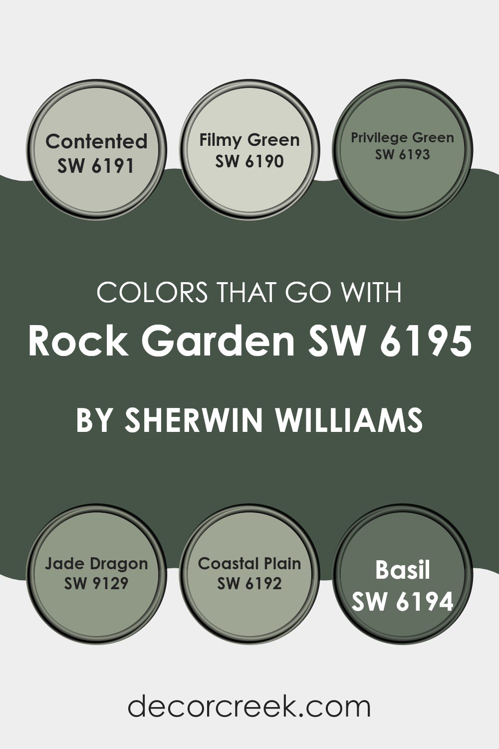
Colors that Go With Rock Garden SW 6195 by Sherwin Williams
Choosing colors that complement Rock Garden SW 6195 by Sherwin Williams is important because they create a harmonious and balanced environment. Rock Garden is a deep, earthy green that works well with various tones, allowing for flexible design choices. Colors like SW 6191 Contented and SW 6190 Filmy Green provide a soft and peaceful contrast.
Contented is a light, muted green that adds a gentle touch, while Filmy Green offers a soft, airy feel. Both of these colors can brighten a room, keeping it open and welcoming. When paired with Rock Garden, they can make rooms feel calm and inviting.
SW 6193 Privilege Green and SW 9129 Jade Dragon bring more depth to the color palette. Privilege Green, a slightly darker shade, complements Rock Garden perfectly, creating a dynamic yet grounded look. Jade Dragon introduces a rich, muted green that adds character without feeling too strong.
For a touch of warmth, SW 6192 Coastal Plain and SW 6194 Basil offer subtle variations. Coastal Plain is a mid-tone green that feels natural and warm, while Basil provides an earthy, slightly brownish hue.
Together with Rock Garden, these colors create a balanced and inviting room that feels connected to nature.
You can see recommended paint colors below:
- SW 6191 Contented
- SW 6190 Filmy Green
- SW 6193 Privilege Green
- SW 9129 Jade Dragon
- SW 6192 Coastal Plain
- SW 6194 Basil
How to Use Rock Garden SW 6195 by Sherwin Williams In Your Home?
Rock Garden SW 6195 by Sherwin Williams is a deep, rich green that can add warmth and comfort to any room in a home. This color is perfect for creating a cozy atmosphere in a living room or bedroom. Imagine pairing it with warm neutrals, like tans or soft whites, to soften its bold presence.
Rock Garden can also work well as an accent color. You might choose to paint a single wall in this shade to make a statement or use it on cabinetry for a pop of color in your kitchen or bathroom. Additionally, it pairs wonderfully with natural elements like wood and plants, enhancing an earthy or nature-inspired theme.
For those who like a more modern look, consider combining it with metallic accents or sleek black and white elements. Rock Garden’s versatility makes it a great color choice for various styles, from traditional to contemporary.
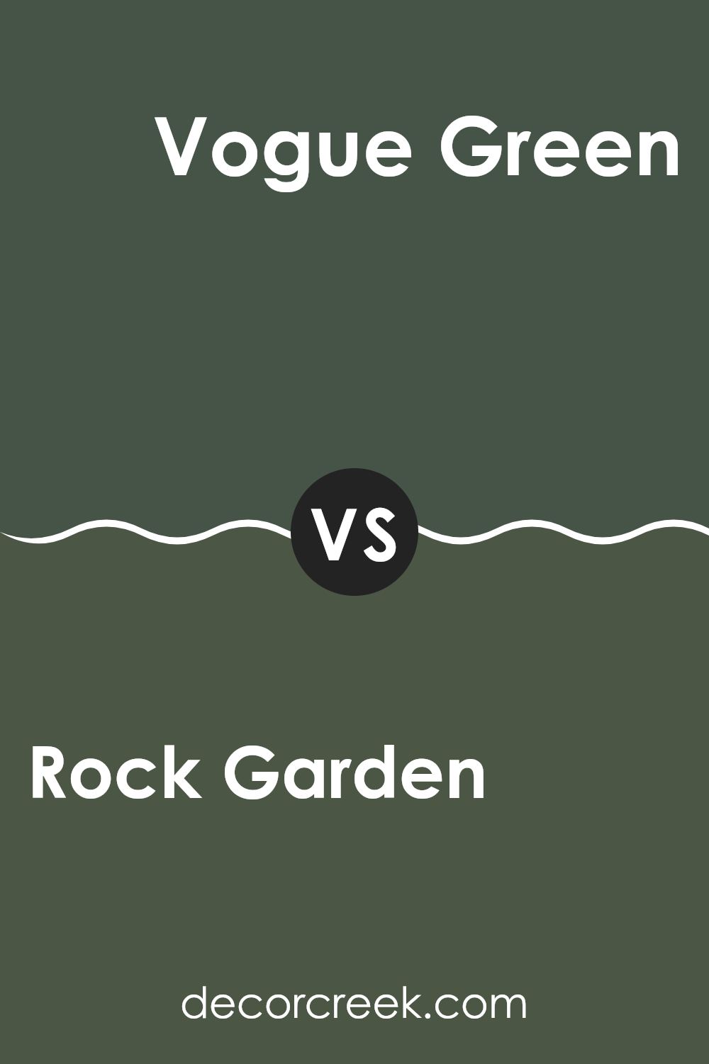
Rock Garden SW 6195 by Sherwin Williams vs Vogue Green SW 0065 by Sherwin Williams
Rock Garden SW 6195 and Vogue Green SW 0065 by Sherwin Williams are both green shades, but they offer different vibes. Rock Garden is a deep, muted green that feels natural and grounded. It’s calming and pairs well with earthy tones, making it great for cozy rooms.
On the other hand, Vogue Green is a richer, more saturated green with a touch of elegance. It has a bolder appearance compared to Rock Garden, making it suitable for rooms where you want a bit more drama and sophistication.
While both colors work well in various settings, Rock Garden is better for creating a peaceful and warm atmosphere, whereas Vogue Green stands out more and can create a chic, vibrant look. Whether you’re going for understated and calm or lively and stylish, these two colors have distinct personalities that can cater to different tastes and moods in interior design.
You can see recommended paint color below:
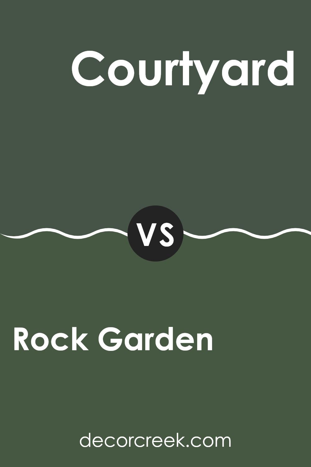
Rock Garden SW 6195 by Sherwin Williams vs Courtyard SW 6440 by Sherwin Williams
Rock Garden SW 6195 and Courtyard SW 6440, both by Sherwin Williams, offer two distinct green hues for your room. Rock Garden is a deep, earthy green with a hint of gray, providing a muted and calming effect. It’s flexible and fits well in both traditional and modern settings, offering a sense of stability.
In contrast, Courtyard SW 6440 is a brighter, more vibrant green. It has a lively and fresh appearance, making it a great choice for rooms where you want to create energy and a sense of liveliness. This color is ideal for areas that need a pop of color or a cheerful ambiance.
While Rock Garden’s subdued tone is perfect for creating a more grounded and cozy atmosphere, Courtyard’s brightness adds a sense of springtime and openness. Choosing between these two depends on whether you prefer a calming environment or a more invigorating one.
You can see recommended paint color below:
- SW 6440 Courtyard
Rock Garden SW 6195 by Sherwin Williams vs Dard Hunter Green SW 0041 by Sherwin Williams
Rock Garden SW 6195 by Sherwin Williams is a rich, earthy green with a touch of gray, giving it a natural, grounded feel. In contrast, Dard Hunter Green SW 0041 is a deeper, more intense shade of green. Rock Garden feels lighter and more understated, making it flexible for various rooms, from living areas to bedrooms. Its muted tone pairs well with both warm and cool colors, offering ease in design choices.
Dard Hunter Green, on the other hand, has a more classic look with its fuller, more saturated hue. It stands out as a strong choice for rooms where you want a bold statement, such as an accent wall or in a study.
While both colors are green, Rock Garden exudes a more subtle vibe, whereas Dard Hunter Green commands attention. Choosing between them depends on the mood you want to set in your room—whether calm and composed or bold and dramatic.
You can see recommended paint color below:
- SW 0041 Dard Hunter Green
Rock Garden SW 6195 by Sherwin Williams vs Shade-Grown SW 6188 by Sherwin Williams
Rock Garden SW 6195 and Shade-Grown SW 6188, both by Sherwin Williams, are beautiful green shades. Rock Garden is a medium to dark green with a slightly muted tone, making it a flexible choice. It feels natural and grounded, perfect for rooms that need a touch of the outdoors.
On the other hand, Shade-Grown is a bit darker, with a rich, deep green hue. It tends to feel more intense than Rock Garden and can add a cozy, intimate vibe to rooms. Shade-Grown works well as an accent color or in rooms where you want a darker, more enveloping feel.
Both colors pair nicely with neutrals, wood tones, and other earth-inspired hues. While Rock Garden is suited for a broader application and can brighten up a room without feeling too strong, Shade-Grown is ideal for those who prefer a slightly more dramatic, darker green.
You can see recommended paint color below:
Rock Garden SW 6195 by Sherwin Williams vs Billiard Green SW 0016 by Sherwin Williams
Rock Garden (SW 6195) and Billiard Green (SW 0016) by Sherwin Williams are two distinct shades of green with unique characteristics. Rock Garden is a deep, muted green that exudes a natural and earthy feel. It works well in rooms where a calm and grounded atmosphere is desired. This color can create a cozy and warm setting, making it a good choice for living rooms or dens.
Billiard Green, on the other hand, is a richer and more vibrant green. It has a classic feel, reminiscent of the traditional color seen on billiard tables. This color stands out more and can add an energizing pop to a room. It is ideal for rooms like game rooms or offices where a lively atmosphere is preferred.
Both colors can complement neutral tones well, but their intensity and mood are quite different, offering options for both soothing and dynamic environments.
You can see recommended paint color below:
Rock Garden SW 6195 by Sherwin Williams vs Isle of Pines SW 6461 by Sherwin Williams
Rock Garden SW 6195 and Isle of Pines SW 6461 are two beautiful shades by Sherwin Williams. Rock Garden is a deep, rich green with an earthy tone, providing a sense of grounding and balance. It’s perfect for creating a cozy and intimate room, like a study or bedroom.
On the other hand, Isle of Pines is also a green, but lighter and cooler compared to Rock Garden. It has a slightly more refreshing vibe, making it suitable for rooms that need a touch of brightness, such as bathrooms or living rooms.
These two greens can complement each other in a room, with Rock Garden adding depth and Isle of Pines bringing an airy feel. While both are greens, Rock Garden leans toward a more muted, natural look, while Isle of Pines offers a hint of energy and freshness.
You can see recommended paint color below:
Rock Garden SW 6195 by Sherwin Williams vs Foxhall Green SW 9184 by Sherwin Williams
Rock Garden SW 6195 and Foxhall Green SW 9184 by Sherwin Williams are two distinct shades of green. Rock Garden is a deep, earthy green with hints of gray. It’s a strong color that might remind you of a forest or a mossy garden. It’s flexible and works well as a main color in rooms where you want a natural and grounded feel.
On the other hand, Foxhall Green is slightly darker and has a richer tone. It carries more of a traditional feel, with a touch of refinement. While it’s also an earthy green, Foxhall Green leans more towards a classic and lasting style.
Both colors are cozy and bring warmth, but Rock Garden tends to be a bit more neutral, making it easier to pair with a variety of accent colors. Foxhall Green might be better suited for creating a dramatic or vintage look in a room.
You can see recommended paint color below:
Rock Garden SW 6195 by Sherwin Williams vs Olympic Range SW 7750 by Sherwin Williams
Rock Garden (SW 6195) by Sherwin Williams is a rich, earthy green that brings to mind the lushness of nature. It’s a deep hue that can create a cozy and comforting atmosphere in any room. This color works great in living rooms where you want to feel connected to the outdoors or in a home office to bring in a sense of calm and focus.
On the other hand, Olympic Range (SW 7750) is a soft, warm gray with beige undertones. It’s a flexible color that can act as a neutral backdrop in a variety of rooms. This color is perfect for rooms where you want to keep things light and airy. It pairs well with both bold and muted accents, making it easy to use in different styles.
While both colors are earth-inspired, Rock Garden is more vibrant, and Olympic Range is more understated. Together, they can create a balanced and harmonious look in your room.
You can see recommended paint color below:
- SW 7750 Olympic Range
Rock Garden SW 6195 by Sherwin Williams vs Laurel Woods SW 7749 by Sherwin Williams
Rock Garden SW 6195 and Laurel Woods SW 7749 by Sherwin Williams are both rich, earthy greens that add a natural feel to rooms. Rock Garden is a deep green with an undertone that leans slightly bluish, giving it a cool vibe.
It’s great for creating a calming and nature-like atmosphere in a room. On the other hand, Laurel Woods is also a dark green, but it has warmer undertones, which make it feel a bit cozier and more inviting.
When used on walls, Rock Garden may appear more formal due to its coolness, while Laurel Woods might feel warmer and more comforting. Rock Garden pairs well with neutrals like white or gray, enhancing its coolness. Laurel Woods works beautifully with warm tones, like beige or creamy whites, highlighting its warmth. Both colors are perfect for those who love a grounded, natural look, but the choice between the two depends on whether you prefer a cooler or warmer green.
You can see recommended paint color below:
Rock Garden SW 6195 by Sherwin Williams vs Forestwood SW 7730 by Sherwin Williams
Rock Garden SW 6195 and Forestwood SW 7730 are both rich, green hues by Sherwin Williams, but they have distinct personalities. Rock Garden is a deep green that carries a hint of blue, giving it a more cool and calm feeling.
It’s a flexible choice that can add a touch of nature to any room without feeling too bold. On the other hand, Forestwood is slightly warmer with its subtle undertones leaning more towards brown.
This makes it feel a bit cozier and earthy, akin to the warmth of a forest. While Rock Garden can act as a bold backdrop that pairs well with lighter or brighter accents, Forestwood can serve as a grounding element that complements rustic or natural decor. Both colors bring the essence of nature indoors, but their slight differences in tone and warmth offer varied ways to create a welcoming and organic atmosphere.
You can see recommended paint color below:
When I look at SW 6195 Rock Garden by Sherwin Williams, I see a paint color that is like a comforting hug from nature. It’s a deep green, almost like a forest, and it feels calm and strong at the same time. Imagine walking through a garden filled with rocks and tall trees; that’s how this color makes me feel.
This color can make a room feel warm and inviting. It’s perfect if you want a place to feel cozy, like a little nest. You don’t have to worry about it being too bright or too dull. It’s just right. It also works well with other colors. You can put it next to lighter colors to make it stand out, or pair it with dark colors for a rich look. It’s like wearing your favorite sweater; it just feels good.
From what I understand, this color can be used anywhere in a house. Whether it’s on the walls of a bedroom, a kitchen, or a family room, it brings a feeling of being close to nature. If you want your home to feel like a calm forest where you can relax and feel at ease, this color can help. It’s like bringing the beauty of the outdoors inside, making everything feel more peaceful.
Ever wished paint sampling was as easy as sticking a sticker? Guess what? Now it is! Discover Samplize's unique Peel & Stick samples.
Get paint samples

