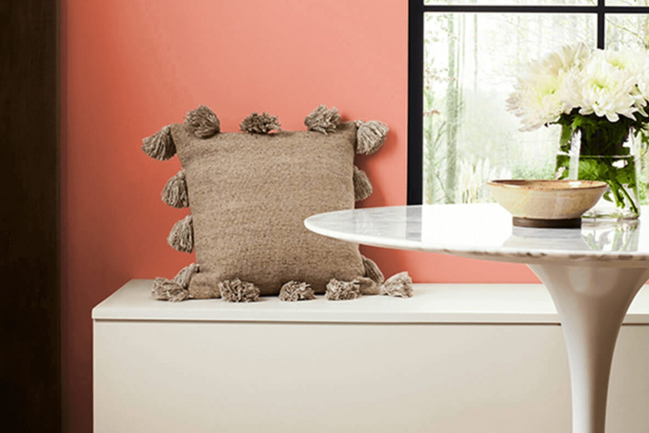
If you’re looking for a color that brightens up a room and brings a cheerful vibe, you might want to consider SW 6612 Ravishing Coral from Sherwin Williams. I recently used this shade in my own home and was thrilled with the warm, inviting atmosphere it created. This vibrant coral has a lively presence that blends pink and orange hues, making it a perfect choice for anyone looking to add energy and warmth to their living room.
Choosing the right paint color can sometimes feel like a tricky decision, but Ravishing Coral strikes a delightful balance between being lively without feeling too intense in a room. It can work beautifully in different settings, whether you’re painting an accent wall in your living room or giving a bedroom a fresh, joyful look.
I’ve noticed that this color pairs well with soft neutrals as well as bold furnishings, allowing for flexible design choices.
In this discussion, I’ll share more about how Ravishing Coral has changed my room and offer tips on how you might use it in your own home.
What Color Is Ravishing Coral SW 6612 by Sherwin Williams?
Ravishing Coral by Sherwin Williams is a vibrant, warm hue that brings a lively touch to any room. This energetic color has a perfect balance of pink and orange, making it flexible and inviting. It’s not too intense, yet has enough brightness to make a statement.
This shade works well in interior styles that highlight cheerful, cozy aesthetics such as bohemian, modern farmhouse, and contemporary settings. In a bohemian room, it pairs well with textured fabrics, woven wall hangings, and wood accents, creating a laid-back, artistic vibe.
In modern farmhouse and contemporary rooms, it contrasts beautifully with soft neutrals and rich textures like knitted throws or plush cushions, adding a pop of color that draws the eye and warms the room.
For materials, Ravishing Coral pairs well with natural elements like light woods, which help ground its brightness, and with metals such as brushed bronze or copper, enhancing its warmth. Textures like linen, cotton, or velvet also complement this color beautifully, adding a touch of comfort and softness to the interior. Overall, Ravishing Coral is perfect for anyone looking to add a cheerful splash of color to their home with a soft yet playful character.
decorcreek.com
Is Ravishing Coral SW 6612 by Sherwin Williams Warm or Cool color?
Ravishing Coral by Sherwin Williams is a vibrant and cheerful color that brings a warm, inviting vibe to any room in the home. It’s a shade of pink with a hint of orange that makes it pop against neutral tones, like whites or grays.
This bold color can make a statement wall really stand out, especially in a bedroom or living room. It also works beautifully in smaller rooms, like a bathroom or an entryway, where it adds a cheerful splash.
Using Ravishing Coral in home decor offers a fresh and friendly feel. It pairs well with light woods and natural textiles, creating a balanced and cozy environment. Additionally, it works well with soft blues and mint greens for a playful, yet harmonious look. Whether you aim to create a focal point in your living room or just add some personality to your surroundings, this color is a great choice.
Undertones of Ravishing Coral SW 6612 by Sherwin Williams
Ravishing Coral is a vibrant paint color that brings a lively touch to interior rooms. Understanding the undertones of this color can greatly influence how it appears once on the walls, as it subtly changes under different lighting conditions.
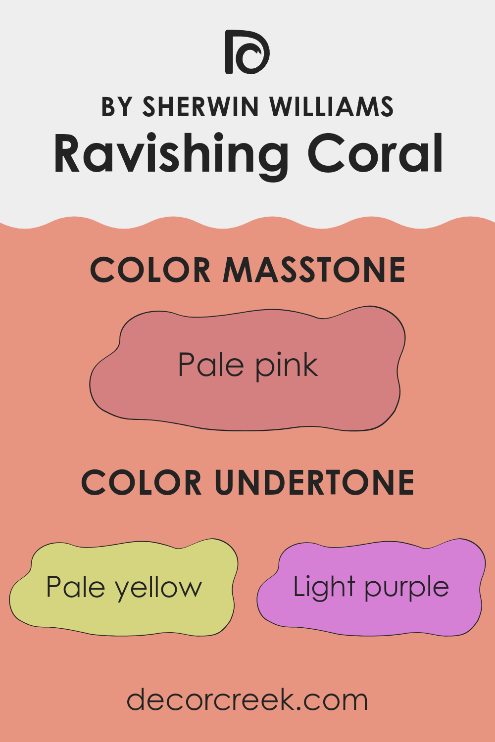
Undertones are the hint of color that is present beneath the main color you see. For Ravishing Coral, these undertones range across a spectrum that includes pale yellow, light purple, orange, and more. Each undertone plays a key role in how the paint interacts with light and affects the mood of a room.
Pale yellow and orange undertones, for instance, warm up the room, making it feel more welcoming and cheerful. These warm undertones can make a room feel cozy, especially in natural light. Light purple and lilac provide a soft contrast, adding depth and preventing the color from feeling too intense. This mix can make the color more flexible for different room settings and decor styles.
Moreover, grey and light gray undertones help in softening the brightness of the coral, making it more flexible and easier to pair with modern interior elements without feeling too strong. Pink and fuchsia undertones add a touch of playfulness and are especially effective in rooms meant for creativity and fun.
When Ravishing Coral is used on interior walls, these undertones help create a dynamic environment that can shift in mood from morning to night and in different weather conditions. This means the room will not only be filled with a beautiful color but also a changing feel that adapts throughout the day. Understanding and using these undertones can help in achieving the desired emotion and function in a room, whether it’s a living room, bathroom, or an office room.
decorcreek.com
What is the Masstone of the Ravishing Coral SW 6612 by Sherwin Williams?
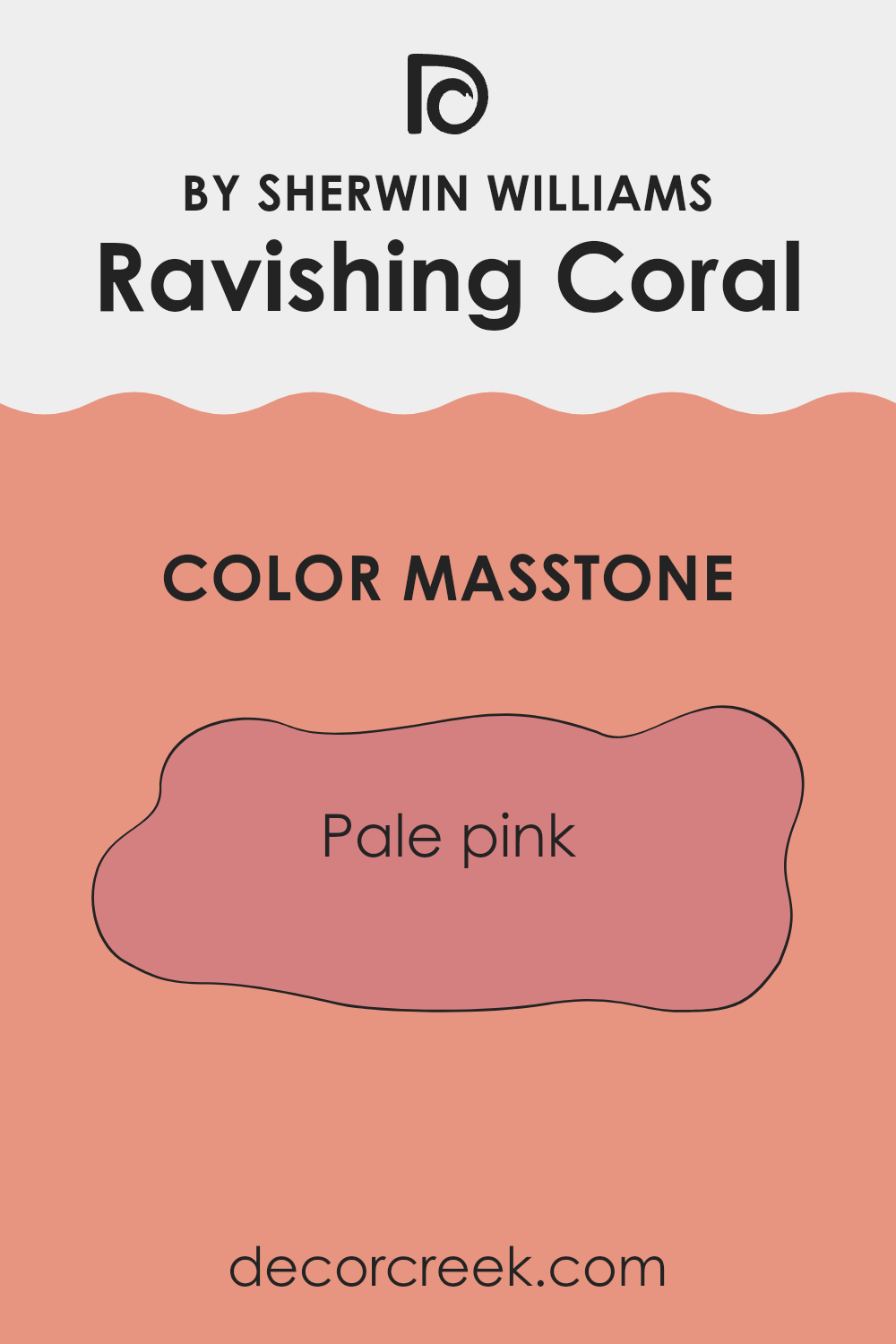
Ravishing Coral, with its masstone of pale pink (#D58080), creates a gentle and inviting feel in any home. This color has a soft, subtle warmth that makes rooms feel cozy and welcoming.
Its delicate pink hue works well in rooms that aim for a calm, cheerful atmosphere, like living rooms or bedrooms where a relaxed vibe is appreciated. The understated nature of this pale pink also means it can blend easily with a variety of decor styles, from modern to traditional.
In addition, because it’s not a very loud or bold color, it doesn’t feel too strong. Instead, it offers just enough color to brighten a room without taking over. This can be especially useful in smaller rooms, where darker shades might make the room feel cramped. Overall, Ravishing Coral is flexible and can add a touch of gentle warmth to any living room, making it a great choice for those looking to add a soft splash of color to their home.
decorcreek.com
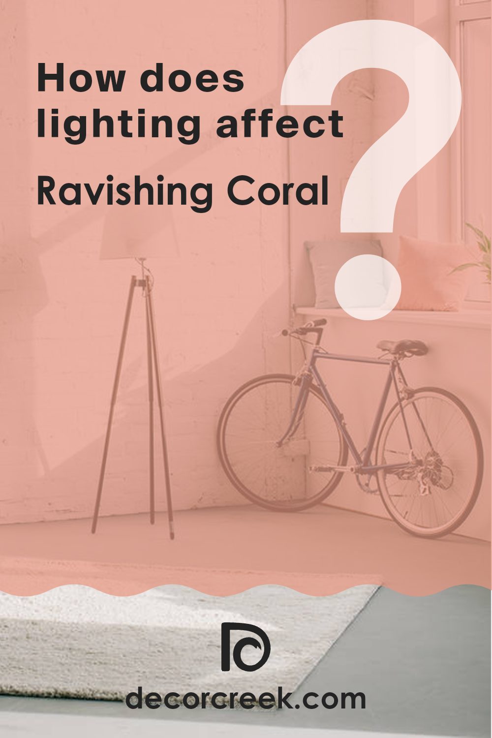
How Does Lighting Affect Ravishing Coral SW 6612 by Sherwin Williams?
Lighting plays a crucial role in how we perceive colors. The same color can look different depending on the type of light it’s exposed to. For example, the color Ravishing Coral by Sherwin Williams can appear slightly different under various lighting conditions. This change happens because different light sources emit varying wavelengths, influencing how a color is seen by the human eye.
In artificial light, such as LED or fluorescent bulbs, Ravishing Coral might appear more intense and vibrant. Artificial lighting can highlight the warm undertones of the color, making the room feel cozy and inviting. However, the specific type of artificial light can affect its appearance; warm white bulbs may bring out its peachy tones, while cool white bulbs could make it look slightly paler.
Natural light shows the truest form of Ravishing Coral, but the direction of the light still impacts its appearance. In rooms facing north, which receive less direct sunlight, Ravishing Coral may look softer and more muted. This could give the room a calm and gentle feel, as the cooler, indirect light tones down the color’s intensity.
South-facing rooms, filled with abundant natural light throughout the day, will show Ravishing Coral at its brightest and most vibrant. This direction highlights the color’s lively nature, making the room feel energetic and cheerful.
In east-facing rooms, the morning light can make Ravishing Coral look very warm and welcoming. As the light changes throughout the day, the color might lose some of its warmth and appear gentler.
West-facing rooms receive strong evening light, which can make Ravishing Coral look bold and lively in the afternoons and evenings. As the sun sets, the color could take on a rich, glowing quality.
Understanding how lighting affects colors like Ravishing Coral can help in making informed decisions about paint choices and room orientation to achieve the desired mood in a room.
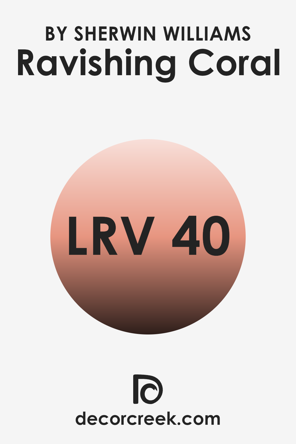
What is the LRV of Ravishing Coral SW 6612 by Sherwin Williams?
LRV stands for Light Reflectance Value, which is a measure used to describe the amount of visible and usable light that a color reflects or absorbs. It is scaled from zero to hundreds, indicating how light or dark the paint color will appear once applied to a wall.
Higher numbers mean the color reflects more light, and is therefore lighter, while lower numbers mean the color absorbs more light, making it appear darker. Choosing the right LRV can make a room feel larger and more open if the value is high, or more cozy and enclosed with a lower value.
For the color Ravishing Coral with an LRV of 40.09, it falls in the middle of the scale. This means it neither reflects a lot of light nor does it absorb too much. In practical terms, this particular LRV makes Ravishing Coral a flexible color that can work well in rooms that need a bit of warmth without feeling too bright.
It’s effective in adding a soft yet noticeable pop of color that can enhance the mood of the room, especially in rooms that have good lighting, whether it’s natural or artificial.
decorcreek.com
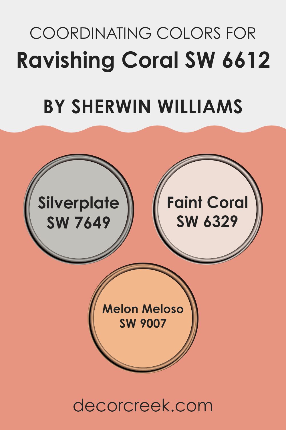
Coordinating Colors of Ravishing Coral SW 6612 by Sherwin Williams
Coordinating colors are shades that work well with a main color to create a visually pleasing palette. For example, Ravishing Coral by Sherwin Williams pairs beautifully with colors like Silverplate, Faint Coral, and Melon Meloso.
These coordinating colors have unique qualities that complement the vibrant hue of Ravishing Coral, improving the overall look of a room. By using these coordinating colors, you can create a cohesive look that ties different design elements together smoothly.
Silverplate is a subtle gray that acts as a neutral backdrop, allowing Ravishing Coral to stand out without feeling too strong. It’s perfect for those who want a balance between boldness and calm in their decor.
Faint Coral is a lighter version of Ravishing Coral, which provides a gentle contrast and helps in creating a soft, layered look. Melon Meloso is a peachy tone that adds a warm, sunny vibe to the room. It nicely picks up the undertones in Ravishing Coral, making the room feel inviting and cozy. Together, these colors work in harmony to enrich the environment and provide a stylish palette.
You can see recommended paint colors below:
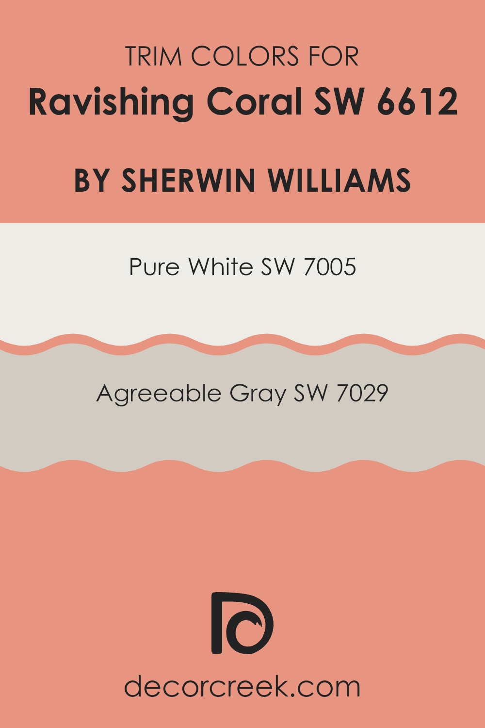
What are the Trim colors of Ravishing Coral SW 6612 by Sherwin Williams?
Trim colors play an important role in improving the overall look of a main color like Ravishing Coral by Sherwin Williams. When selecting a color such as this vibrant shade, pairing it with the right trim colors, like Pure White and Agreeable Gray from Sherwin Williams, can help define and bring balance to your room.
Trim colors frame the main wall color, adding contrast and making the bold hues stand out more clearly. They also help create a clean, finished look around windows, doors, and baseboards, which gives the entire room a more polished appearance.
Pure White SW 7005 is a bright and crisp white that offers a strong contrast to the lively and warm tones of Ravishing Coral. It helps highlight the coral’s intensity and makes the room feel fresh and lively. On the other hand, Agreeable Gray SW 7029 provides a softer, calming contrast. It’s a gentle, neutral gray that works well to complement more vivid colors without taking attention away, keeping the room balanced and inviting.
You can see recommended paint colors below:
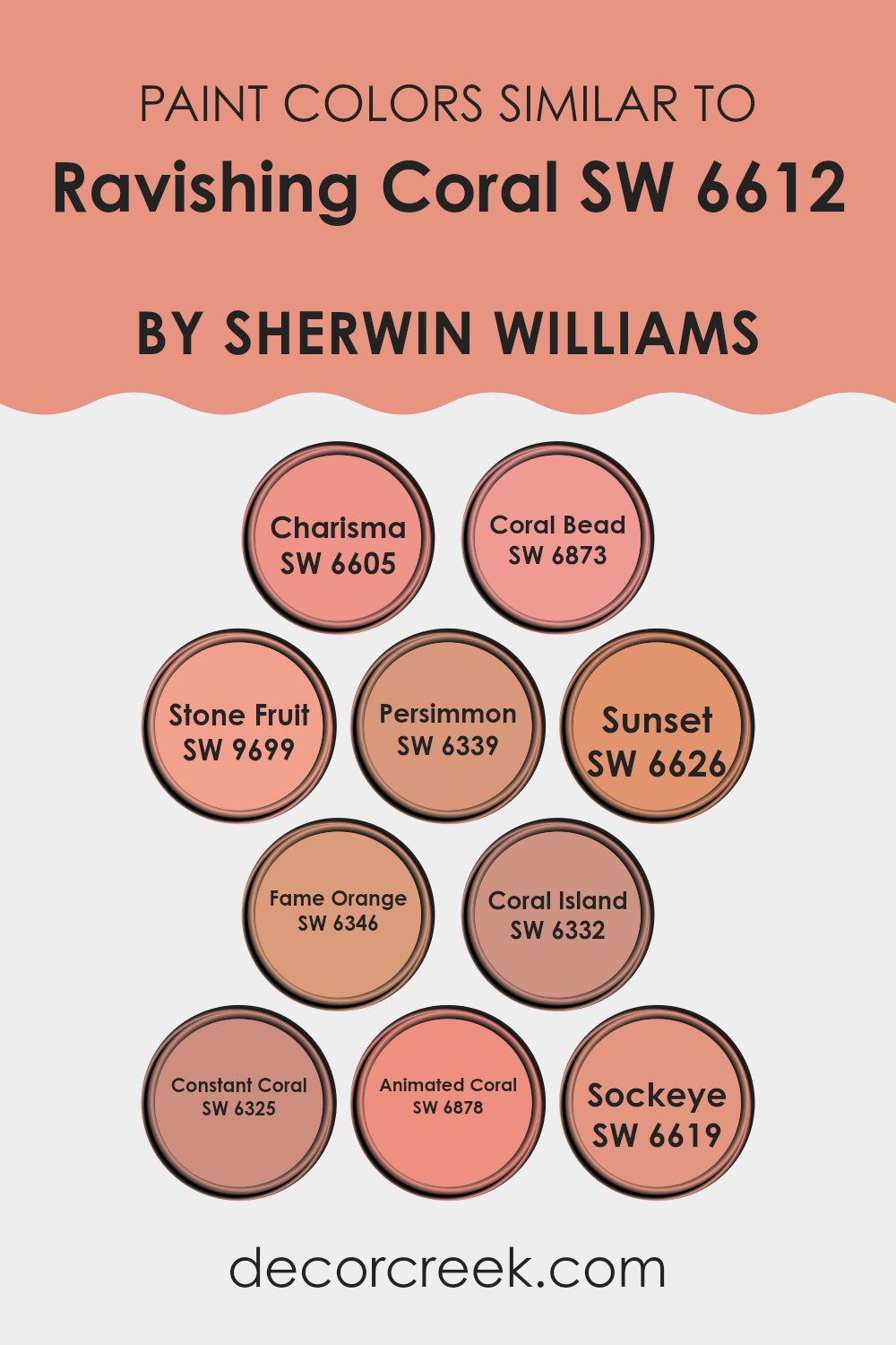
Colors Similar to Ravishing Coral SW 6612 by Sherwin Williams
Similar colors are important in design because they create a cohesive and harmonious visual look. Colors that share a hue or intensity can tie different elements together, making a room feel unified and pleasing to the eye.
For instance, using shades like Charisma and Coral Bead, which are related to Ravishing Coral, can enhance the warmth and welcoming feel of a room without feeling too strong from contrast. These shades work well together because they share a base color but vary in saturation and brightness, offering gentle differences that are appealing yet not harsh.
In this family of colors, Charisma presents a soft, almost gentle pinkish-coral hue that gives warmth and friendliness, making it perfect for lively yet relaxed rooms. Coral Bead adds a bit more brightness, bringing an energetic yet refined touch to interiors.
Stone Fruit offers a deeper, richer tone that resembles a mature coral, giving a cozy, comforting feel. Persimmon and Sunset bring a bold flair; their intense colors can be used to highlight areas or as striking accents. Fame Orange and Coral Island slightly increase the brightness, adding to a cheerful, inviting atmosphere.
Constant Coral leans more toward a calm, steady presence, ideal for rooms needing a touch of softness without high drama. Animated Coral provides a vivid pop of color, great for bringing life into more neutral designs.
Lastly, Sockeye, with its deeper and slightly more reddish tone, offers a unique twist on the main coral theme, perfect for creating focal points or adding depth to an overall design scheme. These similar colors, as variations of coral, work well together to create visual unity and can be easily mixed to suit different moods and settings.
You can see recommended paint colors below:
- SW 6605 Charisma
- SW 6873 Coral Bead
- SW 9699 Stone Fruit
- SW 6339 Persimmon
- SW 6626 Sunset
- SW 6346 Fame Orange
- SW 6332 Coral Island
- SW 6325 Constant Coral
- SW 6878 Animated Coral
- SW 6619 Sockeye
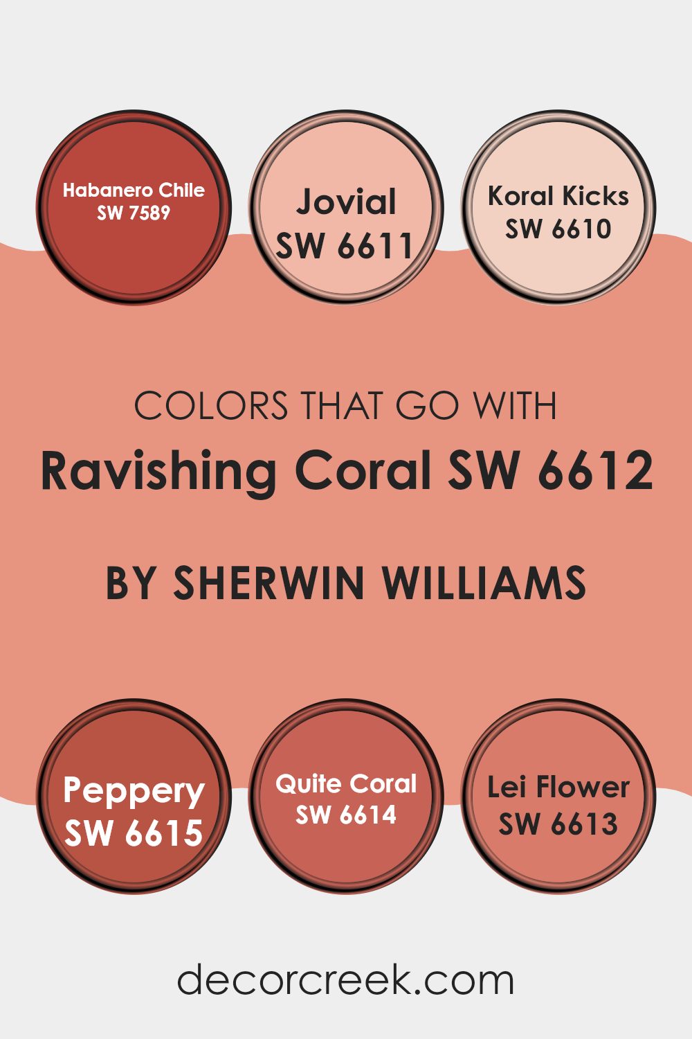
Colors that Go With Ravishing Coral SW 6612 by Sherwin Williams
Choosing the right colors to pair with Ravishing Coral SW 6612 by Sherwin Williams is important because the complementary colors can improve the overall look and feel of a room. Colors like Habanero Chile, Jovial, Koral Kicks, Peppery, Quite Coral, and Lei Flower each have unique qualities that can influence the mood and style of a room. When combined well, they create a harmonious and appealing look.
Habanero Chile is a fiery, vibrant red that adds a pop of energy and warmth to rooms, making it exciting to use in decor elements. By contrast, Jovial is a playful pink shade that brings a cheerful and light-hearted touch to rooms, softening the boldness of Ravishing Coral.
Koral Kicks is a softer version of coral, providing a subtle yet fresh look that works well in relaxed settings. Peppery is a rich, deep orange that offers depth and intensity, ideal for adding a striking contrast in a room. Quite Coral is a muted coral tone, great for those seeking a less strong color that still keeps warmth and coziness. Lastly, Lei Flower has a tropical vibe with its pinkish-purple hue, perfect for adding a fun and exotic flair into interiors. Together, these colors work well to support the look of Ravishing Coral, offering flexible options for different tastes and interior designs.
You can see recommended paint colors below:
- SW 7589 Habanero Chile
- SW 6611 Jovial
- SW 6610 Koral Kicks
- SW 6615 Peppery
- SW 6614 Quite Coral
- SW 6613 Lei Flower
How to Use Ravishing Coral SW 6612 by Sherwin Williams In Your Home?
Ravishing Coral by Sherwin Williams is a vibrant, warm shade that adds a lively splash of color to any room. Perfect for creating a cheerful and inviting atmosphere, this hue works well in living areas and kitchens where you want a pop of brightness.
You can paint all the walls in this shade for a bold effect, or use it on just one wall for a fun accent. It also pairs nicely with neutral colors like white, gray, or beige, allowing those elements to balance out its intensity.
Additionally, Ravishing Coral is a great choice for smaller items like chairs or picture frames, giving your room a quick refresh without feeling too strong. If you’re looking to add a sense of freshness and energy to your home, this color can do the job beautifully.
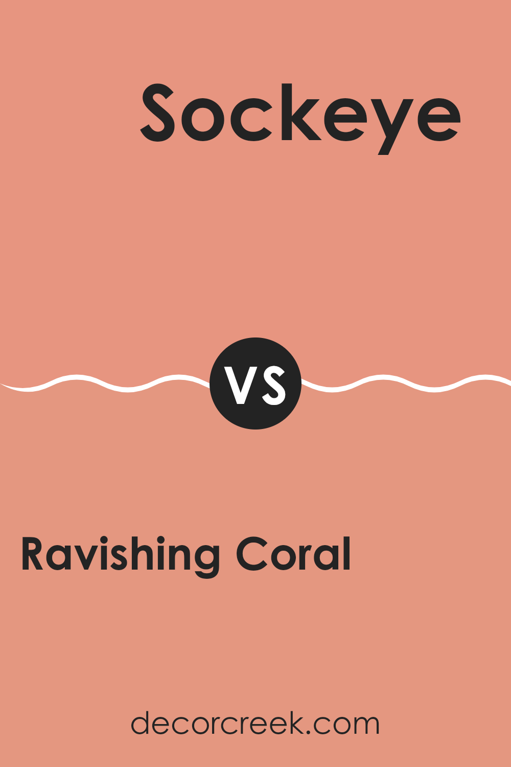
Ravishing Coral SW 6612 by Sherwin Williams vs Sockeye SW 6619 by Sherwin Williams
Ravishing Coral and Sockeye are both vibrant paint colors by Sherwin Williams, but they differ slightly in tone and mood. Ravishing Coral has a soft, warm pink hue that feels light and refreshing.
It’s perfect for adding a gentle pop of color to a room without feeling too strong. On the other hand, Sockeye is a deeper, more intense shade of coral with a richer, almost red undertone. This color makes a bold statement and can add a lot of energy and warmth to a room.
While both colors are in the same family, Ravishing Coral offers a softer approach and Sockeye stands out more strongly, making them suitable for different purposes or moods in your decorating scheme.
You can see recommended paint color below:
- SW 6619 Sockeye
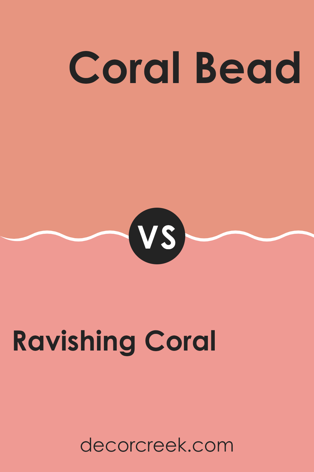
Ravishing Coral SW 6612 by Sherwin Williams vs Coral Bead SW 6873 by Sherwin Williams
Ravishing Coral and Coral Bead are both vibrant shades by Sherwin Williams, but they have different tones that set them apart. Ravishing Coral has a softer, pinkish tone, making it a great choice for creating a warm and inviting room.
It’s gentle enough to be flexible, yet still adds a cheerful splash of color. On the other hand, Coral Bead is brighter and leans more towards an orange hue. This makes it bolder and more striking, ideal for rooms where you want to make a strong visual impact or add a burst of energy.
Both colors reflect light well and can brighten up a room, but the choice between them depends on the mood you want to set and how much you want the color to stand out in your decor.
You can see recommended paint color below:
- SW 6873 Coral Bead
Ravishing Coral SW 6612 by Sherwin Williams vs Constant Coral SW 6325 by Sherwin Williams
Ravishing Coral and Constant Coral by Sherwin Williams are both vibrant, warm colors that share a coral base but offer distinct tones. Ravishing Coral is a lively, bright shade that leans towards a pinkish hue, making it stand out more on the walls.
It’s a great choice if you’re aiming to add a cheerful and energetic feel to a room. On the other hand, Constant Coral has a softer, more muted look that borders on peach. It’s gentler than Ravishing Coral, providing a cozy and inviting atmosphere without being too bold.
This makes Constant Coral well suited for rooms where a calm but warm feel is desired. Both colors brighten a room in their own ways, with Ravishing Coral more striking and Constant Coral more understated.
You can see recommended paint color below:
- SW 6325 Constant Coral
Ravishing Coral SW 6612 by Sherwin Williams vs Fame Orange SW 6346 by Sherwin Williams
Ravishing Coral is a vibrant, rich hue with a lively pink-orange tone that gives warmth and a cheerful vibe, making it great for rooms meant to be inviting and energetic. On the other hand, Fame Orange is a bold, bright orange that leans more towards a classic, pure orange color.
This shade is more intense and can add a striking splash of color to a room, perfect when you want to make a strong statement. Both colors are dynamic and can easily lift the mood of a room, but Ravishing Coral has a softer, more gentle feel due to its blend with pink, while Fame Orange stands out for its vivid and pure orange tone.
Choosing between them depends on whether you prefer a color that’s softer and more blended or one that is clear and bold.
You can see recommended paint color below:
- SW 6346 Fame Orange
Ravishing Coral SW 6612 by Sherwin Williams vs Persimmon SW 6339 by Sherwin Williams
Ravishing Coral and Persimmon, both by Sherwin Williams, offer vibrant and warm hues, though they differ in their specific shades and intensity. Ravishing Coral is a lighter, more muted shade that leans toward pink.
This color brings a soft cheeriness to rooms, making it a great choice for a room where you want a gentle yet lively atmosphere. On the other hand, Persimmon is a deeper, more striking orange. This bold color provides a strong presence and is ideal for adding accents in areas where you want to draw attention or bring in some energy.
While Ravishing Coral is more understated and gentle, Persimmon stands out with its rich, vivid tone. Both colors work well for adding warmth to a room but suit different aesthetic preferences and uses.
You can see recommended paint color below:
- SW 6339 Persimmon
Ravishing Coral SW 6612 by Sherwin Williams vs Coral Island SW 6332 by Sherwin Williams
Ravishing Coral and Coral Island are both vibrant colors offered by Sherwin Williams, but they have distinct tones that set them apart. Ravishing Coral is a brighter, more vivid shade. It leans more towards a pinkish-orange, giving off a fresh and lively feel. This makes it excellent for rooms where you want to add a punch of energy and cheerfulness, like a playroom or a creative room.
On the other hand, Coral Island is a softer, more subdued coral. It has a gentle touch of peach that makes it warmer and less intense compared to Ravishing Coral. This color is great for creating a cozy and welcoming atmosphere, ideal for living rooms or bedrooms where a calming effect is desired.
Both colors are great choices if you’re looking to bring coral into your room, but your preference for brightness and the mood you want to set will help you decide between the vivid Ravishing Coral and the softer Coral Island.
You can see recommended paint color below:
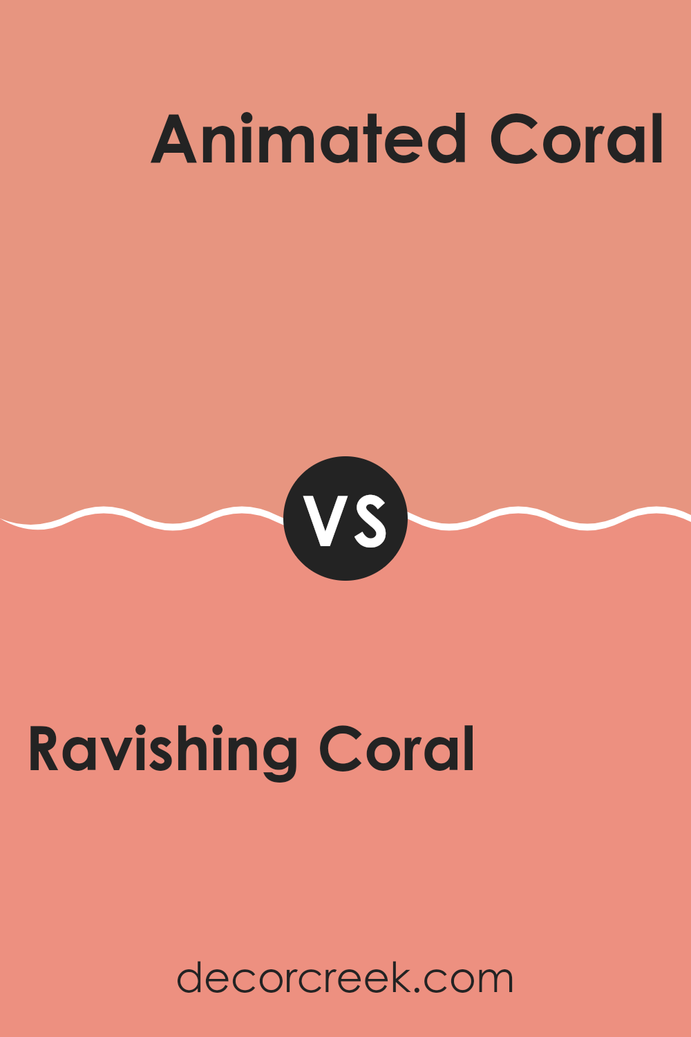
Ravishing Coral SW 6612 by Sherwin Williams vs Animated Coral SW 6878 by Sherwin Williams
Main color, Ravishing Coral, is a soft and inviting shade that gives warmth. It has a peachy-pink hue that could be perfect for creating a cozy, welcoming atmosphere in any home. It’s gentle enough to be used in large rooms without feeling too strong.
The second color, Animated Coral, is more vibrant and punchier. This coral hue leans towards a brighter, more energetic look. It stands out and makes a statement, ideal for accent walls or decor items that you want to draw attention to.
Both colors share a base in the coral family but serve different purposes based on their intensity and brightness. Ravishing Coral is best for those looking for a soft, warm feel, while Animated Coral is better suited for bolder, more lively uses. Whether you choose one over the other depends on the mood and energy you want to bring into your room.
You can see recommended paint color below:
- SW 6878 Animated Coral
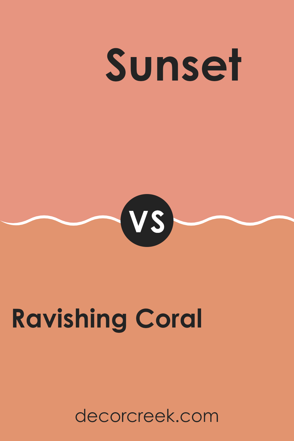
Ravishing Coral SW 6612 by Sherwin Williams vs Sunset SW 6626 by Sherwin Williams
Ravishing Coral and Sunset by Sherwin Williams are two warm and vibrant shades that could brighten any room. Ravishing Coral is a softer, more muted coral color. It gives a gentle and welcoming vibe that’s perfect for creating a cozy, friendly atmosphere in a room. It’s a flexible color that can match different decor styles, from modern to traditional.
On the other hand, Sunset is a bolder, more striking color with a deeper red-orange tone. This color can make a strong statement and is ideal for an accent wall or a room where you want to add a splash of energy. It stands out more clearly than Ravishing Coral and can add a lot of personality and warmth to a room.
While both colors share a warm base, Sunset leans towards a more intense and vibrant look, whereas Ravishing Coral offers a softer option for those who prefer a less vivid style. Both can strongly improve a room but will do so in noticeably different ways.
You can see recommended paint color below:
- SW 6626 Sunset
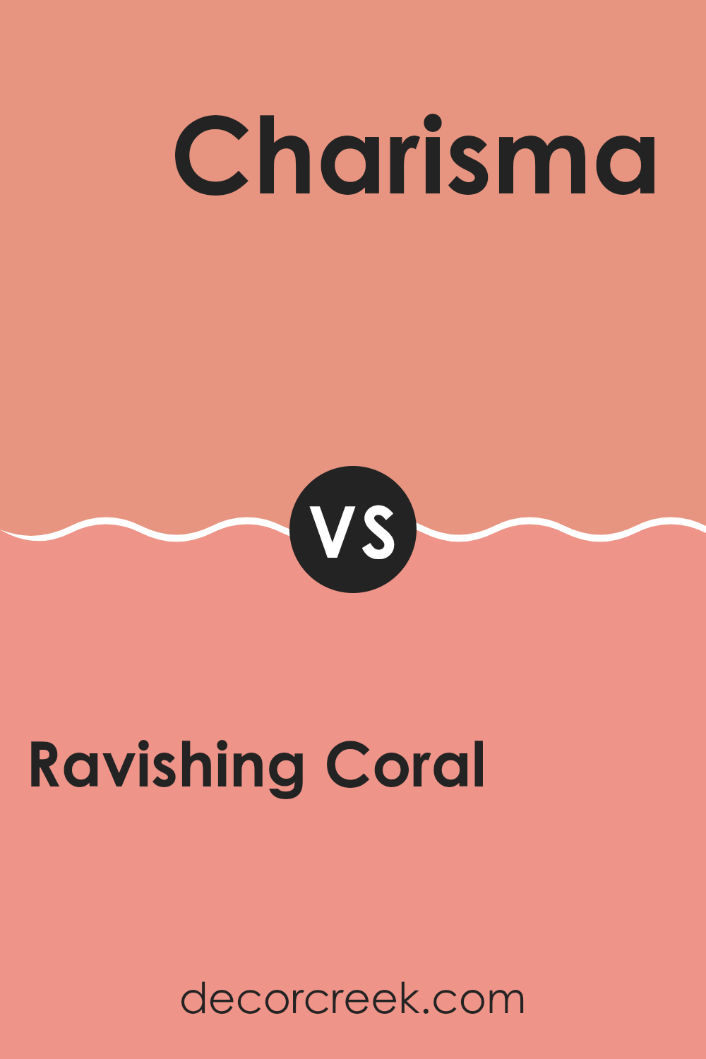
Ravishing Coral SW 6612 by Sherwin Williams vs Charisma SW 6605 by Sherwin Williams
Ravishing Coral is a vibrant and cheerful color with a warm tone that makes rooms feel welcoming. It has an energetic vibe that is great for lively, social areas of a home such as living rooms or dining rooms. Its pinkish-orange hue is bright without feeling too strong, giving just the right splash of color to liven up a room.
Charisma, in comparison, leans more towards a pink shade that also brings warmth to a room. This color is softer than Ravishing Coral, offering a gentle yet inviting atmosphere. It’s a great choice for someone looking to add a touch of warmth without going for the bolder presence that Ravishing Coral provides.
Overall, both colors can warm up a room but in different levels and vibes: Ravishing Coral with more energy and brightness, and Charisma with a softer, more muted feel. Both are perfect for creating friendly and inviting rooms, but your choice would depend on how strong a statement you want to make with the color.
You can see recommended paint color below:
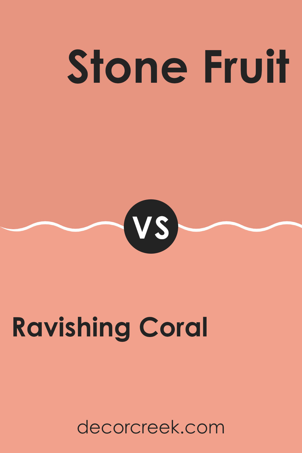
Ravishing Coral SW 6612 by Sherwin Williams vs Stone Fruit SW 9699 by Sherwin Williams
Ravishing Coral and Stone Fruit are two unique paint colors by Sherwin Williams, each offering their distinct vibe for decorating rooms. Ravishing Coral is a bright, playful pink tone with a lot of life and energy. This shade is perfect for lively areas and can brighten up a room, adding a spark of cheerfulness.
On the other hand, Stone Fruit is a warmer, muted peach shade that offers a soft and welcoming feel. It’s less intense than Ravishing Coral, making it ideal for creating a cozy and friendly atmosphere in places like living rooms or bedrooms.
When comparing these two, Ravishing Coral stands out more and is suited for someone looking to make a bold statement. Stone Fruit, with its softer tone, is best for those who prefer something less strong but still want to add a touch of warmth to their décor. Thus, your choice depends on the mood and style you want to create in your room.
You can see recommended paint color below:
After looking at SW 6612 Ravishing Coral by Sherwin Williams, I can say it’s a bright and cheerful color that can make any room in your house feel warm and welcoming. This shade of coral has a lovely blend of pink and orange, which can add a fun pop of color to walls without being too loud.
When thinking about styling a room with Ravishing Coral, you can pair it with soft whites or light grays for a gentle look, or mix it with dark greens and blues for a bit of drama. This makes it a great choice whether you want to paint an entire room or just one wall for a splash of brightness.
Ravishing Coral also works well for different parts of the house. It can cheer up a living room, give a cozy feel to a bedroom, or make a dining area more inviting. Plus, it’s not just for walls. You could use this color for furniture or decorations to tie the whole room together.
To sum it up, SW 6612 Ravishing Coral by Sherwin Williams is a fantastic color if you want to make your home feel more lively and cozy. Whether you’re redoing a single room or the whole house, this color is sure to add charm and cheer wherever you use it.
decorcreek.com
Ever wished paint sampling was as easy as sticking a sticker? Guess what? Now it is! Discover Samplize's unique Peel & Stick samples.
Get paint samples

