I recently spent some time getting to know SW 2846 Roycroft Bronze Green by Sherwin Williams, a color that has gradually caught my attention. If you’re updating your area or looking for a shade that adds a sense of grounded elegance, this might be the perfect choice for you.
Roycroft Bronze Green is a deep, subdued green that replicates the lushness of a dense forest, providing a solid anchor for any room needing a touch of nature’s calm without overpowering the area. This hue pairs beautifully with various textures and materials, from natural wood to metallic finishes, enhancing the overall aesthetic of a room while maintaining an earthy, welcoming vibe.
It’s particularly effective in areas where you want to foster concentration and peace, such as studies or bedrooms. For those considering a new project or a refresh of their current one, using Roycroft Bronze Green can help you achieve a soothing yet refined atmosphere.
It’s a color that promises to enrich your environment with its deep and durable charm.

What Color Is Roycroft Bronze Green SW 2846 by Sherwin Williams?
The color Roycroft Bronze Green by Sherwin Williams is a deep, rich green with bronze undertones, giving it a warm and welcoming feel. This hue is reminiscent of a dense forest at dusk, offering both coziness and a hint of mystery to any area. Its depth makes it a perfect choice for creating a statement, whether on an accent wall, cabinetry, or as part of a color scheme for an entire room.
Roycroft Bronze Green works exceptionally well in interior styles that lean towards the traditional, rustic, or even industrial due to its earthy vibe. It pairs beautifully with natural materials like wood, leather, and wool, enhancing their textures and bringing out their inherent qualities. This color also looks stunning when matched with metals such as copper or bronze, which complement its warm undertones.
In terms of textures, plush velvets or rough-hewn linens can add a delightful contrast when used alongside this robust green. Both help to create an inviting area that feels grounded and connected to nature. The color’s adaptable and earthy charm make it a great choice for living rooms, home offices, or libraries where warmth and comfort are desired.
Is Roycroft Bronze Green SW 2846 by Sherwin Williams Warm or Cool color?
Roycroft Bronze Green is a unique paint color from Sherwin Williams. It’s a deep, earthy green that brings a sense of nature and calmness into any room. This color works well in homes because it pairs beautifully with natural materials like wood and stone. When used in a living room or dining area, it creates a cozy, inviting atmosphere that makes people feel relaxed and comfortable.
The dark green shade is also great for bedrooms, where it helps to create a peaceful, restful environment. It can make large rooms feel more intimate and smaller areas appear richer and fuller. Because of its strong presence, Roycroft Bronze Green is often best balanced with lighter colors or used as an accent wall to avoid overpowering an area.
This color fits well with rustic or traditional styles but can also give a modern area a touch of warmth and grounding. It’s adaptable, aiding in the blending of different styles and decorations in a home.
Undertones of Roycroft Bronze Green SW 2846 by Sherwin Williams
Roycroft Bronze Green by Sherwin Williams is a unique color that might seem simple at first glance but has a complex mix of undertones which can dramatically change its appearance based on lighting and surroundings. The undertones in this paint include a variety of shades such as olive, dark grey, dark green, purple, grey, navy, dark turquoise, red, orange, pink, and pale pink.
Undertones are subtle colors that influence the main hue and can either cool down or warm up a color. For example, olive and dark green can make a room feel more connected to nature, offering a subtle natural vibe, whereas dark grey and navy add a sense of grounding and depth. The mix of red, orange, and pink introduces warmth, making the area feel more inviting and comfortable.
In interior areas, Roycroft Bronze Green can behave quite differently depending on the lighting and other colors in the room. In a brightly lit room with plenty of natural light, the lighter and warmer undertones like orange and pale pink might stand out, softening the overall look. In contrast, in a room with less natural light, darker undertones like dark grey and navy might become more dominant, giving the walls a more pronounced and deep appearance.
This adaptable nature makes Roycroft Bronze Green a great choice for those who wish to add complexity and subtle variation to their living areas without overpowering them with color. Its ability to blend with both warm and cool tones allows for flexibility in home decor.

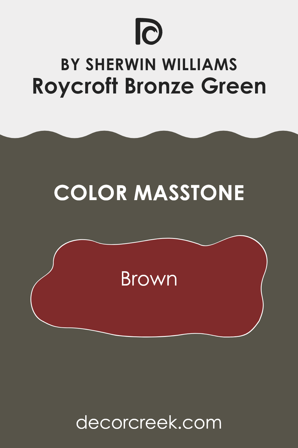
What is the Masstone of the Roycroft Bronze Green SW 2846 by Sherwin Williams?
Roycroft Bronze Green SW 2846 by Sherwin Williams, with a masstone of Brown (#802B2B), brings a deep and earthy feeling to any area. This particular shade of brown pairs beautifully with natural materials such as wood, leather, and stone, making it a great option for homes looking to create a warm and welcoming atmosphere.
This color works especially well in living rooms, dining areas, and bedrooms where its rich tone can create a cozy and comfortable vibe. Being a darker shade, it pairs well with lighter colors like creams and beiges to balance the visual weight in a room.
Additionally, lighting plays a crucial role when using this color; under bright light, its richness shines, enhancing the character of the area, while in dimmer settings, it provides a soothing, grounding effect. Overall, this color is adaptable and functions well in various design styles, from rustic to more modern looks.
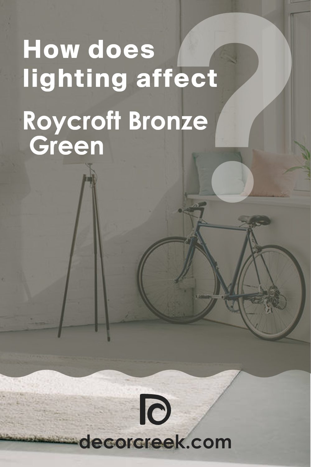
How Does Lighting Affect Roycroft Bronze Green SW 2846 by Sherwin Williams?
Lighting plays a crucial role in how we perceive colors in our environments. Different light sources can drastically alter the appearance of a color. For instance, Roycroft Bronze Green by Sherwin Williams is a unique hue that might look different under various lighting conditions.
In artificial light, such as LED or fluorescent lights, Roycroft Bronze Green might appear slightly darker and richer. These light sources can enhance the depth of this color, making it ideal for creating a cozy and warm atmosphere in areas like living rooms or studies.
Under natural light, the same color can look lighter and more vibrant. Natural sunlight reveals the true character of this green, accentuating its lively yet earthy qualities. This makes it a great choice for rooms that receive a lot of daylight, adding a fresh and airy feel.
The direction a room faces also affects how Roycroft Bronze Green is perceived:
- North-Faced Rooms: These rooms get less direct sunlight, which can make Roycroft Bronze Green appear more muted and subdued. This may not bring out the full vibrancy of the color but can still provide a calm and soothing effect.
- South-Faced Rooms: With more exposure to direct sunlight, this color will appear brighter and more dynamic in south-facing rooms. The abundant light can make the room feel more energetic and alive.
- East-Faced Rooms: Morning light is cooler and can make Roycroft Bronze Green look slightly more bluish or cooler in the mornings, shifting towards its true color as the day progresses. This dynamic change can make east-facing rooms quite interesting throughout the day.
- West-Faced Rooms: As sunlight tends to be warmer in the afternoons and evenings, Roycroft Bronze Green in west-facing rooms can feel warmer and more inviting later in the day.
Selecting the right lighting and considering the room’s orientation can help in making the most out of this adaptable color, ensuring it suits the mood and style you want to achieve.
What is the LRV of Roycroft Bronze Green SW 2846 by Sherwin Williams?
LRV stands for Light Reflectance Value, which measures the percentage of light a paint color reflects back into a room. This number can range between very low to fairly high values and is crucial when deciding how a color will look in a specific area.
A higher LRV means the color reflects more light, making areas appear brighter and larger. Conversely, a lower LRV indicates that the color absorbs more light, which can make an area feel cozier but smaller and darker.
For the color with an LRV of 8.847, such as a deep green shade, it’s clear that it absorbs much of the light that hits it rather than reflecting it. This characteristic makes it ideal for creating a moody or intimate atmosphere in a room. However, using it in a small or poorly-lit room might make the area feel even smaller and darker. It’s perfect for larger rooms or areas where you might want to foster a sense of warmth and enclosure, or to accentuate features by adding visual depth and drama.

Coordinating Colors of Roycroft Bronze Green SW 2846 by Sherwin Williams
Coordinating colors work together to create a harmonious palette that enhances the overall appeal of an area. When working with a specific shade like Roycroft Bronze Green by Sherwin Williams, choosing colors that coordinate well can make a significant difference in achieving a cohesive look. Summit Gray and Roycroft Copper Red are excellent examples of coordinating colors that can be paired effectively with Roycroft Bronze Green.
Summit Gray is a soft, warm gray that provides a subtle contrast to the richer hues of Roycroft Bronze Green. This color can help to balance the depth of the green, making the area feel more open and inviting without overpowering the primary color.
It is ideal for use in areas where you want to maintain a neutral background or soften the overall effect of darker colors. On the other hand, Roycroft Copper Red offers a vibrant, earthy tone that complements the green’s natural vibe. This bold red can add a sense of energy and warmth to a room, making it a great choice for accents such as cushions, artwork, or even an accent wall. Together, these coordinating colors work to create a balanced and appealing visual flow in any area.
You can see recommended paint colors below:
- SW 7669 Summit Gray
- SW 2839 Roycroft Copper Red

What are the Trim colors of Roycroft Bronze Green SW 2846 by Sherwin Williams?
Trim colors are essential accents in interior design that frame and highlight key architectural features like doorways, windows, and baseboards. Selecting the right trim colors can significantly enhance the aesthetic appeal and harmony in an area. For a dark, rich hue like Roycroft Bronze Green, using contrasting trim colors can create a striking visual effect.
Colors such as Ceiling Bright White and Repose Gray are excellent choices because they provide a clean, crisp boundary that makes the deeper green stand out, contributing to a balanced and pleasing look.
Ceiling Bright White, a pure and clear shade of white, is ideal for use as a trim color because it brings a fresh and clear contrast that can make nearby colors pop, especially against darker shades like Roycroft Bronze Green. Repose Gray, on the other hand, is a neutral, mild gray that offers a subtle contrast, softening the transition between the wall color and the trim. This color can add a gentle definition without the starkness of a more contrasting shade, lending a harmonious element to the overall décor.
You can see recommended paint colors below:

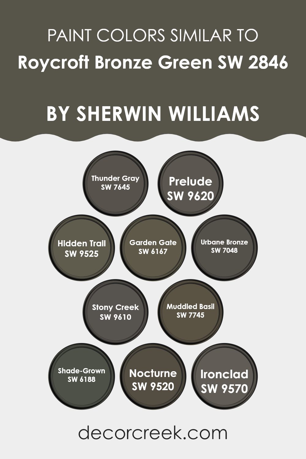
Colors Similar to Roycroft Bronze Green SW 2846 by Sherwin Williams
Similar colors play a crucial role in interior design as they help create a cohesive and harmonious environment. By using shades that share a common hue but differ slightly in darkness or brightness, a room can maintain a consistent theme while subtly distinguishing its various elements. For instance, colors like Thunder Gray and Prelude both offer muted, understated elegance without overpowering the senses.
Thunder Gray provides a darker, stormy ambiance, which is perfect for creating a feeling of coziness and seclusion. On the other hand, Prelude, while still subdued, has a slightly lighter tone, which can help in softening the overall look of the area.
Expanding on this palette, Hidden Trail and Garden Gate introduce earthier tones that work well with natural materials like wood and stone. Hidden Trail brings a rich, deeper soil-like color, ideal for grounding an area or adding depth. Garden Gate, slightly greener, mimics the hues of a leafy garden, perfect for adding a touch of nature.
Urbane Bronze and Stony Creek further this trend by incorporating a more profound, almost elemental feel into their settings. Urbane Bronze is dark and reflective like wet stone, great for accentuating key pieces of furniture. Stony Creek offers a more nuanced approach with its grayish-green tones, lovely for walls that need a subtle yet distinctive color.
Moving to even more specialized shades, like Muddled Basil, Shade-Grown, Nocturne, and Ironclad, each adds its character. Muddled Basil has a damp, vegetative feel to it, excellent for rooms that require a splash of freshness. Shade-Grown is a deep forest green, providing a luxurious backdrop to brighter, highlighting decor pieces. Nocturne and Ironclad both have a metallic sheen, suitable for modern settings where cool, industrial vibes are desired. These colors, by maintaining a similar theme, ensure that the environment feels unified but never monotonous.
You can see recommended paint colors below:
- SW 7645 Thunder Gray
- SW 9620 Prelude
- SW 9525 Hidden Trail
- SW 6167 Garden Gate
- SW 7048 Urbane Bronze
- SW 9610 Stony Creek
- SW 7745 Muddled Basil
- SW 6188 Shade-Grown
- SW 9520 Nocturne
- SW 9570 Ironclad
How to Use Roycroft Bronze Green SW 2846 by Sherwin Williams In Your Home?
Roycroft Bronze Green SW 2846 by Sherwin Williams is a rich, earthy green paint that brings warmth and coziness to any room. Perfect for those looking to add a touch of nature-inspired beauty to their home, this color works well in a variety of areas.
You can use it in your living room to create a cozy, inviting atmosphere where family and friends feel at home. It’s also great for a bedroom, where its calm, warm tones can help you relax and get a good night’s sleep.
Pairing it with natural wood furniture or white trim can enhance its beauty and make the room look more interesting. If you’re not ready to commit to painting an entire room, consider using it on an accent wall or for painting furniture. This can add a lovely splash of color without overpowering the area. Moreover, Roycroft Bronze Green pairs beautifully with softer, creamy colors or even bold hues like mustard or deep red, giving you lots of design flexibility.
Roycroft Bronze Green SW 2846 by Sherwin Williams vs Thunder Gray SW 7645 by Sherwin Williams
Roycroft Bronze Green and Thunder Gray are two distinctive shades by Sherwin Williams. Roycroft Bronze Green is a deep, muted green with a bronze undertone, giving it a subtle warmth.
This color is perfect for creating a cozy and inviting atmosphere in areas that need a touch of nature-inspired robustness. On the other hand, Thunder Gray is a darker, more muted gray with hints of blue, providing a cooler and more understated look.
It’s a great option for those wanting a modern, yet low-key background that doesn’t stand out too much. Given their characteristics, Roycroft Bronze Green works well in traditional or earthy environments, while Thunder Gray suits contemporary and minimalist aesthetics better. Both colors can effectively anchor a room, though they set very different moods because of their differing warmth and color depth.
You can see recommended paint color below:

Roycroft Bronze Green SW 2846 by Sherwin Williams vs Ironclad SW 9570 by Sherwin Williams
Roycroft Bronze Green is a dark, deep green color with hints of earthy brown, giving it a natural, forest-like feel. This color can add a cozy and grounded ambiance to an area, making it a popular choice for those looking to create a warm and inviting atmosphere.
On the other hand, Ironclad is a gray that leans towards cool steel tones, offering a clean and modern look. This neutral shade is highly adaptable, making it an excellent option for both contemporary and traditional settings. It pairs well with various decor styles and colors, providing a sleek backdrop that allows other elements in the room to stand out.
When comparing these two colors, one can see they are distinct in their way — Roycroft Bronze Green adds warmth and depth, while Ironclad offers a cool, crisp vibe. Both are solid choices, depending on what feeling you want to achieve in your area.
You can see recommended paint color below:
Roycroft Bronze Green SW 2846 by Sherwin Williams vs Prelude SW 9620 by Sherwin Williams
Roycroft Bronze Green and Prelude are two distinct paint colors by Sherwin Williams, each bringing a unique vibe to any area. Roycroft Bronze Green is a deep, rich green with hints of bronze that give it a warm, cozy feeling. This color would be ideal for those looking to create a snug and inviting environment, possibly in a study or living room.
On the other hand, Prelude is a much lighter color, featuring soft, airy tones of gray. It’s adaptable and understated, making it perfect for areas where you want a gentle background color that doesn’t overpower the room. Prelude works well in areas that get plenty of natural light, as it can make the area feel even more open and fresh.
Both colors offer their distinct appeal, with Roycroft Bronze Green leaning towards a more traditional, warm welcome, and Prelude offering a clean, minimalistic look. Choosing between them depends on the mood and functionality you wish to achieve in your area.
You can see recommended paint color below:
Roycroft Bronze Green SW 2846 by Sherwin Williams vs Shade-Grown SW 6188 by Sherwin Williams
Roycroft Bronze Green and Shade-Grown, both by Sherwin Williams, are unique yet complementary green shades. Roycroft Bronze Green presents a darker, earthier tone that feels robust and grounded.
This color is perfect for areas where a strong, nature-inspired vibe is desired, providing a subtle sense of richness and warmth. On the other hand, Shade-Grown is slightly lighter and leans towards a cooler, more reserved green. This shade could be seen as more adaptable, fitting well in areas that aim for a calm but fresh look.
Both colors share a connection to natural elements but vary in mood and depth. While Roycroft Bronze Green tends to anchor a room with its deeper hues, Shade-Grown offers a gentler touch that can brighten areas without overpowering them. These colors can work well separately or together, depending on the atmosphere you want to achieve.
You can see recommended paint color below:
Roycroft Bronze Green SW 2846 by Sherwin Williams vs Urbane Bronze SW 7048 by Sherwin Williams
Roycroft Bronze Green is a deep, earthy green with a hint of bronze undertone, giving it a rich, natural feel. It pairs well with natural materials like wood and stone, making it a great choice for areas that aim for a grounded, organic aesthetic.
Urbane Bronze, on the other hand, is a darker shade that leans more towards a grayish-brown, rather than the greener tones of Roycroft Bronze Green. This color is highly adaptable and works well in various settings, providing a strong, neutral foundation that complements both bright and muted accents.
While both colors share a certain earthiness, Roycroft Bronze Green brings more vibrancy with its subtle green hues, offering a hint of color in primarily neutral schemes. Urbane Bronze, with its deeper, almost charcoal-like appearance, provides a more understated backdrop, perfect for highlighting other elements in a design. Each has its unique appeal, depending on whether you’re looking for a touch of nature or a sleek, neutral base.
You can see recommended paint color below:
Roycroft Bronze Green SW 2846 by Sherwin Williams vs Stony Creek SW 9610 by Sherwin Williams
Roycroft Bronze Green and Stony Creek are two colors offered by Sherwin Williams that both bring unique shades to any area. Roycroft Bronze Green has a deep, almost earthy quality, making it perfect for creating a cozy and grounded atmosphere.
It leans towards a dark green with hints of brown, providing a strong presence in any room. On the other hand, Stony Creek is a subtler shade, with more of a muted, gray-green tone.
This color is lighter than Roycroft Bronze Green and delivers a soft, soothing touch to interiors, suitable for those looking for a more understated vibe. While Roycroft Bronze Green fits well in traditional or rustic settings due to its richer depth, Stony Creek is adaptable for various decor styles, particularly in areas aiming for a calm and gentle ambience.
You can see recommended paint color below:
Roycroft Bronze Green SW 2846 by Sherwin Williams vs Hidden Trail SW 9525 by Sherwin Williams
Roycroft Bronze Green is a deep, muted green shade that feels earthy and robust. It has a strong presence, making it a great choice for creating a cozy, grounded atmosphere in a room. On the other hand, Hidden Trail is also a green but with a lighter, more neutral tone, leaning towards gray.
This color is more subtle and adaptable, easily blending with various decor styles and color schemes. When comparing these two, Roycroft Bronze Green stands out with its richer, more dominant green hue, suited for areas where a touch of nature-inspired strength is desired.
Hidden Trail, however, offers a gentler approach. It works well in areas where you want to keep the environment soft and more open, without the color taking over the area. Both colors offer unique qualities, with Roycroft Bronze Green providing depth and Hidden Trail offering adaptability.
You can see recommended paint color below:
Roycroft Bronze Green SW 2846 by Sherwin Williams vs Garden Gate SW 6167 by Sherwin Williams
Roycroft Bronze Green and Garden Gate are two distinct shades offered by Sherwin Williams. Roycroft Bronze Green is a deeper, olive-toned color that exudes a warm and earthy vibe. It has a rich depth that makes it perfect for areas where a cozy, inviting atmosphere is desired, such as living rooms or dining areas.
On the other hand, Garden Gate is a lighter, gray-green hue that gives off a fresh and clean look. This color is more subdued compared to Roycroft Bronze Green and works well in areas that aim for a more open and airy feel, like kitchens and bathrooms.
Although both colors share a green base, Roycroft Bronze Green leans towards a darker, more muted palette, while Garden Gate offers a lighter, crisper appearance. These differences make them suitable for different types of settings depending on the mood one wants to achieve.
You can see recommended paint color below:
Roycroft Bronze Green SW 2846 by Sherwin Williams vs Nocturne SW 9520 by Sherwin Williams
Roycroft Bronze Green is a dark, earthy green that has a rich, bronze undertone, giving it a warm and inviting vibe. This color is perfect for areas where you want a cozy and comfortable atmosphere. It works well with natural materials like wood and stone, and brings a sense of calm to any room.
On the other hand, Nocturne is a deep navy blue with a slightly gray base, making it a cool and calming shade. This color is ideal for creating a grounded, subtle look in areas like bedrooms or offices. It pairs beautifully with lighter blues and grays for a balanced and harmonious environment.
Overall, while both colors provide a peaceful setting, Roycroft Bronze Green has a warm and earthy feel, and Nocturne offers a cool and quiet mood. Depending on what atmosphere you’re aiming for in your area, either of these colors could be a great choice.
You can see recommended paint color below:
Roycroft Bronze Green SW 2846 by Sherwin Williams vs Muddled Basil SW 7745 by Sherwin Williams
Both Roycroft Bronze Green and Muddled Basil are charming colors from Sherwin Williams. Roycroft Bronze Green is a deep, warm green with a touch of brown, giving it a cozy, earthy feel. This color makes any area feel welcoming and grounded.
On the other hand, Muddled Basil is a slightly brighter, fresher green with a hint of gray. It’s more subtle than Roycroft Bronze Green but still offers a natural and calm atmosphere when applied to walls or used in decor.
Roycroft Bronze Green is a good choice if you’re looking for something rich and robust, perfect for areas where you want an inviting, snug feel. In contrast, Muddled Basil works well in areas where you want to inject some freshness and light without overpowering the senses. Both colors reflect a love for nature but cater to different moods and settings. Whether you prefer the depth of Roycroft Bronze Green or the lightness of Muddled Basil, both hues add a pleasant touch of the outdoors to any room.
You can see recommended paint color below:
- SW 7745 Muddled Basil

In wrapping up my thoughts on SW 2846 Roycroft Bronze Green by Sherwin Williams, this paint color really impressed me. It’s a rich, deep green that brings the beauty of nature right into your home. The color is warm and inviting, making any room feel cozy and comfortable. I found it perfect for a living room or a study, where you want to sit and feel relaxed.
This color also works well with a lot of different furniture styles and colors. Whether you have dark wood tables or lighter, modern pieces, Roycroft Bronze Green makes everything look good together. It also pairs nicely with both bright colors and softer shades, so you can use it with your favorite decorations.
Overall, I think Roycroft Bronze Green is a great choice if you want to make a room look nice without trying too hard. It brings a pleasant, homey feel that makes you enjoy spending time there. If you’re thinking about trying a new color for your room, I’d definitely recommend giving this one a try. It’s not just a green; it adds something special to any area you paint it.
Ever wished paint sampling was as easy as sticking a sticker? Guess what? Now it is! Discover Samplize's unique Peel & Stick samples.
Get paint samples

