Introducing SW 9560 Night Out by Sherwin Williams, a paint color that’s all about adding a touch of sophistication and elegance to your spaces. When it comes to giving your room a quick and impactful makeover, choosing the right color can make all the difference.
And if you’re looking for something that combines the drama of nighttime with a subtle hint of luxury, then SW 9560 Night Out is the way to go.
This particular shade is a part of Sherwin Williams’ vast palette, known for its high-quality and lasting finishes. SW 9560 Night Out stands out for its deep, rich tone that can add depth and character to any room.
Whether you’re updating your bedroom, giving your living room a new look, or even adding some flair to your kitchen, this color can provide that perfect backdrop for both relaxing and entertaining.
The beauty of SW 9560 Night Out lies in its versatility. It works wonderfully with a wide range of decor styles, from modern minimalist to cozy traditional.
Moreover, this color plays well with both natural and artificial light, shifting subtly across the day to enrich your interiors with an ever-changing ambience.
If you’re thinking about giving your home a fresh new look, consider SW 9560 Night Out. It’s more than just a paint color – it’s a simple yet effective way to add personality and style to your living space.
What Color Is Night Out SW 9560 by Sherwin Williams?
Night Out SW 9560, offered by Sherwin Williams, is a rich and sophisticated color that adds depth and intrigue to any space. This shade is essentially a deep navy that leans towards the elegance of a midnight sky.
It’s a color that can bring a sense of calm and serenity, while also adding a dramatic flair to the interior. Night Out works exceptionally well in a variety of interior styles, from modern and contemporary to more traditional settings.
It serves as a stunning backdrop that allows furniture and decor to stand out, making it a versatile choice for those looking to add a bold yet refined touch to their home.
When it comes to pairing with materials and textures, Night Out shows its flexibility. It pairs wonderfully with natural wood tones, from light oaks to rich walnuts, adding warmth to the coolness of the blue.
Metals like brushed brass or copper bring out its sophisticated side, while marble or granite accents can create a look of luxurious depth.
In terms of textures, velvety fabrics or plush throws add a layer of coziness to the elegance, while linen or cotton keeps the look fresh and airy.
Ideal for a statement wall in a living room, a cozy bedroom, or an impactful bathroom, Night Out is sure to transform any space into a stylish and inviting area.
Ever wished paint sampling was as easy as sticking a sticker? Guess what? Now it is! Discover Samplize's unique Peel & Stick samples.
Get paint samples

Is Night Out SW 9560 by Sherwin Williams Warm or Cool color?
Night Out SW 9560 by Sherwin Williams is a unique and intriguing paint color that can truly transform a space. It brings a deep, rich, and elegant tone into homes, offering an atmosphere that is both cozy and sophisticated.
This particular shade is versatile, working well in many areas of a home, from creating a statement wall in a living room to setting a calm, focused mood in a home office.
Its depth adds character and a sense of luxury, making it a perfect backdrop for various decor styles and color palettes.
When applied to walls, Night Out can make rooms feel more intimate and cozy, drawing in the space to create a snug environment. This quality makes it ideal for larger spaces that you want to feel more inviting.
In smaller rooms, it provides a bold touch without overwhelming the space, especially when paired with lighter furniture or accents to balance out its depth.
Its rich hue also plays well with natural light during the day and soft lighting at night, highlighting different undertones and adding dynamism to the room.
Overall, Night Out can significantly enhance a home’s aesthetic, offering a unique blend of warmth and sophistication.
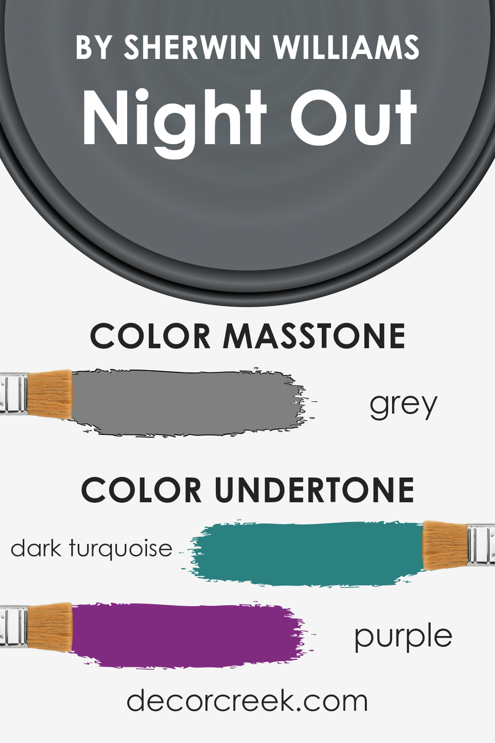
Undertones of Night Out SW 9560 by Sherwin Williams
Night Out is a unique color by Sherwin Williams. It’s not just a simple shade; it carries complex undertones of dark turquoise and purple. These undertones play a big role in how we see the color, adding depth and character.
Think of undertones like secret ingredients in a recipe—they change how the final dish tastes. In the case of paint, undertones affect how a color looks under different lighting and alongside other colors.
When painted on interior walls, the dark turquoise and purple undertones of Night Out bring warmth and a sense of creativity.
Depending on the room’s light, these undertones can either step forward or retreat, giving the walls a dynamic quality. In bright daylight, the dark turquoise might become more noticeable, creating a cool, calming effect.
As the day turns to night and the light changes, the purple undertones might peek through, adding a cozy, slightly mysterious vibe.
This color, with its rich undertones, is great for adding personality to a space without overwhelming it. Whether in a bedroom, living room, or a study, it offers a sophisticated backdrop that pairs well with various decor styles and colors.
No matter the room, the subtle complexity of Night Out makes it a versatile choice for anyone looking to spruce up their interior walls.
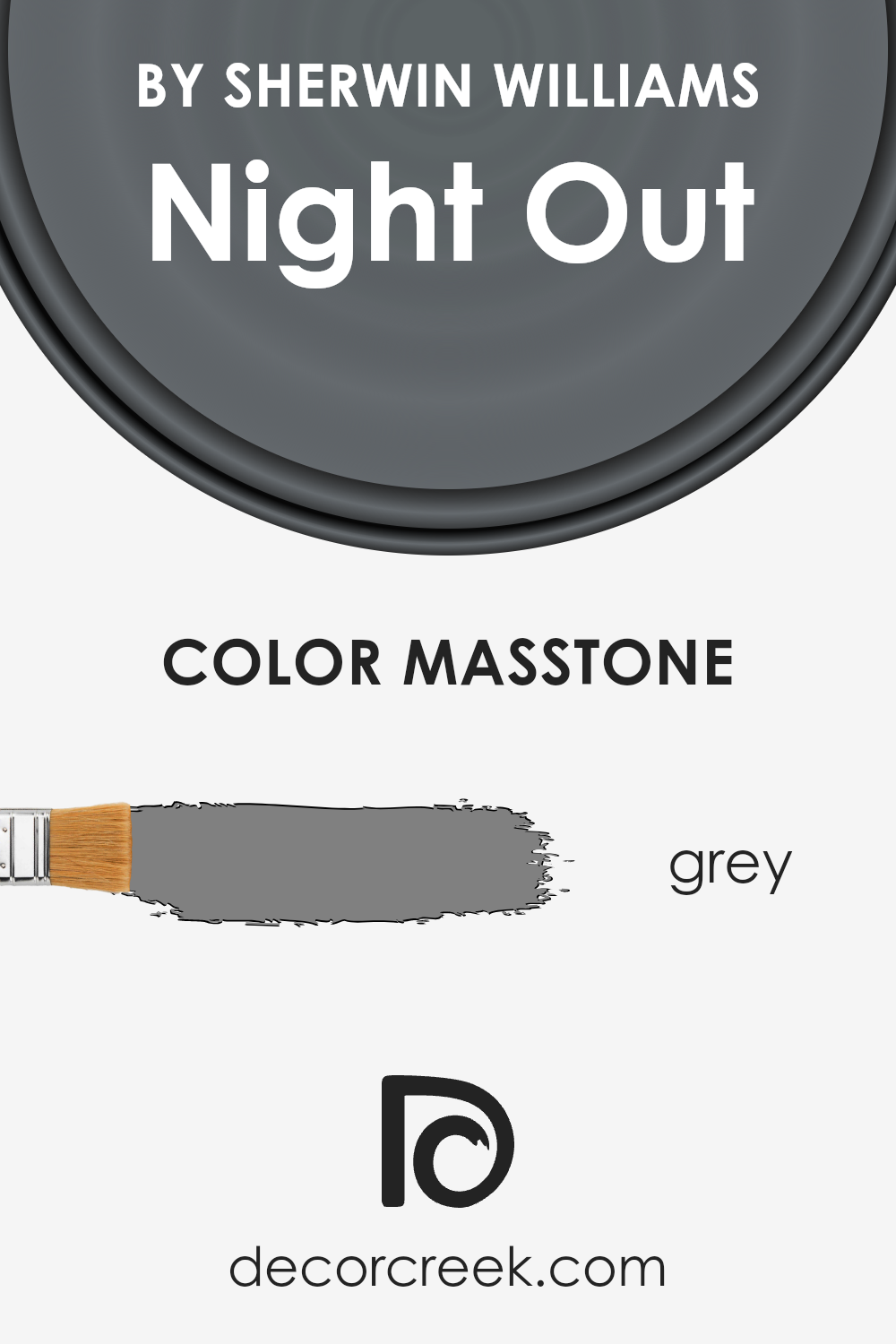
What is the Masstone of the Night Out SW 9560 by Sherwin Williams?
Night Out, with its masstone officially noted as Grey, stands as a versatile choice for homeowners aiming to bring a sophisticated yet understated elegance into their living spaces.
This shade of grey is unique because it strikes a perfect balance between being too dark or too light, making it an ideal backdrop for both bold and muted color palettes.
In essence, it acts like a canvas, allowing other colors and home decor elements to truly shine without overwhelming the senses.
In practical terms, this color can work wonders in creating the illusion of more space in smaller rooms, thanks to its ability to reflect light nicely.
On the contrary, in larger, well-lit areas, it brings a sense of warmth and coziness, making it feel more inviting.
Its unassuming nature allows homeowners to experiment with different textures and materials, making it a fantastic option for those who love to update their decor frequently without having to repaint their walls.
The beauty of this specific shade of grey lies in its adaptability, effortlessly complementing both modern and traditional interiors.
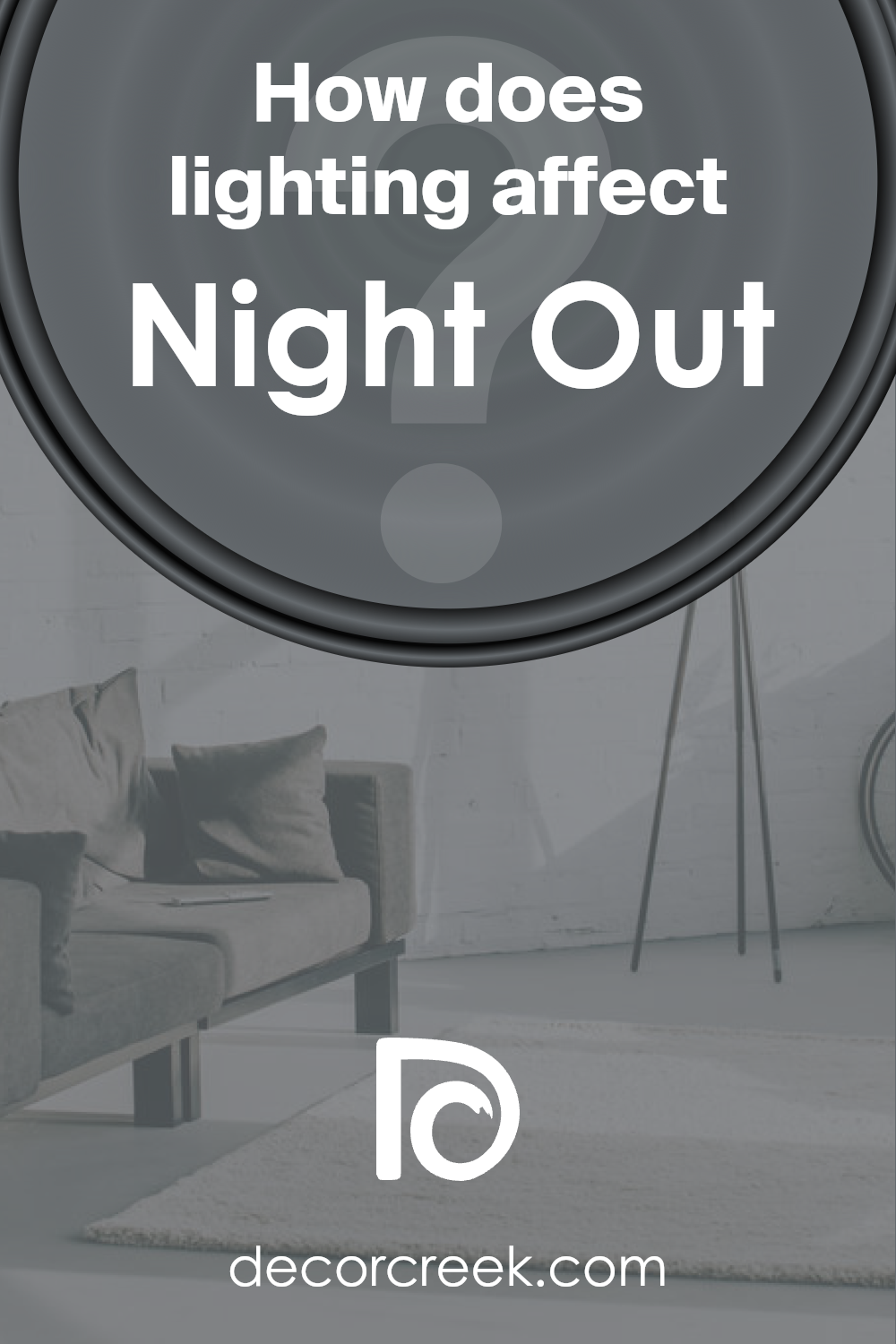
How Does Lighting Affect Night Out SW 9560 by Sherwin Williams?
Understanding how lighting influences colors is quite interesting. Light can change the way a color looks, depending on its source or the direction it comes from.
Let’s talk about how a color, like Night Out by Sherwin Williams, behaves under different lighting conditions.
In artificial light, colors can look very different compared to natural light. For example, Night Out, when lit by standard inside lights, might appear warmer or have a slightly cozier tone.
This is because artificial light, depending on its type (like LED or incandescent), can cast a yellowish or bluish tint, altering the color’s appearance.
In natural light, however, this shade will show its true color, reflecting the full spectrum of light, which can make it look more vibrant or lively.
In rooms that face north, light is typically cooler and can be somewhat dim. Here, Night Out might appear slightly darker and the undertones could seem more pronounced, giving it a more profound look.
This cooler light doesn’t do much in terms of brightening colors, so expect it to look somewhat subdued.
South-facing rooms get a lot of bright, warm light throughout the day. This kind of light can make Night Out look lighter and more dynamic.
It might bring out any subtle nuances in the color, making it more lively than in north-facing rooms.
For east-facing rooms, which get the morning light, Night Out will start the day looking bright and cheerful, then shift towards a softer tone as the day progresses and the natural light diminishes.
This shift could highlight different aspects of the color, from a refreshing morning vibe to a calmer evening feel.
In west-facing rooms, the color gets the opposite effect of east-facing rooms. It ends the day on a high note, getting drenched in warm evening light.
This can make the color appear warmer and more inviting in the afternoon and evening.
Overall, lighting can really influence how colors like Night Out are perceived, changing their character and mood based on the light’s direction and source.
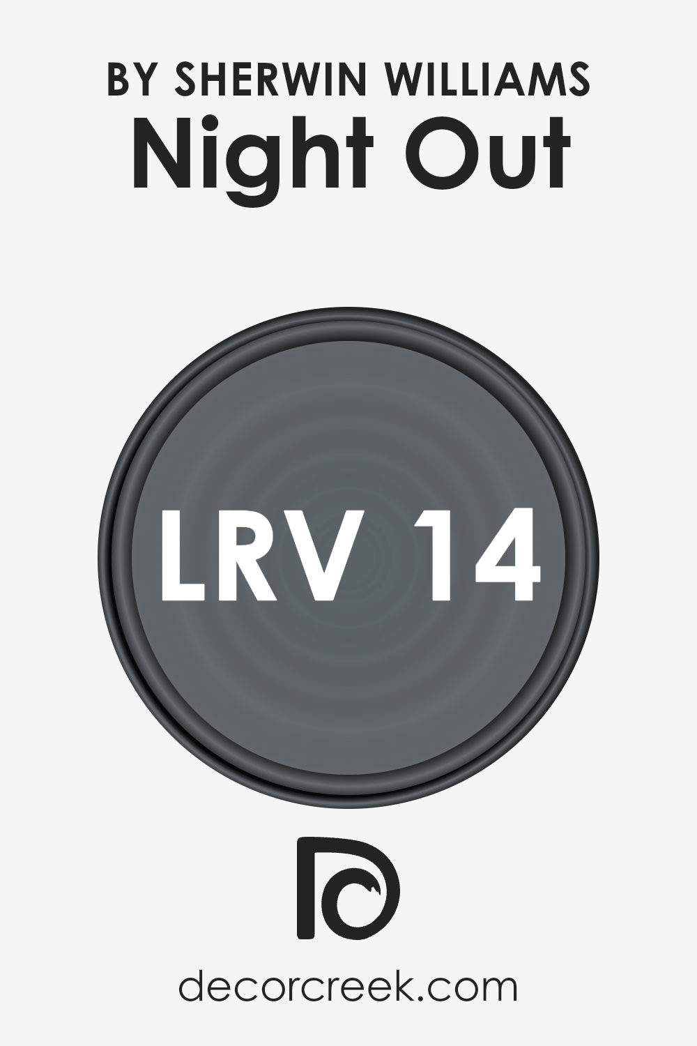
What is the LRV of Night Out SW 9560 by Sherwin Williams?
LRV stands for Light Reflectance Value, which is a way to measure the percentage of light a paint color reflects back into a room.
Think of LRV on a scale from 0 to 100, where 0 is the darkest black that absorbs all light, and 100 is pure white that reflects all light back.
This value is super important because it helps you understand how light or dark a color will look once it’s on your walls. The amount of natural and artificial light in a room also plays a big role.
In a bright, well-lit room, colors will appear lighter and more vibrant, while in a room with less light, colors might look darker and more subdued.
With an LRV of 14.119, the color Night Out by Sherwin Williams is on the darker side. This means it’s likely to absorb more light than it reflects, making a room feel cozier or smaller if used on all walls.
It’s perfect for creating a dramatic or intimate space but remember, it might make a space without much light feel even darker. So, when considering this color, think about the room’s lighting and how it might affect the overall ambiance.
If you love the color but are worried about the room feeling too dark, using it on an accent wall or pairing it with lighter colors and decor can help balance the light reflection and create a desirable atmosphere.
LRV – what does it mean? Read This Before Finding Your Perfect Paint Color
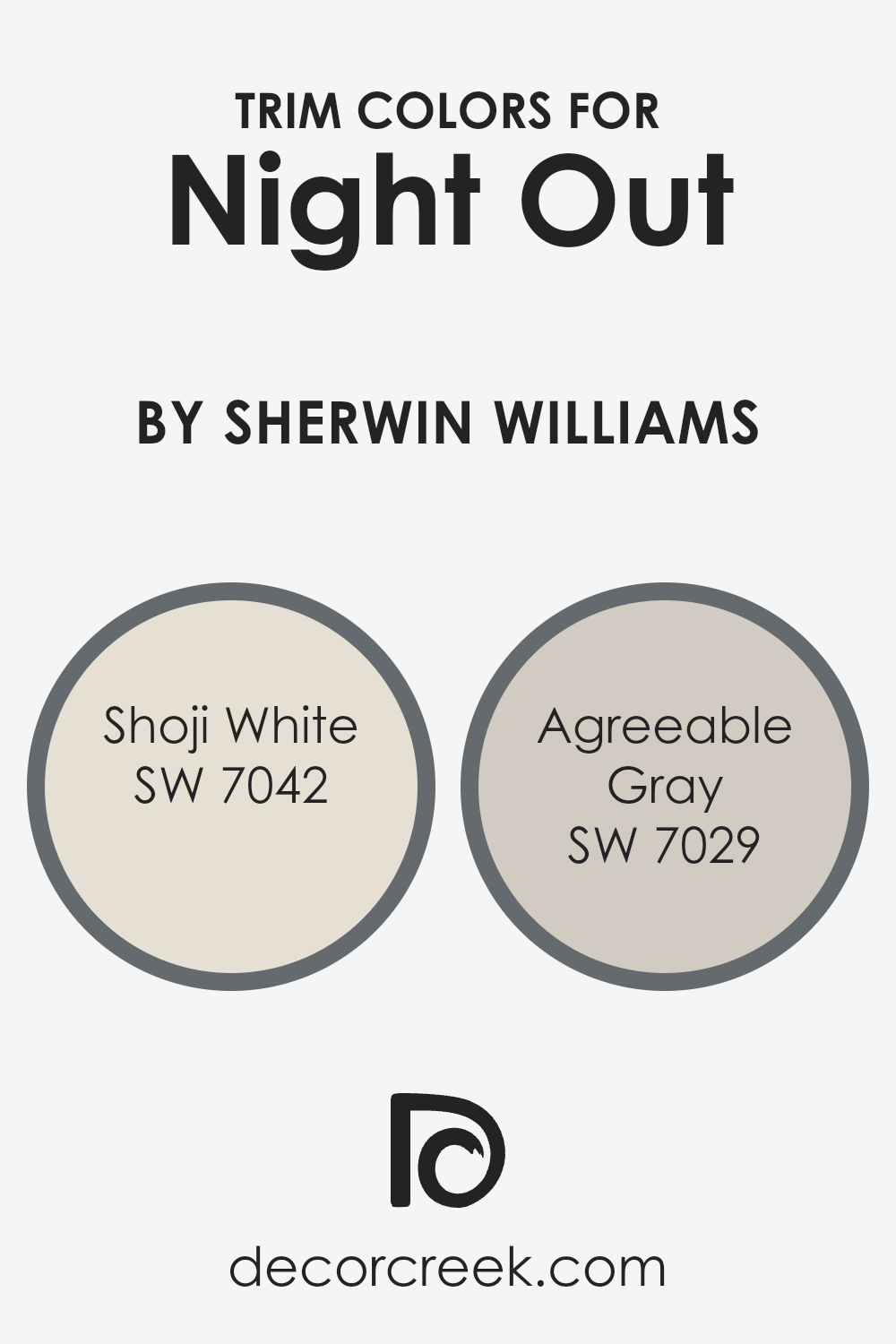
What are the Trim colors of Night Out SW 9560 by Sherwin Williams?
Trim colors are specific shades selected to complement or contrast with the main color of a room or building’s exterior, serving as accents around doors, windows, baseboards, and moldings.
In the context of Night Out (SW 9560), a deep, rich color from Sherwin Williams, choosing the right trim colors can significantly enhance the aesthetic appeal and balance of a space.
The trim acts as a visual frame, highlighting architectural features and defining spaces in a subtle yet impactful way.
When chosen carefully, trim colors can add depth and character to the overall design, making the primary color stand out while ensuring the space feels cohesive and well-thought-out.
For a sophisticated and cohesive look with Night Out (SW 9560), Shoji White (SW 7042) and Agreeable Gray (SW 7029) are excellent trim choices.
Shoji White is a soft, warm white with understated beige undertones, bringing a subtle, soothing contrast that can soften the intensity of Night Out, making the space feel inviting and balanced.
On the other hand, Agreeable Gray is a gentle gray with warm undertones that harmonize beautifully with cooler tones, offering a muted but distinct contrast that can accentuate Night Out’s depth without overwhelming it.
Both colors provide a versatile palette that can bridge traditional and contemporary styles, enhancing the surroundings without detracting from the boldness of Night Out.
You can see recommended paint colors below:
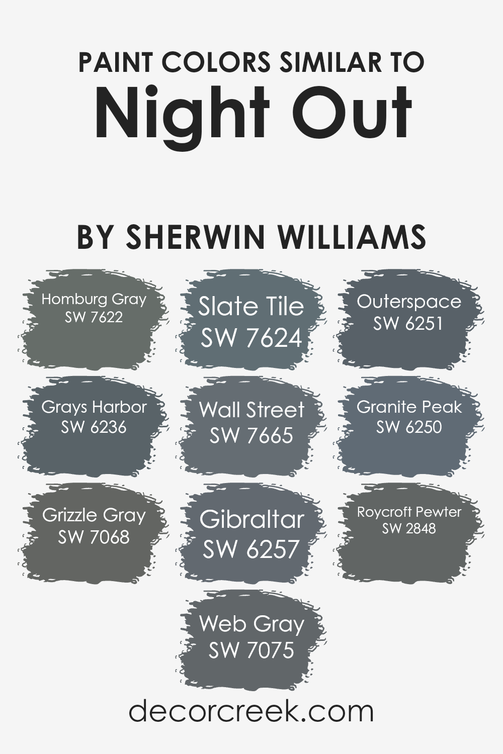
Colors Similar to Night Out SW 9560 by Sherwin Williams
Similar colors play a crucial role in design and aesthetics by creating harmony and a sense of order. When colors are closely related on the color spectrum, they naturally complement each other, leading to a visually cohesive space.
These subtle variations in shade can add depth and complexity to an area without overwhelming the senses with stark contrasts.
The key is in the details; similar colors can highlight slight differences in texture and form, making each element in a space stand out while still contributing to a unified look.
This approach to color selection is especially useful in achieving a sophisticated, layered appearance in interior design or when aiming for a specific thematic or mood setting in a room.
Taking inspiration from Night Out, a rich and nuanced hue, we find a palette of colors that harmonize beautifully due to their similar undertones and intensities.
Homburg Gray brings a stately sophistication with its deep, muted tones, whereas Grays Harbor offers a slightly lighter, more maritime feel. Grizzle Gray and Web Gray sit comfortably in the middle, providing a versatile backdrop for various decor styles.
Slate Tile adds a touch of earthiness, akin to the natural elegance of stone, while Wall Street elevates the palette with its urban chic. Gibraltar leans towards a natural, robust appearance, reminiscent of sturdy cliffs.
In contrast, Outerspace introduces a cosmic depth, and Granite Peak mimics the majestic qualities of mountainous terrains. Roycroft Pewter rounds out this collection with its artisanal charm, bridging historical richness with modern design.
Together, these colors exemplify how slight variations within a spectrum can produce a harmonious and dynamic aesthetic, allowing each hue to contribute its unique flavor to the overall palette.
You can see recommended paint colors below:
- SW 7622 Homburg Gray
- SW 6236 Grays Harbor
- SW 7068 Grizzle Gray
- SW 7075 Web Gray
- SW 7624 Slate Tile
- SW 7665 Wall Street
- SW 6257 Gibraltar
- SW 6251 Outerspace
- SW 6250 Granite Peak
- SW 2848 Roycroft Pewter
How to Use Night Out SW 9560 by Sherwin Williams In Your Home?
Night Out SW 9560 by Sherwin Williams is a unique paint color that anyone looking to add a bit of sophistication and mystery to their home might consider.
This color, a deep, rich tone, works well in various settings, making it versatile for different rooms and styles. Imagine using it in a bedroom as an accent wall behind the headboard.
This can create a cozy, intimate vibe that’s perfect for relaxing after a long day. In the living room, applying Night Out around a fireplace could turn the area into a focal point, giving the room an elegant touch.
Moreover, for those wanting to add some drama to their dining area, this color on one wall could indeed make the space feel more inviting and refined for dinner parties or family gatherings.
Its depth adds an element of luxury without overwhelming the space, especially when balanced with lighter furnishings and decor.
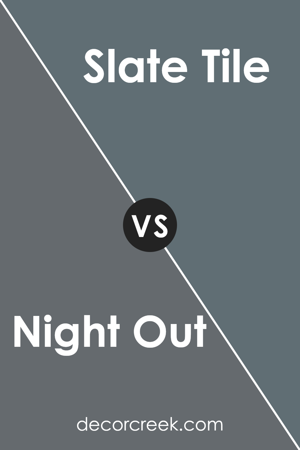
Night Out SW 9560 by Sherwin Williams vs Slate Tile SW 7624 by Sherwin Williams
Night Out and Slate Tile by Sherwin Williams are two distinct colors that offer unique vibes for any space. Night Out is a profound, rich color that brings a sense of sophistication and depth to rooms.
It has a mysterious and elegant aura, perfect for creating an intimate ambiance. Think of it as the kind of color that makes a statement in a cozy library or a chic bedroom.
On the other hand, Slate Tile leans towards a more neutral, versatile shade. This color combines the calmness of blue with the grounding effect of gray, resulting in a balanced hue that fits well in various settings.
It’s ideal for those looking to add a touch of serenity without overwhelming a space.
Slate Tile works beautifully in living areas, kitchens, or bathrooms, offering a soothing backdrop that complements different decor styles.
While Night Out adds drama and intensity, Slate Tile provides a tranquil and adaptable option, making them suited for different tastes and spaces.
You can see recommended paint color below:
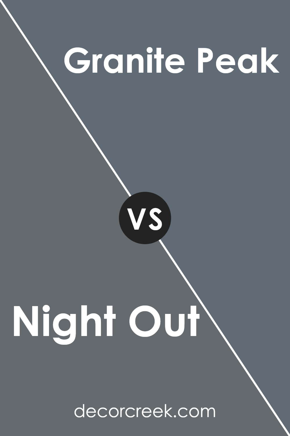
Night Out SW 9560 by Sherwin Williams vs Granite Peak SW 6250 by Sherwin Williams
Night Out and Granite Peak by Sherwin Williams are two unique paint colors. Night Out is a darker, more mysterious shade. It feels like the evening sky just after sunset, offering a sense of calmness and sophistication.
It’s perfect for spaces where you want to create a cozy, intimate atmosphere. On the other hand, Granite Peak is a strong, steady gray that reminds you of a mountain’s rugged charm.
It’s lighter than Night Out, providing a solid, grounding feel without being too overwhelming. This color works well in areas where you need a touch of serenity and stability.
Though both shades bring their distinct qualities to a room, Night Out leans towards a deeper, more enveloping feel, while Granite Peak offers a calming, steadying presence.
They could complement each other in the right setting, especially if you’re looking to balance darkness and light in your decor.
You can see recommended paint color below:
- SW 6250 Granite Peak
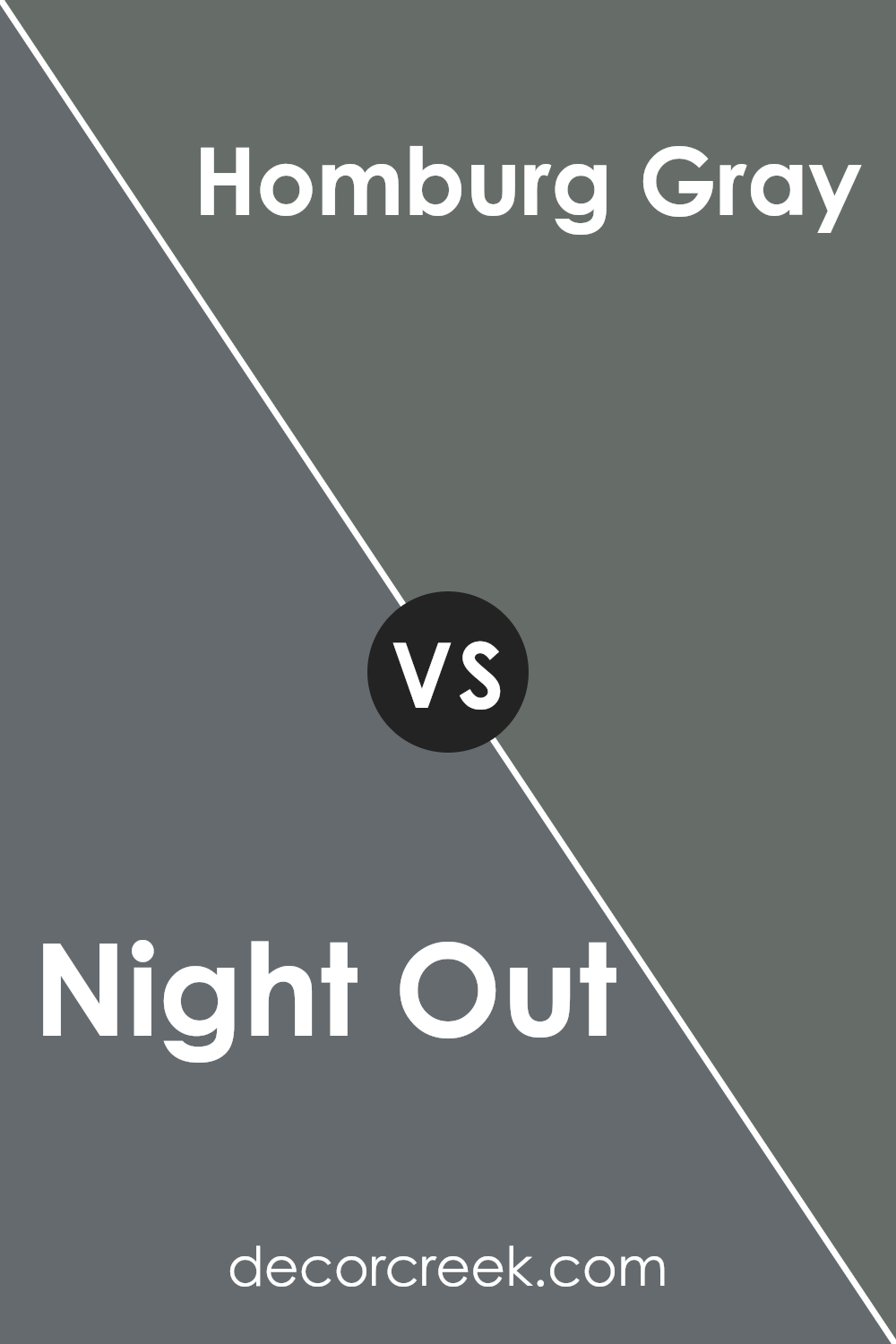
Night Out SW 9560 by Sherwin Williams vs Homburg Gray SW 7622 by Sherwin Williams
Night Out and Homburg Gray, both by Sherwin Williams, are two distinct shades that each offer a unique vibe to a space. Night Out is like a dark, serene evening sky, leaning towards a deep, almost mysterious vibe.
It’s perfect for creating an intimate and sophisticated atmosphere in a room. On the other hand, Homburg Gray feels more like a cloudy day, not too dark but with a solid, steady presence.
It’s a bit lighter than Night Out and carries a touch of green, giving it an earthy, grounded feel. While Night Out wraps a room in a kind of elegant cloak, Homburg Gray provides a more soothing, calm, and versatile backdrop.
Both colors could beautifully complement each other in a space, with Night Out adding depth and drama, and Homburg Gray offering balance and tranquility.
These shades can easily fit various design styles, depending on how they’re used alongside other colors and decor.
You can see recommended paint color below:
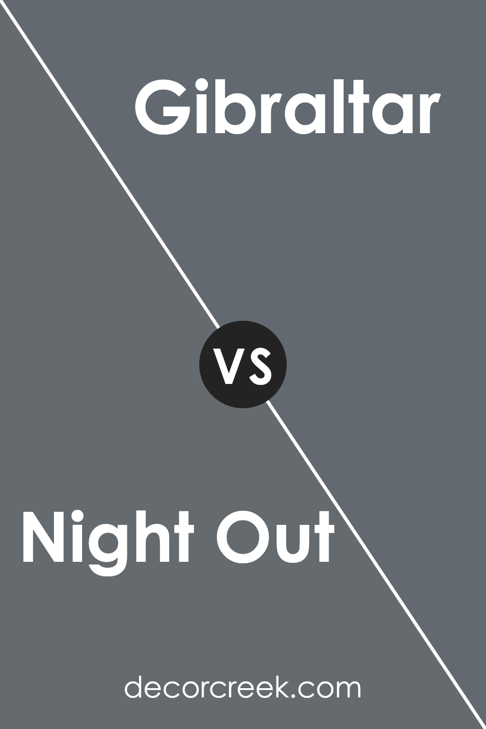
Night Out SW 9560 by Sherwin Williams vs Gibraltar SW 6257 by Sherwin Williams
Night Out and Gibraltar are two colors by Sherwin Williams, each with its own unique vibe. Night Out is a deep, rich navy blue that feels both sophisticated and calming.
It gives off an air of mystery and elegance, making it perfect for creating a cozy and serene space. On the other hand, Gibraltar is a shade that leans more towards a classic gray with subtle blue undertones.
It’s a versatile color that can fit in almost anywhere, offering a sense of stability and tranquility without being too bold. When comparing the two, Night Out presents more drama and depth, ideal for accent walls or spaces where you want to make a statement.
Gibraltar, in contrast, works beautifully as a neutral background, supporting a wide range of decor styles. Both colors provide unique atmospheres; Night Out adds a layer of sophistication, while Gibraltar brings a calm and collected feel to any room.
You can see recommended paint color below:
- SW 6257 Gibraltar
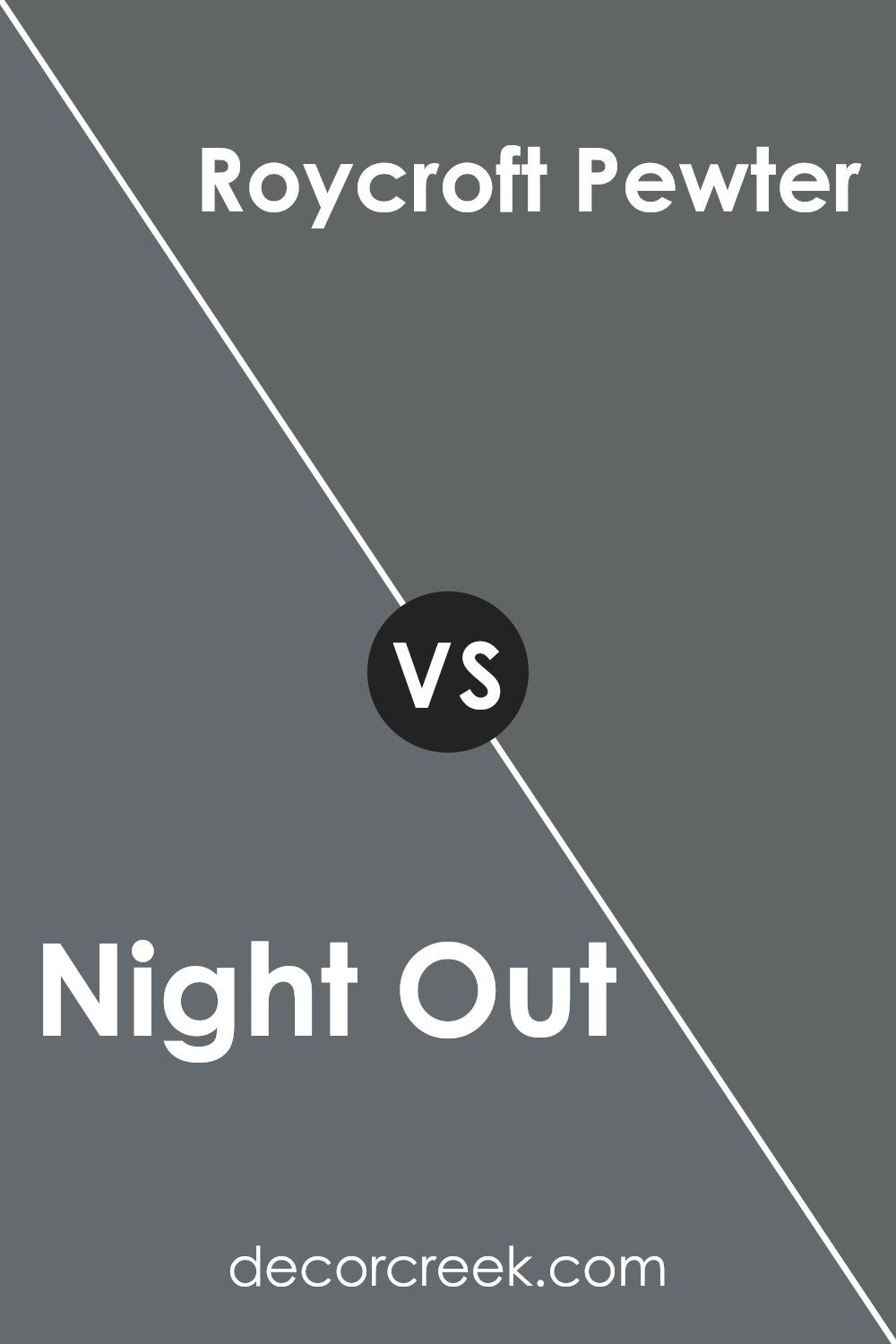
Night Out SW 9560 by Sherwin Williams vs Roycroft Pewter SW 2848 by Sherwin Williams
Night Out and Roycroft Pewter are two distinct colors offered by Sherwin Williams, each bringing its unique vibe to the table. Night Out is a deep, rich color that can add a touch of mystery and sophistication to any space.
It’s the kind of color that’s bold and makes a statement, perfect for creating an accent wall or adding depth to a room. On the other hand, Roycroft Pewter is a softer, more muted shade.
It leans towards a warm, inviting gray that can make a room feel cozy and comfortable. This color is versatile, working well in various settings, from modern to traditional, without overwhelming the space.
While Night Out draws you in with its intensity, Roycroft Pewter offers a gentle, soothing presence. Both colors have their charm, whether you’re looking to add drama or create a peaceful retreat.
You can see recommended paint color below:
- SW 2848 Roycroft Pewter
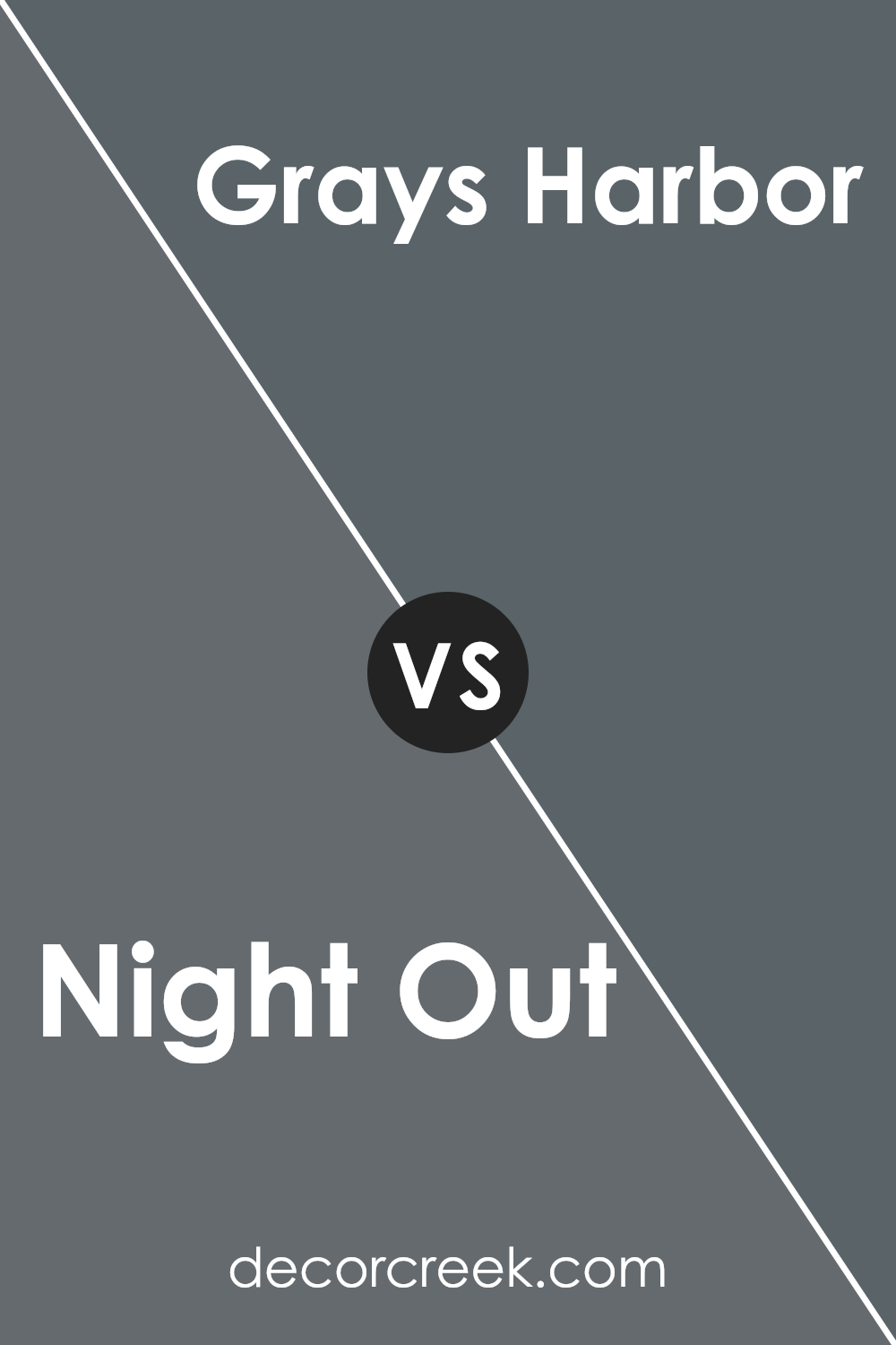
Night Out SW 9560 by Sherwin Williams vs Grays Harbor SW 6236 by Sherwin Williams
Night Out and Grays Harbor are two colors offered by Sherwin Williams that both lean towards the cooler side of the color spectrum yet have distinct differences. Night Out is a deep, rich, almost velvet-like navy blue.
It carries an air of sophistication and depth, making any space feel more intimate and luxurious. It’s perfect for those looking to create a bold statement wall or cozy, enveloping rooms.
On the other hand, Grays Harbor sits at the crossroads between gray and blue. It’s lighter than Night Out and offers a muted, subtle elegance that can make a room feel serene and balanced.
Grays Harbor is versatile, working well in spaces that aim for a calm and collected atmosphere without overwhelming the senses.
While both colors can enhance a room’s aesthetic in their unique ways, Night Out leans towards a more dramatic and bold statement. In contrast, Grays Harbor offers a softer, more tranquil vibe.
Choosing between them would depend on the ambiance one wishes to achieve in their space.
You can see recommended paint color below:
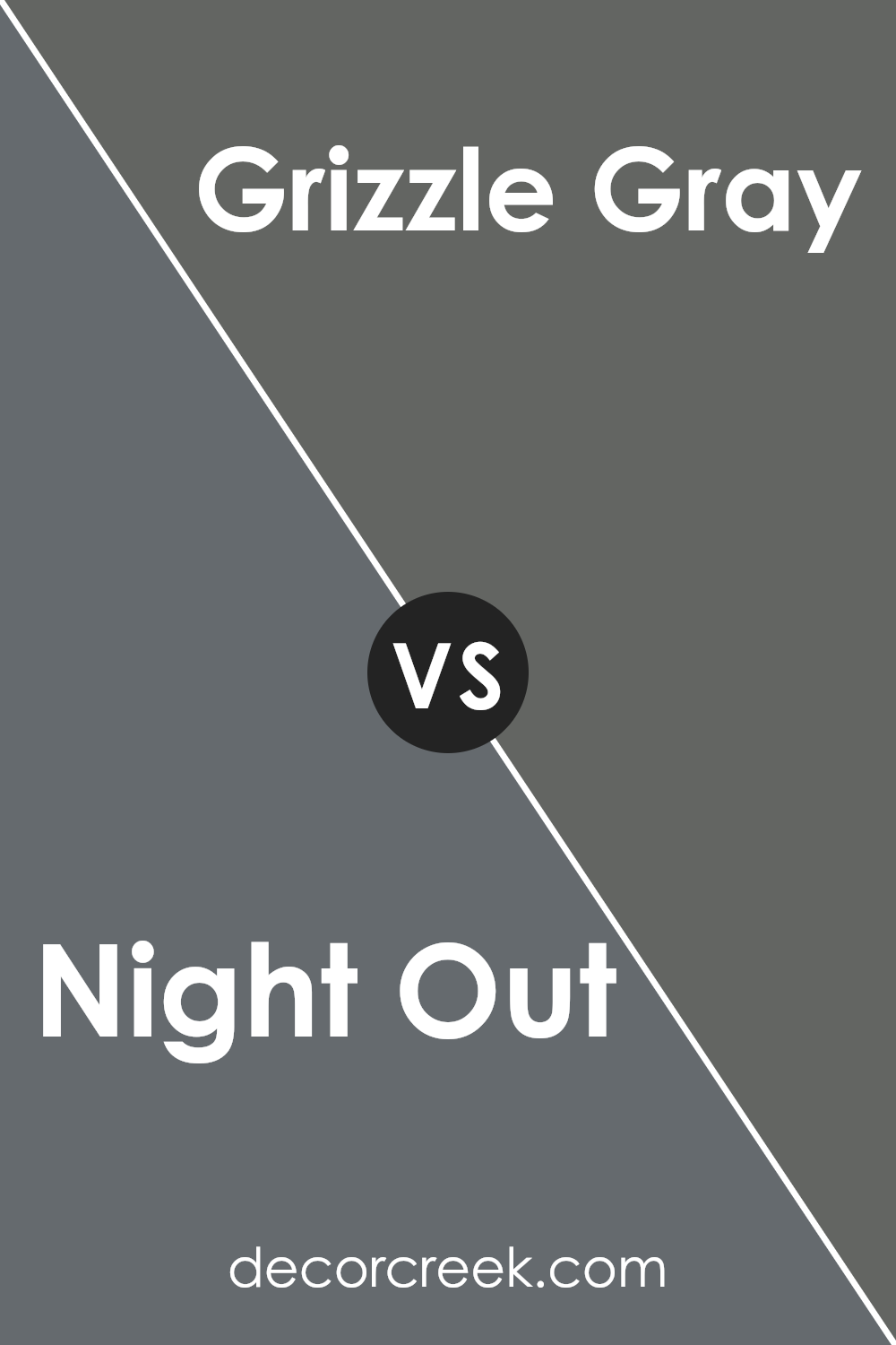
Night Out SW 9560 by Sherwin Williams vs Grizzle Gray SW 7068 by Sherwin Williams
The main color, Night Out, and the second color, Grizzle Gray, both by Sherwin Williams, share a cool color palette but differ significantly in tone and mood.
Night Out is a deep, dark color, much like the shade you’d see in the night sky just before it turns completely black. This makes it a bold choice for creating dramatic and cozy spaces.
On the other hand, Grizzle Gray is lighter and carries more of the classic gray look. It’s versatile, fitting well in many spaces without making them feel too heavy or closed in.
Think of Grizzle Gray as a cloudy day, offering a softer, more approachable atmosphere. While both colors can anchor a room, Night Out leans towards a more intense, profound statement, and Grizzle Gray offers a balanced, understated elegance.
Using them in decor can result in different vibes – Night Out is for those looking to create a deep, sophisticated ambiance, while Grizzle Gray suits a broader range of spaces with its calming and neutral presence.
You can see recommended paint color below:
- SW 7068 Grizzle Gray
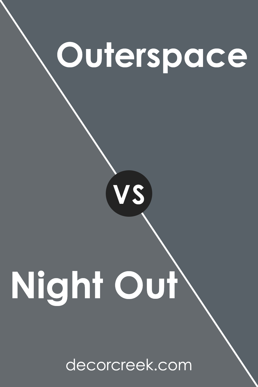
Night Out SW 9560 by Sherwin Williams vs Outerspace SW 6251 by Sherwin Williams
Night Out and Outerspace are two unique colors by Sherwin Williams, each offering its own distinctive vibe. Night Out is a deep, rich tone that feels luxurious and cozy, perfect for creating a sophisticated and warm atmosphere.
It has an inviting quality, well-suited for spaces where you want to relax and unwind. On the other hand, Outerspace presents a cooler hue, leaning more towards a slate gray that brings a sense of calm and tranquility.
It’s lighter compared to Night Out, which helps in making rooms appear more spacious and open. This color works well in modern and minimalistic designs, providing a sleek and contemporary look.
While both colors share a certain depth, Night Out leans towards warmth and richness, whereas Outerspace offers coolness and a crisp, modern feel.
Whether you’re looking to create a cozy retreat or a fresh, airy space, these colors offer beautiful options for your home.
You can see recommended paint color below:
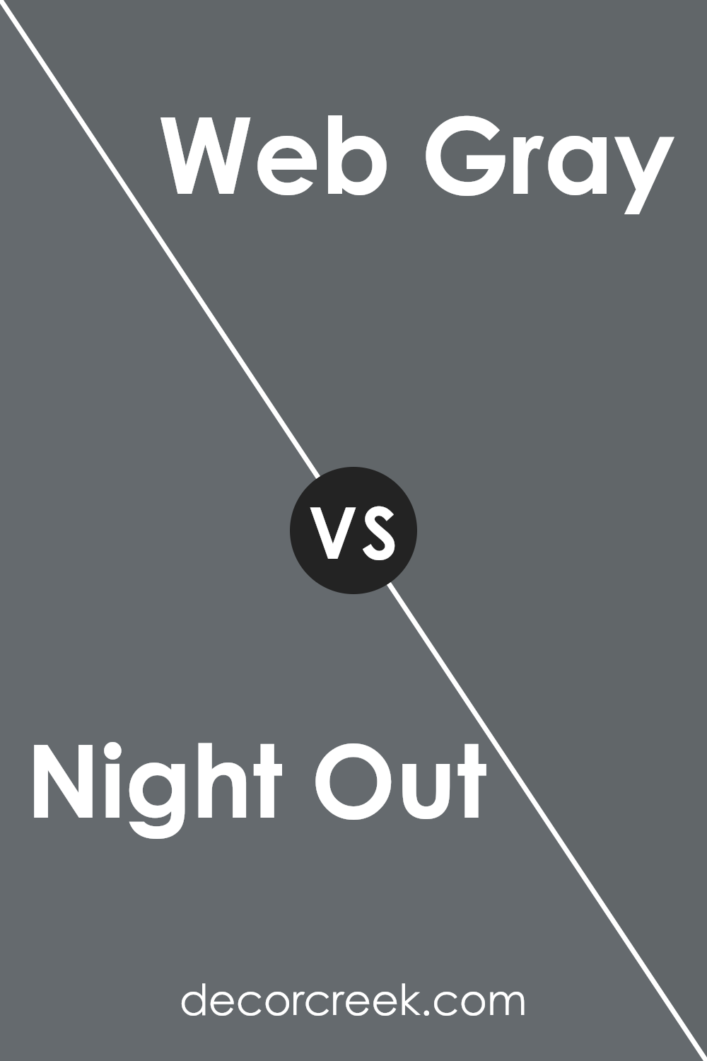
Night Out SW 9560 by Sherwin Williams vs Web Gray SW 7075 by Sherwin Williams
Night Out and Web Gray, both by Sherwin Williams, offer distinct vibes for any space. Night Out is a deep, moody color that feels like the sky at dusk, adding a rich and sophisticated atmosphere.
Its darkness makes it a bold choice, perfect for creating a cozy, intimate setting. It speaks volumes in terms of elegance and depth.
On the other hand, Web Gray is a cooler, lighter shade than Night Out. It’s more subtle and neutral, providing a versatile backdrop that works well in a variety of settings.
This color leans towards a modern, sleek look, offering a sense of calmness and order. It’s less dramatic than Night Out but equally stylish, making spaces feel more open and airy.
When comparing the two, Night Out brings drama and intensity, ideal for statement areas or accent walls, while Web Gray offers a tranquil and clean canvas, great for broader applications.
Both hues carry their unique charm, but the choice between them comes down to the mood and style you’re aiming for in your space.
You can see recommended paint color below:
- SW 7075 Web Gray
Night Out SW 9560 by Sherwin Williams vs Wall Street SW 7665 by Sherwin Williams
Night Out and Wall Street, both colors by Sherwin Williams, offer unique but differing vibes for any space. Night Out is a deep, rich hue that could easily give a room a cozy, sophisticated feel.
It’s the kind of color that’s perfect for creating a statement wall or cozy nook, providing a strong backdrop that allows furnishings and décor to pop.
On the other hand, Wall Street leans toward a cooler, more understated elegance. It’s a versatile grey that works well in various settings, offering a modern and sleek look.
This color has the ability to make spaces feel more expansive and airy, making it a great choice for offices or minimalist living areas.
While both colors bring their own strengths to the table, the choice between them really boils down to the ambiance you’re looking to create.
Night Out sways towards a warmer, more enveloping atmosphere, while Wall Street offers a cleaner, crisp aesthetic.
You can see recommended paint color below:
- SW 7665 Wall Street
Conclusion
In summary, Night Out SW 9560 by Sherwin Williams is a unique and elegant paint color that brings a sense of sophistication and depth to any room.
Its versatility allows it to be used in a variety of spaces, from bedrooms to living areas, making it a popular choice for those looking to add a touch of class to their interiors.
The color’s rich tones provide a perfect backdrop for both bold and muted decor, allowing for a wide range of design possibilities.
Overall, Night Out SW 9560 stands out as a favorite for interior design projects, appreciated for its ability to create a cozy, yet upscale atmosphere.
Its ability to complement different lighting conditions and work with various decorative styles adds to its appeal, making it a go-to option for homeowners and designers alike.
Whether used as an accent wall or as the main color scheme, Night Out adds a luxurious feel to any space, proving itself as a stylish and versatile choice in the world of interior design.
Ever wished paint sampling was as easy as sticking a sticker? Guess what? Now it is! Discover Samplize's unique Peel & Stick samples.
Get paint samples