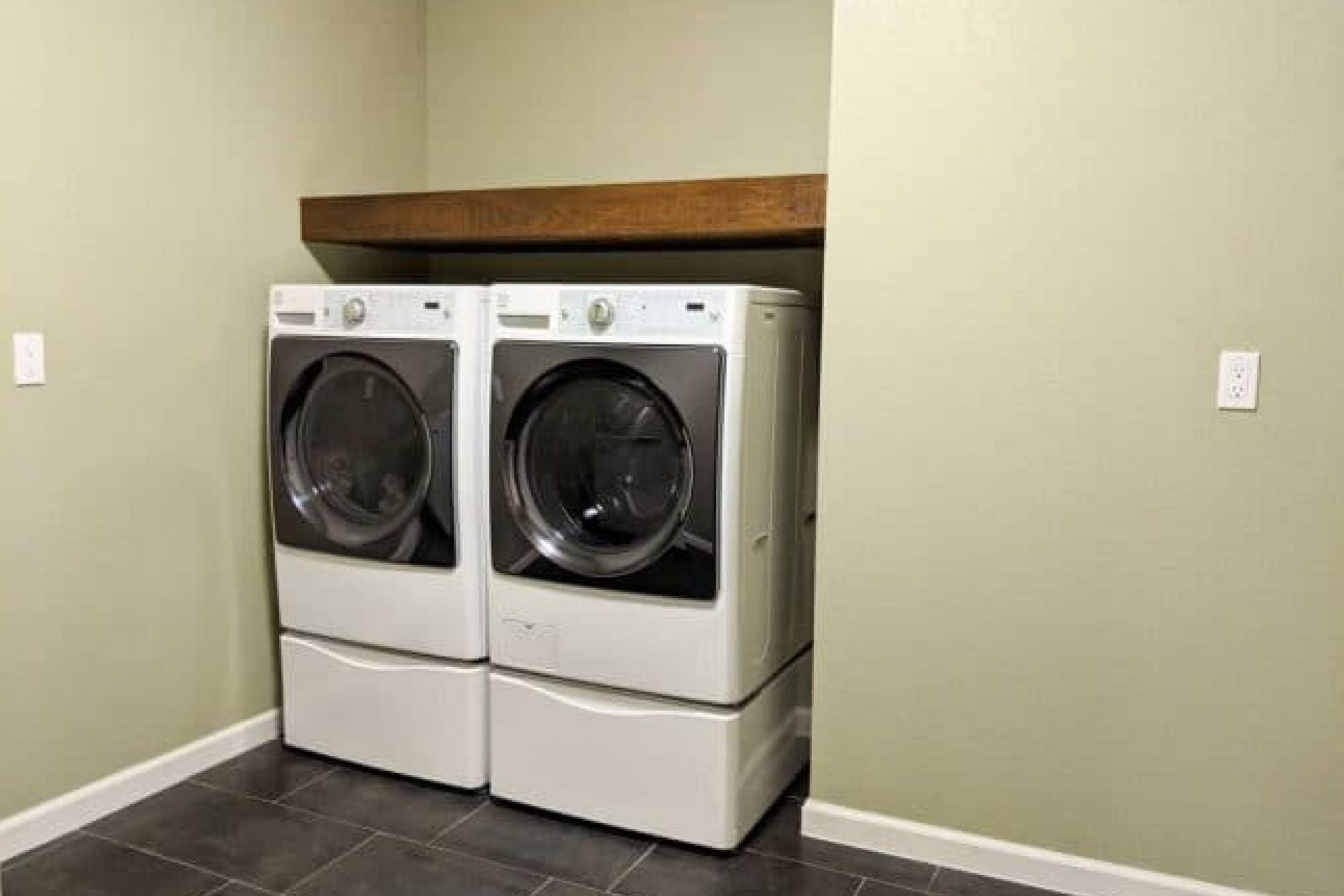
I’ve found this color to be a soothing shade of green that can bring a calm, peaceful vibe to any room. Whether you’re thinking about repainting your living room, bedroom, or even your kitchen, this versatile color could be the perfect choice.
What makes SW 2860 Sage so appealing is its ability to fit seamlessly into various decor styles. From modern to rustic, it complements many different aesthetics, adding a subtle touch of nature.
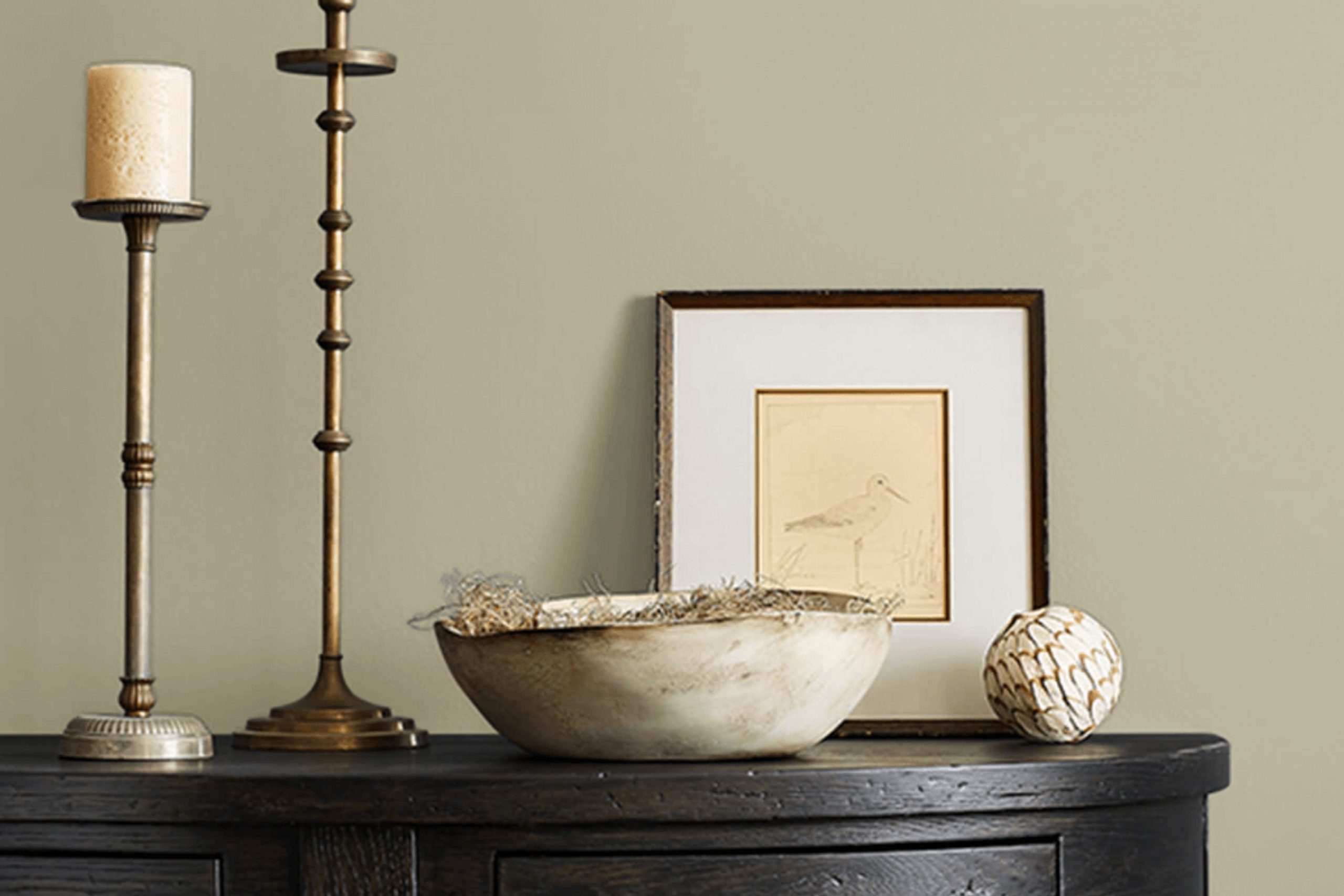
If you have wooden furniture or elements of nature-inspired decor, Sage will enhance these features without overwhelming them.
So, if you’re thinking about refreshing your walls with a new color, SW 2860 Sage could be worth considering. It’s not just a paint; it’s a way for you to renew your surroundings in a calm and collected manner.
What Color Is Sage SW 2860 by Sherwin Williams?
Sage by Sherwin-Williams (SW 2860) is a soothing, muted green shade that adds a natural, earthy feel to any room. This shade draws inspiration from lush gardens and forest canopies, blending the calming qualities of green with subtle gray undertones to create a harmonious and inviting atmosphere.
The color works exceptionally well in interior styles that emphasize organic elements and simplicity, such as Scandinavian, rustic, or modern farmhouse designs.
The versatility of Sage allows it to pair beautifully with a variety of materials and textures. It complements natural wood, from pale birch to rich walnut, enhancing the warmth and natural grains of the wood. This color also goes well with linen and cotton textiles, adding a soft, lived-in touch that is welcoming and relaxing. Leather accents, in shades of tan or brown, also work well with Sage, providing a nice contrast that highlights its earthy qualities.
Sage can be used in various spaces within the home, from creating a calm and restful bedroom environment to establishing a soothing backdrop in a living room or study.
Its natural affinity with plants makes it particularly effective in spaces that integrate indoor greenery, promoting a sense of wellbeing and connection to nature.
Is Sage SW 2860 by Sherwin Williams Warm or Cool color?
The SageSW 2860 color from Sherwin Williams is a soft shade of green that brings a calm and refreshing feel to any room. This color works particularly well in homes because it is subtle and natural, making spaces feel more open and airy. It is a fantastic choice for living rooms and bedrooms where you want to create a peaceful atmosphere.
The light green hue can complement many styles and tastes, blending well with woods, whites, and other neutral tones. This flexibility allows homeowners to use this color in various design themes, whether it’s a rustic farmhouse look or a more modern minimalist approach.
Additionally, SageSW 2860 has a versatility that works in spaces with either a lot of natural light or in rooms that are smaller or dimly lit. In bright spaces, the color looks vibrant and lively, whereas in smaller spaces it can help to make the area appear bigger and more welcoming.
This paint color is not just about aesthetics; it’s also about making the home feel comfortable and pleasant to live in.
Undertones of Sage SW 2860 by Sherwin Williams
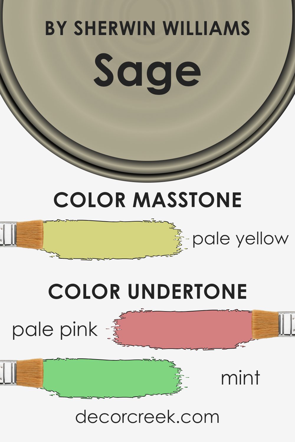
The color SageSW 2860 by Sherwin Williams is a complex hue that can subtly influence the mood and appearance of a room, thanks to its variety of undertones. Undertones are the colors that lurk beneath the main color and can either cool it down, warm it up, or change how we perceive the main color in different lighting conditions.
This particular paint has a mix of both warm and cool undertones ranging from pale pink to olive. These underlying colors play a significant role in how SageSW 2860 is viewed. For example, in a room with a lot of natural light, the light blue and mint undertones might become more apparent, giving the walls a fresher, cooler look.
In contrast, in artificial or dim lighting, the orange and yellow undertones might stand out, warming up the room.
On interior walls, this blend of undertones makes the paint highly versatile. It can either cool down a sunny room or warm up a darker space.
This feature makes SageSW 2860 an excellent choice for living rooms, bedrooms, or even kitchens where the mood can shift based on the time of day and the type of lighting used.
Understanding how undertones affect the color can help homeowners make more informed choices about the colors they use in their homes, ensuring that they get the desired effect in each room, under various lighting conditions.
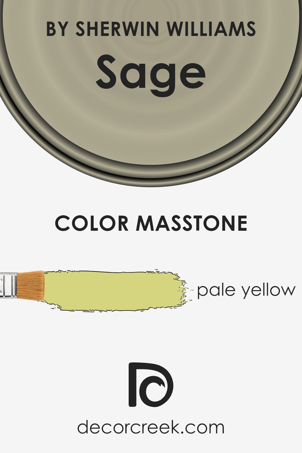
What is the Masstone of the Sage SW 2860 by Sherwin Williams?
The SageSW 2860 by Sherwin Williams has a masstone of pale yellow, identifiable by its specific hue (#D5D580). This light, muted yellow brings a gentle brightness to spaces without being overpowering. Being a lighter shade, it works wonderfully to make smaller rooms feel larger and more open.
Additionally, its softness allows it to blend easily with various decor styles and colors, making it versatile for use throughout the home.
In living areas, this pale yellow can add a subtle touch of cheerfulness, enhancing the mood without dominating the room’s color scheme. It’s especially effective in spaces that receive limited natural light, as it can help to visually warm and lighten the area. In bedrooms or study areas, its soft tone provides a calm, soothing backdrop, which is conducive to relaxation and concentration.
Overall, SageSW 2860 is an excellent choice for creating a bright and airy feel in any home setting.
How Does Lighting Affect Sage SW 2860 by Sherwin Williams?
Lighting plays a critical role in how we perceive colors, as different types of light can change the way a color looks. For instance, SageSW 2860 by Sherwin Williams, a popular paint color, can appear differently under various lighting conditions. This change is largely due to the fact that colors absorb and reflect light differently depending on the light source.
In artificial light, such as that from incandescent bulbs, SageSW 2860 might appear warmer and more muted. This is because incandescent lighting tends to have a yellow undertone, which can enhance the green and gray tones in the paint.
On the other hand, in natural light, especially coming from the sun during the middle of the day, this color can look brighter and more vibrant. This is due to the more neutral or bluish tone of natural daylight, which does not alter the inherent color as much.
When it comes to rooms facing different directions, SageSW 2860 will also show varying characteristics:
1. North-facing rooms: These rooms usually get less direct sunlight, often casting a cooler, bluish light. Here, SageSW 2860 may appear more subdued and slightly darker, emphasizing its gray components.
2. South-facing rooms: In contrast, these rooms receive plenty of bright, warm light for most of the day. This lighting can make SageSW 2860 look lighter and bring out its vibrant green undertones.
3. East-facing rooms: These rooms are lit mainly in the morning. SageSW 2860 will look brighter and fresher in the morning light but might seem duller as the day progresses.
4. West-facing rooms: Since these rooms get sunlight in the afternoons and evenings, the color might appear warmer and more intense during this time, especially during sunset when the light has a golden hue.
Understanding these effects can help in deciding where to paint a particular color in a home, ensuring that you achieve the desired effect with your color choices under different lighting conditions.

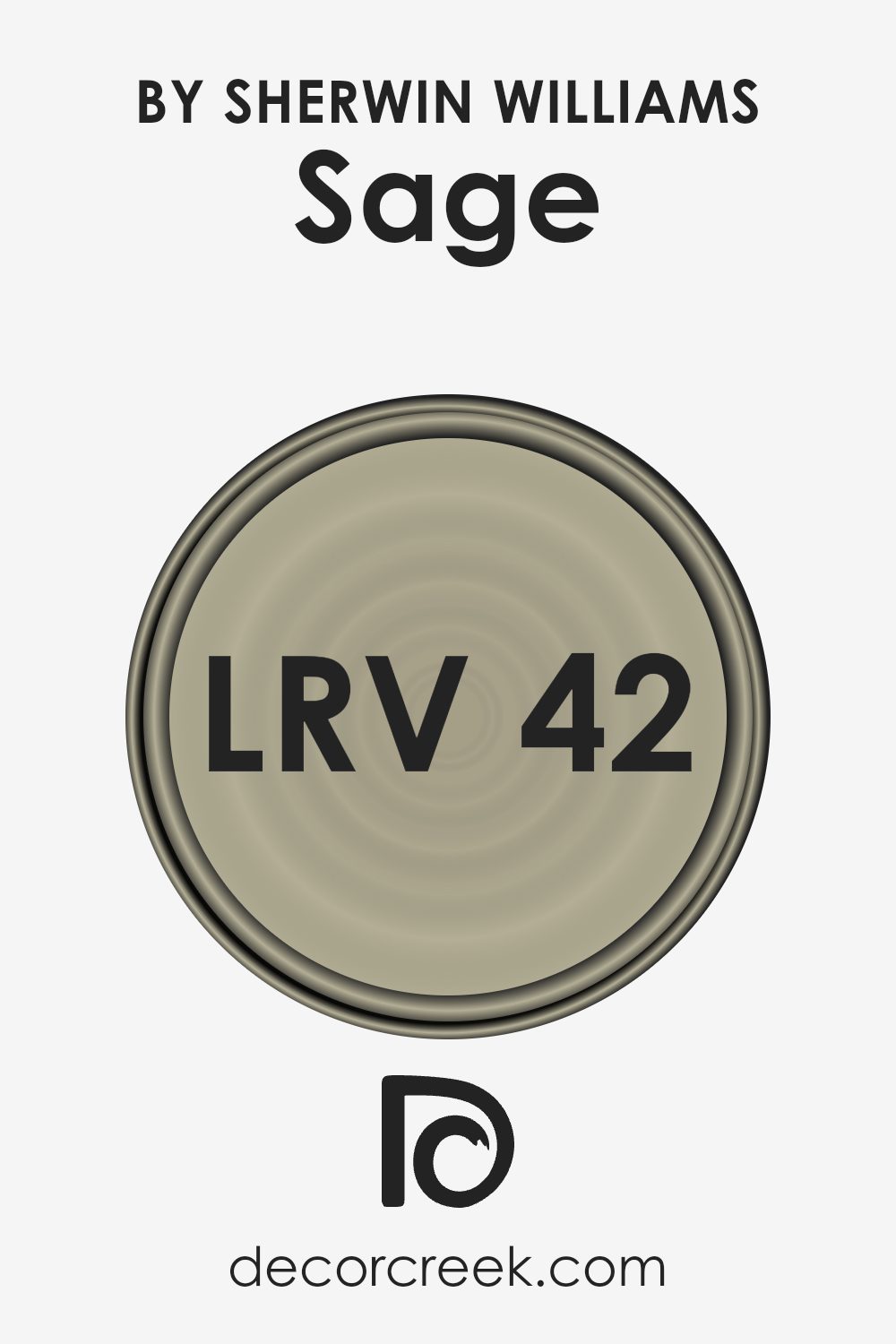
What is the LRV of Sage SW 2860 by Sherwin Williams?
LRV stands for Light Reflectance Value, which measures the percentage of light a paint color reflects back into the room compared to the light it absorbs. Essentially, LRV tells you how light or dark a color will appear once it’s on your walls.
A higher LRV means the color reflects more light, making the room feel brighter, whereas a low LRV indicates that the color absorbs more light, generally making the space feel cozier but smaller.
SageSW 2860, with an LRV of 42.082, falls into the medium range in terms of light reflectance. This means it neither reflects light excessively nor absorbs it too much. In practical terms, this balance makes the color quite versatile—it can enhance a room’s brightness if used with adequate natural or artificial lighting, yet still bring depth and warmth under dimmer conditions.
This LRV makes it a good choice for spaces where you want some brightness but also a feeling of enclosure and comfort.
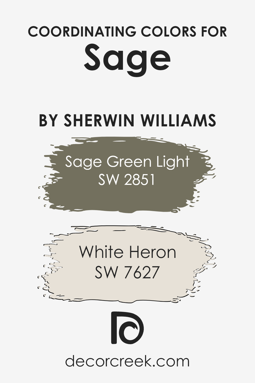
Coordinating Colors of Sage SW 2860 by Sherwin Williams
Coordinating colors work together to create a harmonious look in any space by enhancing each other’s beauty. When decorating with a base color like Sage SW 2860 by Sherwin Williams, choosing coordinating colors wisely is crucial to achieving a balanced and appealing aesthetic.
Coordinating colors like Sage Green Light SW 2851 and White Heron SW 7627 work well because they share similar undertones or complement each other, making the space feel more cohesive and well-planned.
Sage Green Light is a lighter version of the main sage color, offering a subtle contrast while maintaining the overall calm and gentle atmosphere of the room. It’s ideal for trim or as an accent wall, where it softly lifts the more grounded sage. On the other hand, White Heron is a clean and bright white shade that brings out the richness of the Sage without overpowering it.
This color is excellent for ceilings, woodwork, or even larger areas if you want to introduce more lightness into the room and make it appear larger and more open.
You can see recommended paint colors below:
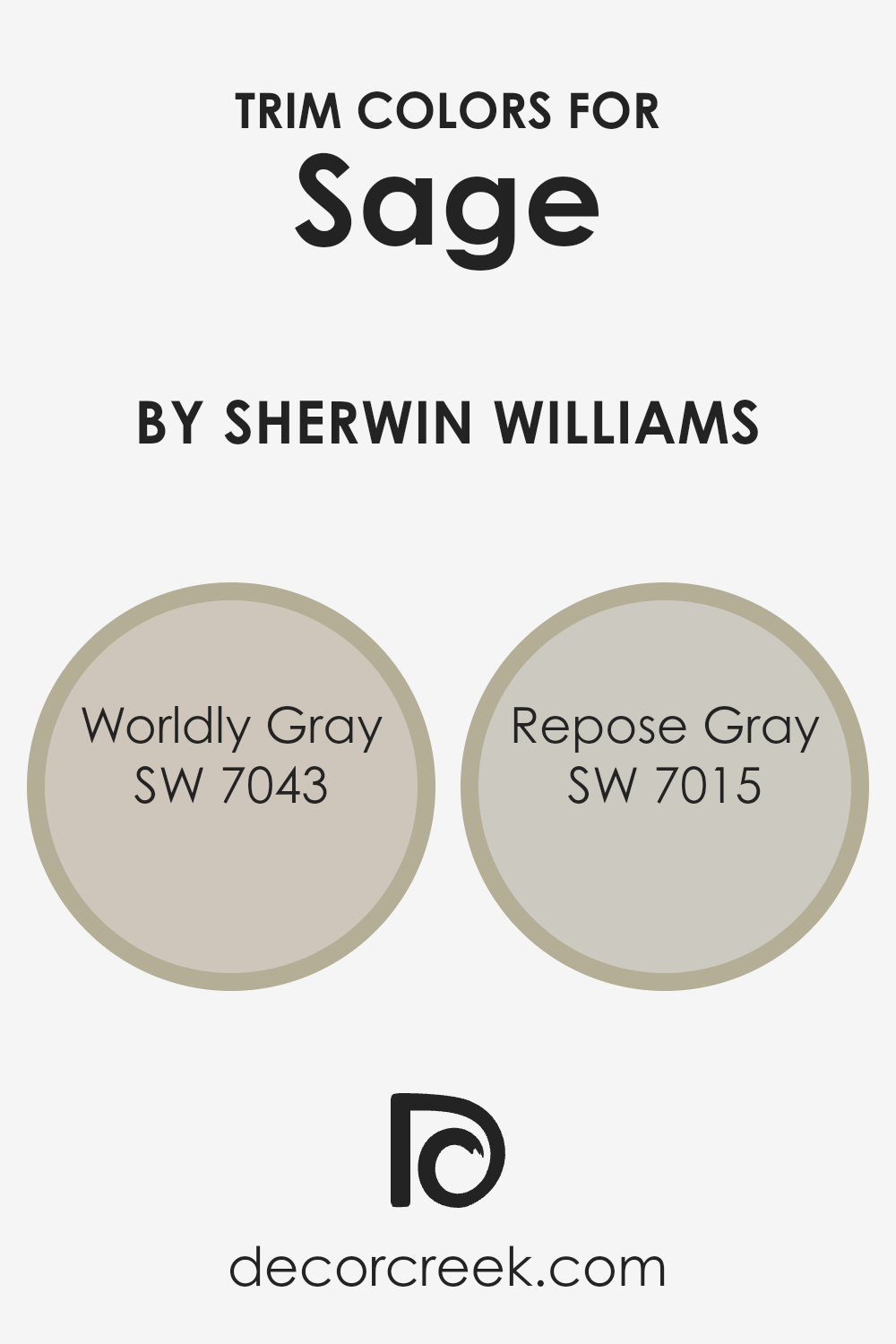
What are the Trim colors of Sage SW 2860 by Sherwin Williams?
Trim colors play a crucial role in interior and exterior design by defining the architectural details and boundaries on features such as doors, window frames, and skirting. When paired with a base color like Sherwin Williams’ Sage (SW 2860), trim colors need to complement and enhance the overall aesthetic.
For SW 2860, using trim colors such as Worldly Gray (SW 7043) and Repose Gray (SW 7015) can provide a subtle contrast that highlights the unique tones of the sage without overwhelming it.
These lighter shades of gray can gently frame the sage, allowing its natural, calming qualities to stand out, while ensuring that the space remains cohesive and harmoniously balanced.
Worldly Gray (SW 7043) is a gentle gray with warm undertones, which makes it a versatile choice for a variety of decorating styles. It can add warmth to the sage, creating a welcoming and polished look. Repose Gray (SW 7015), on the other hand, is a lighter gray with a hint of warmth that offers a fresh and contemporary backdrop that supports the vibrancy of the Sage without clashing with its more subdued tones.
Both of these colors provide a beautiful contrast that is subtle yet effective, making them excellent choices for enhancing the overall appeal of a room or home’s exterior.
You can see recommended paint colors below:
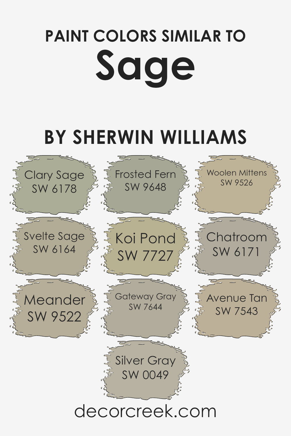
Colors Similar to Sage SW 2860 by Sherwin Williams
Similar colors are crucial in design for creating a harmonious and pleasing aesthetic. When colors from the same family, like those similar to Sage SW 2860 by Sherwin Williams, are used together, they create a cohesive look that is easy on the eyes.
These colors blend smoothly without stark contrasts, ensuring that the space feels united and balanced. This technique is ideal for bringing a subtle depth and sophistication to interiors while maintaining a relaxed and inviting atmosphere.
Clary Sage SW 6178 is a muted green that offers a touch of earthiness to any space. Svelte Sage SW 6164 is slightly lighter, giving rooms a fresh, airy feel. Meander SW 9522 has a dusty green tone that evokes a sense of calmness. Silver Gray SW 0049 is a gentle gray with a hint of green, perfect for modern spaces.
Frosted Fern SW 9648 brings a cooler, frost-like finish to the selection. Koi Pond SW 7727 presents a deeper green hinting at natural water elements. Gateway Gray SW 7644, a darker gray, adds a strong, grounding effect. Woolen Mittens SW 9526 has a warm, soft presence much like the feel of cozy mittens.
Chatroom SW 6171 is a darker, ashier tone that provides a subtle shadow effect. Lastly, Avenue Tan SW 7543 offers a warm tan that complements the greens beautifully for a balanced look. Collectively, these colors work together to provide an appealing palette that enhances any environment without overwhelming it.
You can see recommended paint colors below:
- SW 6178 Clary Sage
- SW 6164 Svelte Sage
- SW 9522 Meander
- SW 0049 Silver Gray
- SW 9648 Frosted Fern
- SW 7727 Koi Pond
- SW 7644 Gateway Gray
- SW 9526 Woolen Mittens
- SW 6171 Chatroom
- SW 7543 Avenue Tan
How to Use Sage SW 2860 by Sherwin Williams In Your Home?
Sage SW 2860 by Sherwin Williams is a calming green shade that can bring a touch of nature into your home. This color is versatile and works great in many areas. It’s perfect for creating a cozy atmosphere in living rooms or bedrooms.
When applied to walls, Sage SW 2860 offers a refreshing backdrop that complements both modern and rustic furniture. You can also use this paint in kitchens or bathrooms for a clean, fresh look.
If you have a small space, like an entryway or hallway, painting it Sage SW 2860 can make the area seem brighter and more welcoming. For a more unique approach, consider using this color on cabinets or as an accent in bookshelves to add a subtle pop of color without overwhelming the space.
This green hue pairs well with light woods, whites, and beiges, making it easy to match with existing decor. Sage SW 2860 can help create a peaceful and inviting environment in your home.
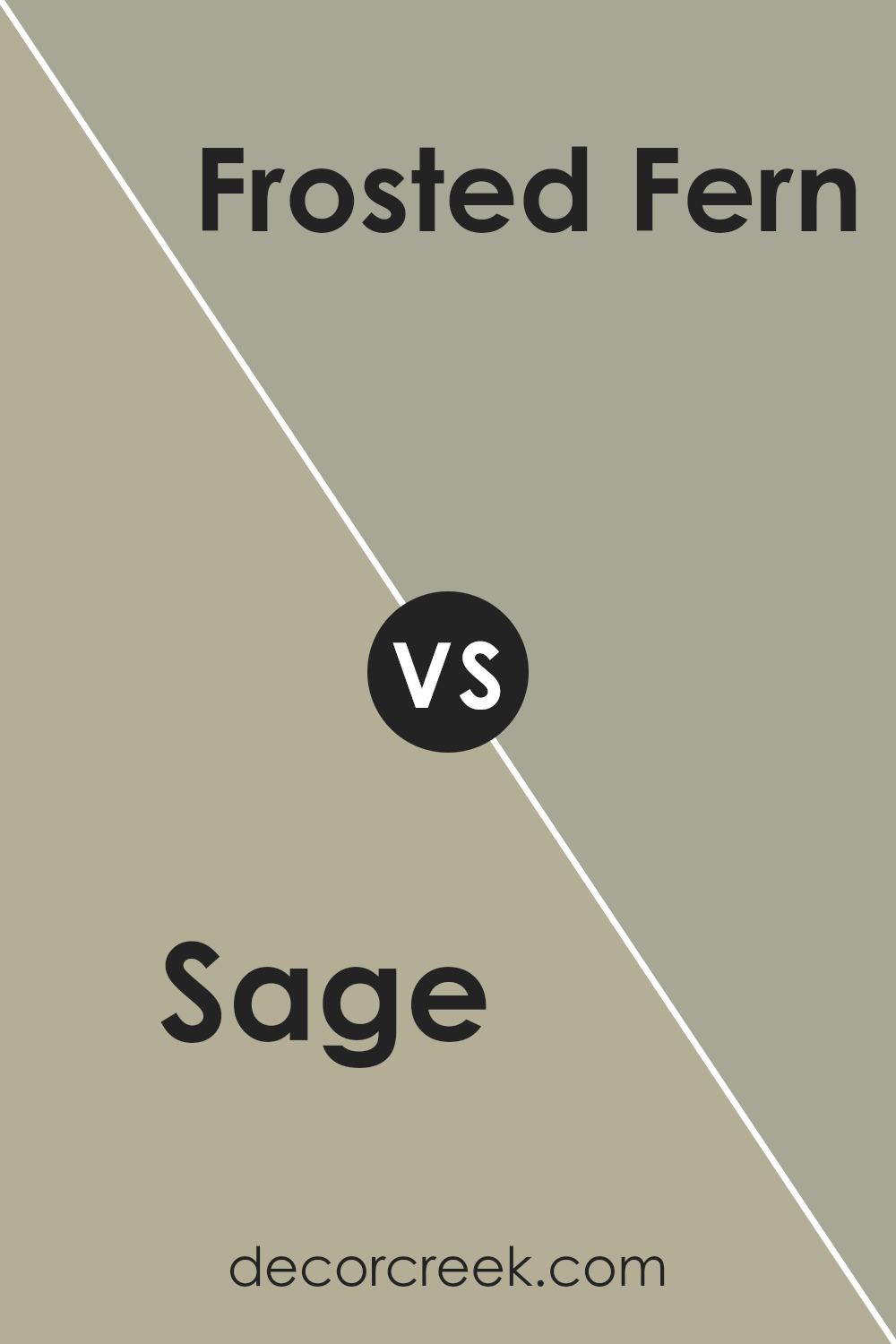
Sage SW 2860 by Sherwin Williams vs Frosted Fern SW 9648 by Sherwin Williams
Sage SW 2860 by Sherwin Williams is a warm, muted green with gray undertones, offering a cozy and inviting atmosphere. It has an earthy quality, making it great for spaces where you want a grounded and calming feel, such as living rooms or bedrooms.
In contrast, Frosted Fern SW 9648 is a lighter and more vibrant green. This color has a fresher look, bringing a lively and refreshing vibe to any room. It’s particularly suitable for bathrooms or kitchens where you might want a cleaner, crisper appearance.
Comparison wise, Sage is darker and more subtle, which helps in creating a snug, intimate environment. Frosted Fern, on the other hand, stands out more due to its brighter tone, enhancing spaces with a touch of cheerfulness. Overall, both colors bring their unique green hues to the table but serve different moods and settings depending on what you’re looking for in your decor.
You can see recommended paint color below:
- SW 9648 Frosted Fern
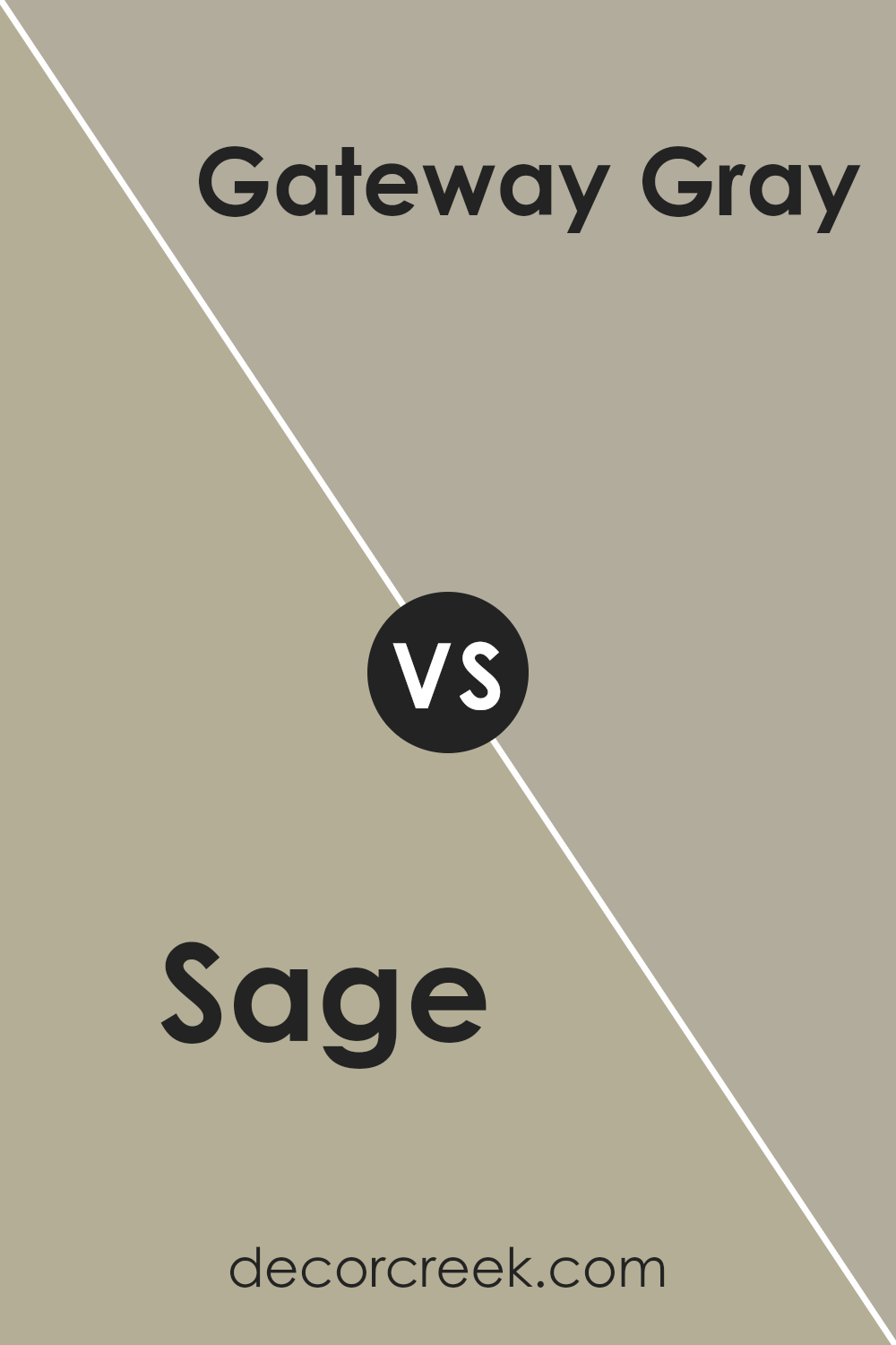
Sage SW 2860 by Sherwin Williams vs Gateway Gray SW 7644 by Sherwin Williams
Sage SW 2860 is a soft and muted green with a touch of gray, giving it a calm and grounding feel that’s perfect for creating a cozy and relaxing atmosphere in any room. Its subtle tone blends well with natural materials and can give a fresh and airy look to spaces.
On the other hand, Gateway Gray SW 7644 is a deeper, mid-tone gray with earthy brown undertones. This color is versatile and warm, making it ideal for adding a bit of richness and warmth to spaces that might feel too open or cold.
It pairs well with a variety of decor styles, from modern to traditional, and can be a solid choice for common areas like living rooms or hallways where a touch of elegance is desired.
Both colors offer unique qualities: Sage brings a breath of freshness, while Gateway Gray adds depth and warmth. They can be used together to create a balanced and harmonious color scheme, combining natural-inspired subtlety with cozy sophistication.
You can see recommended paint color below:
- SW 7644 Gateway Gray
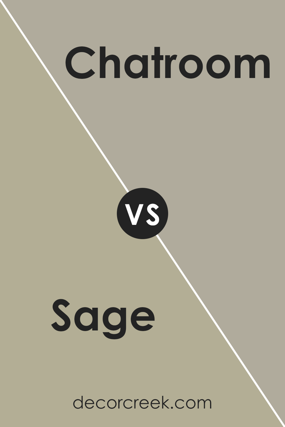
Sage SW 2860 by Sherwin Williams vs Chatroom SW 6171 by Sherwin Williams
Sage SW 2860 and Chatroom SW 6171, both by Sherwin Williams, present unique yet complementary color options for home decor. Sage is a soft green with a muted, almost earthy quality, bringing a calm and gentle ambiance to any space. It reflects natural elements and can help create a relaxing environment, perfect for living rooms or bedrooms where comfort is key.
On the other hand, Chatroom is a deeper, grayish-green hue. This color has a more neutral, subdued appearance, making it versatile for various settings. It can serve as a strong foundational color in a room, particularly effective in spaces that seek a balance between warmth and modern aesthetics.
Both colors can work well together, with Sage providing a lighter, fresher touch and Chatroom adding depth and a sense of grounding. Choosing between the two depends on the desired mood and the specific characteristics of the room to be painted.
You can see recommended paint color below:
- SW 6171 Chatroom
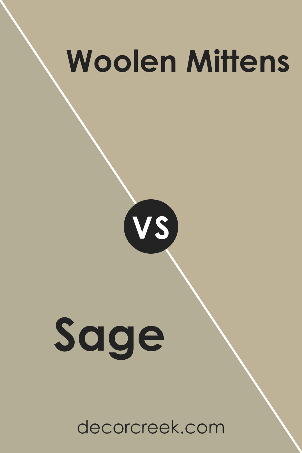
Sage SW 2860 by Sherwin Williams vs Woolen Mittens SW 9526 by Sherwin Williams
The main color, Sage, is a soft, muted green with gray undertones, giving it a subtle, soothing appearance. It’s a versatile paint color that blends well with natural materials and can make spaces feel more open and airy. On the other hand, Woolen Mittens is a warmer, beige color with a cozy feel to it, resembling the comforting hue of a knitted sweater.
This color is great for creating a welcoming atmosphere in rooms where you want to relax. Both Sage and Woolen Mittens work well in various lighting conditions, but while Sage adds a touch of freshness reminiscent of the outdoors, Woolen Mittens provides a sense of warmth.
Pairing these two can balance cool and warm tones in a room, making for a harmonious color scheme.
You can see recommended paint color below:
- SW 9526 Woolen Mittens
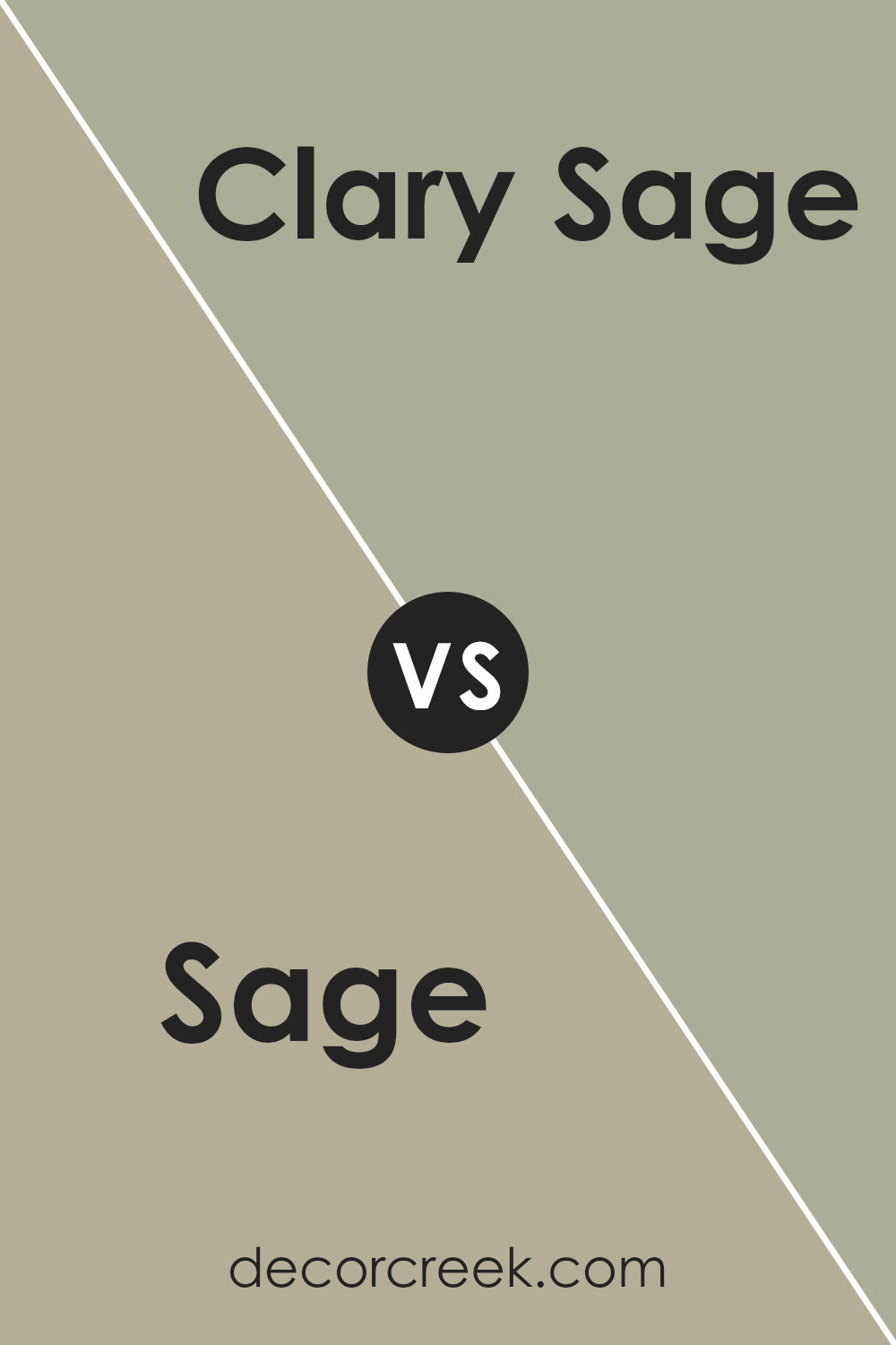
Sage SW 2860 by Sherwin Williams vs Clary Sage SW 6178 by Sherwin Williams
The main color, Sage SW 2860 by Sherwin Williams, is a muted green with gray undertones, giving it a soft and subtle appearance. It blends well into spaces that aim for a calm and gentle ambiance. This color is versatile, fitting nicely in various rooms, from kitchens to bedrooms.
On the other hand, Clary Sage SW 6178 is also a green shade but leans slightly more toward an earthy tone with richer and warmer undertones. This makes Clary Sage a bit more pronounced when applied to walls or features within a room. It’s excellent for areas where a cozy yet fresh feel is desired.
Both colors reflect the natural elements of sage, but while Sage is softer and more reserved, Clary Sage presents itself with a tad more vibrancy and warmth. Choosing between them depends on whether you prefer a lighter touch or a more grounded, nature-inspired vibe in your decorating scheme.
You can see recommended paint color below:
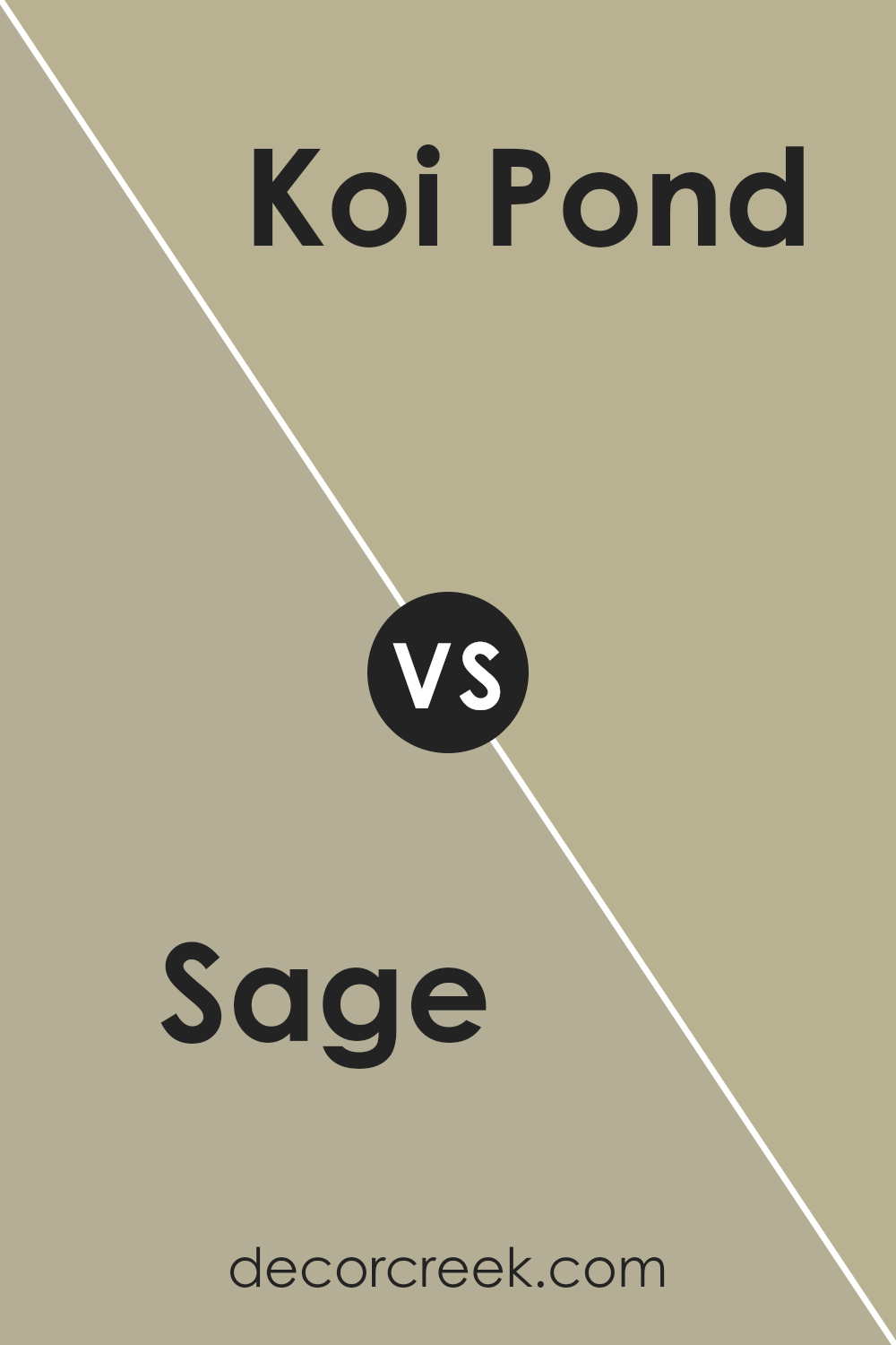
Sage SW 2860 by Sherwin Williams vs Koi Pond SW 7727 by Sherwin Williams
Sage and Koi Pond are both colors by Sherwin Williams, but they have distinct vibes. Sage is a soft, muted green with a touch of gray, making it feel calm and subtle. It’s great for creating a peaceful atmosphere in a space, blending well with natural materials and soft textures. It works perfectly in places where you want to wind down and relax.
On the other hand, Koi Pond is a much deeper and vibrant green. It has more energy and presence, potentially making a room feel more alive and playful. This color might be a better choice for areas where you want more vibrancy and warmth, like kitchens or living areas. It stands out more against neutrals and can work well as an accent wall or for bringing in some character to a space.
Both colors can refresh a room, but their impacts are quite different. Sage soothes, while Koi Pond enlivens. Your choice depends on what feeling you want to achieve in your room.
You can see recommended paint color below:
- SW 7727 Koi Pond
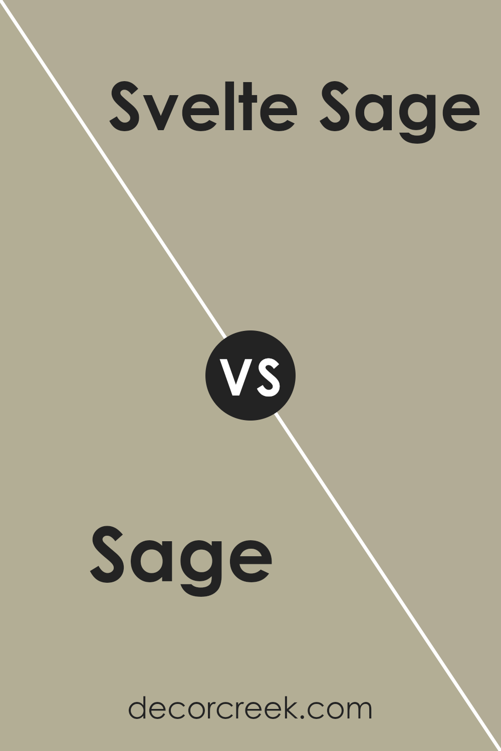
Sage SW 2860 by Sherwin Williams vs Svelte Sage SW 6164 by Sherwin Williams
Sage SW 2860 and Svelte Sage SW 6164, both by Sherwin Williams, are subtle shades that both bring a natural, calming presence to any space. Sage is the deeper of the two, offering a more pronounced green that can make walls or accents stand out a bit more. It lends itself well to spaces where a stronger color influence is desired without overwhelming the senses.
On the other hand, Svelte Sage is lighter and leans towards a muted, pastel-like tone. This color is perfect for creating a soft, soothing backdrop. It works well in rooms where you want to keep things light and airy, enhancing the sense of space without drawing too much attention to the walls.
Both colors pair beautifully with a variety of decor styles, and each can create a welcoming atmosphere. Whether you choose the bolder Sage or the softer Svelte Sage depends on the amount of visual impact you want and the specific ambiance you aim to achieve in your room.
You can see recommended paint color below:
Sage SW 2860 by Sherwin Williams vs Meander SW 9522 by Sherwin Williams
Sage SW 2860 and Meander SW 9522 are two distinctive green shades from Sherwin Williams that offer different vibes to spaces. Sage is a muted, grayish-green hue that brings a calm and gentle feel to any room. It’s understated and versatile, making it easy to pair with a variety of decor styles, from rustic to modern.
In contrast, Meander is a deeper, more vibrant green with a significant blue undertone. This color carries more energy and impact, creating a stronger visual statement. It’s ideal for those looking to add a bit more personality and punch to their space.
While Sage works well in areas where you want a soft background or a neutral base color, Meander is best when used as an accent or in areas where a more dynamic color is desired to make the surroundings pop. Both colors support greenery and natural elements well, but the choice between them depends on the mood you want to set and the level of boldness you’re comfortable with in your color scheme.
You can see recommended paint color below:
Sage SW 2860 by Sherwin Williams vs Avenue Tan SW 7543 by Sherwin Williams
Sage SW 2860 by Sherwin Williams is a soft, muted green with earthy tones, often giving a natural and calming feel to any space. This color works well in areas where relaxation is key, like bedrooms or living rooms.
On the other hand, Avenue Tan SW 7543 is a warm neutral shade that leans towards a beige or light brown. It’s a versatile color that easily pairs with different decor styles and brings a cozy and welcoming ambiance to any room.
While Sage has a distinctly green base that suggests freshness and calmness, Avenue Tan offers a more classic and understated look that can serve as a backdrop to bolder colors or standout furniture. Each color has its own charm and functions best depending on what mood you want to create in your space.
Whether it’s the soothing touch of Sage or the gentle warmth of Avenue Tan, both colors provide unique atmospheres and can beautifully enhance your home.
You can see recommended paint color below:
- SW 7543 Avenue Tan
Sage SW 2860 by Sherwin Williams vs Silver Gray SW 0049 by Sherwin Williams
Sage SW 2860 by Sherwin Williams is a gentle, muted green with earthy tones that can create a calm and inviting atmosphere in any space. It’s a color that brings a touch of nature inside and is versatile enough to work well in spaces ranging from kitchens to bedrooms.
On the other hand, Silver Gray SW 0049 by Sherwin Williams leans more towards a classic, neutral gray with a subtle silvery sheen. This lighter gray offers a clean and timeless look, making it ideal for modern living spaces or for introducing a more airy feel into a room.
When comparing the two, Sage adds a warmth and organic character to rooms, making them feel grounded and cozy. Silver Gray, in contrast, provides a brighter, more open vibe that can help small spaces appear larger. Both colors are excellent choices for creating a relaxed environment, but their effects are distinctly different based on their underlying tones and how they interact with light.
Sage offers a warmer, earthier presence, while Silver Gray provides a cooler, more reflective quality.
You can see recommended paint color below:
In conclusion, SW 2860 Sage by Sherwin Williams is a really neat color that can make a room look peaceful and friendly. It has a green-gray shade that reminds me a bit of forests and gardens. This color is great because it’s not too bright or too dark, making it perfect for any room, whether big or small.
Whether using it in a bedroom, living room, or even a kitchen, Sage brings a fresh and calming feeling to the space.
The best thing is it goes well with various other colors. You can mix it with soft whites, light woods, and even some blues or browns for a nature-inspired look. It’s a choice that can make your home feel like a cozy and welcoming place.
From trying out this color, I learned that Sage is more than just a color; it’s like adding a bit of the outdoor peacefulness right inside the home. It’s perfect for anybody looking to refresh their space without making it too flashy.
Plus, it’s easy to find decorations and furniture to match with it. Truly, SW 2860 Sage by Sherwin Williams is a fantastic color for anyone wanting to give their rooms a gentle, refreshing touch.
Ever wished paint sampling was as easy as sticking a sticker? Guess what? Now it is! Discover Samplize's unique Peel & Stick samples.
Get paint samples

