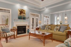
Introducing SW 9522 Meander by Sherwin Williams, a paint color that brings a fresh and inviting vibe to any space. This particular shade stands out due to its unique ability to blend warmth with a sense of calm, making it perfect for anyone looking to add a touch of serenity to their home or office.
SW 9522 Meander is not just another paint color; it’s a way to transform your surroundings into a refuge that reflects a sense of tranquility and comfort.
What’s special about SW 9522 Meander is its versatility. Whether you’re thinking about giving your living room a makeover, sprucing up your bedroom, or even adding a welcoming hue to your office, this shade adapts effortlessly, complementing various decor styles and furniture finishes.
It pairs beautifully with natural light, enhancing the space with a soft, glowing ambiance that makes you feel right at home.
Choosing SW 9522 Meander by Sherwin Williams means opting for a color that goes beyond mere aesthetics. It’s about creating a mood, setting a tone, and crafting an environment where every moment feels a bit more peaceful.
Whether you’re updating one room or considering a whole-house refresh, this shade is poised to add that special touch, making your space not just livable but loveable.
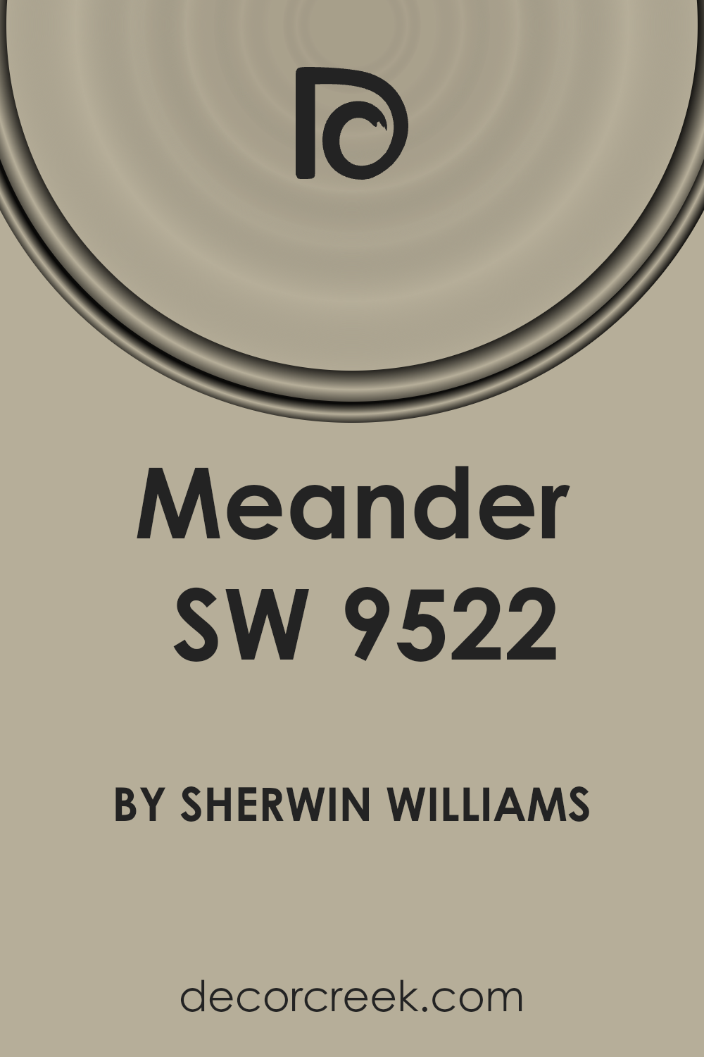
What Color Is Meander SW 9522 by Sherwin Williams?
The color Meander (SW 9522) by Sherwin Williams is a serene and gentle hue that brings to mind the softness of early morning skies or the calm of a tranquil sea.
Its magic lies in its ability to sooth and calm those within its presence, making it an excellent choice for creating peaceful, restful spaces. This light, airy shade falls somewhere between a muted blue and a soft gray, making it versatile and easy to incorporate into various interior styles.
Meander is particularly well-suited for Scandinavian, coastal, or modern minimalist designs due to its clean, subtle nature. It echoes the simplicity and lightness characteristic of these styles, providing a backdrop that feels both refreshing and contemporary.
In a Scandinavian setting, it pairs beautifully with the natural wood finishes and cozy textiles that define this style. For a coastal vibe, combining it with sandy neutrals, whites, and textures like jute or linen can enhance the beachy feel without overdoing it.
When it comes to materials, Meander shines alongside matte finishes and natural fibers, adding depth and interest to the space without overwhelming it.
Metals in brushed nickel or stainless steel offer a crisp, modern edge, while incorporation with velvet or silk textures can introduce an element of luxury and softness. Its adaptability makes it a fantastic choice for those looking to create a space that feels both open and inviting.
Ever wished paint sampling was as easy as sticking a sticker? Guess what? Now it is! Discover Samplize's unique Peel & Stick samples.
Get paint samples

Is Meander SW 9522 by Sherwin Williams Warm or Cool color?
MeanderSW 9522 by Sherwin Williams is a unique and beautiful paint color that can really transform a space in your home. Its subtle hue has a way of adding depth and texture without overwhelming a room.
This makes it very versatile and suitable for various home styles, whether you’re going for a modern, minimalist look or something more traditional and cozy.
One of the best things about this color is how it interacts with lighting. During the day, natural light brings out its warm undertones, making spaces feel inviting and comfortable.
At night, under artificial lighting, it creates a soft, serene ambiance that’s perfect for winding down after a long day.
MeanderSW 9522 shines when used in living rooms, bedrooms, or even bathrooms, offering a backdrop that complements both bold and subdued accent colors. Furniture in natural wood tones or metallic finishes stands out beautifully against it, allowing for a wide range of decorating options.
Choosing this color for your home means adding a layer of sophisticated charm that’s both timeless and modern. It’s a smart pick for anyone looking to refresh their space without going for something too bold or flashy.
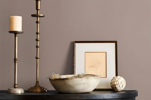
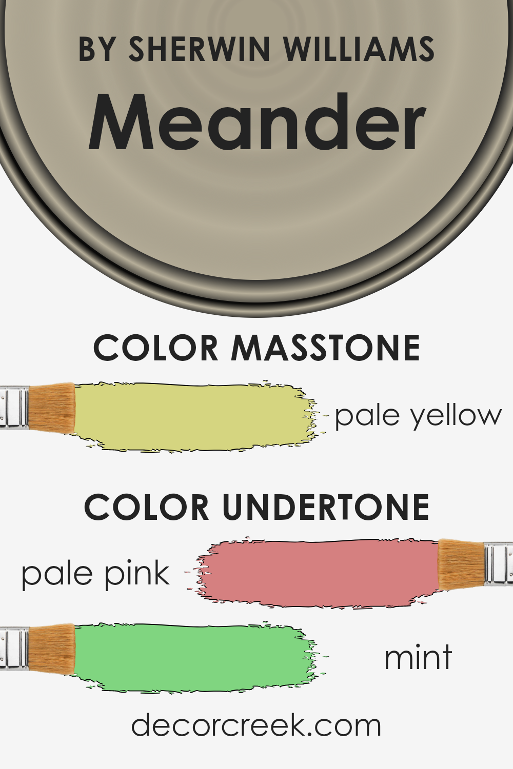
Undertones of Meander SW 9522 by Sherwin Williams
MeanderSW 9522 is a unique color that holds varying shades when observed closely. The undertones are what make it stand out, with pale pink and mint giving it a subtle depth that transforms under different lighting conditions.
Undertones, in general, are like the color’s shadow, hidden but influential. They can change how we perceive the main color, adding warmth, coolness, or a hint of mystery.
In the case of MeanderSW 9522, the pale pink undertone adds a soft, warming effect, while the mint undertone introduces a fresh, slightly cool vibe. This combination means the color can appear more nuanced and versatile, rather than flat or monochromatic.
When applied to interior walls, these undertones play a significant role in setting the mood and atmosphere of a room.
The warmth from the pale pink can make a space feel cozy and inviting, perfect for living rooms or bedrooms where comfort is key. Meanwhile, the mint undertone offers a touch of freshness and energy, ideal for spaces like kitchens or bathrooms that benefit from a clean, vibrant feel.
Moreover, the shifting qualities of these undertones with changes in natural or artificial light make MeanderSW 9522 a dynamic choice for any interior, providing subtle visual interest and a sophisticated backdrop to various decor styles.
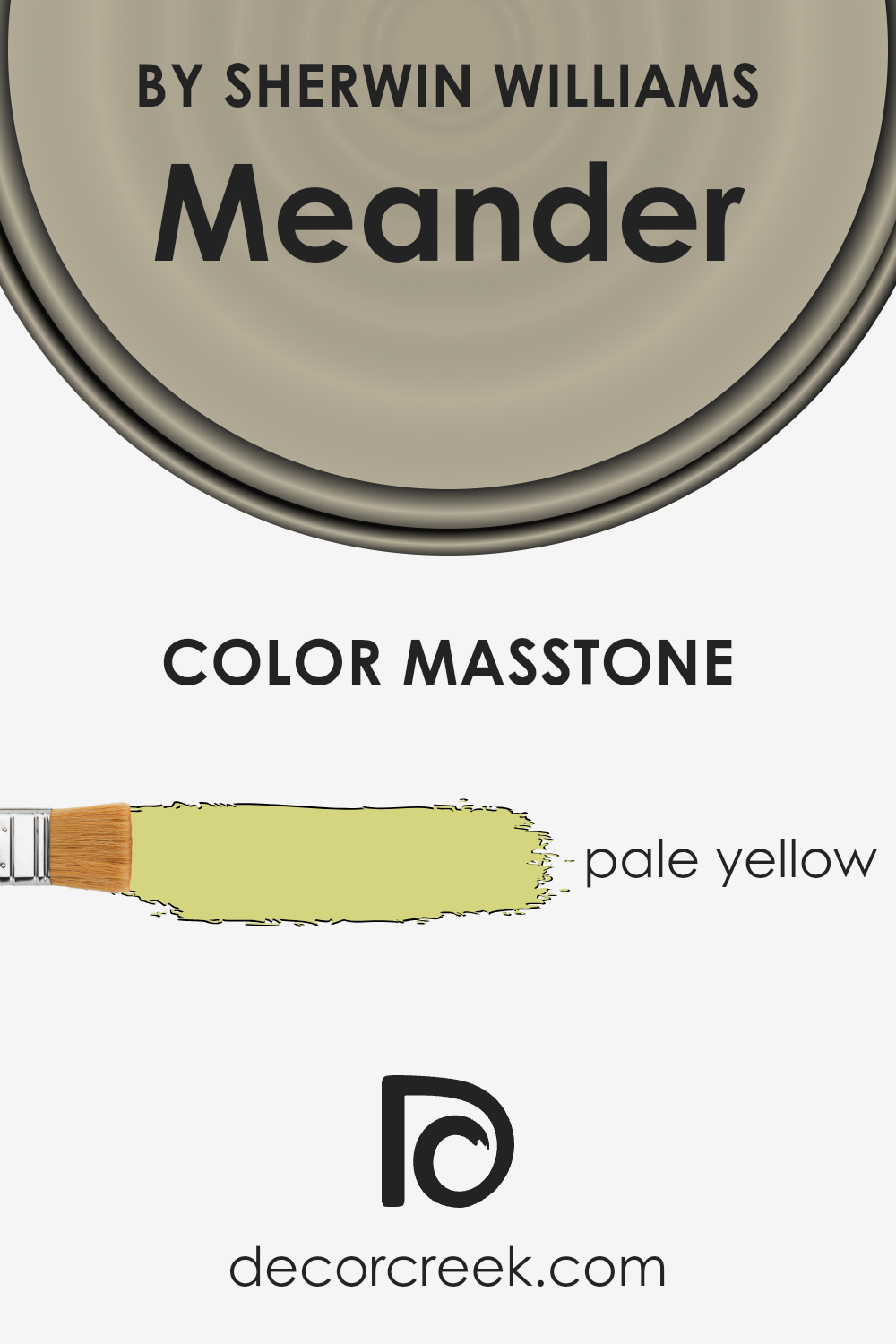
What is the Masstone of the Meander SW 9522 by Sherwin Williams?
MeanderSW 9522, crafted by Sherwin Williams, showcases a masstone of pale yellow, tagged as #D5D580. This specific hue brings a subtle yet inviting warmth to any home it graces. Pale yellow, by nature, is known for its soft and airy feel, making spaces appear more open and illuminated.
This color works wonders in homes by introducing a light, cheerful vibe without overwhelming the senses. It’s particularly effective in smaller or dimly lit rooms, where it can create an illusion of a larger and brighter space.
The gentle character of this pale yellow allows for versatile application, fitting well not only in bedrooms and living areas for a cozy atmosphere but also in kitchens and bathrooms for a clean, refreshing look.
Its natural affinity with both sunlight and artificial light means it adapts beautifully throughout the day, maintaining a warm glow that enhances home comfort.
This color’s understated elegance makes it a perfect backdrop for a wide range of decor styles, from modern minimalism to rustic charm, proving its ability to quietly uplift the aesthetic of any home.
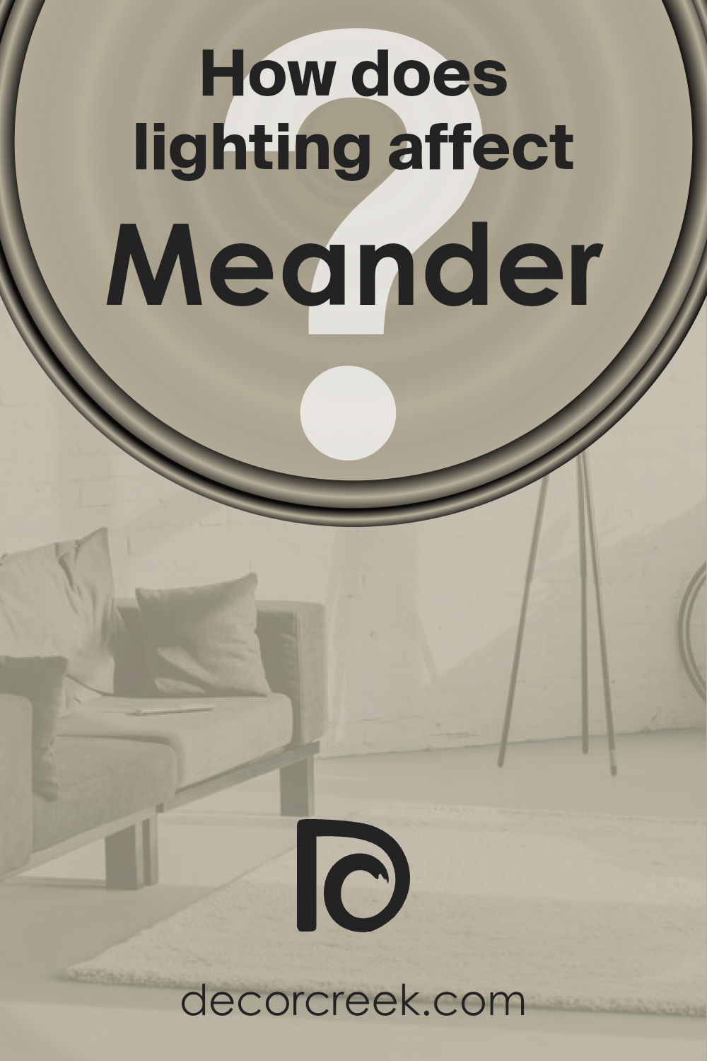
How Does Lighting Affect Meander SW 9522 by Sherwin Williams?
Lighting plays a very big role in how we see colors. The same color can look different under various light sources. This fact is true for all colors, including a particular shade of paint.
When we talk about artificial light, think about the bulbs in your home. They can be warm (yellowish) or cool (bluish). The color in question can look cozy and welcoming under warm light, often used in living spaces to create a comfortable atmosphere.
Under cool light, however, it might appear more crisp and vibrant, which is good for areas like the kitchen or office where clarity is key.
Natural light brings its own variations throughout the day. In the morning and late afternoon, when the sun’s rays are softer and warmer, the color can appear softer and more muted.
Around noon, when the sun is at its brightest and the light is more neutral, the color might show its “true” shade. But of course, this changes with the weather and the seasons.
Now, how does this color behave in rooms facing different directions? In north-faced rooms, which get less direct sunlight, the color can look slightly cooler and more subdued, because the natural light tends to be cooler.
In south-facing rooms, it gets brighter and warmer, making the color look more lively due to the abundance of light throughout the day.
East-facing rooms receive bright light in the morning, which then softens as the day progresses. Here, the color can start the day looking vibrant and lively, then become gentler.
In west-facing rooms, the scenario is the opposite; the color stays muted during the morning and becomes warmer and richer towards the evening as the sun sets.
In essence, the appearance of colors can change dramatically under different lighting conditions, affecting the feel and mood of a room. With this specific color, its versatility allows it to adapt well across various settings, offering varying vibes depending on the light.
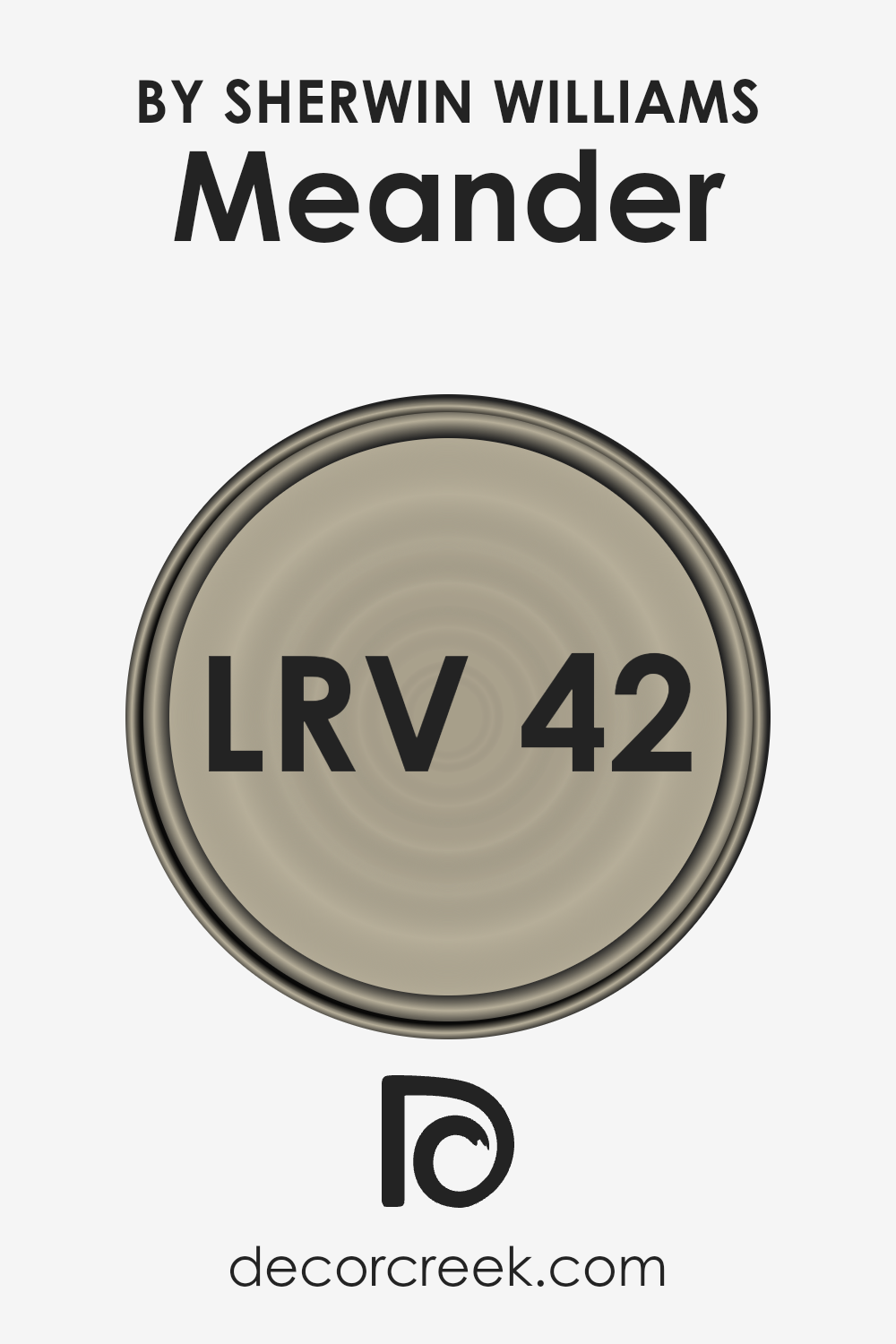
What is the LRV of Meander SW 9522 by Sherwin Williams?
LRV stands for Light Reflectance Value, and it’s a measurement that tells us how much light a color reflects back into the room versus how much it absorbs. Values range from 0 to 100, with 0 being completely black (absorbing all light) and 100 being pure white (reflecting all light).
This number is super helpful when you’re deciding on paint colors because it gives you an idea of how light or dark a color will look on your walls.
A higher LRV means the color is lighter and will make a space feel more open and airy, while a lower LRV means the color is darker and can make a room feel cozier but smaller.
With an LRV of 42.457, the mentioned color is somewhat in the middle of the scale. This means it neither reflects light brightly like a high-LRV color would, nor does it soak up light like a dark, low-LRV shade.
In a practical sense, this LRV suggests that the color has a balanced, versatile appearance that could work well in various lighting conditions and spaces. It’s not too bright but also not overly dark, striking a nice midpoint that can help create a comfortable, inviting atmosphere in a room.
This level of reflectivity is useful for those wanting to add a bit of depth to their space without overwhelming it with too much darkness or creating a stark, overly bright look.
LRV – what does it mean? Read This Before Finding Your Perfect Paint Color
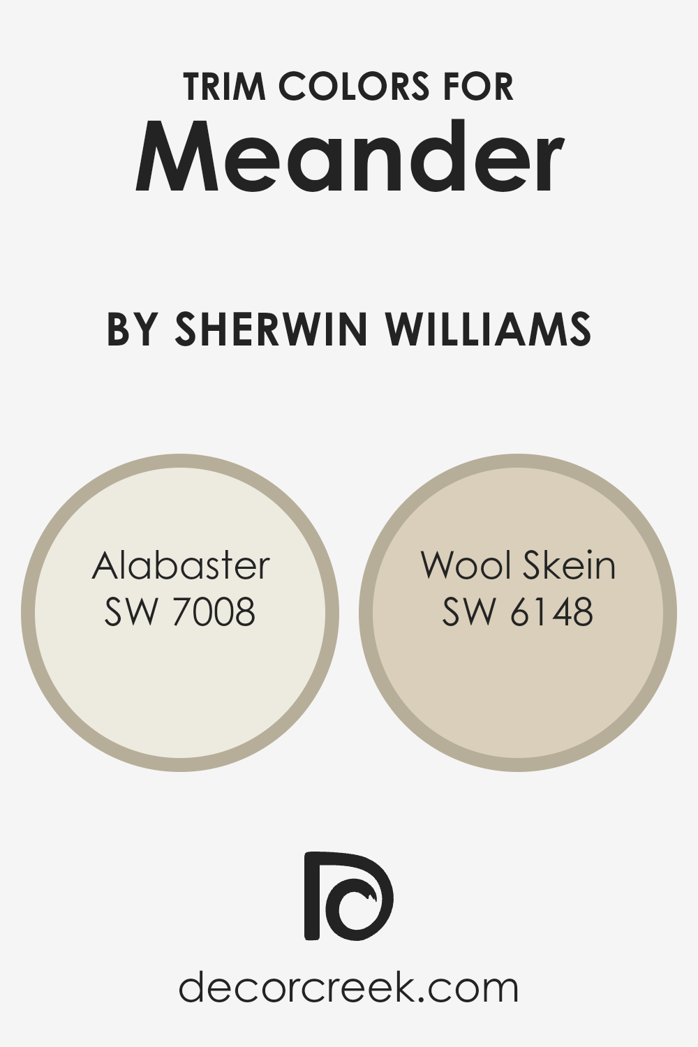
What are the Trim colors of Meander SW 9522 by Sherwin Williams?
Trim colors are essentially the colors used for the detailing work in a home, like door frames, window frames, molding, and skirting boards. They play a crucial role in interior and exterior design because they help to define and accentuate the architectural features of a space, providing depth and contrast.
For a color like Meander SW 9522 by Sherwin Williams, which has its unique charm, choosing the right trim colors can significantly enhance its appearance and bring a sophisticated balance to the room.
The selected trim colors can either subtly blend with the wall colors for a seamless look or stand out to frame the space distinctly, depending on the desired aesthetic.
In this context, SW 7008 – Alabaster and SW 6148 – Wool Skein are exceptional choices as trim colors.
Alabaster is a warm, soft white with a hint of creaminess, offering a subtle contrast that brightens spaces without overwhelming them, making it a perfect companion for the gentle yet dynamic Meander.
On the other hand, Wool Skein is a muted beige with warm undertones, providing a natural, soothing contrast that complements the serene quality of Meander, grounding the color scheme with its earthy essence.
Both colors act as versatile backdrops, allowing Meander to stand out while ensuring the overall palette remains cohesive and grounded.
You can see recommended paint colors below:
- SW 7008 Alabaster
- SW 6148 Wool Skein
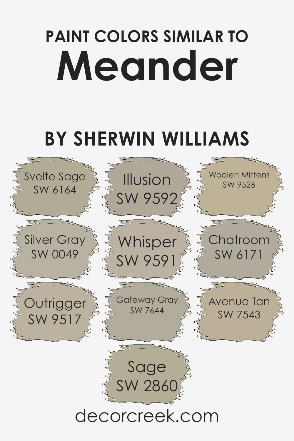
Colors Similar to Meander SW 9522 by Sherwin Williams
Similar colors play a crucial role in design because they create a sense of harmony and balance. When colors are close in hue, they blend seamlessly, offering a pleasing aesthetic that’s easy on the eyes.
This principle is vividly illustrated through colors similar to Meander by Sherwin Williams, which showcase how variations within the same color family can enhance spatial cohesion while allowing for subtle differentiation.
For instance, Svelte Sage presents a soft, earthy green that evokes tranquility, making it perfect for spaces meant to soothe and calm. Silver Gray, on the other hand, offers a light, airy feel with its gentle gray tones, ideal for creating a serene backdrop in any room.
Outrigger and Sage bring more depth to the palette, with Outrigger providing a darker, more pronounced gray and Sage offering a rich, herbal green that grounds a space without overwhelming it.
Colors like Illusion and Whisper take a softer approach, with Illusion’s faint lavender tones and Whisper’s delicate beige offering a hint of color that’s both subtle and sophisticated.
Gateway Gray and Woolen Mittens lean into the sturdier side of the spectrum; Gateway Gray delivers a solid, mid-tone gray, whereas Woolen Mittens wraps a room in the cozy warmth of a soft, nuanced beige.
For those leaning towards a more conversational color, Chatroom’s muted olive undertones offer an engaging backdrop, while Avenue Tan rounds off the selection with its inviting, sun-kissed warmth, proving that similar colors can indeed add depth and character to any space without sacrificing harmony.
You can see recommended paint colors below:
- SW 6164 Svelte Sage
- SW 0049 Silver Gray
- SW 9517 Outrigger
- SW 2860 Sage
- SW 9592 Illusion
- SW 9591 Whisper
- SW 7644 Gateway Gray
- SW 9526 Woolen Mittens
- SW 6171 Chatroom
- SW 7543 Avenue Tan
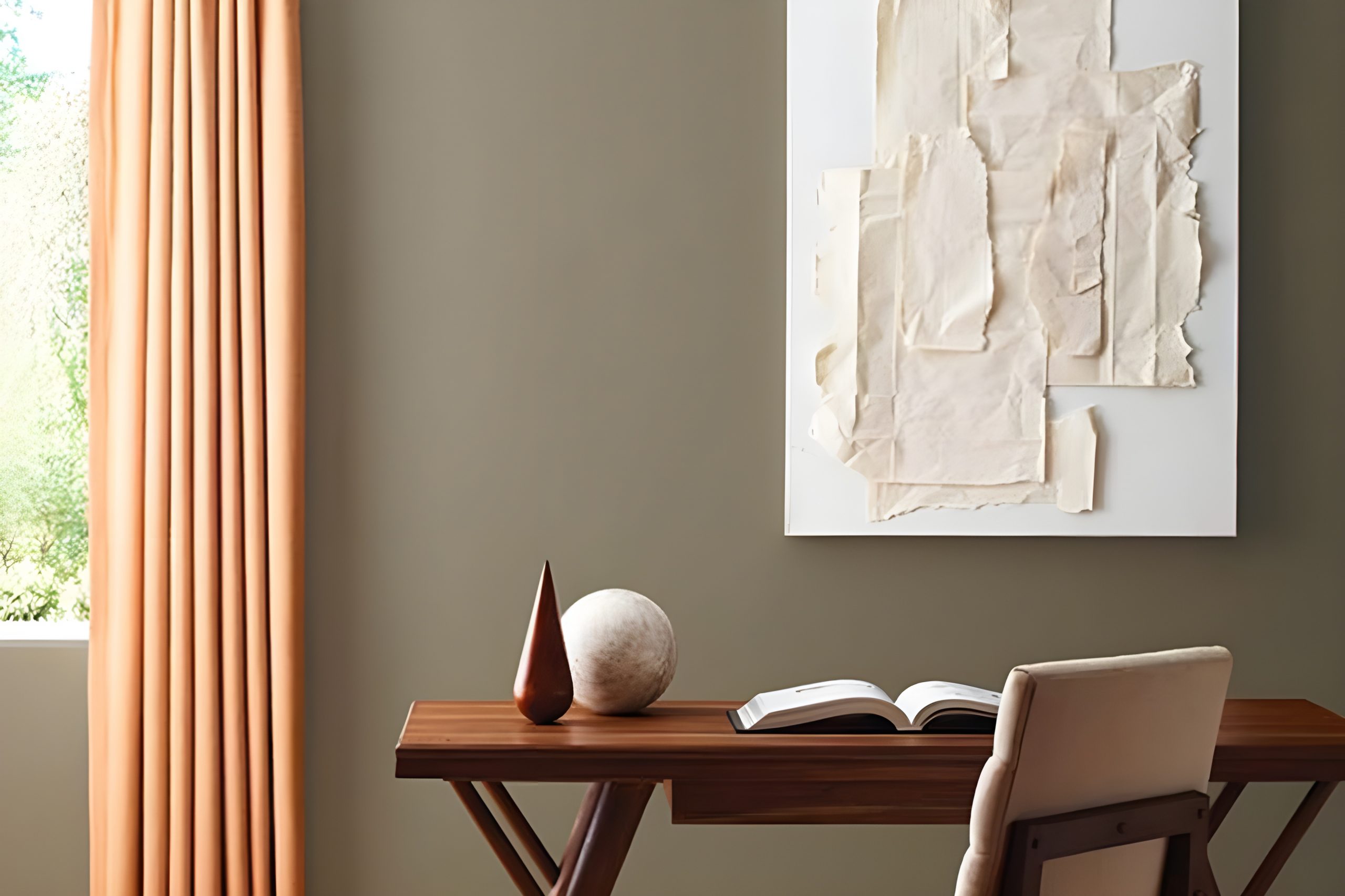
How to Use Meander SW 9522 by Sherwin Williams In Your Home?
Meander SW 9522, by Sherwin Williams, is a paint color that offers homeowners a unique way to freshen up their space. This shade is perfect for anyone looking to add a touch of elegance and tranquility to their home. Given its versatile nature, you can use it in various rooms.
For example, painting your living room walls with Meander can create a cozy and welcoming atmosphere, making it an ideal spot for relaxing or entertaining guests. In the bedroom, this color can help establish a peaceful and serene environment, conducive to a good night’s sleep.
Moreover, Meander isn’t limited to walls. You can apply it to furniture or cabinets for a subtle refresh without overwhelming the space. This approach works great in kitchens or bathrooms, where it can complement both modern and traditional designs.
Pairing Meander with natural light or soft, warm lighting can further enhance its beauty, creating spaces that feel both refined and inviting.
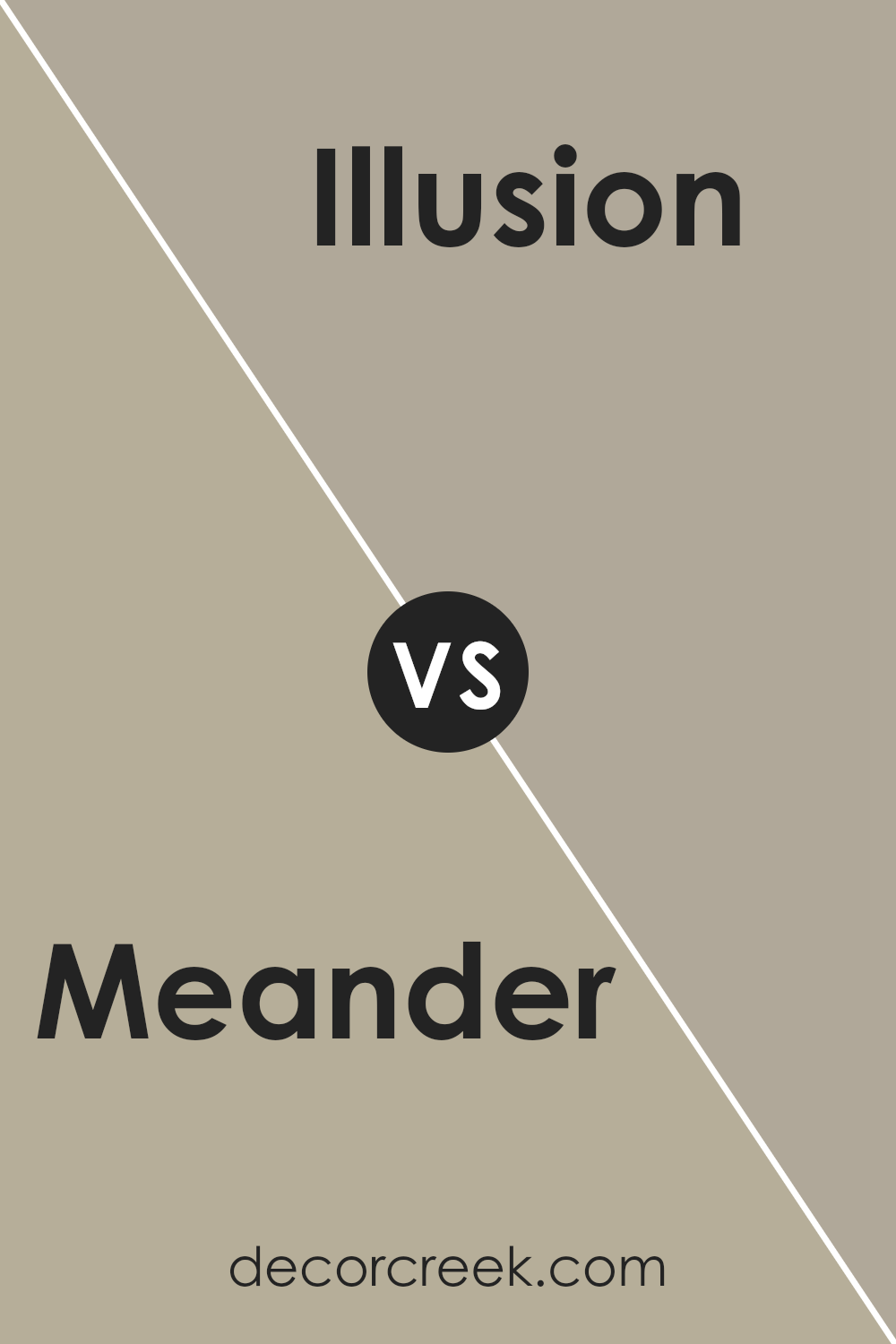
Meander SW 9522 by Sherwin Williams vs Illusion SW 9592 by Sherwin Williams
Meander and Illusion, both from Sherwin Williams, offer unique tones to any space. Meander is a gentle, airy color, like a subtle whisper in a quiet room. It has a calming presence, almost ethereal, making it perfect for creating a serene and inviting atmosphere.
On the other hand, Illusion steps in with a bit more assertiveness. It’s not overly bold, but it carries a deeper, richer hue that commands more attention.
This color has the ability to add a layer of sophistication and depth to a room without overwhelming it.
While Meander might be suited for those looking for a light and breezy vibe, Illusion is for those seeking a touch of elegance. Despite their differences, both colors share an underlying warmth, offering a comforting embrace to any space.
Together, they can create a harmonious balance, combining tranquility with a hint of luxury.
You can see recommended paint color below:
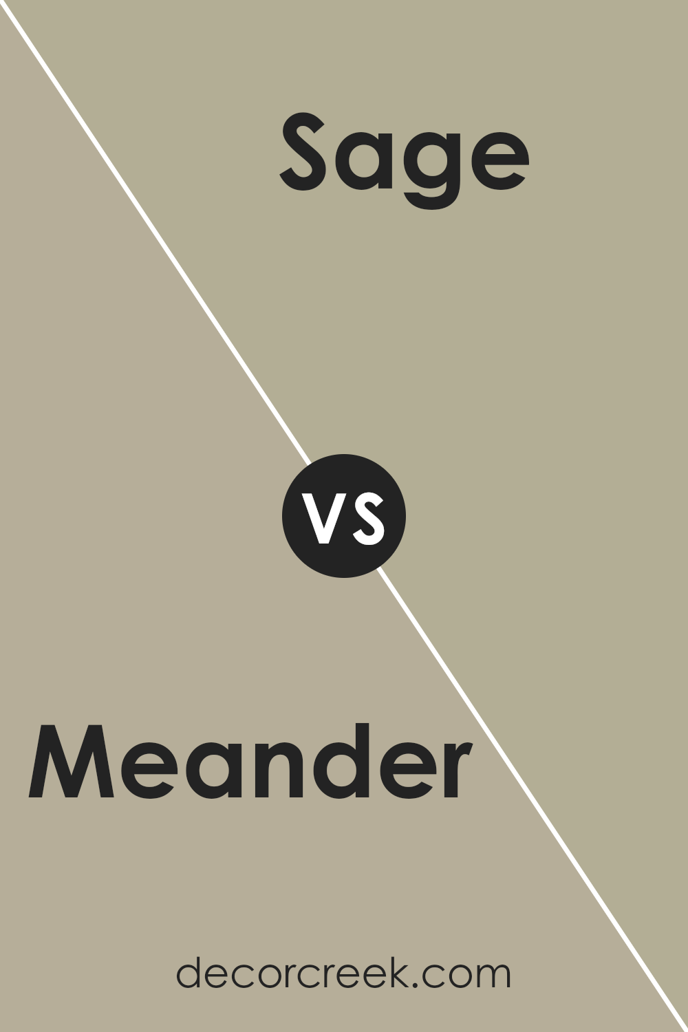
Meander SW 9522 by Sherwin Williams vs Sage SW 2860 by Sherwin Williams
Meander by Sherwin Williams is a unique shade that stands out for its subtle charm. It’s a color that feels both refreshing and sophisticated, bringing a sense of calmness to any space. On the other hand, Sage by Sherwin Williams has a more earthy vibe, reminiscent of natural landscapes.
It’s a softer, more muted green that easily blends with a variety of decor styles, offering a comforting and grounding atmosphere.
When comparing these two, it’s clear that Meander leans towards a brighter, more vivid experience, potentially adding a splash of energy to rooms that crave a touch of uniqueness.
Sage, however, is the go-to for a serene and tranquil setting, perfect for creating a peaceful sanctuary.
Both colors have their own beauty and can transform spaces in different ways. Meander might be better suited for those looking to inject some vibrancy and freshness into their surroundings, while Sage is ideal for those aiming for a calming retreat with a connection to nature.
You can see recommended paint color below:
- SW 2860 Sage
Meander SW 9522 by Sherwin Williams vs Chatroom SW 6171 by Sherwin Williams
Meander and Chatroom, both by Sherwin Williams, offer unique tones for different tastes. Meander is a soothing hue, somewhere in the realm of a gentle blue mixed with soft grey. It brings a peaceful and airy atmosphere to any space, making it ideal for creating a serene environment.
On the other hand, Chatroom presents a darker, more earthy vibe with its greenish-grey palette. It’s perfect for those wanting to add a touch of sophistication and depth to their rooms. While Meander emits a light, refreshing feel, Chatroom leans towards a cozy, grounded ambiance.
Both colors are versatile but serve different purposes based on the mood you’re aiming for in your room.
Where Meander opens up a space with its breezy note, Chatroom ensconces you in a warm embrace without the intense saturation of darker colors. Choosing between them depends on whether you’re looking for a bright uplift or a subdued retreat in your decor.
You can see recommended paint color below:
- SW 6171 Chatroom
Meander SW 9522 by Sherwin Williams vs Outrigger SW 9517 by Sherwin Williams
Meander and Outrigger are two distinct colors from Sherwin Williams that offer unique vibes to any space. Let’s break down their key differences. First off, Meander is a soothing color, presenting itself with a blend that reminds one of a peaceful day.
It’s soft, bringing a gentle and calming atmosphere wherever it’s applied. It leans towards a lighter shade, ensuring that rooms feel more open and airy.
On the other hand, Outrigger is noticeably bolder. It’s a color that stands out, offering a richer and deeper tone. This makes it perfect for creating accent walls or for spaces that aim to make a statement. It provides a strong contrast to lighter colors, adding a layer of sophistication and depth.
While Meander gives off a serene and relaxing vibe, Outrigger offers a sense of drama and intensity.
Depending on what you’re going for in your space, either color can significantly alter the mood and overall aesthetic. Whether you want a backdrop that exudes tranquility or one that speaks with boldness, these colors offer intriguing options.
You can see recommended paint color below:
Meander SW 9522 by Sherwin Williams vs Silver Gray SW 0049 by Sherwin Williams
Comparing Meander and Silver Gray, both from Sherwin Williams, shows distinctions in vibe and style. Meander is a fresh, vibrant hue. It brings a lively and bright energy to spaces, making rooms feel open and cheerful.
Its tone suggests a modern twist on classic styles, offering a blend of coolness with a touch of warmth. This makes it versatile for various decorating themes, from contemporary to traditional.
On the other hand, Silver Gray presents a more subdued and elegant feel. It’s a classic, timeless color that leans towards a serene and sophisticated look. This color is perfect for creating calm and tranquil spaces, ideal for bedrooms or areas where relaxation is key.
Its neutral palette means it pairs well with a wide range of colors, adding a layer of flexibility in design choices.
In summary, Meander adds a punch of brightness and energy, making spaces feel alive, while Silver Gray offers a peaceful and refined backdrop, perfect for creating a soothing retreat.
You can see recommended paint color below:
- SW 0049 Silver Gray
Meander SW 9522 by Sherwin Williams vs Avenue Tan SW 7543 by Sherwin Williams
The two colors, Meander (SW 9522) and Avenue Tan (SW 7543), both by Sherwin Williams, offer unique qualities for your space. Meander is a subtle, soft color with a peaceful vibe. It has a gentle presence, making it perfect for creating a calm and serene environment.
It’s like the quiet background that allows other colors or decor elements to stand out, without overwhelming the senses.
On the other hand, Avenue Tan is a warmer, more grounded hue. It brings a cozy and inviting feel to a room, reminiscent of a warm, welcoming embrace. This color has a robust and earthy quality, making it excellent for spaces where you want to add warmth and a sense of comfort.
It’s the kind of color that can help make a room feel like home, offering a solid foundation that can pair well with a variety of other colors and decorations.
While both colors are beautiful, they serve different purposes based on the atmosphere you’re aiming to achieve. Whether you’re looking for a tranquil retreat or a warm, engaging space, these colors offer versatile options.
You can see recommended paint color below:
- SW 7543 Avenue Tan
Meander SW 9522 by Sherwin Williams vs Svelte Sage SW 6164 by Sherwin Williams
The main color, Meander, and the second color, Svelte Sage, by Sherwin Williams, both offer unique vibes to any space. Meander is a bit of an enigma, presenting itself with a mysterious depth that feels both ancient and refreshingly modern.
Its darker, richer tone pulls in a sense of sophistication and a hint of mystery, making it perfect for creating focal points or accent walls.
On the other hand, Svelte Sage goes down a different path. It’s lighter, with a calm and soothing presence that can open up a room and make it feel more airy and spacious.
This color is great for creating a serene and inviting atmosphere, suitable for almost any room looking for a touch of tranquility.
Though both colors come from nature’s palette, Meander leads with strength and depth, while Svelte Sage offers a soft, gentle touch. Whether looking for the boldness and depth of Meander or the calm, soothing vibes of Svelte Sage, each color gives rooms a unique character, showcasing the variety and versatility of Sherwin Williams’ palette.
You can see recommended paint color below:
Meander SW 9522 by Sherwin Williams vs Gateway Gray SW 7644 by Sherwin Williams
When comparing Meander and Gateway Gray by Sherwin Williams, think of Meander as a light, airy color that has a hint of green in it, making it feel fresh and somewhat soothing.
It’s the kind of color that brings a subtle vibrancy to a space, perfect for creating a relaxed atmosphere without being too bold or overpowering.
On the other hand, Gateway Gray is like the richer, deeper cousin. It’s a mid-tone gray that leans towards the warmer side, giving rooms a cozy feel. This color is versatile, fitting well in spaces where you want more depth and sophistication without going too dark. It’s like wrapping a room in a soft, warm blanket.
Both colors are quite different in mood and impact. While Meander adds a touch of freshness and light, making a space feel open and calm, Gateway Gray offers warmth and a sense of comfort, perfect for creating a cozy retreat.
Depending on the ambiance you want to achieve, either color can transform a room into your desired haven.
You can see recommended paint color below:
- SW 7644 Gateway Gray
Meander SW 9522 by Sherwin Williams vs Whisper SW 9591 by Sherwin Williams
Comparing Meander, a unique color from Sherwin Williams, with another shade from the same brand, Whisper, is like exploring two sides of a calm and serene world. Meander stands out with its slightly bold and more pronounced nature.
It’s a color that brings a sense of depth and sophistication to any space, providing a backdrop that feels both comforting and grounded.
On the other hand, Whisper takes a much lighter approach. It’s the kind of color that fills a room with a sense of airiness and openness.
Whisper’s subtlety makes it perfect for creating a peaceful and tranquil environment, where light plays a key role in enhancing its barely-there vibe. It’s ideal for those looking to add a gentle touch of color without overwhelming a space.
While Meander offers a statement with its richer tone, inviting a more defined and cozy atmosphere, Whisper leans towards creating a soft, soothing, and almost ethereal ambiance.
Both colors offer distinct personalities depending on what you’re aiming for in a room: depth and character with Meander or light and airy with Whisper.
You can see recommended paint color below:
- SW 9591 Whisper
Meander SW 9522 by Sherwin Williams vs Woolen Mittens SW 9526 by Sherwin Williams
Meander and Woolen Mittens by Sherwin Williams are two distinct shades that offer unique vibes for any room.
Meander is a soft, muted green with a hint of grey, giving it a tranquil and soothing feel. This color is perfect for creating a peaceful and serene environment, ideal for spaces where you want to relax and unwind.
On the other hand, Woolen Mittens is a warm, inviting beige with very subtle yellow undertones.
This color gives off a cozy and comfortable vibe, making spaces feel welcoming and homey. It’s an excellent choice for living areas, bedrooms, or any space where you aim for a snug and inviting atmosphere.
While Meander brings in a touch of nature and calmness, Woolen Mittens wraps you up in warmth, akin to the feeling of wearing a comfortable sweater on a chilly day. Both colors are versatile and can be beautifully paired with various decor styles, but they cater to different moods and aesthetic preferences.
Whether you’re going for a cool, calming look or a warm, cozy feel, these colors offer great options.
You can see recommended paint color below:
- SW 9526 Woolen Mittens
Conclusion
Meander is a subtle and versatile color by Sherwin Williams that offers a fresh perspective on interior spaces. Its understated elegance brings a sense of calm and sophistication to any room. This hue is perfect for those looking to create a serene and inviting atmosphere without overwhelming the senses.
Its ability to blend with various decor styles makes it a go-to choice for designers and homeowners alike who are aiming for a refined yet welcoming environment.
The adaptability of Meander proves it to be an excellent choice for those wanting to rejuvenate their living spaces. Whether applied in a busy kitchen, a tranquil bedroom, or a cozy living area, it adds just the right amount of color to stimulate interest while maintaining harmony.
This color stands out for its softness and versatility, appealing to a wide audience seeking to add a touch of elegance and tranquility to their surroundings.
Ever wished paint sampling was as easy as sticking a sticker? Guess what? Now it is! Discover Samplize's unique Peel & Stick samples.
Get paint samples