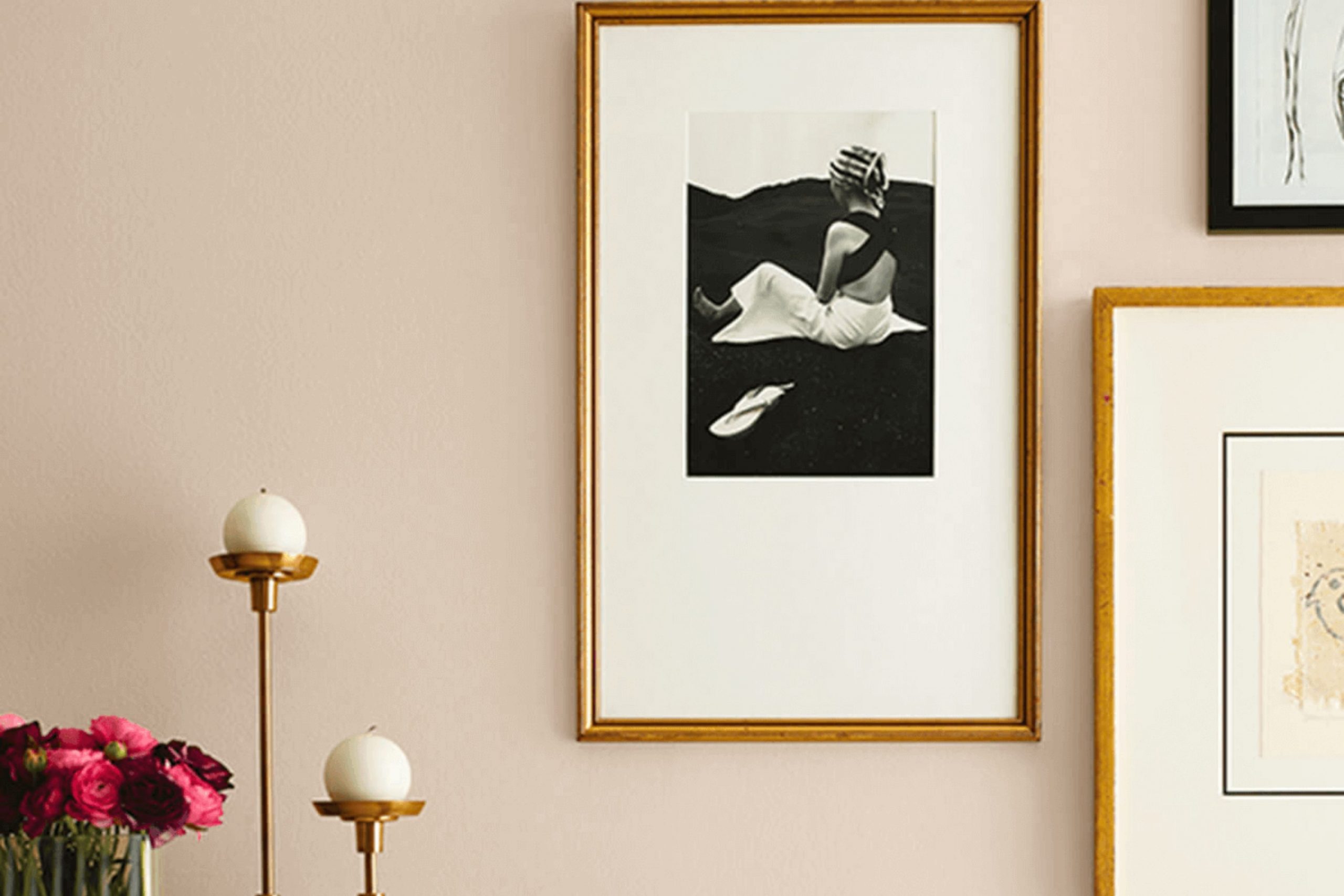
Choosing the right paint color for your room can be a game-changer, and I’ve found a shade that might just be what you’re looking for: SW 6099 Sand Dollar by Sherwin Williams. If you’re aiming for a cozy yet refined atmosphere, this subtle, warm beige could be your perfect match. It’s like a soft hug for your walls, providing a neutral backdrop that complements a wide variety of decor styles and color schemes.
One of the great things about Sand Dollar is its flexibility. Whether you’re updating a living room, bedroom, or even your kitchen, this color brings a sense of calm and warmth without overpowering the room. It pairs beautifully with both bold colors and muted tones, giving you the freedom to accessorize with different textures and accents.
As someone who has experimented with numerous paint colors over the years, I can say that Sand Dollar stands out for its understated elegance. It’s not just another beige; it has a unique quality that works well in natural light, enhancing the room with a welcoming glow.
If you’re thinking about giving your home a fresh look, consider how this inviting hue might enhance your living area.
What Color Is Sand Dollar SW 6099 by Sherwin Williams?
Sand Dollar by Sherwin Williams is a warm, neutral beige color that provides a calming and welcoming ambiance to any room. This adaptable shade effectively balances depth and softness, making it an excellent choice for creating a cozy and inviting environment. The color exudes a natural earthiness that works beautifully to improve interiors without overpowering them. This makes it ideal for living areas, bedrooms, or even entryways where you want to create a subtle, yet inviting atmosphere.
Sand Dollar pairs exceptionally well with natural materials like wood, leather, and linen, highlighting their textures and complementing their intrinsic qualities. These combinations can produce a rustic or country feel that’s both comfortable and stylish. Additionally, when matched with softer textures like cotton or wool, it brings richness and warmth to the room.
This color is perfectly suited for interior styles such as farmhouse, Scandinavian, and contemporary. In a farmhouse setting, it enhances the rustic elements and cozy feel. In Scandinavian interiors, it supports the minimalistic, light, and airy feel, while in contemporary rooms, it serves as a clean backdrop that allows other elements to stand out.
Sand Dollar is a flexible backdrop that integrates well with various decor pieces, producing harmonious interior aesthetics that encourage rest and comfort.

Is Sand Dollar SW 6099 by Sherwin Williams Warm or Cool color?
Sand Dollar by Sherwin Williams is a warm, soft beige that gives a cozy feel to any room. This color is great for creating a welcoming atmosphere in living areas and bedrooms because it pairs well with a wide range of furniture and decor styles. Its neutral tone makes it easy to match with both bright colors and darker shades.
Sand Dollar is a practical choice for homes because it helps to make rooms appear larger and more open. This shade is particularly useful in smaller rooms or apartments where you want to maximize the sense of openness. Additionally, it’s a smart option for homes with children or pets because it doesn’t show small marks or dirt as easily as lighter colors.
This color also works well in different lighting conditions, maintaining its warm hue whether in natural daylight or under artificial lighting. It adds a natural, earthy touch to the home, making it ideal for those who prefer a subtle and inviting look.
Undertones of Sand Dollar SW 6099 by Sherwin Williams
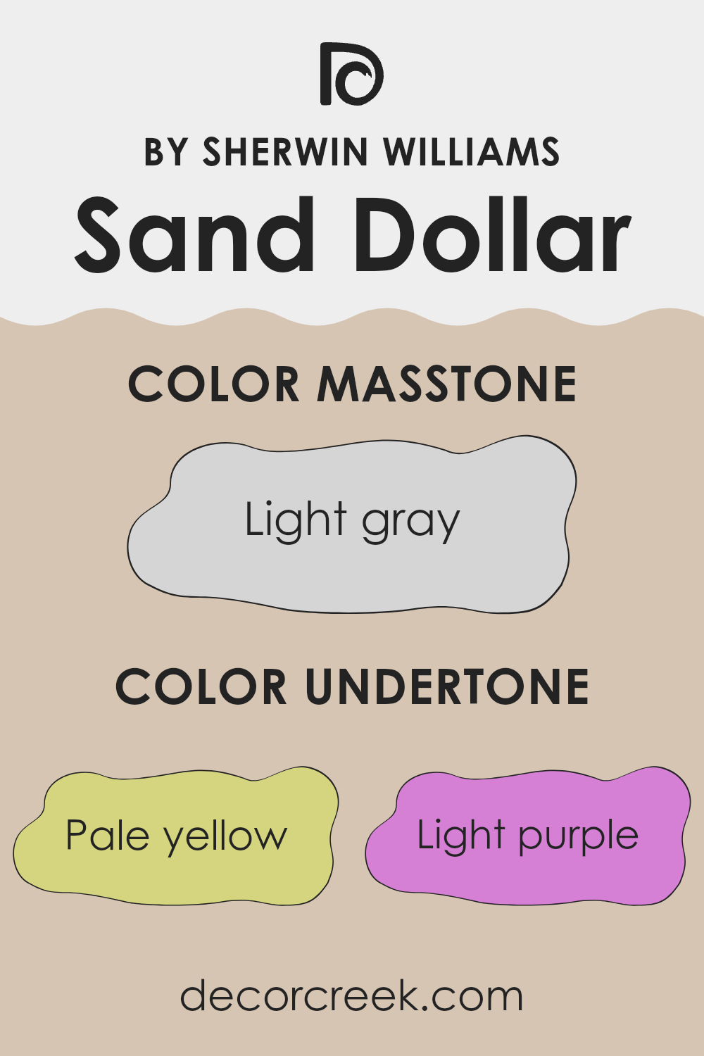
Sand Dollar is a gentle and complex color with a blend of various undertones that influence how it appears in different lights and settings. This paint color can shift in appearance due to undertones of pale yellow, light purple, pale pink, light blue, mint, lilac, and grey.
Undertones are the underlying qualities of a color visible under certain lighting conditions, and they can significantly affect our perception of the main color. For instance, a pale yellow undertone might make Sand Dollar feel warmer in a sunlit room, while a light blue or grey undertone could give it a cooler feel in the shade.
When used on interior walls, Sand Dollar’s range of undertones allows it to adapt to various decor styles and themes. In a room with lots of natural light, the pale yellow or mint undertones might become more pronounced, creating a warm and inviting atmosphere. In artificial lighting, the lilac or light purple undertones might stand out, lending a refined hint of depth without feeling too heavy.
Overall, the unique mixture of undertones in Sand Dollar can make it a highly adaptable paint color, suitable for many areas of a home. Whether in a bedroom, living room, or hallway, this color can offer a soft backdrop that complements a wide range of furniture and accessories.
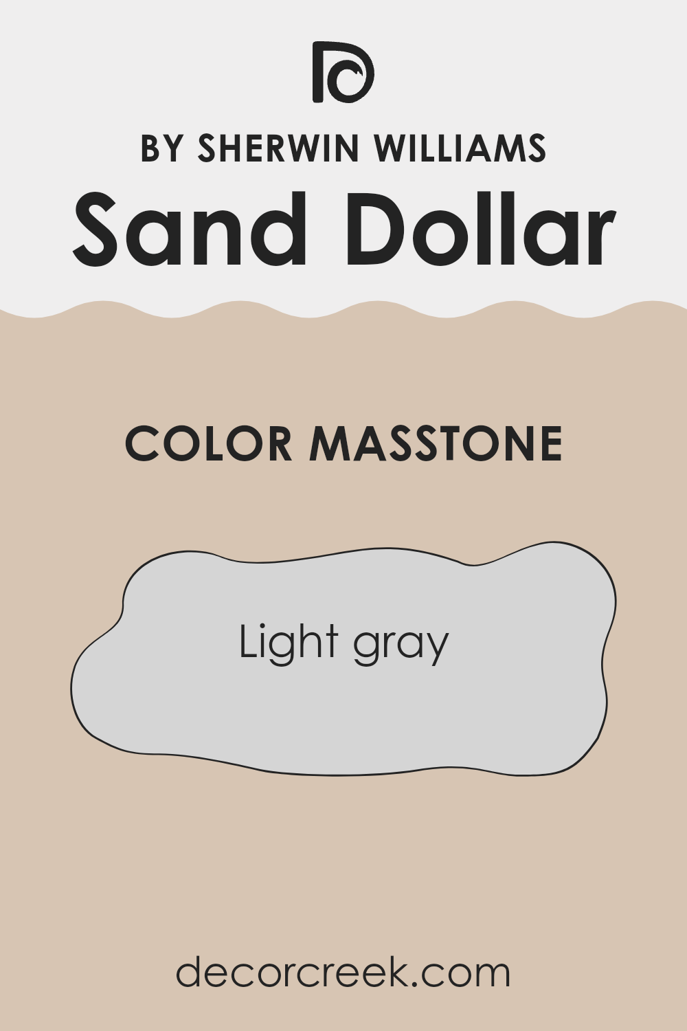
What is the Masstone of the Sand Dollar SW 6099 by Sherwin Williams?
Sand Dollar SW 6099 by Sherwin Williams is a light gray color with a masstone that has an RGB value of #D5D5D5. This soft shade provides a neutral backdrop that complements nearly any decor style, from modern to traditional.
Its lightness brings brightness to rooms, making areas appear larger and more open. The color’s ability to reflect light enhances its flexibility, working well in both well-lit areas and rooms that may not get much natural light.
In homes, Sand Dollar acts as a gentle anchor that allows other colors in the decor to stand out. It pairs beautifully with bold tones, ensuring they pop without feeling too strong. It is also harmonious with other muted shades, creating a cohesive look that is soothing to the eye. This makes Sand Dollar an excellent choice for walls in living rooms, bedrooms, and even kitchens, where its calming effect is often appreciated.
How Does Lighting Affect Sand Dollar SW 6099 by Sherwin Williams?
Lighting can significantly impact how we perceive colors. The way light shines on a color can change its appearance dramatically. This is a crucial point to note when choosing paint colors for different rooms, such as Sand Dollar, a popular neutral shade.
In artificial light, colors can appear warmer or cooler depending on the type of bulb used. For Sand Dollar, using warm white bulbs may bring out a cozy, creamy hue, making the room feel more inviting. With cool white bulbs, the color might look more stark and crisp, which is great for a modern aesthetic.
In natural light, the appearance of Sand Dollar can vary throughout the day. Morning light tends to be soft and warm, giving the color a gentle, soothing look. As the day progresses, midday sun can make the color appear brighter and more vivid. In the evening, as the light fades, the color might return to a warmer, muted tone.
Room orientation also affects how Sand Dollar looks:
- North-facing rooms: These rooms get less direct sunlight, so they tend to have a cooler, more shadowy light. Here, Sand Dollar might look more muted and slightly grayish. It works well if you want a softer, more subdued look.
- South-facing rooms: These rooms receive more intense, direct sunlight throughout the day. Sand Dollar in such rooms will appear warmer and brighter, making the room feel airy and vibrant.
- East-facing rooms: In these rooms, Sand Dollar will be hit by the warm, bright morning sun but will be in softer light as the day progresses. This means the color can appear lively and warm in the morning, then cooler and more balanced in the afternoon.
- West-facing rooms: Here, the color will stay cooler in the morning but get a blast of intense light in the late afternoon and evening. This can make Sand Dollar feel warmer and more dynamic towards the end of the day.
Understanding these effects can help you decide where to use this adaptable color to achieve the desired atmosphere in your home.

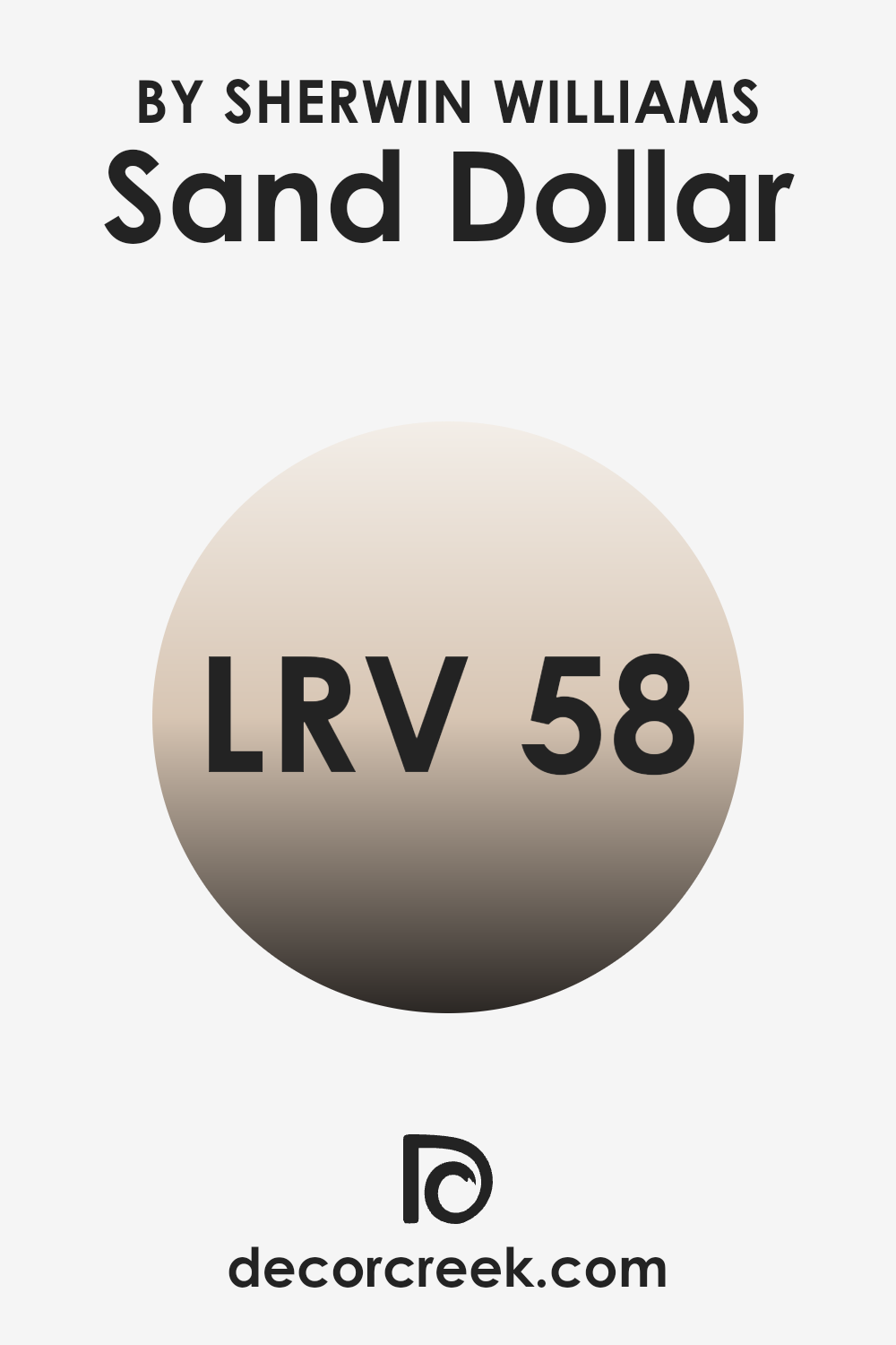
What is the LRV of Sand Dollar SW 6099 by Sherwin Williams?
LRV stands for Light Reflectance Value, which is a measurement used to determine how much light a paint color reflects. This measurement ranges from a low number, indicating that the color absorbs more light and appears darker, to a high number, suggesting it reflects more light and appears lighter.
The lightness or darkness of the color can significantly affect how a room feels. For instance, colors with a higher LRV make a room feel more open and airy because they reflect more light, while darker colors, which have a lower LRV, can make a room feel smaller and more intimate because they absorb light.
For the color Sand Dollar by Sherwin Williams, which has an LRV of almost 58, this means the color falls into the light reflecting category but isn’t extremely bright. It will reflect a moderate amount of light, brightening up the room while providing a warm and welcoming atmosphere without feeling too heavy.
This level of LRV is highly adaptable as it works well in rooms that get a lot of natural light, as well as in those with limited light, making the color appear consistent throughout different times of the day and in various lighting conditions.
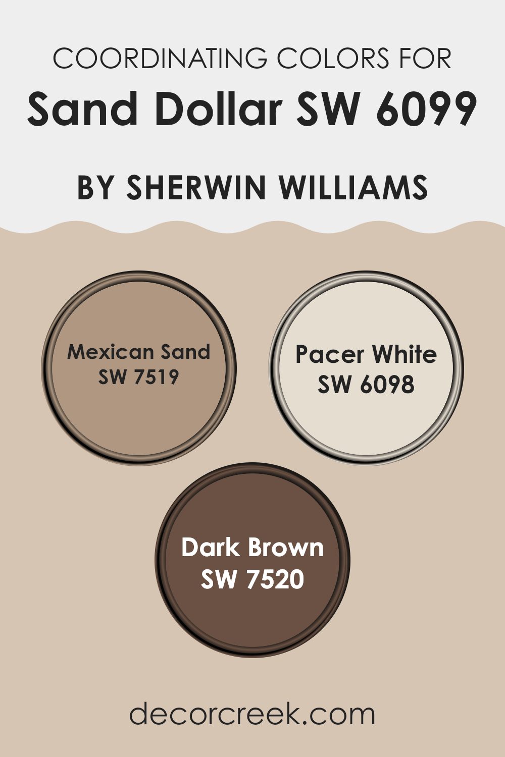
Coordinating Colors of Sand Dollar SW 6099 by Sherwin Williams
Coordinating colors are colors that harmonize well with a main color, enhancing the overall aesthetic and bringing a balanced look to your room. For example, if you are working with a neutral tone like Sand Dollar by Sherwin Williams, which can best be described as a soft, warm beige, you would select other shades that complement this base tone while contributing to the desired mood and visual appeal of the room.
The coordinating color Mexican Sand is a slightly darker hue that resonates with warm, earthy undertones, making it perfect for adding a bit of warmth to a room without overpowering the gentle ambiance established by the main color. Pacer White, on the other hand, is a clean, almost stark white that offers a refreshing contrast to Sand Dollar, making it an ideal choice for trim or accent features that can brighten and define a room.
Finally, Dark Brown brings a strong intensity to the mix, offering a solid and grounding contrast that is excellent for furniture or accent walls, thus providing depth and definition to your decor without distracting from the main theme established by Sand Dollar. These carefully chosen coordinating colors work together to create a cohesive and inviting environment in any room.
You can see recommended paint colors below:
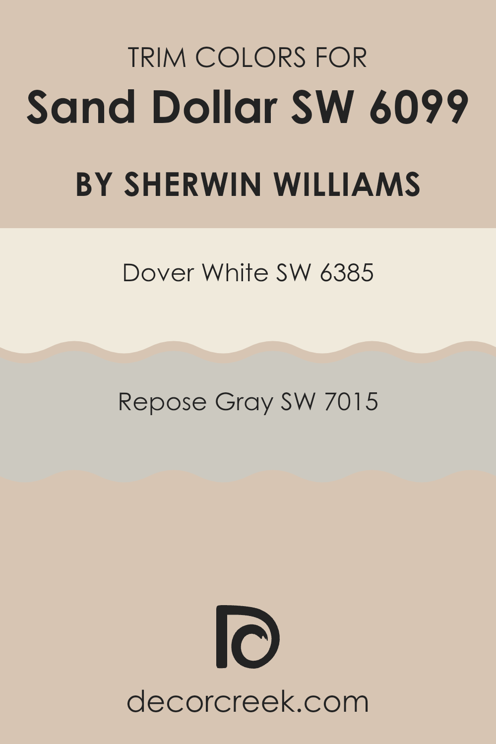
What are the Trim colors of Sand Dollar SW 6099 by Sherwin Williams?
Trim colors are typically used to accentuate and highlight the architectural features of a room, such as baseboards, moldings, window and door frames. Choosing the right trim color can complement the main wall colors and enhance the overall look of a room. For a color like Sand Dollar by Sherwin Williams, which brings a warm and inviting tone to walls, selecting suitable trim colors is key to creating a visually pleasing atmosphere.
Dover White SW 6385 is a warm, creamy white that pairs well with Sand Dollar, as it gently frames and supports the wall color without sharp contrasts. This trim color adds a touch of brightness around doors and windows, softly defining room proportions.
Repose Gray SW 7015, on the other hand, is a light to medium gray that offers a gentle contrast to Sand Dollar, enhancing the warmth of the wall color while still maintaining a smooth visual flow. This gray works especially well in rooms that aim for a calm and cohesive look, providing a slightly more defined frame than Dover White without competing with the main hue.
You can see recommended paint colors below:
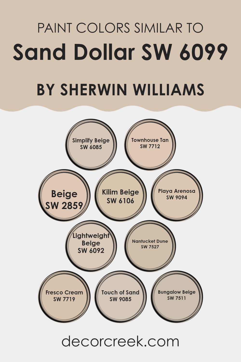
Colors Similar to Sand Dollar SW 6099 by Sherwin Williams
Similar colors are crucial in interior design because they create a sense of harmony and balance. When colors are similar, they blend more seamlessly with each other, giving a room a cohesive and comfortable feel. This is particularly effective for those who want to achieve a subtle yet inviting atmosphere in their living or working area. Colors like Simplify Beige and Townhouse Tan fall into this category, with Simplify Beige offering a light, warm backdrop, while Townhouse Tan provides just a bit more depth with its slightly richer hue.
Beige is a classic color with a straightforward name that gives off a minimal and clean vibe, perfect for those who appreciate easy elegance. Kilim Beige enhances this by adding a dusty warmth that works well in rooms that aim for a cozy, but not too strong, appearance. Playa Arenosa, with its sandy undertone, reminds one of the beach, bringing a calm, relaxed air to any room.
Similar in tone, Lightweight Beige and Nantucket Dune contribute to a soft, neutral palette, with Lightweight Beige being airy and delicate, and Nantucket Dune offering a touch more gravity. Fresco Cream, Touch of Sand, and Bungalow Beige each add their own character: Fresco Cream has a smooth, creamy presence, Touch of Sand has just a hint of earthy richness, and Bungalow Beige brings a traditional yet fresh feel to interiors. Together, these colors work harmoniously to create rooms that are both pleasing to the eye and comforting to the soul.
You can see recommended paint colors below:
- SW 6085 Simplify Beige
- SW 7712 Townhouse Tan
- SW 2859 Beige
- SW 6106 Kilim Beige
- SW 9094 Playa Arenosa
- SW 6092 Lightweight Beige
- SW 7527 Nantucket Dune
- SW 7719 Fresco Cream
- SW 9085 Touch of Sand
- SW 7511 Bungalow Beige
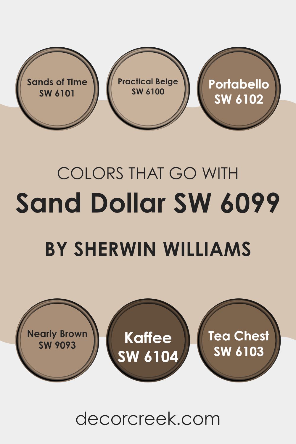
Colors that Go With Sand Dollar SW 6099 by Sherwin Williams
Colors that complement Sand Dollar SW 6099 by Sherwin Williams are important for several reasons. These shades help create a cohesive and welcoming ambiance in any room. Each color has a unique character that allows it to blend smoothly with Sand Dollar, improving the overall look of a room without feeling too strong or heavy compared to the soft nature of the base color. By choosing the right supporting colors, interiors feel balanced and visually pleasing, offering a comfortable backdrop that highlights other decor elements.
Sands of Time SW 6101 is a soft, muted shade that pairs well with Sand Dollar, offering a hint of warmth that feels gentle yet inviting. Practical Beige SW 6100 is another warm tone that works nicely, offering a slightly deeper color that adds a sense of stability and grounding. Portabello SW 6102 is richer and can be used effectively to add depth and contrast, as it is a mid-tone earthy color.
Nearly Brown SW 9093 is a deeper hue that pairs beautifully as an accent, giving a strong and grounded touch to rooms. Kaffee SW 6104 is one of the darkest in this palette, ideal for creating focal points or highlighting features within a room. Lastly, Tea Chest SW 6103 provides a spicy, warm touch, blending especially well in settings that aim for a cozy and welcoming atmosphere. Each of these colors complements Sand Dollar by adding its own character, allowing for a design that feels complete and well balanced.
You can see recommended paint colors below:
- SW 6101 Sands of Time
- SW 6100 Practical Beige
- SW 6102 Portabello
- SW 9093 Nearly Brown
- SW 6104 Kaffee
- SW 6103 Tea Chest
How to Use Sand Dollar SW 6099 by Sherwin Williams In Your Home?
Sand Dollar SW 6099 by Sherwin Williams is a warm, neutral paint color that is quite adaptable and can be used in various rooms in your home to create a cozy and welcoming atmosphere. Its soft beige tone provides a perfect backdrop that complements a wide range of decor styles, from modern to traditional.
In the living room or bedroom, Sand Dollar can add a soothing touch, making the room feel more relaxed and comfortable. This color pairs well with bold hues like navy or can be matched with light pastels for a gentle look. In the kitchen, using this shade on cabinets or walls can give the room a clean, fresh appearance.
Additionally, in smaller rooms or areas with less natural light, Sand Dollar can help to brighten and open up the area, making it appear larger and more welcoming. Overall, it’s a great choice for anyone looking to freshen up their home with a new coat of paint.
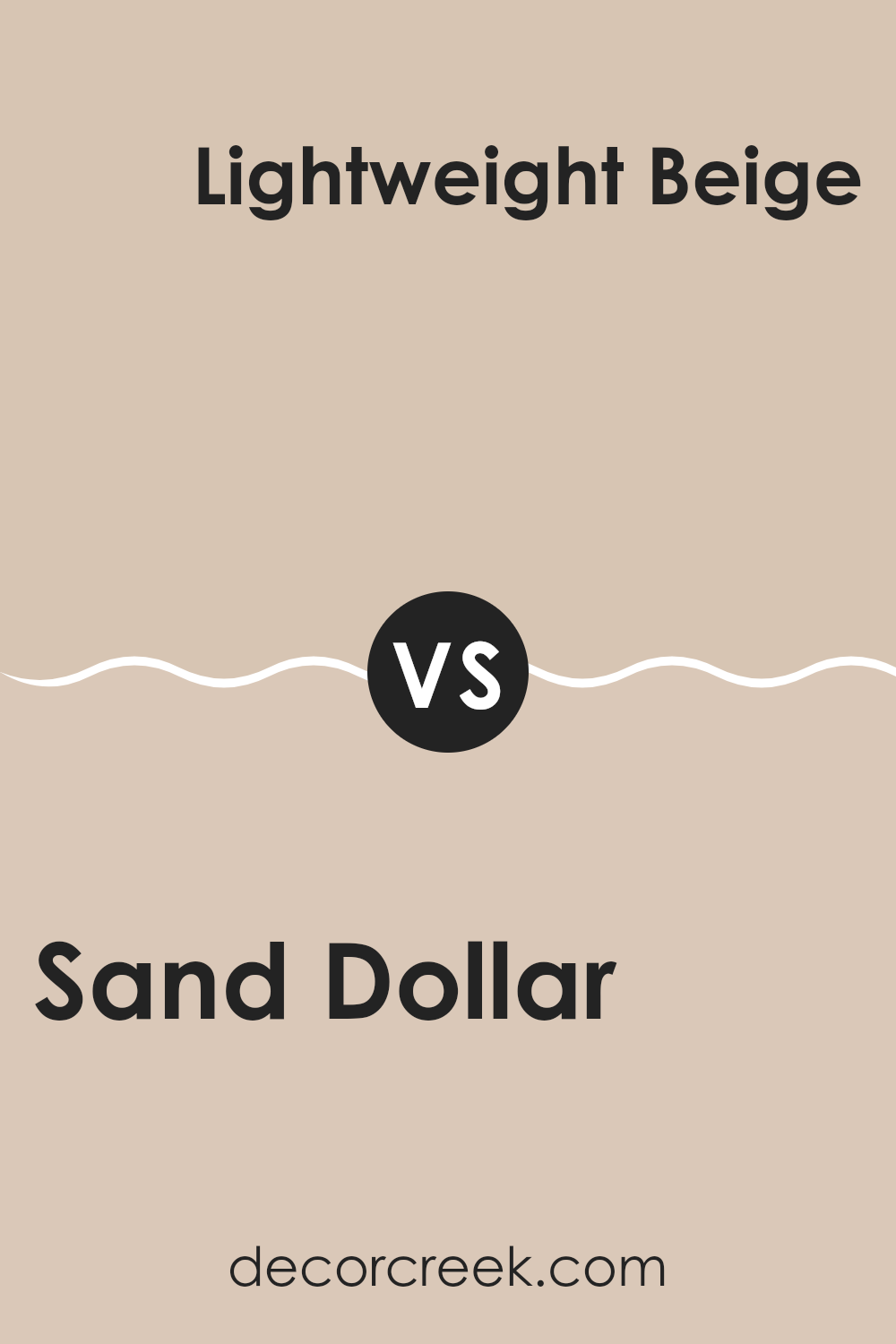
Sand Dollar SW 6099 by Sherwin Williams vs Lightweight Beige SW 6092 by Sherwin Williams
When comparing Sand Dollar and Lightweight Beige, both from Sherwin Williams, you’ll notice subtle but clear differences. Sand Dollar has a lighter, almost creamy feel that brings a bright yet warm touch to rooms.
It reflects light beautifully, making rooms feel more open and airy. Lightweight Beige, on the other hand, is a slightly deeper shade. It offers a bit more warmth due to its richer undertones, creating a cozy and welcoming atmosphere. Both colors are adaptable and can easily blend with various décor styles and other colors.
However, Sand Dollar might be a better choice in smaller or less naturally lit areas to make the room feel bigger, while Lightweight Beige works well in areas where a bit more color depth is needed without feeling too strong. Both are excellent choices for creating a calm and inviting environment.
You can see recommended paint color below:
- SW 6092 Lightweight Beige
Sand Dollar SW 6099 by Sherwin Williams vs Nantucket Dune SW 7527 by Sherwin Williams
Sand Dollar and Nantucket Dune by Sherwin Williams are both neutral paint colors, but they have distinct tones that set them apart. Sand Dollar is a lighter, softer beige that works well in rooms where you want a gentle and calming background.
Its lightness can help make a small room feel larger and more open. On the other hand, Nantucket Dune is a deeper, warmer beige that gives a richer feel to the interior. This color is ideal for creating a cozy atmosphere, perfect for areas where you want a more welcoming vibe.
Both colors are flexible but cater to different aesthetic preferences and needs. Sand Dollar might be better suited for those who prefer a more subtle decor, while Nantucket Dune could be the choice for someone looking for a bit more warmth and depth in their color scheme. Both are great options for a variety of decorating styles.
You can see recommended paint color below:
- SW 7527 Nantucket Dune

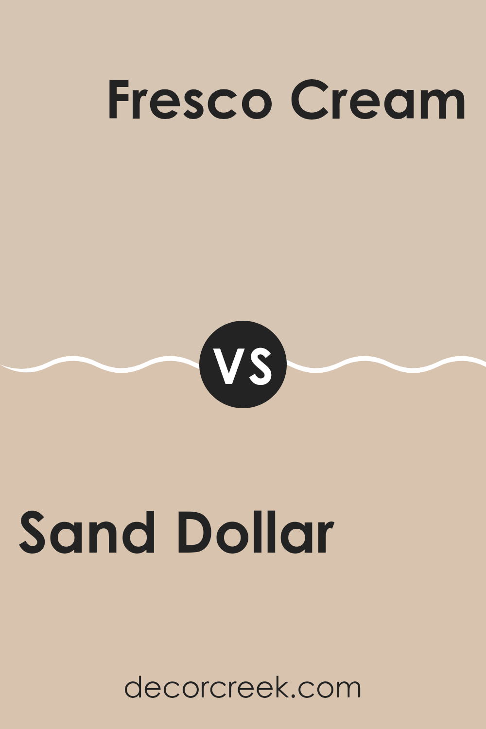
Sand Dollar SW 6099 by Sherwin Williams vs Fresco Cream SW 7719 by Sherwin Williams
Sand Dollar and Fresco Cream, both by Sherwin Williams, offer soft, gentle hues that can create a cozy feel in any room. Sand Dollar is a light beige with a hint of gray. Its neutral tone makes it very flexible, fitting well in rooms that need a calm and understated backdrop.
On the other hand, Fresco Cream has a slightly warmer touch, leaning more toward a creamy yellow. This adds a bit more warmth to a room compared to Sand Dollar, making interiors feel inviting and comfortable.
Both colors work well in various lighting conditions, but Sand Dollar may come across as a bit cooler, making it better suited for rooms with plenty of natural light. Fresco Cream, with its warmer undertones, can help brighten rooms that are less lit or north-facing. When choosing between the two, consider the mood you want to set and the natural light in your room.
You can see recommended paint color below:
- SW 7719 Fresco Cream
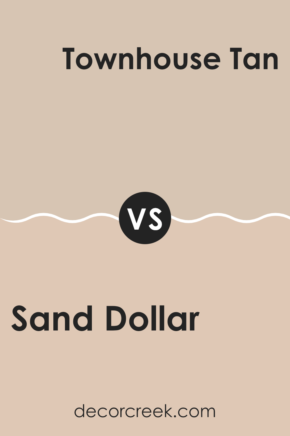
Sand Dollar SW 6099 by Sherwin Williams vs Townhouse Tan SW 7712 by Sherwin Williams
Sand Dollar and Townhouse Tan are two neutral colors from Sherwin Williams, but they show clear differences when compared. Sand Dollar is a light, soft beige with warm undertones that give it a cozy and welcoming feel.
It is perfect for rooms where you want to add brightness without strong color. On the other hand, Townhouse Tan leans toward a darker, richer beige with a slightly more brownish hue. This shade provides a more grounded and solid feel, making it ideal for areas that need a touch of warmth but also require a bit of visual strength and presence.
Sand Dollar works well in smaller or more brightly lit rooms to open up the area, while Townhouse Tan suits larger rooms or interiors with natural wood elements, enhancing the strong, earthy features of the setting. Together, they can complement each other nicely in a color scheme, balancing light and dark neutral tones.
You can see recommended paint color below:
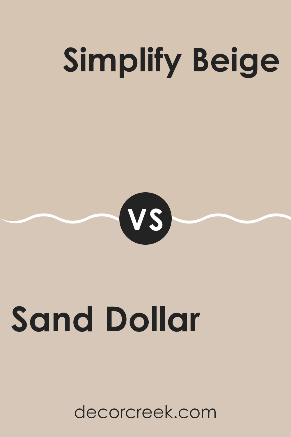
Sand Dollar SW 6099 by Sherwin Williams vs Simplify Beige SW 6085 by Sherwin Williams
Sand Dollar and Simplify Beige are two paints that give off a warm, comfortable feeling but in slightly different ways. Sand Dollar is a gentle, pale beige that feels almost like a soft off-white. It’s great for making a room feel open and airy without feeling too stark or cold.
On the other hand, Simplify Beige is a bit deeper and warmer in tone. It leans more toward a classic beige, giving a room a more traditional and welcoming vibe.
Both colors work well in many settings, whether you want a casual look or something a bit more formal. Each offers a way to create a comfortable, inviting room, but Sand Dollar is lighter and cooler, while Simplify Beige brings more warmth.
You can see recommended paint color below:
Sand Dollar SW 6099 by Sherwin Williams vs Bungalow Beige SW 7511 by Sherwin Williams
Sand Dollar and Bungalow Beige are two neutral shades by Sherwin Williams that are great for creating a warm, inviting atmosphere in a room. Sand Dollar is a light, creamy beige, much like the color of a pale sandy beach.
It offers a sense of softness and works well for making smaller rooms appear a bit bigger and more open. On the other hand, Bungalow Beige is a deeper, warmer color, similar to the natural tone of unbleached wool or a classic clay pot.
It can give rooms a cozy, more enclosed feel, making it a good choice for larger rooms or areas where you want to create a more intimate setting. Both colors work well as base shades, meaning you can easily pair them with other colors or design elements in a room. They suit many decorating styles, from modern to rustic, depending on the accents and furnishings you choose.
You can see recommended paint color below:
Sand Dollar SW 6099 by Sherwin Williams vs Touch of Sand SW 9085 by Sherwin Williams
Sand Dollar and Touch of Sand are both colors by Sherwin Williams, offering subtle differences suited to various decorating styles. Sand Dollar is a warm neutral with a creamy base, making it a flexible option for rooms where you want to create a cozy, inviting feel. It pairs well with bolder colors, serving as a soft backdrop that allows other elements to stand out.
On the other side, Touch of Sand is a bit lighter and has a more muted tone. This color is excellent for smaller rooms or areas with limited natural light, as it can help make the room feel more open and airy. Its subtle tone works well in modern and minimalist designs, providing a clean and fresh look without feeling too stark.
When choosing between these two, consider the size of your room and the atmosphere you want to create. Sand Dollar works well in larger, busier areas, while Touch of Sand is ideal for creating a light, spacious feel in smaller rooms.
You can see recommended paint color below:
Sand Dollar SW 6099 by Sherwin Williams vs Playa Arenosa SW 9094 by Sherwin Williams
Sand Dollar and Playa Arenosa by Sherwin Williams are both neutral colors, but they have subtle differences that set them apart. Sand Dollar is a light beige, almost like a soft tan. It has a warm undertone that makes it feel cozy and welcoming, an ideal choice for creating a comfortable, laid-back room. Think of it like a warm, gentle hug for your interior.
On the other hand, Playa Arenosa is slightly darker and leans more toward a grayish-tan hue. It has a cooler tone compared to Sand Dollar, which gives it a more modern feel. While Sand Dollar is like basking in the warm afternoon sun, Playa Arenosa is more like walking on a sandy beach on a cloudy day.
Both colors are flexible and work well in many settings, but your choice may depend on the mood you want to create. Warm and cozy, or cool and contemporary? These two beautiful shades help you decide.
You can see recommended paint color below:
- SW 9094 Playa Arenosa
Sand Dollar SW 6099 by Sherwin Williams vs Kilim Beige SW 6106 by Sherwin Williams
The two colors, Sand Dollar and Kilim Beige by Sherwin Williams, both offer a warm and welcoming charm, but there are subtle differences between them. Sand Dollar is a lighter, almost off-white color with a soft, creamy undertone. It’s perfect for creating a bright and airy feel in a room, reflecting more light and giving a sense of openness.
On the other hand, Kilim Beige is a deeper shade that leans toward a true beige. It offers a bit more warmth due to its richer and slightly darker tone. This makes it ideal for adding a cozy touch to interiors, especially in living areas or bedrooms where a comforting atmosphere is desired.
Both colors work well with many decor styles, but your choice may depend on the mood you want to set or the size of the room you’re decorating. Kilim Beige may be the better pick for larger, well-lit rooms, while Sand Dollar could be a great option for smaller or less naturally lit areas.
You can see recommended paint color below:
Sand Dollar SW 6099 by Sherwin Williams vs Beige SW 2859 by Sherwin Williams
Sand Dollar and Beige are two neutral paint colors from Sherwin Williams. Sand Dollar is a light, soft beige with warm undertones, creating a cozy and welcoming atmosphere in any room. This color is perfect for rooms where you want a calming effect without making the room feel too closed in. It pairs well with both bright colors and deeper shades, providing a flexible backdrop for various decor styles.
On the other hand, Beige is a deeper, more traditional beige color. It has a richer and somewhat earthier tone compared to Sand Dollar, making it well-suited for areas that benefit from a more pronounced, but still neutral, color presence. This shade can add a bit of warmth to rooms that may otherwise look too stark or cold with a lighter beige.
When deciding between the two, consider the size of your room and the amount of natural light it receives. Sand Dollar might be better in smaller, darker rooms, while Beige could work well in larger, well-lit rooms. Both colors offer a clean and inviting feel, making them popular choices for a variety of home interiors.
You can see recommended paint color below:
- SW 2859 Beige
In closing, I truly enjoyed sharing thoughts about SW 6099 Sand Dollar by Sherwin Williams. This paint color is a soft and gentle beige that can make any room feel warm and welcoming. Think of how a hug feels; that’s the kind of comfort this color brings into a home.
I talked about how Sand Dollar looks in bright sunlight and on cloudy days, and also which colors it pairs nicely with. It looks especially lovely with lighter shades like white or pale blue, as well as with some deeper or brighter tones. This makes it easy to use in many different rooms, from the living room to the bedroom.
I also explained why it’s such a smart choice for anyone wanting to refresh their home without going too bright or too dull. It has a unique way of blending in while still feeling special. So, if you’re thinking about making a change at home, SW 6099 Sand Dollar could be a great option. It’s simple, pleasing, and just feels right—much like choosing the perfect pair of cozy socks on a chilly day.

Ever wished paint sampling was as easy as sticking a sticker? Guess what? Now it is! Discover Samplize's unique Peel & Stick samples.
Get paint samples

