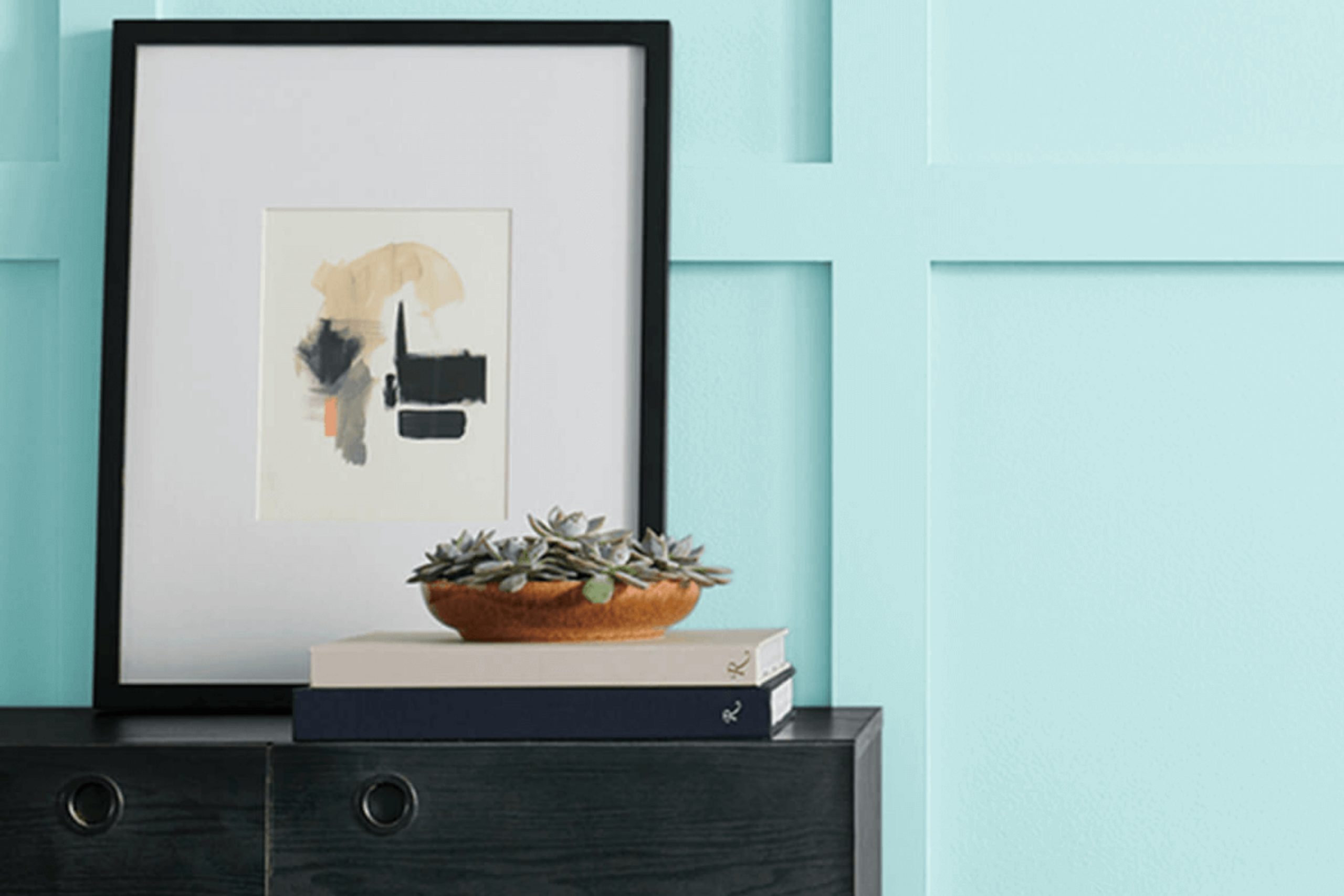
Imagine standing by the edge of a peaceful pool on a sunny day. The refreshing color of the water reflects a gentle blue-green hue that instantly puts you at ease. That’s the feeling you get with Sherwin Williams’ SW 6764 Swimming. It’s not just a color; it’s a whole mood that soothes and reenergizes your surroundings.
Every time you use SW 6764 Swimming in a room, it feels like you’re bringing a piece of the peaceful outdoors inside. This color beautifully bridges the gap between a bright, cheerful blue and a gentle green, making your walls look vibrant yet not overpowering. It’s perfect for anyone who wants a touch of the natural world in their home.
As you consider your room, think about how this color can lighten it up. It’s perfect for areas where you want a peaceful, welcoming atmosphere, like bedrooms or living areas. Whether used as the main feature or as an accent, SW 6764 Swimming fits well with many styles and pairs nicely with a wide range of other colors.
It feels effortless, affecting the mood of the room in a way that’s both refreshing and comfortingly familiar.
What Color Is Swimming SW 6764 by Sherwin Williams?
Swimming SW 6764 by Sherwin Williams is a light, fresh shade of blue with a hint of green, reminiscent of clear tropical waters. This color brings a sense of freshness and openness to any room, making it ideal for use in areas associated with relaxation and calm, like bedrooms, bathrooms, or living rooms. It pairs excellently with coastal or nautical interior styles, bringing a touch of the seaside indoors.
The color works well with white trims and ceilings for a crisp, clean contrast. It can also be paired with natural elements like light wood or wicker to enhance its calm and inviting feel. In contemporary settings, this color complements sleek, modern furniture, especially when accessories in metallic finishes like silver or chrome are used to add some contrast.
For textures, consider pairing this color with soft, plush fabrics, such as cotton or linen textiles to emphasize comfort and relaxation. Soft, knitted throws or woven basket materials also add to its appeal. Incorporating plants and greenery can further complement the blue-green tones, creating a fresh and inviting atmosphere that brings a touch of nature into the home.
Overall, Swimming is adaptable and works beautifully in various interiors, adding a splash of color without overpowering the room.

Is Swimming SW 6764 by Sherwin Williams Warm or Cool color?
Swimming, with the code SW 6764, is a paint color by Sherwin Williams that brings a fresh and bright look to any environment. This shade is a light and airy aqua, reminiscent of clear blue waters, which can create a revitalizing atmosphere in homes.
It works well in rooms where you want to bring a sense of openness and calm, like bathrooms, bedrooms, or even kitchens. This color can make smaller rooms feel less cramped, as its light nature reflects more light, giving the illusion of a larger area.
Paired with white trim, it offers a crisp and clean look, while natural wood tones can add warmth, balancing out the coolness of the aqua. Whether used on all four walls or as an accent, this color can bring a cheerful and welcoming energy to any setting, making it a popular choice for those looking to refresh their living environments.
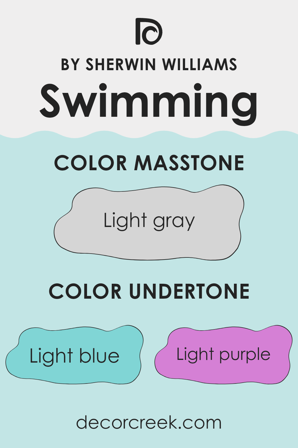
Undertones of Swimming SW 6764 by Sherwin Williams
The color Swimming by Sherwin Williams has various undertones that can change how it looks on walls. The main color is a soft, watery blue, but the undertones give it more depth. These undertones include hues like light blue, light purple, pale yellow, lilac, mint, pale pink, and grey.
When we look at a color, the undertones can make it appear cooler or warmer. For example, blue and lilac undertones might make Swimming appear cooler and more refreshing, while pale yellow and pale pink can add warmth.
In a room, these undertones can influence the mood. An area painted in Swimming with visible light blue or mint undertones might feel calm and open. If the light purple or lilac undertones stand out, it could give the room a gentle, soothing touch. On the other hand, if pale yellow or pale pink undertones are more pronounced, the setting might feel a bit cozier and more welcoming.
Lighting in the room will also affect how these undertones appear. Natural light might bring out the grey or mint undertones, giving a subtle, balanced look. Overall, the undertones make Swimming a flexible color that can complement various styles, depending on how they express themselves.
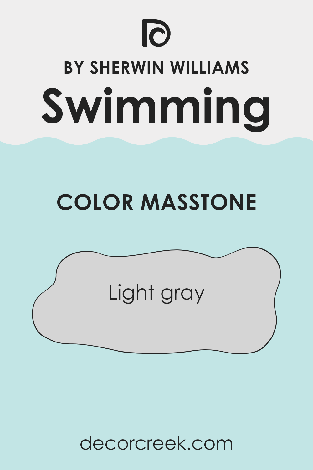
What is the Masstone of the Swimming SW 6764 by Sherwin Williams?
Swimming (SW 6764) by Sherwin Williams presents a soft, light gray masstone, which is adaptable for home interiors. Its subtle shade creates a calm and airy atmosphere, making rooms feel more open and inviting. The light gray tone blends seamlessly with various color schemes, allowing homeowners to pair it effortlessly with both bold and neutral accents.
In living areas, this color enhances natural light, giving rooms a bright and refreshing appearance. Its neutrality serves as an excellent backdrop for artwork and furniture, making it suitable for modern and traditional styles.
In bedrooms, the gentle gray can promote relaxation and comfort. It’s a perfect choice for those seeking a peaceful retreat. In kitchens and bathrooms, it pairs well with stainless steel and white fixtures, providing a clean and crisp look. Overall, this shade’s adaptability makes it a popular choice for those looking to create a harmonious and welcoming environment.
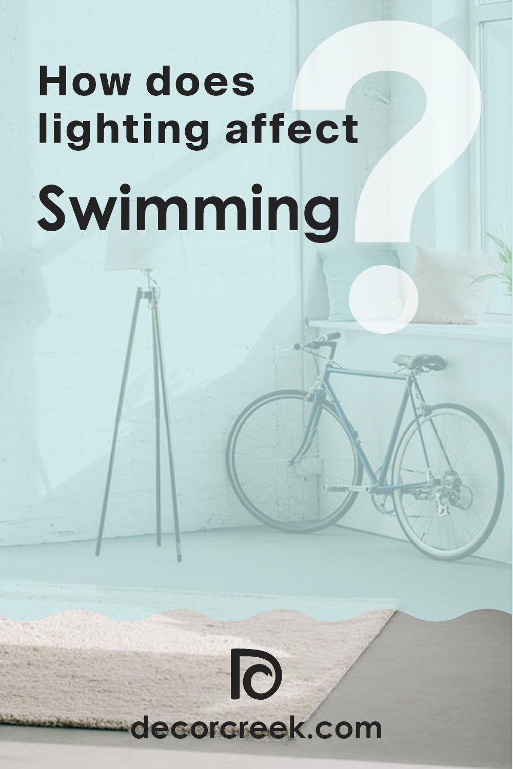
How Does Lighting Affect Swimming SW 6764 by Sherwin Williams?
Lighting plays a big role in how we see colors. It can change the way a paint color looks in a room. Sherwin Williams’ Swimming (SW 6764) is a light blue that can look different depending on the light and the direction a room faces.
In natural light, the color can appear more vibrant and true to its hue. However, in artificial light, it can look a bit different. If the artificial light is warm, such as from incandescent bulbs, Swimming might look a little warmer and less blue. If the lighting is cool, such as from fluorescent bulbs, the color may seem crisper and slightly brighter.
When it comes to rooms facing different directions, the effect can change quite a lot:
1. North-facing rooms: These rooms get cooler, indirect light. This can make colors appear a bit darker and cooler. Swimming may look a bit more subdued and grayish in a north-facing room. This is because the blue tones are enhanced by the cooler light.
2. South-facing rooms: These rooms get bright, warm light most of the day. Swimming will look brighter and more vivid in this kind of lighting. The light can make the blue tones appear more cheerful and lively.
3. East-facing rooms: These rooms get bright, warm light in the morning and cooler light in the afternoon. In the morning, Swimming can look quite fresh and vibrant, while in the afternoon, it might take on a slightly softer tone.
4. West-facing rooms: These get cooler light in the morning and warmer light in the afternoon. In a west-facing room, Swimming may look softer and cooler in the morning, and warmer and more saturated in the late afternoon when the light is more golden.
Overall, the way Swimming looks will change depending on the lighting, adding versatility to its use in different rooms.
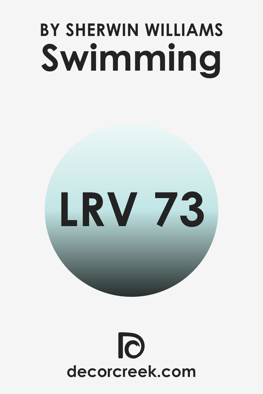
What is the LRV of Swimming SW 6764 by Sherwin Williams?
LRV, or Light Reflectance Value, refers to the amount of light a color reflects. It’s measured on a scale from 0 to 100, where 0 means the color absorbs all light (like black), and 100 indicates that the color reflects all light (like white).
LRV helps in understanding how bright or dark a color will appear on a large surface, such as a wall. Colors with higher LRV will reflect more light and make rooms appear brighter and more open, while colors with a lower LRV absorb more light, making rooms feel cozier and possibly more intimate.
With an LRV of 73.08, Swimming is a relatively light color. This means it will reflect a good amount of light, making rooms feel airy and bright. In rooms that don’t receive a lot of natural light, Swimming can help to maximize the available light, giving the area a more open and fresh feeling. In a room with plenty of natural light, this color can create a soothing, expansive atmosphere without being too intense.
Its light reflective properties allow it to maintain that fresh appearance even in dimmer settings, making it adaptable for different lighting conditions.
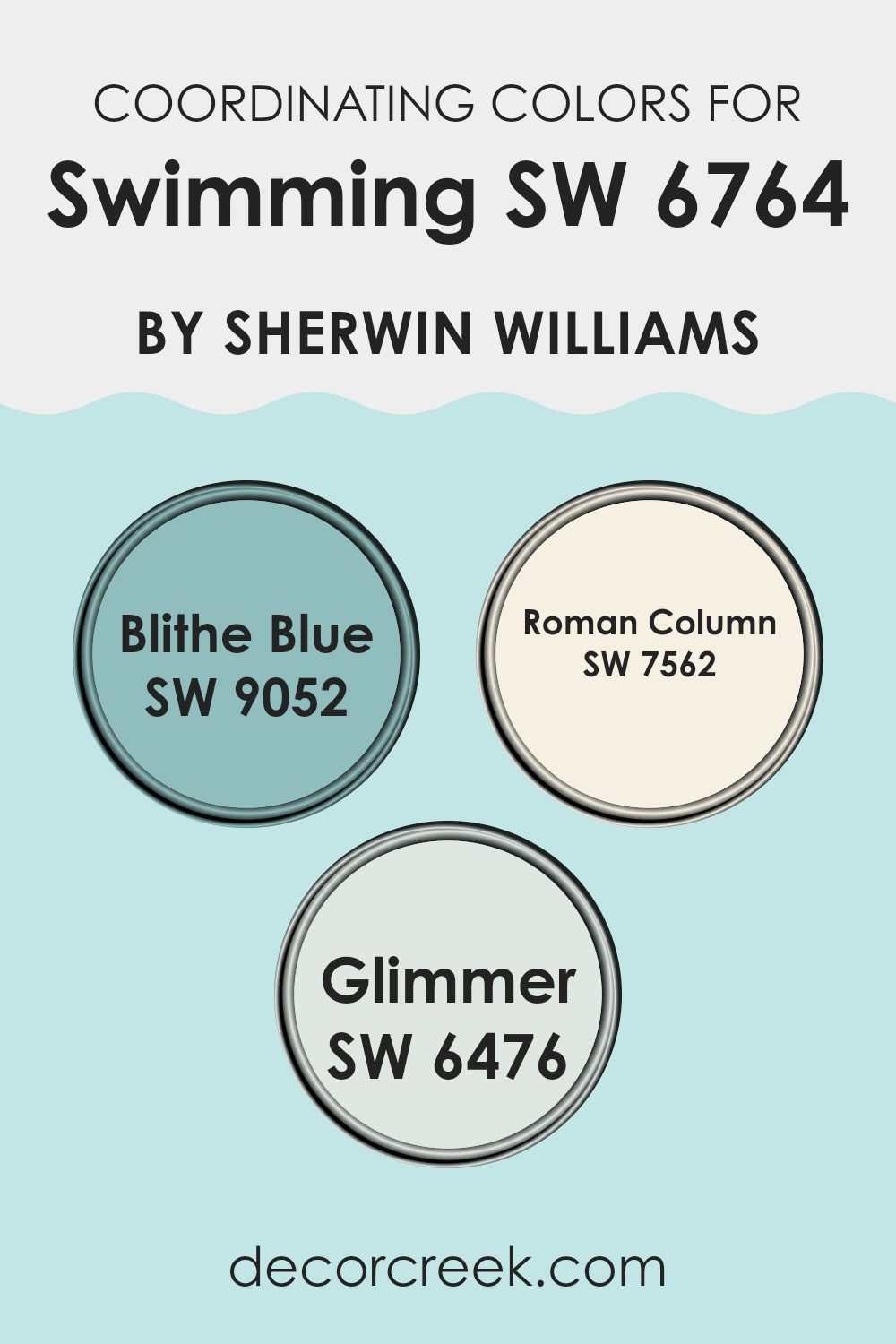
Coordinating Colors of Swimming SW 6764 by Sherwin Williams
Coordinating colors are hues that complement a primary color, enhancing its appeal while maintaining visual balance and harmony. In the context of the soft, refreshing shade of Swimming (SW 6764) by Sherwin Williams, Blithe Blue (SW 9052), Roman Column (SW 7562), and Glimmer (SW 6476) serve as perfect companions. When used together, they create a pleasing and unified look that feels both natural and inviting in various areas. The cool undertones of Swimming harmonize with these shades, making them especially effective in creating a cohesive environment.
Blithe Blue is a gentle and airy blue that brings a sense of openness and freshness to any room. It pairs beautifully with Swimming, adding depth without overpowering it. Roman Column is a soft, creamy off-white that offers a warm and subtle backdrop, providing a sense of calm and comfort.
Lastly, Glimmer offers a light, minty touch that adds a hint of cheerfulness and brightness. Together, these colors work well to create a balanced and pleasant environment, whether used in a bedroom, living room, or kitchen. When thoughtfully combined, these coordinating colors enhance each other, resulting in an area that feels perfectly curated and harmonious.
You can see recommended paint colors below:
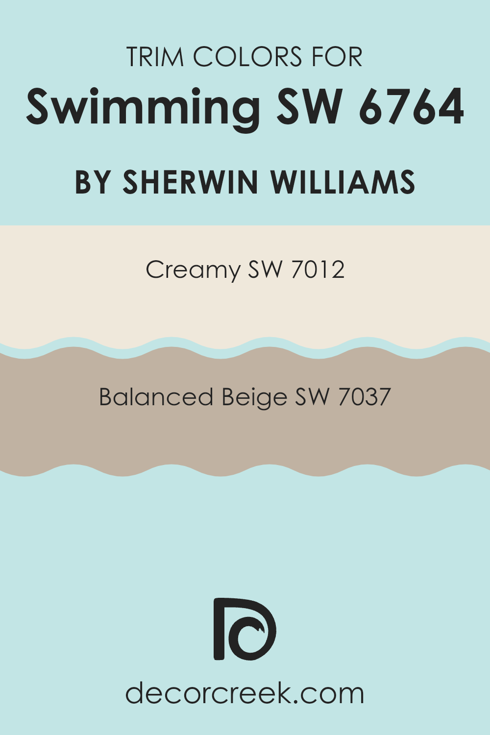
What are the Trim colors of Swimming SW 6764 by Sherwin Williams?
Trim colors are the hues used on the edges or borders of walls, ceilings, or various architectural features within an area. They highlight and define the structure of a room, creating contrast with the main wall color to give interiors a more polished and cohesive appearance. In swimming pool zones, selecting the right trim color can enhance the overall visual appeal and help certain features stand out gracefully.
Using Creamy (SW 7012) as a trim color introduces a soft, warm tone that can brighten edges and draw subtle attention to details without overpowering the main wall or pool colors. Balanced Beige (SW 7037), on the other hand, offers a neutral yet inviting feel, providing a grounded edge that brings together a harmonious look in the swimming area.
Creamy is a light and warm off-white color that gives a gentle and inviting feel to the trim, perfect for brightening the edges of an area. Balanced Beige offers a smooth and natural earthy hue, lending a refined yet welcoming appeal to the trims. Both of these colors pair well with a variety of other shades, ensuring adaptability and cohesiveness in a swimming zone. When these colors are used as trim, they enhance the architectural details without overpowering the main color schemes, allowing the primary design elements of the area to stand out effectively.
You can see recommended paint colors below:
Colors Similar to Swimming SW 6764 by Sherwin Williams
Colors similar to Swimming by Sherwin Williams create a calming and cohesive feel. These hues work together by sharing undertones that align naturally, promoting a harmonious flow in any area. For example, Bubble is a light, airy blue that adds a crisp and refreshing touch.
Pool Blue is perfect for those who want a bit more depth, offering a vibrant yet soothing character. Minor Blue is a subtle, understated tone that gently enhances the environment without overpowering it, while Quench Blue brings a richer, more intense vibe to the room. Bathe Blue offers a soft, peaceful blue, ideal for creating a relaxed environment.
Tame Teal introduces a touch of green to the blue palette, making areas feel grounded yet lively. Waterfall, with its beautiful blend of blue and green, evokes flowing water, bringing both energy and calm. Open Air is a light, gentle blue that feels open and expansive, making it ideal for creating an airy ambiance.
Meander Blue is slightly more muted, providing a gentle, comforting backdrop. Finally, Aviary Blue is a bright, cheerful shade that brings a sense of freshness to any room. Together, these colors enhance the calming effects and visual continuity found with Swimming, offering diverse yet complementary options for any setting.
You can see recommended paint colors below:
- SW 6770 Bubble
- SW 6944 Pool Blue
- SW 6792 Minor Blue
- SW 6785 Quench Blue
- SW 6771 Bathe Blue
- SW 6757 Tame Teal
- SW 6750 Waterfall
- SW 6491 Open Air
- SW 6484 Meander Blue
- SW 6778 Aviary Blue
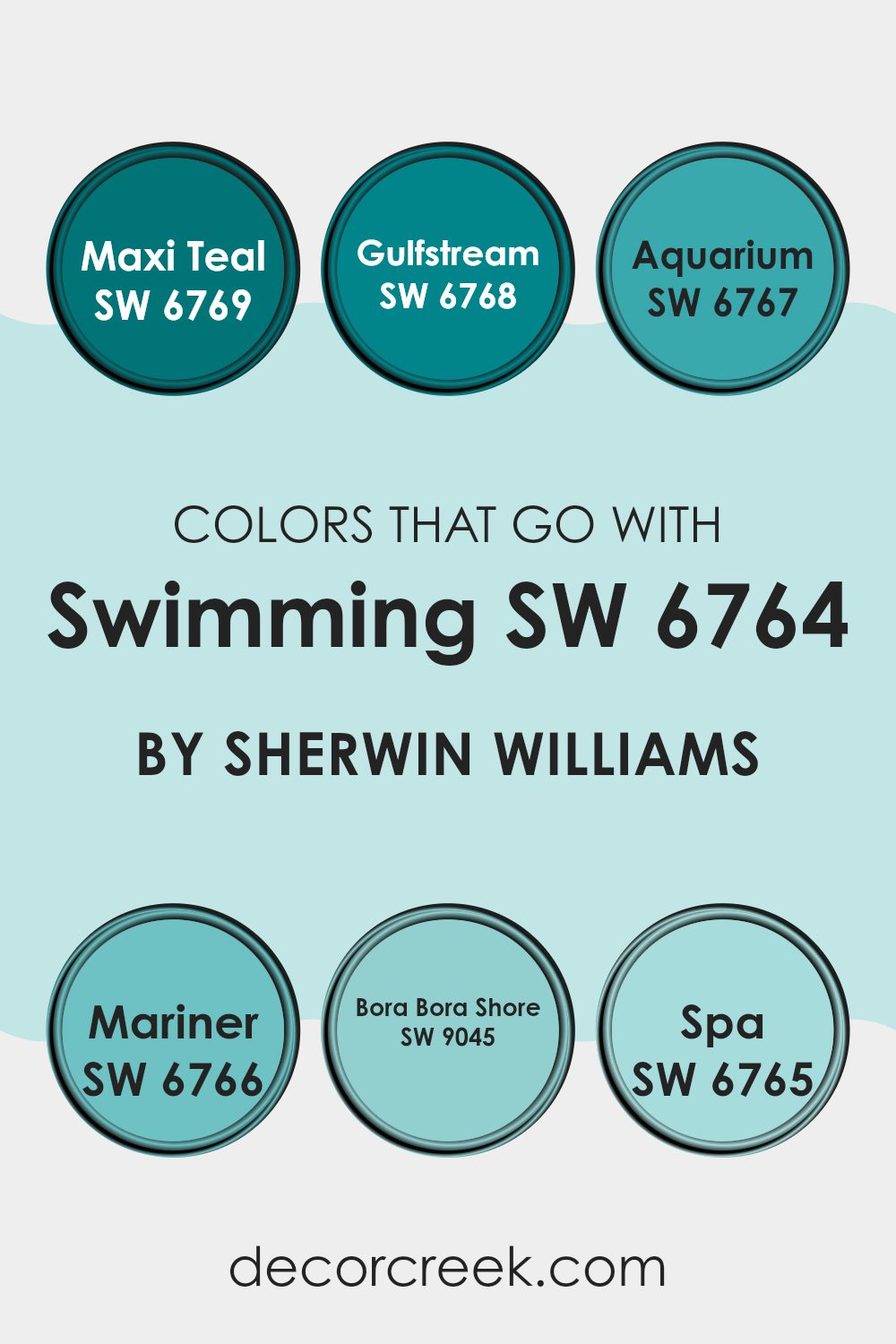
Colors that Go With Swimming SW 6764 by Sherwin Williams
Colors that go with Swimming SW 6764 by Sherwin Williams are important because they create a harmonious and pleasing environment. They add depth, balance, and interest to a setting by complementing and contrasting with Swimming SW 6764, a soft and calming blue hue. For instance, SW 6769 – Maxi Teal is a rich, deep blue-green that adds a pop of vibrant color, making it ideal for accent walls. SW 6768 – Gulfstream, a fresh and bright blue, brightens up any area and works wonderfully alongside Swimming SW 6764 for an airy feel.
SW 6767 – Aquarium offers a crisp, clean blue that’s slightly darker than Swimming, providing a subtle and easy transition between colors. SW 6766 – Mariner brings in a moodier, ocean-inspired blue, adding depth and coolness, perfect for a dramatic effect.
SW 9045 – Bora Bora Shore is reminiscent of sandy beaches and tropical waters with a warm, aqua tone that pairs nicely to create a vacation-like feel. Meanwhile, SW 6765 – Spa is a calming, light blue-green that promotes a sense of ease, enhancing the soothing atmosphere created by Swimming SW 6764. These colors work together by adding layers and textures to your living environment, making it inviting and visually interesting.
You can see recommended paint colors below:
- SW 6769 Maxi Teal
- SW 6768 Gulfstream
- SW 6767 Aquarium
- SW 6766 Mariner
- SW 9045 Bora Bora Shore
- SW 6765 Spa
How to Use Swimming SW 6764 by Sherwin Williams In Your Home?
Swimming SW 6764 by Sherwin Williams is a refreshing and light blue color, perfect for adding a touch of calm and a sense of openness to your home. It’s a flexible shade, suitable for both large and small environments. In living rooms, this blue can create a welcoming and airy feel, making the area feel larger and more inviting. In bedrooms, it helps establish a peaceful environment, promoting relaxation and restful sleep.
For bathrooms, Swimming SW 6764 offers a clean, fresh touch that pairs beautifully with whites or soft grays, enhancing the peaceful, spa-like atmosphere. It can also be used in kitchens to provide a pop of color that isn’t intense, working well with natural wood or white cabinetry.
Additionally, this color works well in nurseries or children’s rooms, creating a fun yet calming atmosphere. Paired with coordinating accents such as navy or coral, it brings a balanced yet stylish look to any room.
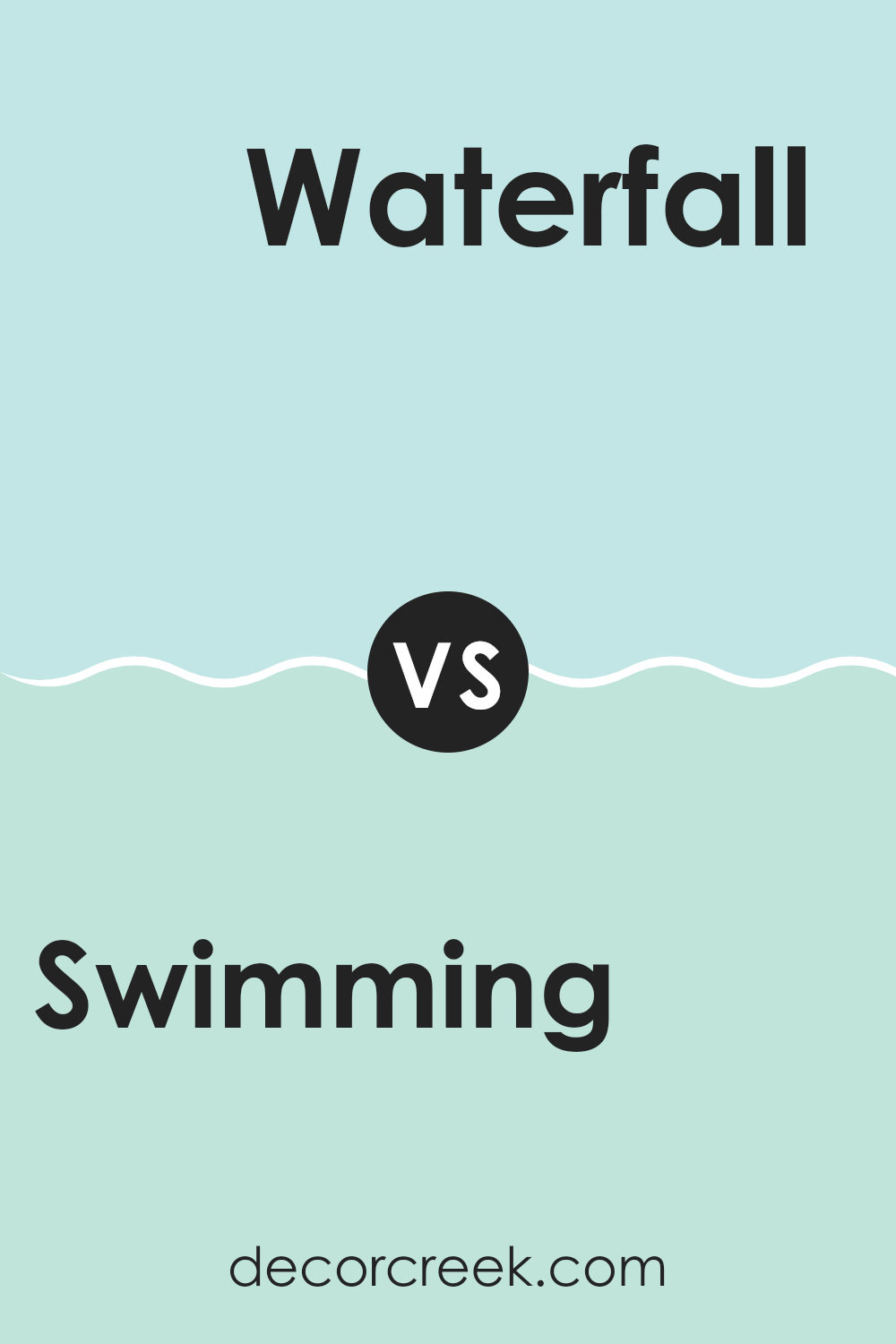
Swimming SW 6764 by Sherwin Williams vs Waterfall SW 6750 by Sherwin Williams
Swimming SW 6764 by Sherwin Williams is a vibrant, rich aqua that evokes a sense of energy and freshness. It’s a bold shade that can instantly enliven a setting, making it a great choice for feature walls or areas where you want to make a statement. This color is lively, bringing a sense of the ocean into your home.
In contrast, Waterfall SW 6750 by Sherwin Williams is a softer, more muted teal. It’s calmer and more subtle than Swimming. Waterfall has a soothing quality, making it ideal for rooms where you want to relax, such as bedrooms or bathrooms. It invokes a gentle, natural feel, reminiscent of falling water.
Both colors bring in elements of water and nature, but Swimming with its boldness can energize a room, while Waterfall provides a calming backdrop without overpowering the setting. They can complement different moods and settings within a home.
You can see recommended paint color below:
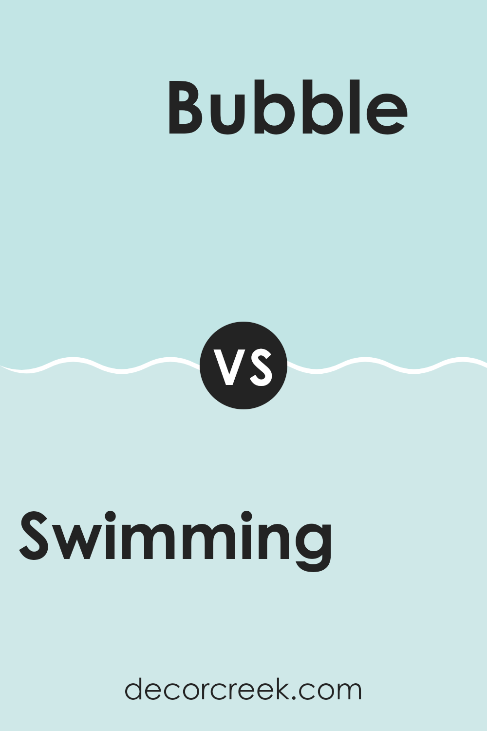
Swimming SW 6764 by Sherwin Williams vs Bubble SW 6770 by Sherwin Williams
Swimming SW 6764 and Bubble SW 6770 by Sherwin Williams are both refreshing, light blue colors, yet they have distinct characteristics. Swimming is a soothing blue with a hint of green, giving it a slightly more muted and calm appearance. It’s a great choice for creating a relaxed and peaceful setting, as it brings a touch of nature into an environment.
On the other hand, Bubble SW 6770 is a lighter, more vibrant shade of blue. It feels a bit more playful and upbeat due to its brightness. This makes it ideal for adding a pop of color and energy to a room, without being intense.
While both colors can brighten up a room, Swimming offers a subtle, soft ambiance, whereas Bubble brings a cheerful and lively feel. Choosing between the two depends on whether you want a calm and gentle atmosphere or a bright and cheerful environment.
You can see recommended paint color below:
- SW 6770 Bubble
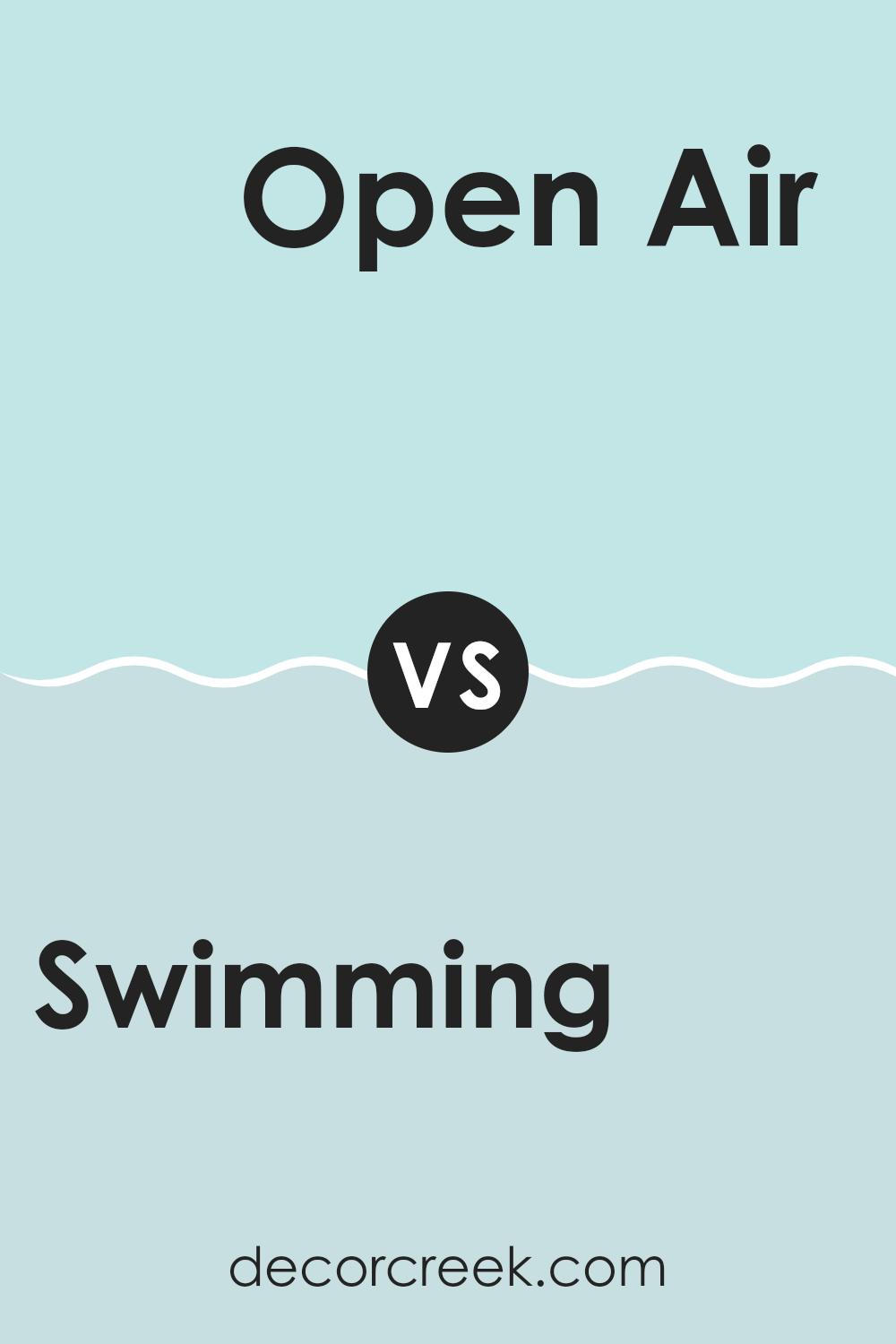
Swimming SW 6764 by Sherwin Williams vs Open Air SW 6491 by Sherwin Williams
Swimming SW 6764 and Open Air SW 6491 by Sherwin Williams are two blue shades that offer different vibes for your surroundings. Swimming is a rich, deeper blue that feels like a bold step into the sea. It’s perfect for making a statement in a room, providing a strong and confident atmosphere.
On the other hand, Open Air is a lighter, breezier blue, reminiscent of a clear sky. It adds a sense of freshness and lightness to any room. While Swimming can make a room feel cozy and enveloped, Open Air opens up a room, making it feel airy and spacious.
Both colors can work well depending on the mood you want to create. If you want something calm and airy, go for Open Air. If you prefer a more dramatic and intimate setting, Swimming might be your choice. Both colors have their charm and unique strengths.
You can see recommended paint color below:
- SW 6491 Open Air
Swimming SW 6764 by Sherwin Williams vs Aviary Blue SW 6778 by Sherwin Williams
Swimming SW 6764 and Aviary Blue SW 6778 by Sherwin Williams are two distinct shades of blue that offer different vibes. Swimming is a soft, muted blue with a hint of green, giving it a fresh and gentle feel. It’s often described as a peaceful, soothing color that can make an environment feel calm and light.
On the other hand, Aviary Blue is a brighter, more vibrant shade. This color brings more energy and a sense of openness to a room. It’s a cheerful and uplifting blue, reminiscent of a clear sky.
While Swimming might be great for areas where you want to relax and unwind, Aviary Blue could be ideal for areas where you want to add a touch of brightness and joy. Both colors can work well in different settings, but their unique tones will create distinct moods in your home.
You can see recommended paint color below:
Swimming SW 6764 by Sherwin Williams vs Meander Blue SW 6484 by Sherwin Williams
Swimming SW 6764 and Meander Blue SW 6484, both by Sherwin Williams, offer a calm and refreshing feel, but each brings its own character. Swimming is a soft aqua that captures a breezy, beach-like mood. It’s light and airy, ideal for rooms that need a relaxed, coastal atmosphere. This shade suits living rooms or bedrooms where a peaceful setting is desired.
On the other hand, Meander Blue offers a slightly darker, richer hue. It has more depth, which can add coziness and warmth to a room. This color is great for areas where you want a bit more intimacy or a soothing effect, like a home office or bathroom.
Both colors pair nicely with whites and other neutrals but can also complement deeper blues or greens. Whether you choose the light, airy feel of Swimming or the deep, comforting tone of Meander Blue, both provide a charming backdrop for a peaceful setting.
You can see recommended paint color below:
- SW 6484 Meander Blue
Swimming SW 6764 by Sherwin Williams vs Tame Teal SW 6757 by Sherwin Williams
Swimming (SW 6764) and Tame Teal (SW 6757) are both colors from Sherwin Williams, and while they share some similarities, they have distinct differences. Swimming is a light, refreshing blue that gives off a cool and open feeling, reminiscent of a clear summer sky. It’s a friendly and inviting color, perfect for areas where you want a calm and spacious atmosphere.
On the other hand, Tame Teal is a bit darker and richer. It has green undertones that make it more of a teal shade. Tame Teal feels a bit more grounded and balanced. It’s a great choice if you want a color that feels homey but also adds a touch of depth to a room.
Together, these colors could enhance each other well, with Swimming bringing in brightness and Tame Teal adding contrast and interest. Whether used individually or in combination, they can both create beautiful environments.
You can see recommended paint color below:
Swimming SW 6764 by Sherwin Williams vs Bathe Blue SW 6771 by Sherwin Williams
Swimming SW 6764 and Bathe Blue SW 6771 by Sherwin Williams are two shades of blue that offer distinct vibes for any environment. Swimming is a soft, muted blue with a hint of gray, creating a calm and relaxed atmosphere. It works well in environments where you want a subtle touch of color without being too intense.
On the other hand, Bathe Blue is a brighter, more vibrant blue. It brings more energy and liveliness to a room. This shade is perfect for areas where you want to feel refreshed and invigorated, such as bathrooms or sunrooms.
Both colors can complement various styles of decor and pair nicely with whites, grays, or natural wood tones. Choosing between the two depends on the mood you wish to create: opt for Swimming for a peaceful and understated look or Bathe Blue for a cheerful and lively ambiance.
You can see recommended paint color below:
- SW 6771 Bathe Blue
Swimming SW 6764 by Sherwin Williams vs Minor Blue SW 6792 by Sherwin Williams
Swimming SW 6764 by Sherwin Williams is a fresh and vibrant blue-green color. This shade brings the feeling of a bright, tropical ocean and can energize a setting with its lively hue. It works well in rooms where you want some fun and life, like a kids’ playroom or a lively living area.
On the other hand, Minor Blue SW 6792 is a softer and more subtle blue shade. This color has a calm and soothing quality, making it perfect for bedrooms or rooms designed for relaxation. While still blue, this tone leans towards a pastel, providing a gentle backdrop that doesn’t overwhelm.
Both colors have their unique charms. Swimming is bold and awakening, while Minor Blue offers a more reserved and calming presence. Depending on the mood you want to create in a setting, you can choose between the energizing nature of Swimming and the peaceful vibe of Minor Blue.
You can see recommended paint color below:
Swimming SW 6764 by Sherwin Williams vs Pool Blue SW 6944 by Sherwin Williams
Swimming SW 6764 by Sherwin Williams is a soothing, soft blue that evokes the calmness of a gentle pool of water. It’s a flexible color that fits well in almost any room, providing a peaceful and relaxing atmosphere. This shade can make an area feel open and airy, creating a comforting environment.
On the other hand, Pool Blue SW 6944 is a brighter and more energetic blue. It feels more lively and vibrant, perfect for adding a splash of color to a room. This shade can invigorate a room, giving it a fresh and cheerful look.
When comparing the two, Swimming is more subdued and creates a sense of calm, while Pool Blue stands out with its brightness and energy. Both colors are beautiful in their own way, but they offer different feelings: one is calming, and the other is lively. Choosing between them depends on the mood you want to create in your environment.
You can see recommended paint color below:
Swimming SW 6764 by Sherwin Williams vs Quench Blue SW 6785 by Sherwin Williams
Swimming SW 6764 and Quench Blue SW 6785 by Sherwin Williams are both soft blue shades that offer a calming effect to any setting. Swimming is a slightly warmer blue with a touch of green, making it feel like a gentle, refreshing splash.
It’s perfect for creating a relaxing atmosphere in rooms like bathrooms or bedrooms. On the other hand, Quench Blue is a cooler, more vibrant blue with a hint of brightness. This makes it a great choice for adding a lively touch to any room, like a kitchen or a kid’s room.
Both colors are reminiscent of water but in different moods—Swimming is akin to a calm, still pool, while Quench Blue is more like a crisp, refreshing ocean wave. Each offers a distinct personality, allowing for a wide range of styles and uses depending on the desired ambiance.
You can see recommended paint color below:
In conclusion, I think SW 6764 Swimming by Sherwin Williams is a wonderful paint color choice. It’s a nice shade of blue that reminds me of a calm ocean or a sunny day at the beach. When I look at it, I feel happy and relaxed. This color can make any room in a house feel more cheerful and bright. It’s perfect for a bedroom if you want to feel calm when going to sleep or for a living room where family and friends gather to have fun.
Using SW 6764 Swimming on the walls can make a room feel much more lively and welcoming. It’s a great choice for those who like colors that bring out a sense of happiness and peace. It’s not too dark or too light, making it a color that a lot of people would probably enjoy in their homes. You can use it in a room for kids or in a bathroom to make it feel refreshing.
Overall, SW 6764 Swimming is a friendly color that can make a big difference in how a room looks and feels, making it an easy choice if blue is your favorite. It adds joy without being too strong, making it a fun color to have around!
Ever wished paint sampling was as easy as sticking a sticker? Guess what? Now it is! Discover Samplize's unique Peel & Stick samples.
Get paint samples

