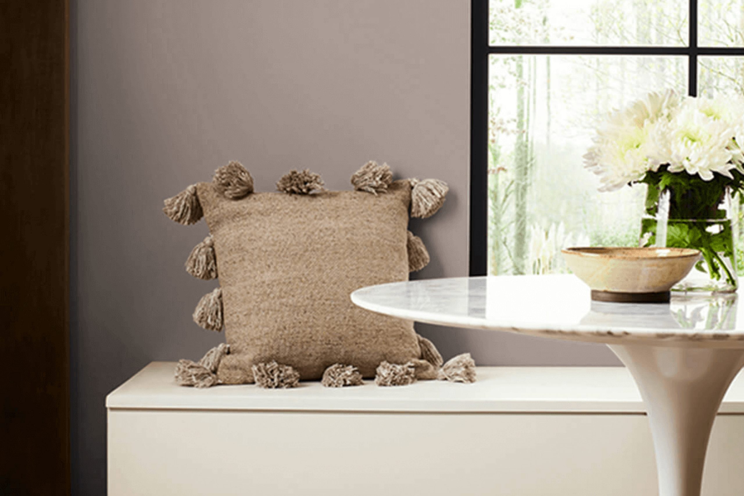
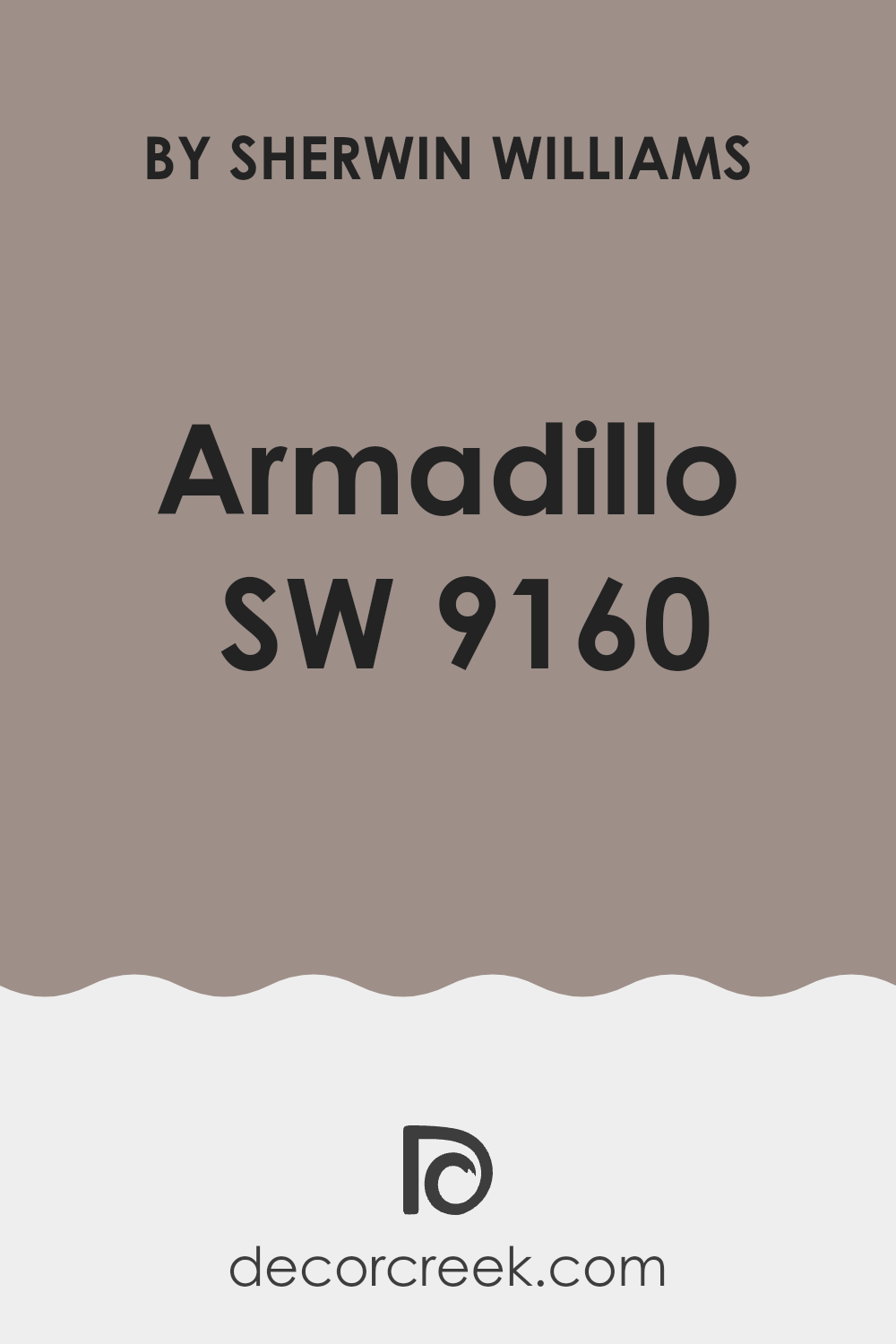
If you’re considering a color that radiates warmth and earthiness for your next paint project, let me introduce you to SW 9160 Armadillo by Sherwin Williams. As someone who often looks for hues that add a unique flair to living spaces without overwhelming them, I found this particular shade quite impressive. Armadillo is not your regular neutral; it’s a deep, rich taupe that brings a sense of grounded sophistication to any room.
Choosing the right color can be overwhelming, I know. Yet, when incorporating Armadillo into your decor, you’ll find it surprisingly versatile. It pairs well with a wide range of complementary colors, from soft creams to bold blues, allowing you to tailor it to your personal style or existing decor seamlessly.
Whether you’re updating your living room, bedroom, or even the exterior of your home, Armadillo offers a robust palette that withstands changing trends, providing a timeless backdrop that enhances your furnishings and accessories.
Having used it in several projects, I appreciate how it consistently delivers a warm, inviting atmosphere.
If you’re aiming for a space that feels cozy yet sophisticated, SW 9160 Armadillo is worth considering.
What Color Is Armadillo SW 9160 by Sherwin Williams?
The color Armadillo by Sherwin Williams is a deep, earthy gray with warm brown undertones. It’s a versatile shade that evokes a grounded, cozy feeling, making it an excellent choice for creating a welcoming space. Armadillo is especially suitable for living rooms and bedrooms as it offers a comforting backdrop that pairs well with both natural light and artificial illumination.
This shade works wonderfully in interior styles that favor rustic or industrial elements, as its earthiness complements raw materials like exposed brick, worn leather, and aged wood. It also fits beautifully in modern farmhouse decor, where its warmth can balance cooler tones and soft textures like linen or cotton.
For pairing, Armadillo looks particularly harmonious next to natural textures. Consider materials such as jute, sisal, and soft wool for rugs and upholstery to create a cohesive, inviting atmosphere. It also pairs well with metallic finishes like aged copper or brushed nickel, adding a touch of contrast and sophistication without overpowering the room’s aesthetic.
In terms of color combinations, consider soft creams, muted blues, or subtle greens to maintain a cozy, earth-toned palette that enhances the overall warmth of the space.
This makes Armadillo a versatile color that helps achieve a balance between comfort and style in many home settings.
Is Armadillo SW 9160 by Sherwin Williams Warm or Cool color?
Sherwin Williams’ Armadillo 9160 is a versatile shade that brings warmth and coziness to any room. This color has a rich earthy tone, similar to dark clay, that makes it excellent for creating a welcoming space. It pairs well with natural materials like wood or stone, enhancing the rustic feel of a home.
In living rooms or bedrooms, Armadillo provides a solid and soothing background that allows both light and dark furniture to stand out, offering a stunning contrast. When used in smaller spaces like bathrooms or hallways, it can make the area feel more intimate and grounded.
For those looking to add a touch of nature to their home without going too bold, Armadillo is a great choice. Its deep and subtle hue works well in various lighting conditions, maintaining its beauty throughout the day. Whether aiming for a modern or traditional look, this color can easily adapt, making it a practical choice for any home.
Undertones of Armadillo SW 9160 by Sherwin Williams
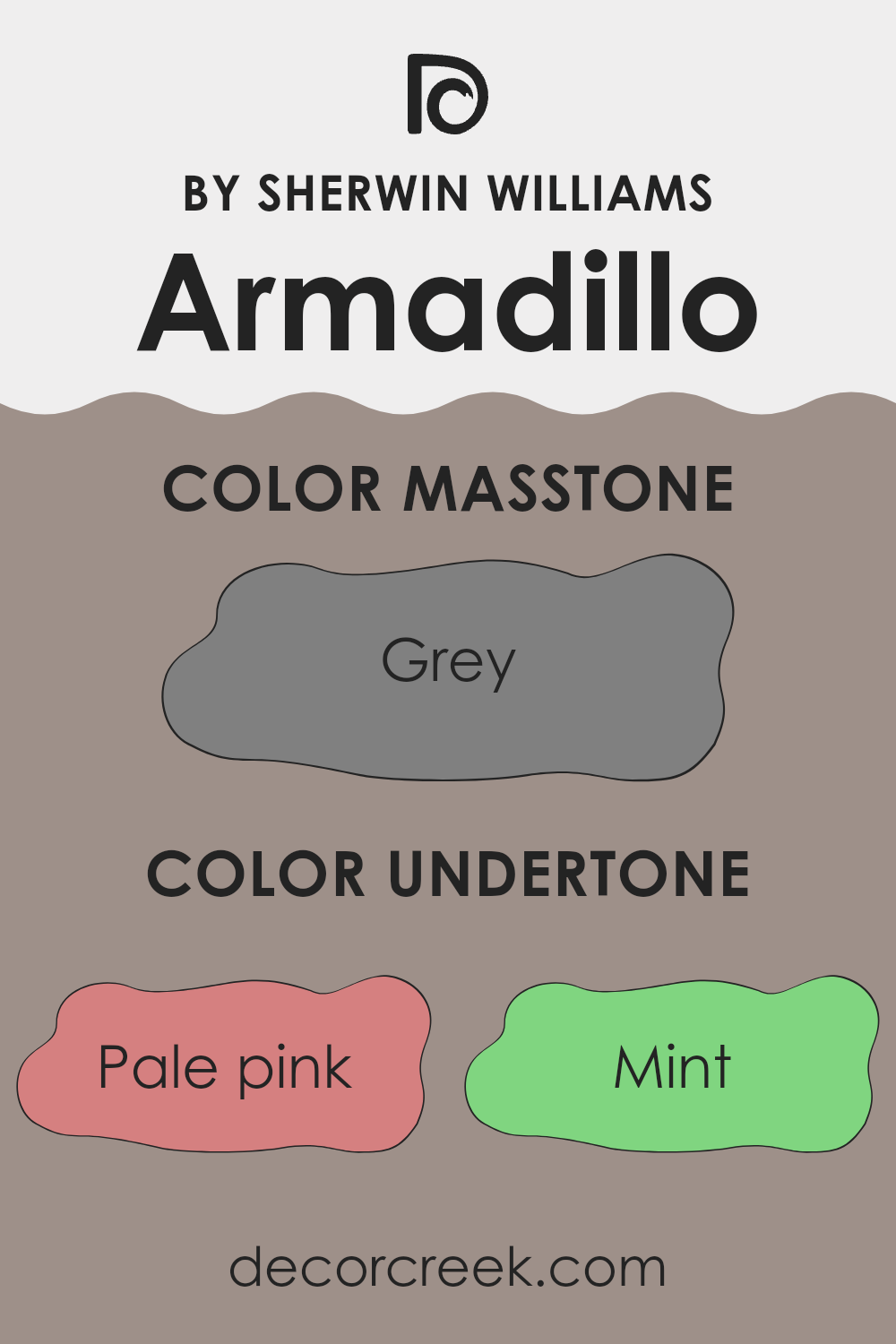
ArmadilloSW 9160 by Sherwin Williams is a unique color that looks different depending on the lighting and surrounding colors because of its varied undertones. Undertones are subtle colors that reside beneath the surface of the main color, influencing its overall hue and how it is perceived in various environments.
This paint has a complex range of undertones including shades of pink, mint, lilac, and more. In a brightly lit room, the pale pink or lilac undertones might make the color appear softer and more welcoming. Under dimmer lighting, darker undertones like olive or brown could make the walls look more grounded and warm.
When used on interior walls, the versatility of the undertones allows this color to adapt beautifully to different styles and decorations. In a room with lots of natural light, the lighter undertones like light blue and mint can give the room a fresh, airy feel. In contrast, in a room with less natural light or at night, the darker undertones like dark green or navy may become more dominant, creating a cozy, enveloping feel.
This adaptability makes it an excellent choice for spaces that are used throughout the day, from sunny kitchens to relaxed living areas.
The undertones play a significant role in the overall look, providing depth and character that can complement various types of furnishing and accent colors.
What is the Masstone of the Armadillo SW 9160 by Sherwin Williams?
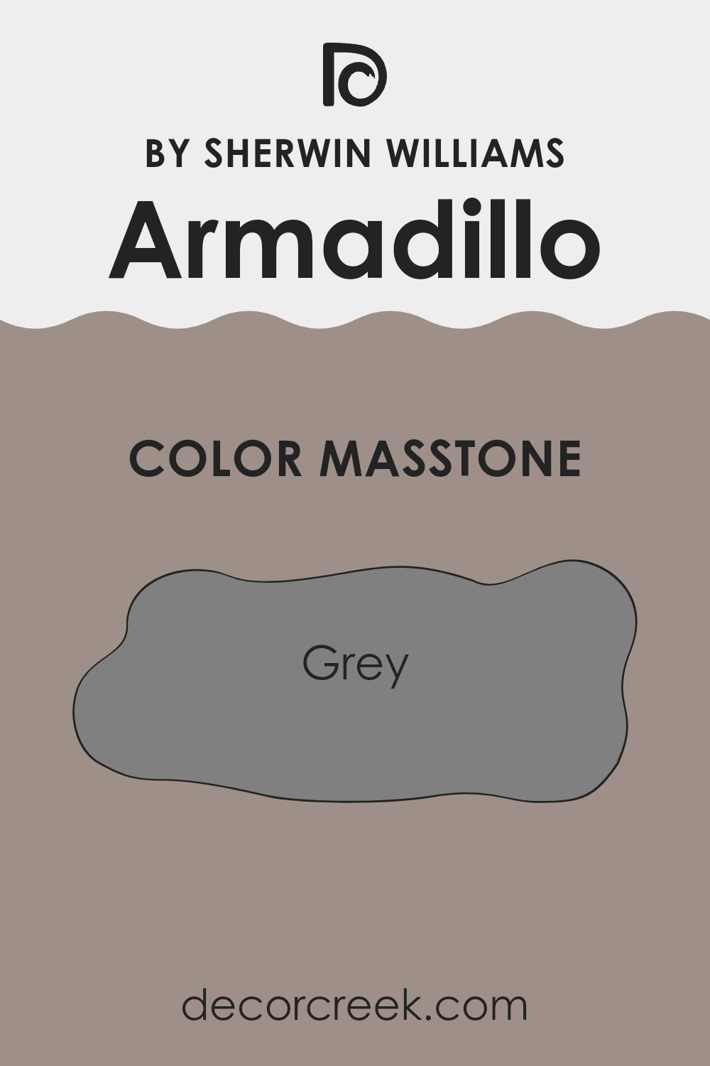
The color ArmadilloSW 9160 by Sherwin Williams has a masstone of grey, similar to the shade #808080. This neutral grey is very flexible when it comes to decorating a home. It can easily blend with a wide range of other colors, whether they are bright, like reds and yellows, or more subdued, like blues and greens.
The consistency of this grey ensures that it doesn’t overpower a room but provides a steady base that can highlight other colors or decor items. It’s particularly good for living areas or bedrooms where you might want a calm and steady background.
It also works well in spaces that don’t get a lot of natural light, as grey doesn’t make the room feel darker but maintains a clean and even tone. Using this shade creates a neat and orderly feel, making it a good choice for modern or minimalist home styles.
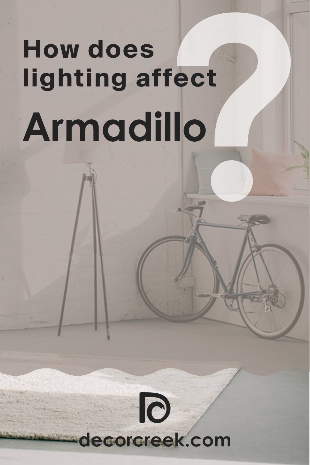
How Does Lighting Affect Armadillo SW 9160 by Sherwin Williams?
Lighting significantly impacts the way colors appear in any space, affecting both mood and functionality. The color in question, a rich, earthy taupe, works differently under various light conditions due to its complex undertones.
In artificial light, such as LED or incandescent lighting, this taupe color can look warmer and more inviting. Artificial lighting tends to enhance the yellow and red undertones, making the room feel cozy and welcoming. This effect is particularly beneficial in living spaces or areas where comfort is key.
Under natural light, the color behaves differently throughout the day and depends on the orientation of the room. In north-facing rooms, which receive less direct sunlight and have a cooler light, the color tends to appear more muted and subtle. It can lend a calm and steady feel to the space, ideal for creating a quiet and focused area such as a study room or home office.
South-facing rooms, basking in abundant sunlight, will show this taupe at its warmest and richest. The ample natural light enhances its earthy qualities, making it look vibrant and lively, which is great for family rooms or dining areas where a friendly and energetic atmosphere is desired.
East-facing rooms see the most change in the color as the natural light transitions from the cool tones of the morning to warmer midday light. Here, the color can look softly inviting in the morning, ideal for bedrooms, and gradually turn more robust and vivid, suitable for multi-functional spaces used throughout the day.
West-facing rooms get the afternoon and evening light, which can make the taupe appear intensely warm and dynamic, perfect for spaces used predominantly in the latter part of the day like living rooms or kitchens where a welcoming atmosphere can be appreciated as the day winds down.
Overall, this rich taupe adapts well to various lighting conditions, offering flexibility and visual warmth to various room orientations and uses.
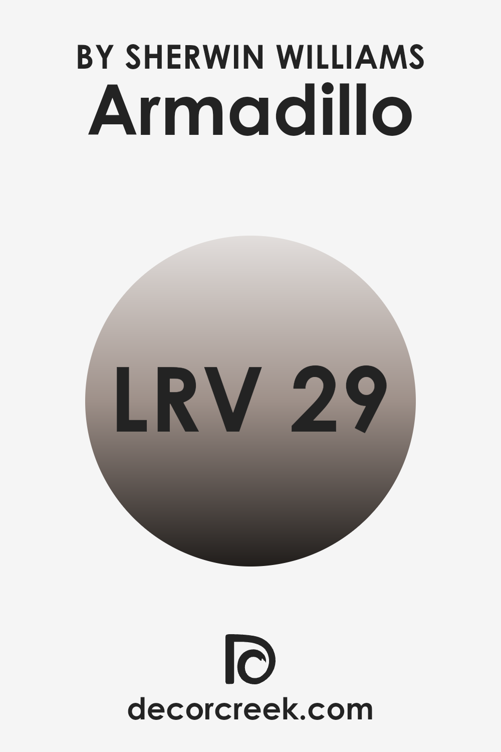
What is the LRV of Armadillo SW 9160 by Sherwin Williams?
Light Reflectance Value (LRV) is a measure used to determine how much light a color reflects back into a room. It is expressed on a scale where the higher the value, the more light is reflected. Colors with high LRVs make rooms feel more open and airy because they reflect more light, helping to brighten the space.
On the other hand, colors with low LRVs absorb more light, which can make a room feel smaller or cozier and can create a moodier atmosphere. With an LRV of 28.926, the color Armadillo from Sherwin Williams is on the darker side of the scale.
This means it won’t reflect much light and might make a room feel more enclosed. This can be ideal for creating a snug and warm atmosphere in spaces like dens or bedrooms. In rooms with less natural light, this color might make the area feel smaller, so it’s important to balance it with good lighting to ensure the space doesn’t become too dark.
Coordinating Colors of Armadillo SW 9160 by Sherwin Williams
Coordinating colors are shades that harmonize well with a primary color, enhancing the overall aesthetic of a space without overpowering the main hue. These coordinated shades can create a balanced and visually appealing palette when used together in interiors or exteriors. When dealing with a neutral base color such as a warm grey or brown, choosing coordinating colors involves selecting hues that complement or subtly contrast with the base, offering a pleasing variety to the eye.
For example, SW 6163 – Grassland is a gentle green that brings a touch of nature into the mix, providing a refreshing contrast against more neutral tones. It reflects the calmness of green fields and has a restorative quality. SW 7012 – Creamy is a soft, off-white color that adds a smooth, light touch to the color scheme, creating a clean and inviting look.
It works wonderfully to brighten darker colors or add subtle warmth to cold environments. Lastly, SW 6028 – Cultured Pearl is a muted taupe that has a timeless elegance. This color offers versatility, working well with both contemporary and traditional designs, aligning seamlessly with a variety of decor styles. By incorporating these coordinated colors, one can achieve a coherent and inviting atmosphere in any room.
You can see recommended paint colors below:
- SW 6163 Grassland
- SW 7012 Creamy
- SW 6028 Cultured Pearl

What are the Trim colors of Armadillo SW 9160 by Sherwin Williams?
Trim colors are secondary colors used in the painting scheme that highlight or contrast with the main wall color, enhancing architectural features and adding definition to the space. For example, Armadillo SW 9160 by Sherwin Williams, which is a rich, deep tone, can be effectively complemented with trim colors like SW 7008 – Alabaster or SW 7043 – Worldly Gray.
These trims provide a clean break from the darker hues, making the walls stand out and giving a neat, finished look to the rooms. SW 7008 – Alabaster is a soft, creamy white that offers a fresh and bright contrast to deeper and darker colors such as Armadillo. This color is particularly useful in brightening up spaces and creating a feeling of openness.
On the other hand, SW 7043 – Worldly Gray is a neutral gray with warm undertones that provides a subtle, yet striking contrast with Armadillo, complementing its warmth without overshadowing. This color can help in achieving a balanced, harmonious look especially in areas where you want a touch of sophistication without using overly vibrant colors.
You can see recommended paint colors below:

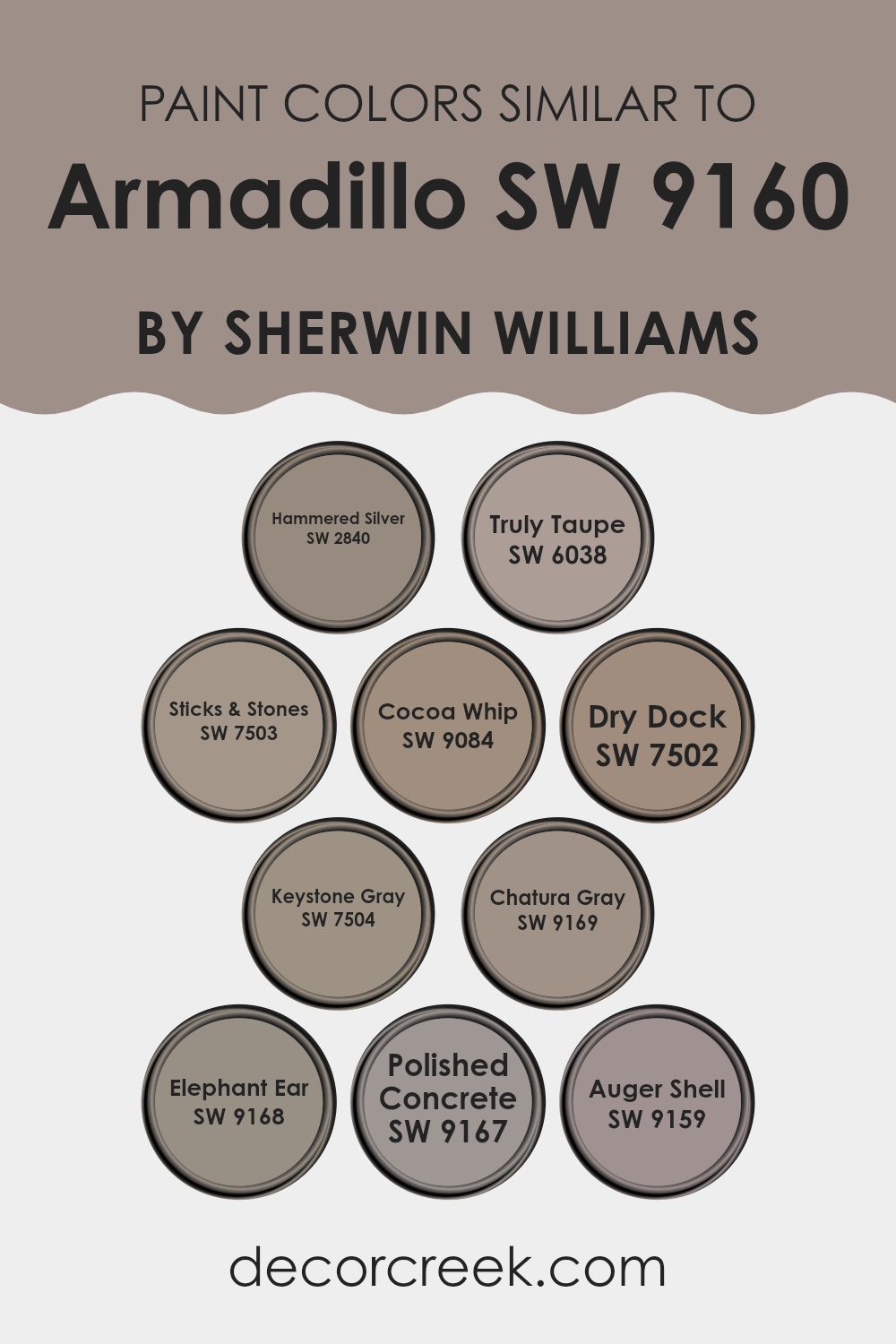
Colors Similar to Armadillo SW 9160 by Sherwin Williams
Using similar colors in decorating can be essential for creating a unified and harmonious aesthetic in your space. When colors like Armadillo and its similar hues are used together, they blend effortlessly, providing a subtle variation that enriches the environment without overwhelming the senses.
By choosing colors within the same spectrum, such as grays and taupes, you ensure that every element in the room contributes to a cohesive look. This can be particularly effective for achieving a calm, collected atmosphere where each color complements the others.
For instance, Hammered Silver and Truly Taupe both play off the cooler aspects of Armadillo, offering gentle contrasts that can enhance textures and shapes in a room’s decor. Sticks & Stones and Cocoa Whip add a touch of warmth, creating a soft transition between furnishings.
Dry Dock presents a slightly lighter option that works wonderfully on larger surfaces like walls to prevent the space from feeling too closed in. Keystone Gray steps in as a balanced medium, coordinating well with both lighter and darker colors, while Chatura Gray strengthens the depth in the palette.
Elephant Ear and Polished Concrete serve similar purposes, with each deepening the color scheme to draw in the eye subtly. Auger Shell, rounding out the selection, offers a lighter, almost neutral complement that can illuminate corners and highlight details without dominating the scene. By using these colors, you can gently define the space while keeping the overall feeling restful and cohesive.
You can see recommended paint colors below:
- SW 2840 Hammered Silver
- SW 6038 Truly Taupe
- SW 7503 Sticks & Stones
- SW 9084 Cocoa Whip
- SW 7502 Dry Dock
- SW 7504 Keystone Gray
- SW 9169 Chatura Gray
- SW 9168 Elephant Ear
- SW 9167 Polished Concrete
- SW 9159 Auger Shell
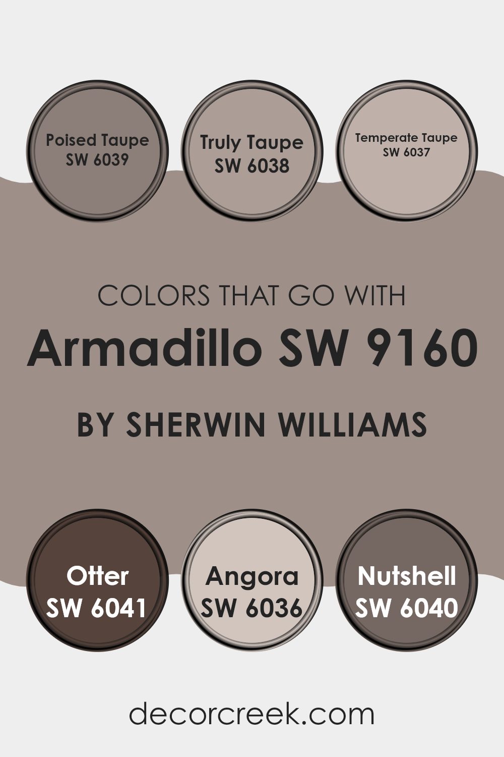
Colors that Go With Armadillo SW 9160 by Sherwin Williams
Choosing complementary colors to go with Armadillo SW 9160 from Sherwin Williams is essential because they help create a cohesive and appealing look in any space. Each color can set a different mood and vibe, allowing for personal customization according to the desired atmosphere.
For instance, colors like SW 6039 – Poised Taupe or SW 6037 – Temperate Taupe can seamlessly blend with Armadillo, as they all share earthy undertones that produce a warm and welcoming feel. These taupes lend themselves well to relaxation and comforting environments, which is perfect for living rooms or bedrooms.
On the other hand, shades like SW 6038 – Truly Taupe or SW 6041 – Otter bring slightly darker, richer earthy hues to the palette. Truly Taupe has a deeper, fuller quality, almost hinting at a soft brown that enriches the surroundings without overwhelming them. Otter introduces a bit darker tone that echoes elements of nature, perfect for grounding a space or adding depth.
For lighter options, SW 6036 – Angora offers a gentler beige that radiates warmth and is flexible across various decor styles. Finally, SW 6040 – Nutshell serves as another robust choice but with a nuttier base, enhancing the connection with natural elements.
These complementary colors all work to create a harmonious and versatile color scheme when paired with Armadillo, making any decorating project more enjoyable and beautiful.
You can see recommended paint colors below:
- SW 6039 Poised Taupe
- SW 6038 Truly Taupe
- SW 6037 Temperate Taupe
- SW 6041 Otter
- SW 6036 Angora
- SW 6040 Nutshell
How to Use Armadillo SW 9160 by Sherwin Williams In Your Home?
Armadillo SW 9160 by Sherwin Williams is a rich earthy brown that brings a sense of warmth and coziness to any space. Ideal for creating a welcoming atmosphere, this paint color is perfect for living rooms and bedrooms where you want to feel relaxed and comfortable. Its deep tones pair well with natural materials like wood or leather, enhancing the rustic charm of any room.
If you’re considering updating your kitchen or dining area, Armadillo can add depth and character to cabinets or walls. In smaller spaces, such as a bathroom or hallway, using this color as an accent wall can add a lovely touch of warmth without overwhelming the room.
For those who like DIY projects, Armadillo works beautifully on furniture pieces, giving them a fresh, new look. Whether you’re revamping an old dresser or sprucing up some shelves, this versatile color can help you achieve a cozy, inviting look in your home.
Armadillo SW 9160 by Sherwin Williams vs Polished Concrete SW 9167 by Sherwin Williams
Armadillo is a warm, deep gray shade that offers a cozy and grounded feel to spaces. It’s a versatile color that can enhance a room’s coziness, making it ideal for living areas and bedrooms where a comforting ambiance is desired. In contrast, Polished Concrete is a cooler, lighter gray that resembles the clean, crisp look of actual concrete.
This makes it a great choice for modern and minimalist designs, as it can help to brighten spaces while maintaining a sleek and understated appearance. While Armadillo adds warmth and depth, Polished Concrete provides a more neutral backdrop, thus making spaces appear larger and more open.
Both colors work well with various decor styles, but the choice between them depends on the desired mood and the function of the room. Whether you’re looking for warmth and depth or a clean, modern appearance, either color offers unique possibilities.
You can see recommended paint color below:
Armadillo SW 9160 by Sherwin Williams vs Truly Taupe SW 6038 by Sherwin Williams
Armadillo and Truly Taupe are two distinct shades by Sherwin Williams, each offering a unique vibe for room settings. Armadillo is a deep, rich gray with strong brown undertones, creating a warm and cozy feel in spaces that need a solid, grounding color. It works well in areas where a strong, yet neutral, backdrop is desired, pairing nicely with both bright and subdued accents.
On the other hand, Truly Taupe is a lighter gray with a subtle hint of brown. This color is much softer, providing a gentle and inviting atmosphere. It’s excellent for areas that aim for a light, airy feel without being too stark.
While Armadillo is more suited for making bold statements, Truly Taupe lends itself to creating a calm and soothing environment. Both colors are versatile but serve different purposes in terms of mood and ambiance based on how deep or light you want your neutral tones to be.
You can see recommended paint color below:
Armadillo SW 9160 by Sherwin Williams vs Chatura Gray SW 9169 by Sherwin Williams
Armadillo and Chatura Gray, both by Sherwin Williams, are distinct yet subtly harmonious shades. Armadillo is a deep, earthy taupe that veers more towards the brown spectrum, offering a solid and grounding effect to spaces. It can create a cozy atmosphere in a room, particularly suited for places where you want a feeling of stability and warmth, like living rooms or study areas.
Chatura Gray, on the other hand, is a darker shade that blends gray with hints of brown, making it a versatile color for various decorating styles. This color can add depth and an understated elegance to spaces without overwhelming them, perfect for modern and minimalistic themes or to add contrast as an accent wall.
Both colors work well in spaces that aim for a refined look without being too bold. They complement each other nicely when used in the same color scheme, offering a layered and cohesive look with their blended hues.
You can see recommended paint color below:
Armadillo SW 9160 by Sherwin Williams vs Auger Shell SW 9159 by Sherwin Williams
Armadillo and Auger Shell are two distinct paint colors from Sherwin Williams, each bringing its own unique style to the table. Armadillo is a deep, earthy gray with hints of brown, giving it a warm, cozy feel that works well in spaces meant for relaxation and comfort. In contrast, Auger Shell is a lighter, softer gray that leans slightly towards beige. This color has a gentle and inviting quality that can make a room feel open and airy.
If you’re choosing between the two, consider the mood you want to set. Armadillo’s darker tone can make large rooms feel more intimate, while Auger Shell’s lighter shade is perfect for smaller spaces or areas where natural light is limited, as it can help brighten up the space.
Both colors are versatile and can easily integrate with various decor styles, from modern to traditional. Whether used as a main wall color or an accent feature, both Armadillo and Auger Shell offer appealing options for your decorating plans.
You can see recommended paint color below:
- SW 9159 Auger Shell
Armadillo SW 9160 by Sherwin Williams vs Keystone Gray SW 7504 by Sherwin Williams
Armadillo and Keystone Gray are both subtle, warm gray shades by Sherwin Williams, but they have some distinct differences. Armadillo is a darker shade that tends to give off a strong, earthy vibe because of its deeper brown undertones. This makes it a great choice for creating a cozy, grounded feeling in spaces like living rooms or studies.
On the other hand, Keystone Gray is lighter and has more balance between gray and beige, which is often referred to as “greige.” This color is versatile, fitting well in many areas of a home, from kitchens to bedrooms. It offers a lighter, airier feel compared to Armadillo, making the space seem more open and inviting.
In summary, while both colors provide warmth, Armadillo leans towards a bolder, more robust presence due to its darker tone, whereas Keystone Gray offers a softer, more flexible backdrop for various decorating styles. Choose Armadillo for depth and richness or Keystone Gray for subtlety and versatility in your home décor.
You can see recommended paint color below:
Armadillo SW 9160 by Sherwin Williams vs Elephant Ear SW 9168 by Sherwin Williams
Armadillo by Sherwin Williams is a darker, gray-brown color that offers a rich, warm feel to any space. It resembles the deep hues of wet earth and is very grounding in its essence. On the other hand, Elephant Ear, also by Sherwin Williams, leans more towards a softer, lighter brown with a subtle gray undertone.
This color is more laid-back and neutral, making it versatile for blending with various decor styles. While Armadillo provides a strong and cozy atmosphere, excellent for creating a focal point or accent walls, Elephant Ear is more subdued, ideal for larger areas to promote a spacious and open feel.
Both colors work well in a scheme that appreciates earth tones but serve different purposes based on how striking or subtle you want the room’s vibe to be.
You can see recommended paint color below:

Armadillo SW 9160 by Sherwin Williams vs Cocoa Whip SW 9084 by Sherwin Williams
Armadillo and Cocoa Whip, both by Sherwin Williams, serve unique purposes in home decor. Armadillo is a deep, rich gray with hints of brown, creating a strong and grounding atmosphere. It works well in areas where you want to bring a sense of solidity and calm without making the space feel too dark.
On the other hand, Cocoa Whip has a much lighter, creamier presence. This color is great for spaces that need a soft, inviting glow, adding warmth without overwhelming the room.
Its lighter tone pairs well with a variety of decor styles and enhances the perception of space, making it suitable for smaller rooms or areas with limited natural light.
While Armadillo sets a more defined, cozy tone, Cocoa Whip opens up a room with its subtle, soothing warmth. Together, they could complement each other well in a color scheme, with Cocoa Whip balancing out the robustness of Armadillo.
You can see recommended paint color below:
- SW 9084 Cocoa Whip
Armadillo SW 9160 by Sherwin Williams vs Hammered Silver SW 2840 by Sherwin Williams
Armadillo and Hammered Silver by Sherwin Williams are two distinct shades that offer unique visual appeal. Armadillo is a deep, earthy gray with brown undertones, providing a warm and cozy feel, ideal for creating a welcoming atmosphere in a home. This color works well in living rooms or bedrooms where a sense of calm and comfort is desired.
On the other hand, Hammered Silver is a brighter, more metallic gray. It has a subtle shimmer that reflects light, giving spaces a fresh and lively look. This shade is particularly suitable for modern kitchens and bathrooms, or any area that benefits from a clean, crisp appearance.
While both colors share a base of gray, Armadillo leans towards a richer, more muted palette, making it great for traditional settings. Hammered Silver, with its shinier finish, suits more contemporary or industrial designs. Choosing between them depends on the room’s purpose and desired atmosphere.
You can see recommended paint color below:
Armadillo SW 9160 by Sherwin Williams vs Sticks & Stones SW 7503 by Sherwin Williams
Armadillo and Sticks & Stones are two beautiful colors from Sherwin Williams. Armadillo is a deep, earthy gray with hints of brown, giving it a warm and cozy feel. It’s perfect for creating a snug and inviting atmosphere in any room.
On the other hand, Sticks & Stones is a lighter shade, blending beige and gray to produce a neutral tone that works well in various spaces. This color can make a room feel open and airy while still adding a touch of warmth.
When comparing these two colors, Armadillo stands out as darker and richer, making it ideal for accent walls or cozy nooks. Sticks & Stones, being lighter, is more flexible and can be used in larger areas without making the space feel smaller. Both colors have their unique appeal and can be used effectively to enhance the aesthetics of a home, depending on the mood you want to set and the natural light in your rooms.
You can see recommended paint color below:
Armadillo SW 9160 by Sherwin Williams vs Dry Dock SW 7502 by Sherwin Williams
Armadillo and Dry Dock, both from Sherwin Williams, offer distinct shades suitable for various decorating styles. Armadillo is a deep, warm gray with brown undertones, making it a robust choice for those wanting to make a subtle yet strong statement. It pairs well with naturals like wood or leather, adding a cozy and grounded feel to any room.
In contrast, Dry Dock is a lighter, softer gray that leans towards beige, giving it a more versatile appearance. This color is excellent for spaces where you want to create a calm, inviting atmosphere without going too dark. It works well in areas with plenty of sunlight, as it reflects light beautifully, enhancing the sense of space.
Both colors provide unique advantages depending on your decor goals—Armadillo for depth and warmth, Dry Dock for brightness and versatility. Choosing between them depends on the mood you’re aiming to achieve and how much natural light your space receives.
You can see recommended paint color below:
Conclusion
Writing about SW 9160 Armadillo by Sherwin Williams has been really interesting! This paint color is more than just brown; it’s like the color of a dark chocolate bar you might nibble on a cozy afternoon. It’s strong and makes you feel safe, kind of like when you’re wrapped up in a thick blanket.
Choosing this color for a room could be a great idea if you want a cozy, comforting vibe. Imagine painting a reading nook or a place where you always relax. It’s not too bright or too dark, just right to make you feel warm and secure. It also doesn’t shout for attention, so it lets the other colors around your room be the stars if you have brighter furniture or decorations.
People who like nature and earthy things will probably love this color. It really connects you to the outdoors, like the ground beneath your feet during a fun hike. And just like nature, this color goes well with lots of other colors, especially greens, beiges, and even blues.
So, if you’re thinking about giving your room a new look, SW 9160 Armadillo is a sturdy, comforting choice. It’s just perfect for making any room feel like a safe and snug cave! Remember, it’s all about creating a space where you feel good and relaxed.
Ever wished paint sampling was as easy as sticking a sticker? Guess what? Now it is! Discover Samplize's unique Peel & Stick samples.
Get paint samples

