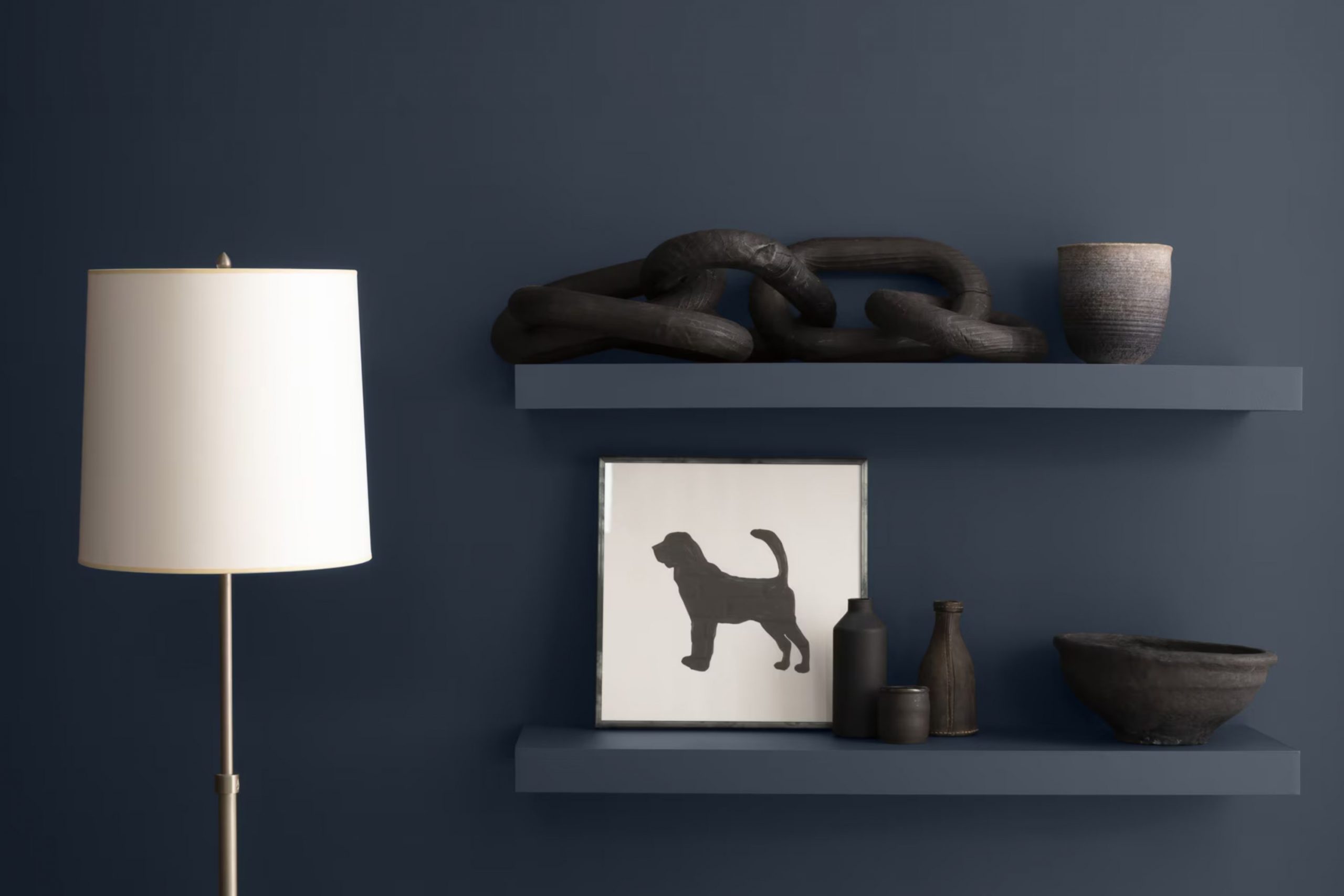
Choosing the right paint color can be a daunting task, but HC-154 Hale Navy by Benjamin Moore might just be the hue you’re looking for, especially if you’re drawn to classic, deep shades. Before you make the decision to refresh your walls with this boldly classic navy blue, there are a few things you should consider. First, think about the lighting in your room; Hale Navy can appear almost charcoal in low light, but in a well-lit room, it shows off its rich, blue tones beautifully. It’s important to test the color in different lighting conditions to see how it changes throughout the day.
Also, consider the existing decor and how this shade will harmonize with it. Hale Navy is highly adaptable and complements a wide range of colors and styles, making it a perfect candidate for a statement wall or even an all-over color if you’re feeling adventurous. Additionally, this color pairs well with both contemporary and traditional decor, bridging the gap between modern chic and classic elegance.
Finally, think about the finish. A matte finish can give a softer, more subdued look, while a gloss or semi-gloss can bring out the vibrancy of the color. Whatever your choice, HC-154 Hale Navy by Benjamin Moore is a solid option that adds depth and refinement to any interior.
Is Hale Navy HC-154 Right for My Home?
Hale Navy is a classic color by Benjamin Moore that I often recommend to clients who want to add a sense of depth and boldness to their interior without making it feel too heavy. It’s a deep, saturated blue that stands out as both confident and adaptable. I love how it maintains a balanced level of brightness, making it perfect for creating striking walls or accent areas in a room.
In terms of interior styles, Hale Navy is particularly well suited to nautical, traditional, and contemporary themes. It beautifully complements crisp white trim or furniture, enhancing a maritime theme, or it can provide an excellent contrast to warm, earthy colors in a more classic setting. For modern interiors, pairing it with sleek metals and cool greys can create a chic, minimalist look.
When it comes to materials, Hale Navy works wonderfully with natural wood, bringing out the rich tones of the wood grain. It also pairs well with leather, adding a refined feel to a room, and can be softened with textured fabrics like wool or linen in lighter colors. Whether it’s in a cozy study or a large living room, this color can truly make a statement while still feeling inviting and warm.
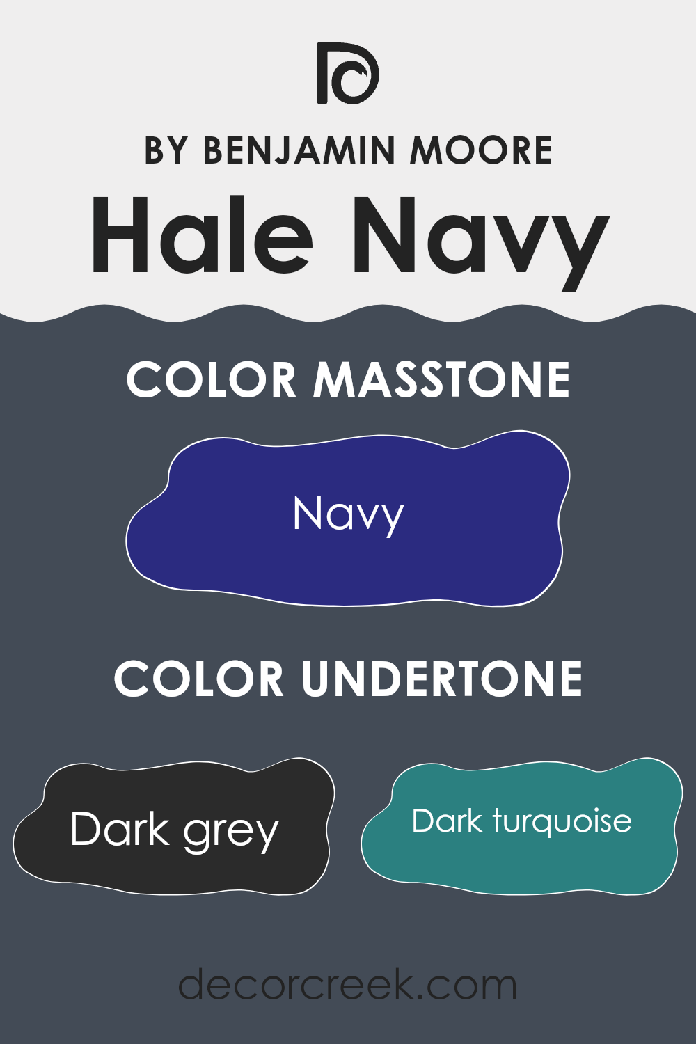
What are the right undertones of Hale Navy HC-154 ?
Hale Navy is a popular paint choice for its deep, rich blue tone that adds a classic yet striking touch to any room. Undertones play a crucial role in how a color appears once it’s on your walls, affecting its interaction with light and the room’s overall ambiance. Every paint color has underlying hues that can subtly or noticeably shift the main color, depending on lighting conditions and surrounding elements.
The undertones in Hale Navy include a mix of dark grey, dark turquoise, and dark green, which provide a grounded, robust depth. These cooler undertones help the color remain vibrant yet stable under different lighting scenarios. Additionally, hints of purple, brown, and grey add complexity, allowing the color to adjust smoothly within various decorative schemes.
When painted on interior walls, Hale Navy with its undertones can influence the mood and perception of the room. For instance, the dark turquoise and dark green undertones could make a room feel more connected to natural elements, offering a fresh yet cozy feel. In bright, natural light, the blue and violet undertones might become more pronounced, lending a lively vibe to the room.
Different lighting conditions can showcase Hale Navy’s adaptability. Under warmer light, the brown and olive undertones might emerge, creating a more intimate atmosphere. This adaptive nature makes Hale Navy a suitable choice for many rooms, balancing between a strong character and the ability to blend well with a range of decor styles and colors.
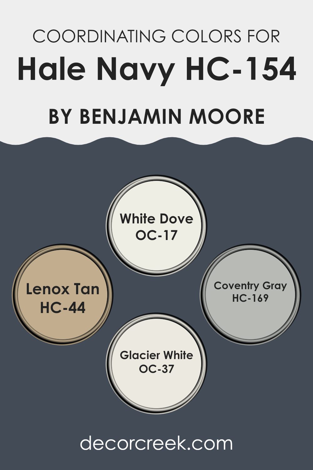
Best Coordinating Colors to use with Hale Navy HC-154 by Benjamin Moore this year.
Coordinating colors are those that complement each other well when used together in décor, fashion, or art. They help create a harmonious look and can enhance the aesthetic appeal of an environment. Using coordinating colors effectively can produce a balanced and pleasing atmosphere, as they are selected to support the primary color used in an interior, ensuring that all elements work well together. For instance, in a room featuring Hale Navy, its coordinating colors can be used to soften or highlight its depth.
White Dove is a clean, crisp white shade that can brighten interiors and offer a fresh contrast to the depth of navy hues. It works well on trim or as a backdrop that allows richer colors to stand out. Lenox Tan is a warm, inviting beige that brings a cozy feel to any room, complementing darker colors like navy by adding a soft, neutral earthiness.
Coventry Gray is a tempered, mid-tone gray ideal for a more modern yet understated look; it works well in interiors aiming for a balanced, neutral palette that still retains some character. Glacier White is another excellent option for those preferring a subtle contrast; it’s a slightly cooler shade than White Dove, providing a nuanced, cleaner angle against bolder colors. Together, these shades can create an inviting interior that feels cohesive and thoughtfully put together.
You can see recommended paint colors below:
- OC-17 White Dove
- HC-44 Lenox Tan
- HC-169 Coventry Gray
- OC-37 Glacier White
Trendy Trim Colors of Hale Navy HC-154 by Benjamin Moore to use this year.
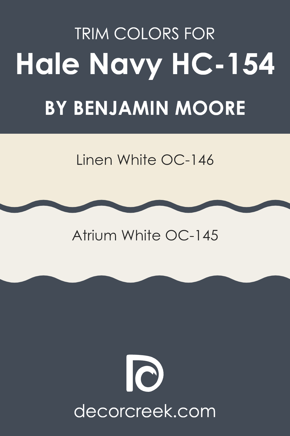
Trim colors are the shades used on the finishing elements of an interior, such as baseboards, moldings, door frames, and window trims. These colors play a crucial role in defining the aesthetic and visual coherence of a room. When used with a rich and deep color like Hale Navy by Benjamin Moore, choosing the right trim colors can significantly enhance the overall appearance. Whites such as Linen White and Atrium White are popular choices for trim because they offer a crisp, clean contrast that highlights the boldness of darker wall colors, making the room’s features stand out in a pleasing way.
Linen White OC-146 is a soft, warm white that has a hint of creaminess, which makes it exceptionally adaptable for interiors that aim for a cozy, inviting feel. This color pairs beautifully with Hale Navy as it softens the intensity of the navy, providing a gentle transition from the strong wall color to a lighter trim.
In contrast, Atrium White OC-145 is a pure, bright white with a subtle touch of warmth. This shade is ideal for creating a sharp and clear definition against darker tones, ensuring that architectural details stand out. Both trim colors help achieve a harmonious yet striking balance with Hale Navy, making them essential for room design aesthetics.
You can see recommended paint colors below:
Evergreen Colors Similar to Hale Navy HC-154 by Benjamin Moore
Choosing similar colors to decorate an interior can create a cohesive and harmonious atmosphere by subtly blending shades and tones without sharp contrasts. This approach is particularly effective when using colors like Hale Navy, which provide a solid, calming base for a color scheme.
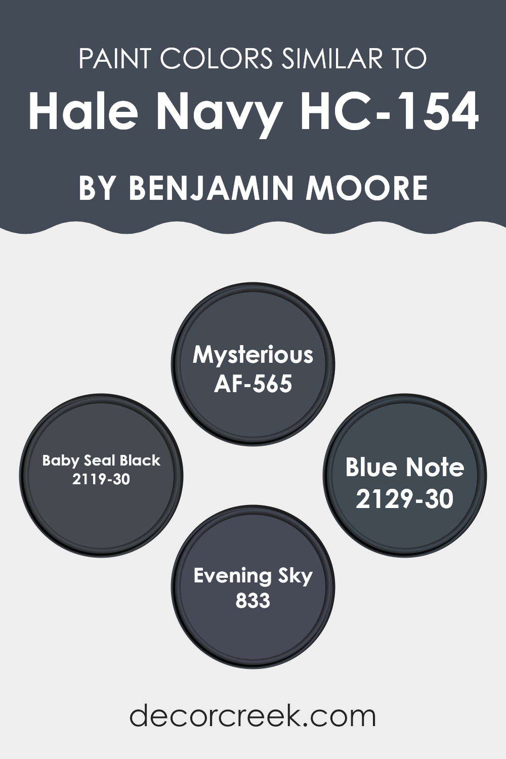
By integrating similar colors to Hale Navy, such as Mysterious, Baby Seal Black, Blue Note, and Evening Sky, a designer can ensure that all elements within the room share a connected mood and style, allowing for a smooth visual flow. These related tones help create a unified look that enhances the overall aesthetic without the disruption that comes with strong contrast.
For instance, AF-565 Mysterious is a deep, mystical grey-blue that hints at the depth of the night sky, offering a subtle twist on traditional navy shades. Slightly darker, 2119-30 Baby Seal Black, as the name suggests, is a rich black with soft blue undertones, perfect for making a room feel cozy and grounded. 2129-30 Blue Note steps it up with a lively yet dark blue tone that can make a bold statement without feeling too intense. Lastly, 833 Evening Sky is a muted blue that mirrors the softness of twilight, adding a gentle touch to interiors aiming for a calm and collected vibe. Using these shades creates a unified yet layered palette that enhances visual harmony and appeal without losing character.
You can see recommended paint colors below:
- AF-565 Mysterious
- 2119-30 Baby Seal Black
- 2129-30 Blue Note
- 833 Evening Sky
Colors that Go With Hale Navy HC-154 by Benjamin Moore
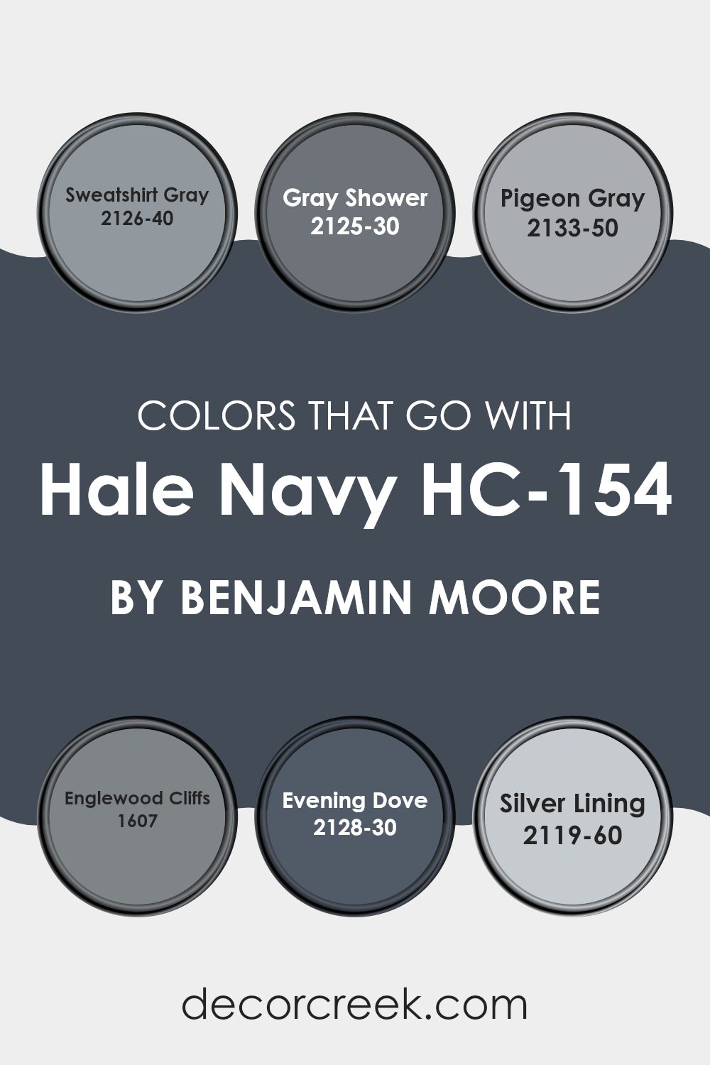
Choosing the right colors to complement Hale Navy HC-154 by Benjamin Moore can significantly enhance the overall aesthetic of a room. Hale Navy is a deep, rich blue that acts as an adaptable backdrop, perfect for both bold and subtle color schemes. When teamed with compatible colors like Sweatshirt Gray, Gray Shower, Pigeon Gray, Englewood Cliffs, Evening Dove, and Silver Lining, it creates a harmonious palette that can suit various decorating styles, from modern to traditional.
Sweatshirt Gray offers a cozy, muted backdrop that pairs well with the assertiveness of Hale Navy, softening its impact without feeling too heavy in the room. Gray Shower is a lighter shade that brings a fresh, airy feel to the room, providing a gentle contrast to the darker navy. Pigeon Gray strikes a balance with a mid-tone gray that complements the depth of Hale Navy, adding a gentle layer of complexity.
Englewood Cliffs presents a slightly warmer tone, bringing a welcoming vibe when used alongside Hale Navy. Evening Dove is another robust choice, with a dark charcoal hue that aligns closely with the navy, perfect for creating a striking yet cohesive look. Lastly, Silver Lining is the lightest, almost acting as a calming, refreshing cleanse against the deeper navy, ensuring the room feels balanced and inviting. Together, these colors create a palette that adds depth and interest to interiors, making color selection a key element in room design.
You can see recommended paint colors below:
- 2126-40 Sweatshirt Gray
- 2125-30 Gray Shower
- 2133-50 Pigeon Gray
- 1607 Englewood Cliffs
- 2128-30 Evening Dove
- 2119-60 Silver Lining
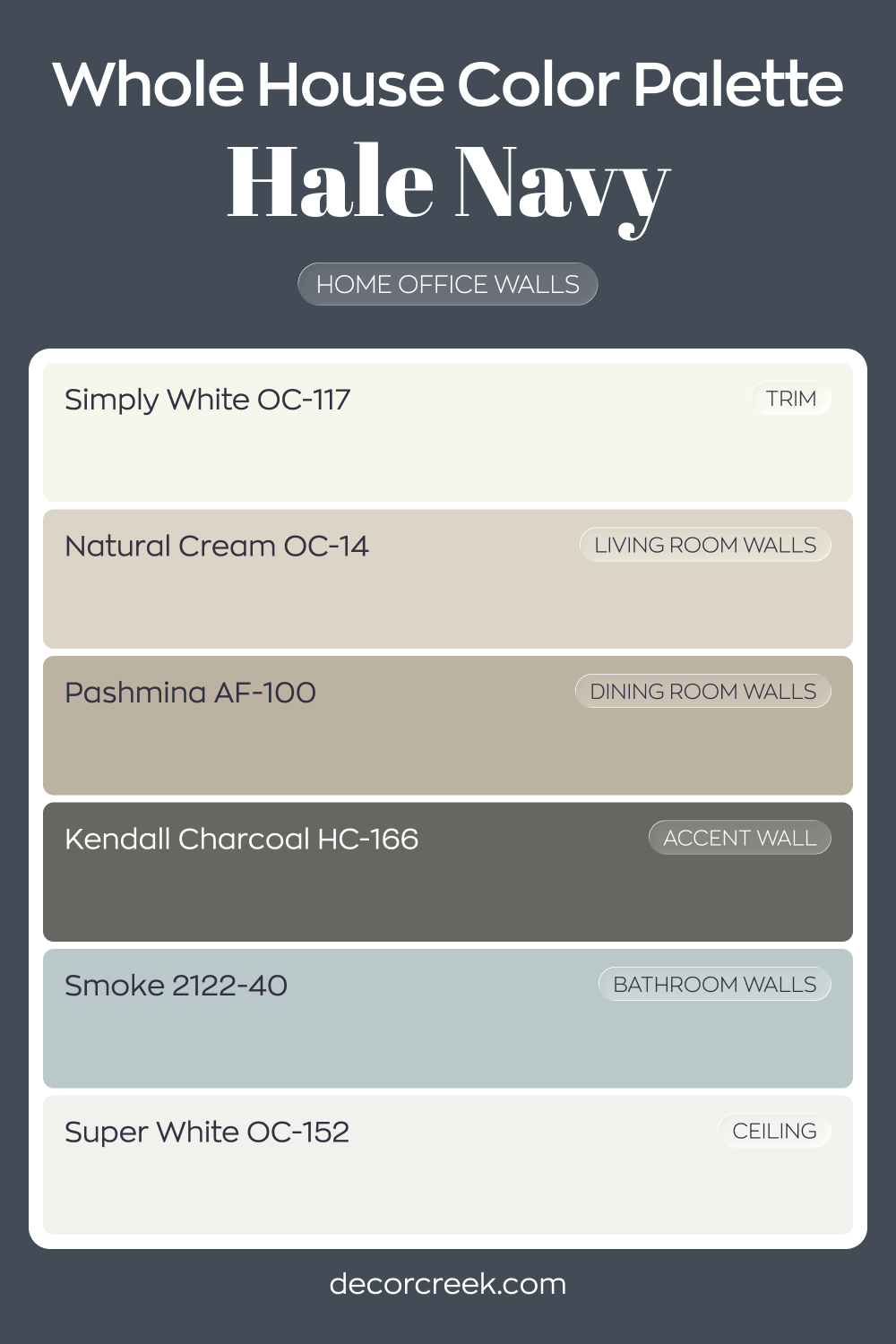
Whole House Paint Color Palette Built Around Hale Navy HC-154
Hale Navy HC-154 gives the house office strong presence with its rich blue depth. Simply White trim and Super White on the ceiling keep the dark tone crisp and tailored. The contrast feels sharp and balanced.
Natural Cream in the living room and Pashmina in the dining room introduce warm neutrals that soften the bold blue.
Smoke in the bathroom adds a cool gray-blue note that complements the palette. Each room carries a distinct mood while staying connected.
Kendall Charcoal on an accent wall deepens the overall design. The mix of creamy neutrals and dark blues creates a layered and confident home.
Hale Navy HC-154 by Benjamin Moore vs Blue Note 2129-30 by Benjamin Moore
Hale Navy and Blue Note by Benjamin Moore are both popular shades of blue paint, but they have distinct differences. Hale Navy is a deep, strong navy blue that appears almost classic and neutral. It’s adaptable enough to use in a variety of rooms, from kitchens to bedrooms, giving a sturdy and traditional feel to walls.
On the other hand, Blue Note is a darker, more intense blue with a hint of black. This color is bolder and more striking, providing a dramatic flair that makes it ideal for accent walls or furniture pieces. It tends to stand out more than Hale Navy due to its deeper saturation.
In summary, if you’re looking for a more conventional, subdued navy, Hale Navy is the better choice. If you prefer a more striking, standout shade, Blue Note would be the way to go. Both colors offer unique aesthetics that can enhance different areas of a home depending on the desired impact.
You can see recommended paint color below:
Hale Navy HC-154 by Benjamin Moore vs Mysterious AF-565 by Benjamin Moore
Hale Navy and Mysterious are both dark hues by Benjamin Moore, but they bring different vibes to interiors. Hale Navy is a deep, rich blue that’s very close to true navy. It can make a room feel cozy and grounded, which works well in a study or living room.
On the other hand, Mysterious leans more toward a charcoal blue, giving it an almost black appearance in dim light. This color suits modern settings, perfect for adding drama and intensity to an interior.
Both colors are flexible options for furniture and accent walls, creating bold statements wherever used. While Hale Navy brings a classic navy warmth, Mysterious offers a more shadowy, deep sea blue that’s almost black, ideal for a striking, moody look.
You can see recommended paint color below:
Hale Navy HC-154 by Benjamin Moore vs Baby Seal Black 2119-30 by Benjamin Moore
Both Hale Navy and Baby Seal Black are popular colors from Benjamin Moore, each adding their own unique flair to interiors. Hale Navy is a deep blue shade that’s adaptable enough to use in a variety of settings. It’s a strong color but retains a calming effect, making it a great choice for both living areas and bedrooms.
On the other hand, Baby Seal Black is a very dark gray that almost looks black. It offers a bold and grounding effect, perfect for creating dramatic accents in a room or used on doors and trim for extra impact.
While Hale Navy brings a touch of brightness into a room with its rich, blue tones, Baby Seal Black leans toward a more neutral, understated look. Both shades are excellent for adding depth and interest to your decor. Depending on the atmosphere you want to create, each offers its distinct charm. Hale Navy might be preferred in rooms where you want a pop of color, whereas Baby Seal Black is ideal when aiming for a subtle, yet powerful statement.
You can see recommended paint color below:
- 2119-30 Baby Seal Black
Hale Navy HC-154 by Benjamin Moore vs Evening Sky 833 by Benjamin Moore
Hale Navy and Evening Sky, both by Benjamin Moore, are distinct in their appearance. Hale Navy is a deep, dark blue that brings about a strong sense of boldness and classic style. Its rich, deep hue is adaptable, making it suitable for accent walls or cabinets to create a striking effect in a room.
On the other hand, Evening Sky is a lighter, softer blue with a calming effect, reminiscent of the sky at dusk. It lends a fresh and airy feel, perfect for creating a relaxed environment in rooms like bedrooms and bathrooms.
When comparing the two, Hale Navy provides a more prominent, striking presence due to its darker tone, whereas Evening Sky offers a gentler, more soothing vibe, making it ideal for a peaceful setting. This contrast in mood and intensity between the two colors can suit different tastes or room purposes.
You can see recommended paint color below:
After reading and learning about HC-154 Hale Navy by Benjamin Moore, I think it’s a really cool color. It’s like a deep blue that reminds me of the ocean at night. It’s not just any blue; it has this strong, rich vibe that makes any room look more interesting and grown-up.
I found out that Hale Navy is great because it works well with lots of other colors. Whether you put it with bright colors like yellow or something calm like gray, it still looks awesome. This makes it very practical for decorating because it can fit in many different areas of a home, like a cozy corner in the living room or even in a fun playroom.
People also like this color because it can cover walls really well, and it lasts a long time. So, if you paint your room with Hale Navy, you won’t have to worry about painting again soon. It’s also easy to find and not too pricey, which is great.
Overall, if someone wants to make their room look neat and feel cool, Hale Navy is a smart choice. It’s pretty, it’s powerful, and it can make any room look a little bit more special. I’m glad I got to learn about this color, and maybe I’ll suggest it next time someone asks for painting ideas.

Ever wished paint sampling was as easy as sticking a sticker? Guess what? Now it is! Discover Samplize's unique Peel & Stick samples.
Get paint samples

