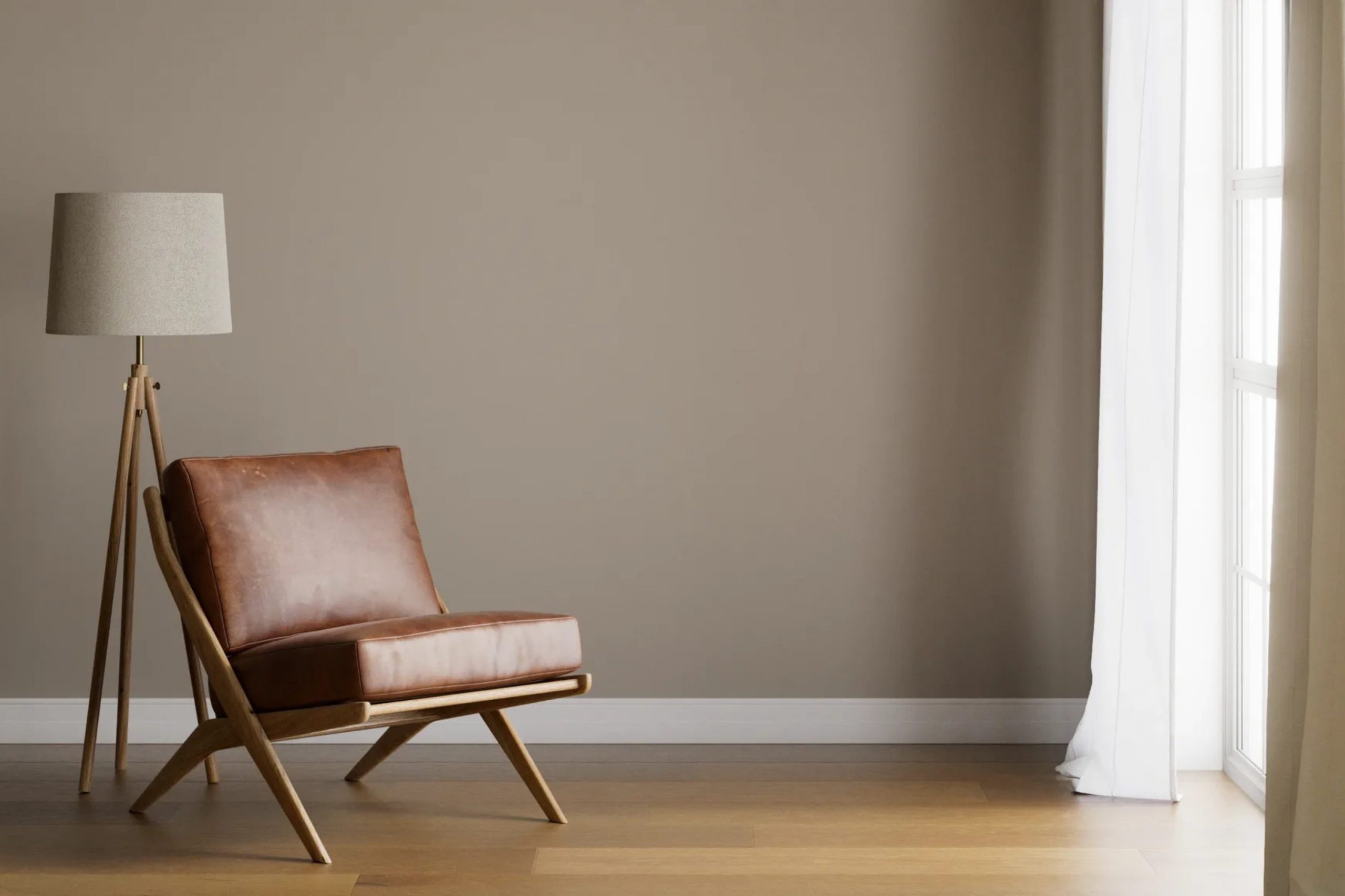
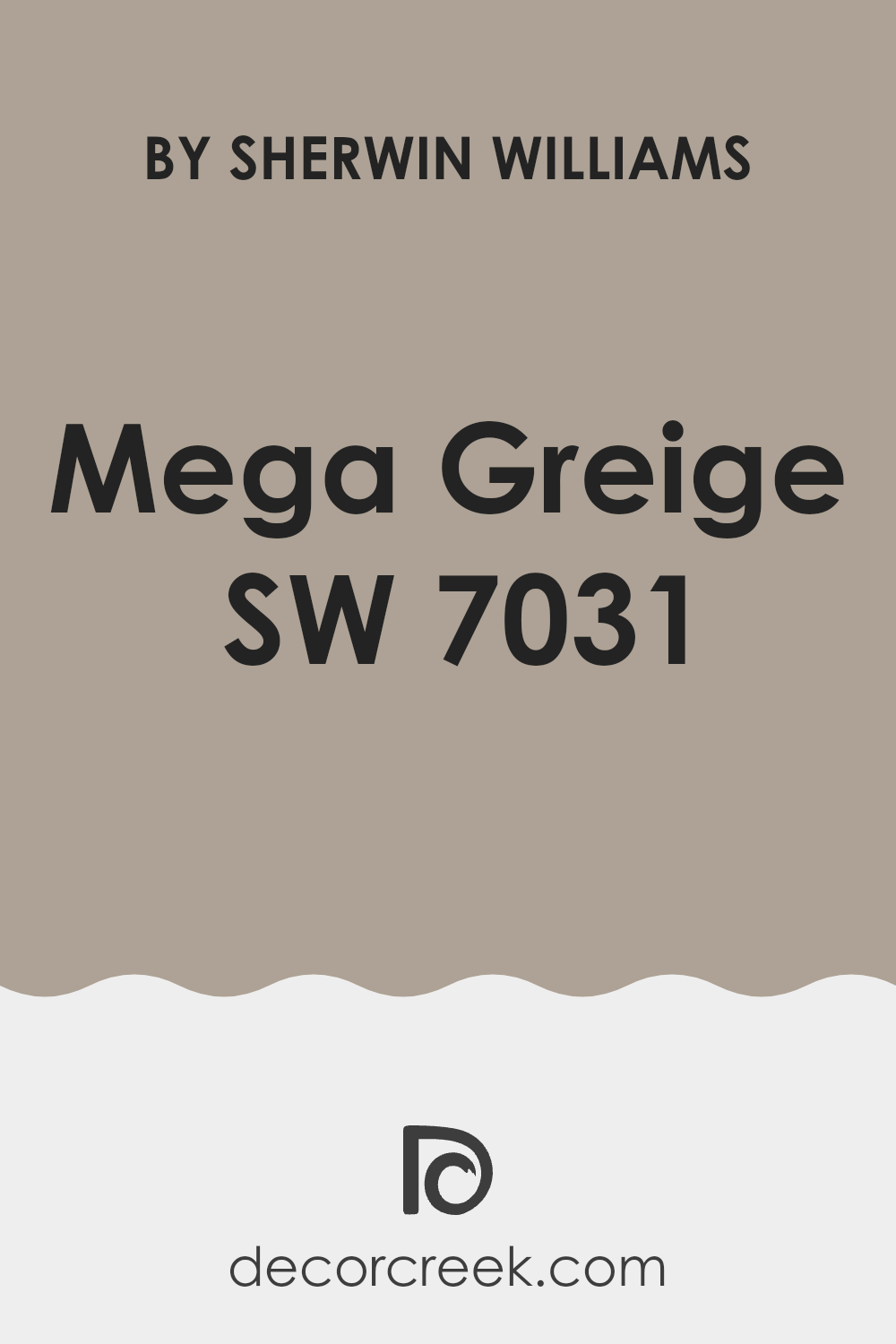
Choosing the right paint color for your room can feel too much with so many options available. Today, let’s talk about Sherwin Williams SW 7031 Mega Greige, an adaptable color that might just be perfect for your next project. As someone who always looks for a balance between warm and cool tones, I found SW 7031 Mega Greige to be a compelling choice. It’s a blend of gray and beige, creating what many might describe as the ultimate greige.
This color is particularly useful for those of you looking to achieve a contemporary yet cozy feel in a room. It’s neutral enough to work well in varied lighting conditions and pairs beautifully with both modern and traditional decor. From my experience, using Mega Greige in a room adds a refined touch without making the room feel too muted. Whether you’re painting a sun-soaked living room or a dimly lit study, this color adjusts wonderfully, maintaining its charm.
SW 7031 Mega Greige is more than just a safe choice; it provides a canvas that allows other elements of your decor to shine. Before you decide on it, consider the mood you want to set in your room.
Its adaptability in complementing different styles and its unique ability to balance cool and warm undertones makes it a standout contender among grayscale options.
Is Mega Greige SW 7031 Right for My Home?
When I first saw the color Mega Greige by Sherwin Williams, it immediately struck me as a wonderfully adaptable shade. It’s this rich blend of gray and beige that feels both warm and contemporary. The beauty of Mega Greige lies in its subtle complexity; it’s not just gray, and it’s not just beige. This quality makes it highly flexible for different interior styles, especially modern farmhouse, Scandinavian, and minimalistic designs where you want a touch of warmth without feeling too intense.
I find that this color pairs exceptionally well with natural materials, which really bring out its earthy undertones. Think about using it alongside light wooden floors or furniture, leather accents, and soft, textured fabrics like linen or chunky wool throws. These combinations create a cozy yet refined atmosphere in any room. The neutrality of Mega Greige also allows for mixing with both cool and warm palettes, enabling me to play with various decor elements without the room feeling disjointed.
In terms of its application in different rooms, it works beautifully in living rooms and bedrooms where you want a cozy but light atmosphere. It’s also great in bathrooms and kitchens when paired with marble or metallics, adding a chic touch to functional areas. Overall, Mega Greige is my go-to for creating a stylish, cohesive look throughout my home.
decorcreek.com
What are the right undertones of Mega Greige SW 7031 ?
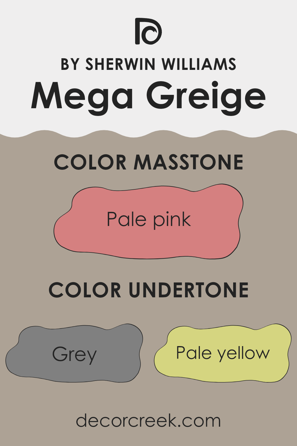
Mega Greige is an adaptable paint color that has a base of warm gray with subtle complexities stemming from its array of undertones. Undertones are essentially additional colors that lurk beneath the surface of the primary color, influencing how it appears in different lighting situations and when paired with various decor elements. Depending on the light and the surrounding colors, these undertones can become more apparent, shifting the color’s overall look.
Mega Greige includes a mix of both warm and cool undertones ranging from gray, pale yellow, and light purple to olive and brown. This combination makes it a unique choice for interior walls as it can harmonize with a variety of themes and furnishings. The presence of gray and light gray helps to anchor the color, making it relatively neutral and easy to work with. On the other hand, hints of pale yellow and olive introduce a subtle warmth that makes rooms feel welcoming.
The varied undertones also mean that Mega Greige can react differently to natural and artificial light. In sunlight, you might notice the lighter, warmer tones popping through, giving the room a brighter feel. In artificial or dimmer light, the deeper tones such as brown and gray might become more dominant, creating a cozier atmosphere.
Overall, the impact of these undertones on interior walls is largely beneficial because it allows for adaptability in design while maintaining the kind of understated beauty that fits many different styles and tastes, from modern to rustic. The choice of furnishings and decor elements will also play a significant role in defining how these undertones interact, hence influencing the ultimate mood and character of the room.
decorcreek.com
Best Coordinating Colors to use with Mega Greige SW 7031 by Sherwin Williams this year.
Coordinating colors are selected shades that complement a main color, enhancing the overall aesthetic and creating a visually harmonious room. When choosing coordinating colors for a particular base color, like Mega Greige by Sherwin Williams, the goal is to pick shades that either provide a subtle contrast or blend smoothly with the main hue to achieve a balanced look. Good coordinating colors will amplify the beauty of the base color while maintaining a cohesive color scheme in the décor.
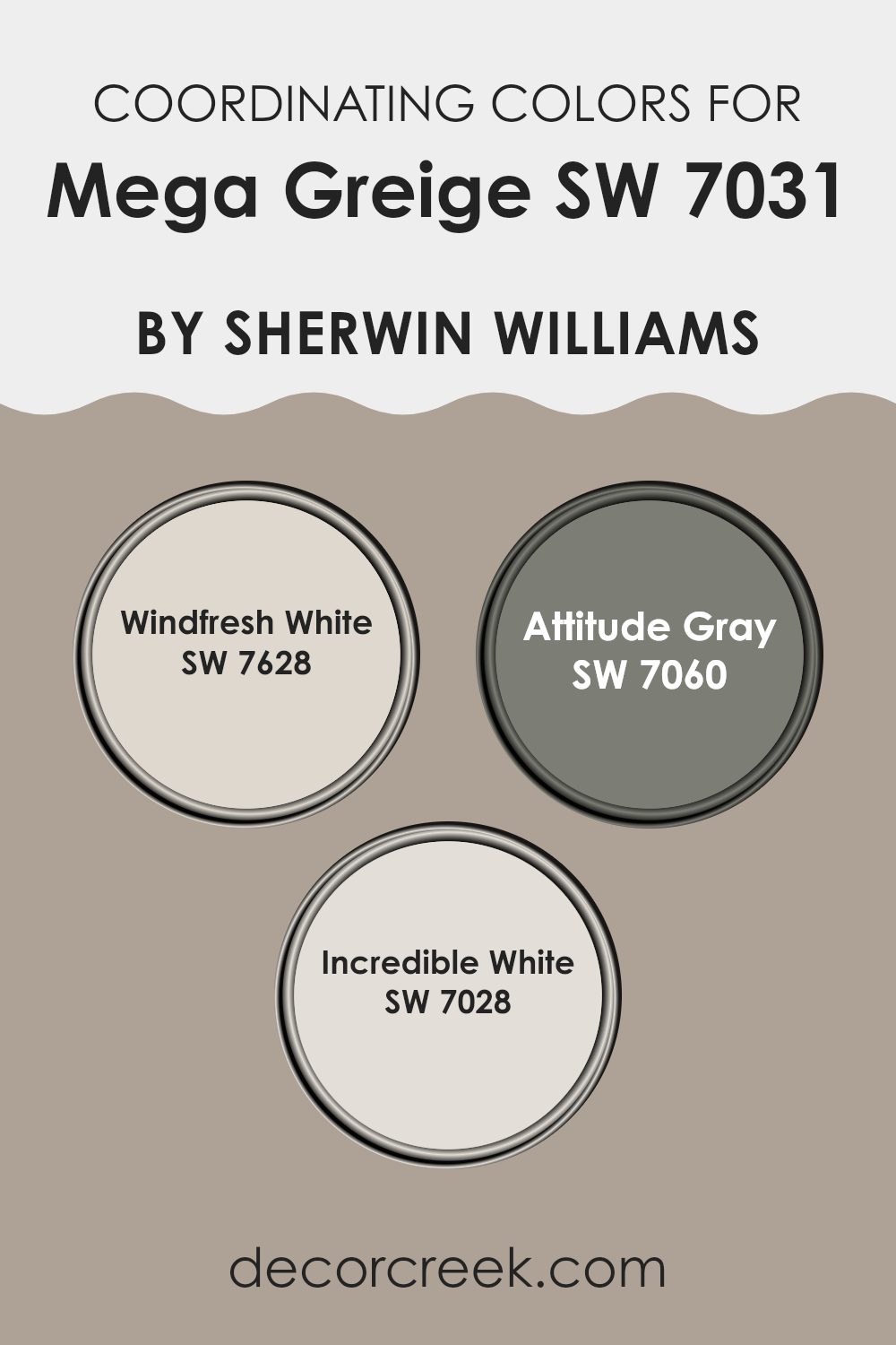
For Mega Greige, an adaptable neutral paint color, shades like Windfresh White, Attitude Gray, and Incredible White work wonderfully. Windfresh White is a clean, bright white that provides a crisp contrast to Mega Greige, making any room feel fresh and inviting. It’s particularly effective in areas that benefit from a light and airy feel. Attitude Gray offers a deeper, more pronounced contrast.
It’s a strong gray that can give a room a more grounded, robust appearance, especially effective in modern and minimalistic designs. Lastly, Incredible White is a soft, subtle off-white with a warm undertone that closely complements Mega Greige, ensuring a soft transition from one area of the room to another, perfect for achieving a smooth look throughout the home.
You can see recommended paint colors below:
Trendy Trim Colors of Mega Greige SW 7031 by Sherwin Williams to use this year.
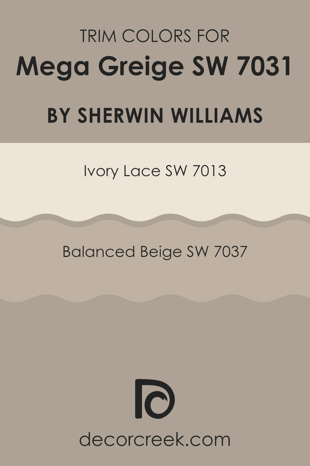
Trim colors are the hues used for painting architectural elements like door frames, window frames, crown moldings, and baseboards that accent the main wall colors of a room. When it comes to selecting trim colors for Mega Greige by Sherwin Williams, choices like Ivory Lace and Balanced Beige are fitting because they create a subtle yet effective contrast that highlights and defines rooms clearly.
Trim colors are crucial as they can enhance the aesthetic appeal and coherence of the interior design, making architectural details stand out without feeling too intense against the primary wall color.
Ivory Lace is a lighter shade that provides a gentle contrast against the deeper tones of Mega Greige, bringing a fresh and clean edge to the room’s overall look without creating harsh lines. Balanced Beige, on the other hand, is closer in depth to Mega Greige, offering a more seamless transition between the wall and the trim. This color is ideal for creating a soft, cohesive look that enriches the overall warmth of the room, making it feel well put together and inviting. Each color, with its distinct qualities, plays a crucial role in achieving a harmonious balance within a room, enhancing both comfort and style.
You can see recommended paint colors below:
- SW 7013 Ivory Lace
- SW 7037 Balanced Beige
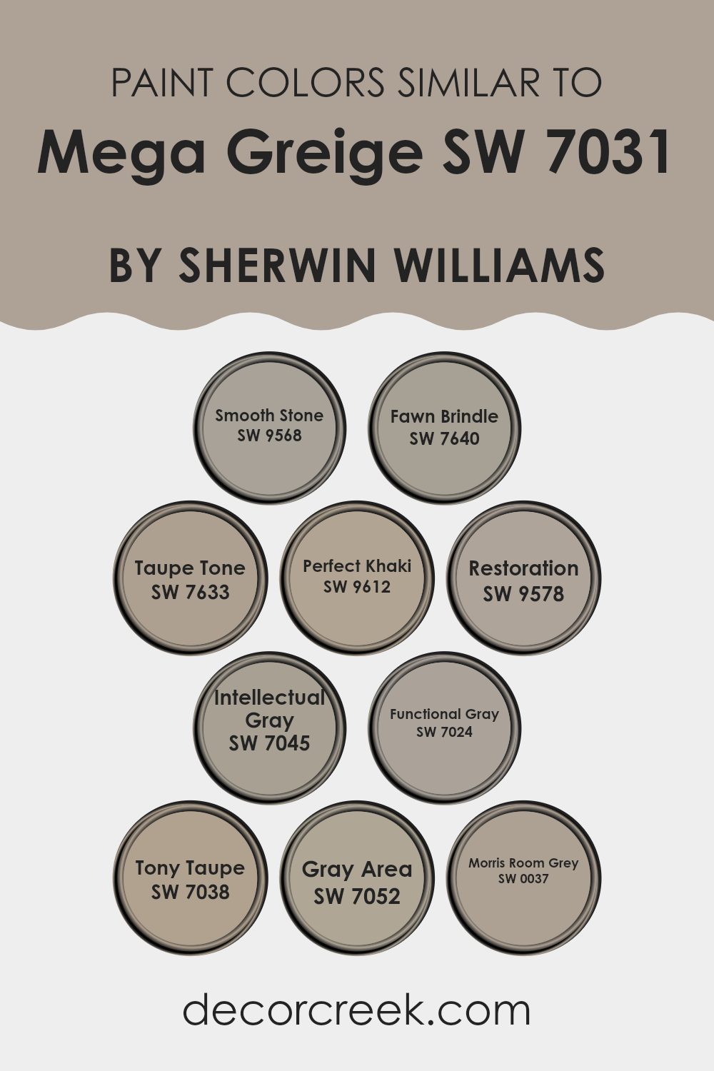
Evergreen Colors Similar to Mega Greige SW 7031 by Sherwin Williams
Similar colors around a base shade like Mega Greige can create a harmonious and cohesive look in any living room, making it feel more put-together and pleasing to the eye. Using shades like Smooth Stone, a gentle gray with a touch of warmth, or Fawn Brindle, which offers a deeper, earthy gray, adds subtle variety while maintaining a unified atmosphere. This approach allows colors to complement each other and often makes a room look bigger and more inviting.
Close relatives such as Taupe Tone, a muted gray-brown, can add depth to the walls without feeling too intense. Perfect Khaki has a slightly greenish tint that brings a natural vibe into a room, merging well with indoor plants and wooden accents. Then there’s Restoration, which leans a bit darker, giving a cozy feel to dens or bedrooms.
Intellectual Gray is smart for those looking for a refined yet understated backdrop, while Functional Gray provides a solid, neutral base that complements brighter colors and bold decor. Tony Taupe adds a hint of refined character, and Gray Area, a deeper shade, can anchor lighter colors like pastels. Lastly, Morris Room Grey gives richness to a room, making it ideal for accent walls or complementing wood finishes and metallic fixtures. By selecting from this palette of colors similar to Mega Greige, you can achieve a balanced decor that feels intentional and welcoming.
You can see recommended paint colors below:
- SW 9568 Smooth Stone
- SW 7640 Fawn Brindle
- SW 7633 Taupe Tone
- SW 9612 Perfect Khaki
- SW 9578 Restoration
- SW 7045 Intellectual Gray
- SW 7024 Functional Gray
- SW 7038 Tony Taupe
- SW 7052 Gray Area
- SW 0037 Morris Room Grey
Colors that Go With Mega Greige SW 7031 by Sherwin Williams
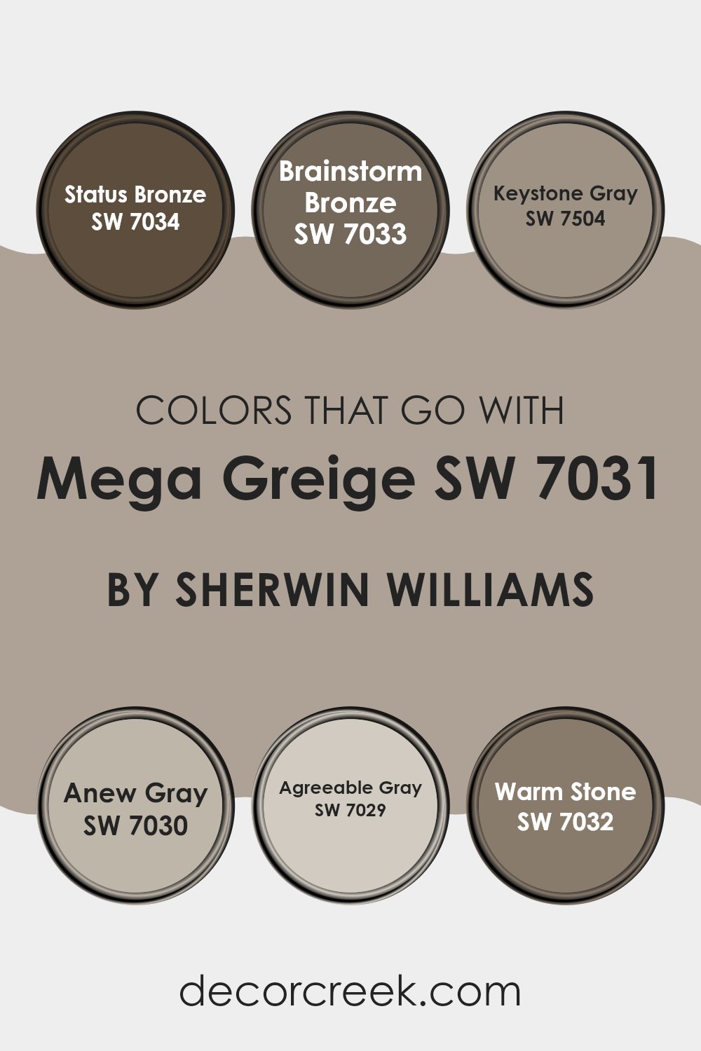
Choosing coordinating colors for Mega Greige SW 7031 by Sherwin Williams is crucial because it helps create a harmonious and appealing room in your home. Mega Greige is an adaptable and warm greige (grey + beige) that can easily adjust to various settings and styles, making it a perfect base color. When paired with the right colors, it can shift the mood and dimension of a room. Working with complementary colors such as SW 7034 – Status Bronze, SW 7033 – Brainstorm Bronze, and others ensures that the room feels balanced and well thought out.
Status Bronze is a dark, rich brown that adds a cozy feeling to any room and works well to ground interiors with its depth. Brainstorm Bronze is a lighter bronze shade, providing a subtle contrast that highlights the depth of Mega Greige without feeling too intense. Keystone Gray is a cool gray that offers a slight contrast to Mega Greige, adding visual interest and a modern twist to the environment.
Anew Gray is a lighter shade that can brighten rooms while still harmonizing beautifully with the softness of Mega Greige. Agreeable Gray is another light gray which can help create a soothing backdrop, making the room feel more open and airy. Warm Stone leans toward a darker, earthier tone, providing a solid anchor and enhancing the warmth of Mega Greige, perfect for creating a welcoming atmosphere. Together, these colors work to create rooms that are cozy, refined, and visually pleasing, allowing for endless creative expression in decorating.
You can see recommended paint colors below:
- SW 7034 Status Bronze
- SW 7033 Brainstorm Bronze
- SW 7504 Keystone Gray
- SW 7030 Anew Gray
- SW 7029 Agreeable Gray
- SW 7032 Warm Stone
Mega Greige SW 7031 by Sherwin Williams vs Fawn Brindle SW 7640 by Sherwin Williams
Mega Greige and Fawn Brindle are two paint colors by Sherwin Williams that have distinct looks despite their neutral bases. Mega Greige is a warm gray shade with noticeable brown undertones. It offers a cozy feeling which makes it perfect for living areas or bedrooms where you want a touch of warmth combined with the simplicity of gray.
On the other hand, Fawn Brindle is darker and leans more toward a true gray, though it still holds onto subtle brown undertones. This color is more muted compared to Mega Greige, giving it a neutral but slightly more reserved appearance. It’s ideal for rooms that require a bit of depth without feeling too intense or heavy.
Both colors provide adaptability in design, working well with various decor styles and potentially serving as strong choices for larger surface areas like walls due to their soothing yet rich nuances. Their differences in tone and depth can cater to different preferences or room functions.
You can see recommended paint color below:

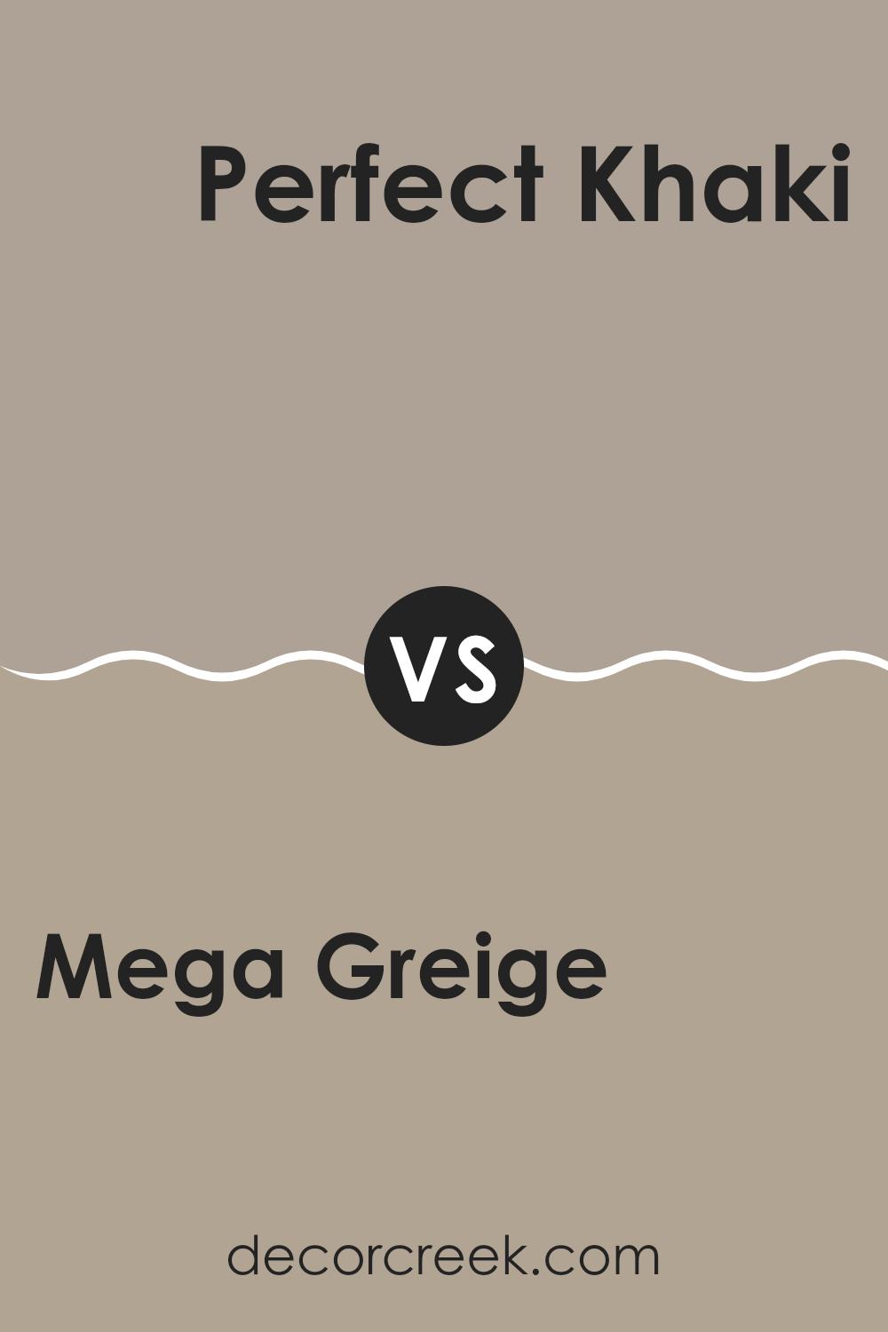
Mega Greige SW 7031 by Sherwin Williams vs Perfect Khaki SW 9612 by Sherwin Williams
Mega Greige and Perfect Khaki are two distinct shades by Sherwin Williams, each bringing its own unique feel to an environment. Mega Greige is a deep, warm gray with underlying brown tones that make it perfect for adding a cozy and comfortable feel to any room. It’s adaptable, fitting well with a broad range of decor styles from modern to country.
On the other hand, Perfect Khaki leans more toward a traditional khaki shade, lighter and with soft green undertones. This color works wonderfully in rooms where a natural, calm feel is desired. It’s particularly good in well-lit areas or places where a gentle and inviting atmosphere is important.
When choosing between these two, consider the lighting and the size of your room as well as the mood you’re aiming to achieve. While both are neutral, Mega Greige offers depth and warmth, whereas Perfect Khaki provides a softer, lighter look.
You can see recommended paint color below:
- SW 9612 Perfect Khaki
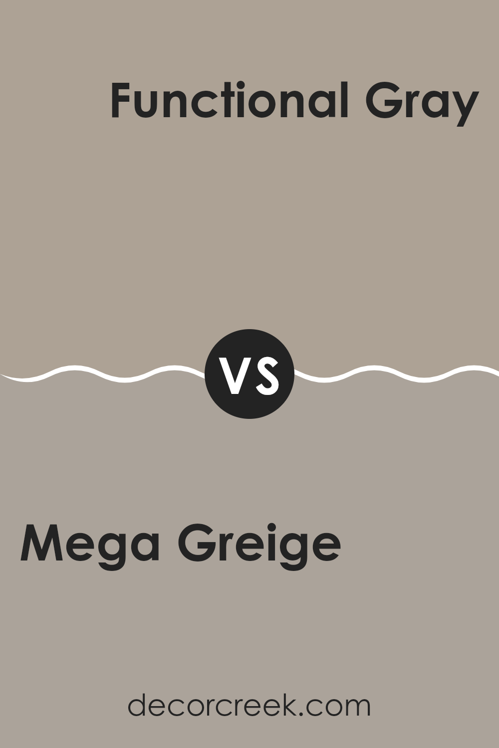
Mega Greige SW 7031 by Sherwin Williams vs Functional Gray SW 7024 by Sherwin Williams
Mega Greige and Functional Gray are two popular colors from Sherwin Williams, each offering a unique feel to interiors. Mega Greige is a warmer tone that blends gray with hints of beige, creating a cozy and inviting atmosphere in rooms. It’s perfect for rooms where you want a neutral backdrop that still adds a touch of warmth.
On the other hand, Functional Gray is a cooler shade that distinctly leans more toward a true gray. This color provides a more neutral and muted look, making it excellent for modern interiors that need a sleek, understated vibe. It fits well in areas that get a lot of natural light, as it maintains its cool tone throughout different lighting conditions.
Both colors are adaptable but cater to different aesthetic preferences: Mega Greige brings warmth and softness, while Functional Gray offers a crisp, clean look. Depending on the room and available light, each can significantly affect the mood and style of a room.
You can see recommended paint color below:
- SW 7024 Functional Gray
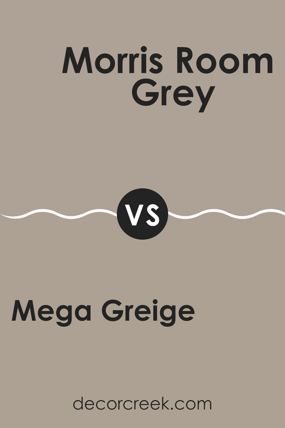
Mega Greige SW 7031 by Sherwin Williams vs Morris Room Grey SW 0037 by Sherwin Williams
Mega Greige and Morris Room Grey are both neutral paint colors, but they have some distinct differences in shade. Mega Greige leans toward a warm beige with subtle gray undertones. It’s a flexible color that pairs well in rooms aiming for a cozy, inviting feel.
On the other hand, Morris Room Grey has a deeper, more pronounced gray tone, which gives it a classic and enduring quality. While still neutral, Morris Room Grey can make a stronger statement in a room compared to the softer presence of Mega Greige.
Both colors work well in various lighting conditions, but Mega Greige tends to warm up a room, making it ideal for living areas and bedrooms. Morris Room Grey could be better suited for adding a touch of elegance to kitchens and bathrooms. Choosing between them depends on the mood you’re looking to create and the room you are decorating.
You can see recommended paint color below:
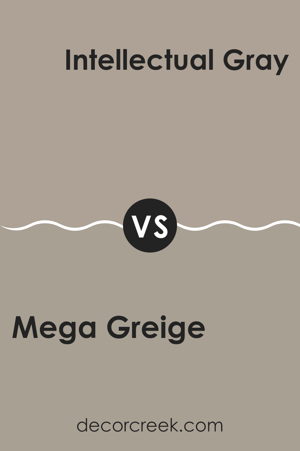
Mega Greige SW 7031 by Sherwin Williams vs Intellectual Gray SW 7045 by Sherwin Williams
Mega Greige and Intellectual Gray are both neutral colors, but they have distinct tones that set them apart. Mega Greige is a warmer shade, blending gray with elements of beige. This makes it a cozy choice for rooms where you want a touch of warmth without giving up the modern feel of gray. It works well in living rooms or bedrooms where a softer, more inviting atmosphere is desired.
On the other hand, Intellectual Gray is a cooler gray that leans slightly toward green, giving it a more grounded and earthy feel. This color is excellent for areas that need a calm and focused vibe, like home offices or kitchens. Its subtle green undertone can also complement outdoor areas well, tying in naturally with garden greens.
When choosing between these two, consider the mood you’re going for: warmer and cozier with Mega Greige, or cooler and more down-to-earth with Intellectual Gray.
You can see recommended paint color below:
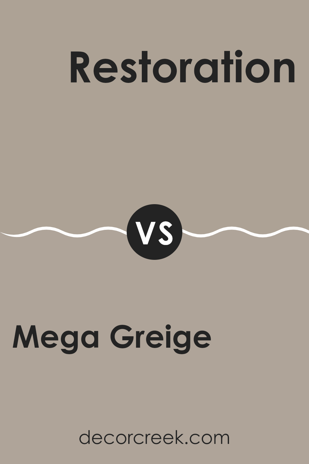
Mega Greige SW 7031 by Sherwin Williams vs Restoration SW 9578 by Sherwin Williams
Mega Greige is a warm, welcoming shade that blends beige and gray, making it highly adaptable for any room in your house. It offers a cozy ambiance without being too dark, and it pairs well with both bold and subdued accents. Think of it as a cozy blanket wrapped around your room; it complements wood tones and softens brighter colors.
Restoration, on the other hand, is a subtler, lighter color that leans more toward a pure, soft gray. It’s perfect for giving rooms an airy and open feel, especially in smaller rooms or areas with less natural light. This color works well in modern settings or when aiming to achieve a clean, minimalistic look. It’s like a gentle breath of fresh air for your home, making rooms feel larger and more inviting.
While both colors offer their unique charm, Mega Greige leans warm and cozy, and Restoration feels light and airy, showing how different shades can set distinct moods and styles in your living room.
You can see recommended paint color below:
- SW 9578 Restoration
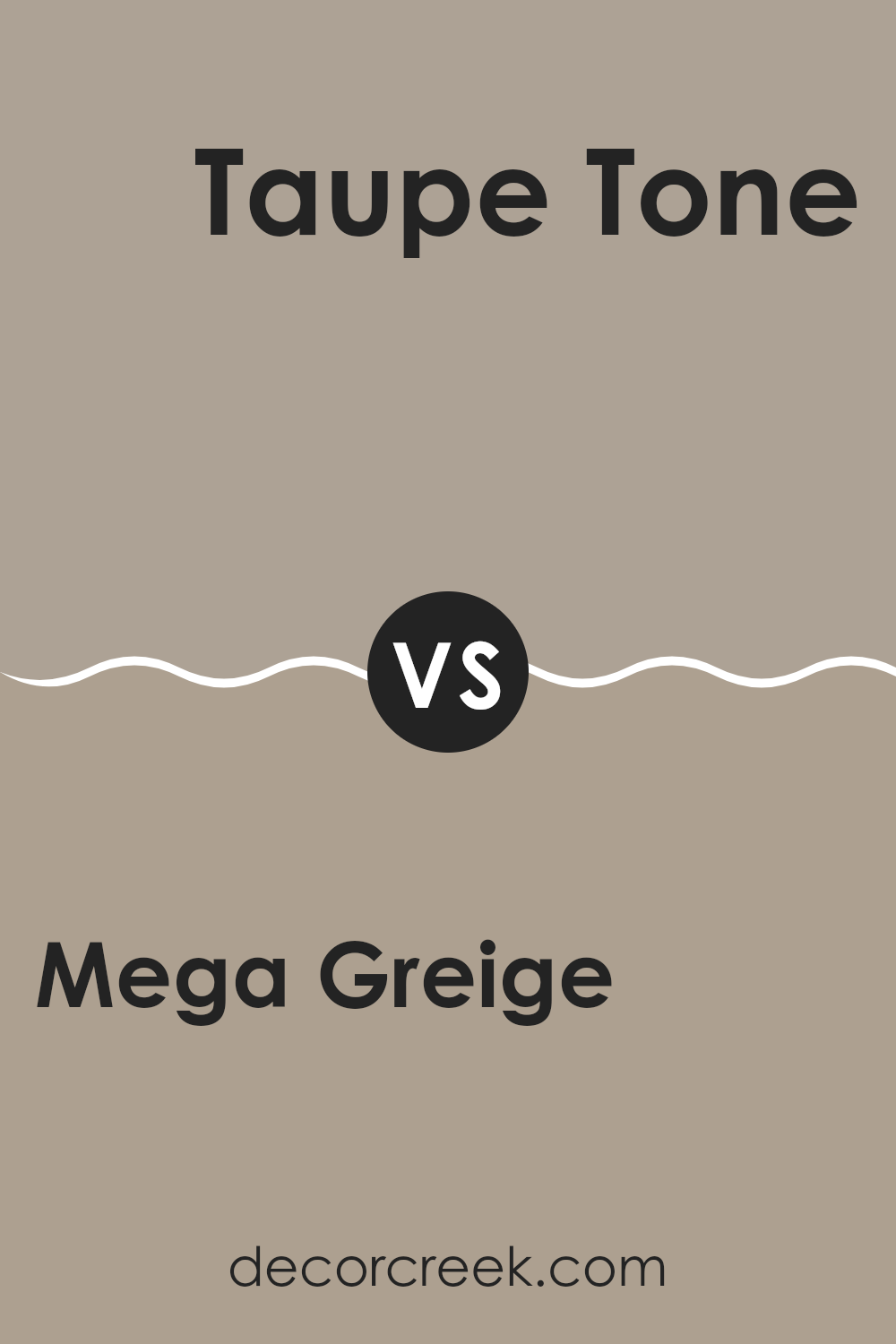
Mega Greige SW 7031 by Sherwin Williams vs Taupe Tone SW 7633 by Sherwin Williams
Mega Greige and Taupe Tone are two neutral colors from Sherwin Williams that complement a wide range of design styles. Mega Greige is a deeper shade that blends gray with beige, creating a warm, inviting feel. It’s perfect for rooms where you want a cozy yet strong presence.
On the other hand, Taupe Tone is lighter, offering a softer approach with its blend of brown and gray tones. This color is great for rooms where you want to add brightness while keeping a subtle, understated look. Both colors are adaptable, working well in various settings like living rooms, bedrooms, and even kitchens.
Mega Greige can be seen as more dramatic, making a statement in larger rooms or as an accent wall. Taupe Tone is better suited for smaller rooms or as a base color, providing a gentle background that allows other design elements to stand out.
You can see recommended paint color below:
- SW 7633 Taupe Tone
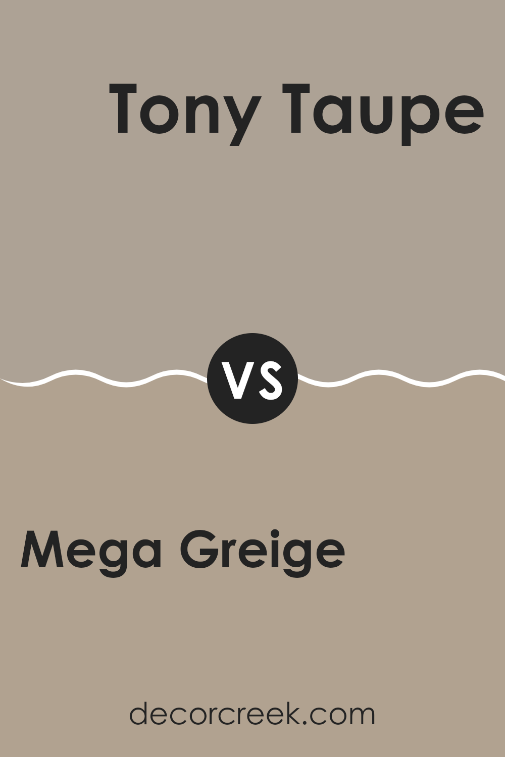
Mega Greige SW 7031 by Sherwin Williams vs Tony Taupe SW 7038 by Sherwin Williams
Mega Greige and Tony Taupe, both by Sherwin Williams, are warm, neutral colors perfect for creating a cozy atmosphere in any home. Mega Greige is a blend of gray and beige with a slightly lighter tone, giving a peaceful and welcoming feel to rooms. It pairs well with a variety of decor styles and adds a touch of brightness without feeling too intense.
On the other hand, Tony Taupe is a bit darker and leans more toward a brown shade, offering a stronger, earthier vibe. This color works great in rooms where you want a sense of grounding and richness. It’s excellent for accent walls or larger areas where you want to make a subtle, yet noticeable impact.
Both colors are adaptable and can work beautifully together, with Mega Greige possibly serving as a base or main wall color, and Tony Taupe as an accent, adding depth and contrast to your room.
You can see recommended paint color below:
- SW 7038 Tony Taupe
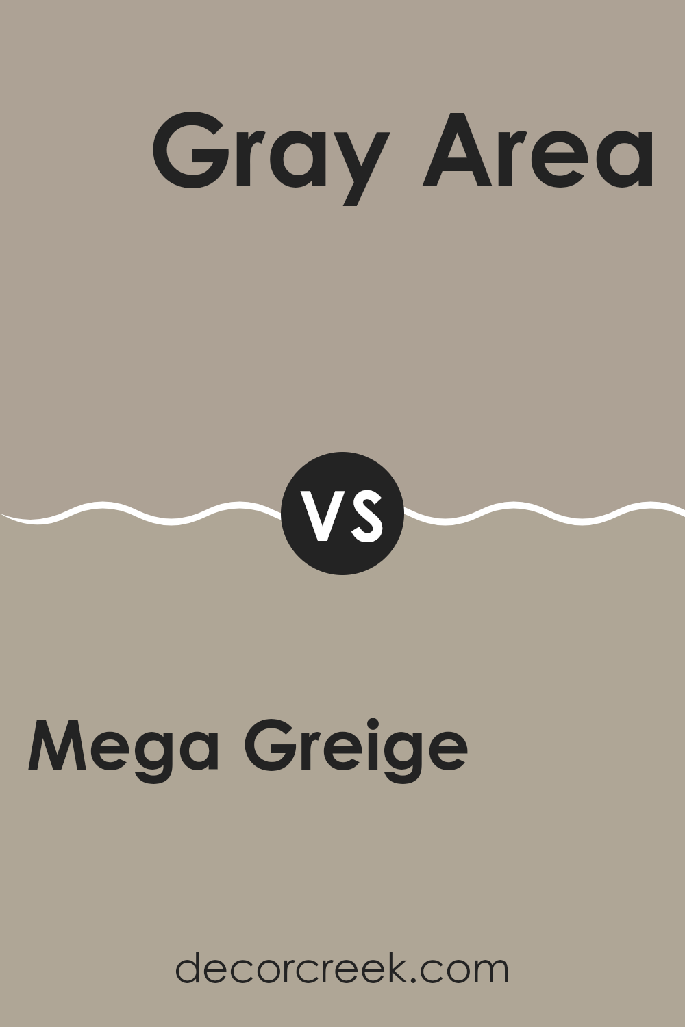
Mega Greige SW 7031 by Sherwin Williams vs Gray Area SW 7052 by Sherwin Williams
Mega Greige and Gray Area, both by Sherwin Williams, are distinct shades of gray that bring unique vibes to any room. Mega Greige leans toward a warm gray with noticeable beige undertones, giving it a cozy feel that’s perfect for living rooms or bedrooms. This color works well in rooms that need a neutral yet inviting backdrop.
On the other hand, Gray Area is a cooler tone, edged slightly toward a more traditional gray. This makes it great for a modern look, especially in places like kitchens or bathrooms where you might want a cleaner, sharper appearance.
The warmth of Mega Greige provides a soft, welcoming aura, while Gray Area offers a more crisp, defined presence, making it adaptable for different decorative styles and preferences. Depending on the lighting and surrounding colors, each can bring out different aspects, highlighting everything from furniture to art pieces effectively. In essence, your choice between the two depends on the mood and functionality you want to achieve in your room.
You can see recommended paint color below:
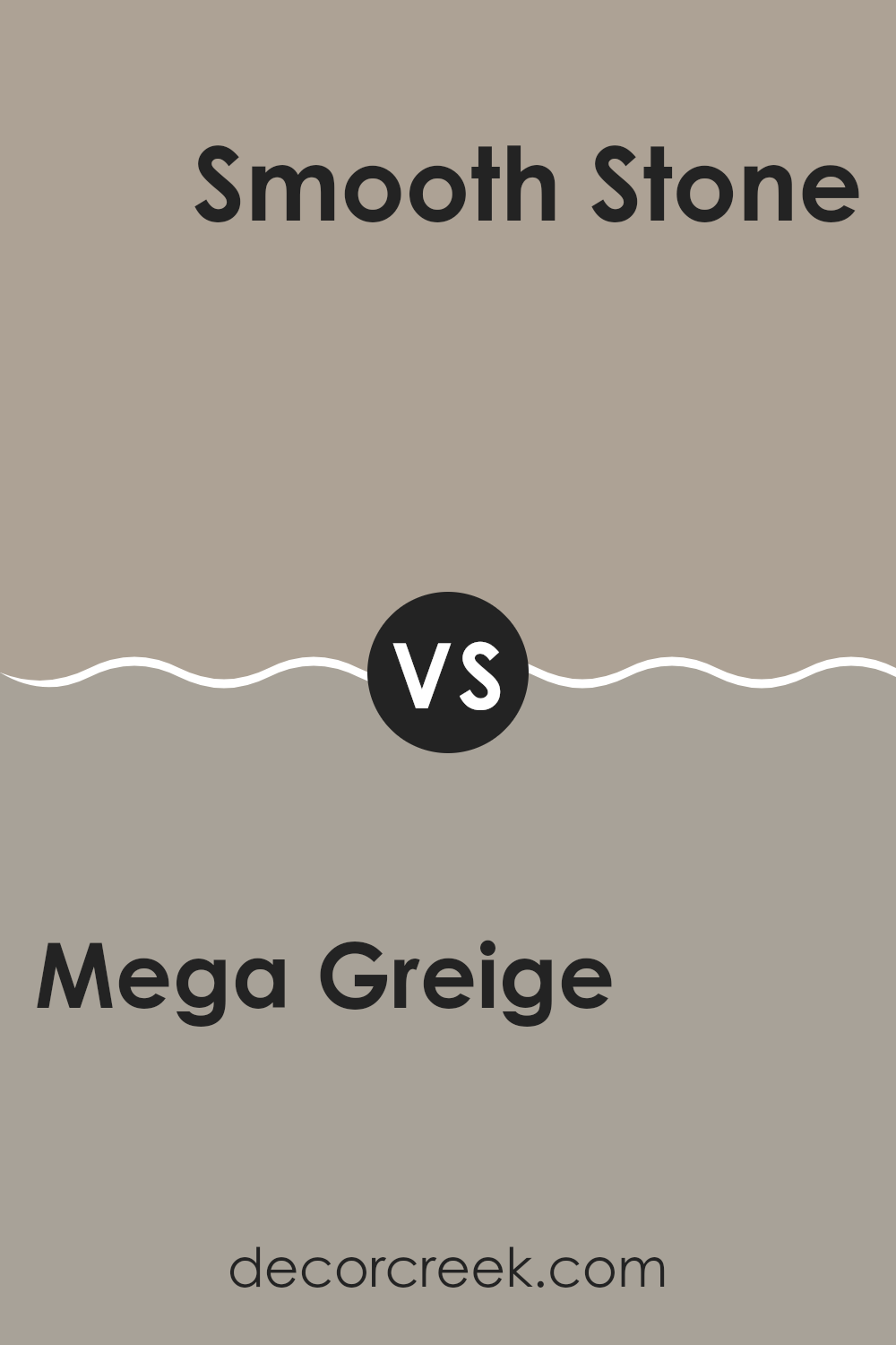
Mega Greige SW 7031 by Sherwin Williams vs Smooth Stone SW 9568 by Sherwin Williams
Mega Greige and Smooth Stone, both crafted by Sherwin Williams, offer subtle yet distinct tones for home decor. Mega Greige presents a deeper, richer gray with a touch of beige, making it ideal for rooms that need a warm, inviting ambiance without darkening the room too much. It pairs well with a variety of decor styles and adds depth to walls, particularly in well-lit or larger rooms.
On the other hand, Smooth Stone offers a lighter and cooler gray, providing a fresh and airy feel. This color is excellent for small rooms or areas with limited natural light as it helps make the room seem larger and more open. Its neutral shade allows for strong adaptability in decorating, matching well with brighter colors or serving as a calm backdrop for bolder designs.
Comparing the two, Mega Greige has a warmer undertone, suitable for creating a cozy environment, while Smooth Stone leans cooler, perfect for a minimalist or modern aesthetic. Both colors reflect light differently and can significantly influence the mood and perceived size of a room.
You can see recommended paint color below:
- SW 9568 Smooth Stone
In wrapping up my thoughts on SW 7031 Mega Greige by Sherwin Williams, I’ve found that this paint color is really special and cozy. Mega Greige is a mix of grey and beige, which makes it super easy to use in pretty much any room in your house whether it’s the living room, bedroom, or even the kitchen. It’s not too dark or too light, so it brings a warm and welcoming feel to the areas we love most.
What I like most about Mega Greige is how well it gets along with different colors. Whether I pair it with bright colors like blues and greens or stick to more calm colors like browns and whites, it looks great. That makes it really useful when I want to change just a few things in a room without having to repaint everything.
Many of my friends and family who have tried this color in their homes tell me they love it because it’s peaceful and pretty without being boring. It seems to make their furniture and decorations look even better!
So, if you’re thinking about giving your room a new look, Mega Greige from Sherwin Williams could be a perfect choice. It’s easy to match with other colors and makes any room feel warm and cozy.
Ever wished paint sampling was as easy as sticking a sticker? Guess what? Now it is! Discover Samplize's unique Peel & Stick samples.
Get paint samples

