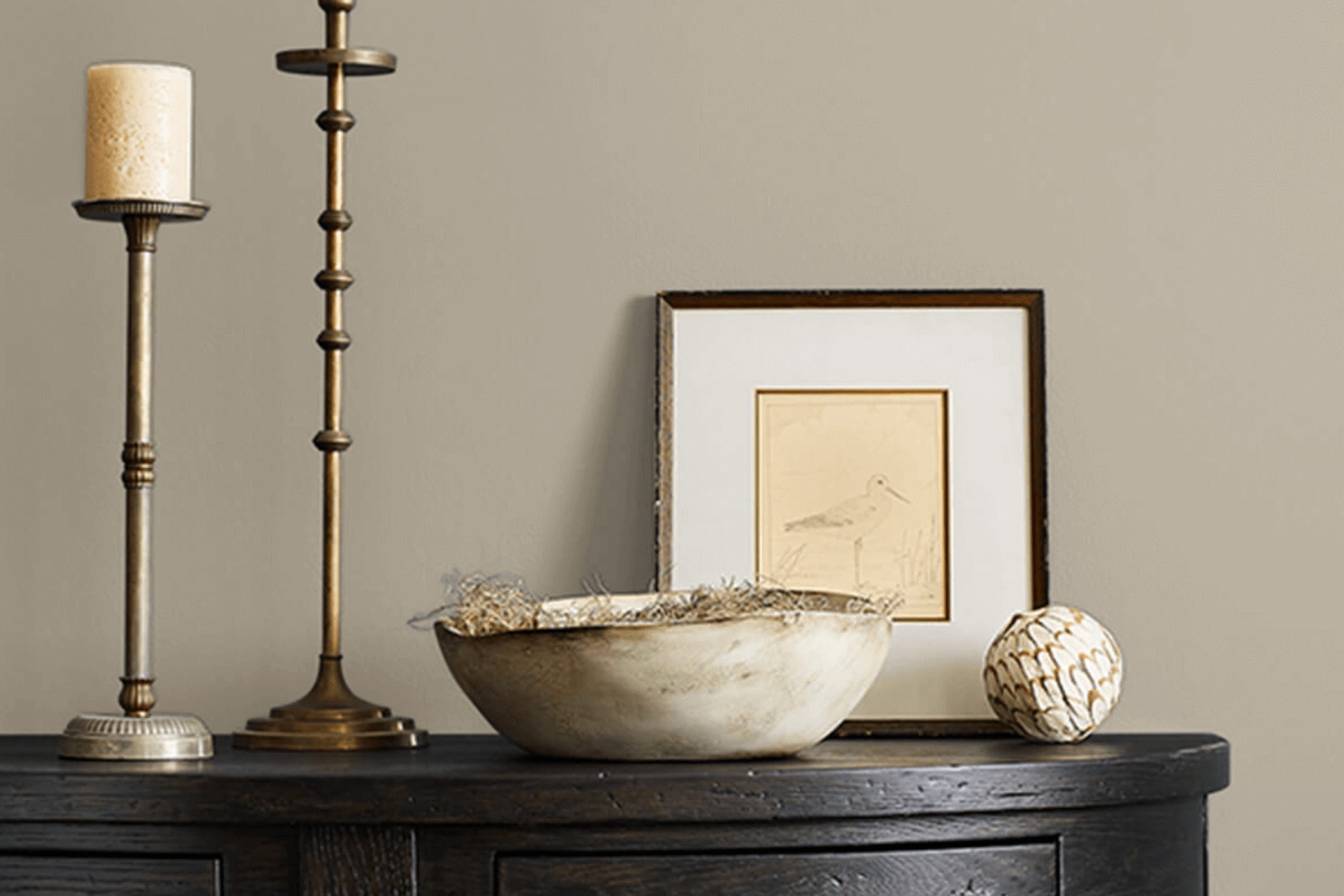
If you’re thinking about giving a room in your home a fresh coat of paint, you might want to consider SW 7052 Gray Area by Sherwin Williams. This color stands out as a unique choice that blends warmth and sophistication, making it perfect for almost any space.
When I researched various shades, Gray Area caught my attention because it offers a neutral base, yet holds enough depth to make a statement. As I pictur using this in my own home, I see the potential in both living areas and bedrooms, where its subtle energy doesn’t overpower but rather complements the room’s features.
Additionally, Gray Area works well with a wide range of decor styles, from modern to rustic, which makes it quite versatile. Whether you pair it with bright accents for a pop of color or stick to a monochrome palette, this shade adjusts beautifully. I’m planning on using it along with some wooden and metal elements to enhance its organic yet refined nature.
The idea is to create a soothing yet inviting atmosphere where you can relax and feel comfortably stylish.
What Color Is Gray Area SW 7052 by Sherwin Williams?
Gray Area SW 7052 by Sherwin Williams is a versatile shade of gray that balances warm and cool tones. This neutral color can adapt to various interior styles, making it a reliable choice for decorators looking to create a cohesive look.
In terms of interior styles, Gray Area is particularly effective in modern and contemporary settings due to its clean and understated quality. It also works well in industrial and minimalist designs, where its neutral hue helps emphasize the raw materials and simple lines that characterize these spaces. Additionally, this shade can give a fresh and updated look to traditional environments without overwhelming the classic elements.
When it comes to materials, Gray Area pairs beautifully with a wide range of textures and finishes. It looks stunning with natural wood, whether it’s a light oak or a dark walnut, enhancing the warmth of the wood. It also complements metallic finishes like stainless steel or brushed nickel, adding a touch of modernity to spaces. For textiles, consider soft fabrics like linen or wool in both light and dark colors to create a balanced and inviting atmosphere.
With its ability to act both as a background and a standout feature, Gray Area is a practical choice for those seeking a stylish yet functional color.
Is Gray Area SW 7052 by Sherwin Williams Warm or Cool color?
Gray Area by Sherwin Williams is a versatile color that can harmonize well with various design styles and spaces in a home. It’s a soft gray shade that strikes a balance between a light and medium tone, making it an excellent choice for those looking to add a neutral backdrop to their rooms without making the space feel too dark or cramped.
This color has a unique ability to adapt to different lighting conditions, appearing slightly more silver in lots of natural light, and a bit more anchored in dimmer, cozier settings. In living rooms or bedrooms, Gray Area creates a calm and inviting atmosphere, making it easier to decorate with splashes of brighter colors or patterns.
It pairs well with white trim or furniture, giving rooms a clean and modern look. Additionally, in a bathroom or kitchen, it can complement metallic fixtures and appliances excellently. Its flexibility in adapting to both warm and cool palettes also makes it a practical choice for home renovations.
Undertones of Gray Area SW 7052 by Sherwin Williams
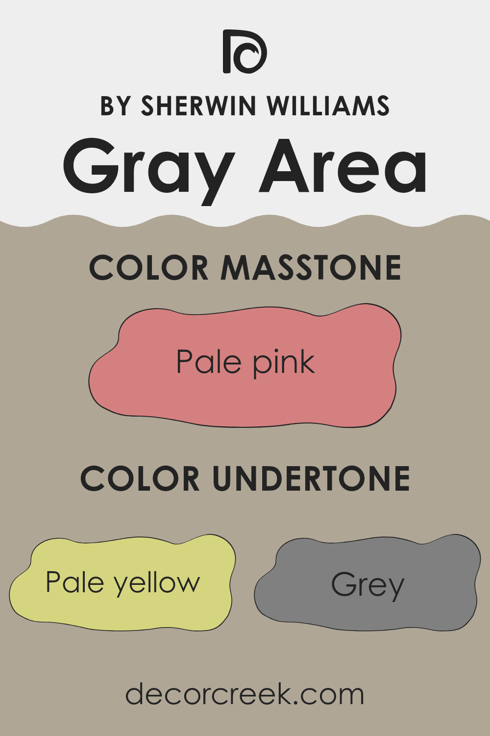
Gray Area by Sherwin Williams is a unique color with a complexity that comes from its blend of subtle undertones, making it versatile and interesting. The main undertone palette includes a variety of shades, ranging from pale yellow to light purple and mint, as well as more distinct hues like orange or olive. These undertones can influence how the color appears in different lights or when juxtaposed with other colors in a room.
Undertones are essentially the colors lurking beneath the surface of the main color. They can subtly shift how a color looks depending on the lighting conditions or adjacent colors. For example, a gray paint with a yellow undertone might look warmer under incandescent light or appear slightly more vibrant when near contrasting colors.
In the case of Gray Area, the variety of undertones enriches its adaptability. On interior walls, these underlying tones can play a crucial role. In a room with plenty of natural light, Gray Area might display its lighter, airier undertones, like mint or light blue, creating a calm and welcoming atmosphere. In spaces with less light, or at different times of the day, the deeper undertones such as brown or olive might become more noticeable, giving the room a more grounded feel.
Thus, the choice of decor, the room’s lighting, and even the direction the room faces can highlight different aspects of Gray Area’s undertones, affecting the overall mood and aesthetic. This makes it a great choice for those looking to achieve a flexible color scheme that adjusts with varying elements and preferences.
What is the Masstone of the Gray Area SW 7052 by Sherwin Williams?
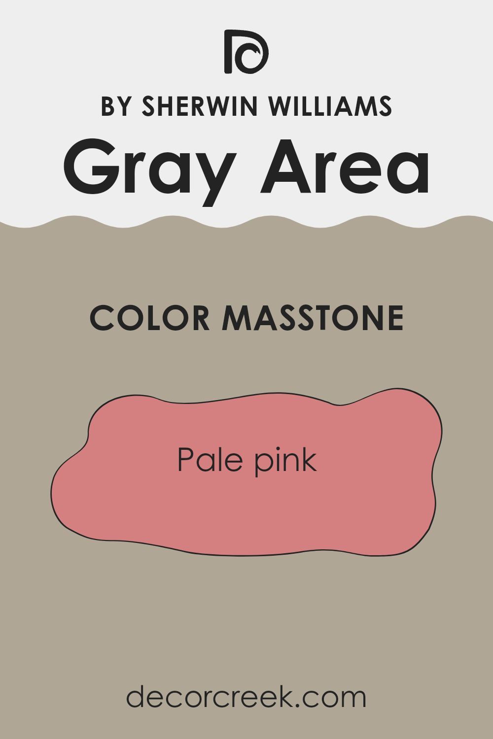
Gray Area SW 7052 by Sherwin Williams is a unique paint color with a masstone of pale pink (#D58080). This soft, subtle shade brings a fresh and inviting atmosphere to any room in a home. When used on walls, the pale pink masstone helps to create a warm, cozy feel, making it perfect for spaces like living rooms or bedrooms where relaxation is key.
Unlike bolder, brighter pinks, this lighter shade doesn’t overwhelm the senses and pairs well with a wide range of decor styles and colors.Using this pale pink can also make small rooms appear larger and more open, as lighter colors tend to give the illusion of more space.
Additionally, its gentle hue works well in rooms with limited natural light, helping to brighten the space. Overall, the pale pink masstone of Gray Area adds a soft touch of color without being too stark or glaring, making it a versatile choice for many homes.
How Does Lighting Affect Gray Area SW 7052 by Sherwin Williams?
Lighting plays a crucial role in how colors are perceived in a space. Different types of light can change the way a color looks, which is why it’s important to consider lighting conditions when choosing paint. Gray Area SW 7052 by Sherwin Williams is a versatile color that can look quite different depending on the lighting.
In natural light, Gray Area tends to show its true color. If a room is bathed in plenty of natural light throughout the day, you’ll see a balanced gray that neither leans too cold nor too warm. However, the quality of this natural light changes depending on the direction the room faces.
In north-facing rooms, which generally receive less direct sunlight and have a cooler, bluer light, Gray Area might appear slightly darker and take on a cooler tone. This can make the room feel more enclosed but also cozy.
South-facing rooms, on the other hand, get ample sunlight with a warmer tone. Here, Gray Area can look lighter and slightly warmer, making the space feel more open and inviting. This is where the color can truly shine, as it harmonizes well with the abundant, warm light.
East-faced rooms get most of their light in the morning when the sun is rising. During these hours, Gray Area will look softer and a little warmer. As the day progresses and natural light decreases, the color may seem more neutral and muted.
West-facing rooms see the opposite effect; they are brighter in the afternoon and evening. During this time, Gray Area could appear warmer and more dynamic, transforming as the quality of sunlight changes from warm to cooler as the sun sets.
Artificial lighting also impacts the appearance of Gray Area. Under warm artificial lights, such as those with yellow undertones, the color can appear softer and warmer. Cooler lights, like daylight bulbs, might make it appear crisper and cooler, similar to how it would look in a north-facing room.
When choosing lighting and color for a room, it’s a good idea to test the paint in different lighting conditions and at different times of the day to see how it behaves and whether it meets the desired mood and function of the space.
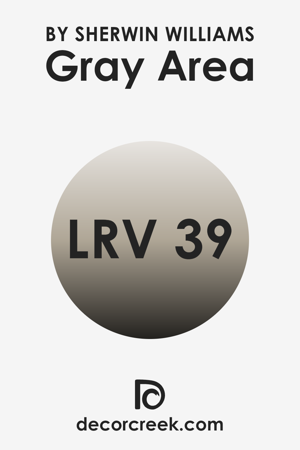
What is the LRV of Gray Area SW 7052 by Sherwin Williams?
LRV stands for Light Reflectance Value, which is a measure of the amount of light that a color reflects back into a room. It ranges between zero and one hundred, where zero represents a perfectly black surface that absorbs all light, and one hundred reflects all light back, like a perfect white. This number helps you decide how light or dark a color will look when painted on a wall.
Colors with higher LRVs make a room feel brighter and more open because they reflect more light. On the other hand, colors with lower LRVs absorb more light and can make a room feel cozier but also smaller and darker.
The LRV of the paint color Gray Area by Sherwin Williams is 38.646, which means it falls into the mid-range category. It doesn’t reflect as much light as lighter shades but isn’t as dark as some deeper tones. This makes Gray Area a versatile choice because it provides a balance, adding more depth and character to a room than a lighter color would, without making the space feel overly cramped or gloomy. When used on walls, this particular shade will affect the overall ambiance, providing a neutral backdrop that can enhance the feeling of space while still bringing warmth and dimension.
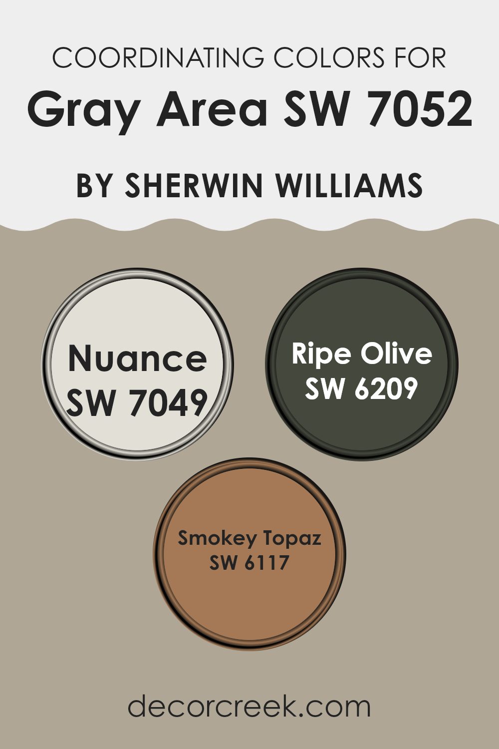
Coordinating Colors of Gray Area SW 7052 by Sherwin Williams
Coordinating colors are those that complement each other, often standing together in a color scheme to create a balanced, harmonious look. For example, if you’re starting with a neutral base like Gray Area, you can add depth and interest to your space by selecting colors that either contrast or enhance this base shade. The idea is to select hues that collectively create a satisfying visual experience, maintaining a flow that is neither too jarring nor too monotonous.
For instance, Nuance is a subtle off-white with a slight gray undertone, a great choice for those looking for a light, airy feel that still complements richer colors. It works wonderfully as a main color or as trim, providing a soft backdrop that allows other colors to stand out. Ripe Olive is a deep, earthy green that provides a striking contrast to lighter shades like Nuance.
This color can be used to add a splash of natural elegance to an area, particularly as an accent wall or within decorative elements. Smokey Topaz is a warm, muted brown that offers a cozy feel to any room. It’s especially effective in spaces where you want to encourage relaxation and comfort, such as living rooms and bedrooms. These colors, when used alongside a neutral base like Gray Area, contribute to a comfortable yet dynamically styled environment.
You can see recommended paint colors below:
- SW 7049 Nuance
- SW 6209 Ripe Olive
- SW 6117 Smokey Topaz
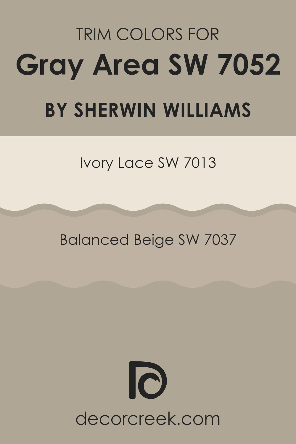
What are the Trim colors of Gray Area SW 7052 by Sherwin Williams?
Trim colors are selected to complement a main wall color by highlighting architectural details like door frames, skirtings, and cornices, enhancing the overall aesthetic appeal of a room. When using Gray Area from Sherwin Williams, a subtle yet effective choice for trim colors can include Ivory Lace and Balanced Beige. These hues work well to frame and define the spaces, ensuring that the walls are neatly contrasted and that the color scheme looks cohesive and well-planned.
Ivory Lace is a soft, warm shade that brings a gentle brightness to a space, making it an excellent choice for trims where you want to subtly highlight without overwhelming the main color.
Balanced Beige, on the other hand, is a warmer tone that provides a stronger contrast without clashing, helping to ground the setting and add depth to the overall design. Both colors help to create a polished and welcoming look when paired with Gray Area, accentuating the clean lines and shapes within a room.
You can see recommended paint colors below:
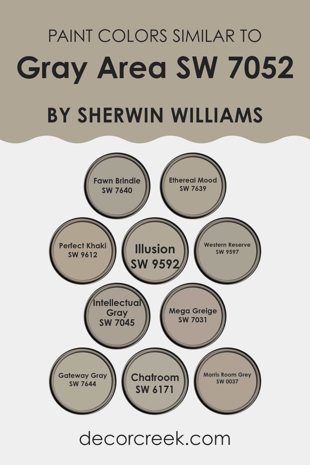
Colors Similar to Gray Area SW 7052 by Sherwin Williams
Similar colors are essential in creating a cohesive look and feel in any space, providing a subtle variation that adds depth and character without overpowering the senses. When looking at colors that complement Gray Area by Sherwin Williams, a range of grays and neutrals come into play, each offering its unique tone while maintaining a general harmony.
These shades can seamlessly work together to enhance the aesthetics of a room, creating a smooth visual flow. They help in achieving a balanced decor either by using them as base colors that blend effortlessly or as accent tones that add a gentle contrast.
For example, Fawn Brindle is a soft, earthy gray that introduces a touch of warmth, making it ideal for relaxing environments. Ethereal Mood, slightly deeper, brings a calm sense to any space, perfect for creating a comforting backdrop.
Perfect Khaki adds a hint of beige, providing a friendly, inviting atmosphere. Illusion and Western Reserve offer a deeper, more pronounced gray, adding a sturdy anchor to any color scheme. Intellectual Gray boasts an almost scholarly feel with its strong presence, suitable for spaces meant to stimulate thought.
Mega Greige combines gray with the richness of beige, offering flexibility in styling and decor. Gateway Gray stands out with its balance of light and depth, making it versatile for various settings. Chatroom has a modern edge, excellent for contemporary spaces. Lastly, Morris Room Grey offers a classic dark gray, providing a solid foundation for adding vibrant accessories or artwork. Each color supports the others, together creating a nuanced palette that allows for creative yet cohesive interior design choices.
You can see recommended paint colors below:
- SW 7640 Fawn Brindle
- SW 7639 Ethereal Mood
- SW 9612 Perfect Khaki
- SW 9592 Illusion
- SW 9597 Western Reserve
- SW 7045 Intellectual Gray
- SW 7031 Mega Greige
- SW 7644 Gateway Gray
- SW 6171 Chatroom
- SW 0037 Morris Room Grey
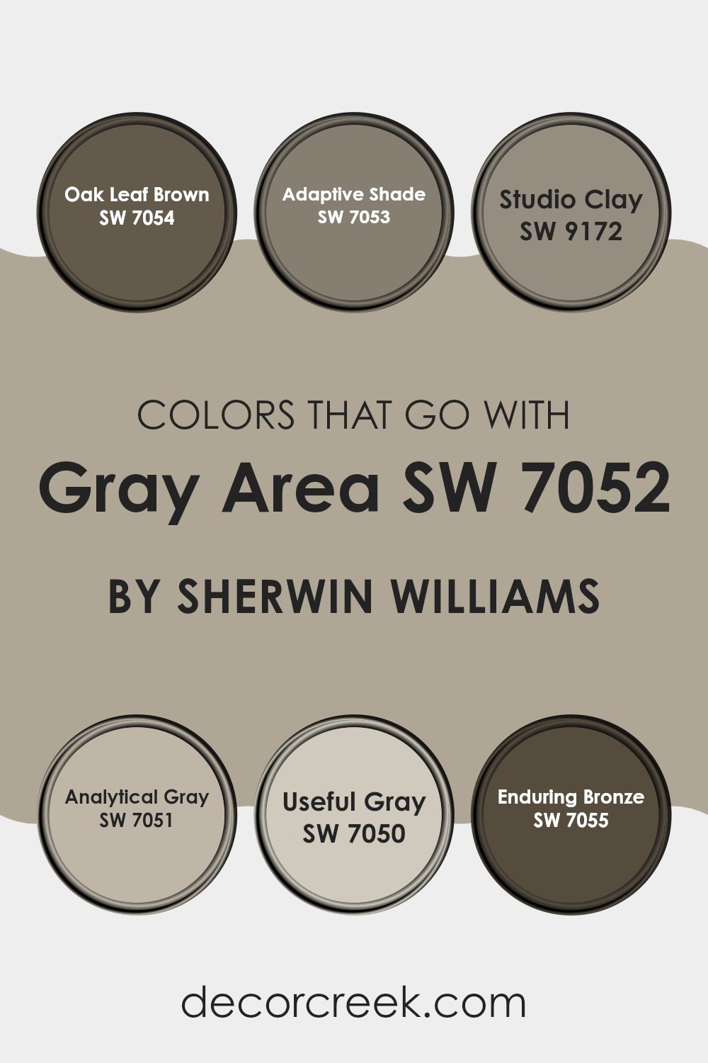
Colors that Go With Gray Area SW 7052 by Sherwin Williams
Choosing the right colors to complement Gray Area SW 7052 by Sherwin-Williams can significantly enhance the aesthetic of a space. Pairing colors thoughtfully can set a mood, create a perceived size difference, or simply improve visual appeal. When selecting colors like Oak Leaf Brown, Adaptive Shade, Studio Clay, Analytical Gray, Useful Gray, and Enduring Bronze, the goal is to achieve a balanced and harmonious environment. These colors harmonize well with Gray Area, each adding its unique but complementary character to the decor.
Oak Leaf Brown is a deep, rich color reminiscent of autumn leaves, perfect for adding warmth to spaces. Adaptive Shade, meanwhile, is a softer grey that mirrors a cloudy sky, forming a subtle contrast with deeper or vibrant hues. Studio Clay brings a touch of earthiness, similar to wet pottery clay, making it ideal for creating a grounded, organic feel in a room.
Analytical Gray is slightly lighter than Gray Area, offering a gentle, seamless transition between colors in a room. Useful Gray has a utilitarian feel, flexible and easy to integrate into various design themes. Lastly, Enduring Bronze has a timeless, classic feel, much like an ancient bronze statue, providing a durable and classy look with its deep, warm tones. Together, these colors work with Gray Area to create environments that are visually cohesive and inviting.
You can see recommended paint colors below:
- SW 7054 Oak Leaf Brown
- SW 7053 Adaptive Shade
- SW 9172 Studio Clay
- SW 7051 Analytical Gray
- SW 7050 Useful Gray
- SW 7055 Enduring Bronze
How to Use Gray Area SW 7052 by Sherwin Williams In Your Home?
Gray Area SW 7052 by Sherwin Williams is a versatile paint color that blends gray with subtle blue undertones, making it a great choice for those looking to add a modern touch to their home. This color works well in nearly any room, offering a neutral backdrop that pairs easily with a wide range of decor styles and colors.
For instance, in a living room, Gray Area can provide a calm and pleasant atmosphere, making the space feel more inviting and cozy. It’s also ideal for bedrooms, where the cool tones can help create a relaxing vibe, conducive to winding down.
Additionally, this color can be used in kitchens or bathrooms where it contrasts nicely with white cabinets or fixtures, adding depth and interest to the design. Because it is so neutral, Gray Area is also excellent for painting larger areas like hallways or open spaces, helping to tie different rooms together smoothly. Overall, using Gray Area SW 7052 is a smart choice for those looking to refresh their home with a fresh, yet timeless look.
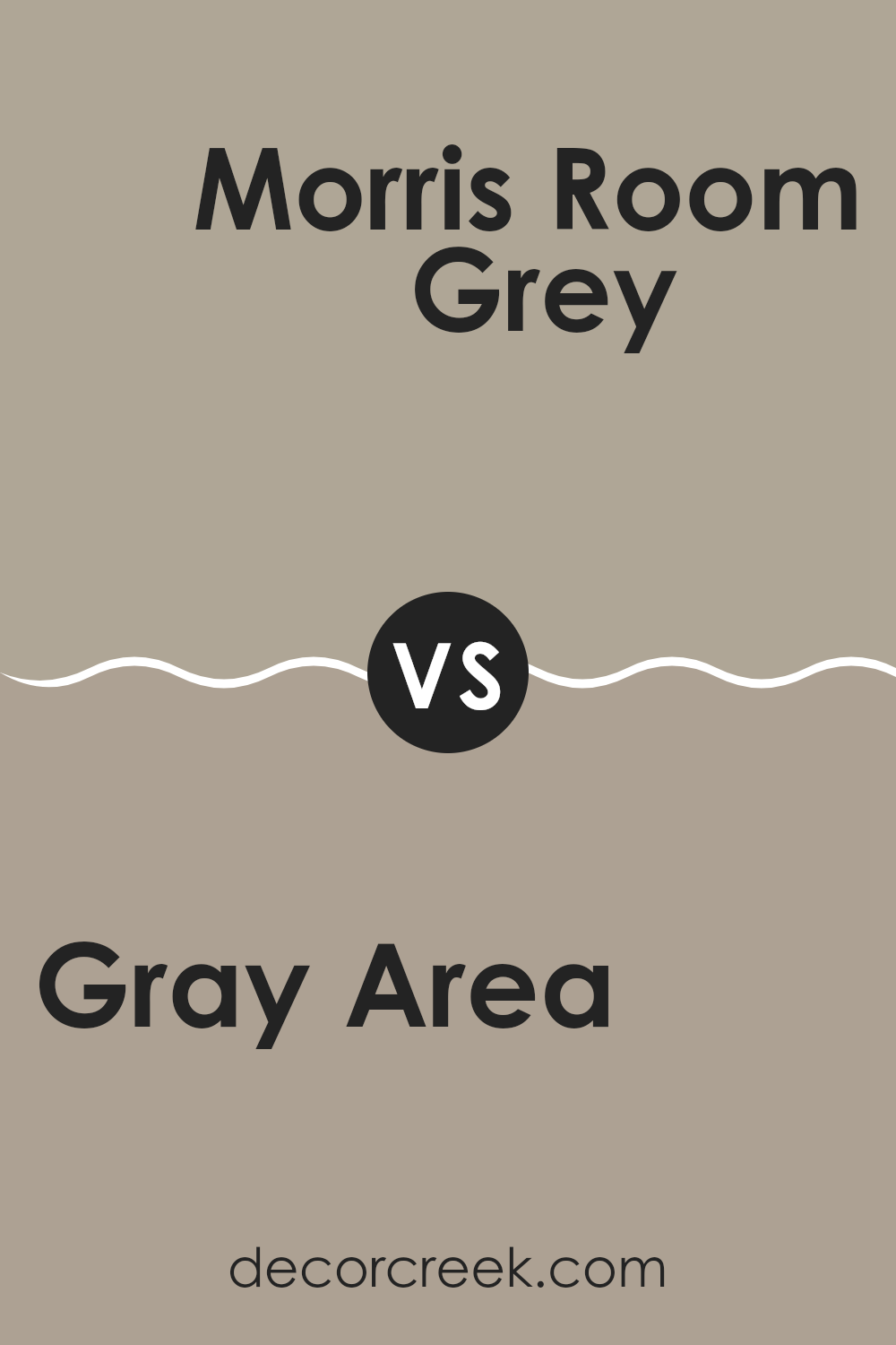
Gray Area SW 7052 by Sherwin Williams vs Morris Room Grey SW 0037 by Sherwin Williams
Gray Area SW 7052 by Sherwin Williams is a neutral gray with cool undertones, subtly leaning towards blue. This hue is versatile and blends well with various decors, making it a suitable choice for modern and minimalistic spaces. It provides a clean, crisp look that can help other colors in a room pop or work peacefully for a cohesive appearance.
On the other hand, Morris Room Grey SW 0037 by Sherwin Williams is a deeper shade with warm undertones that evoke a more traditional feeling. This color is slightly reminiscent of taupe, offering warmth and an inviting ambiance. It’s perfect for cozy settings like living rooms or bedrooms where you want a comforting and welcoming atmosphere.
Both colors provide a beautiful backdrop but cater to different aesthetic preferences and settings. Gray Area is more about cool elegance, while Morris Room Grey leans into warmth and comfort.
You can see recommended paint color below:
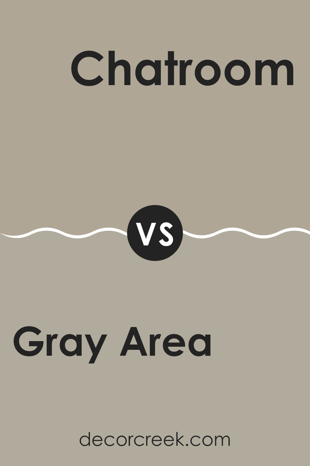
Gray Area SW 7052 by Sherwin Williams vs Chatroom SW 6171 by Sherwin Williams
Gray Area and Chatroom, both by Sherwin Williams, are distinct yet neutral shades of gray. Gray Area is a medium-light gray that offers a clean and modern feel. It strikes a balance between warm and cool tones, making it versatile for various spaces and lighting conditions.
On the other hand, Chatroom is a deeper shade of gray with a slightly green undertone, giving it a more earthy look compared to Gray Area. This color can bring a grounded, cozy feel to rooms, particularly well-suited for spaces designed for relaxation or concentration.
Both colors can be paired well with a wide range of decor styles, but Gray Area might be better for those seeking a brighter, airier space, while Chatroom would work well in a setting where a more muted, subtle ambiance is desired. Each offers a unique vibe, allowing for personal preference to guide which is best for your space.
You can see recommended paint color below:
Gray Area SW 7052 by Sherwin Williams vs Ethereal Mood SW 7639 by Sherwin Williams
The main color, Gray Area, is a cool, medium gray tone that provides a neutral and balanced backdrop for any room. This color is versatile and can easily pair with various decor styles, whether modern or classic. On the other hand, Ethereal Mood packs a bit more warmth due to its slightly dusty quality. It’s a soft gray with hints of mauve, making it ideal for creating a cozy and inviting atmosphere.
While Gray Area can feel more straightforward and traditional as a true gray, Ethereal Mood leans towards a more unique palette because of its subtle lavender undertones.
This distinction allows Ethereal Mood to add a touch of warmth to spaces that might feel too stark with Gray Area. Overall, both colors offer an understated elegance, but your choice depends on whether you prefer a cooler or a warmer tone in your interior spaces.
You can see recommended paint color below:
Gray Area SW 7052 by Sherwin Williams vs Western Reserve SW 9597 by Sherwin Williams
Gray Area SW 7052 and Western Reserve SW 9597, both by Sherwin Williams, offer distinct vibes for any space. Gray Area is a true gray that provides a neutral backdrop, perfect for any room. This color is versatile and works well in spaces that aim for a modern and clean look. It’s light enough to make rooms feel more open while still adding a touch of depth.
On the other hand, Western Reserve is a darker, moodier gray that leans towards the charcoal spectrum. This shade can give a room a more grounded, secure feeling. It’s ideal for creating a strong presence in a space, perhaps in a cozy den or an elegant dining room. This color can also be good for highlighting artwork or furniture as it draws in the eye with its richer tone.
Both colors serve different purposes but are equally effective in their right, depending on the atmosphere you want to achieve.
You can see recommended paint color below:
Gray Area SW 7052 by Sherwin Williams vs Illusion SW 9592 by Sherwin Williams
Gray Area and Illusion, both by Sherwin Williams, are quite different in mood and tone. Gray Area is a neutral gray shade that is versatile and very balanced, making it easy to pair with various decor styles and colors. This color is neither too dark nor too light, serving as a practical choice for spaces that need a calm, subtle backdrop.
On the other hand, Illusion is a darker shade that leans more towards a luxurious deep blue or soft black depending on the lighting. It creates a bolder, more dramatic look and is ideal for accent walls or furniture pieces. Illusion can give a room more depth and a touch of mystery.
In essence, while Gray Area provides a steady and understated base, Illusion offers a stronger statement, demanding more attention and setting a more distinct mood. Both colors work well depending on the needs of your space and what you want to achieve with your color scheme.
You can see recommended paint color below:
Gray Area SW 7052 by Sherwin Williams vs Perfect Khaki SW 9612 by Sherwin Williams
Gray Area and Perfect Khaki are both versatile paint colors from Sherwin Williams, but they bring different vibes to a space. Gray Area is a true gray that offers a clean, neutral backdrop. It’s a great choice for modern spaces and works well in areas that get a lot of light, as it maintains its crisp character without turning too cold.
On the other hand, Perfect Khaki leans towards a warm, inviting tone that combines elements of both beige and lighter brown. This color is particularly effective in creating a cozy and welcoming environment, suitable for living rooms or bedrooms.
It pairs beautifully with natural materials like wood, enhancing its earthy qualities. Overall, while Gray Area provides a sharp, contemporary look, Perfect Khaki offers a softer, more homey feel, making them suitable for different decorative styles and preferences.
You can see recommended paint color below:
Gray Area SW 7052 by Sherwin Williams vs Gateway Gray SW 7644 by Sherwin Williams
Gray Area and Gateway Gray are two distinct shades from Sherwin Williams that offer different vibes for interior spaces. Gray Area is a lighter, cooler gray that provides a fresh and clean look, making it ideal for creating a peaceful, straightforward ambiance in a room. Its subtle bluish undertone keeps it vibrant and can make small spaces appear larger.
On the other hand, Gateway Gray stands out with its deeper, warmer tone, delivering a more grounded, comforting feel. This shade contains hints of brown, which enrich the gray base, adding warmth and a cozy touch to larger areas or rooms with ample natural light.
Both colors are versatile and work well in various settings, whether you’re looking to brighten up a space or add a hint of coziness. Choosing between them would depend on the amount of light a room receives and the atmosphere you aim to achieve. Gateway Gray’s warmth suits communal areas like living rooms or dining areas, whereas Gray Area could be perfect for a modern bedroom or office.
You can see recommended paint color below:
Gray Area SW 7052 by Sherwin Williams vs Intellectual Gray SW 7045 by Sherwin Williams
Gray Area SW 7052 and Intellectual Gray SW 7045 are both gray paints from Sherwin Williams, but they have distinct tones which set them apart. Gray Area is a neutral, balanced gray that leans slightly towards a cool tone. This color is versatile and tends to work well in many different spaces, providing a clean, understated look. It’s particularly effective in areas that get plenty of natural light, as the coolness in the tone becomes more apparent.
On the other hand, Intellectual Gray is a warmer gray, which contains hints of both beige and green. This warmth makes it an excellent choice for spaces that need a cozy or more inviting feel. Intellectual Gray goes well with natural materials like wood and stone, enhancing their natural hues without overpowering them.
Both shades offer unique possibilities depending on the overall feel you want to achieve in a space. While Gray Area can present a more modern and crisp appearance, Intellectual Gray tends to create a more enveloping and warm atmosphere.
You can see recommended paint color below:
Gray Area SW 7052 by Sherwin Williams vs Mega Greige SW 7031 by Sherwin Williams
Gray Area and Mega Greige are both versatile colors by Sherwin Williams, well-suited to a variety of spaces. Gray Area is a true gray shade, offering a clean and straightforward look. It’s a neutral tone that pairs easily with both bright and subtle colors, providing a calm background that allows other colors to stand out.
In contrast, Mega Greige has a warmer undertone, combining elements of gray and beige. This warm mix makes it ideal for spaces where you want to add a little coziness, as it has a softer and more welcoming feel compared to the cooler Gray Area.
While Gray Area is great for achieving a modern and minimalistic design, Mega Greige lends itself to a more classic and homey environment. Both colors are flexible and can be used in various design styles, from contemporary to traditional.
You can see recommended paint color below:
Gray Area SW 7052 by Sherwin Williams vs Fawn Brindle SW 7640 by Sherwin Williams
Gray Area and Fawn Brindle by Sherwin Williams are two subtle and versatile paint colors. Gray Area is a pure, balanced gray that works well in spaces where you want a modern, neutral backdrop. It has cooler undertones, giving it a crisp, clean look. This color is great for rooms that get plenty of natural light, as it maintains its true gray shade without leaning too blue or too warm.
On the other hand, Fawn Brindle is a warmer shade that blends gray with earthy taupe elements. This color offers a cozy warmth, making it perfect for creating inviting spaces. It is particularly well-suited for bedrooms or living areas where a softer, comforting atmosphere is desired. Fawn Brindle absorbs light differently, showing off its rich, welcoming tones, especially in well-lit areas.
Both colors are flexible and can be used to refresh any space, but your choice may depend on the mood you’re aiming to achieve—a crisper feel with Gray Area or a warmer, cozier vibe with Fawn Brindle.
You can see recommended paint color below:
Conclusion
After looking closely at SW 7052 Gray Area by Sherwin Williams, I’ve really gotten to know this color. Gray Area isn’t just any old gray; it’s unique and has its own charm. When painted on walls, it brings a calm and gentle feel to a room, making it perfect for bedrooms or living areas where you want to feel relaxed.
This color works really well with many different styles and furniture colors. Whether you have bright pillows or a dark sofa, Gray Area ties everything together nicely. It’s a shade that doesn’t shout for attention but quietly supports the look of a room, making everything else stand out.
What makes it even better is that it looks different depending on the light. During the day, it can look lighter and softer, while at night, it might seem a bit deeper. So, the room changes a bit with the time of day, which keeps things interesting.
In summary, Gray Area is a really good choice if you’re unsure about colors. It’s soothing without being boring and active without being too loud. It’s a smart pick for anyone wanting to freshen up their home in a simple yet effective way. Anyone looking for a new paint color should definitely consider Gray Area – it might just be the perfect shade they’re looking for.
Ever wished paint sampling was as easy as sticking a sticker? Guess what? Now it is! Discover Samplize's unique Peel & Stick samples.
Get paint samples

